


A passionate Art Director & Graphic Designer with 14 years of experience bringing brand stories to life through powerful, emotionally-driven visuals. Specializing in art and creative direction, team leadership, digital campaigns, brand and visual identity development, and cross-disciplinary graphic and digital design.
Renowned for delivering creative excellence with efficiency and focus, managing multiple projects and diverse teams seamlessly, and consistently exceeding expectations. Trusted by a wide range of brands from NGOs, insurance, F&B, and transportation to retail to craft impactful campaigns and design experiences that resonate.
Driven by a sharp eye for detail, a deep passion for storytelling, and a commitment to pushing creative boundaries.

MAI (Mahakarya Adi Indonesia) Jakarta, Indonesia
Art Director
Supervised works for small team of graphic designer & motion graphic designer
Involved in pitch brief to help creating ideation, key visuals, tone & manners, moodboard and storyboard
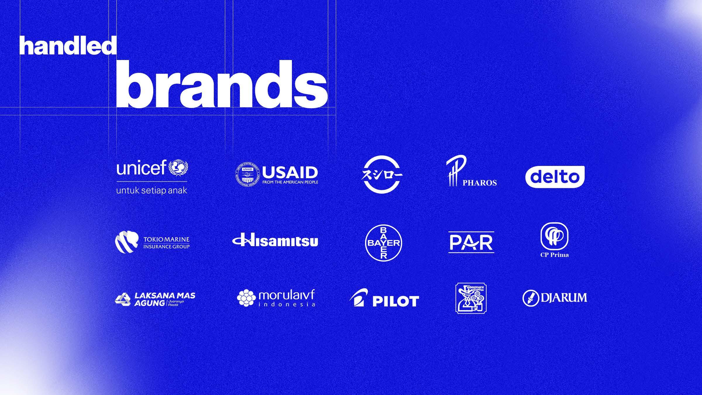
Handled several brands such as:
UNICEF, USAID, Sushiro Indonesia, Pharos (Proris), Laksanamas Agung, Delto medical (Kojima), Bayer (Tanyadia), Hisamitsu (Bye Bye Fever), CP Prima (Pakan CP Prima) and others
PT Omni Intivision (O Channel TV) Jakarta, Indonesia
Graphic Design Section Head
Address
Springhill Yume Lagoon C10/5, Suradita, Cisauk, Tangerang Regency 15343
Indonesia
Contact
email dnougrah@gmail.com
mobile +62 812 969 8722
Social Media
Pandu Nugraha
dnougrah
Pandu Nugraha
Education 2005-2009
Binus University Visual Communication
Creative Skills
Creative Team Management
Art Direction
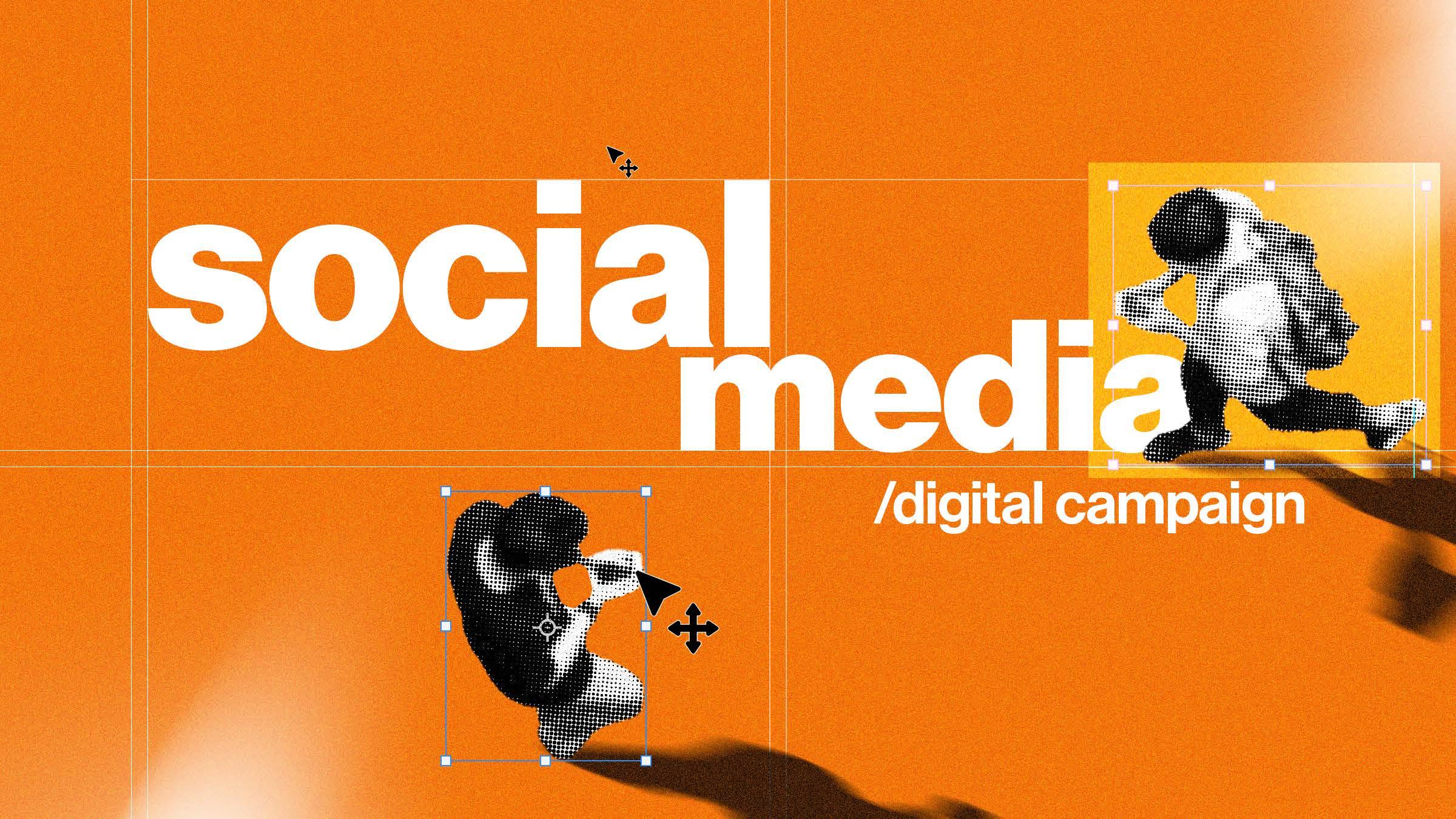
Digital Creative Campaign
Social Media Design Motion Graphic Brand Identity
Layouting
Typography
Bahasa Indonesia (native) English (conversational)
Software Skills
Adobe Photoshop (advance)
Adobe Illustrator (advance)
Adobe InDesign (intermediate)
Adobe After Effects (basic)
Adobe Premier (basic)
Freepik AI Suite (advance)
Chat GPT (intermediate)
Midjourney (intermediate)
Supervise, directing creative ideas, and create a working schedule for Graphic Designer team in the process of making promotional design to fit the company’s brand guideline
PT Omni Intivision (O Channel TV) Jakarta, Indonesia
Senior Graphic Designer
Designing programs logo, promotional materials for off air and on air event, merchandise and stroryboard

Leboye Design Jakarta, Indonesia
Graphic Designer
Assisted for some projects such as:
developing logo for Djarum Trees for Life, developing logo for PT Modern Realty, devoloping logo for PT Bukitasam Banko, and designing cigarette packaging for Djarum
Typography
Scope of Work
Social media maintenance
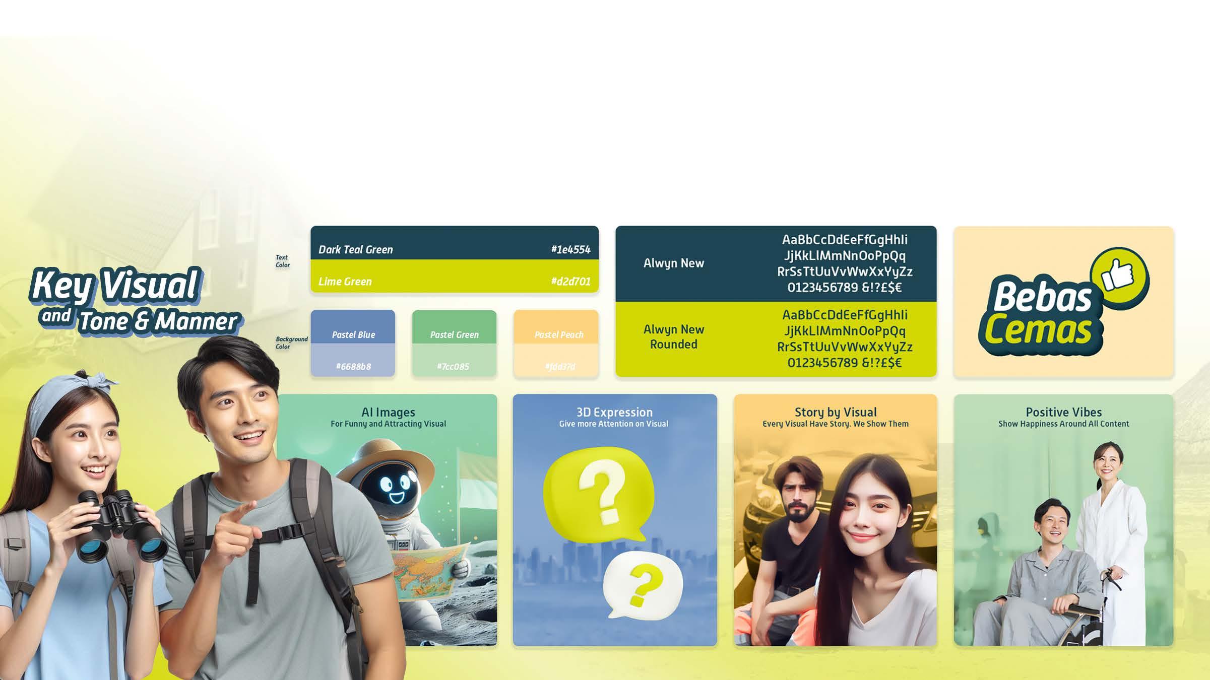
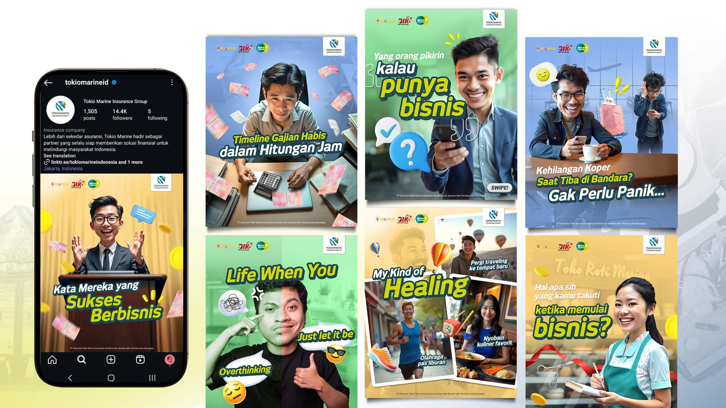
About the Project Tokio Marine Indonesia (TMI) is a global insurance company which commits to provide their customers with products and services of the highest quality, and spreads safety and security to all around them. TMI has a several goals for it’s new digital campaign; enhance brand awareness, introduce and promote TMI product and channel through online/offline activity and maintain and grows the TMI social media account.
Ideation
The client wanted a refreshment on their social media visual. With the adjustment of the target audience that aimed at young people, my task was to create a new key visual and tone & manner with a more ‘witty’ in visual approach combined with vibrant colors and Ai-based visuals, it is expected to provide a refreshment to the visuals on social media.
Social Media Post
Uses a young, witty, and fun approach to make insurance feel more relatable and less intimidating. By featuring casual, expressive visuals and playful captions about everyday worries like losing luggage, running out of salary quickly, or starting a new business.
Scope of Work
Social media maintenance, & DVC Campaign
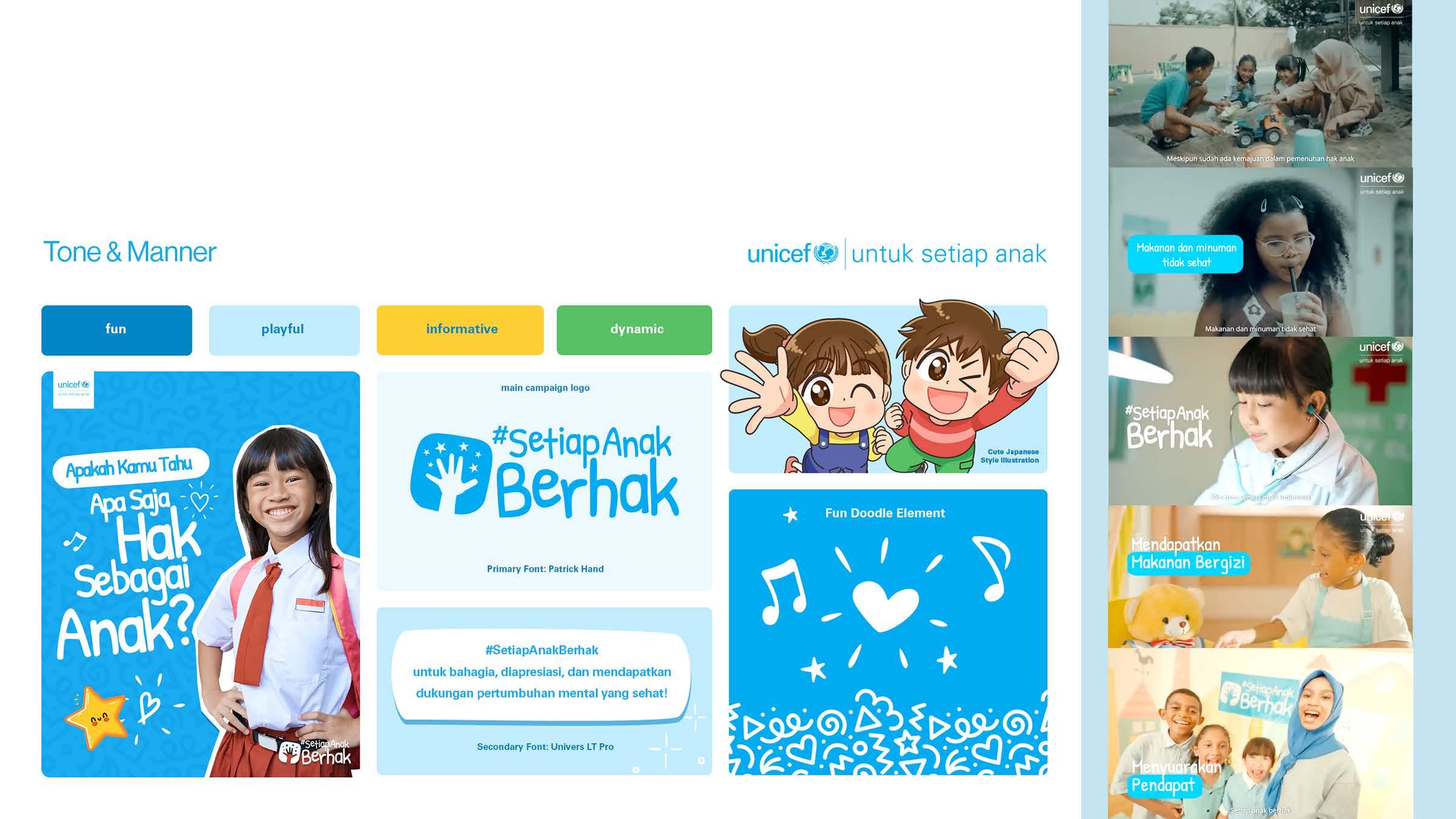
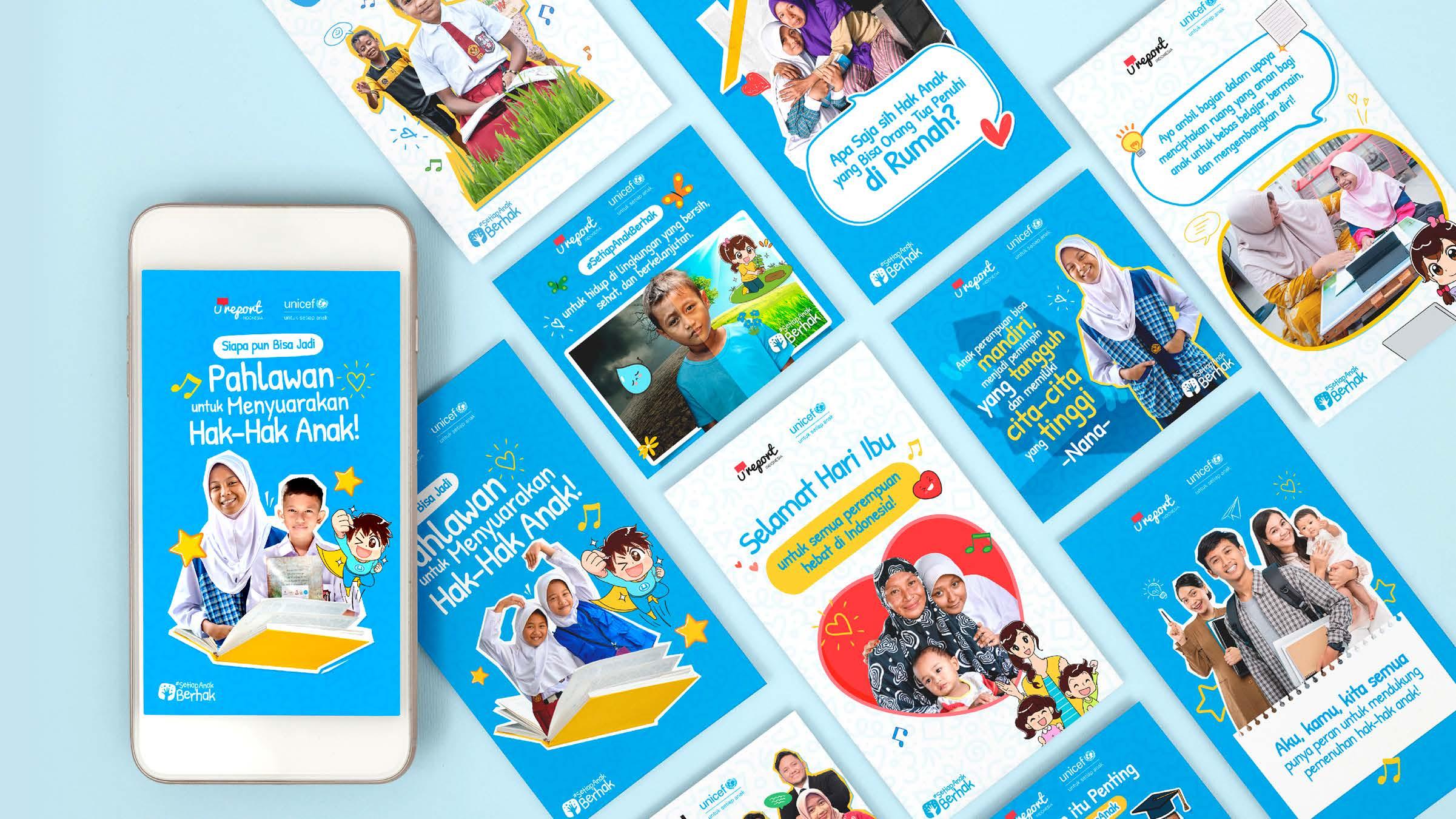
About the Project UNICEF Indonesia wants to have social media campaign movement to strengthening #UntukSetiapAnak communication. The objective is to delivered UNICEF’s programs in Indonesia to reach audiences through supportive movement message through unbranded message.
Ideation
As an art director in creative team, my part was to make all of the visual guidlines for this digital campaign. The choices of fun, playful tone and manner and the uses of japanese style illustrations to bring more informative, friendly and joy to all the visuals so that it will acceptable to the audiences. I also involved in creating the storyline with strategic team and supervised the DVC production for this campaign.
Social Media Post
Uses a playful visual style with bright blue and white colors to inline with UNICEF’s identity, fun illustrations, cheerful photos, and positive messaging make the campaign engaging and relatable for both children and adults.
Scope of Work
Key visual, tone&manner, social media maintenance
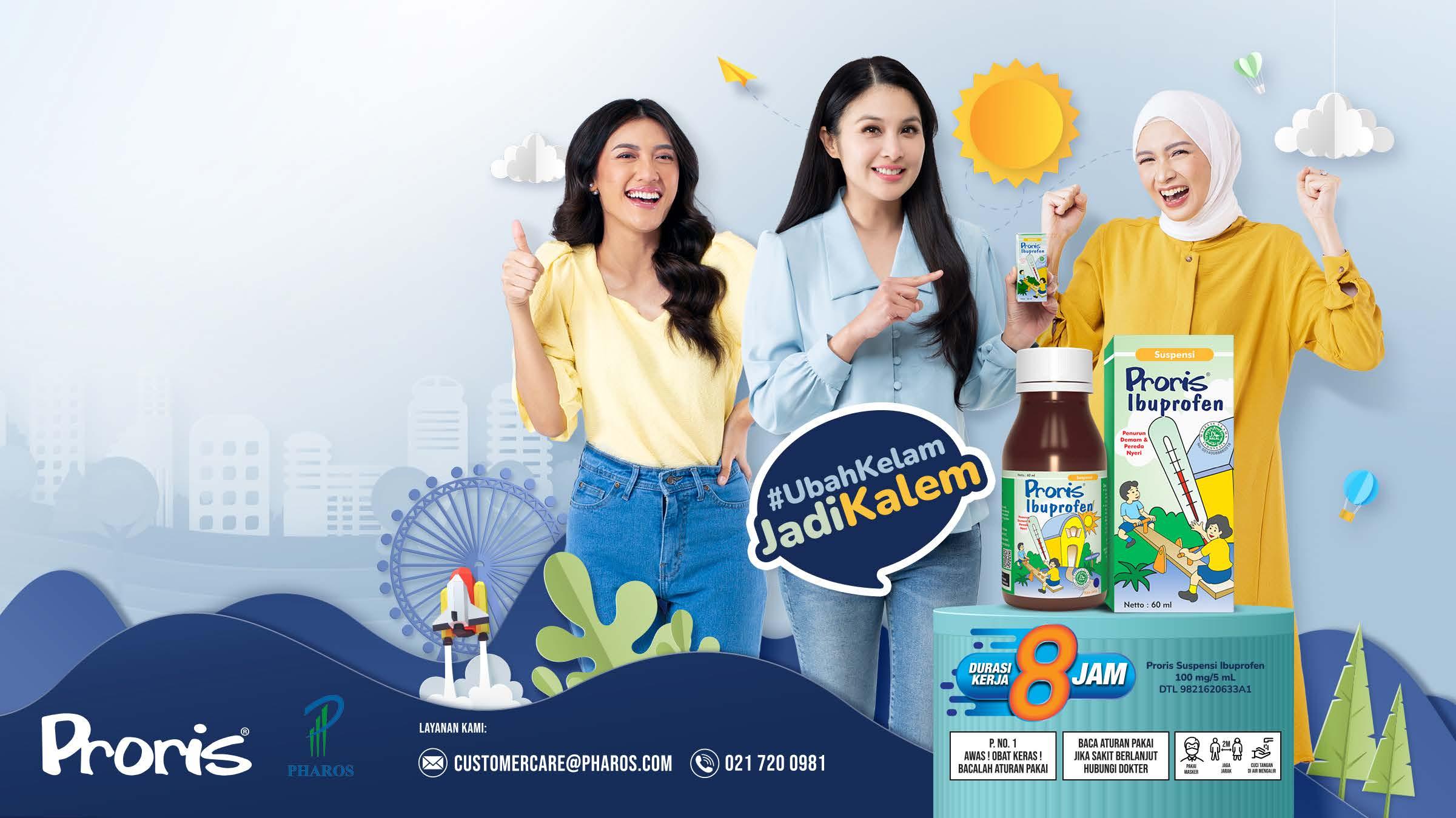
About the Project Proris is a brand name for ibuprofen, which is a type of nonsteroidal antiinflammatory drug (NSAID) for reducing fever, relieving pain (like headaches, toothaches, muscle aches). Client wants this brand to relaunch and to be known not only for relieving fever, but also as a product that can provide a calming effect after consuming it.
The idea of communication ‘dari kelam jadi kalem’ or known as from dark to calm was born where proris became a product that must be owned by mothers who do not want to be bothered with children with fever. Refreshment was carried out starting from the selection of brand ambassadors, new key visuals, and the latest TVC.
In the KV, the visuals style made from cute and adorable illustrations in a paper cut style and in terms of interaction on social media accounts there was a very significant growth since the product relaunched.
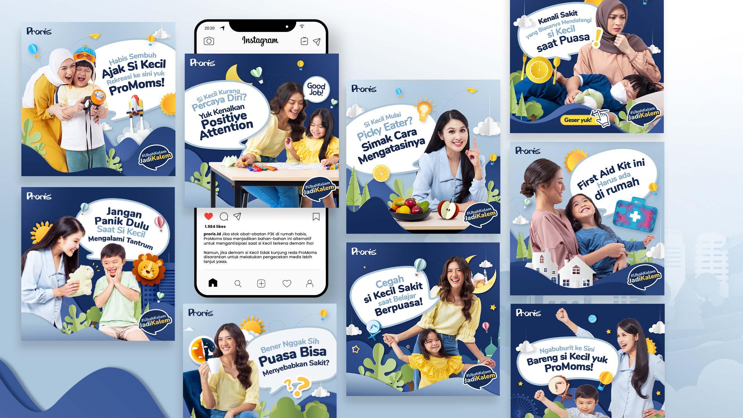
The presence of brand ambassadors in every Proris social media content is very helpful in for reach & engagement for the brand itself.
Scope of Work
Key Visual, tone & manner, social media maintenance, and Video Company Profile

About the Project
PT Prima Armada Raya is a BUMN subsidiary which is part of PT Patra Jasa where the services offered are transportation services including several services which are also affiliated with PT Pertamina (Persero). The agency’s task is to develop a comprehensive strategy to increase awareness of PT Prima Armada Raya both in the digital and offline.
Ideation
As an art director in creative team, my part was to make all of the visual guidlines, and creating storyline for company profile video for this digital campaign. With the proposed hashtag campaign “LayananTransportasiPRIMA” I created a Key Visual that look professional, friendly and trustworthy. The use of bright colors (which is came from the brand’s corporate colors) combine with friendly, professional type of social media content, hope is to be accepted by the audience.
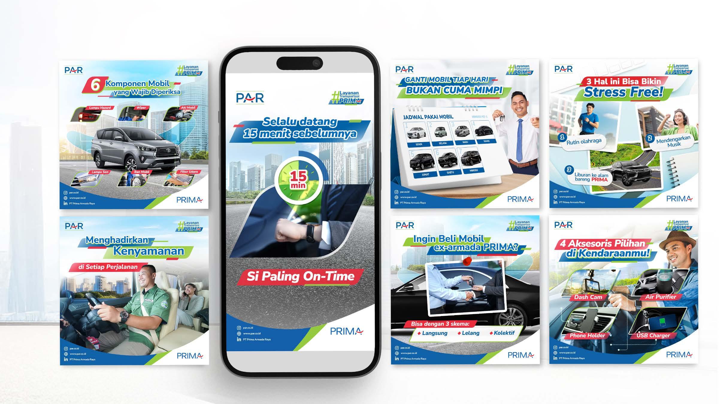
Prima Armada Raya social media post presents their transportation services in a modern, friendly, yet professional way, combining clean layouts, dynamic visuals, and clear tips related to vehicle use and rental benefits for B2B and B2C audiences.
Scope of Work
Key visual, tone & manner, social media maintenance, IP Character
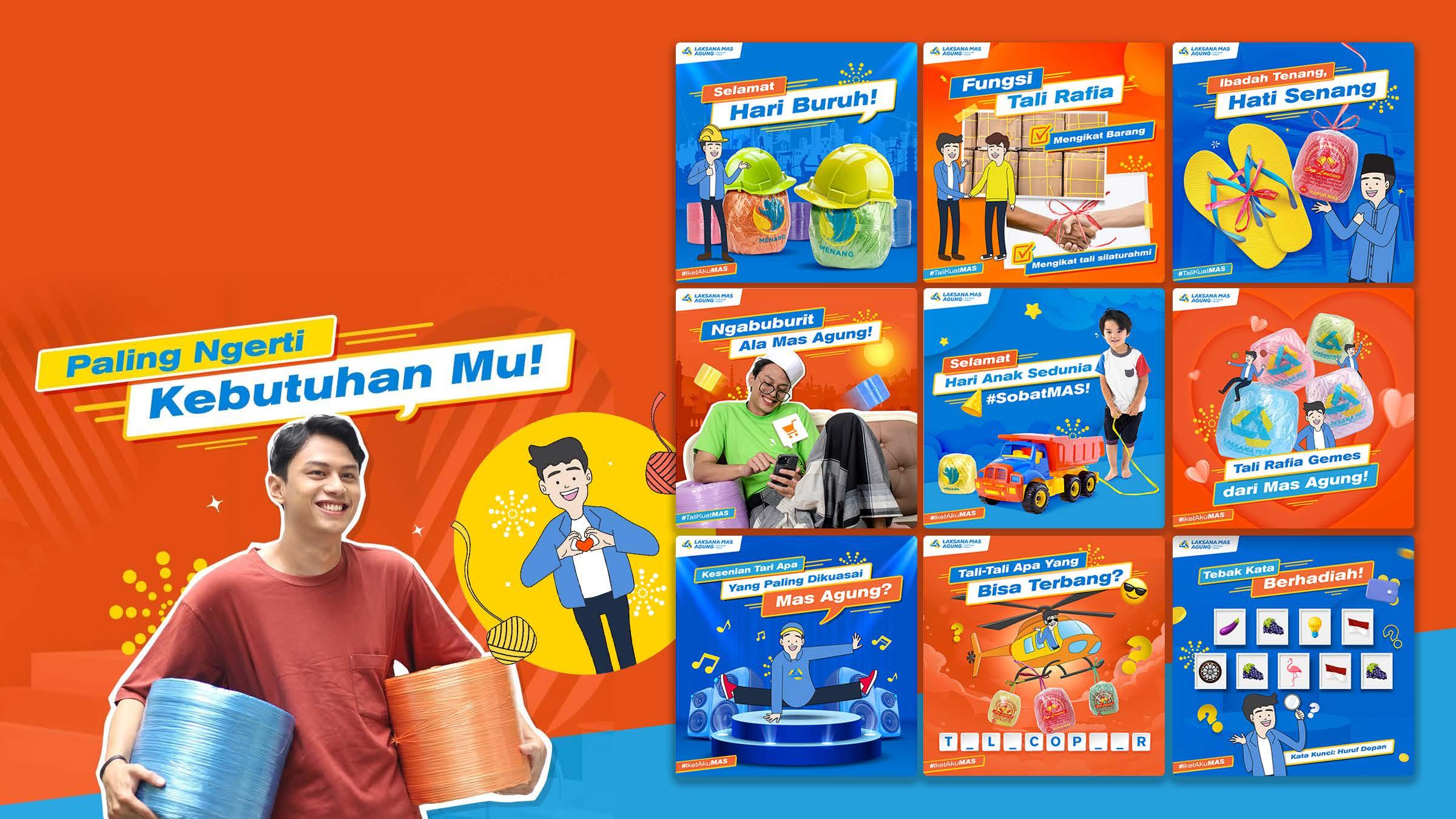
About the Project
Laksana Mas Agung is a plastic company that focuses on raffia rope products. The client wants to introduce their raffia rope products which has a special color and also made from the best yet environmentally friendly plastic materials
Ideation
The client gave us a lot of freedom in exploring this campaign. After brainstorming with strategic team, finally a witty and cheerful theme was chosen for their campign in upcoming year. The combination of blue, yellow and orange to give the impression of being environmentally friendly and also cheerful in the overall visual. My job was also to create 1 IP character named Mas Agung who has been the main mascot of Laksanamas Agung to this day.

Key visual, tone & manner, and social media content sample
Max Bio+ is a premium dishwashing liquid brand designed to make washing dishes easier, more effective, and more hygienic. It targets modern housewives who want a powerful yet gentle cleaning solution. My tasks is to develop the key visual, tone & manner and content sample for its campaign
Ideation
The Key Visual for Max Bio+ captures a cheerful and fresh atmosphere while keep maintaining a premium look.
Featuring a friendly and vibrant model, a clean and modern kitchen background, and dynamic graphic elements, the design highlights the product’s key benefits; effectiveness, cleanliness, and ease of use through lively typography and a refreshing blue and green color palette.
The visual strategy blends a sense of everyday practicality with a polished, aspirational feel, aligning with the client’s goal to appear both approachable and high-quality.
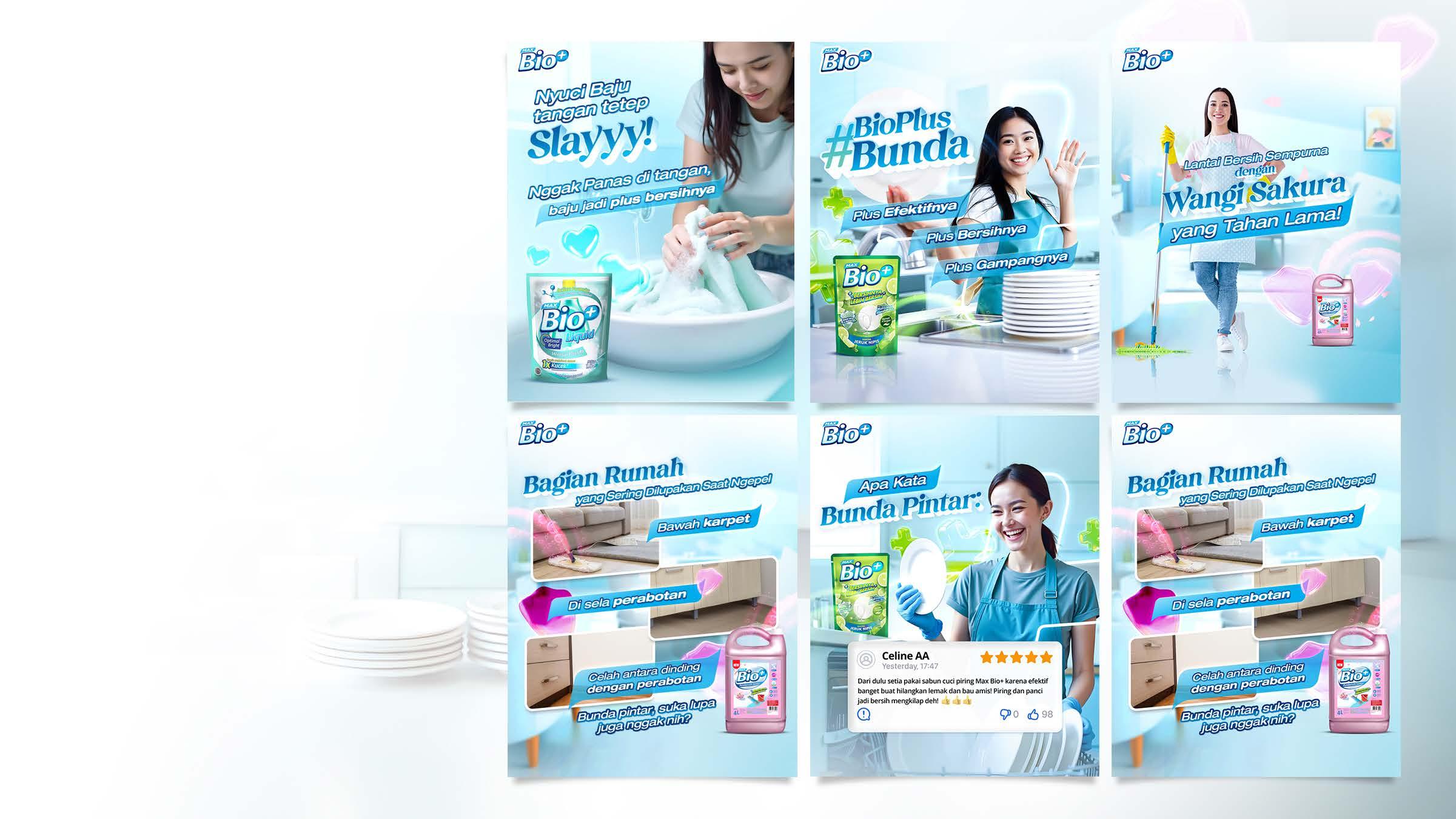
Content sample showcases a cheerful and premium approach to promoting their dishwashing and household cleaning products. The visuals highlight product benefits like gentle care, strong cleaning power, and lasting fragrance, while addressing everyday needs of modern housewives. The tone is friendly, relatable, and uplifting, creating a strong emotional connection with the audience.
Scope of Work
Key visual, and social media content sample
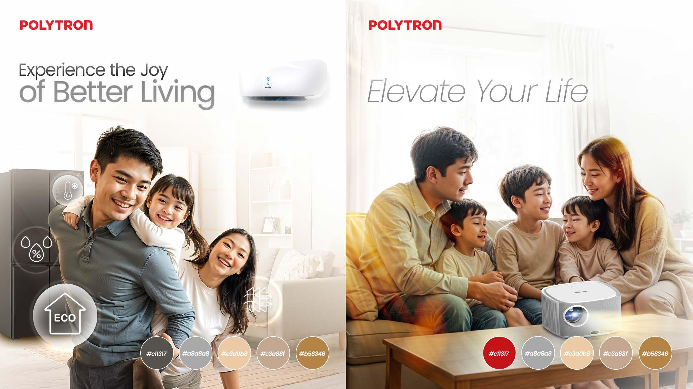
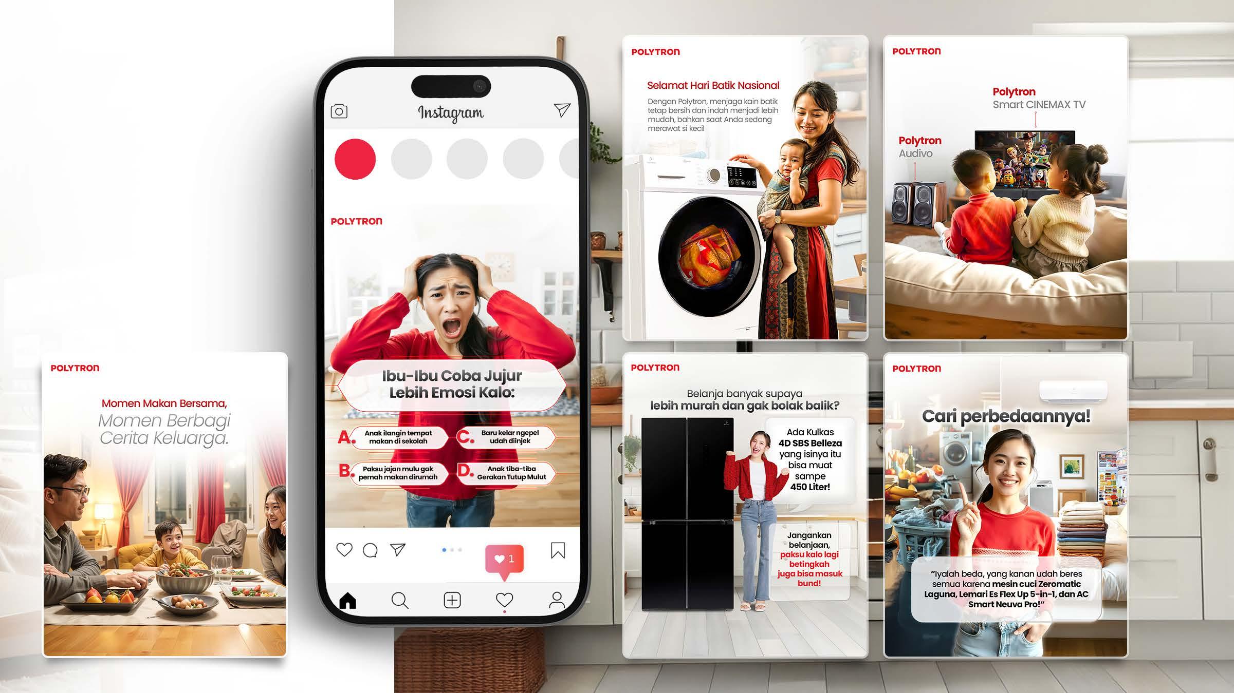
About the Project Polytron Indonesia is a well-established company that is known for electronic manufacturing. They wanted marketing a wide range of products, including home appliances and audio and video equipment amongst other.
Ideation
We propose key visual refreshment to enhance brand identity, address engagement gaps, and adapt to market trends. The basis of the visual refreshment aims to create a more distinct and effective presence for each Polytron account, ensuring clearer communication and better engagement with our diverse audience.
Scope of Work
Key visual refreshment, and IP Character
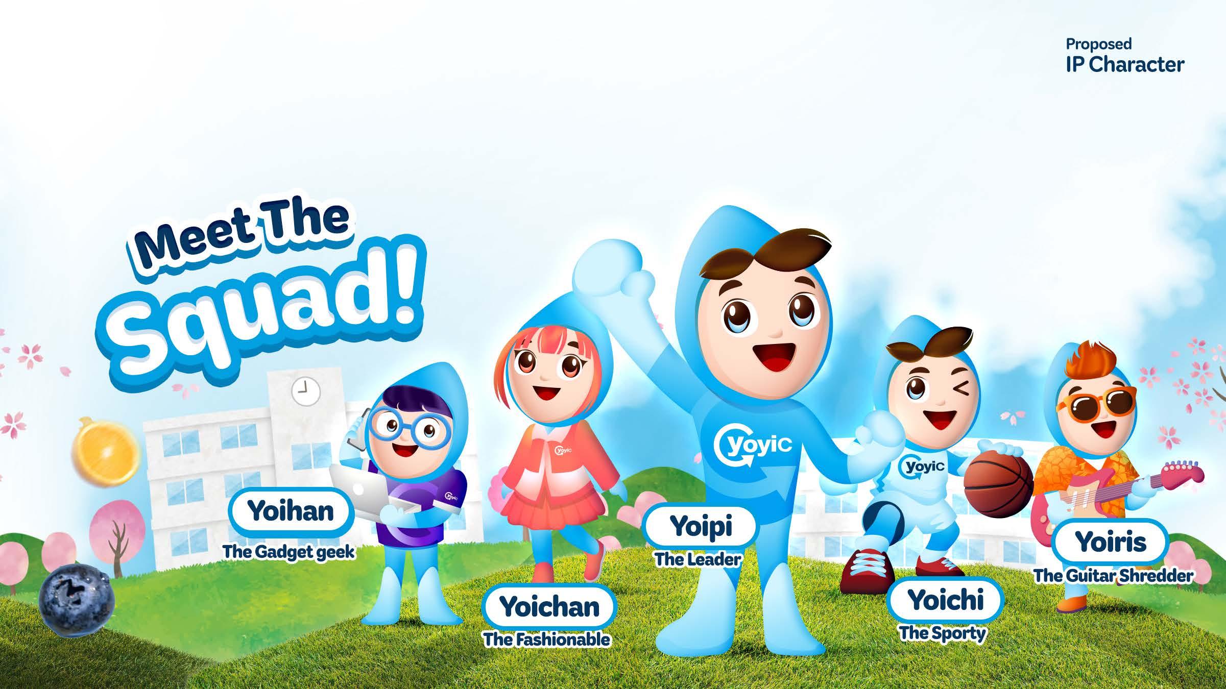
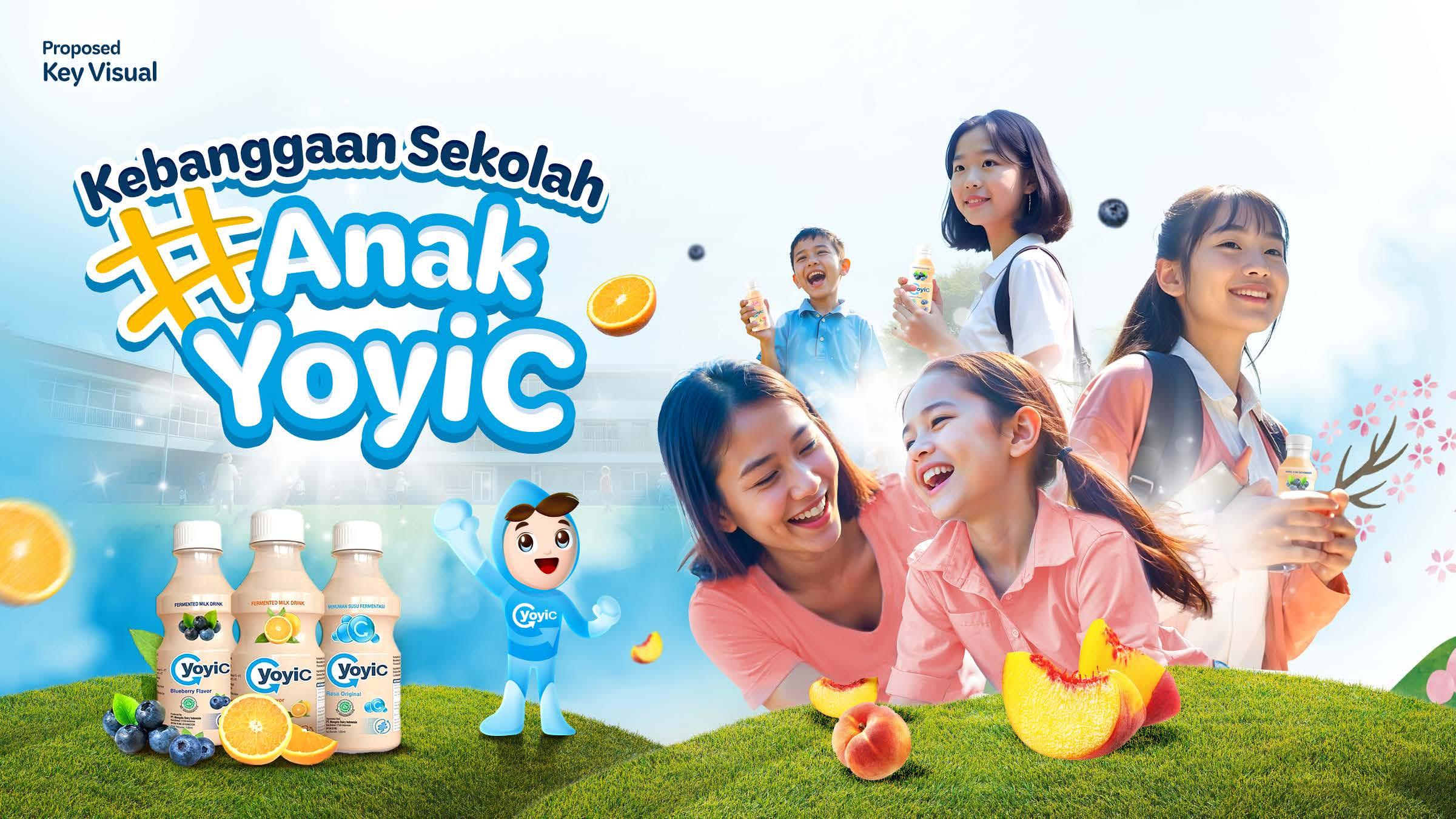
About the Project YoyiC is committed to becoming the go-to probiotic drink brand for Indonesia’s youth, a trusted companion through school days and daily adventures. As part of expanding the Yoyic campaign, the client wants to bring new Key Visual and Intellectual Property as part of supporting their activations.
Ideation
As an art director, my part was to make ideation and visual execution together with strategic team for the new Yoyic Intellectual Character and also the new Key Visual. The Yoi Squad!, They’re a team of probiotic characters, each with their own unique personality and special skills, brought to life with a humanized touch. The Yoi Squad will play an active role in YoyiC’s marketing activities, from offline to online, visiting schools, and participating in various activations to engage audiences everywhere.
Scope of Work
Key visual, tone & manner, and social media content sample
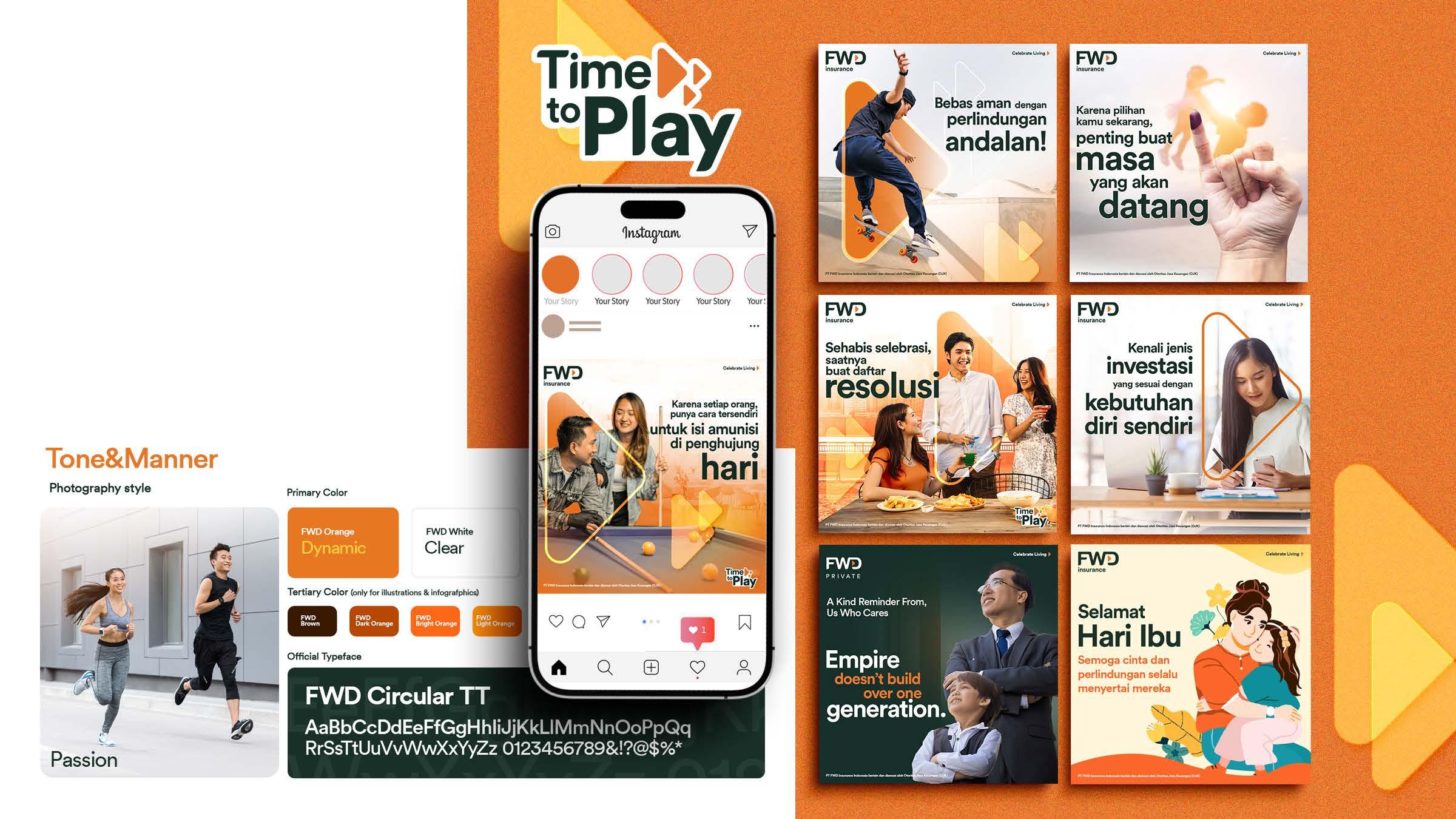
FWD Indonesia as a leading insurance company wants to make sure their audience feel empowered and confident in making their life decisions. So that, they wanted us to make a new communication idea from their main communication “celebrate living”.
Ideation
We propose a new “Time to Play” communication idea. As a part of the creative team, I created propose logo for “Time to Play” to further enhance our communication strategy. This logo will be incorporated on #TimeToPlay related contents. Also we proposed to emphasizing the ‘play’ button in every visual to make the brand more recognize for the audience.
We still maintaining FWD’s tone&manner with their corporate colors that combining vibrant orange, brown and dark grey to showing dynamic, clear yet friendly visual its social media post.
Scope of Work
Develop key visual
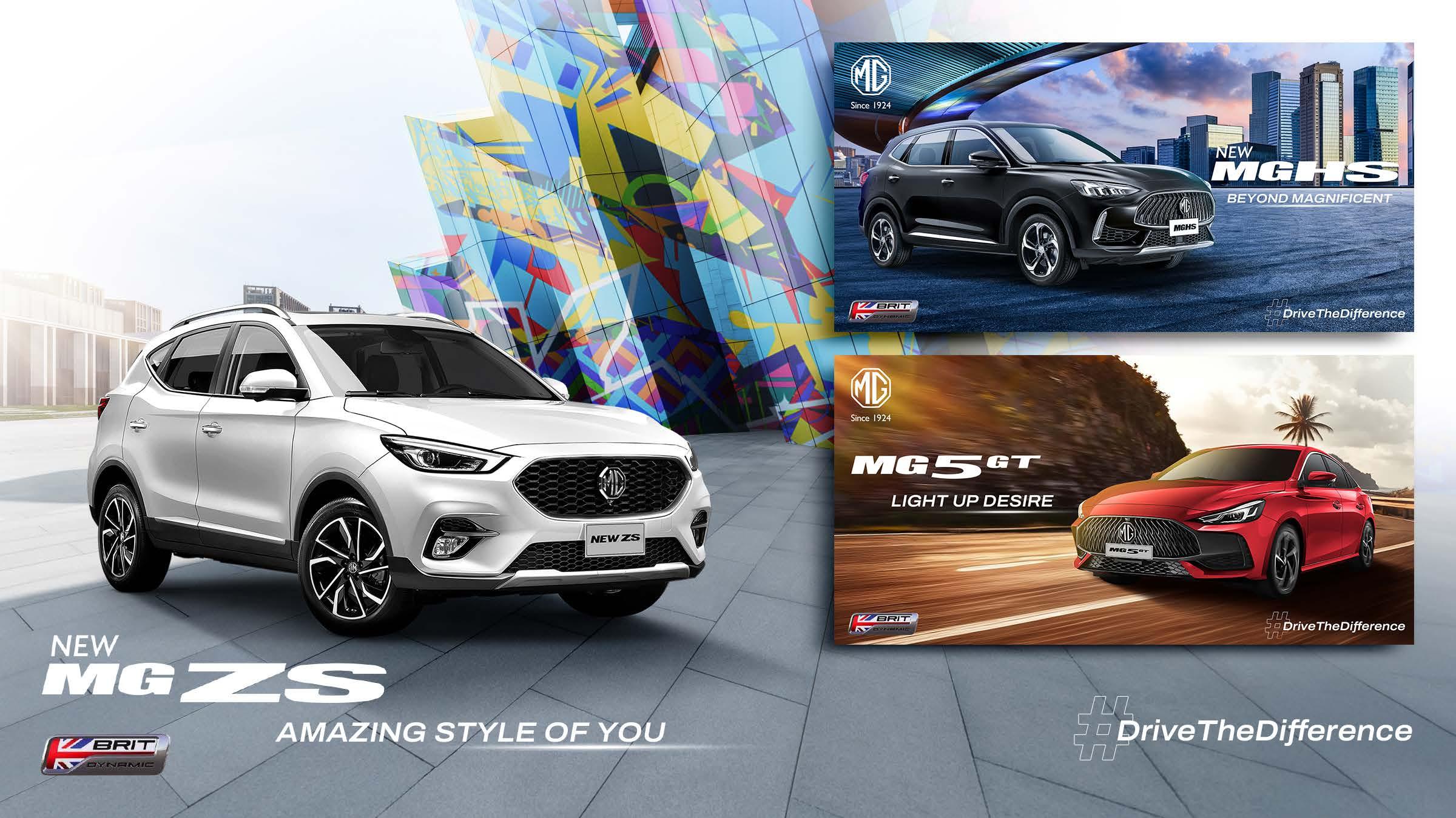
About the Project was responsible for creating key visual suggestions for three MG car models:
New MG ZS targeted for a younger Gen Z audience, with a vibrant and stylish visual approach. New MG HS positioned for millennials, reflecting a more mature and settled lifestyle. MG 5 GTdesigned for an upper segment audience, suitable for dynamic individuals and small families.
Each visual highlights the unique character of the car and combining dynamic backgrounds, bold compositions, and a consistent brand identity to enhance the modern and stylish image of MG.
Scope of Work
Brand Identity
About the Project
Djarum Trees for Life is the program that was founded in 1979 under The Djarum Foundation with the mission of planting trees. The client wants to create their logo and logo application on several media such as stationery, poster and merchandise
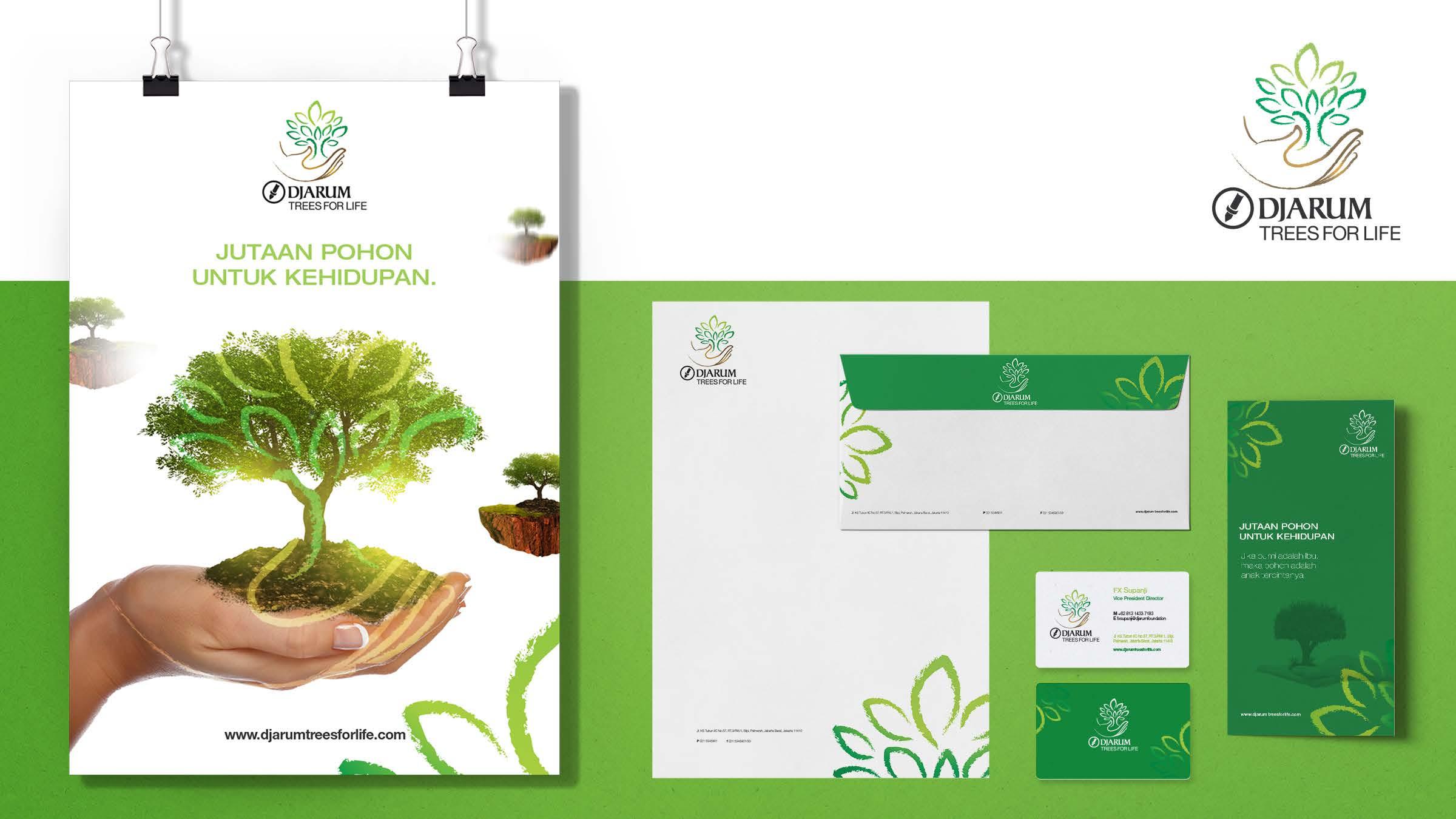
Ideation
To create a brand that represent the mission ‘planting trees to preserve the environment ’, I create a long lasting logo looks with a chalk style drawing and has a natural nuance with combining the hand icon that embraces the tree as a symbol of the mission of this program
Scope of Work
Brand Identity
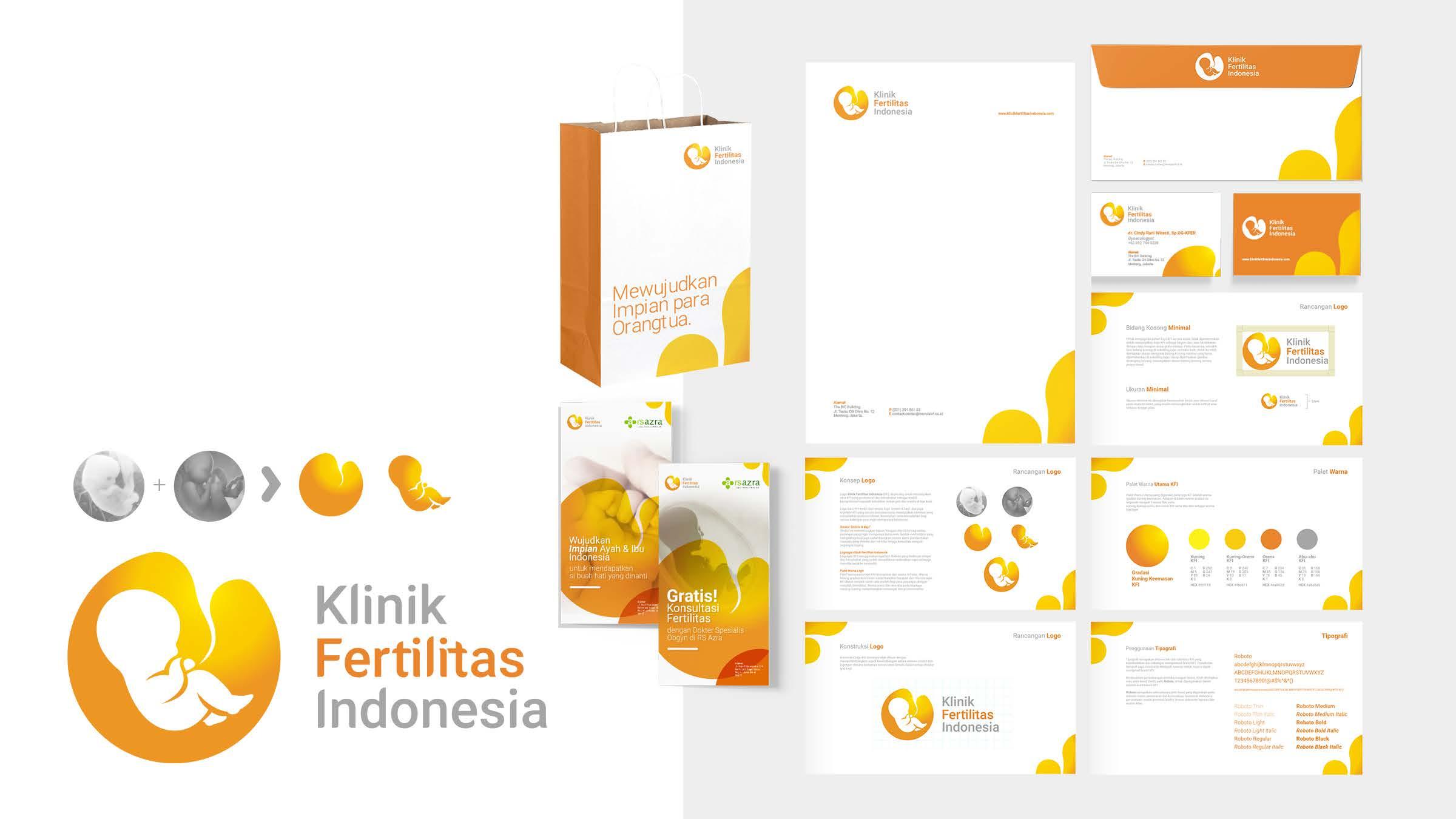
About the Project
Klinik Fertilitas Indonesia (KFI) is a fertility clinic that is intended for parents who want to have children through a pregnancy program at a more affordable cost. KFI is part of the Morulla IVF Jakarta
Ideation
The logo idea came from combining the icons of an embryo and a baby to form a heart symbol to symbolize ‘hope’ and ‘mother’s love’. The orange color is maintained with the aim of giving a warm and positive impression to parents who want to have children. This project work includes logo, stationery, and merchandise
Brand Identity
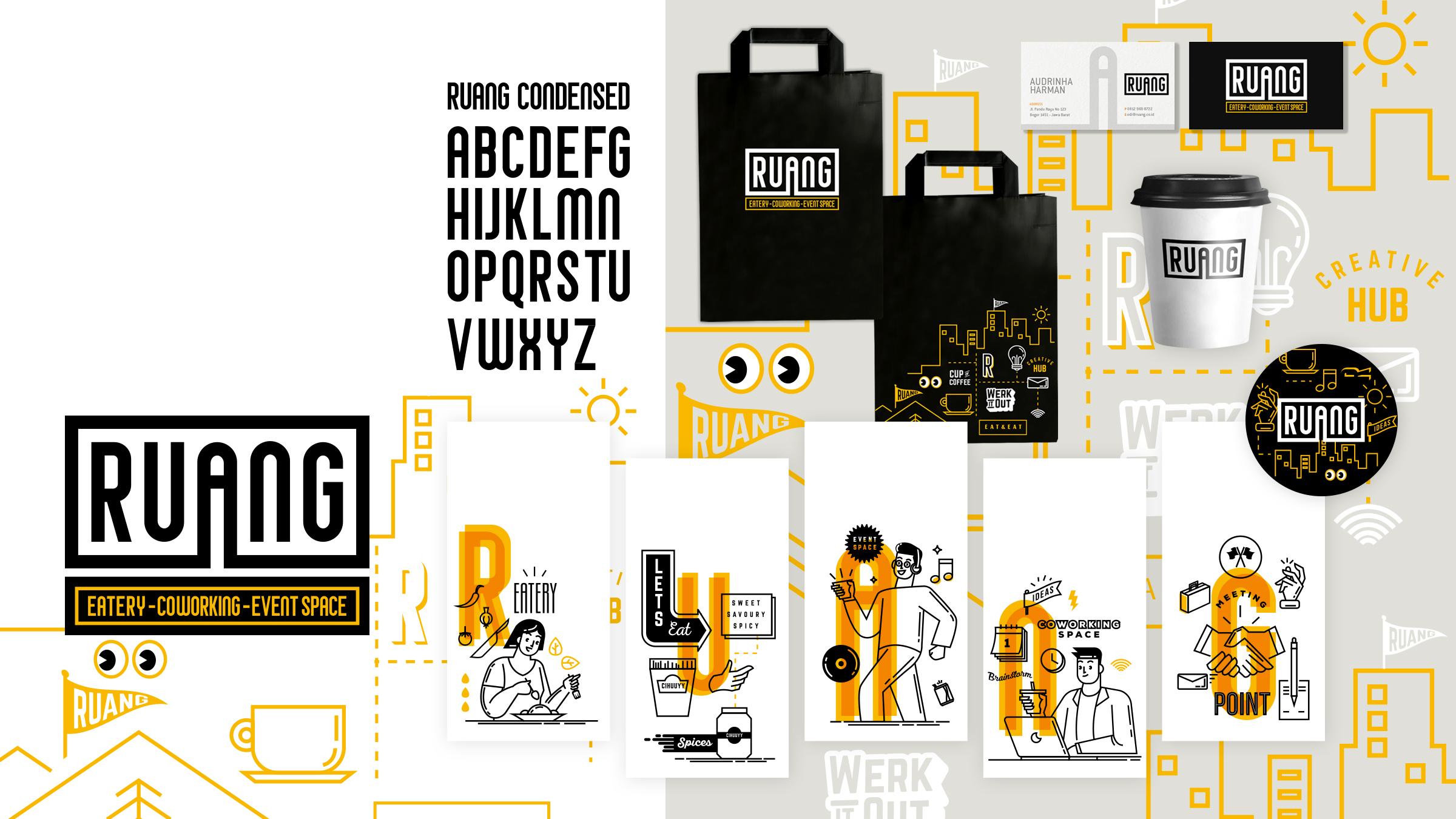
About
Ruang is a multifunction place to eat, gathering, coworking space, and meet in one place that located in Bogor, West Java. Ruang has open concept space for its young and dynamic customers.
Ideation
With an industrialist concept, I created a logotype from a custom typeface with an industrial style inspired by letters from the 40s. have also developed a key visual that can be applied to all promotional media, including stationery, merchandise, wall decoration and dining utensils.
linkedin.com/in/pandu-nugraha-54152050/