Pam Ramirez - Maxwell
APPLYING FOR: Associate Creative Director at Edelman Toronto
APPLICANT :
PAM RAMIREZ-MAXWELL
66 PACIFIC AVENUE
APT. 308
TORONTO, ONTARIO
M6P 2P4, CANADA
PORTFOLIO FOR :
EDELMAN TORONTO
150 BLOOR STREET WEST
SUITE 300
TORONTO, ONTARIO
M5S 2X9, CANADA
SHE / HER / HERS
Portfolio
CURRENT ROLE: Graphic Designer / Creative Director
I AM A PASSIONATE AND EXPERIENCED DESIGNER WHO LOVES TO CREATE DESIGN WORK THAT IS OUTSTANDING , CONCEPTUAL , AND INNOVATIVE . I AIM TO PROVIDE THE BEST CREATIVE DIRECTION FOR RESULTS THAT ARE ALWAYS ON-STRATEGY AND ON-BRAND .
CLIENT:
‘FleetOptics’ + Cimoroni & Co: A Marketing Agency
PROJECT: Social Media Campaign to ‘Recruit Drivers’ for FleetOptics Courier Company.
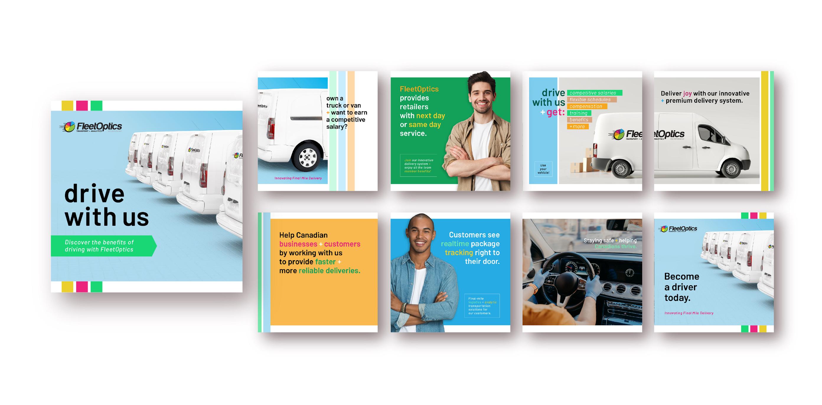
OBJECTIVE: To use their existing logo and establish a brand for a fresh, fun, yet professional campaign series.
MEDIUM: Digital social media platforms: LinkedIn and Facebook.
RESULT : We drove nationwide business growth and brand awareness in a saturated field, recruiting new employees for FleetOptics providing design and copywriting.
3
CLIENT:
‘FleetOptics’ + Cimoroni & Co: A Marketing Agency
PROJECT: Social Media Campaign for ‘Holidays’ for FleetOptics Courier Company.
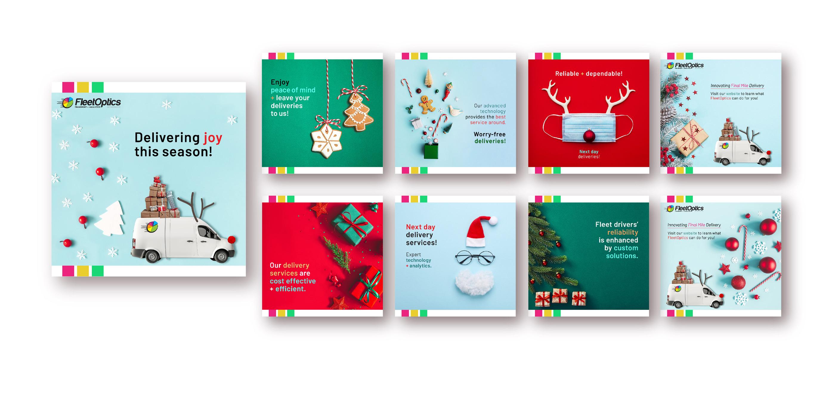
OBJECTIVE: To use the new branding to create a fun and enticing holiday campaign for a varied target market.
MEDIUM: Digital social media platforms: LinkedIn and Facebook.
RESULT : We continued to drive nationwide business growth and brand awareness resulting in more businesses adopting FleetOptics as their delivery solution. Used wording and graphics that helped drive excitement to showcase their core competencies.
4
CLIENT:
‘FleetOptics’ + Cimoroni & Co: A Marketing Agency
PROJECT: Social Media Campaign for FleetOptics’ presence in ‘Vancouver’
OBJECTIVE: To show FleetOptics’ new services and presence in Vancouver to business executives.
MEDIUM: Digital social media platforms: LinkedIn and Facebook.
RESULT : We drove business growth and brand awareness in Vancouver using imagery of diverse business executives along with terms and graphics that showed FleetOptics’ specialty and proprietary technologies.

5
CLIENT: ‘Senior Adult Services’ a Non-profit Organization in the Annex
PROJECT: Annual Report documenting budgets, fundraising, donors, programs, and financial statements.


OBJECTIVE: To design a clean and concise report for their members, funders, and Board of Directors.


MEDIUM: Print and digital.
RESULT : A clear and elegant document was produced that helped illustrate important information to members, funders, and board for this small but important non-profit serving the downtown senior community.
6
CLIENT:


‘Logo Design’ CheeseCake Design Conceptual Logos


PROJECT: Varied logos designed for CheeseCake Design as a creative exercise.

OBJECTIVE: To show a diverse range of logo design ideas and approaches for style variation.

MEDIUM: Print and digital.
RESULT : Typographic exploration and conceptual designs were created for invented businesses.
7
CLIENT: ‘COMDA’ + Cimoroni & Co: A Marketing Agency
PROJECT: Catalogue Template Design for COMDA: A promotional products business.
OBJECTIVE: To design a template COMDA’s internal design department could use on a regular basis.
MEDIUM: Print and digital.
RESULT : A redesign and elevated brand look was created taking into account the best way clients can interact with their new catalogue and website as a unit.

8
‘COMDA’ + Cimoroni & Co: A Marketing Agency
PROJECT: Catalogue template design for COMDA: A promotional products business.


OBJECTIVE: To design a template that COMDA’s internal design department could use on a regular basis.
MEDIUM: Print and digital.
RESULT: A new aesthetic was established while taking into account past customers, yet modernizing their look to target new potential customers.
 CLIENT:
9
CLIENT:
‘Album Design’ Palest Hue Musical Band

PROJECT: To take an illustration and elaborate it digitally into a unique front and back cover for an album.
ART: Cover illustration by Brian Maxwell.
MEDIUM: Print and digital.
RESULT : An innovative design was created from an abstract illustration, which embodied the sound and aura of the album’s music and its genre.


10
CLIENT:
‘Rupert’s Fine Teas’ Packaging Design for Orange Pekoe Tea
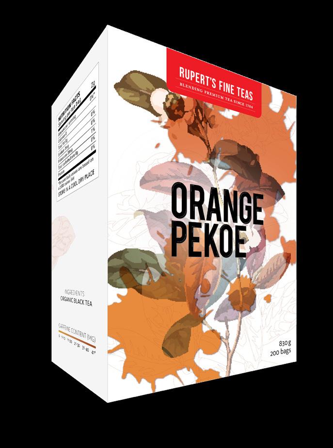
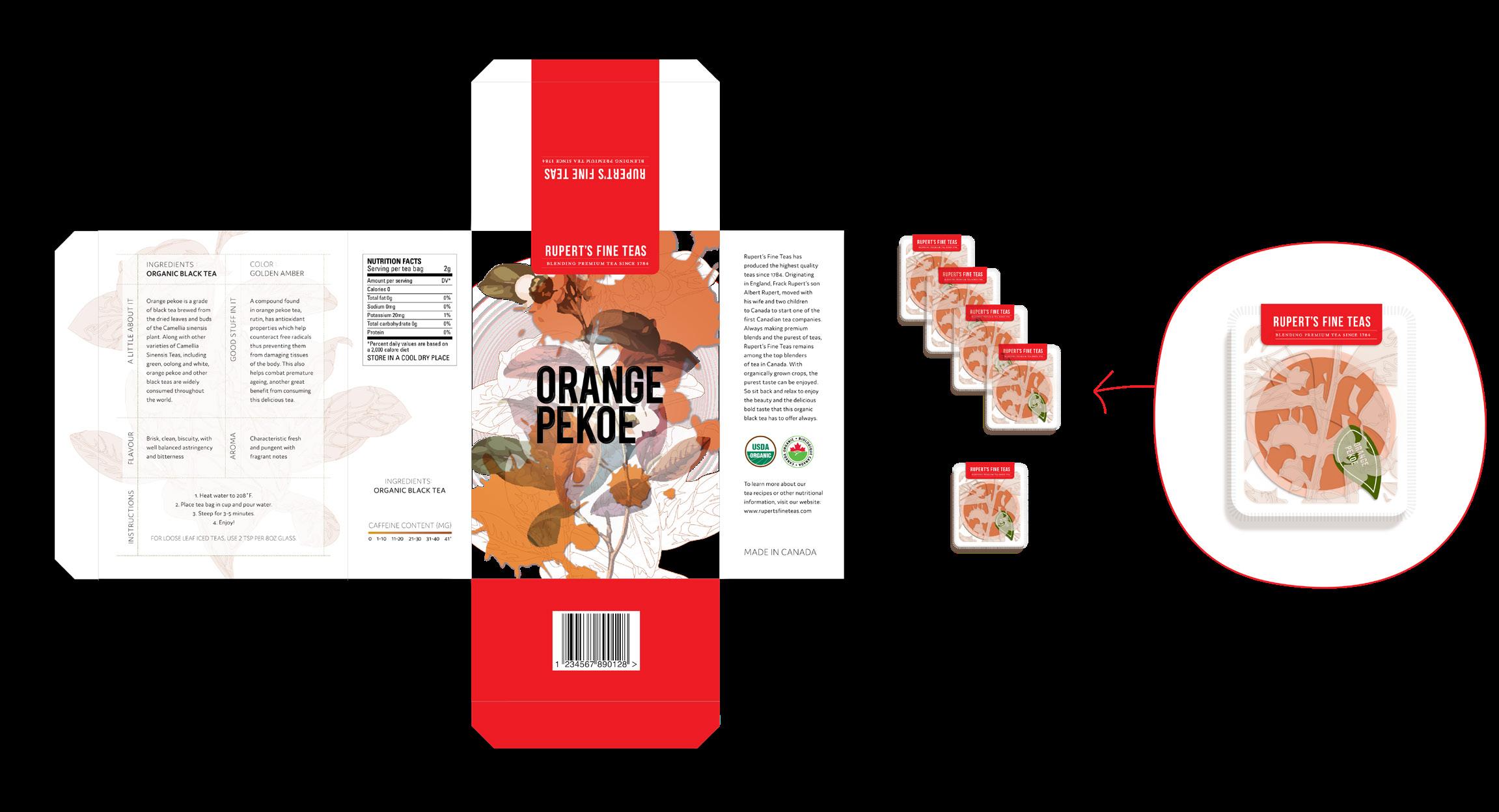
PROJECT: Design sensorial packaging for organic tea.
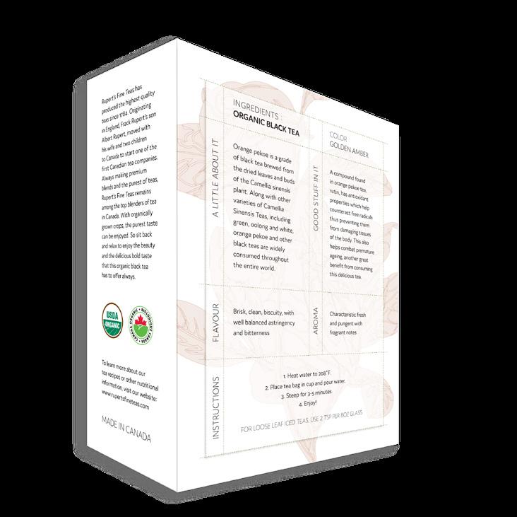
OBJECTIVE: Provide standout packaging using the textures and printing techniques for tactile interaction.
MEDIUM: Print, embossing, and gloss.
RESULT : I used gloss for the tea spills on the cover emulating how light touches tea, and ‘spills’ of different steeping intensities to reflect a ‘moment’ in tea making. The embossed plant-outlines subtly gives the user the illusion of touching the plant prior to opening the box.
11
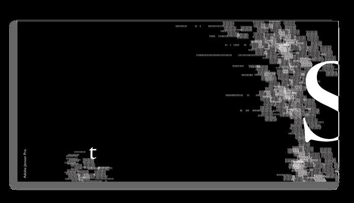
CLIENT: ‘Typographic Exploration’ a Creative Exercise
PROJECT: Combining classic typefaces, two letters of the alphabet, and using only black and white.
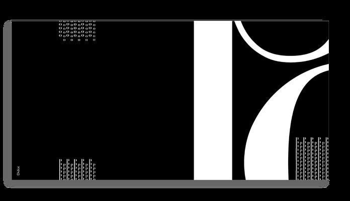
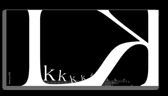
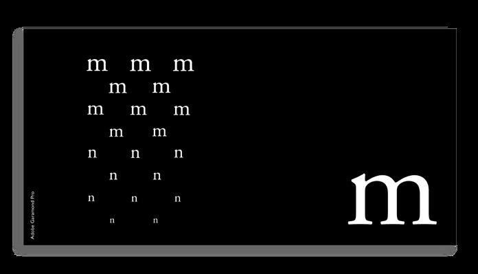
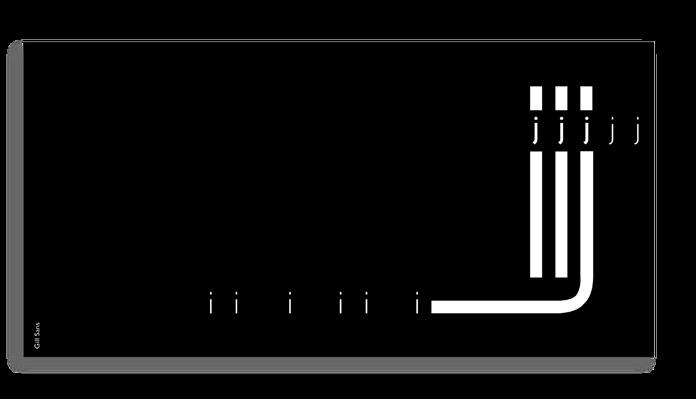
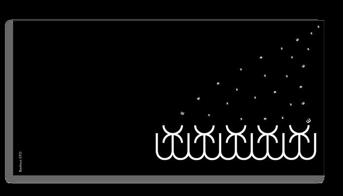
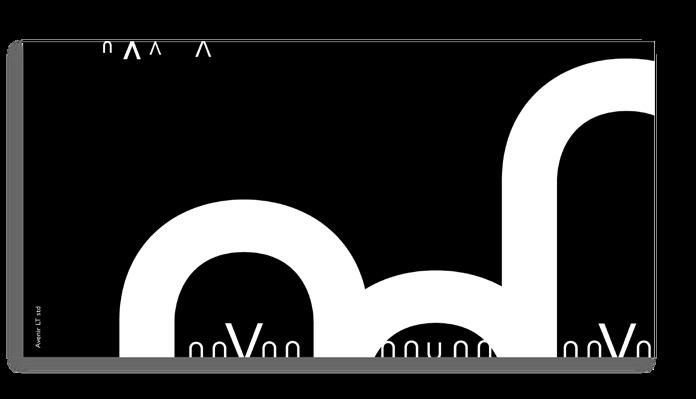
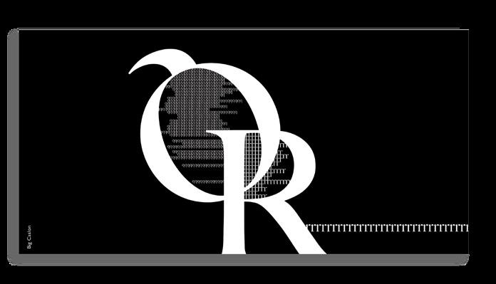
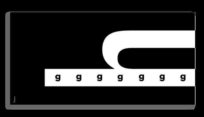
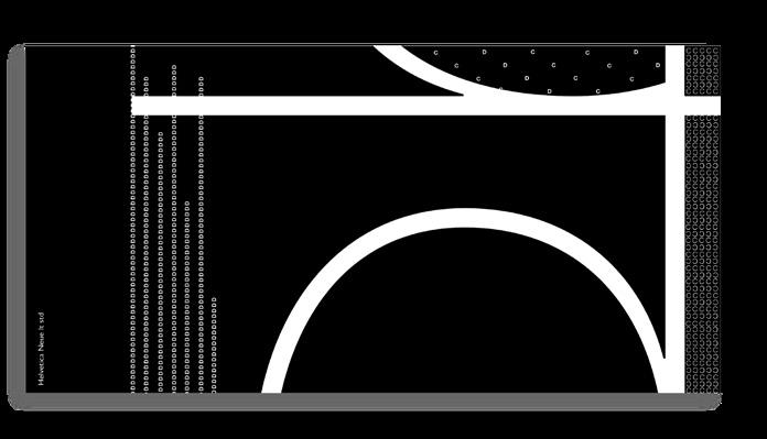
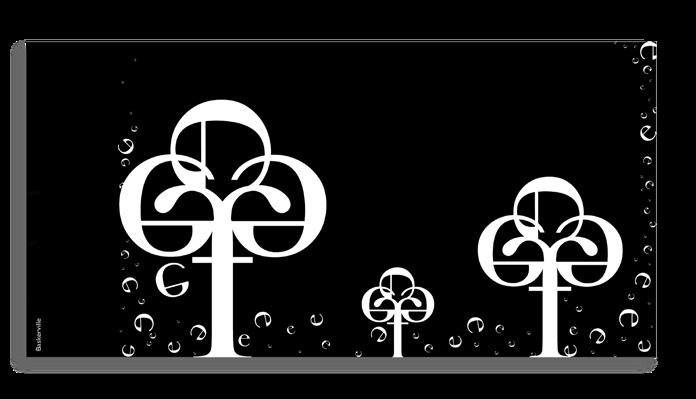
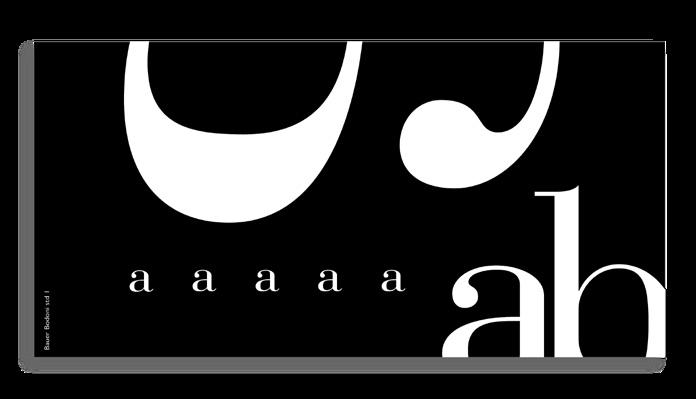
OBJECTIVE: Work within design limitations.
MEDIUM: Print and digital.
RESULT : Interesting visuals and narratives were created.
12
CONTACT INFORMATION:
+ 1 647 210 5031
308 - 66 PACIFIC AVE. TORONTO, ON. CA., M6P 2P4
PAM.RAM.MAX @ GMAIL.COM
WWW. CHEESECAKEDESIGN .COM
LINKEDIN.COM / IN / PAM-RM
@CHEESECAKEDESIGN
THANK YOU
Please feel free to get in touch for further information regarding my work experience.
References available upon request.
