PROFESSIONAL PORTFOLIO


Phone +44 7442103707
pallav_kapoor@outlook.com
Address
London, E14 9JN Web
https://www.linkedin.com/in/kapoor-jpg/
An overseas registered architect with over 3 years of experience in the field of architecture, drawn towards making and experimenting in the field of design. Looking to collaborate on projects of different scales, with professionals by focusing on human-centric built forms.
MA INTERIOR ARCHITECTURE
University of Westminster, London
2023 (1 YEAR)
BACHELOR OF ARCHITECTURE
Bharati Vidhyapeeth Deemed University, Pune
ARCHITECTURAL DESIGNER
STUDIO 0522
(5 YEAR) 2019
SEPT 2019 - AUG 2022
• Oversaw construction and handover(Stages 5 to 6) of a private client’s residence along with concept development and spatial configuration of Eatsure, Pune(Stages 2 to 4) which is India’s first smart food court.
• Collaborated and maintained daily communication with contractors and consultants to inspect construction details and quality of work on-site.
• Prepare detailed architectural drawing packages and technical documents
ARCHITECTURAL INTERN
GDMSPL


JAN 2018 - SEPT 2018
• Assisted senior architects on-site and surveyed the site conditions.
• Developed construction drawings and 3D visuals for residential projects.
• Worked on mechanical, electrical and plumbing drawings for residential and commerical projects.
NOORJAHAN CLOTHING
ENTREPRENEURSHIP
JAN 2018 - NOV 2021
• Created a clothing brand based on Lucknowi Chikankari.
• Oversaw the design and manufacture of the products
• Worked on developing the brand identity along with the website.
Rohit Parmar — Principal Architect Founder and principal architect at Studio 0522 (rohitparmar@studio0522.com)
Subhashish Subandh — Professor Architect and Urban Designer (ashish.subandh@gmail.com)
 (RIBA Student Member | COA | IGBC AP)
JM Mall
BFC Commercial building
Singh residence, Lucknow
Nigam residence, Lucknow
Shahbaaz Villa, Unnao
Ravindra Singh’s residence, Lucknow
King’s court residence, Lucknow
The garden repose, Kanpur
Plyzone, Lucknow
Samsonite store, Fun republic mall
Bluepill, Lucknow
Hettich showroom, Lucknow
Eatsure, Lucknow
Kahlon Emporium, Lucknow
Eco resort, Dudhwa
Rollarappa franschise, Lucknow
Awadh Hospital, Hardoi
Ayushman Hospital, Shahjahanpur
Heramb Agnihotri’s clinic, Lucknow
CULTURAL
Natural History Museum, Zoo, Lucknow
Bauddha Museum, Gorakhpur
Signage System, Ayodhya


Kala Kaksh, Lucknow
Delhi Public School, Gomti Nagar, Lucknow
AIT, Rooma, Kanpur
QUINTIN HOGG TRUST
2023
Special mention in designing a ‘Social Activity space’ for the Marylebone campus, University of Westminster.
VOLUNTEERING
Working in the NGO “Antaryami Tandon“ for education of underprivileged kids.
2021
IGBC Accredited Professional 2019
Projects would achieve one credit point under ‘Innovation and design’ category, If an IGBC AP is part of the project team
PUNE BIENNALE 2015 + 2017
Core organising team member, managed exhibitions for artists from India and neighbouring nations
SMART HERITAGE 2017
Participated in Smart Heritage Workshop by INTACH, New Delhi
Schematic design and development
+Autodesk AutoCAD(Expert)
+Google Sketchup(Expert)
+Lumion(Expert)
Design detailing and construction
+Autodesk Revit(Basic)
+Illustrator(Skilled)
+V-Ray(Skilled)
Research analysis and site planning
+Sefaira(Basic)
+Design Builder(Basic)
Documentation and presentation
+Photoshop(Expert)
+InDesign(Expert)
+Miro(Expert)
+Model making(Skilled)
Soft skills
+Project Management
+Adability
+Team leader
+Detail oriented
+Problem solving
Hobbies
+Piano
+Basketball
Schematic design and development
Design detailing and construction
Site execution and client interactions
+Table tennis
+Swimming
+Reading(Non-fiction)
“I can tell you that the effect you have on others is the most valuable currency there is.”
- Jim Carrey
As customers wander away from personal contacts and toward online purchases, spatial experiences in retail establishments have become vital to draw the customer and his attention back to reality. Entering a new area and allowing it to fill you with fresh experiences and data while not hindering essential operations and providing value to both the owner and the user. Creating an engaging, timeless experience for designers and customers.
A three-generation family business located in the city’s commercial district. The store is in an extremely competitive market, therefore it’s important to stand out. The client wanted the facility to be more than just a place to do business; it needed to be an unforgettable experience. A platform for designers to celebrate materials, as well as a space that serves as an extension of the material library and a visual mood board for customers.
For the client, a modular design approach was used so that he could replace materials and hardware as needed over time, preventing hoarding and disorder of the store. (As shown in the picture.) The store is now in disarray due to a lack of overall vision of defined zones. Proper allocation of hardware, claddings, and laminates offers the client with a long-lasting system.


If hardware stores want designers and architects to return with their clients to debate and consider other options, they must rebrand themselves as experience centres. They’re rebranding themselves as creative businesses rather than merely B2C businesses.
At break points with a visual relationship to charcoal sheets, veneers, and kitchen finishes, such areas have been established. One such space has been developed around the stairs, with MS apartments hidden in the flooring and clad in pine wood spiralling from the bottom floor and moving to become the staircase, eventually becoming the staircase railing. The space between the two battens serves as a display panel for the charcoal sheets, which may be swapped out and changed as needed.


The circulation of the space was greatly aided by the establishment of a retail axis. The administration being on both the front and back of the area connected the space without being invasive to the consumer. To give the circulation an organic movement, the display spiralled around the central axis. The customer could take a breather during the pauses (which were marked in green). To take a breath, consider your options, and make a well-informed decision. Rather than pressuring customers to make snap decisions, the facility offers zones where they may take their time. On both floors, formal and informal zones have been developed to accommodate various gathering sizes.


The reception table serves as the customer’s first point of contact with the personnel. As a three-generation family business, the proprietors wanted the initial connection with the customer to be as authentically Indian as possible, rather than corporate and mechanical. In terms of spatial functionality, the Indian tradition should be preserved.
Materials like veneer and charcoal laminates were used in the reception desk and back drop to show what the combination of materials can produce. Perforated metal sheets painted with PU paint were used throughout the area to provide a sequential experience from one zone to the next. The same perforated sheet is screwed into the wooden batten as a ceiling element, maintaining the space’s design language. Solid blocking has been added, coupled with perforated metal sheet, to enhance the sequential experience. The solid blocks also serve as catalogue shelves, while the backdrop serves as a laminate sample.

Handleless drawers and a cove beneath the panelling to emphasise the brand emblem add to the design language. The contrast between the backdrop and the welcome desk helps to unify the space without becoming too monotonous. The reception desk serves as both a welcoming desk and a billing counter, which has been separated behind the counter to form an L-shaped counter.
 Reception
Breaks
Reception
Breaks
Front elevation
Section aa’
Plan: Back counter
Plan: Cove detail
Plan: Ceiling Section aa’: Drawer detail
The distinction between online and physical is becoming increasingly blurred. Amazon began by dominating the online market, and now it is using that data to dominate physical locations as well. In the food industry, the vision is similar. Cloud kitchens that have been working behind the scenes and producing incredible cuisine are looking for a physical identity since they have controlled the online arena and now want to occupy the food courts by becoming a food court on an app.
Associated brands

EatSure is a food delivery app, which brings you popular restaurants that serve delicious food while abiding by the best-in-class safety measures. This enables you to trust the food that you relish so much.However, EatSure is not just a food delivery app, but also a promise, assuring 100% safety and hygiene in every bite you take. It stands true whenever you order from our sure choice of restaurants, through any channel - EatSure, their own respective websites or apps, or even Zomato or Swiggy. We belive good food is your right. And if you are what you eat, then why not eat only good?
The brand that bold wanted transparency, no artificial flavoring in there brand and there design philosophy.

For EatSure, the brand identity was crucial, and the colours and attitude had to be mirrored in the design as well. The business wanted the secondary colours purple and green to stand out, which was echoed in the space’s interior design. The design language has to be linked to the brand colours since the sub brands are already well-known and successful, and any disorder would jeopardise the parent brand’s identity.


The bold fonts and lines were derived from the logo and the videogame-like typefaces and colour palette guided the design concept.
Pixels have been fundamental constituents of the world of digital technology since the early twentieth century. They hardly attract attention as individuals, since the essential point of a pixelated medium is to make people perceive the “big picture”. Apart from the technological sense, pixels become a focal point by expanding to art and architectural praxis in both micro and macro scales
In the case of surface, pixels now propose a second and temporary skin for buildings, and in the case of spatiality, they produce new layers of space, various affects and sensations. As a result of this superimposition of art and architecture, the boundaries between digital – analog, virtual – real, and temporary – permanent are blurred. Thus, the ambiguousness leads to the development of new possibilities and viewpoints of experiencing and producing art and architecture.
 Brand Logo

Our main goal was to develop a design language that could be translated into a variety of formats. The design had to be appropriate for both a kiosk and an experience centre. We were able to create several spaces using pixelation as our medium while keeping the brand’s identity and harmony.

The food court was created with two goals in mind: to introduce visitors to a new type of hospitality experience and to get them to sign up for and use the EatSure app. When people approach the area, they are greeted by an orientation zone that takes them via the app, after which they are offered the option to place a takeout order or sit and dine in. In the same manner that the EatSure app works for the digital platform, the use of static and dynamic displays communicates the brand idea.
The space was built such that the pixels from the ceiling may be detached and fall to the ground. The negatives have been separated, with some forming light fixtures and others dropping on the tables and flooring, creating an infinity between the floor and ceiling. The use of flora and wooden veneers to create balance to the space contrasts the coldness and mechanical character of a tech company. Wooden veneers accentuate the space’s horizontality, and the brands are displayed on an L-shaped counter that runs the length of the open kitchen, making the cooking and assembly process as transparent as possible.
 Seating area
Orientation zone
Seating area
Orientation zone
50 mm ø MS round-pipe + finished with PU-paint (Asian paint CS198 -Canna Di
25 mm th WPC +Printed vinyl film application(as per artwork) +Edge finished with PU-paint (Asian paint CS007 Blanco Alpho)
Where art, industry, technology, and aesthetics collide, the Bauhaus movement came from a desire to marry functionality and aesthetics. It was not only a design movement but a cultural movement. Ideas and theory were essential parts of the movement and set the tone for the designs that followed these ideas. The Bauhaus style tends to feature simple geometric shapes like rectangles and spheres, without elaborate decorations. Buildings, furniture, and fonts often feature rounded corners and sometimes rounded walls.

The Government Bauddha Museum in Gorakphur, India, is an existing structure with relics and galleries that has been closed for some years. The government launched a smart city initiative and desired a more distinct identity for the area. They requested that the site be memorable and simple in design in order to reduce operating and maintenance costs.
The preexisting galleries and exhibits directed the flow of the area, but they lacked the technical support that today’s museums do. To guide the user, we prepared for NFC tags, audio guides, and sensory cues. The use of projection mapping and interactive projections lead the way forward for the present generation to experience the space


Each gallery’s colour blocking creates a memorable experience for the user. Giving each gallery its own character contributes to the museum’s overall branding. Color blocking creates a simple backdrop for the artwork to stand out. The text and information about the artefacts are highlighted by the colorblock.
The Bauhaus influenced the initial development of the form. The geometric shapes were used as a backdrop for the artefacts and for placing information during form development, but they eventually became part of the exhibitions. Horse and elephant forms were derived from these geometric forms, which were also used to create seating for different galleries.

The museum is significant in terms of iconographical research. This gallery also includes Uma Maheshwar, Varahi, Standing Vishnu, eight-handed dancing Ganesh, Saptamatrika, and Navgraha. Stone-age tools, earthenware, and terracotta from Buddhist sites in Banarsia, Rajdhani, Kopia, and elsewhere have also been featured in the gallery. Animal sculptures, pots, seals, Suka-sarika, Dakini (a baby eater), and human figurines from the Mauryan to the Gupta periods all deserve to be appreciated by tourists. Small objects that were previously unnoticed are now recognised at the appropriate heights and with proximity sensors.


Because the space allows visitors to examine things, experience new sights, and react to the surrounding environment, lighting is a key component in a museum atmosphere. The role of light at a museum is critical in establishing an atmosphere conducive to discovery while also protecting artefacts. Incandescent, fluorescent, HID, fibre optics, cold cathode, and LEDs are examples of common indoor artificial light sources. With track luminaires, incandescent bulbs are typically utilised for ambient and accent lighting. In museums, the most popular light sources are incandescent, fiber-optic, and HID.

To produce a great lighting design, lighting designers must consider particular aspects that effect lighting on space, objects, and purpose. All of the variables that go into the entire picture include colour rendered, colour temperature, texture, form, viewing angles, layered light, and upkeep. The lighting designer can mix lighting elements with an architecturally built environment to create an effective and helpful design for people to be interested in and experience if they are aware of these factors. We employed cove and profile lights on the placeholders with proximity sensors, as well as direct luminaries that shine light downwards directly on the artefacts and diffuse luminaries for consistent illumination. We used an exposed ceiling with lights that was evenly distributed in a grid, balancing the ceiling and lowering maintenance costs.


Madhubani art is a style of Indian painting, practiced in the Northern region of the Indian subcontinent. The paintings depict people and their association with nature and scenes and deities from the ancient epics. Natural objects like the sun, the moon, and religious plants like tulsi are also painted, along with scenes from the royal court and social events like weddings. The use of colors also had strong connections with the religious beliefs and hope of their well-being
The client had always desired for a home that was reminiscent of his childhood home. A place where a large group of people can congregate and start a chat. A place where they may reminisce and create new memories. The project is a three-story high-end house that can accommodate a family of ten. The middle floor becomes a gathering space for the entire family. The perfume of the kitchen pervades the dining and living areas, echoing laughter and memories in the warm tones of the wood.
A modernist approach to Indian vernacular architecture that does not devalue the value of a Indian houselhold.

The celebration of wood and its richness was one of the criteria for the interior design of this home. We continued forward with identifying materials that interacted well with each other and brought out the best in them after defining the warm tones of the house.
Portals to other zones were established using elements such as the wooden glass partition in the drawing room and another in the lounge. A somewhat jarring transition to emphasise the infinite between the two spaces, forcing the viewer to pause and consider their actions as they move from one to the other. The use of solid teak, polished to bring out the natural grains, adds to the house’s timeless appeal. It may be maintained and repolished every few years to preserve the house’s underlying tone.
To complement the warm tones, dedicated areas and places were developed to bring nature inside the house.

The sleeping and private zones are relegated to the back of the home, whereas the public and communal spaces are moved to the front. The backyard becomes a private zone for the family, while the formal spaces, such as the drawing room and dining room, encourage interaction with bigger groups and guests. The drawing room connects to the lobby and porch, allowing for a bigger gathering without jeopardising the zone’s character.

 Moodboard

The staircase is one of the house’s most prominent design elements. The lobby’s cantilevered staircase serves as the house’s spinal cord, linking the communal areas. Polished veneer is used for the golden detailing of the railing bending to the bottom of the tread, and white corian is used for the top. The solidwood railing provides weight to the staircase, which runs constantly throughout all stories and adds to the overall design.

To bring out the grandeur in the interiors, we envisioned the area with warm and deep colour tones. Consistency was achieved throughout the house by using minimal lines and limited colour palettes. The interiors are ageless thanks to the use of wood and Madhubani works of art. Madhubani’s application in modern houses helps in promoting artists and craftspeople.
Certain aspects of the master bedroom can shine thanks to the dark colour tones on the walls. The golden profiles and light work throughout the bedroom gives it a regal feel. The furniture and soft furnishings have the same design characteristics. To accentuate the material palette, the furniture legs were given a golden polish.
The solid wooden teak member that runs through the ceiling adds layers to the bedroom heights, signalling the start of the art work, which wraps from the ceiling to the walls, linking multiple planes and bringing the concept together.
 Gathering space
Master bedroom
Gathering space
Master bedroom
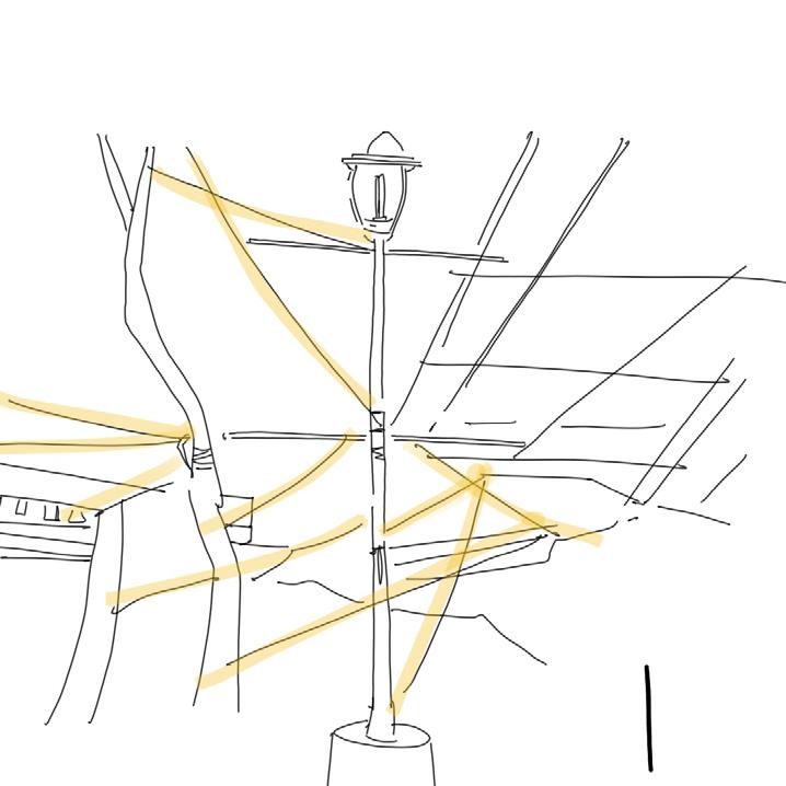
Leake Street is a 300-metre-long thoroughfare located far from the street art buzz of East London yet in a central area of high strategic interest. Sitting just behind the London Eye, Leake Street connects York Road on the north side of Waterloo station, to Lower Marsh, and respectively Lambeth North station, on the south side.
The Tunnel sits underneath the Waterloo International train terminal designed by Nicholas Grimshaw, which was inaugurated in 1993 and is no longer used for this purpose. Surrounded from all sides by disused railway infrastructure, Leake Street is also the access point for a series of arches that open into vast brick spaces of various uses.
As a part of my thesis, I conducted an in-depth exploration of the tunnel’s intricate layers in order to uncover its true essence. After extensive research and meticulous documentation, I was able to identify two distinct types of layers - longitudinal and transverse - that work together harmoniously to create the site’s unique character.
Drawing from this knowledge, I delved deeper into the concept of lateral stacking and subsequently created an installation that captures the essence of the site through ths approach of lateral layers.


The tunnel provides the city with a place for artistic freedom and expression. In this way, the walls can be perceived as a form of ongoing dialogue, a continual artistic discussion, and public forum” (Schacter, 2008, p. 48). Each visit to the site provided me with multiple narratives and stories of its own. The complex and layered narratives started to become clear on constant visits and documentation.
I decided to break down the site and investigate the layers into tangible longitudinal and transverse.

The initiation of the Waterloo Bridge station created the first arched passageway. With the growth of the city, the Waterloo station expanded. and therefore the tunnel expanded. The spatial quality of the tunnel has been a response to the needs of the city. From 1750 to 2008, the tunnel longitudinally grew accruing time and history.


Post-2008 after Banksy’s Cans Festival, the tunnel became a place for artistic expression. As surfaces patiently accumulate strata of individual interventions, they become silent witnesses of daily changes and material archives of consecutive inscription. (Andron, S., 2018.) The artistic expression and opinions of the people have become these material archives forming thick layers of city response to its needs.


I chipped a fragment from the site, to understand the layers of graffiti accumulated. Surfaces accumulate over time through these individual interventions(self-expression) According to Sabina Andron, the spaces can no longer be separated between private solids and public fluids. I believe it leads to an intermediary area which I believe is the temporal ownership of the graffiti writer.
In order to examine these layers more closely, I chose to remove them from the fragment. I used chromatography to separate the layers of paint, and documented the entire process of separation as well as the results obtained from chromatography.

I have created this section to showcase the longitudinal layers present in Leake Street. The expansion of the station and the corresponding response of the tunnel are illustrated through a sequence of images that feature current photos layered with older ones. The objective is to highlight the contrast between the past and present. To emphasize the passing of time, I have incorporated elements from specific eras, such as train engines and attire.

The documentation and the series of experiments come together in the form of an installation. The 1200 x 600 x 2100 mm column works as the structure of the installation. The vertical and horizontal members used for the installation are sourced from the University of Westminster degree show.

The stacking of the bricks goes up to 2100 mm in height. To maintain the infinite possibility of growth and changes they are demonstrated with projections on a fabric. The projections on the fabric are the documented images of the column on the site over a period of 2 months.
The installation showcases the interactions of different users and their interpretations. The monolith serves as an instrument of intrigue and curiosity. The ambiguous form brings users closer to investigating the markings on the bricks. The information on the bricks helps users understand the site and move laterally from the past to the present

Softwares used:
- Meshroom

- Blender
- Meta Spark Studio

-Sketchup

Curiosity to understand and explore

Interaction with AR model

Element of Play

Lacanian psychoanalysis is a theoretical framework that has been used to analyze and understand various aspects of human experience. According to Lacanian theory, the psyche is structured by language and the unconscious, and our experience of the world is shaped by symbolic systems and our relationship to them. User’s personal histories, unconsious desires, and symbolic associations can become the guidelines to understand how user experience and relate to different spaces.
Paintings revolving around the concepts of “gaze,” “acceptance,” and “fluidity” served as the store’s primary source of creative inspiration.
The three keywords eventually evolved into the store’s guiding principles, and Lacanian psychoanalysis evolved into the store’s narrative for circulation. Those fleeting moments of gaze and the fluidity of the user’s sexuality were highlighted by the forms and the materiality. The program evolved into an exploration of narratives and providing direction to customers as they shopped in the store. Detailing the experience of shopping in the store required a thoughtful approach to the store’s tangible goods and the way in which customers interacted with those goods.


The next thing that needed to be done in order to develop the store was to experiment with various forms and produce visual vistas that encourage the customer to explore the various sections of the store. The concept of internal landscaping was developed through the process of ideation as well as through the various iterations of the scale model.
The chosen paintings served as a guide for both the physicality and the feeling that the space hopes to evoke in its visitors. As part of the design process, sketching the function alongside the artwork became a prerequisite. The atmosphere was influenced in various ways by the artwork, including its hues and patterns as well as the story it told. The artwork created by Rene Magritte and Raja Ravma Verma served as the impetus for creating a place for a workshop. The contrast between the function and the emotion that was intended resulted in the conception of a functionality that was more sensitive and had a deeper comprehension of the space.

The functionality and location of the TILL guided the circulation of the ground floor level. The user’s first contact is with the accessories, after which they can choose to proceed to the till or continue their purchasing experience. Subtle cues and thresholds defined the moment for the user, causing him to cover all the various zones with an organic sense of circulation rather than a forced utilitarian experience.
 Model
Software : Procreate
Model
Software : Procreate
STAIRCASE (THE IMAGINERY)
GROUND FLOOR PLAN (THE REAL)
The Lacanian concept of the imaginary, the real and the symbolic guided our vertical circulation
BASEMENT FLOOR PLAN (THE SYMBOLIC)

Softwares used:
- Sketchup
- Photoshop
- Enscape
The Freudian comprehension of the super-ego serves as the conceptual foundation for the Lacanian interpretation of the symbolic. The materiality of the floor and ceiling is based on those surrealist interpretations of the symbolic, and the colors have been kept towards white and neutral space in order to provide the user with a calming presence through the experience of using this space.
The ground level and the basement floor were differentiated from one another by recurring forms that were made of different materials. The overall scheme was given a theatrical output by the use of fabric with lighter hues, along with a continuing linear light and spotlights oriented towards the products, which resonated with the overall storyline of the store. As you read through the section, you’ll gain an understanding of the differences in the experiences you’ll have on each level; however, the mirror arch that connects the ground floor and the basement floor will help you see how these floors are ultimately united.

The paintings, along with various design principles such as framing, reflection, affordance, and ambiguity, helped to create zones that elicited particular feelings and experiences, which added to the overall enjoyment of the shopping experience. The shopping zone, the workshop, and the speakeasy all worked together to initiate a conversation between various people, to move beyond the raw feelings of the id, and to comprehend the values and principles that lie behind the super-ego.
 Basement floor plan
Zone - 03
Basement floor plan
Zone - 03
Softwares used: - Sketchup - Photoshop - Enscape


Craft bazaar is a specialised marketplace that allows artists and craftspeople to display their abilities and knowledge. A craft bazaar benefits artisans while also emulating the atmosphere of a typical rural haat or village market. An urban haat is formed when crafts, cuisine, and cultural activities all come together to make an urban haat.
To provide a location that encourages artists and craftspeople to start their own businesses, therefore boosting the community’s economic and social progress. Because they lack the literacy and technology to sell their skill, online purchasing has become a key issue affecting local craftsmen and hawkers. Higher literacy encourages the use of internet shopping, which reduces the amount of buying done by shops and hawkers and lowers sales. Because the ease of internet purchasing provides customers with a variety of alternatives, and artisans’ restricted options are affecting their businesses, a common ground of numerous craftspeople addresses the issue of quantity.


PPS’s approach to placemaking can serve as a springboard for neighbourhood revival. The 11 principles of placemaking are based on forty years of experience and provide guidance to assist communities 1) combine varied perspectives into a unified vision, 2) translate that vision into a plan and programme of uses, and 3) assure the plan’s long-term execution. Finding the patience to take modest steps, to actually listen, and to understand what works best in a specific situation is key to turning a shared vision into a reality—into a truly terrific place.

A bazaar’s relationship with food is nuanced; visitors to the bazaar often wind up eating the local cuisine served by merchants and hawkers. The community’s support of the craft through the appeal of food allows for innovation in both genres and the creation of a community-driven environment.

Feasibility criteria give recommendations for designing a place that supports and enforces community-driven public spaces, such as evening usage and volunteers. Different activities create pockets of action in a public place, bringing vitality to the area and allowing others to exhibit their skills.
 Scan QR for Walkthrough
Software: Lumion
Scan QR for Walkthrough
Software: Lumion


The following work consists of my day-to-day interests that keep me motivated and inspired. My process of layering over the perceived reality and building over it through different permutations and combinations gradually achieves the desired result. A desire to learn new skills and experiment with different genres and materials intrigues me going forward.


There’s the whole Buddhist thing about the essence of a bowl being its emptiness—that’s why it’s useful. Its emptiness allows it to hold something. I guess that means that design must talk about something else. If you make design about design, you’re just stacking bowls, and that’s not what bowls are for.
–Frank Chimero

“Waste no more time arguing about what a good man should be. Be one.”

You are going to pay a price for everything you do and everything you do not do. You do not get to choose to not pay a price. You get to choose which poison you are going to take. That’s it.
- Jordon Peterson-Marcus Aurelius, Meditations
