Brand Guidelines


V1 OCTOBER 2022
P. 2 1. BRAND CHARACTERISTICS 1.1 Personality ................................. 4 1.1.1 Elements ........................... 4 1.1.2 Voice ............................... 5 1.1.3 Tone ............................... 5 2. LOGOS 2.1 Primary Logo ............................... 6 2.1.1 Logo Structure....................... 6 2.1.1.1 Wordmark .................... 6 2.1.1.2 Welder’s Helmet .............. 6 2.1.1.3 The Line ...................... 6 2.1.1.4 Registration Symbol ........... 6 2.1.1.5 The L.ogo .................... 6 2.1.2 Correct Us .......................... 7 2.1.3 Placement .......................... 7 2.1.4 Clear Space ......................... 7 2.1.5 Incorrect Use ........................ 8 2.2 Plasman Logo 8 2.3 Sub-brand Logos ........................... 9 3. TYPOGRAPHY 3.1 Fonts .................................. 10 3.1.1 Brand Fonts ......................... 10 3.1.1.1 San-Serif: Avenir Next ......... 10 3.1.1.2 Serif: Roboto Slab ............ 10 3.1.2 System Fonts ....................... 10 3.1.2.1 San-serif: Calibri.............. 10 3.1.2.2 Serif: Georgia ................ 11 3.1.3 Display Fonts ....................... 11 3.1.3.1 Open Source: Open Sans ......................... 11 3.2 Type Treatments ........................... 11 3.2.1 Alternate headlines, sub-heads, & body copy ....................... 11 3.2.2 Print Examples ...................... 11 3.2.3 Website ............................ 12 3.2.3.1 Headers ..................... 12 3.2.3.2 Website Body Copy .......... 12 TABLE
CONTENTS
OF
P. 3 3.2.3 Website - cont. 3.2.3.3 Links ........................ 12 3.2.3.4 Examples.................... 13 4. COLORS 4.1 Brand Palette ............................. 14 4.2 Corporate Colors .......................... 15 4.3 Accents .................................. 15 4.4 Neutrals .................................. 15 4.5 Transparency ............................. 16 4.6 Gradients ................................. 16 4.7 Alternate Backgrounds ..................... 17 5. IMAGERY 5.1 Photography .............................. 19 5.1.1 Style ............................... 19 5.1.1.1 Framing 19 5.1.1.2 Subject ..................... 19 5.1.1.3 Composition ................. 19 5.1.2 Use of Stock ........................ 19 5.1.2.1 People ...................... 19 5.1.2.2 Staged Objects .............. 19 5.1.2.3 Post-processing .............. 19 5.2 Icons .................................. 20 5.2.1 Style ............................... 20 5.2.1 Colors ............................. 20 5.2.2 Examples of Use..................... 21 6. EDITORIAL STYLE GUIDE 6.1 Our Style ................................. 22 6.1.1 First person narrative................. 22 6.1.2 Elements of the Oxarc voice .......... 22 6.1.3 Plain, positive language .............. 22 6.2 A note about Plasman ...................... 22 6.3 Oxarc conventions ......................... 23 6.3.1 Abbreviations and acronyms .......... 23 6.3.2 Ampersands ........................ 23 6.3.3 Branch locations .................... 23 6.3.4 Oxarc headquarters.................. 23 6.3.5 The Plant ........................... 23 6.4 Oxarc word list ............................ 23 6.5 Words to avoid ............................ 24 6.6 Grammar and Mechanics ................... 24 6.6.1 Capitalization ....................... 24 6.6.2 Numbers ........................... 25 6.6.2.1 Numerals vs spelled .......... 25 6.6.2.2 Dates ....................... 25 6.6.2.3 Percentages 25 6.6.2.4 Ranges and spans ............ 25 6.6.2.5 Money ...................... 25 6.6.2.6 Telephone numbers .......... 25 6.6.2.7 Temperature ................. 26 6.6.2.8 Time ........................ 26 6.6.3 Proper Names ..................... 26 6.6.4 States ............................. 26 6.7 Common Trouble Spots ..................... 27 6.7.1 They’re, their, there .................. 27 6.7.2 Its vs it’s ............................ 27 6.7.3 Apostrophes ........................ 27 6.7.4 “You’re” versus “your” . . . . . . . . . . . . . . . . 28 6.7.5 To versus too ........................ 28 6.7.6 Accept vs except .................... 29 6.7.7 A Lot ............................... 29 7. COPYRIGHT & TRADEMARKS 7.1 Copyright ................................. 30 7.1.1 Copyright at Oxarc .................. 30 7.1.2 Other creators’ copyrights ............ 30 7.1.3 Social media and copyright ........... 30 7.1.4 Image use and copyright ............. 31 7.1.5 Creative Commons & other licenses ... 31 7.2 Trademarks ............................... 31 7.2.1 Displaying trademark notices ......... 31 7.2.2 How to show Oxarc’s trademark 31
1. BRAND CHARACTERISTICS
1.1 Brand Personality
Brand personality is a framework that helps a company or organization shape the way people feel about its product, service, or mission. A company’s brand personality elicits an emotional response in a specific consumer segment, with the intention of inciting positive actions that benefit the firm.
1.1.1 Elements
Five key elements to think about when imagining the personality of the Oxarc brand are: Brand Competence, Sincerity, Excitement, Sophistication, and Toughness.
With more than 55 years in the business, Oxarc is competent in all matters related to the gas and welding industry. Competence is one of Oxarc’s leading traits.
Our brand is sincere, honest, and authentic. While we and our customers get excited about new and improved products, new processes that streamline our businesses and make our lives easier is where we shines. Oxarc’s sophistication is related to how we think about business and in the ways we can help customers. And, like Oxarc’s hard-working, salt-of-the-Earth cusotmers, Oxarc’s brand is tough and rugged.
Our tagline is Your Single Source Supplier. Oxarc has the products, services, and knowl-
edge to address our customers’ every needs. One way to make the Oxarc brand come to life is to be consistent in voice and tone. Over time, that translates to an identifiable brand personality that more easily engages customers and draws brand loyalty.
So, what’s the difference between voice and tone? Here’s one way to think of it: You have the same voice all the time, but your tone changes. You might use one tone when speaking with colleagues, another in front of your partner and family, and a different tone in a meeting with your boss.
Your tone also changes depending on the emotional environment and the person you’re addressing. You wouldn’t use the same tone of voice with someone who’s upset as you would with someone who’s laughing.
The same is true for Oxarc. Our brand voice doesn’t change much from day to day, but our tone changes according to situation.
In general, what feelings do we want the Oxarc brand convey to our customers or other audiences? We want them to feel excitement about their purchase (or potential purchase), empowered with the knowledge needed to use our products, enthusiastic to begin their projects, and energized after their interactions with us.
P. 4
E x c tnemeti noitacitsihpoS hguoT n e s s
Competence Sincerity
1.1.2 Voice
After 55 years in the business we know our stuff!—but we don’t take ourselves too seriously. At Oxarc, we speak in an experienced, friendly, and helpful tone as a valuable business partner to our customers. We use a conversational voice, and sometimes subtle humor. We treat every customer seriously and educate them without patronizing or confusing them.
When we communicate:
1. We are strong and confident. We have many, many years in the business and we give our customers unrivaled service.
2. We are friendly. Small to mid-size companies are the heart of our business. As a family-owned company, we can relate to their challenges and passions. We speak to them in a personable, kind, and accessible way.
3. We are authentic. We are honest in our communications, and we do not use corporate-speak.
4. Our humor is subtle. We use humor sparingly and we are never condescending. If you’re ever in doubt about whether a bit of humor will “play well” with all audiences, it’s better to avoid it.
1.1.3 Tone
Oxarc’s tone is usually relaxed, informal, and always clear. Use plain language, which means avoiding industry jargon.
When communicating with customers, or writing for an internal or external audience, consider the reader’s state of mind depending on the subject. Are they excited to begin a new project with new equipment? Are they confused and seeking our help? Are they upset and wanting to be heard? Once you have an idea of their emotional state, adjust your tone accordingly.
P. 5
2. VISUAL ELEMENTS
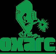
2.1 Primary Logo
Oxarc’s logo is a visual representation of the business. As the primary identifier for Oxarc, the logo must be used on all forms of communication and whenever the company is being represented. It appears on all Oxarc marketing and communications materials, is designed to clearly identify Oxarc in all media, including digital and mobile applications.
Consistent use of the logo strengthens recognition for Oxarc and helps build a unified brand. Unique logos or imagery for branch locations or divisions undermine this effort and are not permitted, with few exceptions that are detailed below.
2.1.1 Logo Structure
2.1.1.1
The Wordmark
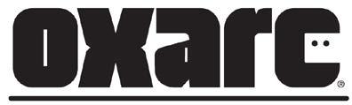
The wordmark is a custom letterform and cannot be replicated by typing the letters. When possible, the wordmark should be one-color, Oxarc Black. The logo may be used in Air (White) when placed on a dark, colored background. See 1.3 Correct Use below.

2.1.1.2 Welder’s Helmet
The two dots placed within the letter C change the letter into a visual representation of a welder’s helmet. This element makes Oxarc’s logo unique and indicates one of our main industries of business.
2.1.1.3 The Line
The line under the wordmark serves to ground the logo and seperate it from surrounding text and imagery.
2.1.1.4 The Registration Symbol
The trademark registration symbol protects the logo and should always appear.
2.1.1.5 The Logo
The wordmark, welder’s helmet, line, and registered trademark symbol are collectively known as the Oxarc logo.
P. 6
WORDMARK WELDER’S HELMET THE LINE LOGO
2.1.2 Correct Use
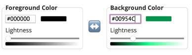
The Oxarc logo should appear in Oxarc black on all light colored backgrounds. The logo should appear in white on any background on which the black logo would be difficult to see.


The contrast ratio between the logo and background color must be at least 7:1. If it is not, use the Air White logo instead. With the white logo, the contrast ratio must be at least 3.5:1.
See https://webaim.org/resources/contrastchecker/ to check contrast ratios. Find the hexcodes for all Oxarc colors on page 13. You’ll see below that the Oxarc logo in black does not meet contrast ratio requirements when used on an Oxarc Green background. The white logo does.
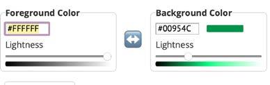
Contast ratio 3.88:1
2.1.3 Placement
Whenever possible the Oxarc logo should appear either:

• In the very top, 1/3 placement at left or
• At the very bottom, in a right 1/3 placement or
• Centered at the very top or bottom.
See examples below.
2.1.4 Clear Space
Clear space must surround the logo to ensure legibility and provide the greatest impact. The amount of clear space for the Oxarc logo must be no smaller than the width of the “O” in Oxarc.
Contrast ratio 5.4:1
P. 7
2.1.5 Incorrect Use
The logo is a registered trademark and cannot be altered in any way. The following examples are not permitted under any circumstances.
2.2 Plasman Logo


Inspired by our customers in the gas and welding industry, Oxarc’s original logo includes Plasman, an embodiment of the American welder, along with a golden spark.
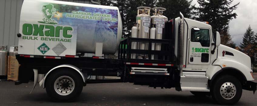
Versions of this logo appear throughout Oxarc’s corporate headquarters in Spokane, on Oxarc’s vehicles and cylinders and will continue to be used in various instances out of respect and gratitude to Oxarc’s founder, Jerry Walmsley.
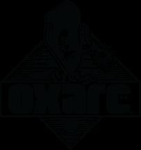


Use of the Plasman logo outside of these quidelines requires written approval from the Oxarc executive leadership team.

P. 8
Different typeface Stretched Squeezed Special effects Incomplete Busy background 1212121212121212 2121212121212121 1212121212121212
®
oxarc
2. VISUAL ELEMENTS-cont.
2.3 Sub-brand Logos

In very specific cases, sub-brand logos are used to identify various service divisions within Oxarc. These are used sparingly, and are often plced on Oxarc workwear.


No new sub-brands may be created or used without written permission from the executive leadership team.
Current sub-brand logos are shown below.
P. 9
3. TYPOGRAPHY
3.1 Fonts
3.1.1 Brand Fonts
3.1.1.1 San-serif: Avenir Next Avenir Next Pro is a new take on a classic typeface—it’s clean, straightforward and works brilliantly for blocks of copy and headlines alike. In addition to the standard styles ranging from ultralight to heavy, this 32-font collection offers condensed faces that rival any other sans on the market in on and off— screen readability at any size alongside heavy weights that work well as display faces in their own right. The complete family of 32 typefaces, or basic family (without condensed fonts), is availabe from Linotype.
OXARC: UltraLight
OXARC: Regular
OXARC: Italic
OXARC: Medium
OXARC: Medium Italic
OXARC: DemiBold
OXARC: Bold
OXARC: Heavy
3.1.1.2 Serif: Roboto Slab
Roboto has a dual nature. It has a mechanical skeleton and the forms are largely geometric. At the same time, the font features friendly and open curves and allows letters to be settled into their natural width. This makes for a more natural reading rhythm.
This font is available free through Google
Fonts
OXARC: ExtraLight
OXARC: Thin
OXARC: Light
OXARC: Regular
OXARC: Medium
OXARC: SemiBold
OXARC: Bold
OXARC: Extra Bold
OXARC: Black
3.1.2 System Fonts
3.1.2.1 San-serif: Calibri
When the sans-serif bran font Avenir Next is not available, use Myriad Pro in its place. Myriad Pro’s clean open shapes, precise letter fit, and extensive kerning pairs make this unified family of roman and italic an excellent choice for text typography that is comfortable to read. Use this font where you would have used the brand font Avenir Next.
OXARC: Light
OXARC: Light Italic
OXARC: Regular
OXARC: Italic
OXARC: Bold Italic
OXARC: Bold
P. 10
3.1.2.2
Serif: Georgia
The use of the serif system font, Georgia, should be reserved for instances when a more formal font treatment is required, and/or when an italic serif is needed.
OXARC: Regular
OXARC: Italic
OXARC: Bold
OXARC: Bold Italic
3.1.3 Display Fonts
3.1.3.1 Open Source: Open Sans
In various third-party platforms, if the brand fonts are not available, use Open Sans where you would have used Use Avenir Next Bold or Heavy, or Roboto Slab Bold, Extra Bold, or Black to capture attention in headlines or titles. Open Sans can be downloaded free from Google Fonts.
Oxarc: Open sans
OXARC: OPEN SANS
3.2 Type Treatments
3.2.1 Alternate headlines, sub-heads, and body copy
Type treatments will be more effective when rotating sans-serif or display headines with serif sub-heads and sans-serif body copy.
3.2.2 Print Examples
On Sale Now
The Lincoln Electric
PowerMIG 211i
This straightforward and dependable machine is ideal for MIG and flux-cored welding.
Get welding quickly!
The seven-segment display with basic knob controls and a simple three-step setup process gets you welding quickly – and when it’s time to move, the sleek case with multiple lift points make it extremely portable.
Looking for an incredibly simple, reliable MIG welder that won’t break the bank?
The POWER MIG 211i MIG welder is ready to go to work for YOU.
JENNA FITZGERALD
Granddaughter of Oxarc Inc. founder serves as Executive Vice President
In this role, Fitzgerald oversees operations, strategic planning, and company culture; she also co-manages vendor contracting and pricing strategy. Fitzgerald began her career at Oxarc while still in high school and has worked for the company on and off since ... [etc]
P. 11
3.2 Type Treatments - cont.
3.2.3 Website
3.2.3.1 Headers
H1 headers should be in Avenir Next - Bold in Oxarc Black or Dry Ice (white) depending on background
This is
a H1
Headline
This is a H2 Sub-Head
This is a H3 Sub-Head
This is a H4 Sub-Head
This is the body copy. This is a website link.
H2 headers should be in Roboto Slab - Black in color Gas or Dry Ice
H3 headers should be in Avenir Next - Bold in Oxarc Black or Dry Ice
H4 headers should be in Roboto SlabSemibold, 14 pt. or larger, in Oxarc Black or Dry Ice
3.2.3.2 Body copy
Website body copy should appear in Avenir Next - Regular, 14 pt. or larger, in Oxarc Black or Dry Ice
3.2.3.3 Links
Links will be in Avenir Next - DemiBold in the same font size as the website body copy but in color hexcode #008545. This slightly darker version of Plasman Green meets WCAG AA accessibility standards and should only be used for web.
P. 12
3. TYPOGRAPHY - cont.
3.2.3.4 Examples Services
Certified Welding Inspection & Testing
Our Certified Welding and Inspection division is capable of performing visual and non-destructive testing of welds and materials along with structural steel and high strength bolting inspections. Team members have performed welding inspections and testing, as both Quality Control and Quality Assurance, for both contractors and government entities.
Inspection and Testing Staff
Our staff consists of Certified Welding Inspectors (CWI/AWS), ASNT Level II and III technicians for Magnetic Particle (MT), Liquid Penetrant (PT), Ultrasonic (UT), Phased Array (PA), and Visual (VT) testing along with certifications for ICC and WABO. We can provide welding consulting along with procedure qualifications and develop written welding procedures specifically for your operation.
Approach
Our approach is to work one-on-one with each client to provide services with the most qualified personnel and appropriate test methods.
Qualification and Certification
We are accredited through the Washington Association of Building Officials (WABO) to perform welder certification and training per AWS and ASME Standards and Codes in the following processes: SMAW (stick), FCAW (flux core), GMAW (mig), SAW and GTAW (tig). We perform testing on plate, pipe, light gauge metals, stainless steel, aluminum, rebar, and special materials on request.
P. 13
4. COLORS
4.1 Brand Palette
Always use CMYK colors in printed applications. Use RGB colors for electronic media and Hexcodes for websites.
OXARC BLACK
DRY ICE
PLASMAN GREEN
P. 14
SPARK
GAS VAPOR
4.2 Corporate Colors
4.3 Accents
4.4 Neutrals
Always use CMYK colors in printed applications. Use RGB colors for electronic media and Hexcodes for websites.
OXARC BLACK
CMYK 0-0-0-100
RGB 0-0-0
HEX #000000
VAPOR
100% PMS 122-11
CMYK 37-0-11-13
RGB 138-193-201
HEX #8ac1c9
DRY ICE
CMYK 0-0-0-0
RGB 0-0-0
HEX #FFFFFF
PLASMAN GREEN
100% PMS 355
CMYK 100-0-100-0
RGB 0-166-81
HEX #00a651
Note: Website links use #008545 instead to meet WCAG AA accessibility standard
SPARK
100% PMS 7409
CMYK 3-32-98-0
RGB 244-178-35
HEX #f4b223
GAS
100% PMS P 169-14
CMYK 43-36-41-45
RGB 96-96-92
HEX #60605c
P. 15
4. COLORS - cont.
4.5 Transparency
4.6 Gradients
Type: Linear
Location: 60
Angle -45°
P. 16
70% 40%
4.7 Alternate Backgrounds


Backgrounds available in CMYK for print, RGB for electronic publishing whether in full color or greyscale.


P. 17
5. IMAGERY

Varied angles/perspectives
Authentic location
Oxarc personnel at work
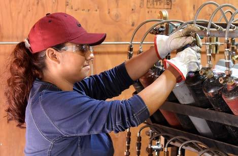
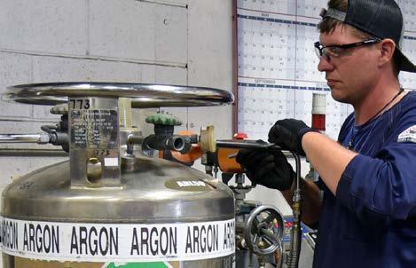


Clear space allows for text
Natural lighting
Clear space allows for text
P. 18
5.1 Photography
Photography is a powerful asset for visual storytelling. It helps us tell the engaging, authentic story that is Oxarc’s. By aligning our photography style and usage, we can create a look and feel that represents the company well.
5.1.1 Style
5.1.1.1 Framing
When possible, incorporate enough negative space to allow for the overlay of text and contextual graphics in layouts.
5.1.1.2 Subject
Capture candid, authentic moments. Avoid overly posed or staged images. The subject of a photograph should not be cut-out and placed on another image or a blank background.
5.1.1.3 Composition
Diverse images help build a strong photo database. Include photos with full focus and those where a subject is in full focus and the background elements are blurred. Frame shots with short, medium and wide options. Vary photos with the subject in the lower third, centered, left half, and right half of the frame. Incude shots of individuals at work, groups, and Oxarc buildings and equipment.
The photos that we use should represent our setting, our people, and our culture whenever possible. Highlight candid, authentic moments that are not overly staged unless the photos are for employee spotlights or website bios.
5.1.2 Use of Stock
Keep in mind that stock photos could have been used in marketing materials for several other companies.
5.1.2.1 People
Try to avoid using photos where the focus is directly on the face of a single person who is not an Oxarc employee or customer. Overly happy, stiff and staged photos look inauthentic and can lead to mistrust in our brand.
The subject of a photograph should not be cut-out and placed on another image or blank background.
5.1.2.2 Staged Objects
Stock photos showing objects staged on a minimal background can be very striking, but they do not show an authentic moment and should be avoided where possible.
5.1.2.3 Post-processing
Stock photography with added lens flare or ‘glow’ or Instagram style filters giving a photo a vintage should not be used (outside of Instagram.)
P. 19
5. IMAGERY - cont.
5.2 Icons
We use icons to represent the various Oxarc divisions, and in infographics and presentations when we want to show the depth of Oxarc products and services and break up heavy body copy.
5.2.1 Style
The icons are in a contemporary style, solid or in thick outlines, with slightly rounded edges. They appear in a single color with no shading.
5.2.2 Colors
The icons will always appear in white on a background circle of Oxarc Black or Plasman Green.


P. 20
Gases Cannabis Manufa turing/Fabr Rentals F re Sa ety Sa ety Education Ene gy Food & Beverage Healthcare Construction Chemicals/Plastics


P. 21 Proud to be the Northwest’s premier provider of welding & industrial supplies, safety products & training, certified welding inspection and testing services, industrial, medical & specialty gases, and more! Visit one of our 21 locations - you’ll see the values of our family -owned business translate to better customer service. Train at Oxarc School of Welding to see how we’re shaping the future of the industry. Contact our sales team today! We’re your single source supplier! 800.765.9055 oxarc.com We’re your single source supplier! Proud to be the Northwest’s premier provider of welding & industrial supplies, safety products & training, fire suppression installation & service, industrial, medical & specialty gases, and more! since 1968. Visit one of our 21 locations and you’ll see the values of our family-owned business translate to better customer service. Train at one of our welding schools to see how we’re shaping the future of the industry. Contact our sales team to learn what we can do for you today! www.oxarc.com • • 1-800-765-9055
Examples of Use
below for an example of how the icons could be used in an advertisement
5.2.3
See
6. EDITORIAL STYLE GUIDE
6.1 Our style
Each business has its traditions and its own way of doing things. Oxarc is no exception. Though we want to write in a way that is grammatically correct, we do not want to distance our customers by writing too formally. These are hardworking, down-to-Earth people.
6.1.1 First person narrative
The Oxarc brand most often uses first person narrative, or the I/we perspective. It is less formal, more human, and helps us better connect with our readers.
6.1.2 Elements of the Oxarc voice
Use active voice. Avoid passive voice. In active voice, the subject of the sentence does the action. In passive voice, the subject of the sentence has the action done to it.
• Yes: Marti logged into the account.
• No: The account was logged into by Marti.
One exception is when you want to specifically emphasize the action over the subject.
• Your account was flagged by our team.
6.1.3 Plain, positive language
Write in plain English. Avoid slang and jargon. Use positive language rather than negative language.
6.2 A note about Plasman
Plasman has been around in various forms since the company’s beginning, and he captures the spirit of Oxarc’s personality, but he does not talk.
We don’t write in his voice.
For more on how to use Plasman, see the Visual Elements section of this guide.
P. 22
6.3 Oxarc conventions
6.3.1 Abbreviations and acronyms
If there’s a chance our readers won’t recognize an abbreviation or acronym, we spell it out the first time we mention it. We then use the short version for all other references. For example:
• first use – Electronic Data Interchange (EDI)
• second use – EDI.
If the abbreviation or acronym is well known, like URL, we don’t spell it out.
6.3.2 Ampersands
It is okay to use an ampersand (&) instead of spelling out “and” when space is limited.
6.3.3 Branch locations
We list the Oxarc branch locations as:
• Oxarc – Spokane, or
• Oxarc – Spokane, WA or
• Oxarc in Spokane, WA
6.3.4 Oxarc headquarters
Oxarc – Spokane may also be referred to as “Oxarc headquarters.”
6.3.5 The Plant
We sometimes refer to Oxarc’s Spokane Operations as “The Plant.”
6.4 Oxarc word list
Here’s how we write some key words and phrases and how we spell them, or the acronyms we use:
• ACE - Auto Card Expiration (email)
• add-on (noun, adjective), add on (verb)
• back end (noun), back-end (adjective)
• BACP - Bank of America Checks Printed
• beta
• brick-and-mortar
• Cannabis – not marijuana, weed, etc
• CAT - Cash Activity Tracking
• CCCP - CapitalOne Credit Card Payments
• checkbox
• coworker
• DIPS - Dry Ice Production System
• drop-down (noun, adjective), drop down (verb)
• e-commerce (the industry)
• email (never hyphenate, never capitalize unless it begins a sentence)
• FACE - Failed Auto Card Email
• front end (noun), front-end (adjective)
• gas & welding industry
• hashtag
• homepage
• internet (not capitalized unless it begins a sentence)
• login (noun, adjective), log in (verb)
• online (never capitalize unless it begins a sentence)
• PET - Process Email Trigger
• PMEP - Profit Margin Exception Monitor
• POP - Purchasing Operations People
• PORP - Private Owned Refill Process
• pre-sale
• RAP - Report Alert Process (converting printed reports into an Excel sheet attached to email)
• RIT - Report Interval Tracking
• QIQ - Quick Inquiry Query (invoice amount)
• SOP - System Operations People
• STEP - Service Tracking Equipment Process
• SUP - SQL Update Process (daily update for mirroring average cost and replacement cost in TIMS)
• third party (noun), third-party (adjective)
• TOP - TIMS Operations People
• username
• URL
• WATT - Where Are The Tubs
• website
• WiFi
P. 23
6.5 Words to avoid
• internets, interwebs, or any other variation of the word “internet”
• young, old, elderly, or any other words to describe a person’s age
• crushing it, killing it
• crazy, insane, or similar words to describe people
• blacklist, whitelist, grandfathered, slave, master, deaf, blind and any other racist or abelist terms
• the names of these competitors: AirGas, Linde, Praxair
6.6 Grammar and Mechanics
6.6.1 Capitalization
We use a few different forms of capitalization. Title case capitalizes the first letter of every word except articles, prepositions, and conjunctions. Sentence case capitalizes the first letter of the first word.
When writing out an email address or website URL, use all lowercase.
• tflak@oxarc.com
• oxarc.com
Don’t capitalize random words in the middle of sentences. Do not capitalize nouns.
Proper nouns are capitalized. A proper noun is the personal name or title given to something. Common nouns are not capitalized unless they start a sentence. A common noun common noun is the word for something. It’s the word you would find in a dictionary for something.
The difference between proper nouns and common nouns is obvious when you see some examples side by side:
Proper nouns Common nouns
New York city
Lucky cat
Pacific Ocean ocean
Uncle George uncle
Sears Tower tower
P. 24
6. EDITORIAL STYLE GUIDE - cont.
6.6.2 Numbers
6.6.2.1 Numerals vs spelled out
Spell out a number when it begins a sentence. Otherwise, spell numbers one through nine, and use the numeral fro 10 and over. This includes ordinals.
• Ten new employees started on Monday, and 12 start next week.
• I ate three donuts at Coffee Hour.
• We hosted 27 eighth graders who are learning to weld.
If you’re using an expression that typically uses spelled-out numbers, leave them that way.
• You always make a great first impression.
• That is a third-party integration.
• What a great sale! Give me a high-five.
Numbers over 3 digits get commas:
• 999
• 1,000
• 150,000
Write out big numbers in full. Abbreviate them if there are space restraints, as in a social media post or a chart: 1k, 150k.
6.6.2.2 Dates
Generally, spell out the day of the week and the month. Abbreviate only if space is an issue.
• Saturday, January 24
• Saturday, Jan. 24
6.6.2.3
Percentages
Use the % symbol instead of spelling out “percent.”
6.6.2.4 Ranges and
spans
Use a hyphen (-) to indicate a range or span of numbers.
• It takes 20-30 days.
6.6.2.5 Money
When writing about US currency, use the dollar sign before the amount. Include a decimal and number of cents if more than 0.
• $20
• $19.99
6.6.2.6
Telephone numbers
Use dashes without spaces between numbers. Use a country code if your reader is in another country.
• 555-867-5309
• +1-404-123-4567
P. 25
6. EDITORIAL STYLE GUIDE - cont.
6.6 Grammar and Mechanics - cont.
6.6.2 Numbers - cont.
6.6.2.7
Temperature
Use the degree symbol and the capital F abbreviation for Fahrenheit.
• 98°F
6.6.2.8 Time
Use numerals and am or pm, with a space in between. Don’t use minutes for on-the-hour time.
• 7 AM
• 7:30 PM
Use a hyphen between times to indicate a time period.
• 7 AM–10:30 PM
Specify time zones when writing about an event or something else people would need to schedule. Since Oxarc is in the Pacific time zone, we default to PT.
Abbreviate time zones within the continental US as follows:
• Pacific time: PT
• Mountain time: MT
• Central time: CT
• Eastern time: ET
6.6.3 Proper Names
When referring to employees, use the person’s full name in the first reference, and then use their last name only. Do not use salutations such as “Mr. O’Bryan.”
6.6.4 States
States are spelled out when used in a sentence without a city but abbreviated when used with a city (ie., when describing an Oxarc location)
• Michael’s thoughts mirror those of many Idaho manufacturers, who feel like they are seeing great returns on their investments.
• Michael bought his products at the Boise, ID Oxarc location.
P. 26
6.7 Common Trouble Spots
6.7.1 They’re, their, there
There is commonly used to introduce sentences or to indicate where something is, as in It’s over there, next to the window.
There is also used as a pronoun to introduce the subject of a sentence or clause:
• There is still hope.
Their is the possessive form of the personal pronoun they, essentially meaning “belonging to or possessed by them,” as in:
• Is that their car, or ours?”
Their is generally plural, but it is increasingly accepted in place of the singular his or her after words such as someone:
• Someone left their tools on the table.
They’re is a contraction of they are.
6.7.2 Its vs it’s
It’s is a contraction and should be used where a sentence would normally read “it is.”
The apostrophe indicates that part of a word has been removed. Its with no apostrophe, on the other hand, is the possessive word, like “his” and “her,” for nouns without gender. For example, “The sun was so bright, its rays blinded me.”
6.7.3 Apostrophes
An apostrophe is used to indicate either possession (e.g., Harry’s book ; boys’ coats ) or the omission of letters or numbers (e.g., can’t ; he’s ; class of ’99 ).
The apostrophe has three uses: 1) to form possessive nouns; 2) to show the omission of letters; and 3) to indicate plurals of letters, numbers, and symbols.
Do not use apostrophes to form noun plurals that are not possessives.
Examples of correct use:
• I am – I’m: “I’m planning to buy a new car someday.”
• You are – You’re: “You’re going to have a lot of fun in this welding class.”
• She is – She’s: “She’s always on time.”
• It is – It’s: “I can’t believe it’s snowing again.”
• Do not – Don’t: “I don’t like moving cylinders.”
P. 27
6.7 Common Trouble Spots - cont.
6.7.3 Apostrophes - cont.
To test for ownership of possessions, rephrase the sentence to add “of.” If it still makes sense, you will know your possessive apostrophe was correct.
Miguel’s helmet was very expensive.
• Add “of” to test: The helmet of Miguel was very expensive. (The apostrophe above shows that the textbook does belong to Miguel, so it is correct).
The drivers’ equipment were very expensive.
• Add “of” to test: The equipment of the drivers was very expensive. (Correct).
Don’t be tempted to use an apostrophe just because a word ends in “s.” For example:
• Two cats: Correct. This is the plural of “cat.”
• Two cat’s: Incorrect. This is not the plural of “cat.”
6.7.4 “You’re” versus “your”
You’re is short for “you are.” For example:
• You’re rich now!
• Does she think you’re happy?
Your is to show something belongs to “you” or is related to “you.” For example:
• Your answer is correct. (“Answer” belongs to you.)
• Your uncle has a Roman nose. (“Uncle” is related to you.)
6.7.5 To versus too
“Too” has two meanings:
• Too” means “as well.” For example: Your eye is swollen. Your lip is swollen, too.
• “Too” conveys the idea of “in excess.” For example: Your cat is too fat.
“To” also has two meanings:
• “To” is like “for” or “towards.” (These words are called prepositions.) For example: Give it to him.
P. 28 6. EDITORIAL STYLE GUIDE - cont.
6.7.6 Accept vs except
“Accept” and “except” are easily confused. They sound similar, but their meanings are very different. “Accept” most commonly means “to receive willingly,” and “except” most commonly means “apart from.”
• I accept your invitation. (I willingly receive your invitation.)
• We all agree except Tony. (We all agree apart from Tony.)
Accept
“To accept” is a verb. It has several meanings:
To hold something as true.
• The officer accepts your point and has decided to let you off with a caution.
• I accept she may have been tired, but that’s still no excuse.
To receive something willingly.
• Do you accept dogs in your hotel?
• Please accept my resignation.
To answer “yes” (especially to an invitation).
• I would love to accept your invitation to lunch, but I made a prior commitment.
Except
The word “except” is most commonly used as a preposition. It can also be used a conjunction, and only occasionally as a verb.
“Except” as a preposition means “apart from,” “not including,” or “excluding.”
For example:
• I can resist everything except temptation. (Playwright Oscar Wilde)
• Marge, don’t discourage the boy! Weaseling out of things is important to learn. It’s what separates us from the animals... except the weasel. (Homer Simpson)
6.7.7 A lot
“A lot” is the opposite of a little. When used as a noun, “a lot” means a large extent, a large amount, or a large number. As an adverb, “a lot” means to a great extent or to a great degree.
Here are some examples of “a lot” in a sentence:
• Mark has a lot of toys. (“Lot” is a noun in this example.)
• He cheats a lot. (“A lot” is an adverb in this example.)
“Alot” is a misspelling of “a lot.” It is not a word.
P. 29
7.1 Copyright
Copyright is a bundle of exclusive legal rights that vary depending on the type of work. A copyright owner can grant some or all of those rights to others through a license.
Copyright protection applies to any original works that are fixed in a tangible medium. This includes works like drawings, recordings of a song, short stories, or paintings, but not something like a garden, since it will grow and change by nature. Copyright does not cover facts, ideas, names, or characters.
Copyright protection begins when the work is first created and it doesn’t require any formal filings. However, to enforce a copyright in the US, you need to register the work with the US Copyright Office.
7.1.1 Copyright at Oxarc
Copyright law applies to nearly every piece of content we create at Oxarc. We display proper—and prominent—copyright notice on our website and any other content we produce.
At minimum, these copyright notices read, “© [YEAR] Oxarc Inc.”
7.1.2 Other creators’ copyrights
We respect the copyright of other creators. If we want to use someone else’s copyrighted
work, we have to obtain a license from the owners.
A copyright license spells out these terms:
• Where we can use the work
• How long we can use it for
• How much we’ll pay them for the use
• Whether or not we’re the only ones who can use the work
• What we can do with the work
• Any restrictions on our use (for example, to use it online but not on a billboard)
7.1.3 Social media and copyright
This is an area where the letter of the law and common practice sometimes differ.
Social media posts often include copyrighted elements like pictures, GIFs, or pieces of writing. If you’re using a copyrighted element in a commercial manner on social media, you should request permission from the copyright holder. Since Oxarc is a company, we defer to the position that our use will be perceived as commercial. But if you’re using it in a more informative or commentary way, like sharing a meme to indicate how you feel about a news story, you may not need to request permission.
P. 30
7. COPYRIGHT
AND TRADEMARKS
7.1.4 Image use and copyright
If you use an image, photo, or other design element (well call it an “asset”) made by someone outside Oxarc, get permission first. Once you have permission, always give the copyright owner credit and link back to the original source.
Images retrieved via Google image search are not licensed for fair use, but many images are available under license through stock photo websites, or open for use under a Creative Commons license. Flickr has a great search feature for images available under Creative Commons licenses.
If you have purchased the right to use an asset you may not need to credit and link back to the source. Read the terms and conditions of your purchase.
7.1.5 Creative Commons and other licenses
Instead of the standard “all rights reserved,” some creators choose to make their work available for public use with different levels of attribution required. Find a breakdown of licenses on the Creative Commons website.
7.2 Trademarks
A trademark, often called a mark, can be a word, name, sign, design, or a combination of those. It’s used to identify the provider of a particular product or service. They’re usually words and images, but in some cases, they can even be a color. Generic terms, or the common name for a product or service, are not protectable.
A trademark is only valid for as long as it indicates the source of that good or service, so we must be very careful about how our marks are used. If a trademark is properly protected, it can last forever and may be a company’s most valuable asset.
7.2.1 Displaying trademark notices
To note that something is a trademark, and in the case of registered marks in order to collect damages, the trademark has to be displayed with an appropriate symbol.
• For unregistered trademarks of goods, use ™
• For trademarks granted registration by the United States Patent and Trademark Office, use ®
• The trademark symbol should appear as close to the mark as possible.
7.2.2 How to show Oxarc’s trademark
• Include the ® symbol in the upper righthand corner, above the word: Oxarc Inc.® this use is preferable.
• Include the ® symbol in the lower righthand corner, below the word: Oxarc Inc.®
• Marks are also sometimes indicated by using all caps: OXARC INC
Our trademarks should be properly noted the first time they’re used in a press release or article, or anywhere else our trademark and copyright notice does not appear.
P. 31

© 2022 Oxarc Inc. | ALL RIGHTS RESERVED Oxarc Inc. | 4003 E. Broadway Avenue | Spokane, WA 99202 | 800-765-9055
