
Oxford Resources for IB Diploma Programme
VISUAL ARTS
COURSE COMPANION

Nathaniel Katz
Jayson Paterson
Simon Poppy
Rwandan artist Christian Nyampeta’s work is a good example of how you can use inquiry to shape your art-making. He has spent several years exploring a central question in his art-making: how to live together. Nyampeta’s work utilizes a diversity of media, from more traditional forms such as drawing, sculpture and filmmaking, to furniture design, sourdough breadmaking, staging a radio play and participatory actions and conversations (Nyampeta, 2013).
Nyampeta’s starting point is the historical scar of the Rwandan genocide against the Tutsi in 1994: “The most important contradiction of my research focuses on how people live in the wake of radical ruptures […] And what role and responsibility do […] artists, such as myself, have in this?” (Nyampeta, 2023)
When Nyampeta inquires into the question “how to live together”, it is multi-layered. It is both a reflection on the history of his homeland, and how people can come together and be a singular nation with shared goals and dreams. But it is also a mundane and practical consideration of what it looks like when people meet in shared, communal spaces.
Some of Nyampeta’s earlier works on the subject were in fact inquiries into living structures and encounters. He designed and built wooden furniture-like structures that acted as proposals and invitations for different ways of interacting with each other. This type of medium is referred to as “participatory art” or “social practice”, because the active participation of the audience and their dynamics are what determine the meaning in the work.
For the duration of the exhibition New Habits at Casco Art Institute in Utrecht, the Netherlands, Nyampeta scheduled a series of workshops examining what it means to wear a “habit”, both literally and symbolically. The exhibition included a dying workshop where all attendees could bring an article of clothing to dye blue (Figure 1.11), a sandal-making workshop and a sourdough bread workshop, among others. The activities and workshops were a reflection
Key term
Participatory art: art that requires the audience to participate in it or interact with it.
on one’s own habits and how to bring them into conversation with others in shared experiences.
Another question that Nyampeta poses is, “How come my name is Christian?” With this seemingly simple inquiry into the Christian roots of his name, Nyampeta tries to understand the historical conditions that led to the continuous suppression of Eastern Africa (Nyampeta, 2023). This project is realized through a series of drawings that create an autobiographical timeline, depicting scenes from his childhood schooling in Rwanda.
In Nyampeta’s lines of inquiry we can see how seemingly simple questions can carry thoughtful and complex conceptual and material processes. His work also demonstrates how an engagement with one’s own personal context organically opens up to both the local and global.

How to conduct art as inquiry
To make art as inquiry is to do and make things because you want to find out what happens and learn from that. Treat each stage of the creative process as a learning moment that may lead you to unexpected places and not as stages towards finishing an artwork.
The following are a few possible paths that could be used to develop a line of inquiry. They identify the various ways in which you will touch on the assessment
objectives as an organic part of your creative process. For each of these you should have already generated an inquiry question.
Path A: The conceptual path
1. Generate
Generate several sketches of possible combinations of art-making forms and creative strategies for communicating ideas. Evaluate which one of these is most effective in communicating your intentions in ways that are subtle and complex. In Figure 1.12, Charlotte made several sketches on a range of topics, in which she utilized metaphor as a creative strategy. Her inquiry questions demonstrate a process of narrowing down the most powerful metaphor to work with: “How are (other) species dealing with human (created) obstacles?” This is further explored in additional sketches.

2. Investigate
Investigate an artist that utilized similar forms or strategies to understand how they used these to communicate their intentions.
3. Situate
Situate the work of the investigated artist within their cultural context, to understand how your own context can inform the communication of meaning
Figure 1.11 Nyampeta leading a blue dying workshop at Casco Art Institute in Utrecht, the Netherlands
Figure 1.12 Charlotte’s idea sketches

3. Generate
Generate ideas that will situate your own work in context. In Figure 1.20, the student identified the use of distortion and colour as key elements in the work of Shamma. These elements were then applied in generating their own ideas for exploration.

4. Refine
Discuss your ideas with peers in order to refine your intentions.
5. Resolve and curate
Resolve your work and curate it for display.
Example pathways
The following suggested paths are just some examples of the ways students approach a line of inquiry. As you construct your own path, remember that there are a few essential elements that you should be engaging with. At some point along the inquiry you should create, connect and communicate. Your inquiry should also cover most of the assessment objectives in a meaningful way. That way, when it is time to compile evidence of your work for the art-making inquiries portfolio, you are best positioned to reach the higher mark levels.
Sometimes, you may not know what your intentions are initially, or you may have intentions for an inquiry but not know which forms to use or which context would work best. You could try a list randomizer app or website to generate randomized combinations of forms, strategies and contexts that can prompt or inspire you (see Figure 1.21 for an example of some results). Now is a good time to try one to see if it would work for you.
Creative strategy
Reinterpretation Sculpture Global
Figure 1.21 An example of some results from a list randomizer app
Make a pot or vase that addresses climate change.
Make a print of something that is personal to you and reproduce it many times.
Use all the furniture in the art room to create a gateway to the school.
Start with a drawing you made as a young child, redraw it now and try to bring new meaning to it.
Make a textile in the local style that says something critical about your community.
Make a mould of something valuable and cast it out of mud.
Use the style of an existing but problematic artist in order to make work in their style that makes a commentary on them.
Convert the entire classroom into a pinhole camera to capture the outside.
Make a timelapse video of the representation of one global issue in the media as it evolves over time.
Figure 1.19 Analysis of Shamma
This experimentation cannot be effectively accomplished with an exercise completed just to address this criterion or a class exercise that everyone does similarly. It must emerge from your desire to develop as an artist and improve your art-making. When your artwork takes on aspects of the qualities that you have investigated, it is said to have been informed by them.
The ultimate goal of your practical investigation into the styles and techniques of other artists is synthesis, which is expressed in the second part of the level descriptor. Synthesis, in this sense, is achieved when the artists’ styles and techniques you have investigated are combined with your own artistic concerns to create a new personalized style and technique.
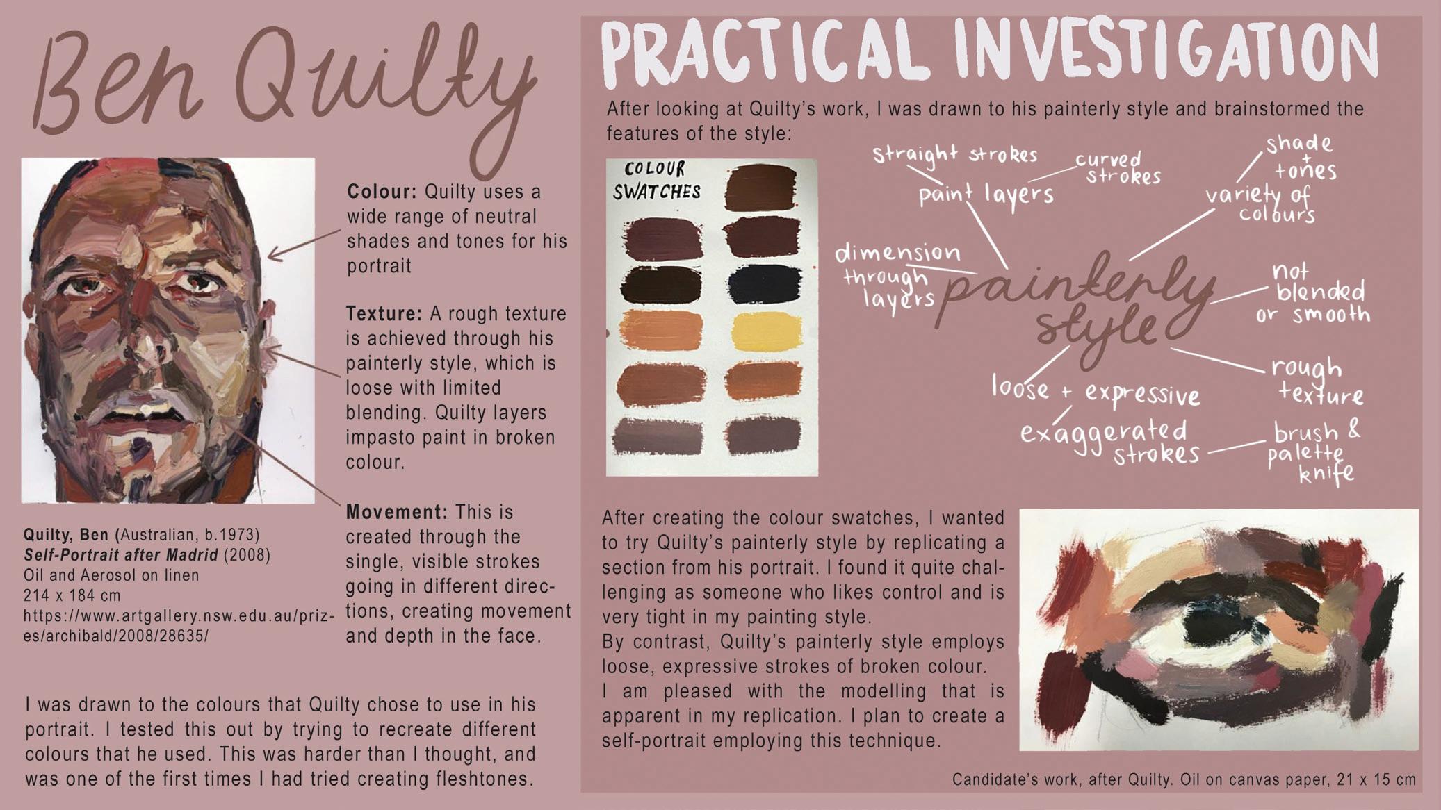
For criterion B, Gwen began by choosing the contemporary Australian artist Ben Quilty. In Figure 4.2, Gwen identifies the visual qualities in Quilty’s Self-Portrait After Madrid (2007). She shows an example of the beginnings of her own practical investigation into his painterly and expressionistic technique. To access the higher mark bands, Gwen would need to go further, showing how she integrates this technique into her own work or synthesizes Quilty’s style with her own in new ways. Portfolio screens that address criterion B will often also show evidence that may address criterion A (exploration and experimentation) and criterion D (critical review).
Understanding criterion C: Lines of inquiry (8 marks)
Key question To what level do the curated visual and written materials show the student’s use of inquiry questions or generative statements and development of their art-making through visually articulated line(s) of inquiry? Examiner’s focus y evidence that shows the development of initial ideas for art-making y your inquiry question or a series of questions or generative statements
Significant mark descriptors
y “The student generates and progresses their artwork through relevant and effective inquiry questions or generative statements.”
y “The submitted materials evidence art-making that is developed to fulfil artistic intentions […] there is clear and meaningful visual articulation of a line or lines of inquiry.” (IBO, 2025)
The first mark descriptor reflects the importance of developing a line or lines of inquiry in your work. These may begin with an inquiry question or generative statement that you use to focus your art-making. They may include subsequent inquiry questions that arise during the development of your work. The first part of the second statement reflects the importance of documenting your processes and the progress of your art-making. Examiners are asked to evaluate the ways that your art-making practice develops from your inquiry questions and/ or generative statements towards fulfilling your artistic intentions. The second statement goes on to place emphasis on using visual evidence to clearly support your art-making practice and demonstrate your line or lines of inquiry.
This criterion is concerned with how you, as an artist, generate your ideas for art-making and develop your ideas through the art-making process. The word limit of approximately 200 words per screen will mean that you need to be thoughtful about the evidence you select to reveal your planning and thinking.
In Figure 4.3, Gwen shows the lines of inquiry she explored through her work, addressing criterion C. She includes a mind map that explores different facets of a theme she wanted to explore. Gwen highlights five branches in the mind map that she articulated as inquiry questions in the left-hand column. Evidence of how these ideas are explored and how they generate and progress her art-making will need to be evident throughout the portfolio, but they can evolve and change as the process of art-making as inquiry raises further questions or ideas for exploration.
Reread Chapter 1: Lines of inquiry to remind yourself how lines of inquiry should be developed in your work.

Figure 4.3 Gwen’s mind map and inquiry questions address criterion C
Figure 4.2 Gwen experiments with Quilty’s painterly and expressionistic technique to address criterion B
Tip
Useful words to describe colour include: analogous, bleached, brash, bright, brilliant, contrasting, cool/warm, discordant, faded, fluorescent, garish, glazed, glowing, harmonious, hue, iridescent, monochromatic, muted, neutral, pale, pastel, polychromatic, primary, pure/ muddied, secondary, subdued, tertiary, tint, translucent/opaque.
Key terms
Polychromatic: many coloured.
Tertiary colours: these are mixtures of the three primaries, used to make browns and the wide range of neutral colours in nature, such as the colours of skin, plants, wood, and so on. Along with pink and mauve, they do not occur in the spectrum.
Saturated colours: colours that are highly pigmented or at full strength.
Complementary colours: the three pairs of opposites on the colour circle are described as complementary. These are orange/blue, red/green and purple/yellow. When placed against each other they contrast and enhance, so red seems redder when placed next to green.
y Are the colour contrasts and harmonies related to white or to black?
y How would the impact change if the artwork was in black and white?
Colour is usually described in terms of contrasts, as the effect of a colour is always dependent on its neighbours. When you describe the effects of colour it can be helpful to consider harmonies and contrasts. Colours that are close on the colour circle will harmonize (these are also called analogous colours), while those that are far apart will contrast. Often artists will build a theme around colours that are adjacent, adding a strongly contrasting colour to activate the composition.
In your practical art, planning colour schemes around harmonies and contrasts is effective. Build a harmony from colours that are adjacent on the colour circle, to act as a foil to a colour that is opposite on the colour circle so that it “pops” out.
The three basic colour contrasts are:
y Contrast of hue, for example yellow against red.
y Contrast of saturation: the contrast of pure pigments with diluted pigments, for example the yellow sun against pale-yellow reflections. Hence you can refer to saturated colours or desaturated colours.
y Contrast of brightness (tonal contrast).
Four other useful colour contrasts are:
y Active and passive contrast: we sense reds, oranges and yellows as busy, moving hues, while greens, browns and blues tend to feel quieter and still.
y Contrast of temperature: colours can be felt as hot or cold hues. Although blue is generally regarded as cool, some blues are warmer than others. Colours such as yellow can have quite different temperature effects depending on their neighbours.
y Complementary colours: this term describes the three pairs of opposites on the colour circle: red against green, orange against blue and yellow against violet. When placed next to each other they enhance their hues. Red against green seems redder and the green seems greener.
y Contrast of colour key: as with notes in music, colours can be described as on a scale, with yellow at the top being high key and indigo blue at the bottom being low key.
We each see colour differently, and consequently philosophers have mistrusted colour because of its subjective nature. “Scientists are not concerned with colour but with radiant stimuli in light, or with the physiological processing of those stimuli by the eye. Whereas colour is in the mind which apprehends it” (John Gage, 2000).
y Can colour be considered as a useful area of knowledge if we each experience it differently?
y Is colour necessary to our understanding of the world? Is colour blindness a limitation?
y Do you agree with Gage’s statement? Where does that place art?
“Blue is always different from yellow, for example, depressed (‘the blues’), where yellow is gay, loyal (‘trueblue’), where yellow is cowardly, and the like. Yellow has the same meaning as blue once in a blue moon.” (Wittgenstein, 1953)
y Is language inadequate as a tool to describe colour sensation?
y Do you agree with Wittgenstein’s colour mood associations?
Texture
Textures are the tactile qualities of surfaces, in other words the qualities of touch. Art often represents one texture with an equivalent in a different medium. Your description of texture will be linked to the media used to imitate the surfaces of objects, such as in representational painting when oil paint is used to mimic the surface of silk, fur, stone or flesh. In non-representational and conceptual art, texture can evoke a mood or act as a metaphor.
The support used will contribute to the texture: canvas, linen, board, wood, metal, silk, hessian, and so on. For sculpture, consider the surface of the material:
y Plaster is dry, absorbing liquids and light.
y Stone can be rough, abrasive, granulated and dull, or polished, smooth and reflective.
y Bronze is patinated and reflective.
y Wax is soft, greasy, and malleable.
Pattern and decoration are elements of texture. In textiles, the physical structure of the cloth, the warp and weft of weaving or the relief of embroidery contribute to its texture. Pattern adds to texture through repetition, a tracery of lines, latticework and through grids. Appliqué, embroidery and quilting are techniques which combine texture with decoration, achieving surfaces that have variety.
In ceramics, pattern is often inscribed into a surface or built up in relief, creating both decoration and a real, tangible, physical texture (as in sculpture). Street artists appropriate the textures of the real world when they spray on brick, rendered walls, concrete or corrugated iron. The smooth, enamelled quality of spray paint contrasts with the weathered roughness of the walls they work on.
You might ask these questions about texture:
y What would these surfaces feel like to touch?
y How was this surface created?
y Is this a real texture or an imitation of texture?
Notice how the sculptor in Figure 8.8 has combined form, line and decoration to dramatic effect. The crisp edges draw the features through the contrast of strong sunlight with shadow. Although the face has been smoothed, the rough nature of wood remains in the chiselled marks behind the head.
Key term
Patina: this is the sheen or colouration on an object’s surface produced naturally by age or deliberately by the artist. Tip
Useful words to describe texture include: abraded, actual/implied, brittle, coarse, delicate, dense, distressed, ephemeral, glossy, granular, layered, leathery, oily, open, pitted, plastic, satiny, seductive, shiny, slick, smooth, soft, sticky, tacky, tactile, touchy-feely, translucent, weathered.
Alternatives to the term “artwork” include: artefact, assemblage, depiction, canvas, collage, composition, graphic, illustration, image, installation, montage, picture, representation, sculpture, textile.

Tip