BRAND GUIDELINES


This is the solid ground that our entire brand is built upon�
As Central Florida’s only professional ballet company, Orlando Ballet brings the transformative power of dance to the stage and the community�
From bold retellings of timeless classics at the iconic Steinmetz Hall at Dr� Phillips Center to impactful education and outreach through Orlando Ballet School and community programs, the company is shaping the future of dance while inspiring audiences of all ages�
Our brand personality establishes a consistent vibe, voice and visual look for Orlando Ballet, one that reinforces who we are and all we stand for� As we bring our brand to life every day, our personality should shine through with every interaction and piece of communication�
Our personality determines how Orlando Ballet comes across to the world� We define our brand personality across three aspects
How our brand feels Limitless Polished Fresh Magical Imaginative
How our brand looks Luxurious Elegant Sophisticated Curated Intentional
How our brand sounds Evocative Precise Inviting Bold Alive
Our Brand Voice tells our story in a way that connects with and moves our audience� It reinforces that Orlando Ballet is an organization that entertains, educates, and enriches our community�
The Story Compass serves as the foundation for all communication, and provides direction for all strategic and operational decisions moving forward
We invigorate the art of ballet, bringing new takes to timeless classics and opening eyes to this inspiring and imaginative world. BECAUSEOFORLANDOBALLET, bigger,morediverseaudiences embraceballetasthepinnacleof entertainment.
BECAUSE OF ORLANDO BALLET, our community and the world recognizes Orlando as the home for brilliantly bold ballet.
Our Brand Voice tells our story in a way that energizes and educates our audience� It reinforces that Orlando Ballet creates special, highquality experiences that you can’t wait to be part of
Orlando Ballet inspires all and brings a magical imagination factor to everything we do�
Orlando Ballet makes our points in clear and compelling language�
Orlando Ballet is approachable and welcomes everyone to experience ballet as an art and a practice�
Orlando Ballet brings a fresh, forward-thinking approach to ballet
Orlando Ballet is passionate and energetic, creating eye-catching language that leaps off the page�
Powerful and compelling, these positioning statements can be used to help people quickly understand who we are, and the scope of what we do
POSITIONING STATEMENT #1
Orlando Ballet is Central Florida’s only professional ballet company� Our dazzling productions shine at the iconic Steinmetz Hall at Dr� Phillips Center and Harriett’s Orlando Ballet Centre�
POSITIONING STATEMENT #2
Orlando Ballet School shapes the next generation of dancers with superior training, international faculty and a proven path to the professional stage, all supported by a commitment to access and excellence�
POSITIONING STATEMENT #3
Orlando Ballet believes ballet belongs to everyone� We welcoming all who wish to dance for fun, fitness and friendship�
What does our audience need to understand about who we are? These are the foundational points you should keep in mind every time you talk about our brand
We’re changing how people perceive ballet in Orlando and across North America by bringing new takes to timeless classics�
Each experience offers clear storytelling, bold choreography, exciting music and high-level production that appeals to a broad audience, not just people who enjoy the ballet�
Orlando Ballet performers and performances are fit for the world’s greatest stages and welcome all walks of life�
These examples can be used as a tool to optimize our current messaging and maintain a consistent tone for future projects
ORLANDO BALLET VOICE
NOT ORLANDO BALLET VOICE
Step into a world of holiday wonder with The Nutcracker. Featuring breathtaking battles, glittering snow and Clara’s magical journey, this cherished tradition returns with soaring choreography and larger-than-life sets
Prepare to be amazed! Immerse yourself in an unparalleled, worldclass experience where a fantasy world bursts to life through the eyes of Clara and her incredible Nutcracker prince�
ORLANDO BALLET VOICE
NOT ORLANDO BALLET VOICE
Under the direction of Christopher Alloways-Ramsey, Orlando Ballet School is led by renowned instructors and considered one of the best training academies in the world�
Orlando Ballet School is committed to the education of students with training programs for a range of levels� Through this commitment, the Orlando Ballet School is regarded as one of the most elite training academies in the world Catering to all dancing levels, Fitness Thru Dance focuses on movement and artistry while our pre-primary, primary, and Academy levels follow a more comprehensive curriculum�
ORLANDO BALLET VOICE
These examples can be used as a tool to optimize our current messaging and maintain a consistent tone for future projects
ORLANDO BALLET VOICE
ORLANDO BALLET VOICE
ORLANDO BALLET VOICE
ABOUT ORLANDO BALLET
WE INVIGORATE THE ART OF BALLET.
ELEGANTLY AUDACIOUS. BOLDLY BALLET.
PERFORMANCES
STUNNING STORYTELLING. UNFORGETTABLE ENTERTAINMENT.
EXPERIENCE THE BEST OF BALLET, AT THE BEST VALUE.
ORLANDO BALLET SCHOOL RAISE THE BARRE. MAKE YOUR PASSION YOUR PROFESSION.
DONORS
PLAY A PART IN ELEVATING OUR ART.
YOUR GIFT BRINGS STORIES TO LIFE.
These examples can be used as a tool to optimize our current messaging and maintain a consistent tone for future projects
Orlando Ballet entertains, educates and enriches through the highest quality of dance� Founded in 1974, Orlando Ballet is Central Florida’s only fully residential professional ballet company, producing bold main stage performances year-round at the iconic Steinmetz Hall in the Dr� Phillips Center for the Performing Arts� From timeless classics to groundbreaking world premieres, Orlando Ballet invigorates the art of ballet and brings exceptional power, precision and passion to every performance�
Beyond the stage, Orlando Ballet invests in the future of dance through transformative community enrichment programs as well as ABT®-certified and European methodology training at Orlando Ballet School, located at Harriett’s Orlando Ballet Centre� We also support emerging talent through Orlando Ballet II, a pre-professional company that helps dancers transition into their careers�
A consistent visual style elevates the Orlando Ballet brand and solidifies our reputation in the community� In all visual communication we strive for a luxurious, sophisticated, and elevated look�
A customized serif is used to denote a sense of history and elegance� Subtle arches in the “A” add motion� Wide letter forms give a sense of stability and balance
The primary logo is the preferred logo to use in most instances� Especially when simplicity and elegance is required
LOGO - TAGLINE
Use in high-level marketing applications where the tagline is needed to highlight the overarching mission of Orlando Ballet�
For use in media related to shows where the artistic director requires credit�
The primary logo includes variations that are to be used when the context calls for them� Rather than hard-and-fast rules, below are general principles for when to use each variation
LOGO
Use in applications where contrast is needed between content and logo� This version can especially be useful when the background of the logo placement is busy
Various logo files have been made depending on the media (print, web, packaging, embroidery, etc�)� Use the horizontal variations when the space requires it See folder for all logo files
PRIMARY STACKED
TAGLINE STACKED
JORDEN MORRIS STACKED
FRAMED
PRIMARY HORIZONTAL
TAGLINE HORIZONTAL
JORDEN MORRIS HORIZONTAL
FRAMED HORIZONTAL
It is important that the logo be used consistently and in harmony with the below guidelines�
DO NOT CREATE NEW VARIATIONS OF THE LOGO
Only use existing variations� Creating new logos cheapens the brand value and causes confusion among our audience�
DO NOT SCALE INDIVIDUAL LOGO ELEMENTS
The lockup of the logo should always remain the same� Do not scale one element apart from another
DO NOT WARP OR ROTATE LOGO
Never distort the logo
DO NOT ALTER LOGO COLOR
The logo should never be used in unapproved colors� This includes brand secondary or tertiary colors Never add a stroke to the logo�
DO NOT USE MONOGRAM
Do not shorten the logo to “OB” or use the monogram in any external communication or creative
It is important that the logo be used consistently and in harmony with the below guidelines�
Always allow plenty of blank space around the logo Give it room to breathe! Generally, the size of the capital “O” in Orlando is enough
Resist the urge to enlarge the logo to “fill the space”� If the logo is too large, it can begin to look amateur� A smaller logo, with more breathing room, looks more premium�
Always allow sufficient contrast between background color and logo If background becomes dark, use the White Curtain version of the logo
TYPOGRAPHY
PRIMARY BRAND FONT
Transat Text Standard
Transat Text Medium
Transat Text Bold
Transat Text Black
HEADLINES - PRIMARY
Transat Text Bold
Tracking: 80pt
HEADLINES - ALTERNATE
Erstoria
*Use Erstoria sparingly Transat Text Bold should be used as the primary Headline font�
Good typography can make designs more visually appealing, easier to read, and provide consistency across the brand� Use only the approved fonts in all visual communication
Lorem ipsum dolor sit amet, consectetur adipiscing elit, sed do eiusmod tempor incididunt ut labore et dolore magna aliqua�
NO MORE THAN TWO FONTS USED TOGETHER
Primary Orlando Ballet brand materials can use Erstoria paired with Transat Text Never use more than two fonts�
The following are general principles to follow when choosing and pairing fonts�
Body copy is Transat Text Standard� Lorem ipsum dolor sit amet, consectetur adipiscing elit, sed do eiusmod tempor incididunt ut labore et dolore magna aliqua�
CALLOUTS AND SPECIAL TEXT CAN BE ALL CAPS TRANSAT TEXT BOLD, TRACKING SET TO 80
DO NOT OVER-USE ERSTORIA
Erstoria can become overwhelming and difficult to read if it is used too much or at small sizes
BUT DO NOT USE ERSTORIA REPEATEDLY
Never use Erstoria for body copy. Lorem ipsum dolor sit amet, consectetur adipiscing elit, sed do eiusmod tempor incididunt ut labore et dolore magna aliqua.
DO NOT USE ERSTORIA IN SMALL SIZES
Warm beiges and “almost” black bring a sophisticated and luxurious feel to the Orlando Ballet brand�
All main brand applications should stick with these neutral colors and may incorporate one secondary color as-needed�
A variety of rich secondary colors bring versatility while maintaining an elevated tone
Aubergine should be the most frequently-used secondary color�
Show palettes can be created using any of these secondary colors�
These colors are used very sparingly They are used to call attention to special items or calls-to-action
Tertiary colors can be used to build color palettes for shows and other sub-brands� Very rarely should more than one tertiary be used in the same color palette
Consistent use of brand colors boosts recognition and contributes to the brand personality� The following brand colors for Orlando Ballet contribute to its elevated look and feel
The following are examples of proper and improper use of the Orlando Ballet color palette�
In these examples, the primary colors are white curtain, piano black, ivory and terre beige
Old gold is incorporated sparingly to draw attention to the website
In this bad example, the letterhead is on bright white paper Too many secondary colors are being used together�
Tertiary colors should almost never be used in media related to the primary Orlando Ballet brand�
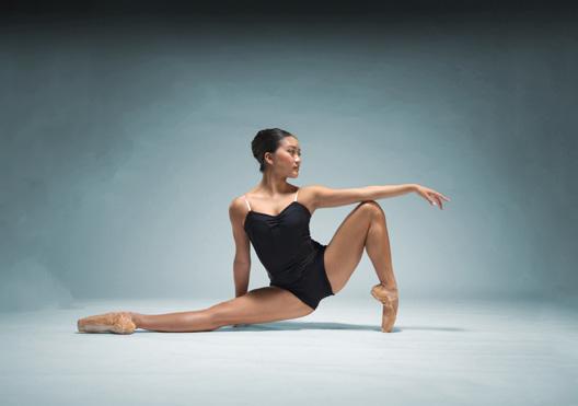
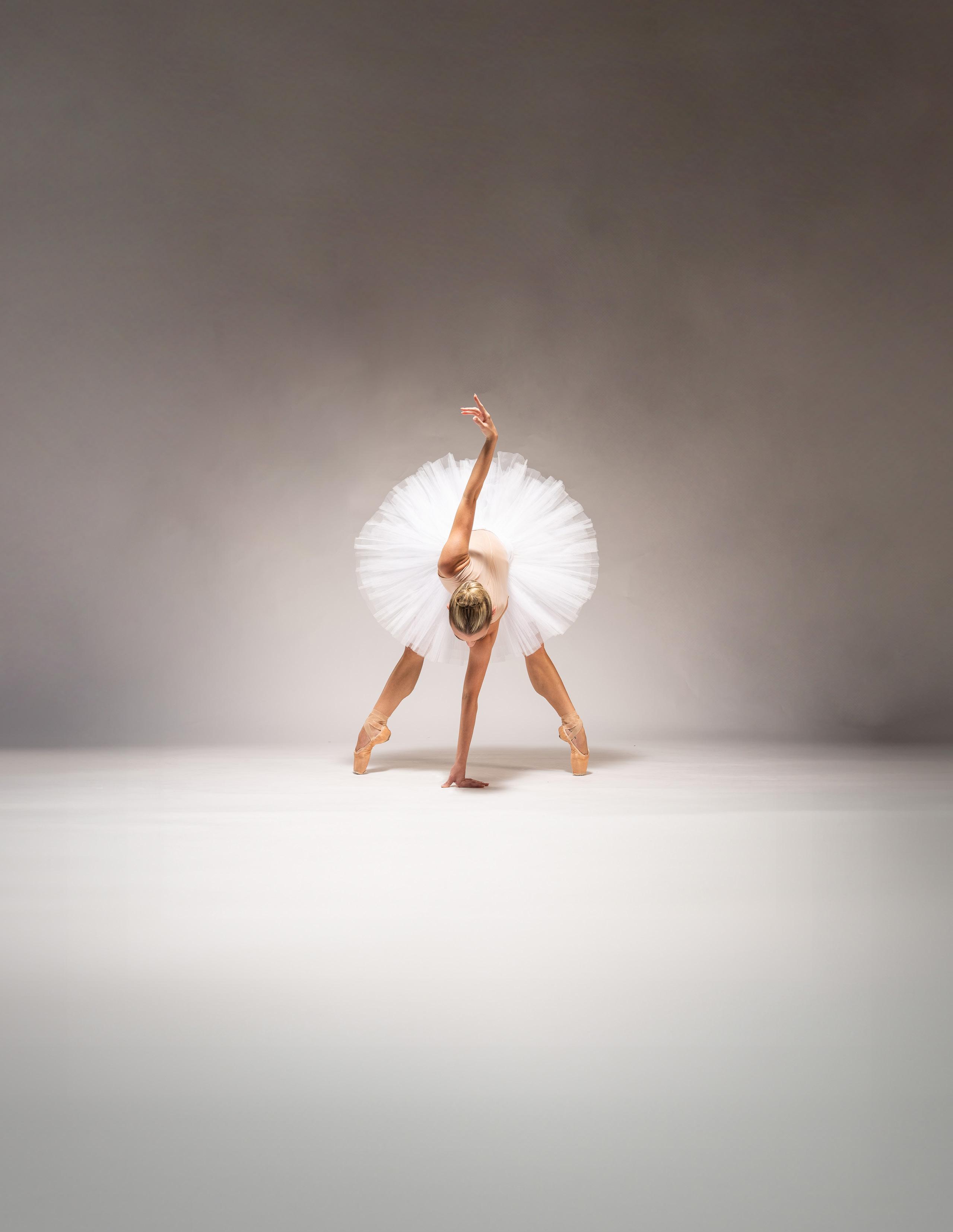
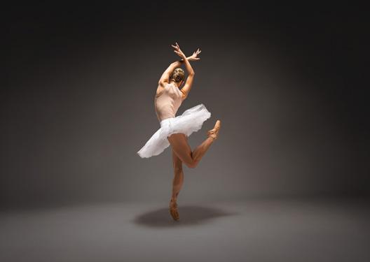
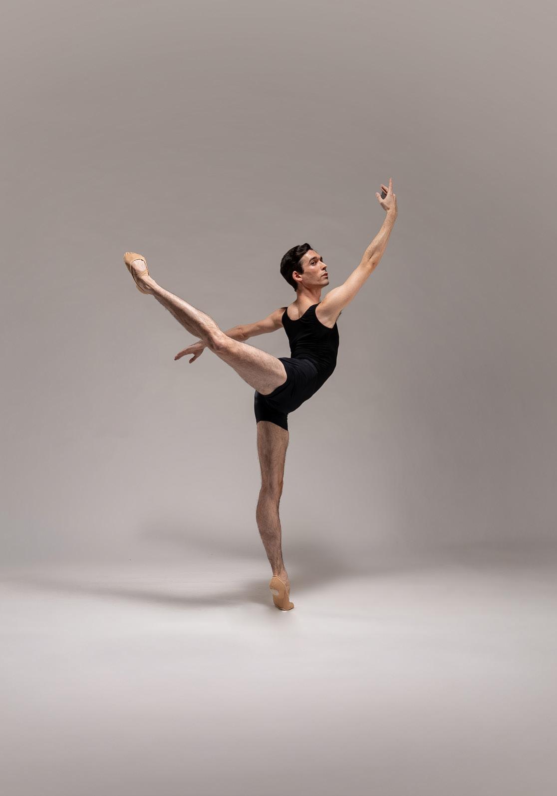
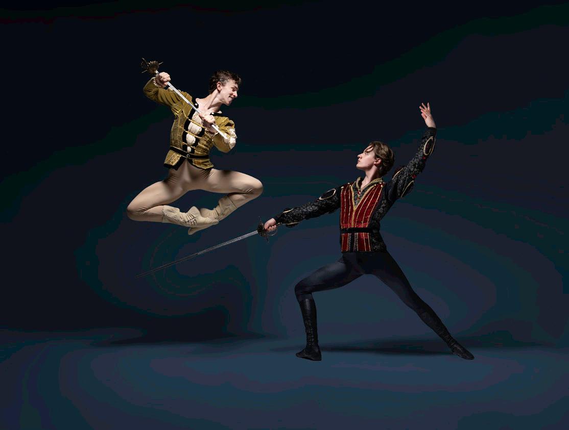
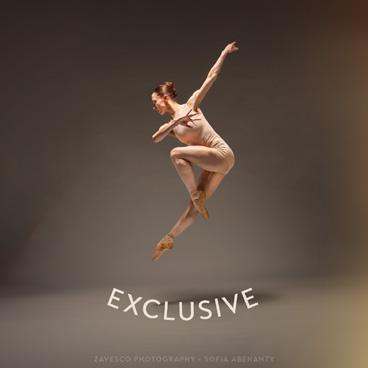
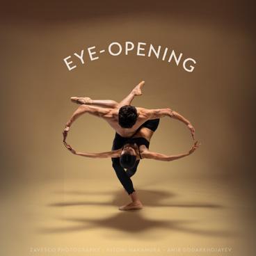
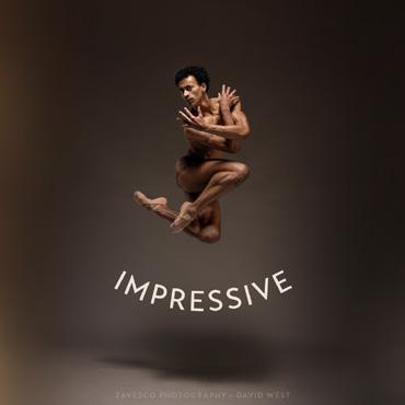
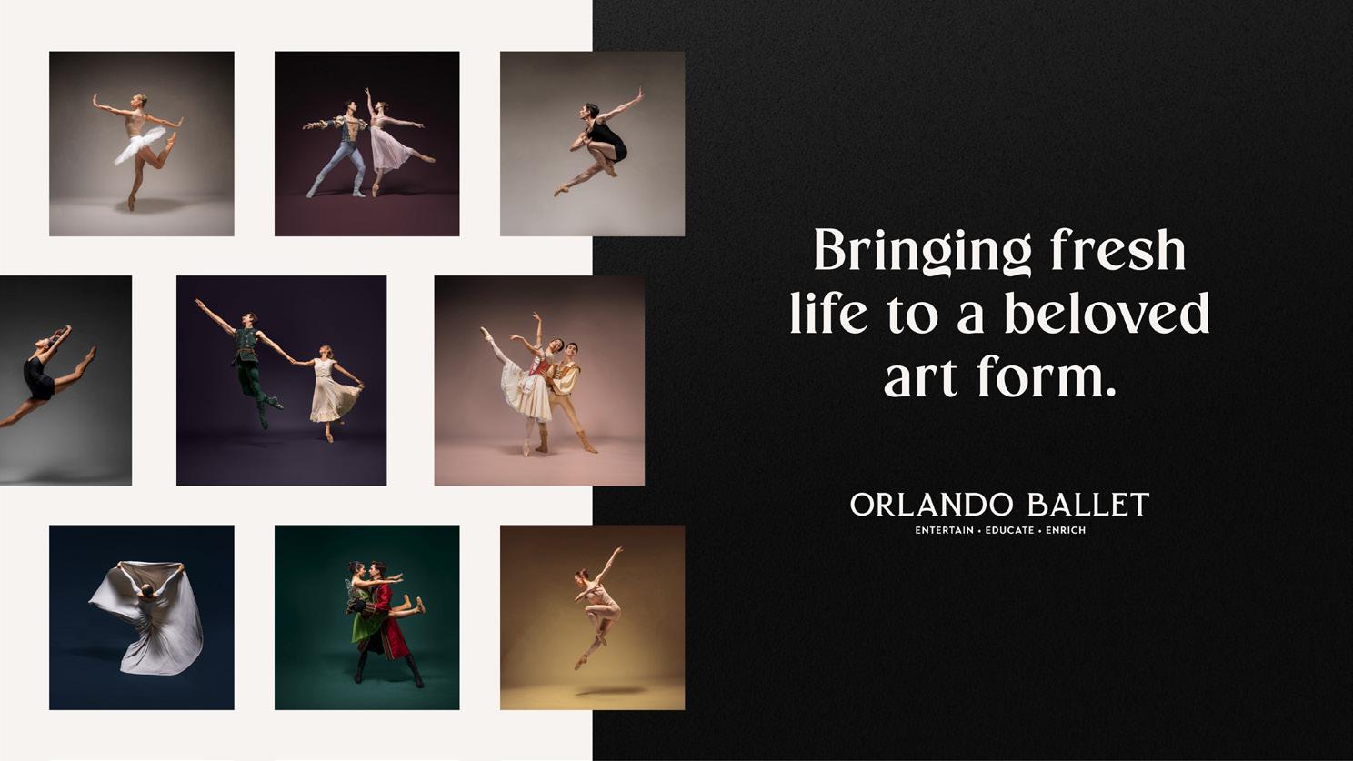
The primary principle for photography is “ballet first”� Candid photography should never look casual� It should always feel “premium” and evoke a sense of luxury and elegance
At time lighting will come from multiple sources (A)� Contrast might be too high (B) Shadows might be too dark (C)� Extra arms or studio items might distract from the subject (D)�
Shadows and low-lights lightened (E)� Skin-tones preserved and evened out (F) Unnecessary items removed from the background� Depth of field effect added (G)� Floor texture softened/blurred (H)� Color grading adds warmth and subtle pink hues (I)
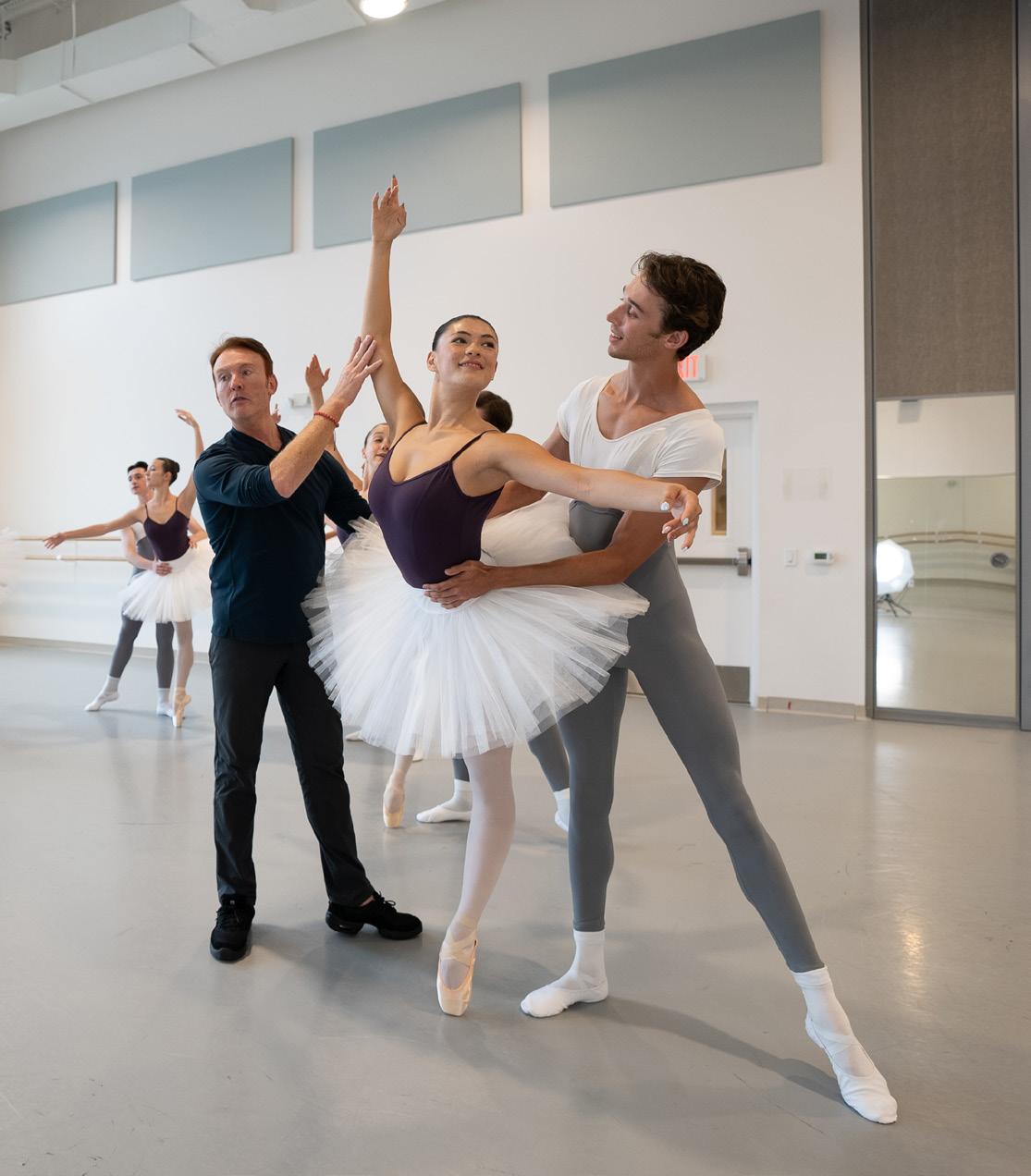

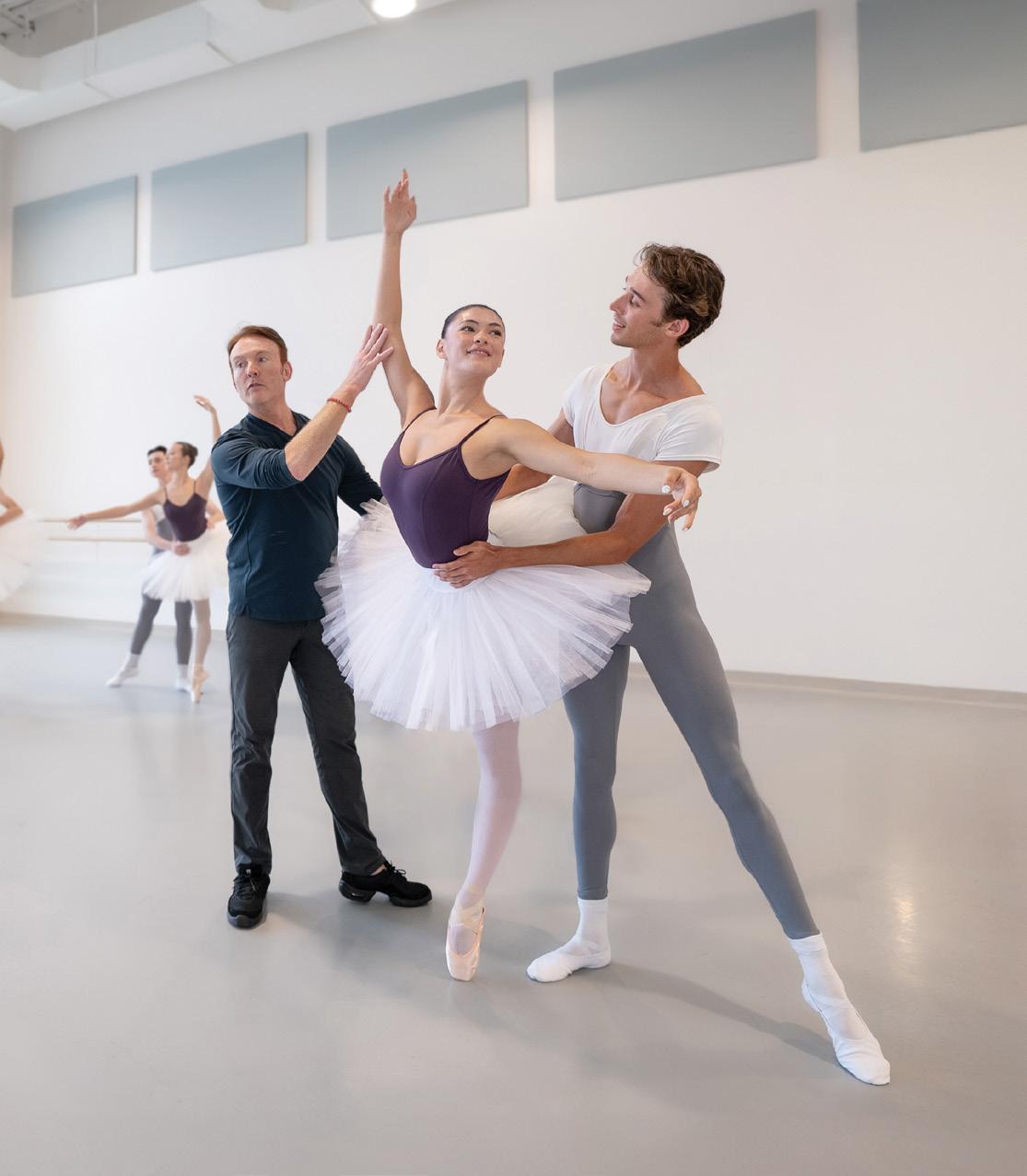
Studio lighting should always highlight the dancer and properly illuminate their faces
Even out skin tones and be sure dancer’s faces and limbs are well lit Remove blemishes� Remove wrinkles and scuff marks in the studio backdrop before generating more background�
Use generative fill to add in more background to photos Do not add in textures or overlays�
Add a color overlay to the background using a primary or secondary color� Very rarely use a tertiary color overlay Find a blending mode and make custom edits to ensure the color tone is rich, elegant and as close a match as possible to an approved brand color
The primary principle for photography is “ballet first”� Brand photography should always highlight the dancer and the perfection of their form
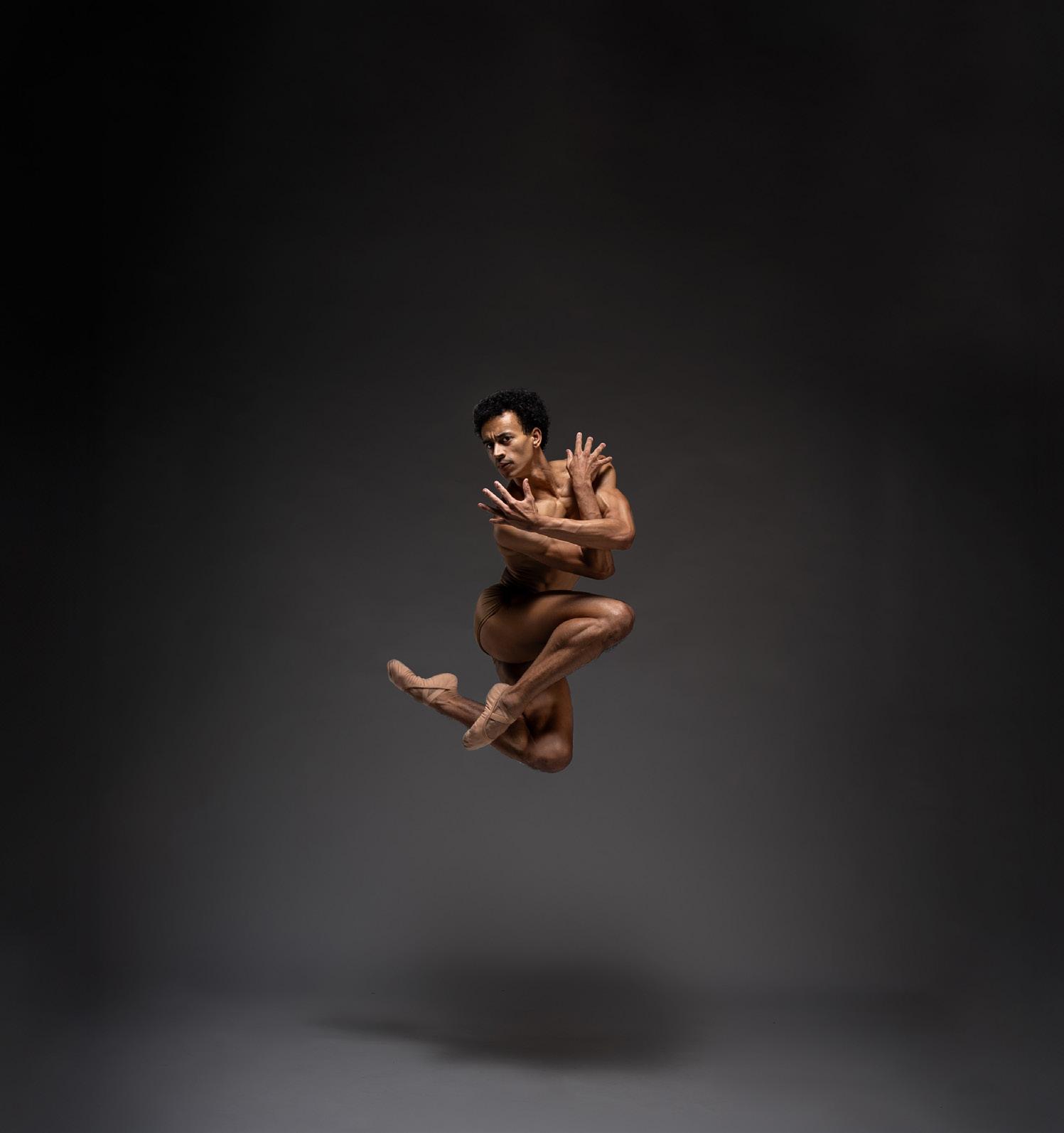
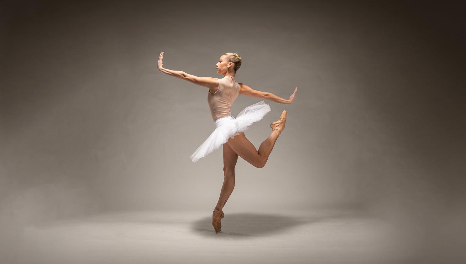
Spend extra time and care in making selections of the subject to ensure there is no color bleed and that the final photo does not look “choppy”�
Very rarely crop out arms, legs, hands, etc� At time is acceptable if the final media requires it and if the pose is more “character” focused and less “dance” focused
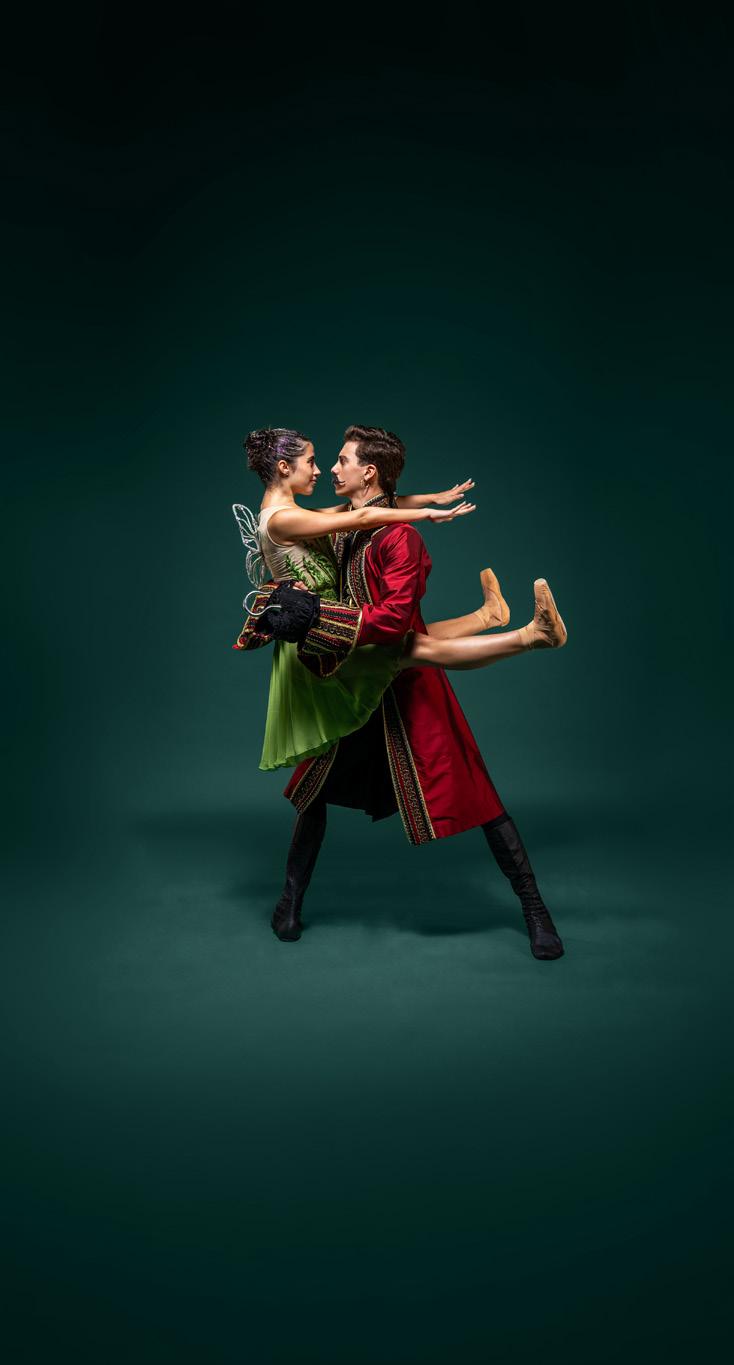
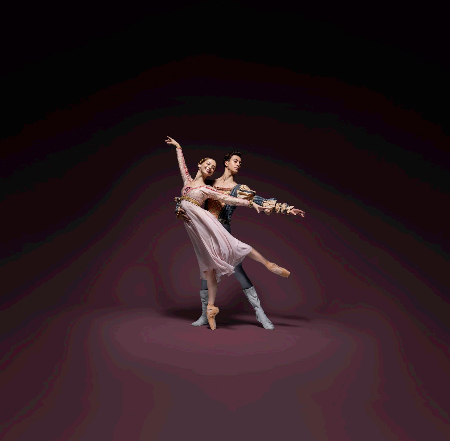
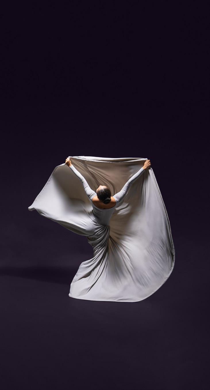
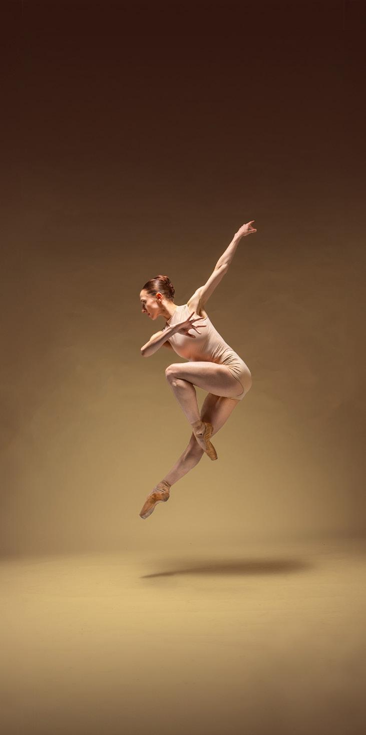
Photography credit must be included anywhere photography is used� The following guidelines dictate how to include this credit in all media
The approved order is: (Photographer Name) • (Dancer Name) • (Dancer Name)
• Always include two spaces in-between bullet points
• List female dancers first, followed by males (left to right)
• Always doublecheck spelling
• Always make text ALL CAPS (see below)
Transat Text Bold
All Caps Tracking: 80
EXAMPLE:
ISRAEL ZAVALETA ESCOBEDO PHOTOGRAPHY DANCER NAME
PLACEMENT
Photography credit should be placed on top of the photo either in the bottom left corner, or bottom centered� Exceptions are acceptable depending on the context
Ensure the credit will not get cropped out in final product
Type color should be White Curtain Start with an opacity of 40% and adjust as necessary so that the credit is readable but not prominent
On light color backgrounds use Terre Beige and adjust opacity accordingly
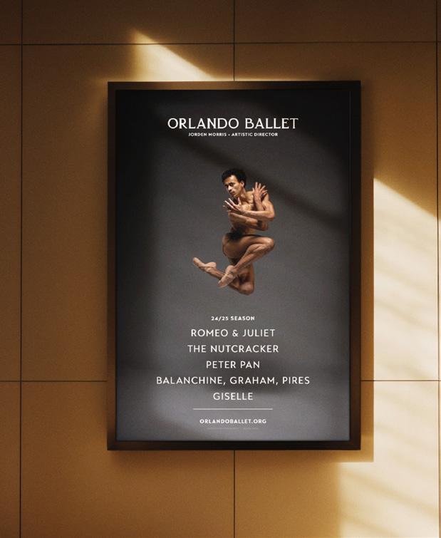
Negative space is the area of a page or design that is empty or has no content, such as the space between text, images, or graphics� It is an important design element that can help content stand out and make it easier to read�
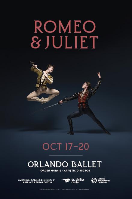
In this poster and billboard design, the text and logo are too large and crowded together� This results in a design that looks cluttered and cheap
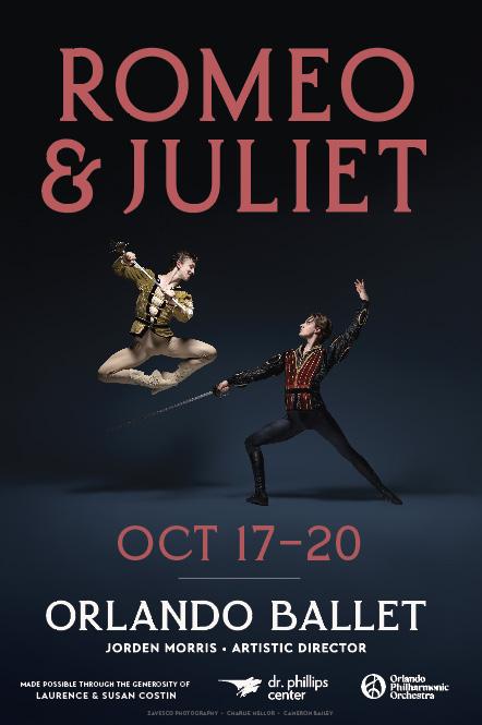

Here, a generous amount of negative space is given around each element� This allows for breathing room and makes it easier to read and find information� Type is still at a size that is easily read from a distance The result is more elevated and premium�

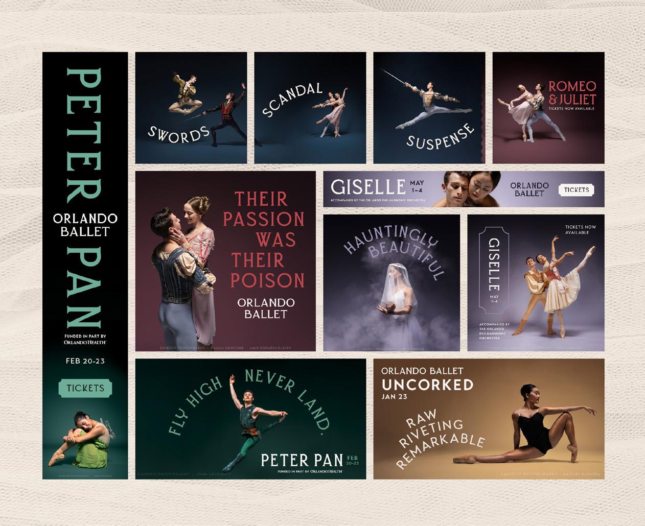
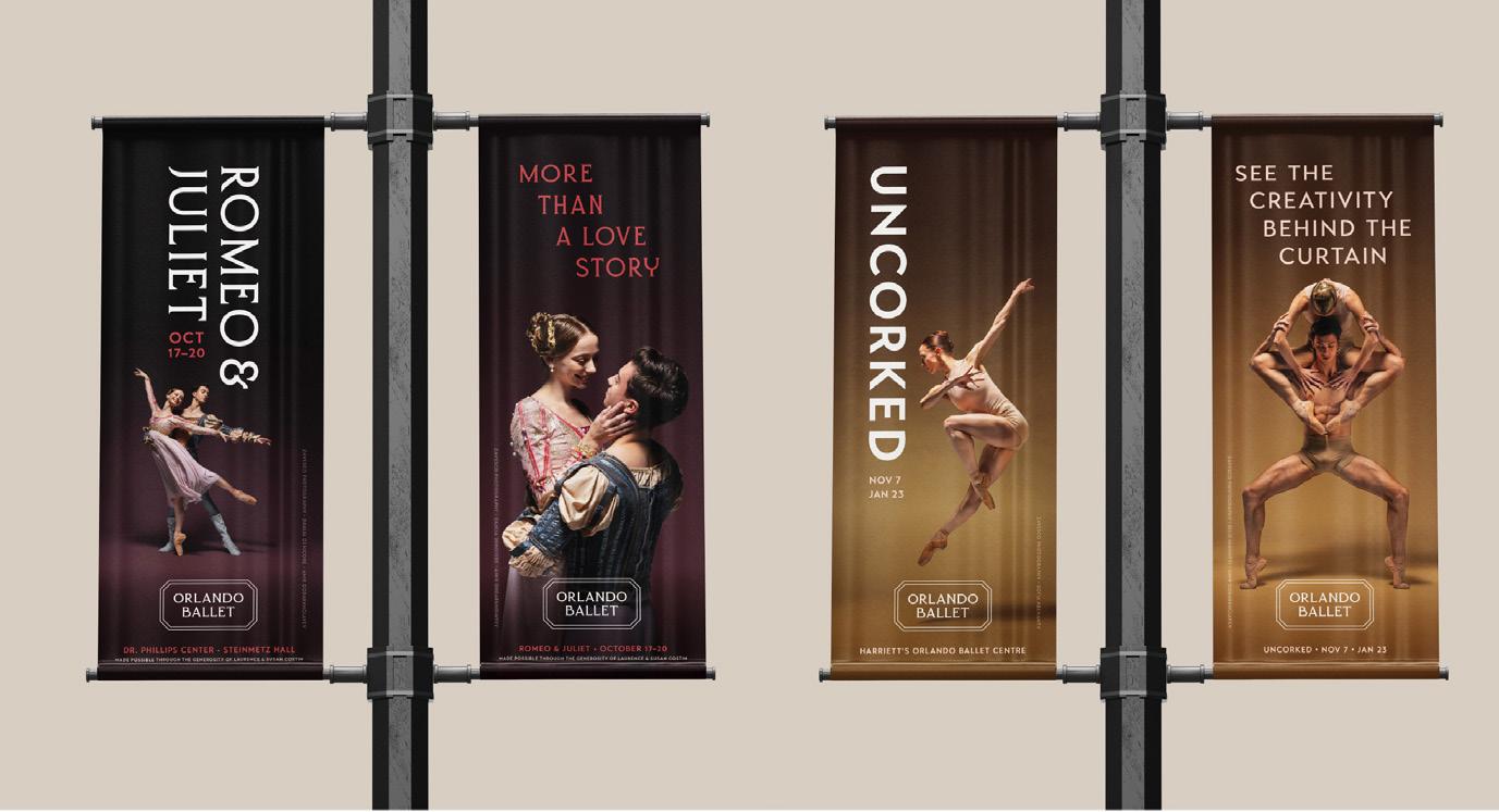
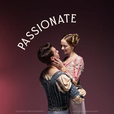
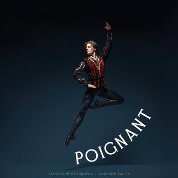
Season creative and mainstage productions tend toward the more expressive, and colorful, of the brand spectrum�
However great care should be taken to keep show marketing material and design cohesive with each other and the Orlando Ballet brand as a whole�
One primary, two secondary, one tertiary (used sparingly)
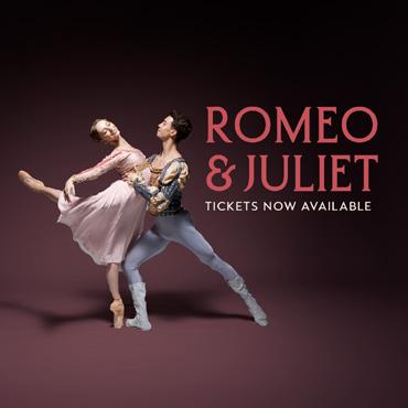
A color palette is created and used for each show, every season� These palettes should stand out from each other� Use primarily secondary colors and incorporate tertiary colors as an accent Examples below�

PETER PAN
One primary, two secondary, one tertiary (used sparingly)
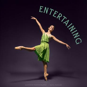
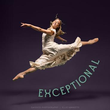
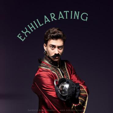

Two primary, one secondary, one tertiary (used sparingly)

Good typography can make designs more visually appealing, easier to read, and provide consistency across the brand� Use only the approved fonts in all visual communication
PRIMARY BRAND FONT
Transat Text Standard
Transat Text Medium
Transat Text Bold
Transat Text Black
Lorem ipsum dolor sit amet, consectetur adipiscing elit, sed do eiusmod tempor incididunt ut labore et dolore magna aliqua�
SHOW-SPECIFIC HEADLINES
Quirino (All Caps)
MODERN/SMALL STAGE SHOW HEADLINES
Transat Text Bold
Shows like Uncorked and others held on a smaller stage can use Transat Text Bold
USE QUIRINO PAIRED WITH TRANSAT TEXT FOR SHOW-SPECIFIC MATERIALS
The following are general principles to follow when choosing and pairing fonts�
NEVER PAIR QUIRINO WITH ERSTORIA
NEVER USE ERSTORIA WHEN PROMOTING SHOWS
Show-specific body copy is Transat Text Standard� Lorem ipsum dolor sit amet, consectetur adipiscing elit, sed do eiusmod tempor incididunt ut labore et dolore magna aliqua�
Good typography can make designs more visually appealing, easier to read, and provide consistency across the brand� Use only the approved fonts in all visual communication
CREATING SHOW TITLES
Quirino (All Caps)
Tracking: 40
Kerning: Optical (Manually adjust kerning so letters are evenly spaced)
Leading: 75% of type size
When displaying show headlines on an arch, always set type on a perfect circle� Ensure that the type is not on an oval or distorted in any way
Tracking should be slightly decreased to ensure letter-spacing looks correct
Consistent typesetting of dates and date ranges should be followed as outlined below� Reference the examples below to see how dates and show titles can be paired
SHOW TITLES PAIRED WITH DATES
If dates are paired closely with the show title, or part of a unit, the dates should always be in Transat Text Bold, tracking set to 80
• All Caps
• Three-letter abbreviation
• No period
• En-dash (–) with no spaces separating dates
FEB 20–22
MAY 1–4
DATE RANGE STANDARD
Always use show dates in the following format:
• All Caps
• Three-letter abbreviation
• No period
• En-dash (–) with no spaces separating dates
DATES APART FROM SHOW TITLES
If dates are separated from the show title, it may be set in Quirino All Caps, tracking set to 40�
FEB 20-22
ACKNOWLEDGMENTS & SPONSORSHIPS
Select shows have live music accompaniment such shows, follow the direction outlined below
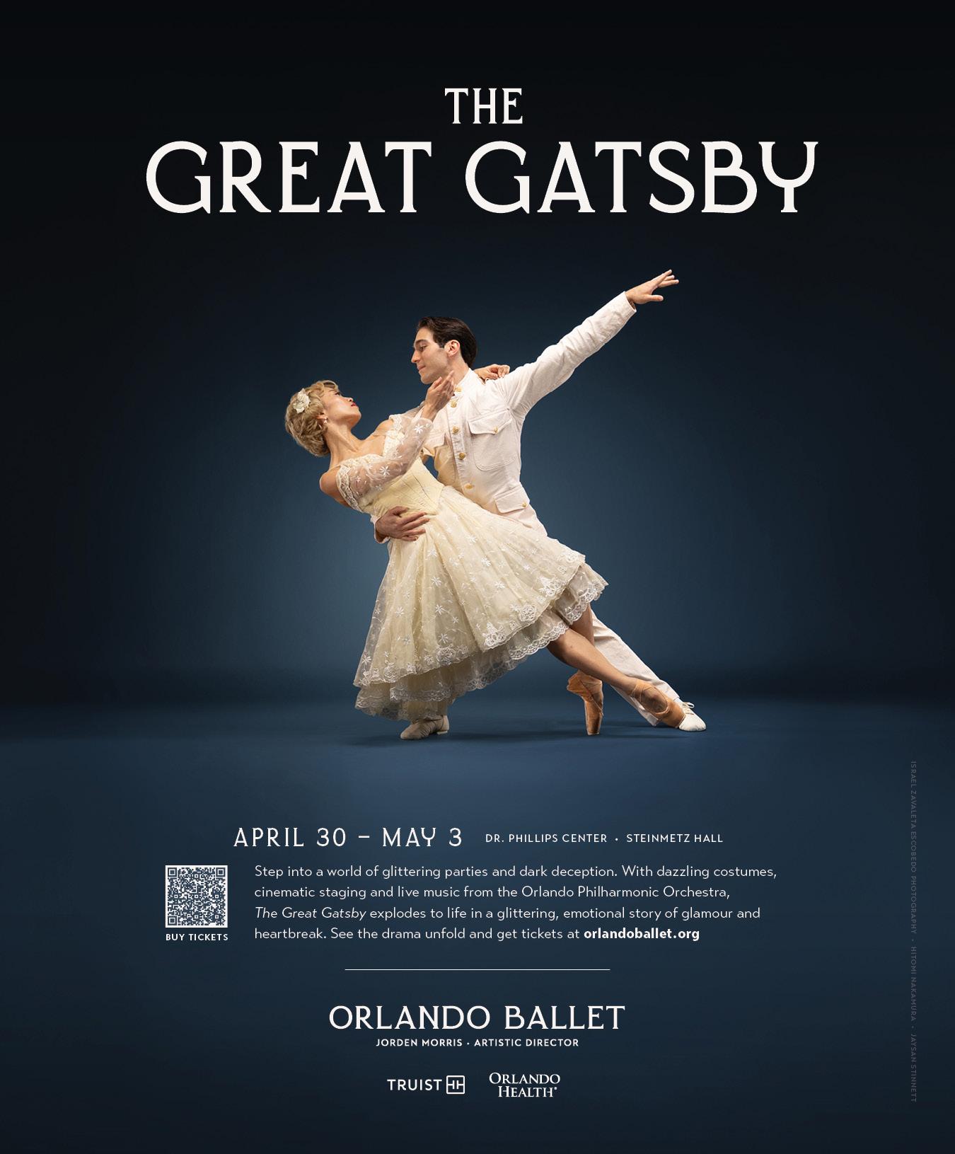
When shows include live music, all printed marketing materials should include the following wording, when possible:
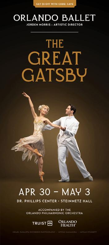
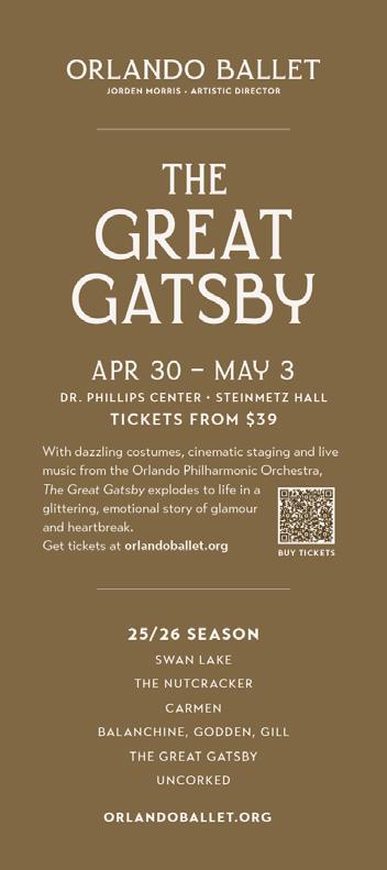
LIVE MUSIC FROM THE ORLANDO PHILHARMONIC ORCHESTRA
Transat Text Bold
All Caps Tracking: 80
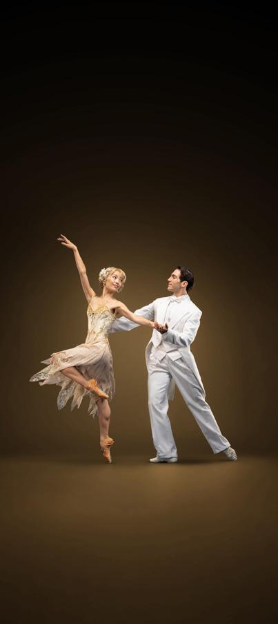
Dr Phillips Center should be written and placed above additional sponsor logos
The bottom of the poster is reserved for additional show sponsor logos and should not be paired with any non sponsor logos
EXAMPLES:
APR 30 – MAY 3
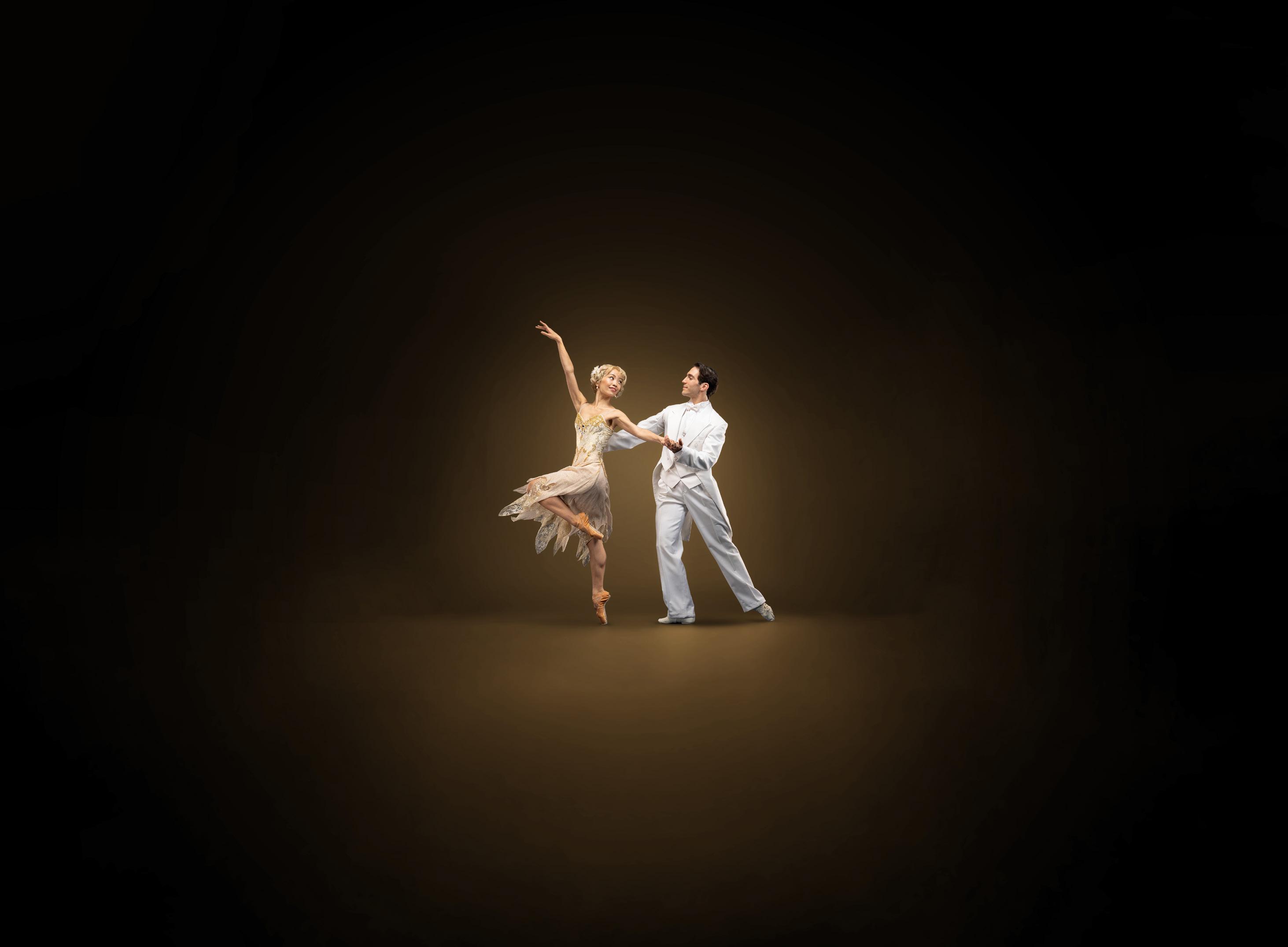
APR 30 – MAY 3
(BROUGHT TO YOU BY)
Part of show title lockup
The wording for sponsor recognition across all media should be consistent� This honors the sponsorship and harmonizes with the agreements made
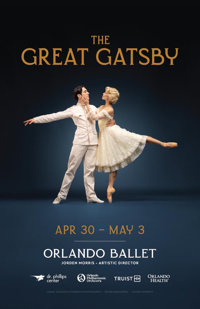
“BROUGHT TO YOU BY (SPONSOR)”
Only one sponsor may be displayed as a full sponsor
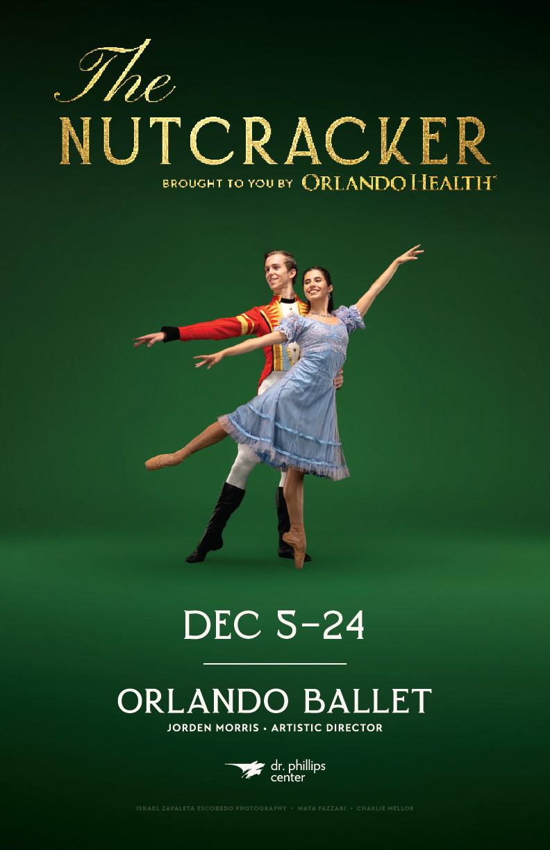
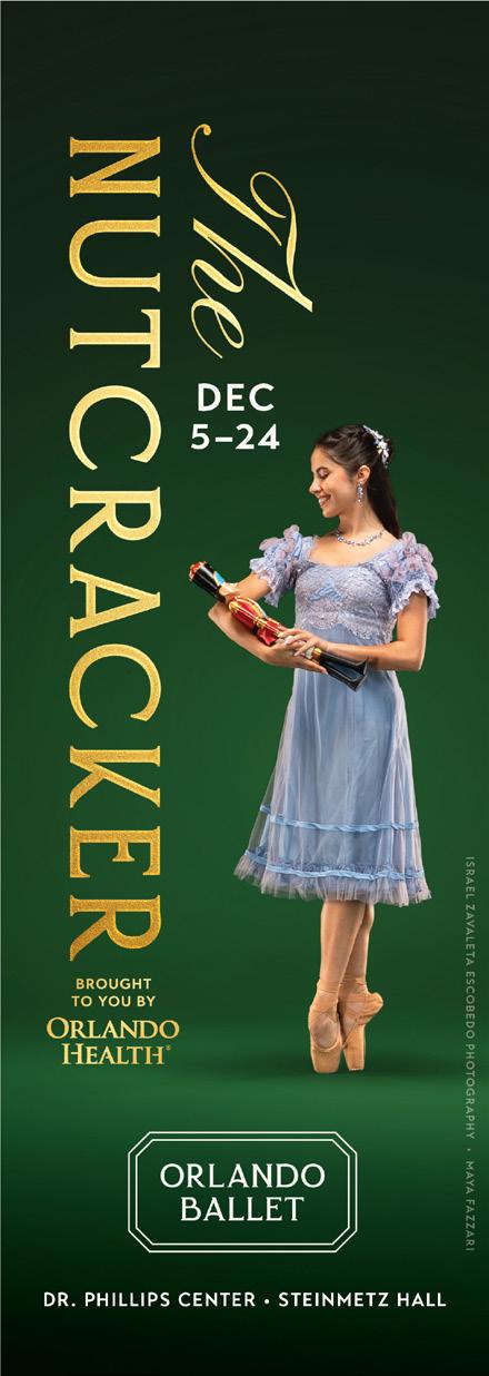
The wording for sponsor recognition across all media should be consistent� This honors the sponsorship and harmonizes with the agreements made
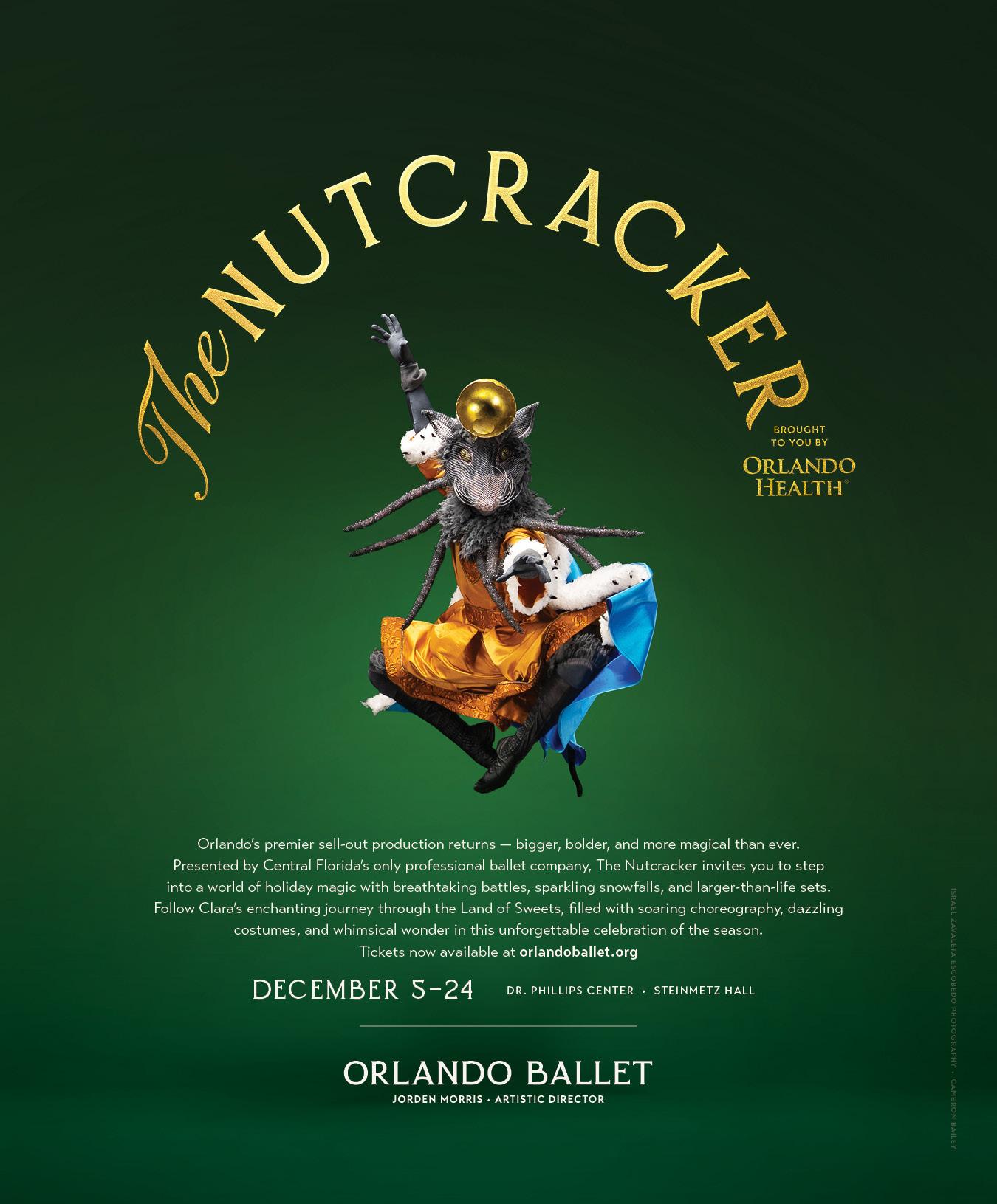
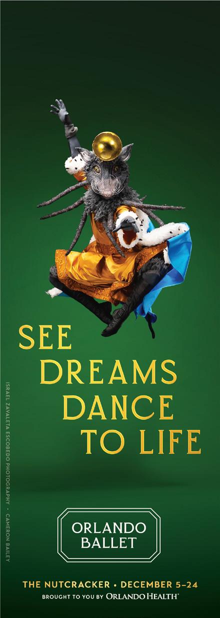
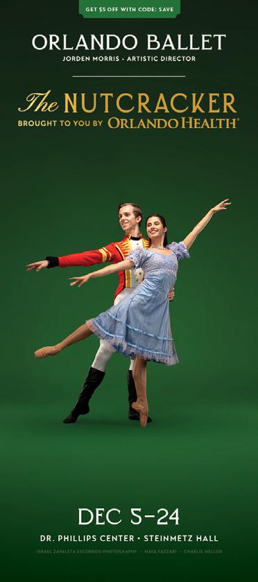
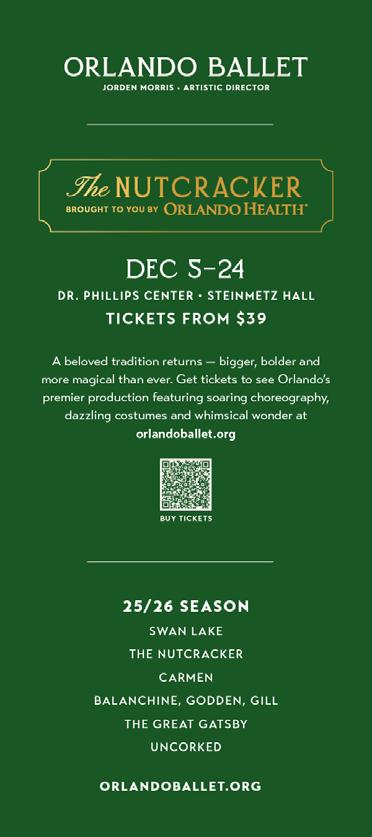
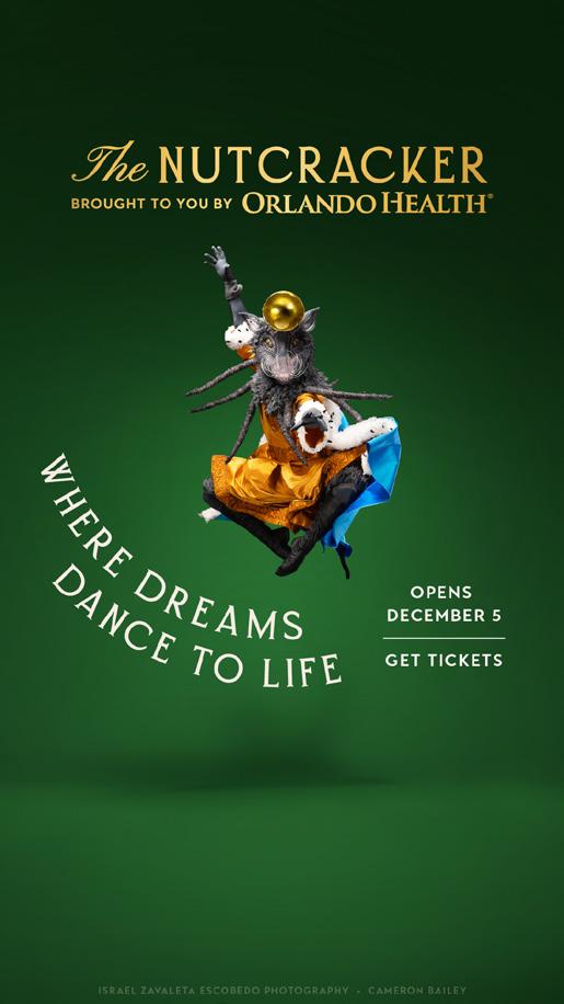
Digital Advertising Acknowledgment (in creative, select campaigns)

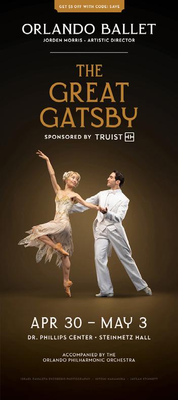
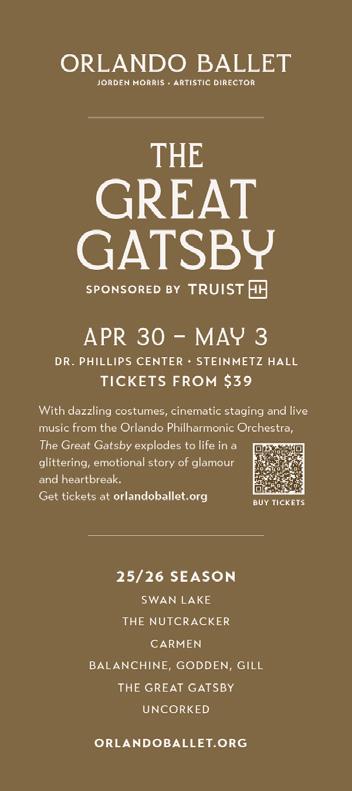
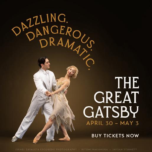
(SPONSORED BY)
Placed under show title
“SPONSORED BY (SPONSOR)”
The wording for sponsor recognition across all media should be consistent� This honors the sponsorship and harmonizes with the agreements made
Only one sponsor may be displayed under the show title per show
SPONSORED BY
SPONSORED BY
SPONSORED BY
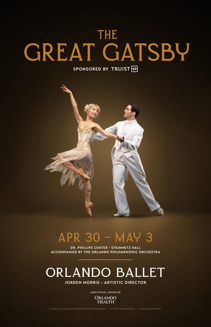
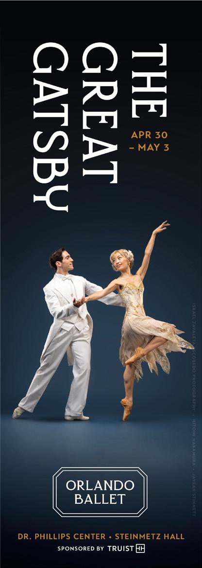
The wording for sponsor recognition across all media should be consistent This honors the sponsorship and harmonizes with the agreements made�
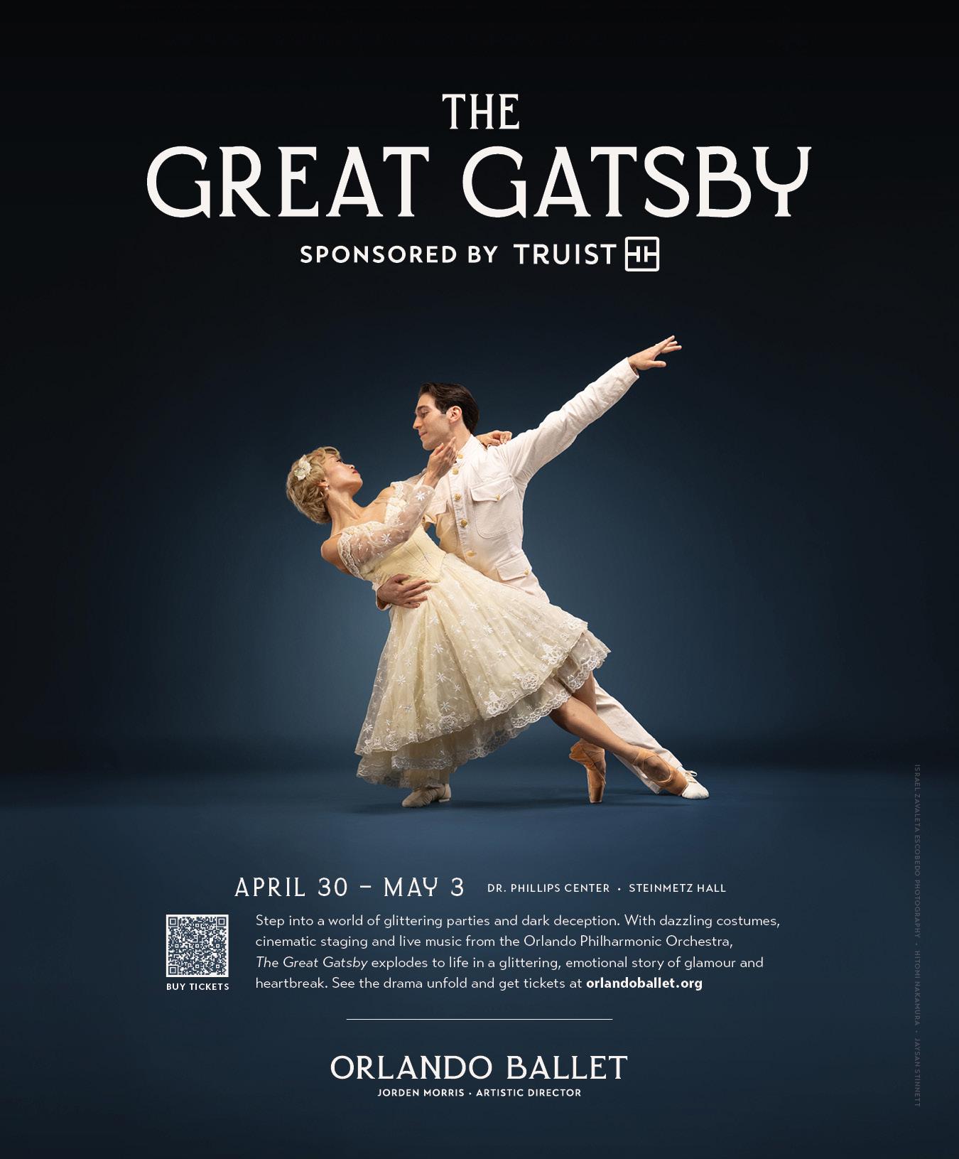
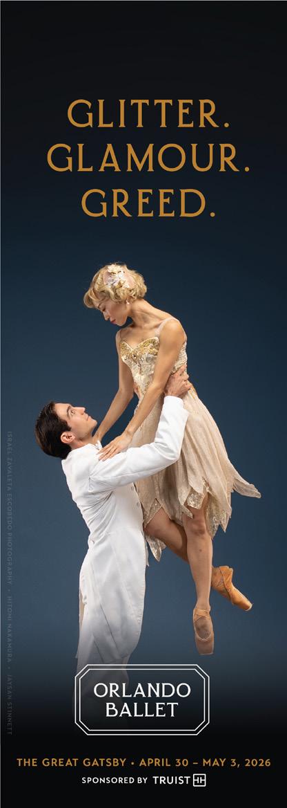
Digital Advertising
Acknowledgment (in copy only, select campaigns)

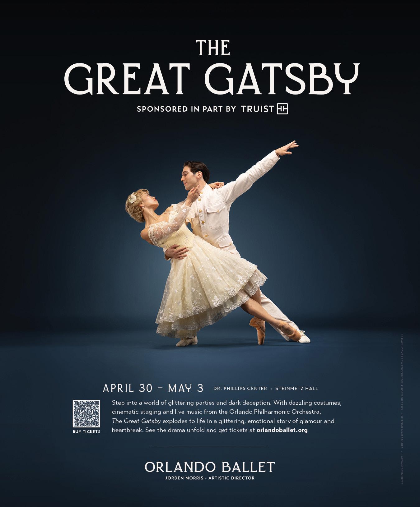
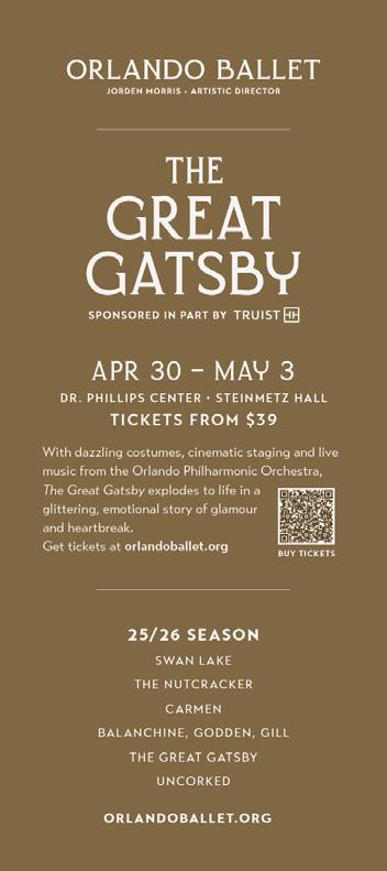
(SPONSORED IN PART BY)
Placed under show title
“SPONSORED IN PART BY (SPONSOR)”
The wording for sponsor recognition across all media should be consistent� This honors the sponsorship and harmonizes with the agreements made
Only one sponsor may be displayed under the show title per show�
IN PART BY
IN PART BY
IN PART BY
The wording for sponsor recognition across all media should be consistent� This honors the sponsorship and harmonizes with the agreements made





SHOW TITLE ACKNOWLEDGMENT
Not included at this level
The wording for sponsor recognition across all media should be consistent� This honors the sponsorship and harmonizes with the agreements made
The wording for sponsor recognition across all media should be consistent� This honors the sponsorship and harmonizes with the agreements made
PRIMARY STACKED
PRIMARY HORIZONTAL
Various logos have been created depending on the intended use�
STACKED LEFT
STACKED RIGHT
Various logos have been created depending on the intended use�
PRIMARY HORIZONTAL
PRESENTS
STACKED LEFT
STACKED RIGHT
Various logos have been created depending on the intended use�
PRIMARY HORIZONTAL
STACKED LEFT
STACKED RIGHT
PRIMARY HORIZONTAL
Various logos have been created depending on the intended use�
STACKED LEFT
STACKED RIGHT
PRIMARY HORIZONTAL
Various logos have been created depending on the intended use�
STACKED LEFT
STACKED RIGHT
Consistent use of brand colors boosts recognition and contributes to the brand personality� The following brand colors for Orlando Ballet Events contribute to its elevated look and feel
Warm beiges and “almost” black bring a sophisticated and luxurious feel to the Orlando Ballet Events brand
All main brand applications should stick with these neutral colors
TYPOGRAPHY
PRIMARY BRAND FONT
Transat Text Standard
Transat Text Medium
Transat Text Bold
Transat Text Black
HEADLINES - PRIMARY
Transat Text Bold
Tracking: 80pt
Good typography can make designs more visually appealing, easier to read, and provide consistency across the brand� Use only the approved fonts in all visual communication
Lorem ipsum dolor sit amet, consectetur adipiscing elit, sed do eiusmod tempor incididunt ut labore et dolore magna aliqua�
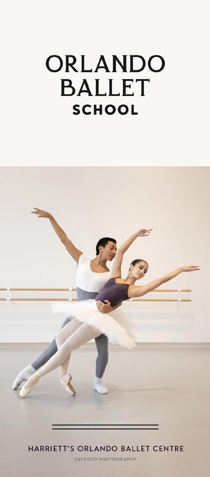
The Orlando Ballet School does not depart greatly from the primary brand� It gets a distinct logo and a restricted color system to help differentiate it when needed� Ultimately, the school and company are one� The school brand tends toward functionality, and highlighting the skill and expertise of the students, instructors and staff�
The Orlando Ballet School logo is a simple variation of the primary logo�
SCHOOL LOGO - STACKED
The logo variations for Orlando Ballet School�
SCHOOL LOGO - HORIZONTAL
SCHOOL LOGO - STACKED WHITE CURTAIN
SCHOOL LOGO - HORIZONTAL WHITE CURTAIN
The same primary colors are used for Orlando Ballet and Orlando Ballet School� The School palette leans much more heavily into the light neutrals�
All School brand applications should gravitate toward these light neutrals and may incorporate one accent color as-needed�
Consistent use of brand colors boosts recognition and contributes to the brand personality� The following brand colors for Orlando Ballet School contribute to its elevated look and feel
Several main brand colors are dropped from the color palette and are to be reserved for the primary Orlando Ballet brand only
These accent colors are to be used sparingly and primarily to differentiate the various School programs
Endeavor to use only one accent color at a time, paired with the primary neutral color palette
Good typography can make designs more visually appealing, easier to read, and provide consistency across the brand� Use only the approved fonts in all visual communication
PRIMARY BRAND FONT
Transat Text Standard
Transat Text Medium
Transat Text Bold
Transat Text Black
Lorem ipsum dolor sit amet, consectetur adipiscing elit, sed do eiusmod tempor incididunt ut labore et dolore magna aliqua�
HEADLINES - PRIMARY
Transat Text Bold
Tracking: 80pt
DO NOT USE ERSTORIA FOR ORLANDO BALLET SCHOOL
The following are general principles to follow when choosing and pairing fonts for Orlando Ballet School�
BOLDER USE OF TRANSAT
Orlando Ballet School brand materials use Transat Text Bold exclusively in headlines
Stacking headlines is part of the design elements as it creates negative space and gives a luxury feel
Body copy is Transat Text Standard� Lorem ipsum dolor sit amet, consectetur adipiscing elit, sed do eiusmod tempor incididunt ut labore et dolore magna aliqua�
CALLOUTS AND SPECIAL TEXT CAN BE ALL CAPS TRANSAT TEXT BOLD, TRACKING SET TO 80
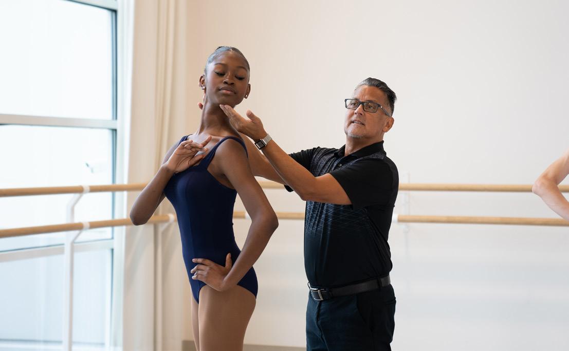
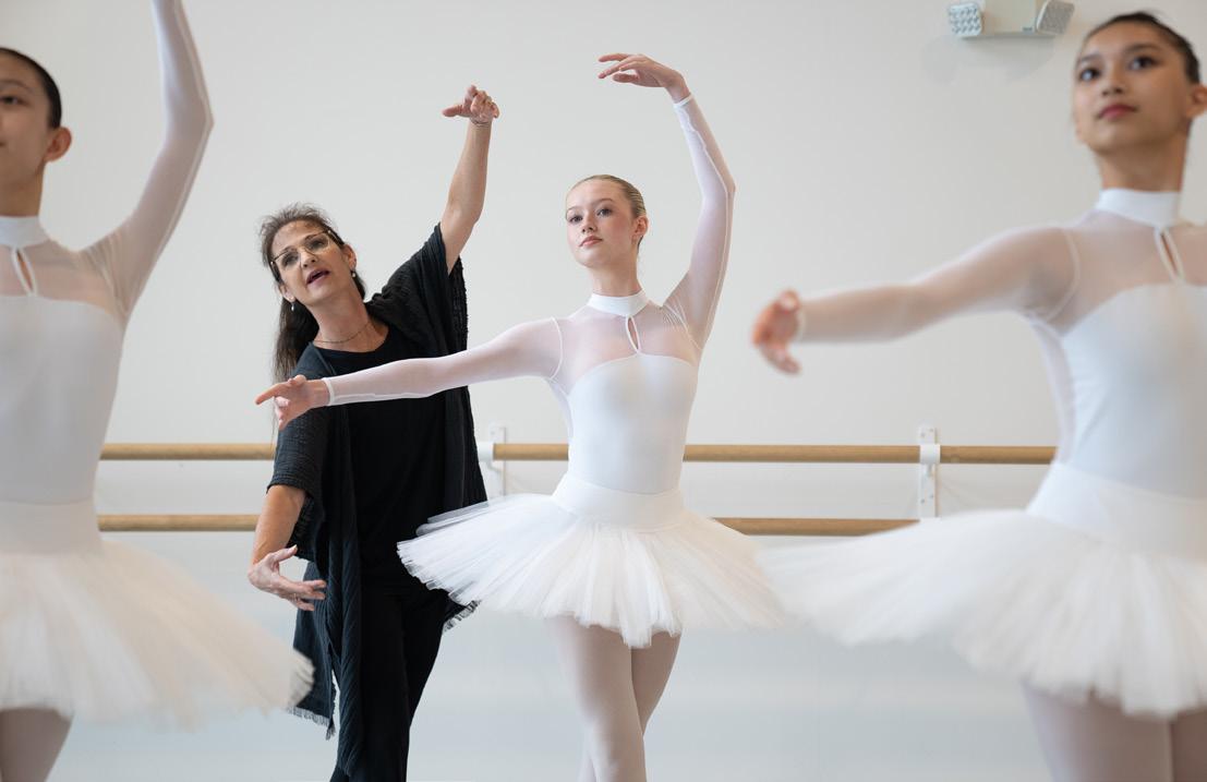
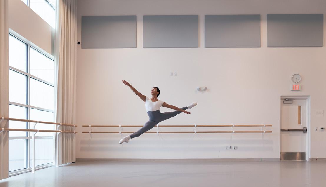
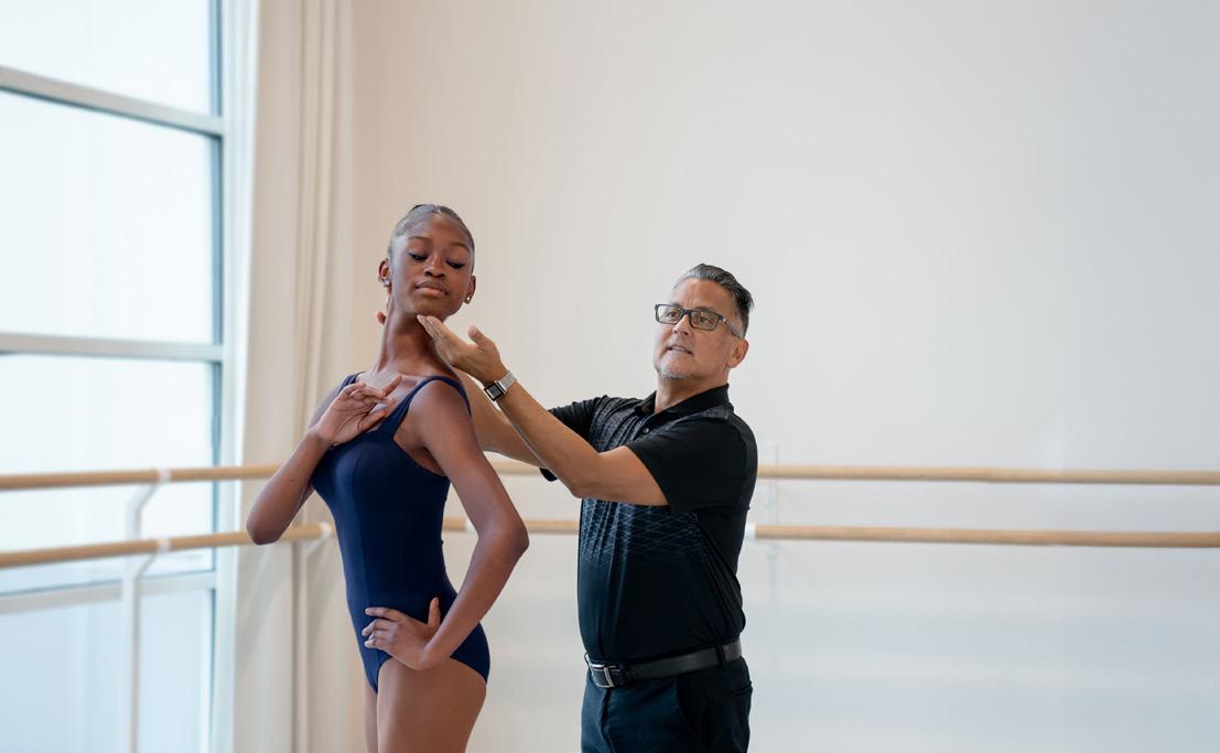
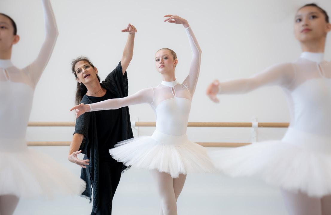
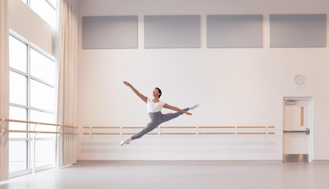
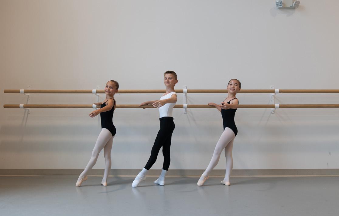
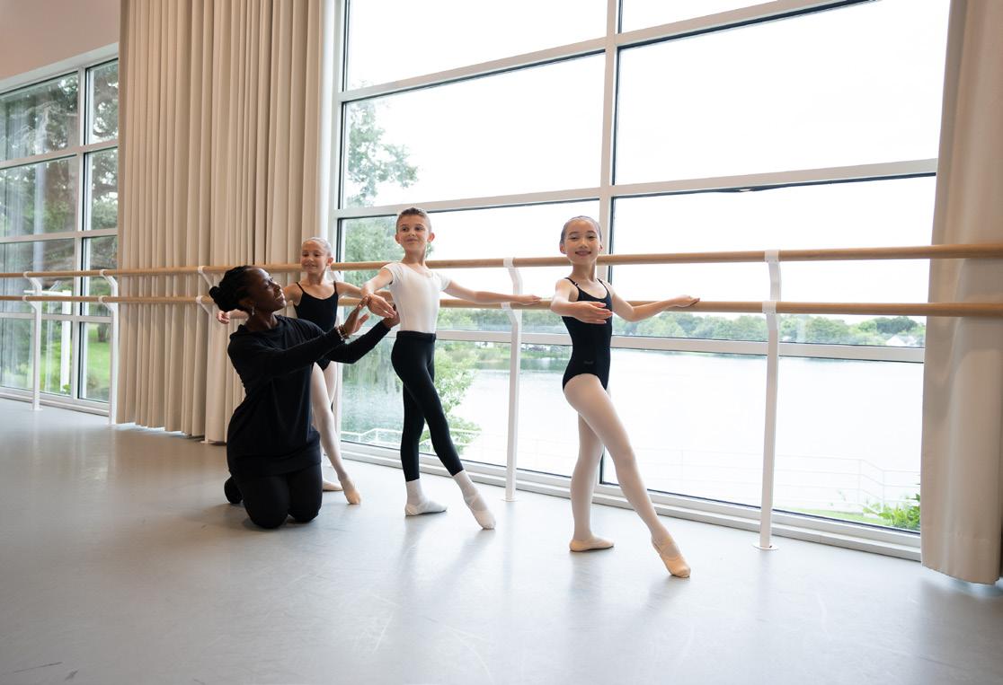
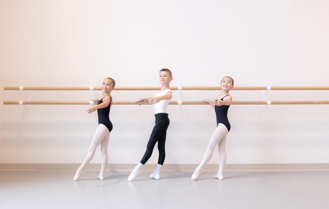
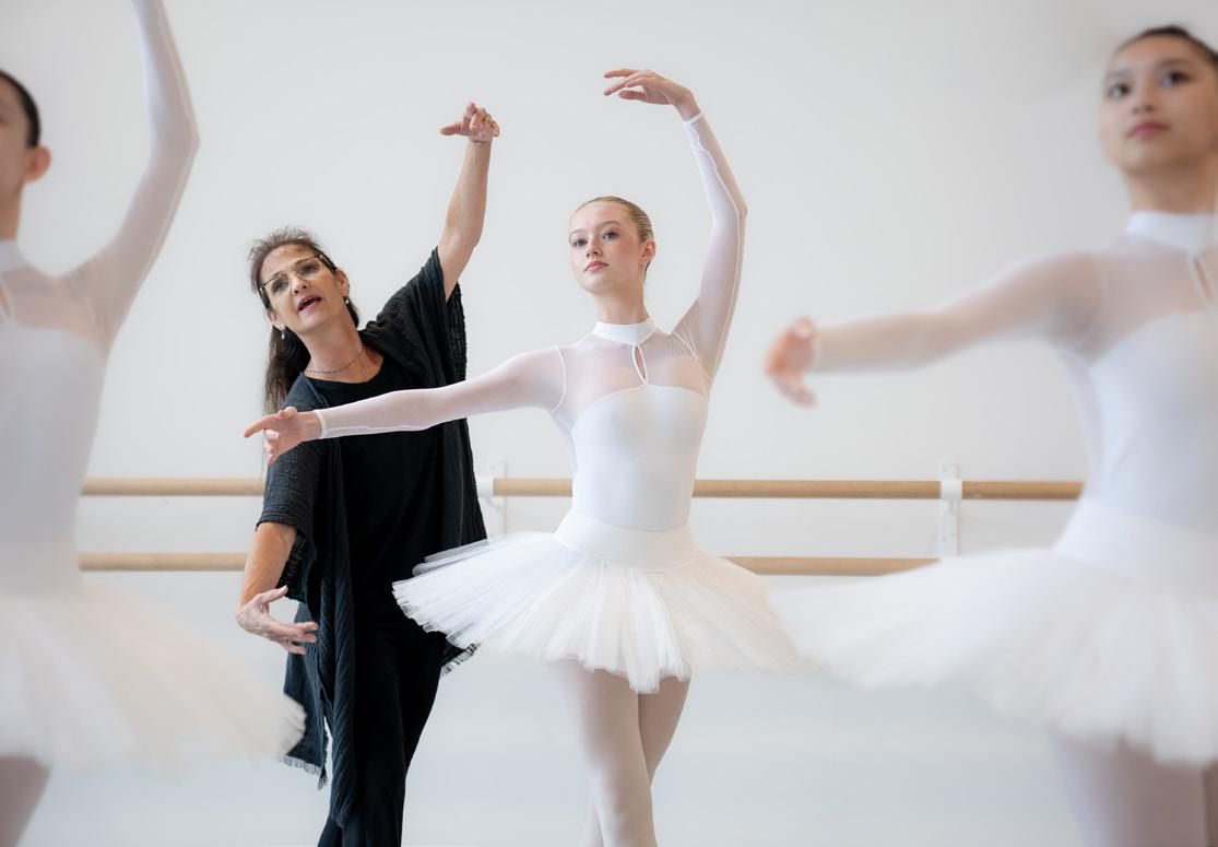
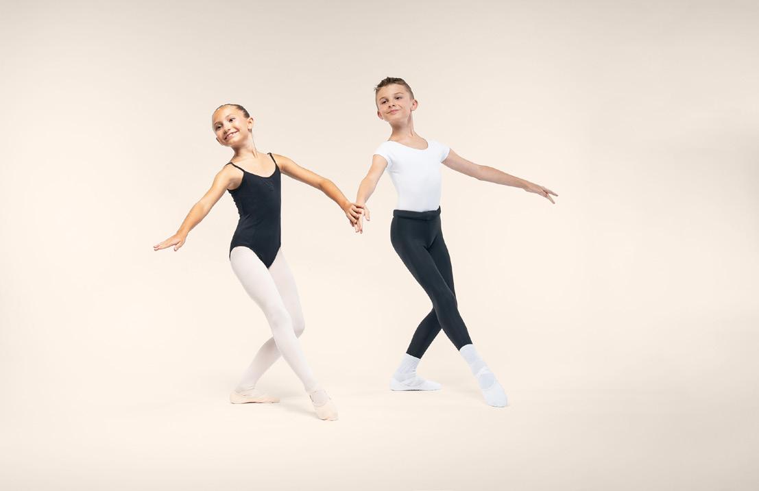
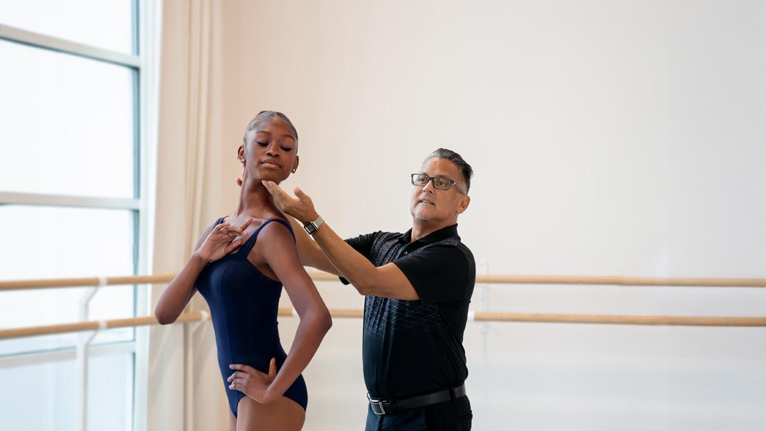
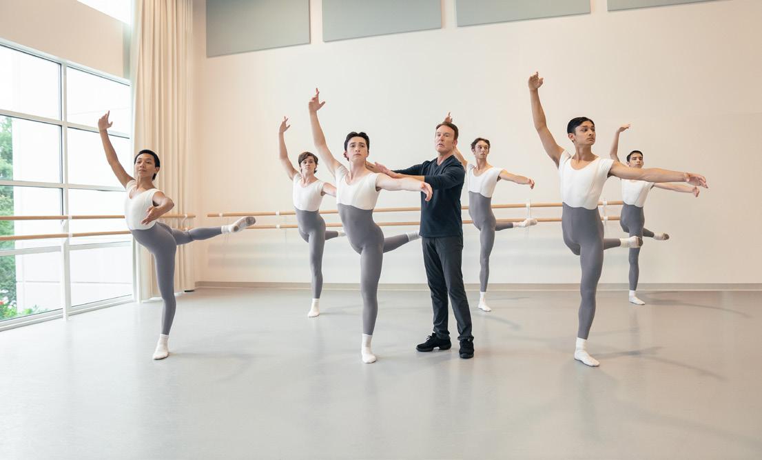
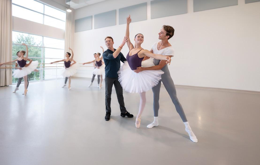
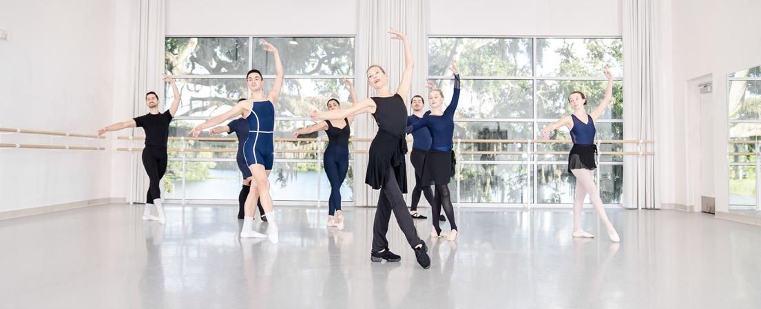
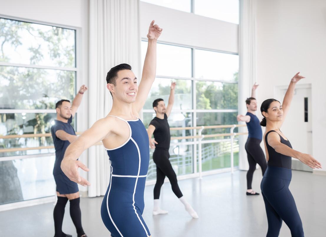
Use natural lighting whenever possible The look should be light, bright and crisp�
Eliminate imperfections in the subjects and backgrounds� Remove blemishes and items in the studio that detract from the “clean look”� (i e fire alarms, scuffs, electrical panels)
Ensure the background is clean and devoid of distracting elements� Do not shoot too many subjects “layered” on top of each other�
Edit studio shots so that background is bright, neutral, and highlights the perfect form of the dancers�
Keep use of studio photography for Orlando Ballet School very limited
The following principles should guide the photography choices for the Orlando Ballet School�

DO’S AND DON’TS
1 Avoid overly staged posing and facial expressions
2� Avoid flat, cool lighting and using too many colors
3� Avoid photographs with no focal point or negative space
4� Avoid unflattering positions
5� Convey camaraderie, joy and a sense of community
6� Lighting and mood should lean toward dramatic while staying warm and accessible
7 Use focus and depth of field to hone-in on individuals
8 Shoot in both landscape and portrait orientation and include adequate negative space
9� Dramatic, colored lighting evokes a vibrant and fun atmosphere
10 Find opportunities to capture movement, blur and genuine expressions
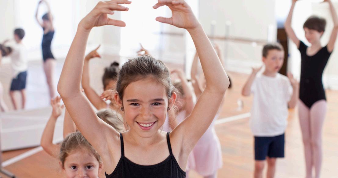
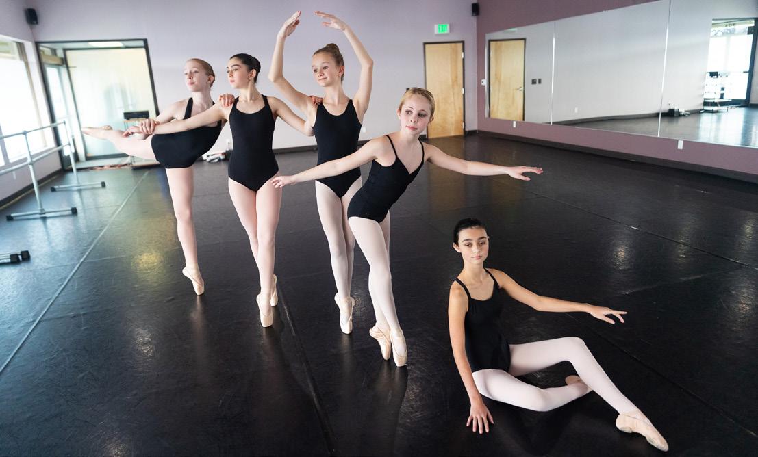
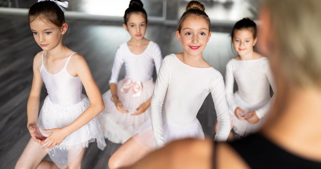
Use natural lighting whenever possible The look should be light, bright and crisp�
Eliminate imperfections in the subjects and backgrounds� Remove blemishes and items in the studio that detract from the “clean look”� (i e fire alarms, scuffs, electrical panels)
Ensure the background is clean and devoid of distracting elements� Do not shoot too many subjects “layered” on top of each other�
Edit studio shots so that background is bright, neutral, and highlights the perfect form of the dancers�
Keep use of studio photography for Fitness Thru Dancel very limited
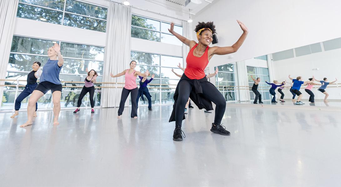
The following principles should guide the photography choices for Fitness Thru Dance�
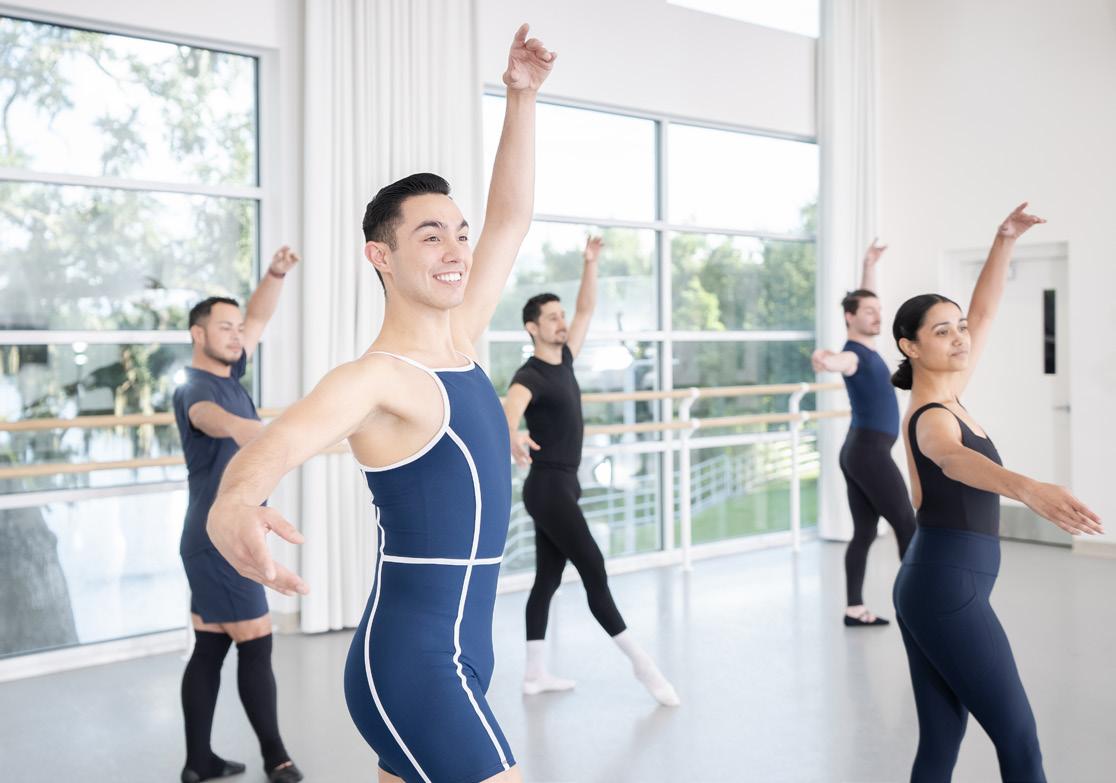
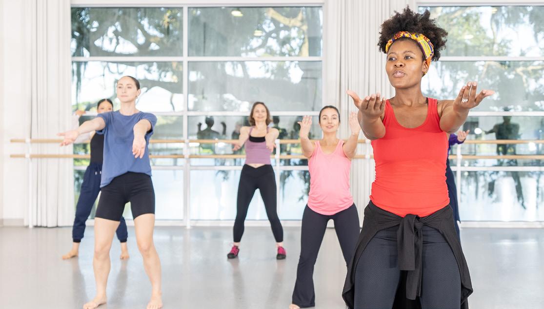
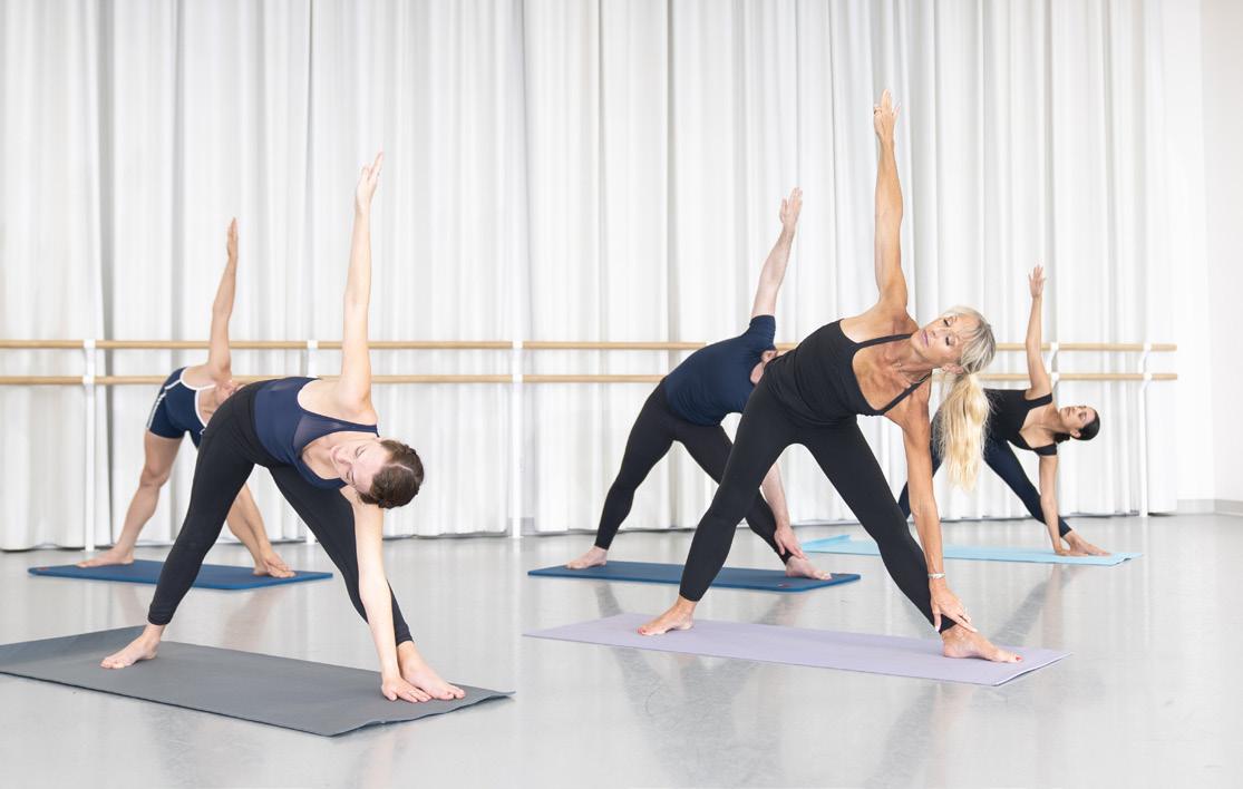
DO’S AND DON’TS
1� Avoid overly staged posing and facial expressions
2� Avoid flat, cool lighting and using too many colors
3� Avoid photographs with no focal point or negative space
4 Avoid unflattering positions
5� Convey camaraderie, joy and a sense of community
6 Lighting and mood should lean toward dramatic while staying warm and accessible
7 Use focus and depth of field to hone-in on individuals
8 Shoot in both landscape and portrait orientation and include adequate negative space
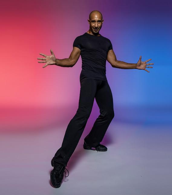
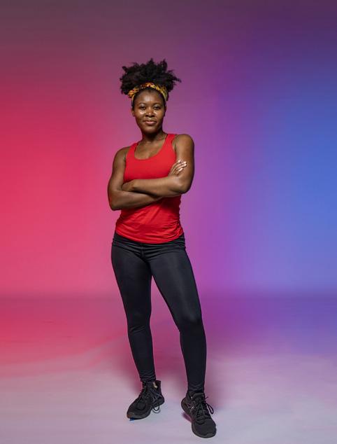
9 Dramatic, colored lighting evokes a vibrant and fun atmosphere
10 Find opportunities to capture movement, blur and genuine expressions

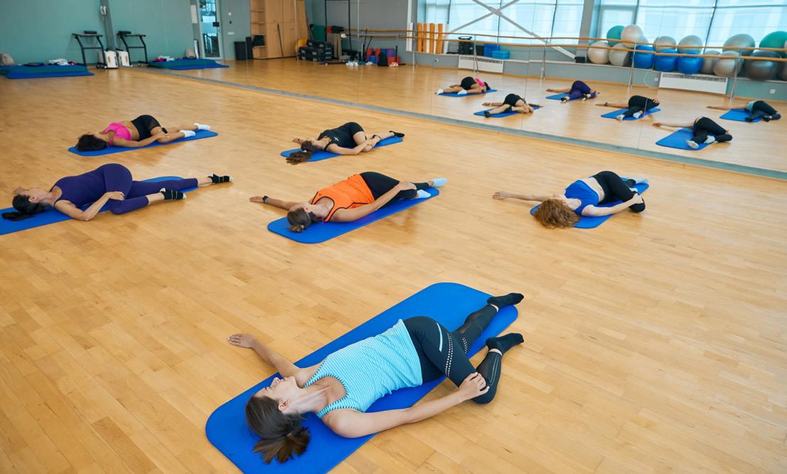

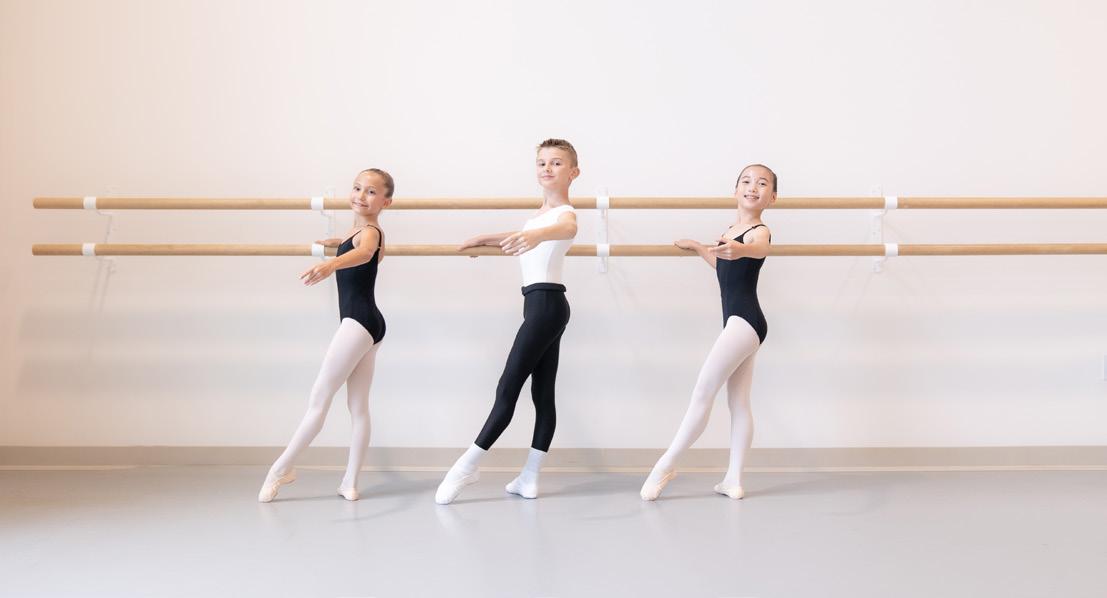
The individual programs offered by Orlando Ballet School each have unique wordmarks and accent colors� Only used approved wording, logos and colors as indicated here
WORDMARK - PRIMARY
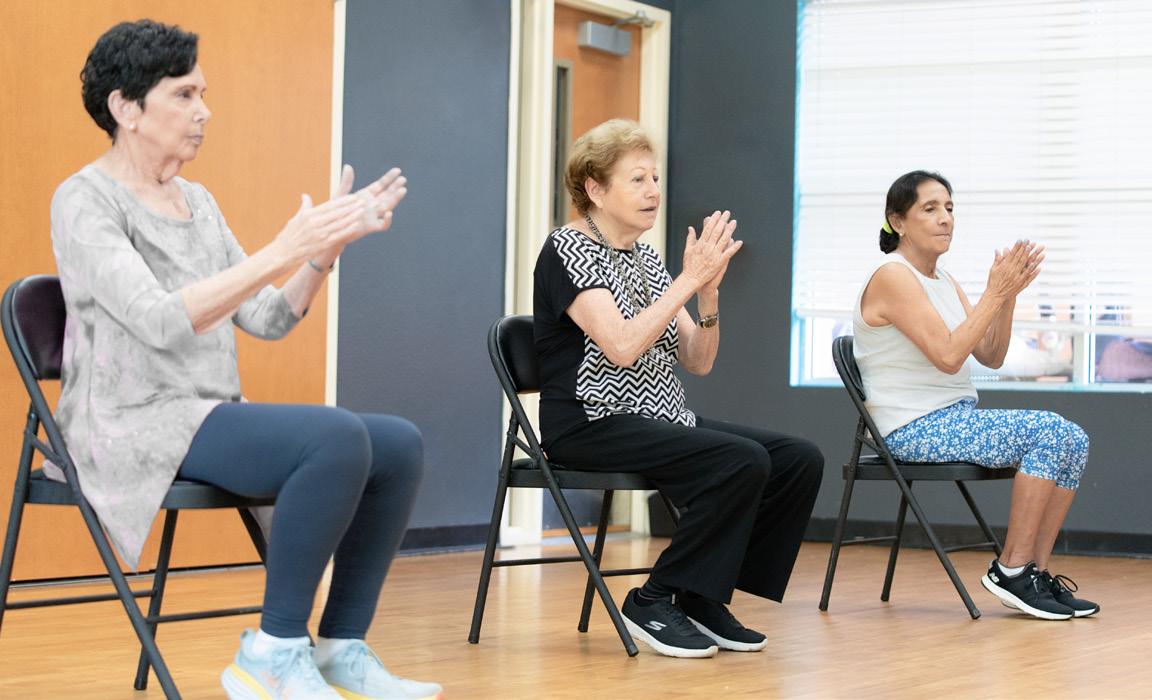
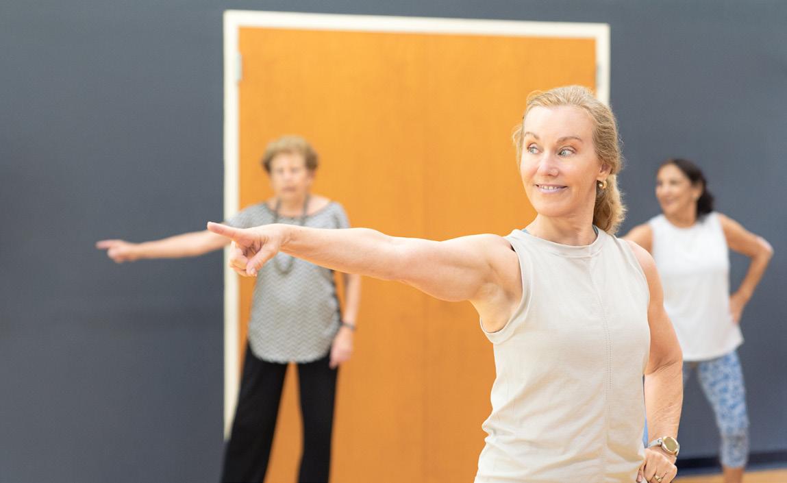
PHOTOGRAPHY EXAMPLES
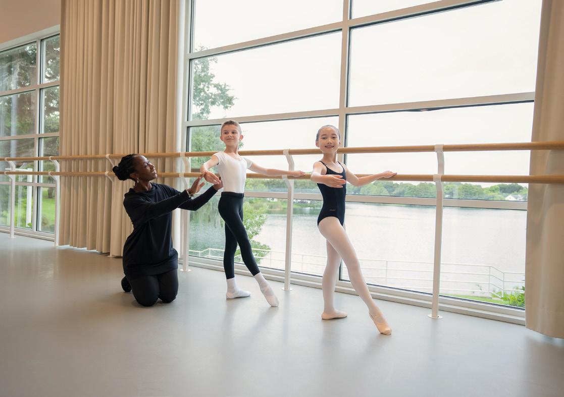
LAVENDER
CMYK 8-11-0-28 RGB 164-156-84
HEX #A49CB8
WORDMARK - HORIZONTAL
WORDMARK - PRIMARY
PHOTOGRAPHY EXAMPLES
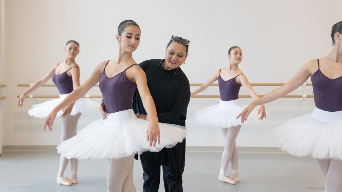
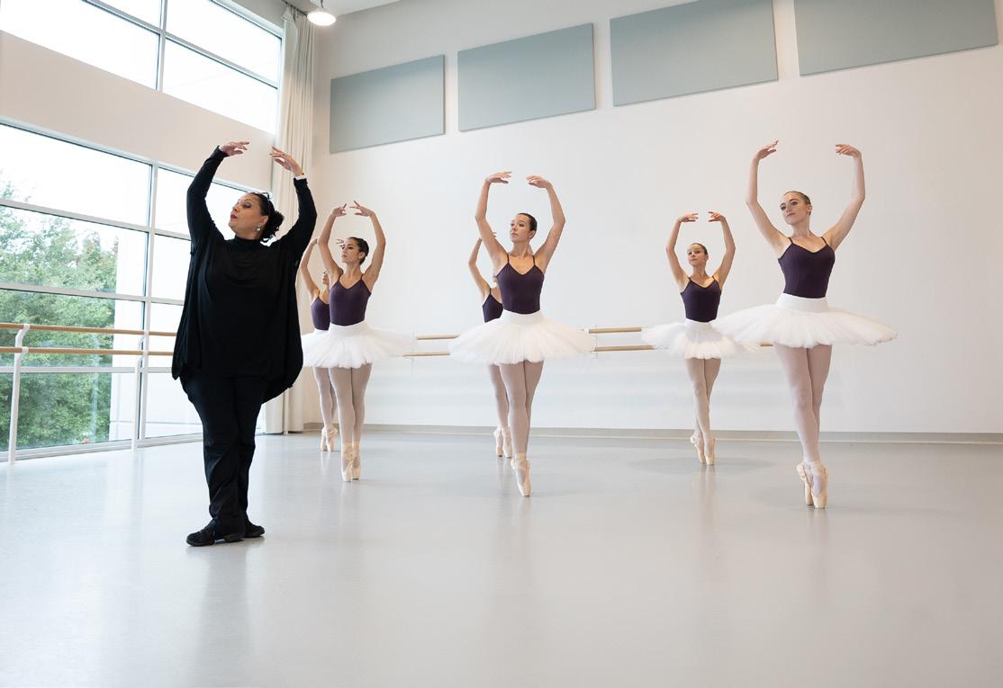
WORDMARK - HORIZONTAL
WORDMARK - PRIMARY
PHOTOGRAPHY EXAMPLES
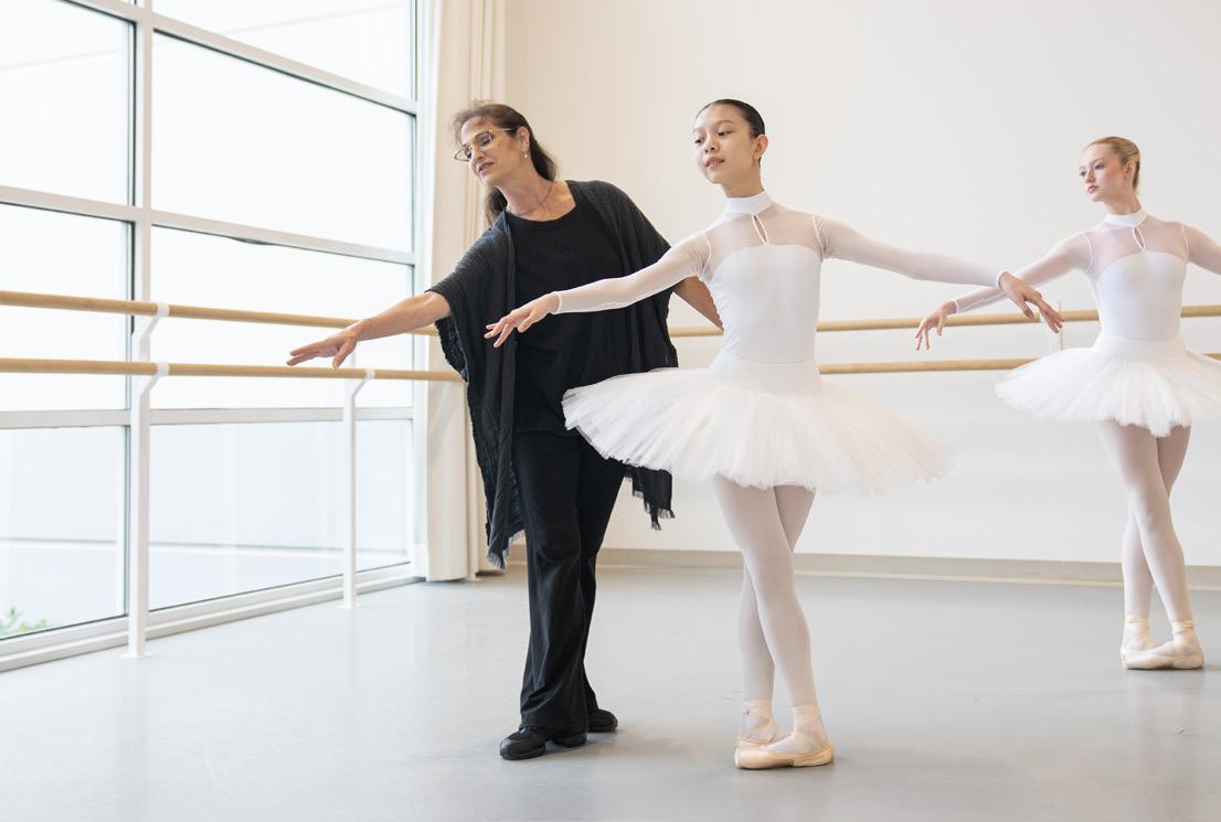
WORDMARK - HORIZONTAL
WORDMARK - PRIMARY
PHOTOGRAPHY EXAMPLES
WORDMARK - HORIZONTAL
WORDMARK - PRIMARY
84-55-0-0 RGB 31-113-193
WORDMARK - HORIZONTAL
PHOTOGRAPHY EXAMPLES
SATELLITE SESSIONS
WORDMARK - PRIMARY
FITNESS THR U D ANCE
SATELLITE SESSIONS
ORL AND O
BA LLE T SCHOOL
PHOTOGRAPHY EXAMPLES ACCENT COLOR
WORDMARK - HORIZONTAL
SATELLITE SESSIONS
ORL ANDO BA LLE T SCHOOL
WORDMARK - PRIMARY
FITNESS THR U D ANCE
C OMMUNIT Y PR OGRA M
ORL AND O
BA LLE T SCHOOL
PHOTOGRAPHY EXAMPLES ACCENT COLOR
WORDMARK - HORIZONTAL
C OMMUNIT Y PR OGRA M
ORL ANDO BA LLE T SCHOOL
WORDMARK - PRIMARY
WORDMARK - HORIZONTAL
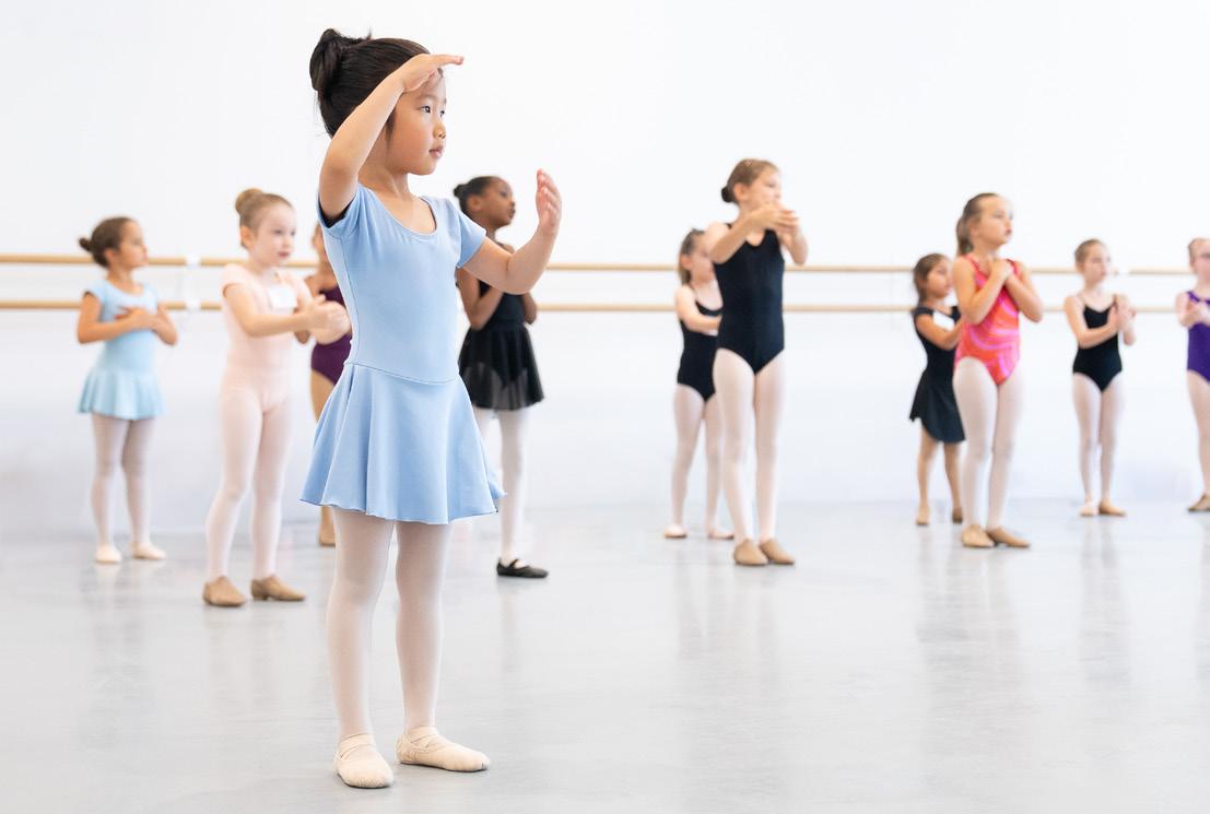
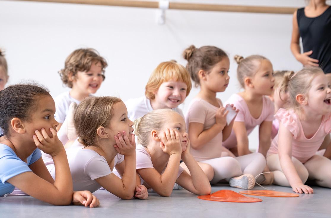
PHOTOGRAPHY EXAMPLES
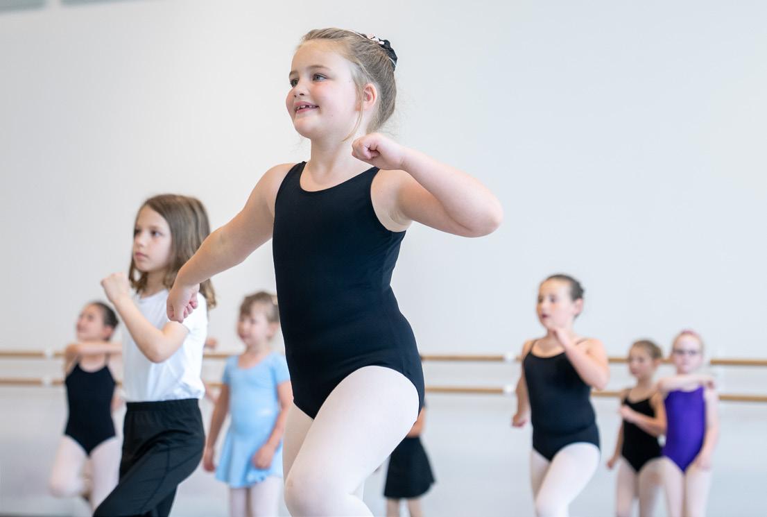
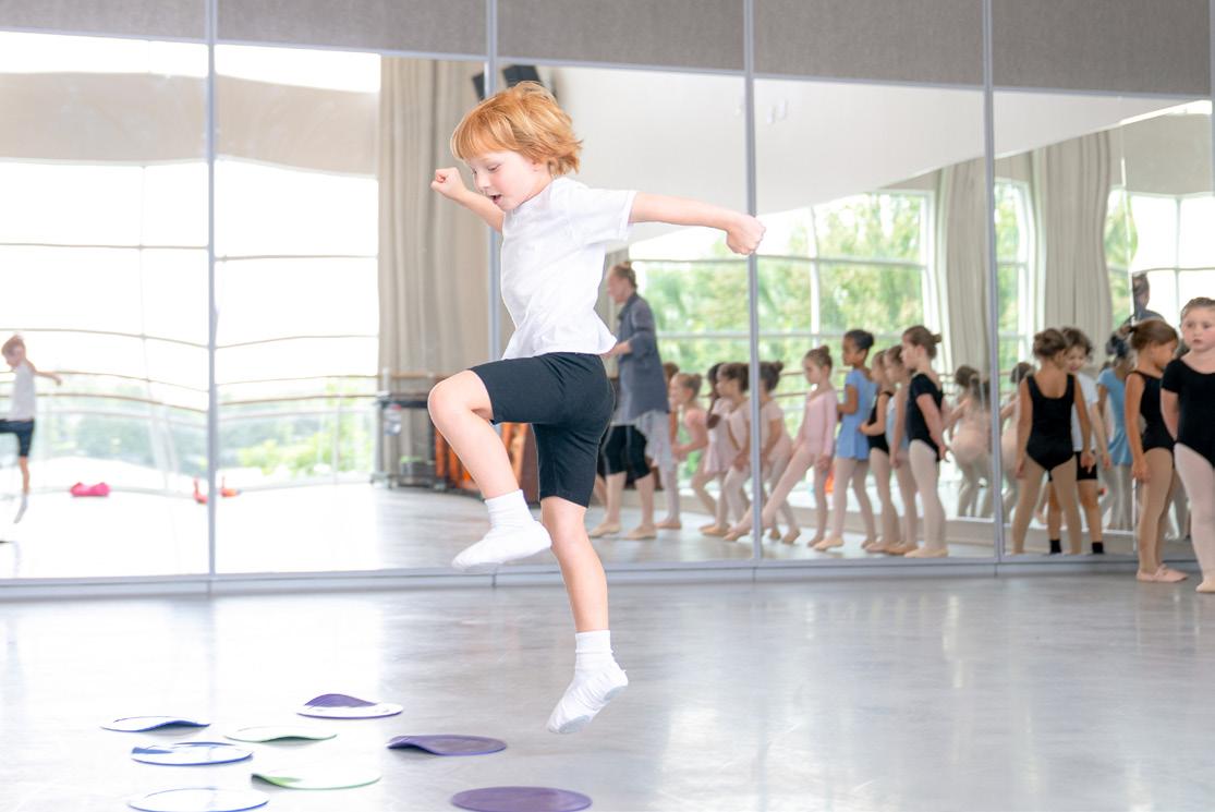
WORDMARK - PRIMARY
PHOTOGRAPHY EXAMPLES
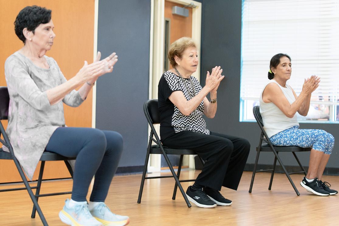
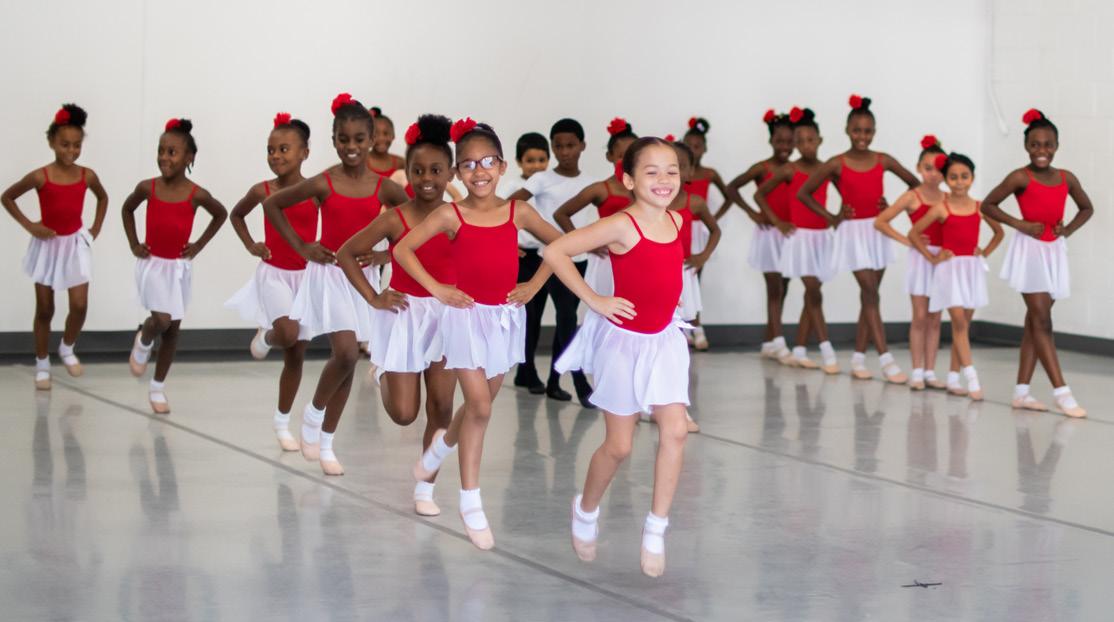
WORDMARK - HORIZONTAL
PROGRAMS WITHIN COMMUNITY PROGRAMS
When people encounter the Orlando Ballet, our entire brand—from voice, to vibe, to visual—will be elegantly apparent�
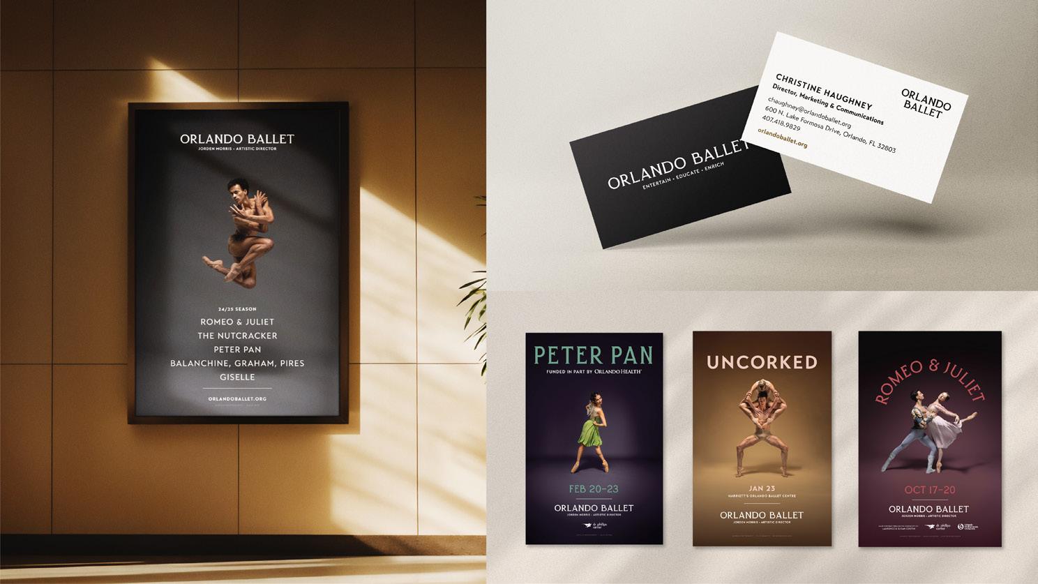
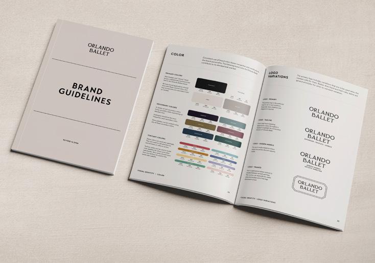
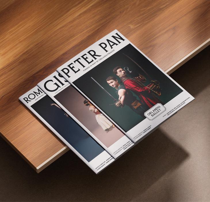
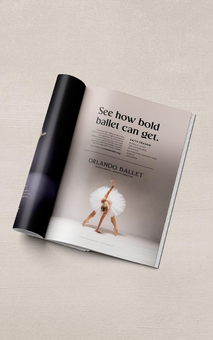
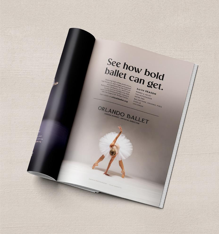
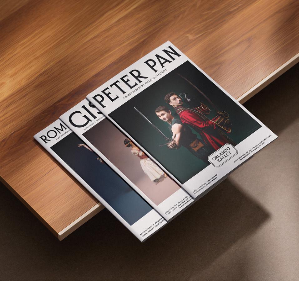
The application of the Orlando Ballet brand in the real world begins with determining if the final product needs to be functional or expressive Most designed pieces will fall somewhere in-between
DOCUMENTS, MANUALS, ANNOUNCEMENTS, SIGNAGE
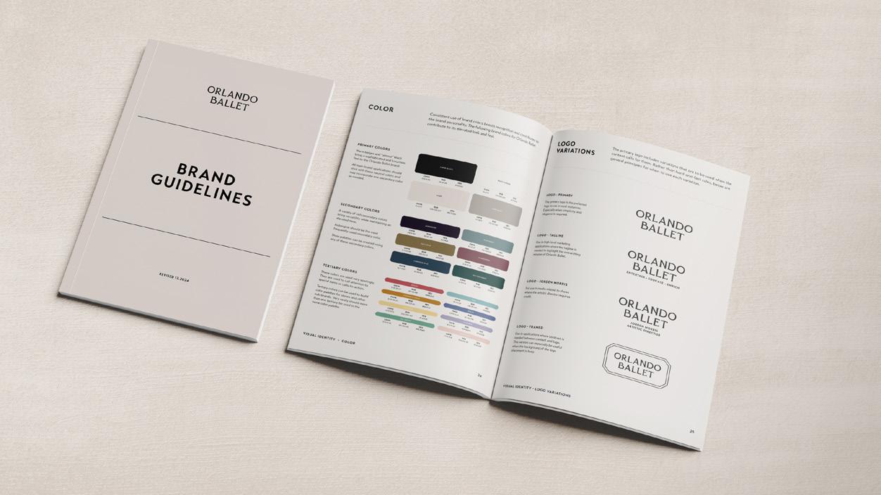
FUNCTIONAL
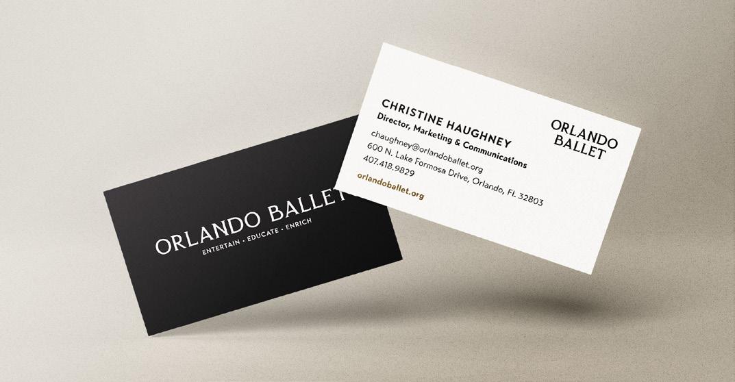
STATIONERY, BUSINESS CARDS
RACK CARDS, BROCHURES
