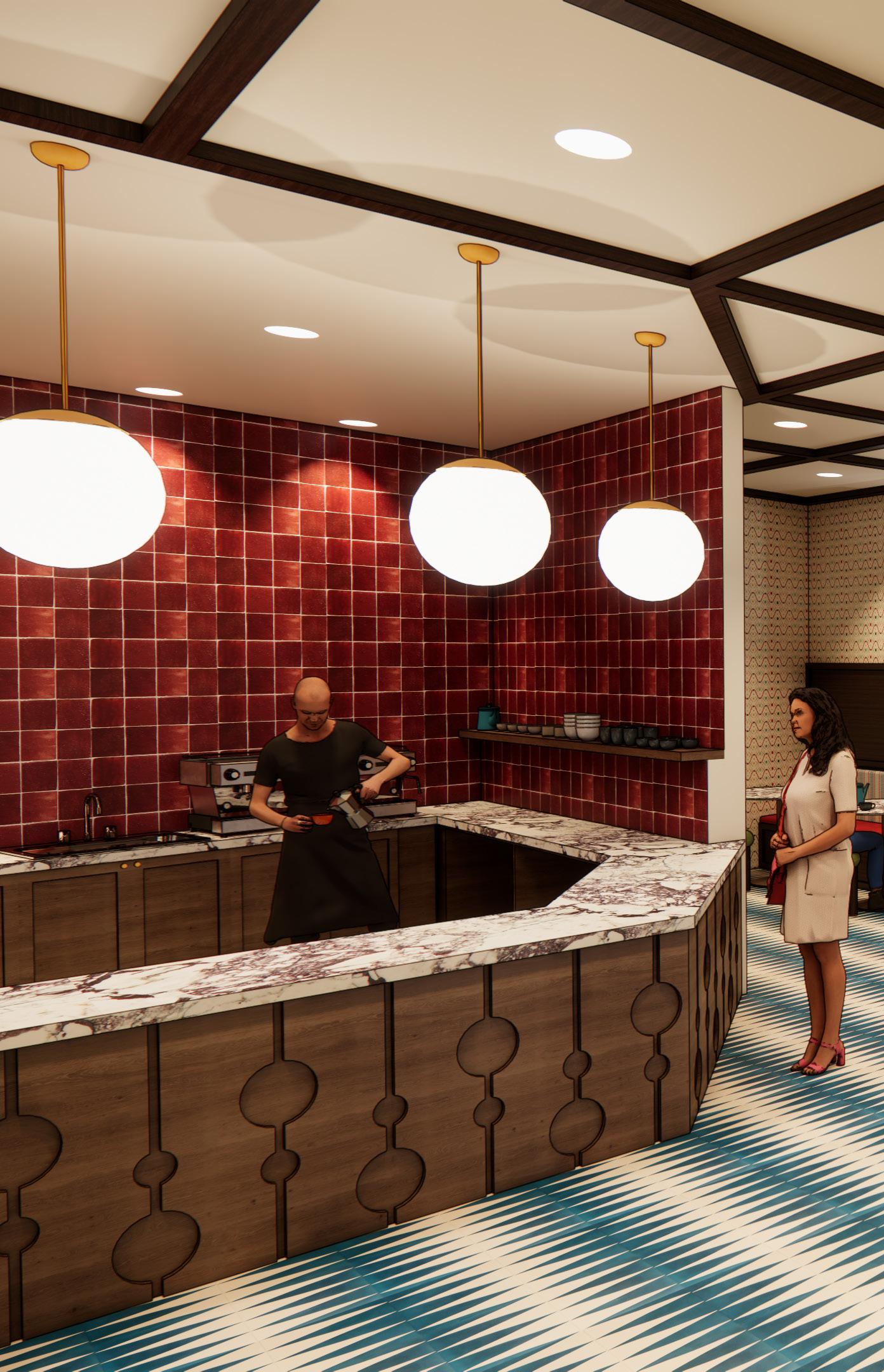
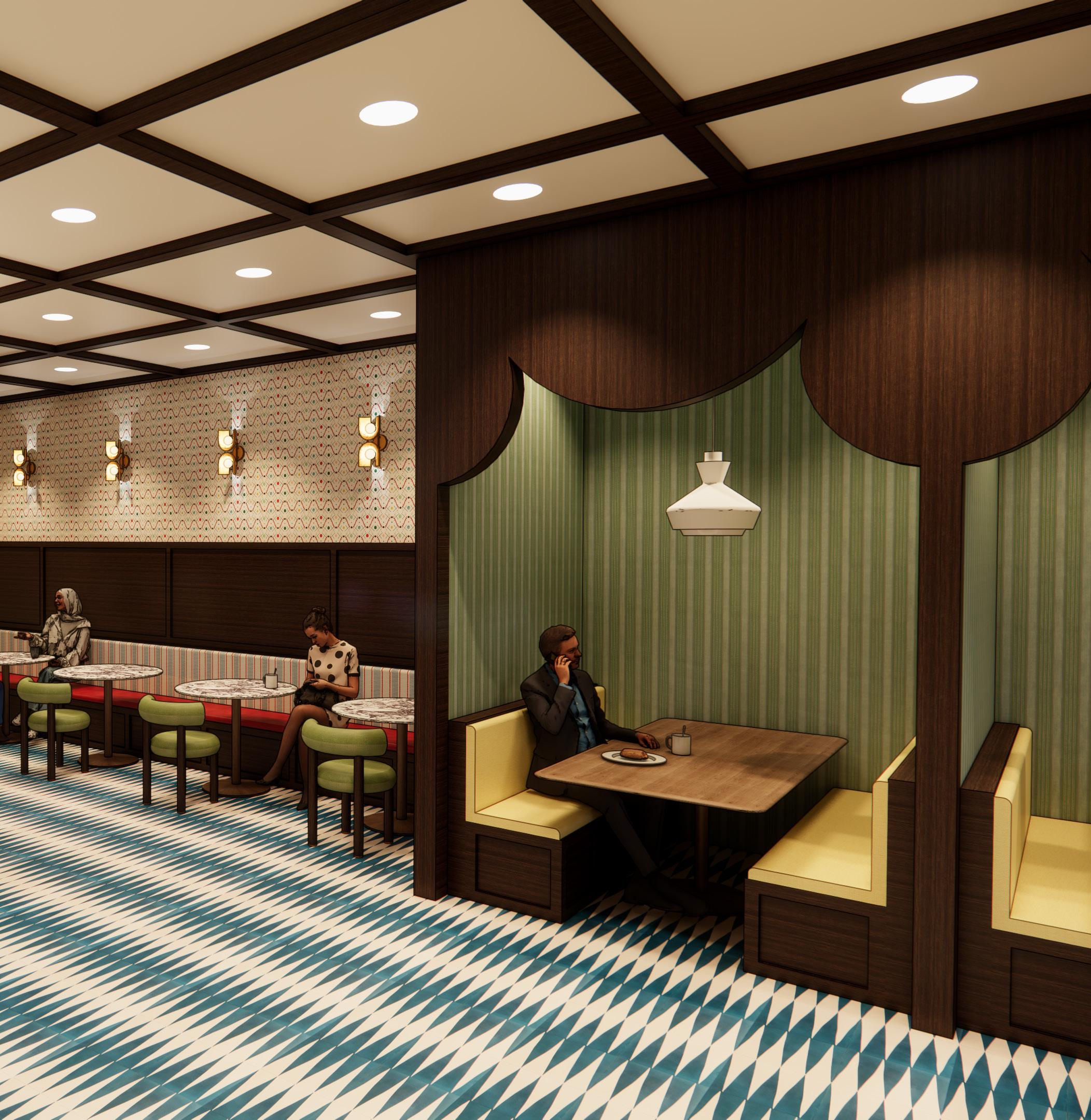
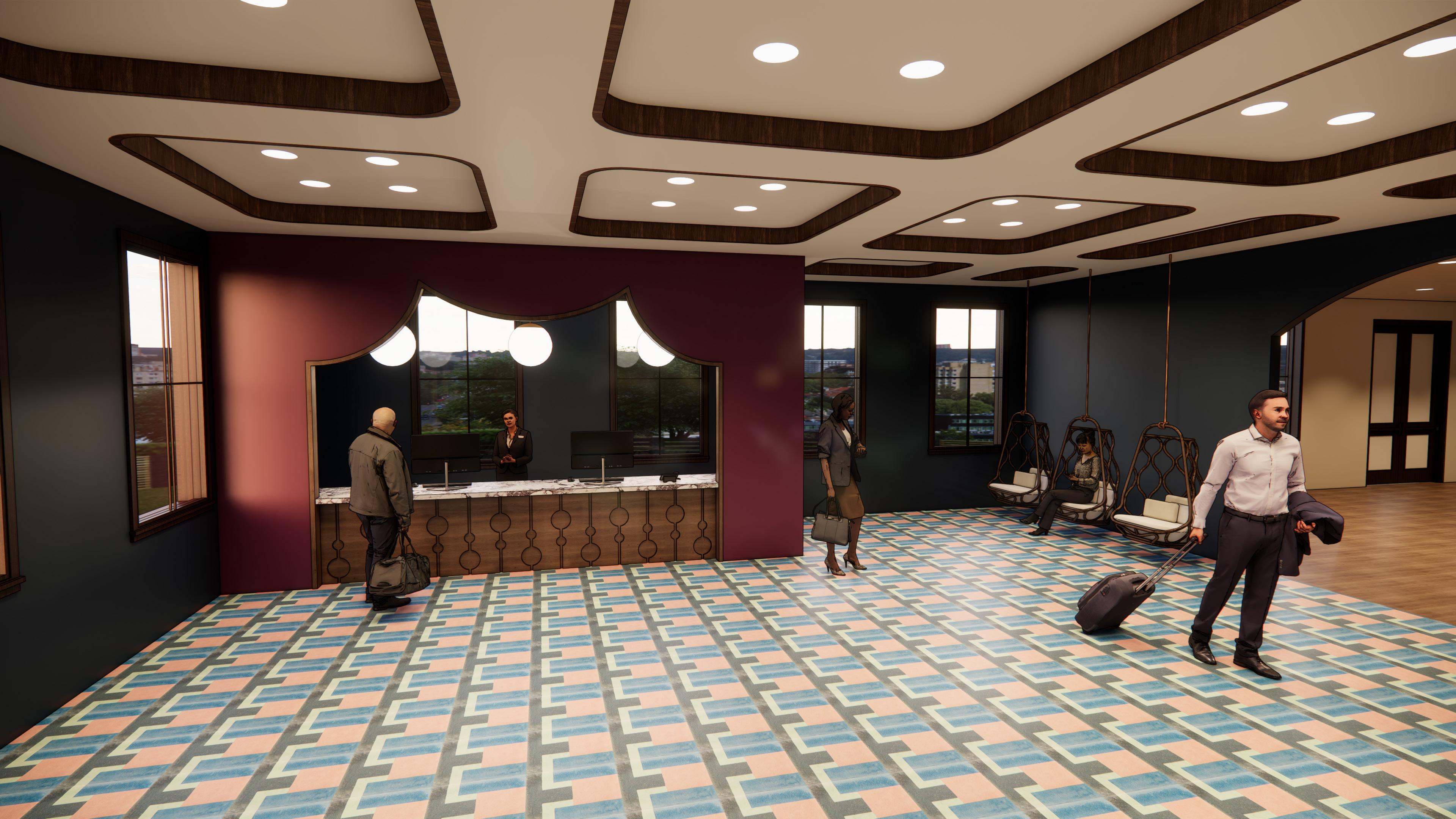
Carousel Hotel aims to create a playful experience for guests and locals alike in order to evoke a sense of child-like nostalgia. Being an adaptive reuse project, the design’s theme and overall concept pull from details of the building’s history that were discovered through research during the initial programming phase. In its past, the Wisconsin Wagon Company Factory was once used for the production of horse-drawn carriages. From this finding, the hotel’s theme explores a wider outlook by considering the use of carriages for traveling circuses and fairs. The circus-like theme is translated into an overarching concept focused around entertainment and the ability of performance to create wonder in its viewers. Thus, the design aims to amuse the spaces’ occupants with its whimsical nature.
Site Madison, WI
Square Footage Software ~23,700 sf Revit, Enscape, & Illustrator
H
Carousel
H
Carousel
H
Carousel
H
Carousel
Logo Design
Cafe
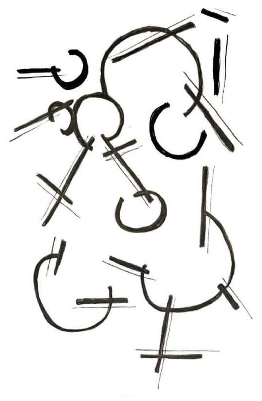
Concept Sketch
Graphic Floor Plans
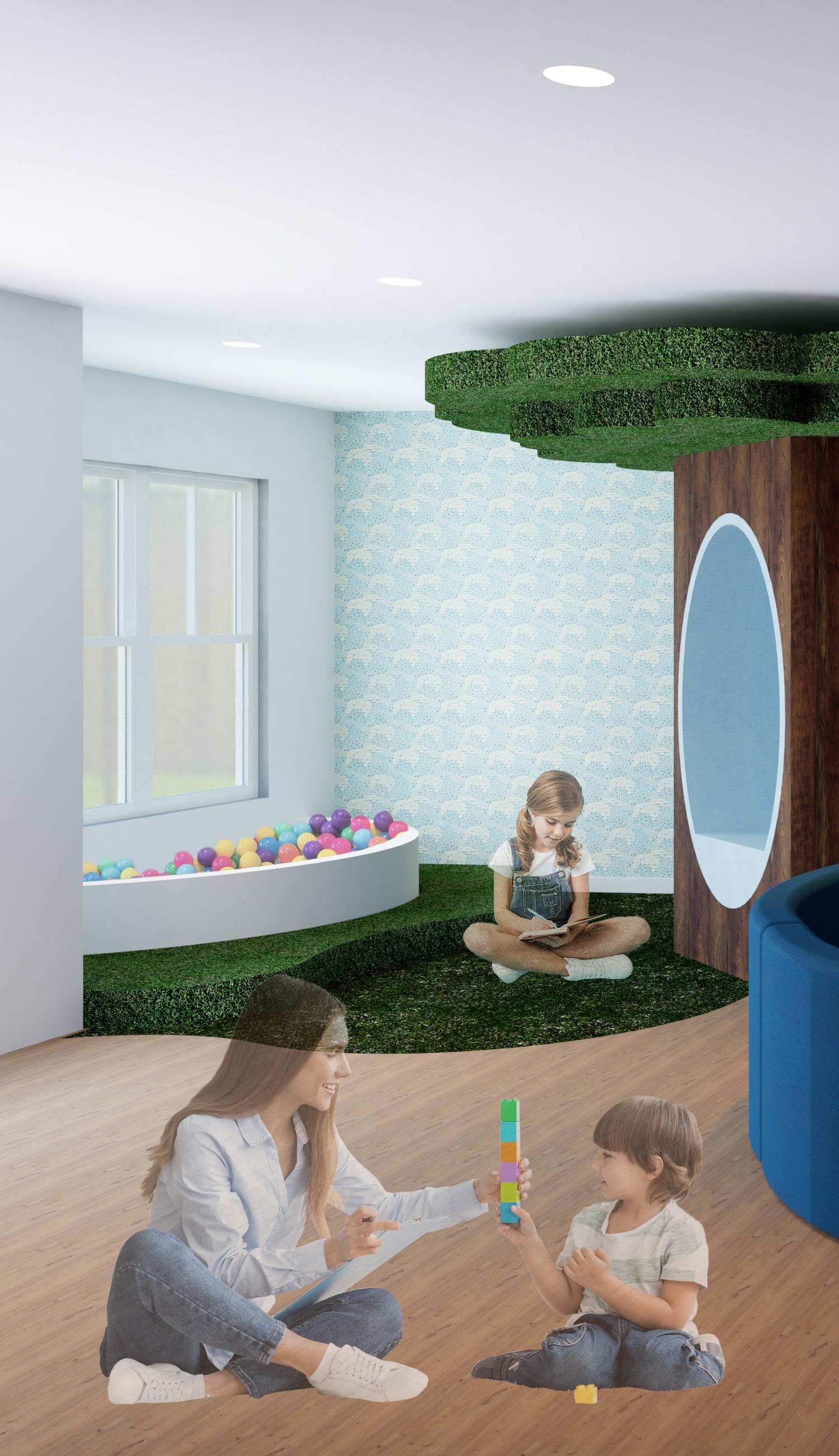
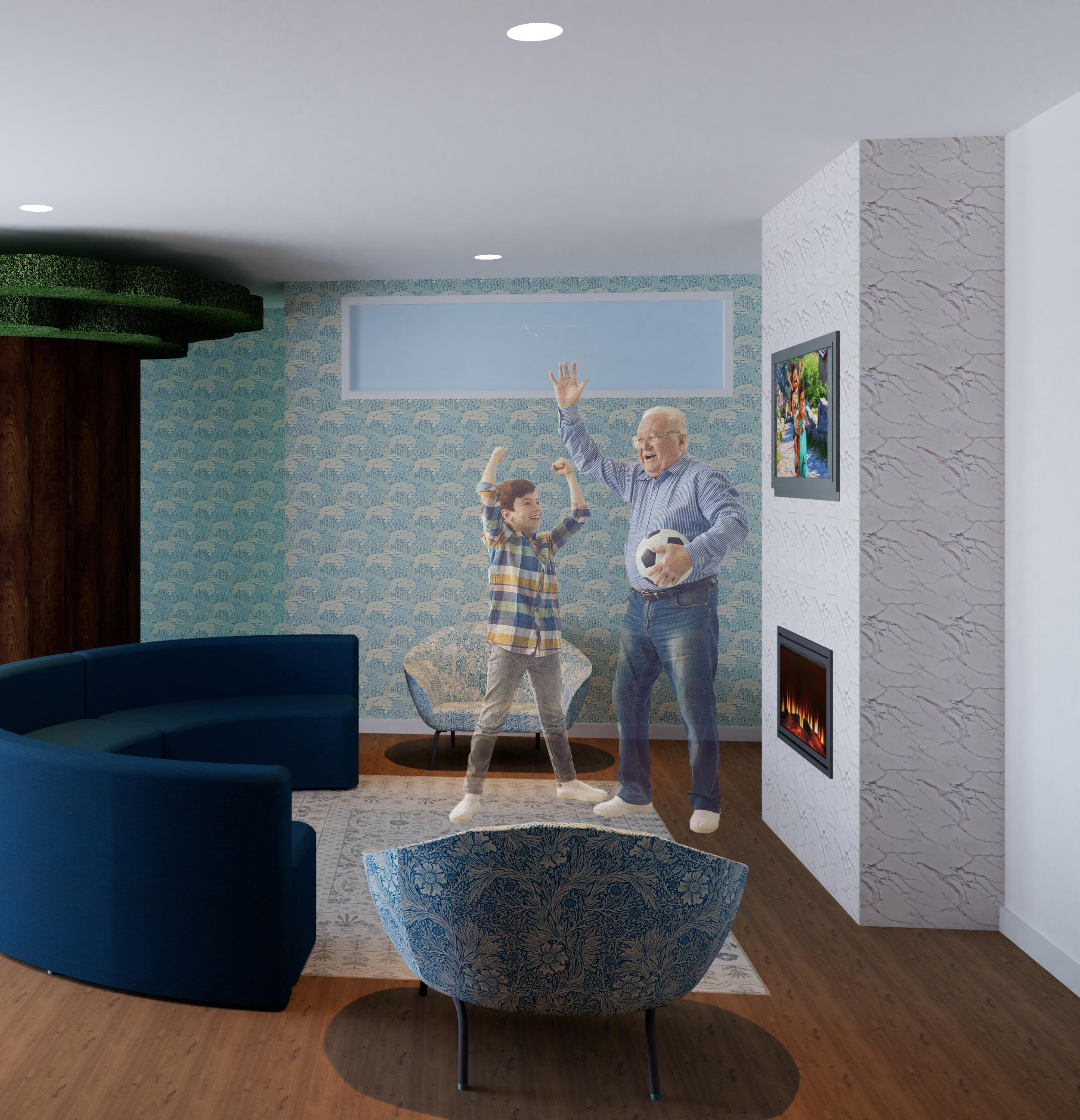
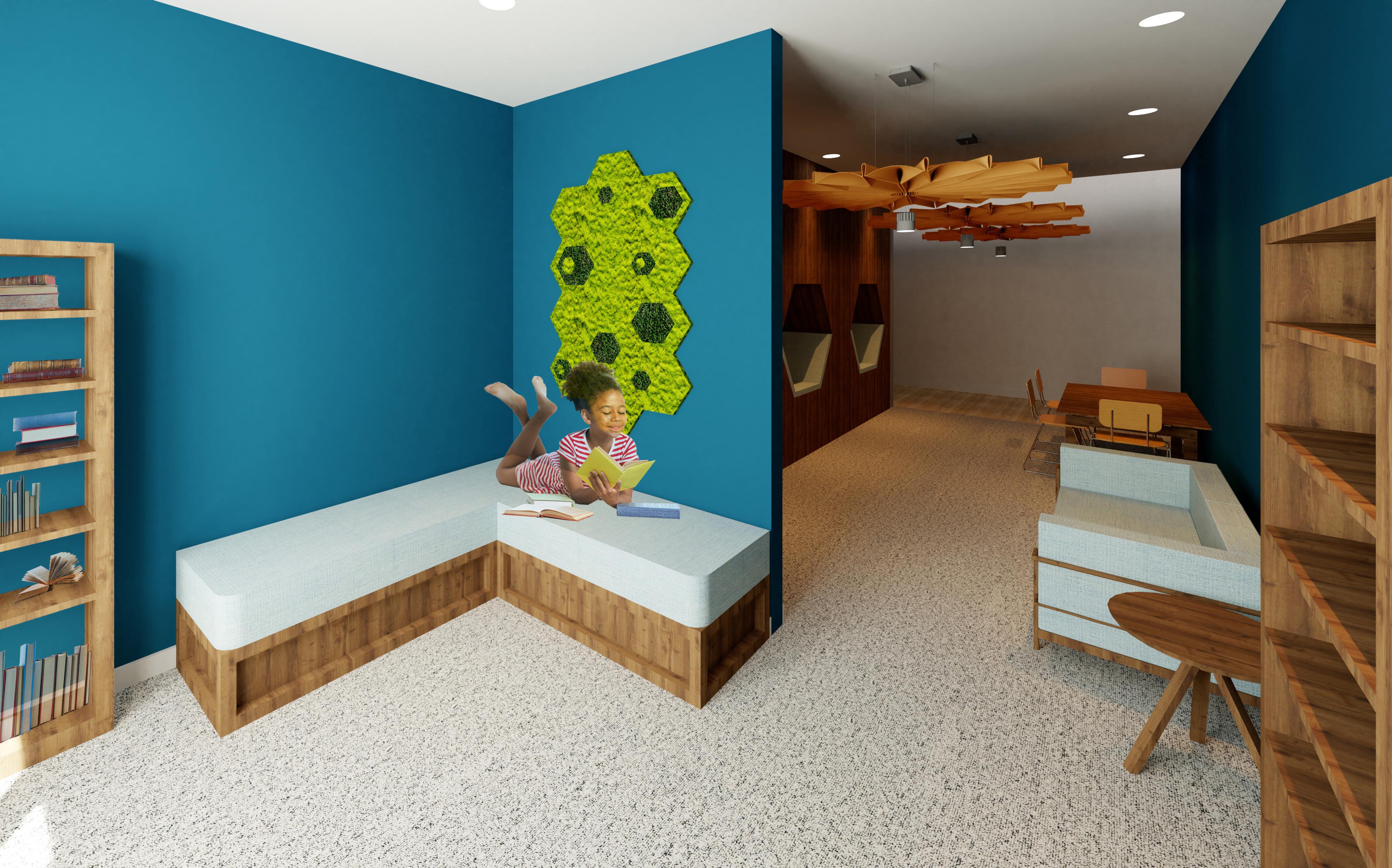
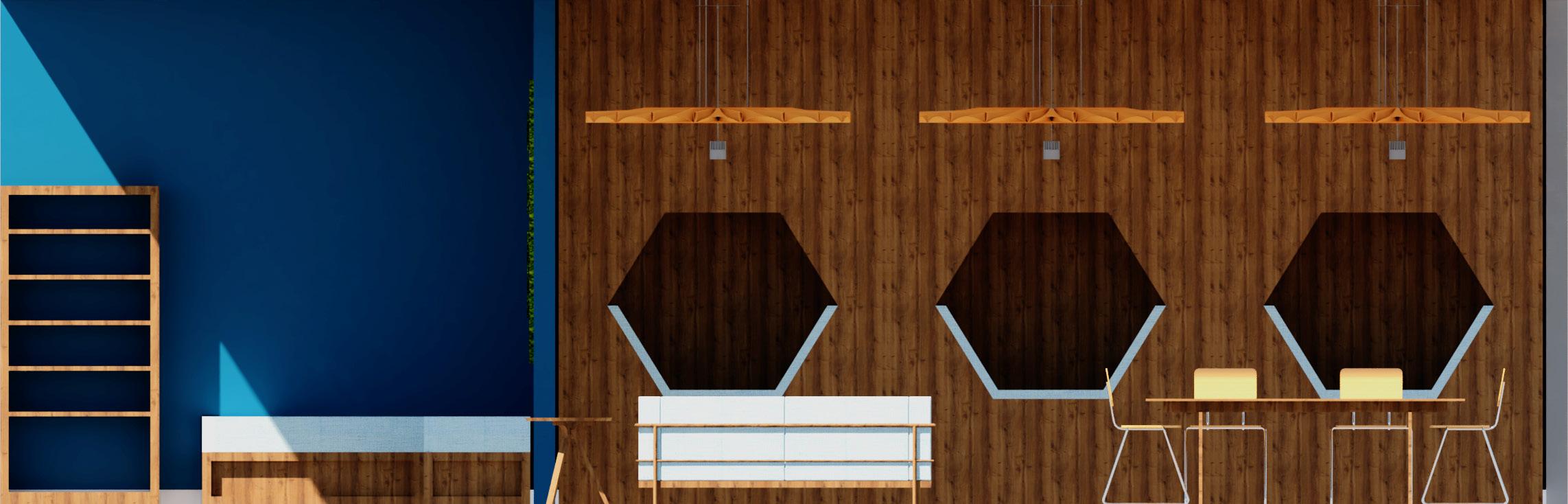
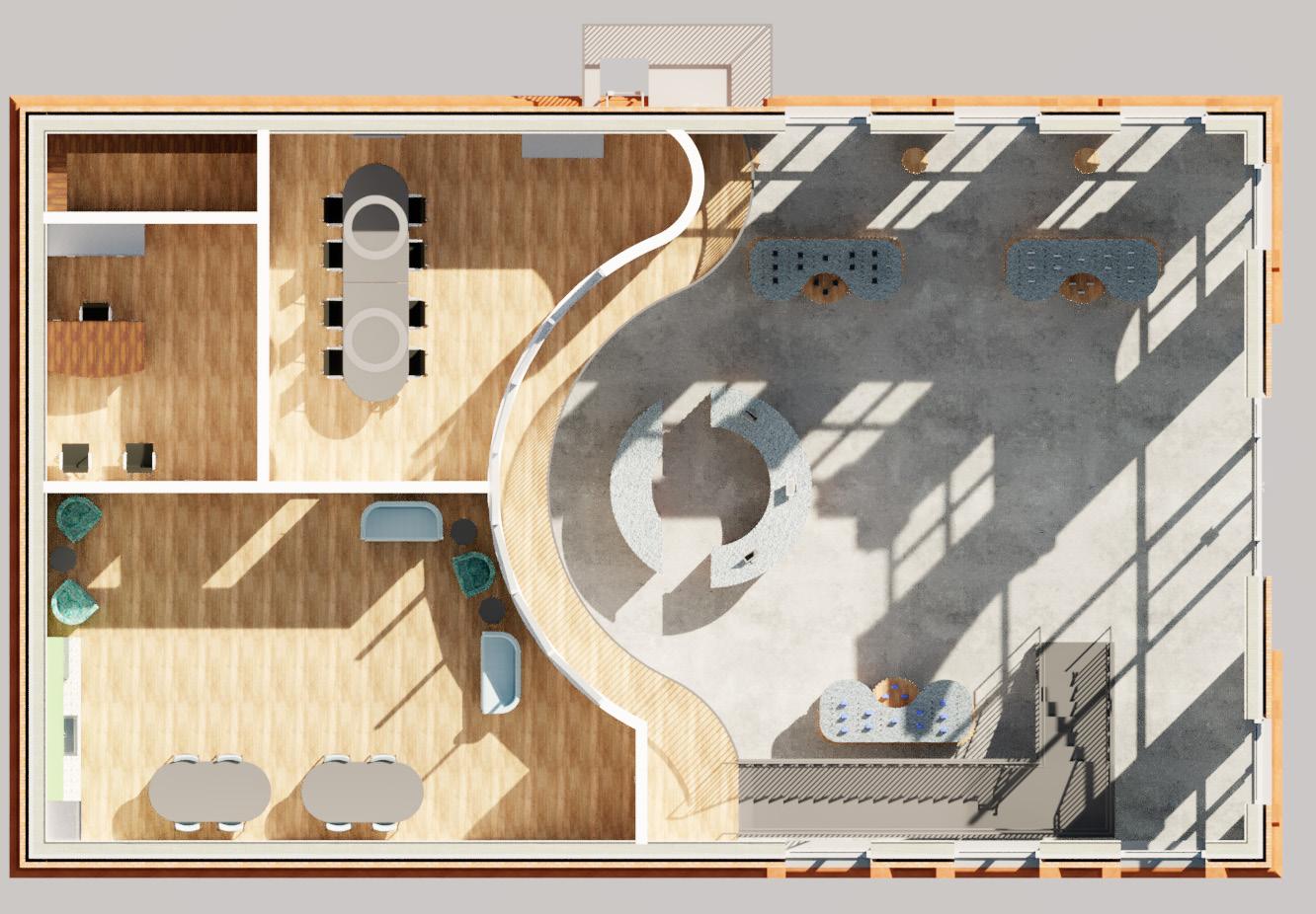
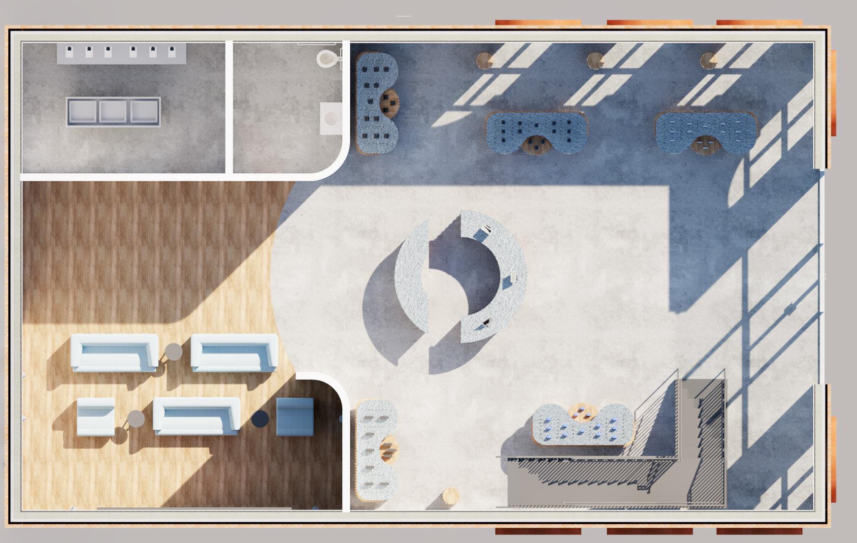
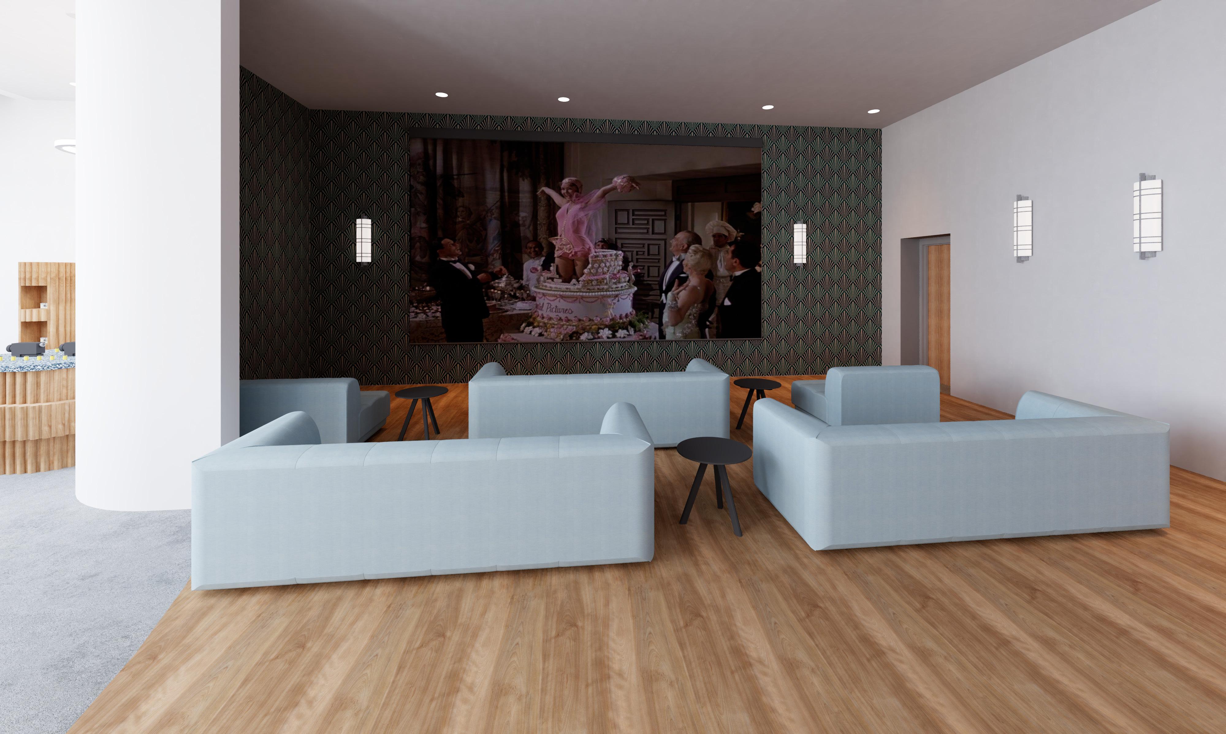
The hotel’s space planning considers the combination of angular walls with that of curves in order to create surprises for its “audience.” The varying entrances consider a range of users from hotel guests themselves along with nearby residents who may wander in to visit one of the amenity spaces which include a cafe, bar, and theater for local artists or comedians to perform.
On the first floor, the separation between the main entrance and lobby area from the amenity spaces offers guests a higher degree of privacy and considers acoustical comfort. The public spaces and ADA rooms consider accessibility standards to allow all guests to feel welcomed.
Interior Views
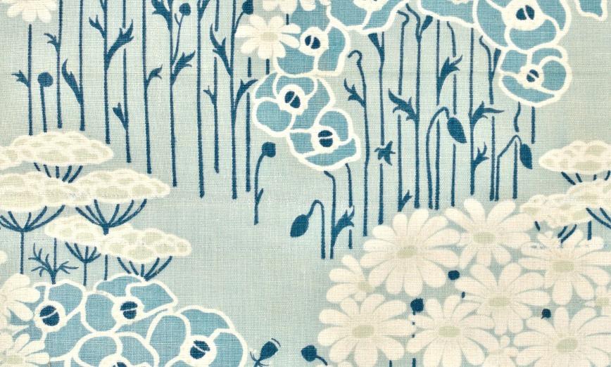
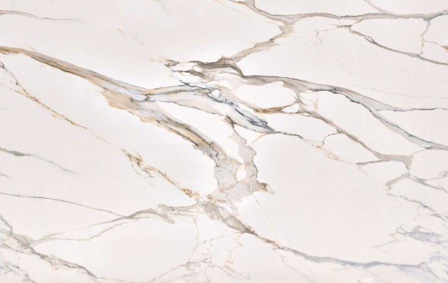
The space’s bold patterns and vibrant color palette excite users through its upbeat aurora, yet they are implemented in a sophisticated manner. The playful details are balanced by warm wood tones and various blank surfaces to refrain from overwhelming users.
Lobby
Pediatric Clinic 2
Healthcare Design - Fall 2023
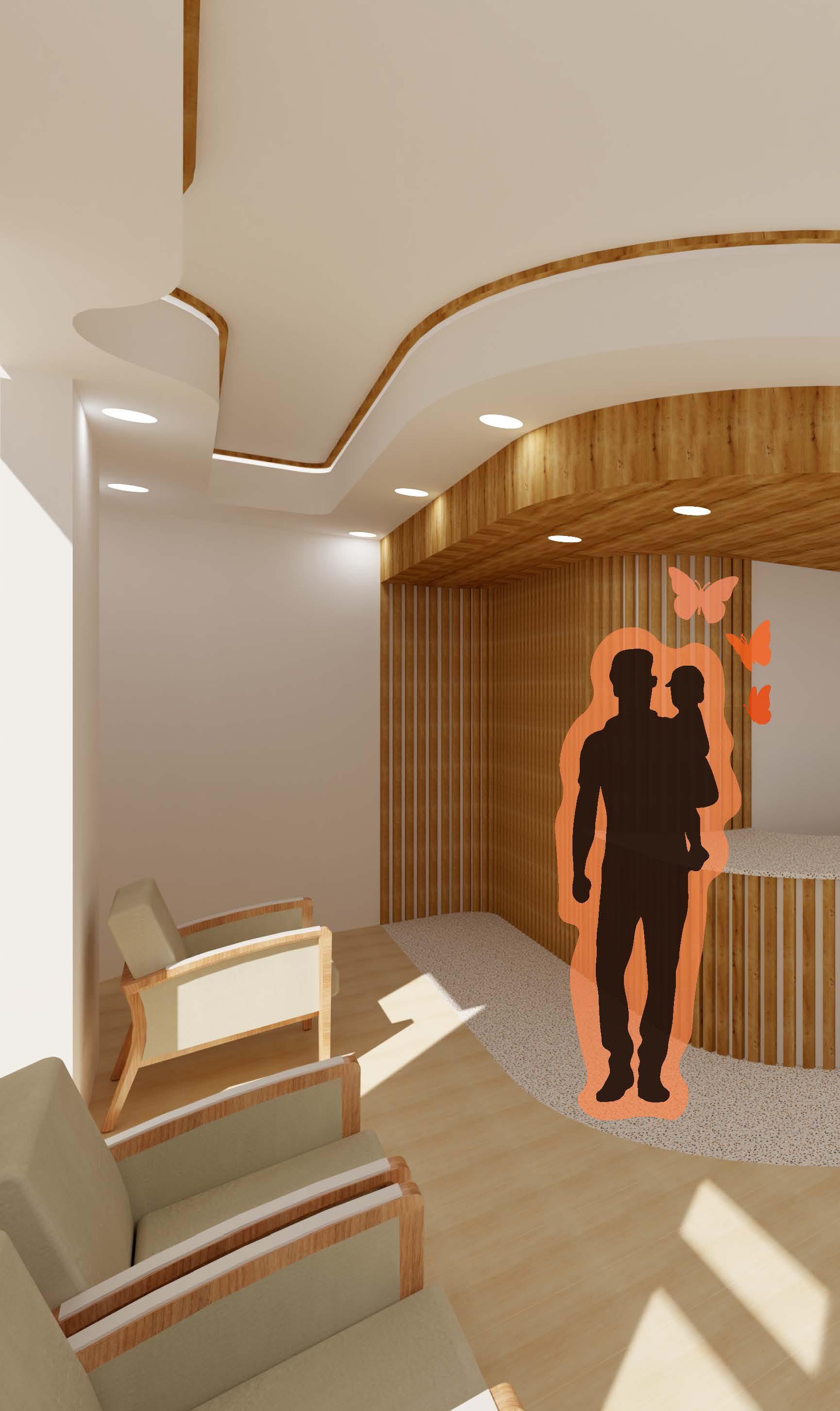
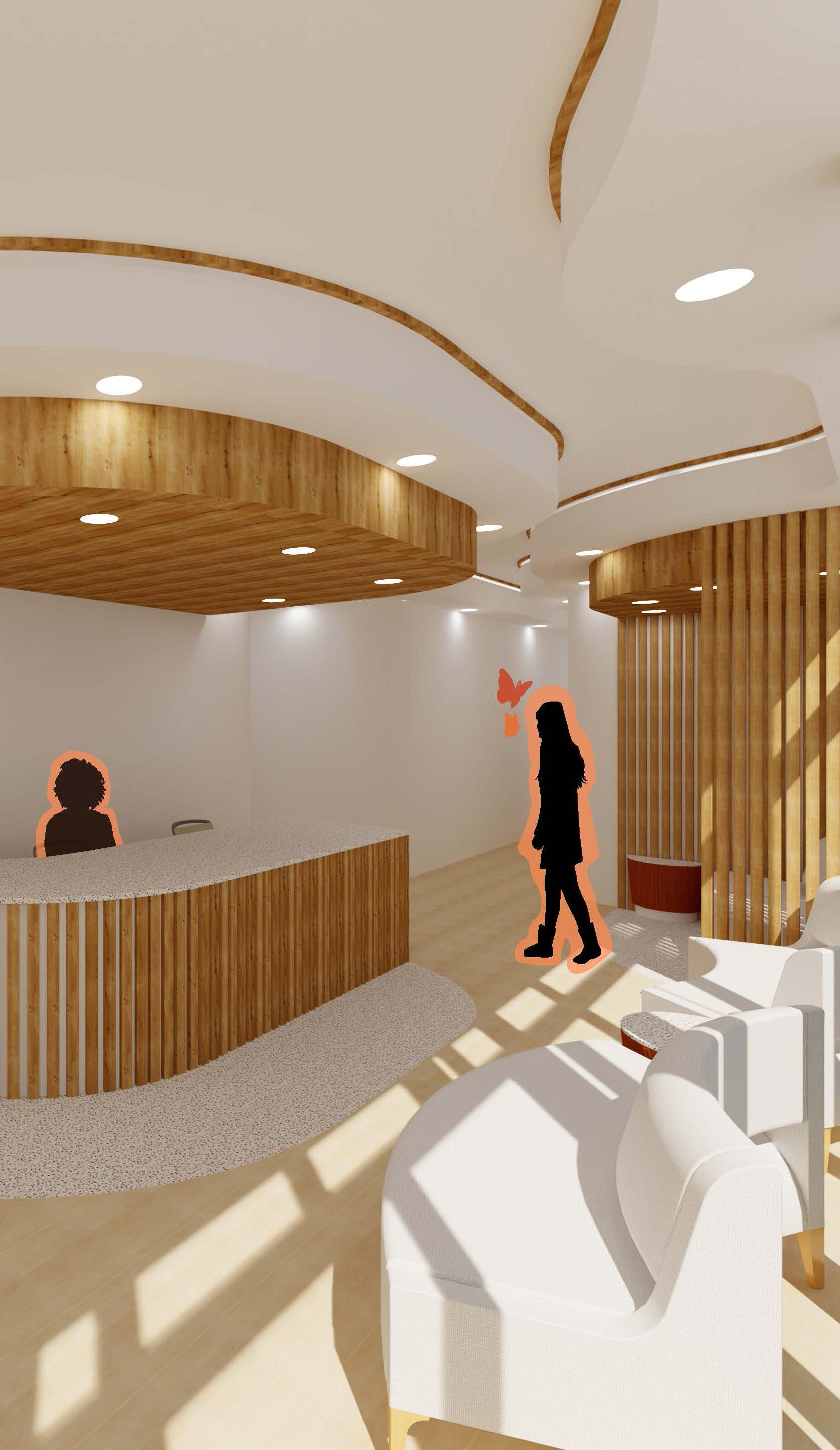
The Checkerspot Clinic pulls inspiration from the symbol of a butterfly, specifically considering Maryland’s State Insect of the Baltimore Checkerspot Butterfly. Being that the clinic is for pediatric care, butterflies are an adequate representation of the proposed users. Users between the age groups of newborn to adolescence are free-spirited in nature, yet just as caterpillars require a transformation into butterflies, children and young adults must grow and discover their true selves.
Site
Square Footage
Software ~3260 sf Revit, Photoshop, & Illustrator
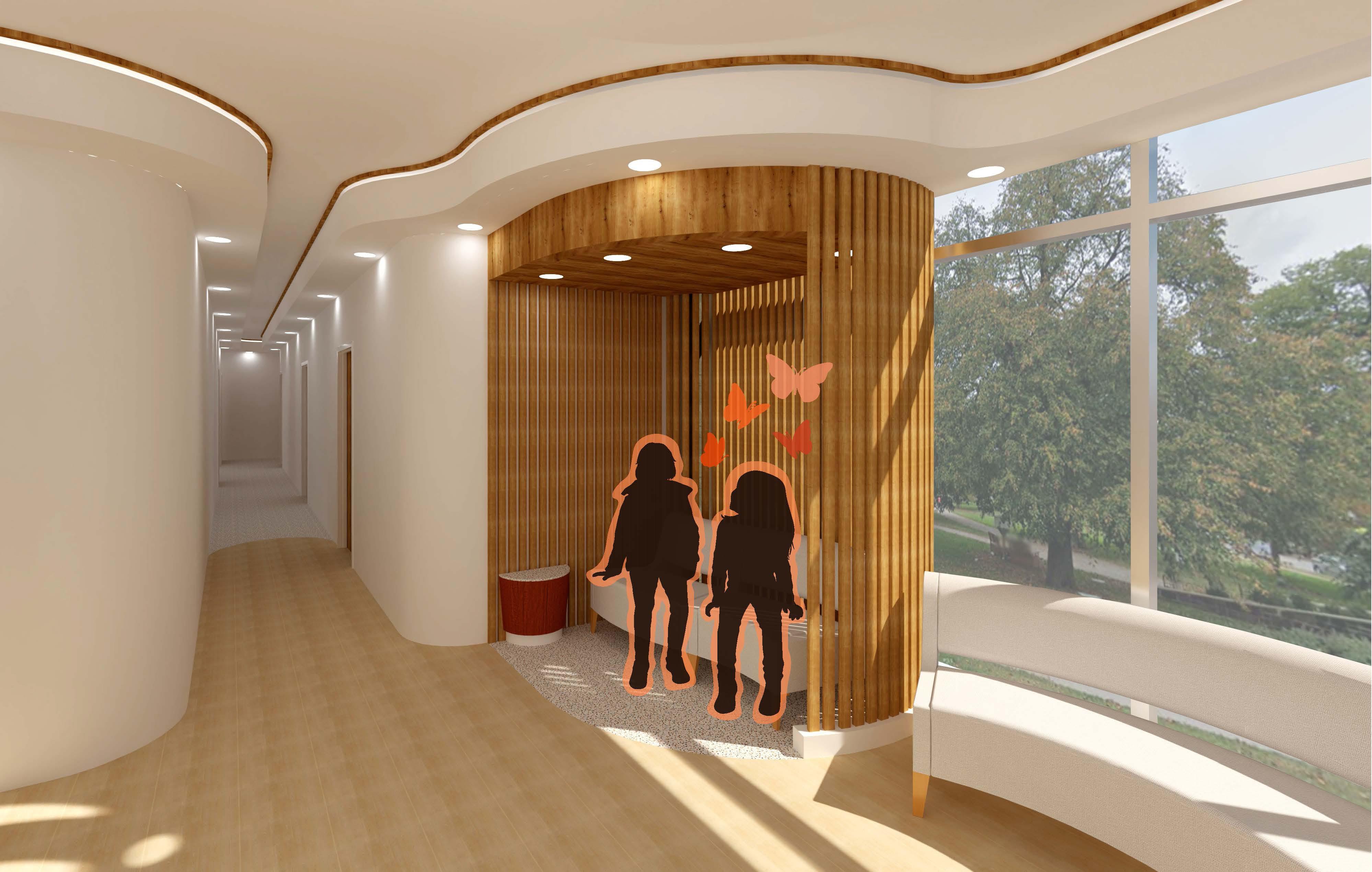
The space is designed to cater to the various journeys and stages of self-discovery by distinguishing clear public and private zones. The design offers freedom to choose within public areas like the waiting area that give users the chance to “fly.” The design further considers the opportunity to implement private zones and alcoves that offer users the ability to be sheltered within “cocoons.”
Bubble
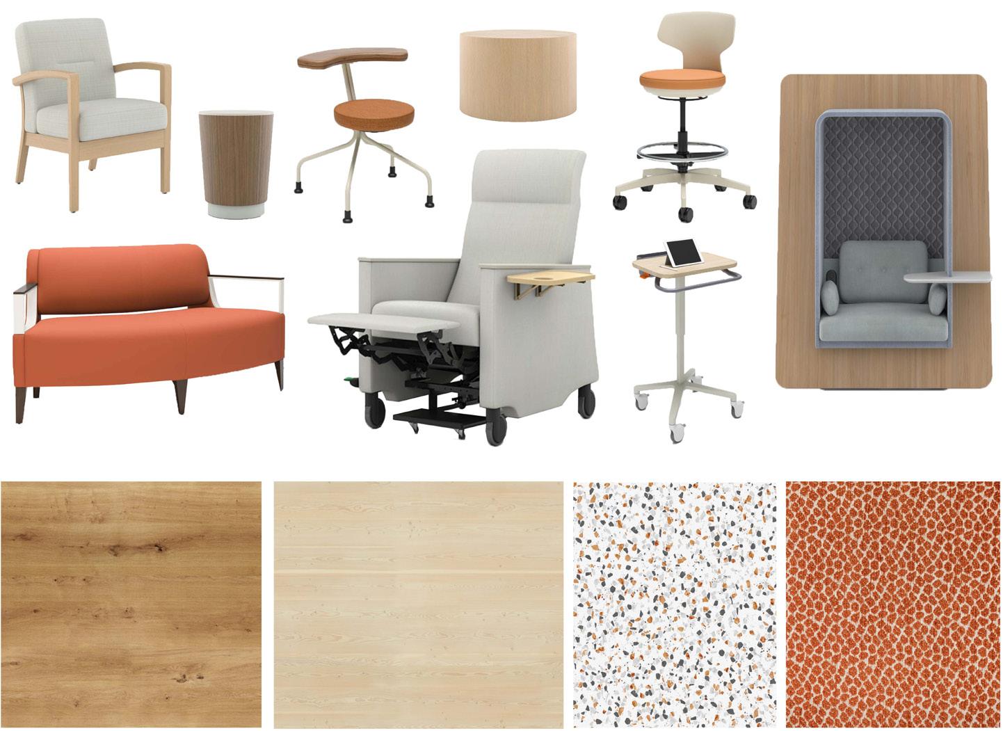
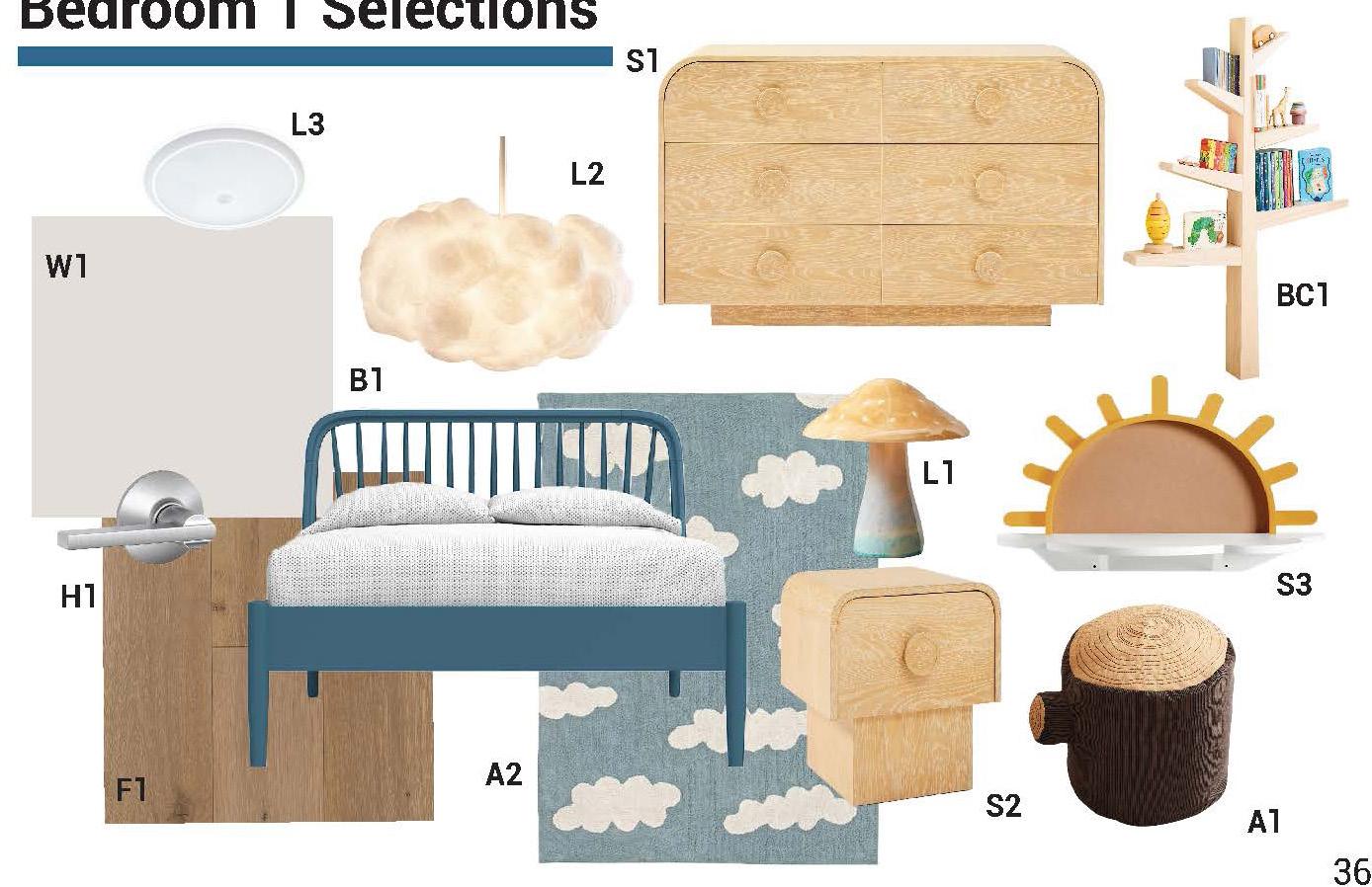
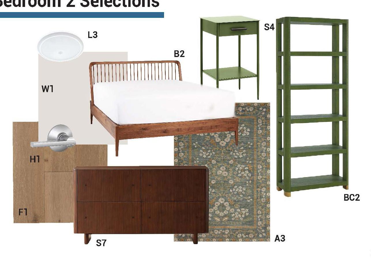
FF&E Selections
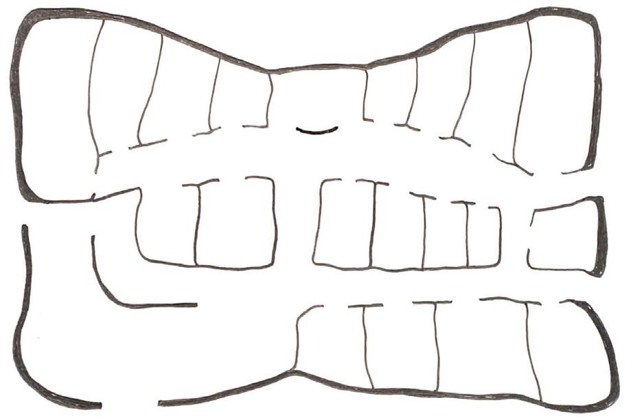
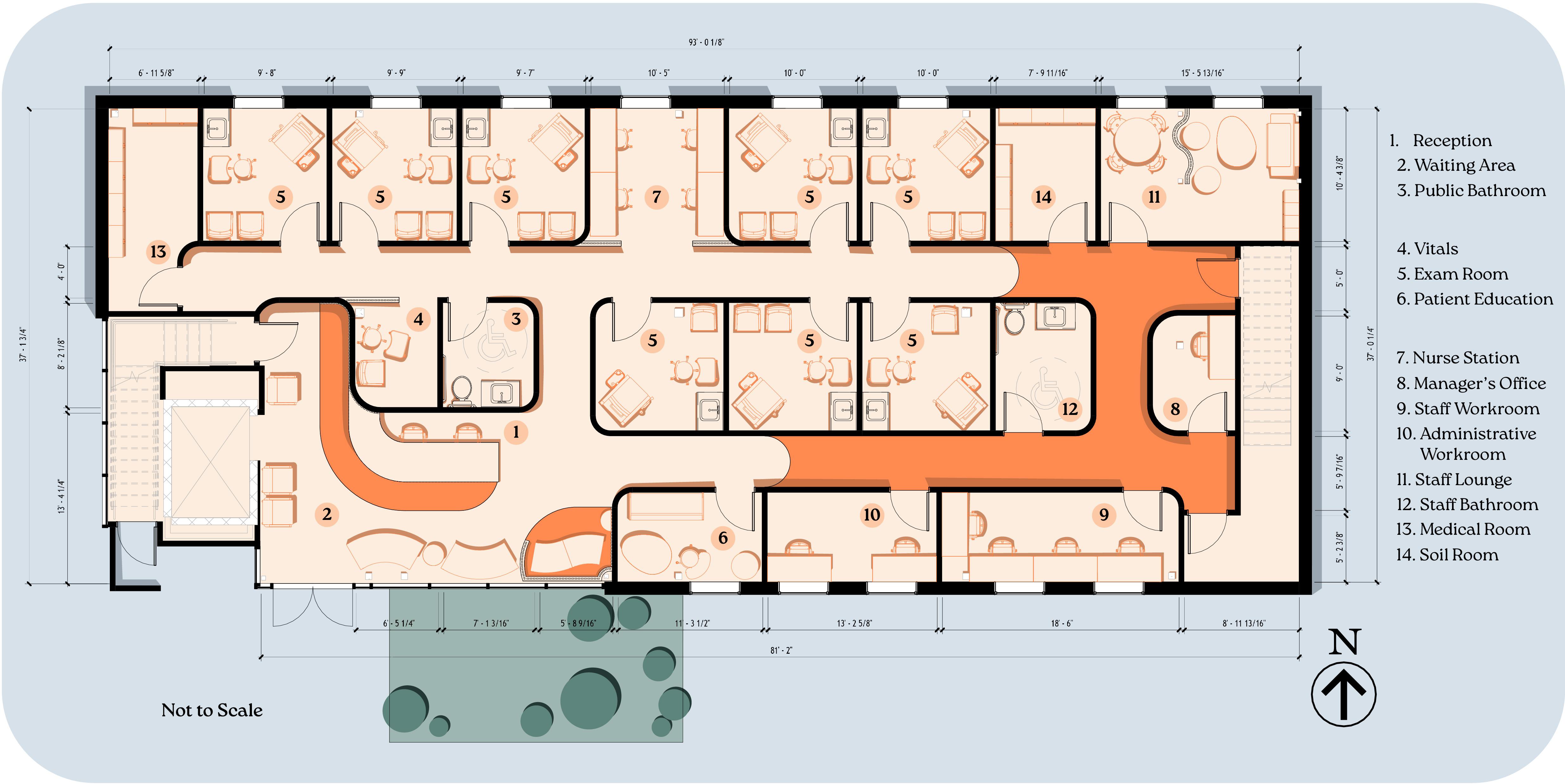
Graphic Floor Plan
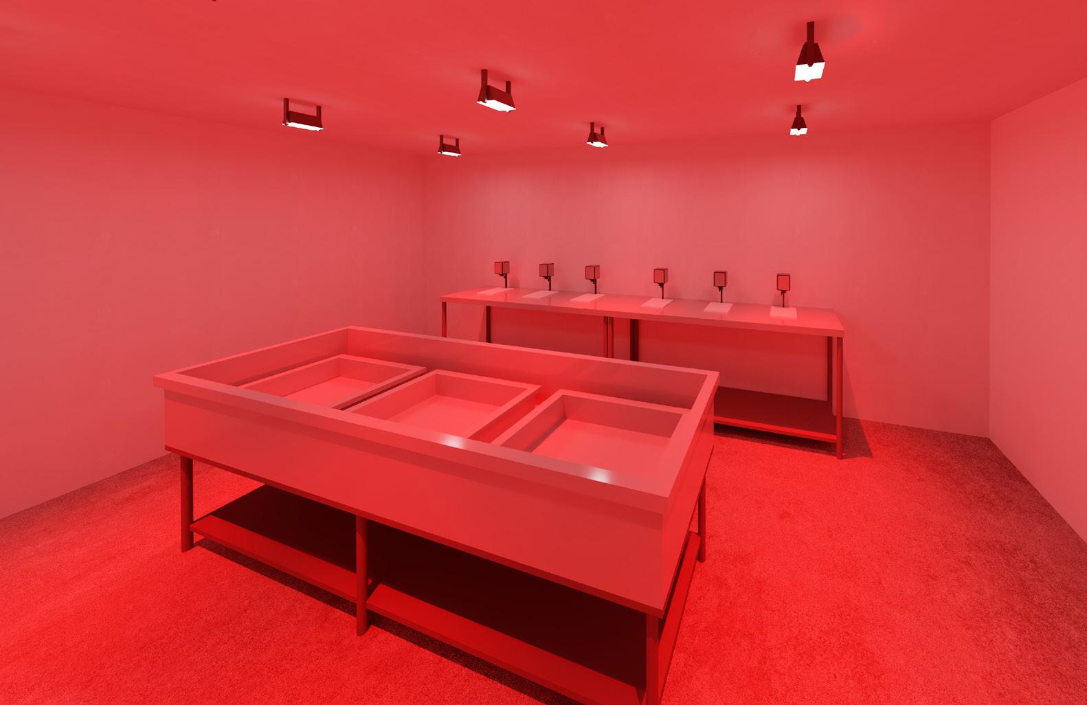
The plan’s layout considers the importance of providing clear separations between patient and staff zones. Additionally, a centralized nursing station grants staff quick access to each exam room while still being proximal to private employee spaces.
Regarding FF&E selections, the use of natural colors, textures, and materials assist in the creation of a calming, nurturing atmosphere.
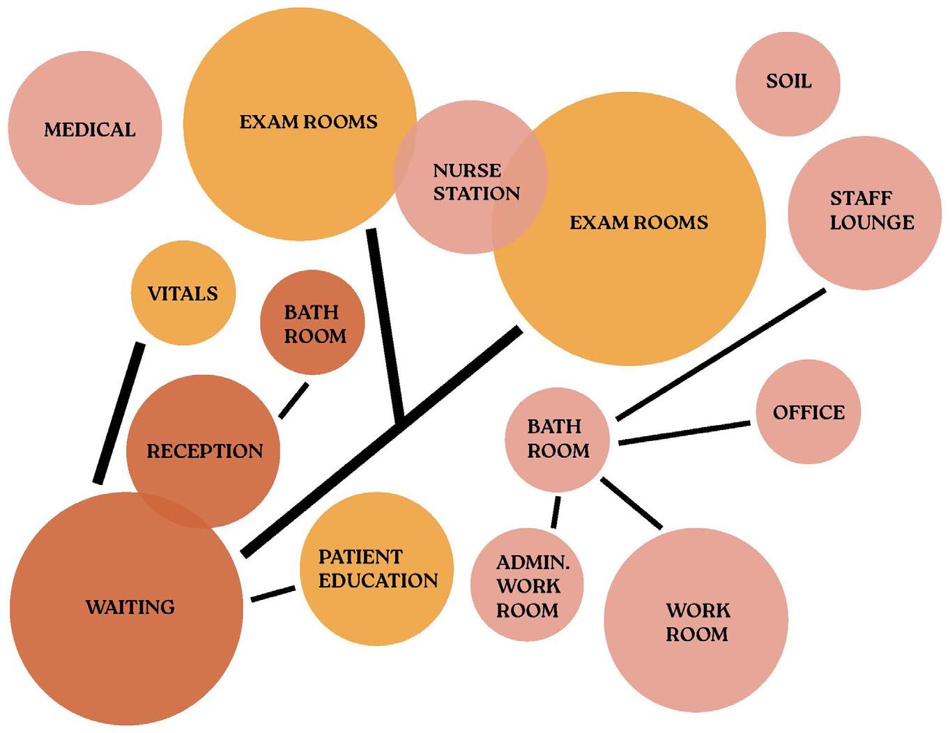
Diagram
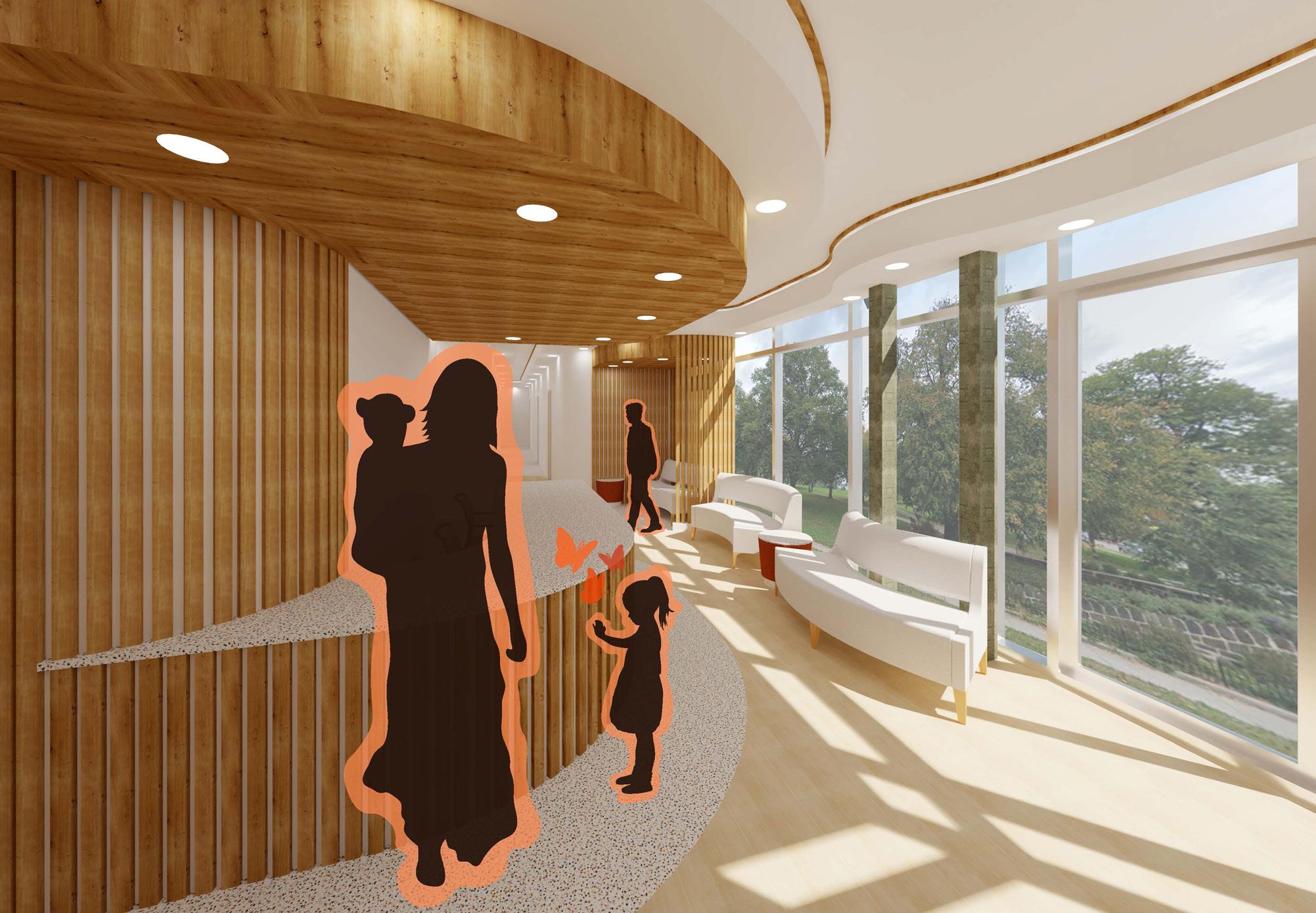
Interior Views
Waiting Alcove
Intergenerational Living Community 3
Senior Living Design - Spring 2023
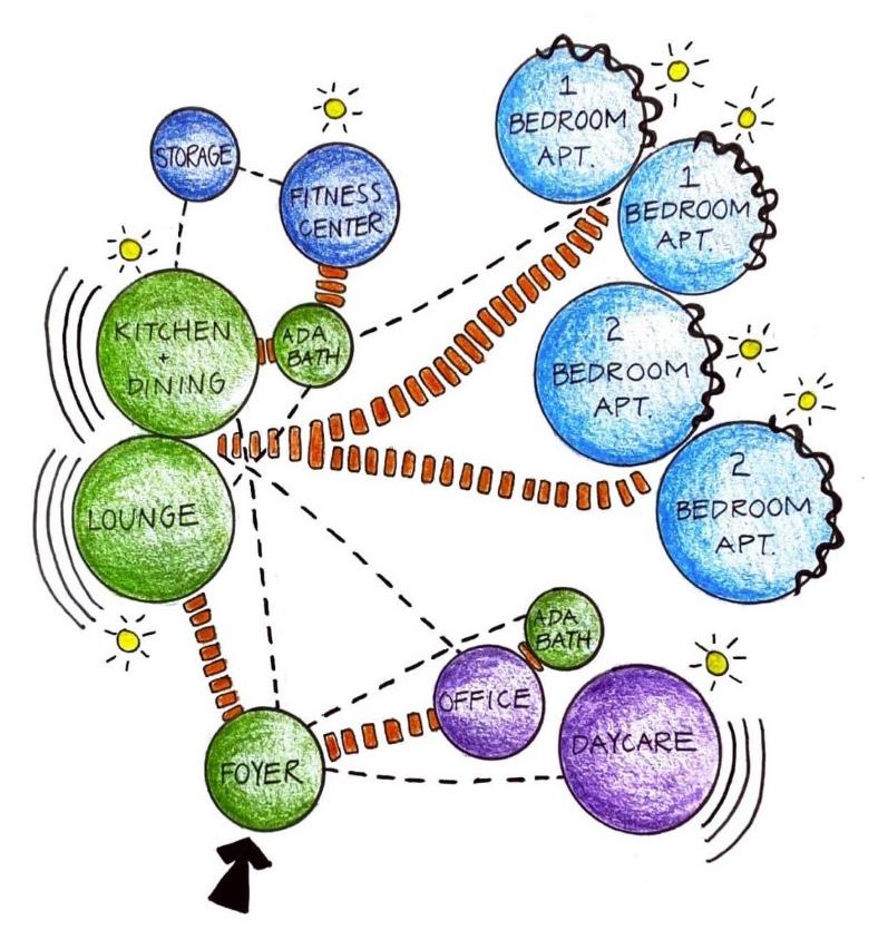
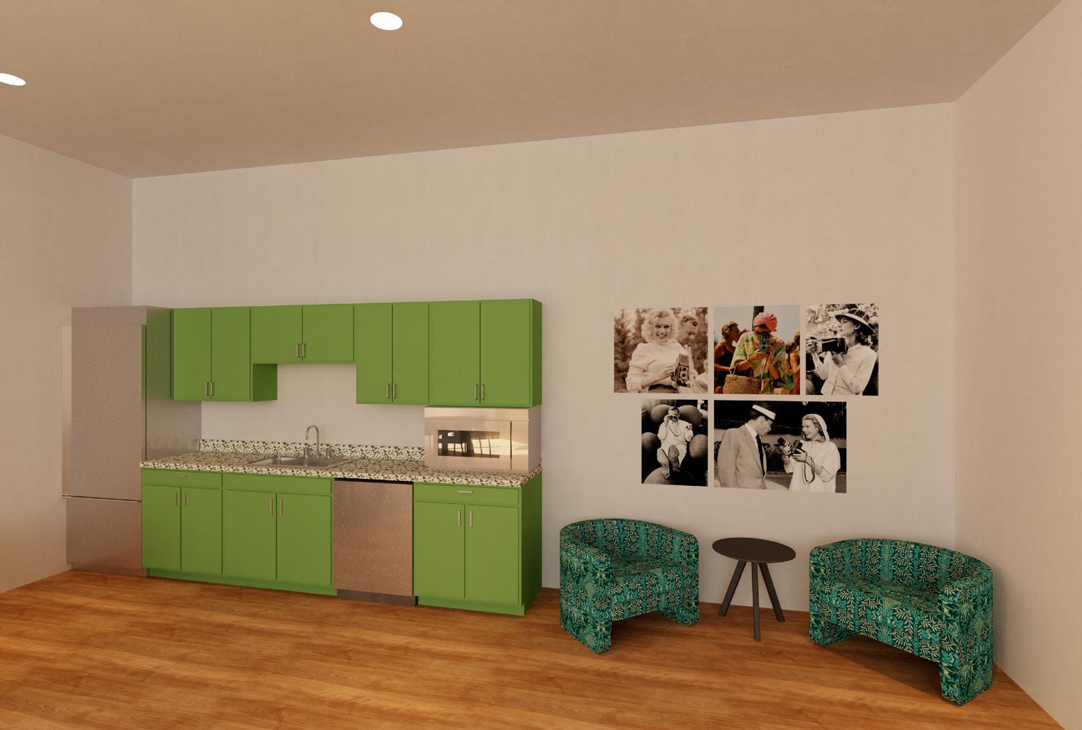
Growing Together is the extension and rebranding of an intergenerational living community in Madison, WI called Hope and a Future. The design focuses on implementing spaces that allow residents of varying ages to connect with each other and themselves to support social, physical, and mental growth. Incorporating the intergenerational contact zones of a lounge and fitness center assist in supporting the goal of growth. The communal kitchen and dining area additionally acts as a space of critical importance due to the nature that cooking has of implicitly bringing people of different background together.
Site Madison, WI
Lounge
Life Safety Analysis
The layout encourages social connection and togetherness through the placement of the communal kitchen and lounge near both of the primary entrances. The circulation is clearly navigable with a direct pathway that supplies entrance to each individual space. As residents walk in the main entries and towards the apartment units, they experience the gradual transition from the most public spaces, to semi-public, semi-private, and finally private. Each space provides flexibility to offer residents the choice of deciding the level of social interaction desired.
S FEC SMOKE DETECTOR FIRE EXTINGUISHER
CEILING MOUNTED EXIT SIGN
WALL MOUNTED EXIT SIGN
AUDIBLE & VISUAL FIRE ALARM
WALL MOUNTED EMERGENCY LIGHT
Interior Views
Alcove
Alcove
The furniture selections provide comfort to exude a feeling of homeyness and support inclusivity by allowing all residents to safely occupy the spaces. Furthermore, the design choices incorporate details of biophilia through use of natural materials like wood, calming shades of blue and green, and naturalistic textures and patterns. Not only is this a way to create a relaxing environment that connects occupants to the outdoors, but it symbolizes the mission of growth and flourishing.
LIGHT
TASK LIGHT
SCONCE LIGHT
DUPLEX OUTLET
DUPLEX GFI OUTLET
MOUNTING HEIGHTS:
6" ABOVE CEILING HEIGHT, 10'-6" AFF
CEILING MOUNTED, 10' AFF
UPPER CABINET MOUNTED, 54" AFF
WALL MOUNTED, 80" AFF
4" ABOVE COUNTERTOP IN KITCHEN/ BATH, 18" AFF EVERYWHERE ELSE
4" ABOVE COUNTERTOP IN KITCHEN/ BATH, 18" AFF EVERYWHERE ELSE
SINGLE SWITCH
DIMMER SWITCH
EXHAUST FAN
Electrical Plan
AFF
AFF
CEILING MOUNTED, 10' AFF
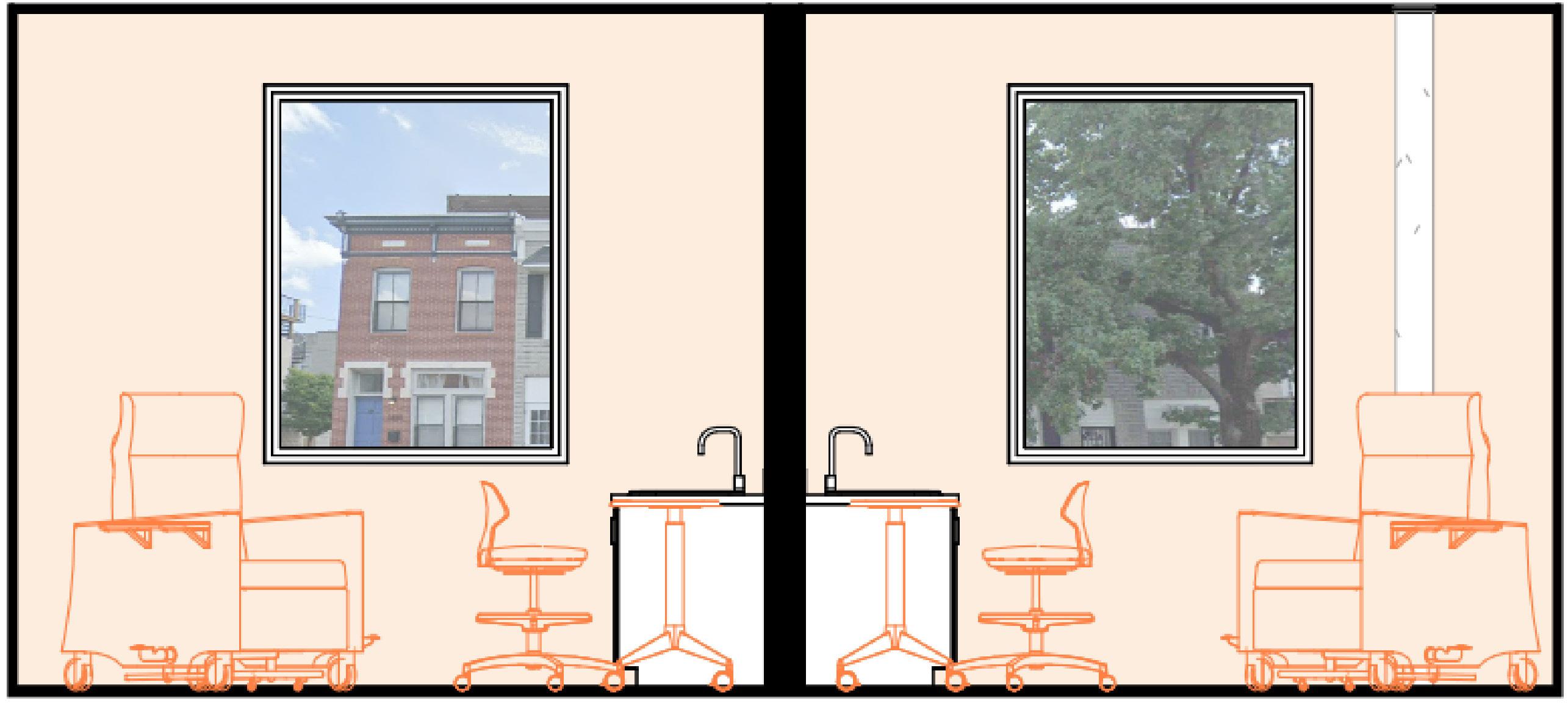
Elevations
Biophilic wall with natural plants growing from it to bring connection to nature into the fitness center - reference concept sketch
Accessible spacing between equipment
Window to allow light into the space, yet high enough that people in the adjacent space cannot see it
Fitness Room
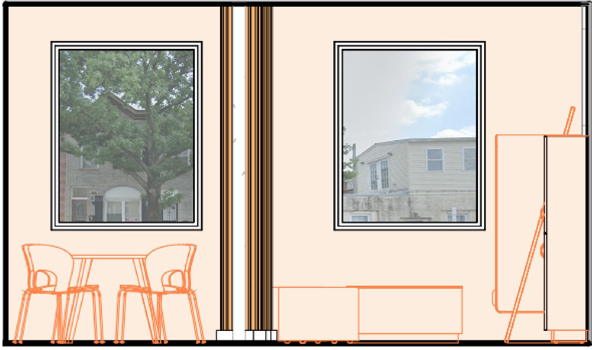
2 Fitness Center Elevation
1/4" = 1'-0" 4
Tables and chairs that offer flexibility and are able to be moved around for larger communal gatherings
Frosted glass divider to support privacy without creating sense of entrapment
Communal Kitchen
1 Kitchen Elevation
1/4" = 1'-0"
Raised ceiling portion
Mirrors to support area for more low-intensity group exercise such as yoga
Booth seating with level of separation for more privacy
Curving acoustic ceiling panels that provide subtle connection to nature due to wave-like appearance - reference concept sketch
Lighting to support the counter workspace
Bubble Diagram
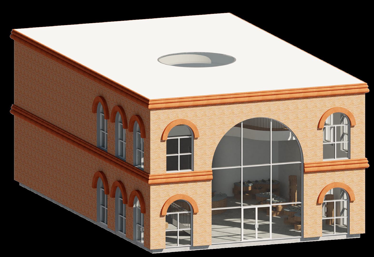
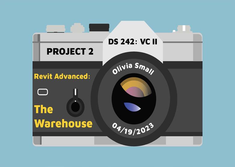
The Warehouse 4
Retail Design - Spring 2023
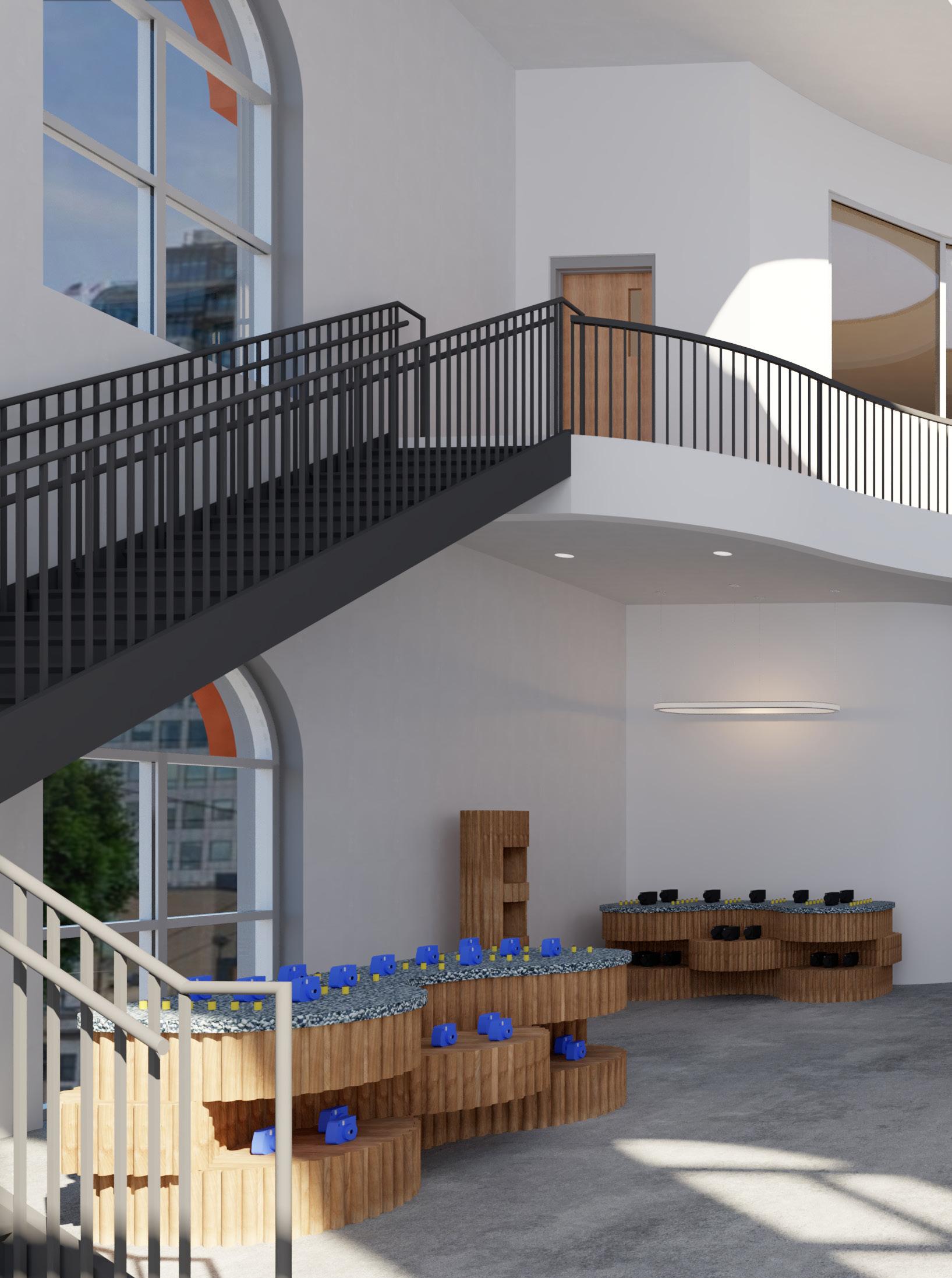
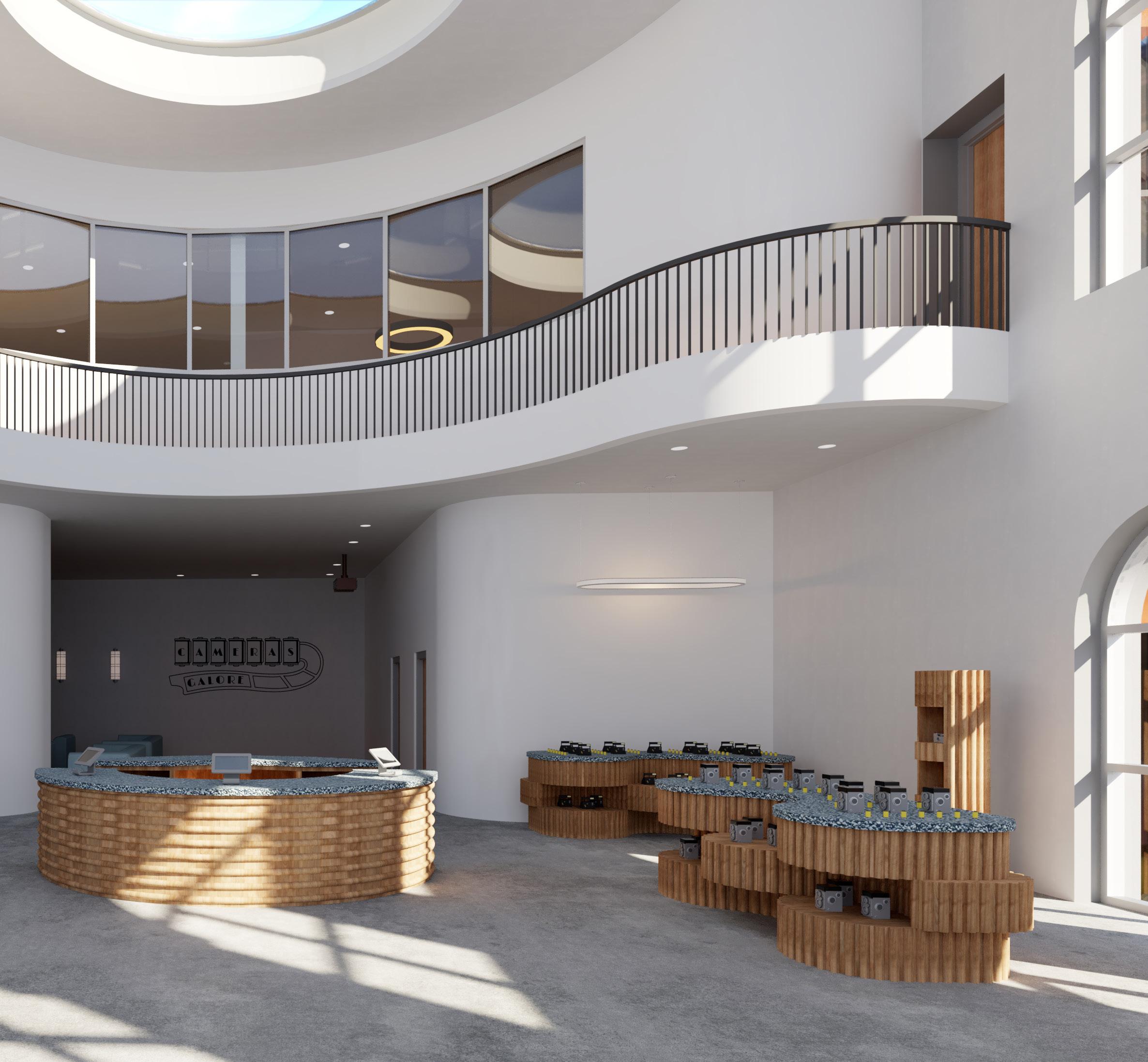
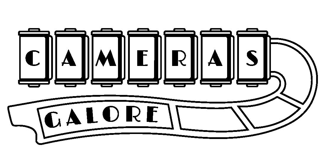
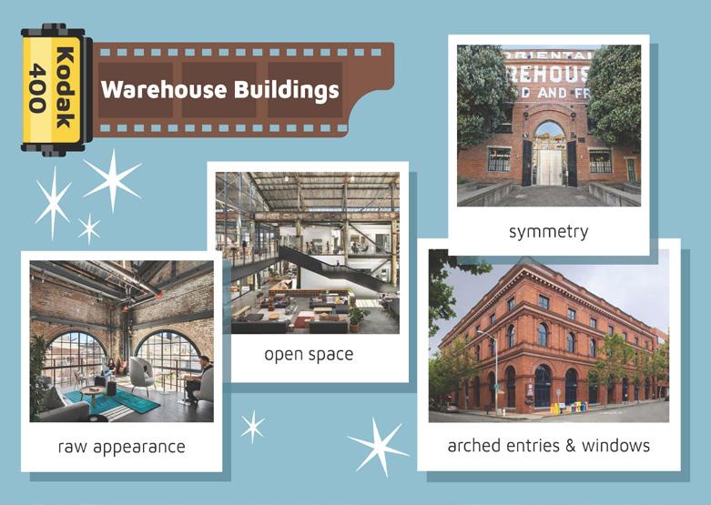
The project focused on advancing Revit skills through the design, renovation, and conversion of a commercial warehouse building. Located in San Francisco, Cameras Galore is a retail space designed to “capture” creatives. It focuses on the merchandising of various cameras and film photography necessities created using Revit’s Family builder tools. A darkroom is available for clients who wish to see their photographs come to live. Furthermore, the inclusion of a theater space was implemented for users to pass the time as their images develop. The second level is limited to staff with access to a break room, office, and conference room.
The design keeps the industrial feel of the warehouse alive through the selection of concrete flooring while still introducing a sense of warmth and playfulness through the curving lines and natural woods. The design further offers a unique atmosphere for shoppers through the custom cash wrap and merchandise displays.
Site San Francisco, CA
Rendered Floor Plans
The Warehouse
The design’s layout playfully mirrors the facade of a camera with the custom cash wrap and skylight of the roof representing the lens. Furthermore, the planning considers the importance for staff to have a sense of security over the retail space. While employees occupy the second level, they can still obtain access to views of the first floor merchandise and cash wrap.
The Warehouse
Exterior View
Renderings
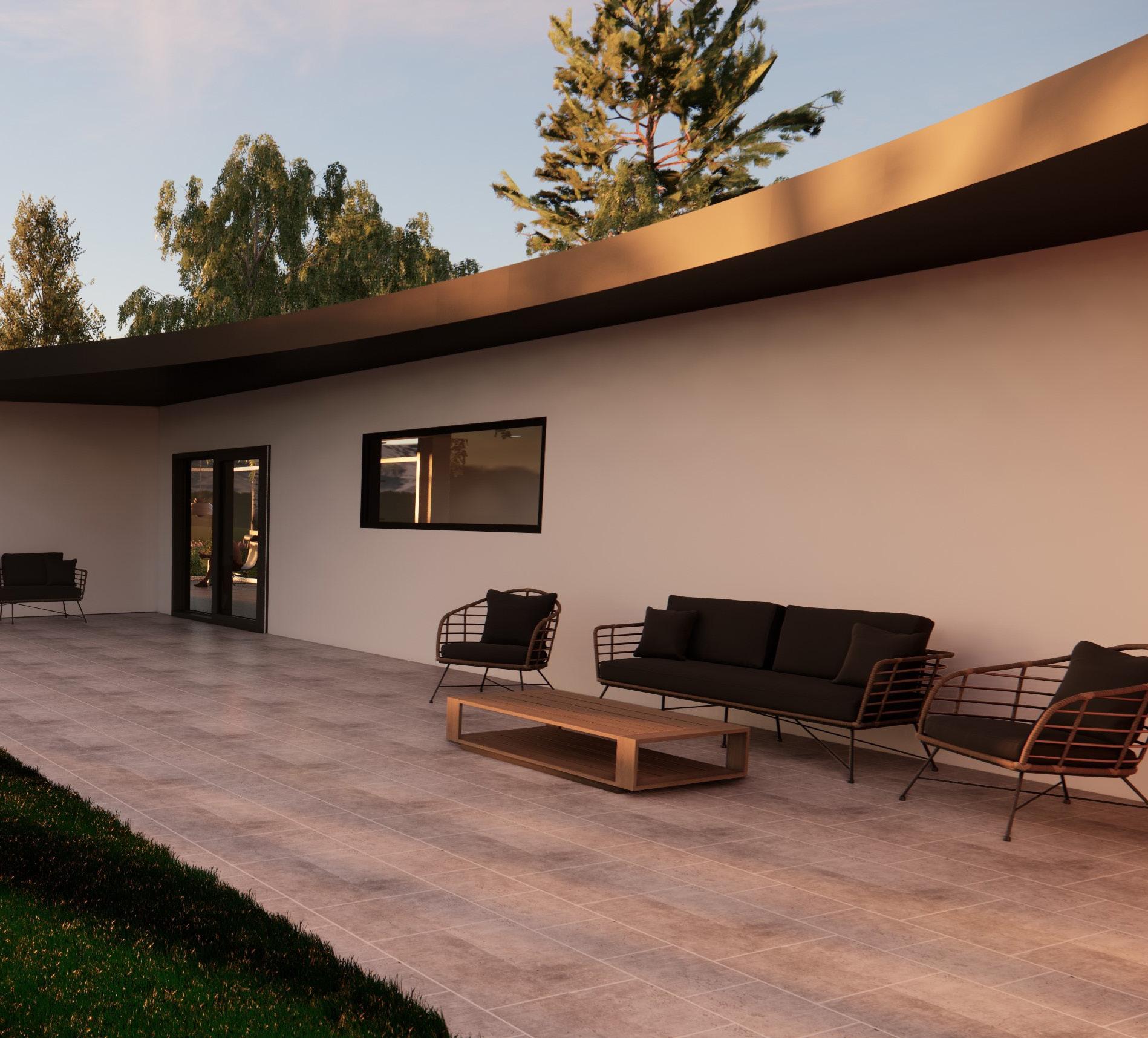
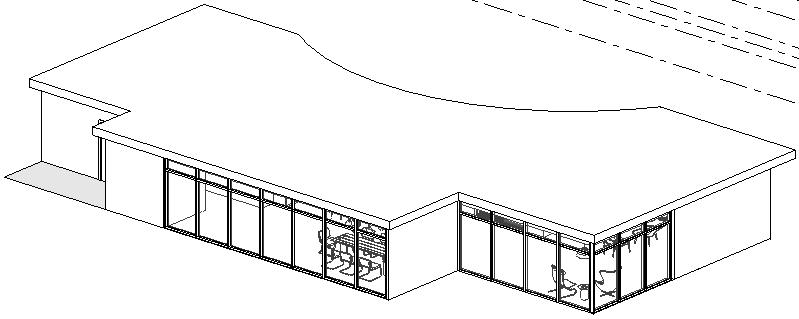
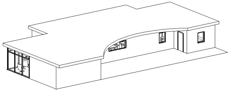
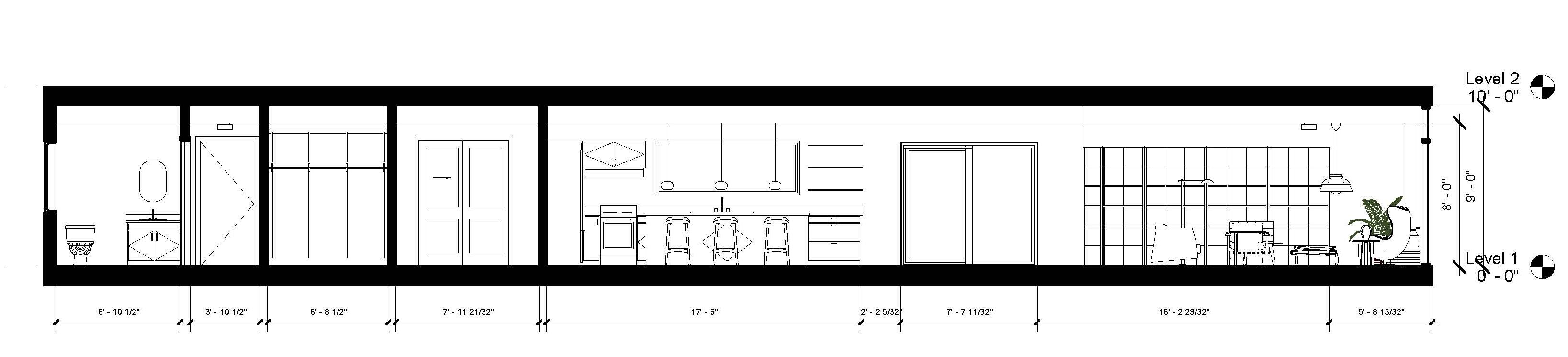
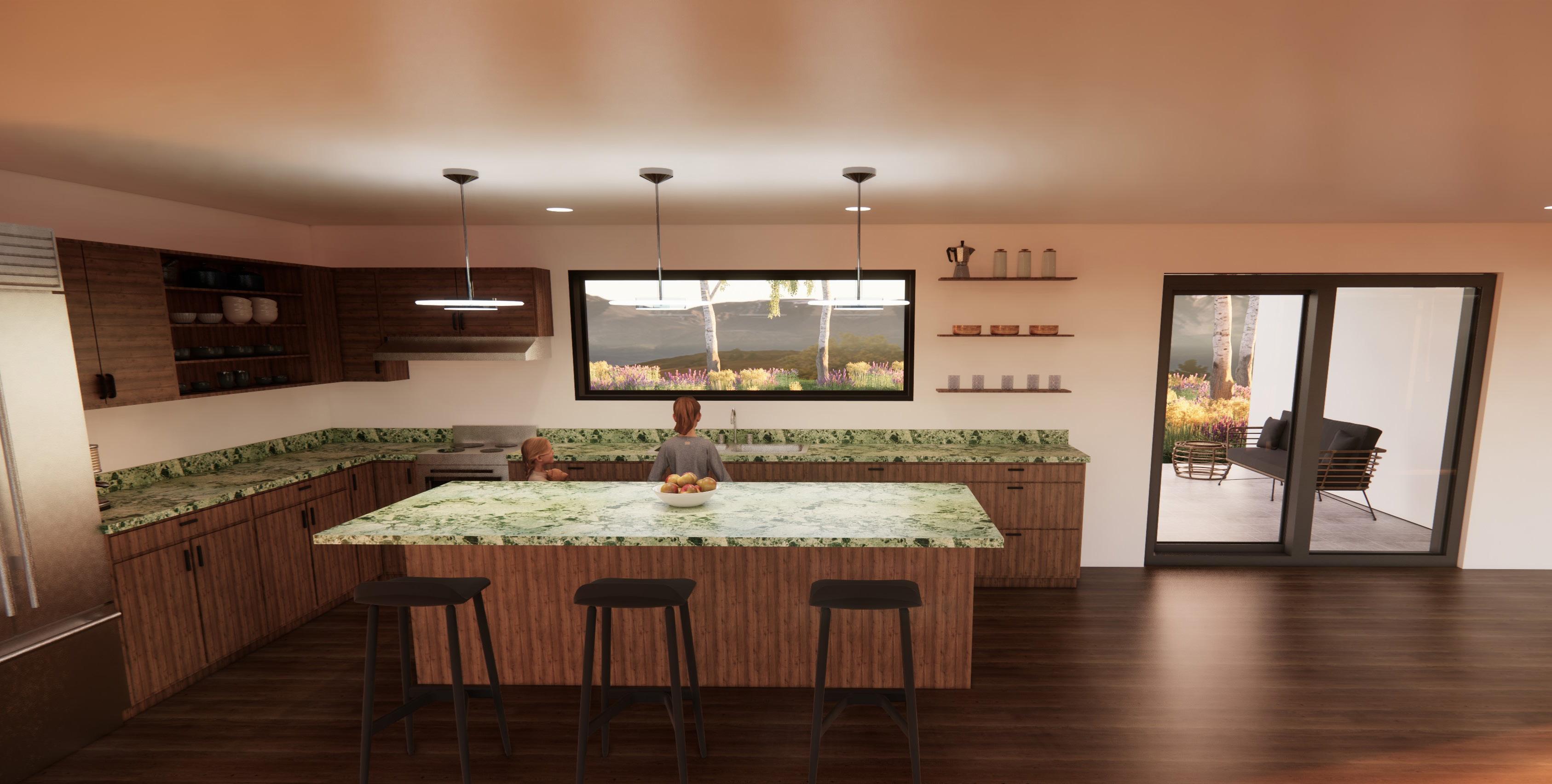
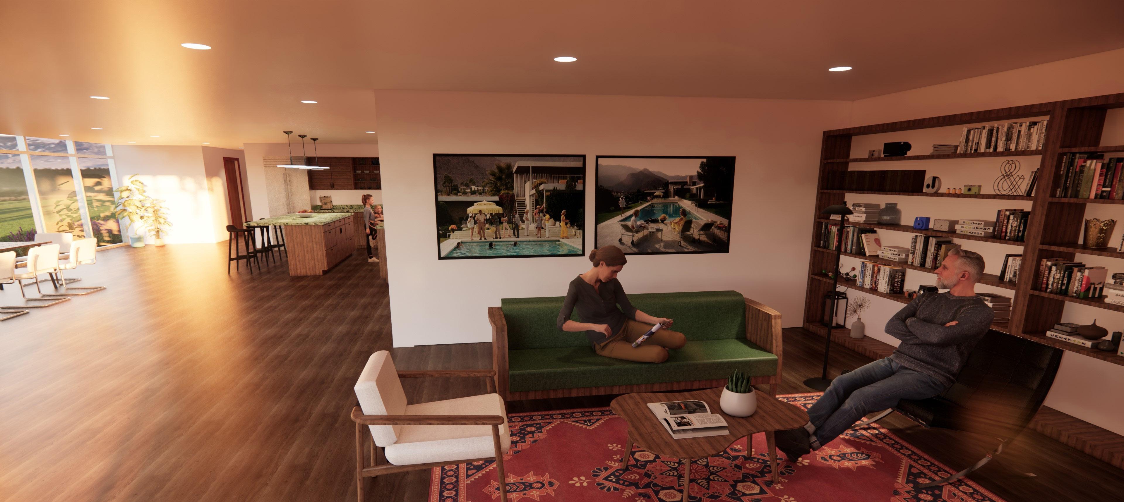
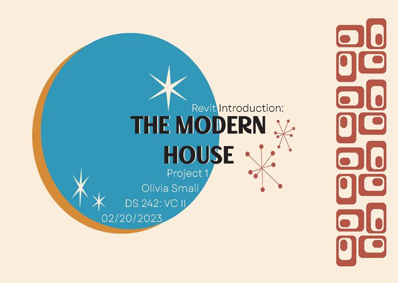
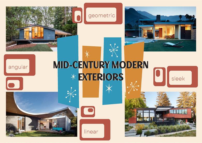
Mid-Century Modern Home 5
Residential Design - Spring 2023
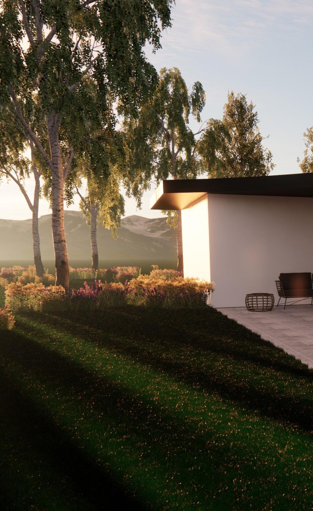
The design process of the modern home involved sufficient research in order to inform the space’s layout, exterior and interior details, and FF&E selections. The single story home considers the importance of simplicity, order, and access to daylight. The curtain walls work to evoke the mid-century modern style as well as connect the occupants with breathtaking views of nature.
Site Palm Springs, CA
Square Footage
Software ~ 2000 sf Revit & Enscape
Outdoor Patio
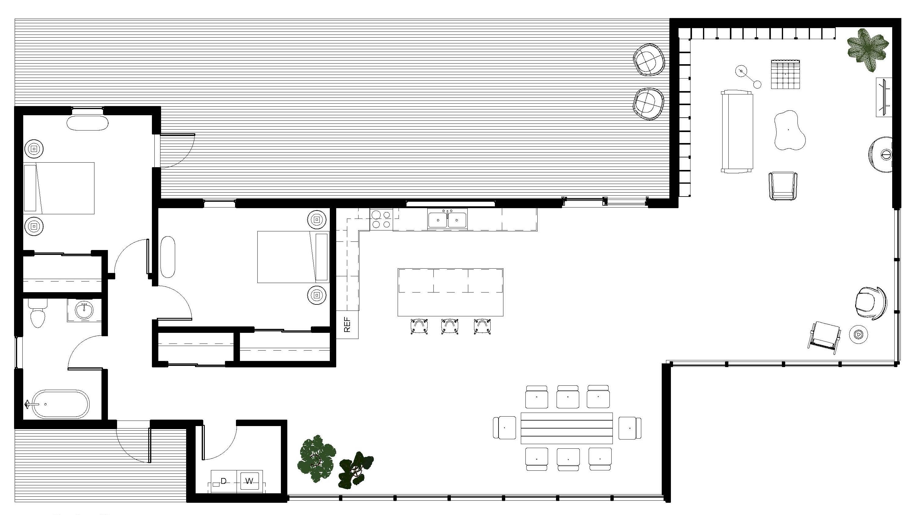
Furniture Plan
Although an open concept, the layout maintains degrees of privacy through the use of angular lines and placement of furniture in corner nooks.
The renderings experiment with the time of day and demonstrate how variations in natural lighting impact the space’s mood.
Exterior View
Exterior View
Renderings
Graphic Design
Spring 2023 - Fall 2024
Period Room Poster
Illustrator
The purpose of the project was to design a period room in a design style that gained popularity at some point between the 19th and 20th centuries. The design pulls inspiration from Art Deco graphic design seen throughout advertisements and posters of the period. The decorative objects drawn depict and reference authentic Art Deco forms. The space itself considers the popularity of the style within theater architecture and interiors.
The Deco-Mount theater
San Francisco’s Stamp Sheet
Illustrator
San Francisco’s Painted Ladies Forever Stamps showcase the limitless possibilities offered through using the basic shapes of rectangles, triangles, circles and so on. The design of the sheet pulls inspiration from the style of a vintage postcard. Each stamp interacts with the overall sheet yet can stand alone as its own individual composition.
Painted Ladies
FOREVER STAMPS
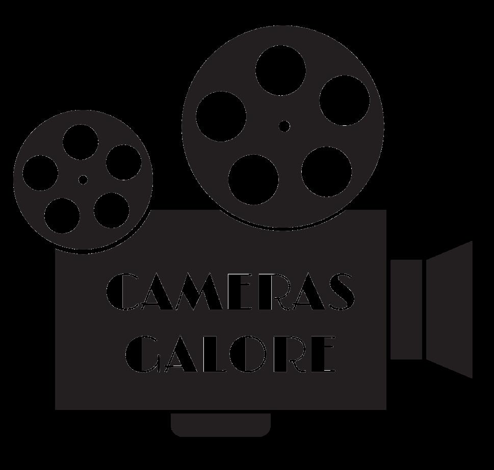
Project Logos
Illustrator
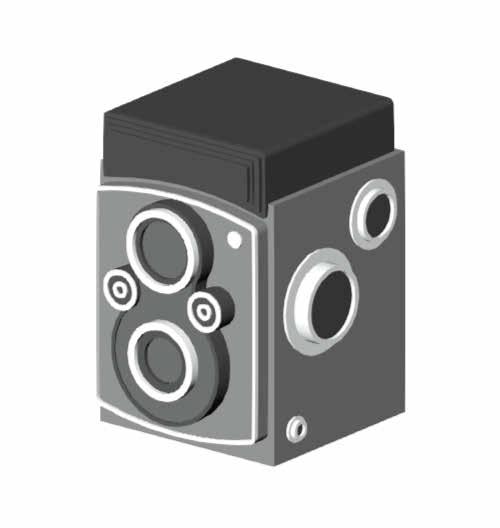
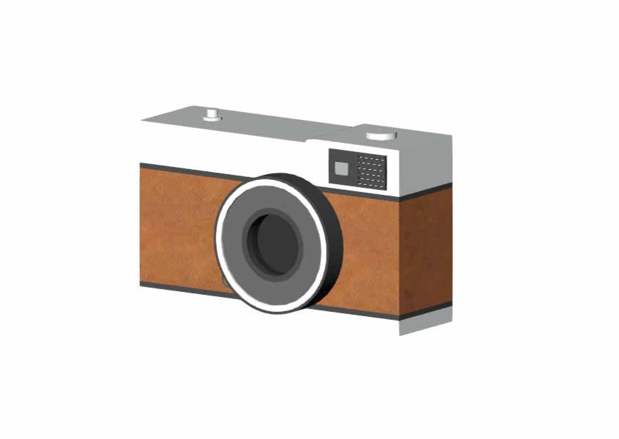
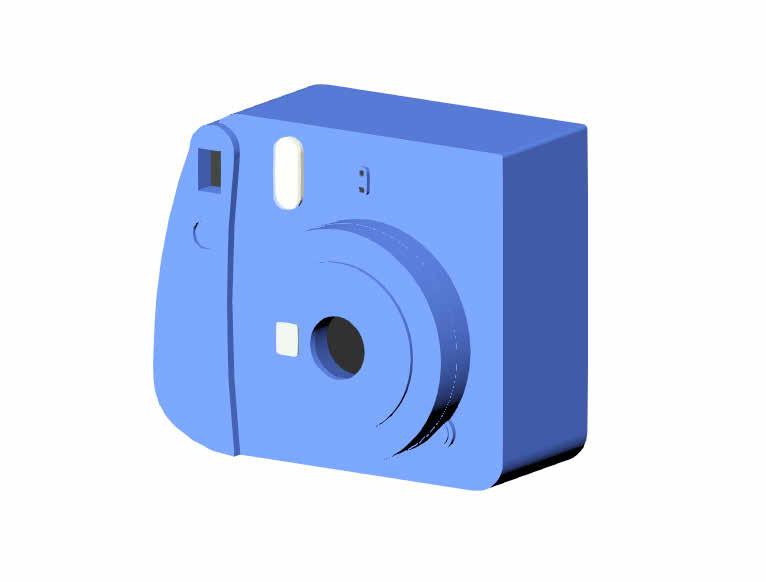
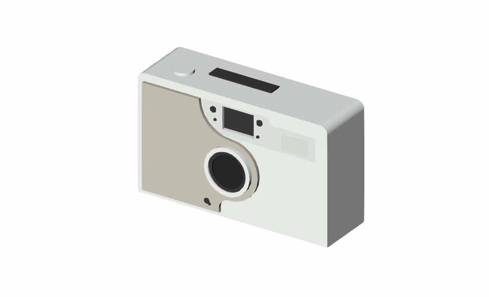
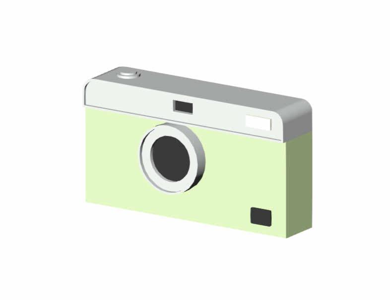
When designing a retail place, it is important to prioritize branding. The logos designed for Cameras Galore evoke the playful nature of the space while clearly indicating the kind of merchandise being sold.
Social Issue Poster
Illustrator
The poster serves as an informative graphic to present current initiatives being enacted to help reduce poverty around the globe. It aims to make viewers aware of current solutions and to hopefully inspire them to do further research.
REDUCE POVERTY through
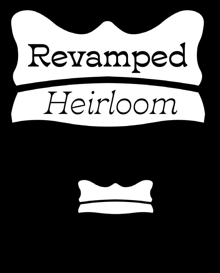
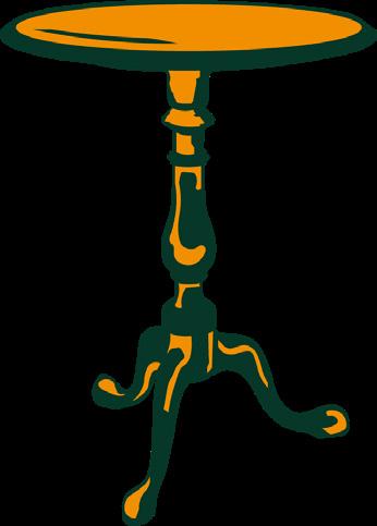
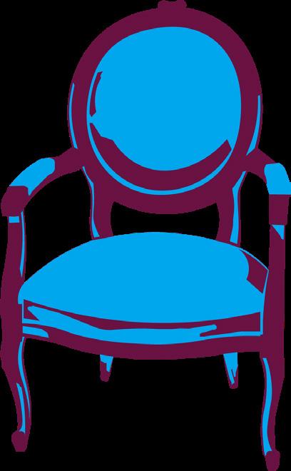
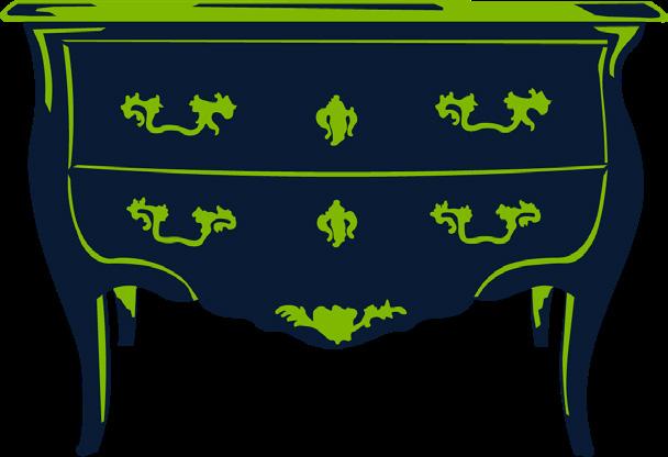
Brand Identity
Illustrator
Revamped Heirloom is the proposed branding for a company that sells antique furniture and goods. The personality can be described as sophisticated, playful, and clean. The vibrant color palette and responsive logo send the tagline’s message of “reimagining your grandmother’s furniture.”
SUSTAINABLE DESIGN
Location Poster
Illustrator
The goal of the project was to create a poster that captures the essence of the designer’s favorite place in the Madison, WI area. The selected place is highlighted in the form of a perspective that uses an analogous color palette to convey the warm and comforting atmosphere of the space.
Project Spreads
Illustrator & InDesign
For interior design projects, project spreads serve as a visual tool to prepare viewers what to expect from the space. Graphic design can be used as a tool to complement the interior design. Both spreads consider details and elements that correlate to styles and objects incorporated within the project’s environment