
design Portfolio Olga Pertek UCAS number: 164-571-4505
Interior

The images on the left show an attempt at an A3 pencil copy of The Casa Batllo, a building in the center of Barcelona refurbished by architect: Antoni Gaudi. This building was said to be inspired by nature: a recurring theme throughout my work.
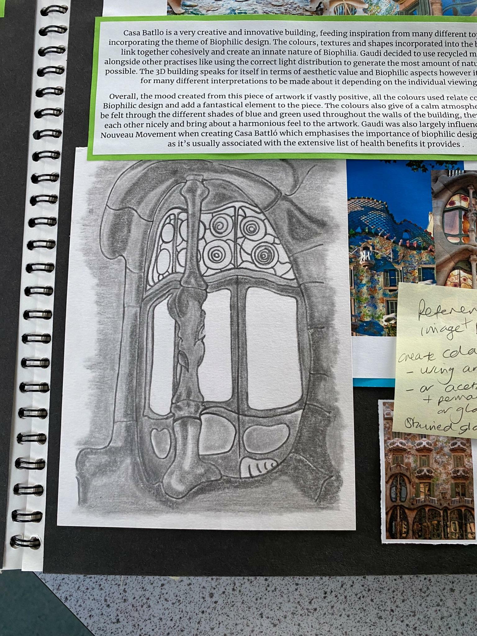
The image on the right is also a detailed pencil copy of the same building, just of a different section. This copy focuses more on the intricate windows that are located at the bottom of the building creating a warm welcome to tourists. I tried to execute this sense of welcoming through delicate shading and defined edges.

In addition to the tonal drawings, I created an A3 monoprint of the balcony section forming part of The Casa Batllo facade. I then added colour using gouache paints and a thin brush to achieve a similar dismantled effect that Gaudi manages to execute in this design.
My main aim with this copy was to recreate the intricate mosaic effect which tends to be a fundamental element in Gaudi’s work.

Furthermore, continuing with Gaudi’s work, I created more A5 copies of a few more buildings that formed part of the architects portfolio. This image is a line drawing using biro and watercolour. It’s of a blue and white mosaic tower located in Park Guell. Alothought small, this line drawing turned out precise and contained a vast amount of complex details.

Here are some images of the photographs I took at Chatsworth House in 2022. This particular sculpture intrigued me as it complemented Gaudi’s architectural work; both artists used similar colour schemes and created their work with an awareness for the environment. In this sculpture different coloured reusable bottles were used to achieve a contrast when creating the towers whereas in Gaudi’s work fragments of leftover mosaic were used to achieve a unique texture. I tried to capture the towers from different angles to show of their proportions and details in different lighting.


The image at the top is an A5 copy of one of Noel Badges Pugh’s work; I created it using gouache paints. I really enjoyed making this copy as the colours used were unique and different compared to the colours other artists use when painting skin tones. This colour experimentation allowed me to express my creativity and not stress about having to make everything look perfect and proportionate.
To further develop my work and build on the techniques I developed after creating copies of Noel Badges Pugh’s work, I decided to make my year 12 final piece inspired by his work. This was an A3 gouache painting of one half of my brothers face vs the other half of my dads face. The topic was natural vs manmade therefore to execute the natural aspect, I predominantly used a variety of green and blue shades giving the piece an environmental essence. The manmade aspect came from the actual products being used in the design: gouache alongside styrofoam - used to create the rose stencil for the background - are created by human beings making them manmade products.


During my year 12 project I created this clay sculpture. The intent was to make it a functioning piece of room decoration. This is a sculpture of a face half being covered by roses; the remainder is wrapped with chicken wire contains individual PVA glue and wire flowers. This piece symbolises the natural vs manmade world: human beings and nature vs clay, PVA glue and wire.

Dimensions: Length - 61cm Height - 31cm
During my week of work experience at Ought2, a business specialising in incorporating planting into design: for interiors & exteriors, I was privileged enough to create a mini moss wall of my own. As this was my first time working with moss, the plan was to experiment with all three types of moss available: bun, reindeer and flat. I was given three shades of green alongside some dyed red moss and my intention was to create a forest from a birds eye view. The panel turned out just how I envisioned and looked exactly like little bundles of trees in a forest.

After becoming more comfortable with handling moss, I was tasked with the job of creating the final segment of a moss wall commissioned for a high end client. I started out with drawing out the existing wall and then created an extension which was connected onto the already existing panels. Although this was done as a rough sketch it required a tremendous amount of consideration and planning to make sure the design fit in with all the other panels and didn’t contrast anything.
This is an image of the complete moss wall installed and ready for use. The panel at the end marked with a red circle is the one I designed and helped create.

After experimenting with moss, I decided to undertake an hour challenge setting myself the task to create a 3D interior design ‘living wall’ made out of a different medium. I decided to use green tissue paper and pink/red fabric flowers to generate a design inspired by ought2 and William Morris. The image at the bottom is the final product. The arrangement of the design was heavily influenced by William Morris’s colourways and use of repeat patterns.

The final product turned out well however, I definitely prefer the look of real plants in comparison to artificial ones as not only do they look better but are also more favourable when it comes to benefits linked with biophilic design. This challenge also provided further inspiration for future work.
Dimensions: Length - 63.5cm Height - 47cm.
Canvas painting dimensions:
Length - 51.5cm/Height - 61.5cm
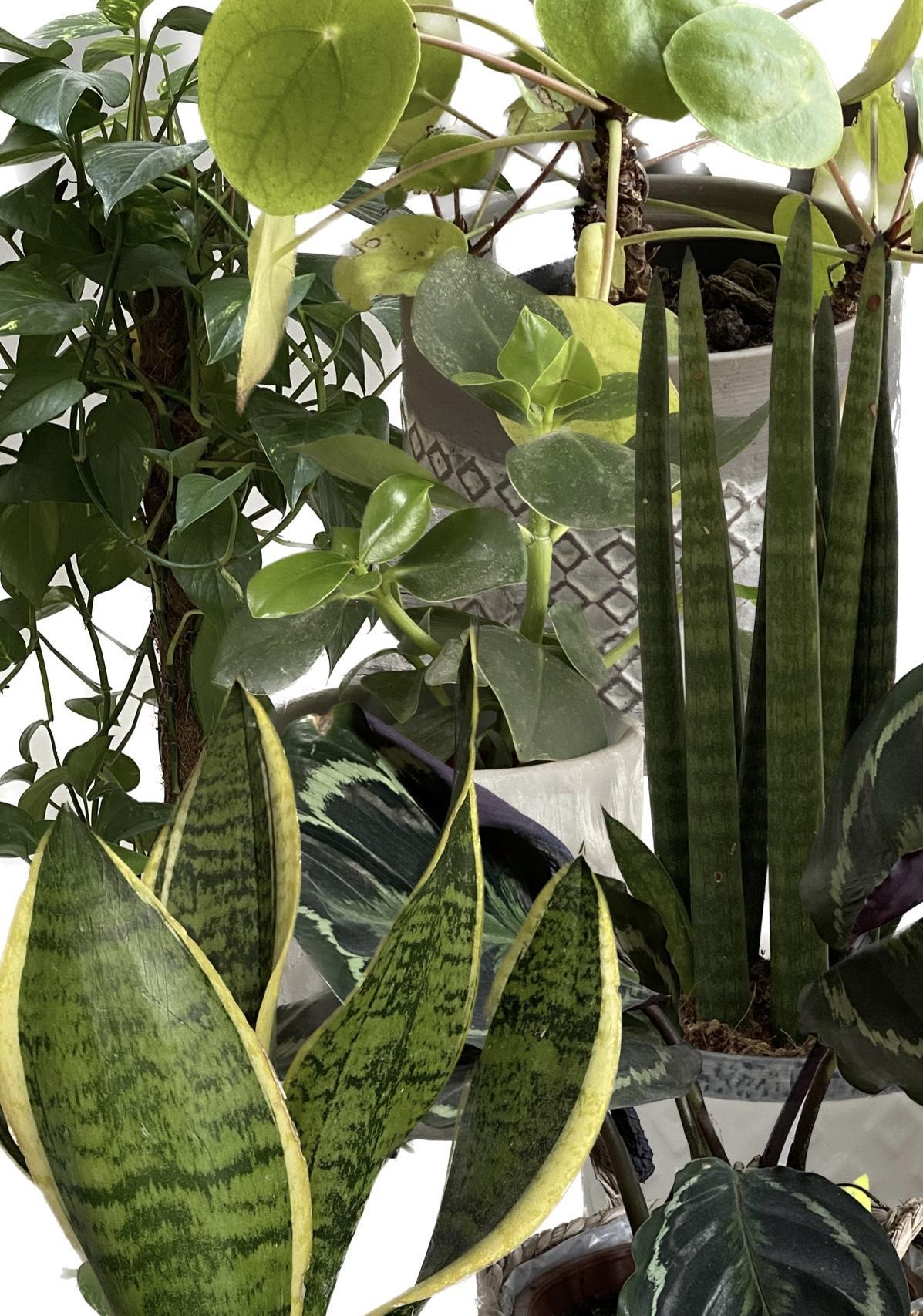
This particular gouache painting (2) was inspired by plants from around my house; alongside a Van Gogh Exhibition I attended. Before starting the canvas painting, I created a collage using an editing app (1). I ended up with many different arrangements however I picked this particular one as it presented all six plants in an equal way; each one standing out individually despite being cramped together.
The painting contains several different shades of green along with other complementary colours like dark purple and brown. The finished piece incorporates biophilic design and ultimately manages to portray calmness and tranquility.

The main aim for my year 13 project was to incorporate as much interior design as possible therefore, I thought the most beneficial way would be to create a wallpaper design. To do this I first created a regular design using an editing app, then I tessellated this design and added colour. after all this was done I photocopied the tessellated print and stuck each copy together to create a larger print. I haven’t yet managed to transfer this print onto any furniture however I plan to do so at a later stage. I even want to incorporate it in my final piece which will be a 3D model of my house redesigned in a biophilic way as this is what my year 13 project is all about (Biophilic Design).

After creating the initial tessellation print I decided to experiment a little with photoshop. This is an image of one of the many different colour ways I created using photoshop. Creating these colourways was definitely beneficial as they allowed me to view my design from a different perspective. This technique also gave me the opportunity to pick the best colourway that fits different types interiors depending on the desired style.

Floor plan dimensions: Length60.5cm Height43cm
These images show an example of a floor plan I created for one of my year 13 final pieces. The one on left is a rough design idea plan of the second floor in my house. The image on the right, is the final outcome of the floorplan on the left containing moodboards that explain each room in more detail. This was created on graph paper to help me with the dimensions of the interior, although they are not to scale having some sort of measuring system proved to be beneficial when it came to shape and size accuracy of each room. This piece was inspired by three artists I looked at in my project based around biophilic interior design: Antoni Gaudi, Ought2 and William Morris all mentioned in previous work.


I also created this same floor plan as before using a digital application called ‘room planner’. I tried using sketchup however it ended up being too difficult so I turned to this application instead as it offered a similar outcome. I enjoyed using this programme as it wasn’t difficult to operate and produced great results. The image on the bottom right shows the corridor of the house from the point of view of a person inside the room.
This was one of my favourite thing to create as it’s something that links directly to interior design and allows me to execute my ideas in a more professional way. Using ‘room planner’ gave me the opportunity to view my floor plan design from not only a 2D perspective but also a 3D perspective.

