Logo
Logo Anatomy
The Olds College of Agriculture & Technology logo is comprised of a symbol and associated logotype, in horizontal and vertical formats. It is crucial that these elements are never altered in any way; the relationship between the symbol and the logotype must remain consistent across all mediums and communications. Only use the logo files from the approved toolkit, and ensure the correct file type is being used for the medium in question.
Special Use of the Symbol
In special circumstances, the symbol can appear in isolation when used as a social media avatar or app icon. In these instances, always use the RGB version of the symbol on white.
Symbol
Logotype
App Icon Social Avatar
Horizontal Logo
The horizontal orientation of the Olds College logo is the preferred-use logo, and is available in five versions. The colour logo is the primary-use version, and should be utilized whenever possible. When reversing the logo out of a dark colour, the colour reverse logo is the preferred-use logo.
Vertical Logo
The vertical orientation of the Olds College logo is the secondary-use logo, and is available in five versions. This logo orientation is ideally used in extreme vertical applications, for both digital and print.
Colour with Release
Vertical Logo
Large Shield Version
The vertical orientation of the Olds College logo with the large shield is also a secondary-use logo and can be used as an alternate in situations where there is a need to maximize the size of the shield. It is available in five versions. This logo orientation is ideally used in extreme vertical applications, for both digital and print. It is the preferred version for merchandise items.
Colour with Release Colour Reverse Black
Colour
Logo Colour
Positive Logo Application
The positive logos are those that will be applied to light backgrounds. They are the colour logo, the colour logo with release and the black logo.
The colour logo is the preferred version. It should be used wherever possible and only on white or very light backgrounds, It can also be used on images that are clean and light and that provide enough contrast.
The black logo is a secondary version. It should only be used on white or very light backgrounds. It can also be used on images that are clean and light and that provide enough contrast.
The colour logo with release is similar to the colour logo. It should also be used on white or very light backgrounds. The advantage of the colour logo with release is that it "protects" the logo's colours. This version is preferred when the background may vary such as in a video application.


Logo Colour
Positive Logo Application
The positive logos should not be applied to colours that do not provide enough contrast. Reference this page regarding brand colours the logo should not appear on.
Even though some of these combinations provide enough contrast to be legible, the end result is not an ideal representation of the brand and therefore should be avoided.
Pantone 340 CP
Pantone 2250 CP
Pantone 2011 CP
Pantone 2925 CP
Pantone 2146 CP
Pantone 2925 CP
Pantone 340 CP
Pantone 2145 CP
Pantone 342 CP
Pantone 2250 CP
Pantone 2145 CP
Pantone 341 CP
Pantone 2250 CP
Logo Colour
Reverse Logo Application
The reverse logos are those that will be applied to dark backgrounds. They are the colour reverse logo and the reverse logo.
The colour reverse logo is the preferred version to appear on dark backgrounds. It should be used wherever possible and only on dark or very dark backgrounds. It can also be used on dark images that provide enough contrast. In addition, it can be applied to the brand colours: 2146 CP, 2145 CP, 2144 CP, 342 CP, and 341 CP.
The reverse logo is a secondary reverse logo and is similar to the colour reverse logo. It should also be used on dark or very dark backgrounds and images that provide enough contrast. In addition, it can also be applied to the brand colours: 2146 CP, 2145 CP, 2144 CP, 342 CP, and 341 CP.

Dark Images
Pantone 2146 CP
Pantone 342 CP
Pantone 2145 CP
Pantone 2144 CP
Pantone 341 CP
Dark Images
Logo Colour
Reverse Logo Application
The reverse logos should not be applied to colours that do not provide enough contrast. Reference this page regarding brand colours the logo should not appear on.
Pantone 2250 CP
Pantone 2250 CP
Pantone 2011 CP
Pantone 2011 CP
Pantone 340 CP
Pantone 340 CP
Pantone 2925 CP
Pantone 2925 CP
Logo Application
Safe Area and Minimum Size Requirements
The safe area of the Olds College logo is defined by the height of the letter "O" in the logo. This safe area should be observed in all situations and in any piece of communication to ensure the logo's integrity.
Minimum Logo Size
The logo has been carefully designed to work at small sizes, but there are limits. The minimum size requirements for screen and print applications are outlined on this page. Note that while these sizes are the minimum allowed, always strive to apply in a way that maximizes its size.
Minimum Sizes Print: 1.5" wide Digital: 130px
Minimum Sizes
Print: 1.2" wide
Digital: 1020px
Minimum Sizes
Print: 1.2" wide
Digital: 102px
Logo Colour
Using the Correct Colour Version of the Logo
Various mediums use colour in different ways. Always use the correct logo for any given situation. A Pantone spot colour version of this logo will rarely be used. On the other hand, the vast majority of printing will be done using a CMYK process. Always use the CYMK logos in these instances. For all digital applications, always use the RGB versions of the logo.
Pantone Spot Colour
This version of the logo uses Pantone spot colours. It is used in rare circumstances such as when a piece is produced on an offset press.
When a piece is printed in colour, use the CMYK colour logo.
For all digital applications, use the RGB colour logo.
CMYK Colour
RGB Colour
File Naming Convention
Reference for Olds College Logo Files
The logo files are named in a specific way to ensure the correct logo is used. Always check what colour space you are working in to ensure that you are getting the best colour representation. Never convert a logo file from one colour space to another (e.g. using an RGB logo in a print application).
Example:
Olds_Vert_Colour_L_RE_Tag_CMYK.ai
Brand Extensions
Brand Extensions
A number of entities and departments within Olds College have been given an identifier that includes their name locked up to the Olds College logo.
This logo lockup is a way for these entities to maintain a strong connection to the Olds College brand.
Each lockup is provided in horizontal, horizontal stacked and vertical versions.
Lockups are supplied by the Olds College Marketing department. Special consideration has been given to the spacing, formatting and alignment. Never attempt to reset or create new lockups.
Brand Extensions
Safe Area and Minimum Size Requirements
The safe area of the Olds College logo is defined by the height of the letter "O" in the logo. This safe area should be observed in all situations and in any piece of communication to ensure the logo's integrity.
Minimum Logo Size
The logo has been carefully designed to work at small sizes, but there are limits. The minimum size requirements for screen and print applications are outlined on this page. Note that while these sizes are the minimum allowed, always strive to apply in a way that maximizes its size.
Minimum Sizes
Print: 1.5" wide
Digital: 130px
Minimum Sizes
Print: 1.2" wide
Digital: 102px
Tagline
Tagline
"Break new ground." is the tagline for Olds College. To ensure consistent application, the tagline is supplied as a vector file.
The tagline is available in both vertical and horizontal orientations, and in black, colour, reverse, and colour reverse. When applying the reverse versions, always ensure there is enough contrast for legibility. In the case of the colour reverse version in particular, only apply to the darkest blue in the Olds College brand colour palette; PMS 2757 CP (CMYK) or HEX: #001E60 (See pages 25 and 26). The colour reverse version may also be applied on an image that meets legibilty requirements.
Always use digital files supplied by Olds College. Never attempt to reset the tagline.
Vertical. Black.
Vertical. Reverse.
Horizontal. Black.
Horizontal. Reverse.
Horizontal. Colour.
Horizontal. Reverse.
Vertical. Colour.
Vertical. Reverse.
Tagline
Modular Application
The "Break new ground." tagline may be used in a prominent way in certain cases. When used prominently, the tagline must be a substantial distance away from the logo. Its size and scale in this application can vary as long as a reasonable amount of distance is maintained.
When signing off a piece of communication, the tagline may also appear aligned with the logo on its left side. In this case, always respect the safe area of the logo. The scale of the tagline is determined by the width of the logotype; it should not be wider than the logotype.


When signing off a piece, align the tagline to the baseline of the logotype. Use the width of the logotype to determine the size of the tagline in relation to the logo. When used in close proximity to the logo in a sign-off application, the tagline should never be wider than the logotype.
oldscollege.ca
Tagline
Tagline Locked Up to Logo
In instances where space is limited, a version of the logo with the tagline locked up to it, has been developed.
This version is also available in all the colour variations outlined on pages four to six.
See page 11 for the rules regarding minimum size and safe area.
Typography
Primary Brand Font
Print Applications
Clan is the primary brand font for print. It is an extensive family giving it the versatility to communicate in a variety of ways. Clan may be used for headlines, subheadings, body copy and all miscellaneous text in a given layout.
abcABC0123
Clan Book
abcdefghijklmnopqrstuvwxyz
ABCDEFGHIJKLMNOPQRSTUVWXYZ 0123456789!@#$%^&*
Clan Book Italic abcdefghijklmnopqrstuvwxyz
ABCDEFGHIJKLMNOPQRSTUVWXYZ 0123456789!@#$%^&*
Clan News
abcdefghijklmnopqrstuvwxyz
ABCDEFGHIJKLMNOPQRSTUVWXYZ 0123456789!@#$%^&*
Clan News Italic abcdefghijklmnopqrstuvwxyz
ABCDEFGHIJKLMNOPQRSTUVWXYZ 0123456789!@#$%^&*
Clan Medium
abcdefghijklmnopqrstuvwxyz
ABCDEFGHIJKLMNOPQRSTUVWXYZ 0123456789!@#$%^&*
Clan Medium Italic abcdefghijklmnopqrstuvwxyz
ABCDEFGHIJKLMNOPQRSTUVWXYZ 0123456789!@#$%^&*
Clan Bold abcdefghijklmnopqrstuvwxyz
ABCDEFGHIJKLMNOPQRSTUVWXYZ 0123456789!@#$%^&*
Clan Bold Italic abcdefghijklmnopqrstuvwxyz
ABCDEFGHIJKLMNOPQRSTUVWXYZ 0123456789!@#$%^&*
Primary Brand Font
Digital Applications
Roboto Flex is the primary brand font for digital applications. It may be used for headlines, subheadings, body copy and all miscellaneous text in a given layout.
Roboto
abcABC 0123
Roboto Regular
abcdefghijklmnopqrstuvwxyz
ABCDEFGHIJKLMNOPQRSTUVWXYZ 0123456789!@#$%^&*
Roboto Italic abcdefghijklmnopqrstuvwxyz
ABCDEFGHIJKLMNOPQRSTUVWXYZ 0123456789!@#$%^&*
Roboto Medium abcdefghijklmnopqrstuvwxyz
ABCDEFGHIJKLMNOPQRSTUVWXYZ 0123456789!@#$%^&*
Roboto Medium Italic abcdefghijklmnopqrstuvwxyz
ABCDEFGHIJKLMNOPQRSTUVWXYZ 0123456789!@#$%^&*
Roboto Regular abcdefghijklmnopqrstuvwxyz
ABCDEFGHIJKLMNOPQRSTUVWXYZ 0123456789!@#$%^&*
Roboto Flex Bold Italic abcdefghijklmnopqrstuvwxyz
ABCDEFGHIJKLMNOPQRSTUVWXYZ 0123456789!@#$%^&*
Roboto Black abcdefghijklmnopqrstuvwxyz
ABCDEFGHIJKLMNOPQRSTUVWXYZ 0123456789!@#$%^&*
Colour
Digital Colour Palette
For Use in All Screen Applications
A cohesive and consistent online presence to promote the Olds College brand is important. The colours below represent the screen-optimized palette for the Olds College brand and should be used in all digital communications, including all social media, online and video applications.
Primary Brand Palette
HEX: #00358E
RGB: 0 53 142
Secondary Brand Palette
HEX: #004EA8
RGB: 0 78 168
HEX: #001E60
RGB: 0 30 96
HEX: #523178
RGB: 82 49 120
HEX: #0067B9
RGB: 0 103 185
HEX: #84329B RGB: 132 50 155
HEX: #009CDE
RGB: 0 156 222
HEX: #B565A7 RGB: 181 101 167
HEX: #006747
RGB: 0 103 71
HEX: #DC582A RGB: 220 88 42
HEX: #007A53 RGB: 0 122 83
HEX: #AF231C
175 35 28
HEX: #76232F RGB: 118 35 47
HEX: #00965E
RGB: 0 150 94
HEX: #4E3524 RGB: 78 53 36
HEX: #00B373
RGB: 0 179 115
HEX: #ED9B33
237 155 51 HEX: #7C878E
124 135 142
#7E7F74
126 127 116
Print Colour Palette
For Use in All Print Applications
Physical printed mediums still play a crucial part in building the Olds College brand. When developing these materials, refer to the Pantone numbers and four-colour breakdowns below. These colours should be used in all printed media, including outdoor advertising, newspaper insertions, posters and brochures.
Primary Brand Palette
Secondary Brand Palette
Print Colour Palette
Applying Colour
The Olds College brand is primarily blue and green. The brand blue and green should be the dominant colours on any given piece of communication. All forward facing pieces such as covers and websites should be primarily blue and green.
The secondary palette is intended for miscellaneous applications such as charts and graphs in presentations or when a publication needs to differentiate sections with small accents of colour.
The colour blocking below gives an approximation of the colour hierarchy. Note that blue and green is dominant in the hierarchy.
The examples below are a sampling of possible ways the brand palette can be weighted. Note how blue and green dominate.
Graphic Elements
Graphic Elements
Graphic elements derived from the logo have been developed to create interest and to enhance or balance out compositions. Echoing the angles in the logo, the graphics add a sense of dynamic movement and provide another visual cue that reinforces the brand. Care should be taken so that these angles are not overused; using it once on a given piece as a visual accent is often enough.
The Hexagon
The Corner Graphic
The Colour Bar
The Line Graphic
Graphic Elements
The Hexagon
If using the full hexagon shape, use it sparingly. It should only be used once on a layout and may contain images that act as a focal point.
More often, hexagon shapes are cropped off the page when used. In this way it is used to delineate fields of colour.


Agriculture is a calling. And a necessity.
VIEWBOOK
Use the full hexagon sparingly on any given piece. Full hexagon shapes can be cropped off the page.
Graphic Elements
The Corner Graphic
The corner graphic is always anchored to a corner. It is a useful device to ensure blue and green is applied to the layout.
When the layout is predominately blue, use the contrasting green corner graphic.
When the layout is predominately green, use the contrasting blue corner graphic.
When the layout is predominately white, use the blue and green corner graphic.
There are times when the layout will allow for a corner graphic on top and bottom. In this case, use green on the bottom and blue at the top.
In certain cases, the corner graphic can be cropped in such a way so that more colour appears on the layout.


Graphic Elements
The Colour Bar
The colour bar is especially effective when the layout is dominated by photography or text.
It can be anchored to either the left or the right side of the layout.
The green part of the colour bar is always at the bottom, and the blue at the top. The location of hexagon that is cropped into the colour bar can vary to draw attention to important aspects of the layout such as the headline.
The colour bar is relatively thin as its purpose is to apply colour in a minimal way.


Graphic Elements
The Line Graphic
The line graphic is a secondary graphic element. It can be used to add visual interest and texture to large fields of colour.
As it is primarily meant to be subtle, it should be applied at a thin line weight relative to the layout. To obtain the subtlety required, giving the graphic some transparency is recommended. Alternatively, a contrasting blue on blue or green on green approach can work. For example, it can be applied using a light blue on a dark blue.
The line graphic was designed to be variable. That is, the vertical line can extend to fit the needs of the layout.
The line graphic should only be used once in a layout.

The line graphic is variable in that the vertical line can extend to fit the needs of the layout.
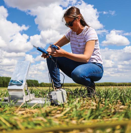
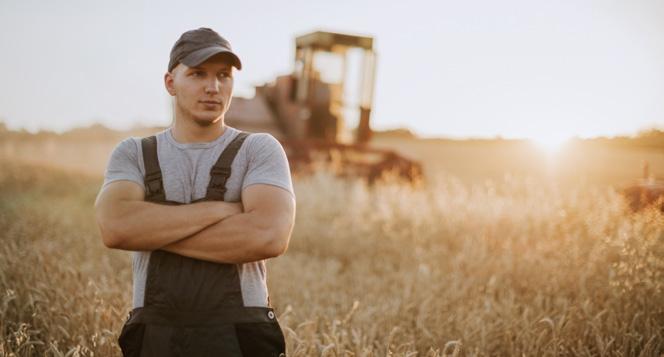
Photography
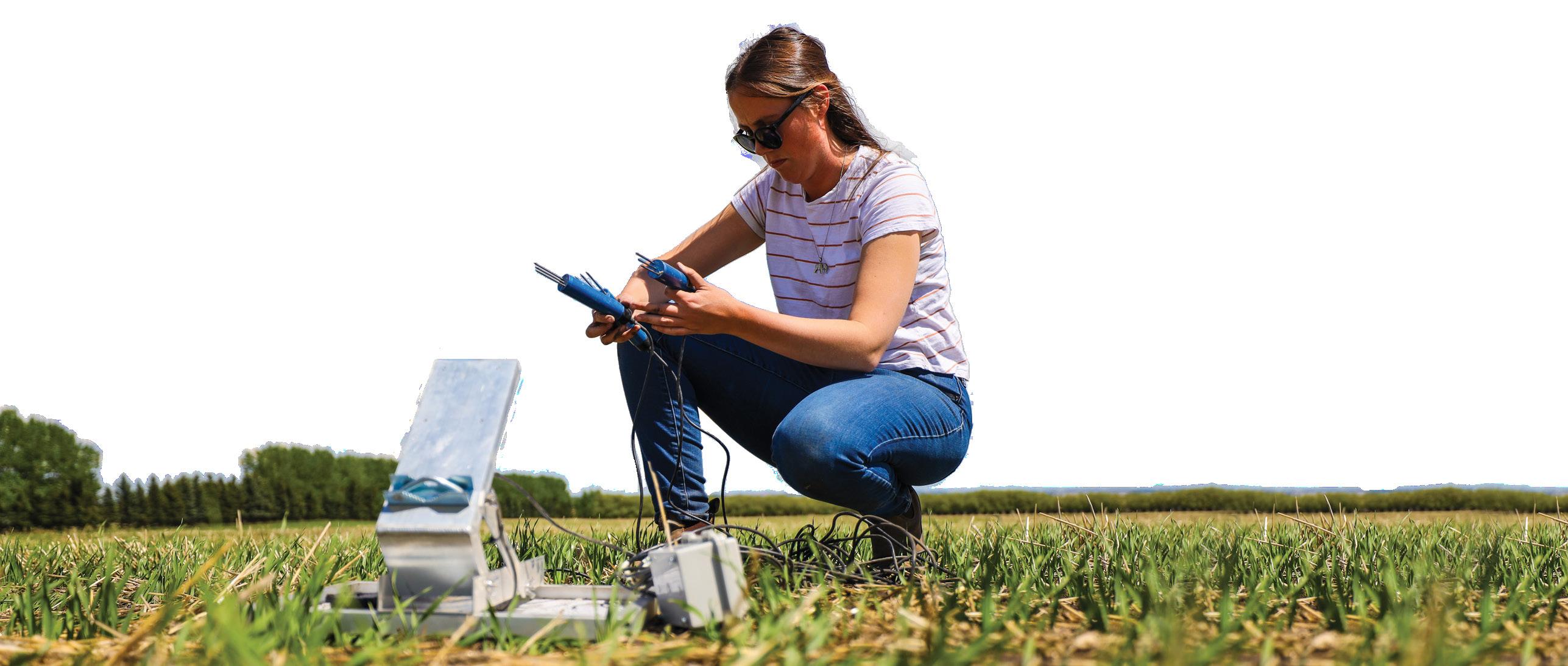
Photography
Individuals
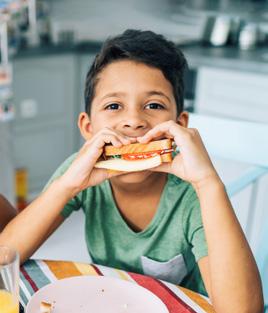
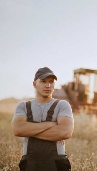
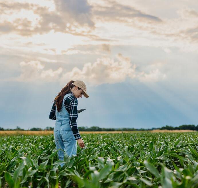
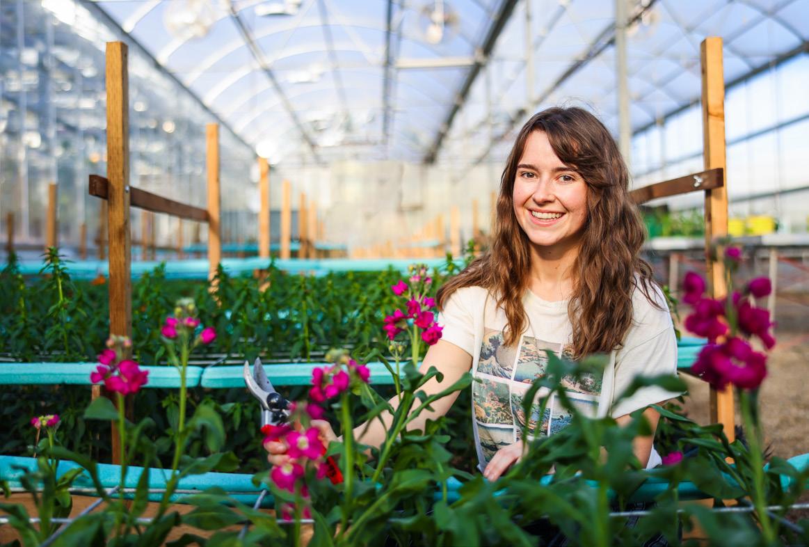
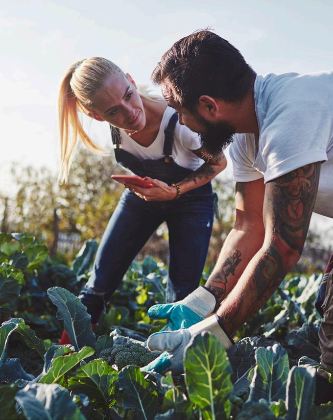
Portraits can be ideal storytelling vehicles. If highlighting a student or faculty member's accomplishments, consider putting the subject in an environment that helps enrich the story.
For more traditional headshots, the subject may be looking at the camera. However, with the goal of creating interest, look to capture spontaneous moments where the subject is not looking at the camera. The idea of breaking new ground is about "doing". For this reason, images of students "in situation" engaged in their area of learning, helps to tell the story of a dynamic learning experience.
Lighting can be used to assist in storytelling. Soft, diffused light may be best suited for traditional headshots. Directional light, on the other hand, can convey a sense of drama. As a lot of photography for Olds College is shot outdoors, attention to lighting is important. Often, early morning or early evening are ideal times to capture soft, warm light and rich shadows. If direct sunlight is unavoidable, try to mitigate harsh shadows and any discomfort to the subject as you aim for natural and confident expressions.
Photography Groups
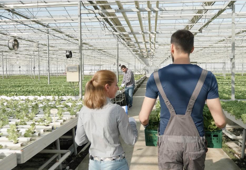
When capturing groups, always look for opportunities to capture the sense of community and connection at Olds College.
Capturing groups can tell the story of how we learn together and from each other. Always seek to capture moments of spontaneous interaction between people.
Group scenarios are also opportunities to highlight the diverse and welcoming environment at Olds College. Strive to capture a sense of camaraderie, energy, and collaboration.
Strive to capture unique and unexpected perspectives. Often, group shots will require a tight composition. Look for ways to layer people in order to create depth and differences in scale. This can contribute to creating areas of focus that draw the viewers in.


Photography
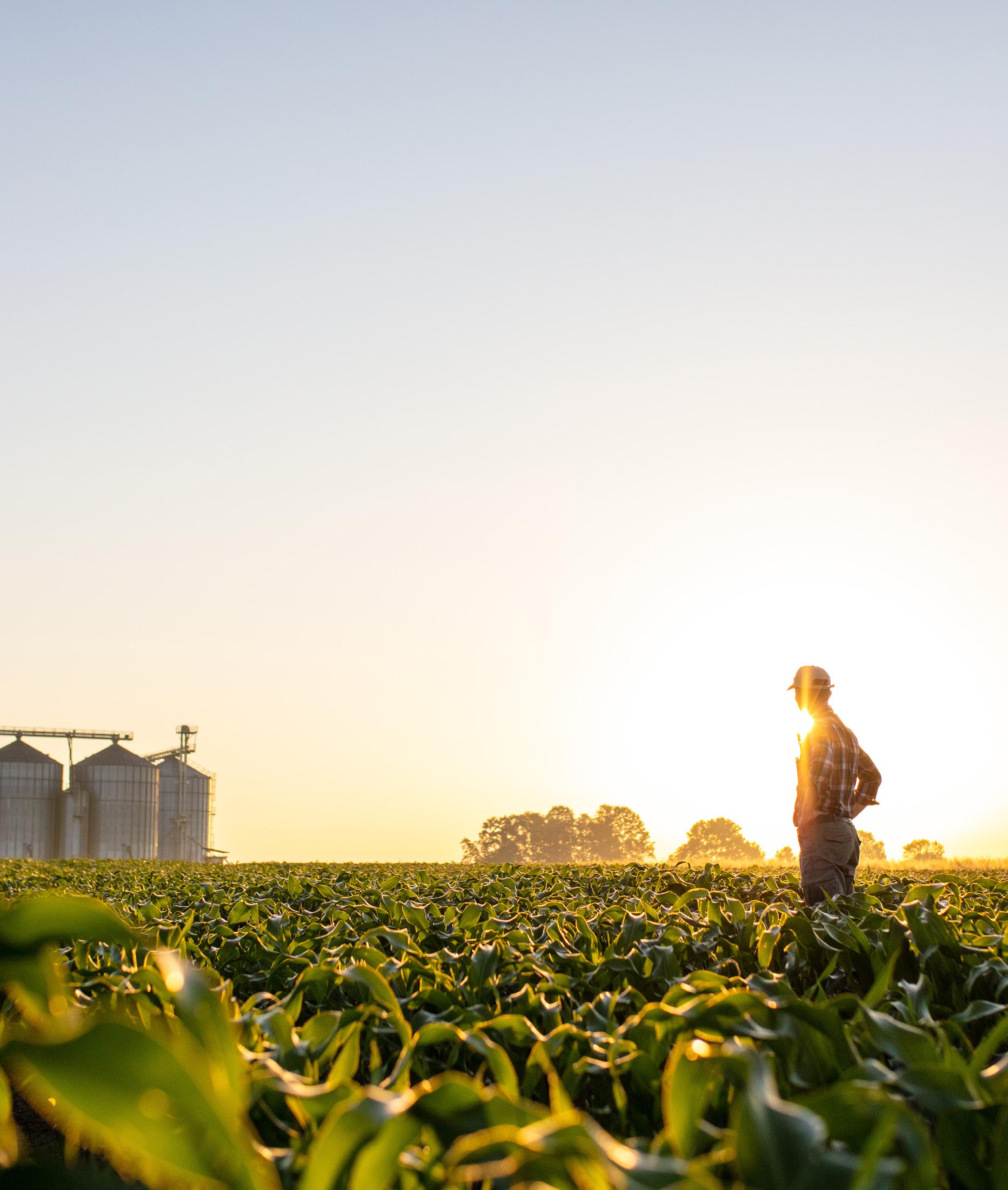
Campus
Lighting can make all the difference when capturing the environment and the facilities at the College.
Low light conditions such as in early evening or early morning create ideal lighting. Always aim to capture the campus at these times in order to capture rich, warm imagery.
In general, this applies to indoor as well as outdoor shots. Spaces such as garages, workshops and stables especially benefit from rich, warm lighting. Outdoor shots benefit from directional lighting that creates depth and dimension. Take advantage of beautiful sky conditions and the lush, green growing season.
Always aim to capture people in campus shots. Even when the goal is to feature the facilities, people add a layer of vibrancy and energy that is at the heart of the Olds College experience.


Voice and Tone
Brand Communications
Tone and Voice
Olds College of Agriculture & Technology speaks with a clear and distinct voice and tone derived from the brand platform.
Key brand messages:
Agriculture is everything.
It infuses everything we do. Give the importance of agriculture, both for our institution and the world at large, the weight it deserves.
This is our tagline. It encompasses our main goal into a simple expression of the brand: pushing the boundaries to bring agriculture, and how we educate students about it, into the future.
Brand Communications
Tone and Voice
Key brand messages:
This is where learning is experienced.
Students at Olds College of Agriculture & Technology are immersed in real and advanced working environments that build their capability to make an impact the moment they enter the workforce and prepare them for the working world that will be.
Focus on our tangible, practical and innovative education.

Brand Communications
Tone and Voice

Key brand messages:
Transforming agriculture for a better world.
This is our social purpose.
We elevate and innovate because that is the way forward.
We speak with authority and prominence as it relates to our position as an institution, yet we speak with reverence and humility regarding the importance of the mission we’ve chosen.
We always show respect for the ways of the past while outlining our commitment to creating more effective methods moving forward.
and Voice

Let our brand tenets lead the way.
Partnership:
We are tightly connected to the industry, and we want everyone connected to the College to feel like they are a part of something bigger. We understand what we can do together is more than any of us can do alone.
Adaptability:
The more things change, the faster we need to get ahead of the curve.
Ingenuity:
We use technical and industry knowledge to conceive, test and succeed at bringing effective new ideas to the table.
Activation:
We are catalysts for change. We must remember to outline the larger purpose in everything we do.
Experience:
Being prepared to make a difference in the world means truly immersing in it. To do is to learn.
Purpose:
To get somewhere, you need to pick a direction and push forward — even if that means carving a new path.
Brand communications
Communications
Tone and Voice
Referencing the College.
The full name "Olds College of Agriculture & Technology" should be used as a first reference on any given piece. Subsequent references can then use "Olds College" or "the College".
Writing style.
Be concise. Make your point with simple yet powerful language.
Be inviting and inclusive. Use first- and second-person language (we, you, us)
Avoid formality. Consider contractions when appropriate.
Be optimistic. Keep the emphasis on positive results more than current challenges.
Samples:
Olds College of Agriculture & Technology is a technical institute offering regional, industry-driven programming with an intensive focus on agriculture and technology.
Through applied research, we find answers to some of the biggest issues our world faces today.
Through experience learning, we’re building the workforce our region and our country needs now, and in the future.
Brand Communications
Tone and Voice
Key phrases, words and messaging
We are:
A driving force for advancing technology.
Focused on innovating production and distribution.
Adapting systems to improve efficiency and sustainability.
Helping to address global hunger and food insecurity.
Researching and innovating new approaches to current thinking and practices.
Testing, and trailing new processes, systems and agricultural equipment.
Developing more sustainable practices to protect and steward resources.
Key nouns
Ingenuity
Experience
Agriculture
Technology
Knowledge
Learning
Sustainability
Catalyst
Purpose
Impact
Community
Ideas
Solutions
Insight
Optimism
Key adjectives
Purposeful
Real Prepared
Practical
Innovative
Immersive
Capable Driven
Unified
Collaborative
Cooperative
Creative
Diverse
Inclusive
Confident
Sub Brands
Sub Brands
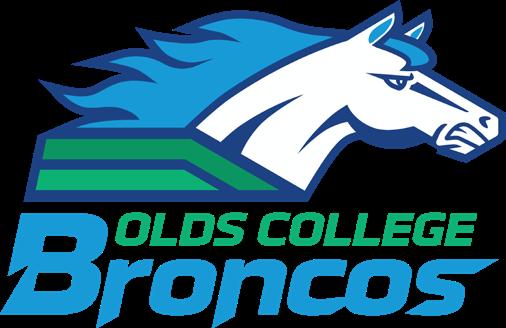
Olds College had three sub-brands. They are: Olds College Brewery, Olds College Broncos and the National Meat Training Centre.
These sub brands have a commercial or enterprise component and must follow all other Olds College brand guidelines, including use of typography, colour, etc.
In order to build a strong and recognizable identity, it is critical that we adopt consistent use of the Olds College institutional logo, brand extensions and sub-brands. For our students, staff, faculty, partners, donors, community and global friends this usage reinforces that our units work together for common goals.
Usage and development of sub-brands is overseen by the Marketing team.
OLDS COLLEGE
OLDS COLLEGE
Sub Brands Application
When applying the Olds College logo in close proximity to a sub brand logo, always ensure that they are given equal prominence in size and "visual weight." However, the most prominent position is given to Olds College, that is, the top left on pieces such as a web page or display. Or, on the bottom right, in the case of advertising.
When applying the a sub brand logo in close proximity to the Olds College logo in tight spaces, always observe the safe areas determined by each brand. The ideal measure of space between the Olds College logo and a sub brand logo is two widths of the crest.
When applying a sub brand logo near the top of the piece such as a webpage, display, or other application where the logo leads off, the Olds College logo comes first.
When applying a sub brand logo near the bottom of the piece such as an ad or cover of a publication, the Olds College logo must appear on the bottom right.
Sub Brands Application
Observing the safe area of the Olds College logo in tight spaces is important, giving the logos a lot of space is ideal as shown on the page.
When the visual identity leads off a piece, the Olds College logo appears on the left.
When the visual identity signs off a piece, the Olds College logo appears on the right.
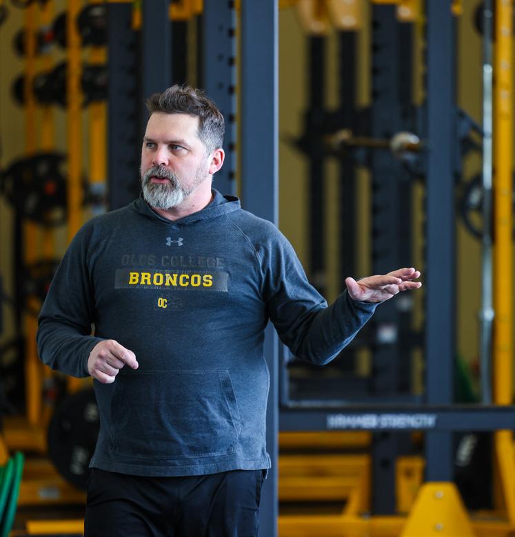
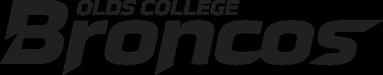
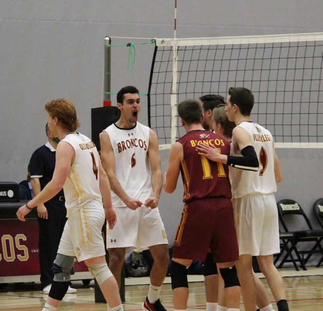
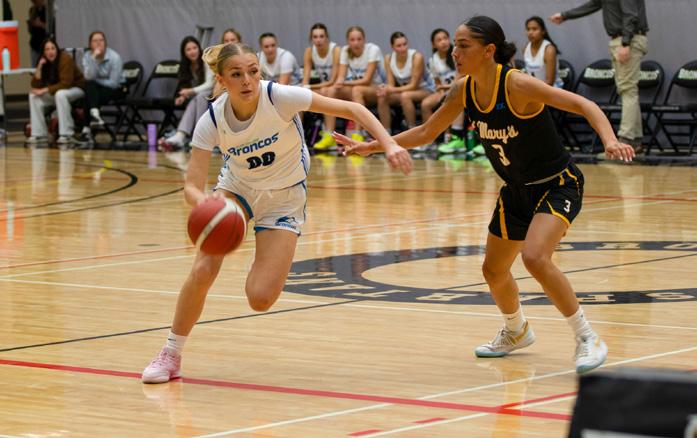
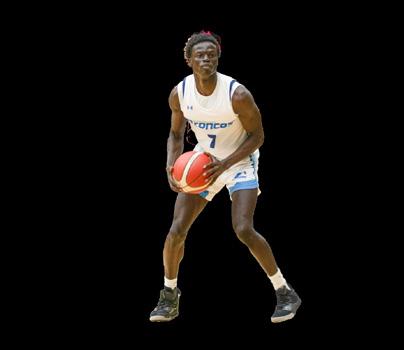
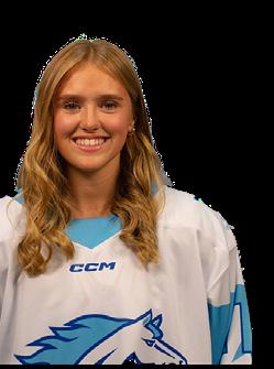
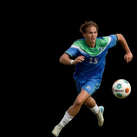
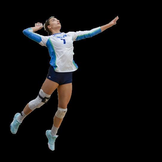
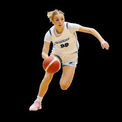
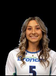
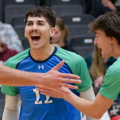
Olds College Broncos — a sub-brand of Olds College of Agriculture & Technology
Use of the Olds College Broncos Logo
In order to build a strong and recognizable identity, it is critical that we adopt consistent use of the Olds College institutional logo, brand extensions and sub-brands. For our students, staff, faculty, partners, donors, community and global friends this usage reinforces that our units work together for common goals.
Usage and development of sub-brands is overseen by the Marketing team.
Important notes:
When possible, it’s best to use the Broncos logo with the Olds College logo.
When referencing the team, always use the full name of “Olds College Broncos” on first use and then it can be shortened to “Broncos” subsequently.
Using wordmarks for Broncos specific sports should only be used by Olds College and the Broncos.
Every instance of clothing or merchandise with the Olds College Broncos logo must be approved by Marketing & Communications.
Any exceptions to these brand guidelines may be granted by the Marketing & Communications department on a case-by-case basis.
Every instance of the Olds College Broncos logo needs to be approved by the Marketing & Communications department.
Design Rationale
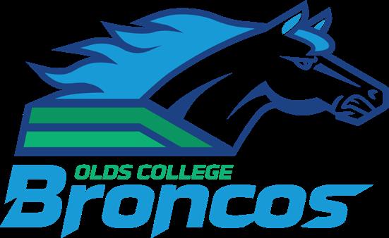
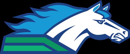
The Broncos logo was updated in August 2024 to better align with the Olds College of Agriculture & Technology brand.
The Broncos logo was created with precise geometric construction on a hexagonal grid with the same geometry the Olds College logo uses. It uses colours that align to the Olds College brand and includes a bold new wordmark. The wordmark’s design uses elements that imply motion and action — the extended font weight is italicized to give it a rakish quality, and parts of the characters extend, slant and are sliced into to give it an appearance of movement.
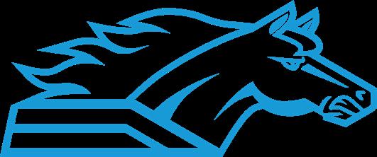
The new logo is a re-interpretation of the horse side profile from the previous Broncos logo to retain brand equity. White horses are rare and celebrated in myth and legend. The updated logo connects with this symbolism while sustaining the legacy, the fierce energy and passionate spirit of the Broncos brand.
The colour stripes echo the sky, water and earth motif in the Olds College logo — and the use of stripes is in references to flags, athletics and racing.
LOGO
The primary logo is the combination or lockup logo. It is a single file that integrates the horse icon and wordmark in specific alignment and spacing.
Where possible use the full color logo. However certain applications will require a single color logo. A single color version in four brand colors is available.

MINIMUM SIZE
Print: In standard offset printing and laserprinting, do not make the logo smaller than 1".
Some implementations such as embroidery and silkscreening will have a larger minimum size, consult with the vendor for their recommendation.
For minimum size in digital applications the logo should not be less than 72 pixels in size (see page 60).
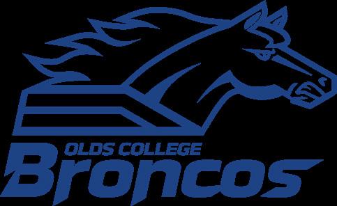

Broncos Logo ColorWhite Background
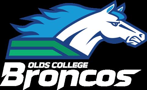
Broncos Logo Color White Wordmark - light blue background
Broncos Logo Color - dark blue background
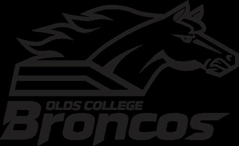
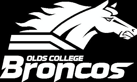
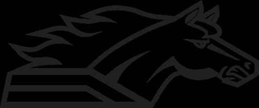
Broncos Logo Black
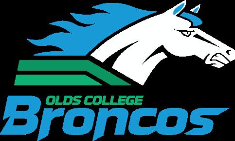
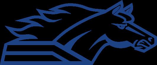
Broncos Logo Dark Blue
Broncos Logo Light Blue
Broncos Logo White Icon Wordmark
WORDMARK
The wordmark’s design uses elements that imply motion and action — the extended font weight is italicized to give it a rakish quality, and parts of the characters extend, slant and are sliced into to give it an appearance of movement.


Broncos Wordmark Color
Broncos Wordmark White – light blue background
Broncos Wordmark Colordark blue background
Broncos Wordmark Black
Broncos Wordmark Dark Blue
Broncos Wordmark Light Blue
Broncos Wordmark White - dark blue background
ICON
The horse icon is a re-interpretation of the horse side profile from the previous Broncos logo to retain brand equity. White horses are rare and celebrated in myth and legend. The updated logo connects with this symbolism while sustaining the legacy, the fierce energy and passionate spirit of the Broncos brand.
ICON

Broncos Icon ColorLight Background
Broncos Icon ColorLight Background
Broncos Icon ColorDark Background
Broncos Icon Black
Broncos Icon Light Blue
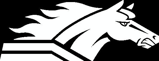
Broncos Icon White
Broncos Icon Dark Blue
COLORS
The Olds College brand is primarily blue and green. The brand blue and green should be the dominant colours on any given piece of communication. All forward facing pieces such as covers and websites should be primarily blue and green.
When developing printed materials, refer to the Pantone numbers and four-colour breakdowns. These colours should be used in all printed media, including outdoor advertising, newspaper insertions, posters and brochures.
The screen-optimized color values should be used in all digital communications, including all social media, online and video applications.
PMS 2146 CP
CMYK: 100 81 0 17
HEX: #00358E
RGB: 0 53 142
PMS 2925 CP
CMYK: 75 18 0 0
HEX: #009CDE
RGB: 0 156 222
PMS 2250 CP
CMYK: 78 0 73 0
HEX: #00B373
RGB: 0 179 115
PMS 340 CP
CMYK: 100 0 81 0
HEX: #00965E
RGB: 0 156 222
White
CMYK: 0 0 0 0
HEX: #FFFFFF
RGB: 255 255 255
CMYK: 75 18 0 0
HEX: #009CDE
RGB: 0 156 222
Spot
Pantone Black C
CLEAR SPACE
Clear space around the logo, icon and wordmark ensures maximum visibility and separates them from any competing graphic elements. Use the width of the letter O in the Broncos wordmark as the width of the clear space margin.
When using the icon and wordmark separately, ensure they are not in close visual proximity to each other. I.e., they should be on different sides (icon on front and wordmark on back of a jersey) or visually separated (icon on top left of a page and wordmark on the bottom right)
A cohesive and consistent online presence to promote the Olds College brand is important. The colours below represent the screen-optimized palette for the Olds College brand and should be used in all digital communications, including all social media, online and video applications.
INCORRECT LOGO USES
This page shows examples of improper logo usage. Improper usage damages the perception and recognition of the institution’s brand and even well intentioned changes can have a negative impact. Please note that the examples shown here do not include all non-compliant possibilities. While the examples below only show improper usage of the primary logo, these guidelines apply to all Olds College brands and subbrands.
Do not flip Do not rotate Do not distort
Do not alter the colors Do not layer content Do not change the composition

Do not change elements Do not add effects Do not invert the colors of the logo
LOGO WITH RELEASE
If you need to use the logo on a color background other than white, light blue or dark blue, use the release version. The release is a border that acts as a visual buffer between the logo and the background color.
Broncos Logo White Release
Broncos Wordmark - White Release
Broncos Wordmark Black - White Release
Broncos Wordmark Dark Blue - White Release
Broncos Wordmark Light Blue - White Release
Broncos Wordmark White - Light Blue Release
LOGO LARGE TEXT
Some implementations present technical limitations such as thread size (embroidery) or number of pixels (e.g. social media profile icons). The Logo Large Text version is available for these instances to ensure legibility of the “OLDS COLLEGE” text.
The Logo Large Text variant can also be used in digital applications where the logo appears at sizes smaller than 100 pixels. Please note that the logo should not be smaller than 72 pixels.

Broncos Logo Large Text Variant
Broncos Logo ColorWhite Background
Sample Use cases: Embroidery
Broncos Brand Graphic Elements
Graphic elements derived from the logo have been developed to create interest and to enhance or balance out compositions. Echoing the angles in the logo, the graphics add a sense of dynamic movement and provide another visual cue that reinforces the brand. Care should be taken so that these angles are not overused; using it once on a given piece as a visual accent is often enough.
The Hexagon
The Sport Stripe
3D Box Pattern
Broncos Event Badges
Hexagonal Image Frame
Image with 30º mitered corner
10% Opacity Broncos Icon
Broncos Diagonal Slice Green
Broncos Diagonal Slice Green
Broncos Diagonal Slice Green
Broncos Brand Design Best Practices
Layout Anchors
Judicious use of the Broncos Dark Blue in the background, in text headers, left/right rail, footer and header will serve as a foundation for the layout.
Establish a connection to the Olds College brand through sparing, balanced placement of one or several of these elements:
• Broncos Olds College graphic elements in the layout,
• through sparing use of the hexagon shape as a photo framing,
• through the use of a 30º photo corner miter.
The graphic elements should serve as accents. If hexagonal framed photos are used they should serve as hero images (on a cover, for example).

Broncos Dark Blue Headings
Broncos Dark Blue Footer
Olds College Corner Graphic
Broncos Light Blue Pull Quotes
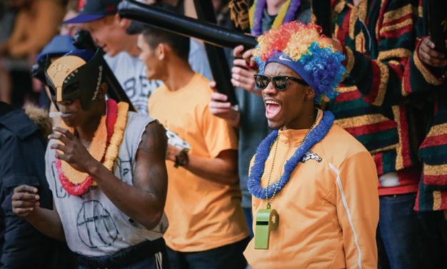
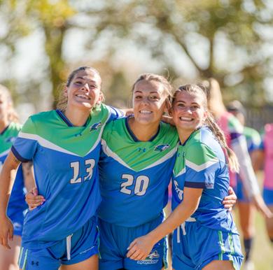
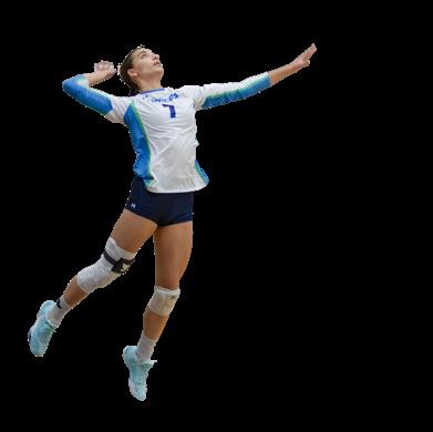
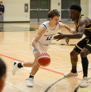
Broncos Social Media Examples

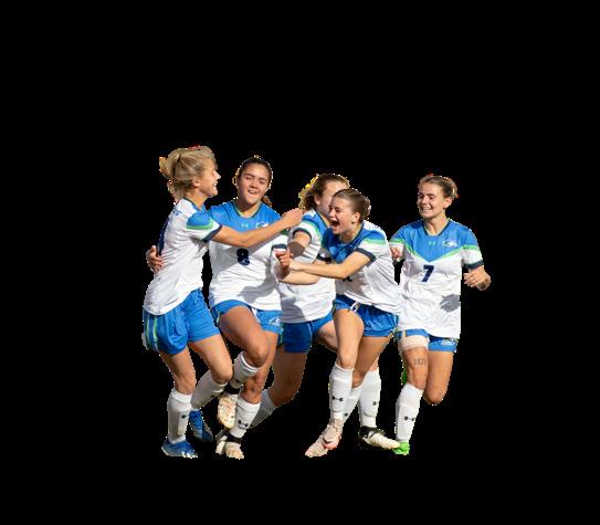
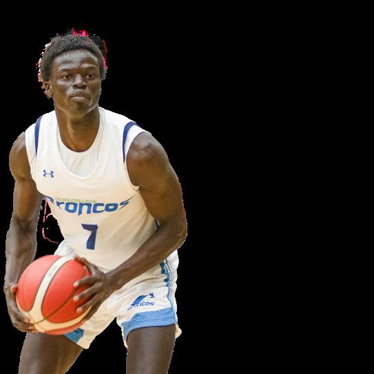
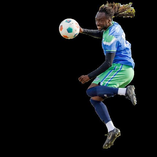
Use uncluttered, compelling photos with a central focal point in your social media posts.
Use Broncos brand graphic elements sparingly and only to communicate a central idea, emphasize the action or increase dynamism.

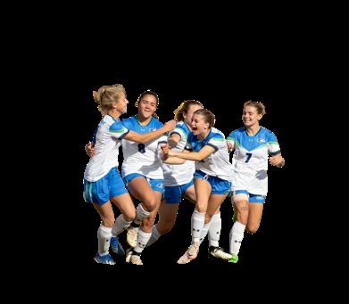


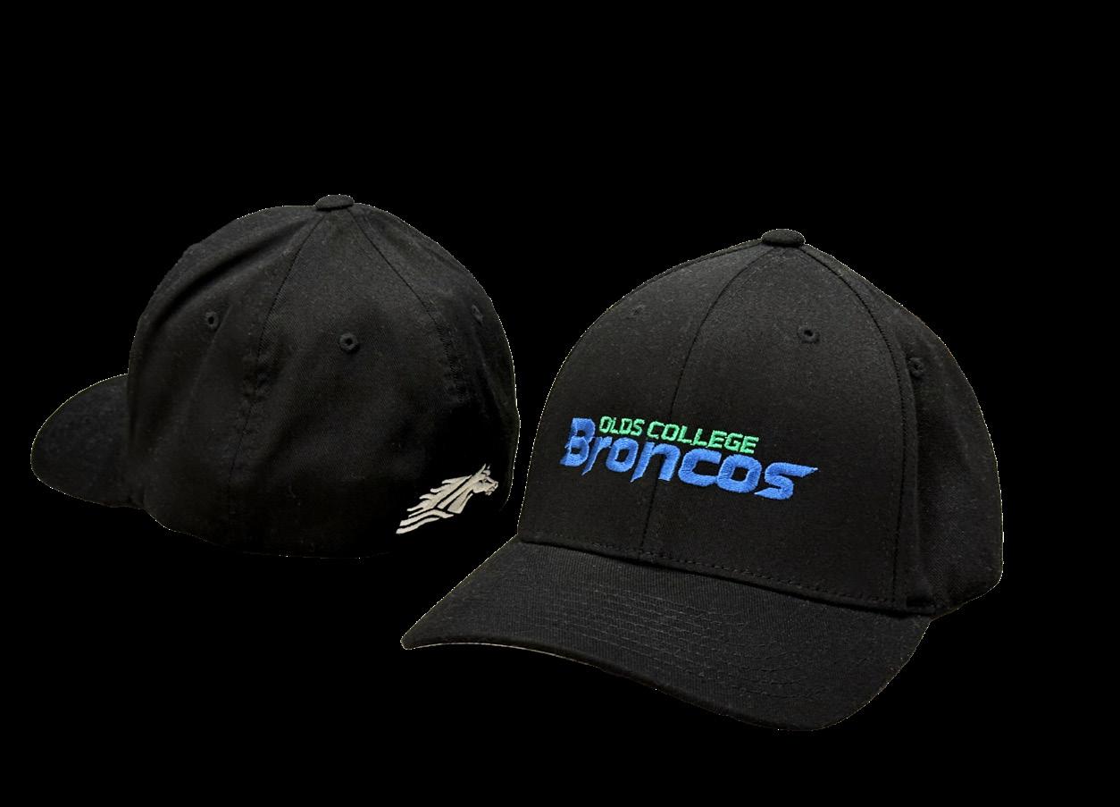
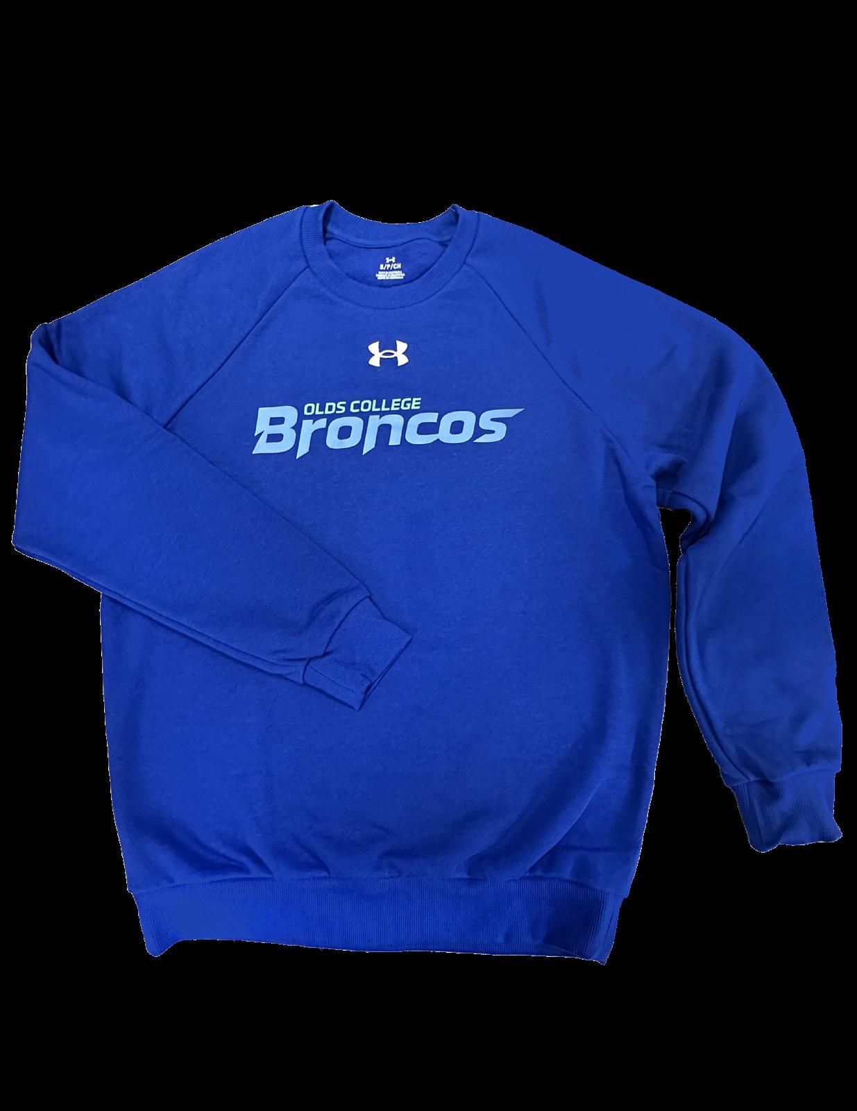
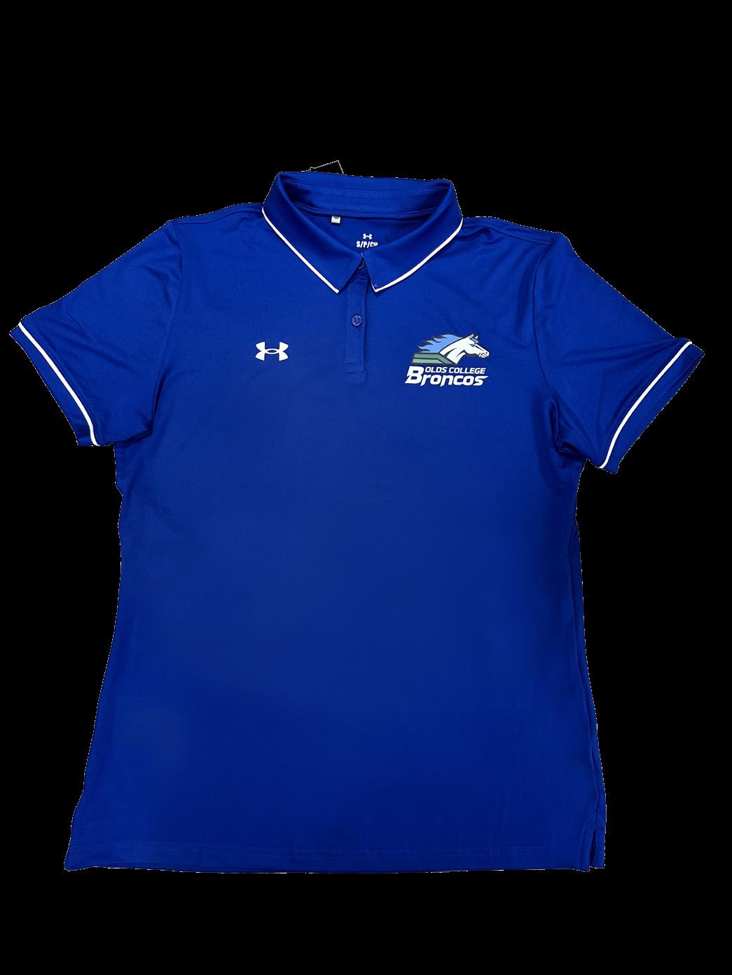
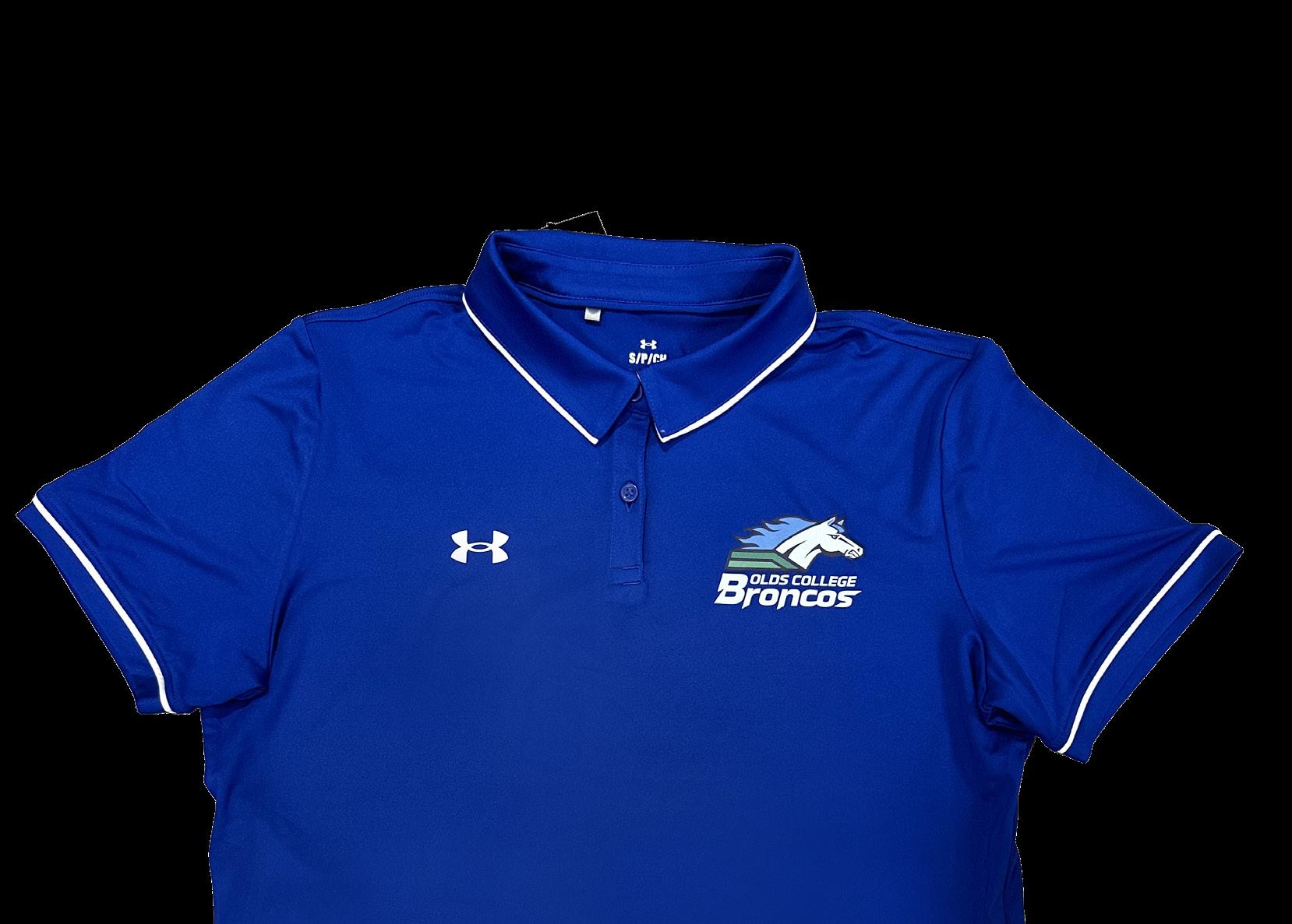
Merchandise & Clothing
Every instance of clothing or merchandise with the Olds College Broncos logo must be approved by the Marketing & Communications department.
Sport-specific wordmarks are for use by Olds College Broncos only.
Sponsor Logo Requirements for Athletics
The use of external sponsor logos on athletic wear is dependant on level and amount of sponsorship. When co-branding with sponsors, Olds College Broncos logo should be the prominent logo in sports wear. For example, the Broncos logo would likely be found on the front left chest while the sponsor logo would be on sleeves or the back of merchandise. Use of external logos for athletics is on a case-bycase basis.
Special Occasion Wear
Teams and groups are encouraged to participate in various events that support special occasions or a variety of groups; however, we do not modify our logo or brand.
Please note: Underarmour is not a sponsor — it is the official supplier of Olds College Broncos Athletics sportswear and merchandise..
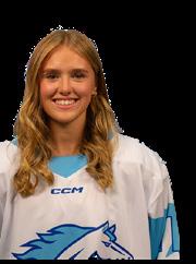
Jr. Broncos
The Jr. Broncos logo represents our affiliate youth athletic programs that we are partnered with to promote youth development in sports. The Jr. Broncos logo is used on the jerseys, apparel and promotional material of our affiliated teams which currently includes the Olds Minor Hockey Association female teams and the Jr. Broncos volleyball club program. New designs that involve the logo must be approved by Olds College. All logo usage will be approved on a case-by-case basis.
The Jr. Broncos wordmark is for internal use only for specific articles of sportswear.