

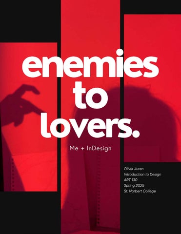

During the crash course project, engaging with a real person changed my overall direction of how I approached making the prototype because I was trying my best to focus on their own style, perspective, & experience which I was able to learn about from interacting with my partner & having multiple discussions with them within a short timeline.

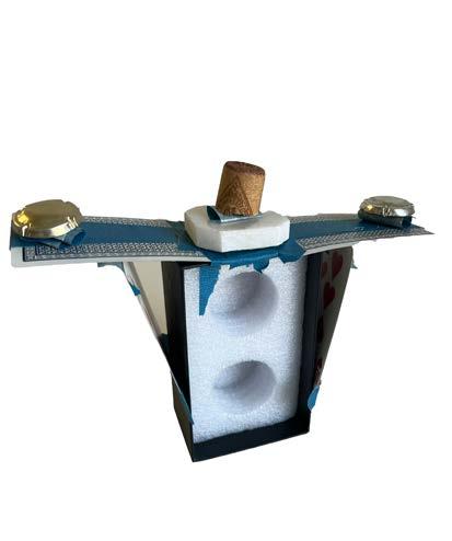
For me, showing them unfinished work almost made me nervous & embarrassed in a way because I couldn’t help but feel like I was falling short of making a clear & final representation of their experience on campus. The pace felt fun and informal because it was such a quick and timely project. I feel like it did in a way relieve the pressure of having to have something so finished & finalized because it felt like I was making very rough drafts.
The overall objective of this project was to quickly create image compositions using dots and lines and similar shapes focusing first on experimenting and then improving the drafts. The goal was to express feeings and emotions through using the simple compositions of dots and lines.
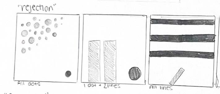
Gestalt is having different emotional connections and thoughts based off of what we see. It relates to this project because depending on how we configure our dots and lines, they can represent different feelings/emotions. It wasn't to difficult to make a "well-crafted object" but my patience did run very thin because I was taking too much time configuring my project. This project helped change the way I look at minimalism. I have never had much of an understanding of making something with minimal figures to convey such big meanings and emotions. But after this project I was able to understand the figures more. It was difficult to represent the same ideas and words that other people were also creating and not have replicas.
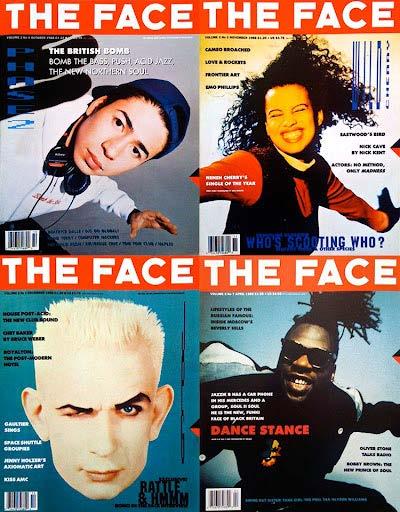
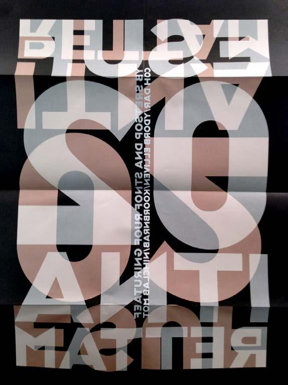
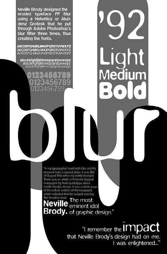
Neville Brody is an English graphic designer, typographer, and art director. He is known as one of the most influential graphic designers out there. He was born in 1957 in Southgate, London and became more well known in the 1980s during what was known as the punk and post-punk movement in the United Kingdom, and you can really see that aesthetic, vibe, and energy level in his work.
As art director for magazines called The Face and Arena, he completely broke away from what was the traditional grid based layouts of modern design. In his work he used bold typography, many textures that some described as sketchy and messy, as well as emotional imagery to create something raw and natural and never seen before. One of the things that makes Brody’s work so interesting and unique is how he plays with typography.
He didn’t just use letters as something that you can just read, he utilized the letters in a way that they became visual elements that drew people in and made viewers feel something. He often distorted or layered the type to the point where it was barely readable, but it still worked in the compositions because it grabbed the attention of the viewers and made people think.
Brody helped launch FontFont and FUSE, which were platforms for digital typefaces that could be experimented with and altered. These typefaces weren’t always practical or something that could be used in everyday writings, but they pushed the boundaries of what type could look like and what it could do in the design world.
Later in his career, Brody took on multiple popular branding projects, like the BBC’s redesign and worked with companies like Nike and Coca-Cola. And even when working with bigger brands/clients, he stayed true to his design style and vision of using design to challenge the traditional graphics. Brody’s work shows how powerful design can be and that it’s not just to look cool or aesthetic, but to portray a message and make people think.
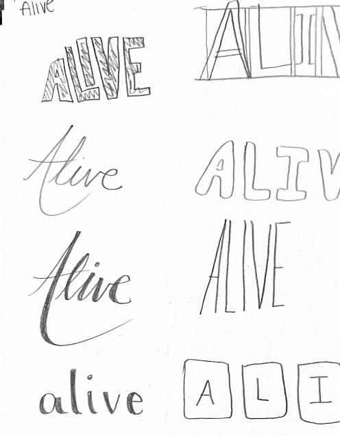
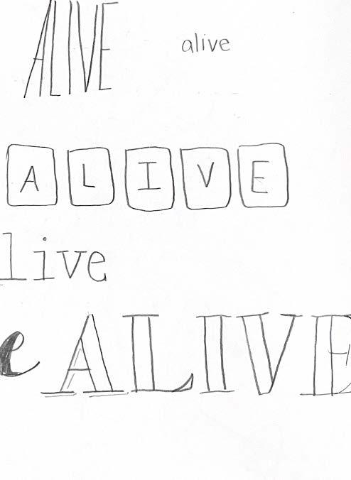
The objective of this project is to create a PSA poster that uses strong, clear design and solely using type to quickly communicate an important message and a call to action, while also practicing professional communication between a client and a designer.
We kicked off this project with a trial run. We were given information about a hypothetical event and had to design a poster to a dvertise it. Then as a class we were shown how to bring the sketched out draft to InDesign and make it cleaner and more official.
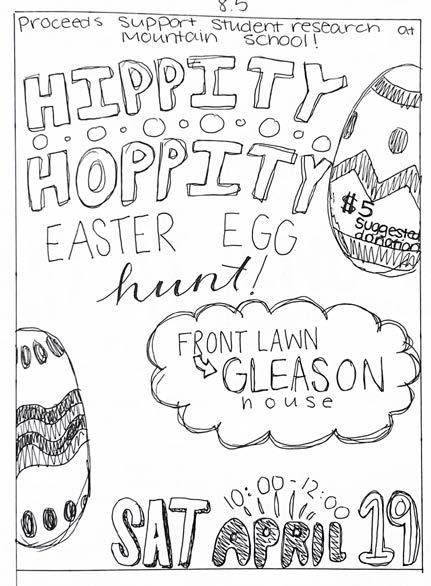
It was challenging to be limited to type only - specifically for the reason that it was hard to use limited words from the client and be able to fill the entire space of the poster while maintaining a balanced space. I used opacity to attempt to draw viewers to the more important text that was in the darker texts. A skill I learned is being able to work with any mock ups that the client chose regardless of if it was the one I would have chosen to use.
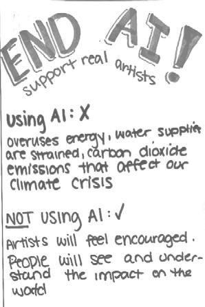
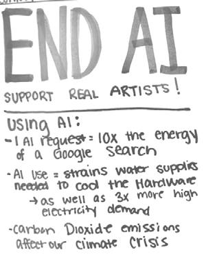
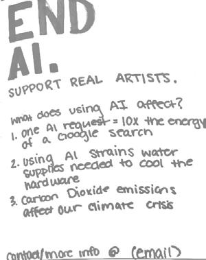
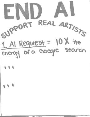
Using AI :
Overuses energy
Water supplies are strained from having to cool the hardware
Carbon Dioxide emissions that affect our climate crisis
AI
NOT Using AI : Artists will fell encouraged.
People will see and understand the impact of AI