
HARIOM SHRESTHA undergraduate architect selected works 2019-2023 P O R T F O L I O a r c h i t e c t u r e
9761767541

hariompuwaju@gmail com

9761767541
hariompuwaju@gmail com
I am Hariom Shrestha, a third-year architecture undergrad honing my skills and knowledge in the matters of design and architecture

Personally architecture is when people respond to a place. A building, a room or any spatial form will remain just it, unless it makes an impact on a person their experiences and their emotion
Thus, my ideas tend to consider user's experience and functionality of the design and I hope to grow in the same pathcreating designs that help people feel better
I hope you enjoy reading my work as much as I enjoyed making it Thank you!
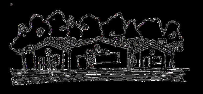
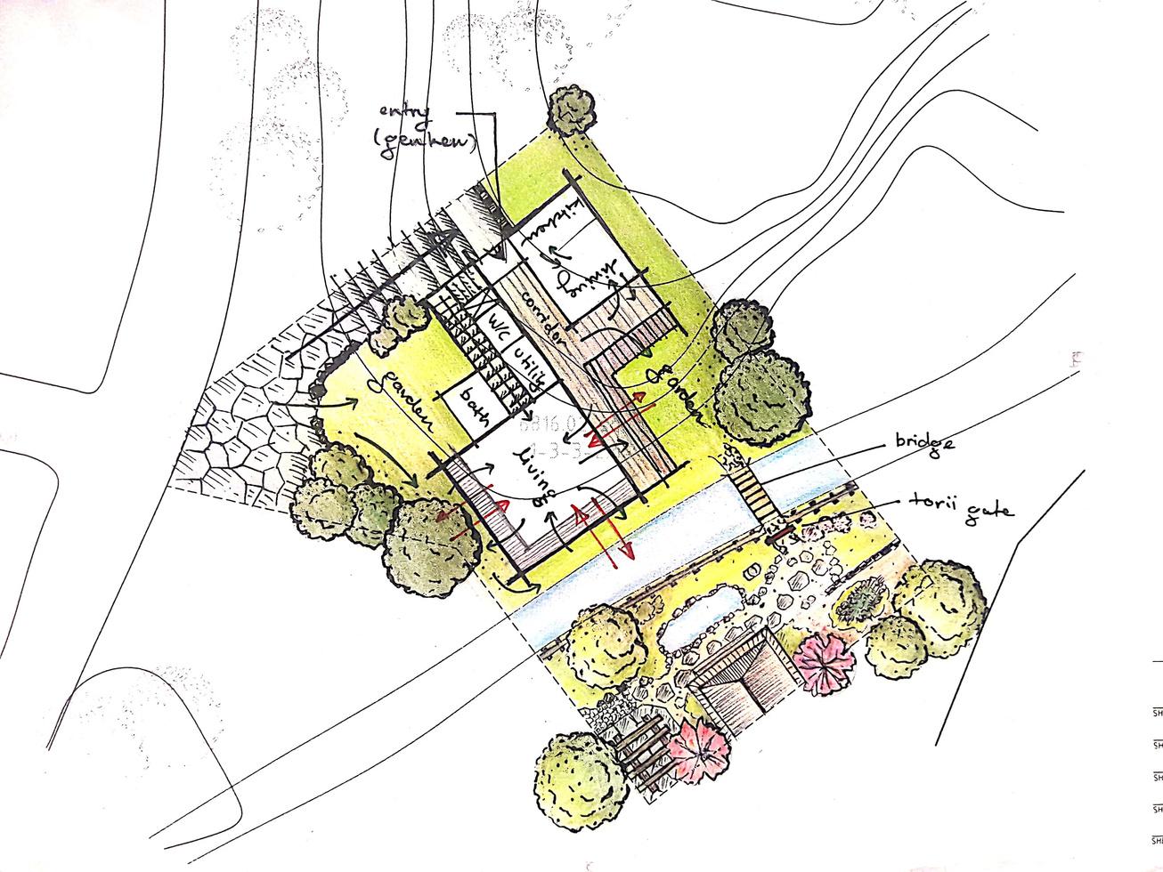
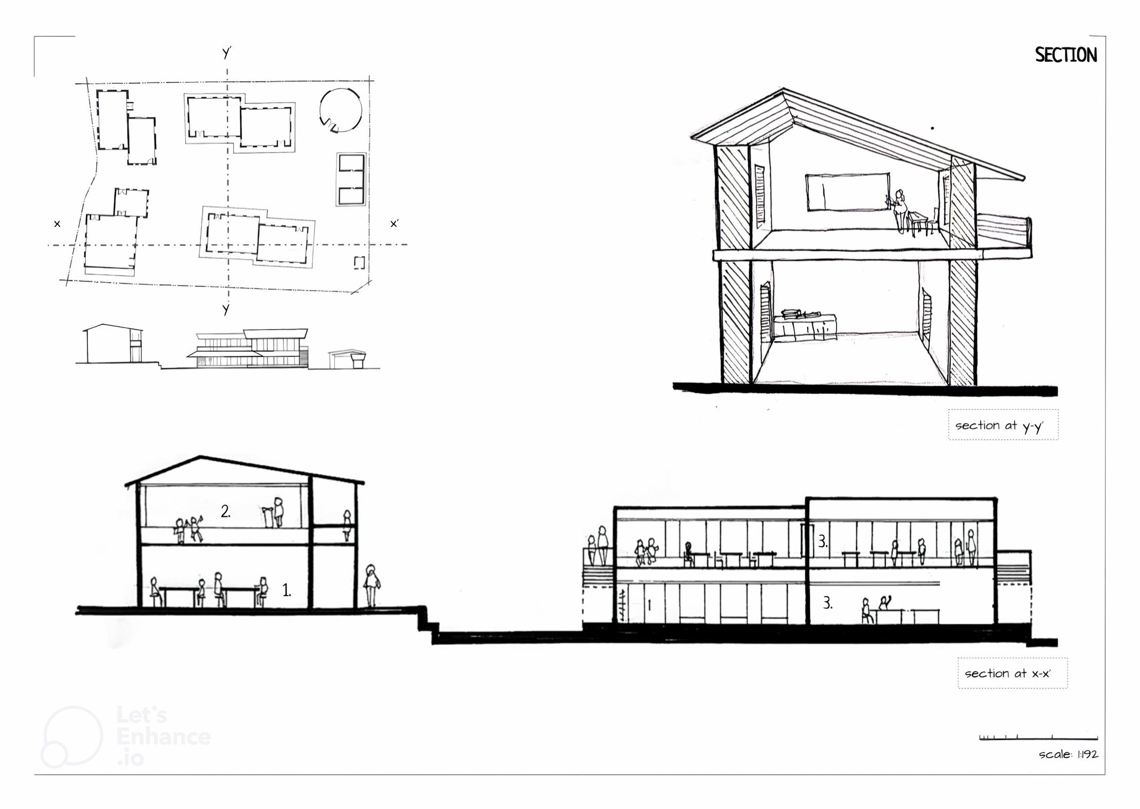
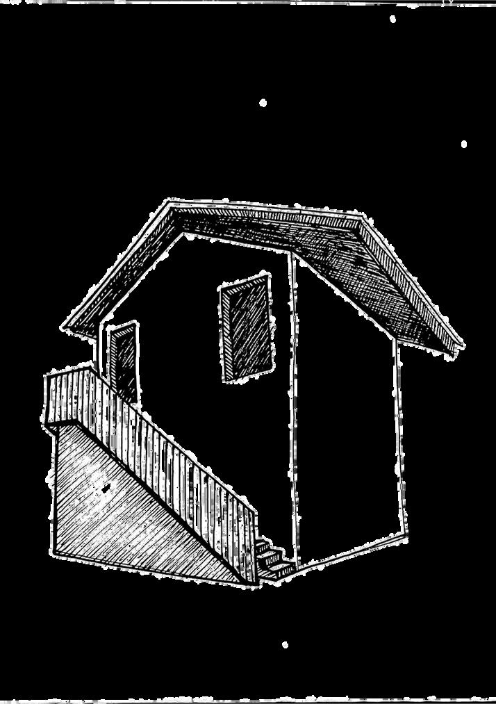
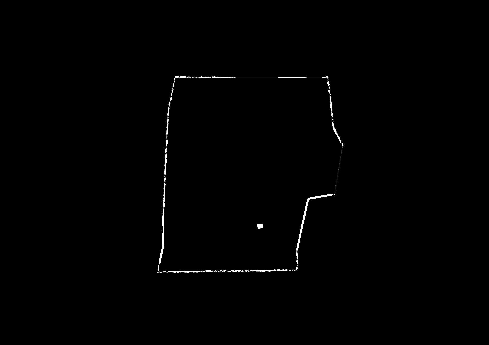
term: third semester (2021) site: buddhanilkantha, kathmandu project: residence + studio site area: coverage:
client: haruki murakami - his wife and two children highlights: problem solving, assessing master architect, site responsive, japanese arch.
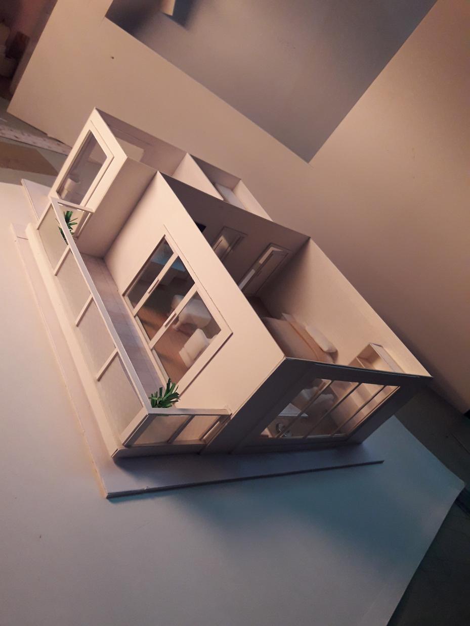
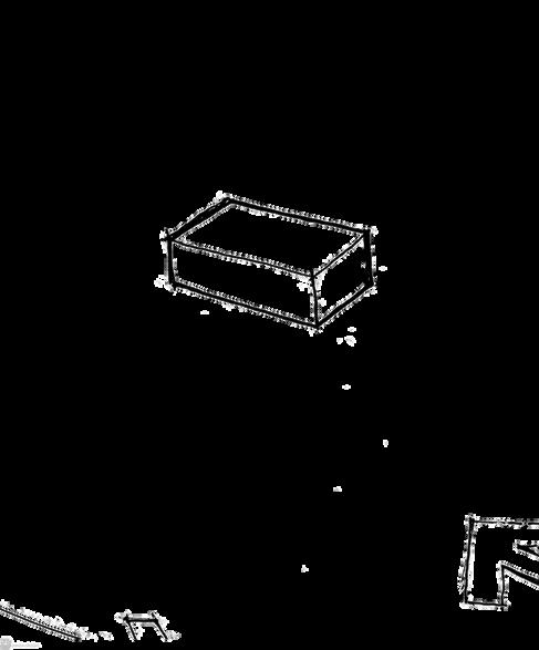
Paying homage to traditional Japanese architecture, the residence is a paradisiacal abode set in a forest lap in the cold hills of Buddhanilkantha
Guided by a cultural concept, the design interprets aspects of traditional Japanese architecture through Van der Rohe’s minimal, modernist style.
The project responds to each family member's requirements and needs.
Enclosed by nature through landscapes and softscapes, the interiors and exterior seamlessly transition through floor-to-ceiling glass windows opening the rooms to the serene garden.
The two-storied main wing is equipped with a sloped roof for rain water conservation and enhanced thermals along with glassed engawas for better thermals.
The guest/studio wing on the other side of the river serves as a peaceful getaway in the heart of a serene garden.
master plan brief:
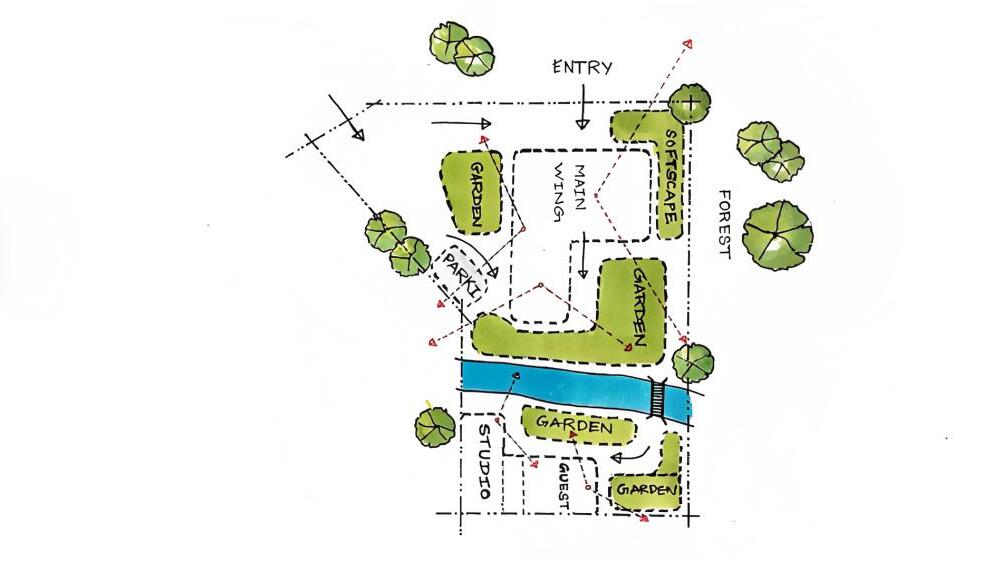
Whole residence encapsulated by nature - gardens, softscape, river and forest.
Guest and Studio wing secluded from main wing.
Views and/or access to garden through every room
Serene and peaceful surrounding for every feature
A long corridor connecting all the rooms, with a w/c at the end.
Incorporating Japanese architecture with the modernist ideas of Van der Rohe.
public private semi-private
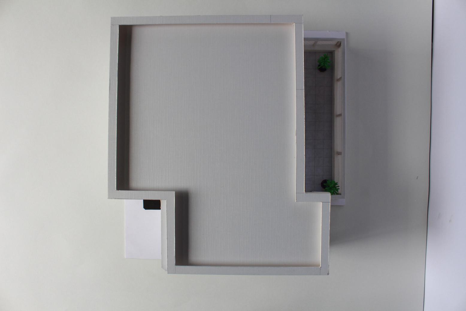
floor plan brief
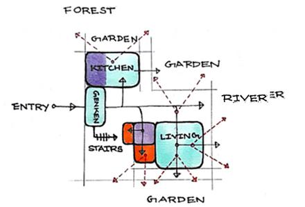
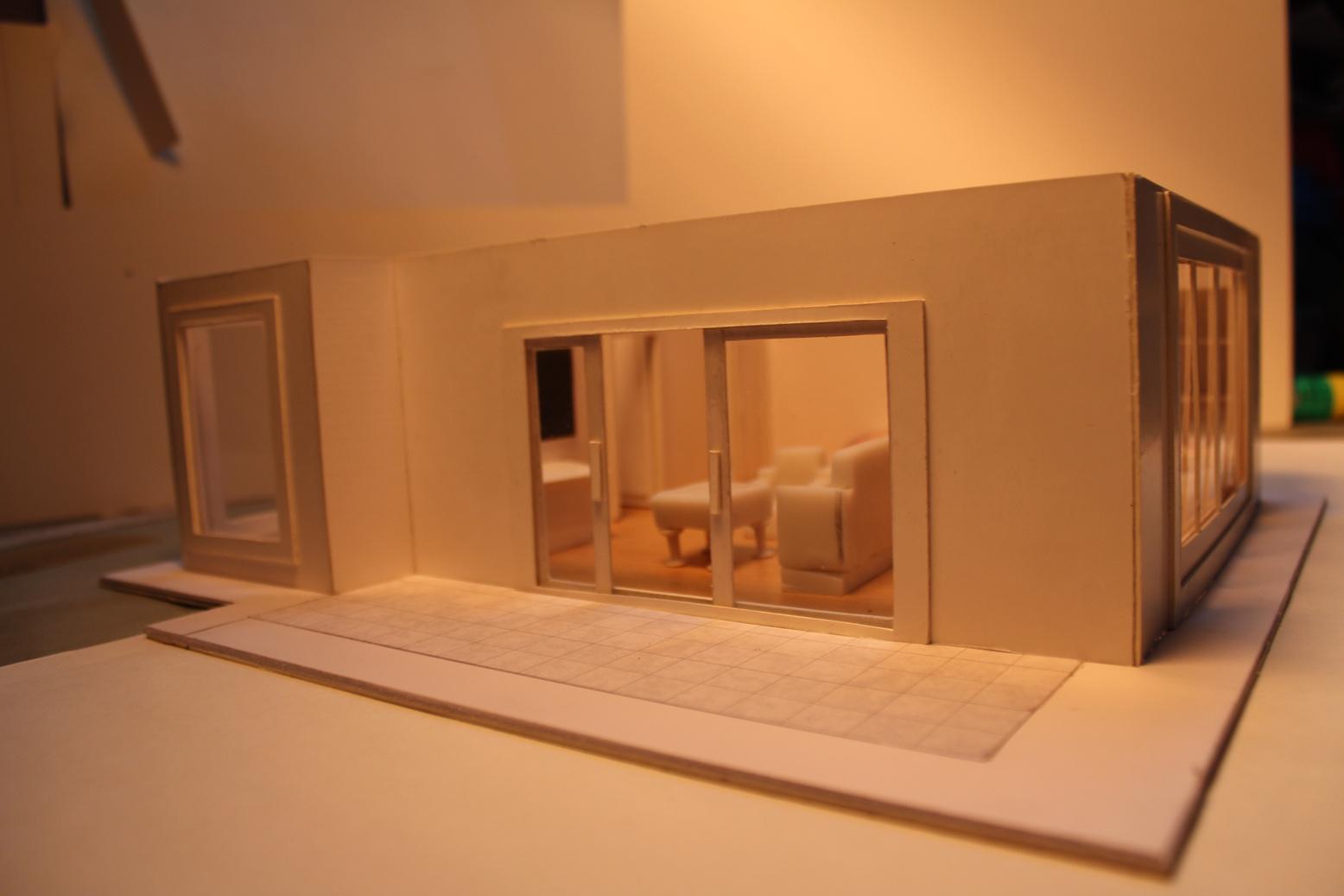
ground floor:

living room acting as garden viewing roomopen to garden through engawa.
washroom positioned in a tranquil surrounding.
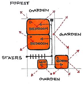
first floor:
daughter’s bedroom positioned on north for diffused lighting - good for reading/studying.
son’s bedroom positioned in wind direction, well ventilated through majorly glass openings.
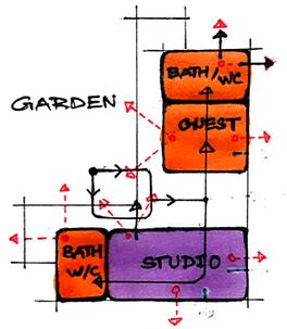
studio/guest
set in tranquil peaceful surrounding. buffered, secluded area.
guest room acting as washihitsu.
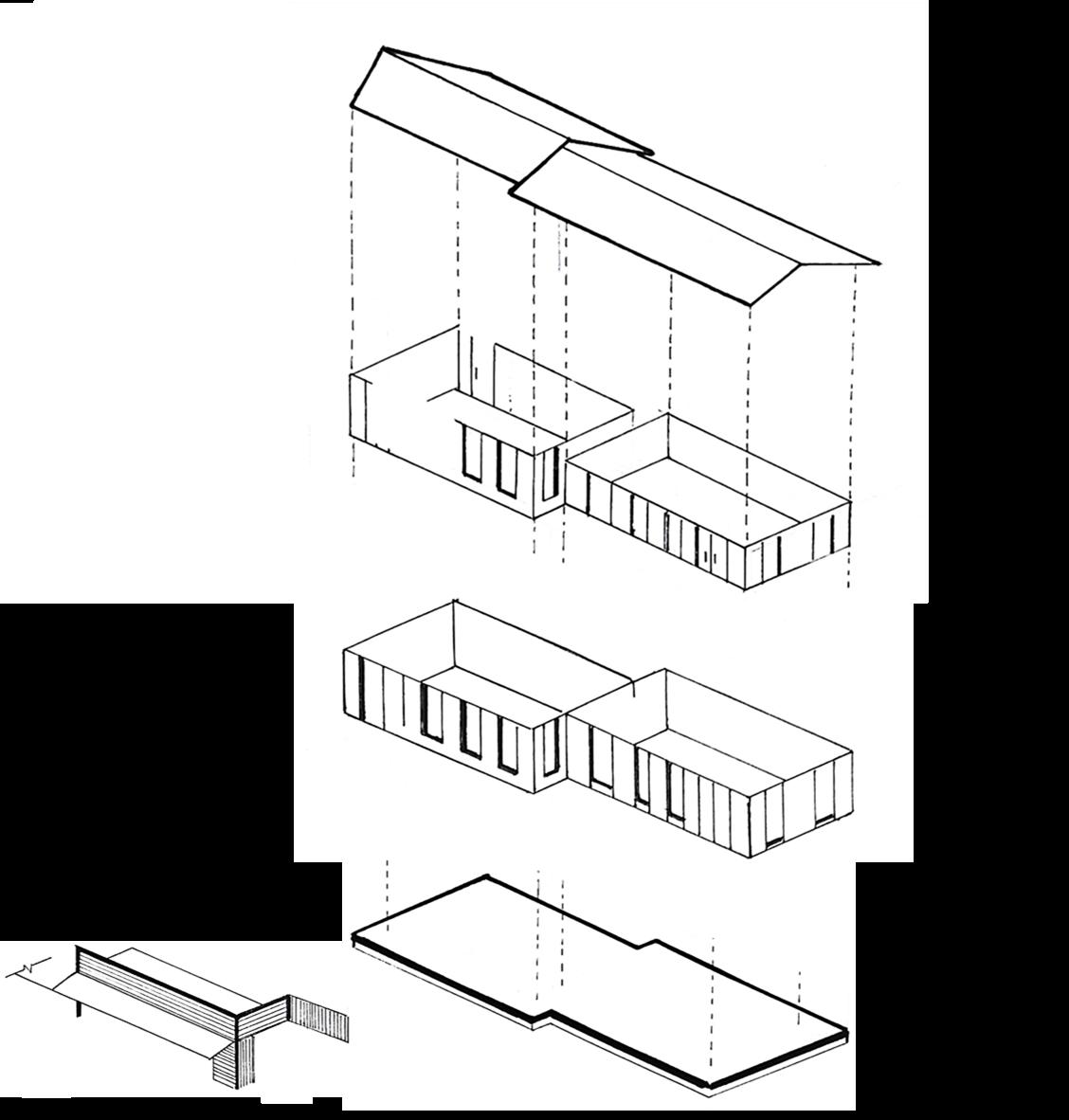
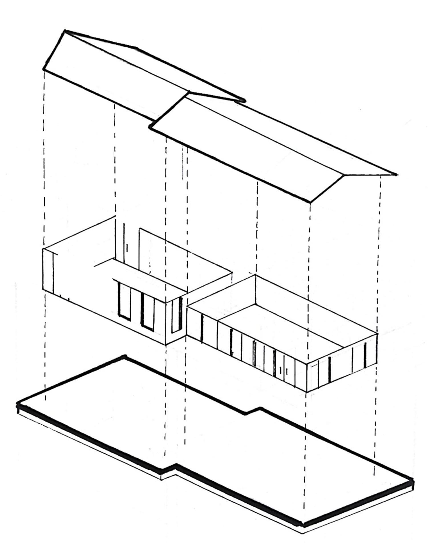
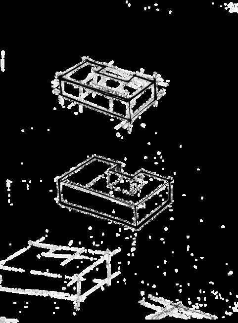
Step 1
establishing the plan; based on optimum orientation of functions
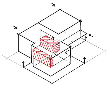
Step 2
expanding the plan into voluminous blocks; two stories
Step 3
addition: raised engawa, balcony | subtraction: to form corridor
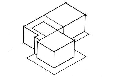
Step 4
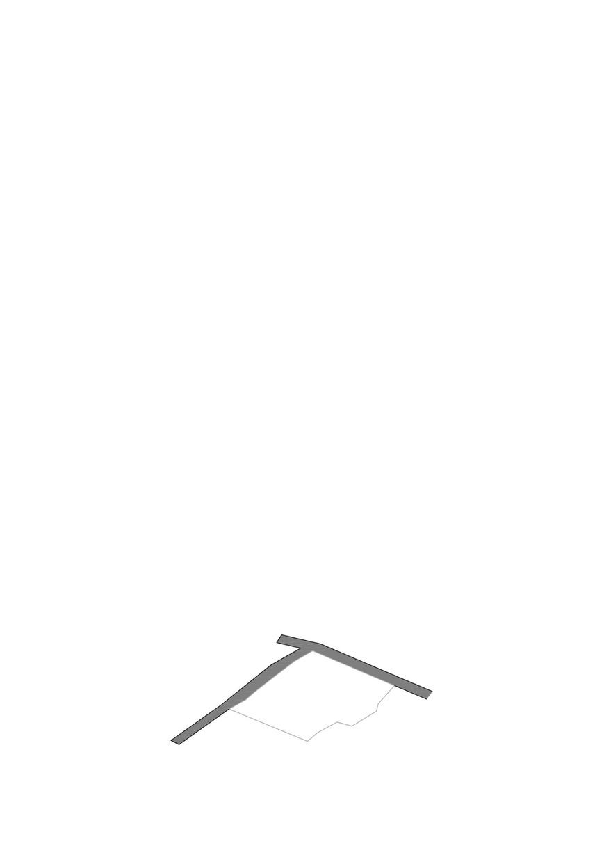
addition: glass engawa, eaves, glass, roofs | final form

Roof flat skylight sloped
First bedroom: main son daughter WC
Ground dining kitchen living utility WC
Engawa


term: fourth sem
(2022) site: buddhanilkantha, kathmandu project: primary school site area:
client: orphaned children who seek a better life highlights: problem solving, anti-bullying, emotional, psychological
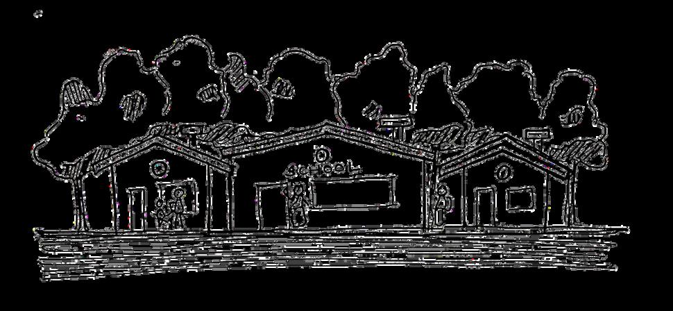
This school aims to provide a safe shelter for children with an unfortunate past. The orphaned children come from an underdeveloped and marginalized community, and the objective is to shift them into a primary school/hostel.
The Ghar-Aangan School is guided by the core concept of reducing intimidation. For children who have a past, a whole new life in a new setting/system can make them susceptible to intimidation, or the feeling of fear.
The school attempts to reduce fear in children and induce the feeling of:
thus, the name,
The Ghar-Aangan School
the ghar-aangan school
Kindergarten : 3 - 5 years
Primary : 5 - 8 years
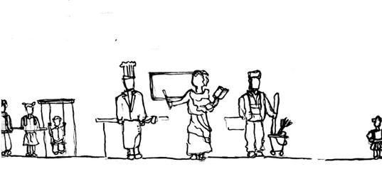
staff
Primary: Teachers
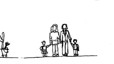
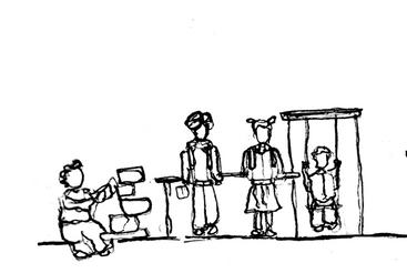
guardians relatives of the students; guests, visitors
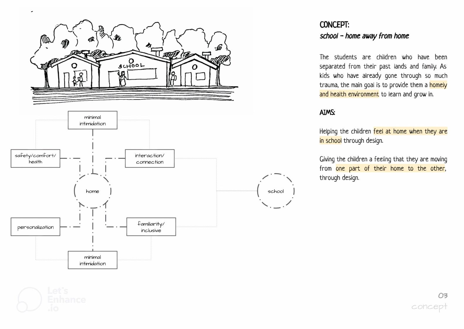
GUIDING CONCEPT
school - home away from home
The students are children who have been separated from their past lands and family.
As kids who have already gone through so much trauma, the main goal is to provide them a homely and health environment to learn and grow in.
AIMS:
Giving the children a feeling that they are moving from one part of their home to the other, through design.
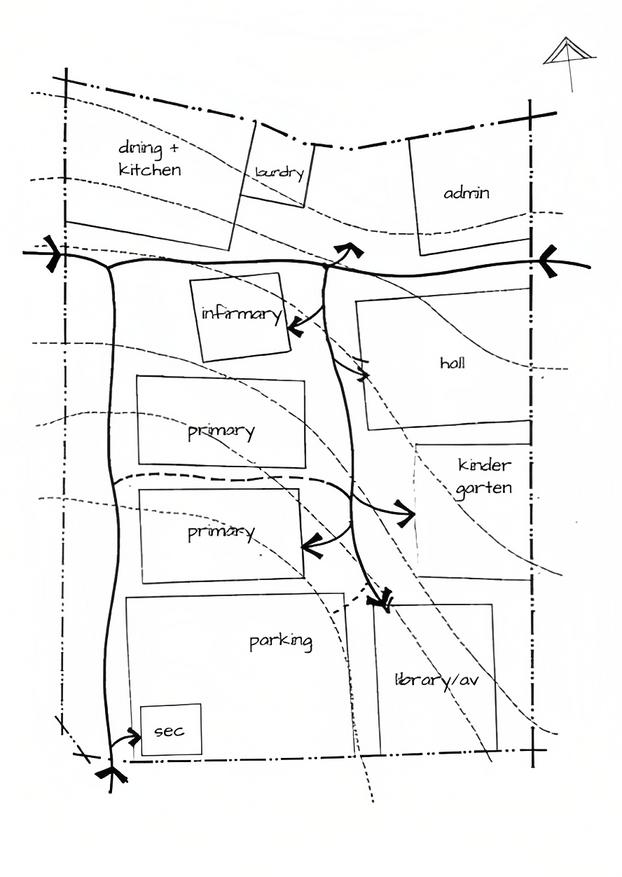
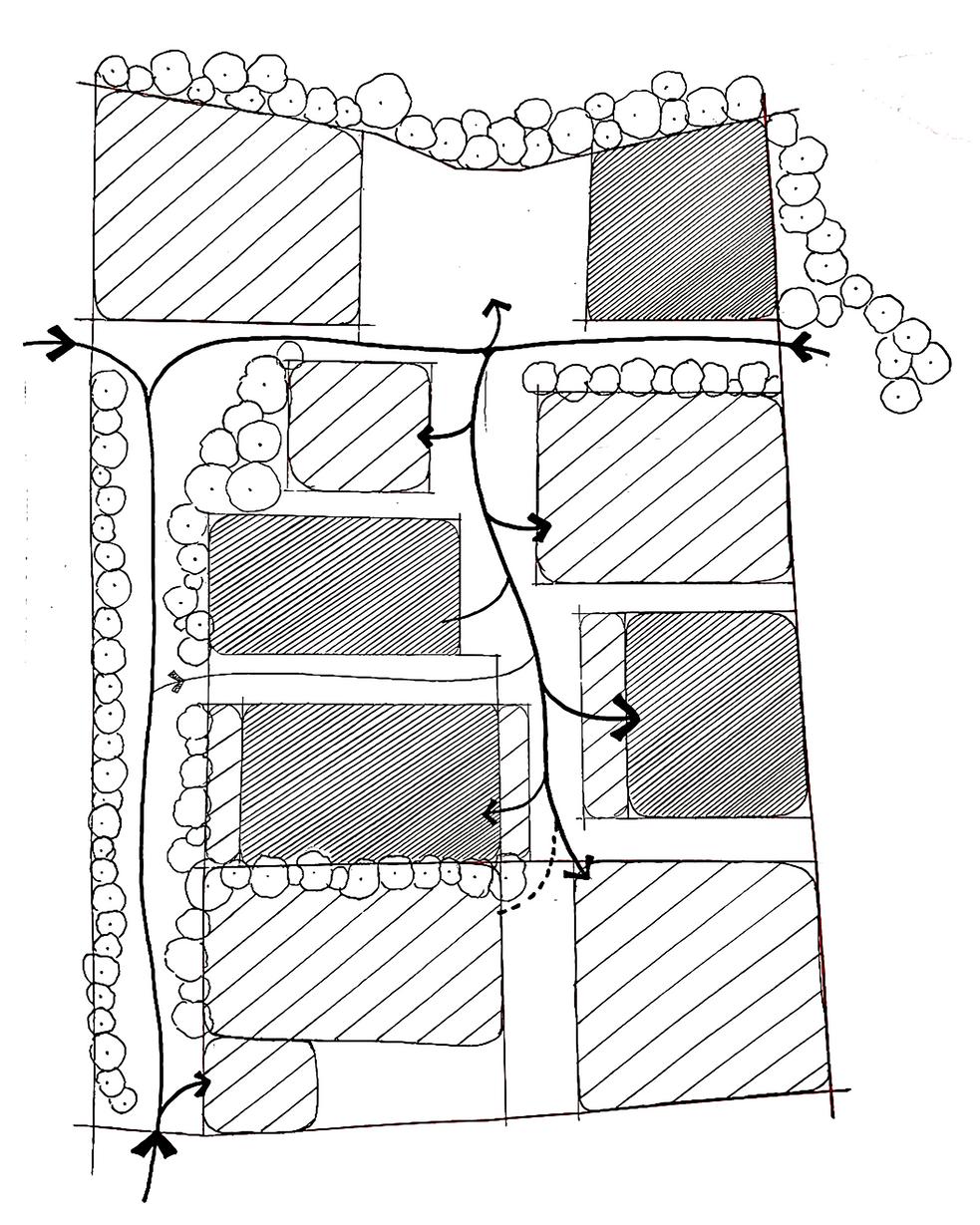
Planning: zoning based on intimidation levels
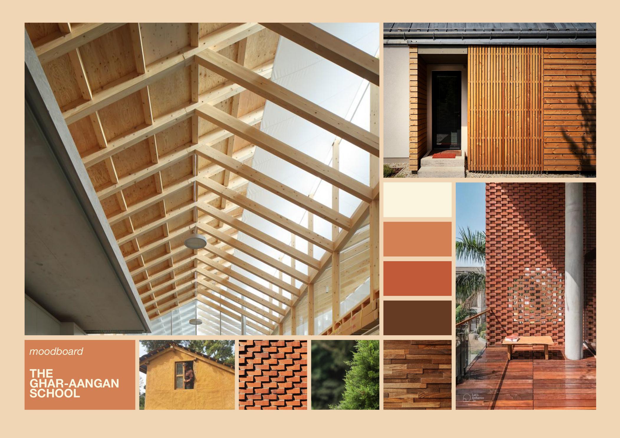
Massing: opting for traditional Nepalese house aesthetic, build and materials familiar to children, reminiscent of home Emotional: soft materials, green spaces, breakaway areas, anti-bullying approaches
The table shows causes that might cause intimidation to children and the respective approaches that are employed.
i. Minimal intimidation
Design implementations based on tackling intimidation factors such as cultural shock and spatial anxiety.
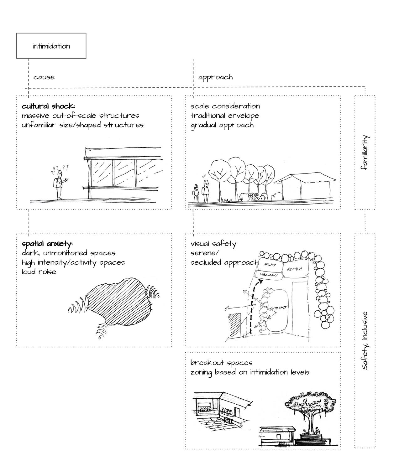
Cultural shock : children of rural background might not be familiar with large scale urban buildings; thus, Spatial anxiety :
opting for smaller scale, traditional buildings preventing dark and unmonitored spaces breakout spaces to escape noise (introvertfriendly)
secluded entry/avenue to the school for a gradual approach;
no sudden noisy or large buildings that might intimidate the child
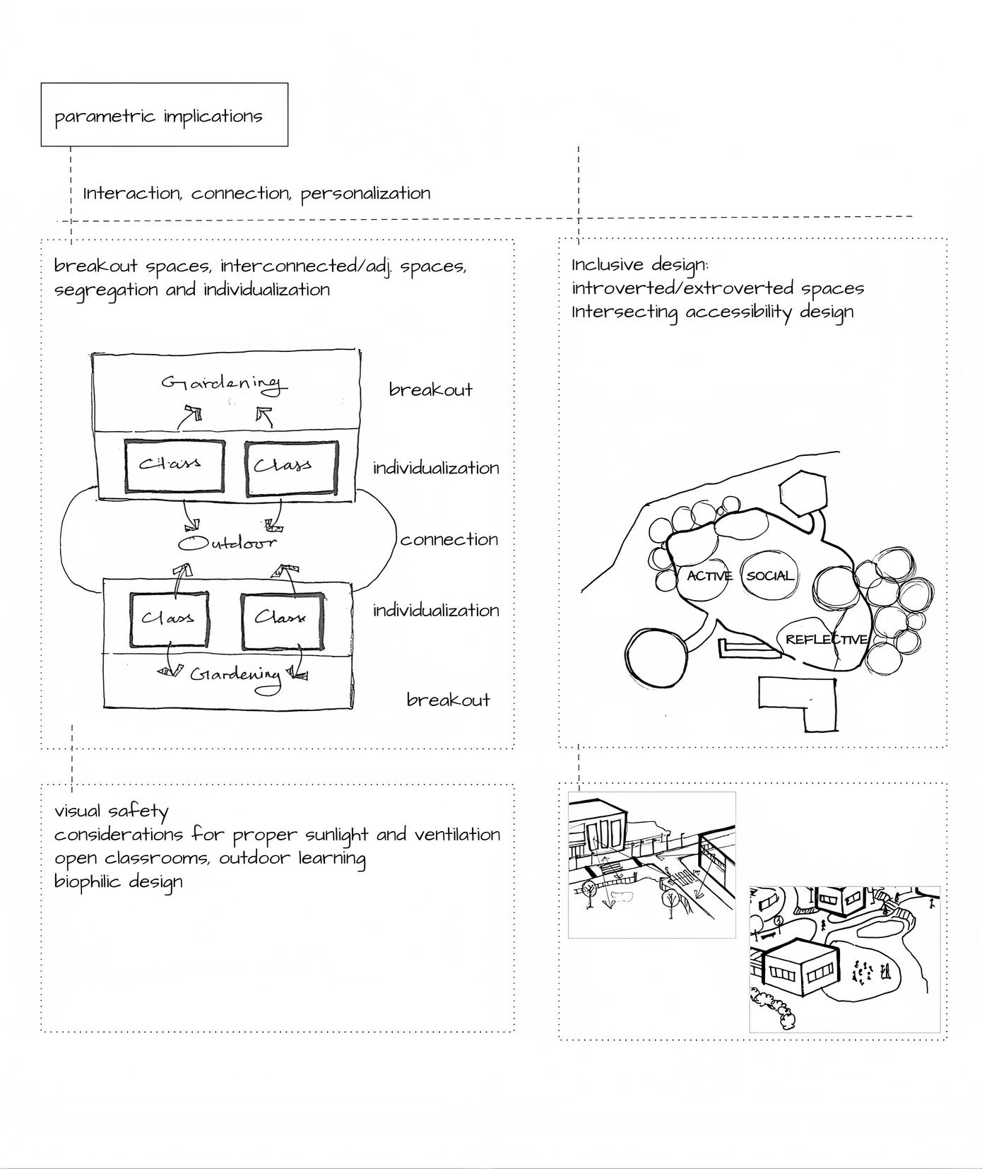
Reflecting the interconnected spaces of a home, the ability to personalize and not feel left out.
Garden spaces: for each block/class which the children can care for/personalize.
Acts as a space for interaction, open-air classroom and breakout.
Outdoor : connects two blocks, doubling as a space for playing/interacting.
During recess, the children have the option to play outdoor or spend time in the gardeninclusive of introverted and extroverted children.
Visual safety: maintaining a line of sight from one block/place to another.
Attempts at open-air classrooms for a postCOVID world;
Considerations for ample sunlight and ventilation.

High activity/intensity spaces: admin, classrooms, playground, office
Spaces with loud noise can be irritating
Children are likely to feel nervous in spaces unfamiliar to them
Also includes places that might overwhelm children or make them anxious.
Due to this un-comfortability factor, these spaces can be deemed of higher intimidation level.
Low activity/intensity spaces: garden, library, canteen, lab, infirmary
Counters the louder spaces and Brings balance or escape
Thus, these spaces can be deemed as those with lower intimidation level.
The functions have been arranged in such a manner that spaces with higher intimidation levels are balanced through:
Gradual and secluded approach Adjacency to lower intimidation level spaces.
Visual safety
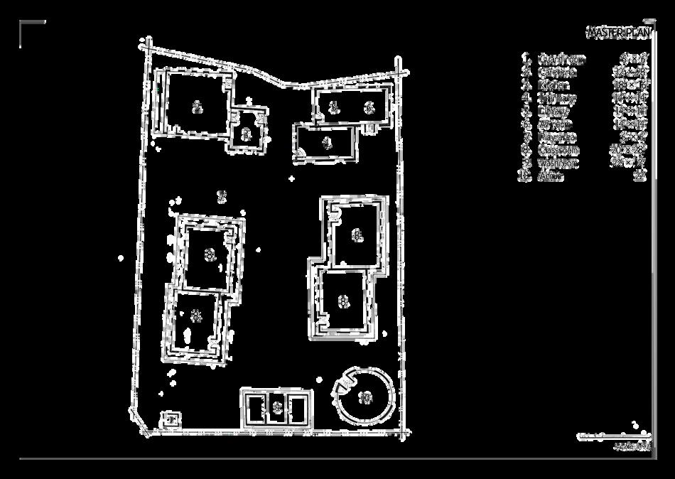
Guard room 6’ × 6’
Cafeteria 32’ × 28’
Kitchen 18’ × 16’
Infirmary 14’ × 14’
Library 14’ × 14’
AV room 14’ × 14’
Play area 6’ × 6’
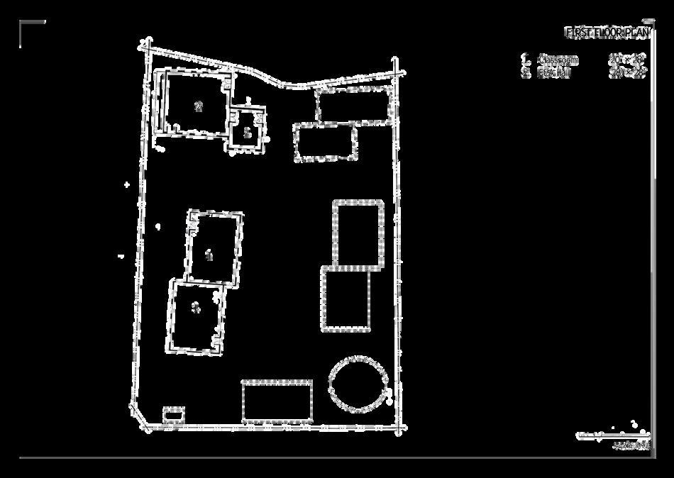
Classroom 20’ × 28’
Washroom 22’ × 12’
Grouping of functions into four categories
Zoning based on intimidation levels:
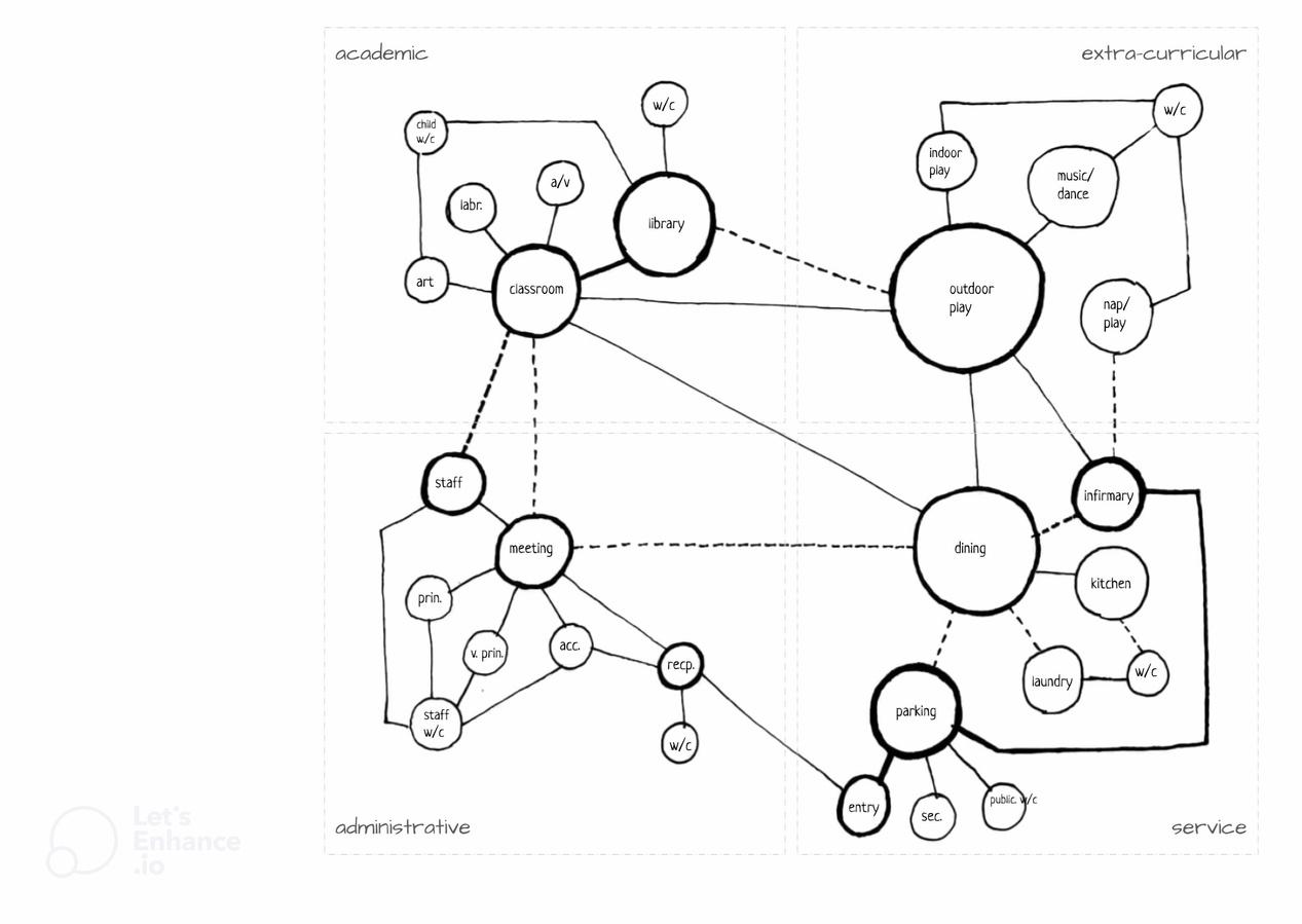
A higher intimidation level zone is balanced by its adjacent lower intimidation level zone.
e.g: the administration (10) is balanced by the washroom (9) and adjacent greenspaces.
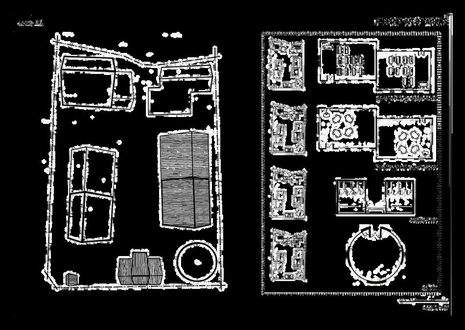
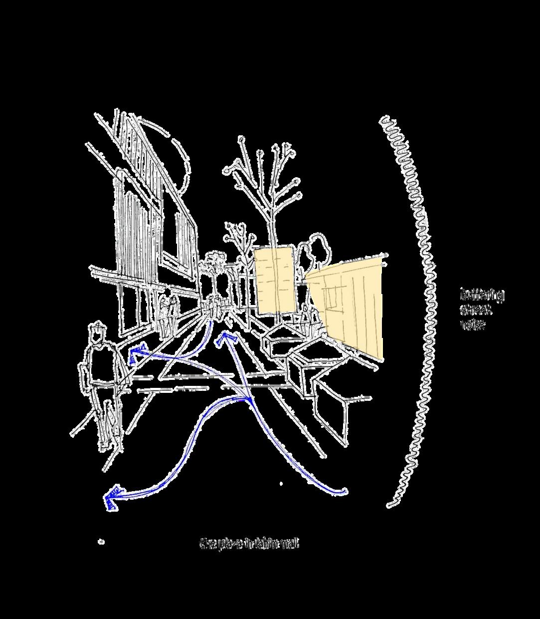
pre-primary block exterior fundamental axonometric
avenue at entry - secluded approach, space for recollection and interaction
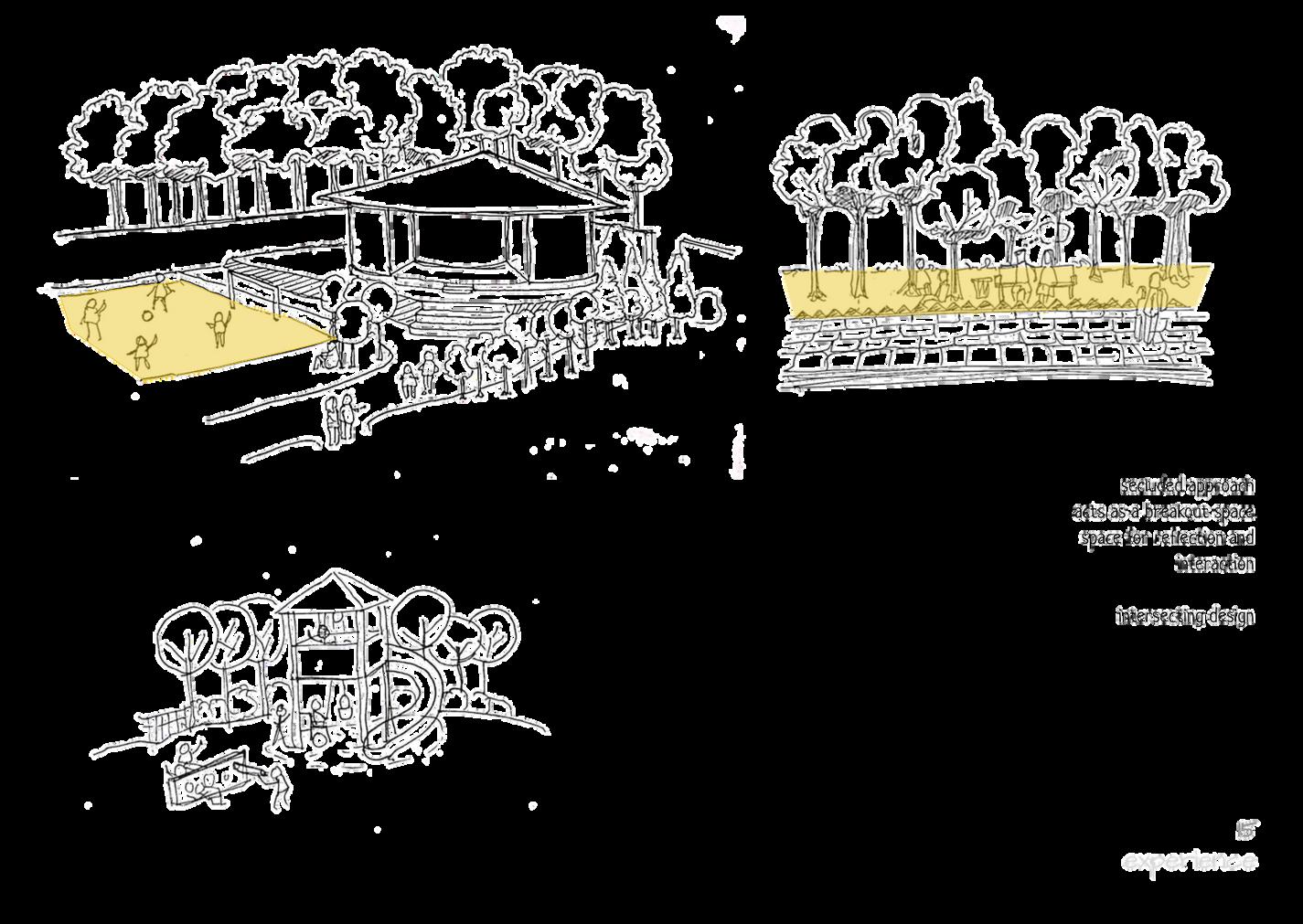
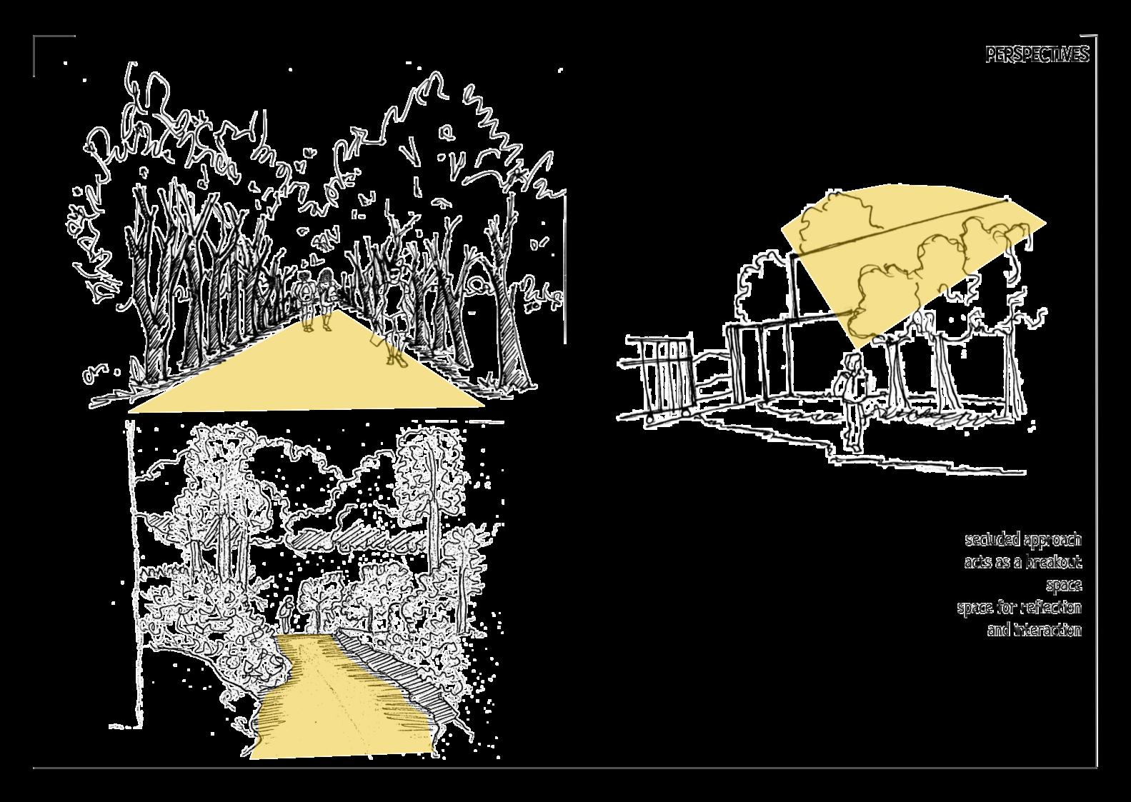
visual safety - vision to/from living quarters gives the feeling of "
precedents - the way to doksaan school a path with trees providing a calm, serene and safe feeling
a play tower where differently able children can guide other kids on the top to pull sand; a wall of winding tubes
low inti. playground next to high inti. admin
entry avenue used for recollection of day after school
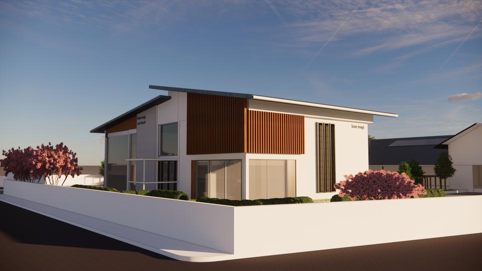
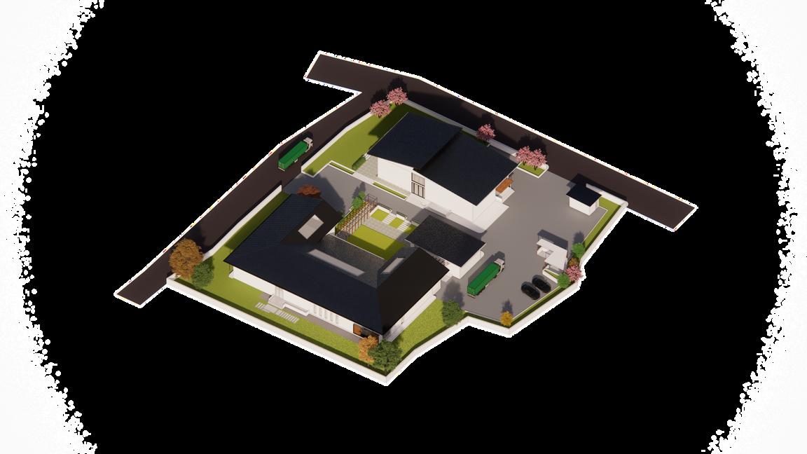
term: sixth semester (2023) site: balkumari, lalitpur project: manufacturing center + showroom site area:
highlights: concept thinking, problem solving, 3D rendering, efficiency
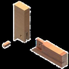
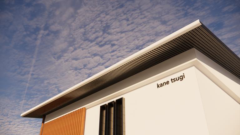
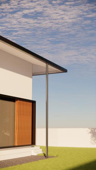
The name ‘kane-tsugi’ comes from a Japanese style woodworking joint - where two legs are joined with one pin. The legs are separate entities joined by the pin, ultimately functioning as one whole joint.

The inspiration for this project arose from this very concept, further iterated as:
first leg - showroom + admin unit
pin - courtyard + landscape
second leg - manufacture / factory
The separation of these units brings advantage to each of them; but it creates distance between the factory workers and the admin workers
The separate units and its respective workers are brought together by the courtyard where the factory workers and admin workers can interact.
concept:
The furniture manufacture center is divided into three units and their respective functions;
the units and functions are separated or adjoined for increasing efficiency: efficiency - worker health + less material travel distance
the
show+admin:
proximity to pedestrian/vehicular access away from noise
manufacture:
smoother workflow
less traffic
user:
creation of zones - privacy levels circulation based on user type
the
show+admin:
manufacture:
adjacency to relative functions
adjacency to sequential functi
U-shaped layout [ process / pr
user:
organized spaces - easier tran
the P R O B L E M:
alienation between administrative employee employees
t h e ATTEMPT:
creation of spaces and places to impel intera
the users - canteen, courtyard
approaches: buffer through landscape stack effect [climate]
showroom + admin
visual exposure from street away from noise
ped /vehicular access
less traffic, better ambience
canteen + courtyard
interaction between showroom + admin workers & manufacture workers space for outdoor showcasing
tory/manufacture unit
ic, smoother workflow
ayout) U-shaped layout of sequential functions
load in
factory workers
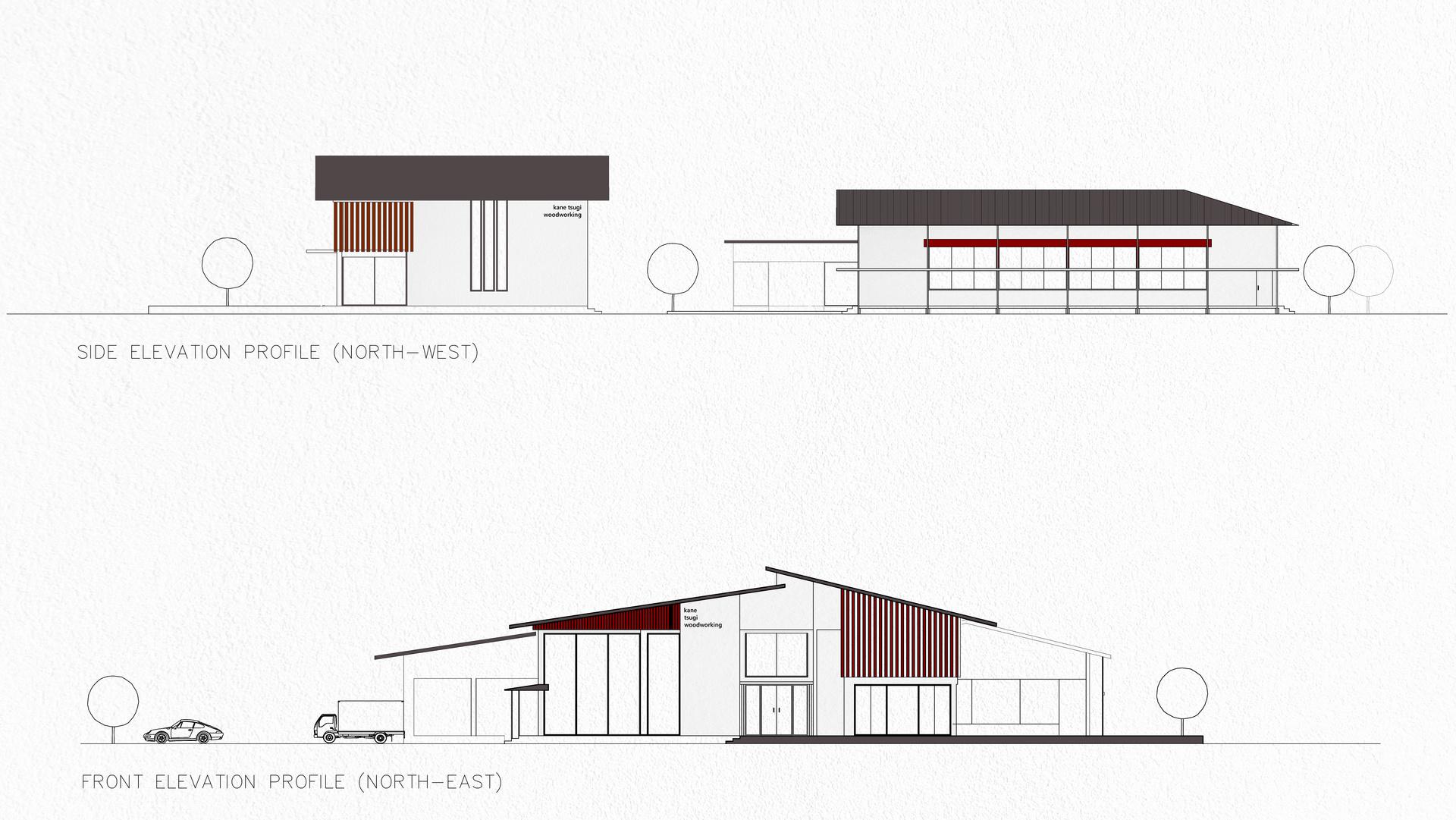
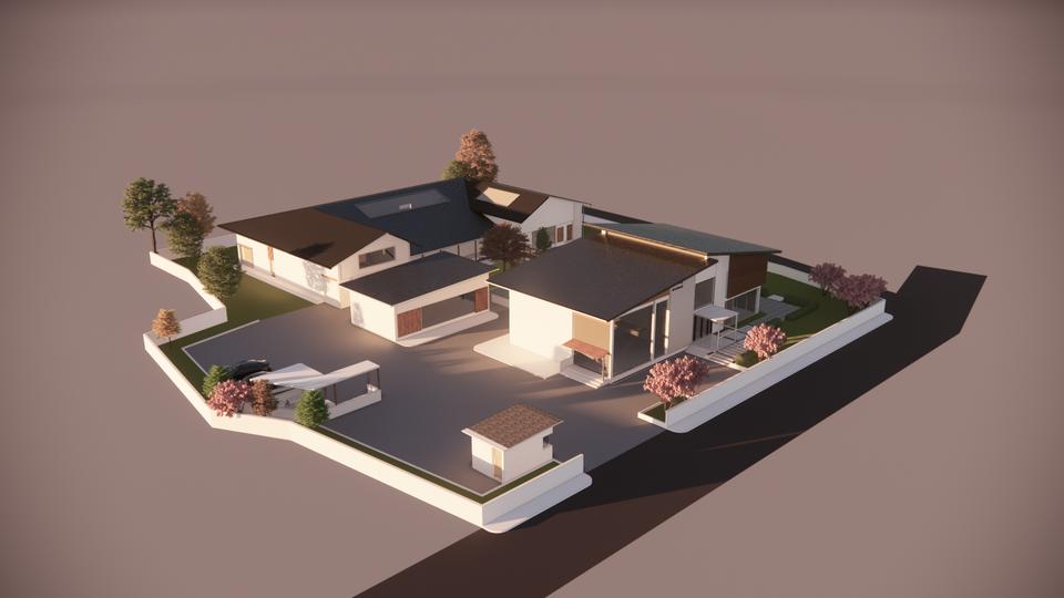
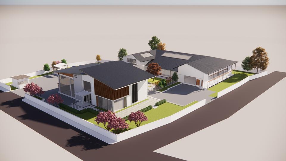


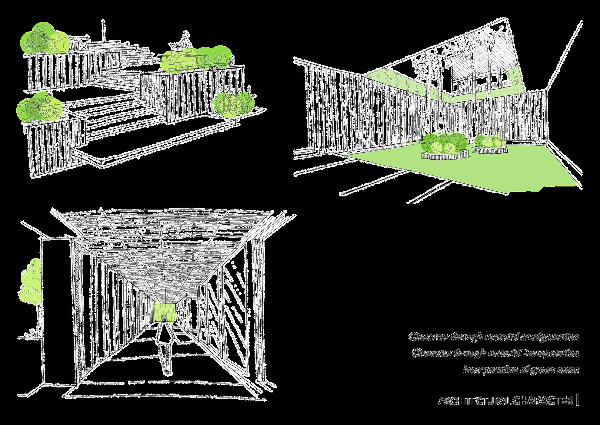
Massing:

Influenced by modern Japanese industrial architecture
The showroom + admin unit has a clerestory structure design, whereas the manufacture unit features a gable roof.
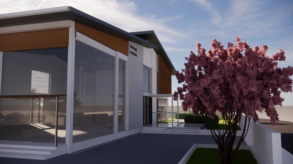
Both units are steel structured with double C-section columns and I-beams. Dark metal shingles roof all units for a high profile and aesthetic steel roof.
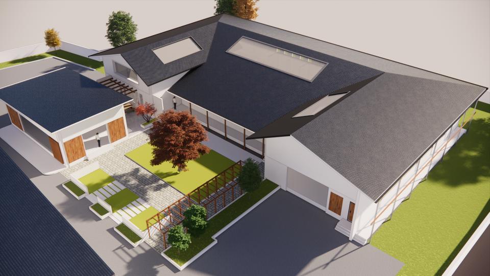
Wooden louvres are positioned on the north-NW side of the showroom unit; doubles as a design element.
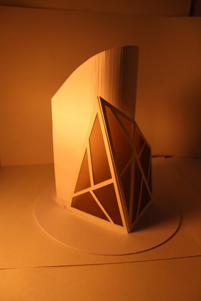
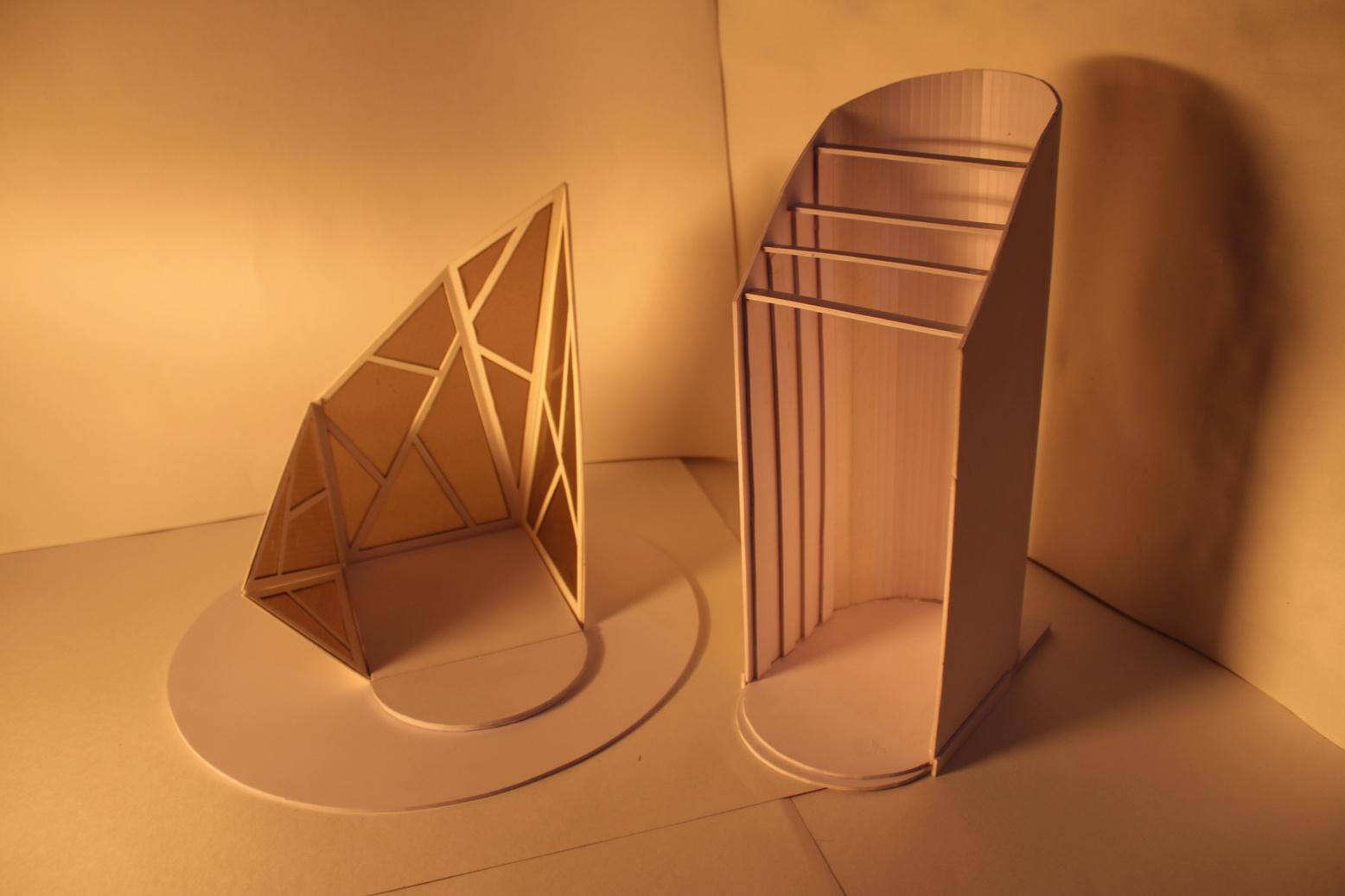
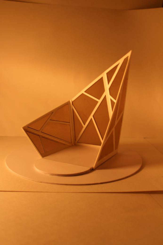
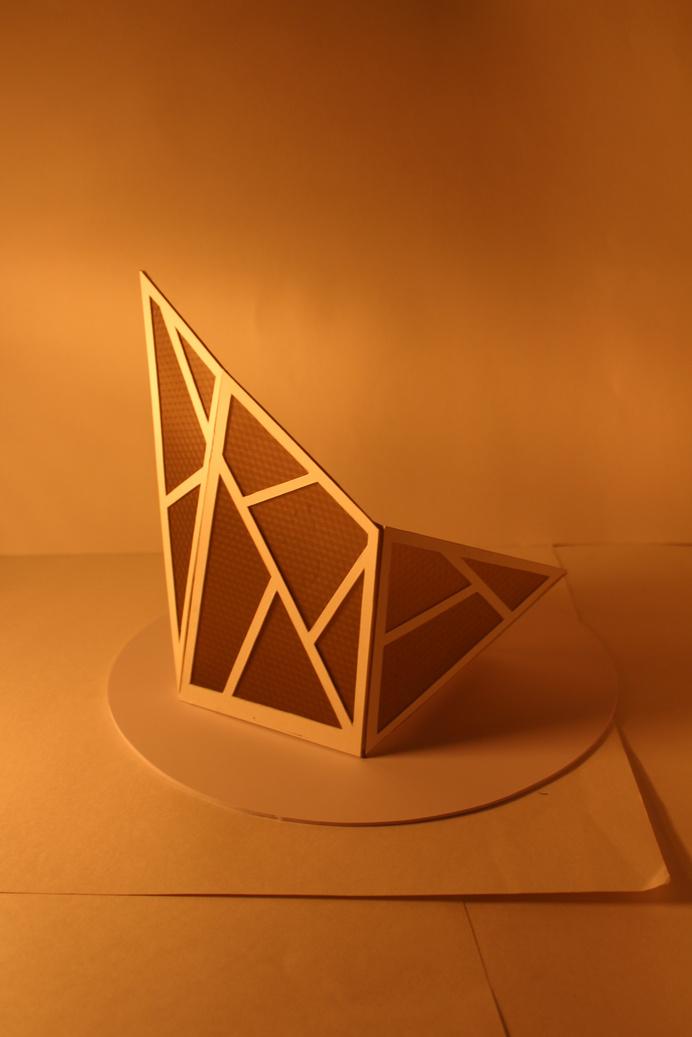
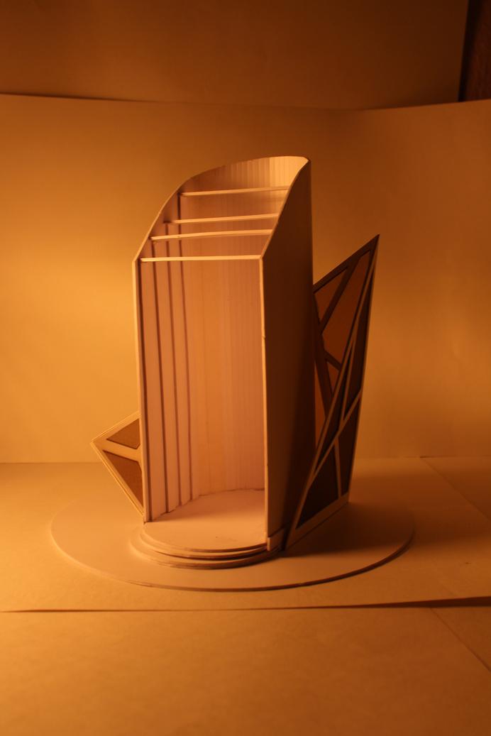
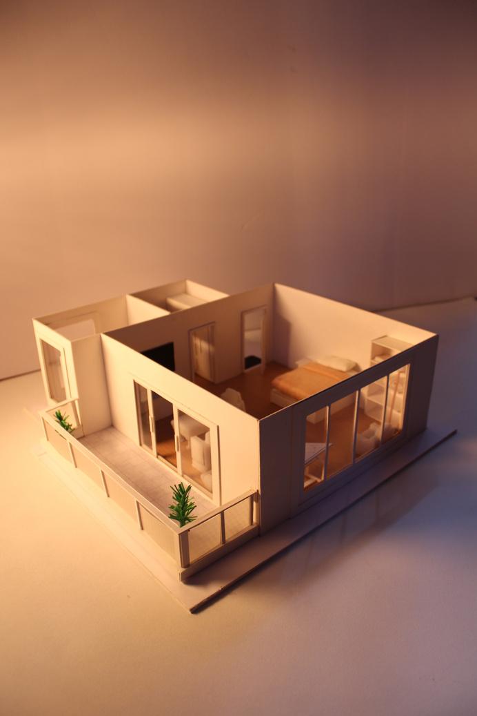
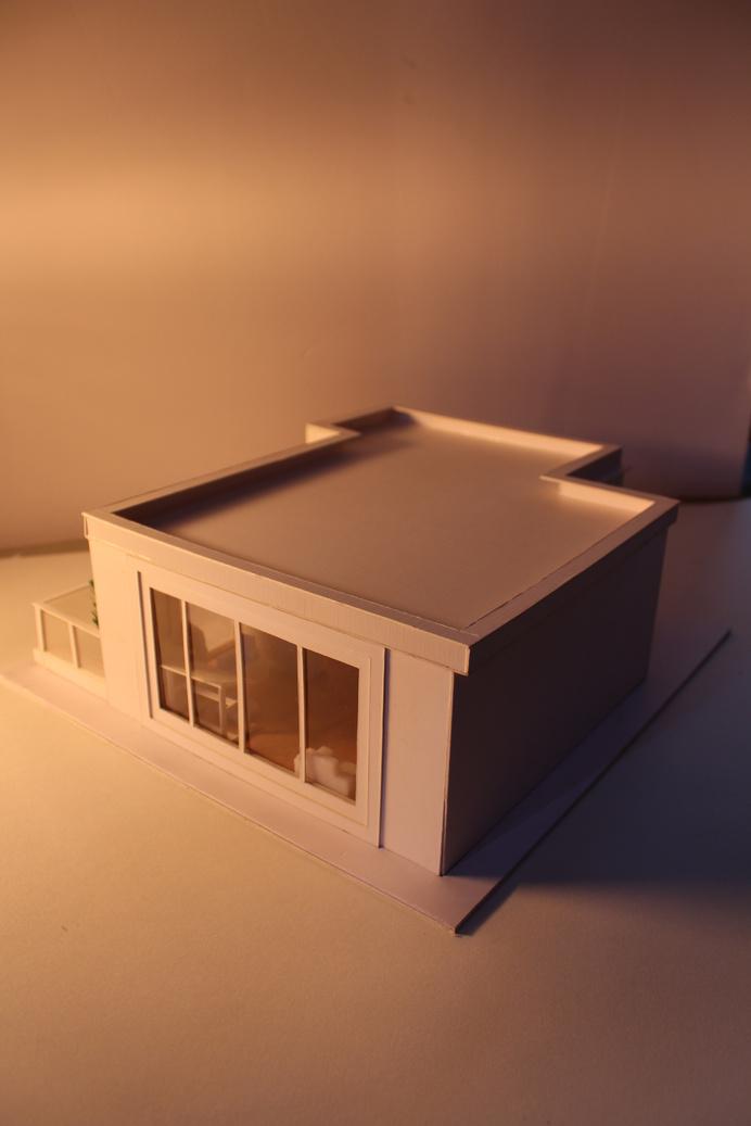
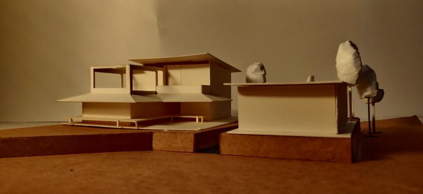
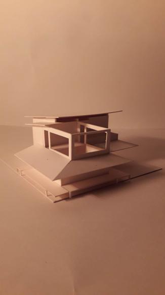
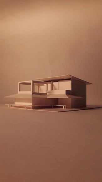
physical models, cover page designs and free hand sketches
The following is a compilation of works, projects and snippets of architecture and graphic design related subject matters.
The sharply cut eaves for a model, any two fonts and colors that complement each other, cover pages that catch an eye and communicate - I have always had a flair for creating designs that can communicate meaning and look good at the same time
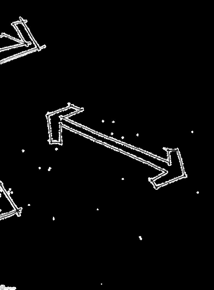
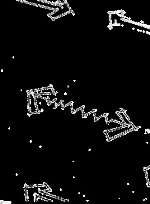
In addition to this, quick sketches are my go-to.
The mind is a plethora of ideas bursting, and sketches help me communicate my ideas to people and even to myself in a vivid manner.
Also, it's very fun!