Est. 2024


Est. 2024
Savor Local Elegance with a Dash of Vintage
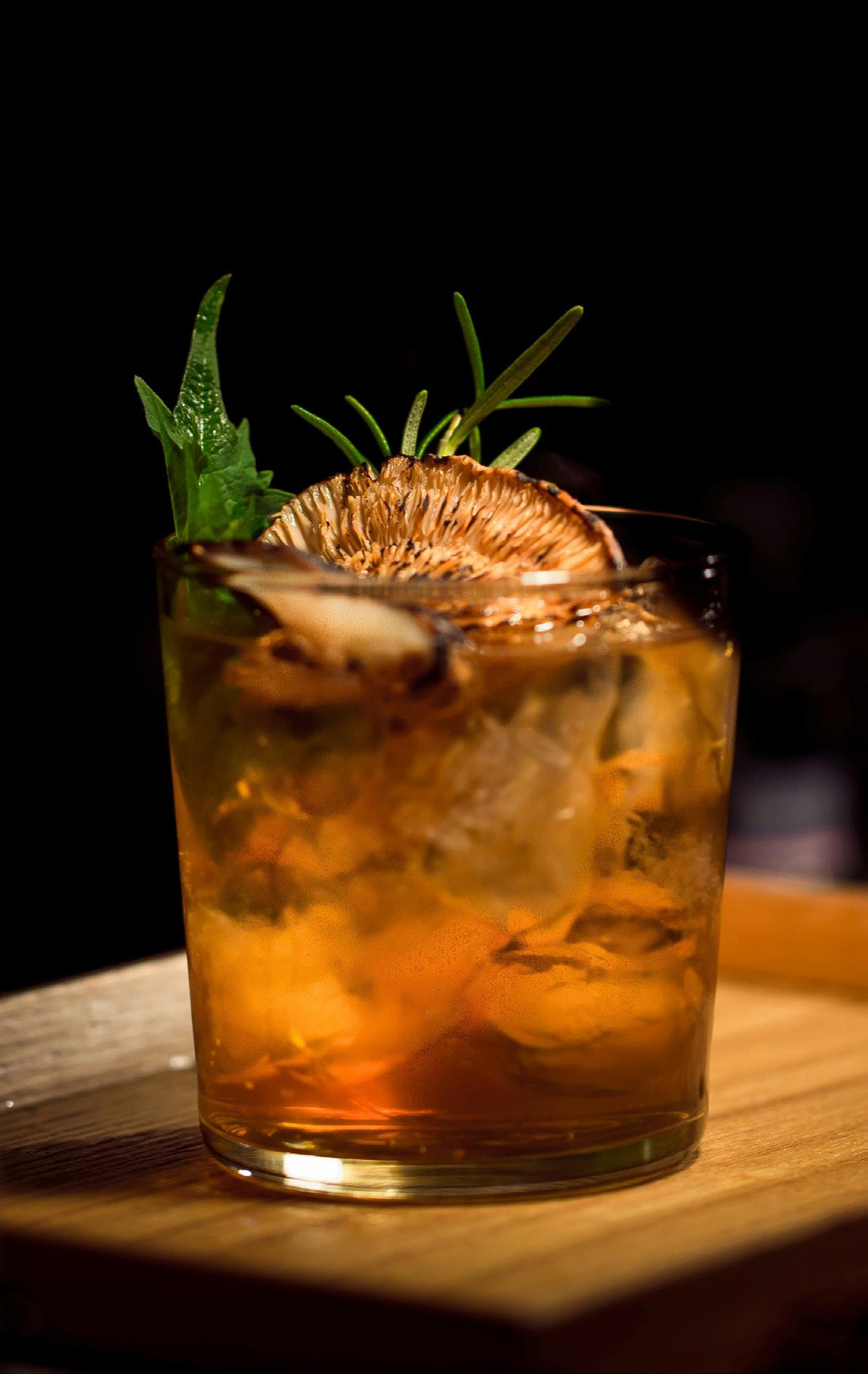
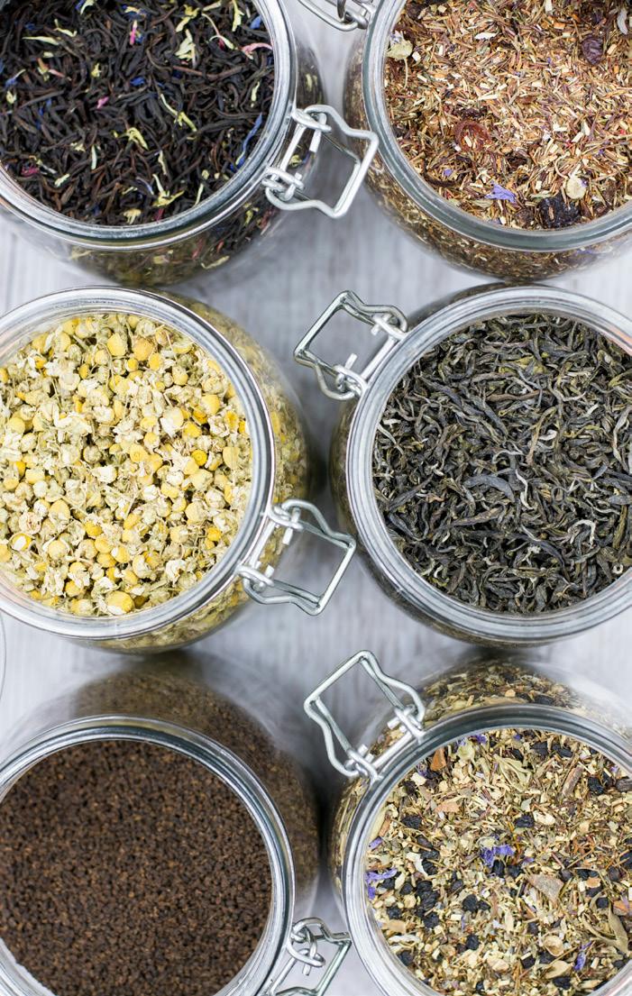
Jasper’s Café and Lounge is a celebration of local culture, agriculture, and community wrapped in a glamorous Roaring 20s atmosphere. Drawing inspiration from Art Deco and the vibrant essence of vintage Miami, Jasper’s offers a space where you can enjoy tea-centric cocktails, farm-to-table charcuterie boards, and an espresso menu—all while supporting local businesses and savoring an upscale experience. Our dedication to employees, community, and local artisans sets us apart, creating a space that feels both luxurious and deeply connected to the world around us.

At Jasper’s Café and Lounge, we are committed to cultivating a luxurious, artdeco-inspired space that connects the community, supports local businesses, and celebrates the joy of tea. Through our farm-to-table offerings and vintageinspired ambiance, we strive to provide an unforgettable experience that nourishes both body and soul.
Community First: Jasper’s believes in fostering strong connections with local farmers, artisans, and businesses to create an ecosystem of support and sustainability.
Employee Care: Our employees are at the heart of what we do. We ensure a positive, growth-oriented environment for every team member.
Elegance & Quality: Every detail at Jasper’s is crafted to embody sophistication and refinement, from our handcrafted tea cocktails to our curated charcuterie boards.
Sustainability & Support: By prioritizing farm-totable practices and working with local vendors, we contribute to a sustainable food system that benefits everyone involved.

The brand voice of Jasper’s Café and Lounge should reflect its core identity: elegant, welcoming, and communityfocused, with a hint of vintage charm and sophistication. Here’s a breakdown of how the brand voice would sound:
Elegant but Approachable: Tone: Sophisticated yet inviting.
Warm and Community-Centered: Tone: Friendly, conversational, with an emphasis on local ties and collaboration.
Vintage Glamour with a Modern Twist: Tone: A bit playful, inspired by the charm and exuberance of the Roaring 20s, but with modern, accessible language.
Passionate About Quality and Craftsmanship:
Tone: Thoughtful and detail-oriented, expressing a deep care for quality in everything from tea to charcuterie boards.
Mindful and Sustainable: Tone: Caring and intentional, with a focus on sustainability, both in products and practices.
The logo merges the sophistication of Art Deco with subtle hints of vintage Miami. Key elements:
• Clean, geometric lines with elegant curves inspired by Art Deco architecture.
• Jasper, the dog, main feature and dapper delight.
• Visual reference to tea cup to symbolize the café’s focus on tea-centric offerings.
• A stylized emblem that reflects collaboration or connection.
This should be the main version of the logo, used on all main signage, business cards, menus, and digital assets.
When the wordmark is removed, the emblem is left. It should be used sparingly when the full logo is unable to be used.
When the emblem is removed, the wordmark is left. It should be used sparingly when the full logo is unable to be used.
In cases where the horizontal logo does not work well, the vertically stacked logo may be used.
The full color logo should be used when able on dark or light backgrounds. When it’s not possible to use the full color logo, a fully white logo may be used on dark backgrounds and a fully dark teal or black logo may be used on light colored backgrounds.
When the logo is used, there must be a certain amount of clear space around the logo to ensure it is not crowded. The clear space will be equal to the height of the letter J from the wordmark.
To ensure readability and easy visibility the full logo should never be smaller than 2 inches wide. The emblem only should never be smaller the .5 inches wide and the wodmark only should never be smaller than 1 inch wide. 2 inches
Primary Font: Quiche Sans
A classic Art Deco font with bold geometric shapes, perfect for embodying the upscale, stylish feel of Jasper’s.
Decorative Font: Mendl Sans
A simple, modern font with some unique characteristics perfect for headlines and decorative text. Not for use of large bodies of text.
Web Font
A clean, minimalist sans-serif font that complements the Art Deco style without overwhelming the eye. It adds a touch of modernity while still maintaining a classic aesthetic.
Deep Teal: #123636
Gold Gradient: #c7b082 & #f0dbba
Teal: #369196
Coral Pink: #e0bdc2
Terracotta: #bf635e
Yellow: #f5c457
Gold: #f0dbba
Mint: #a6c9ba
Jade: #00a36c
Each color may be used in 100% tint or in variations of tint from 10% up. No color tint under 10% should be used.
The photography style for Jasper’s Café and Lounge should reflect its upscale, vintage ambiance with a modern twist. Focus on soft, natural lighting to highlight the intricate details of the Art Deco design, tea-centric cocktails, and charcuterie boards. Shots should feel elegant and inviting, capturing both the luxurious atmosphere and the warmth of the community connection.


Elements which support the brand will focus on Art Deco shapes and curves to further accentuate the branding. Each element will pull from linework and simple shapes. Jasper, the dog, may be used on it’s own when the sitaution calls for it.
These are simple examples of how the branding should be used across various marketingmaterials. Please consult owner for more information or direction for further graphics.


