

2024Fine Arts Senior Thesis Exhibition
MAY 3-MAY 18, 2023 · CANTOR FITZGERALD GALLERY, JOHN B. HURFORD ‘60 HUMANITIES CENTER
DEPARTMENT OF FINE ARTS
Cantor Fitzgerald Gallery
Haverford College
370 Lancaster Avenue
Haverford PA 19041
www.haverford.edu/exhibits 610-896-1287
Gallery hours:
Monday-Friday 11am-5pm
Saturday-Sunday 12noon-5pm
This catalog was produced on the occasion of the Fine Arts Senior Thesis Exhibition May 3-18, 2024


Fine Arts
Senior Thesis
MAY 3-18, 2024

Cantor Fitzgerald Gallery
Exhibition
John
Haverford College 370 Lancaster Avenue, Haverford PA 19041
B. Hurford ‘60 Humanities Center
The Haverford Department of Fine Arts is pleased to present the 2024 Senior Thesis Exhibition, which marks the graduation of Lindsay Alexander-Eitzman (printmaking), Lilah Craig (painting), Miko Fleming (printmaking), Annabel Junko Flint (printmaking), Thekla Jubinville (sculpture), Naomi Lawrence (printmaking), Luca Ponticello (painting), Liliana Rokita (photography) and Neha Thumu (printmaking).
All Fine Arts majors are required to take the intensive, year-long Senior Seminar, during which they explore the themes, methods, and concepts presented in this exhibition. Throughout their senior year, they master the techniques and develop the visual vocabulary in their concentration to shape a coherent body of work.
The Department of Fine Arts encourages all students to bring to their art the full weight of the liberal arts education they have gained at Haverford. This year-long thesis project reflects the individual growth of the artists as well as their commitment to the cultural vitality of the wider community.
Markus Baenziger Chair, Fine Arts Department
The Class of 2024:
Lindsay Alexander-Eitzman printmaking
Lilah Craig painting
Miko Fleming printmaking
Annabel Junko Flint printmaking
Thekla Jubinville sculpture
Naomi Lawrence printmaking
Luca Ponticello painting
Liliana Rokita photography
Neha Thumu printmaking

Lindsay Alexander-Eitzman printmaking
Sacred Violence
Under the blanket of unequivocal love, God in the Bible demands blood. Biblical justice demands retribution before the realization of universal salvation. The Lord observed the extent of human wickedness on the earth, and he saw that everything they thought or imagined was consistently and totally evil.
The Lord slew all the first-born in the land of Egypt, both the first-born of man and the first-born of cattle (Genesis 6:5-22 NLT). The Israelites’ firstborn sons, however, were redeemed with a sacrificial lamb. The sins of humanity were similarly redeemed by the crucifixion of Jesus Christ. With seven horns and seven eyes, a sacrificial lamb is the one who brings the Apocalypse of Revelation.
There is a certain beauty about the violent, incomprehensible and frightening sections of the Bible. From the unfathomable descriptions of angels by the prophet Ezekiel to the tribulations of Job for his unwavering dedication to the Lord, the Bible offers many scenes of horror to those outside the
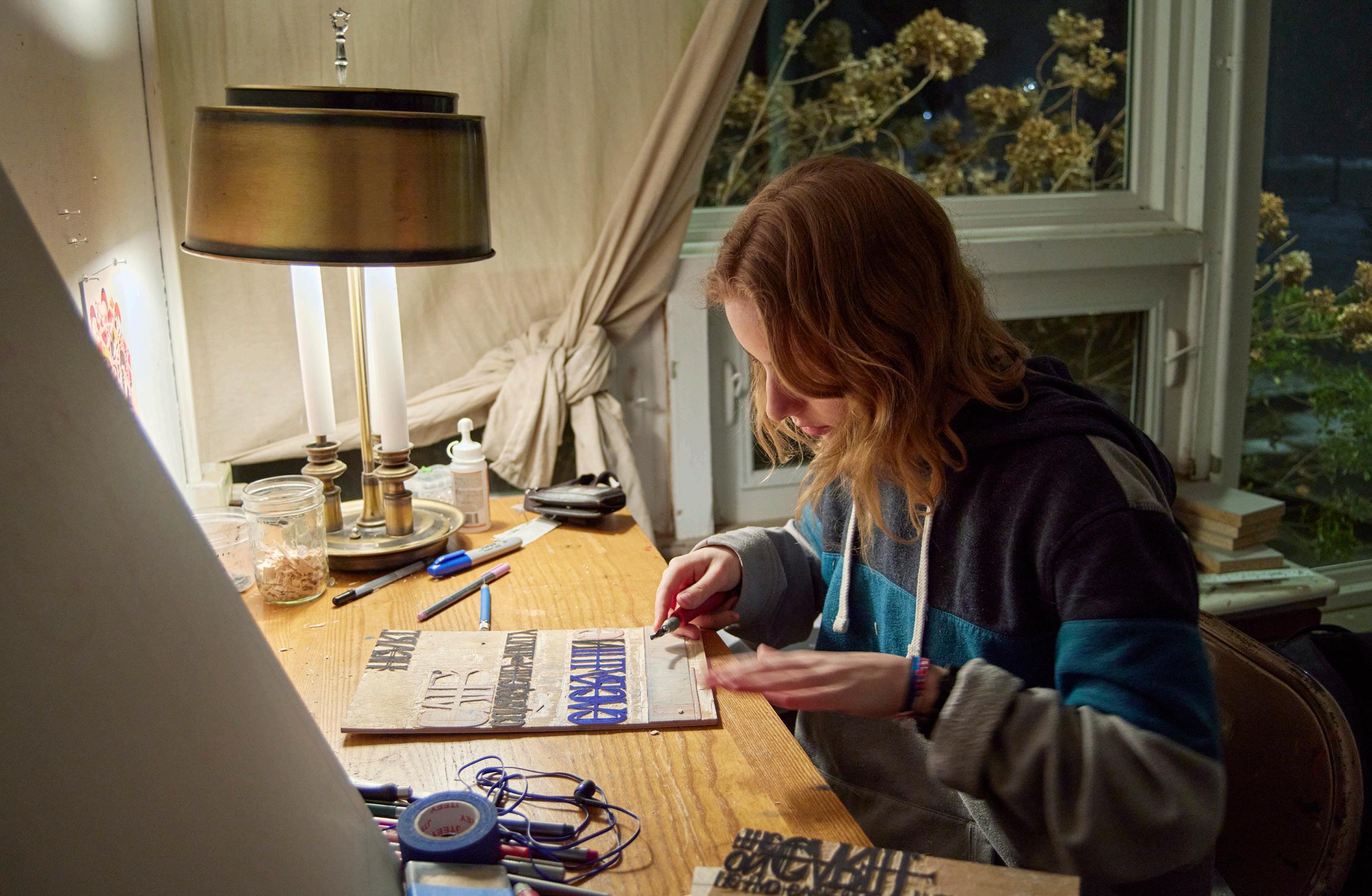
field of Christianity. Even within the Church, these scenes are often ignored or reinterpreted through the lens of love and peace. My thesis seeks to bring some of these texts and scenes to light through woodcut relief printmaking. The woodcut blocks are hand carved with unsettling phrases from the Bible, spelled out in stylized Gothic typefaces. Printed to resemble ancient scrolls, the text is condensed and blurs together from far away like an incomprehensible but readable piece of old literature—similar to the notion that we cannot understand the thoughts and motives of God. Through the many hours put into hand-carving the blocks of text, the meditative process and blood sacrifice I have given to the cloth and blade are my own form of dedication and worship.
Therefore, I urge you, brothers and sisters, in view of God’s mercy, to offer your bodies as a living sacrifice, holy and pleasing to God—this is your true and proper worship (Romans 12:1 NIV).
Left:
In the Parker House studio, January 24


Above:
Parker House studio wall, November 15
Left: In the Senior Seminar group meeting, January 24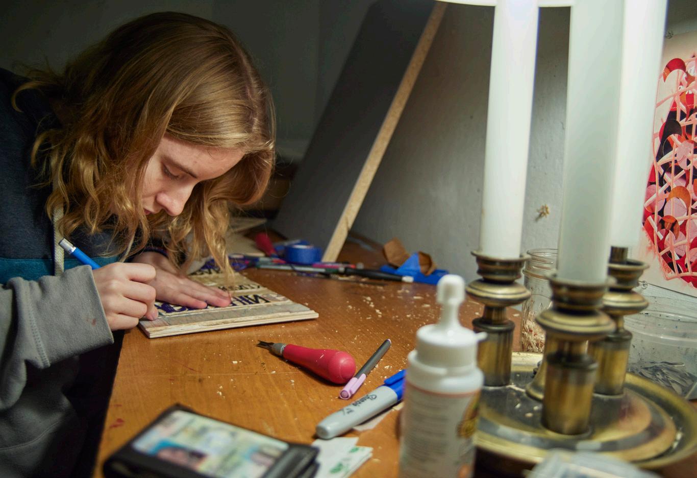
 Right:
Carving a woodcut block in the studio, January 24
Below:
Detail of scroll
Right:
Carving a woodcut block in the studio, January 24
Below:
Detail of scroll

Clockwise, from right:
In the studio, November 15
In the fall midterm group critique, November 1
Woodcut block marked for carving, February 13
Stack of carved woodcut blocks, March 26


Lilah Craig painting
My thesis is a selection of oil paintings and paper lithographs depicting moments of domestic stillness. The paintings capture members of my family at times of rest, amidst the chaos of daily life. The prints are vignettes of mundane items in my house, which are essential to the character of my home.
I paint what I’m familiar with, what gives me comfort, what is beautiful to me. When I’m surrounded by other people, my instinct is to observe. I appreciate the little details, especially in people with whom I’m familiar. The particular attributes that make them who they are. In this project, I focus on facial expressions, the ways people hold themselves, and how they interact with others.
The paintings are not entirely realistic, and contain stretches of the canvas that are composed of
line and color without consideration of objects, but it is important to me that the colors create a believable scene. I hope to capture the authenticity of my subjects’ emotions and personalities. I embed fragments of personal history, such as a specific book my mom read to me as a child or my brother’s favorite blanket, gifted to him by our grandmother. To me, these paintings take on a sense of depth and memory that is different from painting people with whom I’m less familiar, and my relationships with each person are reflected in the paint’s look and feel.
I attempt to capture the essence of quiet moments of human connection, instances when we show love to one another through simple, everyday actions, rather than grand gestures. I invite the audience to reflect on the tranquility that is found in such moments of shared stillness.
Left: In the Parker House studio, March 27

 Left: Studio view with Giants Beware! (in progress) on tables, December 5
Above:
Final fall group critique, December 13, with Couch (in progess) on wall
Right: Flower 2023, paper plate lithograph with chine collé, 17 x 11 in. (plate)
Left: Studio view with Giants Beware! (in progress) on tables, December 5
Above:
Final fall group critique, December 13, with Couch (in progess) on wall
Right: Flower 2023, paper plate lithograph with chine collé, 17 x 11 in. (plate)


Clockwise, from left:
Working on ACL in the studio, Aptil 9
Summer 2023, paper plate lithograph with chine collé, 13 x 15 in. (plate)
Studio tabletop, January 24
 ACL 2023-24, oil and oilstick on canvas, 24 x 20 in.

Miko Fleming printmaking
When I was very young, I would tell my mother I remembered a time before I was born. Now, I do not believe this was a real memory, but more of a story I wanted to believe and then told so often that I eventually convinced myself it was real.
Memories can feel concrete in that they appear to be reminders of critical moments or anchor points tying together the basic chronology of our lives. However, science and experience continuously confront us with the reality that memories are fallible, fragmentary, and sometimes complete fantasy. Nevertheless, memories are inseparable from our identity, whether they are “real” or not. Even if artificially sewn together, memories form the material of our life’s overarching story, which becomes the foundation for who we perceive ourselves to be. My thesis seeks to celebrate the intriguing fantasy of memories by choosing to disregard “truth” and instead appreciate memory’s elusive inconsistencies, irrationality, and incompleteness. Through this project, I explore these ideas while reflecting on my memories. In my images, I seek not to portray my memories accurately, but to recreate the impression of memory through the mediums
of printmaking and pop-up pages printed with lithographic, monotype, and chine collé techniques. Often, I will take abstract approaches to representation, combining the strongest elements of my memories—of my family members, plants, animals, and myself—and translating them into symbols which might take the form of a gesture, an object, a phrase, or a color.
The pages develop out of 2-dimensional sketches which are reanimated through pop-up techniques. I chose pop-ups to illustrate memory firstly because of nostalgia tying into the themes of childhood, but also because I believe that the limited movements of pop-ups are reminiscent of fragmented memories—mimicking a waved hand, falling petals, and scattering butterflies.
Through this project, I have been able to explore how my mind has embellished, warped, or even fabricated my core memories. As a result, I have been able to reflect on how these memories have shaped my identity, and how being confronted with their possible falsehoods can change the perception I have of reality and myself.
Left: In
the printmaking studio, March 26


 Left: Studio wall, December 13
Above: Final fall group critique, December 13
Right: In the spring midterm critique, March 27
Left: Studio wall, December 13
Above: Final fall group critique, December 13
Right: In the spring midterm critique, March 27

Below:
 Left: In the printmaking studio, March 26
Fall midterm group critique, November 1
Left: In the printmaking studio, March 26
Fall midterm group critique, November 1

Above:
Studio wall, February 13
Right and below :
Studio wall, November 15, with pop-up elements


Annabel Junko Flint printmaking
My Ukiyo-e / 私の 浮世絵
M y project utilizes the medium of printmaking as an exploration of my heritage and identity, and its connection to Japanese culture. Through its emulation of the style and ideals of traditional ukiyo-e, I tell the story of a year in my life as a half-Japanese, half-American individual. The juxtaposition of the images I choose to depict, the techniques I utilize, and the style I choose to embody highlight my identity as a non-traditional Japanese American.
Traditional ukiyo-e prints are created with multiple handcarved woodblocks, with each color on a separate block. They are characterized by their bright colors, and follow consistent compositional rules and motifs. The subject matter of a print varies widely, and there are separate classifications for its sub-genres, such as bird and flower (kacho-ga) or landscapes (uki-e). Despite this variation, all prints attempt to portray similar emotions of yūgen and mono no aware, or mystery, depth, and transient beauty. Compositionally, all ukiyo-e prints exhibit elements of irregularity, and are often arranged asymmetrically.
Despite being traditionally Japanese, ukiyo-e art has an interesting historical relationship with European art. Instrumental in inspiring van Gogh, there are many recreations and references to ukiyo-e prints throughout his works. Artistic inspiration also traveled in the other direction, with the introduction of linear perspective into ukiyo-e by artist Utagawa Toyoharu. He also developed a form of copper plate engraving similar to etching. Utagawa’s influence on landscape can be seen
all throughout uki-e art, most famously in prints by Hiroshige and Hokusai.
Ukiyo-e’s mixed history mirrors my mixed history. Its combination of traditional Japanese values with both Japanese and European techniques makes it a fitting style to depict my story. Due to my heritage and upbringing, I feel very connected to Japanese culture and its values. However, there are many things that separate me from someone who is traditionally Japanese: I am mixed race, I was born and raised in America, and I can’t speak Japanese fluently. I believe these factors do not negate my connection to Japanese culture, but add nuance to this relationship.
In this project, I chose to create a visual diary of a year in my life, from March 2023 to February 2024. I often use sketching as a diary, and depict scenes from my life. Ukiyo-e also focuses on the transient beauty of life, and the fleeting small moments. To bring together my personal experience and these cultural values, I will depict 24 moments (two images per month) in my interpretation of ukiyo-e style. In each month, I will use two different kinds of printmaking: hand carved relief, and etching. I will hand-carve linoleum blocks, which will more closely resemble the traditional techniques of ukiyo-e. I will also use zinc-plate etching, which pays homage to ukiyo-e’s connection to European printmaking. I will use chine-collé to color my prints, a technique derived from asian printmaking. This will allow me to emulate the wide array of colors used in traditional ukiyo-e, and highlight another traditional Asian printmaking technique.
Left: Pulling a print in the printmaking studio, March 26


 Top left:
Prints on Parker House studio wall, March 26
Left:
Final fall group critique, December 13
Left:
Studio table with linoleum blocks, January 24
Below:
Studio wall with prints for April and May, November 15
Top left:
Prints on Parker House studio wall, March 26
Left:
Final fall group critique, December 13
Left:
Studio table with linoleum blocks, January 24
Below:
Studio wall with prints for April and May, November 15


Clockwise, from left:
In the final fall group critique, December 13
Fall midterm group critique, November 1
Prints on studio table, April 22
Right: In the printmaking studio, March 26

Thekla Jubinville sculpture
My senior thesis explores perspectives and space through a multimedia installation. Each of the three major elements is given space to be viewed separately; while their parallel arrangement creates two hallways that, when passed through, change what is visually accessible. This forces a choice of perspective in order to be viewed cohesively. The direction the work is viewed from can alter its definition, affecting its interpretation.
These passageways are created by two walls and divided by a curtain of ceramic tiles. One side of the wall is full of plaster face casts, each of a different person. Each face is directed at the hanging tiles that separate the viewer from the other side. This curtain consists of 400 glazed tiles suspended in the middle of the space. In this hallway, bits and pieces of the 6’x6’ mixed media painting hung
on the opposite wall are visible through the gaps in the tiles. However, nothing can be fully viewed until standing on the other side, where the work with both painted and sculptural elements faces the unglazed side of the tiles.
The dialogue of the work has multiple interpretations and definitions that are subject to change based on the physical positioning of the viewer. Simply shifting perspective can reveal an entirely new meaning to something that was once thought to be understood. As we move through the world, things change depending on where you stand; every perspective is going to have varying degrees of what is visible. This encourages the consideration of how subjective our own perceptions are in nature and to embrace this fluidity of interpretation as it is inherent to the human experience.
Left: In the foundry,
March 5


22
Plaster face casts In the foundry, March 26
Trimming masks, March 5
Tiles laid out, April 9

 Clockwise, from right: Positioning ceramic tiles in the foundry, April

 Top: Spring midterm critique, March 27
Left: Suspended tiles in studio, March 5
Top: Spring midterm critique, March 27
Left: Suspended tiles in studio, March 5

 Right:
Colored string, Parker House studio, December 13
Below:
Studio wall, March 26
Right:
Colored string, Parker House studio, December 13
Below:
Studio wall, March 26

Naomi Lawrence printmaking
This installation is an exploration of connectivity and interdependence. More and more over time I have come to believe that we are taught to think about ourselves and others entirely backwards. The dominant understanding of the Western, capitalist cultures I’ve grown up in is that we are individuals inherently separate from each other and the world around us. This fits neatly into neoliberal ideologies of personal responsibility, rational self-interest, and independence. I find this to be entirely inaccurate. On both a physical and psychological level, we are deeply entangled with our surroundings. Our skin is a permeable membrane— we all breathe the same air, and our bodies are home to trillions of microorganisms that affect our health, mood, behavior, and memory. We are social creatures, and rely on our communities and find fulfillment in helping others. Every thought and opinion we have is shaped by the information we consume, from conversations with loved ones to advertisements on train platforms. Our networks spread outwards and outwards—we impact and are impacted by every living creature on this planet. In these and many other ways, individuality does not present a useful framework to understand human experience.
In this project, I have looked to forest ecosystems as a helpful metaphor for people. On the surface, trees can appear to be fully separate beings. We might assume that they are competing for resources, each racing to climb the highest and get the most sunlight. However, trees are connected through their roots to networks of mycelia, the thread-like structures that make up most of the mass of fungi. Through these networks they communicate, send distress signals, and share nutrients and water. The forest consists less of individual, competing organisms and rather of a wide-reaching network of interdependent collaborators.
I have drawn on the imagery of forest ecosystems— roots, mushrooms, and soil microorganisms—to create abstracted repeating patterns for this installation. These patterns, printed with woodblocks on hand-dyed fabric, are infinitely repeatable. They reach out to fill the space, overlapping and entangling with one another to create a network that encompasses the entire installation. The viewer is invited to step into this network and become both surrounded by and embedded in it.
Left:
In the spring midterm critique, March 27


 Left: Wall in Parker House studio, December 13
Right:
Carving a woodcut block in the studio, February 27
Below:
Final fall group critique, December 13
Left: Wall in Parker House studio, December 13
Right:
Carving a woodcut block in the studio, February 27
Below:
Final fall group critique, December 13

 Top: Studio wall, December 13
Left: Spring midterm critique, March 27
Top: Studio wall, December 13
Left: Spring midterm critique, March 27

 Right: Parker House studio, February 13
Below:
Detail of test print in studio, November 15
Right: Parker House studio, February 13
Below:
Detail of test print in studio, November 15

Left:
In the Parker House studio, February 22
Luca Ponticello painting
The Room
The main aim of this project is to showcase all of the artistic skills I’ve been cultivating over the past few years, from sculpture and 3D design to drawing and painting. The Room installation is complete with handmade furniture, custom posters, and paintings displayed as photographs that each reference a personal memory. Some images, such as the posters on the wall, take on an illustrative style, referencing 20 th/21 st century Pop art and consumer culture.
Conceptually, The Room also serves as an ode to materialism and consumerism, two conditions which art is often used to criticize. Materialistic people are commonly perceived as superficial and overindulgent. Excessive consumption of material goods is regarded as unsustainable; mass-production of everything from clothes to art to furniture produces poor-quality products with uninspired designs, breeding wasteful consumer habits. People prioritize buying what they can afford over what is durable and aesthetically valuable, only for these goods to fall apart and need to be replaced. As a result people buy new and often, continually and without consideration, causing more goods to be made and eventually thrown away.
Yet consumption is not inherently wasteful, and materialism not inherently superficial. When we buy and keep new things for specific reasons, taking care to consider why we might want a specific item instead of another, our consumption habits become much more particular
–we consume more thoughtfully, and likely much less. Additionally, our things come to say much more about what we value personally, even artistically. This sort of curation is as significant for a creative practice as any other; demonstrating as much expressiveness as a painting and as much planning and forethought as a handcrafted quilt or bookcase.
I consider all aspects of my material life as an opportunity for self-expression, and I have learned that I no longer wish to spend my money or my time on collecting things that I don’t find beautiful. I don’t think this is superficial—at least not to a fault. Instead, I find it to be a deeply personal, important reflection of my creativity, and by extension, my personhood. The Room serves to convey this philosophy. Its aim is to feel nostalgic and authentic, and to remind viewers of the ways in which they relate to and value their own things. I want to show viewers that material possessions are very meaningful, and that a more purposeful relationship with how we consume serves to correct the flaws of overconsumption, rather than reinforce them.
The Room is, then, as much about materialism as it is about myself. Each piece is particular, and puts on display what I enjoy most about art and craftsmanship, the styles which I’ve come to appreciate, and what I am capable of. I hope only to improve at my craft, and unlock new and smarter ways to translate my artistic ideas into real life objects.


Clockwise, from left:
Test-fitting parts of Bookcase in the foundry, April 16
In the spring midterm critique, March 27
Senior Seminar group meeting, January 24
Right: Board (detail)


 Above:
At work in the Parker House studio, March 26
Right:
Painting (in progress) with preparatory sketch, March 5
Left: Poster
2024, alcohol ink on paper board, 40 x 30 in.
Above:
At work in the Parker House studio, March 26
Right:
Painting (in progress) with preparatory sketch, March 5
Left: Poster
2024, alcohol ink on paper board, 40 x 30 in.

Liliana Rokita photography
FLUIDITY
Over the course of the past year or so, I explored the concept of fluidity and how it manifests in connections between people and water. Furthermore, I explored how fluidity in motion and water can mirror the fluidity in self-expression and the human experience across geographical locations. This exploration into fluidity continued to evolve into a focus on how people physically decorate themselves to express who they are on the inside.
My concept of fluidity arose from the photographs I made this past summer in which I sailed from the Caribbean across the Atlantic to the Mediterranean Sea with twentytwo other college students and recent college graduates. Throughout this voyage and when I returned to Haverford in the fall, I studied the various relationships people have with water, from splashing in a cool creek to sailing through a tropical storm. Many of these water photographs omit details that would situate the image in a specific time and place in order to reveal the fluidity that exists outside of temporal and geographical markers. During the fall semester, I watched my friends’ clothing styles change as well as their haircuts, hair color, tattoos, and piercings. These transformations led me to push the scope of fluidity further from just water to the fluidity that exists within the human
experience itself. Specifically, I became interested in the fluidity of gender expression and the rituals and ways in which people style their exterior appearance to reflect their interior. In addition to my friends, I began photographing and talking to people in public who stood out to me, focusing not on a particular aesthetic but rather on how people breathed life into their objects (i.e., their clothes, shoes, tattoos, piercings, and other accessories).
The photographic sequence ends with an exploration of the relationships between people and their objects, from sentimental tattoos of stuffed animals and childhood memories to sweatshirts promoting their book to repurposed thrifted clothing. The arrangement of photographs loosely follows the evolution of my exploration of fluidity and reveals the connections between fluidity in nature and fluidity of interiority that we impart to our objects. The collection of FLUIDITY photographs is made of a variety of mediums including color and black and white film–both medium format (70mm) and 35mm–as well as digital photography. The photographs are all inkjet printed on archival paper. The photographs range in location and relationship between the subject(s) and me from the greater Philadelphia area to Corsica, France and from close friends to absolute strangers.
Left:
Examining contact sheets in the photography lab, March 15


 Creek Cool-Down
2023, archival inkjet print, 10 x15 in.
Park Hangouts
2024, archival inkjet print, 13 x13 in.
Right:
Inspecting
Below:
2
In the darkroom, April 2
Bottom left:
Fall midterm group
November 1

 a print in the photography lab, April
critique,
a print in the photography lab, April
critique,


Above:
Final fall group critique, December 13
Left:
In the Senior Seminar group meeting, January 24 Bottom right: Parker studio wall, December 13
The Rituals of Hair Braiding
2024, archival inkjet print, 10 x15 in.

Philly Cops Exposed 2024, archival inkjet print, 13 x13 in.


Neha Thumu printmaking
The Uncanny
“Complete. Global. Saturation.”
Horror is an art form that instills a sense of fear within oneself through a variety of methods, whether that be a grisly monster covered in gore or even an unknown figure that lurks in the shadows. Ever since I could remember, I was always fearful of the most stereotypical elements of horror: dark hallways, oddly shaped shadows, and the mere thought of something watching behind a mirror. This deepseated fear horror has caused me has led me to be averse to the very thought of consuming any horror media. Until recently.
This year has been a resurgence for me in terms of gaming. Which has eventually led me to rediscovering horror games. Their ability to combine
beautiful art with an intricate plot riddled with terrifying moments is simply incredible. As an aspiring animator and game dev, I would be remiss not to use horror to create content with such storytelling capability. Horror not only represents a story that I have created but also allows the audience to create their own interpretations of the pieces.
With my animated video, lithographs, and 3-D printed figures, I seek to bring the audience into an ordinary world with unordinary creatures. The viewer can step into the domains of each of the four monsters within the world and unravel the mystery hidden in their stories.
Left:
In
the painting studio, February 22

 Above: Prints on Parker House studio wall, March 3
Left: Prints on cart, March 3
Above: Prints on Parker House studio wall, March 3
Left: Prints on cart, March 3

Left:
Below:
 Final fall group critique, December 13
With Professor Kim in the printmaking studio, March 27
Final fall group critique, December 13
With Professor Kim in the printmaking studio, March 27

Above:
On studio wall, December 13:
No Exit
2023, polyester plate lithograph, 10¾ x 8 in. (image)
Dreamweaver
2023, polyester plate lithograph, 11¾ x 9 in. (image)
Right:
1
Opposite:
In the printmaking studio, March 27
 The fall midterm group critique, November

Special thanks to the Office of the Provost, whose support made this exhibition and catalog possible, and to Matthew Callinan, Asscociate Director of Cantor Fitzgerald Gallery, VCAM, and Campus Exhibitions, for his continuous assistance with the installation.
Thanks also to Department of Fine Arts faculty members Markus Baenziger, Hee Sook Kim, William Williams and Zachary Hill, and to photography lab technician Shaina Nyman and department assistant Amy Simms.


