PORTFOLIO


COPYRIGHT @ 2022 VI DO
ALL RIGHTS ARE RESERVED. NO PART OF THIS BOOK MAYBE USED OR REPRODUCED IN ANY MANNER WITHOUT THE WRITTEN PERMISSION OF VI DO.
VI DO
PHONE: (408) 221 - 0158
EMAIL: dianka.do@gmail.com
A young, enthusiastic interior architect and designer who believes in the power of visual communication. Traditional concepts simply represents a foundation for further creativity. In each project, my approach comes with new eyes to bring out the most unexpected experience.

cont ents


NATIONAL GEOGRAPHIC HEADQUARTERS
The project is based in Presidio, San Francisco. The headquarters will be occupying an existing building of 36,000 square feet in total. The building has 2 levels which the 1st level will be used for a public purpose and 2nd-floor will be for private use.

SITE ANALYSIS

Demographics

With the populaiton of 4,226. The demographics in the Presidio neighborhood is considered to have a higher education household with 84% have Bachelor or higher degree. The income is also higher than average in San Francisco with the annual income of 66% above 150K.

Most likely the race of White population live in this area that are in the working range from 25- 44 years old. With such demographics and the rich history of preserving the natural habitat with view to the ocean and many green hills. The neighborhodd have become one of the signiture place of San Francisco, where the real estate is higher than other part of the city. However, 97% of the population living here renting their space to develop their household and mainly to have convinient access to their workspace.
The safety grade of this area is rated as A+and is rated as one of the best place to live in California.

Living in Presidio of San Francisco offers residents an urban suburban mix feel and most residents rent their homes. In Presidio of San Francisco there are a lot of bars, restaurants, coffee shops, and parks. Many families and young professionals live in Presidio of San Francisco and residents tend to have moderate political views. The public schools in Presidio of San Francisco are above average.
Site Research
The location receive good amount of light throughout the day. Office windows need to have window treatment to avoid glare. Wind most of the time blow from North to West which doesn’t affect the property. The property have a clear surrounding with nice view to public park and water side. The location is limit on public transportation with only 2 bus lines coming to the area. However, the property have large parking lots around the building convinient for users with vehicles.
Most of the noise will come from 2 main streets: Sheridan Ave and Graham St. However, the traffic in this area is not high and the noise is kept at medium level.

The toporaphic of this area is mainly flat. It’s easy for any type of vehicle as well as pedestrian to move around. Most of the greenary surrounding are good and should be kept for the view. The North side of the property should maximize the amount of windows to access the view to the water side and bay view.
The property have limited amount of street lights and most street curb doesn’t have a slope for wheelchair access.
CASE STUDIES
OCAD U CO Incubator Offices, Toronto

This office was designed by Quadrangle firm. OCAD U has established a start-up incubator and executive training hub where public and private-sector clients can explore new pathways to innovation and problem-solving, informed by design thinking.


The space has an open concept that is divided by rich colors to bring out the upbeat and creative inspiration. When looking at these images, it does seem like a fun and fast pace office, and all the spaces are connected. There are many acoustic elements used for this office since it’s placed in a crowded city. The ceiling dropped down with sound-absorbing panels in most of the spaces, in closed spaces designers used carpet flooring to avoid echoing. Flooring is polished concrete that allows heavy foot traffic with low maintenance.


There are a lot of comfortable seatings like lounge chairs in the office that allow the employees to work for long hours comfortably anywhere they want which creates a sense of freedom in this layout. The office is very well lit by both natural light and artificial lights.
Designers succeed in serving the users the purpose of exploring the knowledge in a fun and professional way that the space is very engaging to people while having much room for a “classroom”.
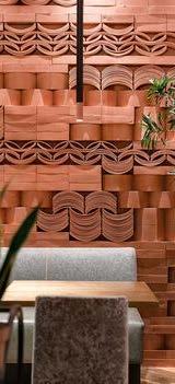
Alchemist Retail Store, Miami
This retail store is a high-end place that was designed by Rene Gonzalez Architect. Alchemist brand represents the spirit of the avant-garde focusing on oneof-a-kind artisanal creations.
With such a client, Rene Gonzalez Architect has approached the design as chic and unique as possible with a constantly changing selection of fashion, beauty, and lifestyle items followed by the interior. The idea is to make the store more likely a gallery for each fashion designer.


Between the interior and exterior is a seamless transition with floor-to-ceiling windows and mirrored surfaces that reflect the sky above and the street below. The concept for the new Alchemist is the idea of an insulated box, a cocoon-like space that allows patrons to disconnect from the constant motion, sound, and heat of Miami Beach and to be enveloped in a calming language of motion, color, texture, and light. Melamine foam wraps the ceilings and walls, simultaneously acting as a buffer for the surrounding structure while providing a soft tactile quality that is rarely experienced in architecture.
The symmetrical pattern of the saw-tooth walls is accentuated by hidden LED light bands that produce a rhythmic changing composition of color that appears and disappears behind the surface of the foam walls.
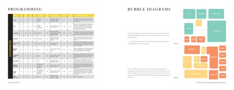
PROGRAMMING
Lobby A1 15 10 150 Entrance, Reception, Cafe YES Lounge seatings, coffee tables, signages, lightings, outlets. NO YES
Colorful presentation as whole concept of the office. Inviting feelings while utilize the natural light.
BUBBLE DIAGRAMS
Cafe A2 15 25 375
Entrance, Lobby, Kitchenette YES Chairs, tables, serving counter, outlets. YES NO
Should be well designed with representing the client’s company but also should be more like a “fast” and convenient coffee place where people can grab a coffee but not staying for too long.
Retail Place M 60 20 1,200 Exhibition YES Shelvings, registers, loung sitting, signages, display, lightings, storages, mirrors. YES YES Merchandise should be a focus. For display using shiny, reflecting materials to grab buyers attention and exciment to look around.
Exhibition A3 30 30 900 Retail place YES Shelvings, displays, lightings, signages, seating. YES YES
Receptional Area B 100 7 700 Lobby, Cafe YES Counter, signages, ADA features. NO NO
Displays should be present first and as focal points. Should design a well lead path for direction.
Design should be interesting to be as a first impression of the company but also simple and timeless design. Strong color choice to make a statement.
The first-floor will be use for the public. Visitors, including young adults, families and students, will have access to the exhibition, retail place, and the coffee shop.
The loading dock needs to be near the exhibition in case of large displays being delivered to the building.
Meeting Room B 15 6 90 Offices NO Chairs, tables, boards, outlets. YES YES
Should be designed as an inspiring place for staffs to work and sit in. Open concept to encourage staffs to feel comfortable.
Conference Room B 15 16 240 Offices NO Chairs, tables, cabinets, television, outlets. YES YES
Kitchenette A2 7 7 49 Cafe YES Counters, kitchen appliances, plumbing. YES YES
Regional Manager B 15 2 30
Professional, enclosed space with colored glass that seperate the room use from other, and should be easy to spot and find for visitors.
Modern counter for multiple use. Convenient but also comfortable for staffs to use but should be designed very clean and neat.
Senior Staffs B 15 12 180
Conference Room, Meeting Room, Restrooms YES Chairs, tables, storage cabinets, outlets. YES YES
Conference Room, Meeting Room, Restrooms YES Chairs, tables, storage cabinets, outlets. YES YES
Friendy and open design eventhough it’s private offices. Using colored glass could create a playful feeling when looking from the outside.
Professional, open but inspiring workspace that encourage people to work more and enjoy being in the office by using comfortable and ergonomy furniture. Colorful and fun pattern.
ADA Restrooms B 100 3 300 Offices NO Plumbing, sensor switches, restroom appliance, vanities. YES NO Clean and fun design.
The second floor is privately reserved for the National Geographic’s headquarters. However, there are a number of semi-private spaces such as the reception and conference rooms which are designed to accommodate and host meeting with clients. Other semi-private spaces also include restrooms.
BLOCK DIAGRAMS

PRELIMINARY DESIGN
REFLECTED CEILING PLAN

LIGHTING SCHEDULE

Throughout the project, recessed lights are utilized to make sure the whole building is well-lit, with the amount of light in each space depending on its function. Light fixtures are sourced in different way.


For the public space, to generate a welcoming, soft ambient while avoiding overcrowding the lobby or the exhibition, cove lights and recessed lights are strategically put together.


The café is a place used for recreational purposes, therefore, the lights are particularly designed to emphasize the aesthetics of the café. Since mirrors are set on the ceiling, artificial lights are reduced in order to prioritize and maximize the effects and reflection of natural light shining in from the windows.
The private headquarters must provide a conductive and productive environment so that employees maintain a desirable work performance, therefore, the lighting on this floor is bright and sufficient, especially in computer stations and at office desks. The light tone is also cooler as it is helpful for workers to stay energized and focused.

DESIGN CONCEPT


National Geographic is known for its commitment to exploring and engaging the planet with people. Therefore, bringing nature closer to the users is also the main target of this project. The series on how the weather could change in San Francisco has been the main inspiration. The users will be able to feel like they are experiencing it. The scheme of the sunset, the translation of the water in the ocean, the vague fog, or even the gloominess of a cloudy day will be recreated through a variety of materials and colors.
The project will feature the staggered vertical mirror panels and geometric platforms and saturated color, glass, and glimmering light. The project is treated by a range of textures that make users explore the environment in a way. It’s like when our eyes are always being amazed by the natural world, each space in the project will have its surprise and character. There will be an interesting and intentional counterpoint that comes from mixing a weight material like stone and solid wood with a current hi-tech look-a-like material like a colored mirror, and metal panel. As far as the main point of the concept is a minimalistic and neat interior, one of the principal materials is the colored glass partitions. Throughout the headquarters, there is the repetition of objects and lighting that represent the brand. A variety of pattern will be showcased that provides strength and identity to the project.


The “foggy ceiling” represented in the workspace delivers uniqueness and excitement to the room. Inspired by the come-and-go nature of the San Francisco’s fog, the ceiling is assembled using fine mesh steel sheets which will crumble together to generate a bumpy texture, mimicking the fog. To vitalize the fog’s lightness and gloominess, LED lights are placed on the ceiling to shine through the mesh.


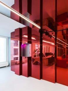
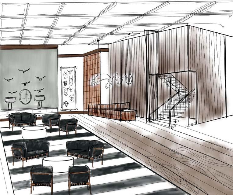
RECEPTION & LOBBY DESIGN

Entering the building, visitors are delightfully greeted by a colorful and vibrant lobby. From here can access the National Geographic exhibition, the Shallow Cafe, or the retail store.
The reception took inspiration from the red color of the Golden Gate Bridge in the evening. The gorgeous red will reflect on customized walls that are placed offset than flat in the wall to create the motion and mimic the ornament on the Golden Gate bridge.
The lobby simplifies all the color shades that could appear in the San Francisco sunset. Warm tones and saturation colors are presented on the Vernon Panton’s wall lamps and contemporary furniture.

Vi Do Portfolio 2022 National Geographic Headsquaters

EXHIBITION DESIGN

The exhibition in the National Geographic’s building represents an extension of wide gypsum board panels which have the flexibility to diversify themes throughout the year. Displayed content can be easily replaced and monitored to serve different exhibitions. The space is also prepared with a track light system that can be adjusted to lighten up different spots of the exhibition as required.

The first theme in the exhibition will be the exploration and study of the “Sand Dollar skeleton” that can be seen almost anywhere on our beach in San Francisco.Sand Dollar Skeleton reviews the history of the beaches and ocean by investigating the grains and characteristics of the Sand Dollar fossils
The story behind the Sand Dollar skeletons will reveal the long history of San Francisco, in which the National Geographic Headquarters is located. The exhibition’s purpose is not only to introduce the story of Sand Dollar and the ocean, but also to remind visitors that there are meanings to everything, no matter how little or trivial it may seem to their daily lives.
CAFE DESIGN

The café, located on the first floor, provides visitors with convenience as they are given opportunities to grab refreshments before and after their journeys.

The café is inspired by the ocean and the waves of the San Francisco beach, therefore, this space’s main scheme involves gradient blue and cool color tones. Since the beaches in the Bay Area are mostly cold and windy, the café uses surfaces that express glossiness and smoothness, such as stainless steel. For visitors to have an “under the sea” experience, both the back wall and the ceiling are covered with wave-like mirrors that portray the water surface. The walls and glass partitions are colored gradient blue to provoke an elegant aura which is similar to that of the waves. In addition, the lighting system used in the café is extraordinarily soft and subtle. To balance out the playful color and texture, the contemporary furniture and light fixtures are specifically selected so as to insert simplified shapes and forms.

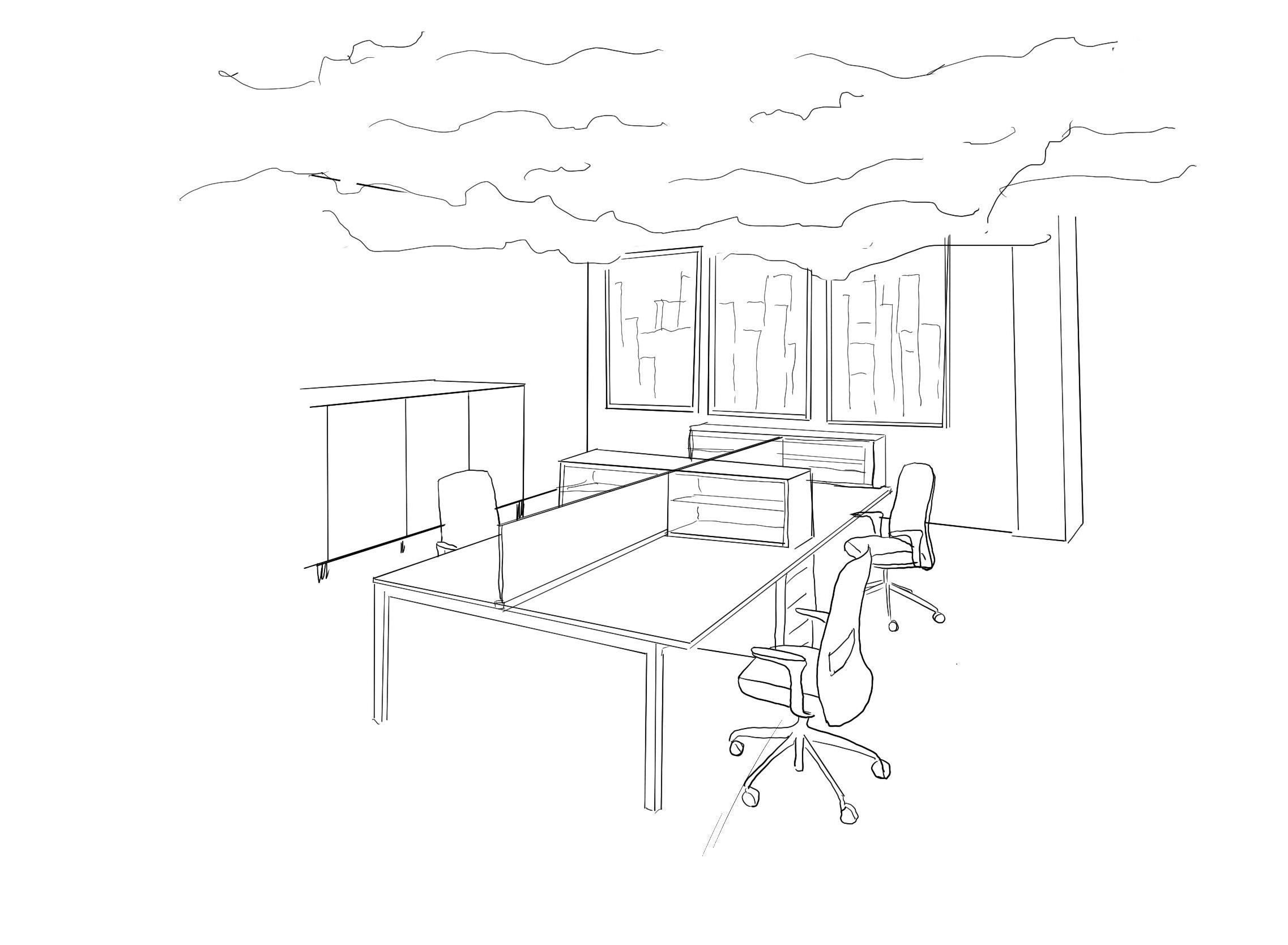
OFFICE DESIGN

The headquarters is located in Presidio, which is in close proximity to the Golden Gate Park. That said, inspirations from tall trees were applied to the office to duplicate the sensation of forests and to imply growth or development. Moreover, light fixtures are customized to reference the tree trunks in the woods and the volume of the fixtures also helps define and limit the workspace area reserved for employees to perform their job.


In terms of functions, the carpeting is installed to avoid and absorb as much noise and echo as possible. In terms of aesthetics, light green carpets are sophisticatedly chosen to resemble grass, adding a natural touch to the office space.
KITCHENETTE DESIGN
The kitchenette serves as a social hub for National Geographic’s employees. Therefore, darker colors are applied to convey a relaxing, comfortable, yet delightful space. Imagine how the city of San Francisco starts to light up under the dreamy lilac sky during twilight. The kitchenette illustrates the scene.

The kitchen cabinetries are built-in and customized with glass panels, displaying the interior LED bulbs and their starlike effect, which successfully complements the darker color used throughout the area. Walls are painted gradient purple to soften the space and the several National Geographic’s cover pages are used as focal points of the room.
All furniture is kept minimal and mobile to accommodate special occasions as users are given opportunities to rearrange the room as desired.
The project is a collaboration with Volkswagen and will be a mobilizable construction place throughout the US.
The project has an original design of architecture and interior by the Xhub team. The project includes an excursion center as a main and public building and a smaller mobil hub for private use.
2 XHUB VOLKSWAGEN COLLABORATION

DESIGN DEVELOPMENT


PRIVATE HUB CONCEPT

EXCURSION CENTER CONCEPT

Volkswagen reached out to the new generation and asked us to reimagine the future of mobility in 20 to 30 years. Our design teams have the mission to create a “new experience” for people when they go on long road trips. Our team Xhub worked together to bring our ideas to life. We offer charging points for EV cars where users can also “charge” themselves in a hub-like mobile apartment, located throughout the United States.

SUSTAINABLE MATERIALS BAMBOO

SMART GLASS
DESIGN CONCEPT


Short-time renewable material resource. Bamboo will be used for both the exterior and interior of the excursion center and private hub.
Bamboo will be used in the structure of the building as well as ceiling and flooring finish.


Bamboo has greater comprehensive strength than concrete and brick and lasts incredibly long. However, this material should not be used near the location that has high humidity.


RECYCLED PLASTIC
The intention of using recycled plastic is to reduce greenhouse gas emissions and is giving plastic waste new use, rather than clogging landfills.
A blend of recycled and virgin plastic is also used to make polymeric timbers that can be used in building the structure of the private hub.

Reused plastic can also design products such as cable pipes, roofs, floors, PVC manholes, and PVC windows.

Smartglass allows the user to determine the amount of light admitted to the space which will mainly be used in the private hub for the two main bedrooms that have large windows.
Smart glass is an innovative approach to green architecture and is often referred to as the natural skin for modern urban buildings. The glass is designed to transform from opaque to transparent by simply flipping a switch.
The smart glass will have an electrochromic layer, typically made from tungsten oxide, and an electrolyte, usually containing lithium ions.

Looking at the future, the project scope is to rely on merging natural elements with human experience. From materials to organic forms and architecture flows will be represented in this project that reminds the user of where they are as well as giving back to the environment a healthier result by reaching the Net Zero architecture.

PRELIMINARY DESIGN


 Excursion Center -Kid’s Area
Excursion Center - Main Lobby
Excursion Center -Kid’s Area
Excursion Center - Main Lobby


3
ALÉGRIA SENIOR LIVING FACILITY
The project based in Polanco city in Mexico. The project will be ocuppying an existing building of 24,000 square feet in total. The building have 12 floors that designers are required to design 1st, 2nd and 4th floor.

POLANCO, MEXICO
One of Mexico citu’s most upscale neighborhood with a variety of interesting shops and quality restaurants is Polanco, which is also known as the Berverly Hill of Mexico.
DEMOGRAPHICS:

With the population of 27,322. The population of youth that are workable age have the highest amount while the elderly in this neighborhood took only 6.12%. It can be said that Polanco have a young population.
Most of the population are local people with almost equal amount in genders.
The household population of Polanco in the 2015 Census was 39,286 broken down into 9,198 households or an average of 4.17 members per household.
The annual regular revenue of Polanco for the fiscal year of 2016 was 106,996,789.42. This can consider as high income compare to the rest of Mexico.
CULTURE:
After 1950s, Polanco witnessed the construction boom, the culture have been heavily influenced. Most of buildings inspired by the Mission Revival Style and Southwestern US. Therefore, the life style there have also influenced by the modern and freedom. People embrace their entertainment and constantly develop to have a better life quality.
The neighborhood is notable becasue of its culture diversity and has been historically perferred by the descendants of Spanish, Jewish, Lebanses and others.
CLIMATE
Weather in Polanco is usually extremely hot with a high percentage of humidity. Rainfall happens regularly throughout the year with dry/hot wind coming from the west. Polanco receives a lot of daylight throughout the day.
Polanco is a neighborhood that is surrounded by greenery from park and water sides that keep the air quality in Polanco fresh and healthy. With a low population, the pollution from vehicles is low. Polanco is also considered as the safest neighborhood in Mexico.

DESIGN CONCEPT
Based on the “Viva !” meaning “Long Live !” ALEGRIA is a reimagine senior living space where it get influenced heavily from the Mexico culture and the modern lifestyle of Polanco city.
The project goals is to bring energy and positve to senior who going to spend memorable and happy later life time while not missing out any thing outside in the world. Luxury apartment that have Mexico feature to make seniors feels like they are home and near to their culture. Pattern and warm tone color will be repeated in many spaces to convey the flow of life inside the building and that each room is well considered.
SKETCHES
The following sketches are made for the lobby, lounge area, and hair salon.


Sketching out each room helps me to imagine how the color coordinate with each other and how architectural features can add will not make the space too crowded as well as sketching the following room gives me more sense of what type and shape of furniture I can place in each room.

As my original idea was to use a lot of wood material in this project since it’s located in a hot climate. Involving wood into the space can somewhat block the heat and the noise from the outside plus give a welcoming environment to people who stay or visit this living space.

BUBBLE DIAGRAMS
PRELIMINARY DESIGN
ELEVATIONS
Elevations showings the library, hair salon, and apartment kitchen layout in the senior living building. The main color used is muted green to create a sense of nature involved in the interior.
The hair salon took a vintage turn when using leather chairs and walnut wood with glass block windows and doors to create a cozy environment for seniors to feel comfortable and welcoming.


The design of the library was given more character by using a wall covering in the back of the shelves in the library to invite people to the display and to widen the space. All shelves were placed at a lower height for ADA and all users easy access.

The apartment kitchen layout is clean and modern providing enough storage for users while it’s also easy to access from the push latch cabinet to under sink space for a wheelchair to roll in. For the safety of the residents living in apartments, kitchens are only equipped for basic needs, not having a cooking top or range.


Upper: Hair Salon North Elevation

Middle: Library East Elevation
Lower: Apartment Kitchen North Elevation
Push Latch Cabinets Marble Splashback


