2 minute read
presentation drawing

Advertisement
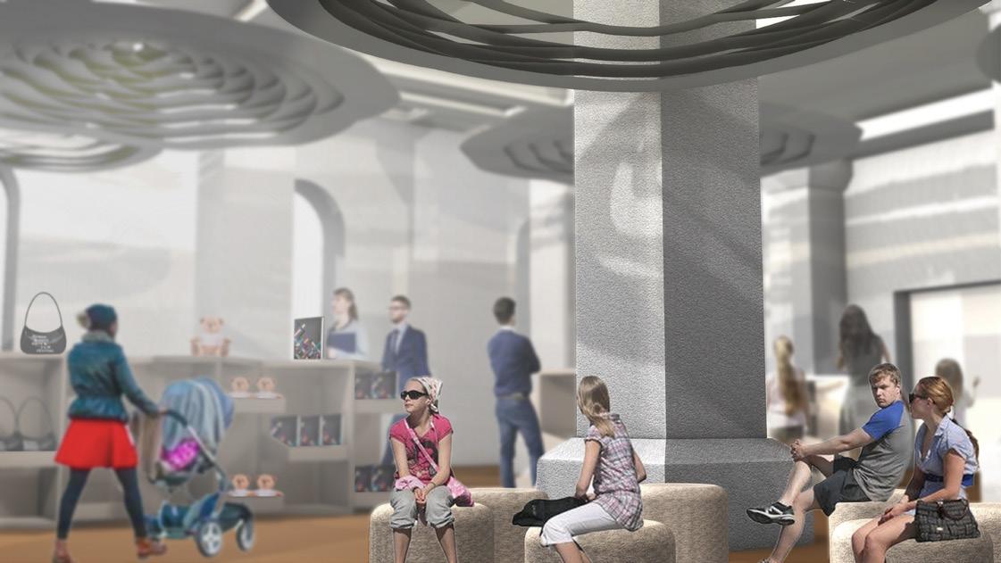
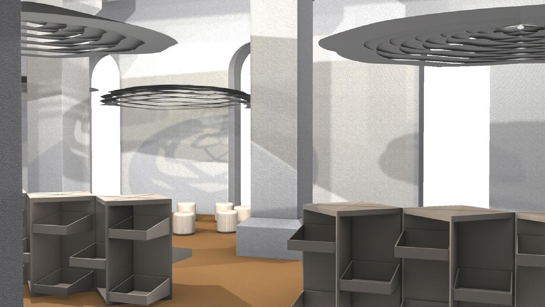
Before After Before After




Acting on my tutor feedback, by blurring the background helps me to communicate better on how my design functions as well as to add a sense of hierarchy and a shallow depth of field. This also helps the drawings to look more dimensional and more spatially dynamic which I really like.
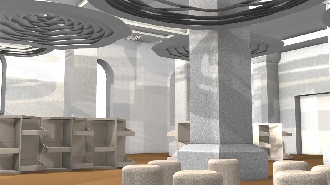
Daytime - Merchandise Stall

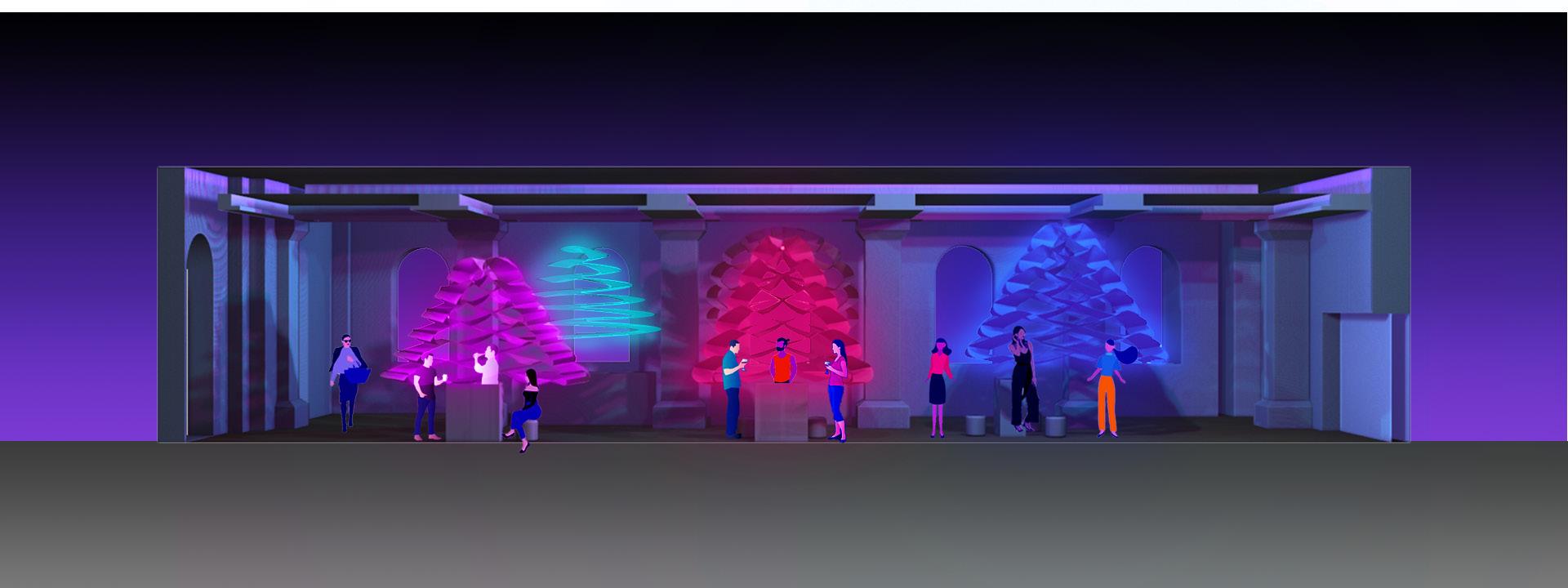
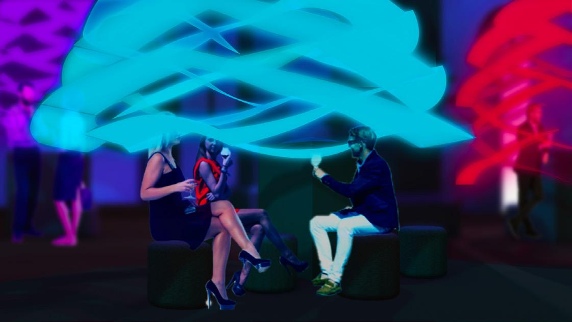
Nighttime - Bar & Opening Party

As much as I like how my perspective drawings during the daytime came out, unfortunately, the night ones are my least favorite. As my design material is the OLED light sheets, I tried to spend so much time on getting the glow effect right, to the point I overcomplicated unnecessarily for nothing. Not only the effect appears to be somewhat misleading as it seems to be neither too bright nor too dark, but it also looks very flat. Had I installed less, the process of coloring each ones could have been easier and perhaps more effective.
Also, the scale in the human figures seem to be a bit odd as well. This is because of the camera angle that I found it quite tricky to get it right, which is something that I should practice more for further projects.
Apart from those collaged drawings, initially, I was also aiming for creating rendered perspective section drawings as I thought it would communicate the overall interior atmosphere as well as the function and transformation of my design very clearly.

While the presentation drawings suppose to communicate what the atmosphere and experience my design offers or it should invite the viewers a sense of what it is like to be there, these section drawings of mine look more towards technical drawings. As much as I like how they look, there is no ‘immersive’ quality as what a presentation drawing should have compared to the previous ones mentioned earlier. Draft Perspective Section Drawings

