

KAYANAH REID
PORTFOLIO
01- ‘Dreaming Pages’ Logo and Packaging project, 2023
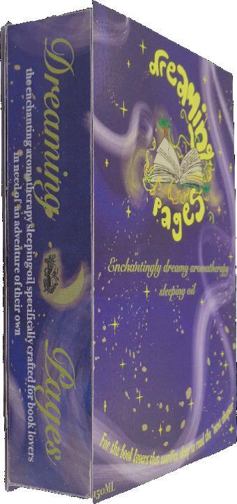


My most monumental project (as stated in my personal statement) is Dreaming pages, an aroma therapy sleeping oil that immerses bookworms into the book they can't put down. The packaging design is inspired by a (hardcover) book as I wanted it to appeal to the target audience of book lovers.
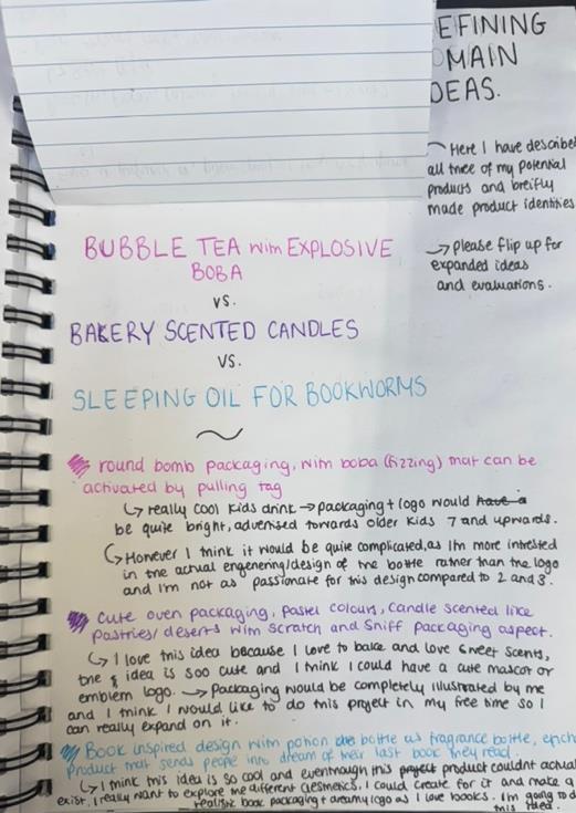


My brief was to create the logo and packaging for an imaginary fragrance, confectionary or drink. Which allowed my creativity to run wild and develop 3 potential ideas. The concepts were inspired by my current hobbies but I ultimately deciding on ‘Dreaming (between) pages’ as I had so many ideas to experiment with.
01- ‘Dreaming Pages’ logo development
I experimented with calligram compositions featuring moon and book graphics, which reflect the themes of nighttime binge reading. My favorite designs incorporated ink and biro graphics: one being highly detailed, the other embodying a fantasy aesthetic.


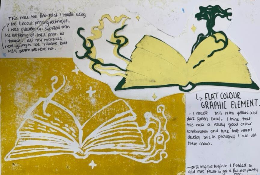


UsingAdobe Illustrator for the first time, I faced challenges but grew more confident as I progressed, especially when referencing my notes. Initially, I included moon craters in the calligram for extra detail, but after receiving feedback, I decided to remove them as they made the logo too busy.


02-'Human v Nature’ zine, 2023


This zine is the result of a gelli printing workshop. This was my first using the medium, so I experimented with different materials like flora, fauna, denim, magazine pages and miscellaneous items like cardboard letters, a ruler and Lego bricks.

YOU CAN SCAN THE QR CODE FOR THE FULL ZINE FLIPTHROUGH ON YOUTUBE.
I chose a black-and-white color scheme for human subjects and used colors for natural elements to contrast human vs. nature. However, the “human error” page (pg. 13-14), with black and red layering, a misspelled word, and reversed text, highlights that human mistakes are part of human nature. This shows that the line between human and natural elements is never fully distinct, as humans are part of nature, and even man-made creations could be seen as natural. The page texture was made from plastic Lego bricks and a ruler, emphasizing my own mistakes in this learning process.
03-banksy inspired stencil street art, 2023

PRINT MEANING:
Rocky road ahead sign is used on top of shredded cardboard to replicate car tracks and the rough texture of a rocky road.
Repeated swerving danger signs to show the drivers blurred vision and dizziness, implicates they saw these signs as they were in motion, swerving? White blotches, to represent hazy vision after impact. Red, white and black, the classic colours of design and in Banksy's work.


YOU CAN SCAN THE QR CODE FOR THE FULLZINE FLIPTHROUGH ON YOUTUBE.
This zine is the result of a gelli printing workshop. This was my first using the medium, so I experimented with different materials like flora, fauna, denim, magazine pages and miscellaneous items like cardboard letters, a ruler and Lego bricks.
I chose a black-and-white color scheme for human subjects and used colours for natural elements to contrast human vs. nature. However, the “human error” page (pg. 13-14), with black and red layering, a misspelled word, and reversed text, highlights that human mistakes are part of human nature. This shows that the line between human and natural elements is never fully distinct, as humans are part of nature, so certain man-made creations could be seen as natural.

Rocky road ahead sign is used on top of shredded cardboard to replicate car tracks and the rough texture of a rocky road.
Repeated swerving danger signs to show the drivers blurred vision and dizziness, implicates they saw these signs as they were in motion, swerving? White blotches, to represent hazy vision after impact.
This is an observational sketch of two random objects. Made with 4b, and 6b lead pencils.
This was made using a similar technique to the one above, however I could use the charcoal in a stick form and white chalk for details.

These are some observational drawings I did recently, using only a paintbrush in dipped in charcoal powder to make these hazy reinterpretations of the ceiling of a train station platform. You can see the refence images on the next slide.


Inspired by my trip to Falmouth I refined and edited the photos I took and made this photobook to practise layout design and gift to my mum, as this trip was very special to us. These are some of my favourite pages.
Bruce Castle Football Club’ logo, 2024.


This is a logo I created for a family-friend's football club; they needed a rebrand as their old logo was not suitable for their future endeavors and I volunteered.


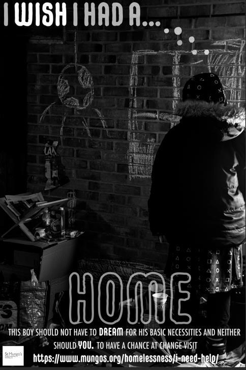
For this project I was tasked to create a poster for a social issue/organisation that would encourage people to reach out for help or/and guidance. So, I made sure to include tear off information slips, so people wouldn’t forget such an important number.
Out of my 3 final designs, the reason I chose this design is because the typography and the lighting create an impactful, professional and attention-grabbing design. Which is crucial to have for this brief.
06- social issue advertisement, research and idea development


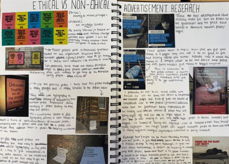
This was an extremely sensitive brief, so I made sure to thoroughly research the topics I chose. Ultimately feeling most inclined to design to support homeless people, as I personally don’t like the dehumanisation and desensitisation that is associated with the homeless population, which was strengthened when I saw official government warning posters, villainizing the whole population of vulnerable people. Fully encouraging me to choose this social issue.


I chose street photography to create an emotionally impactful advertisement aimed at encouraging homeless individuals to seek help from St Mungo's and Shelter. Given the sensitive nature of the topic, I made sure to research ethical approaches and photographers who specialise in street photography. After completing the research, I initially selected a location on campus that suited my needs, but due to permission issues, I had to find an alternative. Ultimately, my nan's driveway became the ideal location, offering not only unrestricted access but also a variety of props that enhanced the shoot and gave me a lot of images to choose from.


FINAL 3 POSTERS
Out of my 3 final designs, I chose the 2nd design as the typography and lighting create an impactful, professional and attention-grabbing design. Which is crucial to have for this brief.

Cd and cd sleave


This project had a broad brief, giving me the creative freedom to make anything that celebrates, advertises, or promotes an event in time. From the beginning, I wanted to showcase my growth as a designer and experiment with illustration. So, I combined this with my passion for music and decided to design a deluxe release for a Western artist's album, incorporating unique merchandise and design techniques typically found in K-pop releases. Album merchandise packaging.
Illustrated lyrics book cover.


After researching the difference between western album covers and K-pop album covers (plus merchandise), I planned to design the shared elements (part 1): (illustrated) album cover, cd sleave and the cd surface graphics As well as the K-pop merch elements (part 2): physical album packaging and illustrated lyrics book, instead of a photobook (as I don’t have rights to photos of the artist I choose).


To find an album to redesign, I had to listen to and research aspects like pre-existing design, the artists intentions, aesthetics, etc of each album. The artist I chose was UMI and the album ‘Forest in the City’as its experimental alternative RnB sound allowed me to visualise lots of different ideas for the many aspects I would design. I also really connected to the themes of spirituality, self discovery, acceptance, love and growth in the overall album, which I needed to convey in my design.


This was my first time illustrating in Procreate, so it took longer than expected to finish. I also struggled to find the right texture for the treetops, but I enjoyed learning the tool, even creating my own brick pattern brush, which didn’t make it into the final piece but was a good experiment.
I embedded connections to UMI and her values in the illustration, such as a river linking to the English translation of "umi” meaning the ocean (in Japanese) and emphasising natural elements, which link to her first name name, Tierra, meaning earth (in Spanish), and a visual cord of energy connecting the music’s healing frequency to the chakras embedded in mud, signifying the healing aspect of the album.

I created this textural collage by printing leaves, weeds and flowers onto a3 paper with paint, then scanned them into photoshop where I overlayed each print to create this collage, my aim was to make this as textural as possible, which I think I achieved.


The texture of the album typography pays homage to the original ’Forest in the City’ branding/merchandise by Eddie Mandell, as he also uses floral texture. To make it I I layered the collage I made previously, over the typeface using a clipping mask and adding effects in photoshop, to make the typography harmonious with the textures of the illustration. I also added this texture to the packaging. I wanted to include links to UMI’s Japanese heritage, and the songs sung in Japanese, so I included a translation of the albums title on the spines and covers of the album cover (merchandise packaging and cd sleave that would hold the cd inside the packaging).


After finishing the album’s main illustration, typography and packaging, I knew I wouldn’t have enough time to complete everything I initially wanted to design/illustrate. So, I reduced the lyrics book to 3 songs to plan and experiment with.


Final surface graphic for hello, hi


Researched 3 artists that I thought aligned with the the songs: v? an abstract artist for hello, hi’s chaotic but harmonious musicality.Ayako Rokkaku and Jon Burgerman for ‘whatever u like’s’ intention of reviving our inner child.
Hello, hi: experimented with watercolour, found my last attempt had perfectly conveyed the experience of listening to the song.
Whatever you like: I experimented with random things I found, e.g. bubble wrap, cardboard cup sleave, etc to experiment with texture, as kids will play with anything. However, I still wanted to experiment more with a visual that explicitly conveyed childhood.
, lyrics book, research and experimentation
Surface graphics for whatever u like:


Moonlit room, Illustration sketch

I used acrylic paint, coloured pencils, glitter, glitter glue, felt tip pens and my fingers to create this (master)piece (that would make 5-year-old me proud) for whatever u like’s surface graphic. Also using stationary gel pens to create transition page on lined paper, signifying adulthood pre- and post- acceptation of the inner child, and its impact on your creativity.
To continue my lyrics book, I would transfer these pieces into illustrator to add the lyrics and experiment with different compositions/details. As well as completing the illustration for ‘moonlit room’.
wordmark


Combination mark logomark


This project was a true labour of love, starting in mid-September and wrapping up in midNovember. I dedicated time to curate the branding, ensuring it reflected me and my journey as a designer, creating something I’d be proud to showcase on social media and to clients. I began the logo in Procreate with a low-fidelity graphic but wasn’t happy with how basic and minimalist it looked. I wanted the logo to be unique, fun, and balanced, but it didn’t capture that, leaving me frustrated as I struggled to express my ideas visually. After taking a break to refresh, I experimented with dynamic handwritten typography for the logo, but it felt too busy with the logomark. I then focused on refining just the 'k', and eventually decided to deconstruct the logomark, which I was pleased with. The colour palette honours ‘dreaming pages’. I chose ‘KReative Design’ because I am and have and will always be a creative, wanting to explicitly convey this I mixed my initials ‘K’ and ‘R’, to remind myself to always create from my unique point of view.
wordmark
Combination mark logomark


This project was essential and a labour of love, starting in midSeptember and finishing in midNovember. I dedicated time to carefully curate the branding, ensuring it represented me and my journey as a designer, and created something I’d be proud to showcase on social media and with clients.


Chose ‘KReative design’as K and R are my initials, so it's personalised to me, especially as a ‘creative’, as I’m always striving to have a unique outlook on the world. I began building my logo using a low-fidelity graphic in Procreate, but I wasn’t satisfied with how basic and minimalist it looked. I wanted the logo to be unique, creative, and strike a balance between fun and relaxed, which it didn’t. This left me feeling frustrated and stuck, as I was unable to visually articulate my ideas.

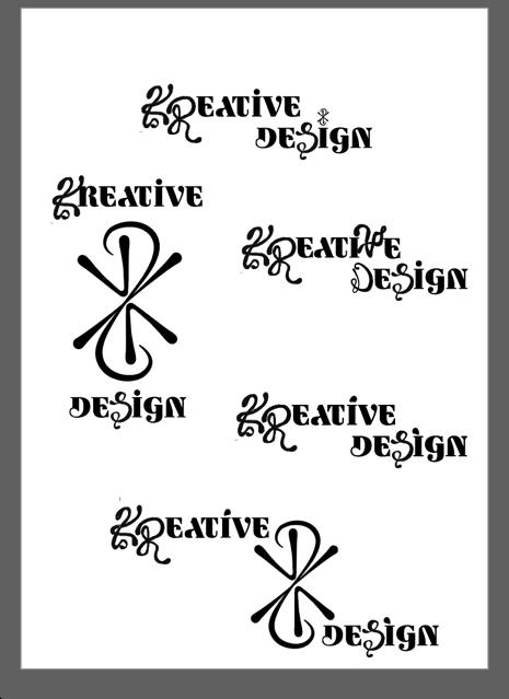


So, I took a break and returned with fresh ideas, where in the video, you can see I first tried dynamic handwritten typography for my logo. However, it felt too busy with the logomark, so I refined it by focusing on just the 'k'. Ultimately, I decided to experiment with deconstructing the logomark instead, loving the outcome. And colour pallet as is pays homage to ‘dreaming pages’.