STORIES

VOLUME 18

When we think about creating a beautiful, relaxing home, our thoughts often turn straight to the aesthetics – the colour combinations, or whether a sofa or table will look ‘right’ in a certain spot. While palette and proportion are key to any harmonious room, there is a third, equally important element: the materiality of a space and the pieces in it.
In architecture, materiality goes hand in hand with design; that choice between a stone, concrete, or even wooden structure produces an immediate response. In interiors, those material decisions are multiple, intricate, and complex. They span the patina of cabinet handles, the finish on a wooden table, or the texture of an upholstered sofa. It’s why, at Neptune, we curate our collections to work seamlessly and interchangeably together. It’s also why we place such value on the provenance of the materials we select, from sustainably sourced Appalachian oak to supple flax linens.
In this edition of Stories, we explore our relationship with materials in all its forms. In a world where we conduct so much of our lives behind screens, it’s refreshing to see how connecting with natural textures grounds us. As a business that appreciates wood’s natural strength and resilience, it’s humbling to contemplate how one small, wooden boat delivered Sir Ernest Shackleton and his crew to safety across some of the roughest seas in the world. The polar explorer Felicity Aston – herself no stranger to our dependence on materials at critical moments – considers how such relationships add to a deeper life experience.
At the other end of the scale, we look at the materials artists use to express themselves, as we reflect on the workings of an historic French pastel-making business which has supplied some of the greatest artists in memory. And, closer to home, we discuss the impact of plaster mouldings on a room and the joy found in mixing modern tableware with favourite vintage pieces.
Materiality impacts our lives and homes in so many ways – often subtle, but always significant. We hope the features in this edition of Stories touch you in some way, too.
Stories is printed on FSC-certified, responsibly sourced paper and carbon balanced by the Woodland Trust.
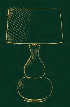
Opposite: Stratford dining table / Herstal lamp / Heddon candlestickThank you to the talented authors and journalists who contributed to this edition, along with our fabulous team of in-house writers.
Suzanne Imre

For 17 years, Suzanne Imre was the influential editor of interiors magazine Livingetc; a renowned style pundit and trend leader. Today, she lives in London and works as a brand consultant, content director, and writer.
@suzanne.imre
Jessica Doyle
Jessica Doyle is design and interiors editor at the Telegraph, and has previously written for publications including the FT, House & Garden, Country & Town House, and Homes & Gardens. She lives in south-east London with her husband and their two children. @tjedoyle
Felicity Aston
Felicity Aston MBE is a record-holding explorer, research scientist, and author of five books on exploration. In 2012, she became the first woman in the world to ski across Antarctica alone. She is currently leading the B.I.G. (Before It’s Gone) Expedition, a multi-year, pan-Arctic exploration of snow and ice for scientific research. bignorthpole.com felicityaston.com

Kassia St. Clair
Kassia St. Clair is an author, cultural historian and broadcaster and writes for The Economist and Architectural Digest. Her book, The Secret Lives of Colour, was Radio 4’s Book of the Week. Her latest book, The Golden Thread, is published by John Murray Press.
@kassiastclair
Busola Evans
Busola Evans is a freelance interiors writer, having previously worked at The World of Interiors, Homes & Gardens and Livingetc. She has been a journalist for over 20 years and has written for leading publications including The Sunday Times Magazine, The Telegraph, and The Guardian. @busolaevans

Richard Darn
Astronomer Richard Darn helped Northumberland become England’s first International Dark Sky Park in 2013, having previously assisted with the launch of the Kielder Observatory. With numerous media appearances to his credit, at heart he remains a stargazer. He advises on dark landscapes across the UK, from the Norfolk Coast to Exmoor National Park. darkskiesuk.org @RichDarn1

David Nicholls
David Nicholls is the deputy editor of House & Garden. For 20 years, he has specialised in interiors, including a decade as design editor of the Daily Telegraph magazine. A Canadian by birth, he now lives in London. @mrdavidnicholls

Ella Mills
Ella Mills is the founder of Deliciously Ella, a plant-based company sharing simple tools for a healthier life via cookbooks, food products, a restaurant, and a wellness app – plus a social media community of four million people. @deliciouslyella

Carmel Allen
Carmel Allen’s career has come full circle: she studied art, archaeology, and anthropology at university, then went on to have careers in publishing and retail before returning to art in her current role as managing director of The Tate galleries.
@carmelallenseye
Alice Loxton
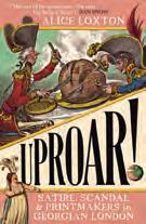
Alice Loxton is an historian, writer, and presenter. She is passionate about bringing history to mainstream audiences and has worked with History Hit, Channel 4, LadBible, BBC Bitesize, The National Trust, and many other charities and organisations. Her new book, ‘UPROAR! Satire, Scandal and Printmakers in Georgian London’ is published by Icon Books. @history_alice
Ben Fogle
Ben Fogle is a broadcaster, adventurer and author. He has climbed Mount Everest, rowed the Atlantic and raced to the South Pole. Ben presents programmes including C5’s New Lives in the Wild. He is the United Nations’ Patron of the Wilderness.

@benfogle
Clare Nolan
Former magazine editor Clare Nolan is a stylist, photographer, and creative consultant. She runs online courses for florists and flowerlovers to help people unlock and nurture their creativity. She is the author of In Bloom, published by Octopus Publishing. @clarenolanuk
Amy Bradford
Amy Bradford is the former features director of ELLE Decoration. Now a freelance writer and editor, she’s a regular contributor for Neptune and also writes for titles such as The Telegraph and FT How To Spend It. She lives in Suffolk.


Jo Rodgers
American born Jo Rodgers is a journalist who lives in London and East Sussex with her husband and two children. She is a contributing writer at Vogue, Conde Nast Traveller, House & Garden, and Country Life.
@jo_rodgers

4
Wood matters Suzanne Imre
7
A meaningful plan Suzanne Imre 10
Where style meets structure Jessica Doyle
16
In materials, we trust Felicity Aston
22
On Potter’s Pink Kassia St. Clair
26
A passion for business Busola Evans
32 Dark skies Richard Darn
34 All in the mix 40
An artistic secret David Nicholls
the kitchen: recipes
means to us
82 Going conkers Jo Rodgers
Rejecting MDF and chipboard in favour of solid timbers, the founders of Neptune embarked on a mission to find the best materials for the job, as co-founder John Sims-Hilditch explains to editor Suzanne Imre.

It was a gut feeling that morphed into a ‘certain stubbornness,’ laughs Neptune’s co-founder John Sims-Hilditch, that led him and partner Giles Redman to a fundamental decision about the materials they would and wouldn’t work with.
Early on in Neptune’s history, as the business progressed from garden furniture to designing kitchens, John and Giles made an important agreement: they would never use MDF or chipboard in any of their designs, focusing instead on solid timber frames and super-strong birch ply panelling for all the cabinetry they produced, and oak or tulipwood for furniture.
It’s a commitment that still stands today, and John explains why: ‘It goes back to our founding principles of ‘doing the right thing’. Even at that early stage, I was aware that you need an awful lot of glue to make MDF and chipboard which couldn’t be good for people’s health, nor was it as durable as solid wood, and it simply wasn’t nice to live with.’
From a sustainability perspective, John notes: ‘The wonderful thing about working with natural timbers is that they are organic. With sensible practice, they will easily regenerate – removing vast amounts of CO2 from the atmosphere. Today, our timber comes principally from the Appalachian Mountains, where trees have been planted at a faster rate than they are felled for over 50 years –currently at a replacement rate of 2.5 times.’
The duo therefore source timbers based on their durability, tactility, and beauty – always selecting the right material for the right purpose. Oak was top of the list. ‘Oak has a long history in British furniture-making,’ explains John, ‘it’s incredibly strong but also naturally beautiful – it doesn’t need coating or finishing. I consider it a king amongst woods because of that.’ Teak was selected for outdoor furniture for its high oleoresin content which means it performs well in harsh weather, and tulipwood for painted pieces because of its durability and perfectly smooth surface that carries paint well.
John was also an advocate for birch plywood for the inset panels on cabinetry, as they gave doors a rigid dependability without being heavy or clunky. Ply is created using thin sheets of wood which are layered over each other at right angles and built up to create a strong, stable panel that won’t expand or contract according to climate in the same way that solid timber will. ‘We use a similar technique in the central panels of our framed tables such as Arundel and Suffolk,’ adds John. ‘We take 6mm thick sheets of oak and cross-bond them to achieve a super-strong panel that won’t warp, thus dramatically improving the performance and life of our tables. This technique isn’t widely used because it’s hard to do, but we believe it’s worth it.’
With Neptune’s 100-year vision influencing all their design and material decisions, it was important to find a way to protect the timber without detracting from its natural beauty. Step forward IsoGuard®, which John and Giles developed with a specialist coating company based in Belgium. Unlike a traditional varnish or veneer, which leaves a sealant layer sitting on top of the wood, IsoGuard® works on a penetrative level, soaking into the wood and binding – at a microcellular level – to every piece of raw cellulose that it finds, coating it in a protective film while leaving the wood surface looking and feeling naturally beautiful.
That tactility of timber – alongside its beauty – plays an important role in Neptune’s choice of materials. ‘Touching wood, you feel grounded; walking on wood, you feel grounded,’ says John. ‘Having wood in our homes brings us closer to nature, a place where we can feel happier and calmer. And it’s that sense of serenity that we seek in the natural materials we employ in our furniture.’
Find out more about our materials at neptune.com/why-neptune

How best to develop and protect Britain’s natural wooded habitat for the next generation?
As responsible timber furniture makers, Neptune is partnering with a forward-thinking woodland creation charity that not only plants trees to suit the local environment, but also nurtures them through to maturity.
Much like our commitment to make furniture that will last 100 years and give pleasure to generations of families, so today’s tree experts are campaigning for forests to be planted with a long-term strategy (rather than focusing on headline-worthy sapling numbers), so that woodlands can flourish for centuries to come. Leading the charge is the woodland creation charity Stump Up For Trees (SUFT), based in South Wales. Neptune is partnering with SUFT to support their ecological restoration work in the Bannau Brycheiniog (Brecon Beacons) and surrounding area.
SUFT General Manager, Dr Jenny Knight, explains the thinking behind the charity: ‘We have a long-term approach to woodland creation; it’s not just about what we’re putting in the ground, but how it’s going to develop. A birch might live for 100 years, but an oak could live for 900 years, so planting a mix of species makes for a complex and rich natural habitat.’ One such project currently underway involves planting a mix of birch, hawthorn, and oak. Thanks to their different growth rates, the birch will shoot up rapidly, creating shady protection for the hawthorn and oak in their early years. The hawthorn will branch out as the birch trees decline, and when the hawthorn finally fades the oak will still be in its glorious prime.
It’s a concept that resonates with all we stand for at Neptune – looking to nature to create an environment that will be dependable and enjoyable now and for future generations. Like all good ideas, Stump Up For Trees began as a passion project for two neighbours – farmer Keith Powell and writer Rob Penn. ‘Keith had planted all the trees he could on his
farm,’ explains Jenny, ‘but part of his grazing land was common ground and he couldn’t understand why he couldn’t plant there too.
It was with the help of Rob that he persuaded the other farmers and local authorities to allow planting on the common.’ 64 acres were eventually transformed, and Keith and Rob realised the lessons they’d learnt could help other landowners reimagine their acreage. And so, Stump Up For Trees was born.
Today, the charity has over 250 active volunteers and plants about 27 native species, including rowan, hazel, and even rare Wych elm. While the charity’s approach is holistic – with a focus on surveying, designing, and nurturing projects that suit the local ecology – they have still planted 235,000 trees in just three years. As prime tree-planting season approaches, upcoming projects include multiple small woodlands and shelterbelts on unproductive farmland, a diverse 40-hectare site, working with the Bannau Brycheiniog National Park Authority to rejuvenate old hedgerows and plant new ones, and exploring the role of trees in flood management in South Wales.
For Neptune’s CEO, Aalish Yorke-Long, the partnership with Stump Up For Trees is a natural union. ‘At Neptune, we’re committed to making furniture which will last for 100 years and more. And as British designers who appreciate the beauty of working with timbers such as oak and birch, we want to support a charity with a similar ethos to us. The first step in this exciting partnership is a donation initiative, but going forward the Neptune team will be rolling their sleeves up and getting involved in as many ways as we can.’
To support the remarkable work done by Stump Up For Trees, Neptune will plant a tree with SUFT for every tree we’ve used to make furniture this year.
Furthermore, customers can opt to add a £3 donation to their order which we will then match. Raising £6 per purchase not only funds the planting of a tree, but it also ensures that tree is monitored and maintained by SUFT for 12 years. At 12 years old, a tree reaches establishment and enters a new regulatory framework, which protects it as woodland.


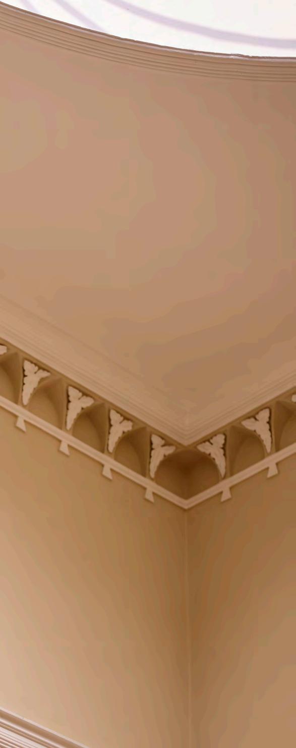
A room’s plaster mouldings might be seen as decorative details, but they are often aesthetic necessities, says interiors editor Jessica Doyle.
In the drawing room of a beautiful castle in the Scottish Highlands, there is an elegant coffered ceiling framed by a beaded plaster cornice that wraps around the top of the room. This ornate flourish is the icing on the cake of a layered, highly detailed space decorated by the interior designer Henriette Von Stockhausen of VSP Interiors (@vsp_interiors), who specialises in historic and period properties.
Plaster mouldings can indeed be seen as the aesthetic icing of an interior scheme, but, says Henriette, they also play an important role in bringing together style and structure – particularly in the large, high-ceilinged rooms found in historic properties.
Plasterwork took off in the UK around the 16th century as a means of decorating structural features, initially in churches and royal palaces and later in private homes. Corbels embellished wall brackets that supported structures above; architraves and chimneypieces decorated door and fire surrounds; and cornices and skirtings covered the untidy joins between the ceiling or floor and the walls – an especially useful device when wallpaper became fashionable in the 17th century.
Where mouldings have been removed or fallen into disrepair, restoring them is a useful way to bring character back into a room and vital for ensuring the style and proportions of the mouldings suit their location. ‘Each period has its own very definite measurements and styles, so it’s important to tell that story and get it absolutely right,’ says Henriette.
Earlier neoclassical plasterwork, for example, was inspired by architecture on the Continent, with a keen eye on the proportions and character of the Doric, Ionic, and Corinthian orders of Ancient Greece. As time went on, decorative application held sway over architectural considerations and designs became more light-hearted and ornate, as can be seen in Georgian, Regency, and Victorian examples.
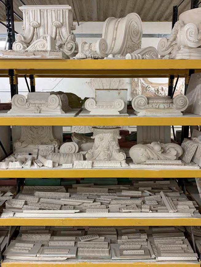
Plaster specialists such as Stevensons of Norwich (@stevensonsofnorwich) create reproduction plasterwork for the restoration of historic buildings. Recent projects include the Theatre Royal on Drury Lane and The Newt hotel in Somerset, as well as classically inspired mouldings for private homes.
According to the company’s director, Edward Gates, contemporary interior design is seeing interesting developments in the application of mouldings: ‘More and more, we see people using traditional cornices, but offset from the ceiling and used as uplighters, inset with a run of LED lights,’ he says. ‘Ceiling roses have also been adapted to make them compatible with the ever more complicated and heavier light fixtures that people use today.’
Whether a room is traditional or modern in style, plasterwork brings character and gravitas to a space. ‘If you use plaster moulding correctly, then you can really add structure, detail, and something beautiful to a room that could otherwise be quite bland,’ says Henriette. ‘I love those features; they make a room that bit more special.’
Farrs Limited
Stoke-on-Trent
This family business has been crafting plaster mouldings for Staffordshire, Cheshire, Shropshire, and Derbyshire since 1885. They specialise in interior architecture like panel mouldings, cornicing, and dado rails. farrsplaster.co.uk @limitedfarrs
Alexander Griffin
Cambridge & Bath
Plaster-artist Alexander Griffin makes breathtaking busts, bas reliefs, and other decorative pieces inspired by original Greco designs. His workshop is in Cambridgeshire, but you’ll also find his designs in the treasure trove of Berdoulat in Bath.
alexander-griffin.com @griff.plaster
Essex
Experts in fibrous plastering, this team has advanced their craft with modern innovations while staying true to artisanal methods. As well as residential projects, they’ve worked on some of the capital’s most iconic buildings such as the Royal College of Music. heritageplasterservices.co.uk
@heritageplasterservices
Adams Plaster Mouldings
Liverpool
This sixth-generation family business has ceiling roses, cornicing, and corbels for every residential need. They are also a prolific name in the commercial space and specialise in luxury retail. covingonline.co.uk @adamsplastermouldings
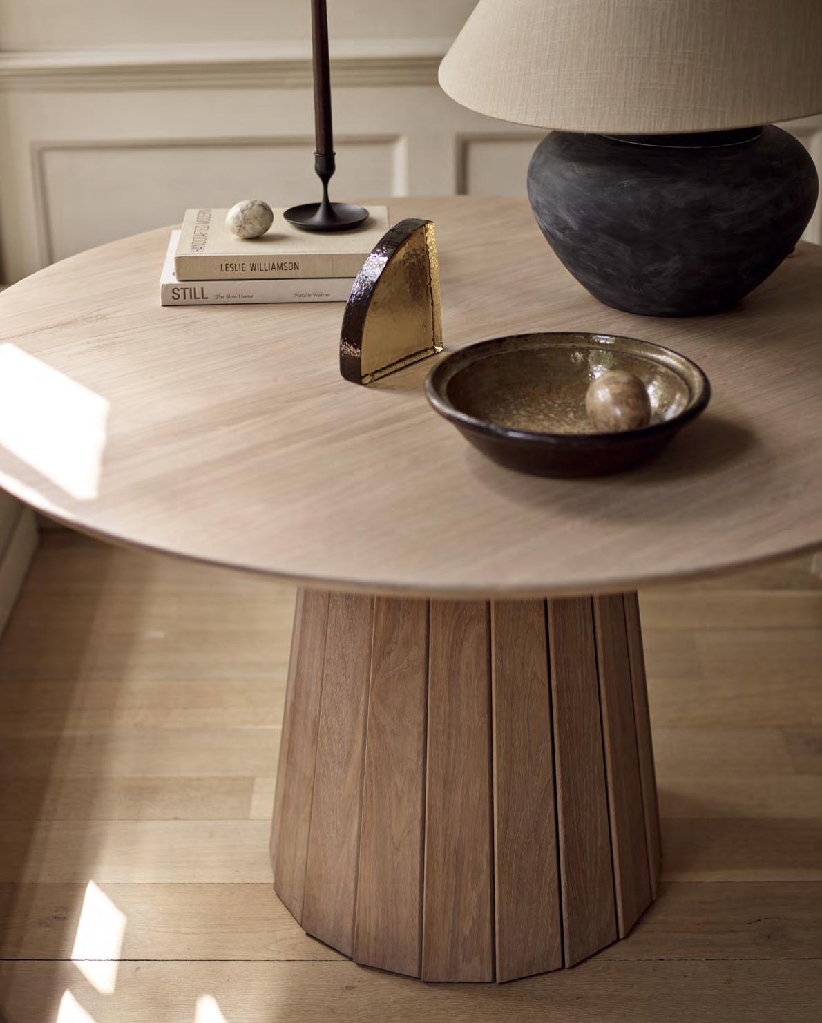
This table wasn’t designed overnight. We pored over classic furniture shapes and Mid Century references until we landed on its clean-lined silhouette and versatile circular or ellipse tabletop options. We experimented with castellation techniques until the pedestal base had the perfect balance of solidity and lightness. And we tweaked the footprint until Stratford was comfortable in rooms big or small. The result is a blend of tried-and-tested craftsmanship and modern innovation, designed to last for generations to come.
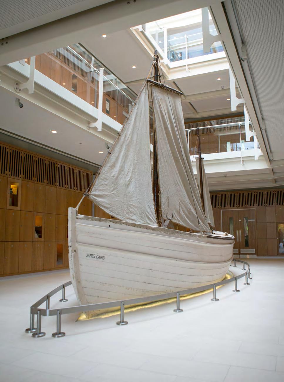
POLAR EXPLORER FELICITY ASTON MBE WAS THE FIRST WOMAN TO SKI SOLO ACROSS THE ANTARCTIC. HERE, SHE CONSIDERS OUR RELATIONSHIP WITH THE MATERIALS THAT WE DEPEND ON – NOT LEAST THE SMALL, WOODEN LIFEBOAT THAT DELIVERED SIR ERNEST SHACKLETON AND HIS CREW TO SAFETY OVER 100 YEARS AGO.


Previous page: Relaying the James Caird across the ice, Antarctica, November 1915
Above: Launching the James Caird, Antarctica, April 1916

Photography

I have sailed the Southern Ocean from the tip of the Antarctic Peninsula to the razor-backed island of South Georgia. The water was black and endless. From the deck of a modern research ship, on a day considered clement, the waves still rose to the height of Victorian terraces above a swell that undulated as steeply as Devonshire hills. Gazing at that ephemeral landscape of water (and trying hard to ignore its nauseating effect), I thought of the James Caird that had sailed those same seas a century before. The wooden lifeboat – which was not quite 7m long – had a makeshift deck of canvas scraps and was weighed down with rocks hastily gathered from a storm-lashed beach for ballast.

The James Caird carried six desperate men fleeing across one of the most dangerous oceans in the world. They were fighting for their lives and those of the 21 men they had left behind, shipwrecked and stranded, on a desolate rock named Elephant Island. Among the six was Sir Ernest Shackleton, leader of The Imperial Trans-Antarctic Expedition and whose ship, the Endurance, had been crushed by the ice of the Weddell Sea before the expedition had made landfall. Shackleton determined that the only hope they had of survival was to attempt the impossible – an 800-mile sail in an open boat, navigating by occasional glimpses of the sun, to a tiny scrap of land in a very wide ocean where there might be an operational whaling station to call on for rescue.
When lying in a tent on a polar plateau, listening to the storm outside, the fabric shelter around me is no longer an inanimate object – it speaks to me. In every nuance of sound and movement, I can tell where the strain is being felt or what needs adjusting. Having used the same tent model during more than two decades of polar expeditions, it’s no longer simply a piece of equipment but an additional team member. The fabric is infused with the emotion of countless anxious nights clinging to the hope of seeing through a crisis.
How much more intense must have been the feeling of Shackleton and his crew toward the humble timbers of the James Caird as they made their terrifying voyage. I imagine them taking turns lying in the tight space beneath its canvas deck, separated from the churning waters beyond the hull by such a narrow breadth that it must have felt like they were swimming. I imagine their ears straining to identify every creak, every groan of the Caird, dreading the sound that would portend a final catastrophe.
The Keeper of the Archives at Dulwich College, Shackleton’s alma mater and where the James Caird is now preserved, told me that most visitors find it much bigger than they imagined. I was struck by how flimsy it looked. It appeared as robust as a cardboard cut-out stage prop in the centre of its brightly lit display hall. Peering through the hatch in the reconstructed canvas deck into the gloom of the space below, I closed my eyes and tried to catch a whiff of its history. I was hoping for notes of seal blubber and oil paint used in wretched attempts to keep out the ocean, for the lingering odour of expedition-wrecked bodies and long-since deteriorated supplies, for something that would transport me back in time.
Opening my eyes, I noticed a length of wood secured along the base of the hold to strengthen the boats keel. I knew it to be the mast of another, smaller, lifeboat rescued from the Endurance and cannibalised on the beach of Elephant Island to prepare the Caird for its impossible voyage. Seeing this detail of a story I knew so well made real in the object in front of me gave me that touchpoint in time that I was searching for.
The wooden strips hammered to the hull to act as makeshift runners when the Caird was used as an oversized sledge, and the scraps of metal hammered flat over damage made by floes as the men rowed through dense pack ice, had the same effect.
The story of the expedition’s dogged survival is written clearly in the timbers of the James Caird, and it’s as affecting as any account of the epic tale I have ever read. Physical objects have the ability to conjure the reality of place, time, and feeling in a way that cannot be replicated. As we enter an age distracted by the virtual, the 3D-scanned, and the intelligence of the artificial, I hope we also remember to recognise the unequalled magic of the material.

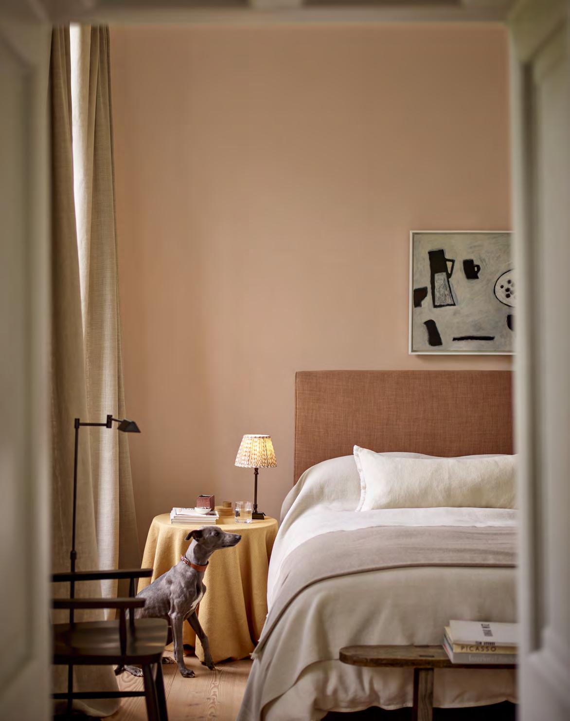
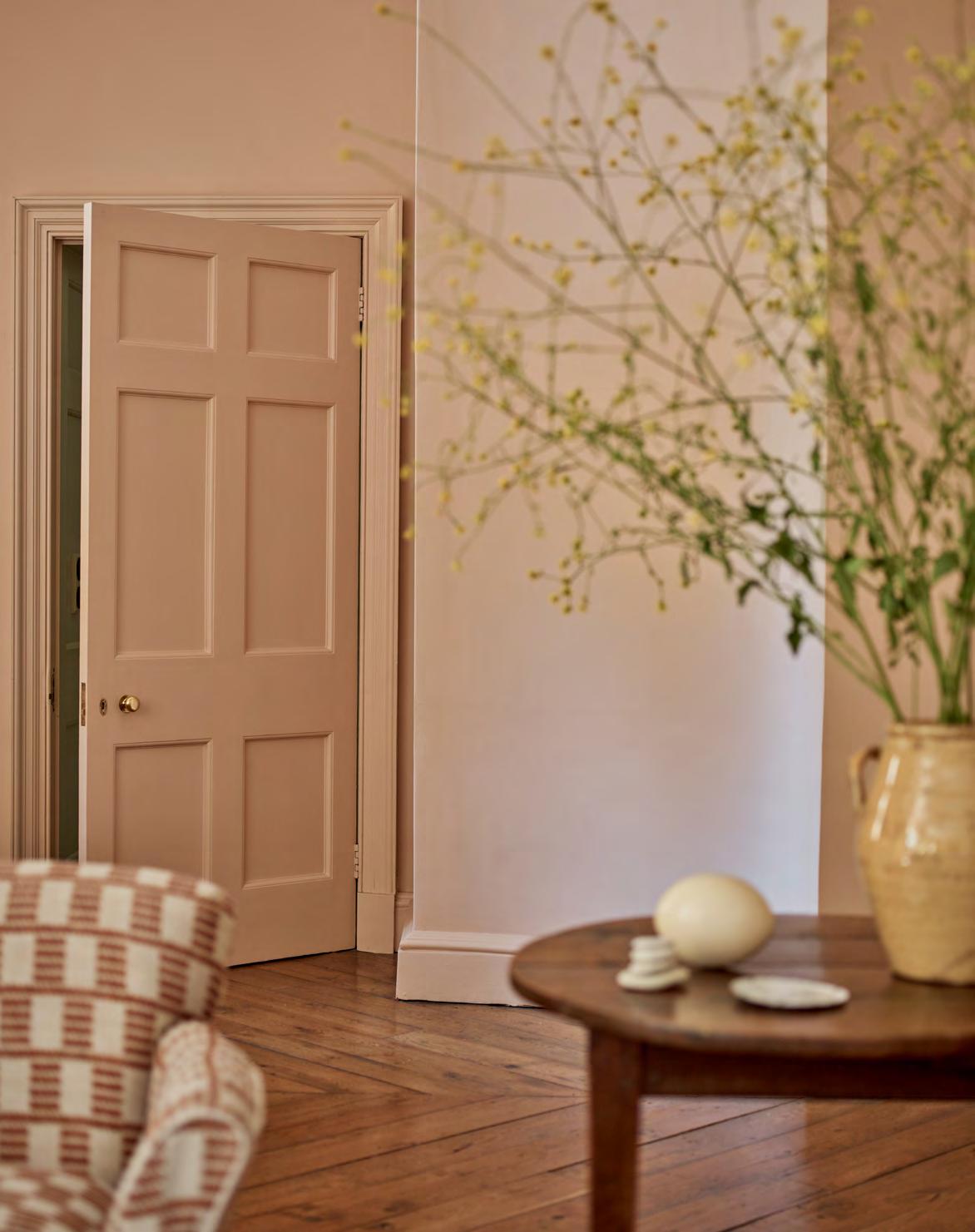
To mark the launch of our new seasonal colour, author and colour expert Kassia St. Clair explores the tempestuous nature of pink, that paler shade of red.

Pink has always had exceedingly spirited champions. Marilyn Monroe sashayed her way through ‘Diamonds Are a Girl’s Best Friend’ in what would become an iconic hot pink belted gown. Diana Vreeland, the legendary magazine editor, quipped that it was the ‘navy blue of India.’ While the designer Elsa Schiaparelli, upon encountering what would become her signature ‘Shocking’ shade, wrote that it was ‘bright, impossible, impudent… like all the lights and the birds and the fish in the world together.’
At the other end of pink’s spectrum, Robert Adam, the Neoclassical architect who popularised lighter, subtler pink schemes two centuries earlier, was no less feisty. A veteran of the Grand Tour and a student of Giovanni Battista Piranesi, Adam began his career by savaging the work of his rival James ‘Athenian’ Stuart. Adam derided Stuart’s (largely green) designs for Spencer House as pityfulissimo, and those for Kedleston Hall in Derbyshire ‘so excessively and ridiculously bad…[they] beggared all description.’
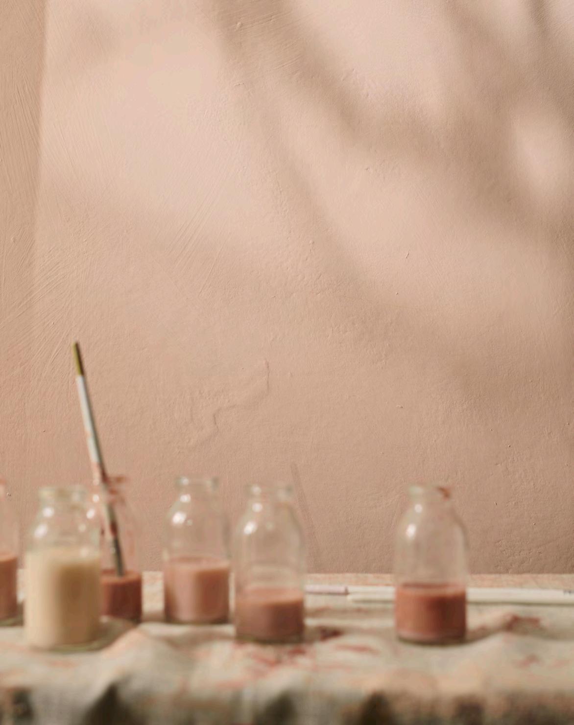
Adam’s own vision for Kedleston, which he duly executed when he was hired in Stuart’s place, was exuberant in its use of pink. The spectacular Marble Hall, for example, had a pale pink ceiling and walls and was lined with rosy alabaster columns. His style – which he deployed at many grand houses and was widely copied – has had a lasting impact on interior design to this day. Adam would have been surprised, then, by the idea – so ingrained today –that pinks are inherently feminine. In his day, they were more aligned with men. This was because they were seen less as a separate colour and more as pale reds, a hue associated with clerical and military uniforms, energy, power, and wealth. It wasn’t until the 20th century that a shift was made. Over the course of several decades, it became the default colour for any product, idea, or service aimed at women and girls; ‘shrink it and pink it’ was the lazy marketing mantra. Neptune’s new Potter’s Pink is neither the full-blooded shade associated with Monroe and Schiaparelli, nor the commercialised Legally Blonde and Barbie tone, nor even that beloved of Adam, which is perhaps best described as the colour of a cherub’s blushes. Imagine instead something more earthy, natural, and lived-in, with undertones of grey and yellow. The kind of tint that puts you in mind of freshly applied gypsum plaster, straight-from-the-earth red clay deposits or sun-dappled, faded Italian palazzos. Characterful enough to steal the scene on its own but, unlike Adam, equally capable of playing well with others. The kind of colour, in other words, that is more than capable of being its own champion.
You can order a sample pot of Potter’s Pink online or pick one up in your local store. For inspiration on decorating with our seasonal shade, head over to our Instagram, @neptunehomeofficial
Opposite: Walls and woodwork painted in Potter’s PinkOur new seasonal shade takes its name from the delicate freshness of un-fired pottery clay. With the subtle look of raw plaster on walls, it has a sense of earthy texture and historic precedence. Potter’s Pink works beautifully across whole rooms (and even ceilings), where it feels both light and cocooning. It also serves as a natural foil to dark timbers and organic textures like linen and sheepskin.
Made in the UK, this water-based paint is very low in VOCs and available in emulsion and eggshell.
The secrets of a successful enterprise? There are a few. But innovative ideas and a refusal to follow the herd are high on the list. Interiors writer Busola Evans speaks to three fearless founders who are thinking differently…
When Alex Head launched her luxury events catering business, The Social Pantry, in 2011 with a focus on zero-waste produce, she was determined to do things differently. So, when she was asked by a charity if she would consider employing a prison leaver, rather than recoiling in horror, she saw it as an opportunity to make meaningful change. ‘I thought, why not? Everyone deserves a second chance,’ she explains. ‘It was about offering an opportunity. When people leave prison, they often struggle with housing or finding a job so if you can eliminate one of those, that can make a huge difference. I have always been aware that some people have had a tough start in life or a lot of hurdles to overcome.’
Since then, Alex has tried to ensure that 10% of her staff are ex-offenders, and she regularly works with prison reform charities. She believes this has enhanced her business, which has become equally known for its forward-thinking work in sustainability. Alongside glamorous events – the company has catered for notables such as Hilary Clinton and David Attenborough – Alex now has four restaurants and cafés, including one for staff at Feltham prison. ‘We used to worry about talking about employing ex-offenders but, ironically, it’s now a reason many companies want to work with us. They want a supplier who shows social and sustainability responsibility. However, the biggest reward for me is changing someone’s life.’
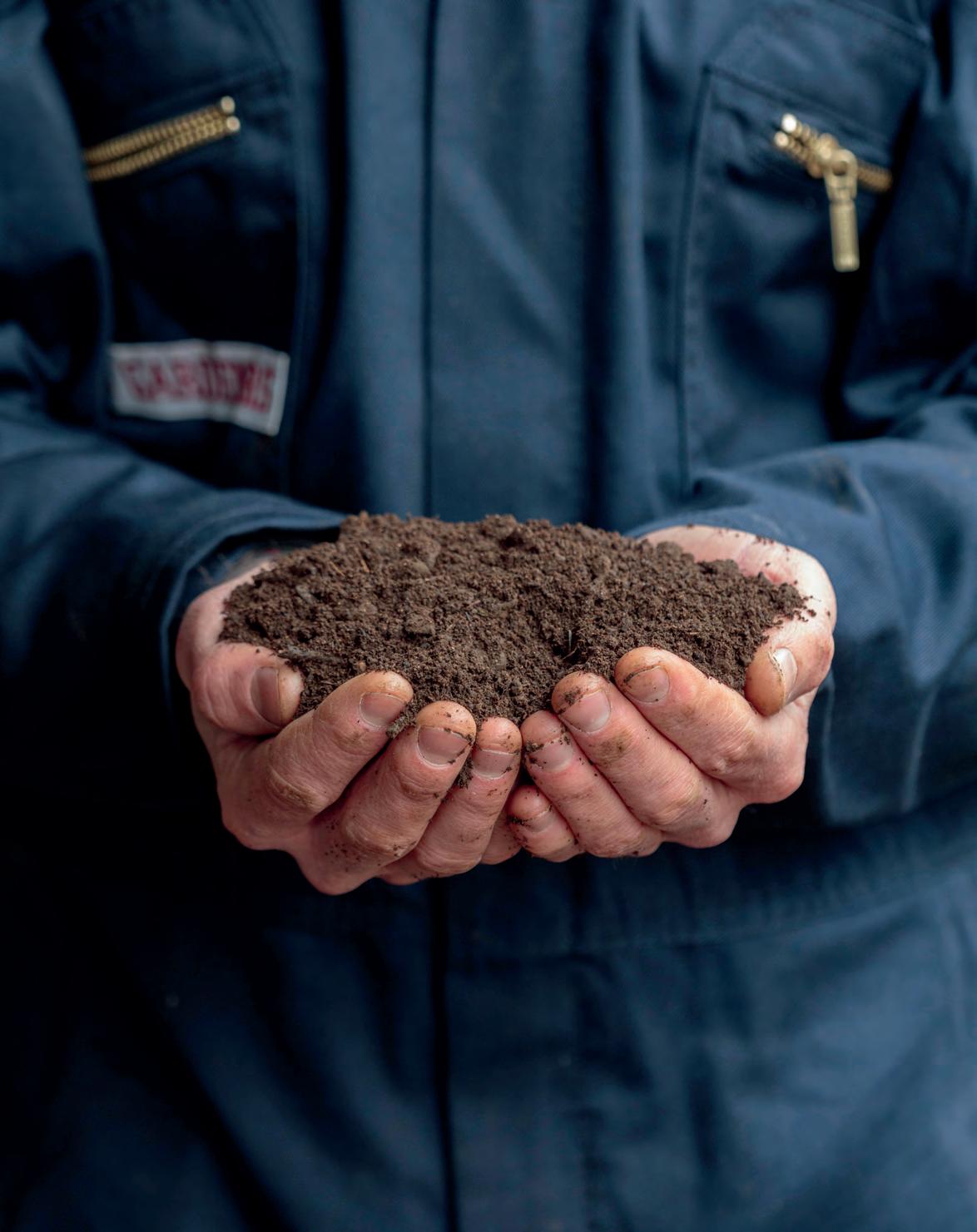
Henrietta Courtauld and Bridget Elworthy are not afraid to get their hands dirty – literally. As founders of The Land Gardeners, they are self-professed soil obsessives and passionate about improving the health of farms and gardens across the country and beyond.
While conversations about organic growing methods are now commonplace, it was a different story back in 2011 when the friends conceived their business idea. ‘We were both working as garden designers and the focus then was all about how things looked,’ says Bridget. ‘We had become increasingly aware of what a huge issue climate change is and started to think of changes we could make. We knew we needed to start with what we know best, which is working with our hands and the soil. The more we looked into soil, we realised it is core to everything. Soil health, plant health, animal health, human health, and ultimately planet health are all linked.’
The pair have worked with Austrian soil scientists to develop high-quality compost with which they do field-scale trials. ‘The biggest challenge is getting that knowledge out to as many people as possible and making sure whatever we are doing is replicable,’ adds Henrietta.
Plant-growing remains key to The Land Gardeners’ work. Their base –Wardington Manor in Oxfordshire (also Bridget’s home) – has a walled garden from which they produce seasonal cut flowers. They also have books, an online magazine, and offer garden tours and courses. Bridget says: ‘It’s very rewarding when someone says they’ve now connected with their soil and their garden is suddenly filled with wonderful life.’
A cowshed on an old dairy farm in west Wales seems an unlikely setting for a business that has had global impact and won international acclaim. But not when it is the site for Do Lectures, an annual gathering of some of the world’s leading marketing experts and changemakers, where they share their achievement stories to inspire others.
The idea came 14 years ago, when founders David and Clare Hieatt ran an online clothing business and were keen to connect with their customers in person. They decided to hold a three-day festival underpinned with interesting talks by friends from the advertising industry, where both had previously worked. ‘We wanted to offer something people would find useful, like learning about social media and website building.’
It was an instant success. Today, the event – which still holds just 100 people and has a waiting list – is filmed and shared online for free. The talks cover a range of topics and have been watched worldwide more than 150 million times. ‘When we started filming them, it was unheard of, but we thought it would help reach more people,’ says David, who runs Do Lectures with Clare alongside their cult jeans brand, Hiut Denim. Now their ‘sideline’ has spawned books, workshops, courses, a podcast, and has even been recreated in Australia and America. ‘It’s about encouraging people and creating a community,’ says Clare. ‘It feels like we have birthed a massive family and that is incredibly satisfying.’
Astronomer Richard Darn explains the importance of dark skies for our health and the protection of wildlife, and where to go to spot marvels like the Milky Way.

When was the last time you looked up on a clear night?
Did you see thousands of stars sparkling like diamonds and a Milky Way etched into an inky black sky? Probably not. Such a ravishing view has become an increasingly rare sight for people in the UK. Light pollution has taken its toll on the starry firmament to the point where 80% of us can’t see the Milky Way from where we live.

But all is not lost. There has recently been a step change in awareness of the importance of dark skies, not just so we can see the stars, but to enable us to get the quality sleep we need, and for the protection of nocturnal wildlife like moths and bats.
In fact, 18 areas in the UK are now internationally recognised as ‘Dark Sky Places’ under a global scheme. That’s more than any other country outside the United States. The locations stretch from Orkney to Sark, with magnificent landscapes in between including Northumberland, the Yorkshire Dales, and Snowdonia.
From these viewpoints, the night sky can look spectacular. Instead of the handful of stars you might see from a city, your eyes can take in up to 2,000. The Milky Way is an unmistakeable river of light, while you might be lucky enough to see one of the vivid kaleidoscopic displays put on by the Northern Lights. It really is worth visiting these areas to reconnect with the boundless universe. It’s an immersive and stress-busting experience, leaving a permanent imprint on the mind.
So, if you fancy a spot of ‘star bathing’, what should you look out for? For those yearning to see the Milky Way, then autumn is the perfect time to track it down. The band of light is directly overhead during the evening and best seen from dark rural locations on moonless nights. You might also glimpse shooting stars. We see lots of these during meteor showers, the best of which include the Orionids, which peak on 21st October, and the Geminids on 14th December. If you want to spy a planet, then Jupiter is especially bright in November and currently at its highest point in the past eight years. In fact, the planet is so well placed that if you use binoculars, you may be able to spot four of its moons which are over 480 million miles away.
To enjoy such magical sights, we can all do our bit to protect and preserve the night sky by using external lights carefully, pointing them downwards, and switching them off when not needed. As well as reducing your light use this autumn, take the time to look upwards and get to know your dark sky.
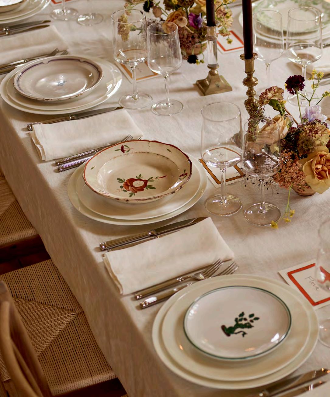
THESE DAYS, THE BEST DRESSED DINING TABLES DON’T MATCH.
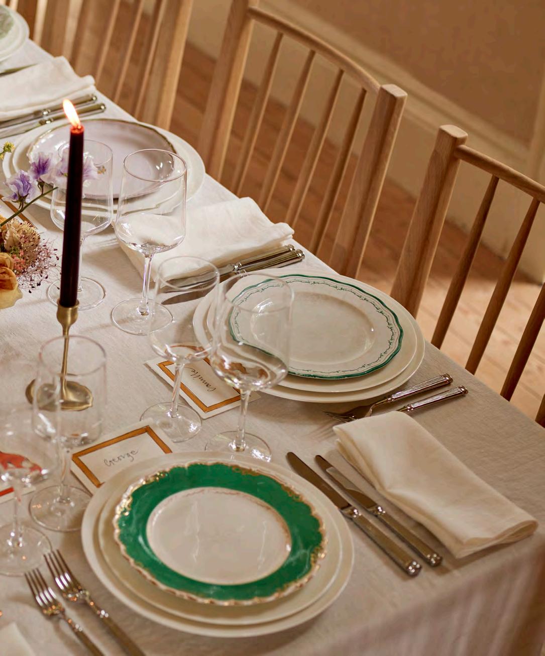
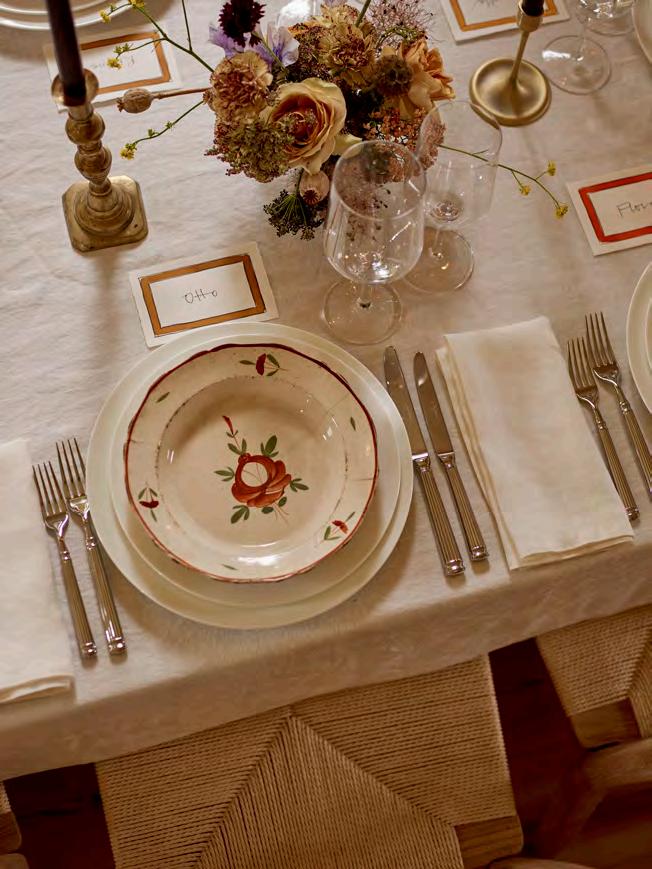
Abeautifully laid table is a considered art. One that goes far beyond the simple placing of perfectly matched plates, bowls, and serveware or coordinating crystal glasses. And one that can be elevated by mixing in vintage finds. From a platter you found trawling through local markets to an heirloom china set handed down through generations, it’s the pieces with a little history that will bring depth, character, and charm to a table or dresser display.
Start by sourcing your china, whether that may be from a local antique shop, an old box tucked away in the attic, or well-known haunts like the Newark or Kempton antiques fairs. It’s a task former fashion editor turned collectibles dealer, Sasha Wilkins, is an expert on as the owner of antiques business @foundbysashawilkins. ‘Be open-minded when you don’t recognise the name on the reverse of a piece,’ Sasha recommends. ‘While storied makers like Wedgwood, Spode, and Royal Worcester are still household names, there were hundreds – if not thousands – of now defunct potteries producing beautiful pieces in England during the 19th and early 20th centuries. The most important thing is that you like it.’
Lucinda Chambers, the co-founder of lifestyle brand Collagerie (@collagerie), agrees. As the former fashion
director of Vogue for over 30 years, Lucinda has an eye for shape, colour, and pattern. ‘I try to make up what I lack in the culinary department with a visual table. I’m a big collector of ceramics, so they all tend to come out. I make each place setting individual, so no two are the same. The more you mix, the greater the impact – I often lay mismatching plates one on top of the other.’
Once you have collected your chosen pieces, you can begin styling. Mismatch large and small scale patterns and layer various styles and patinas. ‘Try a geometric border next to a floral pattern, or an engraving of a castle,’ suggests Sasha. Lucinda pulls her selection together with her choice of tablecloths. ‘I layer them up and have one runner going down the middle,’ she says, ‘it can be just a length of patterned fabric, but it’s the glue that holds all the patterns and textures together.’ Just be mindful to ‘select a limited colour palette to ensure a unifying theme between old and new,’ advises Neptune stylist Meaghan Hunter. ‘And, crucially, don’t hold back. The more you bring together different styles, the more cohesion across your arrangement.’
It seems then, the best approach to mixing your china is to style confidently, particularly when the contrast between vintage and new is so poignant.
Lucinda Chambers will be styling a kitchen and dining room in Neptune Fulham during September and hosting a design talk on 28th September in the store.
This is
The humble chair is one of the most ancient forms of furniture. And while our lives have changed over the course of centuries, the importance of a quality chair has not. Elegant and refined, yet comfortable and solid, Kenilworth is a contemporary evolution of the historical chair with its birch wood frame and profiled chalked oak seat. Gather several around a table, tuck one under your dressing table or desk, or stand one in the corridor or hallway.
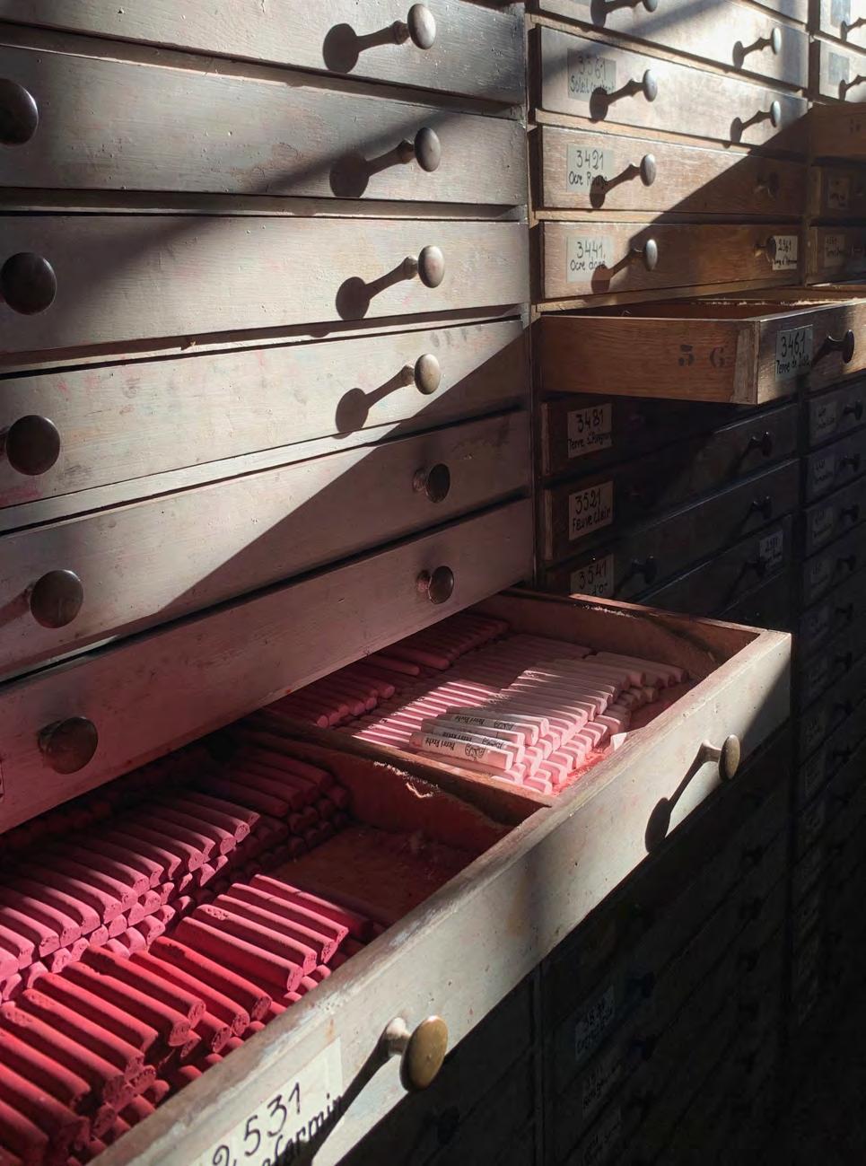
The pastel strokes on many an iconic artwork lead back to one small Parisian workshop, where for centuries its pastel recipe has been a closely guarded secret.
Interiors editor David Nicholls explores the tantalising material world of this ancient art.

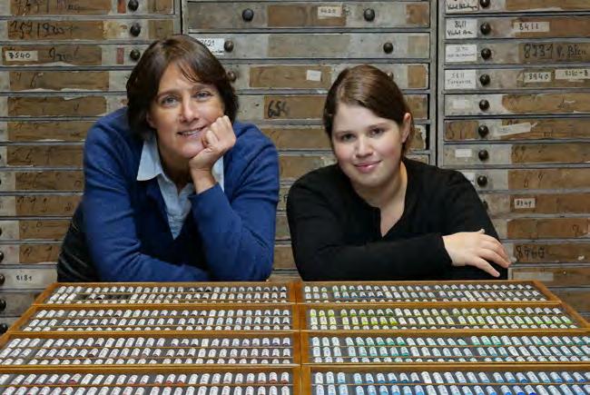
Less than an hour outside Paris is a tiny medieval village where two women engage in a strange alchemy that has been enchanting and bewitching artists for generations. Their exact location cannot be revealed, nor the secrets of the work which Isabelle Roche learnt from her ancestors about a quarter of a century ago. She shared this knowledge with Margaret Zayer when the keen-to-learn American arrived in France in 2010. What they have achieved together in these old stone farm buildings is remarkable. Some may say, miraculous. They have saved a small family business that works with an under-threat heritage craft, and transformed it into an internationally recognised specialist sought out by artists around the world.
La Maison du Pastel supplies artists with incomparably beautiful sticks of pastel, a medium that has been used since the Renaissance and reached the apex of its popularity in the 18th century with the work of
Venetian pastelist Rosalba Carriera and the English portraitist John Russell. It straddles the line between painting and drawing, and artists love it for its sense of immediacy; unlike a brush daubed with oil, the stick of pastel becomes an extension of the hand that holds it.
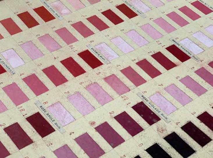
Isabelle has traced the origins of the company to the early 18th century, although her family’s connection dates back to the late 19th century when her distant relation Henri Roche – a successful chemical engineer –bought the previous incarnation of the company. It was he who forged relationships with artists including Whistler and Degas, who came to him seeking just the right colour and texture of pastel. By the time Isabelle took the reins at La Maison du Pastel in 2000, it was a struggling business which produced just a small proportion of its full palette. Today, she and Margaret have made over 1,800 colours available, with the introduction of innovations such as metallic and iridescent pastels.
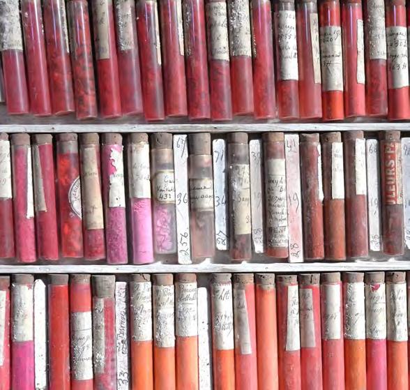

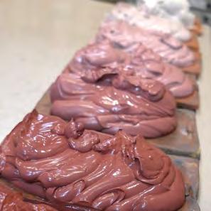
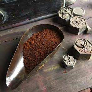
The way the precious sticks of pastel are made is virtually unchanged from the methods Henri Roche developed in the 19th century. A kaleidoscope of pigments, sourced from around the world, are weighed out on a scale that is more than 100 years old. These days, the pigments are ground by machine – albeit one that was bought in the 1940s. To form the stick, the pigments are combined with a binder. Traditionally, this might be gum arabic or gum tragacanth, but the formula here –created by Henri – is a closely guarded secret. White is then added, and the ingredients are thoroughly mixed by hand. The amount of white used is what dictates the shade and intensity, and at La Maison du Pastel, nine shades of each colour are produced; there are dozens of reds, blues, greens, yellows, violets and more – all available in a descending range of intensity.
Achieving these shades is an artform in itself, rather than a science; it is all done by eye. The paste that has been through the process looks like dollops of intensely coloured gelato before it is set out to dry in tiles, then rolled in cloth to squeeze out the excess water. Little
balls of paste are weighed and rolled out to form long sticks, which are then cut and laid out on a rack to dry. If you’re someone who enjoys going down a social media rabbit hole, check out the reels on La Maison du Pastel’s beautifully curated Instagram account (@la_maison_ du_pastel), where you can see some of this process. The company’s methodology may be historic, but its way of connecting with the world is very modern.
Artists have been flocking to its tiny shop in the Marais – tucked away in a courtyard behind an old garage door – since 1912. These days, they can only do so on Thursday afternoons, when Isabelle and Margaret come into the city to sell the fruits of their labour. It’s a chance for the artists to handle the pastels, to witness how the pigment is distributed onto the paper, its texture, and the intensity of its colour. And – just as it was with Henri Roche – it’s where Isabelle and Margaret can engage and connect with artists directly to assess what they need, and witness how they respond to the magic little wands of colour that have been lovingly and secretly created by two women deep in the French countryside.
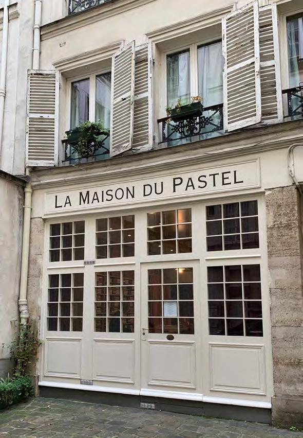
The cobbled courtyard that’s home to La Maison du Pastel is not far from the Seine and just a short walk away from the second arronidissement, which is where you’ll find our original Neptune Paris store. Complete with two floors of kitchens and home furnishings and a pretty faux flower shop, it’s well worth a visit.
Run by husband-and-wife team, Pierre and Fransien, this Neptune home resides in a classic Parisian building – with a rather elegant stone façade – which was built at the end of the 19th century following the demolition of its neoclassical predecessor, Hôtel d’Uzès.
Many years later, this picturesque street is now home to a plethora of chic cafés, terraces, and restaurants for passersby to choose from. If you’re popping in to see us, café La Porte Montmartre, which is just around the corner, is a personal favourite of ours.
You’ll find Neptune Paris at 12 rue d’Uzès, 75002 Paris. In the autumn, we will also be opening a new store just outside the city centre at 8 place de l’Eglise, 78640 Neauphle-Le-Château.
For more details of what you’ll discover inside our stores, or to get in touch with the team, visit neptune.com/paris

This is
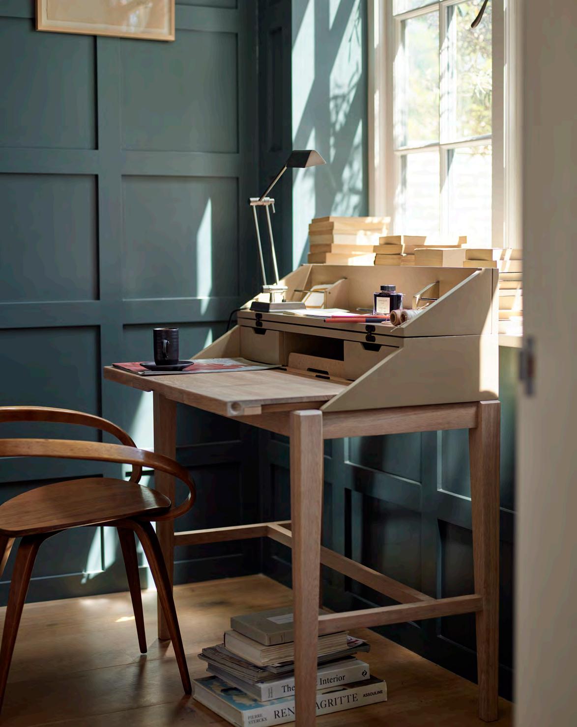
For the full-time home workers, aspiring novelists, and impromptu artists. For those who need to carve out a little solitude for concentration and creativity amidst the bustle of home. Ardingly features a solid oak pull-out work surface and smart hidden storage, all within an elegant timber frame in your choice of paint colour. And, come the end of the day, it folds into a smart console table in just a few swift movements. Ardingly is a desk, but not as you know it.
Ella Mills, founder of health and wellness brand Deliciously Ella, creates her recipes from a studio kitchen in London. Needing an efficient and beautiful working space that could be used for cooking and filming recipes, Ella turned to Neptune for design help. The result? A Henley kitchen with bespoke elements, cabinets painted in Cactus, and a hardworking Silestone quartz worktop.
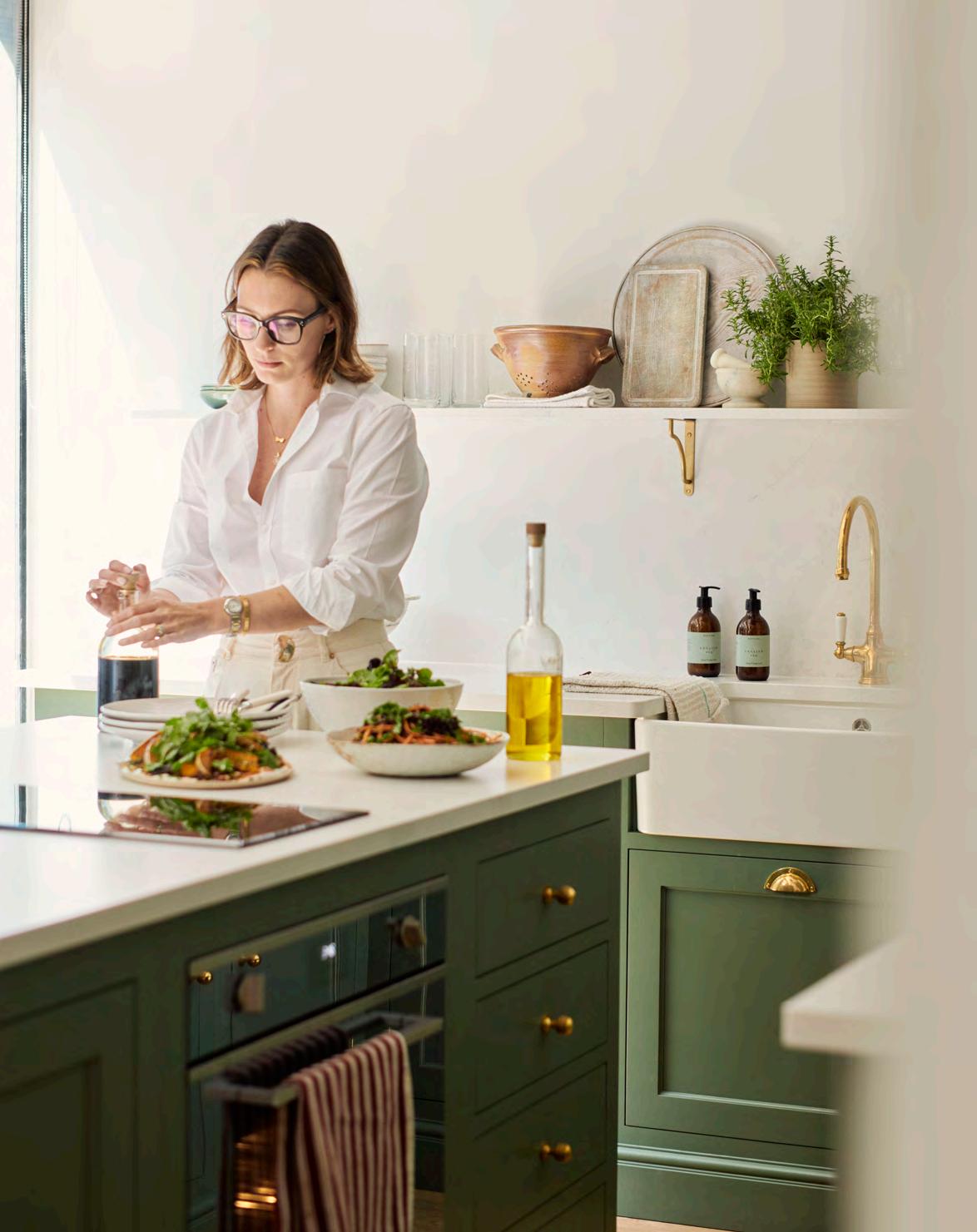
I started Deliciously Ella at my kitchen table back in 2012 after a bout of ill health. Originally intended to be a personal project, my blog was a way to teach myself to cook healthy and delicious plant-based recipes and improve my health. Over the years, as the business has grown, we’ve moved to a professional studio kitchen but our core purpose of sharing not just healthy but delicious ways to feel better, has remained the same.
Below are some of my kitchen staples and over the page you’ll find three autumnal plant-based recipes, each of which have been created and fine-tuned in my new studio kitchen.
My favourite element of our new Neptune kitchen is the larder cupboard. Not only is it a beautiful design feature, but it also offers bucket loads of storage. We store everything from our blender and toaster to tins, jars, and spices, keeping our countertops mess-free.
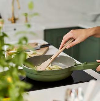
I can’t be without my Always Pan®. It’s a frying pan come sauté pan, steamer, roasting dish, and saucepan all in one, and just proves you don’t need every pan under the sun to make delicious recipes. It also matches the beautiful Cactus green of our Neptune kitchen which is rather pleasing.
The cornerstone of many weeknight suppers in our household, this humble jar packs a punch, giving maximum results with minimal effort. Sauté vegetables and chuck some harissa on them, serve with rice or pasta and you have that depth of flavour in a foolproof way.
While large food processors have a time and place, the Ninja Professional Stackable Chopper® is my go-to for something more compact. If I’m making a lentil ragu, I just chuck all the vegetables in and within seconds you have 10 minutes’ worth of chopping complete. It’s such a hack for unlocking healthy eating.
Opposite: Ella in her Neptune Henley studio kitchen, painted in Cactus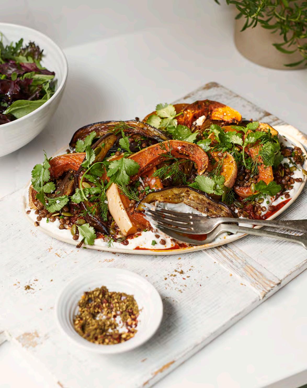
Makes enough for four
This is the perfect plant-based main. Slow roasted wedges of aubergine and butternut squash are tossed with chilli, thyme, and za’atar, then layered with crispy maple lentils and spicy garlic yoghurt.
For the slow roasted aubergine
3 aubergines, cut lengthways into 2cm wedges
1 small butternut squash, seeds removed and cut lengthways into 2cm wedges
3 tbsp olive oil
1 tsp chilli flakes (optional)
A small handful of thyme, leaves picked
1 tbsp za’atar
20g mixed soft herbs, roughly chopped
(I love a mixture of coriander, chives, and dill)
1 Preheat the oven to 180°C. Add the aubergine, squash, olive oil, and chilli flakes (if using) to a large baking tray. Season well with salt and pepper, then use your hands to mix everything together and spread the veg out into a single layer. You may need to use two trays to do this.
2 Slice the very top off the garlic bulb, so that you can just see the inside of the cloves, and drizzle with a little olive oil. Wrap loosely in foil and add to the corner of the baking tray. Cook the vegetables for 1 hour, stirring halfway, until silky soft and tender.
3 Meanwhile, add the lentils, olive oil, maple, tamari, and chilli flakes (if using) to a small baking tray. Toss together and oven cook for 10 minutes. Remove the tray, then stir through the pumpkin seeds and return to the oven for 10 minutes. Set aside to cool until everything is ready.
For the crispy lentils
400g green or brown lentils, drained
½ tbsp olive oil
4 heaped tbsp pumpkin seeds (about 60g)
1½ tbsp maple syrup
1½ tbsp tamari
A pinch of chilli flakes (optional)
For the roasted garlic yoghurt with harissa
300g coconut yoghurt
1 bulb garlic
1 tbsp harissa
4 Once cooked, remove the tray of vegetables from the oven and take out the garlic bulb. Scatter the za’atar and thyme leaves over the vegetables and return to the oven for 10 minutes, or until everything is golden and fragrant. Set aside to cool slightly before serving.
5 To make the roasted garlic yoghurt, squeeze the garlic cloves into a small bowl and roughly mash with the back of a fork. Stir through the yoghurt and season to taste with salt and pepper.
6 To serve, spoon the garlic yoghurt onto a large, flat serving dish and drizzle over the harissa. Spoon over half of the crispy lentils, followed by the roasted vegetables. Scatter over the remaining lentils, then add the herbs and a generous pinch of sea salt flakes.
Makes enough for four
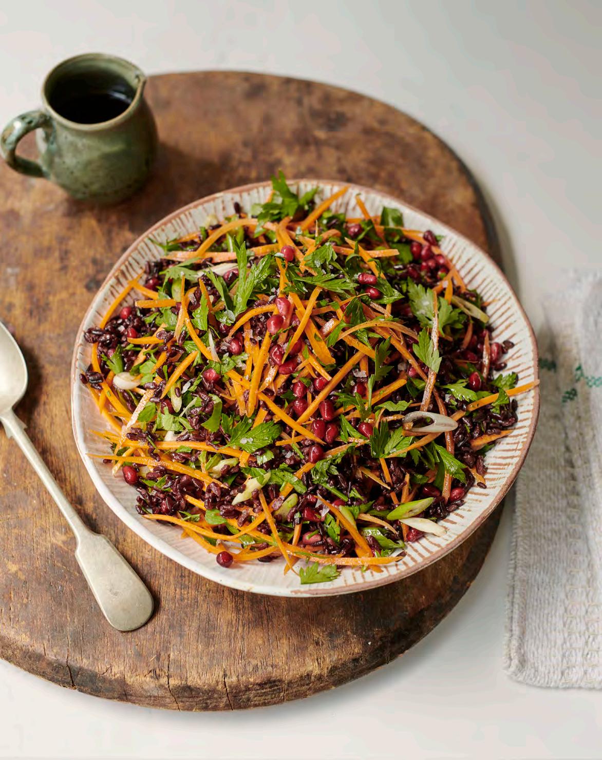
This jewelled wild rice salad is packed with delicious flavours, including spring onions, pomegranates, maple, and cinnamon. It’s very easy to make, making it a versatile side dish you’ll return to again and again.
For the salad
200g wild rice
A drizzle of olive oil
5 spring onions, thinly sliced
100g pomegranate seeds
30g parsley, roughly chopped
3 carrots, julienned or grated
For the dressing
3 tbsp olive oil
1½ tbsp sherry vinegar
2 tbsp maple syrup
½ tsp cinnamon
½ tsp allspice
Salt and pepper
1 Add the rice to a saucepan of salted water and cover with a lid. Bring to the boil, then reduce the heat and simmer for 30-35 minutes, until just cooked. Drain and refresh in cold water, before thoroughly draining once more. Transfer to the salad bowl and stir through a little olive oil.
2 W hile the rice is cooking, make the dressing. Simply whisk together the olive oil, vinegar, maple, cinnamon, allspice, a pinch of salt, and plenty of black pepper.
3 Once you’re ready to serve, add the spring onions, pomegranate seeds, parsley, and carrots to the salad bowl and toss to combine. Stir through the dressing, then taste to check the seasoning and adjust as needed.
Makes enough for four
Nothing beats a hot fruity crumble on a cold day. With hints of cinnamon, vanilla, maple, and almond, this beautiful plum and blackberry crumble looks and tastes absolutely amazing.
For the fruity filling
6 plums, halved and cut into 1cm slices
300g blackberries
½ tsp vanilla bean paste

2 bay leaves
½ tsp ground cinnamon
1-2 tbsp coconut sugar, to taste
A pinch of salt
1 Preheat the oven to 180°C/160°C fan.
2 Toss together the plums, blackberries, vanilla, bay leaves, cinnamon, sugar, and a small pinch of salt (to balance the sweetness of the fruit). Tip into an ovenproof dish (roughly 25x30cm).
For the crumble
150g spelt flour, sifted
150g porridge oats
3 tbsp flaked almonds
4 tbsp maple syrup
4 tbsp olive oil
A pinch of sea salt flakes
3 To make the crumble, sift the flour into a bowl then toss together with the oats, almonds, and sea salt flakes. Pour in the maple syrup and olive oil and use your fingers to bring everything together until the mixture resembles wet breadcrumbs. A few larger lumps are great as these will create a lovely crunchy texture once cooked.
4 Scatter the crumble over the fruit and cook for 30-35 minutes, until golden and bubbling. Serve with coconut yoghurt or vegan ice cream.
Art – and art books – should captivate and stretch us, argues Carmel Allen, CEO of The Tate galleries and one-time art and archaeology student. Here, she selects the four art books always guaranteed a place on her bookshelves.

Tears, joy, and quiet contemplation; almost every day at Tate Modern or Tate Britain I witness the transformative power of art. It can challenge and provoke too, but it never leaves anyone feeling indifferent. Away from the gallery, I find art books can have the same profound effect. Better than any meditation app, browsing the pages of an art book can slow me down and encourage me to look closely and be mindful. They are my treasures. Here are some of my favourites:
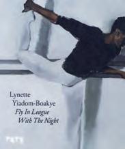
Lynette Yiadom-Boakye
(Tate, £30)
This brilliant British artist writes poetry, too. ‘The things I can’t paint, I write, and the things I can’t write, I paint’. This quote sets the scene for Lynette’s wonderful portraits, which pull you in and make you want to know more. But here’s the thing: her sitters don’t exist anywhere but in her mind.
Robert Fairer
(Thames & Hudson, £48)
The photographer Fairer made his name shooting backstage at the fashion shows of the 90s. He’s done a series of books documenting various designers, but this one on McQueen is as compelling as the fashion designer’s short life. The details of the makeup, the clothes, the hair, the models are mesmerising… every time I open this book, I see something new.
Katy Hessel
(Hutchinson Heinemann, £30)
Who doesn’t have a copy of Ernst Gombrich’s The Story of Art on their shelf? It was the set text for my art education back in the 1980s, but first published back in 1950. It gave a male perspective of art and not one female artist was included. I was shocked when my own daughter was later recommended to buy a copy for her art A Level in 2018! Thankfully, in 2022, talented writer and creator of @thegreatwomenartists podcast, Katy Hessell, published The History of Art
Without Men. Every home needs both. Not just to give both sides of the story, but as a reminder that there’s still work to be done to bring gender equality to our children’s education. Katy writes beautifully and there’s a discovery for the curious on every page.
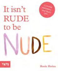
Rosie Haine
(Tate Children’s Books, £11.99)
Encouraging body positivity from an early age can only be a good thing. The playful illustrations by the incredibly talented Rosie Haine do just that in this picture book for children. Every child I’ve given a copy to loves it and my niece and nephew demand to have ‘the bottom book’ read to them at bedtime!
The Georgians’ legacy is often limited to understated architecture and classically proportioned spaces. Historian and author Alice Loxton is on a mission to give proper recognition to their wicked sense of humour and love for gossip, which have had immeasurable impact on today’s satire.
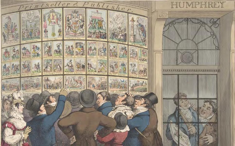
London, at the close of the 18th century, was a circus. Port-pickled politicians wept over the brilliance of classical oratory; duchesses pranced through butchers’ shops in a flutter of lace and ribbons; and every vagabond and countess, scoundrel and bishop, gossiped with glee over the Royal Academy’s placement of a fig leaf. But only one thing truly electrified the city. It attracted vast crowds of people, pushing and screaming. Their enthusiasm was ‘indescribable’. Toes were trodden on, bonnets went awry, and buckles snapped. It was ‘veritable madness’. Visitors reported ‘you have to make your way in through the crowd with your fists’. This was the Beatlemania of the day.
What were these crowds so desperate to glimpse? The latest satire hanging in the print shop window by caricaturists such as James Gillray, Thomas Rowlandson, and Isaac Cruikshank. These images were political and social critiques of all levels of society. From king to pauper, no one was safe. With razor-sharp wit, bold creative vision, and superb artistic skill, Prime Ministers were reduced to toadstools, grand bishops transformed into hot-air balloons, and high society pretension ridiculed.
One of the most powerful myths these satires created was regarding the reputation of Napoleon. At the height of Napoleon’s power, Gillray and his gang led a propaganda campaign. They belittled Napoleon, literally. A new character was created, named Little Boney. This was a ranting, raging, nonsensical being, and – most importantly – very, very short.
In reality, Napoleon was a man of average height who probably stood taller than Nelson. Yet the image of the emperor as a tantrum-ridden toddler was funnier – and more powerful – than the truth.
But it wasn’t just emperors who were upturned by satire. Every day new prints were shaping public conversation, building careers, and shredding reputations. How many speeches in the House of Commons were tempered to avoid being lampooned by the etching burin? How many patriotic young men signed up to fight in Europe, buoyed by images of bloodthirsty sans-culottes? How many fashionable ladies discarded their bonnets after seeing them ridiculed in the print shop window?
Another great legacy of these prints was their mark on British humour. Everyone from Jane Austen to George III to Lord Byron lived in a world where conversation was peppered with witticisms from the etching burins of Piccadilly – saucy puns, double entendre, and injokes. This Gillrayic humour has trickled through the ages. You’ll see it in Gilbert and Sullivan and Carry On films. The creators of Spitting Image conceded they owed Gillray a royalty payment. Newspaper cartoonists today are constantly paying heed to their predecessors. Martin Rowson admitted that one of Gillray’s satires (featuring an enormous plum pudding) is ‘probably the most famous political cartoon of all time … stolen over and over and over again by cartoonists ever since’.
It is remarkable, then, that Gillray and his fellow artists – with their wit, weirdness, and colossal impact – haven’t become beloved characters of British history. I’m on a mission to change that, to kickstart the Gillray renaissance. Place him on the plinth of national treasures, beside Reynolds and Turner. Give him a place on the £20 note, or a Netflix series! There is so much more to discover about the remarkable lives of these artists – their fizzing creativity, their boldness of vision and – most importantly – their spirit of uproar!
From family foraging expeditions along country lanes to dumpsterdiving to survive, author and presenter Ben Fogle embraces the chase when it comes to finding food in nature.
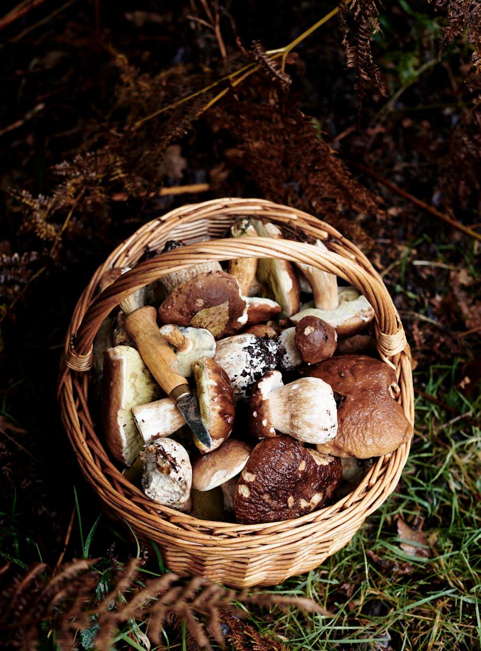
Ilove foraging. I’ve foraged since I was a child. What began with wild strawberries and blueberries in Canada and Scandinavia, has grown into a career of foraging with others.
But can we just begin with those strawberries and blueberries? Tiny and delicious. And, as they say, you soon realise size doesn’t matter. In fact, I would choose those small, succulent, wild berries over the uncomfortably large, often tasteless shop varieties, sold for their aesthetics and weight over their taste.
There is something so satisfying about sourcing food without the need of a shop. Over the years I have foraged for, and from, just about everything. I have foraged seaweed and nettles. Mushrooms and wild herbs. I have accompanied people as they collected elvers in the River Severn and seaweed in Shetland. I have spent time with people who forage roadkill, and even ‘dumpster-dived’ to liberate other people’s ‘out-of-date’ food.
The key to foraging, in all its different forms, is to collect and harvest food that would otherwise be left or overlooked. The satisfaction, I’ve learnt over the years, comes in the ‘hunt’. And so, I’ve foraged in the ocean and in the woods. It’s the thrill of not knowing quite what you are going to collect that adds to the experience.
As a family, we will often collect things to add to our meals while we’re out walking. There’s something very peaceful and fulfilling about foraging with your loved ones. We turn it into a game to work out what we can and can’t eat. We don’t take risks – we always use an app to help us identify different plants, fruits, and berries before picking them.
I’d go as far as to say foraging is the ultimate exercise in mindfulness. It gives you a chance to escape the pressures of the world. To slow down and connect to the landscape in a primeval way. We are so used to staring at our phones that we often fail to pay attention to the flora and fauna around us. Nature is a very healing, calming environment and foraging is the perfect way to immerse yourself in such a peaceful place.
Five things to safely forage this autumn:
Blackberries
This seasonal staple grows throughout autumn and can be found in hedges, woodland shrubs, and heathland. Pick ones turned purple-black and use them in crumbles, pies, wines, and jams.
Commonly found in hedgerows and woodland fringes from the end of September, the fruit from this wild climbing rose can be picked once it’s turned a deep orange-red. Just make sure to remove the irritant seeds by cooking down and sifting the fruit.
Naturalised in Britain, the walnut tree – although relatively uncommon – is a real treat to find. At their best in October, gather the pale-green casings from the ground or shake the tree to dislodge them.
Contrary to popular belief, all poppies produce edible seeds. Found within field margins, meadows, and gravel gardens, they are ready to harvest once the seedheads mature into a grey-brown.
Dandelions
Often overlooked, these hardy weeds are entirely edible raw or cooked. Harvest them before they flower, when the leaves are most tender, and use in salads and drinks.
For expert tips on foraging safely we recommend these apps...
PictureThis: a ‘botanist in your pocket’ that uses your camera to identify over 1,000,000 plants, flowers, and trees.
Forage - Wild Free Food: a digital foraging guidebook, it describes the habitat, season, and uses of plants.
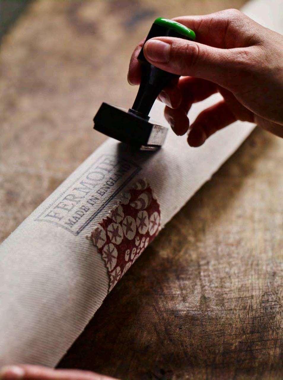
To mark the collaboration between Neptune and Fermoie, we get to know the British brand behind such distinctive and beautiful fabric.
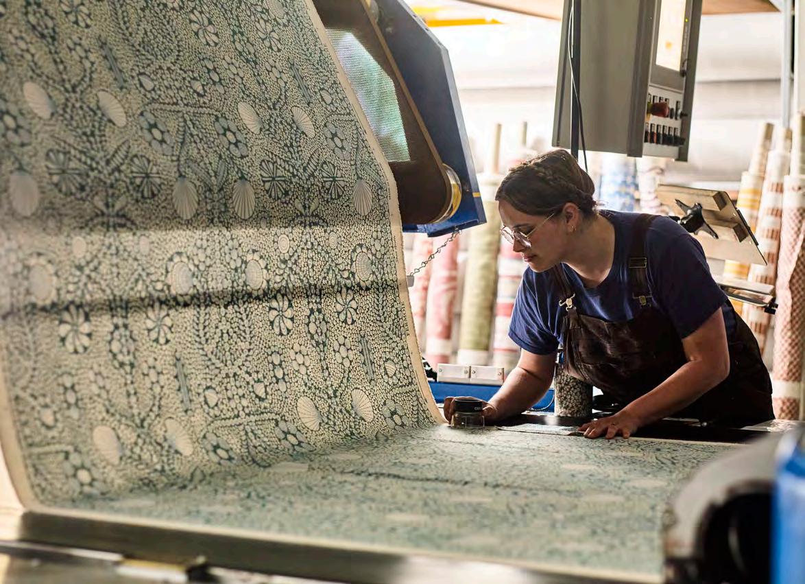
We take in an infinite number of patterns every day, some consciously and others subconsciously. They are abundant in both the natural world and manmade design, with plenty of overlap between the two. Pattern is a powerful tool to harness, not only as a vital interior design device, but also as a rich avenue for personal expression. For pattern to be effective, though, it must be accessible. Leading the way in realising this mission is British fabric house Fermoie. Their workshop is situated on the edge of the Savernake forest – an immersive tangle of trees and the inspiration behind their bold Savernake print. Their fabrics are made from start to finish onsite, with studio and manufacturing teams working side by side.
With so many patterns competing for our attention, Fermoie’s signature is a simple one. Every design starts with a hand-drawn line, and they print using traditional rotary screens rather than digitally for a ‘lightly kissed’ effect. It’s a brave move to stand by original methods in an increasingly digital world, but one that pays off. ‘Printing with screens allows for a layering of textures and pressures throughout the fabric,’ explains Fermoie’s Managing Director, Jamie Shawcross. This process creates a gentle impression, for remarkably useable designs that celebrate the materiality of the cloth itself.
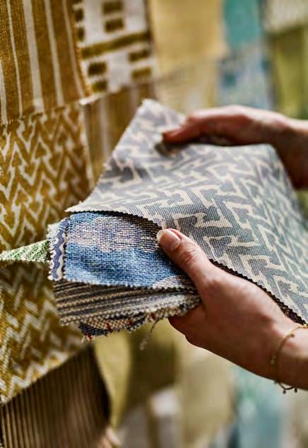
Our shared focus on designs that are easy to live with is just one reason why we’ve partnered with Fermoie. Based just a short distance from each other in Wiltshire, we’re united by an unwavering dedication to providing a quality product and service. Our capsule collection features three prints and includes upholstery and cushions covered with Fermoie’s 100% natural flax linen, and lampshades made from a lightweight linen sheer.
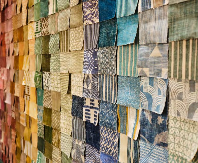
Fermoie’s patterns range from the small-repeat designs they’re so wellknown for, to bold, expressive ones like Shell Grotto. Nature serves as a constant guide for their studio team, as it does for us at Neptune. Cove – one of the fabrics in our limited-edition collection – was originally drawn from a Dorset clifftop overlooking the water. The designer observed a surprising uniformity in the ripples of waves, which formed the basis for this geometric pattern. Inspiration comes in myriad forms, though, and
the Carskiey stripe – also featured in our capsule collection – comes from an historic textile document found at Carkiey House in Scotland.
Founded by the original duo behind Farrow & Ball, it’s no surprise that colour plays a leading role in Fermoie’s work. They take their cues from nature here, too, in much the same way we go about curating our signature colour palettes at Neptune. ‘Neutrals, plains, and light colours are all well and good, but I’m not seeing that in nature. I’m seeing boldness and brightness and bringing a little of that inside brings happiness,’ says Jamie. And yet, once again, their approach prizes accessibility. Fabrics are grouped by colour family rather than pattern, making it easy to mix different designs together in one harmonious scheme.
Where interior design can sometimes feel confusing – overwhelming, even –Fermoie’s ethos proves that the best approach is often the simpler one.
Florist and author Clare Nolan shares her planting plans for the colder months.
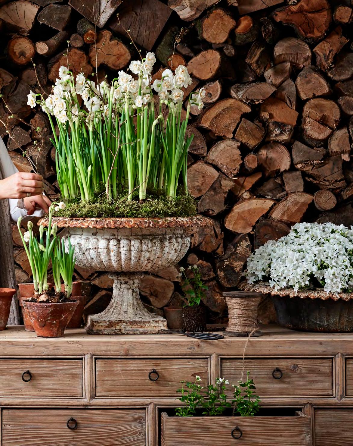
Autumn’s first frost takes the last of the dahlias still standing, drawing a line under the year’s growing season and sending the cutting patch into a deep slumber. When there’s so little going on in the garden, I seek beauty elsewhere. It comes in the form of spring bulbs ‘forced’ indoors; tricked into flowering outside of their normal season. Amaryllis and hyacinth will each take their turn, but the easiest and quickest of all are Paperwhites – a Tazetta form of Narcissus, better known as the humble daffodil.
These dainty blooms are a world away from the acid yellow varieties that flood the supermarkets as cut flowers in late winter. Each bulb produces two or three stems each topped with up to 10 delicate, white, papery flowerheads. Their heady scent, a floral mix reminiscent of hyacinth and jasmine, can easily fill a room.
The classic variety for forcing is the Narcissus ‘Ziva’ Paperwhite, which has a height of 40cm, but pretty much any of the N. Tazetta varieties will work. I pot-up a ramshackle array of vessels of various shapes and sizes; vintage ceramic jelly moulds, a pair of shallow terracotta planters splattered with lichen, and a series of plasticlined wicker baskets.
Paperwhites are the sprinters of the bulb world, flowering within four to six weeks. I plant in succession – 10 days or so apart – aiming for a flowering time that will straddle the Christmas holidays. This ensures plenty of blooms not only for the big day itself, but more importantly for the days following when the house is stripped of its festive finery.
You can use a multi-purpose compost (with added grit for extra drainage) and plant the bulbs with their shoulders just proud of the surface. Or, for a no-soil option, you can use stones and pebbles – those from garden or driveway gravel will do, just give whatever you’re using a good clean first. A layer of about 10cm at the bottom of a pot or vase – or any other watertight container – will allow the roots to anchor down, then nestle the bulbs on top (growing tip upwards). A shoulder-to-shoulder arrangement works well, as they look best when clustered in large groups. Then it’s as simple as adding water to the bottom of the bulbs and waiting for the magic to happen.
You can place your bulbs in a cool location to slow down the flowering time, or force them into bloom more quickly with heat, depending on your preference.
To slow them down, place the container in a cool place (10-15°C is ideal) away from direct sunlight. Check the bulbs frequently and water when the potting mix feels dry more than 3cm below the surface. If you are using the no-soil method, keep topping up the water so the roots are submerged.
If you want your bulbs to flower more quickly, place the container in a warm, sunny location (around 18-20°C) and lightly water, so the soil is moist but not soggy. It will soon produce strongly scented blooms.
You can support flopping stems with birch twigs or pea sticks and twine.
When the planter has finished flowering, discard the bulbs to the compost heap as they are unlikely to flower reliably the following year.

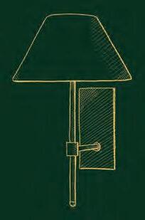
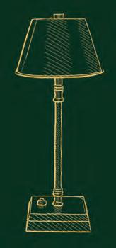
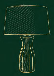
‘Light is the first essential. Light stimulates, nourishes, preserves. You can no more do without it… than if you were a flower.’ When novelist Wilkie Collins wrote these words in 1859, electric light was not yet a familiar feature in our homes, but at this time of year, we may wonder how we ever did without it. As the days shorten, cultivating a layered lighting scheme is vital. Much as you would gather textiles on a bed, or china, glass, and candles at the dining table, this means punctuating your space with multiple points of light to create depth and character: a pair of wall sconces to bounce the sheen off a favourite mirror, perhaps, or a tall floor lamp to brighten a dark corner.
Layered lighting schemes do involve some forward planning. Wiring for wall lights, for example, must be installed before decorating happens. Configuring switches and sockets in advance is as important as the light fittings themselves; there’s nothing more frustrating than a lamp that can’t be switched on intuitively, from a convenient place, or an overhead light that won’t dim to a cosy glow.
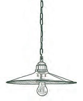
However, there are plenty of easy ways to improve what you already have. Clusters of small lamps, scattered on tables and surfaces – or even on floors, to wash light upwards – can be marshalled on a more ad-hoc basis in winter. They act much like cushions: practical yet decorative, bestowing inviting warmth. ‘Versatile rechargeable lamps can be moved around and placed on bookshelves, tables, or windowsills without the need for sockets, bringing forgotten areas to life,’ advises Gail Norfolk, senior home designer at Neptune’s Bury St Edmunds store. ‘As an alternative to a pendant, our Coates and Soane directional ceiling lights highlight artwork, architectural features, or a simple coffee table arrangement with a soft, diffused light.’
Task lighting also comes into its own in winter. Create pools of light in the zones you gravitate towards, using table and floor lamps with adjustable features (if they’re dimmable, too, so much the better). Consider swapping a fixed overhead light for an adaptable, rise-and-fall pendant with more atmospheric potential. And switch up materials for those with maximum glow factor. Neptune’s new solid brass Emerson pendant and wall light, handmade near Athens in Greece by a maker known for nautical lighting, will develop a rich patina over time. The metal is traditionally spun for a ribbed texture and – in the case of the wall light – paired with ribbed glass to further diffuse the light.
The simplest trick of all, adds Gail, is to change your lightbulbs to boost the ‘light temperature’. ‘Choose warm white LED bulbs between 2700 and 3000 Kelvin,’ she recommends. ‘Our range by British brand Tala gives your home that cosy Neptune feel.’
With a little planning, lighting can become a secret weapon for boosting winter warmth around your home, according to interiors journalist
Amy Bradford.

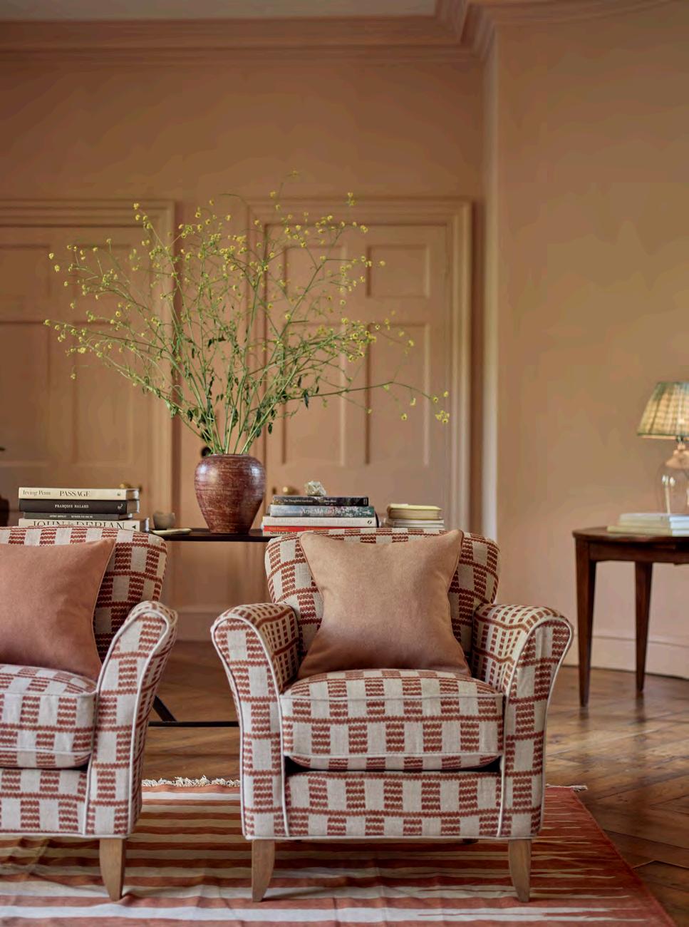
The golden ratio – known in scientific circles as 1:168 – is everywhere you look. It’s in the beautiful concentricity of a fossil and the mesmerising layers of a rose.
In interior design, this theory of thirds has manifested itself in the 60:30:10 decorating ratio. This principle can apply to every element of a room, from the scale of furniture to colours, textures, and patterns.
Using colour as an example, the principle advises that 60% of a space is dedicated to your main colour, 30% to your secondary colour, and 10% to your accent colour.
In this sitting room, our seasonal shade Potter’s Pink accounts for 60% of the scheme, with a warm neutrality that’s perfect for decorating whole rooms. Shades of brown make up 30% through timber furniture and the deep rust colour of the Fermoie fabric on our Matilda armchairs and the stripes on the rug. Finally, the fresh green of the scatter cushion and the decorative foliage account for 10%.
This is an excellent way of ensuring a space feels balanced and cohesive, rather than cluttered or jarring. Like all rules, however, it shouldn’t be followed blindly. Every space is different, and 70:20:10 might work better for you, or simply 60:40.
The beauty of this trick is you can adapt it to suit your own taste. The space could be minimalist or maximalist, bright or monochrome. Either way, variation and balance are key to any successful interior.
Neptune interior design manager, Simon Temprell, offers his advice on putting the ratio into practice.
Balancing colours
‘The percentages of this simple equation can be expanded to include, say, two accent colours. In that case, you might allow each accent 5% or reduce your main colour to 50% and give 10% each to your accents. It’s not meant to be an exact science, but rather a useful guide.’
Balancing textures
‘Identify the three most dominant textures in your scheme, remembering to include any that appear in floor or wall coverings. For instance, a room that is dominated by exposed brick may need some slick, shiny surfaces to balance out the rough texture.’
Balancing patterns
‘Pattern-mixing can be daunting, so the 60:30:10 principle is a great guideline. 60% would be patterned wallpaper, if you have it, or a large-scale pattern on a sofa or curtains. 30% would be smaller upholstered pieces, then dedicate 10% to a small-scale pattern like a trellis or a ditsy floral.’
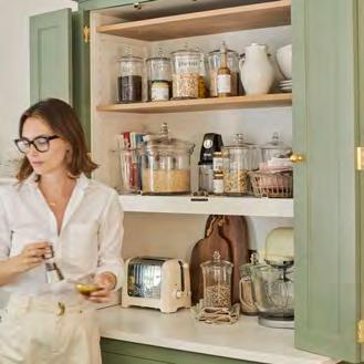
This Chichester kitchen takes the roots of historical country house kitchens and reimagines them for contemporary living, including an innovative pantry wall.
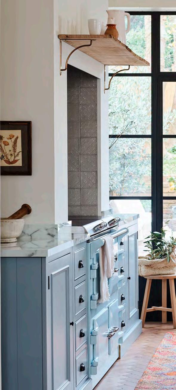
The story of the country kitchen is full of ironies. Firstly, the style is no longer confined to the country at all – you’re just as likely to encounter a country kitchen in the middle of Notting Hill as you are in a sleepy village in Shropshire. It’s a style that’s widely coveted for creating a sociable heart of the home, and yet it harks back to households where there was a marked divide between the working domestic quarters run by servants and the recreational ones occupied by the family. And although our lifestyles are quite different to past generations, we still yearn for the look and feel of a classic country kitchen.
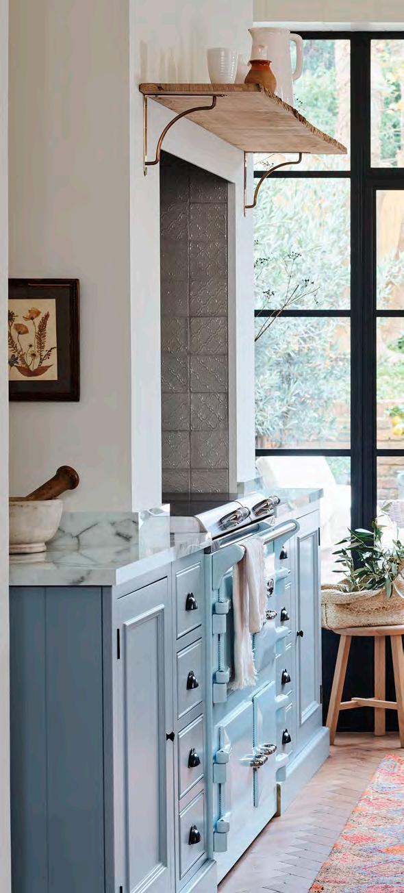
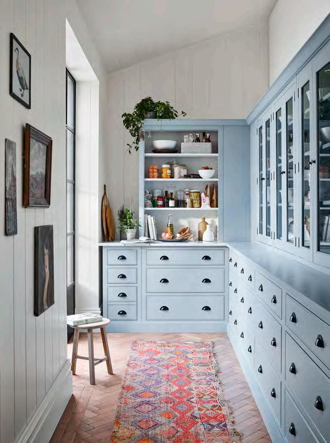
Over 20 years ago, Neptune co-founder John SimsHilditch and creative founder Emma Sims-Hilditch set out to furnish their first home. In antique centres and reclamation yards, they found the sort of freestanding pieces that once typified a traditional English kitchen. They were drawn to Georgian designs for their elegant proportions, decorative mouldings, and prevalence of open shelving. Each design they discovered went on to prove its timelessness both in form and function, and it was those few pieces that inspired John to develop our first kitchen collection: Chichester.
The historical roots behind Chichester were at the forefront of our team’s mind when they came to design this kitchen for a period London townhouse. ‘It’s entirely possible for new and old to exist harmoniously,’ says kitchen designer Jessica, ‘even to bring out the best in each other, and I think this kitchen does that.’
Storage has remained essential to all iterations of the kitchen across the centuries. The domestic quarters of an historic country house had clear working zones, each with its own specific purpose: the kitchen was for prep and cooking, the pantry for storing non-perishables, a cool larder for perishables, and the scullery for washing. This property had a potentially awkward, corridorlike space just off the main kitchen area which our design team decided to transform into a ‘pantry wall’ with floor-to-ceiling Chichester cabinetry combining open shelving with closed cupboards and drawers. ‘With so much storage here, the main part of the kitchen didn’t need wall cabinets, keeping it light and airy,’ says Jessica. This is unusual today, as we tend to eek out every inch of wall space, but it was a common feature of a typical Georgian kitchen, where the main kitchen was for cooking (and staff meals) only. Today, it makes room
for displaying personal pieces like artwork, crockery, and collectables that add soul to the space.
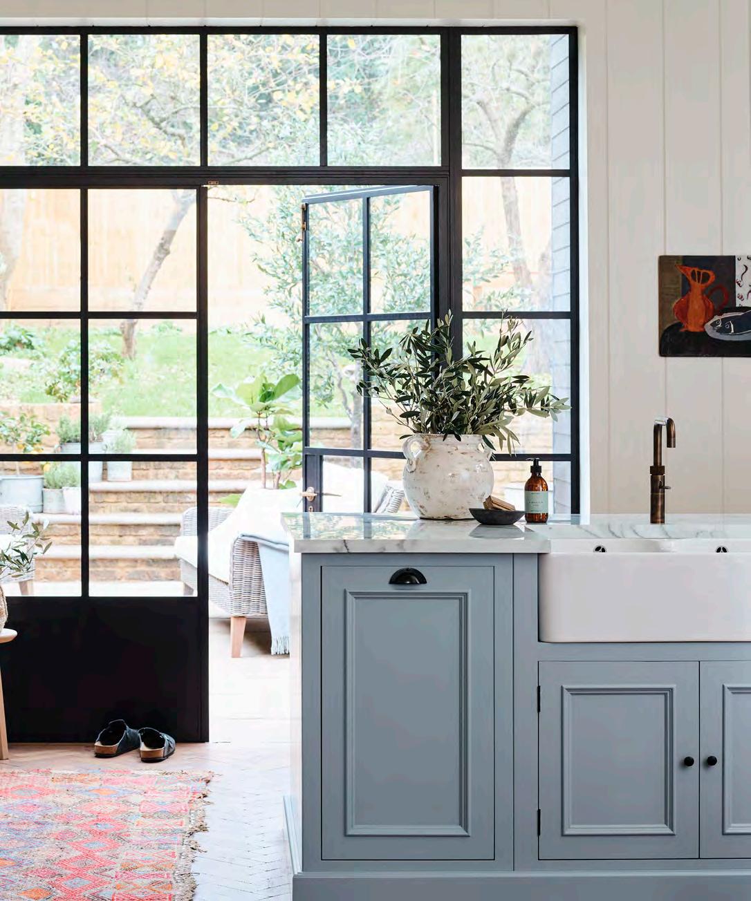
The island sits right in the middle of the room’s floorplan. The modern kitchen island is an evolution of the wooden preparation table which held pride of place in the working kitchens of the 18th and 19th centuries. This is where vegetables were chopped, desserts perfected, and plates loaded up ready for serving. Today’s island is used for food preparation, too, but it’s also a social hub –somewhere to sip your morning coffee or get some work done. This one has a traditional butler’s sink, carefully positioned so you can gaze out of the Crittal windows while doing the washing up.
Next came the all-important cosmetic decisions. We used our archival Flax Blue shade for the cabinets, offset by neutral Shell on the boarded walls and cabinet interiors. Blue-painted kitchens are commonly seen as a modern, stylistic choice, but this is a misconception. Sky blue shades were a popular choice in old kitchens to create a cool airiness amidst the hustle and bustle of cooking and preparing food. Blue paint was also hailed as an effective insect repellent – whether because of the heavy dose of lye in its composition, or because flies mistook it for the sky, is up for debate.
This, then, is a kitchen of juxtapositions; from the rich black-bronze hardware that offers a welcome contrast to the lightness of the Flax Blue cabinetry, to the sleek silhouette of an industrial style tap paired with a timeless butler’s sink. This is a hard-working kitchen, one that exemplifies the need to marry form with function – and beauty – in our interiors. And it’s also proof that while our lives have evolved considerably from those of our ancestors, they can still teach us a thing or two about kitchen design.
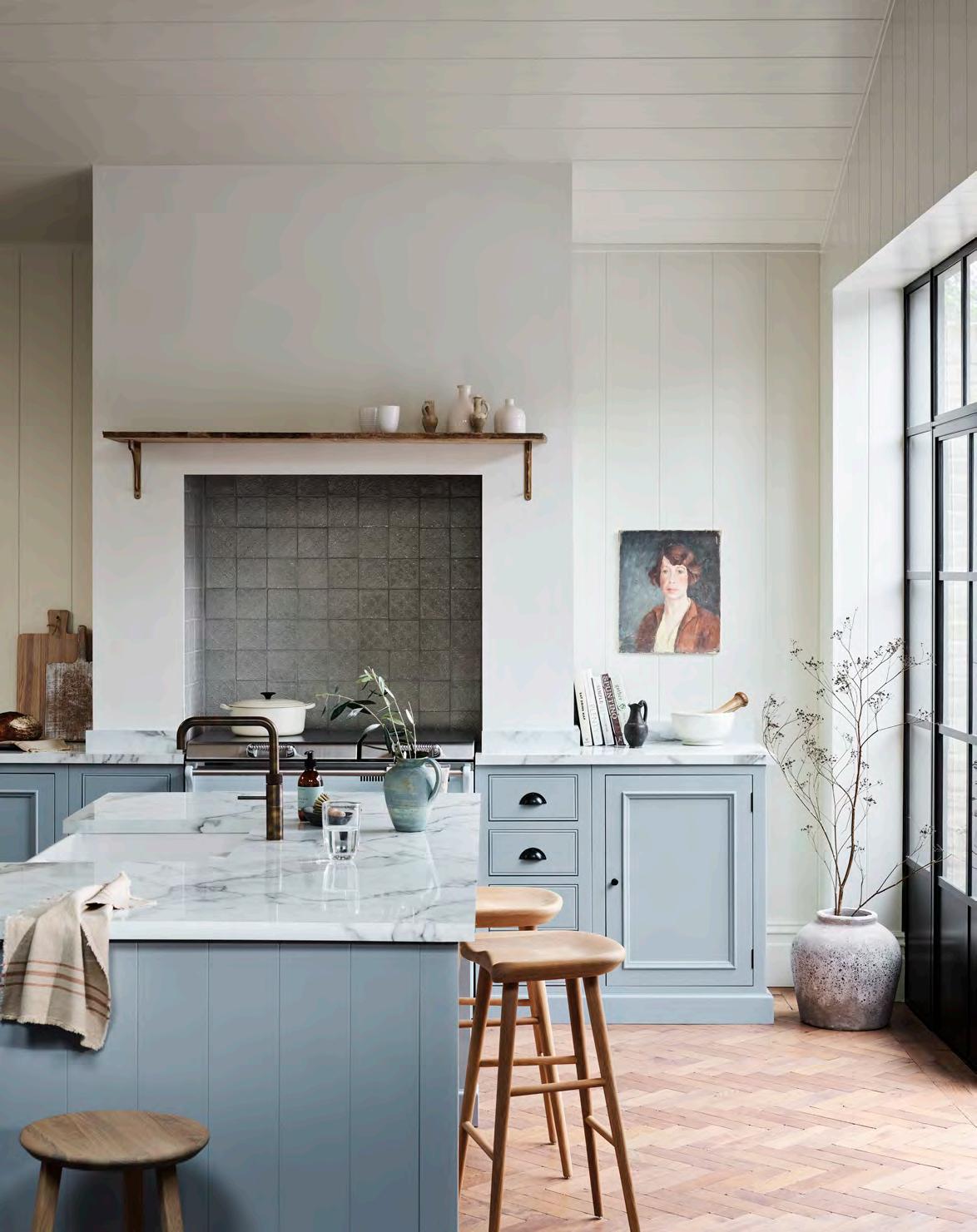
1. Natural stone
Marble was originally used on prep tables for making pastry and chocolate due to its cooling properties. Natural stone is not only very strong, but aesthetically it brings decorative colour and pattern to kitchens.
2. Solid timber
Wooden surfaces have long been used in kitchens for chopping blocks and preparation tables. We find that oak is an excellent choice for worktops due to its reassuring strength, beauty, and tactility.
3. Engineered quartz
We recommend looking to engineered materials like Silestone or Dekton for the look and feel of natural stone, with the added qualities of high scratch-resistance and low porosity.
To start designing your Neptune kitchen, visit us in store or online to book your first, free consultation.
‘SERVICE’ HOLDS TWO MEANINGS AT NEPTUNE: UNIQUE DESIGN SERVICES AND EXCELLENT CUSTOMER SERVICE. CEO AALISH YORKE-LONG TELLS US WHY BOTH ARE SO IMPORTANT TO HER.
Can you start by reminding us of the different design services Neptune offer?
Yes, we’ve got a Kitchen Design Service, which comes with full project management support, and a Home Design Service, which focuses on interior design and soft furnishings. We also have our colour consultancy, which helps customers use our palette of paint colours in their homes. And, most recently, we launched Neptune Trade, which offers tailored support to design professionals.
As part of the kitchen design process, we offer a bespoke service for customers who need certain design details resolved. That workshop, based in Wiltshire, also repairs any damaged or returned goods, which makes a huge difference in terms of sustainability. We are proud that 98% of our returned items go back to ‘good stock’ thanks to that service. And it supports our 100year vision, which aims to create less waste. Being able to repair items and get them back out to customers, in perfect condition, is important to us.
Why are services such an intrinsic part of the Neptune experience?
We’ve been in business for 26 years, and during that time we’ve built up a huge amount of design experience. Our services allow us to share that knowledge with customers. We help people work with what they’ve already got – antiques they’ve inherited, or vintage pieces they’ve sourced – then introduce our designs to work alongside them.
What do customers say about the design services?
Check out Trustpilot! We’re rated at 4.5/5 which is quite unique for a business of our complexity. As well as the product, the reviews call out our teams and individuals by name; be it the designer, the driver, or the kitchen installer. They paint the picture that we’re not just dropping a product in your home, we’re offering a complete service and put love and attention into every part of that process.
You joined Neptune in 2022, what has struck you most about the services available?
The kitchen design and installation process has opened my eyes to the importance of working with experts. There are so many stages to a kitchen installation, and so many places where it could go wrong if you don’t work with experts. We have a rigorous process in place that includes visiting your house 12 weeks before installation to do final measurements and checks. We also appoint Installation Project Managers, whose job it is to make sure the project is seamless and stress-free for the customer. Understanding the thought and care that has gone into developing our kitchen service has been fascinating.
What service would you like to introduce next?
Refurbishment is something I’m particularly interested in. It comes back to our 100-year vision; we want customers to buy once and buy well. But we’re also aware that customers might want to reimagine a kitchen or item at a later date – to help them do that is an ambition of mine.
The concept of service is at the heart of Neptune’s retail approach. What does good service look like to you?
For me it’s easy, it is making an experience personal, which comes down to people and human interaction. That, and removing the friction and stress from a customer’s busy life. Both of which I hope we deliver.
Is there such a thing as over-service?
Well, personally I get upset when brands text me, as that feels more private, but it depends on the individual. We like to give people the option to choose the level of service they receive from us. At our stores, customers are welcomed with a smile, offered a drink, and allowed to browse, but the key role of our teams is to explain why our materials and designs are so impressive. I believe genuine service is altruistic, it shouldn’t feel transactional; rather, we offer it because we love what we do.
How does Neptune resolve issues when they occasionally arise?
In those situations, we stand by our values – to do the right thing and to do it together. We want to put things right as quickly as possible. And to do that, we need the support of the customer to tell us what’s gone wrong and work with us to make it better.
How do you deliver good service to the online-only customer?
You can be clever with visitor recognition mechanisms, but for me, good online service is the human touch – it’s about removing some of the automation and making it easy to reach someone on the end of the phone.
Can a customer’s experience of service influence the reputation of a business?
They are intrinsically linked; reputation is what customers think of us, which is driven by the service they receive. At Neptune, we don’t give good service to build reputation – it’s a by-product – but I hope our reputation is enhanced by the effort we put into looking after our customers.
Journalist Jo Rodgers delves into the hidden depths of the horse chestnut’s rich history.
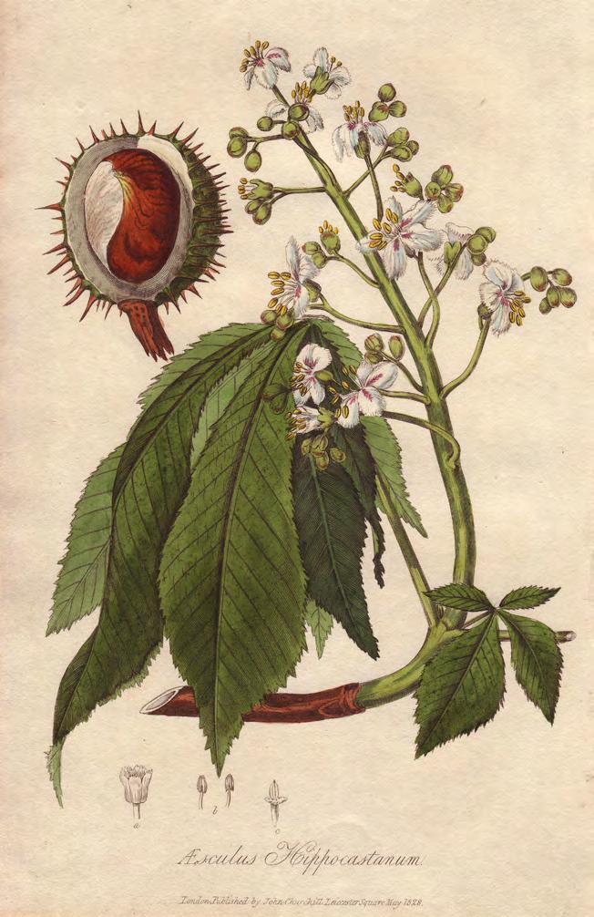
Horse chestnuts are not a lot of help to us when you get down to it. Unlike sweet chestnuts, you can’t eat them – although the Victorians did try grinding them into a (poisonous) flour. There’s a cosy myth that if you sock them away in the corners of your house, squirrel-like, they will discourage spiders, but this has never been proven. Ditto their powers against rheumatism. They have, however, been used to make a homespun laundry detergent. This is probably the summit of their practical use.
In 1917, puzzling notices sprung up on school bulletin boards across the country regarding conkers. It was autumn, the usual mists were rolling in, and children were encouraged by the Board of Education to do what they would do any other year: collect the glossy nuts (spiky green shells removed, please). In exchange for rummaging, they would be paid seven shillings and a sixpence per 50kg by the Ministry of Munitions. No reason was offered. It was the First World War, and this exercise was described on posters as ‘invaluable war work.’

Over 3,000 tonnes of horse chestnuts were picked out of the grass and carted to under-the-radar factories. Unbeknownst to the foragers, the conkers were being processed into acetone, which in turn was used to make cordite, an explosive. They were a wartime substitution for maize and, alas, a poor one, with bags of rotting chestnuts spotted on station platforms. By 1918, children returned to using them for games, which brings us to their true and undisputed function.
Conkers the game — for those who haven’t experienced it — involves poking a string through the nut (make a clean hole with a skewer first) and tying a knot at the end. Precise rules vary, but in most instances your opponent dangles their conker from a string and you try to knock it with yours, which is hanging from its own string. And so it continues, back and forth, until one conker cracks and the other emerges triumphant, ready to face a new challenger.
Cheaters have been known to boil their horse chestnuts, which hardens them. At the World Conker Championships, held annually in Northamptonshire on the second Sunday in October, competitors must draw their chestnuts from a communal bag provided by the organisers. You are allowed to refuse up to three conkers before being compelled to settle.
The days are shortening, and the cold is sharpening. The ground is covered with irresistible, good-for-nothing conkers. Never mind about the laundry –why not have a bash?
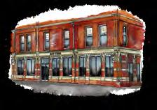

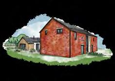

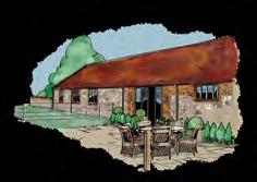
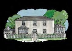

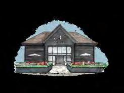

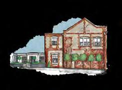
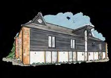
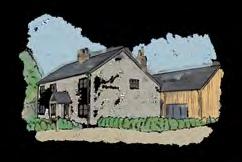
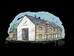
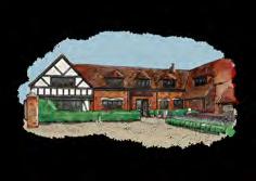

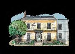

Our stores are spaces to relax in, just as you would in your own or a friend’s home. They are inspirational places, too, thoughtfully curated to showcase our approach to design.
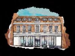
So, while we hope you enjoy looking through this volume of Stories, we look forward to meeting you in person, too. Find your nearest store neptune.com/our-stores