

Brand Toolkit
REVISED OCTOBER 2024

NEC’s Flagship Brand 4
Icon & Marks
Icon 6
Wordmark 7
Lock-up Variations 8
Clear Space & Size 9
Heirarchy Map 10
Tertiary Identity & Usage 11
Misuse of Icon 12
Photography
Vision 14
Archive 15
Flagship Color
Inspiration 16
Primary Colors 18
Support Colors 19
Icon Colors 20
Flagship Typography
Sentiniel 22
Gotham 23
Digital Brand 24
Digital Color
Digital Support Colors 26
NEC Prep 27
Digital Typography
PP Fragment Glare Light 30
Aktiv Grotesk 31

NEC’s Flagship Brand

Icon and Marks
Icon
The mark is created using a customized weight of the sans serif font Kyrial. The line weights are relational to the letters to provide rhythm and balance.

Wordmark
The wordmark is built using the font Kyrial and can be used individually or locked-up with the icon. See examples on page 8.

Icon and Marks
Lock-up Variations
The intention is that the logo mark and the name appear on one page or view, but the scale and lock-up may vary. We have shown a few of those variations.
Clear Space and Size
The wordmark and icon should be isolated from competing text, images and graphics by surrounding it on all sides by an adequate amount of clear space that is equal to the height from the upper line to the top of the 'N'. To ensure legibility, minimum sizes are provided for print and digital use.
Clear space


The NEC Seal
The NEC seal is reserved for specific uses such as presidential communications, transcripts, diplomas, and legal documents, and it can only be used with the express written permission of the President's Office.


Icon and Marks
Hierarchy Map
Schools
Expanded Education
Divisions
Office of Student Services
Community Engagement + Professional Studies
Preparatory School
Office of Student Services
Departments & Programs
Projects within departments & programs
No logo - program name should be included in text
Tertiary Identity and Usage
Entrepreneurial Musicianship
These identifying wordmarks use Kyrial to echo the clean look of the main NEC brand. The vertical line anchors the wordmark and also ties back to the main brand. These would always be used in tandem with the school's or division's NEC logo mark. They should be placed separately on the layout and not become too “locked-up”. A headline/program image should be the dominant design focus, with the marks as supporting elements.
Entrepreneurial Musicianship
Entrepreneurial Musicianship
Icon and Marks
Misuse of the Icon
Do not alter the icon or marks in any way. Avoid physical distortions and special effects such as drop shadows. Below are some examples of misuse.
AB. C. D. E. F.
G.
H.
I.
J. K. L.
M.
Use other color than the primary and secondary palette
Combine the colors
Use a color gradient
Apply a drop shadow
Change the font
Warp the logo
Rotate the logo
Stretch the logo
Place the logo on a gradient background
Change the placement of the wordmark
Outline the logo or the wordmark
Lock up other graphic elements with the logo
Lock up wordmark with the logo
L.
Entrepreneurial Musicianship
Entrepreneurial Musicianship
M.
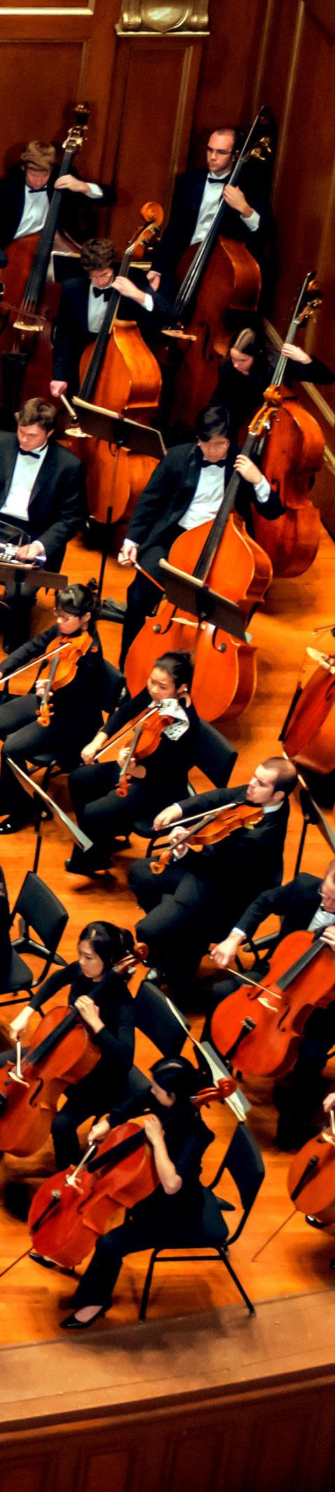
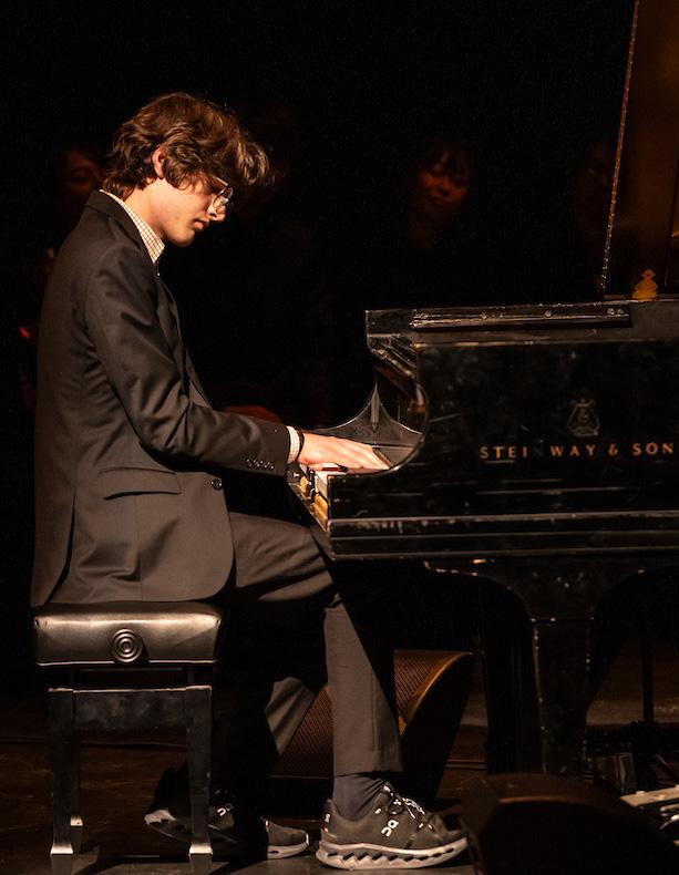
Photography
Vision
Capture NEC’s dynamic spirit, from spontaneous, action-driven moments to moody, dramatic shots. Whether showing students deeply engaged in learning or faculty passionately teaching, the focus is on authentic energy using natural light and genuine expressions. Every shot should reflect NEC’s sophisticated and creative essence. Focus on the technical aspects—composition, color, and narrative—to convey the intensity of performances or the quiet dedication during practice. Showcase the diverse NEC community across ages, backgrounds, and roles. Group shots should feel natural and connected, highlighting the inclusive, collaborative environment. Ensure high-resolution, top-quality imagery fit for all mediums. Attention to clarity, composition, and consistency is key to upholding NEC’s cohesive visual identity in both digital and print formats.


Archive
The NEC photo archive is a comprehensive resource that documents the rich history and vibrant life of the New England Conservatory. Organized by categories such as Campus Life, Concerts, Faculty, Preparatory School, Summer Programs, and Video Essentials, this archive spans multiple years and events, providing a visual timeline of NEC’s legacy. It serves as an invaluable tool for maintaining visual consistency, allowing for the selection of images that align with the institution's style and tone.


Color

Inspiration
The gold is inspired by the warm color and light found throughout the conservatory, in Jordan Hall, in the wood and brass instruments, in the light of a concert, and now on the facade of the Student Life and Performance Center.

Flagship Color
Primary
Evoking the warmth and glow of Jordan Hall, the gold is complemented by a deep plum. Together, they provide a vibrant and upbeat palette that is at home in both classical and contemporary environments and applications.
PMS 124 C
CMYK* 0 30 100 0
RGB* 234 170 0
HEX #eaaa00
* RGB and CMYK value may need to be adjusted for web and print based on technology and printer specifications. Always test color before production.
PMS 669 C
CMYK* 87 97 8 49
RGB* 63 42 86
HEX #3f2a56
Support
These colors support the primary colors. Avoid over ‘colorizing'; instead choose one or two colors that best support the application.
† For CMYK prints, decisions about black ink usage depend on the specific requirements of the project, printer capabilities, and paper type. It is always a good idea to consult with the printer for their recommendations.
PMS 7599 C
CMYK* 1 85 92 19
RGB* 179 61 38
HEX #B33D26
PMS 634
CMYK* 95 0 0 62
RGB* 0 102 130
HEX #006682
PMS 7711
CMYK* 90 3 24 5
RGB* 5 158 168
HEX #059EA8
PMS 7452 C
CMYK* 55 37 0 0
RGB* 128 148 221
HEX #8094dd
Black 85%
CMYK*† 0 0 0 85
RGB* 38 38 38
HEX #4c4c4e
Black
CMYK*† 0 0 0 100
RGB* 0 0 0
HEX #000000
Flagship Color
Icon
The primary icon and wordmark colors are gold and dark plum but may also be used in support colors as appropriate. The logo can also be dropped out of any solid color from the color palette and photography.
* The black logo should be used for black and white printing only.


Flagship Typography
Sentinel
Sentinel is a fresh take on a familiar and practical typographic genre. A well-rounded family with clear and expressive gestures, the self-possessed Sentinel is practical at small sizes and engaging at large ones.
Aa
Aa Bb Cc Dd Ee Ff Gg Hh Ii Jj Kk Ll Mm
Nn Oo Pp Qq Rr Ss Tt Uu Vv Ww Xx Yy Zz
0 1 2 3 4 5 6 7 8 9 . ? ; ( ) ! @ # $ % &
Body Text
Lorem ipsum dolor sit amet, consectetur adipiscing elit, sed do eiusmod tempor incididunt ut labore et dolore magna aliqua. Ut enim ad minim veniam, quis nostrud. lorem ipsum dolor sit amet,consectetur adipiscing elit,sed do eiusmod tempm, quis nostrud. lorem ipsum dolor sit amet,consecor incididunt ut labore et dolore magna aliqua. Ut enim ad minim veniam, quis nostrud.
Lorem ipsum dolor sit amet, consectetur adipiscing elit, sed do eiusmod tempor incididunt ut labore et dolore magna aliqua. Ut enim ad minim veniam, quis nostrud. lorem ipsum dolor sit amet,consectetur adipiscing elit,sed do eiusmod tempor incididpm, quis nostrud. lorem ipsum dolor sit amet,consunt ut labore et dolore magna aliqua. Ut enim ad minim veniam, quis nostrud.
Sentinel is typically used in a headline or a heading before body text. The web-safe Google equivalent for this font is Lora.
Gotham
Aa
Aa Bb Cc Dd Ee Ff Gg Hh Ii Jj Kk Ll Mm
Oo Pp Qq Rr Ss Tt Uu Vv Ww Xx Yy Zz 0 1 2 3 4 5 6 7 8 9 . ? ; ( ) ! @ # $ % &
BodyText
Lorem ipsum dolor sit amet, consectetur adipiscing elit, sed do eiusmod tempor incididunt ut labore et dolore magna aliqua. Ut enim ad minim veniam, quis nostrud. lorem ipsum dolor sit amet,consectetur adipiscing elit,sed do eiusmod tempm, quis nostrud. lorem ipsum dolor sit amet,consecor incididunt ut labore et dolore magna aliqua. Ut enim ad minim veniam, quis nostrud.
Lorem ipsum dolor sit amet, consectetur adipiscing elit, sed do eiusmod tempor incididunt ut labore et dolore magna aliqua. Ut enim ad minim veniam, quis nostrud. lorem ipsum dolor sit amet,consectetur adipiscing elit,sed do eiusmod tempor incididpm, quis nostrud. lorem ipsum dolor sit amet,consunt ut labore et dolore magna aliqua. Ut enim ad minim veniam, quis nostrud.
A geometric sans-serif typeface family. From the lettering that inspired it, Gotham inherited an honest tone that’s assertive but never imposing, It has many different weights and is very versatile. Gotham is typically used in a headline or body text. Aktiv is typically used in body text. The web-safe Google equivalent for this font is Poppins.

NEC’s Digital Brand

Digital Color
Digital Support Color
Note: RGB and CMYK value may need to be adjusted for web and print based on technology and printer specifications. Always test color before production.
PMS 124 C
CMYK 0 30 100 0
RGB 234 170 0
HEX #EAAA00
PMS 663 C
CMYK 0 1 4 0
RGB 255 253 244
HEX #FFFDF4
PMS 7499 C
CMYK 0 3 8 2
RGB 249 242 228
HEX #F9F2E4
PMS 7579 C
CMYK 16 89 99 5
RGB 198 64 40
HEX #C64028
PMS 188 C
CMYK 0 85 79 51
RGB 125 19 26
HEX #7D131A
PMS 5435 C
CMYK 31 21 0 20
RGB 140 162 204
HEX #8CA2CC
PMS 124 C
CMYK 0 25 73 29
RGB 182 137 50
HEX #B68932
PMS 1245 C
CMYK 0 31 91 42
RGB 147 102 13
HEX #93660D
PMS 426 C
CMYK 0 4 0 91
RGB 58 51 41
HEX #3A3329
PMS Black 6 C
CMYK 0 4 4 91
RGB 24 23 23
HEX #181717
NEC Prep
The NEC Prep brand is represented by a unique shade of blue, specifically designated for NEC Prep. This color should be exclusively used in association with NEC Prep to maintain brand consistency and recognition.
PMS 5405 C
CMYK 42 28 0 38
RGB 92 115 159
HEX #5C739F

Digital Typography
Pp Fragment Glare
A modern digital font characterized by its sharp angles and fragmented design, making it perfect for cutting-edge digital projects and creative displays that demand attention.
Aa
Aa Bb Cc Dd Ee Ff Gg Hh Ii Jj Kk Ll Mm Nn Oo Pp Qq Rr Ss Tt Uu Vv Ww Xx Yy Zz
0 1 2 3 4 5 6 7 8 9 . ? ; ( ) ! @ # $ % &
Headline
Lorem ipsum dolor sit elit
PP Fragment Glare is typically used in a headline or a heading before body text. The web-safe Google equivalent for this font is Marcellus.
Aktiv
A versatile and contemporary digital font, Aktiv is known for its clean lines and balanced proportions. This typeface offers a sleek and professional appearance, making it ideal for a wide range of applications and ensuring clarity and readability in any context.
Aa
Aa Bb Cc Dd Ee Ff Gg Hh Ii Jj Kk Ll Mm Nn Oo Pp Qq Rr Ss Tt Uu Vv Ww Xx Yy Zz
0 1 2 3 4 5 6 7 8 9 . ? ; ( ) ! @ # $ % &
Body Text
Lorem ipsum dolor sit amet, consectetur adipiscing elit, sed do eiusmod tempor incididunt ut labore et dolore magna aliqua. Ut enim ad minim veniam, quis nostrud. lorem ipsum dolor sit amet,consectetur adipiscing elit,sed do eiusmod tempm, quis nostrud. lorem ipsum dolor sit amet,consecor incididunt ut labore et dolore magna aliqua. Ut enim ad minim veniam, quis nostrud.
Lorem ipsum dolor sit amet, consectetur adipiscing elit, sed do eiusmod tempor incididunt ut labore et dolore m
Aktiv is typically used in body text. The web-safe Google equivalent for this font is Lato.
