

ARTS2190: Introduction to Graphic Design
Winter 2024


Winter 2024
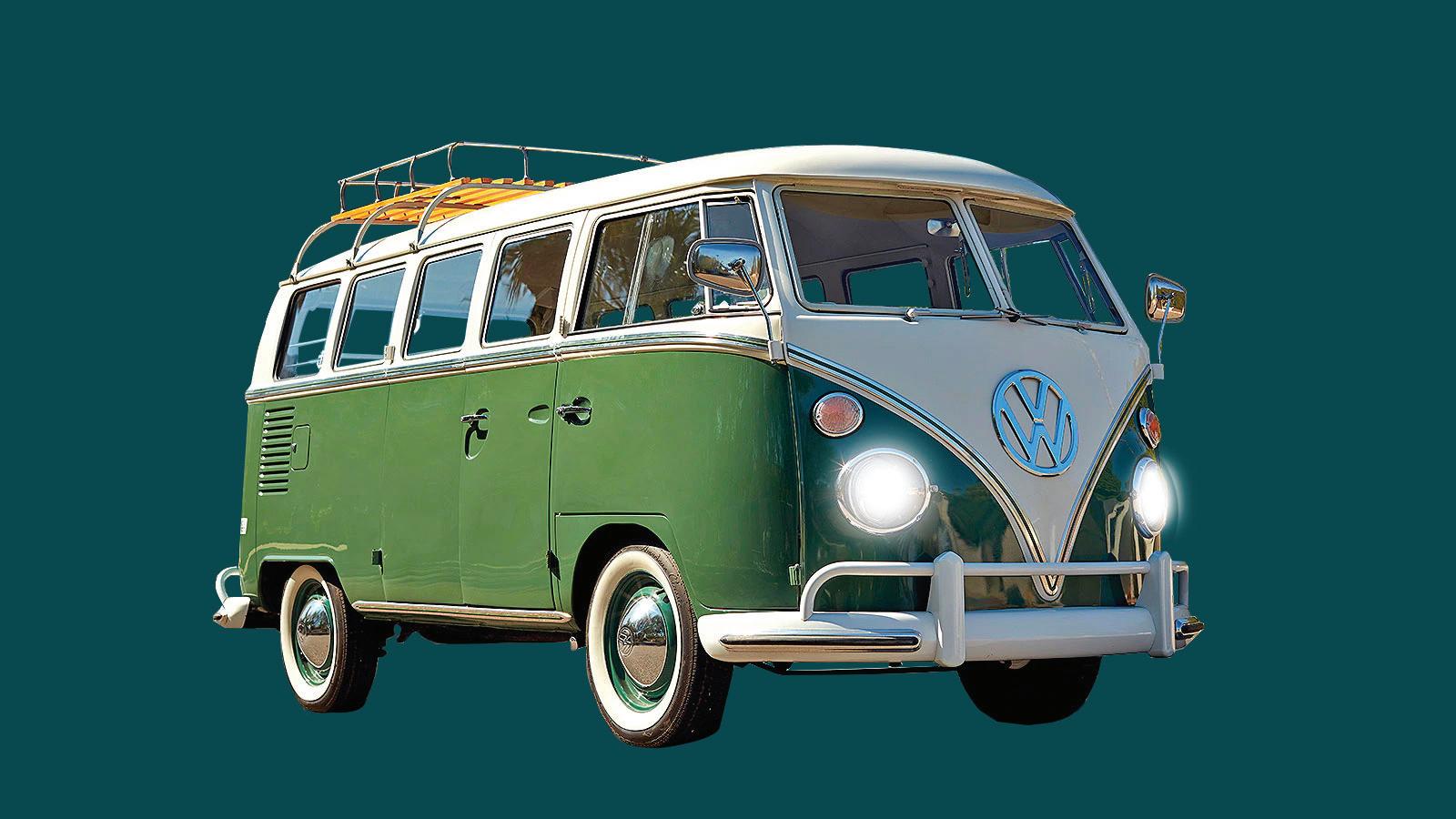
So the image above is the for the assignment I did using the pen selection tool. I used the pen tool to trace a rough outline of the mini van and then I went in and edited the anchor points and segments to get a more precise selection. After that I made selections of the windows inside that showed the background. I used the options bar and excluded the interior window selection and the little pieces around the van from the main selection of the entire van. I masked it, then added a blue background that works well with the color of the minivan since I used the eyedrop tool to get a color on the van. I lastly added white soft paint on the headlights of the minivan to get rid of the reflection of the previous background and also to give it the effect of it being on.
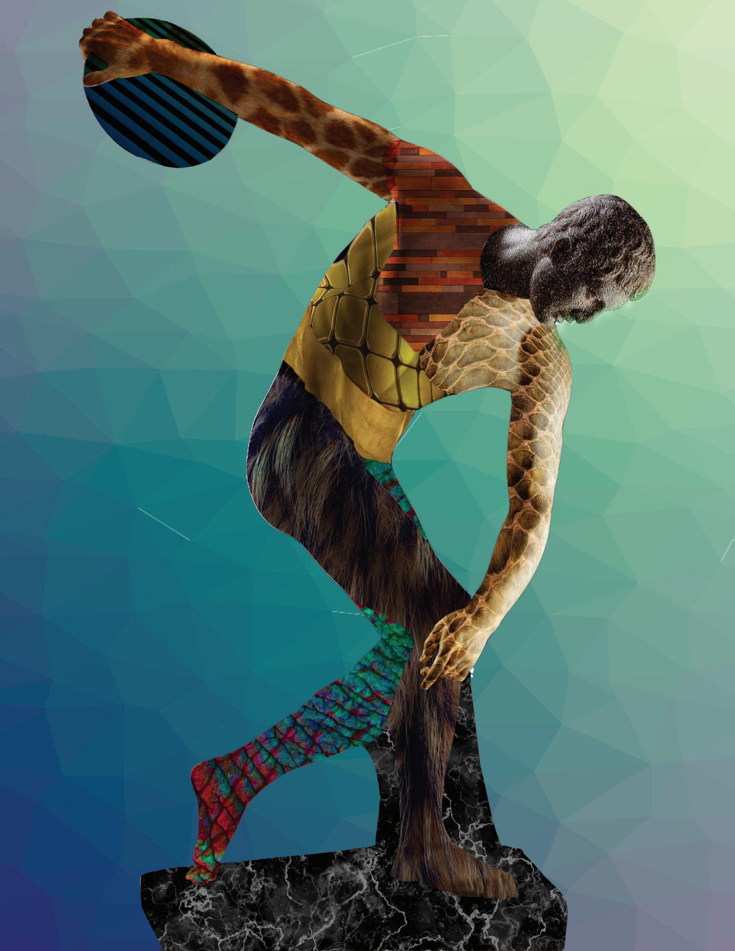
Beside is my artwork, where I created textures on a statue, I choose David, with vector masks, blending modes, and adjustment layers. I really feel that I did a good job on this piece and gave me the opportunity to learn about many features on photoshop. I found that my favorite blending mode is multiply because it gives it a realistic look to it. Another tool I used to make it look realistic to the original statue was the warp tool, which I like using the 3x3 grid because you can manipulate the way it looks easier. It was a very repetitive process and it helped me solidify the process of vector masks.
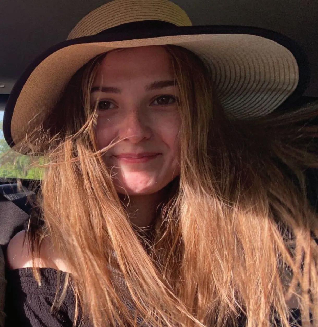
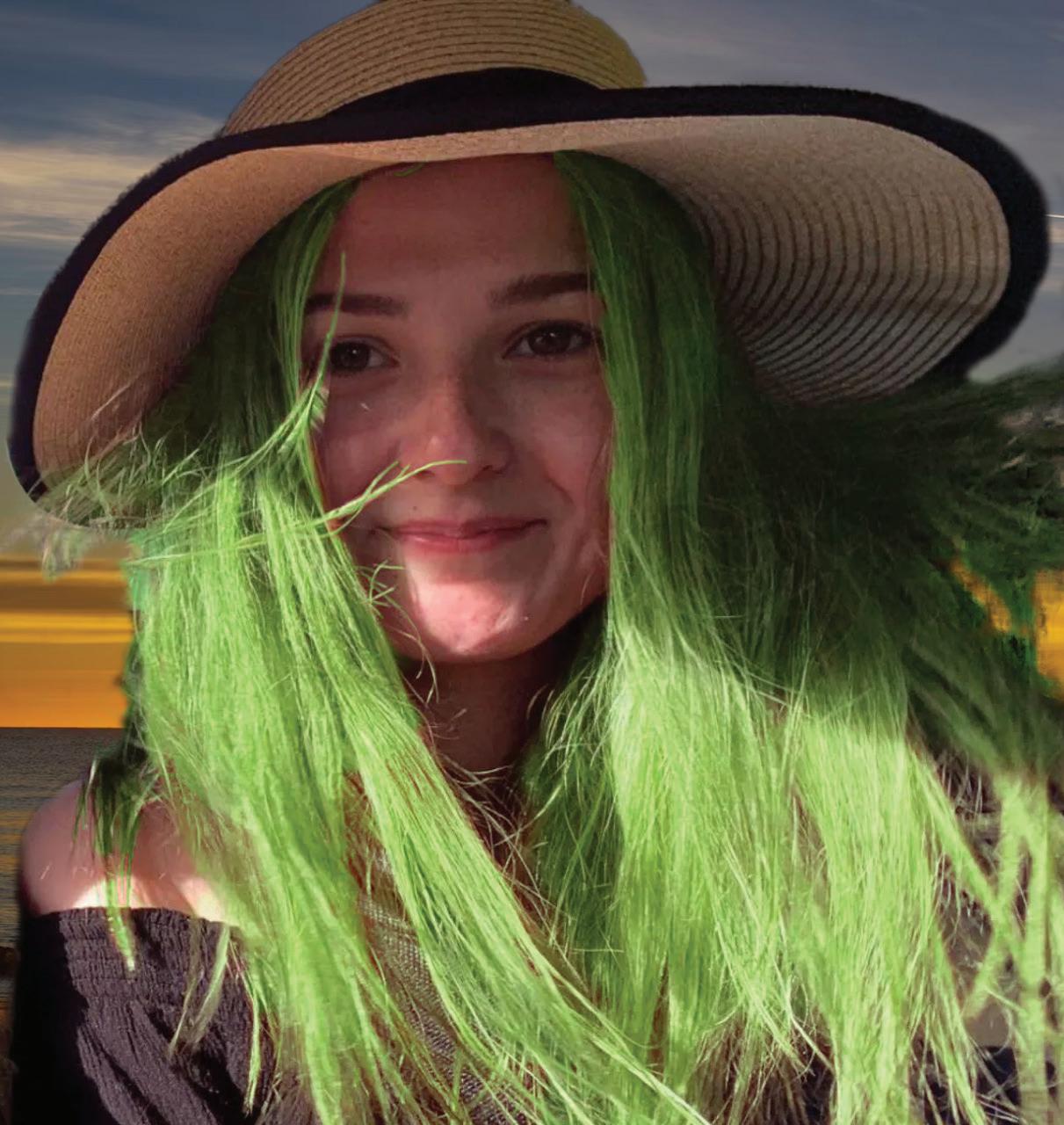
I used multiple types of selection tools to manipulate an image to change features like the hair and background. For my image, I choose a picture of my cousin where I used the quick selection tool to get a rough draft of her hair. Then I went in with the lasso tool to get some of the thinner pieces that weren’t detected by the quick selection tool. Lastly, to get the selection of the hair, I used the select and mask features which gave me access to tools such as the refined edge brush tool and brush tool that made a pretty accurate selection of the hair as a whole. After getting the selection, I used a hue/saturation adjustment layer to turn the hair green. Our next task was to find a background, download it, open it as a new layer, and then use the select and mask to get a selection that allowed the person and hair to
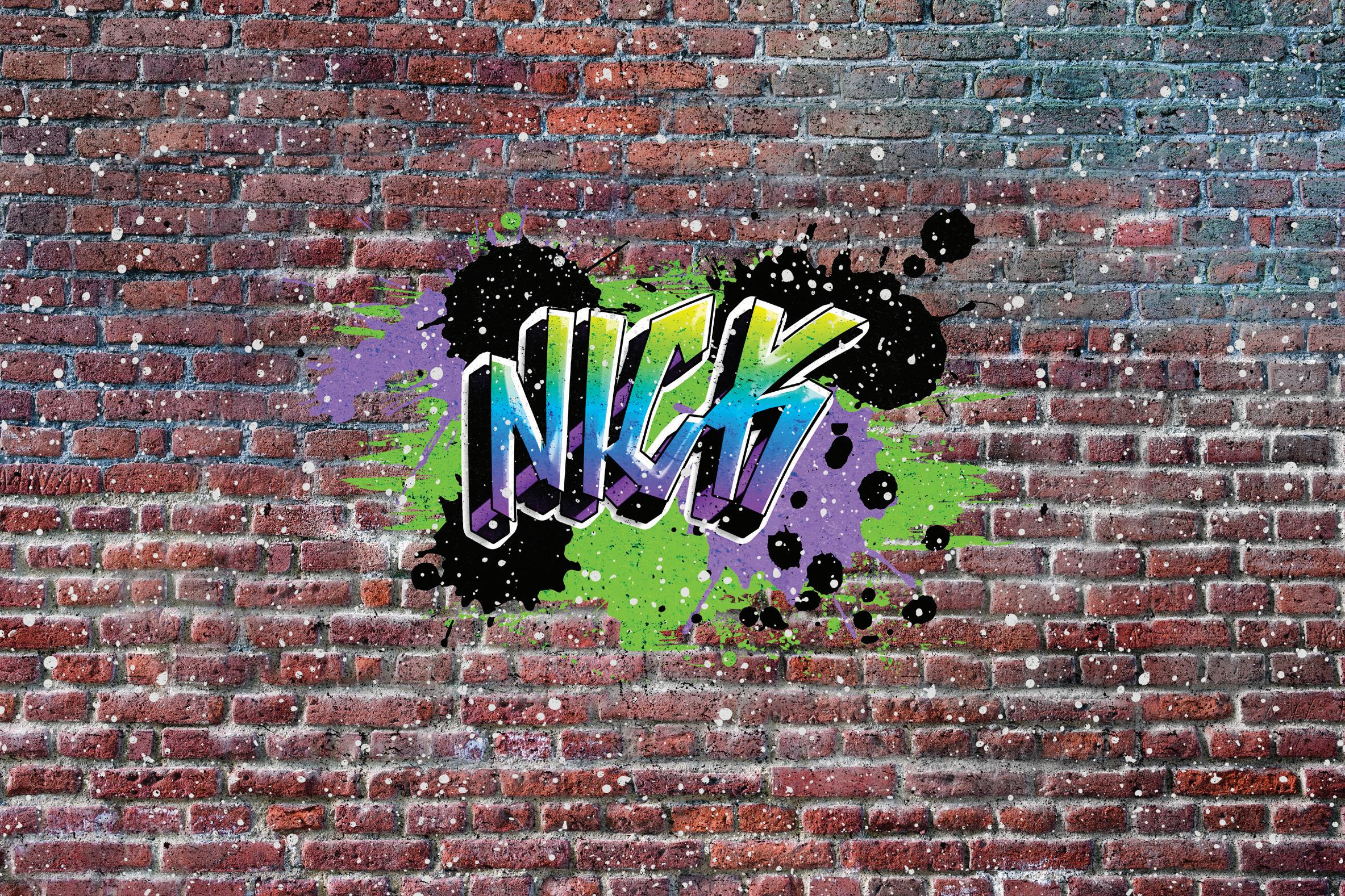
I did the graffiti wall assignment, where we learned retouch tools in photoshop and made a brick wall with windows and curved tiles into a plain brick wall with graffiti. I mainly used the clone stamp tool to get rid of the windows and unwanted tiles, but to make it look more realistic, I went in with other tools like the burn, sponge, heal brush, dodge, etc. I wanted to make a non destructive layer that I can mess with, so I started by adding a layer and then working with the clone stamp tool till I got the selection I wanted. Next I merged the layers and then used the other retouch tools. After that I followed the YouTube tutorial, which used blending effects and layers to create the graffiti effect on top of the wall.
Last week I used the pen tool to trace a more complex cartoon character in Adobe Illustrator. I choose scar from the lion king because I feel he has enough complexity to challenge me, but isn’t overwhelming. I mostly switch between the curvature pen tool and the pen tool to create the vectors. The curvature pen tool was nice to use as I feel it has the direct selection tool and pen tool abilities in the one tool alone. I also like how you can easily transition between the anchor point styles, smooth and corner. I did constantly switch between the two pen tool as I feel each one was more beneficial for certain shapes. When I filled in the color, I messed with how it would look as I used gradients in some areas, and the shade in the middle was a gaussian blur to give the two dimensional shape more
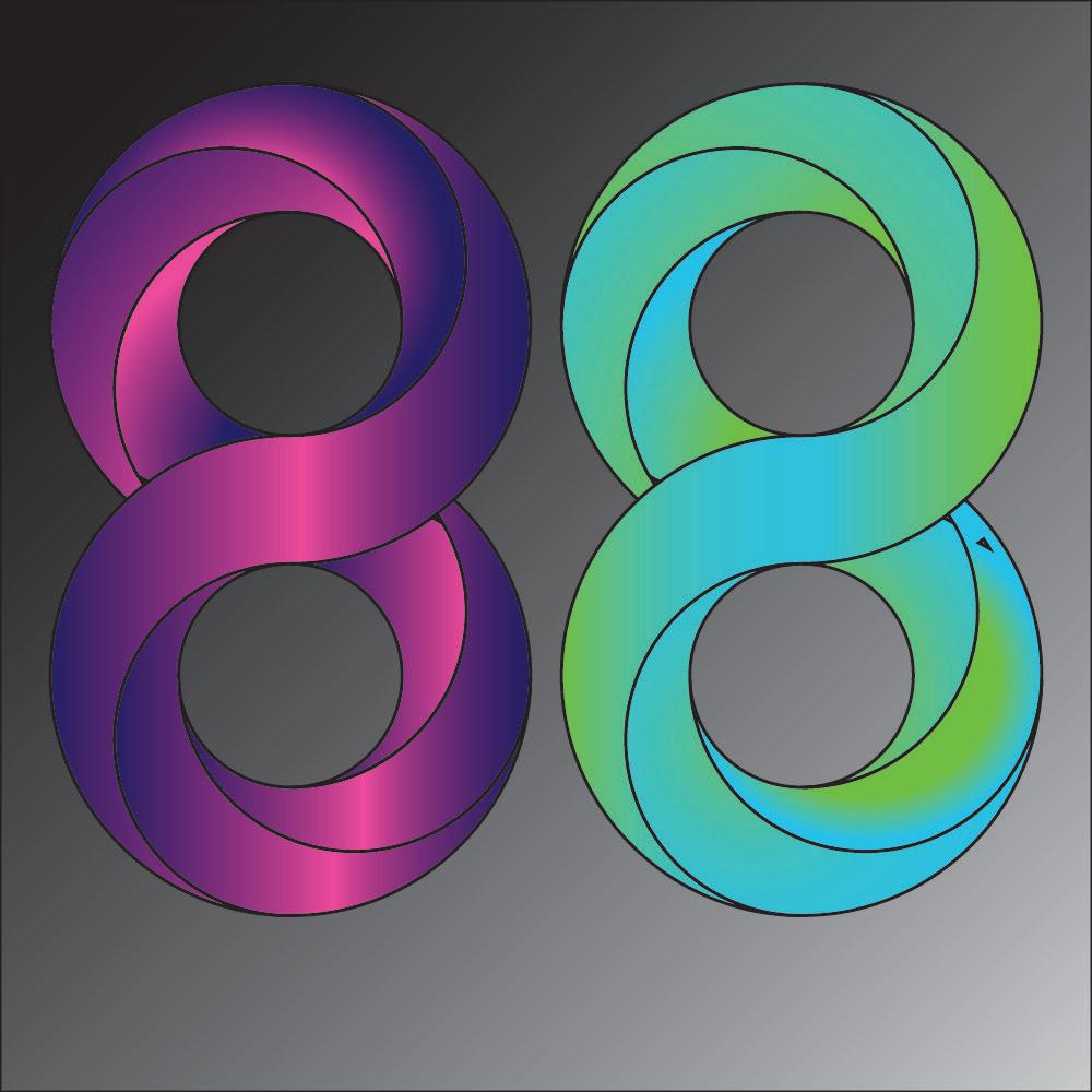
I created two specifically designed 8’s in Illustrator. I actual found this to be very interesting as it really challenged my abilities and skills using the Adobe illustrator software. Some tools we used was the shape builder, ellipse tool, and gradients to create the product of this assignment. The shape builder tool allowed you to subtract and add separate fragments of overlapped shapes to each other. We worked on this tool for a bit and I feel pretty comfortable using this item. The ellipse tool is pretty basic, all you really have to remember is that if you want a even width and height, all you have to do is press shift and drag over the canvas. We used smart guides to help get the circles perfectly even, whether it was horizontal or vertical. Then the tool I had a hard time with was the gradient tool that merges more than two colors together in multiple ways. Hopefully I can practice this tool more in the future to the point that I feel comfortable using it.
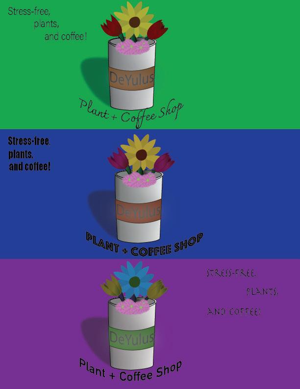
This project consisted of making an original logo design with three slightly different variations in Adobe Illustrator. I found this assignment very helpful to get comfortable with Adobe Illustrator as it taught me a lot about the application. One concept I feel I improved on was messing with Gradients, as I used it on the cup and floor to create shadows to give the logo more depth. I finally applied color swatches in this work too and it really helped me compared to how I was trying to use color before. A new concept to me was the Recolor tool, which allowed you to change the entire color of a piece, giving you multiple variations of the same thing.
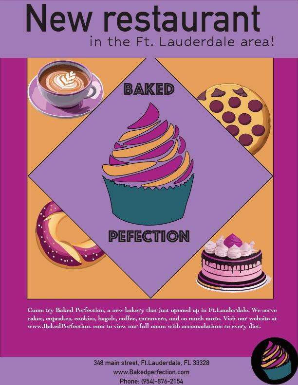
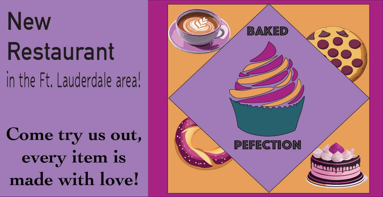
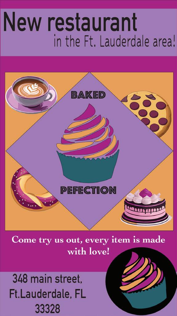
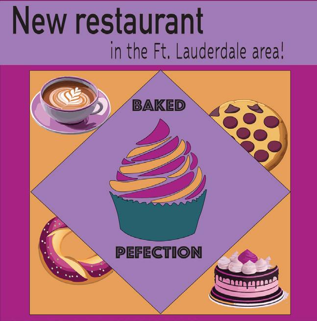
This is a campaign magazine ad for a restaurant, which I choose a bakery, and then we created other boards to create similar ads with the same elements on different medias. The medias we use was for a magazine, facebook, two different instagram posts styles, and a google search type up. This was the first time ever using art boards and it honestly was a easy process. Another new feature I was introduced to was the text to vector graphic, which I found intriguing as it used AI to give you an image based on a desired prompt and type of style of your work.
I think it is good to finally start using generative AI as it is a completely foreign concept to me. I liked the overall design I made as it was close to what I imagined in my original design.
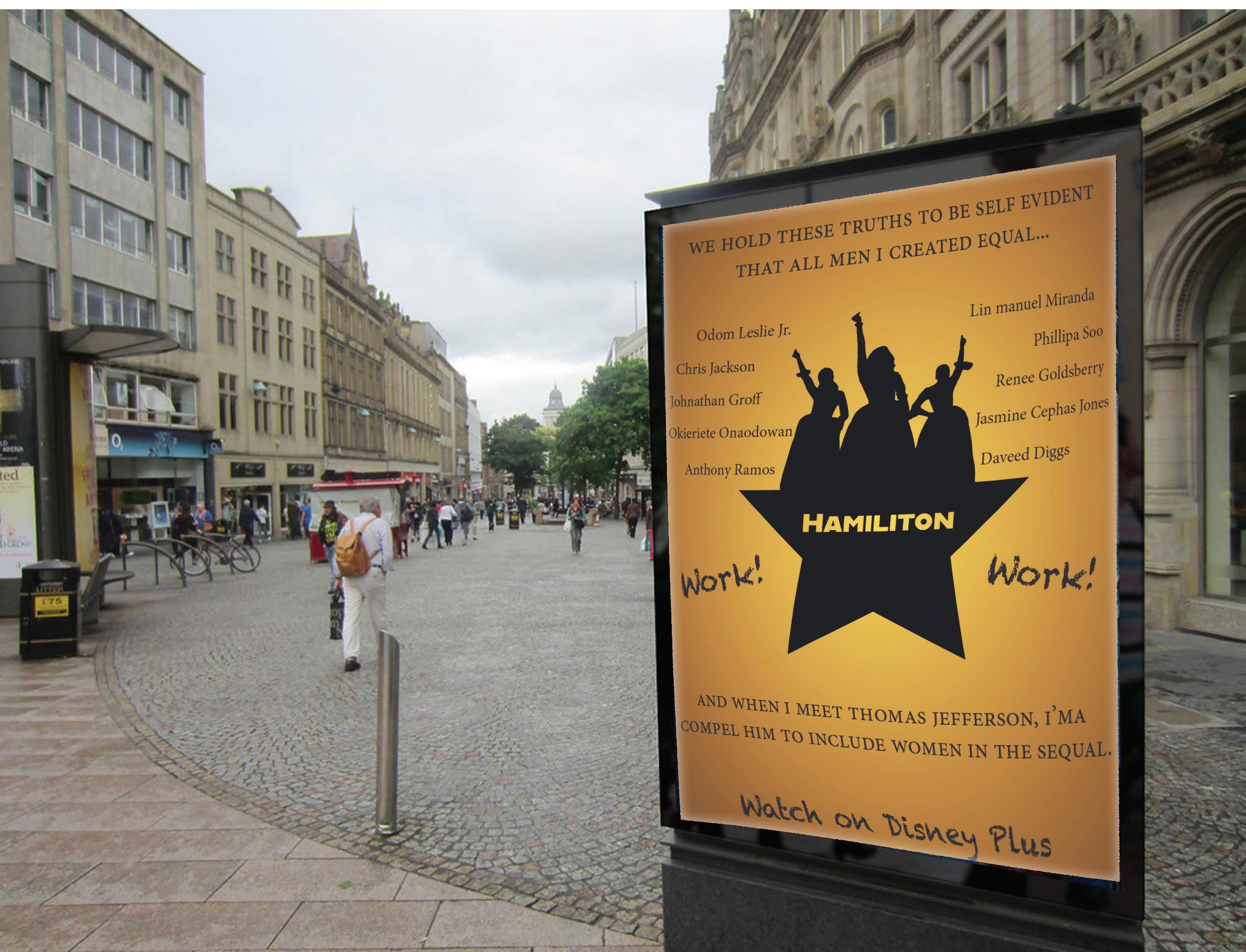
I created a movie poster using Indesign with elements that were produced in Illustrator and photoshop as well. This was a bit challenging of an assignment to as InDesign is a new concept to me and figuring out what parts I wanted from each platform was also a bit difficult. For the poster, I choose to do the movie Hamilton, which is a recording of the broadway show about the life of the founding farther, Alexander Hamilton. I am happy how it turned out as everything in the poster I created myself and I even did a mockup to give it a real life effect.
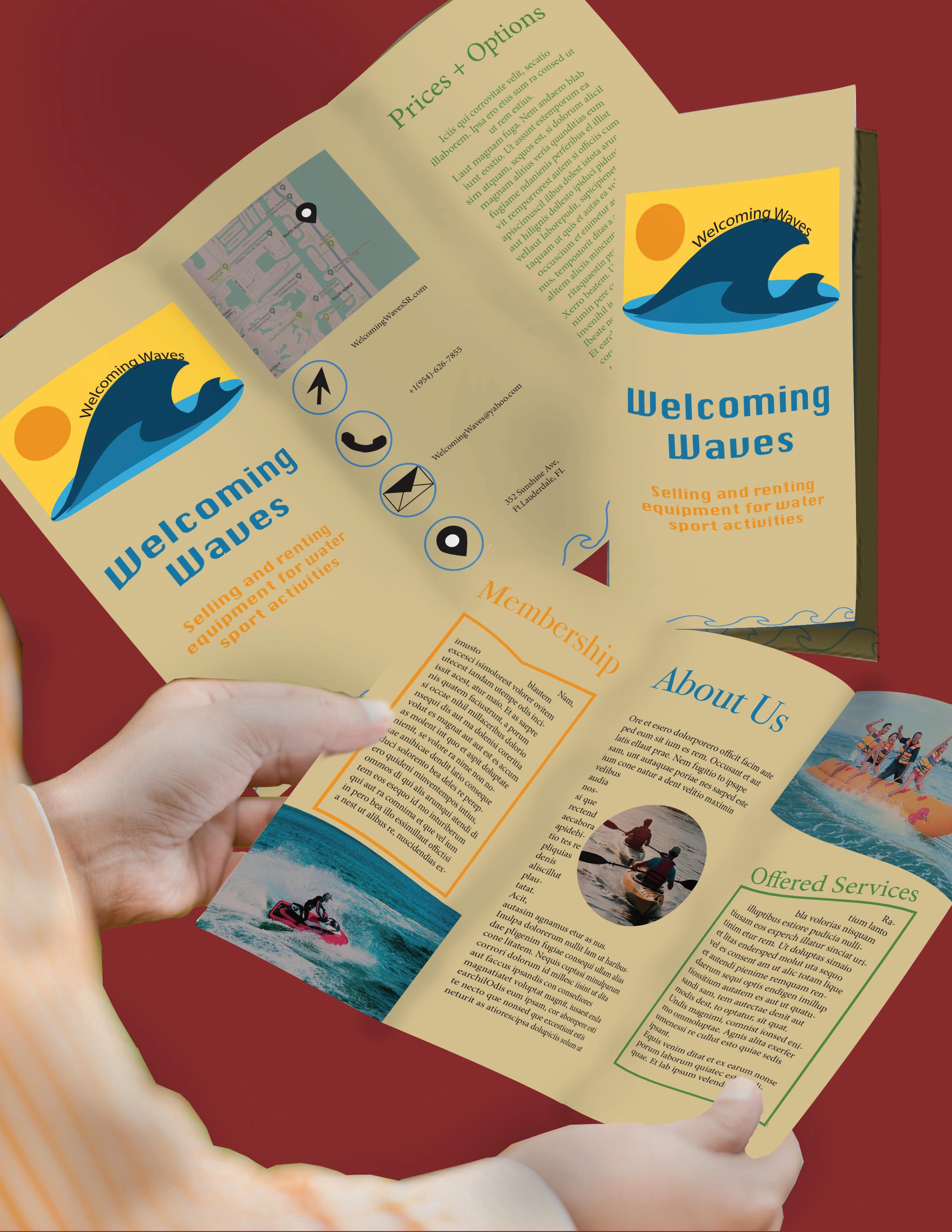
The design to the right is my mockup of a trifold design I created. We used photoshop and illustrator elements, while designing it with typography and other elements in Indesign. I feel much more comfortable not only using Indesign to create pieces, but also to use all three applications simultaneously to get a more accurate depiction of your original sketch. My favorite part of the whole project was creating a logo as I used Illustrator to set the tone of the entire brochure. For Illustrator I mostly used the pen tool to create vectors and photoshop I edited photos to give them a warm tone with clear quality. I am really proud of these piece as it came out the way I envisioned and I got to practice mockups to show clients what a real product would be displayed as.
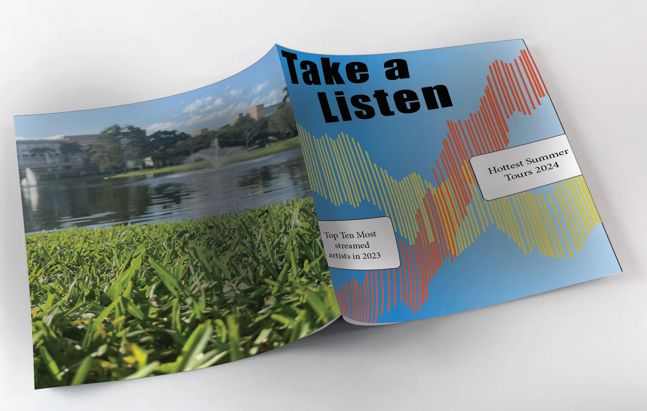
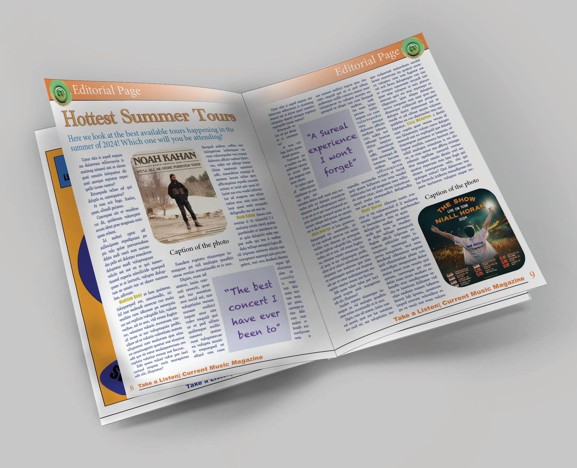
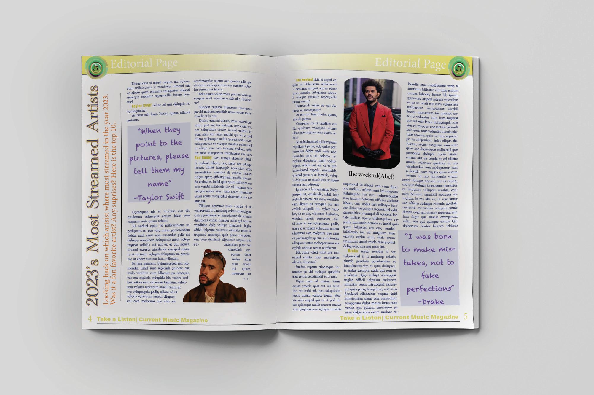
This is my 12-paged magazine project where we started with the page set-ups, using the parent pages. It consists of two ads, a cover page, back page art, and two different articles consisting of a similar theme. I enjoyed making multiple parent pages to add different elements to change the section. For example, my first article is in yellow, second is orange, and my other pages like the back, table of contents and ads are blue. This keeps the variable consistent throughout the entire magazine, but allows you to have a bit more variety in it. I used photoshop to pull in photos, Illustrator for the logo, and Indesign for the typography. Overall, I practiced the skills I acquired in all three applications to curate the final result.
