

NAUFAL TAQI ATHALLAH GRAPHIC DESIGN ARCHIVING BEGIN : OCTOBER 06, 2022 TIMEZONE: GMT +7 18 22

Hi! I’m Naufal, currently graduated from Product Design degree from Bandung Institute of Technology (ITB). Besides product design, I’ve been into graphic design. Focusing on branding, social media content, illustration, signage, and layout design. I believe that every design have to be functional and easily to understand. While I was in college, I’ve been trained to do many creative processes such as design thinking, sketching, management, and ethnography. Since then, I was able to combine my knowledge with the things I’m passionate about in design.
Depok, November 15th 1999 Tubagus Ismail VI Street no.10 Bandung, West Java naufaltaqiathallah@gmail.com +6282128659519
@naufaltaqiathallah
Education
Natural Science Nurul Fikri Senior High School 2014 - 2017
Bachelor Degree of Product Design Bandung Institute of Technology 2017 - 2021
Exhibition
Indventa 4.1 Final Assigment Exhibition 2021
Pamali & Design Jigana Kleb Bandung Design Biennale 2021
Achivement
Semifinalist
CASA Design Challenge CASA Indonesia 2020
Skills
Branding Layout Design Design Thinking Design Management 3D Modelling Sketching Sport & Nature Software Adobe Illustrator Adobe Photoshop Adobe Premiere Pro MS Office Fusion 360 AutoCAD Keyshot Blender
Graphic Designer Ruangguru 2022
Graphic Designer Editorial & Artistic Team Bandung Design Biennale 2021
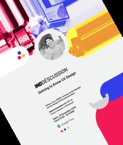
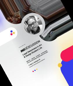
Head of Publication INDDES ITB 2020 - 2021
Head of Executive Fancy Night FSRD ITB 2019
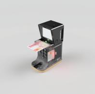
Product Design Intern PT. Wahana Lentera Raya 2019
Graphic Designer Glow Up Club 2018 - 2021
Graphic Designer Loakarya 2018
Artistic & Signage Team Pentomino Final Exhibition TPB FSRD ITB 2018
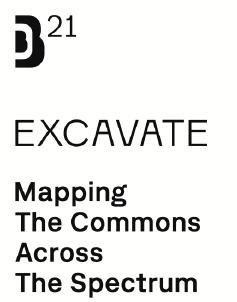
Bandung Design Biennale 2021 proposes Excavate: Mapping The Commons Across The Spectrum as it’s central theme. BDB'21 intends to complement and regenerate the domestic panorama of the design context by mapping various actors through an excavation of thoughts, objects, and actions as a form of value diversification and to dig deeper into how creative exploration can be carried out outside of conventional exhibition forms. How open experiments and critical questions that touch the economy, environment, society, and culture can be the first step for all of us to find new alternative answers.
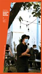
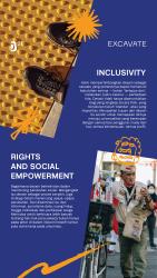
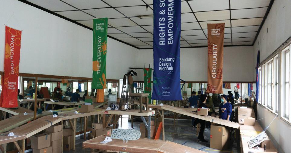
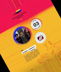
I was given the opportunity to join the editorial and artistic teams. The majority of my work consisted of creating and executing some Instagram content with the goal of increasing followers and public awareness of the event.
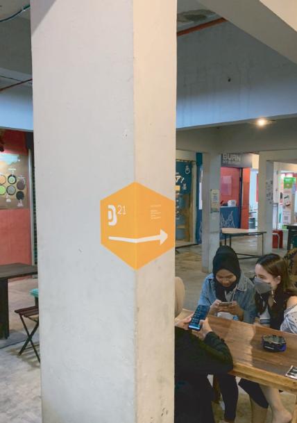
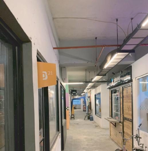
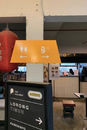
Aside from that, I was in charge of the signage and installation design. Such as wayfinding signage, and the main installation that visitor can interact with.
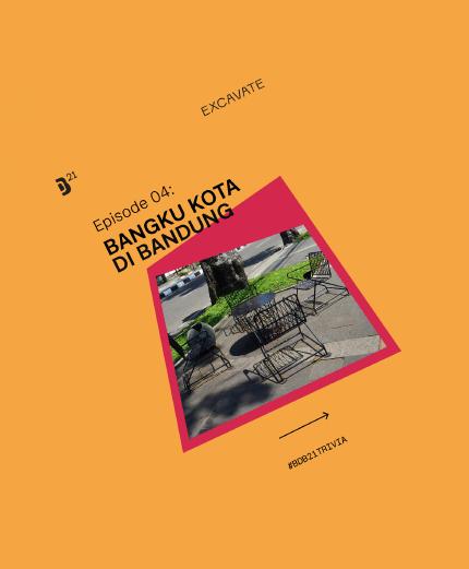
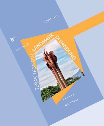
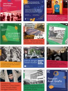
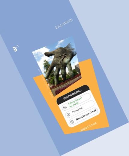
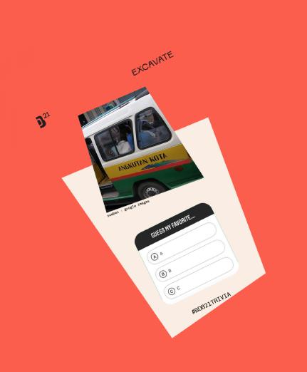
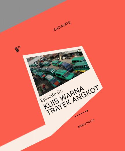
From the picture besides, I was working to do some publication about the event’s needs such as an article, schedule for each venue including maps, and the every project’s report.
In the process, we used to work with a guideline, like color functions which identify project’s categories, used a trapezoid as the main form to represents this year theme with various styles, hierarchy, and visual assets that we had compiled from participants.

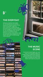
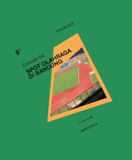
The content of this year’s Bandung Design Biennale has always talk about excavation, either its an object, figure, landmark, and any elements that represents Bandung. These content aims to provide a new perspective on how people perceive Bandung not only as a capital but also as a city with creative potential.

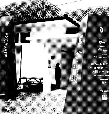
The Curator Installation was made to give the public a tangible form of the excavations in the Bandung Design Biennale 2021 from many projects.
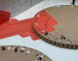
Assigning a number and level to each artifact makes the digging feel "gradual" in this room. Then the rough look in this room also accentuates the excavations that don't always look good but are basically still valuable.
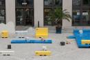
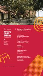
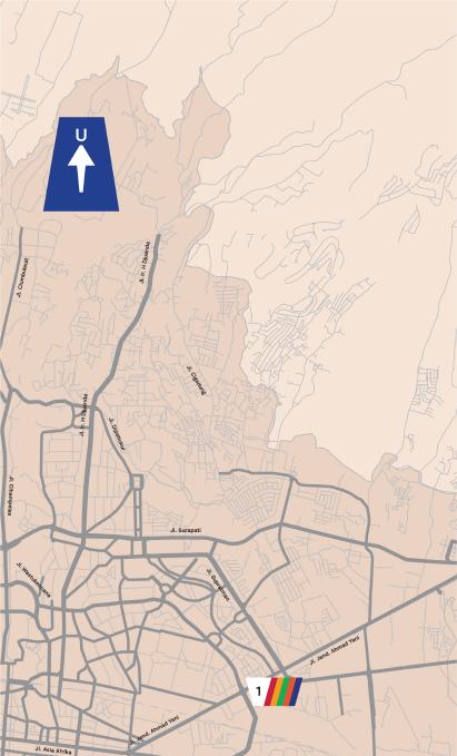
The Hallway Space Kosambi was one of the venues for this year’s Bandung Design Biennale. Exploring the sign’s form to respond the existing architecture elements was the challange in this project.
Branding and Publications
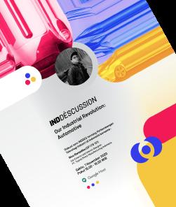
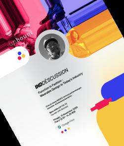
INDDES ITB is a Product Design Student’s Association at the Faculty of Art and Design ITB. INDDES ITB have a function as a forum for students to develop knowledge about the product design profession so that students can have an early preparation for their career. Such as doing some seminar with experts in the fields of weareable, furniture, design thinking, and learning about the intellectual property of a product. In addition, INDDES also held several trainings and media to accommodate student work.
Job Description :
As the head of publication, I’m responsible to make the community’s new branding and visual guideline. I also in charge of planning the contents to provide all of the informations about the community.
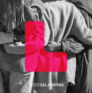
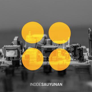
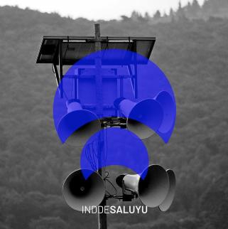
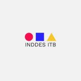
INDDES ITB has always been known for its primary colors, which include red, blue, and yellow. These three colors serve to represent the community's departments: Human Resources Department, Professional Department, Media nd Public Relations Departments.


was given the opportunity to design a new branding for INDDES in order to make it a more fun and vibrant community. Thus, increasing the color saturation, combining gradient and solid color become the new INDDES


Each of INDDES ITB’s departments is represented by a different visual characters.
INDDESALAWASNA is represented by a red chair. This icon represents the Human Resource department's responsibility to share love, happiness, and joy with all members of the community.
INDDESAYUNAN, represented by a yellow tire icon, represents the meaning of togetherness to represent the Professional Department that always walks confidently together.
INDDESALUYU symbolized with a blue signal icon. Identify the Media and Public Relation Department, the icon represented the two department’s responsibility as an information distributor with excellent delivery and visual appeal.
Branding and Publications
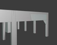
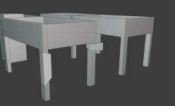
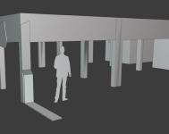
As the head of graphic design at Loakarya, I was in charge of creating the visual guidelines and visualizing each content draft. Aside from that, I created 3D assets to visualize Loakarya's products prior to their launch, as well as information about each product's features.
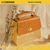
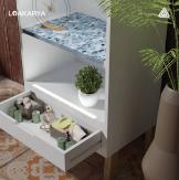
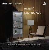
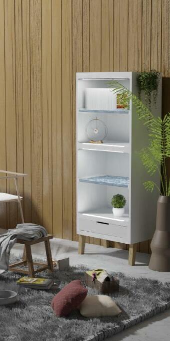
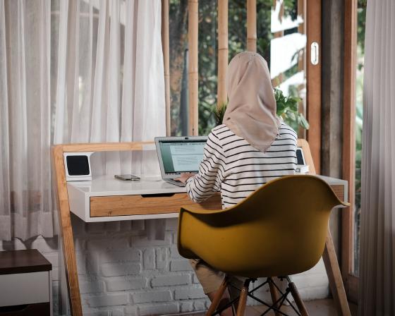
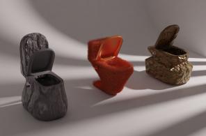
Loakarya is a brand that cares about environmental issues like the destruction of nature and increasing waste material. We have an interest in escalating the value of waste material by upcycling and repurposing for eco-living.
With this vision, we produce furniture such as working tables and bookshelf with recycled material. We also eager to enhance people awareness about the environment’s current condition by doing some informative and educational instagram content.
primary colors
natural
represents water and wind, green represents leaves and forest, brown represents soil, and black represents
and night.
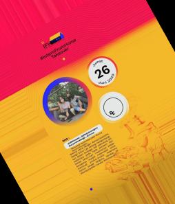
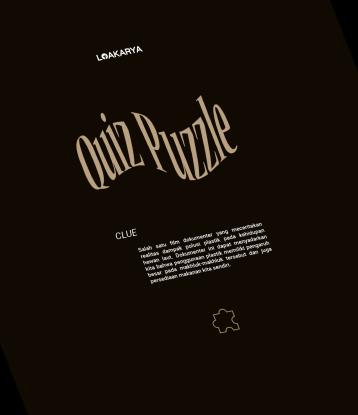
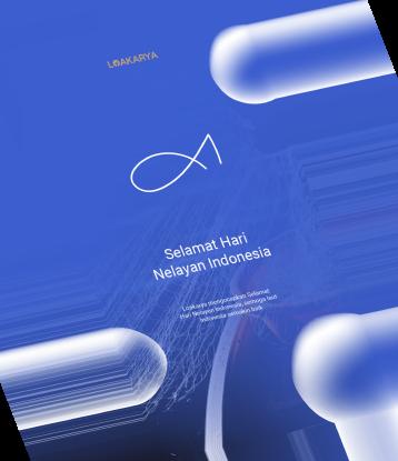
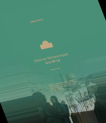
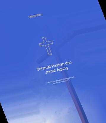
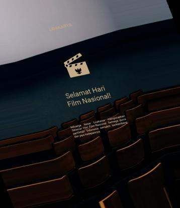
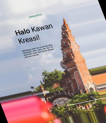
Loakarya's content was created to provide information and engage users. Loakarya provides a wide range of content related to the environment, such as furniture tips, figure quotes, the most recent news, and so on. Several publications have also been created to commemorate each feast day, such as Eid Mubarak, Christmast, Chinese New Year, and definitely a date that remarks as an earth-related day.


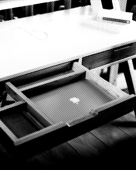
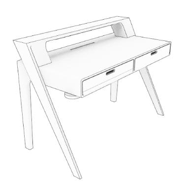
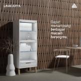
In addition to the 2D graphic publication, I was given the opportunity to transform Loakarya's product into 3D visuals. These visuals will assist users in getting a better understanding of the product, starts from the installation procedures to the detailed features, and so on.
Loakarya's photos assets were captured based on the visual guideline. Some keywords to represent the mood of the photos is natural and informative, since our product mostly made from reusable natural materials.
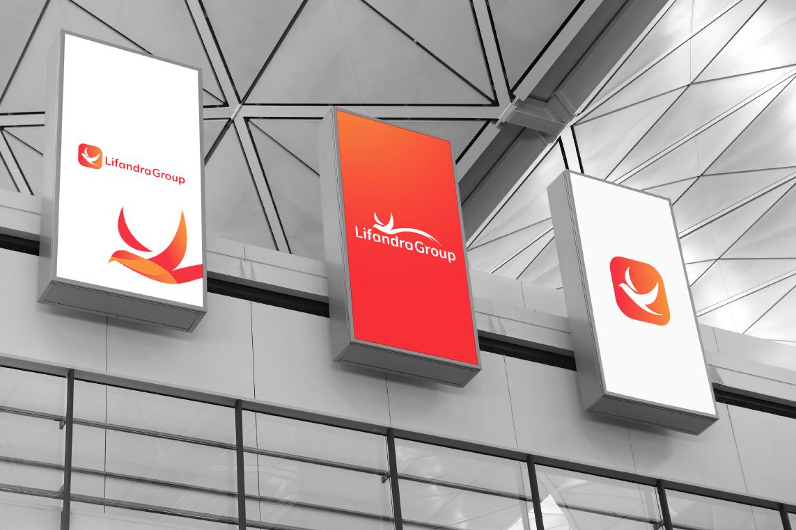
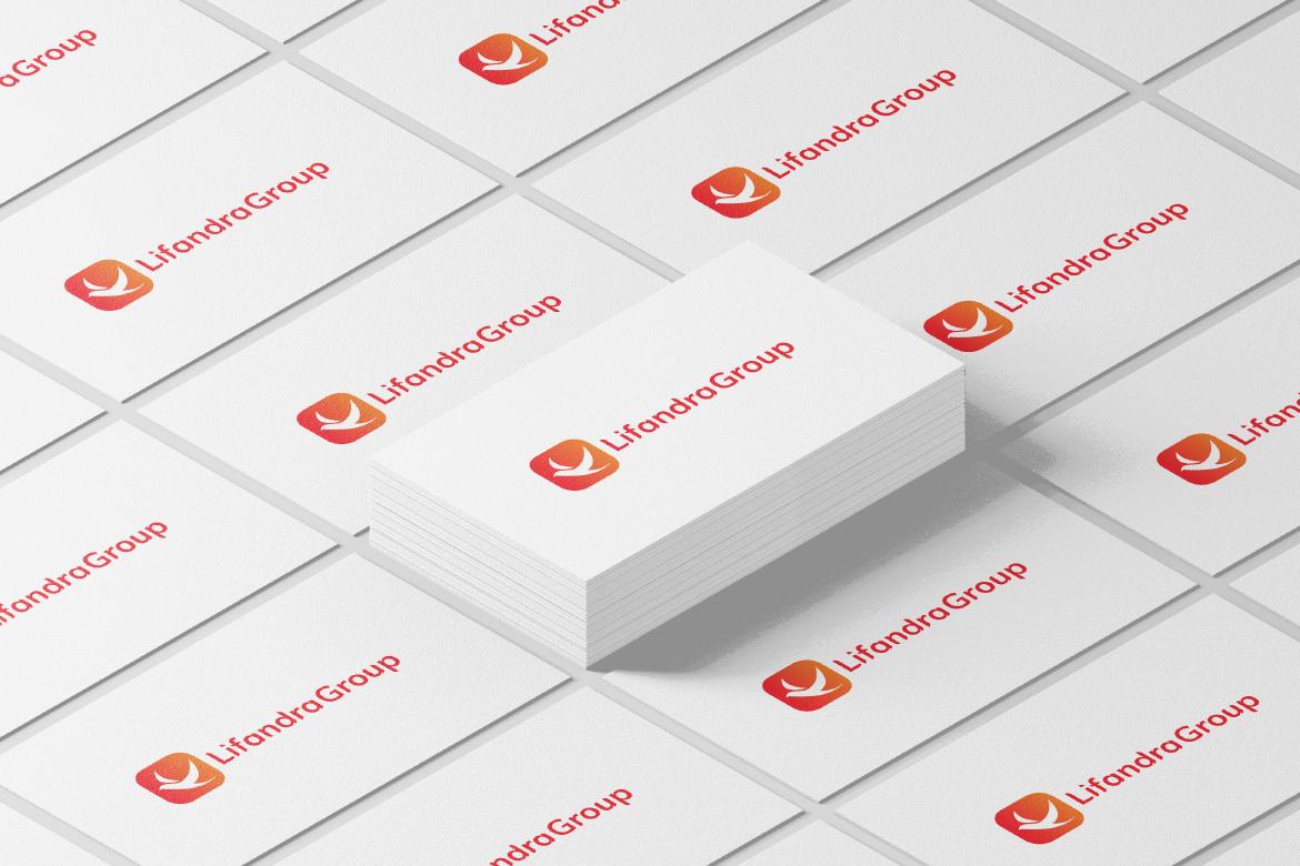
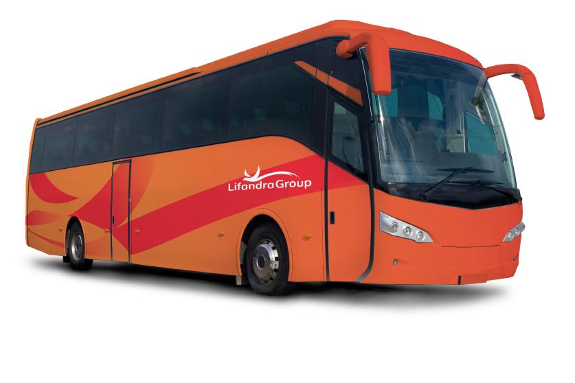
Lifandra Group is a travel company that offers accomodation services from Java to West Sumatra. Since 1960, this legendary travel has been so popular.
In 2021, Lifandra Group collaborating with Merah Sari Bus Company to relaunch their bus service. This new growth requires them to re-brand their company while retaining the value of their identity.
In this project, I was instructed to designing a new logo for Lifandra Group Company. The company wants to represent themselves with a bird icon, using red as their corporate identity.
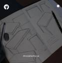
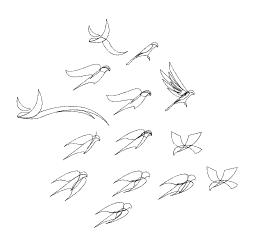
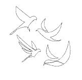
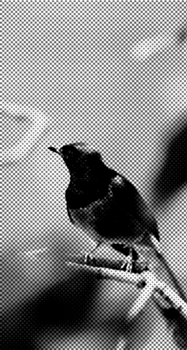
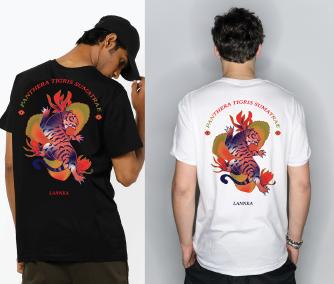
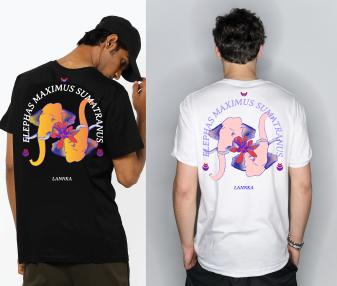
Murai Batu is one-of-a-kind fauna in Sumatra Island. These species are found all over Sumatra and are known for their chirp and long tail.
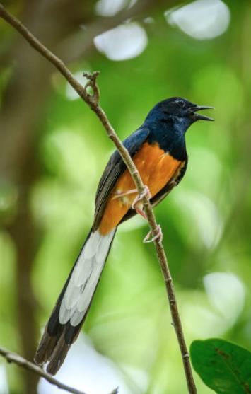
Murai Batu's silhoutte will represent Lifandra Group's vision of always providing passengers with integrity and trust.
From the image below, I went through several sketching processes in order to find the best form of the bird that was most representative.

Lifandra Group
Lifandra Group
Lifandra Group Lifandra Group
Lifandra Group Lifandra Group Lifandra Group Lifandra Group
Job Description :
I was able to design their new logo to make the brand appear more simple and classic. I was also able to create a visual style guide for their photo content.
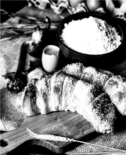
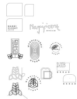
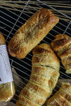
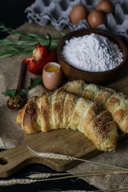
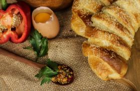
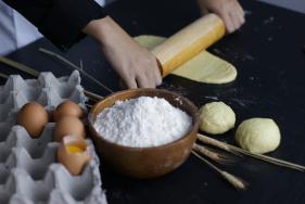
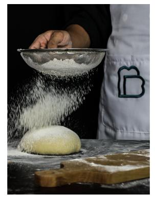
Magnificent Bread has been making bread since 1989 using an original family recipe. This brand has been produced with manufacturing standards in order to maintain the stability of the quality taste and it’s luxuriousity.
Using the keywords "simple and classic," six different logos were created. These six alternatives were inspired by an art deco building that I simplified to portray bread or wheat, both of which were used as their main identities.
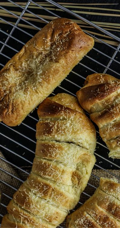

To provide buyers with interesting visual information, I also created some sketchy line visual assets based on the bread's flavor variety: cheese, chocolate, original, and so on.On the right page, we several photos that we took for the promotion needs used homemade production items.
Logo and Visual Identity (Competition)
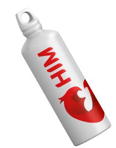
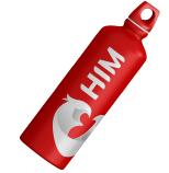
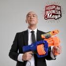
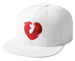
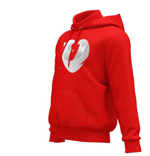
Hiduplah Indonesia Maya is a podcast hosted and created by Pandji Pragiwaksono that focuses on everything that goes viral on the internet.This year, HIM launched a competition to redesign their old logo into a new one.
Job Description :
The competition requires participants to visualize the new logo, which will be used on various merchandise such as t-shirts, hoodies, tumblr, and so on.
Participants were required to create a new identity based on how the public perspective to the podcast.
Supervisor : Pandji’s Team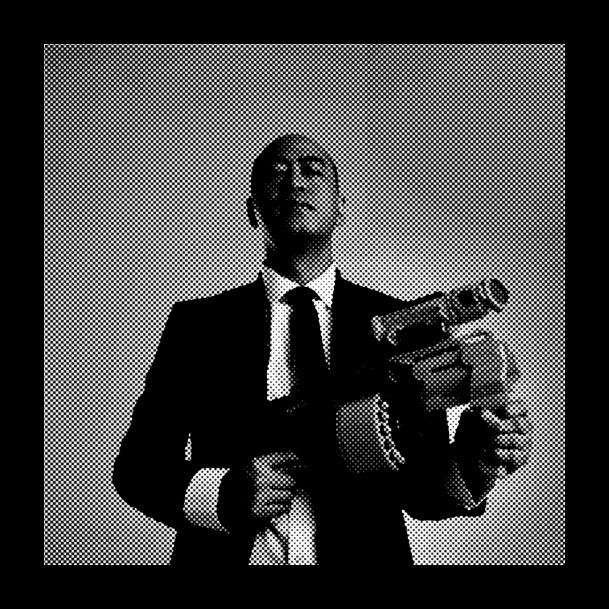
logo features a Garuda, a Cat, and a Love. Garuda represents Indonesia
its people, Cat represents Pandji because he has become controversial as a result, and love represents hope for either Indonesia or its people.
the colors of the Indonesian
red and white, the logo
combined with the Mulish font, which I customized, to create a new set

Sigange and Pattern
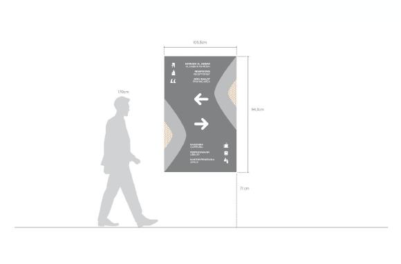
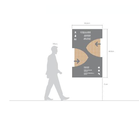
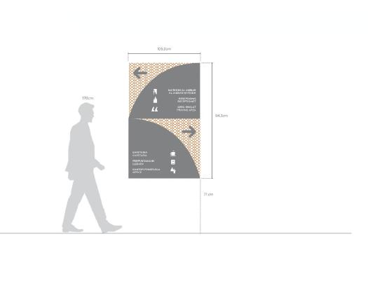
Al - Jabbar Mosque is one of the biggest mosque in West Java located in Gedebage, Bandung. Created by contractors Adhi Karya and Hutama Karya.
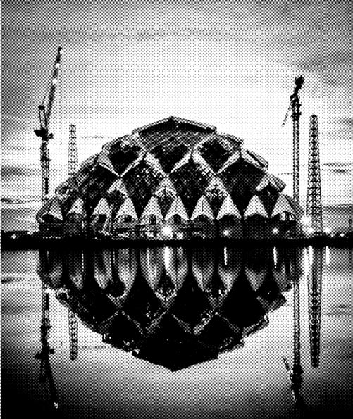
Al Jabbar Mosque is located on an area of 25.99 hectares and was built with the concept of floating on the Gedebage reservoir which has an area of 7.2 hectares.
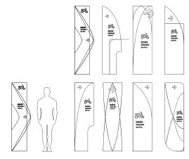
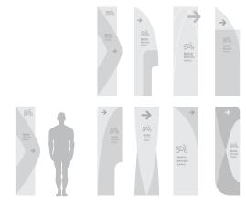
Currently LABO Studio and ITB lecturers submitted a project proposal for making the signage needs around the mosques and museums.
Job Description :
In this project, I was given the opportunity to design various signage with different purposes for the mosque and museum's needs using the color and material that were chosen.
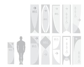
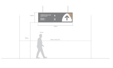
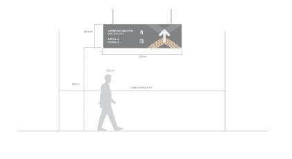
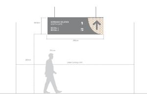
Supervisor : Raditya Ardianto TaepoerHere's a some of the exploration and concepts for outdoor and museum signage. The form was intended to be an informative and simple design, while also reflecting the building's form characteristics. These signs are designed in a variety of sizes based on the requirements, such as having to make it larger for directional and regulatory purposes.
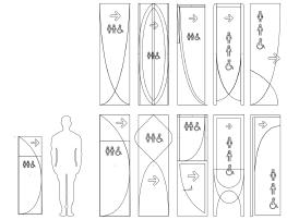
Aside from exploring the signage form, I'm also doing some ideation for the signage patterns. These patterns are the main form's repetition and combination that also reflecting the building characteristic.


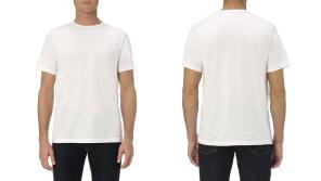
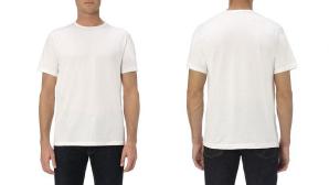
Job Description :
I was able to designing a new PS’s apparel merchandise. Created with various design in a white plain shirts.
PS ITB is a sports organization that provides a platform for us to train our talents in the fields of football, futsal, and management. As a good member, I participated in many programs at PS ITB, from competitions to fun activities. Apart from that, I try to help in other ways such as designing our merchandise such as t-shirts, mugs, and t-shirts.
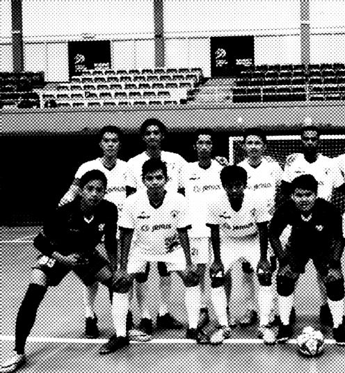
PS ITB is a community that provide every member who has the most sports spirit from the way he makes decisions, acts fairly, and coorperate. For this reason, this concept portray that playing football have some values that can be “digest”.
Many students feel that playing soccer is something that makes them happy, even if they are releasing all their stress in academics. Therefore PS ITB is a place to give peace to students in their football activities.
Each soccer unit or organization does not only practice, but there are many things that can be obtained, such as organizing big events, and making new friends. So that harmony is needed between members. Therefore, all forms of activities in the unit must be based on love and attachment.


I hope you enjoy this portfolio . Feel free to contact me if you want to know more about me and my works.
copyright ©2022 by Naufal Taqi Athallah. All rights reserved.
Contact me at naufaltaqiathallah@gmail.com +6282128659519
@naufaltaqiathallah