Brand Audit


September 2022


September 2022


eSafety Commissioner
CORE BRAND

AFFILIATED PARTNER
PROGRAM / INITIATIVE
External


- messaging, service and provider is unclear


A/B testing results: Stock imagery is the strongest performer for link clicks and landing page views.
Recent posts (right): imagery is clean but inconsistent with other images previously used.


Primarily using eSafety visual brand. This will need to remain if the asset is to be used on eSafety website.


Good Things Foundation have developed their own style for BeConnected causing a disconnect across assets.
What works:
Featuring prominent topic callouts (ie Webinar) clearly defines the service/product offering
The current colour palette has been designed to be more harmonious with eSaftey - the focus on the darker colours within the palette when used alongside eSafety assets.


Discontinue all use of the ‘eSafety with BeConnected’ lockup as it is not a true co-brand and goes against usage rules for each brand respectively.
Add a clear callout/label to the top of assets describing the topic in an easy to understand language - ie. ‘online presentation’ for webinar. As two Australian Government lockups need to be included on all documents - to create as much more clear space between the two logos as possible. Move the BeConnected logo to the right of the header while keeping the eSafety logo in on the left hand side. Feature only BeConnected URL to reduce crowding on the documents and create a clear direction for user.
Reduce prominence of eSafety logo and always include disclaimer.
Introduce a warmer toned pink as a step between the core magenta-purple and the secondary blue-purple providing a more diverse colour palette that can be applied to specific topics.
Focus on the lighter colours when developing assets so more harmonious with eSafety where needed.
Topics to be given colours for clear segmentation to the types of content featured within the brand Icons to be used sparingly only and be simple, and recognisable to the target audience.
Multiple topics covered
Consider using the BeConnected font only.
External agencies tend to use san-serif fonts for BC assets, where brand guidelines haven’t been consulted this will result in less disconnect.
Where possible, increase the point size of the font in the body copy for increased legibility
Body copy. Learn to use technology with confidence, how to protect yourself online and find out what opportunities the internet can provide by joining our free online Be Connected presentations.
Hosted by the eSafety Commissioner, these presentations cover a range of topics to help improve the digital skills and online safety of older Australians.
Youthful, energetic, dynamic
Diverse
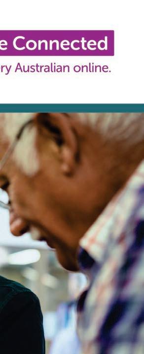
Mood and tone of the images should be unstaged, welcoming and natural
We want the audience to identify with the images - show the full person interacting with the tech in a positive way to reflect how tech can make their lives easier Some use cases it’s better to hero the device (screen shots etc) in this instance, always show a human element (hand etc).


Alternative treatment for BeConnected assets that have more text or being used in a crowded environment - ie. a library or social media


Simplifiying the images will allow greater readability for text


Illustrations should be used sparingly, ideally only to demonstrate a topic or specific where photography isn’t suitable.
They should be minimal and showing a clear action to simplify complex subjects, using recognisable/universal symbols.
Avoid abstract concepts
Avoid illustrations of whole people as they don’t resonate with audience
To help keep the message simple, ensure the background is neutral and the illustrations feature a maximum of 3-4 colours


Social media tiles designed for externals to share will need to feature full government crest lockup for both esafety and BC.
Improve your
Continue the use of the BC condensed logo lock up for tie in with eSafety social brand guidelines for owned channels


Exception to the rule is for use in Stories where the full logo can be featured

Improve your
Recommend using photography for social posts based on results of A/B testing. If copy needs to be applied to the tile, ensure the background of the image is clean and uncluttered to allow the message to be easily read


Using a consistent graphic device reinforces branding.
The ‘wave’ device as shown provides a point of consistency across the brand and a tie-in to the eSafety branding so it gives BC it’s own personality without a total disconnect from eSafety.
Colours from the colour palette can be applied to differentiate subjects


Applied topic colours and imagery on a per-subject basis to create a unified suite of assets


A-B testing results showed equal performance for stock images and images using the curve device.


When used as a stand alone asset for Be Connected, the device can be applied to Young Mentors using the eSafety Seniors colour to maintain cohesion across the Young Mentors branding.


