

Portfolio


Photoshop
Camera Raw and Select and Mask
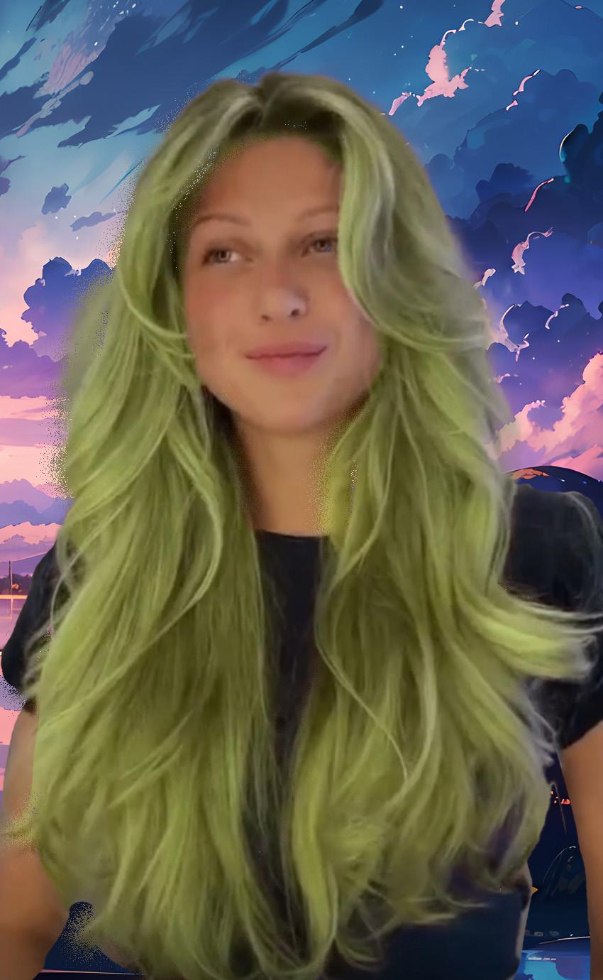
In this assignment, I selected a photo from discord and right clicked to copy the image.
When I went to Photoshop, I went to file at the top, clicked new and click the clipboard option. From there I pasted my image in the document and it showed up. I added a mask layer and with the brush tool, selected the hair of the girl in the picture. With the refine edge brush tool, I redid the process for a perfect look. Than I went to adjustment layer, clicked on “hue/saturation” and changed her hair from blonde to mint green.
Afterwards, I unlocked the background layer, click option and dragged the layered mask to the background layer. I edited the mask to now include the girls body. I went to google and searched for a sky background and pasted it into the layer. With the move tool, I selected “show transform controls” to adjust the background. After adjusting, I got the result I wanted.
-2-
Vector Masking
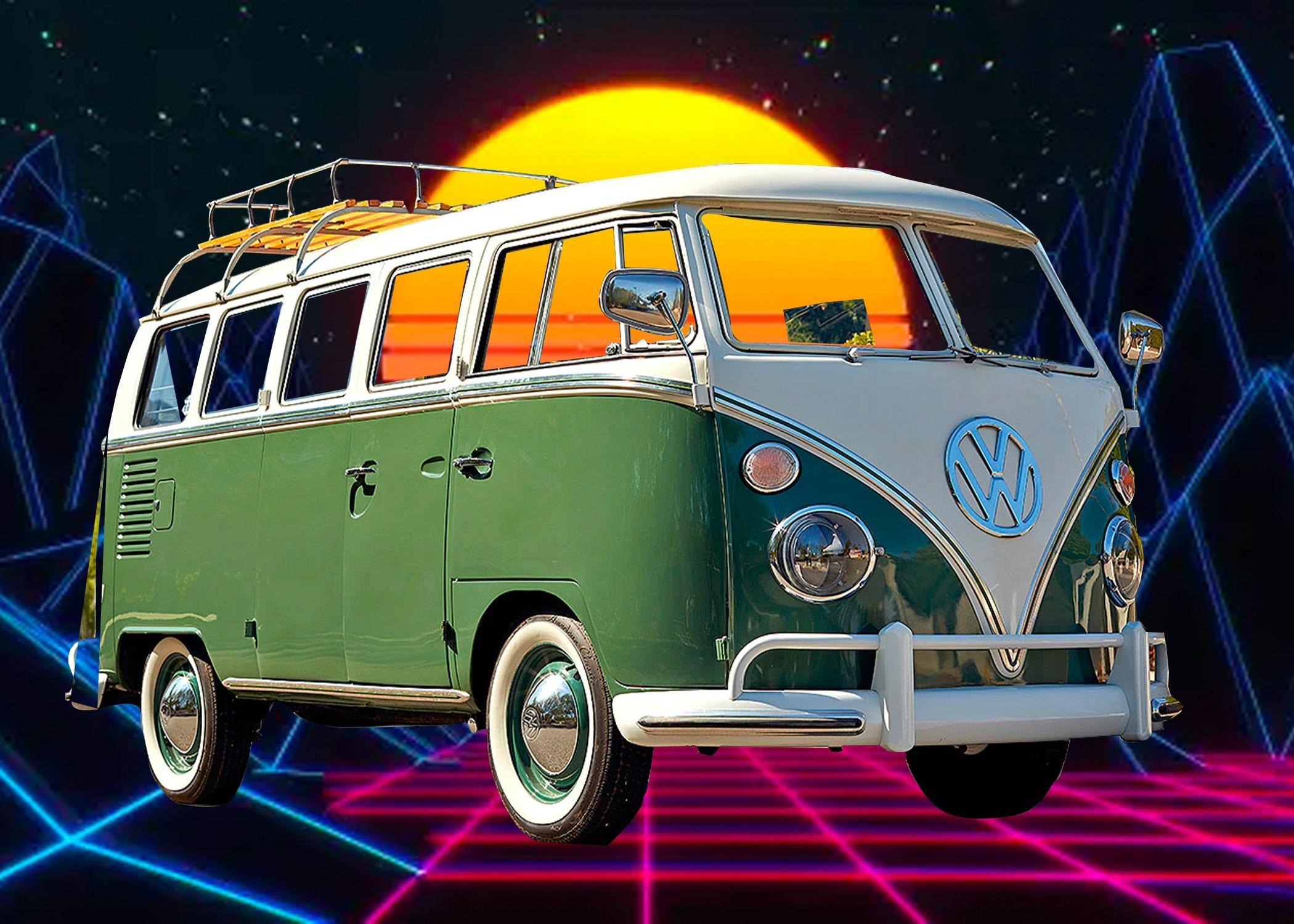
I choose the van because I thought it was the most interesting one for me. I used the pen tool and made sure I selected “paths”. I started to trace the van as best as I could using both corner type anchor and smooth type anchor points. After connection the big body of the van, I went in and started to mask the small holes like the windows and the metal bars it has on top. After that, I clicked my path, and double clicked the layer mask to mask out the entire van. After seeing it was good enough, I search on google for a video game-like background. I imported the picture, adjusted it to fit the layer, and moved it to the bottom so that the van can be on top of it.
-3-
Photoshop
Photoshop
Sculpture Texture
I imported the picture of the sculpture to Photoshop. I opened another file, with a preset called “US letter”. Then, I used the “object selection” tool to select the statue. I clicked and dragged it into the file with the US letter format. On Google, I searched for the texture images I had in mind, right-clicked on the one I wanted, and clicked on “copy image”. Back into Photoshop, I went to the Edit menu and clicked “paste”. I would then adjust the texture on where and how I wanted it to look on the sculpture.
For some, I used the lasso tool, quick selection tool, or pen tool. I would then mask the layers and have the texture appear in the area I have selected to mask.
In some layers, I would even adjust the opacity to make it more realistic. I also used the morph tool on the seashell texture to fit Venus in the statue. I would repeat this process for the other textures I would paste into the document and adjust them as I saw fit.

-4-
Brick Wall & Graffiti
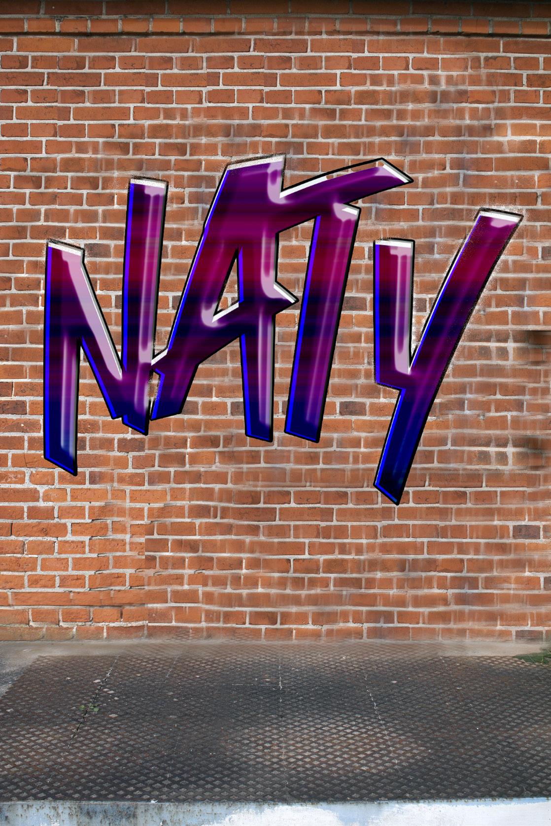
After getting the brick wall picture chosen for me, I downloaded it and imported it onto a new Photoshop document. Then I used the Clone Stamp Tool to copy the brick pattern and placed it on other ares to cover two metal bars that were on the brick wall. After covering those, I tried to cover the door, again using the Clone Stamp Tool. This part got complicated for me because it would copy the door section as well. I tried turning on and off the “aligned” option in the options bar and sometimes it worked, and sometimes it did not. After covering the door with the brick pattern, I looked at the youtube video provided for the Graffiti text. I was able to follow along until I came across the part where a layer was copied 21 times. My Photoshop did not let me do this, sending an error message. Since this was as far as I could go, I kept my text as it was. Copying the text to the file where the wall was did not go smoothly either. I found myself screenshotting what I have done and importing the screenshot to the file with the brick wall. I removed the background and adjusted it as much as I could.
-5-
Photoshop
Raven from Teen Titans
-I copied and pasted my image into Adobe Illustrator.
-I double clicked the layer’s thumbnail and changed it to a template. I clicked ok and made another layer.
Character Tracing
-With the Pen tool, I started tracing different shapes and figures on my character.
-After completing the tracing, I selected my entire character and changed my selection to Live Paint.
-With the Live paint Bucket tool, I started filling in the colors my character wears to complete the project.
-6-
Illustrator
The “88” Assingment
Used the ellipse tool to create multiple circles, aligning them perfectly using the help of smart guides.
Then I used the shape builder tool, to combine some shapes, and colored them using the gradient tool.
Then I duplicated the 8 and recolored it.

Illustrator -7-
Try the World Logo Design

The
WE BRiNG THE WORLD TO YOU The
We Bring the WORLD to YOU The We Bring the WORLD to YOU
First, I took the photo I took of my sketch from Discord, copied it and pasted it to Illustrator. I found it hard to go based on my sketch so I searched for a map of the world in the globe shape and pasted onto illustrator. Using the pen tool, I started to trace the roundness of the globe and I myself would measure the “pizza” slices and traced as I thought was best. After going all the way around, I started to outline the countries, also using the pen tool and cut them up to align with each pizza slice. When I was done, I used the selection tool and selected a certain pizza slice with the parts of land and ocean inside and moved it slightly outwards to show that it was a slice. I then clicked on every shape I made and colored it as I saw fit. I made different text book for each word in “Try the World”. For each word, I added a different font, and curved the words along with the edge of the world. For the Slogan, I used one text box. However, for the words “World” and “You” I changed the typeface a bit to make them stand out. After adjusting the placement and color I looked for a background image that could match “food” or “snacks” aesthetic. I pasted the background to the back and adjusted it to the size o the document. Then I saved my file and created a new, larger file. I went to my original design, using the selection tool I clicked and drag to select everything and copied it. I pasted it onto another document 3 times and put all of them side by side. I went in and changed the font and color of the title to the other 2 copies to show other ideas I had.
Illustrator -8-
Mate Amante Campaign with Mutations


First, I looked for images of a mate and thermo on google that were placed in a eye level view. I copied and pasted two different photos of each item into Illustrator. For both images, I clicked on their thumbnail and changed them to templates. From there, I started to trace both items using the pen tool. After I finished, I selected both items, made them Live Paint and used the Live Paint Bucket tool to color in both of the items as I wanted. Using the direct selection tool, I moved one over the other to overlap, which was my idea for the logo. Going to dafonts.com, I found a font that I wanted for the name of the company. I installed that font and used it for “Mate Amante”. I also searched for an Argentinian flag background and used it as part of the advertisement. I started to place these images and other text that I had as I wanted in my magazine format. From there, I made the other artboards I needed to make and would copy and paste the elements from my original artboards to the other ones. I had to adjust many as i saw fit and exclude the information on certain formats where it was not necessary.
Illustrator Mate Amante An Argentinian Bakery Hablamos Español! We speak English! 5820 Lagos Blvd. Tamarac, FL 33321 ¡Servimos Mate, otros tradicionales tragos, todo tipo de pasteles Argentinos y otras comidas deliciosas para que disfrutes! We serve Mate, other traditional drinks, all kinds of Argentine pastries and other delicious foods for you to enjoy! _ mateamante mateamante Come visit our new location in Tamarac, Florida! We serve your favorite Argentinaian food and brunch. Feel free to come for us during breakfast, brunch, lunch, and dinner! We have bakery items and more! We are excited to serve you :) ¡Ven a visitar nuestra nueva ubicación en Tamarac, Florida! Servimos tu comida Argentina favorita y mediatarde! No dudes en venir a buscarnos durante el desayuno, el brunch, el almuerzo y la cena. ¡Tenemos artículos de panadería y más! Estamos emocionados de servirle :) #bakery #argentina #argentinianbakery #florida #soflo
Movie Poster


First, I found pictures I wanted of the characters from a WEBTOON called “Unordinary”. I placed each of these photos in their own file in Photoshop. I masked the photos and removed their backgrounds. Then in illustrator, I decided to make the WEBTOON logo by tracing one I found online. I put a fill color, and made it a green that’s similar to the original. In Indesign I opened a US letter and imported all of the photoshop files I had. From there, I started to arrange them as best as I could. I then imported the logo and moved it around until I liked its placement. In InDesign, I made the text using different fonts such as comic sans and more.
-10-
InDesign
Trifold Brochure
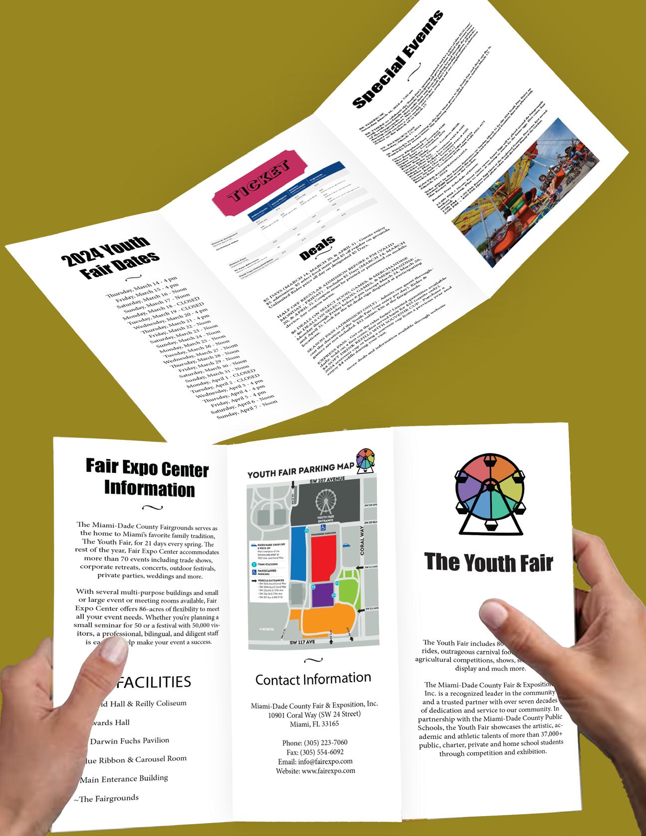
For the Trifold, I used a combination of Photoshop and Illustrator along with InDesign to make it. I decided to make it about a local fair called the “Youth fair” I took all the information from their website and organized it from the most important to the least, according to which pages will be viewed first from opening up the brochure. The logo I designed was in Illustrator and the photos I used were edited in Photohsop. All text were done in InDesign. The mockup was down in Illustrator where drop shadow and transform was used to give it a realistic look.
InDesign -11-
InDesign
12 Page Magazine Phase 1


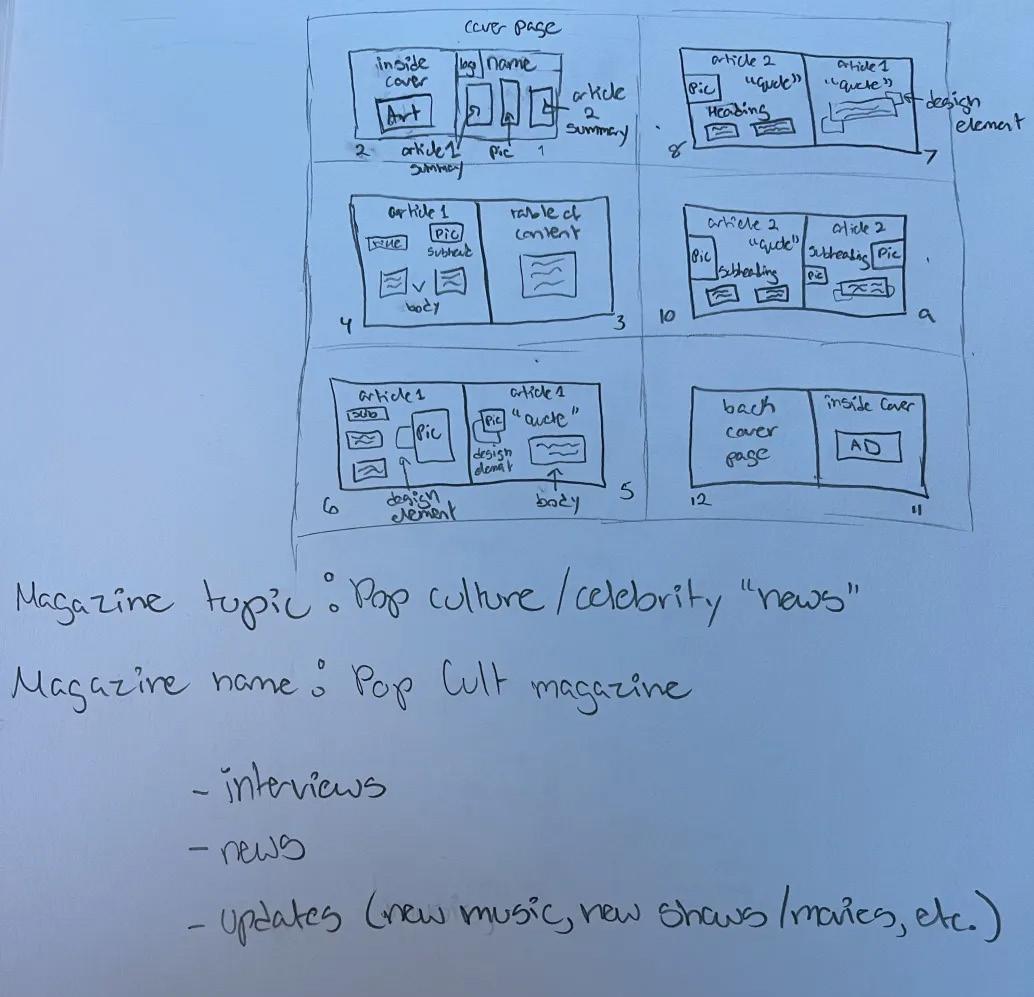
To start Phase 1 of the 12 Page Magazine Assignment, I went into InDesign and followed the steps we were given to create the 12 paged document. From there, I followed the lecture about Parent Pages and started to use them by making a header, a footer and adding page numbers. I looked at the “general page layout” and saw that Page 2 and 11 may have advertising content. For page 2, I added the AD I had made for a made-up bakery called “Mate Amante”. For page 11, I made an AD, using both Photoshop and Illustrator, for Sabrina Carpenter’s latest Album “Emails I Can’t Send”. I masked her photo in photoshop and placed it into illustrator. I arranged the other elements in Illustrator to the best of my ability and once I was satisfied, placed it into InDesign. Since the back cover of the magazine can include an art we made, I decided to include the character trace I made of Raven from Teen Titans.
-12-
NEW ALBUM DROPS THiS FRiDAY! <3
12 Page Magazine
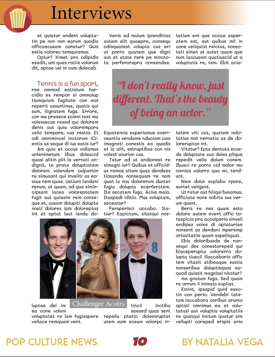
Phase 2

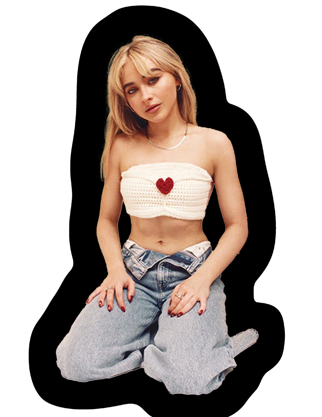
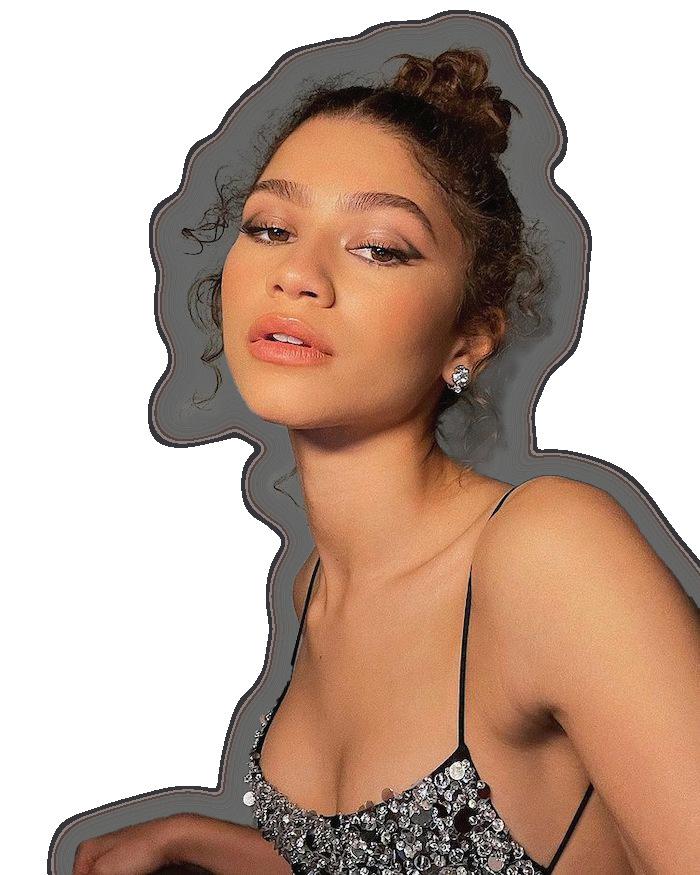
Picking up from where I left off in the first part, I used the “article” I created when we were learning about object styles. I put this article into the “interview” section and imported some photos about the upcoming film called Challengers. Then, I used the release of the new Joker movie’s trailer as the article in “Pop Cult” section. Than I went into illustrator and added some drop shadows to my AD and made a few other adjustments. I moved on to make the table of contents where I made sure to include the pop culture news, interview, and new music ad that are included in the magazine. I was running out of time since I had to be somewhere after class and rushed the cover. I grabbed a photo of Zendaya, a celebrity who is included in my Magazine, masked it, and used her as the cover. I included my logo, magazine name, and some teaser of the kind of content in the magazine.
InDesign -13-
POP CULTURE NEWS Pop Culture News! Interviews! New Music Drop!
Pop Cult BY NATALiA VEGA
Thank You for Reading !
Natalia Vega