Portfolio
Natalia Santiago Herrera

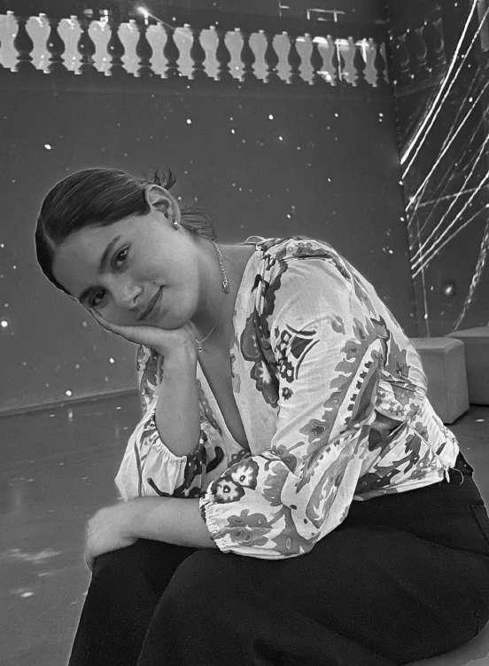
Natalia Santiago Contact +52 2225509738 natalia_santiagoh@hotmail.com Mexico ABOUT ME Passionate for architecture and their different topics like: residential architecture, public space and interior design. During my interships and career the approach has been in sustainability architecture, social housing and interior deisgn.
EDUCATION
2017- 2022 INSTITUTO TECNOLÓGICO Y DE ESTUDIOS SUPERIORES DE MONTERREY
Architecture
Graduated
2019- UNIVERSITY OF VALENCIA
Introduction to sustaintability architecture
Course
2022- UNIVERSIDAD POLITÉCNICA DE MADRID
Sustainability in Architecture
Summer Course
WORK EXPERIENCE
• Intership in Berman Arquitectos (3D modeling and design)
-2020-2022
• Intership in PSP Mexico (Controller)
-2022-2023
• Freelance
-Branding and Social Media of CRIKAS
-2021
-Branding and social media of mh regalos
-2021-2022
• Autocad
• Sketchup
• Twinmotion
• Illustrator
• Microsoft
SOFTWARE LANGUAGES
• Photoshop
• InDesign
• 3Ds-Max
• Revit
• Dialux
• Spanish(Native)
• English
-Bulats Certicate B2
-Linguaskill B2
-TOEFL 557
• French
-Learning
HOBBIES
Passionate about photography, painting, graphic design and learning about design.
INTERIOR DESIGN
Content ARCHITECTURE
BRANDING CC conexion AGUA QUE CORRE SURTIDOR ELECTRICO FELINA THE HIGO HOUSE MONTEMORELOS CRIKAS MH REGALOS ESENE STUDIO
ARCHITECTURE
CONEXION
Team: ARCO
Natalia Santiago
Lucía Leyva
María F. Peréz
2022
PROBLEMATIC VISION
Located in Puebla, Mexico, in the highway to Veracruz, Mexico, the particularity of our site has is that is next to a canyon,that connects with La Malinche. Besides of being between a frontier with Amozoc and Puebla.
Our vision is to connect the community with the site, and that they can feel part of it.
OUTCOME
Create a learning center for the youth that needs an space to keep learning and be able to improve new cultural or ludic skills. To create another space for learning, we create small modules, that create a more flexible space.
This ludic route will expand to high voltage to create a conection with the community

WHAT CONNECT US?
CRIMINAL INCIDENCE
HOUSING
DENSITY
MIGRATION ROADS
POPULATION
EDUCATION

“ALL THE ROADS LEAD US TO THE SAME DESTINATION”
BACKGROUND
This project was inspired by the megatrend of food that will impact in our future as a society, in 2050 only 50% of the population will have access to the food, that was our main statement, on the other hand we start thinking about big cities. How were they going to produce their food? Would they be the last ones to know about this problem?

We start studying all the food process, we went on different solutions, but for us creating a process that could be circular that means NO WASTE.
OUTCOME
Once we understood the food process we decided to create a design in wich u could create your food with no waste and only using a 10% of water.
CC
Project in collaboration with Saúl Rodríguez 2022.
FORM
We decided to use this form is one of the most strongest and can be divided in different pieces.
This diagram represents how we wanted to create connections between the community.

“TO CREATE A CITY WITH FOOD FOR EVERYBODY”
SURTIDOR ELECTRICO

BACKGROUND
Located in the city of Puebla, Mexico. This lighting and construction material store needed a big space to show their lighting, with a warehouse to keep all the products.
Project collaboration with Berman Architects 2022.

AGUA QUE CORRE
Natalia Santiago
Esmeralda Torres
Lucía Leyva
Héctor Arellano
Diana Hernández
Abraham Montes
Berenice Peralta
Eduardo Guillen
Arely Ortega
Leobardo Chávez
Karla García
Emmanuel Velez
2019
SERAtoyac is an architecture module that starts with the research of the differents adversities that exists in the Atoyac river, located in Puebla, México.
The module is a wood structure of columns and platforms, with a fiberglass ceiling. Easy to put together, thanks to the use of assemblies and bolts.

PROBLEMATIC GOAL
Improve the learning of the childrens with the different activities/games that would be found during the module, these program will show the childrens the differents issues that the river has and how they can be part of the solution.
Team: SER ATOYAC

INTERIOR DESIGN
FELINA
BACKGROUND
Through their jellwery, that express the timelessness of their brandin each piece. With the first research we decide to resume the concept that was going to be expressed with the design.
 Equipo: ARCO
Natalia Santiago
Juliana G. Rugerio
Abel Huesca
Liliana Sánchez 2022
Equipo: ARCO
Natalia Santiago
Juliana G. Rugerio
Abel Huesca
Liliana Sánchez 2022

“Create an experience inside of the space through the furniture,textures, colors and fragances”
THE HIGO HOUSE

BACKGROUND
A residence ubicated in El Higo, Veracruz, named after the place,these project offers two rooms that works regardless each one with kitchens and bathrooms to offer more flexibility. On the other hand they wanted to create modern spaces, the main color was white, due to the small spaces we had, while the main material was wood to create a natural space.
Project collaboration with Berman Architects 2020.


“To create a space that is connected with nature”
MONTE MORELOS
BACKGROUND
Montemorelos is a residence that was designed to have this relaxed vibe. We choose neutral colors to have this natural touch, most of the texture chosen was wood.
 Project collaboration with Berman Architects 2021.


BRANDING
CRIKAS
HISTORY
A brand that borns from the necessity to complement the nutrition of the aliment we already know, upgrating the potencial of the nutritionals, keeping the traditional taste of Mexico, recreating them with better nutritions.

PACKAGING
Designed to make it easier to the users, the bags has a wire at the top that maintains a perfect sealed. Other aspect we did was to used inks that are friendly with the planet.
SOCIAL MEDIA
The goal was to get a lot of attention from other differents users,each post transmit information about all the benefits that bringsthis brand.


MH REGALOS

HISTORY
A brand that starts in 2008, this brand belongs to a women that always felt gifts are not something you can buy in any store and when is about someone or any special ocassion, it should take more attention. That’s one of the reason MH Regalos Born. Since 2008 she has dedicate to create different products like: Hangover Kits, Blankets, Baskets with products for newborns, etc.
In 2021 she decided the brand needed a change and that’s when the colors and typography to something more simple and elegant.

STUDIO ESENE
HISTORY
ESENE STUDIO is a design brand that born in 2023, that is dedicated to architecture, interior design and branding. The vision of this brand was to create a logo that was creative but formal at the same time, that is one of the reason we choose the font with curves, the color was chosen by the client.


Thank you Contact +52 2225509738 natalia_santiagoh@hotmail.com Mexico