02
HAVEN GEA
Brand Identity / Layout design
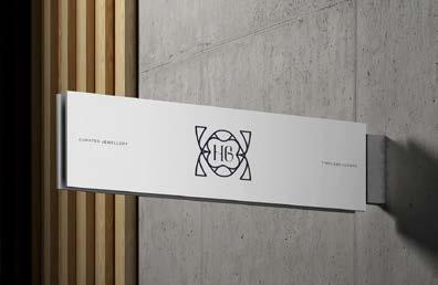
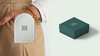
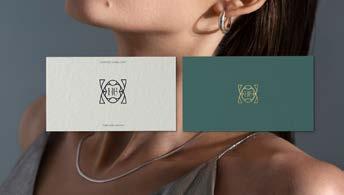
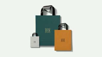
Designed the visual identity for HG (Haven Gea), a brand that blends serenity with quiet luxury. Inspired by Art Deco, I crafted the logo using clean lines and balanced shapes to reflect harmony and elegance. My goal was to capture a sense of stillness while maintaining a refined and timeless feel.
In developing this identity, I mainly focused on modern design trends that emphasize simplicity, natural influences, and a lasting aesthetic. By merging nature’s beauty with structured design, I created a brand identity that feels both classic and contemporary.
Signage
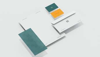
Packaging, business cards
KIRAKU
Brand Identity / Layout design
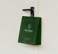
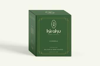
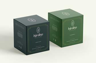
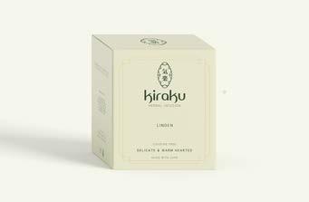
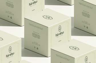
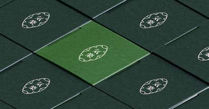
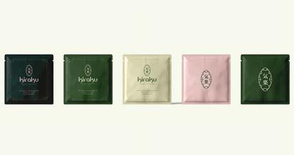
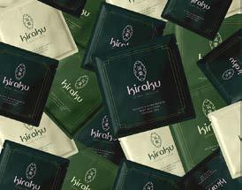
Brand identity design created for a personal client - tea brand, KIRAKU. The name itself signifies simple joys and a harmonious way of living.
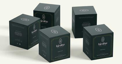
To bring this vision to life, I introduced the signature characters. These figures seamlessly integrate into the brand’s packaging and storytelling, serving as a gentle invitation to experience tea with intention.
Handcrafted, wild-harvested tea from the misty hills of Japan. Rooted in tradition and mindfulness, KIRAKU reflects warmth, care, and tranquility in every cup.
Logo variations
ZEPHYR
Brand Identity / Layout design
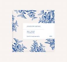
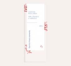
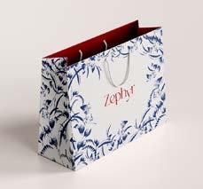
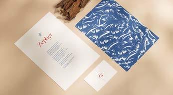
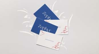
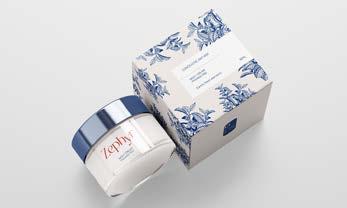
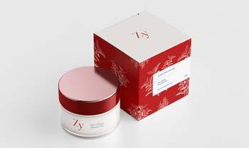
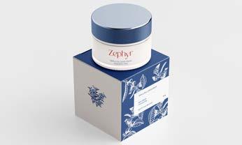
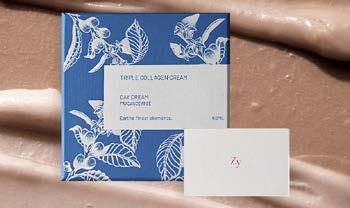
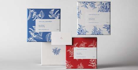
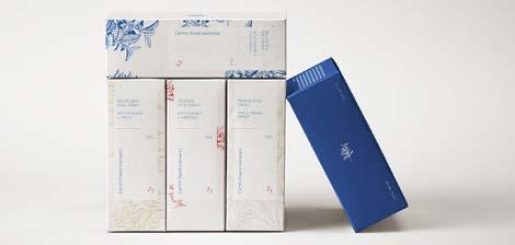
This beauty brand celebrates nature’s finest treasures, blending pure, natural ingredients.
Its mission is to enhance health and beauty, empowering individuals to radiate confidence. Skincare is both an art and a promise. The logo and visual identity were designed to reflect this philosophy. Every element embodies natural beauty and self-assurance, inviting individuals to shine with confidence every day.
Packaging, flyers, business cards
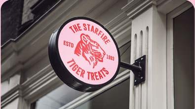
The Starfire Bakery
Brand Identity / Layout design
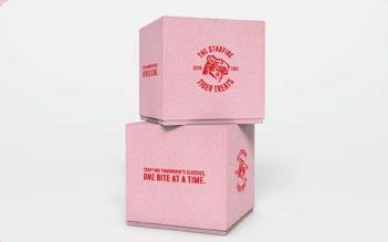
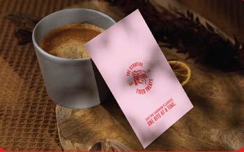
By blending their rich heritage with a contemporary flair, the project aims to create a memorable brand identity while resonating with a younger and new audience. The focus is to expand the customer base while incorporating current design trends.
The choice of a tiger as the logo suggests strength, energy, and a bold identity, symbolizing the bakery’s intention to be a powerful force in the market. This strategy sets the business apart from traditional competitors, finding a balance between tradition and modernity.
Signage
Packaging, business cards, merch
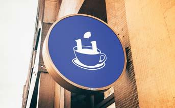
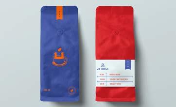
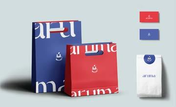
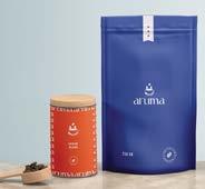
Aruma Coffee
Brand Identity / Layout design
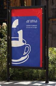
Aruma aims to make their clients daily coffee experience special. The primary goal is to enhance this experience, making it memorable. Embracing a modern design philosophy to stay current and appealing to contemporary tastes.
Custom logo creates comfort and relaxation. It becomes a recognizable and relatable emblem that immediately communicates the essence of the brand.
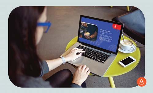
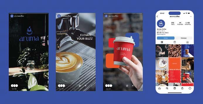
Established an online prescence by creating a website page and maintaining an active presence on social media platforms.
This gives an opportunity to showcase the brand’s products and services in a visually appealing manner, announcing promotions, discounts, and special offers to incentivize customers and visit the website, explore products, and make purchases.
Social media posts
Sakana Seafood Identity
Brand Identity / Layout design
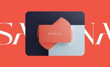
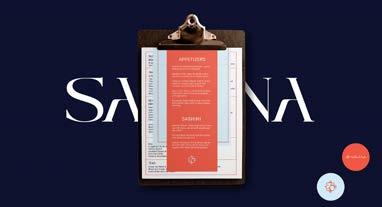
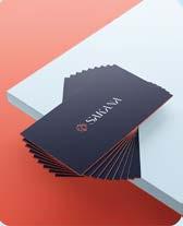
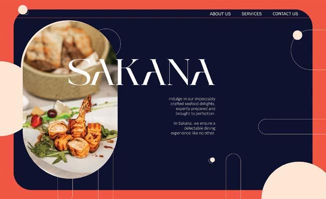
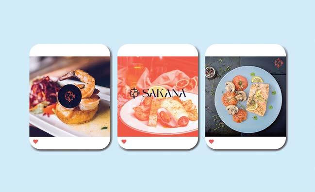
Sakana is dedicated to crafting exquisite seafood delights, aiming to provide a unice experience for their cherished clients. The project is designed to showcase Sakana’s mission.
The goal is to create a cohesive and memorable brand identity, reinforcing the culinary vision of Sakana.
Logo
Minicase Identity
Brand Identity / Layout design
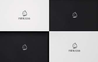
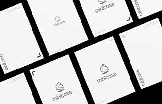
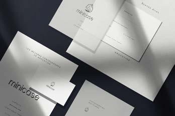
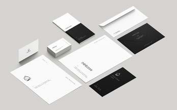
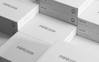
Minicase stands for a unique logo that was carefully created for a local startup company based that specialises in building offices out of recycled shipping containers.
Created a logo that combines heritage and contemporary in answer to the client’s unique requirement, easy to understand for the untrained eye.
The color palette is chosen to convey a sense of solid, classic and timelessness brand feeling. The combination aims to create a visually appealing and trustworthy image.
BM Yoga Identity
Brand Identity / Layout design
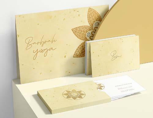
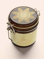
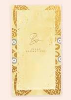
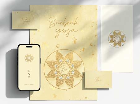
Crafted a distinctive logo and brand identity for a yoga studio based on the client’s vision, which includes incorporating golden tones, handwritten typography, and creating a welcoming ambiance.
The color palette & handwritten typography were chosen to symbolize warmth and enlightenment, fostering a sense of connection and approachability.
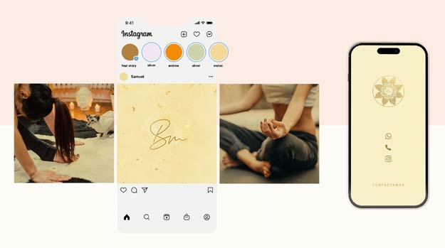
To increase brand’s visibility, a set of promotional flyers, business cards, and social media promotional posts were designed as a strategic approach to increase visibility, raise awareness.
By maintaining a consistent brand image, engage with the community, and inform the audience about services and events. This resulted in growth their presence both offline and online.
Social media posts
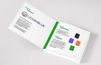
LEARNBLUE Brand Guidelines
Digital Brand Guidelines Design
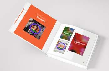
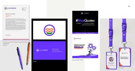
The goal of the LEARNBLUE brand guidelines project is to establish a comprehensive and standardized set of rules and recommendations for using the LEARNBLUE brand consistently across various platforms and applications.
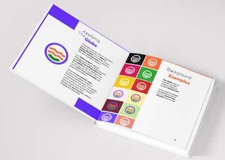
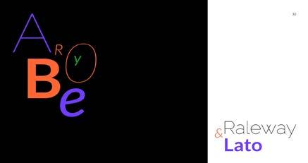
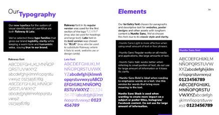
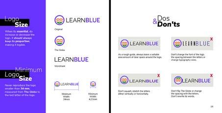
This involves creating a standardized approach to the use of logos, colors, typography, imagery, and other visual and textual elements associated with the brand.
The brandbook solves as a valuable resource for internal and external stakeholders, offering them insights into the correct and effective use of the LEARNBLUE brand.
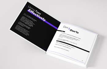
By outlining the dos and don’ts, usage scenarios, and the rationale behind design choices, stakeholders gain a deeper understanding of the brand’s essence.
Examples of LEARNBLUE logo applications
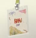
Pyahu Identity System
Institutional Design
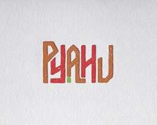
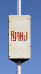
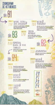
Identity system created for Haroldo Conti Cultural Center, with a focus on promoting the culture and human rights of Guarani groups.
Using indigenous typography and a color palette inspired by the Guarani flag, the system aims to engage both young and adult audiences creatively.
The ultimate goal is to raise awareness, foster societal change, and recover the memory of victim communities.
The centerpiece is an event with pre-registration, providing insight into the Guarani world, encompassing traditions, culture, and language.
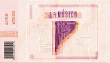
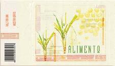
Event calendar, tickets, cards
Promotional Campaigns
Brand Identity & Editorial
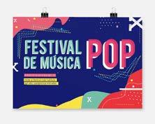
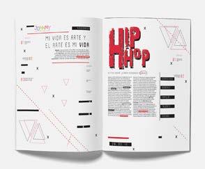
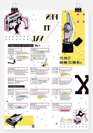
Set of promotional flyers, calendars, and magazine articles for summer festival. The focus is to convey the lively and joyful ambiance that characterizes such events, creating an connection with the target audience.
Through the promotional materials, the intention is to evoke a spirit of playfulness, encouraging people to participate in the festival with a sense of joy.
The set of promotional pieces contributes to creating a cohesive brand image for the upcoming summer festival.
The consistent use of vibrant colors and celebration of creative spirit across posters, calendars, and magazine articles reinforces a unified visual identity, making the festival easily recognizable.
VAW Magazine
Editorial Design
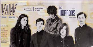
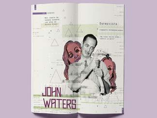
The goal for “VAW” magazine is to create captivating and thought-provoking set of articles that resonate with the essence of alternative living. The focus is on utilizing collage design and typography to invite readers to question societal norms and embrace diverse lifestyles.
The project involves a deliberate fusion of typography, imagery, vibrant colours and layout.
MARTINEZ Magazine
Editorial
Design
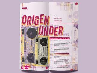
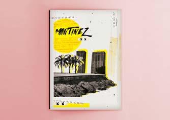
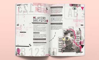
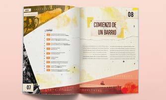
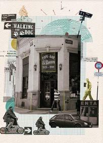
Set of articles for local magazine. The client’s vision is to have an experimental design that serves as an invitation for readers to enter the neighborhood. The focus is on offering a unique and sensory journey into the history, culture, and spirit.
Through a combination of images, textures, and experimental typography, designed a narrative style that goes beyond traditional linear storytelling, creating a more dynamic and immersive reading experience.
Infographics
Informational Design
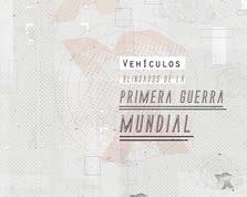
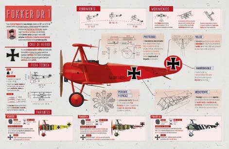
Set of infographics that detail armored vehicles used in World War I.
As a design project, it serves as an educational resource by providing users with detailed information.
Museum Postal Design
Exhibition Design
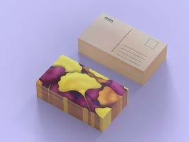
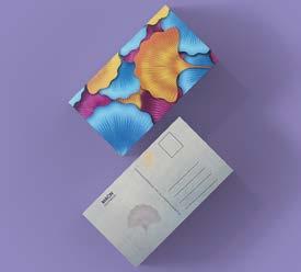
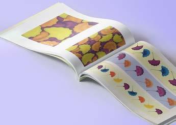
Set of postals crafted for MACN Museum. This unique collection is inspired by the geometric patterns of the flagella leaf.
There was an in-depth examination of the geometric intricacies inherent in the flagella leaf beforehand, by crafting postcards and patterns, the project seeks to enhance the visual appeal within the museum, contributing to an elevated aesthetic ambiance.
Collage Design
Digital Collage
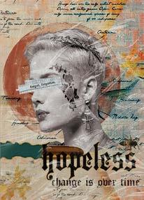
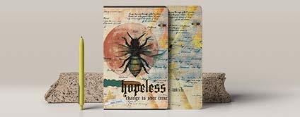
Set of collage posters and notebooks that blends typography, images, and colors to emulate the vibrant and dynamic style of street art.
The goal is to produce a set of visually striking items that capture the essence and energy associated with street art.
Character Design
Digital Design
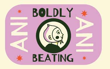
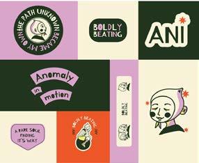
‘ANI’, a character designed for a learning-focused podcast that discusses anxiety. Mascot of this project, representing a journey of self-discovery and overcoming challenges.
Through logo, bold typography, and graphic elements that convey movement and transformation, I aim to create a visual universe that reinforce the message of progress.


