Naomi Colon
Interior Design Portfolio
Savannah College of Art and Design


Interior Design Portfolio
Savannah College of Art and Design
My name is Naomi Colon. I am a young professional who’s excited to tell stories and create experiences through design. I believe in the importance of creating spaces that foster human connection. Spaces, that hold a certain kind of magic as they carry hundreds of stories and create experiences through design. That is what interior design is to me, the art of creating a space where different stories and experiences are able to unfold. A space that carries feeling and will create an impact.
Blooming Inquisitions
Immersive Experience
Laurella
Retail Design
Komorebi
Workplace Design
Hand Rendering
Digital Design


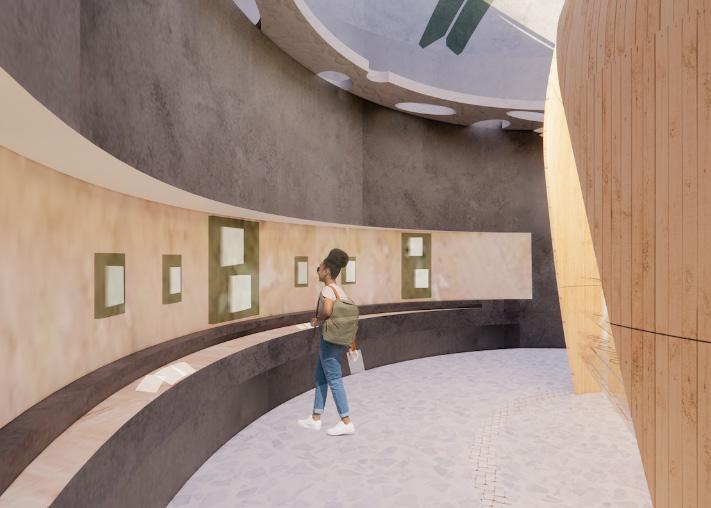
Blooming Inquisitions stems from the life cycle of dandelions. In its final stage, when a dandelion closes up and dies, it transforms into a pappi that blows away and sprouts new flowers wherever they land. Each dandelion is part of a bigger process, no matter where they drift off they carry their identity with them. Similarly, this project will be planted in new locations and throughout it will carry the identity of Lacoste.


This project is a pop-up event that will be planted in different locations for new people to enjoy. This project is designed to carry the culture and experience of Lacoste which will be experienced through the 5 senses similarly to the way a dandelion goes through its life cycle. This pop-up is made of 5 different pods, each representing a different sense (taste, sound, smell, sight, and touch). The pods are designed each by a different group which are made up of 3 people each (my group is taste).
This project started out with all groups working together to design the architecture of the outside structure of the pods. Then, we separated into our groups and started designing based off our sense. Each pod reflects our personal experience of being in Lacoste.
Key
Group I: Vue ( Sight)

Group II: Gout (Taste)
Group III: Sonner (Sound)
Group IV: Sentier (Smell)

Group V: Toucher (Touch)
The outside structure of the pod features traditional materials found in Lacoste such as wood, bronze, and brass. The pod showcases a modern twist through its use of a glass roof, which also serves as the main source of natural light.
Upon entering the pod the user will be immersed in a “Bread Oven” that showcases a unique twist to the traditional bread ovens and bakeries in France. From there the user can choose which direction to take. In either direction there are “Farm-to-Table” exhibits that feature the local agriculture.

In the market area users can pick up samples of different foods made in Lacoste which are beloved by locals. This space also exhibits an LED screen in the middle that displays different pictures and short videos that show users what its like to walk through the famous markets of Lacoste. This screen along with the food will create an immersive experience that will capture the user’s attention and give them a little piece of the beautiful southern village of Lacoste.


The recipe wall is made up of several cork boards, that are inspired by wine corks, which are full of local recipes written by residents of Lacoste. It’s designed so users can come and take these recipes home to try, and not only that but space and paper is provided so users can leave their own recipes. This creates a personal touch and a unique space where two cultures interact with each other.
Komorebi aims to give its users a second home while creating a unique space where they can focus while feeling comfortable and energized. Not only that, Komorebi also seeks to give users a sense of reawakening through its wellness program. The space will use biophilic design, organic shapes, different textures, and pops of color to employ the sense of both comfort and energy .

Workplace Design
Winter 2022
Savannah, GA


Individual Project


Software Used
Revit Enscape Photoshop
Second Home was founded in 2014 by Rohan Silva and Samuel Aldenton to provide a creative office space for entrepreneurs and creative businesses. Throughout its office spaces Second Home aims to keep supporting job creation by using biophilic design to enhance calm, creativity, and focus.
Key
Small-to-medium companies: 37.9%
Start-up teams: 27.1%
Freelancers: 16.6%

Main Entrance
Bathrooms
Fire Exits
Elevators
Windows Columns


Arches
Main Entrance
The organization of the main area, which is made up of the workspaces, is ordered based off the parti-diagram which supports the concept as it adds a sense of energy through movement.


Scale: NTS


Key


The reception is the first place users will go upon entering the building. It introduces colors such as beige and green as well materials such as wood and marble that are used through the whole space to create a sense of comfort. Unique elements such as the flooring, ceiling, and custom desk are added to create a sense of energy which ties back to the concept.

The wellness room uses a unique carpet design, that alternates between two colors, to create a sense of energy that will encourage users to perform different activities from yoga to Pilates. A prominent element in this room is the pendant lights, users will be able to see the illumination of the lights only from a specific angle which goes back to the concept, as Komorebi is that specific moment when light shines through leaves in a tree.


When creating this store, Laurella became the star influence. As this would be their first store in the U.S. it was important that their values and mission remained intact and were communicated to the customers. Laurella is all about being transparent and fun. Throughout its stores they use their iconic pink as well as unique design elements to create a space that is not only a store but an experience.
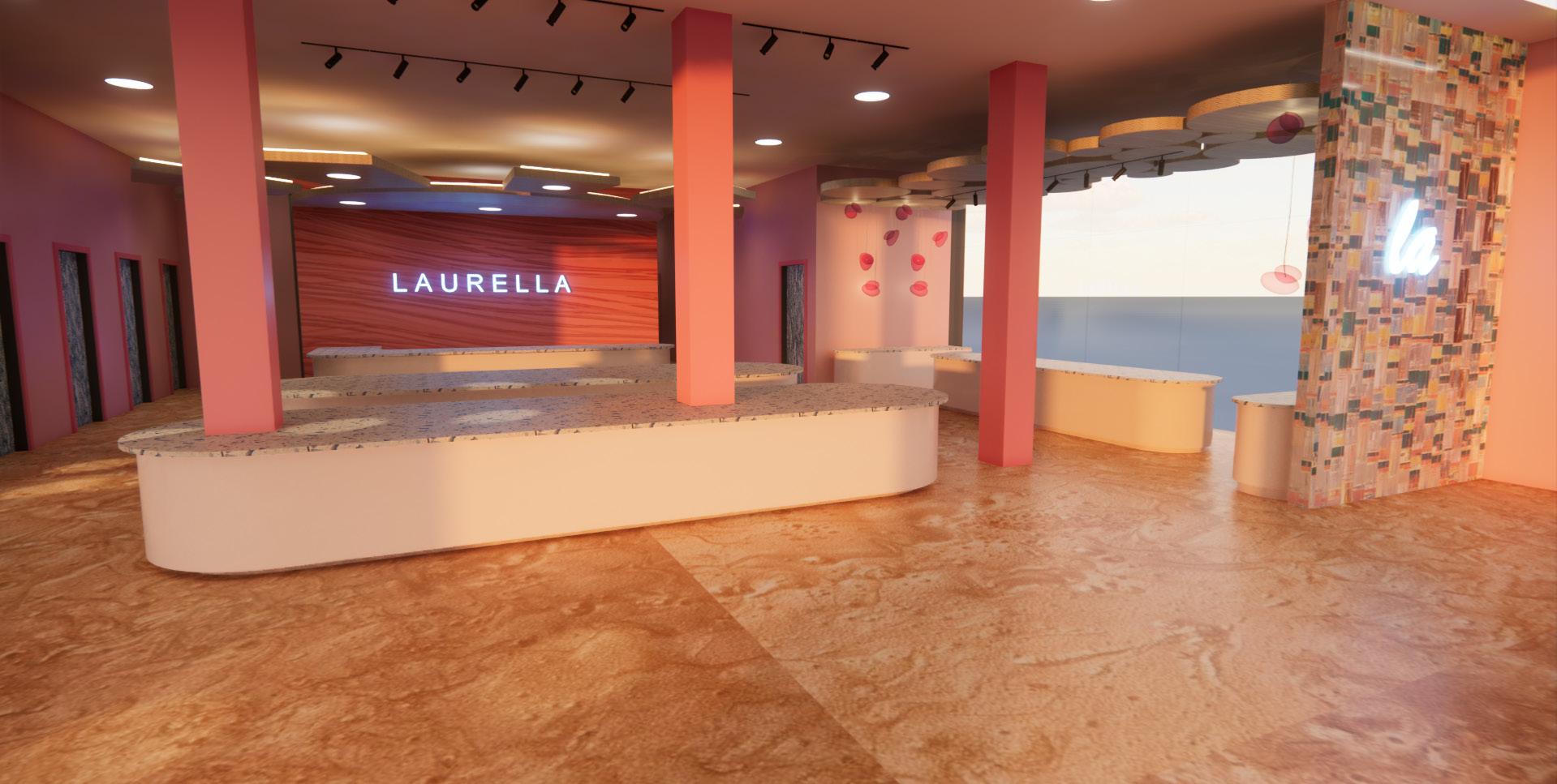


Laurella is a popular Polish fashion brand that was created out of the love of two people for each other and fashion. This fashion brand is a response to the need to own fashionable and high-quality clothing at a lower price while at the same time being a rebellion against expensive brands.


Laurella is looking to expand their brand which is why they are coming to the U.S. Laurella is a perfect fit for Long Beach, Ca as it is known for its fun designs and iconic pink. This new location will incorporate Laurella’s iconic pink while at the same time incorporating elements native to Long Beach, CA such as its beach and art.


As a fashion brand, Laurella, needed a space that could showcase different products. That is why this store has different areas such as clothing display, accessory display, and jewelery display. Unique to this location, this store features Social Media Walls where customers can take pictures.
Key Recessed Lighting
Pendant Lighting
Task Lighting
Halogen Tubular Lighting
LED Light Strips
Track Lighting
Exit Signs
Main Entrance
The check out area is designed to leave the users with a positive long lasting impression of Laurella. The star element is the drop ceiling which is designed to represent the bright sun of California. This area also represents the merge of Laurella and Long Beach as it uses the iconic Laurella pink as well as the blue and beige of Long Beach.

Part of Laurella’s mission is their desire to create more than a store but to create an experience. This is where the social media wall comes in, it provides a space for customers to take pictures in front of a custom wall made of colored glass that also displays their logo. This not only promotes the brand, it also creates a positive experience for the customers.

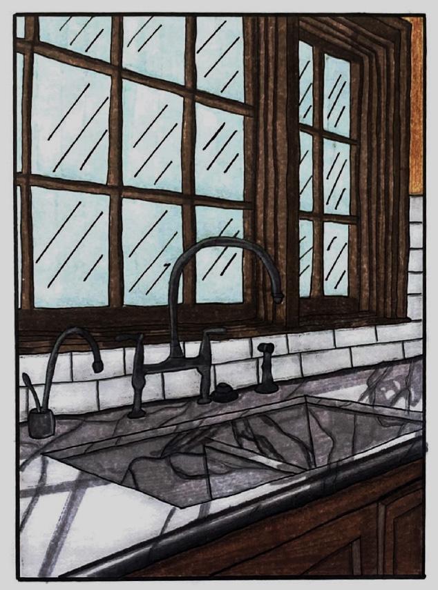
These renderings were created as part of a rendering course . They were created with pen, markers, and color pencils.


These works were created in a visualization in digital design course where we learned different techniques and tools for both Adobe Illustrator and Photoshop.


