THIS PORTFOLIO CONTAINS THE DESIGN WORK OF NANA KOMORIYA.


2
01
10,000 BEDS IN A LANDSCAPE
Fall 2022
Harvard GSD
Option Studio
Fernanda Canales
Pages 6 - 19
OUT THE WINDOW
Fall 2018
UC Berkeley
Arch 100C
Rudabeh Pakravan
02
COLLECTIVE ELISIONS: LEAKY LIVING
Spring 2022
Harvard GSD Core IV
Sean Canty
Pages 20 - 37
05
ORDINARY, EXCEPT
Fall 2020
Harvard GSD Core I
Lisa Haber-Thomson
03
STACKS OF CLT & SMALL SPACES
Fall 2021
Harvard GSD
Core III
Yasmin Vobis
Pages 38 - 49
06
FRAME
Spring 2021
Harvard GSD
Core II
Jeffry Burchard
Pages 50 - 61
FILM SHED
Spring 2021
Harvard GSD
Core II
Jeffry Burchard
Pages 82 - 89
Pages 62 - 71
Pages 72 - 81 07
08
HIDDEN ROOM
Fall 2020
Harvard GSD Core I
Lisa Haber-Thomson
Pages 90 - 93
09
JUMP CUT
Fall 2020
Harvard GSD
Core I
Lisa Haber-Thomson
Pages 94 - 97
3
04


4
10
PEACE PAVILION
Spring 2019
UC Berkeley Arch 100D
Mark Anderson
Pages 98 - 105
13
DOUBLE NEGATIVE
Fall 2017
UC Berkeley
Arch 100A
Jason Campbell
Pages 116 - 125
11
CULTURAL CENTER
Spring 2019
UC Berkeley Arch 100D
Mark Anderson
Pages 106 - 109
12
GOOD FOOD
Spring 2018
UC Berkeley Arch 100B
Eleanor Pries
Pages 110 - 115
14
CONSTRUCTION & MATERIALS
Spring 2018
UC Berkeley Arch 160
Dana Buntrock
Pages 126 - 131
15
MARIPOSA ADU
2019 - 2020
Sidell Pakravan
Professional Built Work
Kristen Sidell & Rudabeh Pakravan
Pages 132 - 135
5
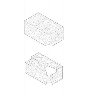
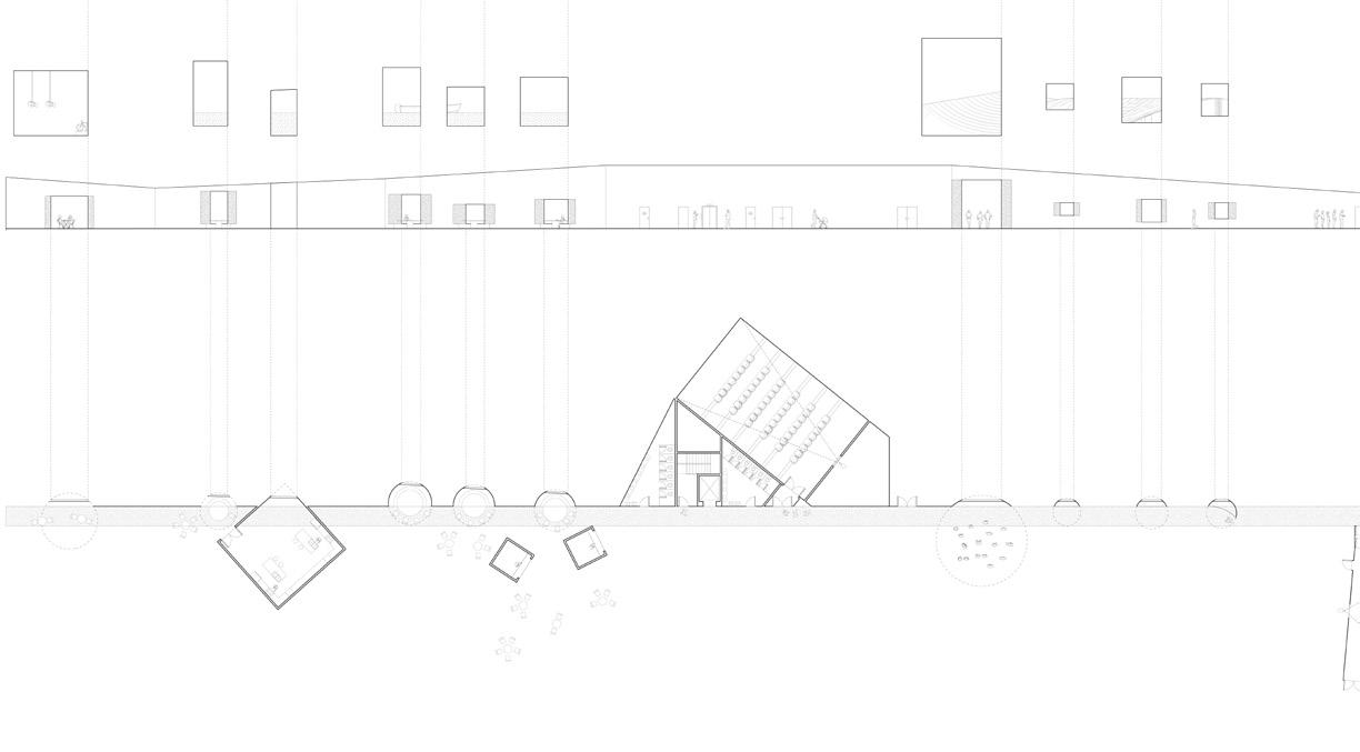
10,000 BEDS IN A LANDSCAPE
COASTAL COLLECTIVE: PROTECTING THE SHORELINE THROUGH DAILY RITUALS
Fall 2022 / Harvard GSD Option Studio / Fernanda Canales
Katoku beach, on Amami Oshima, is one of Japan’s last remaining natural beaches. Japan, and its smaller islands, are prone to natural disasters including tsunamis, coastal erosion, and flooding, and as a result, the government relies heavily on concrete construction in attempts to protect the shoreline and its communities against these disasters. This site has prompted questions of how coastal built environments can be designed without being disruptive and destructive to the natural environment while addressing and protecting communities from inevitable natural disasters. The tsunami tower is adapted in this project as an infrastructure that has the potential to support uses beyond its primary program as a safe evacuation space and can bring people together not only in times of crisis but in the day-to-day. Rather than an intervention that protects by creating a physical barrier against the sea, this project embraces its proximity to water and provides a framework that supports spaces for daily rituals, protection in times of crisis, and the natural environment. This proposal suggests that the infrastructure for crisis, living, and nature are not isolated but are one of the same.
6 01

7


8 01 Japan’s Ryukyu Islands in the Ryukyu Trench 02 Amami Oshima (Island) 03 Katoku on the south east side of Amami Oshima 04 Chinase coastline before 05 Chinase coastline today with concrete intervention 06 Concrete seawall 07 Kominato coastline 1945 08 Kominato coastline today with concrete intervention 09 Concrete wall along beach 10 New York Time’s article titled “This Pristine Beach is One of Japan’s Last. Soon It Will be Filled With Concrete.” 11 Intital concept collage titled “Bathing Alone, Bathing Together” 01 04 07 02 05 08 03 06 09 10

9 11

10

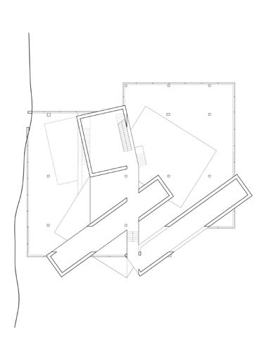
11 SITE PLAN OF 10,000 BEDS

12 SECTION

13

14 SECOND FLOOR PLAN


15 GROUND FLOOR PLAN ROOF PLAN


16 GROUND FLOOR PLAN SECOND FLOOR UNIT PLAN

17


18 THIRD FLOOR UNIT PLAN
FLOOR UNIT PLAN
FOURTH
19
COLLECTIVE ELISIONS LEAKY LIVING
EXISTING OFFICE BUILDING, ADAPTIVE REUSE
Spring 2022 / Harvard GSD Core IV / Sean Canty
In collaboration with Zane Slone
This project explores ways to adapt an existing office building with a deep floor plan into collective housing. Through operations of elisions, the office building is rescaled for domesticity, light, and spaces of collectivity. Private interiors become leaky and collective through strategic cutting that works within the existing structural framework.
The work of artists Gordon Matta Clark and Eduardo Chillida help guide our interventions on the existing building. In Bingo 359 Erie Avenue, Matta Clark demolishes most of the facade but surgically cuts around and leaves a piece of it intact. Careful and strategic methods of demolition can lead to the reconstitution of existing elements as something special and new. In Conical Intersect, we learn from Matta Clark’s two step operation of cuts to create internal double negative conditions in which collective spaces can emerge and to frame these internal relationships from the exterior to allow for views and light. The offcut pieces become artifacts of demolition, creating a visual legibility of the subtractive processes.
This project was in collaboration with Zane Slone. We developed and evolved the interests of the project together throughout the semester. I took charge of space making, plan making, and model making while Zane focused on developing the narrative and representation around demolition and reuse.
20 02

21


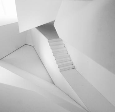
22 PHOTOGRAPHS OF 1/4” SCALE SECTION MODEL


23

24


25
The work of Eduardo Chillida became a productive reference in the way we developed the circulation, unit organization, and collective spaces in the plan. We took note of solid and void relationships in Chillida’s black and white artwork and its reading of leaky, swelling, and spilling spaces. In Chillida fashion, these plan diagrams show the figure ground relationships and how they shift from floor to floor. The voids are open and collective spaces that are strategically cut to fit within and preserve the existing cores and structure. A large cut at the heart of the building creates a collective center in which a series of secondary collective spaces leak into.


The corridor becomes an important organizational element and has a clear and consistent reading throughout the floor plans. The corridor swells and leaks into collective spaces as it intersects with internal and external subtractions.

26 1 ALEWIFE
CENTER, CAMBRIDGE MA
GROUND FLOOR
SECOND FLOOR
FOURTH FLOOR
THIRD FLOOR
FIFTH FLOOR
LEAKY PLANS
EXISTING FACADE CONSTRUCTION


BRICK VENEER
WALL INSULATION
CONCRETE BLOCKS
27 EXISTING PLAN

28 THIRD FLOOR

29 FLOOR PLAN


30 GROUND FLOOR PLAN SECOND FLOOR PLAN


31 FOURTH FLOOR PLAN FIFTH FLOOR PLAN


32 SITE PLAN PROPOSED WEST ELEVATION EXISTING WEST ELEVATION


33
SECTION OBLIQUE
EXISTING SOUTH ELEVATION
PROPOSED SOUTH ELEVATION
DEMOLITION & OFF CUT MATERIAL
This series of diptychs illustrate the existing facade, the demolition of the facade, and the reconstitution. While these operations open up spaces for collectivity and light, our interventions of subtraction come with questions of what to do with the demolition material that results from this subtractive process.


34
EXISTING DEMOLITION RECONSTITUTION
REUSE & RECONSTITUTION

Our proposal spills out further beyond the boundaries of the building and leaks out into the empty parking lot space in front. The resulting pavilions, or low res sheds, are constructed from off cut demolition material including steel wide flanges, fragments of floor plates and walls, and brick. These spaces offer a place for residents and community members to participate in the crafting and exchanging of smaller scale repurposed objects. Introducing workshops and studio spaces within the building as a form of collective space supports the creativity and creation of domestic objects, such as furniture, made from demolition rubble. These pavilions and goods made from off cut pieces become artifacts of demolition.


35
DEMOLITION ORGANIZATION RECONSTRUCTION
AFTERLIFE OF PAVILIONS


Across scales of aggregates, ground is what holds everything together.
At the smallest scale, rubble is cast to create new and fun terrazzo like surface materials. Cement or concrete from the ground is what holds the rubble aggregates together. At the mid scale are the domestic objects that are produced from demolition. And at large scale are the pavilions that are spread across the site to serve as collective spaces through out the neighborhood. In the afterlife of the project, after all of the demolition material is sorted and reconstituted, the pavilions are disassembled and reassembled on different sites across the neighborhood to continue to serve the community. 1 Alewife Center is the main makers space with its workshops while the pavilions scatter across the site as satellites to make repair and collective space convenient and accessible to all.

36
PAVILIONS
PAVILIONS ON SITE
SPREAD ACROSS NEIGHBORHOOD

37
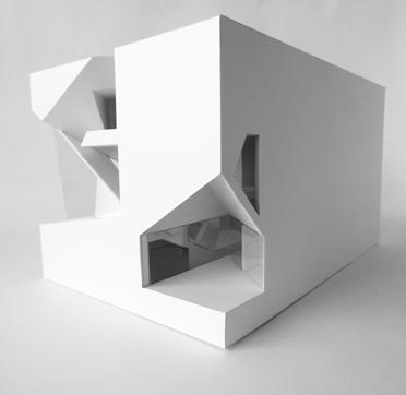
STACKS OF CLT & SMALL SPACES
NATIONAL SCIENCE FOUNDATION IN BOSTON
Fall 2021 / Harvard GSD Core III / Yasmin Vobis
This office building for the National Science Foundation situated in Boston explores ways to introduce a scale of domesticity and intimacy into the workplace. While offices inherently follow a top-down hierarchy, bottom-up spaces are inserted into the project to give adjacency to the inhabitants. The primary structure consists of 12’ x 80’ CLT panels that are calibrated to program and lighting needs. Much like a house of cards, the structure builds from bottom-up with each panel resting on at least two points of the structure below. This choreographs the interior organization and shapes the exterior by the pushing and pulling of the envelope. Enfilades are cut into the CLT to create circulation shortcuts, visual connections, and to shrink the perceptual scale of the large office building.
noun: domesticity
1. home or family life.
“the atmosphere is one of happy domesticity”
This project was nominated by faculty for the Harvard GSD Archives and Publications.
38 03

39


40 OVERLAYED PLAN OF STACKED CLT
AXONOMETRIC OF STACKED CLT
SECTION PERSPECTIVE
STRUCTURE & SPACE
While structure is often concealed and is secondary to the architecture, the CLT structure in this project becomes the generator for the interior organization and the spatial experience. Each level is structured by three to five 80’ long CLT panels. This structure builds from the bottom up and must follow a set of rules in which each CLT panel must rest on two points of the CLT structure below. Although there are a strict set of rules, the stacking of the CLT can be quite lose. The program and their specific lighting needs are studied to carefully calibrate the CLT panels. Arranging the CLT panels in a crucified form is the most rational plan that allows for the most light and is desirable for workspaces. Loosely arranged panels provide medium light for library, exhibition, and workspace. The most closed off arrangement of panels creates a floor plan with low light, required for programs such as the lecture hall and light sensitive exhibitions.


41 MOST LIGHT Workspace MEDIUM LIGHT Workspace Library Exhibition LOW LIGHT Lecture Hall Library Exhibition (Light Sensitive) CLT
SITE PLAN IN BOSTON
An important reference in developing the premise of this project is Kumiko Inui, a Japanese architect. Her research titled “Learning from Little Spaces” is a series of photographs and observations of environments across Japan in which people inhabit and make place in these so called “little spaces”.


Inui describes that there is a “delight in discovering little spaces or places that are part of our day-to-day environment”. She also states that “Our behavior is structured by space” and that “It is a natural tendency of architects to believe in the power of space to create structure, and to try and design new behavior for people or new ways for them to gather together”. “We spend our days absorbed in our plans, sure that we can make the world a better place through models and blueprints.”
This relates very much to the plan making of this project in which loosely calibrated CLT walls and volumes produce loose spaces that allow people to make place within the office environment.


42 PLANS &
LITTLE SPACES
BASEMENT FLOOR PLAN THIRD FLOOR PLAN SIXTH FLOOR PLAN FIRST FLOOR PLAN FOURTH FLOOR PLAN SEVENTH FLOOR PLAN SECOND FLOOR PLAN FIFTH FLOOR PLAN EIGHT FLOOR PLAN


43 THIRD FLOOR PLAN FIRST FLOOR PLAN


44


45 EXTERIOR ENVELOPE 01 Perforated metal mesh 02 Hollow steel section / bolted to perforated metal mesh 03 T steel section 04 Insulated glass unit 05 Aluminum frame EXTERIOR BALCONY 06 Paver 07 Paver pedestal 08 Waterproofing membrane 09 Rigid insulation 10 Gutter INTERIOR VERTICAL STRUCTURE 11 Steel plate with bolts 12 Steel column 13 Screws at 45 degrees 14 Bolt 15 T steel section 16 Two 12’ x 80’ 5 ply cross laminated timber panels INTERIOR HORIZONTAL STRUCTURE 17 Raised floor 18 3” reinforced concrete slab 19 Screws at 45 degrees 20 7 ply cross laminated timber 21 Floor air diffuser 22 Mechanical systems INTERIOR PARTITION 23 2 x 4 dimensional lumber 24 5/8” gypsum WINDOW 25 3” steel frame 26 Insulated glass unit GROUND 27 Slab on grade 28 Interior floor finish 29 Gutter 30 PVC perforated drainage pipe BASEMENT 31 Reinforced concrete 32 Batt insulation 33 5/8” gypsum FOUNDATION 34 Concrete foundation footing 35 Gravel 36 Subsoil 01 25 29 28 27 26 30 31 34 32 35 33 36 12 15 14 16 11 13 02 03 04 05 10 06 07 08 09 17 23 18 24 19 20 21 22

46 1/32”
MASSING IN SITE MODEL

47 1/8” SECTION MODEL


48 ENFILADES & THROUGH VIEWS


49
04
OUT THE WINDOW
CREATING A RELEVANT MODEL FOR A DENSE AND LEGIBLE CITY
Fall 2018 / UC Berkeley Arch 100C / Rudabeh Pakravan
In designing a large scale housing project in Oakland, California, the window is explored as a catalyst that can generate new relationships between urban form, boundary, public space, flexibility, density, and legibility. On the one hand, the window frames the interior experience and its relativity to the city, “the inside out”. On the other, the window generates legibility for the urban form, “the outside in”. In this study, I developed an interest in exploring the window as a subtraction or erasure that allows for pockets of nature and privacy to be experienced in the midst of density. This project is developed through a four step sequence:
01 Domestic vs Urban: Exploring Boundary and Legibility
02 Through the Lens: Site Readings and Literature
03 The Elevation is the Generator: A Precedent Study
04 Spatial Construct: Out the Window
“Certain features – open space, vegetation, sense of motion on the paths, visual contrasts – seem to be of particular importance to the cityscape.”
— Kevin Lynch, Image of the City
This project was selected for the CED Circus 2019, Student Exhibition 2019 & Student Archive 2019
50

51

52
SITE PLAN
The site is at the intersection of Broadway Ave and West Grand Ave in Oakland. A wet wall, an infrastructural element found in existing urban conditions, is used as a continuous organizational device for the units across the site. The circulation is always along the wet wall axis which sets up a rhythm of movement. By having the wet wall house the bathrooms and kitchens, it maximizes the opportunity for windows and erasures to happen at the corners.

53
The units are arranged across the site in clusters of three units (a studio, one bedroom, and two bedroom) with one shared common space on the ground floor. The shared space can be used as anything from an extra bedroom, an office, to an Airbnb that could generate extra income for the residents of the three units. The interior spaces are flexible, and units can be combined and separated with the sliding doors. This model proposes a new way of living that offers residents flexibility and control over the space that they live in.


54 GROUND FLOOR PLAN THIRD FLOOR PLAN ROOF PLAN
SEPARATE UNITS
SHARED SPACE + TWO BEDROOM
ONE BEDROOM + TWO BEDROOM STUDIO + TWO BEDROOM

55 SECOND FLOOR PLAN

56
Elevation oblique illustrating the relationship between the exterior facade and the interior plan.


57
Collage renders using photographs of physical models visualizing the outside in, elevated open spaces, and the inside out
EXPLORING BOUNDARY AND LEGIBILITY


This project began with two collages that manipulate the site context as an initial exploration of the relationship between domesticity and urbanism. This reading of the city was then followed by a close study of the Moriyama House by Sanaa. I found interest in how the volumes of the Moriyama House create in-between spaces for nature and privacy that feel remote from its immediate urban context. I wanted to explore this idea further by stacking and rotating volumes to create interstitial open spaces on different levels that integrate with the urban form. Through study models, a parti wall that connects the spaces together was realized. The parti wall became of particular interest to me because of the conversations of urbanism that it generated.


58
Floor Plan of the Moriyama House / SANAA
Elevation of the Moriyama House / SANAA
Plan: A rotation is introduced as a response to the site
Elevation: Stacking and shifting of volumes allows for interstitial spaces to exist


SPATIAL CONSTRUCT
In developing the final spatial construct, a rotation was introduced as a response to the site and the parti wall was thickened to become a habitable wet wall space. The wet wall and rotation work together as a generator for spatial organization. The wet wall is shared between units and can be read to have a paradoxical relationship: it is the most private layer of domestic life yet it plays with the idea of pushing into each others spaces. A void was cut into the wet wall to offer light and to form a relationship between the individual and the sky.
59

60
FINAL BRISTOL MODEL at 1/2 scale with interior details of the wet wall, furniture, sliding doors, and stairs. Study model at 1/8 scale.


61
ORDINARY, EXCEPT
THE TRIPLE DECKER TYPOLOGY
Fall 2020 / Harvard GSD Core I / Lisa Haber-Thomson
In collaboration with Joseph Kyle
This final project from Core I, titled Ordinary, Except, investigates the rear-deck ordinary of the typical Cambridge/Somerville triple-decker home as a projective tool for designing an artist residence. The project interrogates the rear-deck to articulate the tension between compartmentalization and wholeness, public and private, interior and exterior, and typological and novel. The resulting sequence of ascending deck spaces employs users’ phenomenological senses to connect and distinguish three distinct programs — art making, exhibiting, and living — while also exploring how different conditions of enclosure both index and disguise the changes in New England’s seasonality.
This project was nominated by faculty for the Harvard GSD Archives and Publications.
62 05

63


64 FLOOR PLAN 01 FLOOR PLAN 02 Cook 300 sq ft East, West, South Facing Lounge 400 sq ft All Facing Paint 300 sq ft North Facing Display Art 3000 sq ft North Facing Sculpt 300 sq ft North Facing Photograph 200 sq ft Minimal Sunlight Sleep x 4 200 sq ft East Facing Study x 4 100 sq ft North Facing CATALOGUE Spaces calibrated for optimal lighting conditions suited for each living, exhibiting, and art making program. B B A A
Three primary factors affect the deck’s form and use (or “deckness”): the changing seasons, vertical circulation, and privileged positions of viewership. The project interrogates these factors as it seeks to articulate, question and redefine what “deckness” can be or should be.
Almost synonymous with the deck typology is the back-stair, a secondary form of vertical access for the building’s stacked apartments. If the front stair functions as a public circulation element, the back-stair is reserved for residents and their close friends. This design explores this key variable of vertical circulation by keeping its deck-stair-deckstair sequencing, but abandoning its typical placement along the triple-decker’s rear façade and expanding its function to include a gradient of public and private uses.
A vertical circulation route links the project’s three distinct sections from the center, always by way of intermediary deck spaces. This circulation leads the visitor through varying conditions of enclosure and threshold on their path toward more and more private space. This arrangement ensures the physical connection but psychologically separates the Living House, which occupies the southern triple-decker, the Art House in the northern triple decker, and Exhibition House which occupies the space between.


Despite the fluidity with which visitors may circulate and engage with each ascending deck space, each program-specific building is arranged according to its programmatic use. Room types within each section are arranged according to their specific needs relating to ceiling height, light quality, and aperture orientation.
All bedrooms are placed on the Eastern side while the sculpting and painting studios are given a double height ceiling and large Northern-facing apertures. The central mass offers three distinct types of exhibition space — a darker, lower space ideal for photo and video exhibitions, a lofty space for painting and interior sculpture, and an exterior deck for outdoor sculpture.

65
FLOOR PLAN 03 FLOOR PLAN 04
The journey from the exhibition galleries to the roof deck is characterized by repeated moments of movement, stasis, and observation. Every deck space either functions as a platform for looking, or a place to be looked upon. Mimicking the ordinary deck typology, where a second floor deck looks down into a first floor deck across the alley, this looking is rarely co-planar. The project’s sequencing generally moves from public to private to allow the privileged position of viewership to always be given to the more private space, eliminating the possibility of unwanted observation.
Each deck’s placement is determined by the project’s vertical circulation strategy while the level of enclosure determines the extent to which interior activities correspond to exterior seasonal conditions. The most enclosed deck spaces occur within both existing triple decker volumes. Here, the changing of seasons affects interior plant life very little creating a distinct discontinuity between interior and exterior, especially during the cold months of the year. Exterior plants must be moved indoors while tropical house plants continue to grow against a snowy landscape outside. A greenhouse effect is created, although the architecture itself has stayed the same.


66


67 SITE PLAN UNROLLED DECK DIAGRAM
In stark contrast to the most enclosed decks, the two most open decks experience a great degree of seasonal change which affects their plant life, light and programmatic use significantly throughout the year. During the summer months, these decks offer sunlight and views of the neighborhood while their vegetation assumes an architectural role offering supplementary enclosure, shade, and privacy to users escaping their muggy interiors. During winter months, these decks go unoccupied — the plants are moved indoors and snow accumulates beneath their open windows.
The varying degrees to which these decks bring outdoor conditions inside affects the artists most significantly. Each must pass through three different levels of deck “openness” in their journey from the Living House to the Art House. The visceral experiences that they must undergo behave as important thresholds — distinguishing living space from working space and public space from private space in a structure that could easily become programmatically ambiguous.


68
FRONT
SECTION A
ELEVATION
While the thresholds distinguish space through the phenomenological experience, the massing reinforces this distinction through discontinuous geometry. The contrast between the original triple decker masses and the circular addition remains evident when viewed from the street. This distinct massing is undermined, however, by a unified aperture treatment which renders the original tripledeckers reminiscent of the original. Sitting midway between unity and discontinuity is the roof treatment, which echoes the conventional gable roof typology when viewed from the street, but rejects it when inhabited by users within the various deck spaces. The peels that occur throughout the project’s façade reflect this investigation by blurring the thresholds between interior and exterior. They are a formally unique addition to a collection of reinterpretations of regular deck elements. When taken all together they reinterpret what “deckness” may be — something that circulates visitors and frames privileged views as well as something that negotiates the changing of New England’s seasons in novel and programmatically specific ways.


69
BACK ELEVATION
SECTION B

70

71
PICTURE HOUSE
Spring 2021 / Harvard GSD Core II / Jeffry Burchard
Just as much as the picture house is for viewing movies and experiencing an internal and fictional world, the architecture offers a counterbalance and allows for visitors to connect with the surrounding context. The picture house is outward looking just as much as it is inward looking. With this project, I wanted to interrogate and rethink the typical experience of going to and leaving the movie theater. After being immersed in the magic of a movie — the transition back into reality is often characterized by the dark unimaginative hallway. This project rethinks this transition to allow individuals to experience a sequence between the movie frame and real life. This is done through a series of apertures, materiality, and situating the project on the site.
Approaching the project from the inside out and from exterior inward, the architecture mediates program and site and sets up “frames” to be experienced, whether it be the movie frame or view frame — both inward and outward looking.
72 06
FRAME

73
UNROLLED SECTION & PLAN
The unrolled section and plan index the path along the ramp with the views and spaces that would be experienced along the way. These moments of pause and viewing are woven into the sequence and are experienced before entering and after exiting each theater.
74

75


76 FLOOR PLAN 01 FLOOR PLAN 02 A A
FROM THE INTERIOR
The spaces within the project are treated as either within wall space or outside wall space — this creates a series of thresholds as the ramp leads you through dark into light and back into dark spaces. Portions of the ramp that are carved into the poche will squeeze you between two walls that lead into a framed view or push you out into an open space. The service spaces are embedded into the wall such as the bathrooms, egress stair, and elevator. This thickness offers the sound isolation necessary for the theaters and it offers itself as a medium for carving into and capturing views.

Throughout the project there are three different aperture strategies used to carve and connect the interior spaces with the exterior context. The first is framing the view with thickness — carved by circles to produce a thick frame that freezes the view. These circles mark points of stasis and observation such as in the waiting areas. The second aperture type is carved by path — always happening at the bend of the ramp in which you walk towards and almost enter the frame itself. The last aperture strategy is carved by space — in which the service spaces embedded in the wall protrude and cut into the façade.
MATERIAL AS MEDIATION
Right before entering the theater, the ramp cuts into the exterior wall leading you into the framed view as you turn the bend. This carving into the wall to produce an aperture for capturing the view is tied to the capturing of a movie within the theater space through materiality. The same textured and rough surface of the concrete in contrast to the smooth surface treatment throughout the rest of the project crafts a parallel experience of movie viewing and exterior viewing.

Right after watching a movie within a theater of rough surfaces, the ramp then leads you to experience the studio lot (where the filming took place) again through a similar frame.

77
FROM THE EXTERIOR
The picture house is situated within the studio lot in South Boston that was designed in the previous project. It sits on the water on the north end of the site right next to my film shed. The picture house is approached from either the harbor walk from the West through the film shed or from driving up the main road. In the elevation, the roof of the picture house continues the roof profile of the film shed creating a continuous reading from the exterior.

FRAMES AS MEDIATION
The section further investigates the notion of inward and outward looking and how view frames can relate to one another. In the central space, an exterior courtyard is carved by a sphere. From this courtyard space with stepped seating, the waiting area acts as a “screen” for people watching and vice versa. Through the waiting area is a view of the ocean to allow those who are in the very heart of the building to still be able to experience and connect with the surrounding context.

The other aperture from the courtyard looks into the exhibition and archive space where items used for filming are on display. Another aperture looks from this space towards the film shed beyond where the filming of the movie took place. This creates a visual relationship between the filming of a movie, to seeing the artifacts used for filming, and to watching the final product.

78
ELEVATION SITE PLAN SECTION A


79


80
Similar to occupying a seat within a theater, the booth allows you to occupy the wall while experiencing a more intimate relationship with the captured exterior view.
The act of movie watching is further connected to the site through the reveal of the theater screens on the exterior facade. This allows for an indexing of where each of the interior theaters are located throughout the building. The way the apertures are carved from the interior suggest “thinness” of the facade while the set back of the screens reveals the “thickness”.


81
FILM SHED
COURTS, CORNERS, ARCADES, BRIDGES, FACADES
Spring 2021 / Harvard GSD Core II / Jeffry Burchard
This project, consisting of a film shed and studio lot, begins with the analysis of the film Run Lola Run and the five architectural elements — courts, corners, arcades, bridges, and facades — that are extracted from the film. The two architectural elements that became of interest in the development of this project are “courts” and “corners”. When manifesting these elements into the shed, they are used as mediating devices between interior and exterior as well as form and program. These devices connect and organize program through negative space.
An extensive framework of structure is developed to bridge the negative spaces and hold the separate volumes together. The structural system has a different relationship with each volume and offers spatial definition while operating at multiple scales. Structure is explored beyond its sole role of support and is developed to suggest scale, define spatial experiences, and index transformation over time whether it be within a day, between seasons of filming, or over a longer period of time.
82 07

83


84 GROUND FLOOR PLAN SITE GROUND PLAN SECOND FLOOR PLAN SITE ROOF PLAN A A B B
The film shed is one of five sheds that sits on a studio lot located by the water in South Boston. Each of the five film sheds consist of smaller masses that together create a site of urban density that mediates private and public access through movement and the incorporation of the architectural elements derived from Run Lola Run. My film shed sits at the Northern edge of the studio lot on the water. The program is organized within five volumes that have been pulled apart. The large sound stage and two smaller sound stages each occupy a volume on the upper part of the site while the back of house program with smaller subdivisions are held within the two sheds on the bottom portion of the site. With the idea of “courts” and “corners”, I was exploring operations such as subtracting and voiding to explore how these moves can start to define new thresholds and space. A subtraction is made at the corners of the volumes where they squeeze at a point in order to define a covered courtyard space on the ground level. The doors into the sheds and the stairs up to the catwalk always happen at these moments or nodes and one can circulate from one space to the next either on the ground level or elevated on the second level.

85


86 STRUCTURAL DIAGRAM ELEVATION A SECTION A SECTION B INTERIOR ORGANIZATION DIAGRAM
In addition to the corners being cut, there are cuts subtracted from the structural system to define an outdoor sound stage beneath where filming can take place in between the volumes. A subtraction is also made from the circulation catwalk space in the two adjacent sound stages. Although the circulation catwalk appears to be part of the sound stage in massing, it is acoustically isolated from the sound stage and is open to the air. This is apparent in section B where a new boundary is defined between the two sound stages that now share a visual connection and spatial experience.


87
INTERIOR 01: FOR 100 PEOPLE
The structural system has a different relationship with each of the volumes. The structure sits on top of the shed with the dressing rooms and lounge spaces while it creates courtyards for the admin shed next to it. The structure pierces through the two middle sheds and becomes part of the interior ceiling treatment for the sound stages. The largest sound stage has operable skylights that fit within the structure that can open up when natural light if desired, otherwise the lighting is completely controlled. And the last film shed that sits in the water is independent of this roof system but is experienced as a large canopy cantilevering above.
INTERIOR 02: FOR 10 PEOPLE
In addition to each of the sheds having a different relationship to the structure, the structural system operates at multiple scales and can give spatial definition to various conditions of space. This is evident in the varying density and scale of the structure in the renders. The large sound stage in the first interior render shows a dense structure that lends itself to be used for hanging things and filming things. This is a space for a large number of people. The next interior space is in the admin shed and it is a courtyard that brings light into an otherwise dark workspace — this is a space to be experienced by a few people. And lastly, zooming into one module of the structure which is 10 ft by 10 ft in dimension and is perfect for creating a space for a single person to occupy and experience.


INTERIOR 03: FOR 1 PERSON
Change throughout a day. I became interested in how this structural system can start to index not only scale but change over time. The project reads as both a continuous whole and as fragmented volumes depending on where the film shed is viewed from. There is a further shift and fragmentation with how the structure interacts with the sun throughout the day and the shadows that are cast on the architecture itself, rendering it to be read differently at different times.
Change over filming seasons. Another interest is how the film shed space would be used outside of its purpose of filming. In the two exterior renders, the same space is shown but the experience of the architecture changes with its shifting entourage from a filming platform to an outdoor café area
Change over an extended period of time. The residual space underneath the elevated catwalk on the edge of the sound stage also becomes of interest. It is essentially an arcade but it is a space that is not built yet and so it can adapt to different uses and needs over time, whether it be for storage or a pop up make up station for actors working in the sound stage. If a more enclosed space is needed plywood can be installed to create enclosed rooms in the future.
88


89
HIDDEN ROOM
FIVE ROOMS
Fall 2020 / Harvard GSD Core I / Lisa Haber-Thomson
This project is interested in the overlap as a tool for blurring and defining boundary and threshold. The interest of the overlap is that it is ambiguous in which space it belongs to — it exists as a venn diagram in which it could belong to any of the intersecting spaces.
The form is derived from an exploration of curvilinear and rectilinear geometries that adhere to a strict set of rules. The packing and overlapping of rectilinear volumes breaks boundaries and produces an ambiguous in-between space while the curvilinear geometry works to reinsert thresholds into the project by offering itself as an orienting device. The curved corners inform movement by hugging and pulling the occupant from one space to the next leading to the hidden room as the very end of the sequence.
This fifth room is hidden from view but reveals itself by protruding the corners of its boundaries into the other rooms. In defining boundaries, the overlap is engulfed and taken up by each preceding space in the sequence. However, the overlap remains legible by imprinting itself through a level change. This raises questions on boundary — a wall is built to establish the threshold for a space, but the step that is reminiscent of the overlap allows the adjacent space to spill over and blur the threshold. To further complicate the reading of the overlap, an aperture is opened on the façade at the intersection of two volumes. This produces a reading of hierarchy in which one volume appears to be inserting itself into the other.
90 08

91
The grid is rotated about the center of the circle at 30, 60, and 90 degrees. Four rectangles are authored into the circle using this grid under the conditions of being fully within the boundaries of the circle with at least one corner being tangent. This packing produces conditions of overlap between the volumes. The logic to determine what happens with the overlaps is informed by sequence — a linear sequence of moving from one space to the next determines the threshold. A rule is established for the preceding space to take the overlap. To supplement this sequence, a smaller set of circles are introduced and placed within each volume in relation to the overlaps.


92
SECTION A SECTION B B B A A


93
PLAN LIBRE AND RAUMPLAN
Fall 2020 / Harvard GSD Core I / Lisa Haber-Thomson
This project jump starts with three elements: Le Plan Libre by Le Corbusier, Raumplan by Adolf Loos, and the term “offset”. The intent of the project is to stitch together the two unlikely sections and to have them remain legible in the resulting form. The initial interest in using “offset” as a spatial strategy is related to the term “jump cut” often used in films — an “offset” can create a jump cut when transversing through in section and in plan.
In developing the project, the term “offset” lent itself in being used in a very specific way. A volume and its rotation is derived by drawing lines to connect two spaces from the two sections. An “offset” or “twin” is then created for that volume. The offset pairs are pulled apart but remain the same in size and proportions so that the relationship remains legible. The scheme for apertures and circulation is developed in a way to further strengthen the connection and visual reading between the offset volumes. In order to derive the organization for the apertures, the two given sections are used again as a reference. A space within one of the sections is highlighted and extruded through to cut through both the offset volumes. The resulting void creates a visual connection between the two volumes and further emphasizes a continuous reading in the relationship between each pair.
94 09
JUMP CUT


95
The organization for the circulation fits within the same scheme. Two spaces are picked from the given sections and are used this time to cut through multiple volumes. The main circulation is embedded in the two resulting linear voids and this creates an axiality for movement that relates to both the volumes and to the building as a whole. The circulation mainly fits within the linear bars but in some cases rotate and break away to conform to the rotation of the volume that it occupies. The axis for circulation is consistent between the offset volume pairings so that they can be experienced through similar movement.


96


97 SECTION A FLOOR PLAN 01 FLOOR PLAN 02 FLOOR PLAN 03 SECTION B ELEVATION A ELEVATION B B B A A
PEACE PAVILION
KAIRA LOORO ARCHITECTURE FOR PEACE
Spring 2019 / UC Berkeley Arch 100D / Mark Anderson
In collaboration with Shaun Lien
The Peace Pavilion in Sédhiou, Senegal is a curation of spaces that feel both enclosed, for a sense of shelter, and open, for peace. Like most buildings in Sédhiou, the pavilion sits in its site in a casual manner, and its form is generated from several loosely intersecting geometries that create a solid and void relationship. The voids become outdoor spaces that divide the pavilion into two distinct parts that are in dialogue with one another. In some orientations, the parts seem to be distinct sculptural objects. In other views, they read as a whole through a uniform roof profile. The facade is generated by cues from the surrounding context. With various depths and angles, the louvers create a facade that is constantly revealing and concealing, allowing for the pavilion to change its qualities while the visitor is moving around it. Excavation into the landscape allows the roof to have a close relationship with the ground and create an interior slope that fully engages the human body. The slope of the ground allows a continuous exhibition surface to transition from bench to table. A field of natural columns as interior structure contrasts the exterior louvers and invites the visitor to meander through the space.
98 10

99


100 SITE PLAN SECTION PERSPECTIVE


101 CONCEPTUAL PLAN
REFLECTED
PLAN ROOF PLAN
FLOOR &
CEILING
EXPLODED AXONOMETRIC: PAVILION ASSEMBLY

102
Approaching from the front, the pavilion appears to be solid as the louvers are arranged to conceal interior spaces. The two volumes read distinctly and sculpture like. On the other side, the river facing facade has a uniform roof profile, making the two parts read as a whole. The louvers are arranged spaciously to channel views from the river. The spacing between the louvers increases where there is an entry point, creating a porous space with many entrances. This weaves interior and exterior spaces and allows for a flexible public space that can have multiple functions.
FRONT ELEVATION / ENTRY
REAR ELEVATION / RIVER


103


104
Final model at 3/16 scale made with plywood and dowels.


105
CULTURAL CENTER
KRAKOW, POLAND
Spring 2019 / UC Berkeley Arch 100D / Mark Anderson
Inspired by John Hejduk, this vertical structure offers a space that rethinks and reconnects modern day Krakow to its geography and history through narrative and visual connection. The structure is carefully situated to channel various views from across the city. The louvers vary in depth to frame or fragment specific views and is operable to offer a dynamic experience. Historic images, maps, and text are projected onto surfaces to curate an immersive exhibit while creating a visual connection that relates the modern city to the historic city.
This study was essential in the process of developing ideas for the Kaira Looro Peace Pavilion competition.
106 11
107

108 Site map of Krakow, Poland


109
GOOD FOOD
SAN FRANCISCO CENTER
Spring 2018 / UC Berkeley Arch 100B / Eleanor Pries
Good Food Center is located at the intersection of Oak St and Franklin St in San Francisco and is centered around the education, research, and production of food. The building requires various programs that are public and private, from a large market hall to test farms and research labs. While synthesizing the different programs, the structure and performance of the building is rigorously studied in creating the form. I developed a study of a prismatic form that shapes the exterior envelope as well as the interior experience and spatial organization. The study focuses on how shading devices can improve the performance of a building while crafting a transcending spatial experience as a byproduct. Particular attention is given to the structure of the building so that it fits within the framework of the spatial experience.
110 12

111


112 GROUND FLOOR PLAN MEZZANINE PLAN
FLOOR PLAN THIRD FLOOR PLAN SECTION B-B
SECOND
SECTION A-A SECTION C-C
The envelope consists of a faceted double skin with panels that vary in material for four different degrees of transparency: glass (transparent), polycarbonate (translucent), metal mesh (perforated), and solar panels (solid). Different size panels and materials are calibrated to the suns path and are layered to create varied lighting conditions. The envelope casts shadows onto the surface of the interior prismatic volumes that house the various programs. The structure resembles a diagrid system with a deep roof structure, box truss, and vertical structures that are carefully hidden within the volumes. The horizontal beams hidden within the floor plates attach to the light steel frame structure that supports the double envelope. The hidden structure and prismatic form craft a unique spatial experience that feels light and transcending.


113 SOUTH WEST NORTH EAST CONCEPTUAL FACADE DEVELOPMENT

114
Final model at 1/4 scale made with acrylic, copoly, mesh, and bristol. Multiple iterations of study models at 1/8 scale include relational models, idealized models, and synthetic models that test different materials and production methods including hand cutting, laser cutting, and 3D printing.


115
DOUBLE NEGATIVE
POTRERO HILL LIBRARY
Fall 2017 / UC Berkeley Arch 100A / Jason Campbell
A double negative is defined as two subtractive voids that intersect to produce a third condition. A three dimensional spatial construct of the double negative is designed by a subtractive process. For PC, a sculpture by Tony Smith, was the starting point of a rigorous recursive process. The geometries of the sculpture were duplicated and combined through careful analysis. The same geometries were used to extrude from the mass to create voids. The recursive process of the overlaying trajectories resulted in the creation of the third condition, two negatives that make a positive. There is a clear registration in the overlapping of the two voids, in which an unexpected solid is formed. In this process, complexity was pushed while carefully maintaining a balance between solid and void.
This project was selected for the CED Circus 2018 & Architecture Undergraduate Publication 2017.
116 13

117
SERIAL SECTIONS show the emergence of a solid, the unexpected third condition formed by the double negative.


118


119 FINAL BRISTOL MODEL
UNROLLED ANALYTICAL DIAGRAM


120
The double negative was further developed into a study of the relationship between form and program in designing a contemporary library. The intent for this library was to create an internalized space that is experienced through orientation, circulation, and thresholds. A central atrium is formed by the solid and void relationship of the double negative. The void houses the circulation and sequence of the program, while the solid becomes an object of navigation and orientation.


SOLID
The central solid is a means for way finding. Where ever you are in the building, there is always some kind of relationship between you and the solid whether it be looking up at it, walking around it, or occupying it. An unrolled analytical diagram illustrates the relationship between the circulation and the central solid.
121
LONGITUDINAL SECTIONS TRANSVERSE SECTIONS
VOID
The library requires a set of specific programmed spaces, including a lobby, offices, reference area, computer room, community room, children’s area, young adult’s area, and reading areas. The program is carefully arranged around the central void in relation to one another. The circulation wraps around the void in a spiral motion, orchestrating the sequence from one program to another.


122


123 THIRD FLOOR PLAN SECOND FLOOR PLAN

124 FINAL BRISTOL MODEL 1/4 scale


125
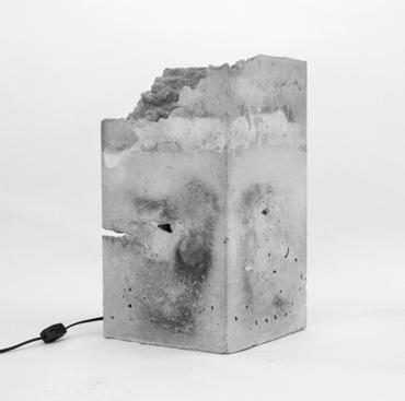
CONSTRUCTION
MATERIAL EXPLORATIONS
Spring 2018 / UC Berkeley Arch 160 / Dana Buntrock
In collaboration with Mahira Aly, Leah Lock, Sahil Mohan Three projects explore the three common building materials: steel, wood, and concrete.
STEEL
Steel was a challenge for it is an unforgiving material. Precision and attention to detail were key in the success of this project. The intent for the design of this steel stair was to have a repetition of frames that support a set of very light and minimal treads. The stair was constructed mostly with cold connections with minimal welding used solely for the handrail. Angles and rivets were used to create clean and aesthetic connections. Each of the angles were carefully cut from cold rolled L steel to match the exact thickness of the HSS frame. The treads were crafted by sandwiching perforated metal sheet in-between two metal bars. My group members and I worked together throughout the entire process. While in the workshop, I worked mainly on the smaller steel pieces, such as cutting the angles and drilling holes for the rivets, as I am very meticulous.
126
14


127
WOOD

In exploring wood as a material, a planter box was constructed using 2 x 2 softwood lumber, dowels, power tools, and hand tools. The intent for the planter was to create a continuous ribbon of density with repetitive vertical and horizontal members. Three different joints were used for three different conditions: the lap joint for structural support, the tongue and groove for the transition between horizontal and vertical members, and the bridle joint for creating the troughs that the plant pots sit in. My main contributions to the project were translating and developing the concept into the physical model as well as detailing and constructing the joints.


128
CONCRETE
Concrete was my favorite material to work with; the process was fun and experimental. My group members and I spent some time experimenting with different formwork materials before casting a table lamp as the final product. We found that plastic formwork produces a glossy polished finish while sand can be used as formwork for creating a irregular and grainy texture that resembles the walls of a cave. These two very different form working methods were used to craft a smooth rectilinear surface on the exterior and a rough organic texture on the interior. For the final pour, my role was to laser cut and assemble the formwork and to handle the sand during the pour.


129
GRÂNDOLA MEETING CENTER / AIRES MATEUS


Fall 2021 / Harvard GSD Construction Systems / Yasmin Vobis


In collaboration with Junainah Ahmed
The 1’-0” = 1” scale section model of the Grândola Meeting Center in Portugal by Aires Mateus reveals the construction tectonics and details behind an architecture that appears truly solid in form and in experience.


130

131
MARIPOSA ADU
SIDELL PAKRAVAN ARCHITECTS
2020 / Professional / Kristen Sidell & Rudabeh Pakravan
During my time working at Sidell Pakravan Architects, I lead and managed the design and construction of a 400 square feet ADU in Berkeley, California.
Built for the homeowner’s father, this accessory dwelling unit has an L shaped floor plan to allow for both a private and a shared condition. Five large windows and a patio face the back yard, creating a generous relationship with the main house, and a tall, slender window defines the more private bedroom area facing the side of the property.
Part of the State of California’s goal to increase housing units, this ADU contributes to ‘upzoning’ this north Berkeley neighborhood.
132
15


133


134
FLOOR PLAN
SECTIONS


135
NANA KOMORIYA nanakomoriya@gsd.harvard.edu
