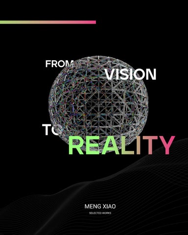
TO VISION REALITY

SELECTED WORKS MENG XIAO


SELECTED WORKS MENG XIAO
Design is all about transformation. I love turning flat 2D ideas into bold 3D realities— like watching a pancake puff into a cake. With a spectral range of creativity, every project becomes a journey of color, change, and endless possibilities.
TO MY PARENTS AND INSTRUCTORS, THANK YOU FOR YOUR LOVE, SUPPORT, AND GUIDANCE.
Exhibition Design: PURE, UNADULTERATED JOY
FROM CONCEPT TO CLARITY
Typography Design: TYPOGRAPHY CARD SET
Packaging Design: ECLAT
Packaging Design: NEW MOON
Branding Design: WORLD ANIMAL NEWS
Brand Identity Design: GNC REBRANDING PROJECT
04 05 06 07
Thesis: GALAXILIFT
EXHIBITION DESIGN
PURE, UNADULTERATED JOY

Design comes to life when fueled by a bold artistic vision and the pure joy of creation.
[COURSE]
Type Systems
[SEMESTER]
Fall 2022
[INSTRUCTOR]
Hunter Wimmer
[CATEGORY]
Exhibition Design, Environmental Design, Branding, Web Design, Booklet Design, Print
[Keyword]
Saturate
Psychedelia
Mysticism
This branding project captured the vibrant, expressive energy of tvvv’s art. Tasked with creating a visual identity that reflected her bold style, I designed a series of promotional materials to captivate and excite visitors. From flo wing city banners to eye-catching posters in public spaces, every piece conveyed one message: “Come experience the joy!”
My mission was to create a bold branding identity that captured Devon’s fearless use of color and imagination. Dynamic visuals matched the energy of her paintings, sparking curiosity and inviting the audience into her world. Clean typography and vibrant colors ensured the promotional materials grabbed attention. This identity extended to banners, posters, a dedicated website, and promotional media, creating an immersive experience. My goal was for viewers to feel the same joy and freedom that radiates from Devon’s work, whether online or in front of a gallery.


Ghosts of Indulgence (2022)
30 x 24 in. acrylic, oil, glitter, rhinestones and vinyl on panel -Devon Walz


Lock and Key (2021) Paper Clay, Modeling Foam, Acrylic, Glitter, Resin, Glass Vase -Devon Walz


TYPOGRAPHY DESIGN
TYPOGRAPHY CARD SET

Typography comes to life when its nuances are revealed through a perfect balance of thoughtful design and a deep passion for creative expression.
[COURSE]
Type Forms
[SEMESTER]
Fall 2021
[INSTRUCTOR]
Anthony Palmer
Typography Design, Print Design, Graphic Design, Branding
[Keyword]
Minimalist
Geometric
Contrast
The Typography Card Set explores type as both art and communication. Designed as a visual and educational tool, it celebrates the beauty and diversity of different typefaces. The goal was to create a tactile experience, allowing users to engage with typography on a deeper level. Each card highlights a distinct typeface, showcasing its unique features and how design can shape meaning. This set invites users to interact with type in a personal and impactful way.
The goal of this project was to bring typography to life through a series of meticulously crafted cards. Each card showcases a carefully selected typeface, paired with clean, modern layouts that allow the typography to take center stage. Designed for designers, students, and type enthusiasts alike, this collection explores the powerful role typography plays in visual communication. From sans-serif to serif, each card offers a distinct perspective, inviting a deeper appreciation of type as both a functional tool and an art form. With its minimalist design and bold color palette, the set is not only a practical resource but also a source of inspiration, blending education and aesthetic appeal in one visually engaging package.


PACKAGING DESIGN
ECLAT

Luxury in design arises when simplicity meets elegance, creating a harmonious fusion of beauty and purpose.
[COURSE]
Packaging Design 3:
Advanced 3D Branding
[SEMESTER]
Fall 2023
[INSTRUCTOR]
Hannah Coward
[CATEGORY]
Packaging Design, Branding, Graphic Design, Product Design
[Keyword]
Elegant
Luxurious
Effective
The ECLAT Packaging Design for Lanvin blends elegance with inno vation, reflecting the luxury that the brand is known for. This skincare collection is a visual representation of Lanvin’s signature sophistication and modern beauty. With the focus on both functionality and aesthetic appeal, the packaging was designed to stand out while maintaining a minimalist yet luxurious feel. The design incorporates sleek lines, a refined color palette of black and gold, and modern typ ography that communicates purity, high-quality, and luxury.
The ECLAT line was designed to create a visually luxurious skincare collection, combining simplicity with elegance. The black and gold color scheme represents timeless sophistication and radiance, while the sleek, minimalistic packaging highlights the quality of the product. Each bottle and jar is crafted to enhance the user’s skincare experience, making them feel pampered with high-quality materials and clean, refined typography. Every detail, from the transparen t toners to the bold black and gold creams, evokes exclusivity and luxury in every touch.


DESIGN

True care for pets shines through when innovation meets natural ingredients, creating a harmonious balance between purity and sustainability.
[COURSE]
Packaging Design 3:
Advanced 3D Branding
[SEMESTER]
Fall 2023
[INSTRUCTOR]
Hannah Coward
[CATEGORY]
Packaging Design, Branding, Graphic Design, Product Design
[Keyword]
Natural Gentle
Hypoallergenic
The New Moon Pet Cleaning Product Design project focuses on extending the brand’s offering by creating a visually cohesive and eco-friendl y line of cleaning products. Known for their premium dog food and treats, New Moon is now expanding into pet care with a range of products like shampoos, conditioners, and grooming wipes. The packaging design embodies the brand’s commitment to natural, non-toxic ingredients, utilizing clean lines and minimalistic branding that resonates with eco-conscious pet owners. This project brings together functionality and sustainability, delivering a product that is not only effective but also safe for pets and the environment.
The goal of this project was to create a pet cleaning product line that aligns with New Moon’s existing brand identity while emphasizing the eco-friendly and premium quality of the products. Each product’s packaging is designed with simplicity and clarity in mind, using neutral tones and soft accents that reflect purity and natural care. The choice of biodegradable materials and minimalistic designs ensures that the packaging is environmentally responsible and aesthetically pleasing. From shampoos to grooming wipes, the product line is visually cohesive, communicating trust and care through every detail.


BRANDING DESIGN
WORLD ANIMAL NEWS

Design finds its voice when clarity meets purpose, transforming silence into an engaging and impactful user experience.
[COURSE]
Branding Design:
World Animal News
[SEMESTER]
Spring 2022
[INSTRUCTOR]
Anthony Palmer
[CATEGORY]
UI Design, Rebranding, Graphic Design
[Keyword] Natural Gental Bright
The From Silence to Voices project involved selecting an existing poorly designed website and reimagining its interface for a better user experience. This redesign focuses on enhancing both the website and app’s homepage and article pages to create a more engaging and accessible platform. By improving the visual hierarchy, typography, and navigation, the new design aims to transform the user journey from confusion to clarity. The result is a cohesive and user-friendly interface that invites users to interact with content seamlessly, providing a platform that communicates information effectively and intuitively.
The goal of From Silence to Voices was to turn a challenging user interface into an intuitive and visually appealing experience. Through a clean and modern layout, with optimized typography and simplified navigation, this redesi gn prioritizes accessibility and usability. Each design element—from the organized homepage to the well-structured article pages—focuses on guiding the user naturally through the site. This project emphasizes clarity, allowing content to take center stage, while enhancing the overall user experience by making informati on easy to find, read, and engage with.
The Global Authority on Animal News


BRAND IDENTITY DESIGN
GNC REBRANDING PROJECT

Brand evolution happens when vision and innovation converge, transforming tradition into a contemporary, personalized health experience.
[COURSE]
Brand Identity Design:
GNC Rebranding Project
[SEMESTER]
Spring 2024
[INSTRUCTOR]
Hunter Wimmer
[CATEGORY]
Branding, Graphic Design,
UI/UX Design, Print Design, Environmental Design
[Keyword]
Pioneering
Empowering
Rapid
The GNC Rebranding Project involved revitalizing the brand’s identity to emphasize a modern, personalized approach to health and wellness. The redesign focused on aligning GNC’s visual and strategic identity with its mission to deliver faster, more effective, and personalized healthcare solutions. Through update d brand elements and a cohesive design system, this project aimed to make GNC’s offerings more accessible and relatable to health-conscious consumers. The result is a refreshed brand that not only retains GNC’s reputation for quality but also speaks to a new generation seeking personalized and outcome-driven health solutions.
The goal of the GNC Rebranding Project was to develop a visual identity that speaks to today’s health-conscious audience while emphasizing GNC’s commitment to personalized care. The rebrand blends clean, modern aesthetics with functional design elements that reflect both simplicity and inno vation. From updated logos and typography to refreshed packaging and in-store experiences, every detail was carefully crafted to enhance brand clarity, build customer trust, and clearly communicate GNC’s mission. This rebranding elevates GNC as a leader in personalized health, making healthcare more accessible, effec tive, and outcome-driven.
1935
GNC was founded in 1935 when founder David Shakarian opened the first health food chain called Lackzoom in Pittsburgh.
In the late 1940s, Shakarian’s business expanded to other states and began adopting the name GNC. (General Nutrition Centers) 1940
Shakarian died in 1984, and Jerry Horn took over the company the next year. 1984

Shakarian’s store was hit by flooding during the year, but he opened a second store in the same year. 1936

GNC began producing and selling its own branded vitamins and health supplements. 1960

Thomas H. Lee’s Boston investment company bought GNC in a leveraged buyout. 1989

GNC established 172 corporations and 224 franchise outlets, as well as 207 units through the acquisition of Nature Food Centers.

Nature’s Northwest was bought by GNC, and the company expects to open 15 more outlets in the UK.
GNC has filed for Chapter 11 bankruptcy protection and plans to close at least 800 stores.

GNC created the groundwork for its development into the United Kingdom by acquiring Health and Diet Group, the country’s second biggest comprehensive self-care firm.
Harbin Pharmaceutical Group, a Chinese stateowned company, agreed to acquire around 40% of GNC.
GNC is strategically redefining its direction, adopting a nuanced brand mission and strategy to enhance its market positioning.
We combine advanced health monitoring technology, personalized health routines, and customized nutrition solutions to empower individuals to pursue better health. We believe in the power of personalization to achieve lasting health improvements and ensure that each person’s journey to health is unique.


Empowering
Rapid


PRODUCT
PRO_01: GNC Nanocapsule
PRO_03: Health Sync Bracelet
SERVICES
SER_03: Virtual Health Coach
ENVIRONMENTS
ENV_01: GNC Health Experience Center
ENV_03: GNC Recovery Center
EDUCATIONAL OPPORTUNITIES
EDU_02: GNC Nutrition Academy
EVENTS
EVT_02: GNC Products Expo
EVT_03: GNC Fit Fest
CO-BRANDING
COB_01: GNC + Apple
EXPERIENCES
EXP_01: GNC Health Retreats
EXP_02: GNC Membership Club
EXP_03: GNC Custom Center

A Health Sync Bracelet that monitors users health.
The Health Sync Bracelet will monitors user’s health. It can track the user’s physical health status in real-time and remind them to take the appropriate nutrition supplements according to their physical condition.


Health Monitoring Technology Personalized Health Routines PRO_01
Customized Nutrition Solutions
PRODUCT
PRO_01: GNC Nanocapsule
PRO_02: GNC Customized Nutrition Pack
PRO_03: Health Sync Bracelet
SERVICES
SER_01: GNC Personalized Nutrition Advice
SER_02: GNC Product Subscription
SER_03: Virtual Health Coach
ENVIRONMENTS
ENV_02: GNC Gym
ENV_03: GNC Recovery Center
EXPERIENCES
EXP_01: GNC Health Retreats
EXP_02: GNC Membership Club
EXP_03: GNC Custom Center for Health Sup -
EDU_01: GNC Virtual Learning Platform
EDU_02: GNC Nutrition Academy
EVENTS
EVT_01: Intelligent Health Revolution Day
EVT_02: GNC Products Expo
EVT_03: GNC Fit Fest

Customized nutrition packs for GNC users.
GNC customized nutrition pack provides customized nutrition packages based on each user’s personal health status, medical reports, eating habits, and lifestyle.


PRODUCT
PRO_01: GNC Nanocapsule
PRO_02: GNC Customized Nutrition Pack
SERVICES
SER_01: GNC Personalized Nutrition Advice
SER_02: GNC Product Subscription
SER_03: Virtual Health Coach
ENVIRONMENTS
ENV_01: GNC Health Experience Center
ENV_02: GNC Gym
ENV_03: GNC Recovery Center
EXPERIENCES
EXP_01: GNC Health Retreats
EXP_02: GNC Membership Club
EXP_03: GNC Custom Center for Health Supple -
EDUCATIONAL OPPORTUNITIES
EDU_01: GNC Virtual Learning Platform
EVENTS
EVT_01: Intelligent Health Revolution Day
CO-BRANDING
COB_01: GNC + Apple

The GNC Virtual Learning Platform will provides the public with knowledge of nutrition supplements and health products.
The GNC Virtual Learning Platform provides the public with knowledge of nutrition and health products. These include the benefits of various vitamins and how supplements can help control high blood pressure, hyperlipidemia and high blood sugar.


THESIS GALAXILIFT

Exploration reaches new heights when innovation and sustainability intersect, unlocking a bold frontier for eco-conscious space travel.
[COURSE]
Thesis:
GalaxiLIFT
[SEMESTER]
Fall 2023 - Fall 2024
[INSTRUCTOR]
Laurie Makela
[CATEGORY]
Branding, Graphic Design, UI/UX Design, Print Design, Environmental Design
[Keyword]
Innovative
Explorative
Eco-conscious
The GalaxiLIFT project introduces a unique brand identity for an innovative space elevator experience designed to make space accessible to the general public. Inspired by “The Wandering Earth II,” this project brings the futuristic vision of a space elevator to life, highlighting sustainable technology and human curiosity. The branding captures the wonder of space travel while emphasizing eco-friendliness through solar-powered technology, aligning with environmentally conscious values. GalaxiLIFT’s design features immersive digital experiences and interactive interfaces that enhance user engagement, making space exploration feel within reach for everyone.
The goal of the GalaxiLIFT project was to create an immersive, inclusive space travel brand that sparks a sense of wonder and adventure. Every design element—from the app and website interfaces to marketing materials and in-cabin experiences—was thoughtfully crafted to guide users through a seamless journey within the GalaxiLIFT experience. The visuals emphasize dynamic energy and exploration, blending cutting-edge technology with accessibility. This project reflects humanity’s evolving relationship with space, aiming to demystify space travel and make it an environmentally sustainable, awe-inspiring journey for all.
In an era where space travel is no longer a distant dream, GalaxiLIFT makes the cosmos accessible to everyone. This project envisions a revolutionary space elevator capsule that offers an exhilarati ng, firsthand experience of weightlessness and spacewalks. GalaxiLIF T breaks down the barriers of space exploration, opening it up to ordinary peo-ple-not just the elite. Driven by my passion for space, this thesis combines bold ideas with practical research to transform the impossible into a reality for all.
PROBLEM
Not everyone can be an astronaut qualified to participate in space travel and explore the universe.
OUTCOME
I will use graphic design to promote a new space elevator to the public, allowing exploration of the universe for more than just astronauts.


The GalaxiLlFT brand represents the arrival of a new era of space exploration for everyone.
The logo’s dynamic lines represent our spirit of infinite exploration and mankind’s relentless pursuit of the universe. The star above the letter G represents the ocean of stars in the universe, and GalaxiLlFT makes the stars accessible.
Our mission is to make space elevator travel accessible to all, unlocking the potential for everyone to realize their dreams of exploring space.


I am immensely grateful to everyone who supported and guided me throughout my design journey. To my instructors at the Academy of Art University, thank you for your invaluable insights and encouragement, which have shaped my approach and refined my skills. To my family and friends, your unwavering support has been my greatest motivation.
A special thank you to my classmates and peers, whose creativity and feedback have inspired me to push beyond my limits. Lastly, to everyone who believes in the transformative power of design—thank you for inspiring this project and fueling my passion for creating meaningful experiences.
School | Academy of Art University, School of Graphic Design
Course | Senior Portfolio
Instructor | Irena Milev
Student | Xiao Meng
Telephone | (626)-404-3799
Email | xiaom.toy@gmail.com
Website | meng-xiao.com
Bookbindery | 600 California St, Fl 11, San Francisco, CA 94108-2727
Diemaker | 3325 S 116th St, Tukwila, WA 98168, USA
Photography | Pexel, Adobe Stock
Title of Book | From Vision To Reality
Cover Stock | Hardcover, ImageWrap, Durable matte finish
Text stock | Semi-matte, 80# (118 gsm)
Fonts | Jeko, Roboto, Open Sans
Software | Adobe Creative Cloud (Indesign, PhotoShop, Illustrator), Figma, Rhinoceros 3D, Vray, Zbrush
©2024 All rights reserved. No part of this publication can be reproduced without express written permission from Xiao Meng.
