DIGITAL MARKETING
LIU Post
Digital Marketing for Business – April 2025
Assignment #1
Brand: Zara
Team members
Jenniffer Michell Ceron Barajas
Danna Camila Arango Ariza
Daniela Beatriz Reyes Casco
Maria Buitrago Salamanca

Call to actions (CTA)
Zara has different call to actions bottoms such as in their different social media:
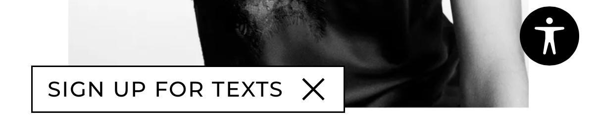
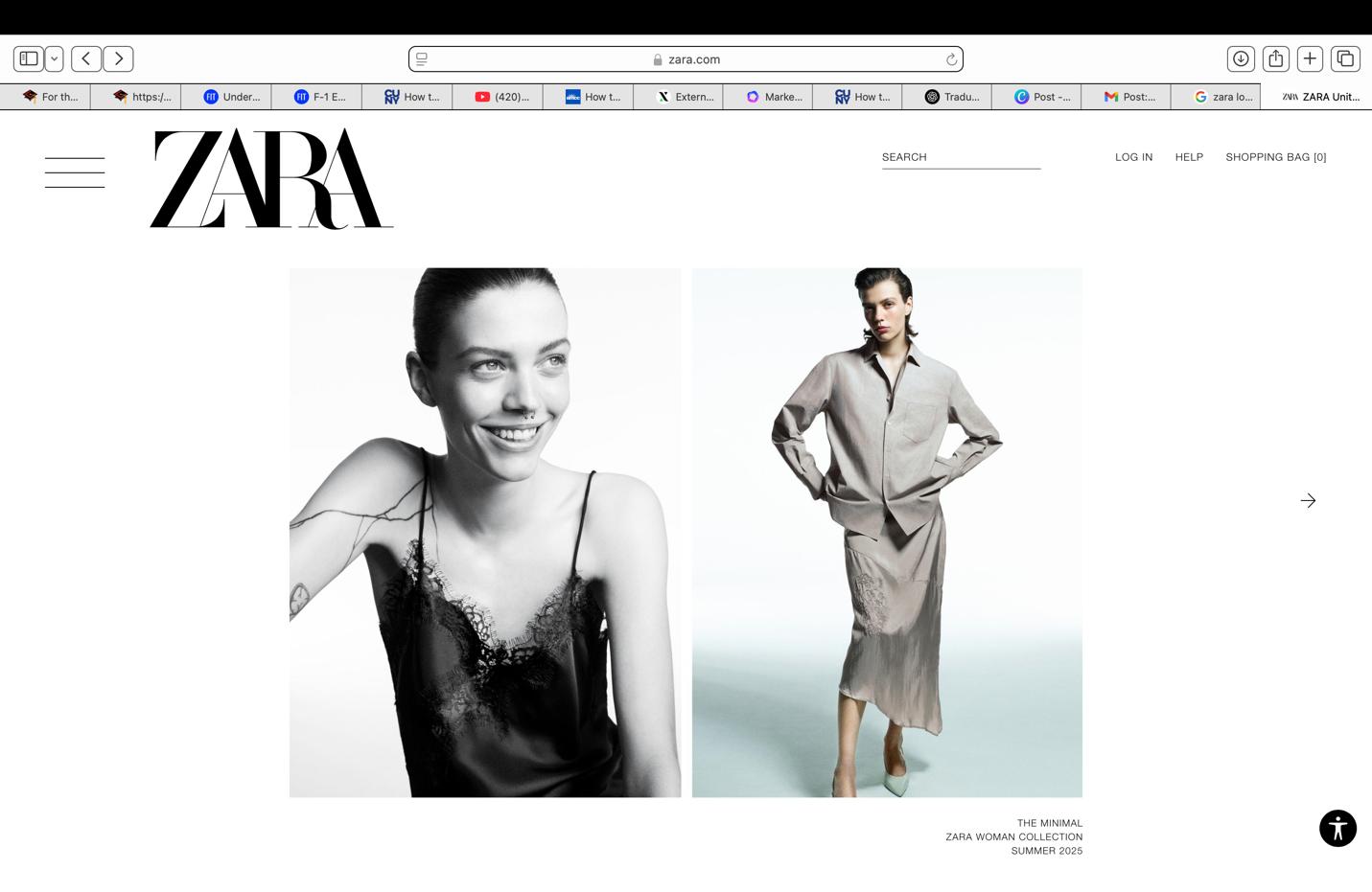
• Sign up for texts (Website)
• Sign up for our newsletter (Website)
• Help (website)
• Log in (website)
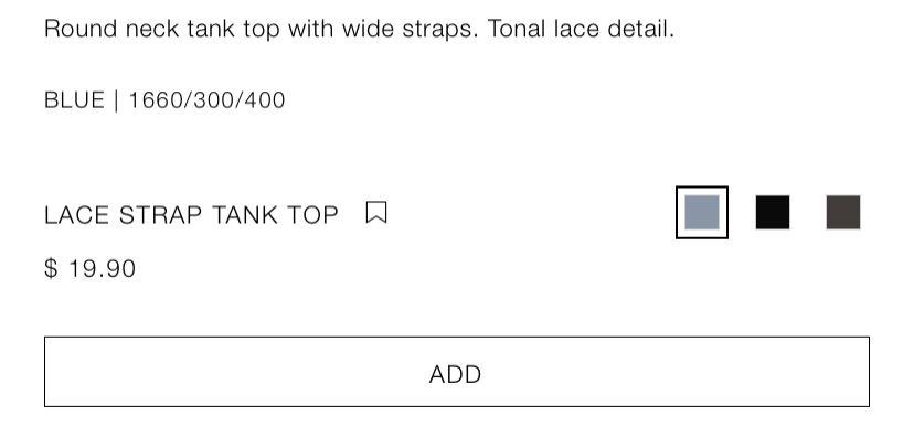
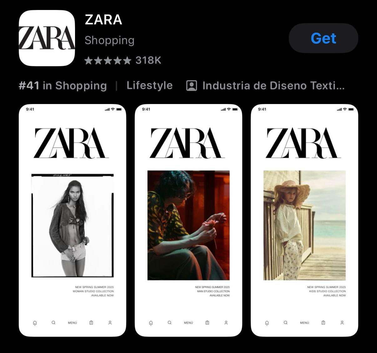
• Shopping bag (website and app)
• Add and save item (website, app, Instagram and Facebook)
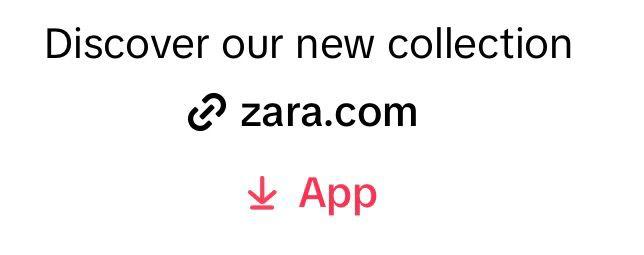
• Discover our new collection (Instagram) link
• New collection – bottom (stories on Instagram)
• Shop (Instagram) – bottom
• Description – bio with their other lines – accounts for man and kids
• Link that directs you to the clothing you see on the post (Facebook)
• Link to get the app (Tik Tok)
• Instagram bottom
• Facebook bottom
• Website bottom
• Tik Tok bottom
• Website bottom
Type of content
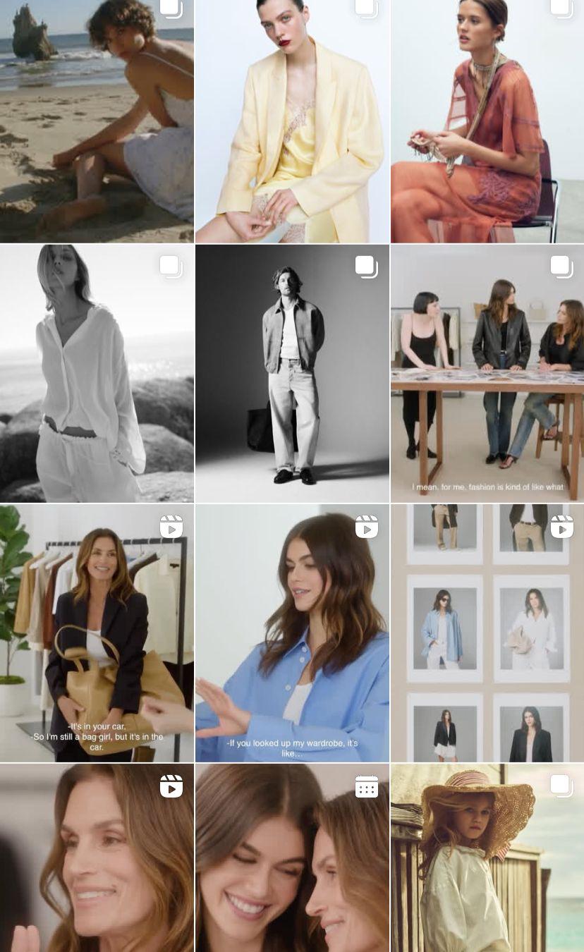
• Fashion photography – high quality – high end
• Minimalistic
• Neutral colors and clean backgrounds
• Clothing focus content
• Collection – campaigns on reels
• Interviews with famous people –reels
Content
The content across their different social media platforms doesn’t vary much and is based on the following types of content.
Social media channels:
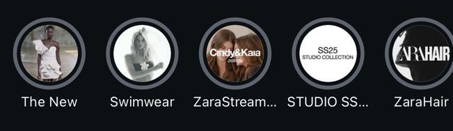
• Instagram and Tik Tok (reels, videos, pictures and stories)
• Facebook (gallery of clothing pictures and text about the collection)
• Website (newsletter, outfits recommendation with their clothes)
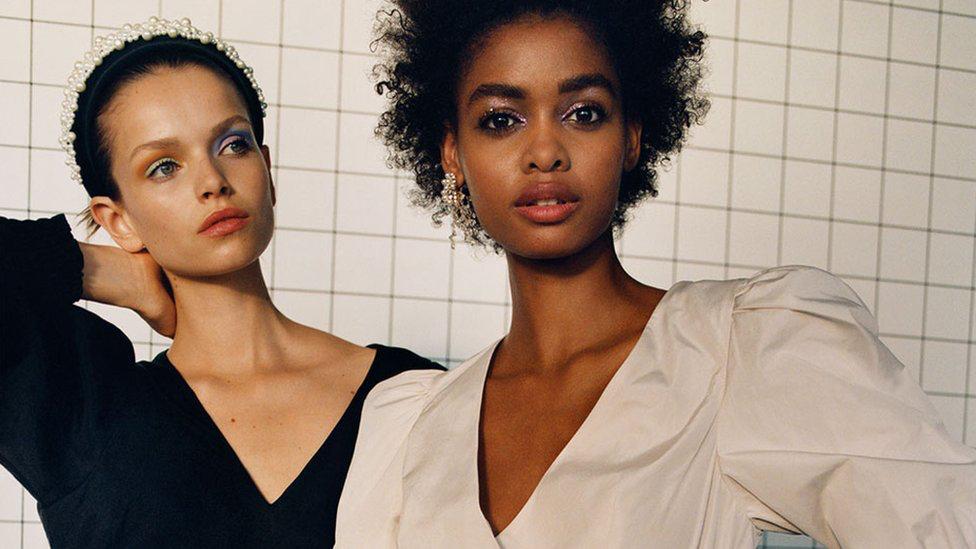
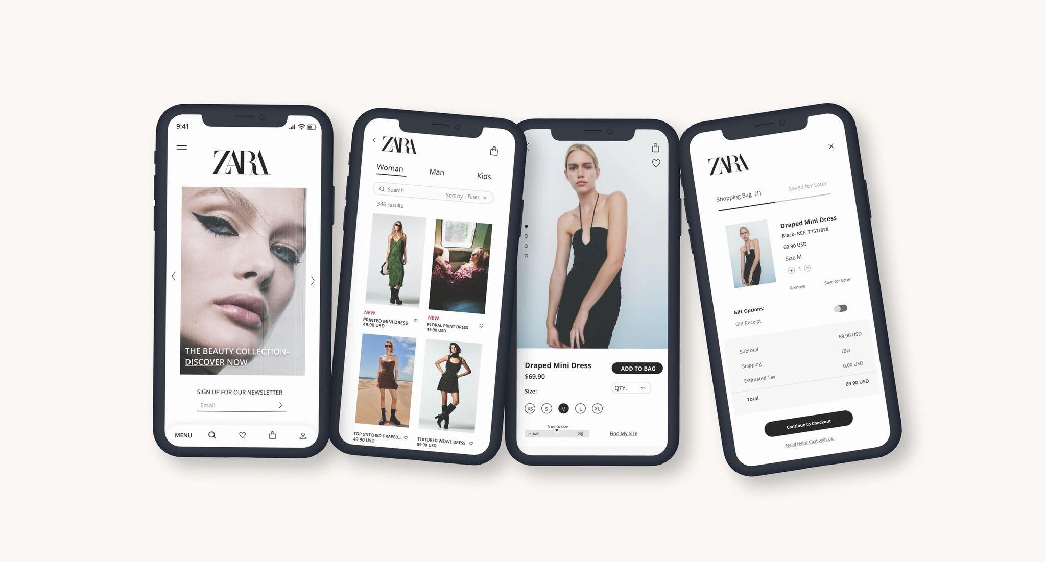
The design is cohesive and balance, minimalistic and color neutral. Easy to look at it, align to all their channels. The photography of the products is high quality and editorial. They use bottoms for quick shopping to not lose the item you are looking in the app and website.
Structure
The site / app is easy to follow with consistent fonts, black and white colors. Easy to follow, buy clothing and get more information.
Navigation
It’s easy to get around for a clothing brand and access, it’s not overwhelming with ads.
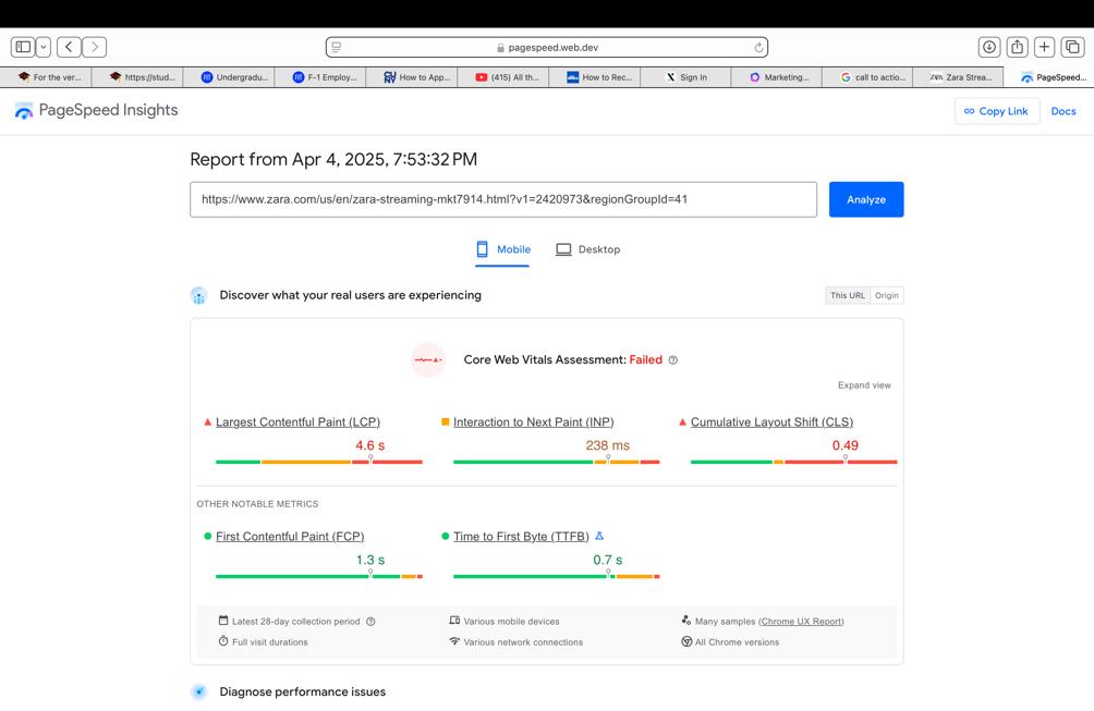
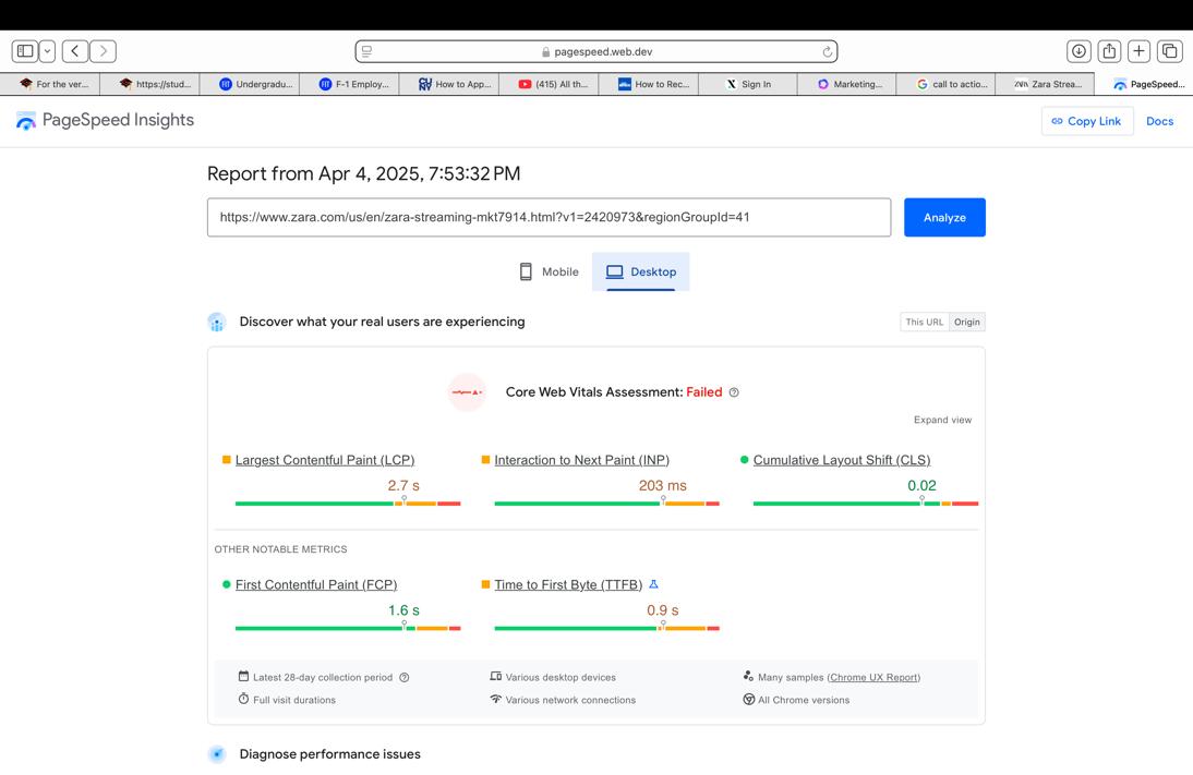
The website and app don’t pass the test, because of their visual content is too big and takes more time to load.
The capacity of response of the bottoms are not too good, which affects the interaction with the user and time shopping.
Mobile
• The photography and video content looks very good and high end align with their clothing and public, however the text size its small when you look at the screen
• The links are easy to find and access and it’s in all their descriptions social media.
Social Media
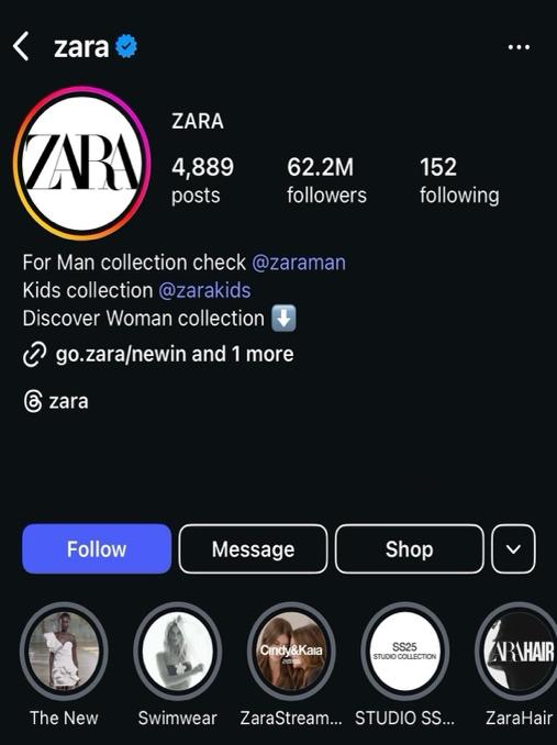
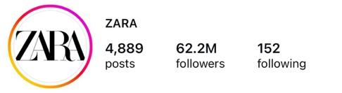
• Instagram (62.2M) Followers – 3 times per week they post content
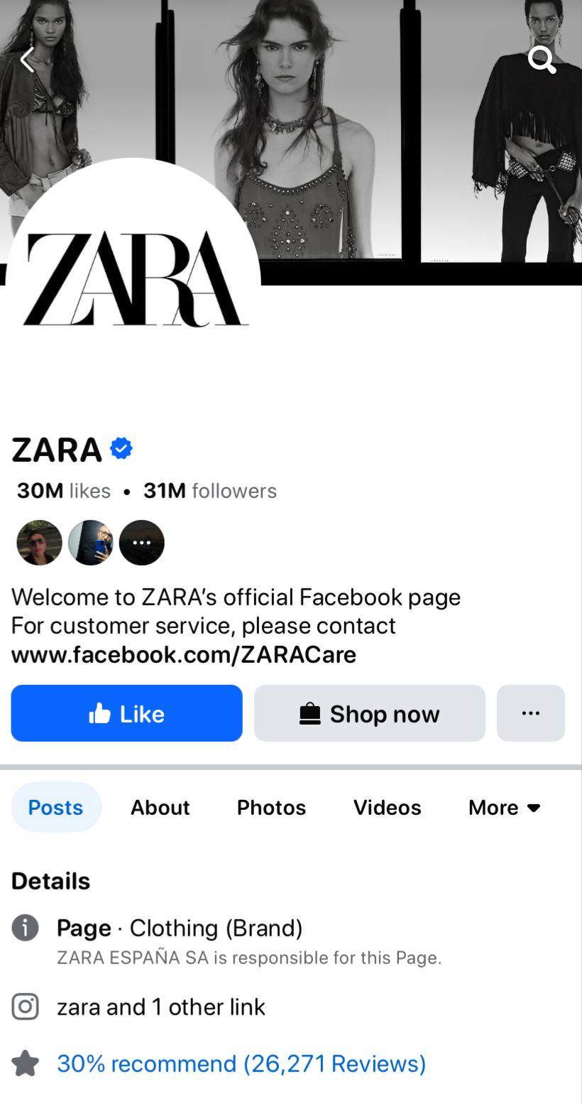
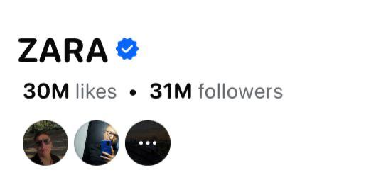
• Facebook (31M) Followers – 3 times per week they post content
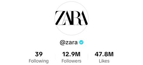
• Tik Tok (12.2M) Followers – 3 times per week they post content
• Pinterest (1.6M)


Their content is fashion – clothing focused, interviews with celebrities and newsletter. Their post text is about the collection description. On Pinterest their content is more UGC focused
Opinion
In our opinion, it is a brand with a long trajectory, with very defined, minimalist, and professional branding. However, we noticed that it needs improvement in certain aspects, such as the font type and size, as they can be difficult to read. In its apps and website, there are some missing buttons like “back to top,” which would make the experience more efficient. Its performance and speed are not very good, which causes users to leave the website/app repeatedly, potentially leading to abandonment of the site and loss of sales.