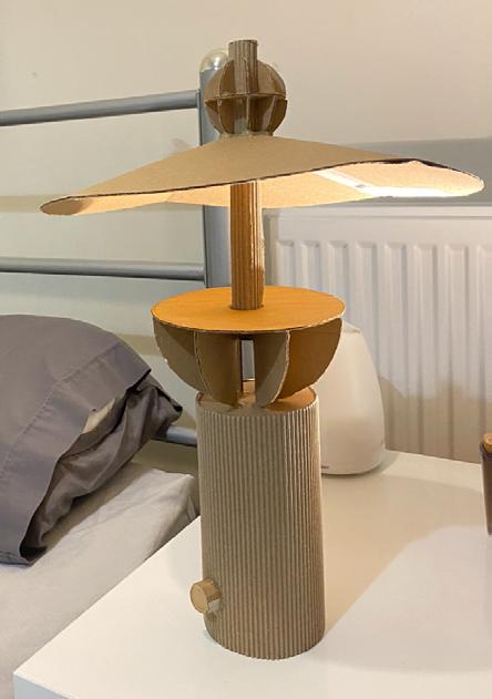
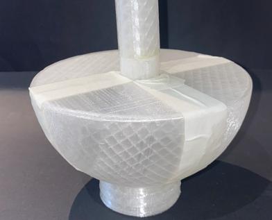
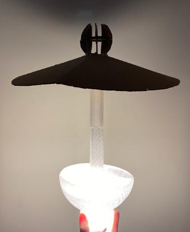
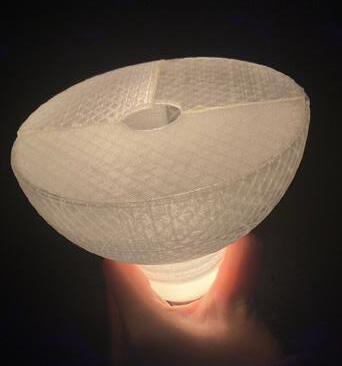
Echo 2
Design Brief
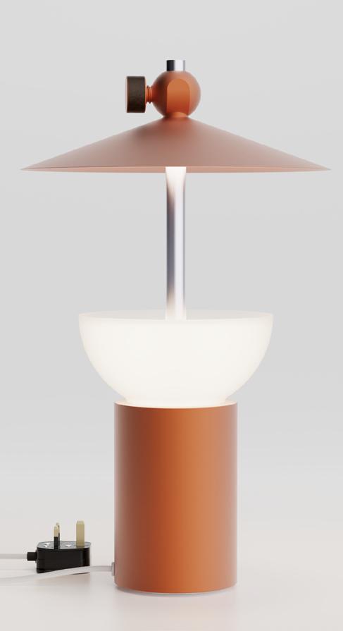
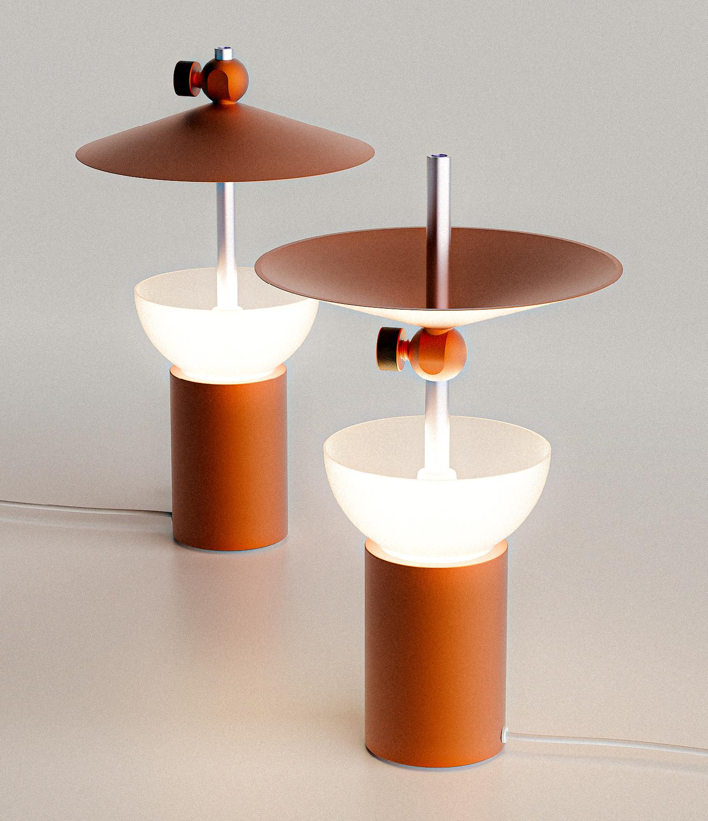
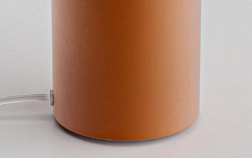
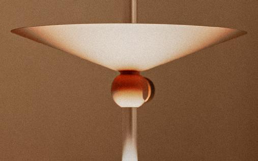
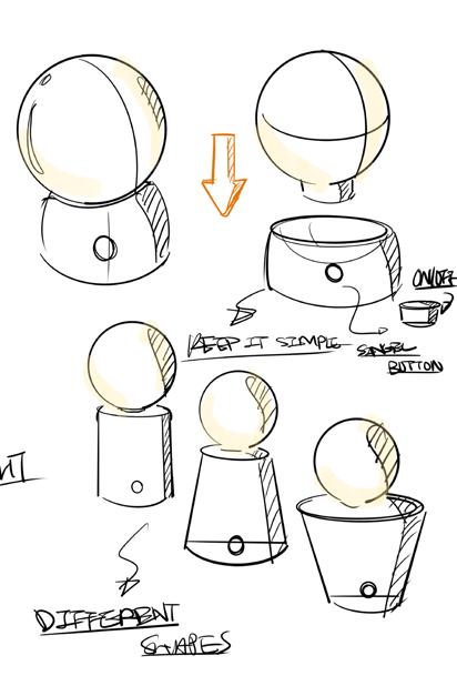
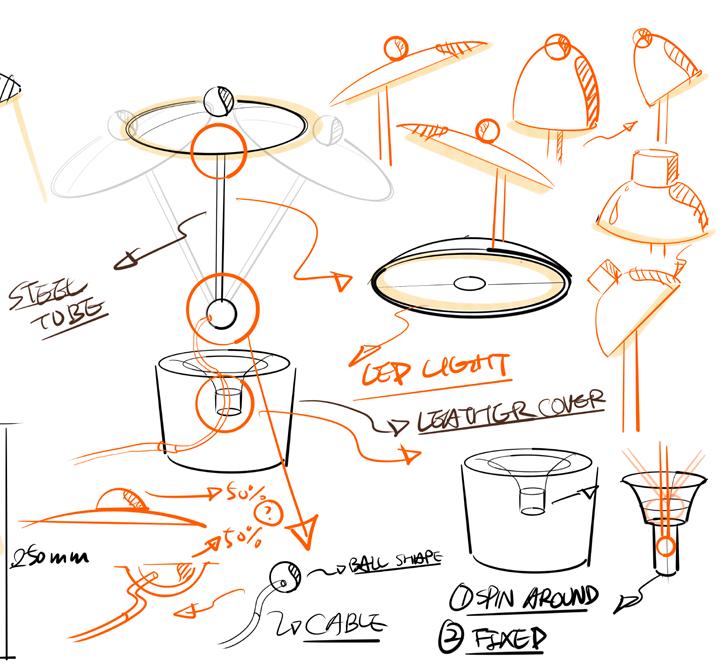
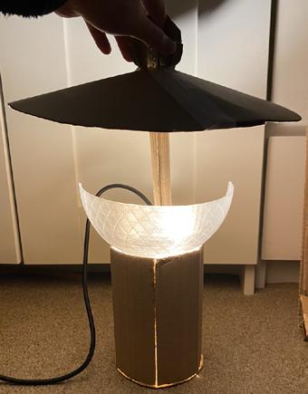
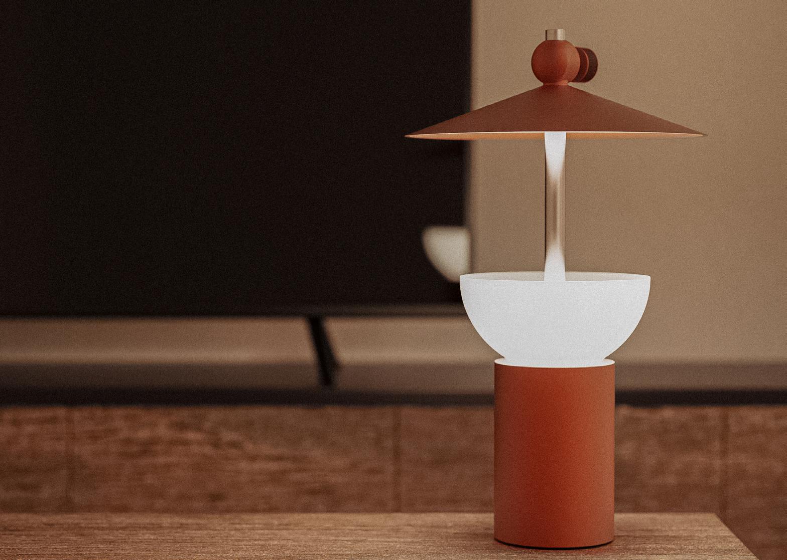
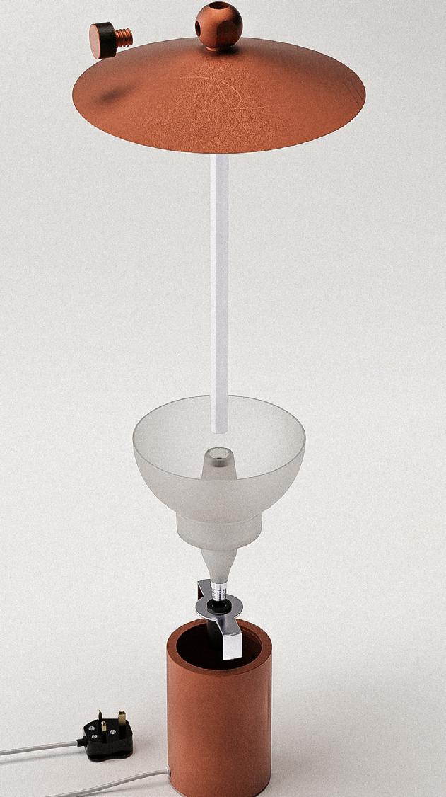
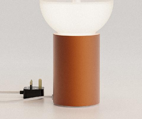
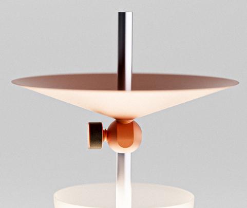
To design a table lamp for the living room and bedroom that aligns with the Made.com market demographic, while incorporating one of the WGSN - 10 Key Trends to create an innovative lighting fixture.
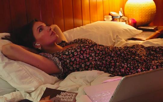
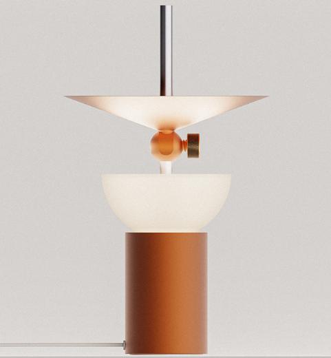
HMW create a table lamp in the retro style that interacts with the design to produce a cozy environment?
Design Focus
Design specification
- Modern retro
- Flexible
- Comfort and wellbeing
- Sustainable design - Interaction
People feel comfortable when exposed to warm tones of hue
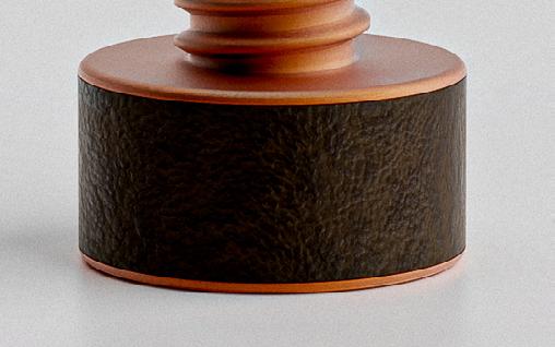
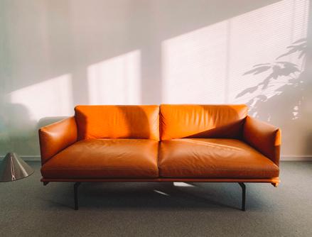
The texture of the leather and the material itself evoke retro feeling
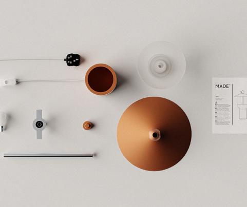
Aluminium
6061 alloy Leather bovine
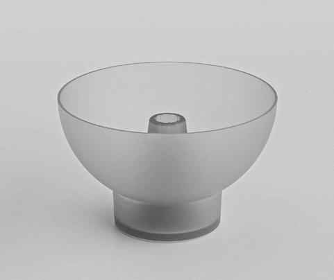
Polycarbonate
278 x 278 x 467 mm
Product details Brand langauage
Clean
Most of the designs in Made.com are characterised by clean and simple aesthetics. The design focus is on basic shapes and warm nostalgic colour tones. Also, tend to avoid overly complicated structures and prioritise user-friendliness.
Material
Based on product analysis, it is evident that metal is a commonly used material in Made.com products. Therefore, the focus for the table lamp design should be on incorporating metal. Aluminum has chosen as a material to address weight concerns while also adding a premium touch that aligns with Made.com's style.
Alloy steel
Stainless Steel
User testing, questionnaires, and interviews were used to gather research findings
45%
75%
Of people are equally divided on whether or not they are concerned about the artistic environment. Those with colour blindness, on the other hand, were the most concerned.
Of people struggle to select the correct colour, are uncertain of their colour selection, are concerned about making mistakes, and are hesitant to start painting.
Quality
People choose a particular medium primarily because of its quality. The medium's cost and selection options come in second as decision factors.
Nicholas_23/ university student/ UK
Confidence
When it comes to use colours (painting), people with CB lack confidence. For example, they would avoid using colours by choosing black and white instead of exploring different colours. There is a significant number of artist who choose alternate mediums path because they struggle to see colours and lack confidence in doing so.
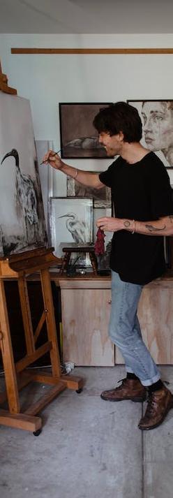
Love painting/ go for simplistic/ strong protan/ shop at hobbycraft/ seeking for inspiration/ living in a flat/ travel between studio and home
Inclu
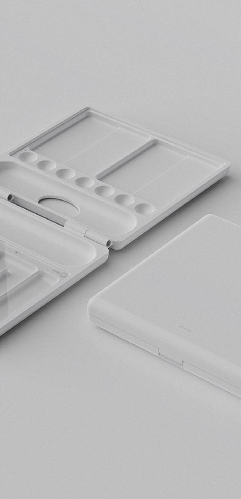
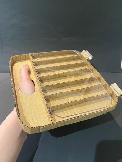
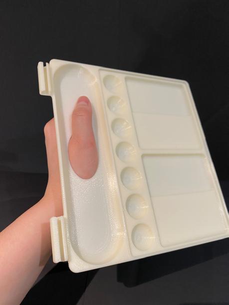
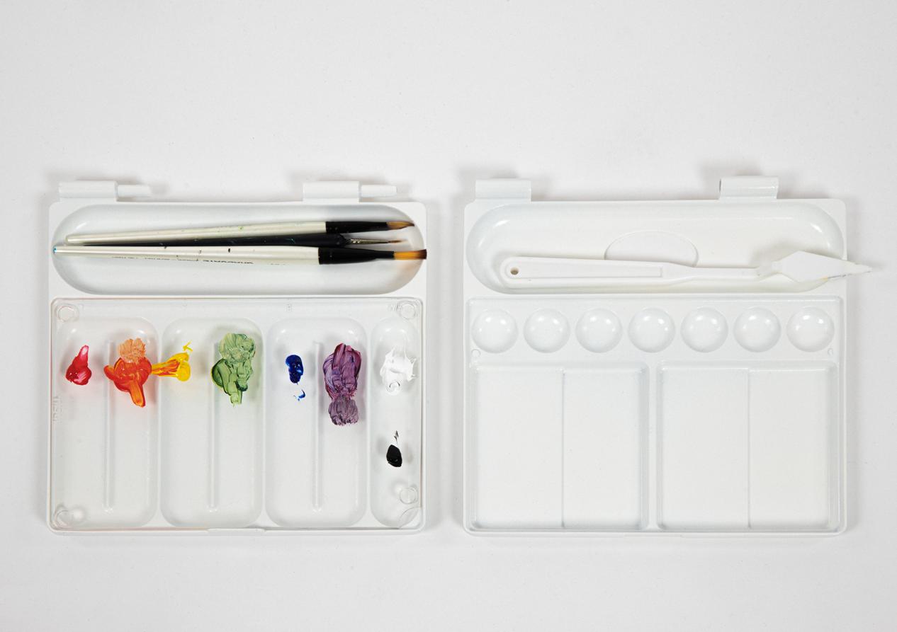
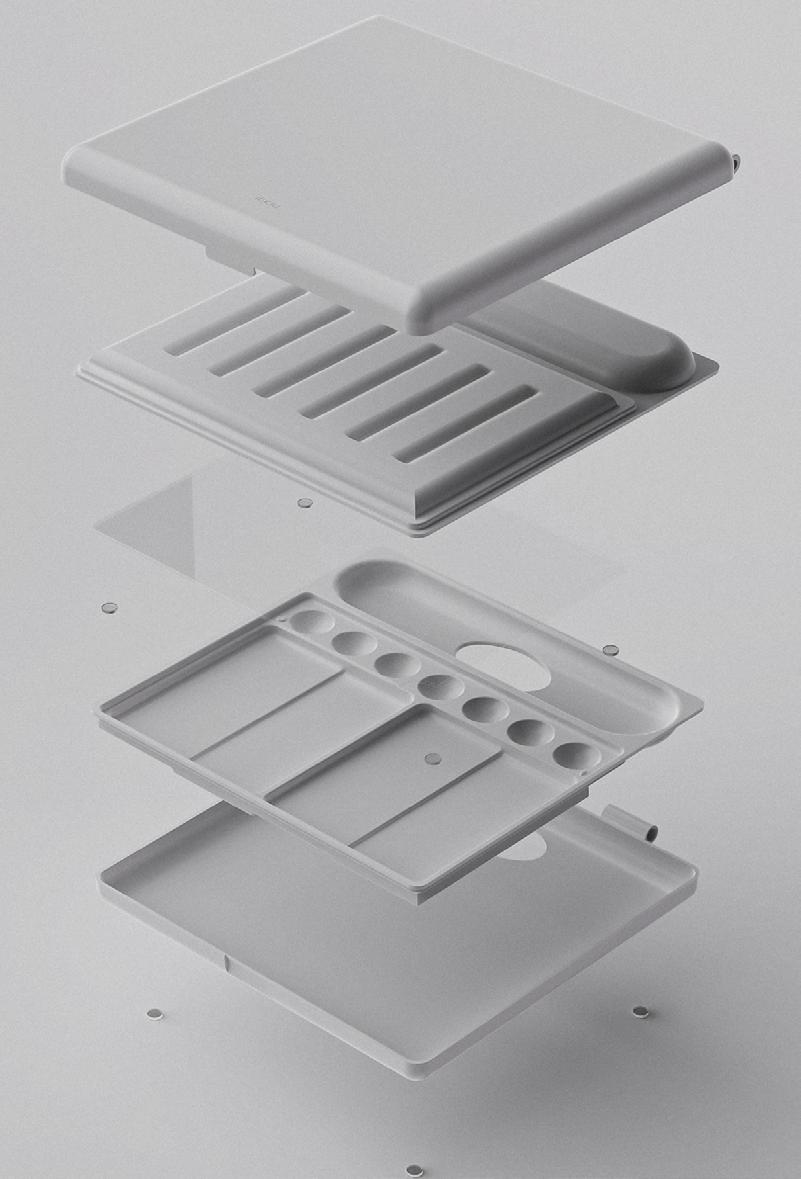
An inclusive colour mixing tray
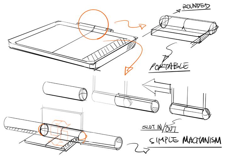
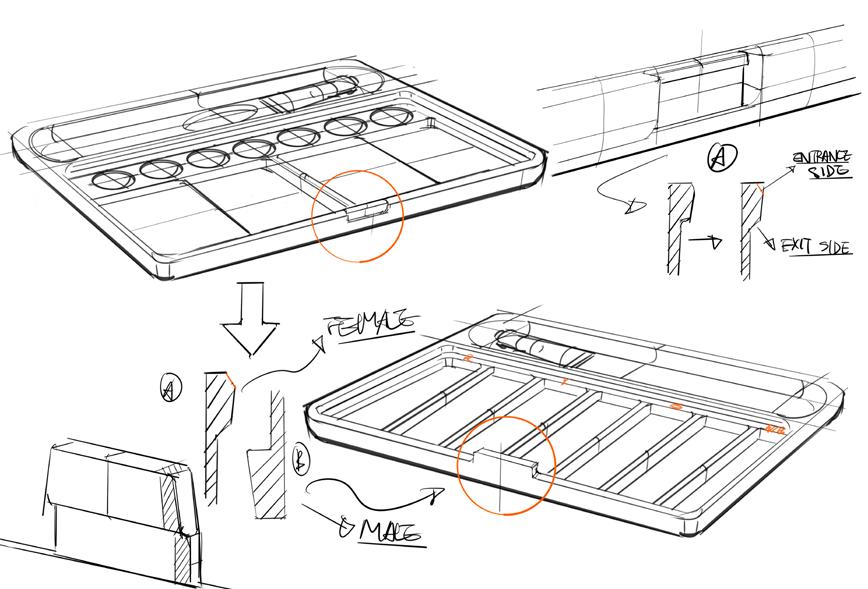
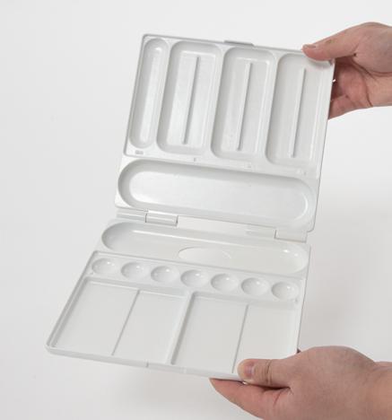
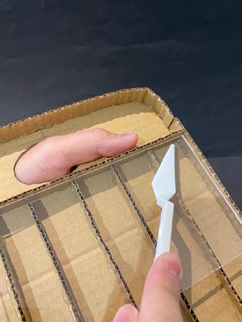
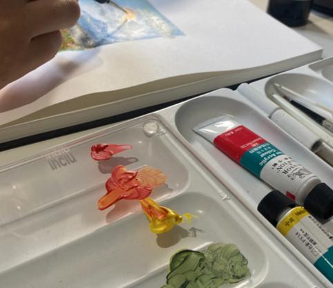
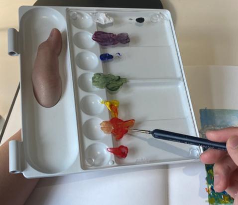
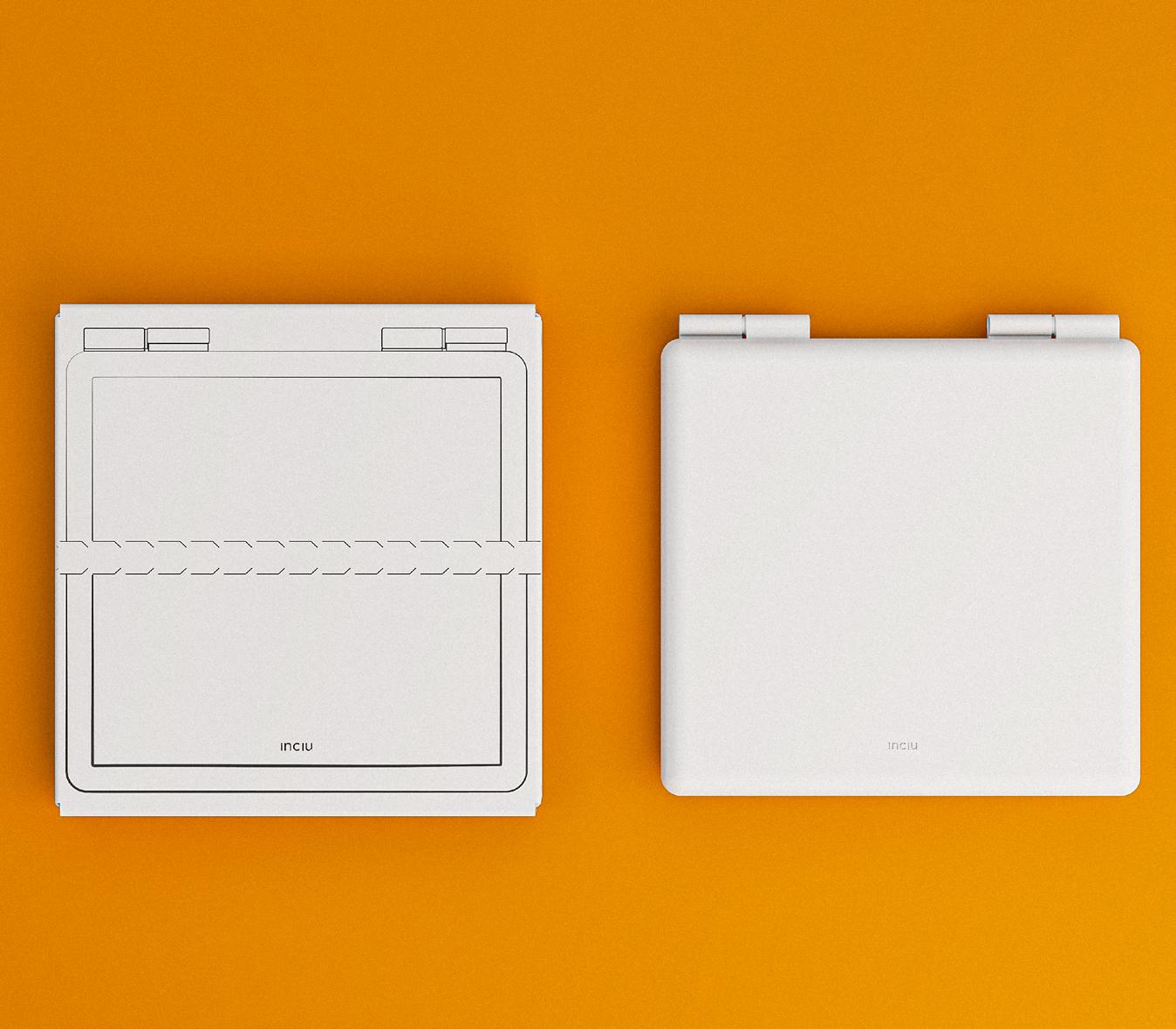
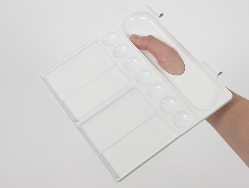
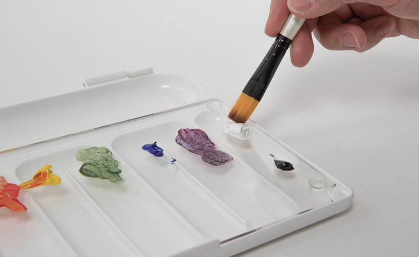
Inclu is a detachable colour mixing tray that can be held in hand or placed on a table, suitable for different painting styles. The integrated label helps colour-blind users identify paints and encourages the use of colour theory. By separating the mixing area from the tray, it keeps pigments intact while making it portable.
Human-centred design is the primary design method that follows product creation. Throughout the testing process and evaluation of each stage, the design effectively improves people’s painting experience and enjoyment of the world of colour while painting.
Product details
222 x 221 x 36 mm
Label
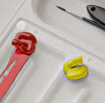
The product uses word labels to enhance colour identification and mixing, empowering colourblind users with confidence in exploring and working with colour paints.
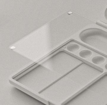
Glass palette
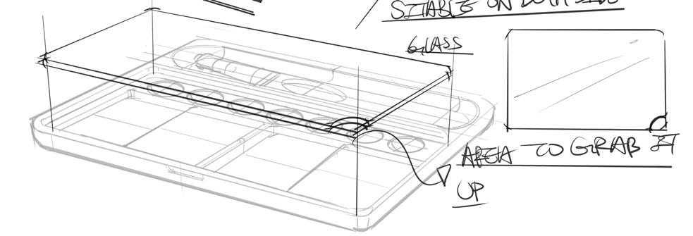
The product uses transparent materials, enabling users to place it on objects and compare mixed colours with their desired colours.
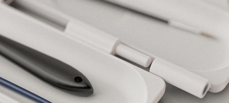
Detachable
The product is attachable for personalised painting preferences, usable on both tables and hands. It also enhances the experience of cleaning the colour tray.
Polish plastic (ABS)
Tempered glass (pencil polished)
Rubber (clear polyurethane)
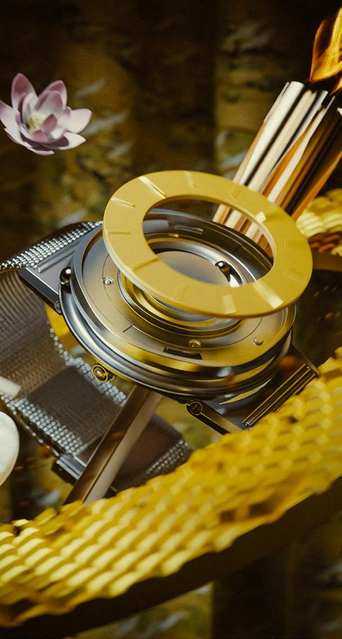
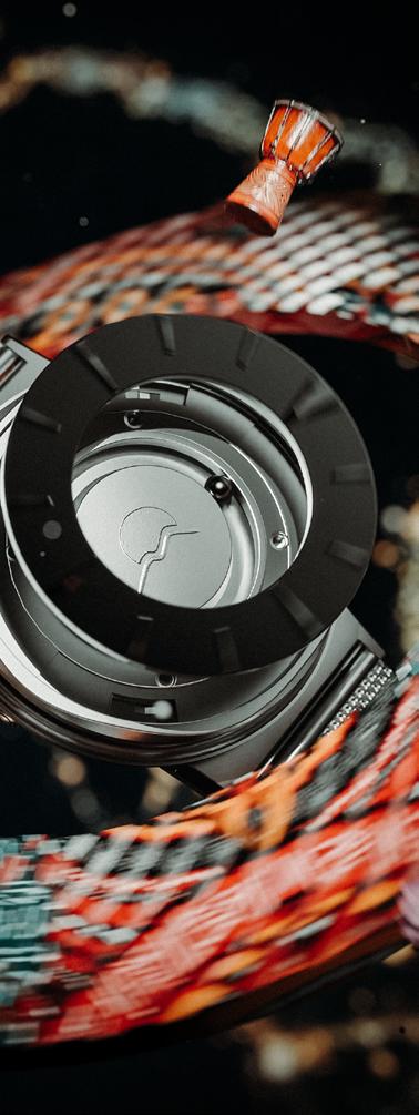
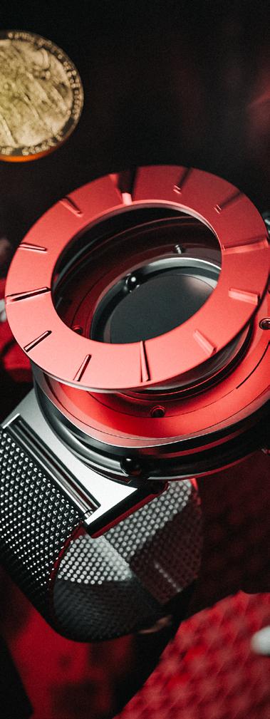
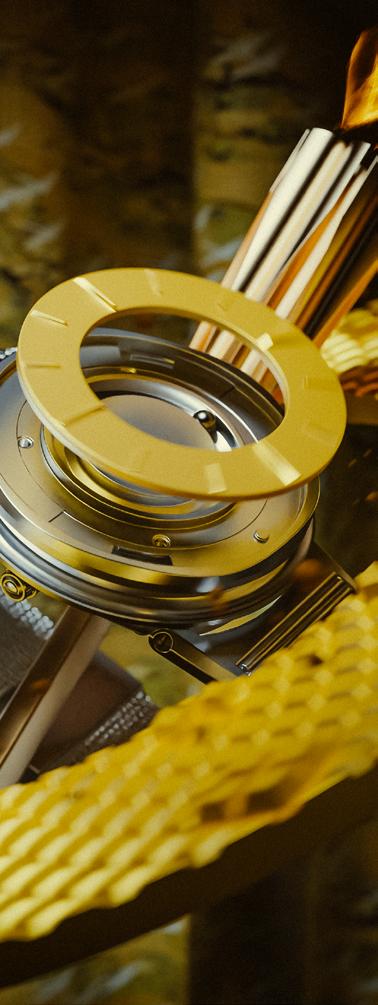
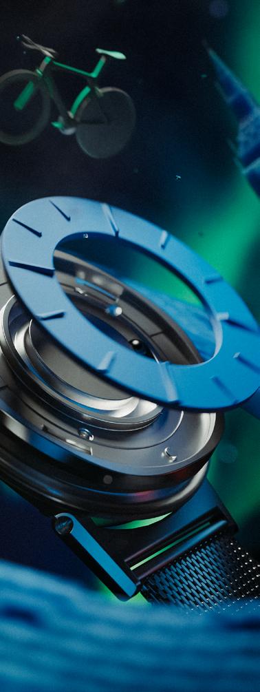
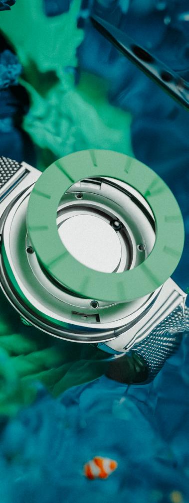
Eone_ Paralympic and Eone watches
Visuals_Eone 4
Client work
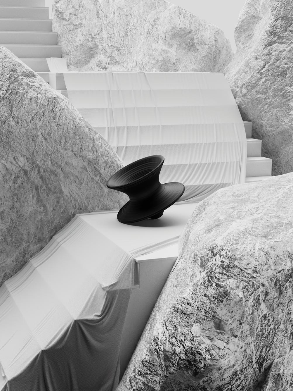
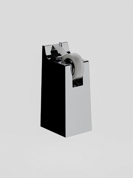
3D CAD modelling/ visualisation/ abstract/ scene creation/ promo shots
Visualisation is a part of my passion and one of my strengths that allows me to effectively convey my products.
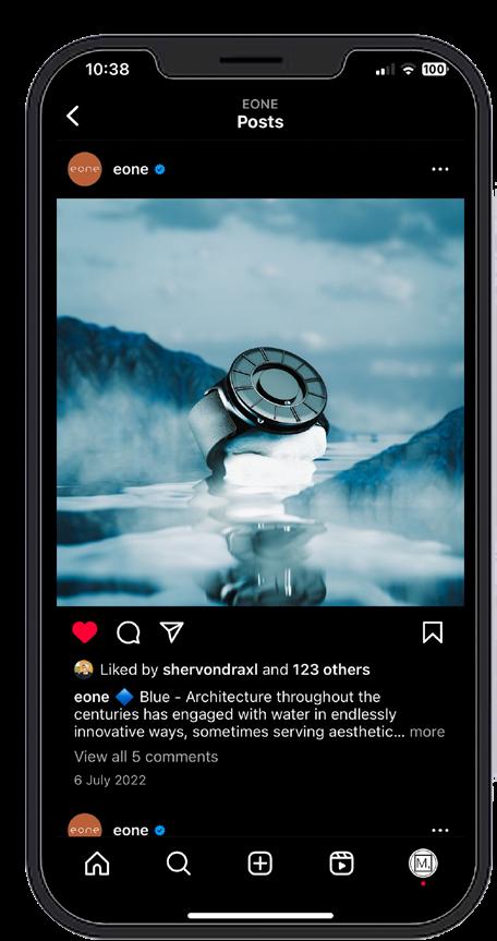
I promoted Paralympic and Eone watches by creating a concept that integrates athletic components and diverse compositions to interact with the watch, enhancing both functionality and design.
These project presents numerous approaches to how eone watch can blend in with various elements, as well as how colours can merge with texture.
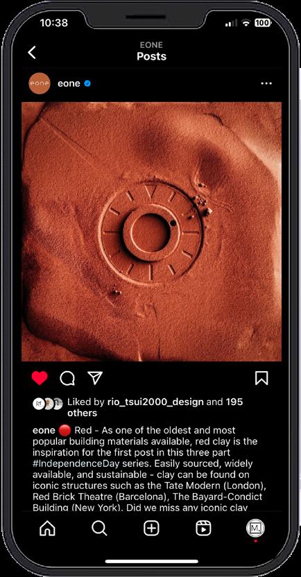
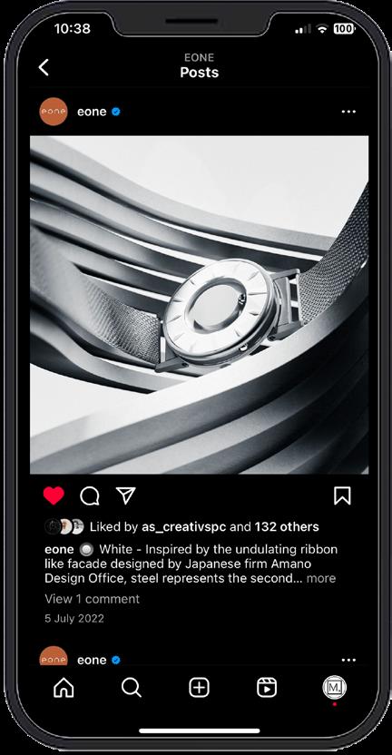
Eone_ IndependenceDay and Eone watches
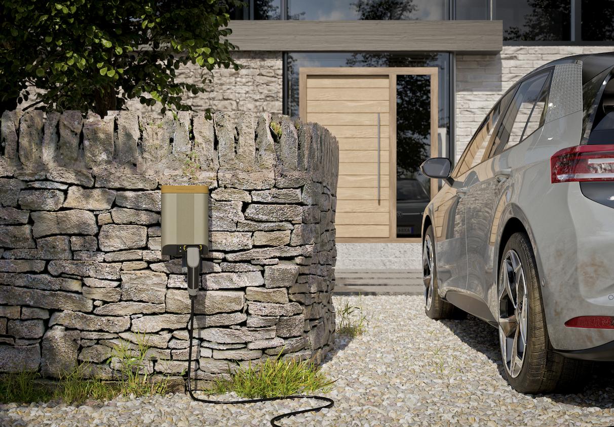
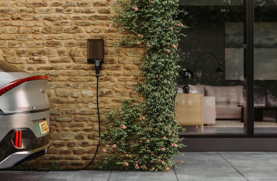
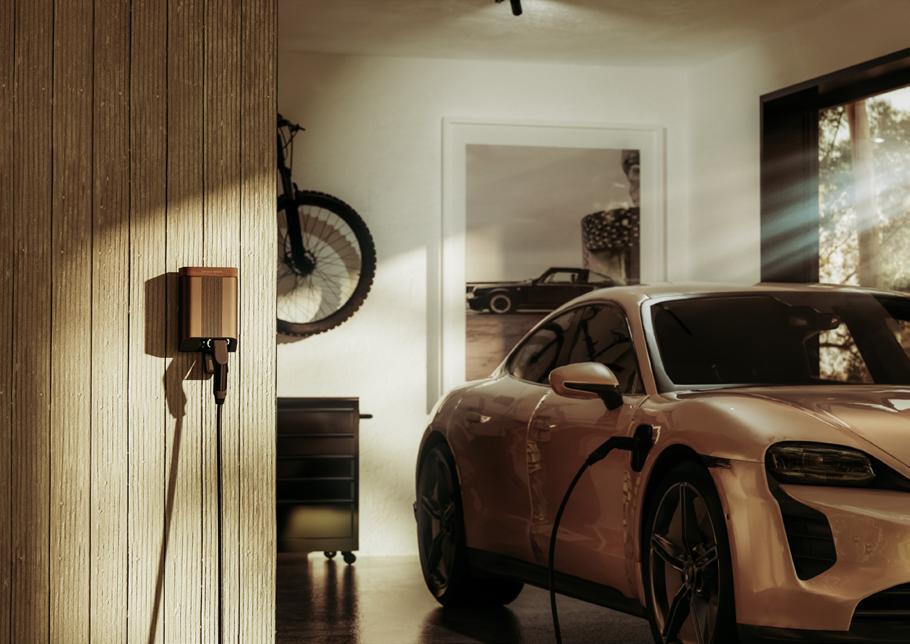
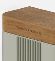
Visuals_S&P
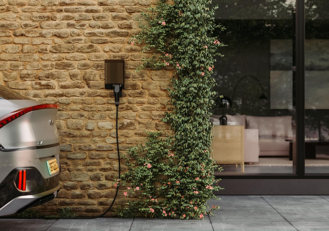
Details a realistic product render or product is all about adding details. Composition, lighting research, and little tree shadows can add a little life to renders.
Brand language
Understanding customer needs and aligning with the brand language are key to success. In this project, key considerations included:
Colour Tone & Scheme
Ensuring consistency with the brand’s visual identity
Furniture Style
Matching design aesthetics to maintain brand coherence
Asset Matching
Selecting elements that complement the overall look and feel
Hands-on experience
Most of our projects involve extensive hands-on testing and installation, ensuring functionality, quality, and seamless integration.
Improving standard range
Enhancing the standard product range through engineeringdriven improvements, including optimising mechanical components, refining manufacturing processes, and ensuring efficiency, durability, and performance through rigorous testing and validation.
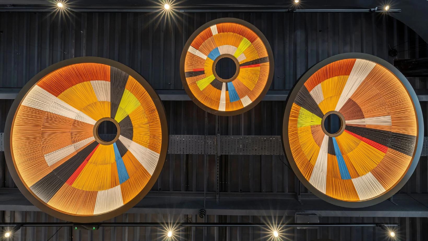
Nando's
Software:
- Keyshot for creating realistic visuals
- Solidworks for model creation
- Photoshop for postediting
-Lightroom for colour effects and image enhancement.
I focus on:
- Marketing research: Use different on-trend materials and colour schemes, and what people like to see.
- Mastering Lighting & Materials: Practising different lighting setups and realistic textures
- Setting Goals: Focusing on specific areas like shadows and reflections
- Receiving Feedback: Sharing work on soical platforms for constructive input
- Challenging Myself: Taking on more complex projects to push my skills
Instagram/
@mwcpd
Email/ meiwong.mwcpd@gmail.com
Linkedin/ www.linkedin.com/in/wongmeiyin
