Feature 3: The exquisitely sensitive work of Peter Wildbur
Page 15
Aoebele
Feature 6: Visual cultures across the ‘Pond’
Page 25
Ian McLaren
& Elizabeth Resnick
Steven
Ludwig
Scott Bakal
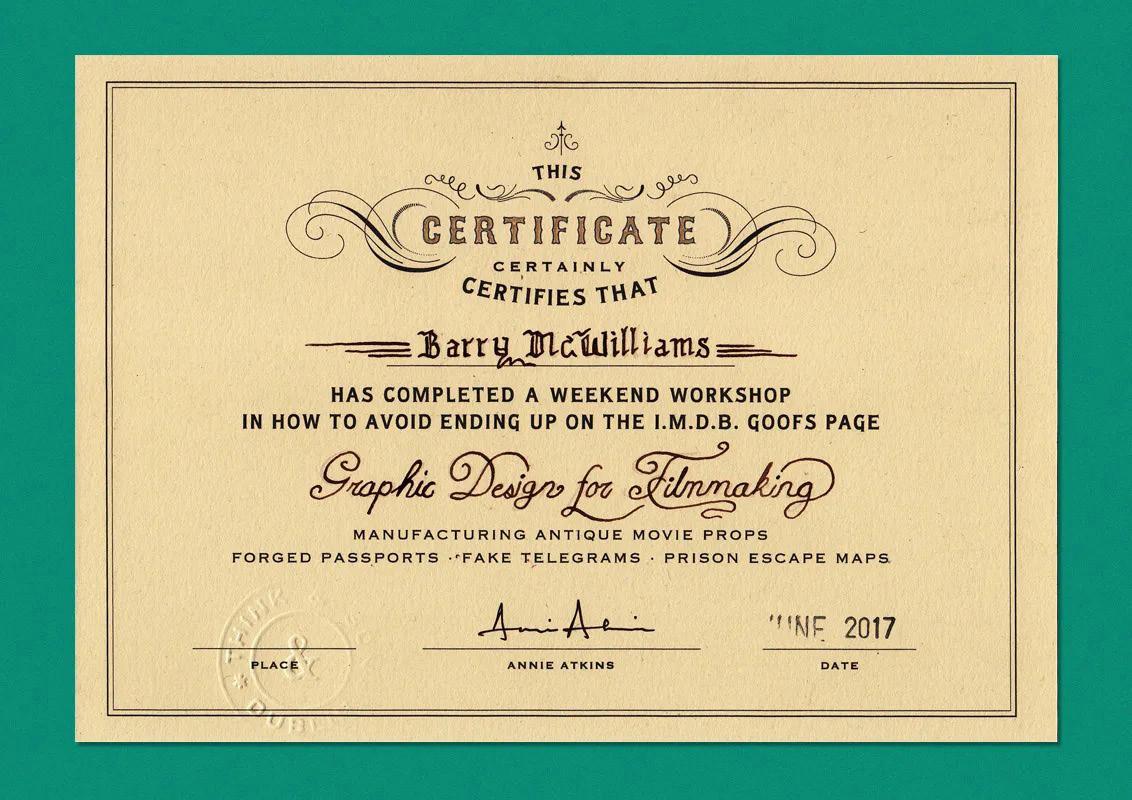
Annie Atkins Graphic Design for Film
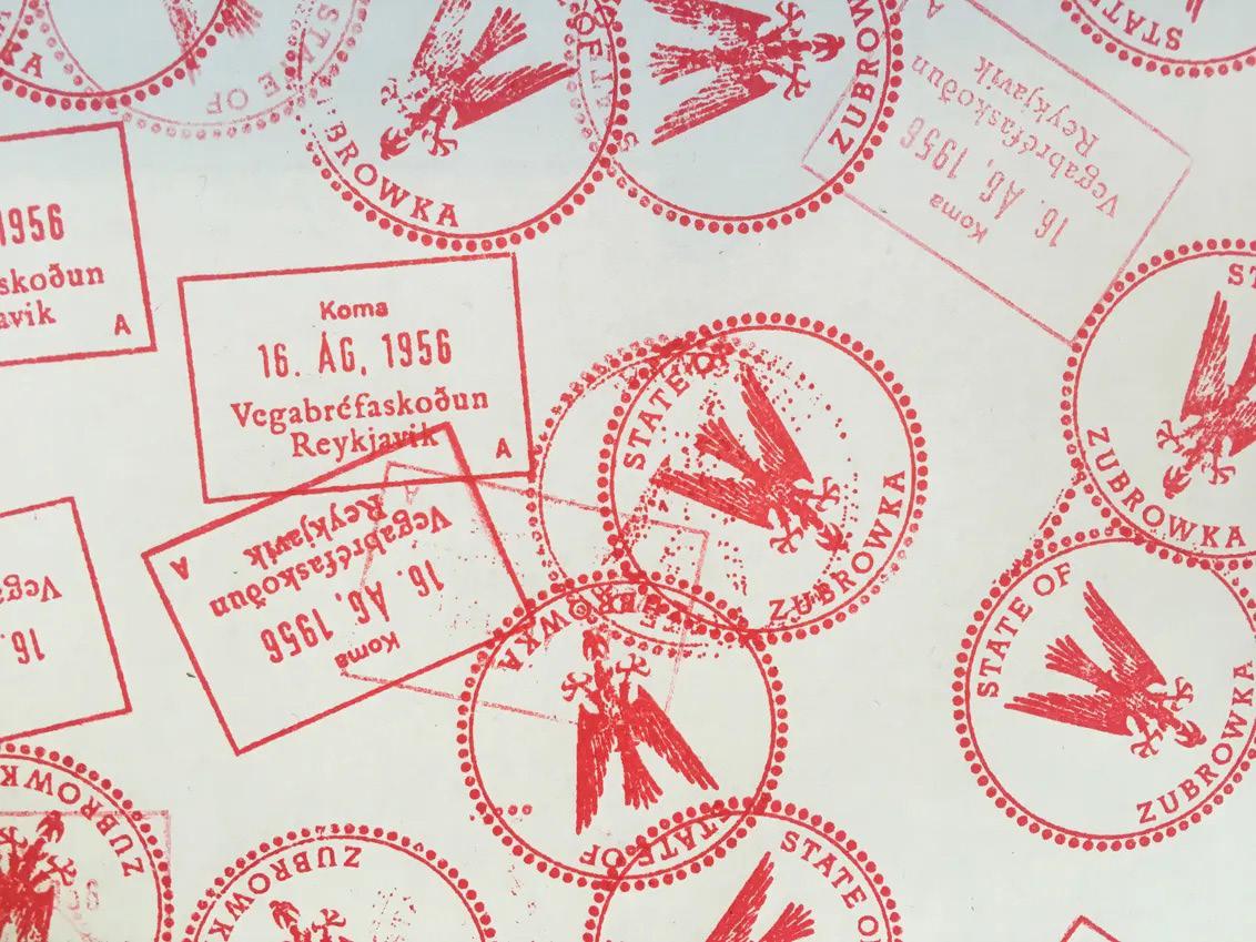
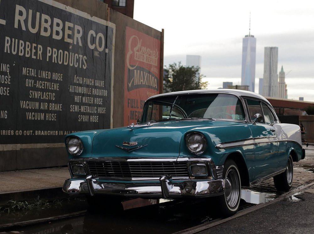
It’s a long way to Zubrowka from the small village of Dolwyddelan, in north Wales, where Atkins was raised by her artist mother and graphic designer father. The nearest cinema was 25 miles away; her exposure to movies came through her neighbour’s VCR. Her early career veered from Ravensbourne to a stint at a Reykjavík advertising agency, followed by a course in production design in Dublin.
Atkins has worked with the best of the best in the industry, including Steven Spielberg and Wes Anderson. She helps create text and graphic-based props for movies and has done so for over ten years. She has many film credits, including “The Grand Budapest Hotel,” “Bridge of Spies,” the upcoming “West Side Story remake,” and Wes Anderson’s newest project, “The French Dispatch.”
She studied graphic design for her undergraduate degree and soon moved to Sweden to pursue a career at a firm. Atkins soon realized that her aesthetic and Scandinavian graphic design did not mix well. After a few years, Atkins went back to school and studied film and blended her two degrees to forge her career as a graphic designer for film.
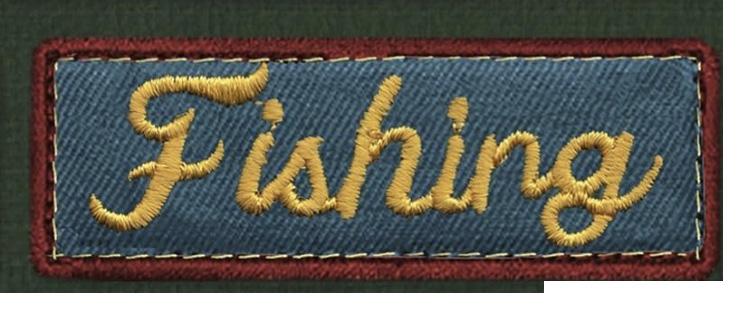
She works on handwritten letters, logos, street signs, and even military jackets. “I’m quite fascinated by typography from other times. It’s so easy for us now to set and kern a paragraph, whereas when you look at the older methods of printing, you understand the methods of detail and attention that has to be paid into things because you can’t afford to make a mistake so easily.” Her work uses historically accurate methods to create a robust world for characters to live in. Her work is fascinating to think about because it is vital to creating a film’s whole
environment. Yet, it should never be too apparent to a viewer. Her work is often overlooked, but her work’s smallest detail tells an excellent story for the film.
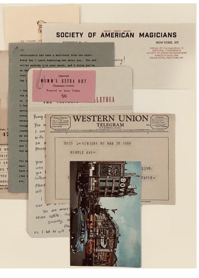
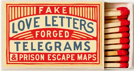
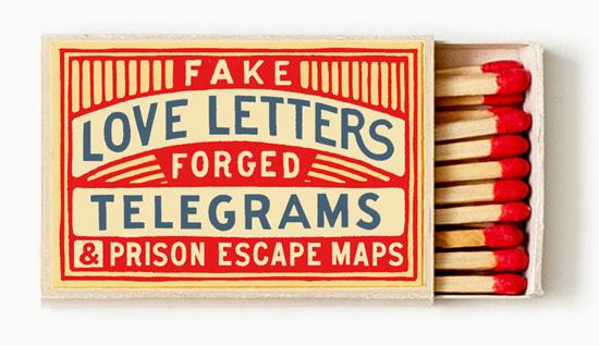
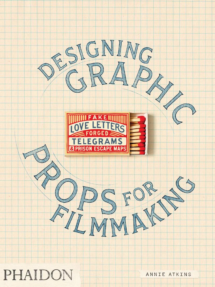
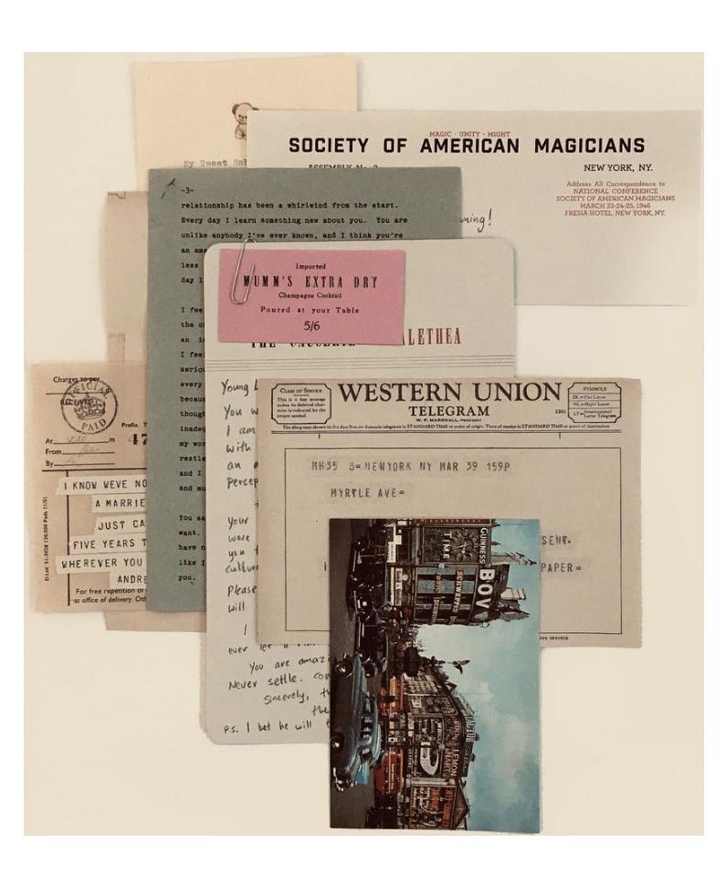
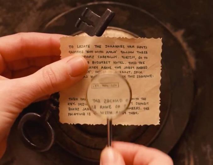
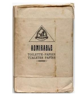
Her book, Fake Love Letters, Forged Telegrams & Prison Escape Maps allows Atkins to share, among other things, how she created the film’s sweetly sinister, somewhere-in-time, somewhere-in-Europe wonderland; an aesthetic remixed from the vintage passports and tattered train tickets, Stasi stationery and children’s diaries that she found during her research.
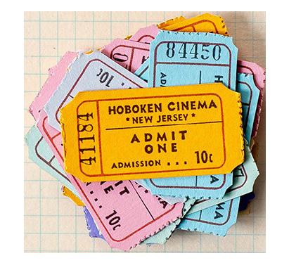
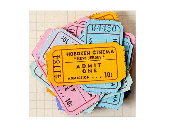
And she’s just as passionate about the graft of her craft: there are spreads in her book devoted to everything from her collections of ephemera (cardboard bottle tops, Egyptian cinema tickets) to recipes for aging paper (tea, Brasso, balsamic vinegar and potassium permanganate all make the cut).
I’m quite fascinated by typography from other times. It’s so easy for us now to set and kern a paragraph, whereas when you look at the older methods of printing, you understand the methods of detail and attention that has to be paid into things because you can’t afford to make a mistake so easily.”
“I’m not brilliant at anything, I just know a little bit of everything and have learnt to cheat over the years. “ ”
The Process
An interview with Annie Atkins
“My role in film is very specific prop design role it’s graphic prop making and graphic set design so in in film we just call it graphic design, but it’s making all the pieces that the actors actually handle in sets that are pieces of graphic material. So newspapers, telegrams, bus tickets, cigarette packets, anything that’s made out of paper or anything that has lettering on it. Really anything that has some kind of photo or illustration on it or has a pattern on it. And this would be set pieces as well. If it was say a big piece of signage or Billboards in the background, shop front signs, posters on the wall, dressing for a set like notice boards in somebody’s office would have to be covered with little bits of paper with appropriate things written on them.
You’re usually hired by the production designer or the art director who are the people who were desiging the entire movie and you’re brought into the Art Department with a few weeks of prep before the camera starts rolling. The art department is where everybody else sits like the drafts people, set designers, this whole set decorating team, it’s kind of like a another leg of the design. Usually, the first thing you do is you sit down with a script and a highlighter and you go through the script, marking out anything that sounds like it’s going to be a piece of graphic design because you know then that that’s going to be your responsibility to produce it.
Then with directors it’s different on different movies like a graphic designer doesn’t always work directly for the director. Usually you’re working for the art directors, the production designer, the set decorators, the prop master, or whoever it is that’s in charge of any given piece. I’ve done a lot of work with Wes Anderson in the past and he’s very involved with his art department so then you would talk directly to a director like that, but you know I’ve done other movies where I’ve never even seen the director.
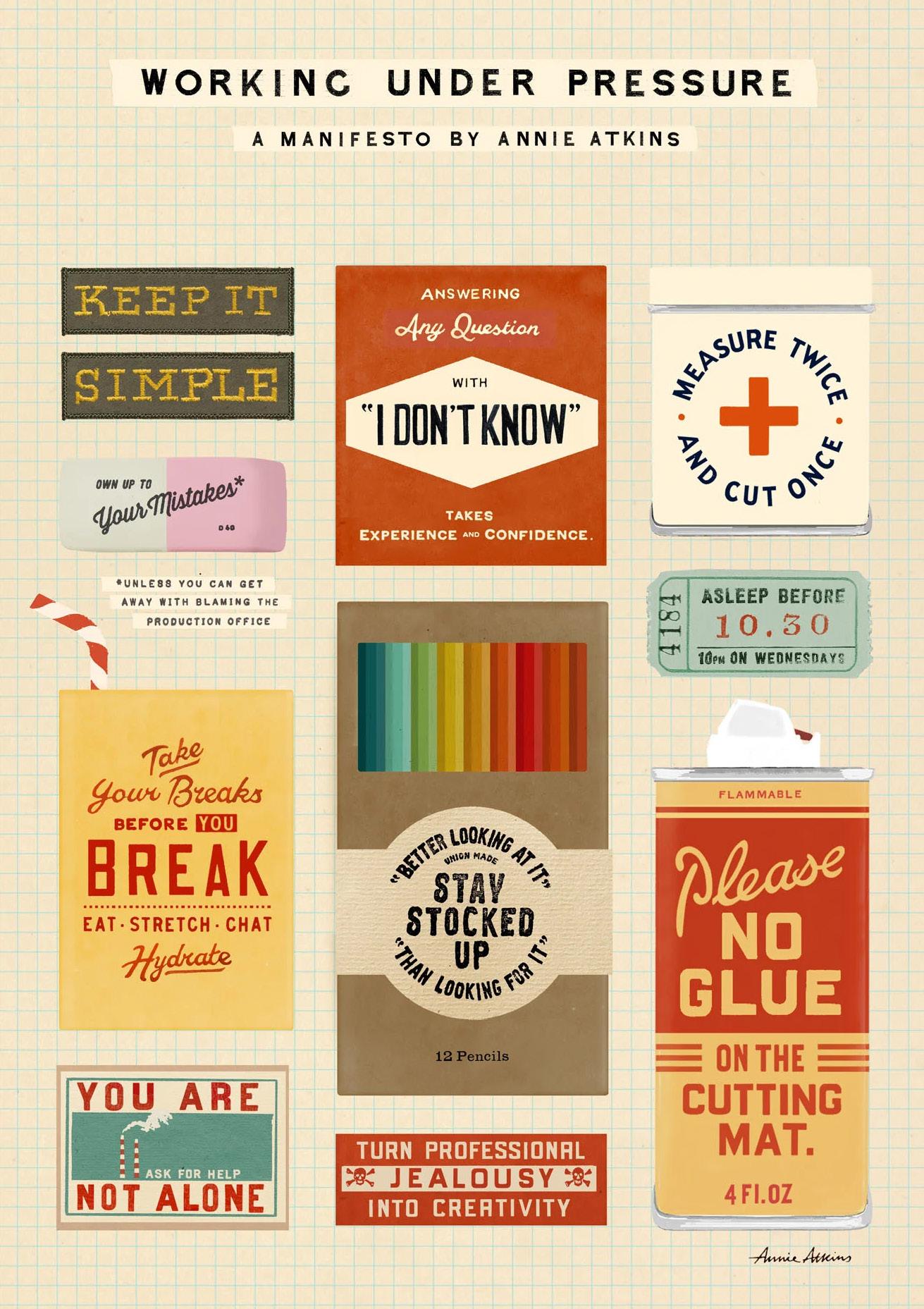
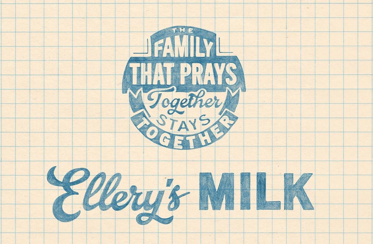
Annie Atkins Manifesto Poster
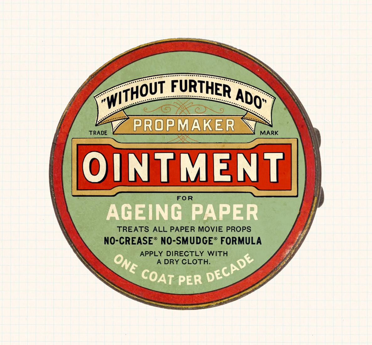
Propmaker ointment package design.
Luckily for me most of what I make is never seen because most of the graphic design you put in the movie set is in the blurry background, it’s not in focus. You know, the camera is looking at the actor’s face, it’s not looking at a piece of graphic design. And while this can often be a little bit disappointing, sometimes it’s really relieving because if we ever do make mistakes, it’s rarely ever seen.
As much as this is true, you don’t know what’s going to be seen so you have to make sure that all the work you make is legally clear to use, is right for the period, is right for the place, is right for the genre and the tone of the script, because you never really know for sure, when you’re going to get your closeup.
When you start noticing the props your eye is being drawn from the real drama that’s unfolding between the characters. For the most part you shouldn’t be analyzing the little bits of paper in the background.
One way we can stop this happening is actually to put more detail into our props. So sometimes when a piece of graphic design has less detail in it, it really stands out. But the more detail we add: the more period detail and the more genre detail there is, it kind of melts into the background and blends in. That’s where research comes in, really. We spend quite a lot of time researching and making sure we understand our different times and countries around the world. Even what calligraphy looked like in Eastern Europe in the 1930s as opposed to America in the 1950s. We do spend a lot of time getting these things right so that they disappear.”
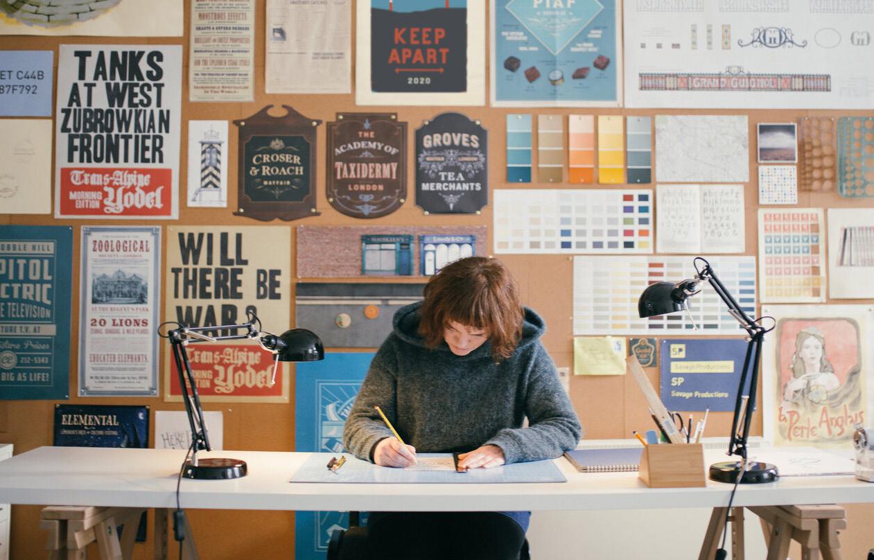
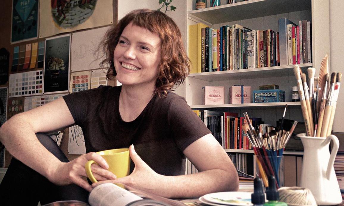
Annie Atkins in her home studio.
Poster designed by Annie Atkins.
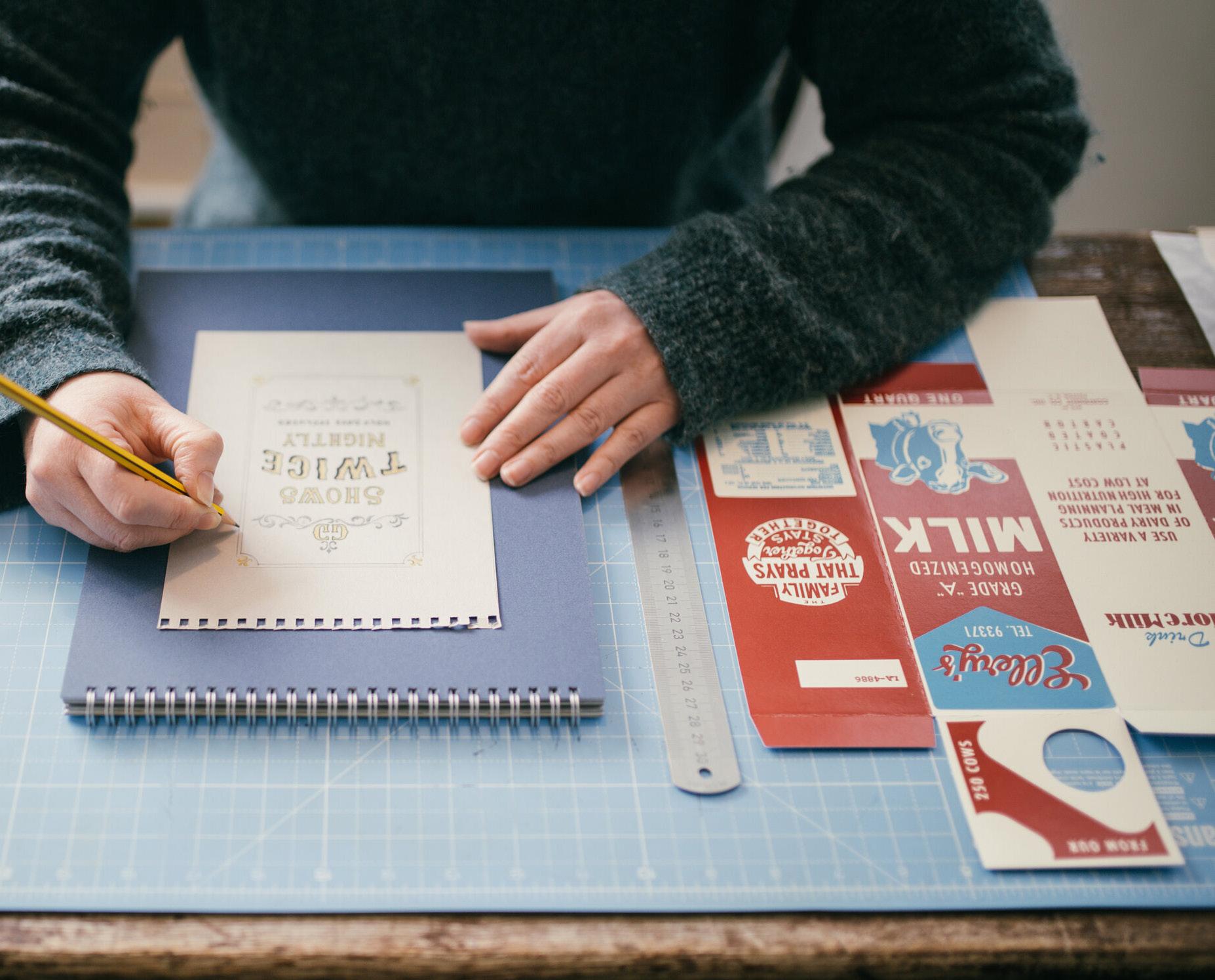
Annie Atkins drafts up a mock-up in her home studio.
Films by Wes Anderson
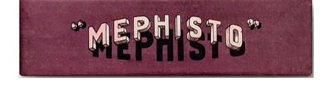
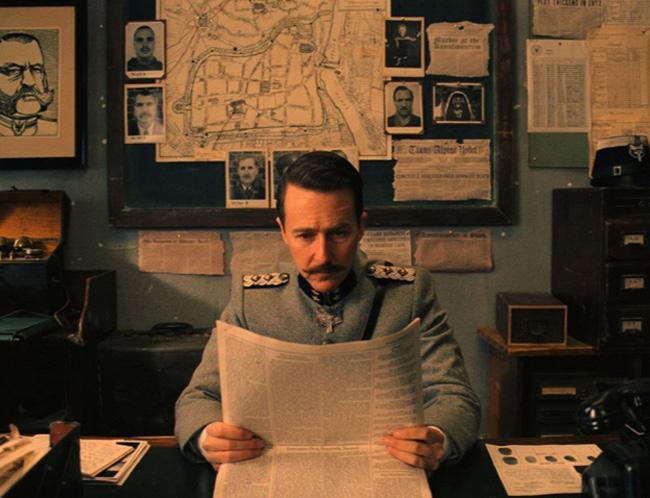
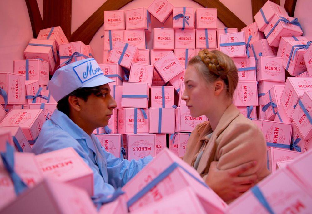
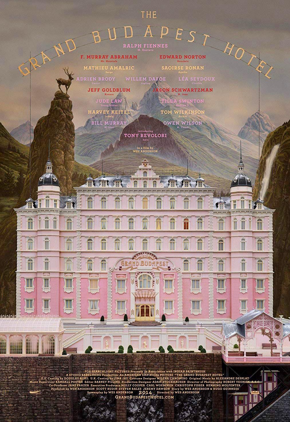
The Grand Budapest Hotel 2014
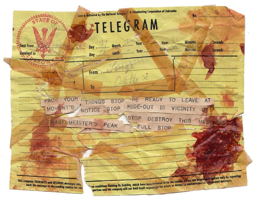
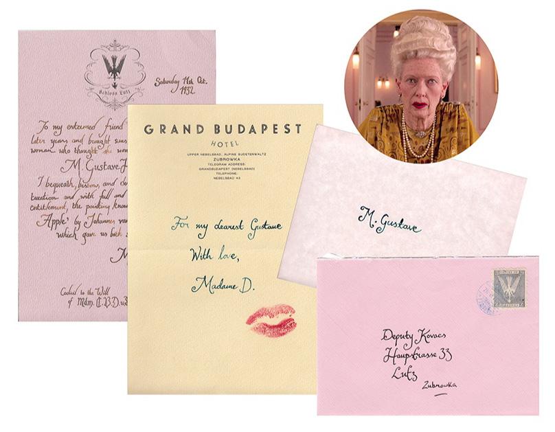
Wes Anderson is the most experimental and hands-on director I’ve ever worked with, and I worked closely with him and his production designer, Adam Stockhausen every day. The Grand Budapest Hotel was my move from TV to film, and it was an incredible rollercoaster from the moment I got the first call from the producers, to the winter I spent with the cast and crew in the fictional Empire of Zubrowka, to the day I sat down in the cinema to watch the movie for the first time. I doubt I’ll work on a more beloved film that pays so much attention to graphic design again in my lifetime, so not a day goes by when I don’t thank my lucky stars (and Wes and Adam!) for that opportunity.
As a lead graphic designer in The Grand Budapest Hotel, Annie handmade multiple copies of each production prop, to serve as replacements whenever a prop was torn or coffee was spilled. For a single piece of paper read during a train scene, for example, she created a dozen replicas. All twelve copies were flawlessly identical in their crafty Japanese paper, their rubber stampings and their typography that features a selection of vintage fonts, digital as well as typewritten.
Movies attempt to add a sense of authenticity to their imaginary happenings, and graphics play a part in grounding the story in its historical context. Annie’s job, therefore, relies heavily on periodical design for inspiration. She’s a big fan of junk shops and flea markets, where she browses through old items as part of her research. “I like rifling through the old tickets and sweet wrappers looking for vintage type,” she says. Atkins’ collaborative mindset allows her to contribute to the
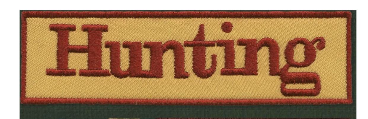
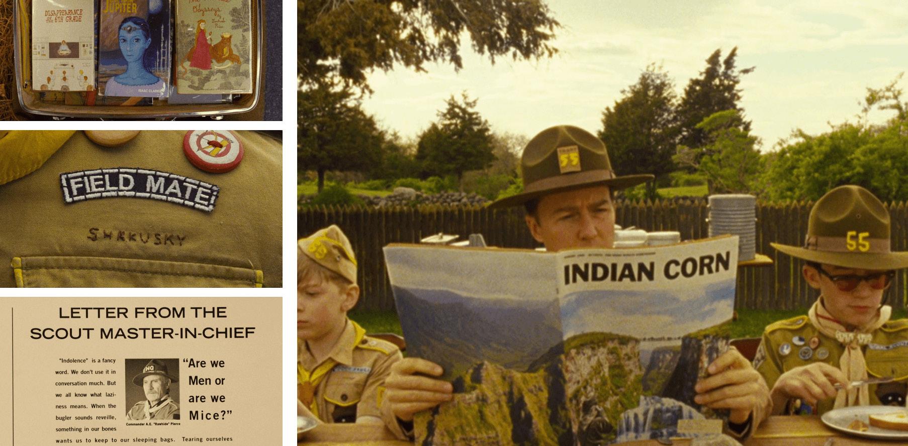
overarching vision while maintaining her unique artistic voice. Another example of the crucial role of design in film can be observed in “Moonrise Kindom,” where her work added a nostalgic and evocative tone to the story. She meticulously crafted a variety of custom-designed items, including scout badges, maps, and dioramas, all of which added whimsical layers to the narrative. Atkins’ craftsmanship and attention to detail
Scene from The Grand Budapest Hotel
Scene stills from Moonrise Kingdom.
resonated with audiences through her hand-drawn illustrations and thoughtfully chosen typography, enhancing the film’s nostalgic charm. Atkins’ exceptional graphic design work exemplifies the transformative power of design in shaping the world of film and beyond. Through her meticulous attention to detail and unwavering commitment to authenticity, she creates unforgettable cinematic experiences that transport audiences.
Atkins’ designs go beyond mere embellishments; they shape and enhance the narrative, leaving a lasting impact. As the world of cinema continues to evolve, Annie Atkins stands as a beacon, reminding us of the incredible influence designers hold in creating immersive and captivating visual experiences.
Lastly, Atkins’ design work in Wes Anderson’s latest film, “Asteroid City,” once again exemplifies her ability to transform cinematic visions into mesmerizing realities. Through captivating typography and a nostalgic yet futuristic style, she fully immerses viewers in a world that feels simultaneously real and distant. From intricately designed architecture to meticulously crafted interior spaces, Atkins’ designs infuse each location with personality, making them feel truly lived-in.
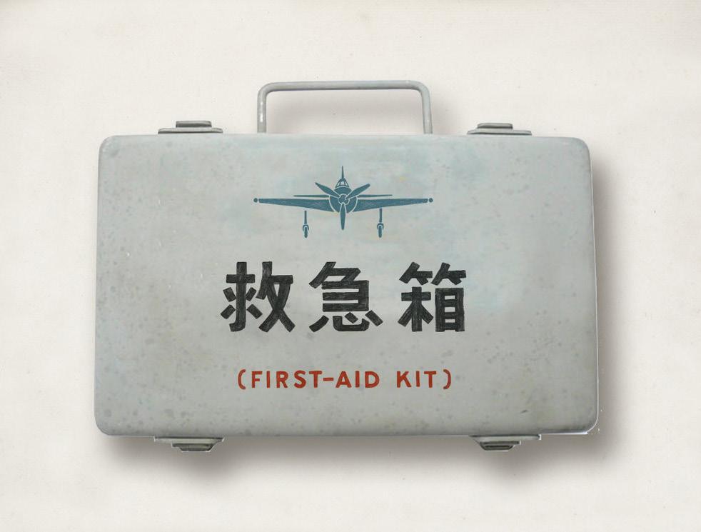
Props from Isle of Dogs.
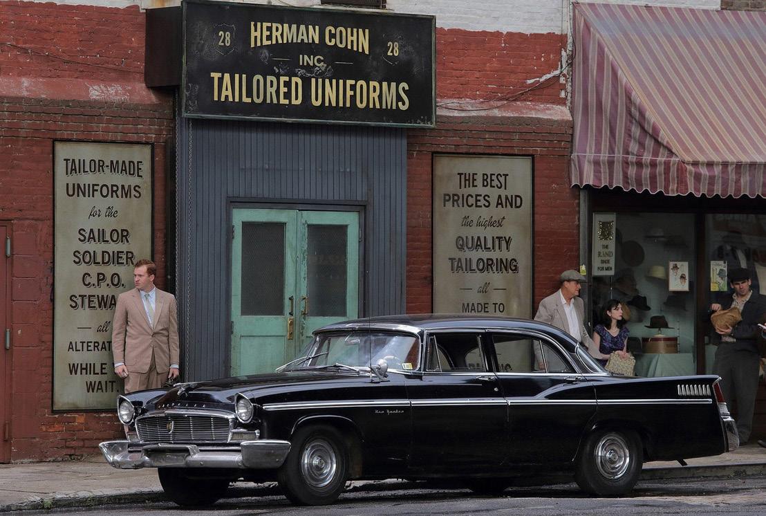
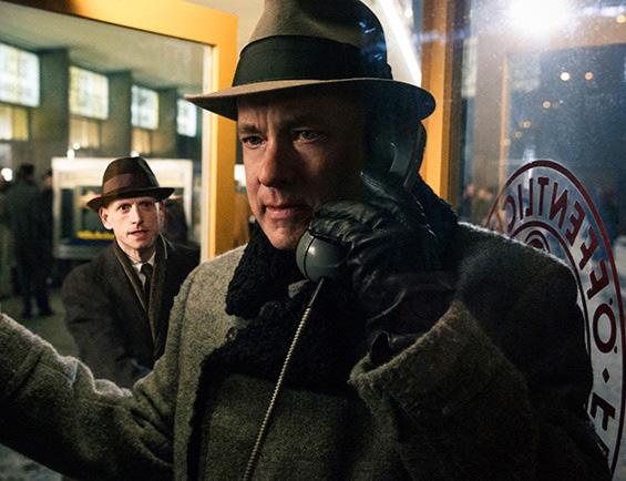
Bridge of Spies
A 2015 film by Steven
Spielberg
Propmaking and designing is such an invisible art form once it’s in a movie because hardly anything the designer makes is actually seen. In some cases, the invisibility can be a good thing as mistakes are bound to happen. Atkins reveals one of her biggest mistakes happened in Spielberg’s Bridge of Spies
“
We got radioed up to the art department from the set. We didn’t have a label for a bottle of brandy and somehow, I had just completely missed it in the script, and nobody had caught it. It was quite a key scene because Tom Hanks’s character who was like the good guy was being offered a glass of brandy by the bad character, and the feeling in the scene was supposed to be ominous. It lead the audience to question if the brandy was poisoned. So this is kind of what we would call a hero prop. It has relevance to the story and it wasn’t one to miss in the script. I’ll say that and I had to make it very very quickly. I made it and designed it and printed it out and stuck it to the bottle in 20 minutes or something.
Luckily, you have a little bit of time because they’re still setting up the scene and the camera crew are doing their job and the lights down there, but the problem is then legal clearance. I had to send that prop to clearance to make sure that it was okay to use in the movie and of course the clearance officer was in Los Angeles and we were shooting in Germany.
It wasn’t until the next morning I got the email saying no this is not clear to use and you can’t use it. It was too close to the design of a real Armenian Brandy label. So I had a lot of sleepless nights over that because we’d already shot it. Luckily for me most of what I make is never seen because most of the graphic design you put in the movie set is in the blurry background, it’s not in focus. You know, the camera is looking at Tom Hanks’s face, it’s not looking at a piece of graphic design. And while this can often be a little bit disappointing, sometimes it’s really relieving because we never actually saw the bottle, I don’t know what happened maybe his hand was over the label when he poured the brandy, or it was out of focus or whatever. But in this instance, it worked out and I was quite relieved.”
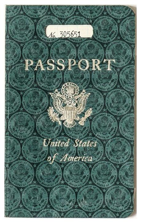
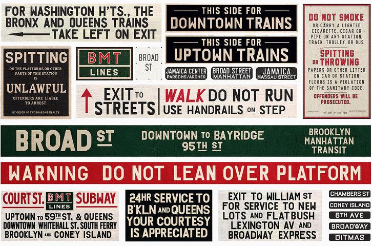
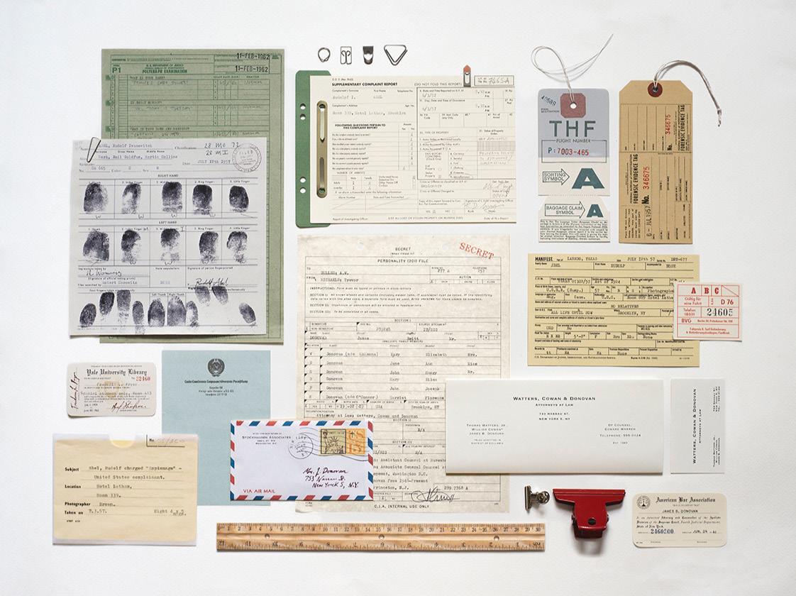
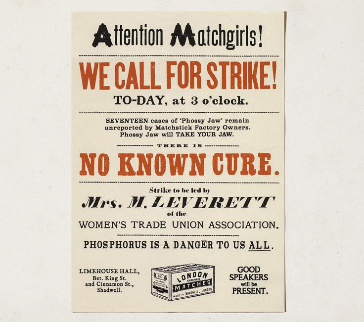
Forged CIA documents, Subway and shop signage, and printed ephemera for Spielberg’s Cold War thriller, set between New York and Berlin.
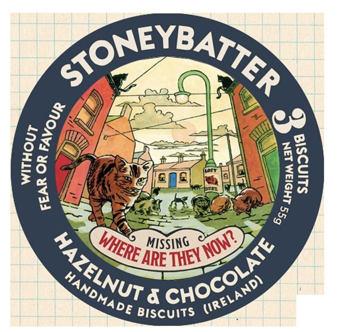
Box labels for a gang of trolls living in a cave under the city of Cheesebridge.
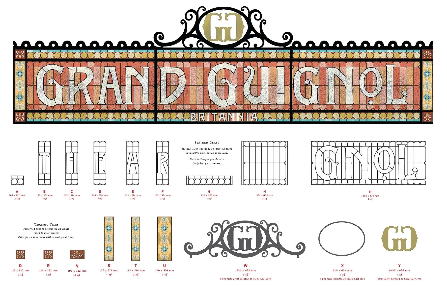
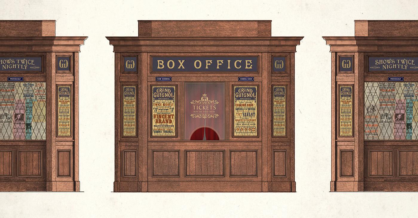
Shopfront signage and imitation letterpress posters for a Victorian London inhabited by monsters.
Other Films and TV
The Tudors, West Side Story, and other projects.
“I started my first job on a show called The Tudors which was about Henry VI, so it’s in the 14th century/15th century. Because I was so new to it all and everything I’d done before had been digital, I came in thinking that I could just speed things up for everybody and do make everything digitally. That was a real steep learning curve to me to understand that no, you can’t just use a handwriting font in place of calligraphy. We have to do things the right way or the analog way, and sometimes we use digital tricks. What I’ve learned to do is cut back and forth all day long between my drawing board and my computer and my scanner, so I’m constantly using analog tools like rubber stamps or real pen and ink, and then I’m scanning it in and I’m bringing it into Photoshop.
It’s tricky designing something that doesn’t look like it was made by an art department when you’re in the art department: you really have to shake off your digital instincts and step in to the shoes of the character—or the time or place—that you’re designing for. I love that challenge. If something was made by hand at the time, then I try to make it by hand now.
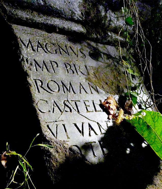
My most fun job was on a show called Camelot which you will have no recollection of whatsoever, but I got to make some rather convincing ancient tombstones by carving Roman lettering in to soft, wet clay. In film making where we really succeed is where we are open to absorbing the design from the world around us and imitating it often, because if we want our pieces to feel authentic then we need to start studying pieces from the real world. Whatever they are, whether it’s a shopfront sign or an old love letter, you know a lot of the art of film is actually forgery. We’re actually copying, and people who work in film, we don’t have a hangup about originality the same way people out there in kind of more contemporary design surroundings do.
Jeff Goldblum “
Annie Atkins is a master craftswoman...she makes the unreal seem hyperreal and the real more supremely alive”
I did some work on a film set in 1994. It was an Ang Lee film. And I found that really tricky actually, because at that point the nineties hadn’t hadn’t really been cataloged yet, so it was difficult to find reference material to copy. And I just had to try and remember what it looked like, which was a bit odd. But usually, usually the kind of movies I take on would be mid-century or earlier. So I’ve done a few mid-century things.
I’ve also done a couple of Victorian England things, which I love, by the way, I absolutely love Victorian London. It’s such a great time and place to design for. And then when I first started out, I did a lot of like really ye olde stuff, like medieval stuff. So I think I think I really take things on based on the period before anything else. There’s also a rule of thumb that you just take the first solid offer that comes along because filmmaking is a precarious place, you know. But I tend not to get offered the contemporary stuff. It’s not really my area.
I had done a TV show here in Dublin about the building of the Titanic. I was a very low budjet show which are really hard to work on because you don’t have a lot of support. There’s only one graphic designer, but you still have to produce the same volume and quality of graphics that you would for any other show. And I put my heart and soul into it because it was the first show I’d worked on that was set after the invention of the printing press. And I really loved that because all of a sudden I was designing letterpress posters and pamphlets and cigaret packaging and things that just didn’t exist in, for example, the 15th century, which is what I had been designing for. So I put a lot of myself into the project and I got some really great portfolio pieces out of it. But I said after that show, I’m not doing another TV show and I’m leaving film because it was just too much. And then I got the call about The Grand Budapest Hotel.”
Tombstone from the TV show “Camelot”.
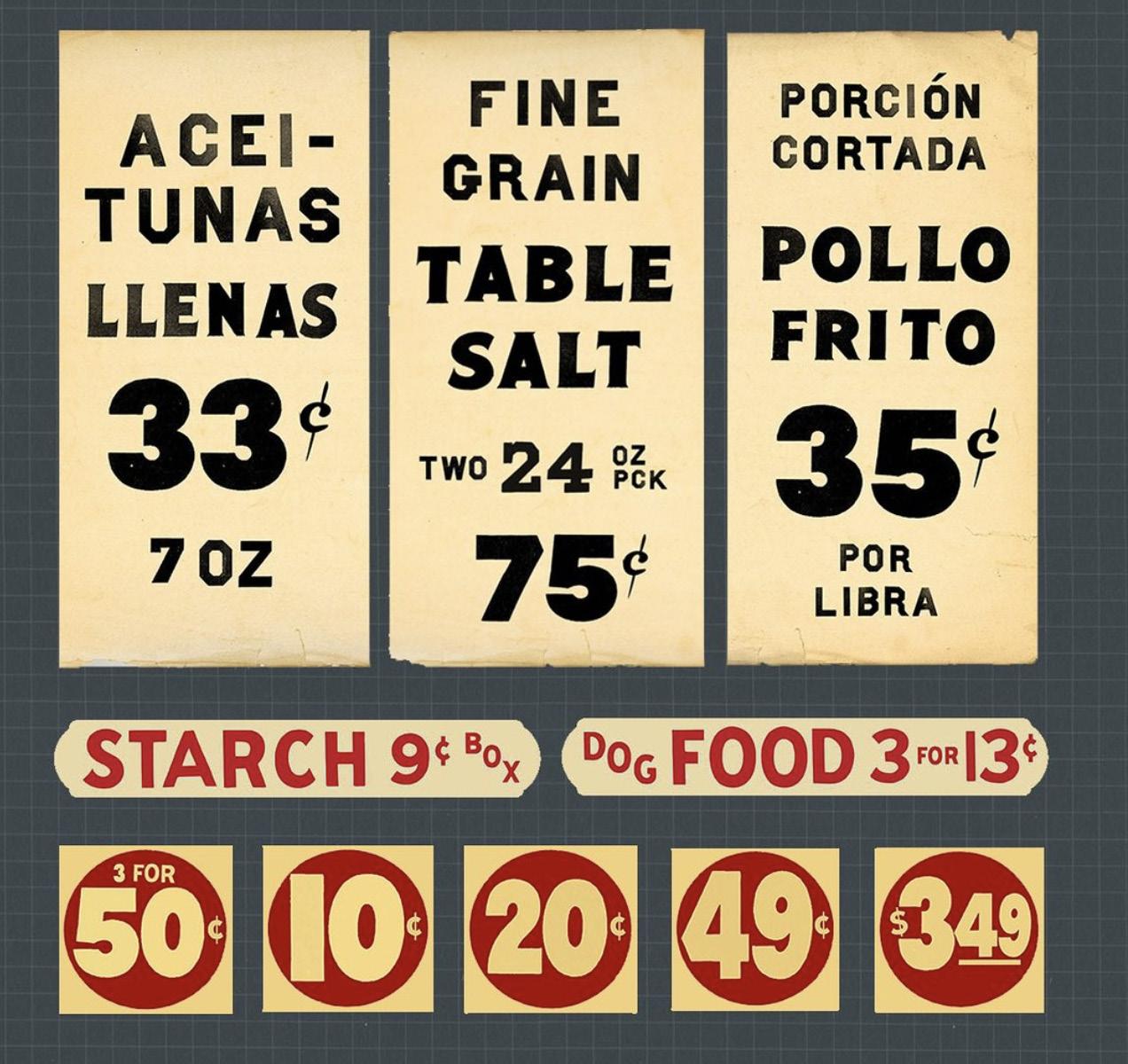
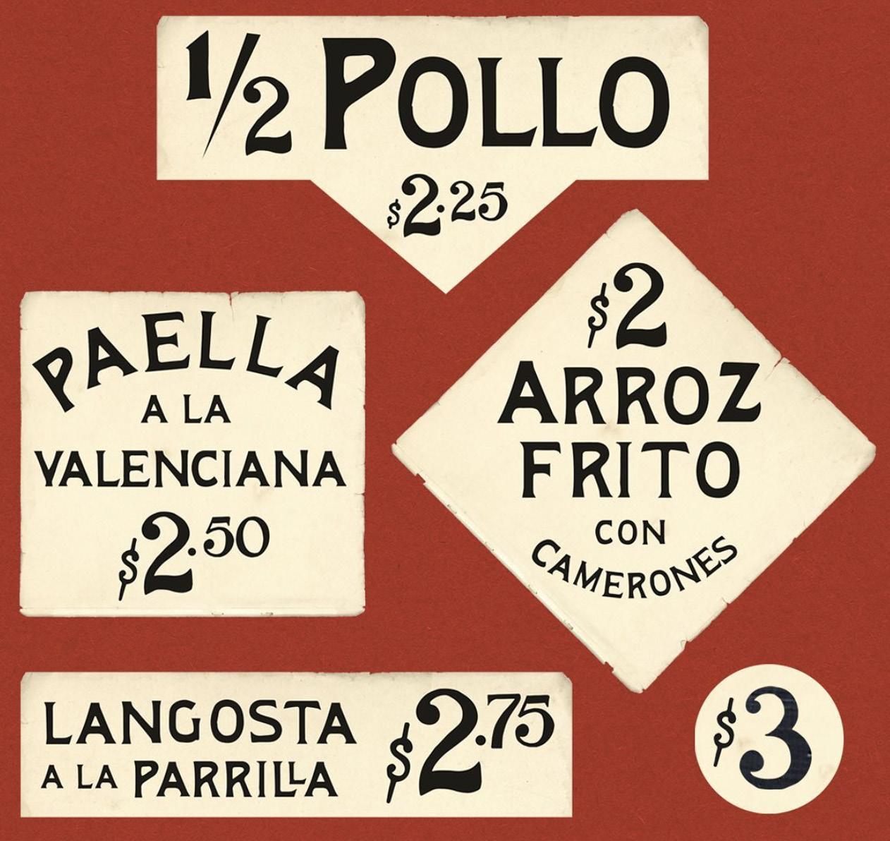
Storefront signage from West Side Story
Branding Projects
Creating film-worthy branding and design.
“The majority of my work is in designing pieces for film sets, but I do sometimes work on commercial projects for clients too, if the brief seems like my cup of tea.”
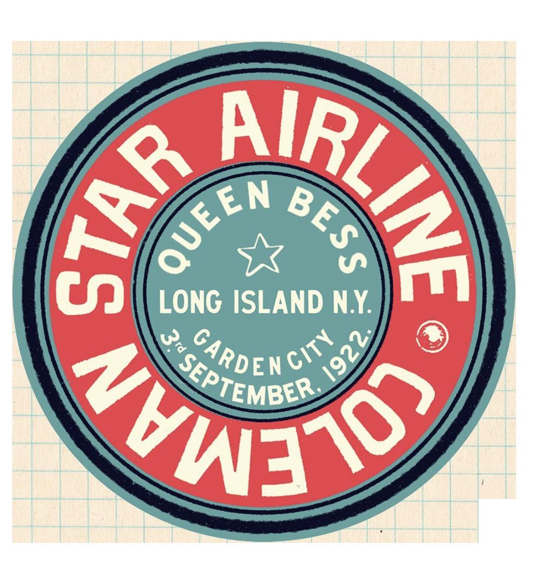
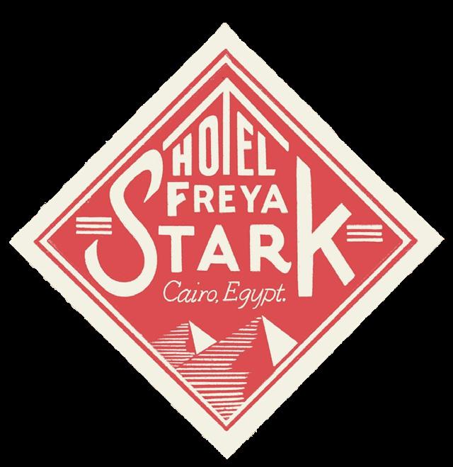
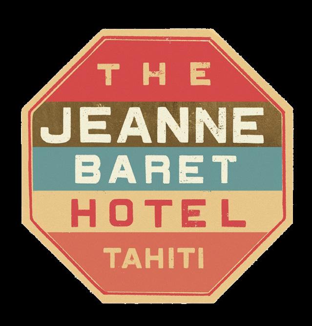
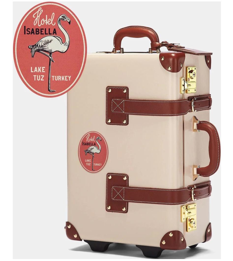
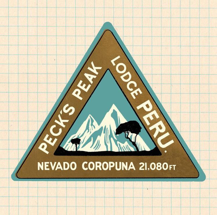
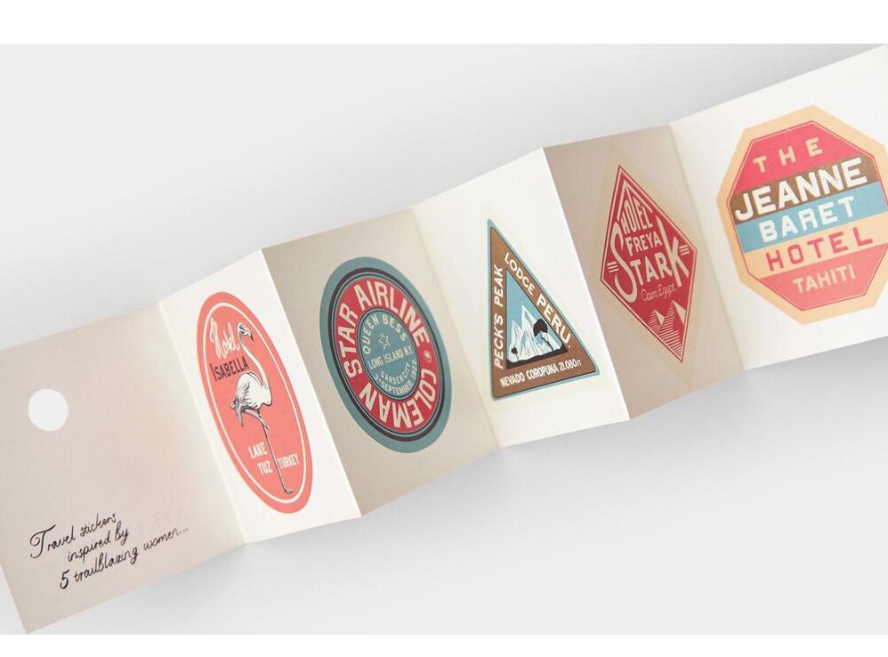
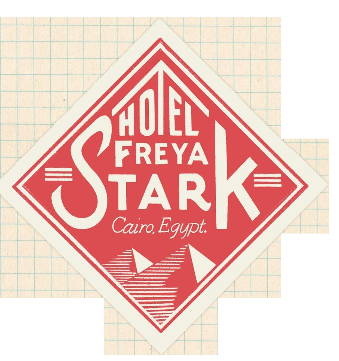
A set of travel stickers for the luxury vintage suitcase brand, Steamline.
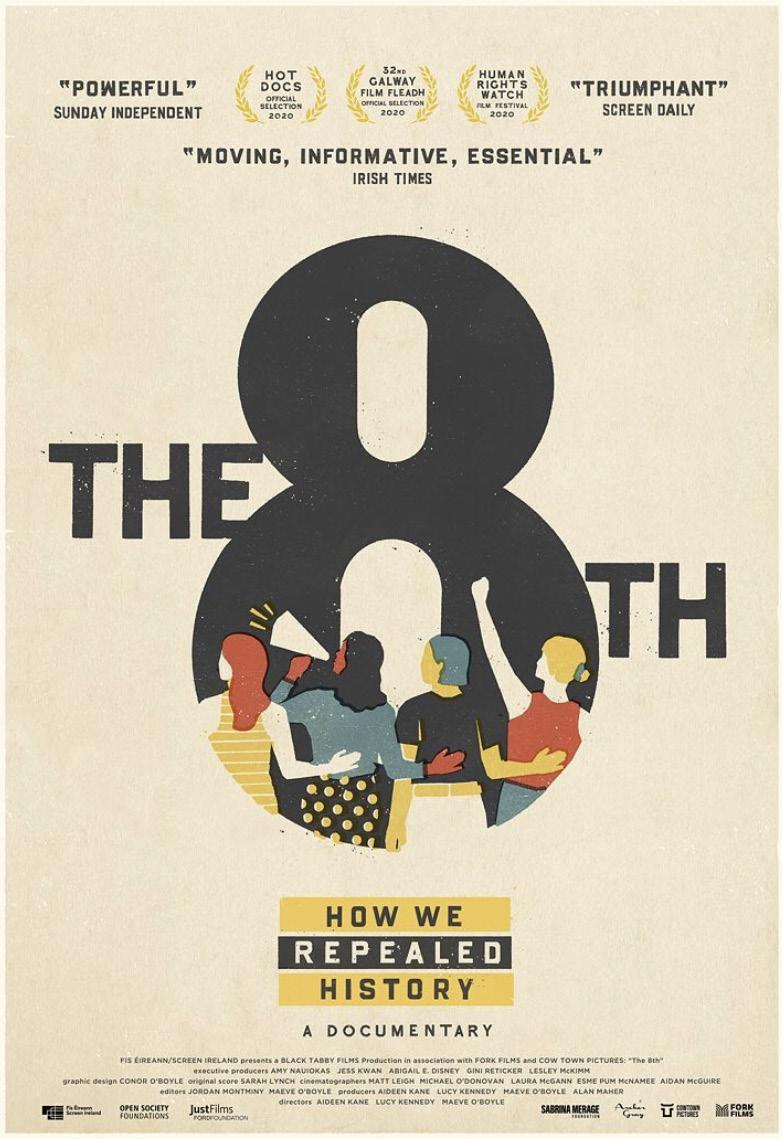
A project for a documentary about Ireland’s tough abortion laws being overturned.
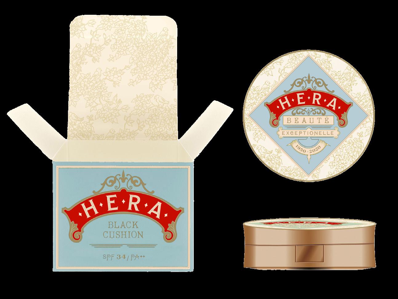
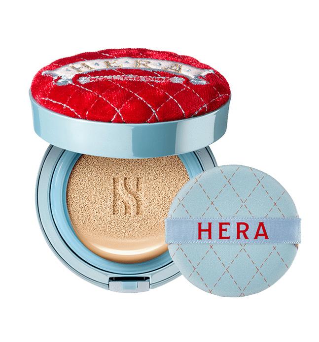
A limited edition packaging design for the
Korean make-up brand Hera, celebrating their 50th anniversary.
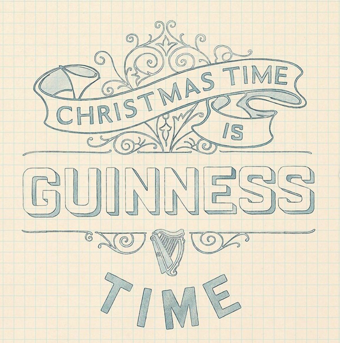
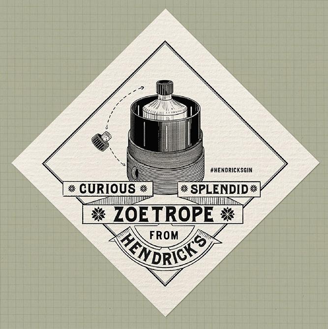
In collaboration with Hen’s Teeth agency in Dublin, I designed the Christmas gift packaging for Hendrick’s Gin so that its box turned into a Zoetrope.
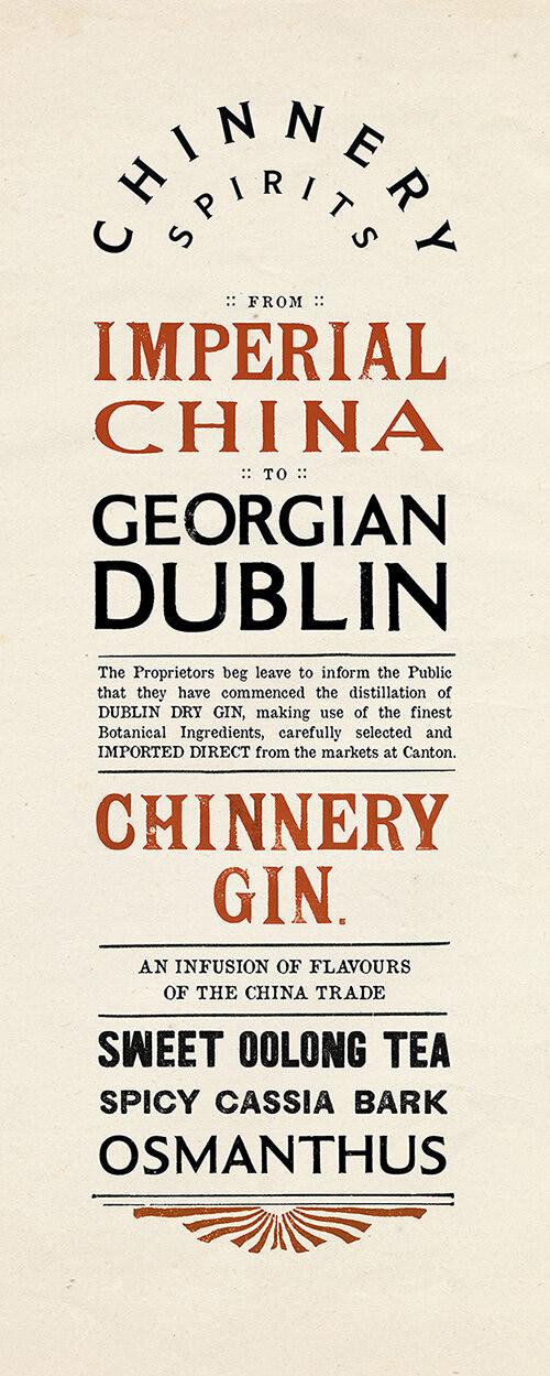
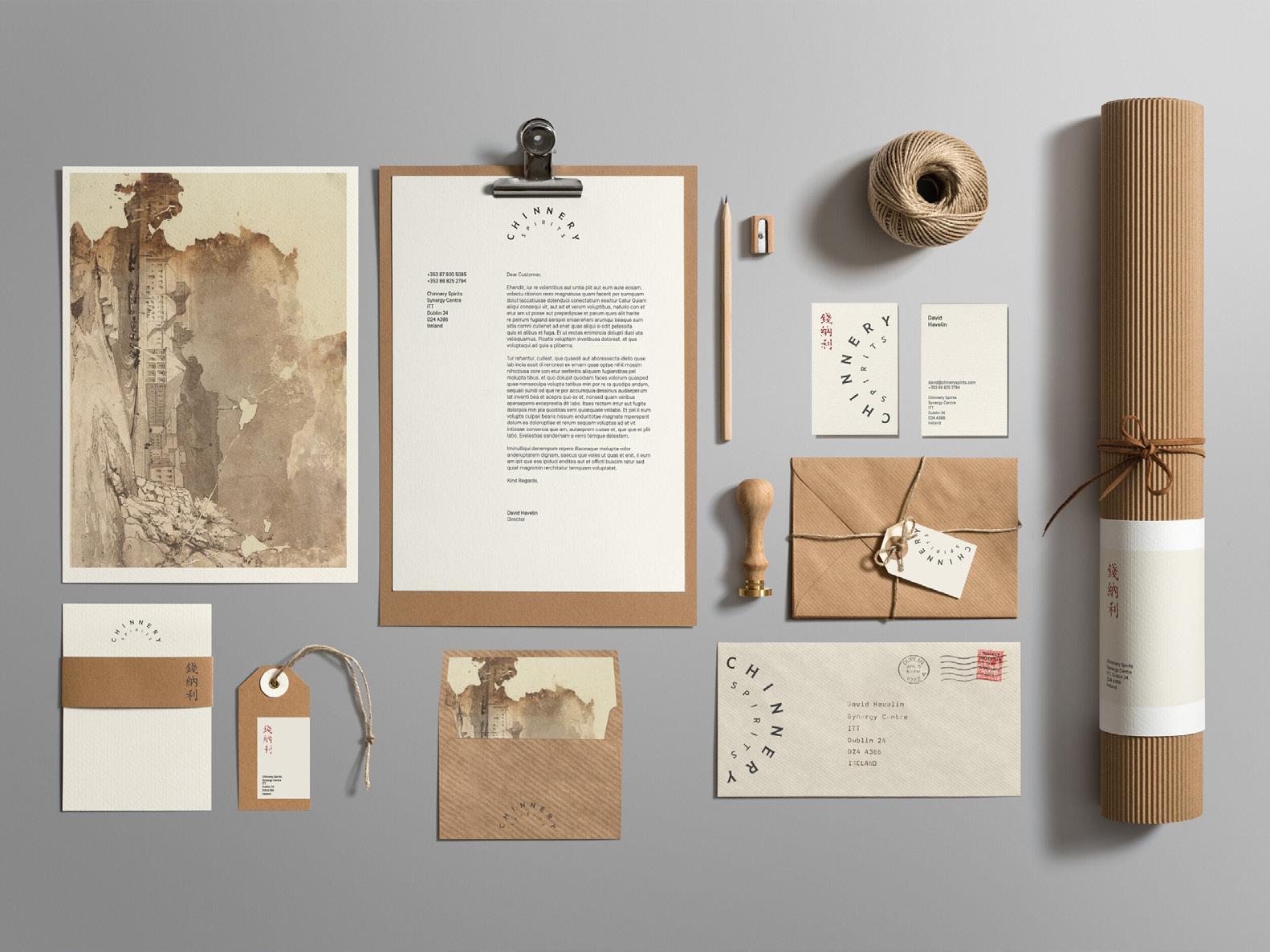
Signage and stationery for a Dublin gin with a Chinese flavour.