Keep things consistent. STAY
Every time someone visits our website, views our social media, or receives a marketing email, they form a perception of Nature Heals. Adhering to these guidelines ensures we are communicating a consistent brand identity; keeping our brand recognizable, reliable, and sustainable.
Brand Story
Growing up, I was that child who spent more time outside than in. I climbed trees, played in the dirt, and found peace among the birds and leaves. My uncle used to call me "earth lady" because, no matter the season, I was outside, in touch with the ground, feeling the pulse of the earth.
As I grew older, the simple pleasures of childhood faded away, replaced by the complexities of adulthood—loss, grief, and the daily stresses that can weigh heavy on a person. Family and friends weren't always available to offer the emotional support I needed. So, I returned to nature, to the places where I felt most at home. It was among the trees and beside the rivers that I found solace and began to heal.
I realized then that nature was more than just a backdrop for life's events—it was an active participant in my journey toward wholeness. The changing seasons taught me about the rhythms of life, and the interconnectedness of all things became clear. It was this awakening that inspired me to create Nature Heals.
Nature Heals is my way of sharing the healing power of the outdoors with others, especially BIPOC city dwellers who often face unique challenges in their personal and professional lives. I knew from my own experience that reconnecting with nature could be a powerful remedy for mental health struggles. Through coaching, counseling, and group activities, I wanted to offer others the same sense of connection and peace that had helped me navigate my own journey.
What started as a local initiative has grown into a vision for a global network of support. I believe that by restoring our relationship with nature, we can restore our relationship with ourselves and each other. Whether through one-on-one sessions, group workshops, or global retreats, Nature Heals is here to guide women through the universal experiences of grief, loss, and transformation, using nature as our co-therapist.
MISSION Nature Heals is dedicated to empowering women of color to overcome mental health challenges through the restorative power of nature. We provide personalized coaching, counseling, and consulting services to individuals, groups, and organizations. By fostering a deeper connection with nature, self, and others, we aim to guide our clients toward healing.
VISION
We envision a world where all women, particularly those from BIPOC communities, can access nature-based mental health resources. Our goal is to create a supportive global network that encourages personal growth, fosters community, and nurtures a profound connection with the natural world. Through education, experience, and advocacy, we strive to lead a transformation in mental health care that recognizes the healing benefits of nature.
ORGANIC + FAMILAR
Mood Board
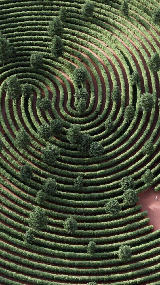
The Nature Heals mood board artfully combines rich, earthy tones with serene, organic imagery to create a compelling narrative of natural healing and spiritual connection. Each element, from color to texture, works in harmony to evoke a sense of peace, grounding, and renewal. The inclusion of therapy elements, such as the meditative labyrinth pattern and the imagery of individuals finding solace in nature, emphasizes the therapeutic power of the natural world.
BUYER PERSONA
Target Client
Kyrah Adams, a vibrant 30-year-old real estate agent residing in the bustling city of Baltimore, leads a life filled with professional success and social engagements. Despite her outwardly dynamic lifestyle, Kyrah has recently undergone a profound shift, grappling with the aftermath of a traumatic experience that has left her questioning the deeper meaning of life. She thrives on spontaneity, creativity, and connections with others, yet finds herself feeling disconnected and unfulfilled amidst the hustle and bustle of city life.
Earning a comfortable salary, Kyrah enjoys the finer things that urban living has to offer—exploring thift shops, attending music festivals, and indulging in culinary adventures. However, beneath the surface, she
yearns for something more—a sense of purpose, inner peace, and authentic connections that transcend the superficiality of her social circles. Despite her outgoing nature, Kyrah struggles to open up about her emotions and vulnerabilities, feeling a sense of isolation even in the midst of a crowd.
Motivated by her desire for healing and personal growth, Kyrah seeks out Nature Heals as a beacon of hope and transformation. Drawn to its holistic approach, which combines mental health support with nature-based activities, she sees it as a sanctuary where she can explore her innermost thoughts and feelings in a supportive, non-judgmental, safe environment. With a longing to reconnect with the natural world as a source of inspiration and healing, Kyrah is eager to embark on this journey of self-discovery and rediscover the beauty and wisdom that lies within and around her.
Kyrah
DEMOGRAPHICS
Age: 30
Gender: Female
Race: Black
Marital Status: Single
Children: None
Location: Baltimore
Homeowner: No
Education: Bachelors
Industry: Real Estate
Income: $103K
PSYCHOGRAPHICS
Introvert
Observant Thinking Judging
Extrovert Intuitive Feeling
Prospecting
Price matters
Sustainability matters
Quality matters
PRIMARY
The primary logo is the main logo for the Nature Heals brand. It should be used the most and for applications that are meant to introduce the brand to new viewers. The tagline can be removed if space is limited.
SECONDARY
The secondary logos are alternatives that can be used in place of the primary logo. They make it possible for the brand to stay fresh and unpredictable.
Logo Details ATTRIBUTES
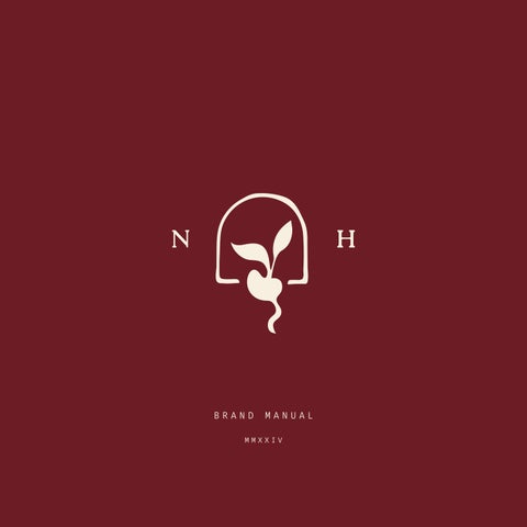
The Nature Heals logo showcases a stylized labyrinth with a sprouting plant at its center, symbolizing growth, healing, and the journey of inner discovery. Below this emblem, the brand name is prominently displayed, followed by the tagline, and then the signature if space permits.
To ensure legibility, the logo maintains a minimum width of 1 inch and features a clear space around it equal to the height of the "N" in "Nature." Designed using a grid system, the logo achieves balanced proportions and a harmonious appearance.
Minimum Size: 1 inch wide
Clear Space:
Construction: Grid System
MAIN ICON
The main icon is a mark that has a variety of applications. It can be used as a profile image, in packaging, marketing materials, and product branding. The uses are limitless. It can be used without displaying the primary logo first, but only to familiar audiences.
Variants
SUBMARKS
The submarks should only be used as supplemental branding. They are meant to enhance the brand, but do not communicate enough information to stand alone.
1. Stretch or squash the logo
3. Lower the opacity of the logo
5. Ignore the clear space
2. Use any text styles or effects
4. Alter or remove any elements
6. Use off-brand colors

#8E5930
IVORY
#F7F0E0
RUBY MOSS
HAZEL TAWNY
#6C1C25
#636B2F
#79683A
RUBY is the heartbeat of the Nature Heals palette, symbolizing the vitality and passion found within the natural world.
MOSS brings a sense of tranquility and calm, mirroring the lush greenery of a forest floor.
HAZEL , with its warm brown undertones, represents the stability and comfort found in nature's embrace.
TAWNY is the gentle, sun-kissed hue that bridges the gap between the vibrancy of ruby and the earthiness of hazel.
IVORY brings a sense of clarity and simplicity, offering a blank canvas for new beginnings and fresh perspectives.
BACKGROUNDS
Acceptable Pairings
The logos and submarks can appear in any brand color that is contrasting with the background. Ruby and tawny is a combination that works well. Moss and hazel should not be used on top of any background except ivory. Ruby can be used with a hazel or moss background, but this combination should be used sparingly. Any color can be used on an ivory background.
Fonts System
DICO TYPEWRITER CAPS
Roca Light
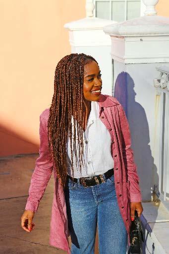
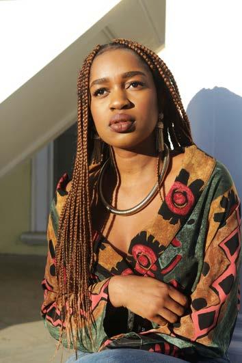
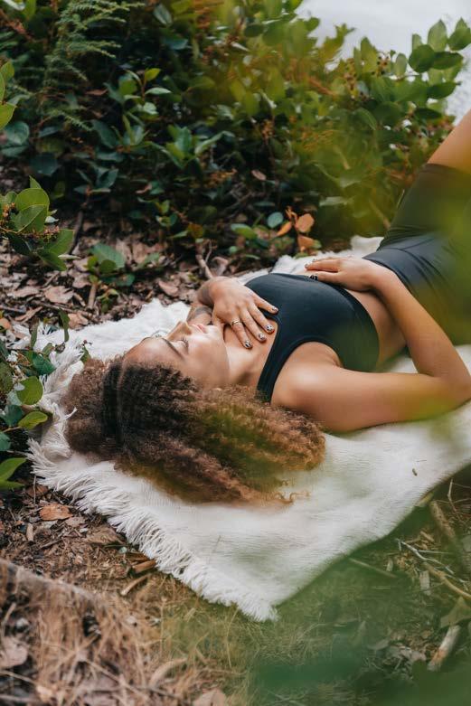
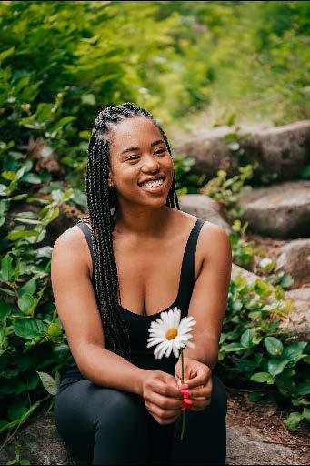
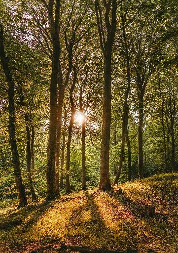
PHOTO STYLE
Visual Aesthetic
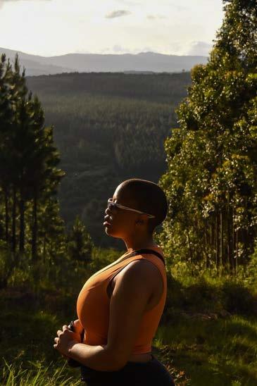
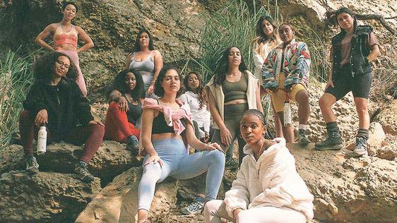
Brand images should be vibrant and sun-kissed, featuring a subtle green undertone. Natural sunlight is preferred over studio lighting to achieve gentle shadows and softer contrast. Photography should showcase subjects in natural settings or surrounded by greenery. Ideal images include people smiling or in meditative poses, avoiding any moody or depressive themes.

ILLUSTRATION
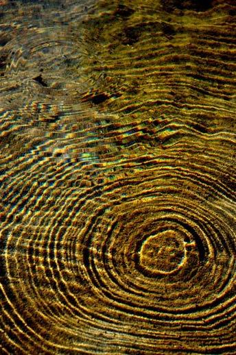
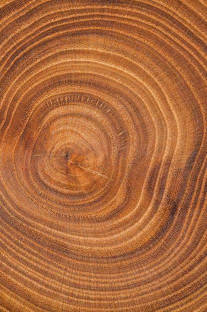
This illustration evokes wood grain and river ripples, capturing the natural beauty of the outdoors. The organic lines reflect movement and vibrancy, symbolizing growth and resilience.
Textures
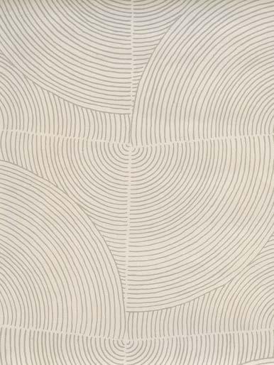
PATTERN
This pattern reinforces the core elements of your brand identity, making it instantly recognizable and memorable. It should be used to fill blank spaces, like the back of a flyer or the lining of a notebook.
These guidelines are malleable and allow for the creative freedom necessary to grow the Nature Heals brand. It’s best to keep these guidelines close by when designing brand collateral. Feel free to refer back to this manual whenever there is uncertainty. If you have any questions, contact roni@mttrdesign.co.