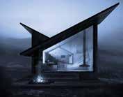
Portfolio Marco Peroni _PRODUCT DESIGN _2022
About me Parelio Micro Tebe Napalympics QueerStatale Gallery Pas De Deux Mini Ghelf Rosetta Academic Professional Personal 4 18 7 30 40 50 57 61 52

High school diploma at Arturo Tosi scientific high school, Busto Arsizio, Varese
Product design Bachelor degree at Politecnico di Milano
09/22 - Present
Technical Office, Civic srl - Trezzano S/N (MI)
- Designed and developed new or personalized technical luminaires (Fusion, Illustrator)
- Drafted lighting calculations for public and private architectural projects (Dialux Evo)
- Updated the website and catalog in terms of UX, in cooperation with an outsourced company
- Broad management freedom, discrete responsibility and participation in decisions.
Dairago, MI, Italy 25/03/1999
+39 3475261768 marco.peroni99@gmail.com
IG: @marco_peroni_
01/22 - Present
Graphic Designer for @whynot_space project
- Brand identity, Logo and merch design
Adobe
Autodesk
Renderings
Light design
Languages
Soft
Illustrator, Indesign, Photoshop, Lightroom, Premiere Pro
AutoCAD, Fusion, Inventor, Alias
Keyshot
Dialux Evo, Ldt Editor
Italian - Native language
English - 7.5 IELTS test
Public speaking, teamwork, adaptability, fast learning
“Practical and pragmatic. He prefers to find practical solutions to wasting time in useless chatter. “
“It’s that friend you send a photo of a flower to find out what species it is or to whom you ask for advice on what movie to watch on Friday nights.”
“Always try to find a detail to stand out from the others, in a surprising and never banal way.”
“A curious person who at the same time intrigues, that’s why it’s nice to make speeches of all kinds.”
I like nature, sparkling water, pop culture, plants, orange color, horror movies, Kayaking, perfumes, acting, Wikipedia, sun, museums and design.
“He is sensitive, empathetic and honest, but also distracted, dramatic and impulsive”

I started working with Civic at the end of September, just after graduating. I accepted this internship offer because it aligned with my studies and specialization in light design. Civic is a family business that has been specializing in the production and sale of technical lighting for both interior and exterior spaces for over 30 years. During my time at their headquarters in Trezzano sul Naviglio, I had the opportunity to gain a deep understanding of this market sector. I learned about the company’s position in today’s competitive environment, as well as its strengths and weaknesses.
In its more than 30 years of activity, Civic has always strived to have a wide and up-to-date catalog, while remaining faithful to its main features, such as the use of high-quality raw materials like stainless steel and glass, which consequently ensure durability and ease of disposal at end of life.
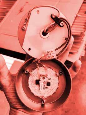
Throughout the ten-month experience, I was involved in a range of tasks. I started by creating data sheets and managing social media posts. As time went on, I also got the chance to work on product design and provide personalized customer consultations. This involved conducting lighting calculations using Dialux.
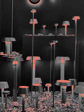
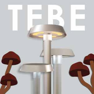
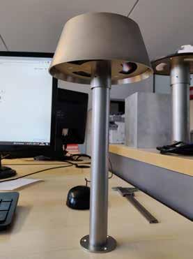
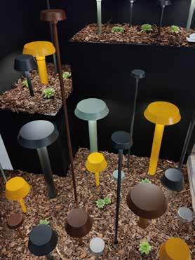
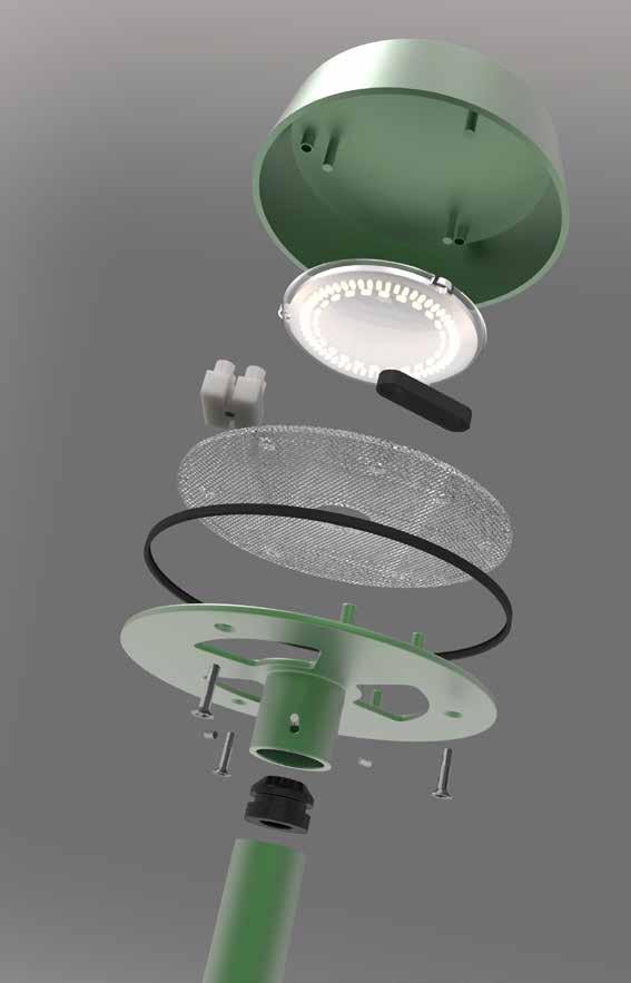
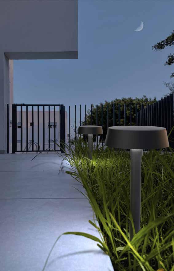
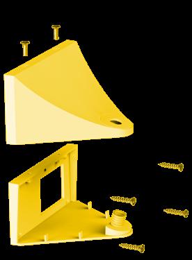
For the “Euroluce” fair in April, Civic wanted to create a series of new products to surprise our customers. Among the various innovations, we wanted to introduce a new garden bollard that would be smaller in size compared to the existing “TEBE” model in the catalog.
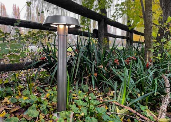
The main challenge of the project was achieving compactness: the market is saturated with a plethora of similar products, so the focus was on creating a product that would stand out in terms of quality, both in terms of materials and visual appeal. The product could not exceed a width of 10cm and a height of 3cm. It had to be both durable and aesthetically pleasing, while also ensuring efficient illumination.
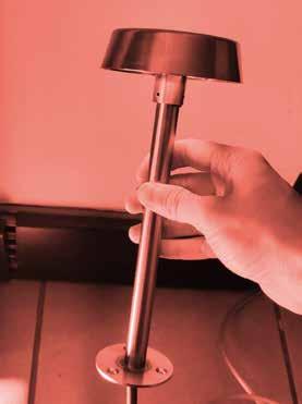
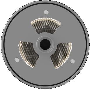
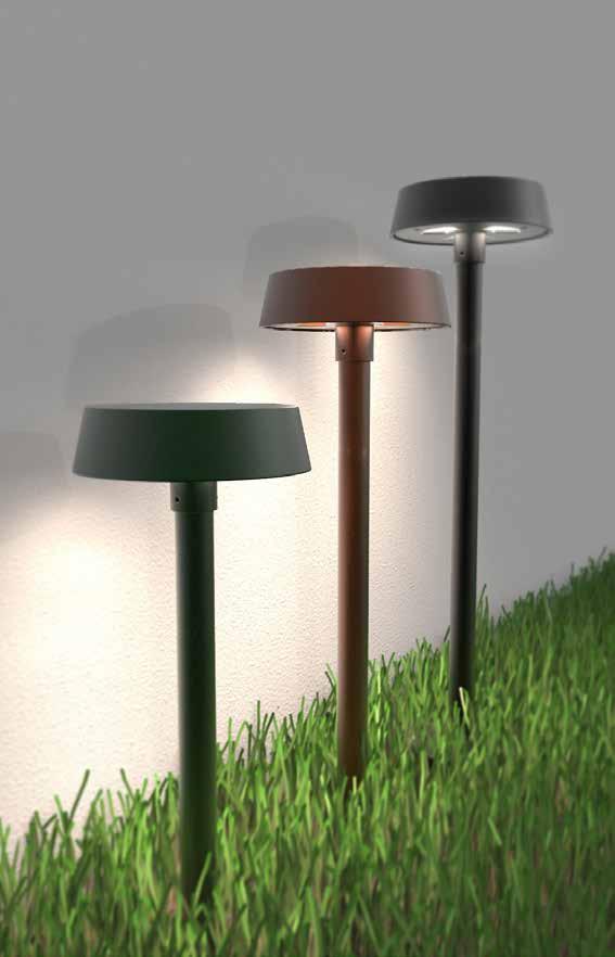
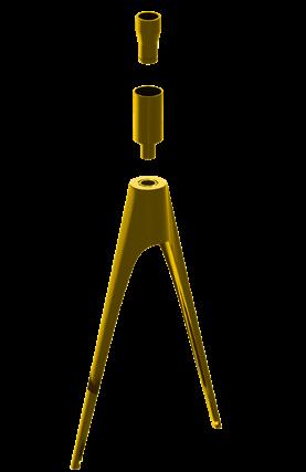
The head is made entirely of 304 stainless steel: the lower disc is made by welding the windowed disc to the tube that will connect with the stem. The cap is deep-drawn using a preexisting mold made from an old recessed product no longer available from the Civic catalog.
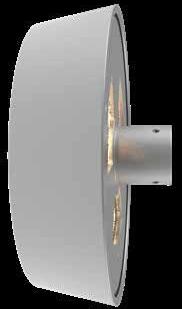
a composition that recalled its mushroom shape.
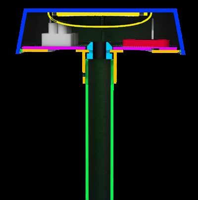
Micro Tebe emits a uniform, enveloping, and welcoming light thanks to the three windows, each shielded with a UGR polycarbonate sheet. By obscuring one or more of the windows, it is also possible to create directional light openings in addition to the 360° illumination.
After the fair, further modifications were made to the project in order to enhance production efficiency and create a product that is as appealing as possible to customers.
The “head” element is sold in the catalog along with a range of accessories, such as a steel stem available in three different lengths. Additionally, there is a polycarbonate stem option that can be directly inserted into the ground, making it suitable for illuminating areas with bushes or foliage.
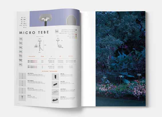
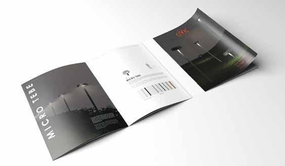
Once the fixture was finalized, all the article codes were generated in collaboration with the sales department. Finally, a concise brochure was published to showcase the Tebe family, including Tebe, Mini Tebe, and Micro Tebe. The brochure provides an overview of the different features and accessories available, enabling customers to easily understand and select the desired options when placing an order.
«[…] Quid uocem? Imagines solis? Historici soles uocant et binos ternosque apparuisse memoriae tradunt; Graeci parhelia appellant, quia in propinquo fere a sole visuntur aut quia accedunt ad aliquam similitudinem solis. Non enim totum imitantur sed magnitudinem eius figuramque: ceterum nihil habent ardoris hebetes et languidi.» Lucius Annaeus Seneca

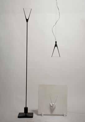
A family of lamps that embraces design and optics.
We began by conducting desk research and group brainstorming sessions to define a user sample specific to the context we were working on, which was a villa with a garden and pool. Through surveys, interviews, and direct observations, we identified various user needs. We prioritized the most significant ones and created a project brief, which served as the foundation for our benchmarking and further research on relevant regulations.
The concept was developed following the factors that distinguish the reference company, Luceplan.
The aesthetics of its products are simple but original, free from any formal style or production technique. The innovative and technological approach of treating light as a real material to be molded. The will to amaze.
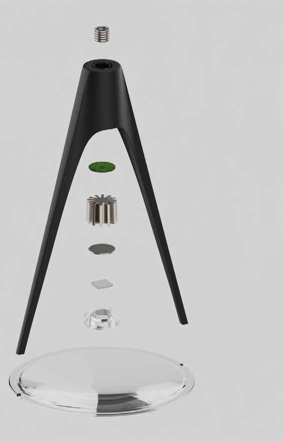
Glass lenses possess an inherent beauty derived from their circular shape and transparency. Despite appearing light and unobtrusive, they possess a significant material presence. Recognizing this, we chose to incorporate glass lenses as a distinctive and aesthetic element for our lighting fixtures. Our intention was to separate the essential and functional components of a lamp, resulting in a minimalist and uncluttered aesthetic where form and function are intricately connected.
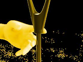
The fork, or support structure, was meticulously designed to maintain minimal dimensions while ensuring the product’s integrity. It comprises a hollow body that encloses the internal components, including the LED and the aluminum heat sink, along with two extensions that support the lens and position it at the optimal distance for the refraction process. The fork was modeled with a modern and essential aesthetic, incorporating a blend of curved lines, edges, and tapered surfaces.
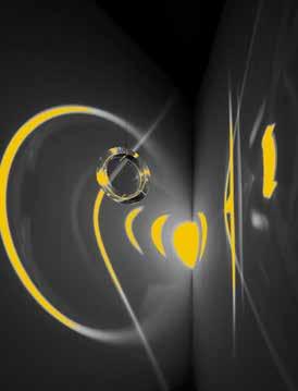
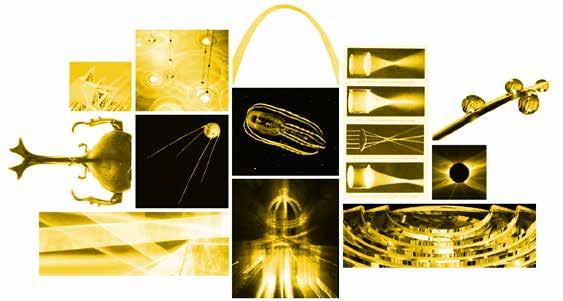
We were captivated by the ethereal beauty of bioluminescent creatures, the juxtaposition of satellites and celestial bodies, the dynamic nature of parametric architecture, and the mesmerizing surface tension of water. We explored the intersection of light, art, and optics in our search for scenarios where light interacts with empty and solid spaces.
Rivet
To hook the different parts
Spherical
Variable
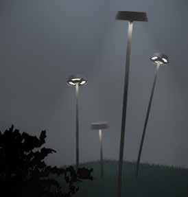
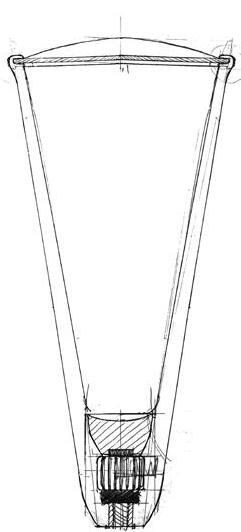
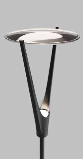
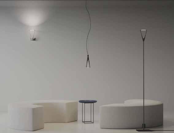
Parelio Floor emits light towards the ceiling and gently falls into the surrounding environment.
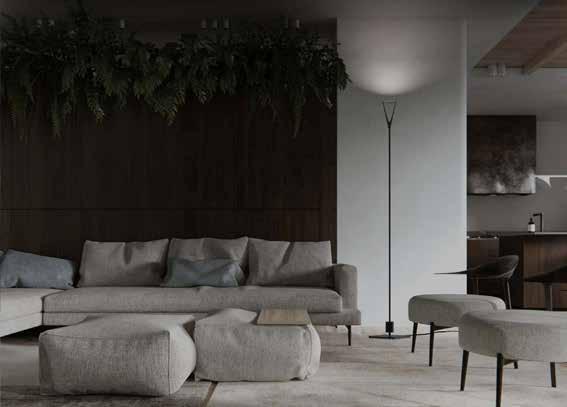
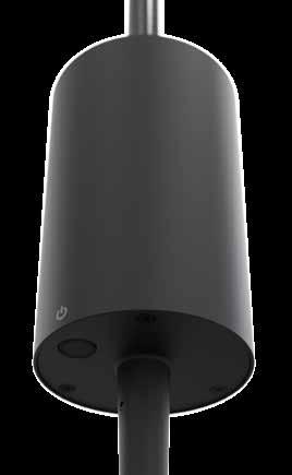
The base is a zamak plate, covered by a diecast aluminum plate. The heart of the lamp is enclosed in a small raised cylindrical volume. It acts both as a power supply and as a joint for the pole of the floor lamp. The fork is connected to a carbon fiber shaft by a small cylindrical disc. Thanks to the presence of a capacitive dimmer located in the supply cylinder, the intensity of the COB-Led of the lamp can be adjusted with just the touch of the hand.
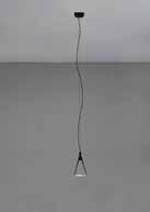
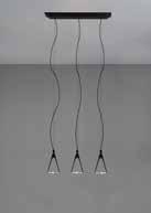
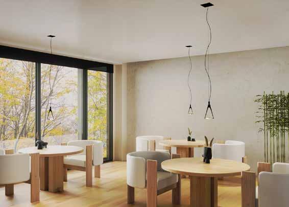
Parelio Suspension enhances the lightness and preciousness of the suspended lens. It is designed to illuminate areas of various sizes with direct light, it produces a homogeneous and circular light.
Parelio Suspension is available in a triple or single version, to allow greater freedom of spatial arrangement.
The cylindrical connector is made up of two plastic components inside which, interlocking together, act as a cable clamp to block the suspension wire; the mechanism is covered with metal. This part allows to maintain a free rotation to adjust the orientation of the fork.
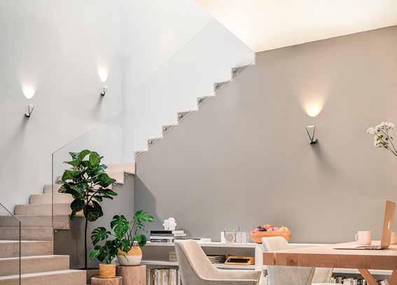
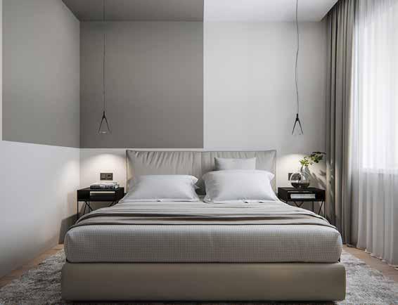
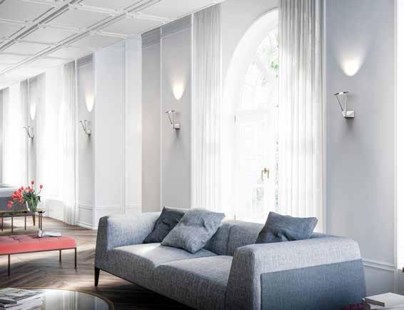
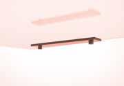
Parelio Wall differs from the rest of the family for the lack of the extremely slender shape.
The fork, inclined by 15 degrees, emits a beam of light upwards, illuminating part of the wall and ceiling, illuminating much of the room in small rooms with diffused light or defining and creating rhythm in the architecture in larger spaces.
The fork is fixed to the wall by a kind of pedestal divided into two parts: a metal skeleton, made of aluminum, which is fixed to the wall and on which the fork is installed through a hollow screw that allows the electric cables to pass through. The second part is the PMMA cover which is fixed with two countersunk screws.
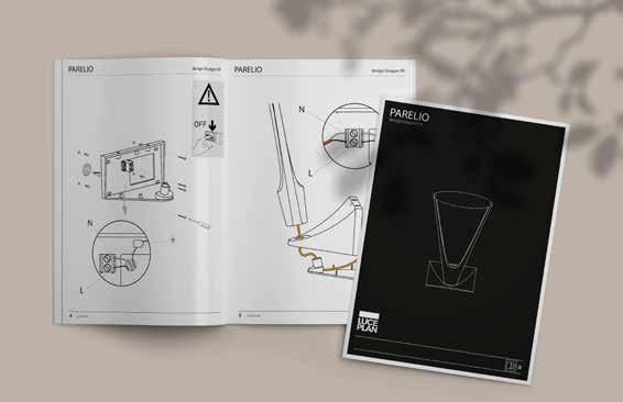
Comprehensive instruction booklets have been developed for all three products, aligning with the high standards set by the Luceplan catalog. These booklets provide detailed guidance on assembly, installation, and usage, ensuring that customers have clear instructions to make the most of their lighting fixtures. The instructions are designed to be user-friendly, presenting information in a concise and accessible manner, enhancing the overall customer experience.
Most of the components of the models were made with the 3D printer in PA12, to achieve a high level of accuracy and precision in the details and to be able to easily assemble the different pieces. The applique was made in white to show the color variant on the market, because it can be produced in both versions, white or black.
Discover here Project book and Instructions

_Laboratorio di Design del prodotto _2021 with Margherita Nisco
Elisa Wan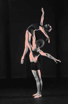
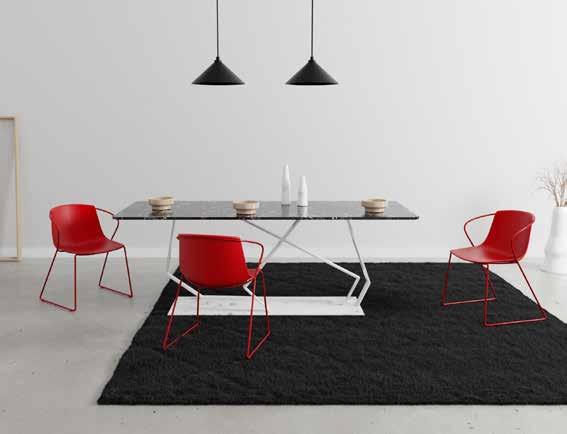
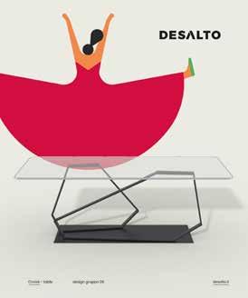
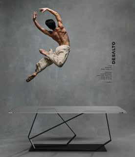
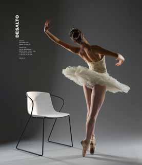
A table and a chair that dance, defying the laws of gravity
“La danza è poesia perché il suo fine ultimo è esprimere sentimenti, anche se attraverso una rigida tecnica. Il nostro compito è quello di far passare la parola attraverso il gesto.”
For nearly 30 years, Desalto has spread worldwide an idea of an aesthetically sophisticated product based on constant technical and technological research focused on greater functionality. Thirty years of activity make Desalto a young but also time-honoured brand. Of both dimensions Desalto is titled.
Strong brand identity
Large selection of finishes
Coherent style
Small selection
Similar products
Add new proposals in the catalog
Dare with more complex shapes
This collection was designed trying to translate the concepts of physical and emotional body, that were inspired in a particular way ballet; form of art that embodies elegance, delicacy, harmony but at the same time strength, balance and rigor, specific dance characteristics linked to Desalto’s identity.
Cheaper companies with similar products
Same style companies but larger choice
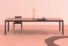
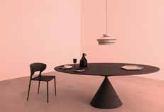
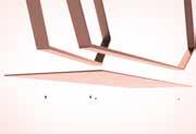
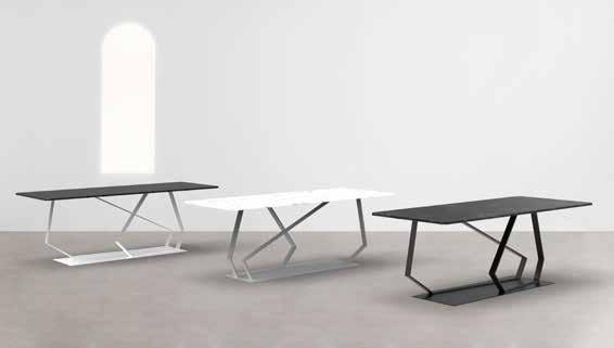
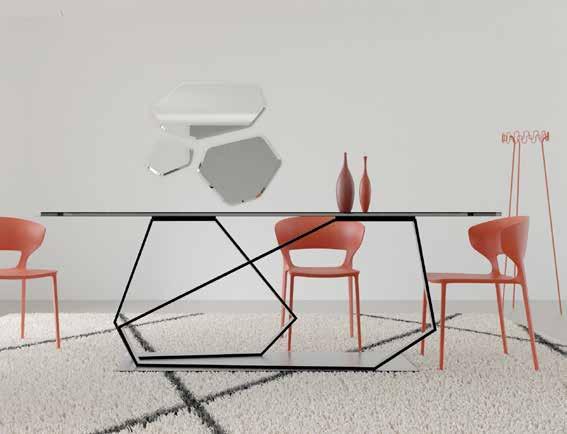
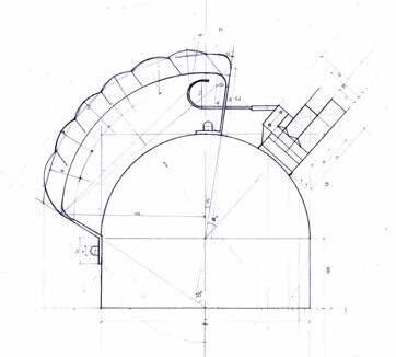
If a table were to dance, it would undoubtedly be embodied by Croisé. With its glass top, the table elegantly unveils the lightness and durability of its steel legs. The delicate nature of glass harmoniously combines with the robustness of steel, resulting in a perfect equilibrium that defines this exceptional table.
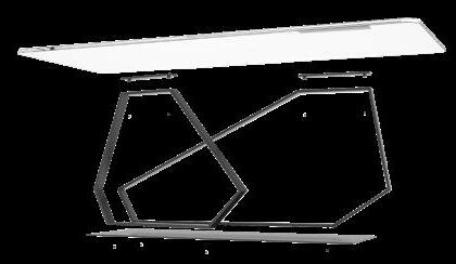
Table transparent crystal 2200x900mm
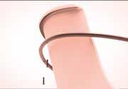
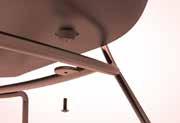
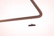
Leg in tubular stainless steel l: 60mm H: 15mm sp: 2mm
Support plate stainless steel L:60mm H:10mm
Panhead screw 10mm
Base plate stainless steel 1500x500x6mm
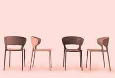
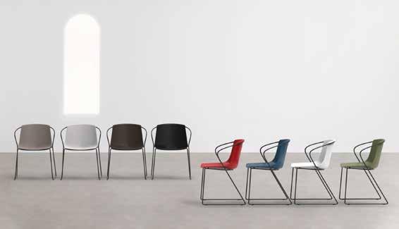
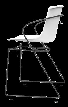
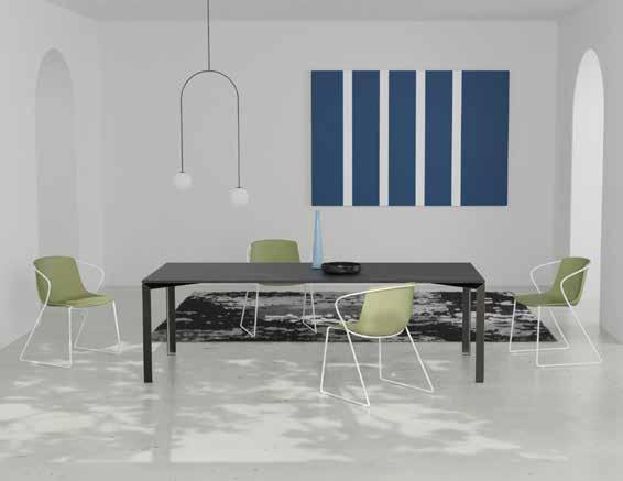
Light and dynamic, slender yet welcoming, Relevée is an infinite line inspired by the graceful trajectories of ballet. It embraces the light and inviting form of its seat, resembling a delicate petal. Relevée represents the movement of the same-named ballerina, capturing the graceful momentum of a long-limbed and agile body. It strikes a balance between steel and polypropylene (PP), akin to a dancer in her tutu costume.
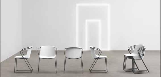
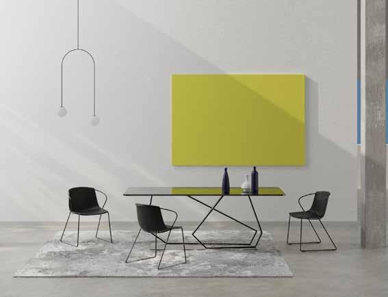
Posters are made following the Desalto’s style: peculiar kind of people interacts with table and chair. The two dancers are turned because if they showed their faces they would divert attention from the real protagonist of the poster, the furniture.

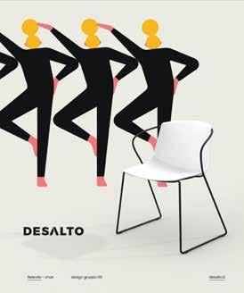
The theme of dancers is also adopted for the social campaign, in this case with illustrations by Giacomo Bagnara.


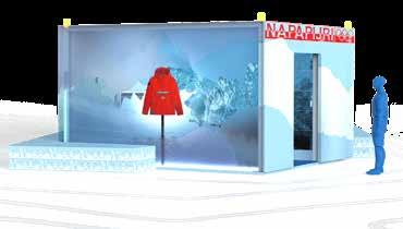
“Napalympics”
noun, neologism [ singular ] /nɑpa’lɪm.pɪks/
Portmanteau of the word “Napapijri” and “olympics
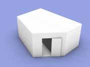
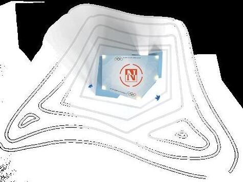
_Temporary store, pop-up e shop sharing _2022 with Giovanni Marconetti
Napapijri and Milano-Cortina 2026

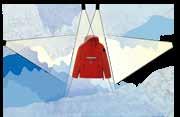
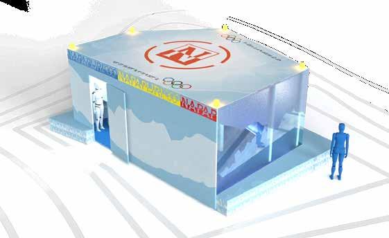
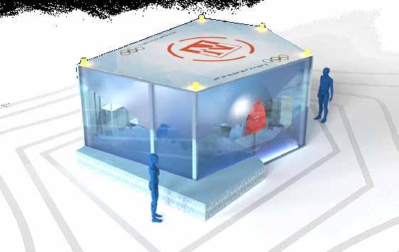
Pop-up Ice cave experience
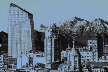
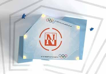
The Cobranding logo is the result of combining the classic Napapijri logo, Italian clothing brand with the iconic five Olympic rings. The color palette is the combination of the natural colors of snow and ice with the vibrant and traditional colors of the Olympic Games, thus highlighting the duality of the event, which takes place both in Milan, modern and dynamic and Cortina, linked to Alpine traditions.
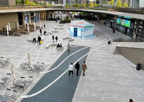
The store is located in piazza Tre Torri, where there is also the official store inside the mall. It will be possible to reach the shop from different routes and by different transportation means. Since it is a multi-level designed square, it will be possible to view the pop-up from any angle.
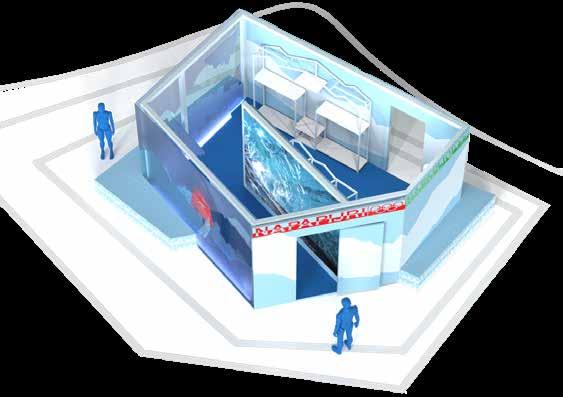
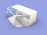
1. ENTRANCE
Toward the center of the square to welcome customers
2. INDOOR EXPERIENCE
A multi-sensory immersive experience that mimics entering an ice cave
3. SHOWCASE
4. EXHIBITOR
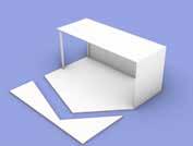
5. TABLE it will be possible to place the products and view them. In the lower part some products may be stocked.
6. CHECKOUT
Checkout space is minimal as the only payments that will take place will be electronic.
7. BENCH two irregularly stepped seats made of sheet metal painted.
8. EXIT
Toward the citylife store, it will invite the customer to enter the official store.
Ice
(1) The pop-up store is formed from a standard 240x600x270cm container. A short side of the container is removed while a long side is flipped over to form a part of the floor. (2) The side is trimmed of excess parts.
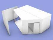
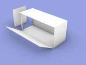
(3) Then the structure that will support the glass walls and the inner wall containing the led wall is installed. (4) The glass and doors are mounted to the structure. (5) The store skeleton is complete. (6) At this point the exterior decorations, plexiglass sheets, stickers, the two benches, and a land art inspired by contour lines in the plaza are added.
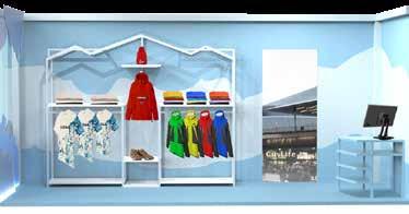
Merchandising has been chosen by looking at more iconic products: an important part of the displays will be occupied by the iconic jackets, such as the Rainforest, declined in Olympic colors. Another part of the displays will be dedicated to accessories such as bags or hats and traditional alpine products such as shoes or carabiners. There will be no real warehouse inside the store, since the actual store is only a few meters away and it will be possible to stock up directly from there. The displays, custom themed, have built-in LED strips to enhance the merchandise on display. A cabinet is placed at the bottom for storage of the displayed merch.
The storefront is made using plexiglass sheets processed and finished to look like ice sheets and placed on multiple levels to create three-dimensionality. The special feature is that in the background will pass people visiting the store animating the showcase and creating depth, which will be further enhanced by the led wall placed in the background recreating the glacial cave.
A single special edition jacket is placed in the center of the showcase to give the suggestion that it is imbedded in ice, as if it were a precious find. Spotlights placed on the sides and above evenly illuminate the jacket, which will be clearly visible even at night.
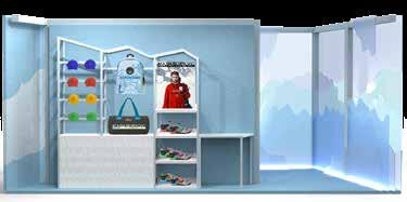
General lighting in the store is provided by the Civic company: in the first part, dedicated to the experience, Raise, frameless floor recessed luminaires with a glass surface, temperature 4000K, are installed. In the retail area, on the other hand, 9 DivaIn at 3000K are mounted on tracks to guarantee precise and homogeneous lighting.
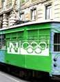
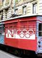
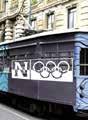
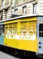
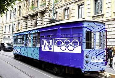
Streetcar line 1 will be dedicated for wayfindig with ice-colored cars, decorated with the co-branding logo and level curves, leading to the Domodosolla stop where the store can be reached. Five designed five versions declined in traditional Olympic colors.
The outdoor experience will consist of a presentation event of the new collection items that will be landed (emergency landing!) via drones, on the landing platform printed on the roof of the Pop up store. The event will be visible from the various floors of the plaza and will be scheduled on certain days and times to create a memorable event expected by the entire city.
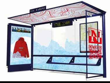
The shelter is customised while maintaining the stylistic and aesthetic characteristics of pop-up and wayfinding: the roof is decorated with level lines while the rear glass is decorated with frosting effect stickers. On one side there is the ‘frozen jacket’ also used in wayfinding, while on the other side there’s the logo with a QR code that links to the event website.
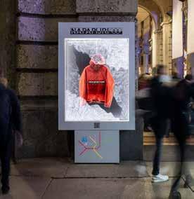
Displays containing real special edition napapijri jackets set in artificial ice will be installed in the rest of the city. Below is a subway map showing the “Tre Torri” stop and a QR code that leads to the event website.
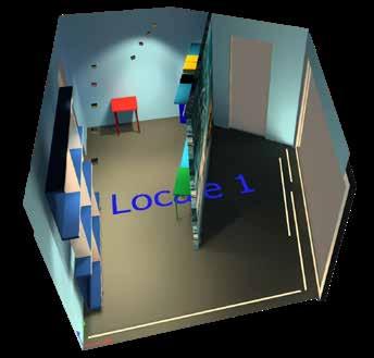
In order to emphasize the collaboration between Milan and Cortina D’Ampezzo, we made the decision to repurpose the pop-up store by relocating it to the municipality in Veneto. The store will be transformed into a tourist information point for the city, providing a second life for the space. The partition wall of the store, which includes LEDs, plexiglass plates, and decorations, will be removed. This will result in a spacious and well-lit glass area of approximately 24 square meters, which can be rearranged to suit the desired interior design.

“Spesso per un bambino la scatola che conteneva il giocattolo diventa più accattivante del giocattolo stesso.”
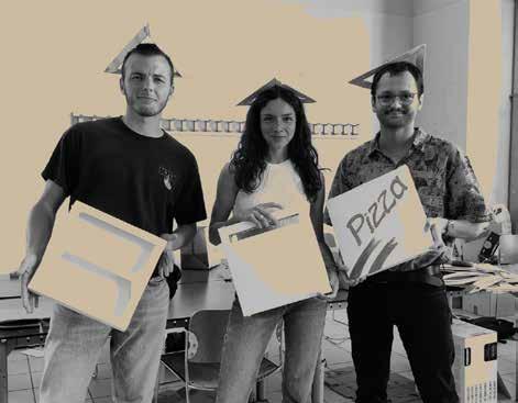
_Workshop:il futuro del packaging in cartone ondulato _2022 with Alessandra Bernardi Lorenzo Pozzan

Pizza boxes come to new life in a game that rekindles the evening
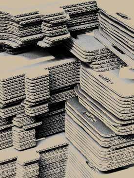
Ghelfi is an Italian company that has excelled in the production of corrugated cardboard for boxes and packaging since 1952. Over the years it has distinguished itself through important awards and patents, and for years it has collaborated with students at the Politecnico with an open eye toward the future.
The brief is “Hacking packaging, projects arising from packaging”: the project involves the creation of an open source platform where ideas are uploaded in which, starting from a generic packaging, an object of greater utility can be created, enhancing the infinite possibilities of this material.

On this day we generated as many concepts as possible by trying to match different users to different situations while trying to find an innovative and functional solution.
Computer stand
Travel lamp
Hairdryer diffuser Piggybank
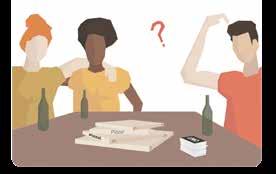
After choosing to create an after-dinner game with friends, we outlined a plausible scenario to better focus the design. In a casual situation where friends after a pizza and beer dinner want to spend time inside the house playing some board game, we provide a fun alternative that gets everyone on the same page and saves the night.
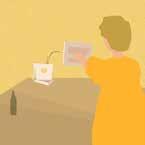
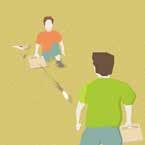
The game, called Mini Ghelf, echoes the name of the company by matching the miniature version of the sport of golf, also suggesting the type of game. In fact, the activity consists of a series of mini-games that can be played with a ping pong ball and various objects made using take-out pizza boxes.
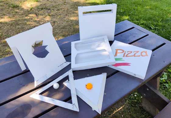
On this day, we set about making prototypes and their associated assembly instructions.
The last day of the workshop was dedicated to presenting the concept through a slideshow and advertising content, in this case a tiktok that ilustrates the assembly operations.
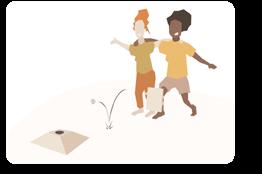
A turni colpire la pallina cercando di fare buca nel tirangolo. Si può utilizzare il triangolo solo oppure inserire dei top per aumentare il livello di difficoltà.


Due squadre si sfidano colpendo la pallina, cercando di fare gol nel triangolo dell’avversario.
opzionali
Soffieria Villa is a small workshop in Trezzo sull’Adda. For years they have been collaborating with architects and designers who use their technical and artistic skills to realise their enlightening ideas. produce all kinds of design objects, furniture and lighting, lamps, glasses, inkwells and everything that can be made from blown glass.


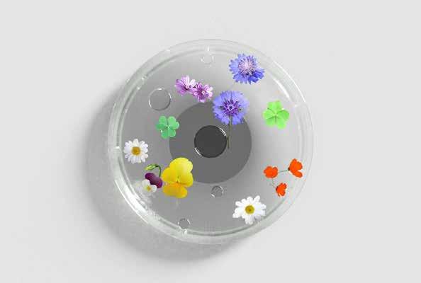
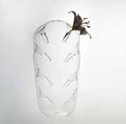
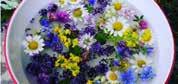
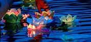
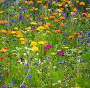
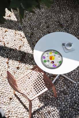
There are many flowers, especially in fields, woods or gardens, that cannot be put in normal pots because they have too short or too soft a stem, such as mallow or dandelion, or because they are short-lived such as poppies or periwinkle.


Most small flower vases are designed to be singleflowered and modular to create arrangements with several pots.

I want to make a form that is unique, innovative and has aesthetic strength even without the inclusion of the flowers.
I am inspired by traditions such as St. John’s Water or Ullambana in which flowers are laid on the water and only their corolla emerges.
I want to create “the random order” of field flowers, different but coexisting in the same ever-changing environment.
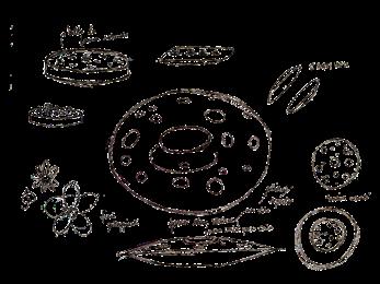
The vase is formed by two plates welded together, in which the top surface features a series of randomly scattered holes of various sizes to accommodate flowers of different sizes. The use of glass creates an object that is elegant and balanced due to its transparency that enhances the flower in its shapes and colors as if it were lying on the surface of a body of water.
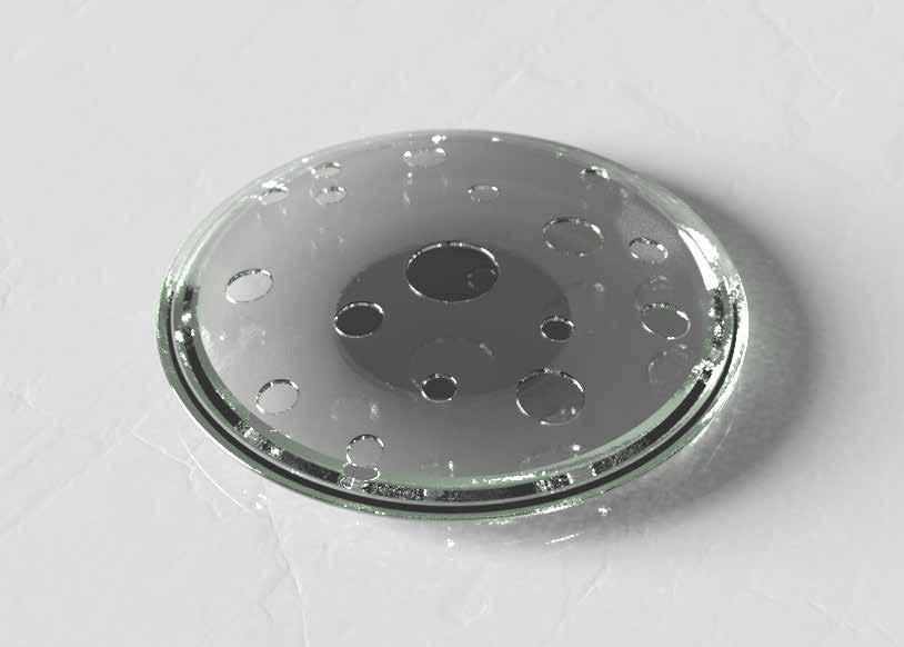
I wanted to create something that was unique and in some ways even a little unusual: a discreet shape that blends easily into the decor without being conspicuous, but which when enriched with flowers can arouse more curiosity and have a strong visual impact, while still remaining sober.
An interesting aspect is the ease with which different flowers can be removed and added constantly from one day to the next, bringing a little of the surrounding nature into home. Another highlight is that its slim, round shape makes it washable in the dishwasher.

In 2009, the LGBTQ + student collective was born under the name of “GayStatale” within the state university of Milan. An association that has always stood out for its activism and its many activities against discrimination, aimed not only at students but at all citizens.
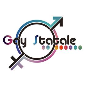
To keep up with the evolution of the community, the organization needed a new name and a new face that could make it become an example of hospitality and socialization.
The old logo was complex and not very modern and did not collect within the broad spectrum of the community’s identities. The old Logo
The association would change its name to “QueerStatale Milano”, meaning the term queer as a reappropriation of a term once considered derogatory.

I was asked that the logo appear dynamic and young, that it contains all the colors of the Progress Pride flag and that remains linked to the Milanese university context.

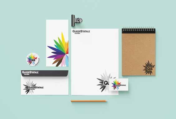
Olive tree is the tree sacred to Athena, symbol of the university. The union of these concepts is summed up in the logo: a wheel of colorful leaves opens brightly outward, yet still leaves a wedge free to welcome those in need.
The explosion represents the energetic spirit of the community.
The association must be a place open to meeting and acceptance.
I designed a logo that was recognizable in various forms in order to be as versatile as possible. For example, the monogram is perfect for social network profile photos but also stickers or pins.
fuggendo via fra raggio raggio // Cielo di giugno,azzurra giovinezza dell’anno; ed allegrezza di rondini sfreccianti in folli giri nell’aria. Ombre, ombre d’ali vedo guizzar sul bianco arroventato / del muro in fronte: ombre saetta, nere, vive al mio sguardo più dell’ali vere. Traggon dal


_@whynotspace logo _2022


_Illustartor & Photoshop
_Travel photos _2021
_Pas de deux technical drawings _2021
_Lab Design del prodotto
_AutoCAD