Moss Brenner-Bryant Design
Portfolio
Ocean Table 2022.
Glass Fabrication
Nikolas Weinstein Studios, 2019-2022. Buenos Aires Representaciones de Buenos Aires, FUC, 2018. Deconstructed Nude Descending a Stair Sculpture I, Williams College, 2016.
End Table
Metal Fabrications II, Lick-Wilmerding High School, 2013.
Selected Architecture Projects
Architecture II and Sustainabuilding, WIlliams College, 2017-2018.
Roxbury Public Library
Career Discovery Program, Harvard GSD, 2016.
3-5 6-9 10 11 12 13-17 18-22 Contents
2
Ocean Table,
2022.
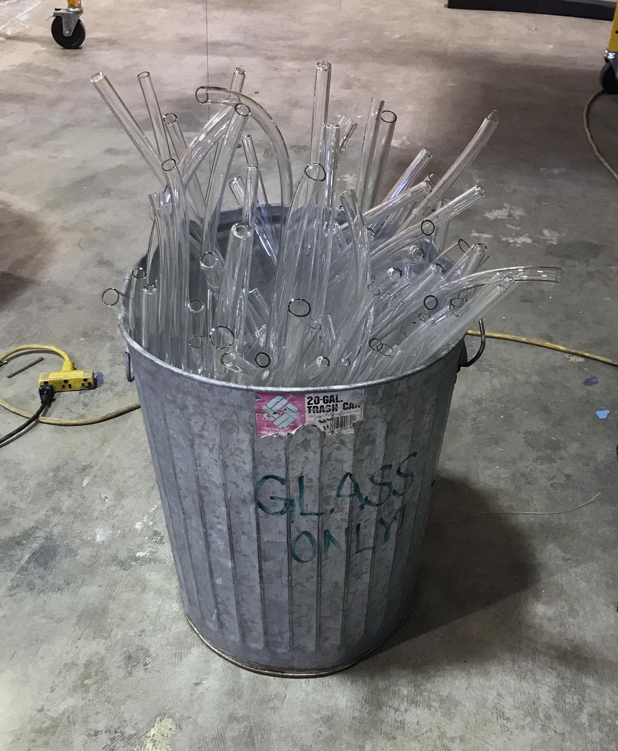
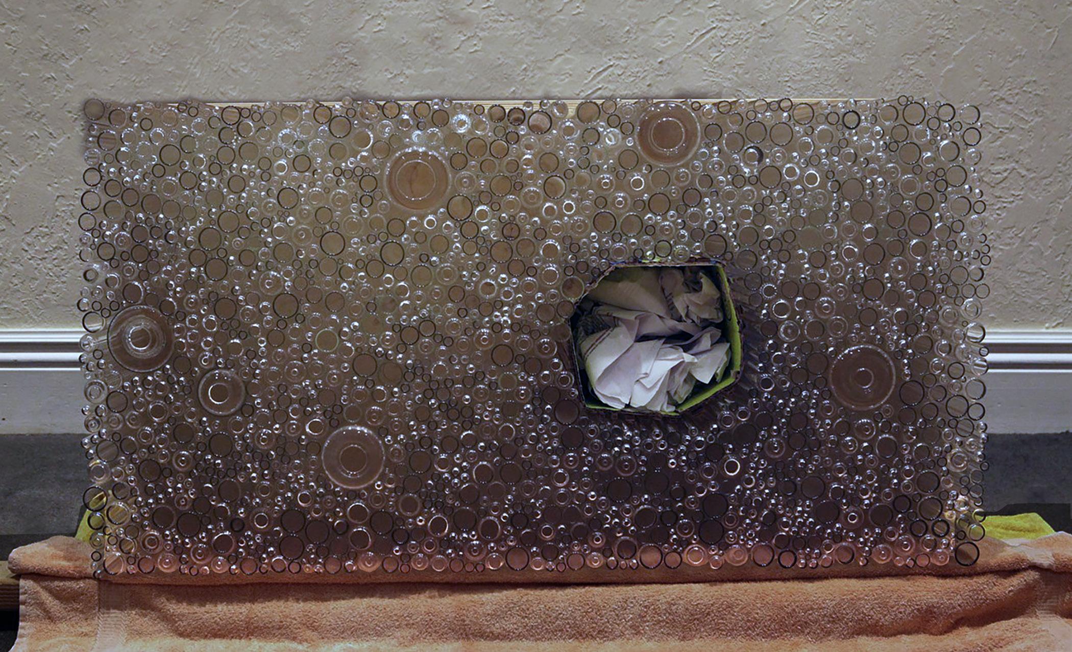
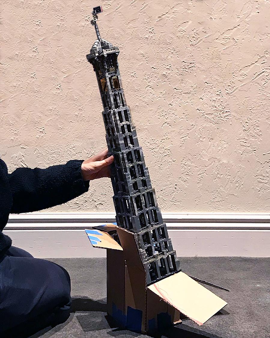
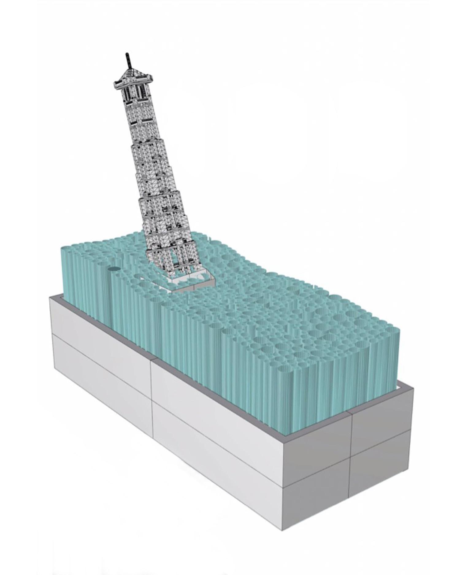
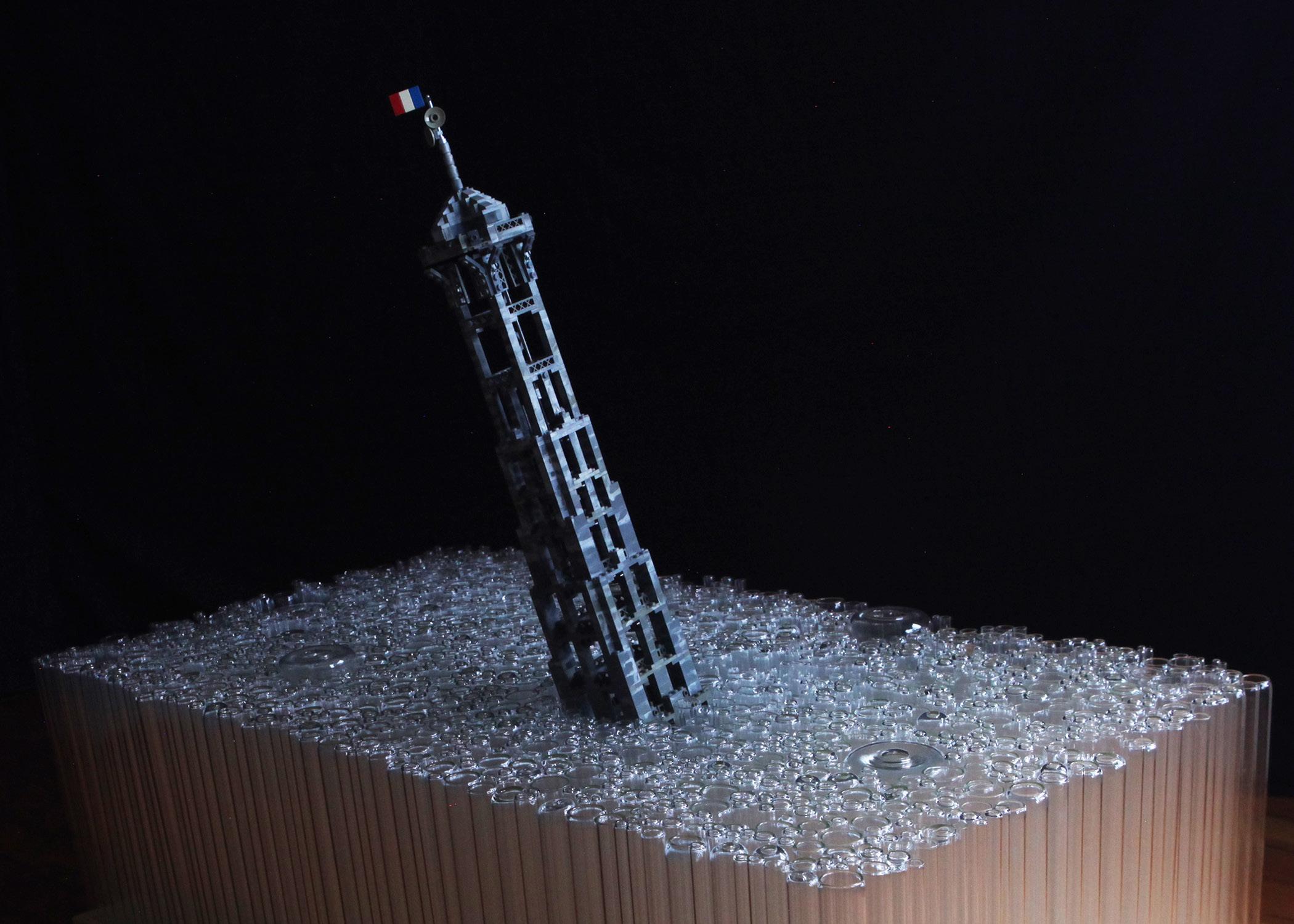
I designed this table to make use of all the tubes that go to the landfill from the glass sculpture studio where I work. Combining those tubes with the Lego Eiffel Tower I made as a kid, my design for this table depicts a vision of the future as climate change continues to run its course. The Eiffel Tower leans precariously, already partially submerged under the surface of the ocean, represented by the uneven surface of the table.
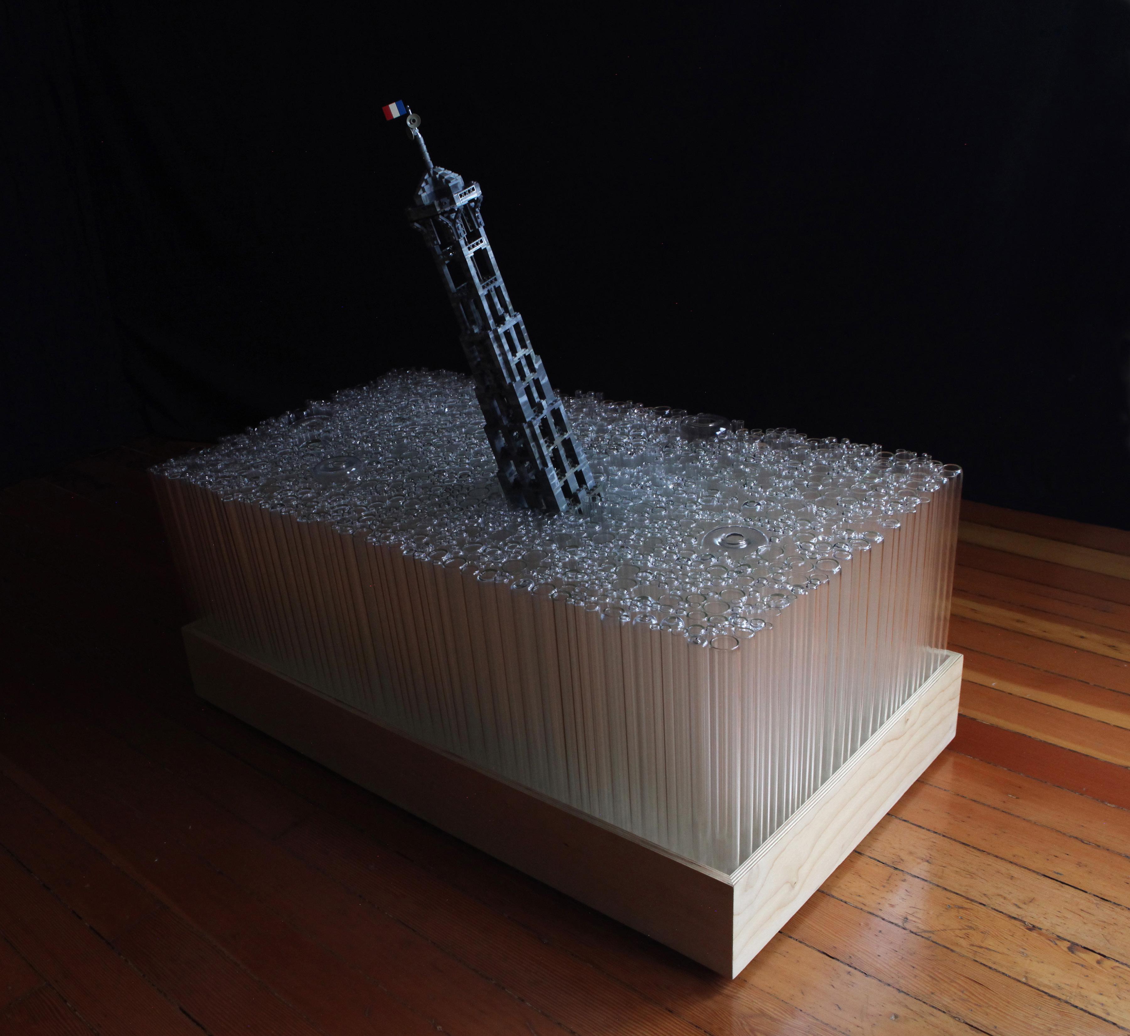
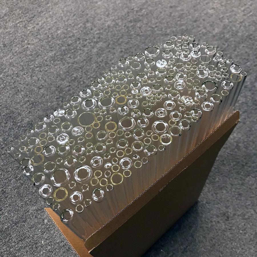
Working at Nikolas Weinstein Studios, a glass sculpture studio, we work almost exclusively with borosilicate glass and generate large amounts of short off-cuts that the studio can’t use. Sadly, they also can’t go in the regular recycling, so we regularly throw away hundreds of small glass tubes.The glass tubes are a beautiful material that was sad to see go to waste, so I designed this table to use as many of those tubes as I could, to save them from the landfill.
The form of the table was also meant as a critique of the waste and carbon emmissions produced by our consumer culture. As such, I wanted to make the entire table from salvaged materials to avoid contributing to the exact same problem I wanted to critique. I’ve already mentioned the Lego model, and the glass tubes, and the wood salvaged from studio offcuts.The only two items I purchased in order to make the table were one bottle of wood glue and one bottle of a natural wood finish.
I wanted the table to toe the line between functional furniture and sculpture, functioning as a real table, but not allowing the user to forget its message.I found that balance in the uneven surface of the table. While it is flat enough to safely support a glass, every time you feel that slight wobble as you set down your glass, you are reminded of the the table as a sculpture, and of what it represents.
3
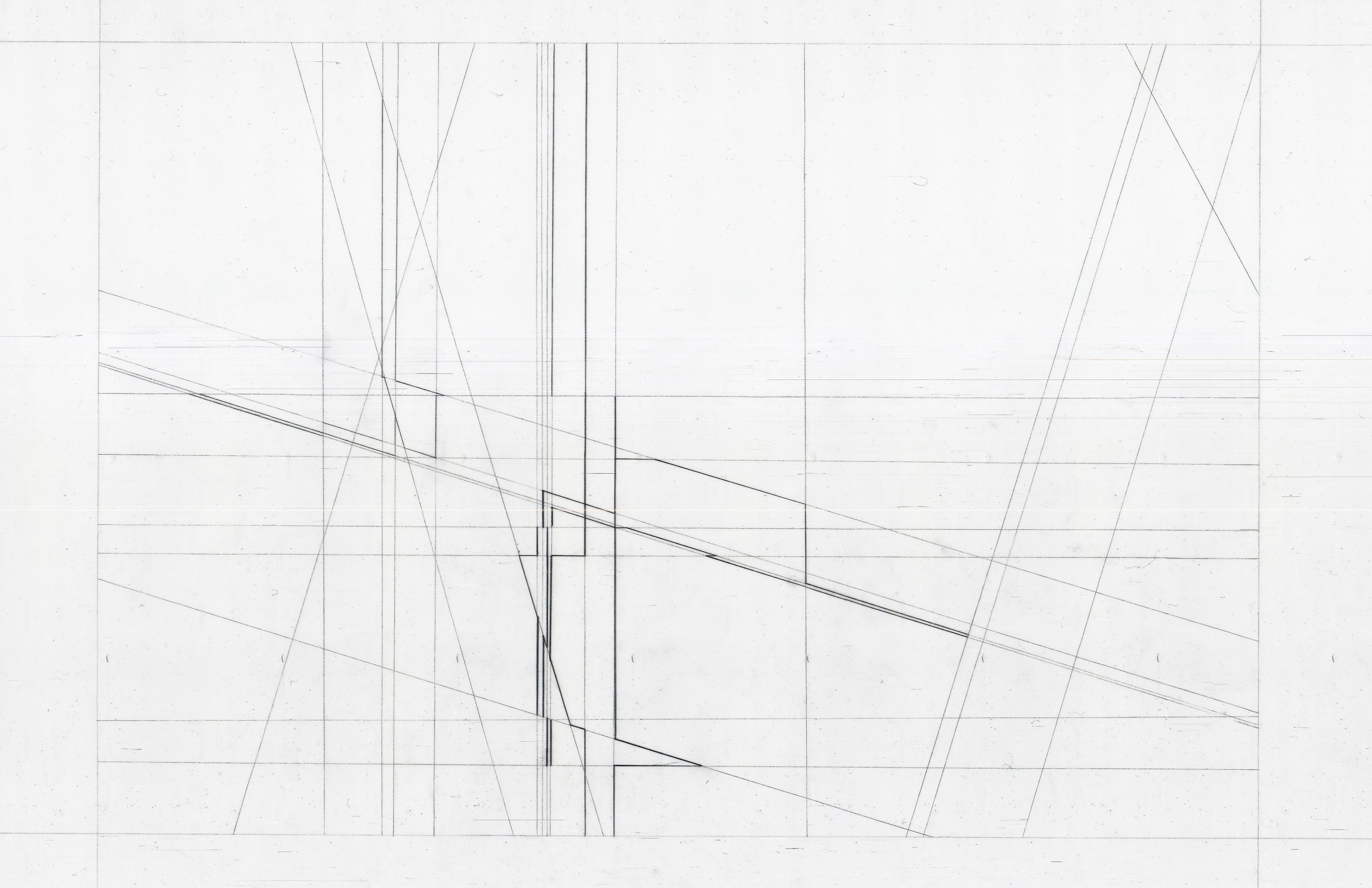
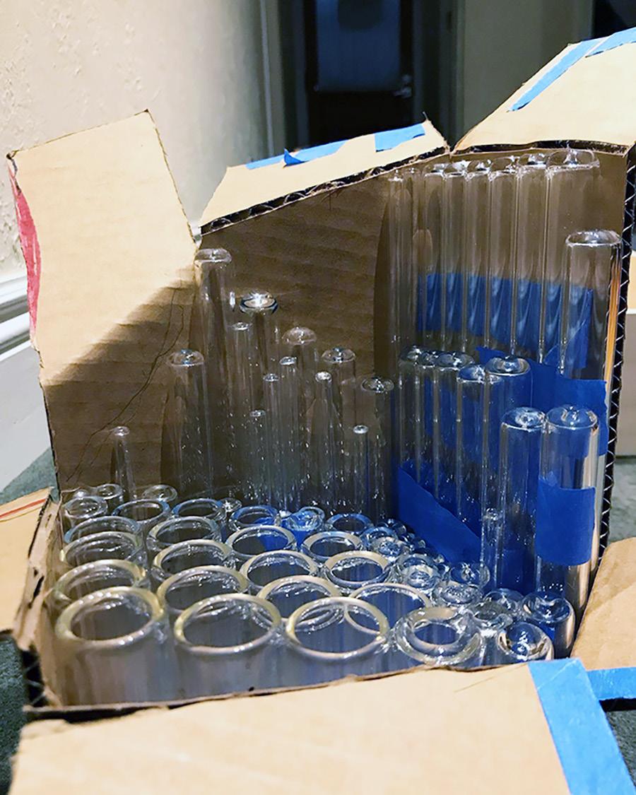
The table began its life as trash. I salvaged every tube from studio offcuts, before cutting them to length and fire-polishing the ends to make them smooth to the touch. After I had enough tubes to fill the entire table, I began stacking the tubes into the wood frame I had made. Stacking them with the table turned sideways ensured they would be packed in as tightly as possible.
In the center I place a cardboard placeholder with the exact dimensions of the central section that would support the leaning Lego Eiffel Tower.
4
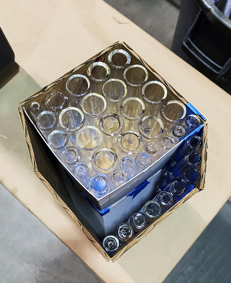
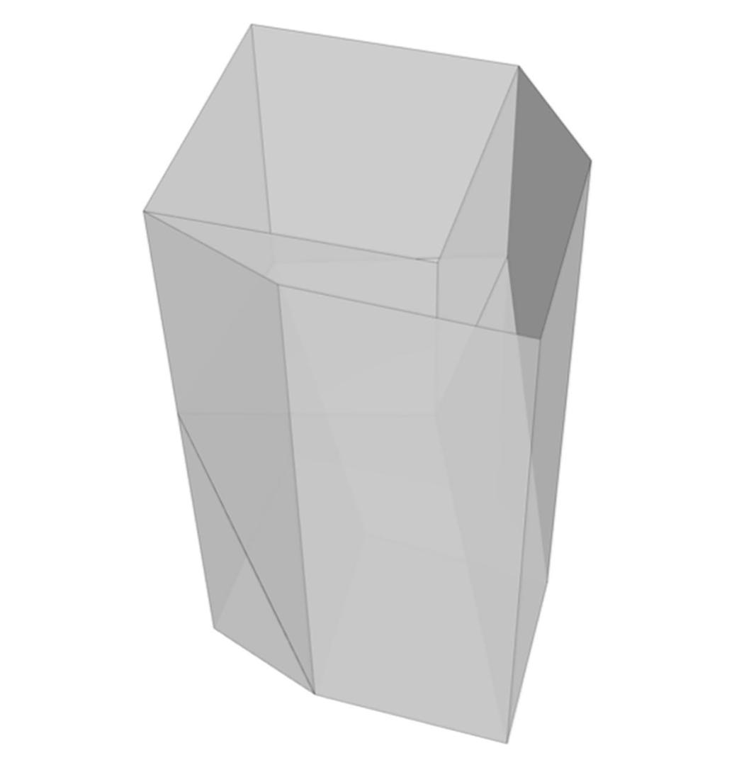
Supporting the leaning Eiffel Tower was one of the most difficult elements of constructing the table. While all the other tubes in the table were the same length, the tubes under and on top of the Eiffel Tower were not. I used my Rhino model of the table (1) to isolate the section of tubes that would sit underneath the tower. I then modeled the Eiffel Tower edges as planes (2), before turning those planes into a cardboard jig. The jig allowed me to cut the stepped tubes without measuring each one individually. By flipping the jig upside down, I could let the tubes fall to the bottom of the sloping walls (3), and then mark the top, before cutting the tube on that marked line. After filling the cardboard jig with tubes using that process, I flipped the jig back over to reveal the stepped tubes (4). The perfect fit of the stepped tubes underneath and around the leaning Eiffel Tower (5), safely supported its tilting weight without any additional internal structure.
2 1 4 5 3 6 5
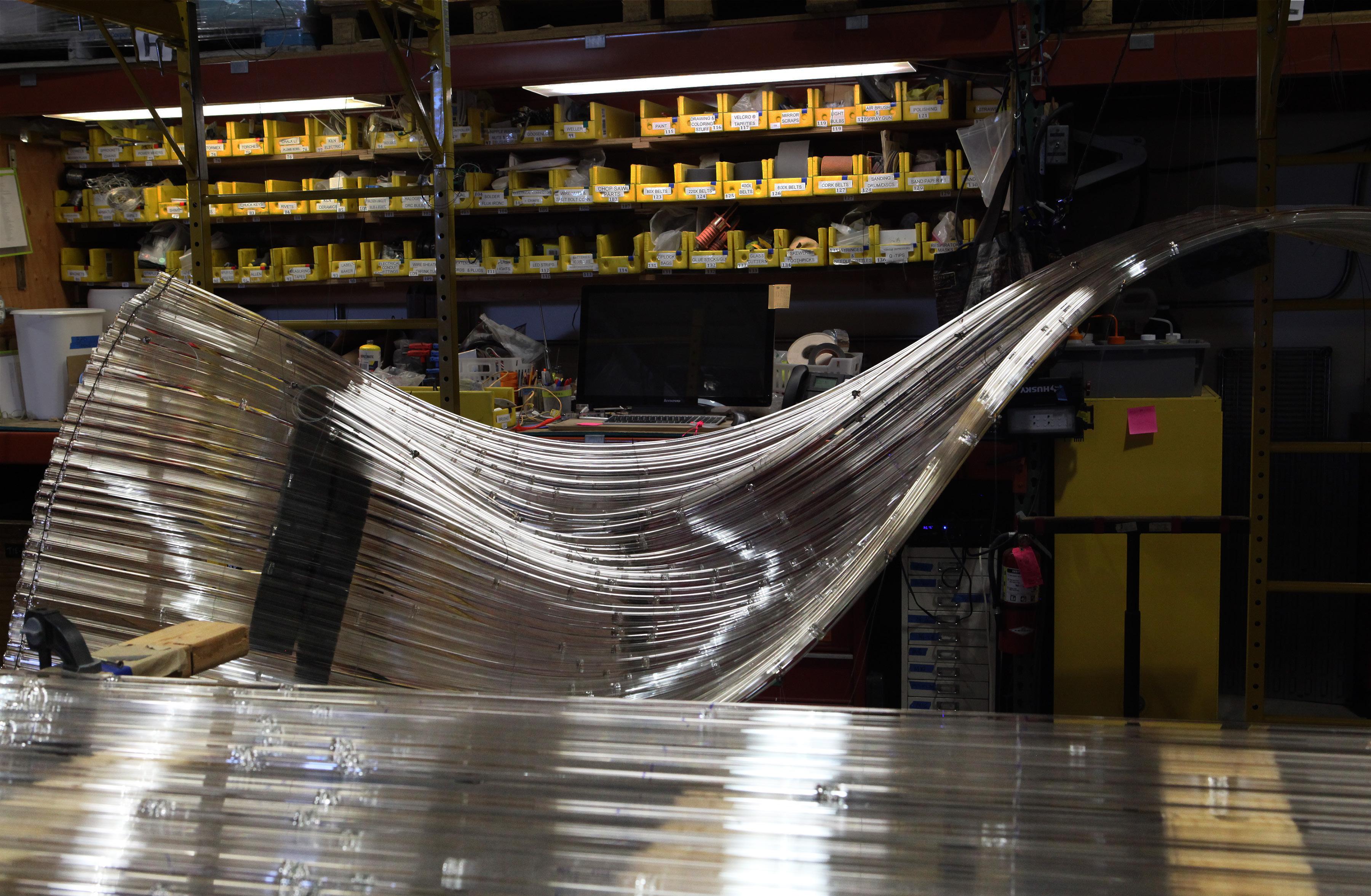
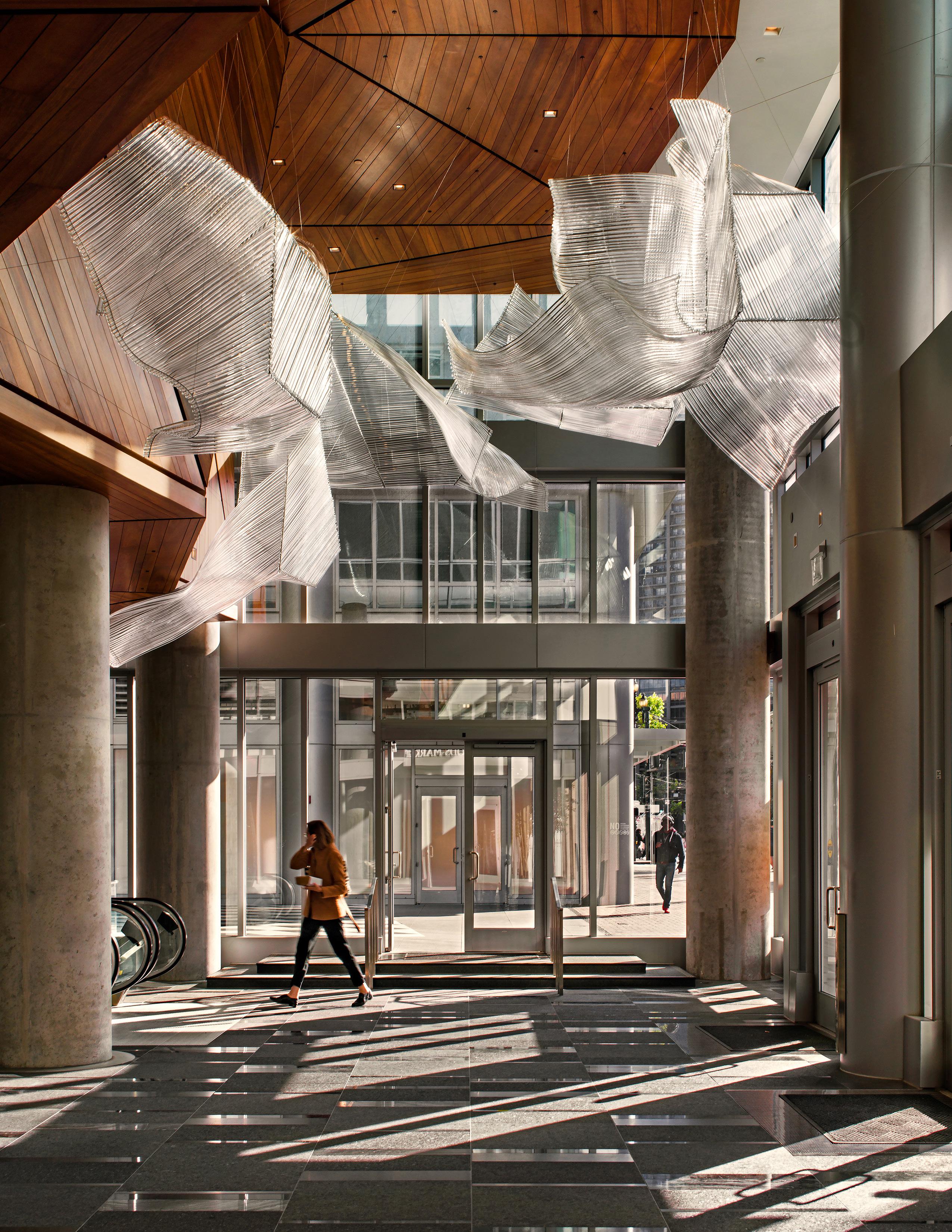
Glass Fabrication, Nikolas Weinstein Studios, 2020-2022.
Nikolas Weinstein Studios is a glass sculpture studio where I have worked as a fabricator for the last 3 years. At present my main role is running the kiln, and designing how we fire our pieces. I took the photo above on the final day of an installation for a residence in Vietnam. I was in charge of the kiln for this project and was also part of the 3-person installation team.
6
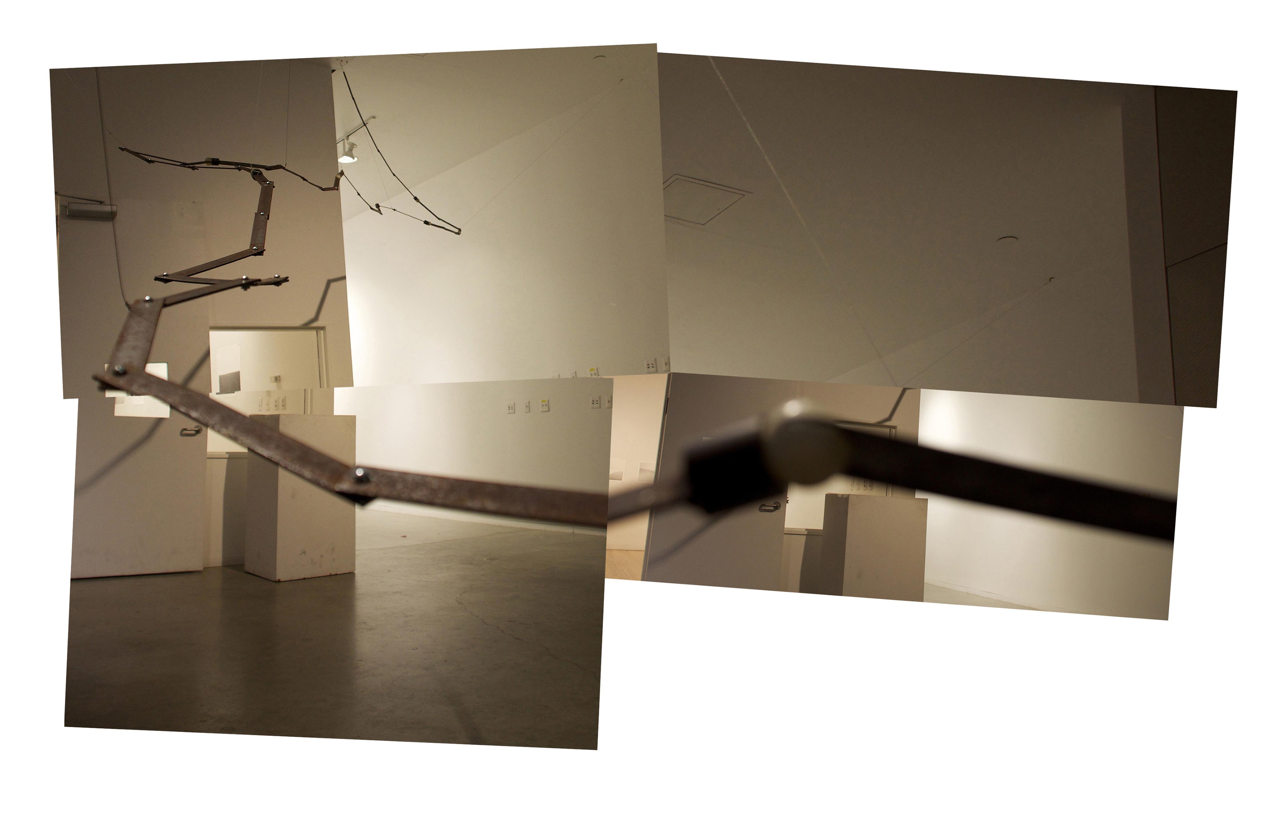
Annotated Kiln Setup, 2022.
At Nikolas Weinstein Studios, my role is to to take the pieces from Rhino models and turn them into organically shaped panels of glass. That transition from computer model to kiln fired sculpture presents a significant conceptual challenge. It requires me to visualize the movement of the glass in between flat sheet and final formed model. All I am given is a starting point and an ending point—it is up to me to imagine all the stages in between. This kiln setup shown on the right was one of the most complex I have designed in my three year tenure at the studio.
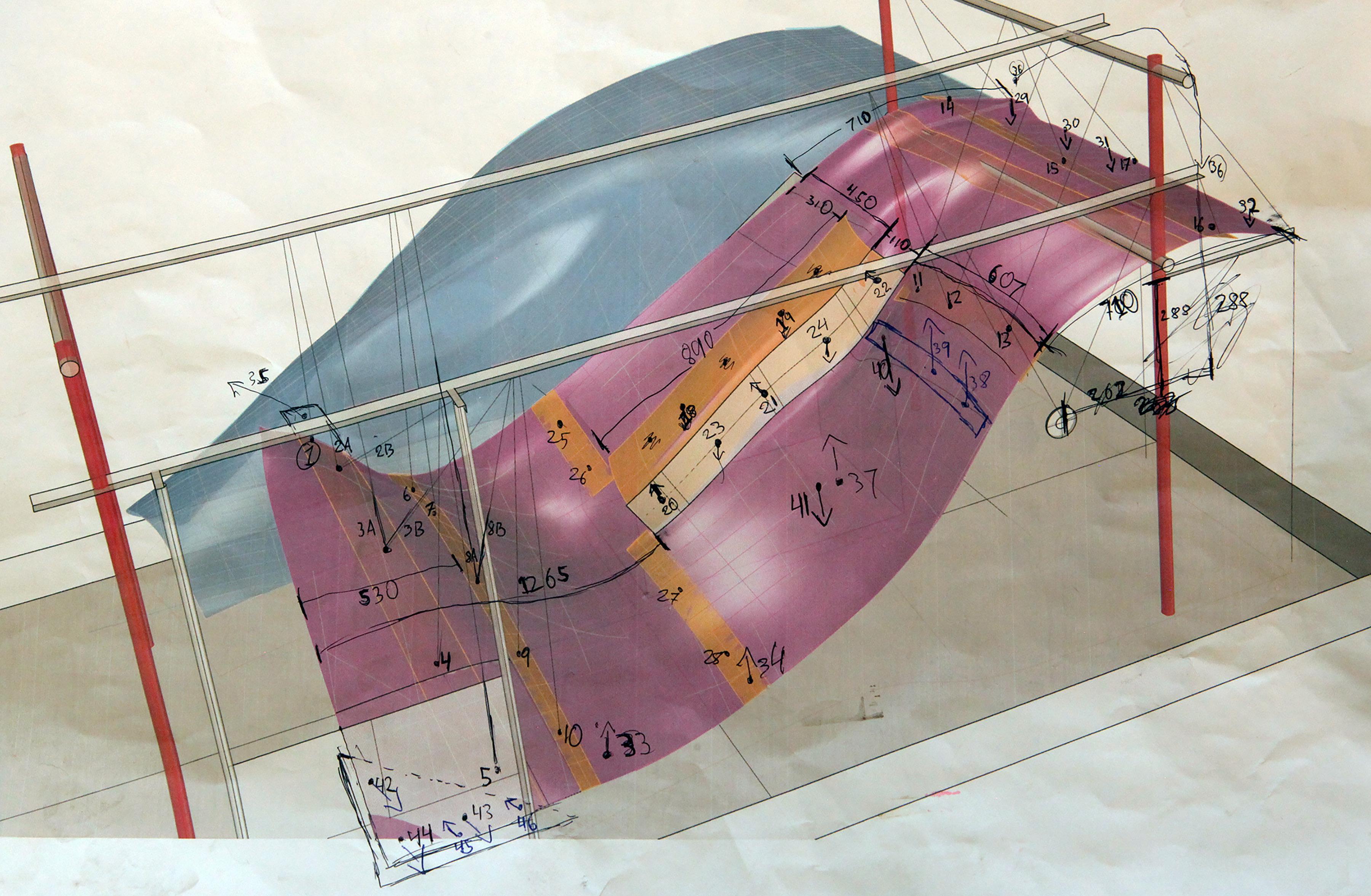
7
Fired Glass Panel,
2022.
The panel shown on the right was the end product of the kiln setup shown on the previous page.
Nikolas is very protective of the fabrication methodology he has developed that allows the studio to create such unique sculptures. As a result, I cannot show or explain the details of the complicated setups which I carefully design in order to achieve a final formed piece such as this one.
However, this limit actually places you, the reader of this portfolio, in much the same position as I am when I design these kiln setups.
You can see the beginning, the Rhino model, and you can see the end, the flowing panel of glass.
What lies in between is up to your imagination.
8
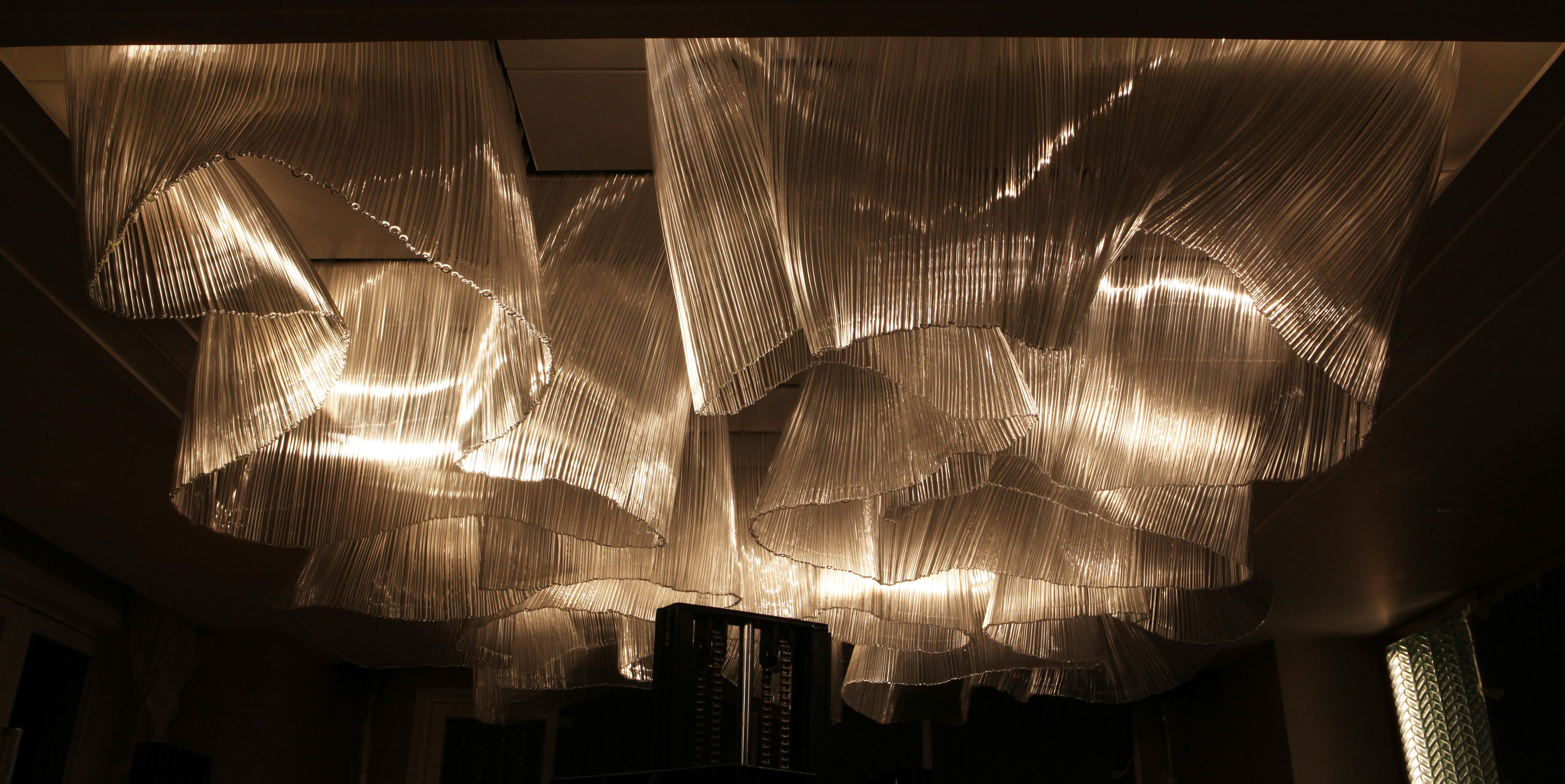
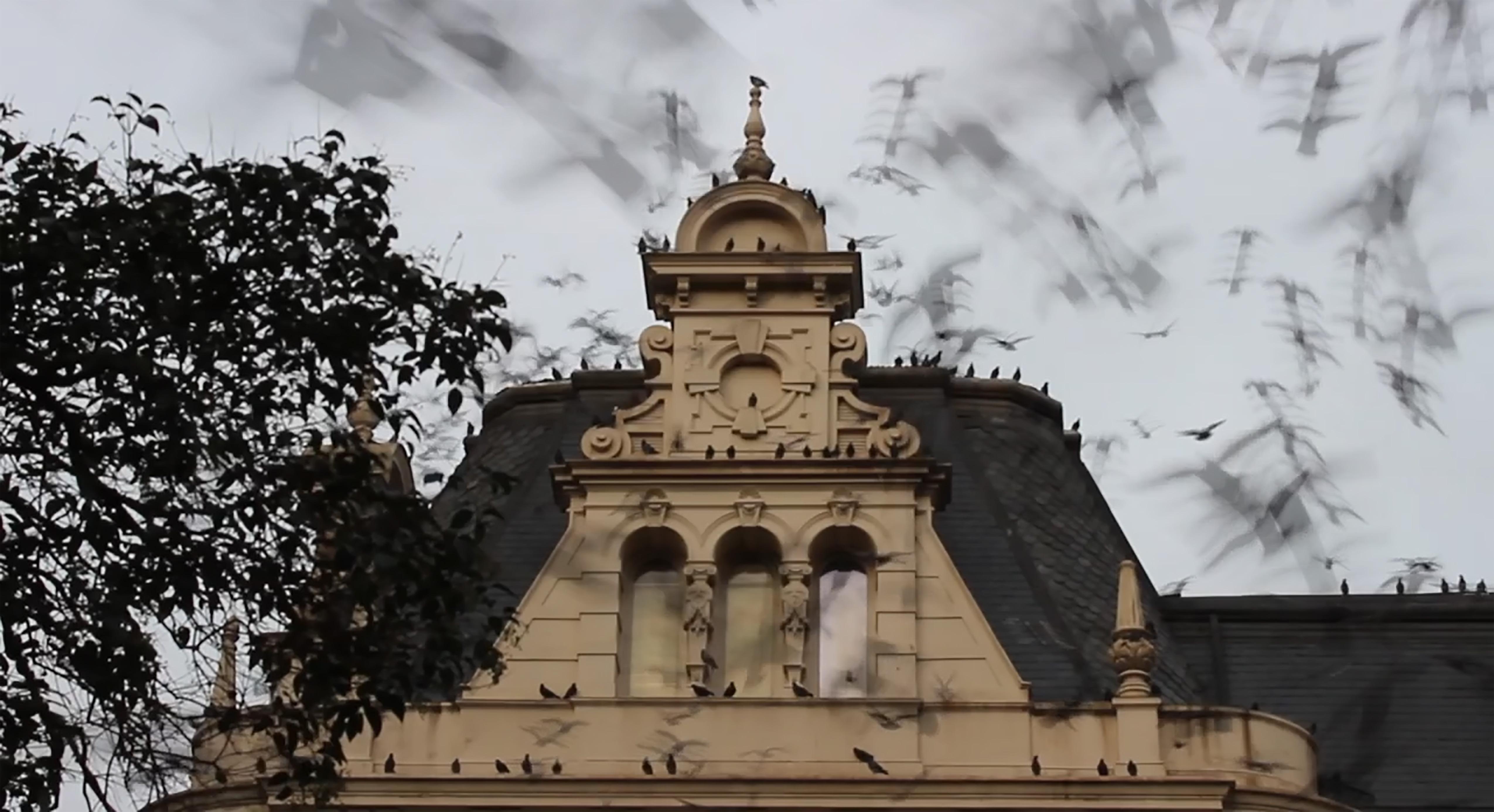
Trinity Place, 2021.
Trinity place was a particularly challenging project, because it was highly experimental, and very technically complex.
There was one particular condition on this project that proved incredibly challenging, a condition we referred to at the studio as “the wing of death.”
To understand that particular condition, you have to understand how the pieces are constructed. For this project the pieces were each made up of three or four smaller panels which we then joined via stainless steel “spines.”
Those four panels can be seen in the diagram below: two organic panels (O1 and O2), the flat panel (F), and finally the long panel (L), or “the wing of death.”
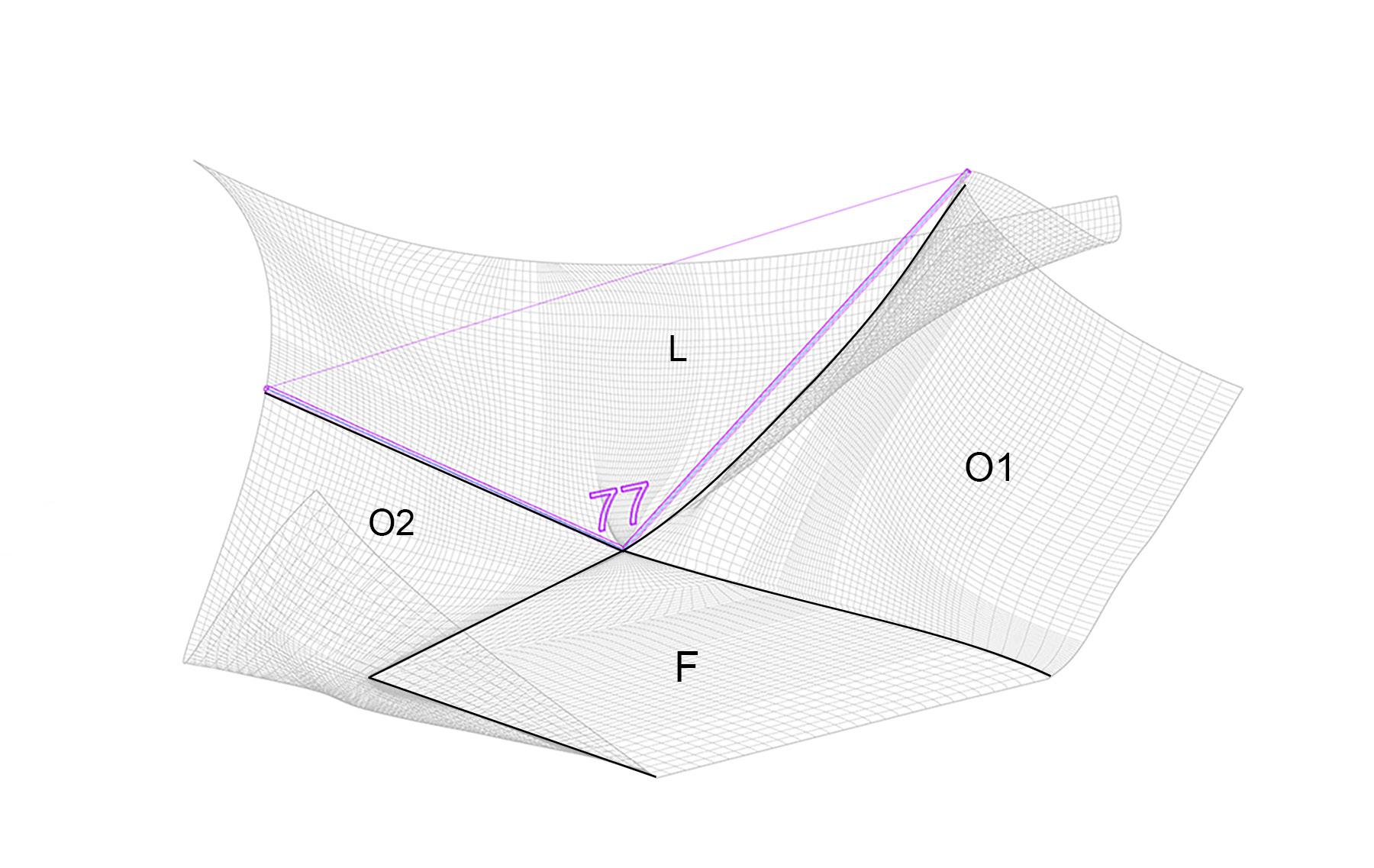
We called the long panel “the wing of death” because it was unbelievably difficult to make. First off, its tubes ran the full length of the piece, which was often over 3 meters long. It was also the only panel that was not directly joined to the central spine-- the strongest structural element. But perhaps more difficult than all of that was its shape in relation to the rest of the piece. The two organic panels are joined to the spine, and yet they have to match perfectly with the first tube of the long panel. That means the first tube of the “wing of death” has to have a sharp crease in the center, at an angle that perfectly matches its neighboring organic panels.
Precisely how we solved this seemingly impossible challenge, once again I cannot say, but the clues are there, hanging in the lobby of Trinity Place.
9
Buenos Aires
Representaciones de Buenos Aires, FUC, 2018.
An eight minute video made while living in Buenos Aires, the film is almost completely absent of people, a meditation on the deaths of the thousands of desaparecidos killed during the military dictatorship in Argentina. This theme is made explicit in a final scene in which “son 30000” can be seen graffitied on the street, a reference to the 30,000+ people who were murdered, many of whose bodies are still unaccounted for. Throughout the video the camera often looks towards the sky, and sometimes settles on birds who reappear several times in the video. This too connects to the murdered civilians as one method of hiding the bodies was to drop them from an airplane into the ocean, leaving only the birds as witnesses.
10
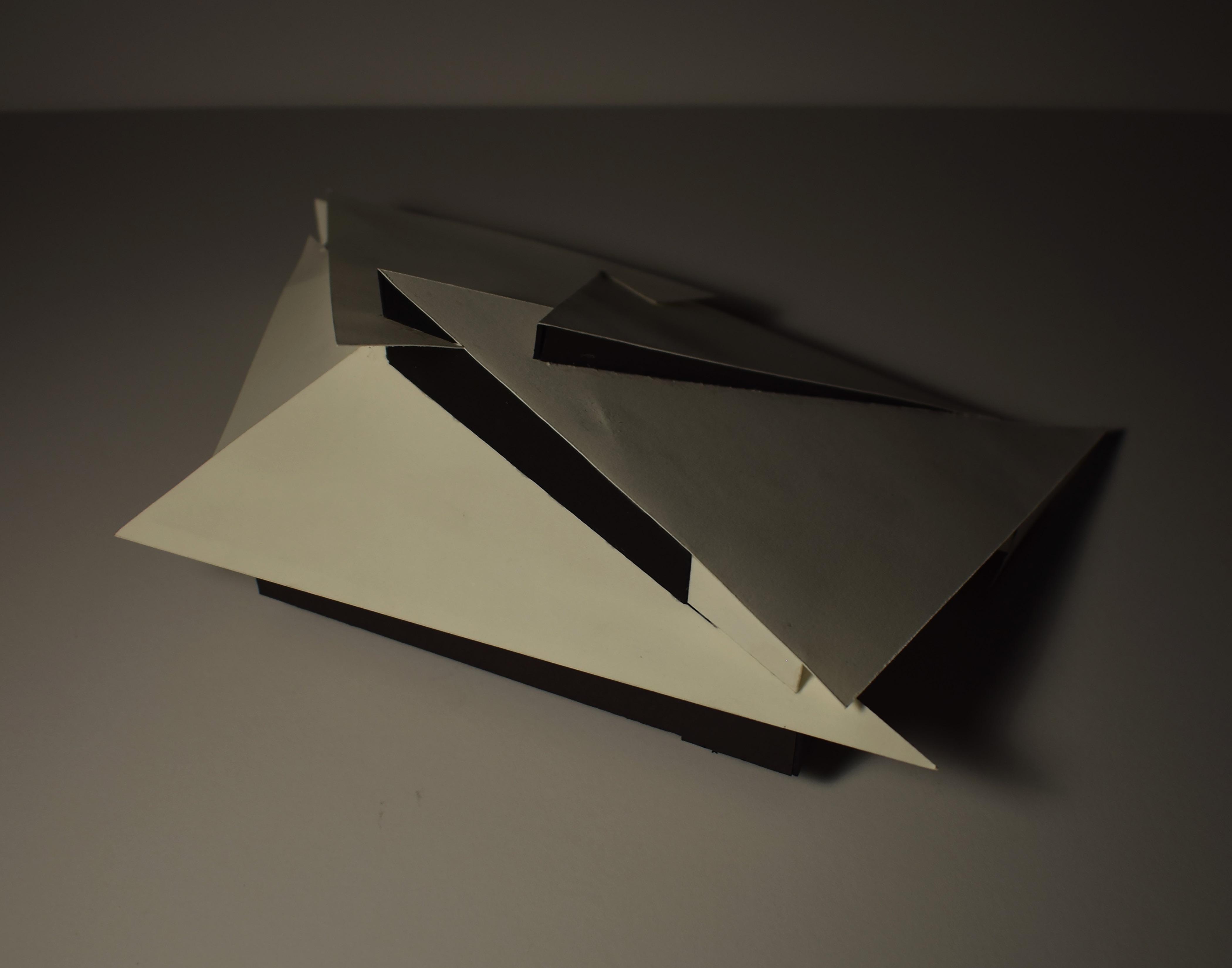
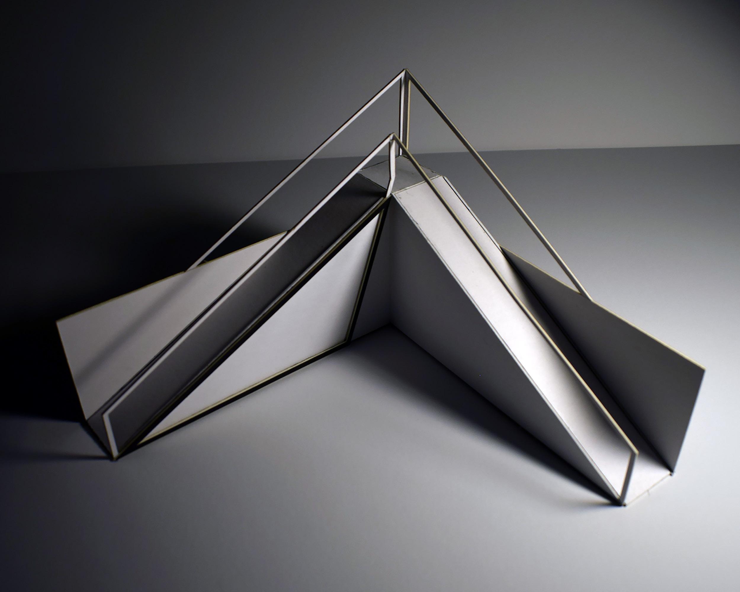
Deconstructed Nude Descending a Stair
Sculpture I, Williams College, 2016.
The number of hinge and ball-and-socket joints was taken from the number in the human body, and the length of each piece of flat bar is the average of the largest and smallest bones in the body. In these ways and others, the piece references the human body, while at the same time descending from the ceiling down to the floor. This arrangement and non-traditional depiction of the human form was inspired by Duchamp’s Nude Descending a Staircase No. 2. The sculpture was meant as a deconstruction of the human form descending a staircase.
11
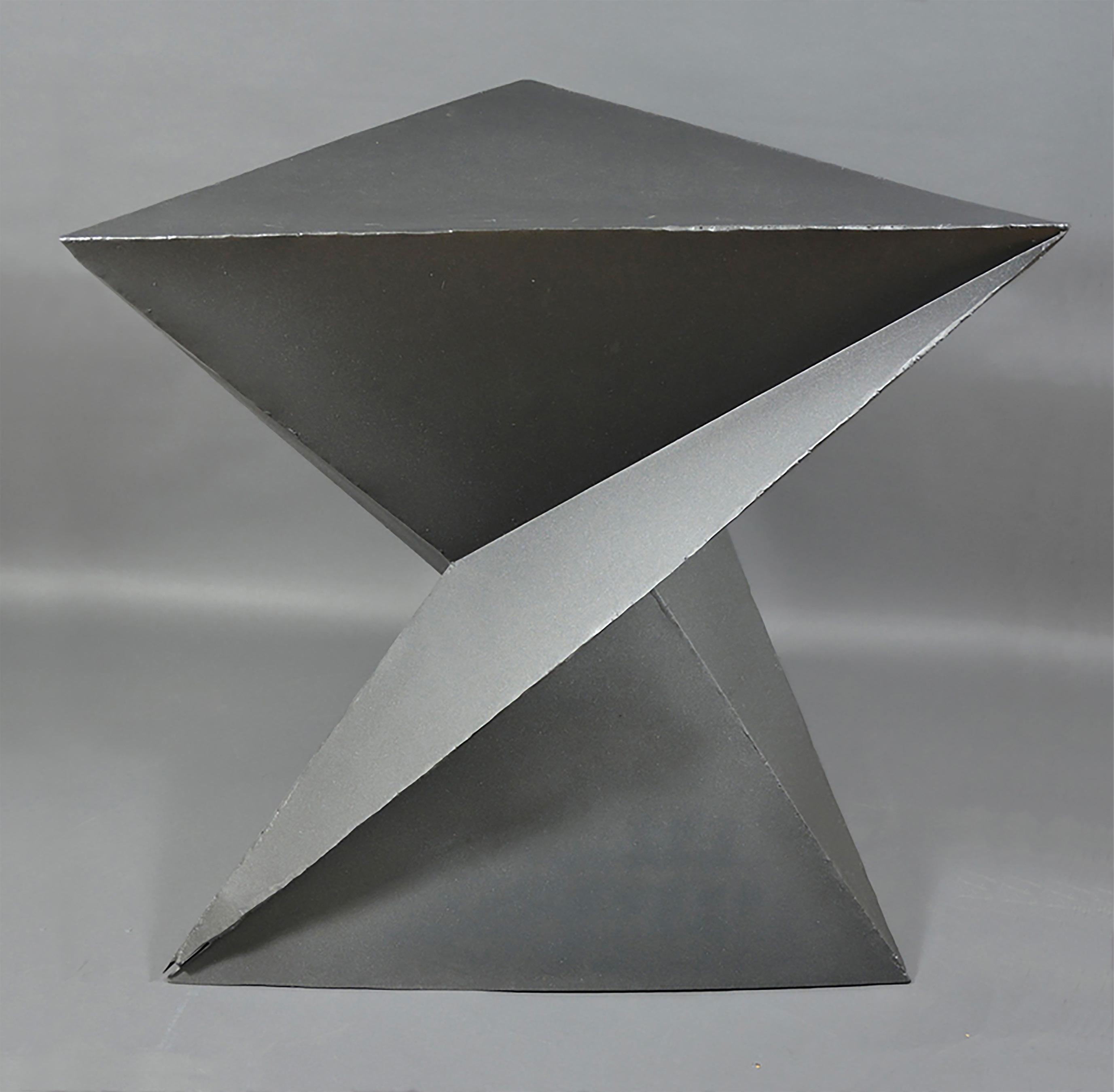
End Table
Metal Fabrications II, Lick-Wilmerding High School, 2013.
Concept based on the twist of a triangular prism.
I made this table by hand in high school. First, I laser-cut stencils out of MDF. Then I used those stencils to cut the sheet metal, tracing around them with a hand held plasma torch. Finally, I bent and welded all the pieces together, and after many hours of grinding, I finished it with matte grey spray paint.
12
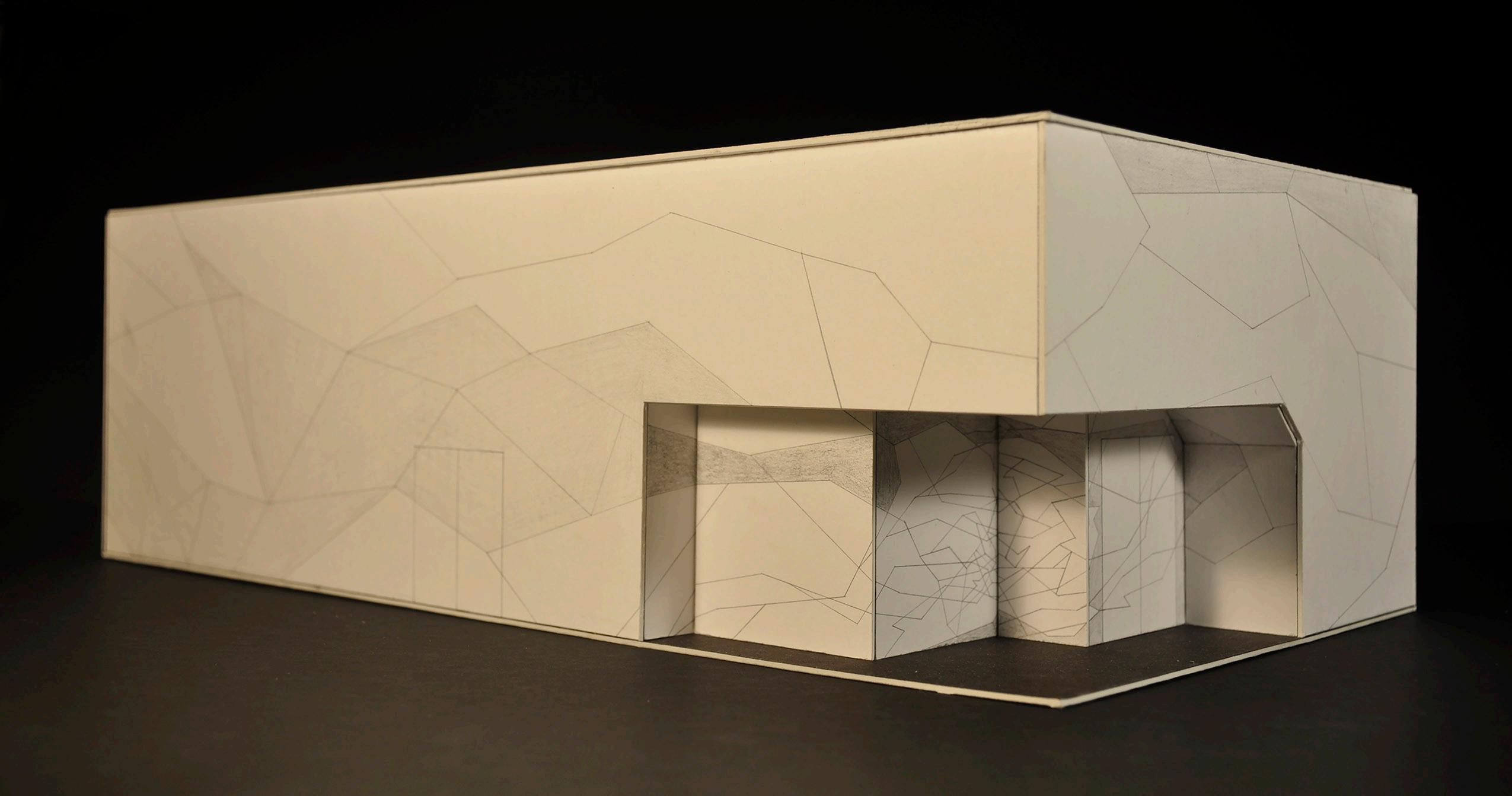
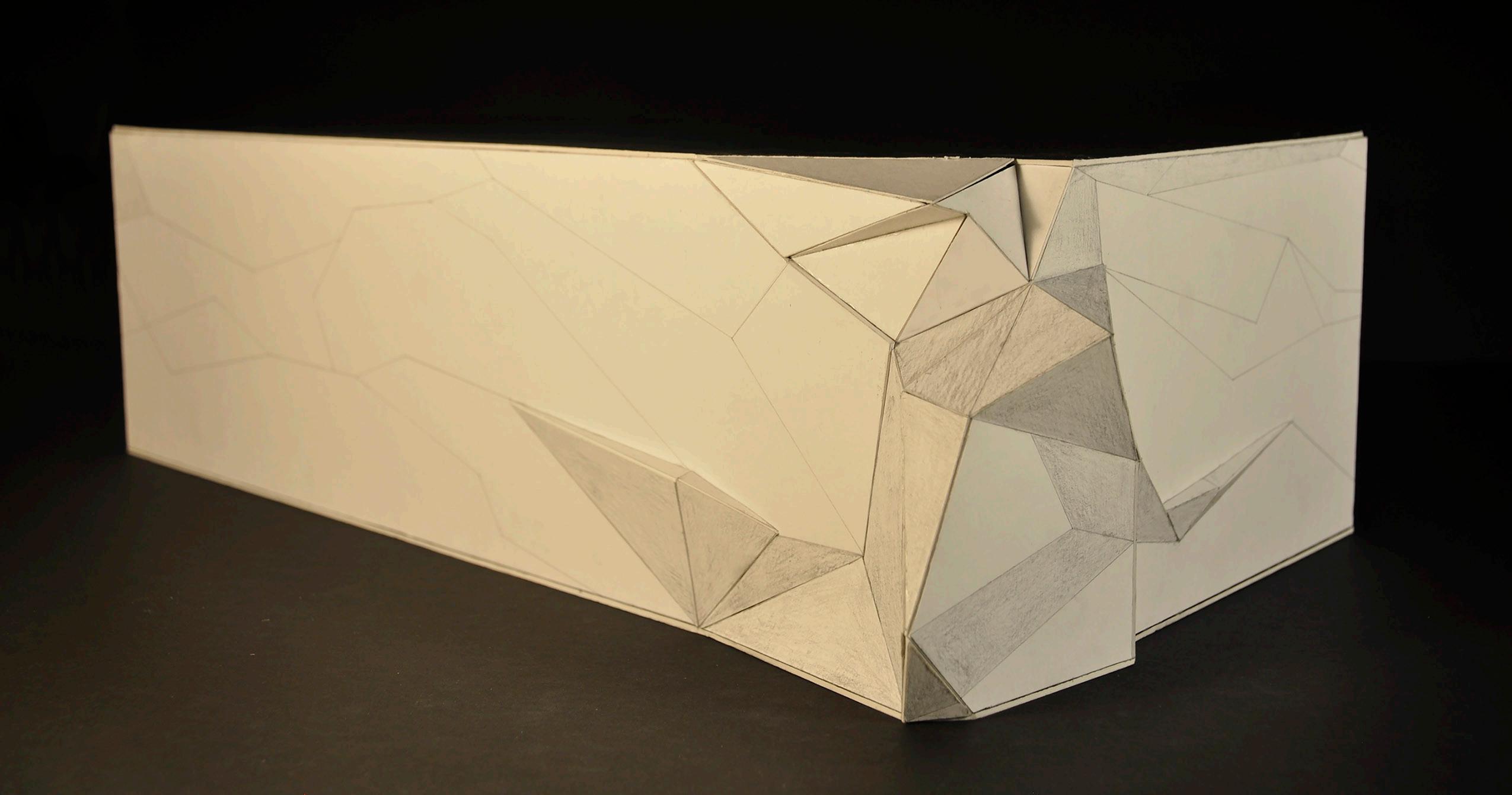
Crematorium
Architecture II, Williams College, 2017.
Angular intersecting roof inspired by the form of sticks leaning against one another to form a campfire. Black planes represent windows and white planes represent walls and roofs.
The unusual clerestory windows are meant to bring light into the interior chapel from above, evoking the spiritual purpose of the space.
13
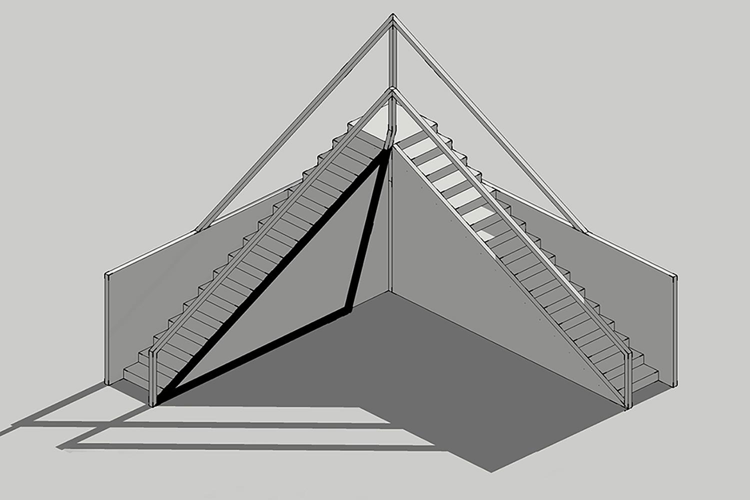
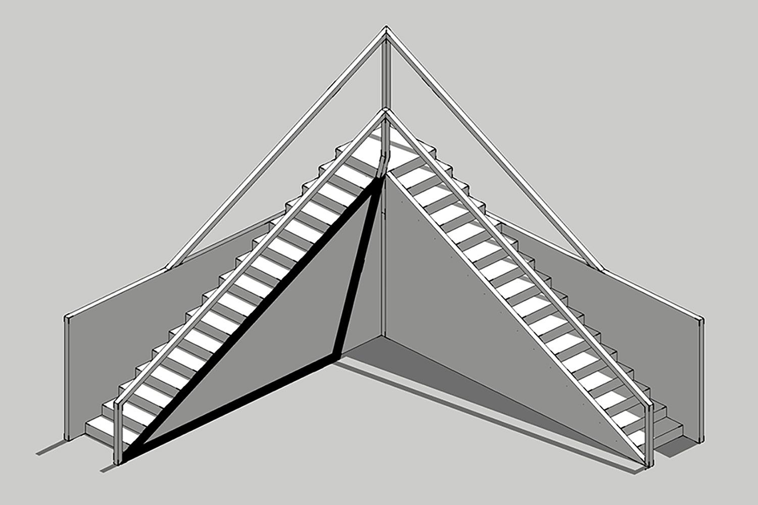
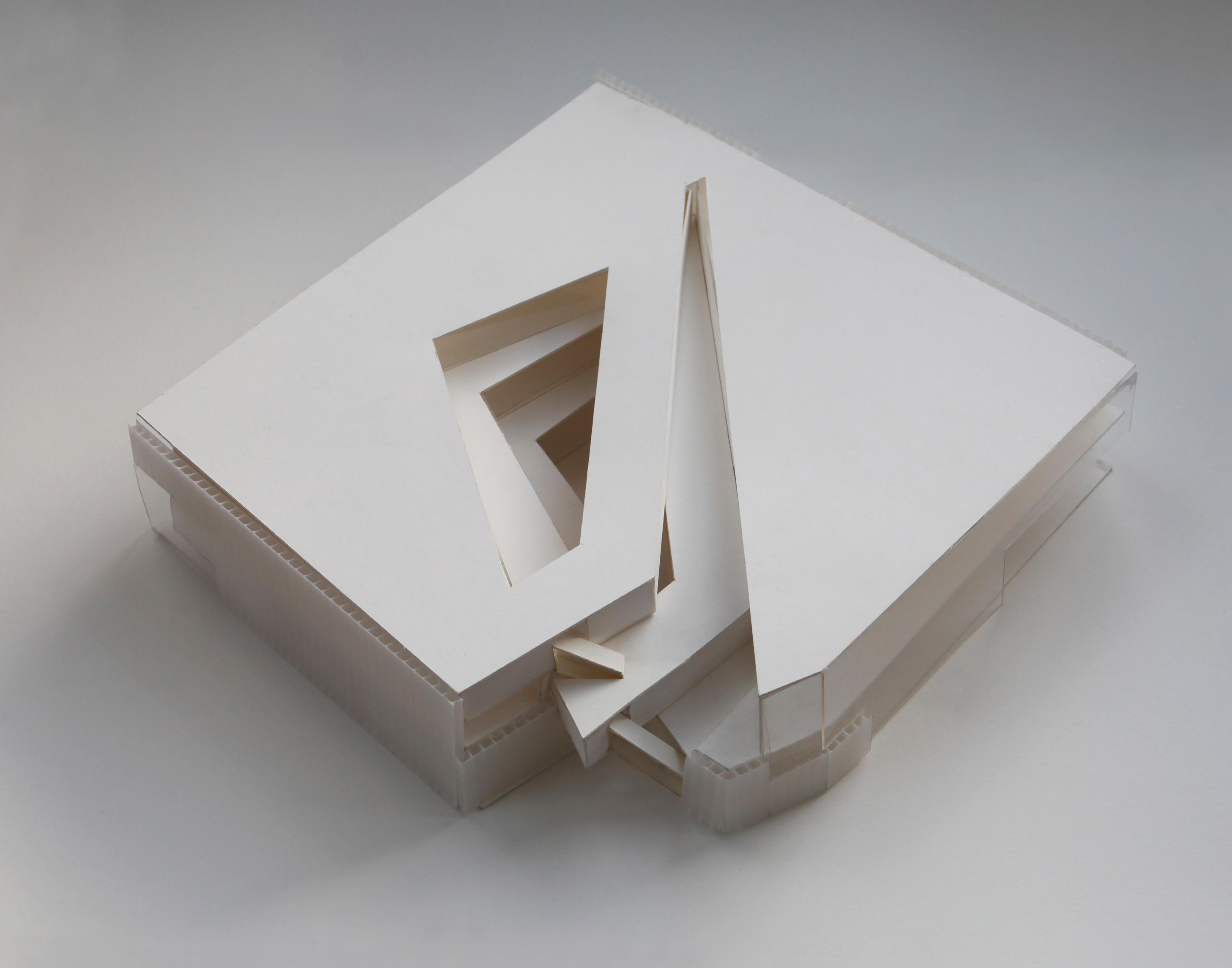
Celestial Pavillion
Sustainabuilding, Williams College, 2017.
Pavilion designed to relate to the movement of the sun. On the summer solstice (left and upper right) the shadow reaches one end of the black triangle. On the winter solstice (lower right) it reaches the other end of the black triangle. Climbing the staircase, one’s head also simulates the movement of the sun as it begins below the horizon, rises in the sky, and then moves back down below the horizon as the day concludes.
14
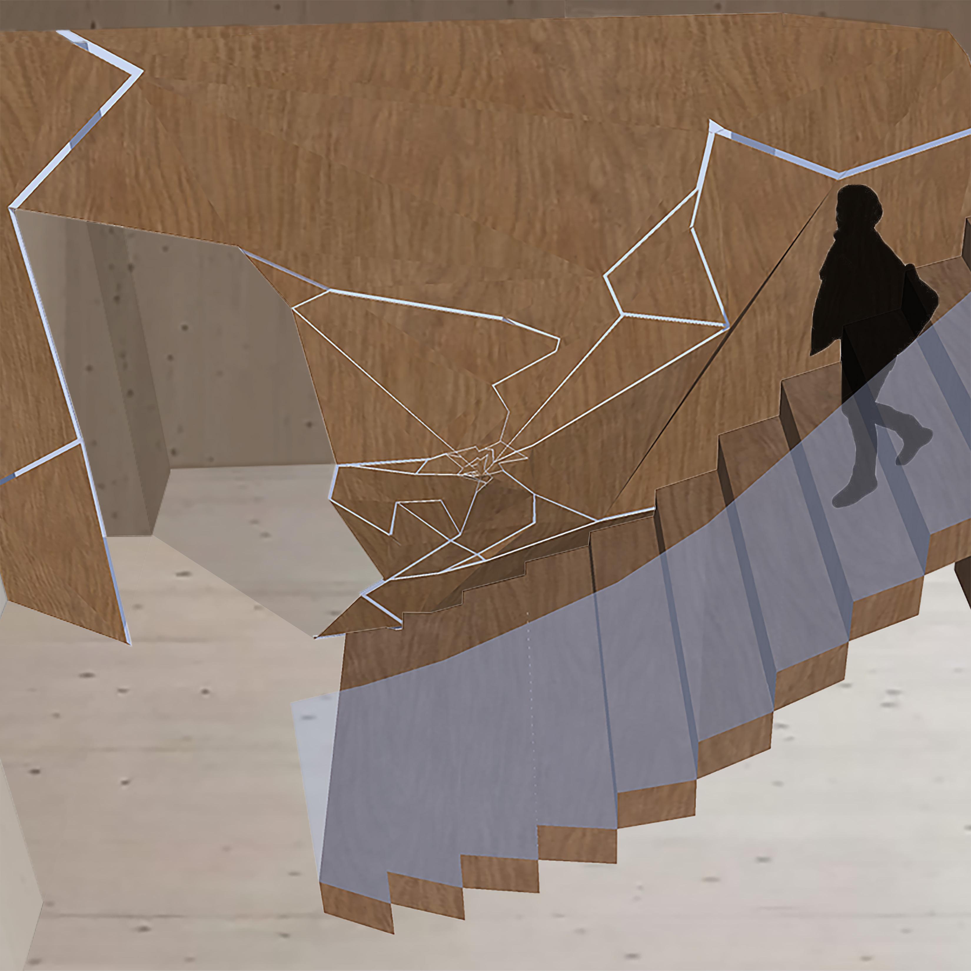
Alpine Hut
Sustainabuilding, Williams College, 2017.
Form reflects the importance of creating a feeling of warmth within the hut, given its cold environment. With limited access to fuel or firewood, instead of a central hearth, heat is conceptualized as the cracking of ice, an aesthetic which creates the visual identity of the project. This cracking emanates from the center of the hut, and is expressed as thin glass ‘cracks’ on the wall behind the central staircase.
15
Because the site is so remote and needs to be heated constantly to maintain a resonable interior temperature, it was important to minimize the volume of the envelope. Doing so required fitting all the pieces of the program neatly into a tight space. The Alpine Hut included a communal dining area where all the visitors could gather to eat and socialize on the first floor, as well as shared bedrooms and bathrooms for up to 30 visitors.
Even with the small envelope, I still wanted much of the communal dining area to be a double height space. With the bedrooms above packed so tighly together, it was important that the communal area felt open and spacious, making it a comfortable place to relax after a long day of hiking in the cold.
Second Floor Plan First Floor Plan
16
The entrance of the hut is set back into the rectangular prism or ‘cube’ bringing it closer to the center of the hut and to the source of the cracking. This proximity to the source of the cracking can be seen visually as an increased concentration of cracks on the exterior walls as they cut further into the hut. The shaded areas represent windows, and the non-shaded areas represent wooden walls painted white.
The form of the ‘cube’ is only broken in two places: first, the entrance, which is set into the ‘cube’ to draw it closer towards the source of cracking, towards the heat, and second, in the northwest corner, where the cracking finally ruptures the ‘cube’ to create a uniquely beautiful double height space set off from the main public dining area. This more intimate space with windows framing the Swiss Alps beyond creates an opportunity to pause and appreciate the beauty of the natural setting.
17
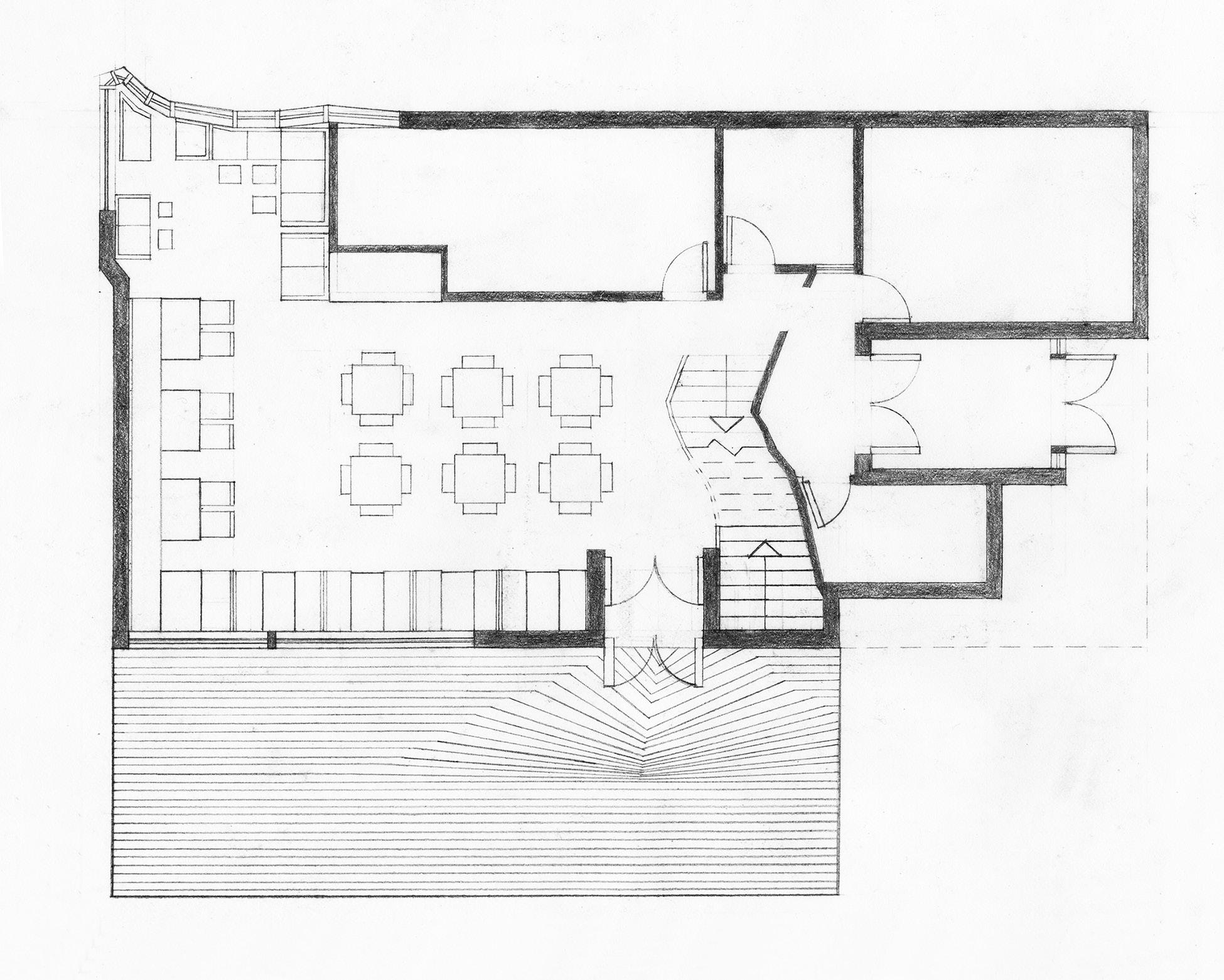
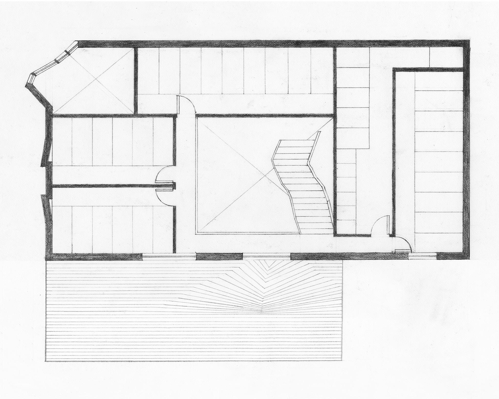
Roxbury Public Library
Career Discovery Program, Harvard GSD, 2016.
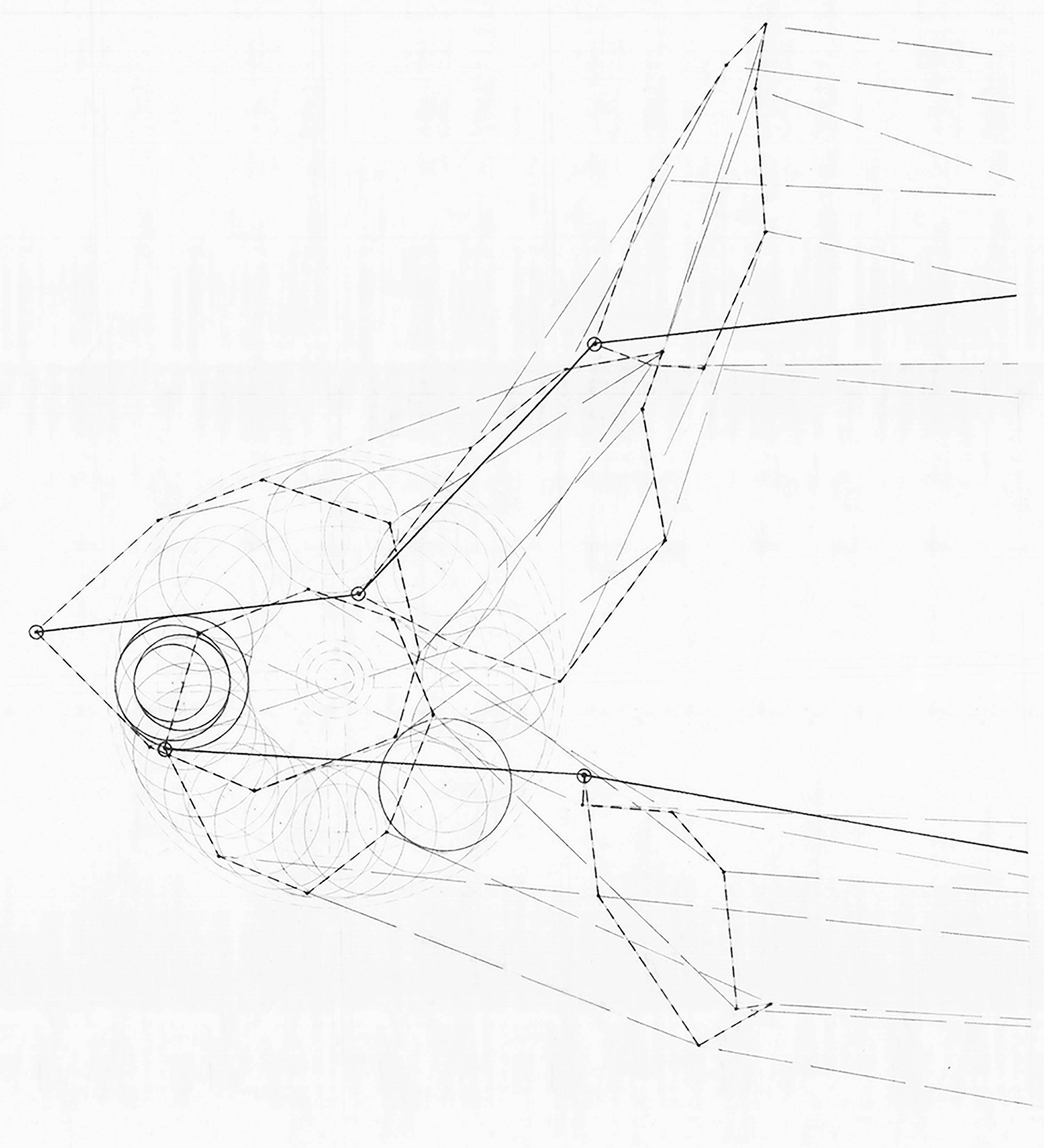
The design process began by choosing an object—I chose a lead sharpener—and making plan, section and elevation drawings of it.
Next, I made an animate drawing of the sharpener, mapping the rotation of the fingers as they rotate the lead holder.
That rotation then became the inspiration for the shifting central atrium and circulation space in my final design of the Roxbury Public Library.
Lastly, I decided I wanted the main stacks to be located in that shifting central volume to emphasize that even in the digital world we live in, books remain the true heart of the library.
18
Plan, section and elevation drawings of a lead sharpener (above) were the starting point of the design process.

The animate drawing (right) shows the motion of two fingers using the lead sharpener. Polygons represented with short dashed lines show the rotational path of the individual joints of the index finger and thumb. The longer dashed lines represent the fingers themselves which connect the joints to one another. The circles show the rotation of the lead being sharpened. Finally, the darker lines call out a single moment, the lead held between the index finger and thumb, with the opening of the sharpener in the same position in which it is represented in the plan drawing.
19
Before beginning the design stage, we visited the site and walked around for the afternoon to get a feeling for the neighborhood. After exploring for a bit, I wrote down what felt to me like the important locations within walking distance of the site. I then plotted those points on a map, connected the dots (left), and that shape became the form for the central shifting stacks at the heart of the library.
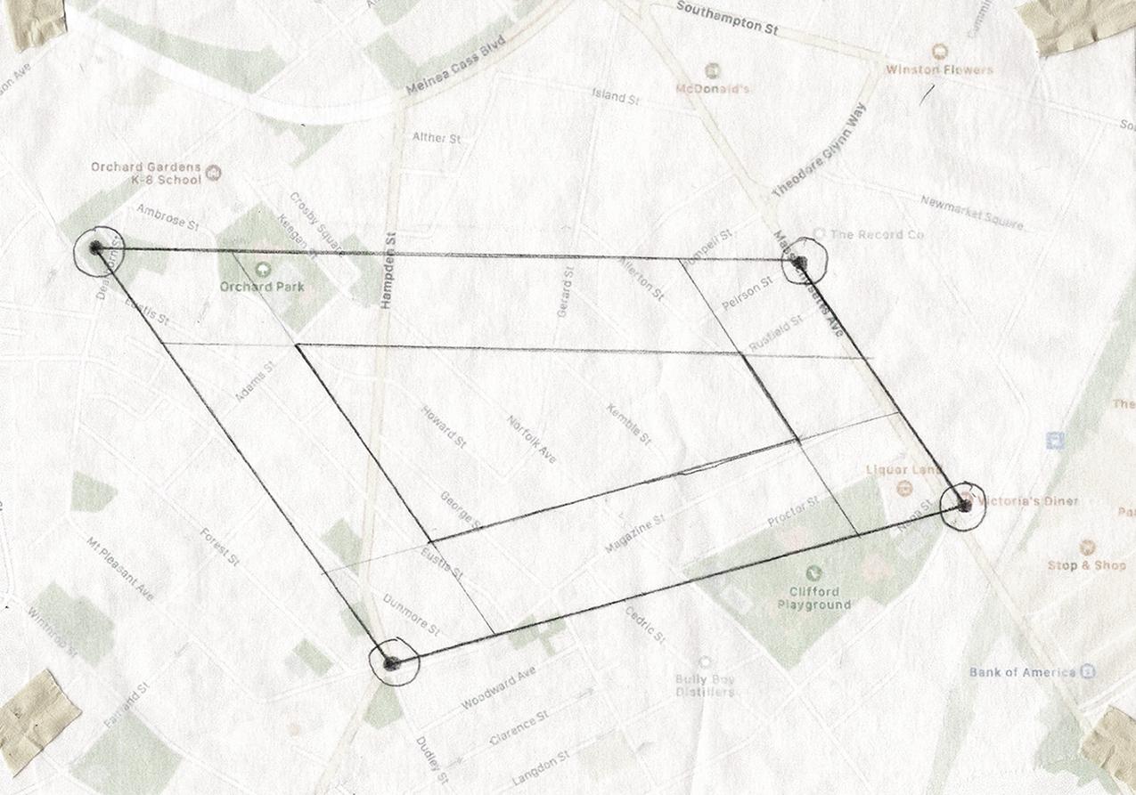
The form for the central shifting volumes came from the site visit, but the rotational movement stacks came from my initial animate drawing of the lead sharpener. The movement of the atrium was an attempt to translate that initial drawing into the final design of the library.
The decision to create a central void was also an effort to bring more natural light into the center of the space, a critical consideration especially in the northeastern US, where natural light is so hard to come by in the winter months.
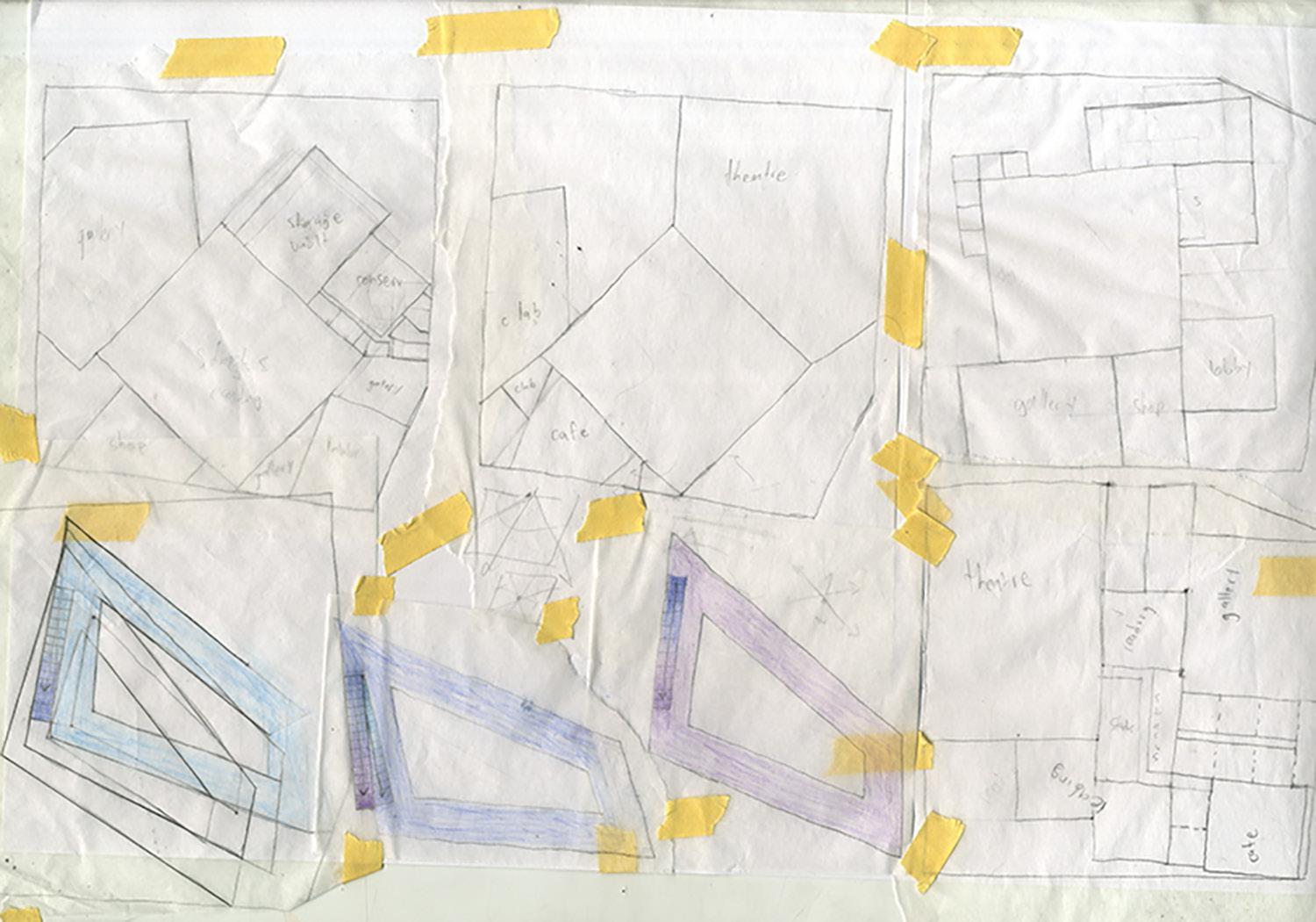
The sketches above show the beginnings of my plans mapping out the different parts of the program, as well as the first sketches of the shifting central stacks, and the intricate stairs that move in between the shifting volumes.
After the initial sketches on trace paper, I solidified how I would subdivide the different pieces of the program, and sketched those subdivisions out to scale on a larger sheet of vellum (left). The real challenge was plotting the circulation between the shifting central volumes and the double-height spaces surrounding them.
20
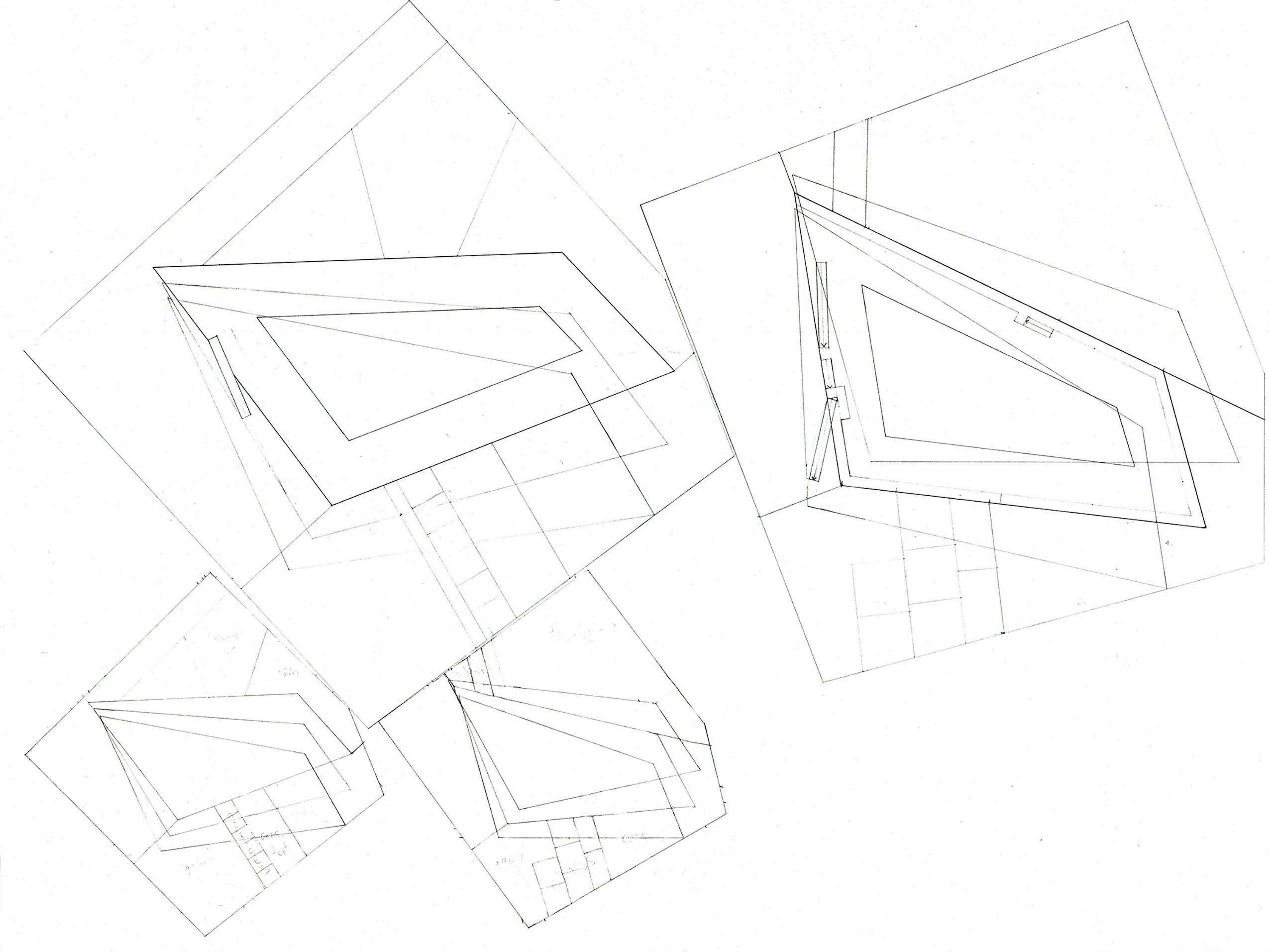
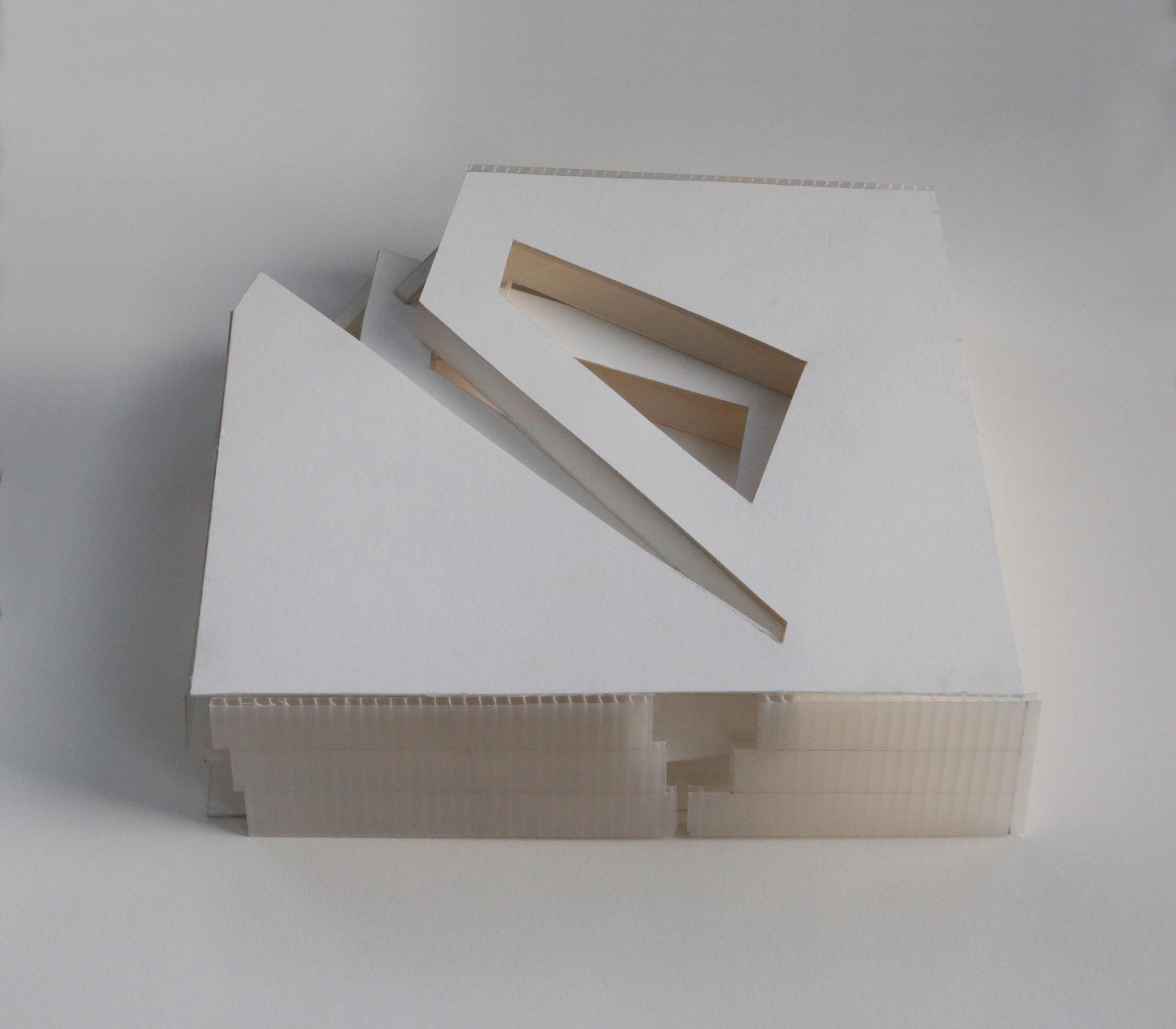
The final plans and section drawings show the ultimate resolution of the intricate criss-crossing staircases and rotating central volumes.
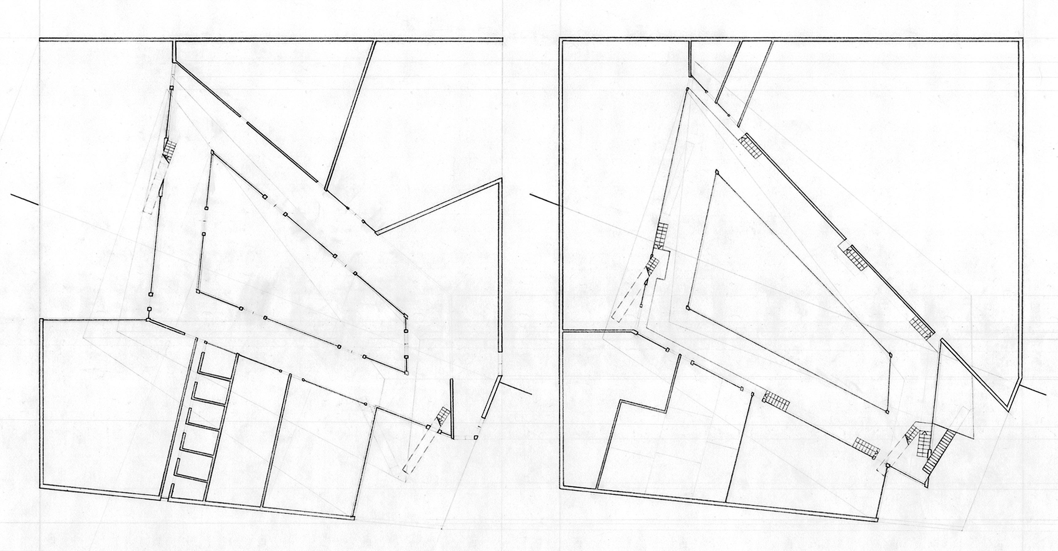
The void space in the center of the library is accessible on the ground floor, and creates a a unique, secluded outdoor space for reading and enjoying the library.
First Floor Plan
Second Floor Plan
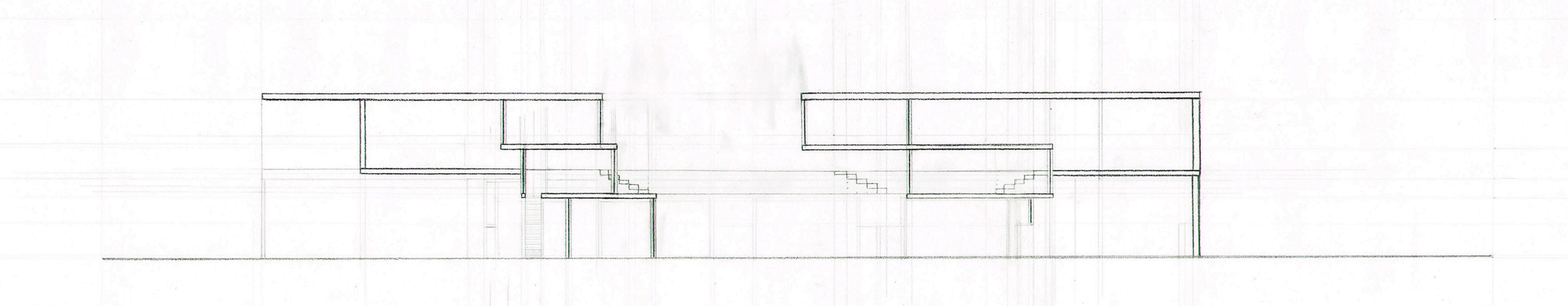
Section
21
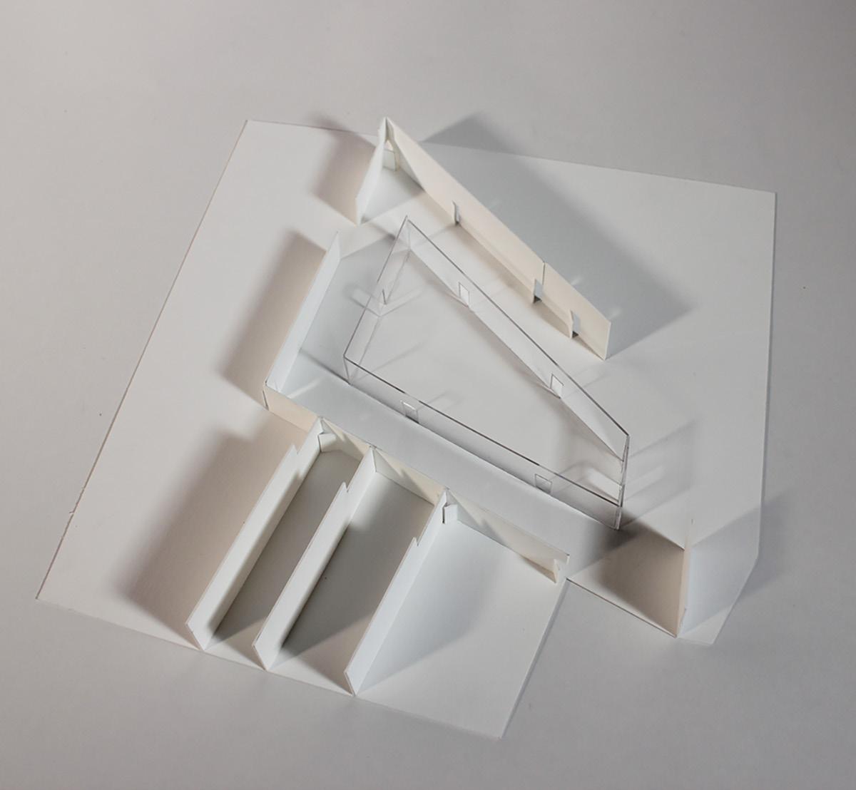
Getting as much natural light as possible into all areas of the library was critical in order to create a public library people would go out of their way to visit. As a result, almost all of the exterior walls are either glass or channel glass. Using channel glass allows the spaces that should not have full transparency to still receive natural light.
The divisions between full transparency and channel glass on the exterior were chosen by projecting lines outwards from the shifting central volumes. In this way, even from outside the library, you get a feeling of the rotational movement present in the spaces within.
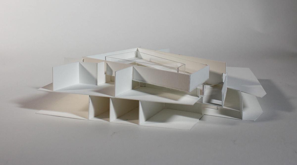
Here you can see the glass walled, uncovered, interior courtyard. The void allows light to illuminate this outdoor space, but it remains isolated from the bustle of the surrounding streets, creating a tranquil outdoor space for reading at the center of the library.
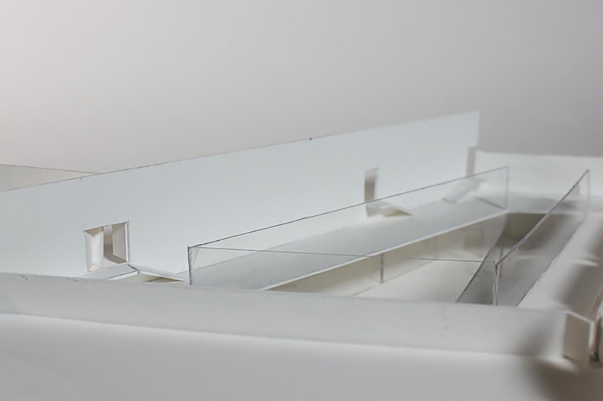
Because there are three levels of shifting central stacks, but only two levels surrounding them, the second level of the stacks sits a few feet below the second level outside it. To bridge this gap, I added a set of seven stairs before each doorway on the second floor. This elevation difference and small sets of stairs is also shown in the section and plan drawings on the previous page.
Seeing the model without exterior walls more clearly illustrates the relationship between the three central shifting volumes and the two floors surrounding them.
22