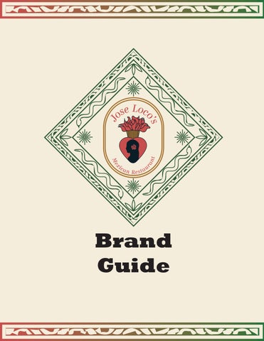
Brand Guide
Jose Loco’ s
Mexican Restaurant
Jose Locos since its establishment in 2013 by Maria Valdovinos, beckons guests to indulge in the vibrant tapestry of flavors that define Mexican cuisine. Embracing classic Mexican dishes, generous jumbo margaritas, and a relaxed ambiance, every aspect of the dining experience is meticulously crafted to transport guests to the sun-drenched streets of Mexico. By combining traditional culinary techniques with carefully selected ingredients, Jose Locos delivers a symphony of flavors that pay
homage to the rich Mexican heritage. Every dish is crafted with Jose Locos’ passion and attention to detail, ensuring a delightful feast that enchants the senses. Whether you’re gathering with loved ones for a festive fiesta or simply craving a taste of Mexico’s culinary delights, Jose Locos welcomes you to embark on a culinary adventure that celebrates the vibrant flavors, rich traditions, and warm hospitality of Mexico.
At Jose Locos, our vision is to transport guests to the vibrant streets of Mexico, immersing them in a genuine, flavorsome Mexican dining experience. Our mission is simple yet powerful: to foster a warm and inviting atmosphere that allows guests to unwind, relish in captivating food, and savor the company of loved ones.
At the heart of our identity lies our logo, as the cornerstone of our visual representation. Just as each dish is meticulously crafted with our unwavering passion and attention to detail, so too is our logo. The Jose Loco Logo stands as a bold emblem, deeply rooted in traditional symbolism that proudly reflects the vibrant tapestry of Mexican heritage.
Complementing the Jose Loco Logo is a supporting logo hierarchy, designed to adhere to our unique brand guidelines. Together, these visual elements embody the essence of Jose Loco, serving as a powerful testament to our commitment to excellence and our celebration of Mexican culture.
Our logo is a vibrant homage to Mexican heritage, featuring an emblem encased within an azulejo tile — a traditional ornamental found in churches, palaces, and various other establishments, restaurants and bars. At its core, our emblem centers around the silhouette of a woman, an embodiment of Maria Valdovinos, adorned with a rose in her hair—a nod to our original logo design.
This lady is encased within the corazón sagrado, or sacred heart, symbolizing the profound complexities of love — its faith, beauty, pain, and hope. In this way, our logo not only pays tribute to our rich cultural roots but also encapsulates the enduring spirit of Jose Loco, resonating with authenticity, passion, and reverence.
The primary logo, seen on the previous page, is designated for use across all official documents. Our standard logo, the medallion emblem logo positioned at the top, is the go-to choice for a diverse array of placements, from menus and t-shirt designs to take-out containers and website banners.
Should the standard logo present legibility challenges the secondary logo options come into play. With vertical spacing constraints, the icon logo situated in the middle is the preferred alternative. Oppositely, for situations with horizontal spacing, the name logo positioned at the bottom is the preferred substitution.
In instances where legibility is compromised due to background complexities or limited color printing options, it is advisable to opt for the single-color alternatives presented on the left. These alternatives include the black and white variation or the Azulejo Blue from our color system, seen on page 12.
The usage guidelines for the logo system remain consistent across color variations and should adhere closely to the established system without deviation.
Ensuring the integrity and effectiveness of our logo is of the utmost importance, as its incorrect usage can undermine its impact. It’s crucial to exercise care and diligence to maintain correct and consistent application of the mark across all platforms.
On this page, you’ll find examples of common misuses of the marks, such as cropping, warping, altering colors, reducing opacity, and overlaying onto graphics that encroach upon the clear space. The logo is to be presented at a minimum size of an inch to ensure clarity and visibility. While these examples don’t encompass every possible misuse, they serve as important reminders to double-check and adhere closely to our usage guidelines.
Careful consideration of color and typeface is crucial as they play pivotal roles in shaping the brand’s identity and perception. Color holds immense symbolic power, evoking emotions, setting moods, and communicating messages without words. By selecting the right color palette, we can convey the vibrant energy, warmth, and richness of Mexican culture, immersing customers in an authentic dining experience even before they take their first bite.
Likewise, the choice of typeface contributes significantly to the brand’s personality and visual appeal. Typeface not only affects readability but also conveys a subtle message about the brand’s character and values. In the case of Jose Loco’s, Rockwell font was chosen for its bold, modern, and confident appearance, aligning perfectly with the restaurant’s aim to portray a contemporary yet authentic image.
Lime Green
RGB: CMYK: Hex: 42 115 57 84 31 100 20 #2A7339
Rose Red
RGB:
CMYK: Hex: 200 77 76 16 84 70 04 #C84D4C
Azulejo Blue
RGB:
CMYK: Hex: 168 117 52 30 53 92 12 #A87534
Medallion Gold
RGB:
CMYK: Hex: Black
RGB:
168 117 52 30 53 92 12 #A87534
CMYK: Hex: 08 32 41 89 70 58 69 #082029
Linen Tan
RGB: CMYK: Hex: 242 234 220 04 05 13 00 #F2EADC
White
RGB: CMYK: Hex: 255 255 255 00 00 00 00 #FFFFFF
Primary Colors:
Lime Green and Rose Red. The Rose Red represents red rose since in the first variation of the logo and to represent the owner (Maria). The green represents the fresh green herbs used in every dish.
Secondary Colors:
Azulejo Blue and Medallion Gold. Representing azuelejo tiles, Azulejo Blue represents our heritage. The Medallion Gold is to be used to outline the logo and to not be used as a one color variation.
Neutral Colors:
Black, White, and Linen Tan, these colors are to be used as backgrounds for the logo or one-color variations, except for the Linen Tan.
Rockwell will be used as the font style. Extra Bold will be used as the headline, Bold Italic as the subheading, Regular as the body text, and italic as the small print. The Rockwell font complements the brand due to its bold and modern appearance. The clean lines and strong presence of the Rockwell font align well with the bold and contemporary image that Jose Loco’s aims to portray. This font choice helps convey a sense of confidence and professionalism, enhancing the overall branding of Jose Loco’s as a stylish and reputable establishment.
Heading - Rockwell Extra Bold
Body - Rockwell Regular
Artistic Text Accent - Old Press
Subheading
Lorem ipsum dolor sit amet, consectetuer adipiscing elit, sed diam nonummy nibh euismod tincidunt ut laoreet dolore magna aliquam erat volutpat. Ut Gitiur aliquia sumque nonemporion eos sernate nduntotatque volor aut utae prorerrum et et, et occum hil iumquidiciis isquasintore etur?
Small Print
Subheading - Rockwell Bold Italic
ABCDEFGHIJKLMNOPQRSTUVWXYZ
abcdefghijklmnopqrstuvwxyz 1234567890.,/\|:;”!?@#&()
Small Print - Rockwell Italic
ABCDEFGHIJKLMNOPQRSTUVWXYZ
abcdefghijklmnopqrstuvwxyz 1234567890.,/\|:;”!?@#&()
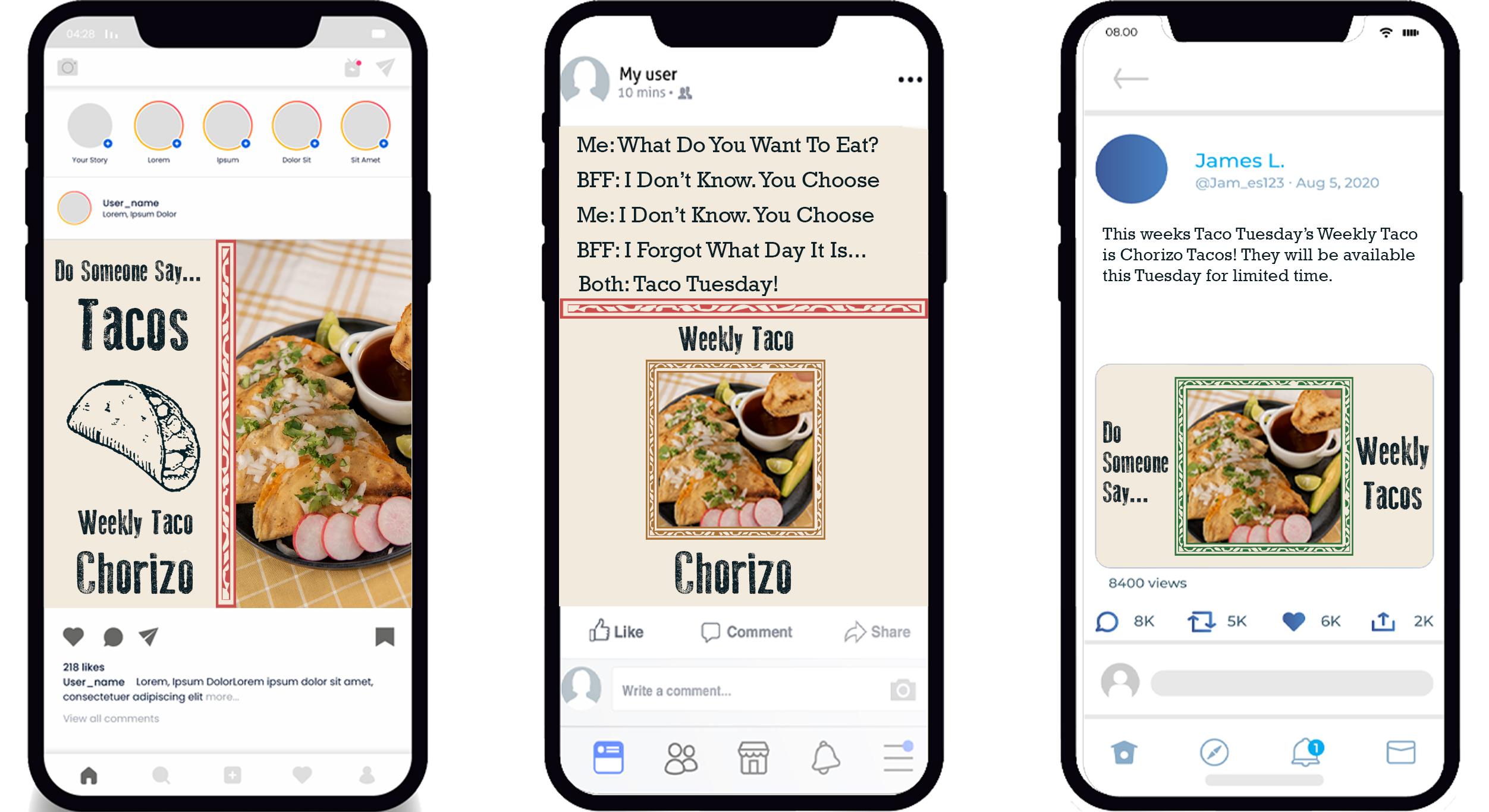
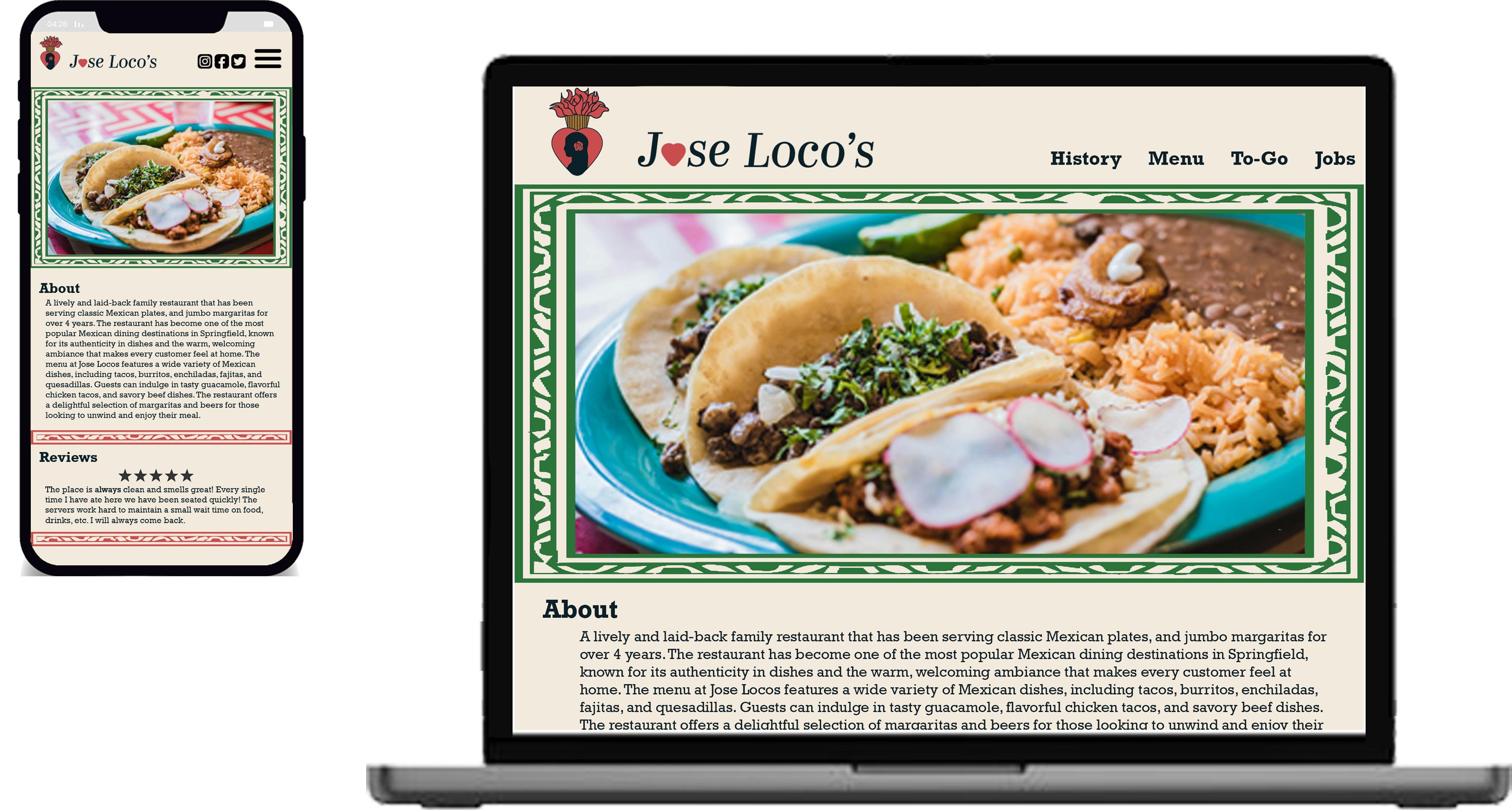
Strategic asset placement plays a pivotal role in shaping the restaurant’s visual identity and reinforcing its brand message. The placement of assets such as the logo, imagery, and design elements on various marketing materials, menus, signage, and digital platforms is crucial for brand recognition. Consistency in asset placement ensures that customers can easily identify and connect with the Jose Loco’s brand across different touch points, fostering a sense of familiarity and trust.
Asset placement can also influence customer behavior and engagement. Placing key information, such as promotions or special offers, in prominent locations can attract attention and encourage action, driving sales and customer satisfaction. Meticulous attention to asset placement is essential for building brand recognition, creating a cohesive brand experience, and influencing customer engagement, ultimately contributing to the success and longevity of our brand identity.
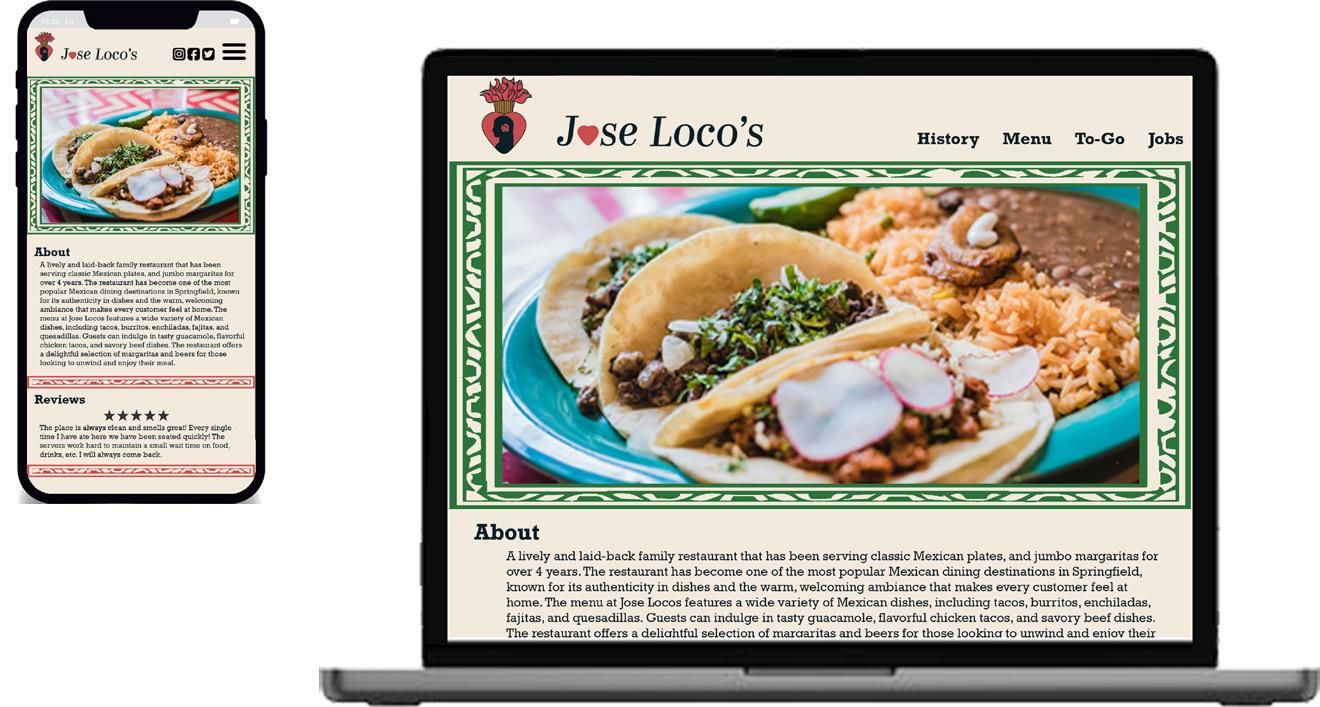
offers or events. Optimizing the phone website ensures that customers can easily access essential information such as menus, reservations, and location details from their mobile devices. By aligning the rebranding efforts across these platforms, Jose Loco’s
Waiters’ shirts offer a tangible representation of the brand, serving as a sense of unity and professionalism among team members while reinforcing the brand recognition. The shirts also provide an opportunity to infuse personality into the brand, through playful slogans and custom designs that reflect the restaurant’s unique vibe. Similarly, the menu design plays a crucial role in shaping the customer’s perception of the brand and influencing their dining choices. The menu design should reflect the new visual identity and branding elements from the layout and typography to the imagery and color scheme; to communicate its commitment to quality, authenticity, and innovation.


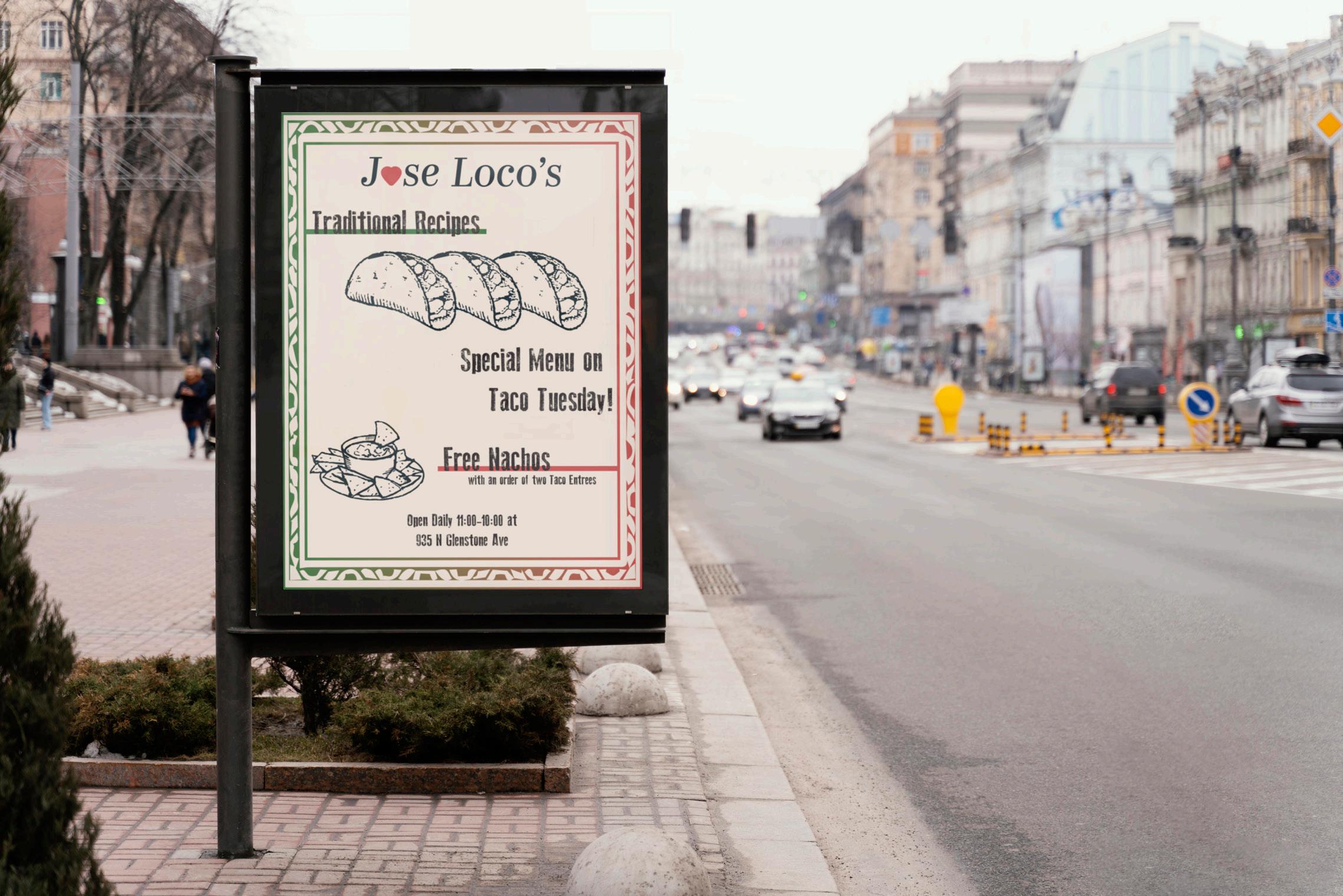
Posters offer a visually striking means of communication, allowing Jose Loco to showcase promotional offers, upcoming events, and signature dishes. By incorporating elements of the rebrand, such as the new logo, color palette, and design motifs, into poster design, Jose Loco’s can create eye-catching displays that capture attention and spark curiosity among patrons. Similarly, entry door design plays a crucial role in shaping the customer’s first impression of the restaurant. From bold graphics and vibrant colors, every aspect of the design should align with the restaurant’s refreshed identity and communicate its values of warmth, hospitality, and authenticity. 68” (5’-8”)
The inclusion of iconography holds significant importance as it serves as a visual language that communicates the essence of the brand to customers. Whether it’s through iconic images of traditional Mexican cuisine, vibrant cultural motifs, or symbols that evoke the spirit of celebration and community, iconography enables the brand to connect with customers on a deeper level and create memorable brand experiences. Moreover, iconography has the power to transcend language barriers
and cultural differences, allowing Jose Loco’s to communicate its brand message effectively to a diverse audience. Whether it’s through universally recognized symbols or culturally relevant imagery, iconography enables the brand to connect with customers across different demographics and geographic regions. Overall, the use of iconography is essential for effectively communicating the brand’s identity and values, enhancing brand recognition and consistency.


Icons serve as visual representations of food and drink items on our menu, capturing the essence of each dish or beverage in a timeless manner. These icons should evoke the charm of older, weathered hand sketches, infusing a sense of authenticity and tradition into our brand identity. Uniformly presented in a neutral black color, these icons add a touch of rustic elegance to our menu, enhancing its visual appeal and guiding customers through their dining experience with style and sophistication.
Incorporating iconography with azulejo tiles adds a distinctive touch of Mexican cultural heritage and aesthetic elegance. These iconic ceramic tiles, adorned with intricate patterns and vibrant colors, have long been synonymous with Mexican architecture and design. By integrating elements of azulejo tiles into the iconography, Jose Loco pays homage to the rich tradition of craftsmanship and artistry that defines Mexican culture. Whether used as background motifs or standalone design elements, these icons evoke a sense of authenticity and sophistication that resonates with patrons.


Moreover, the addition of the iconography with azulejo tiles serve as a visual representation of Jose Loco’s meticulous attention to detail and commitment to quality that characterizes the dining experience. Reinforcing the restaurant’s cultural identity and commitment to providing an authentic Mexican dining experience that is both timeless and unforgettable.