

mass market
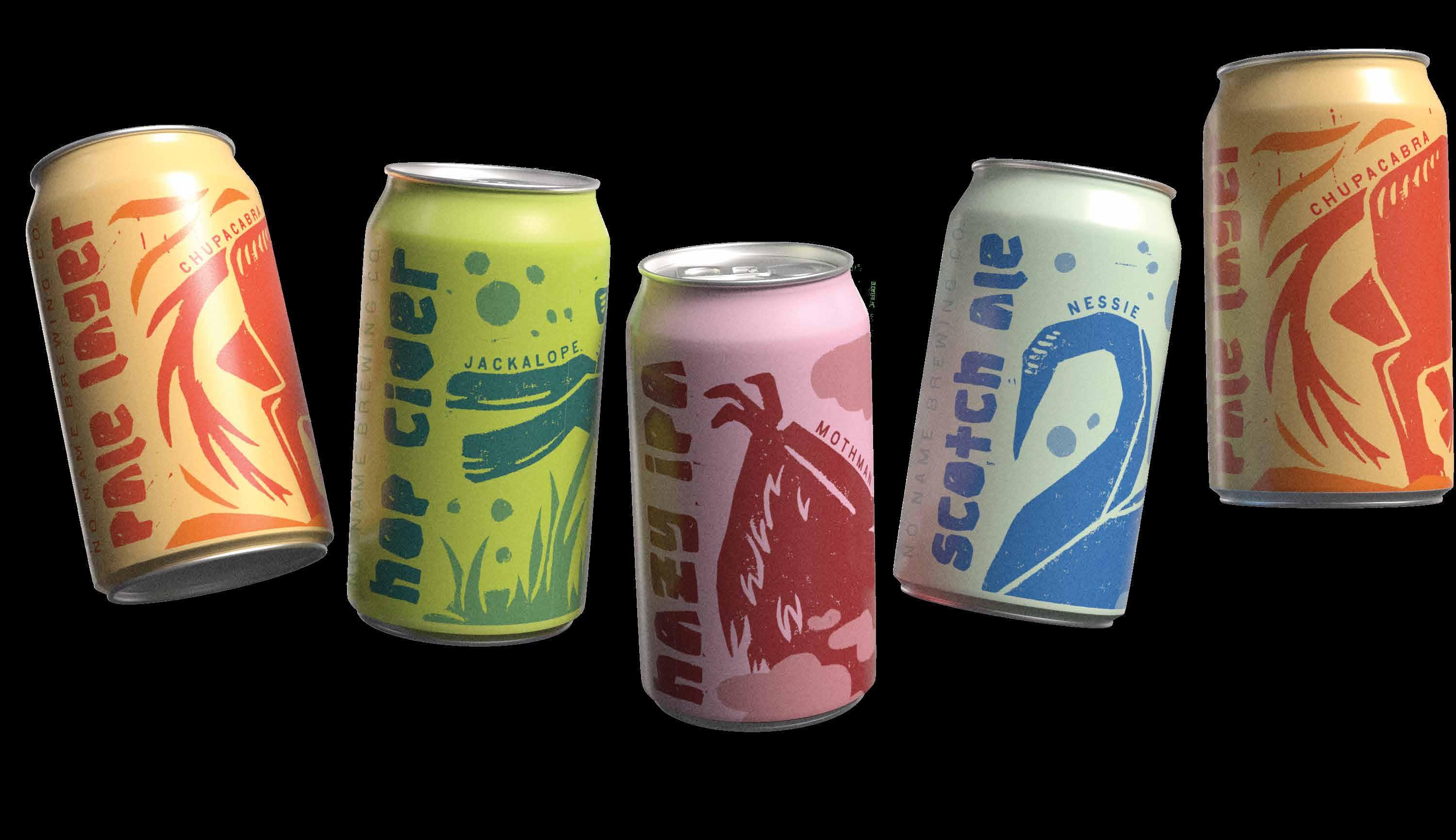
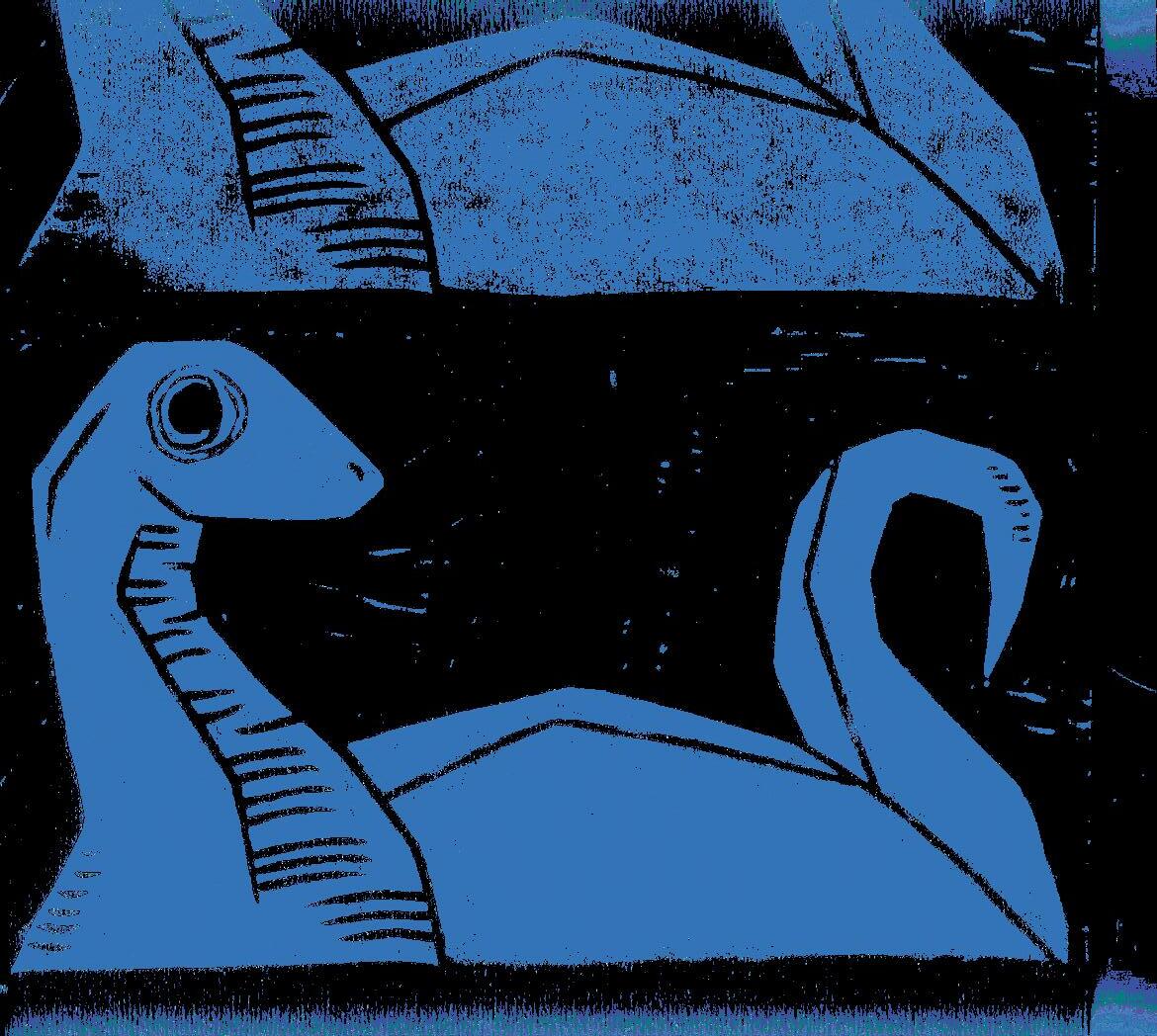
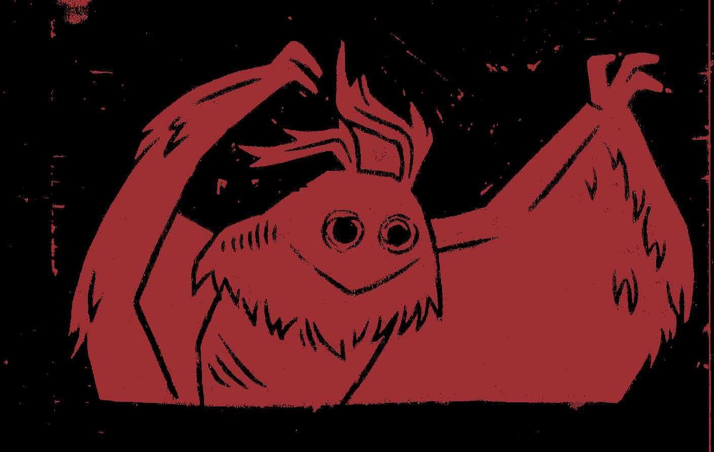
nessie was the first can designed, setting the tone for the rest of the pack. her blue hues reflect her underwater loch ness home in scotland - fitting for a scotch ale.
primary: #3373b7 secondary: #d0e5cf
tertiary: #7ba5c2
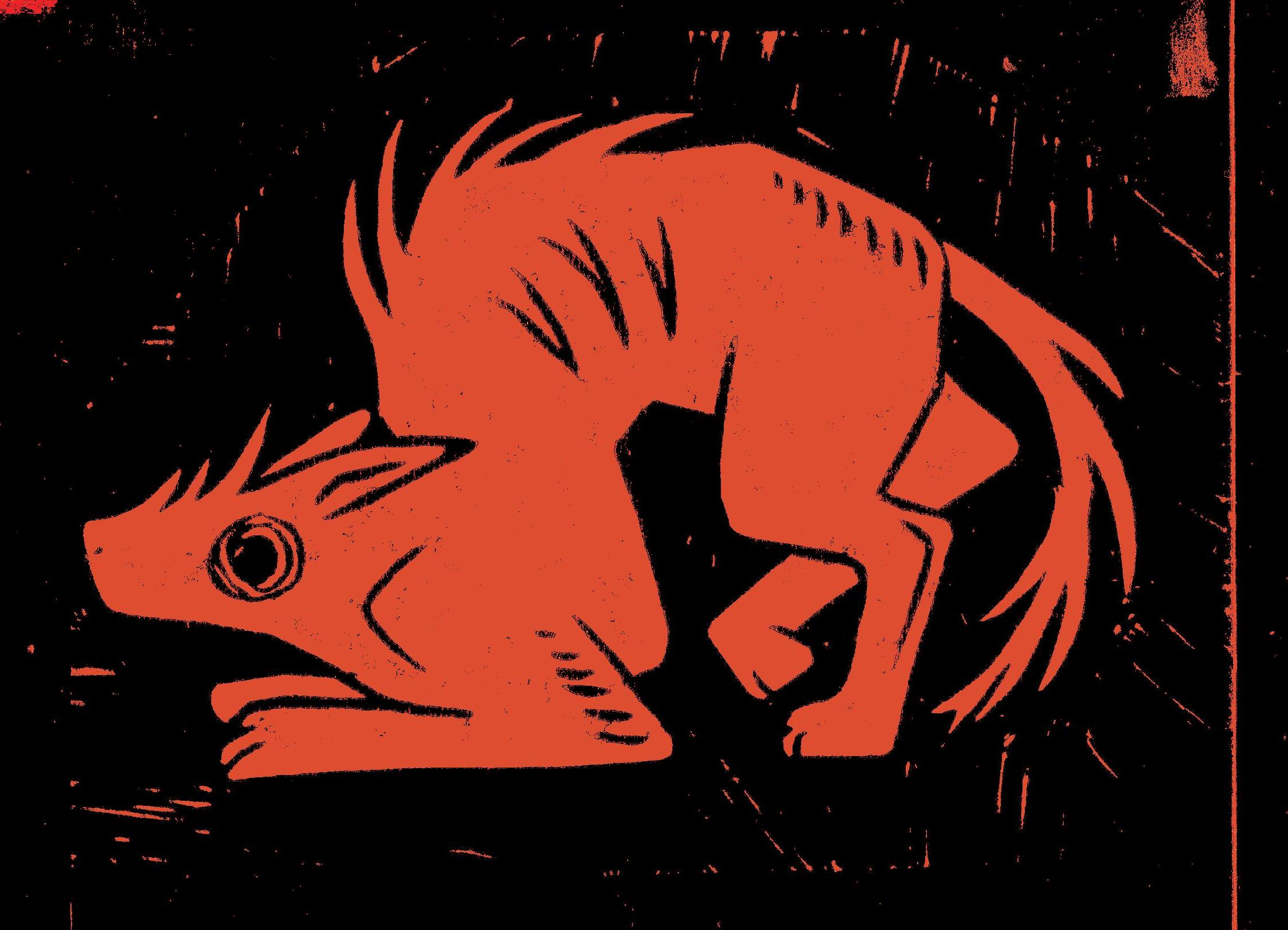
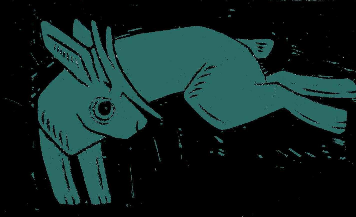
jackalope’s greens echo the grasslands he calls home. this cider is just as hoppy as the animal itself.
clear area defined by unit of n
clear area defined by unit of n
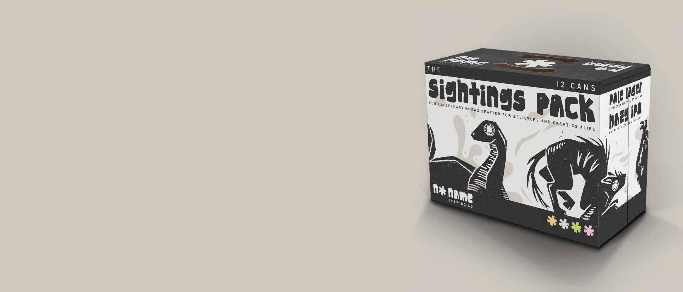
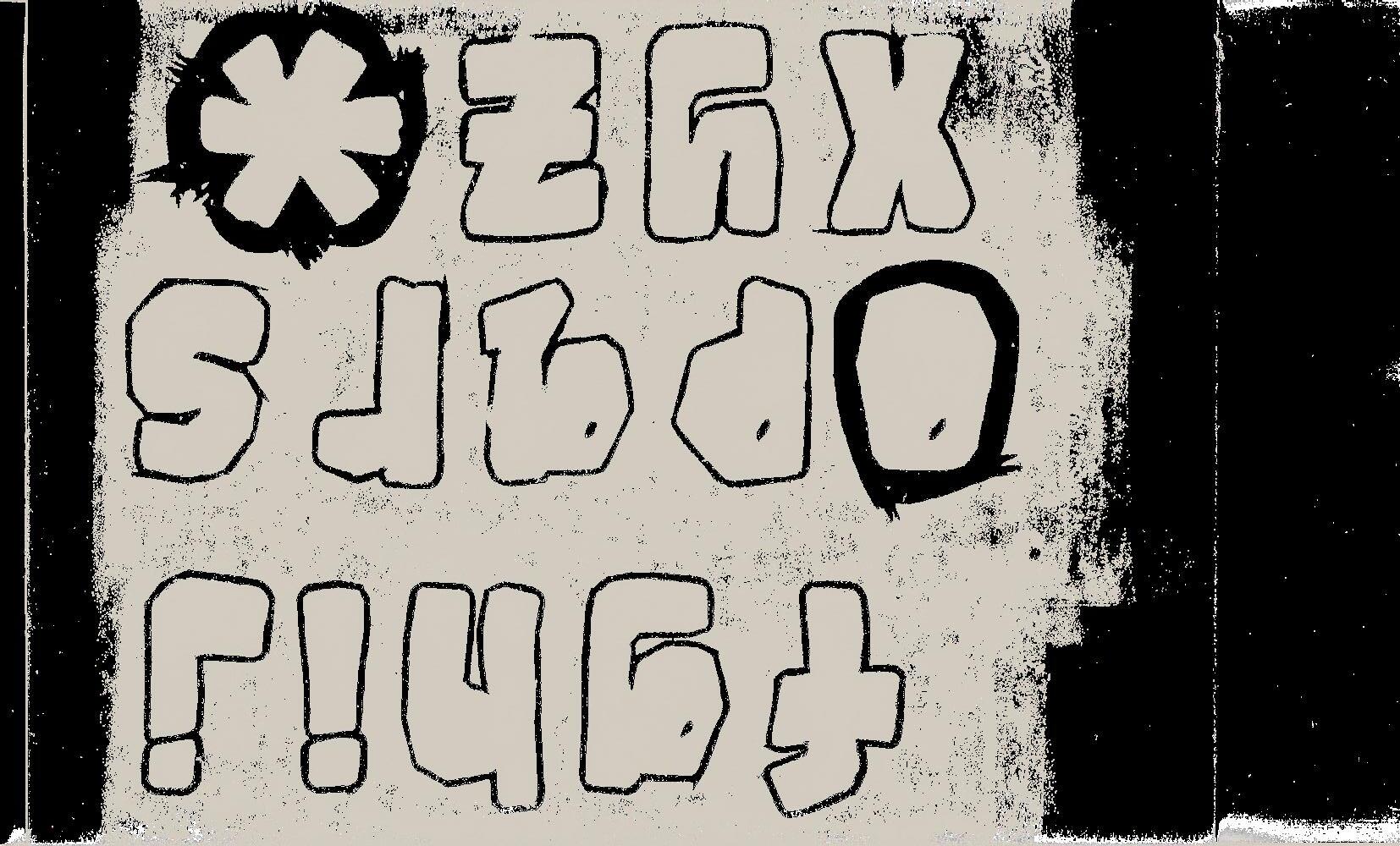
the asterisk is no name brewing company’s most iconic mark - a symbol that says everything without saying a word. we stamp it f***ing everywhere. on the cans, on the box, in the fine print. it’s not just decoration, it’s our placeholder. when you see an asterisk, think of us. think of what it could be.
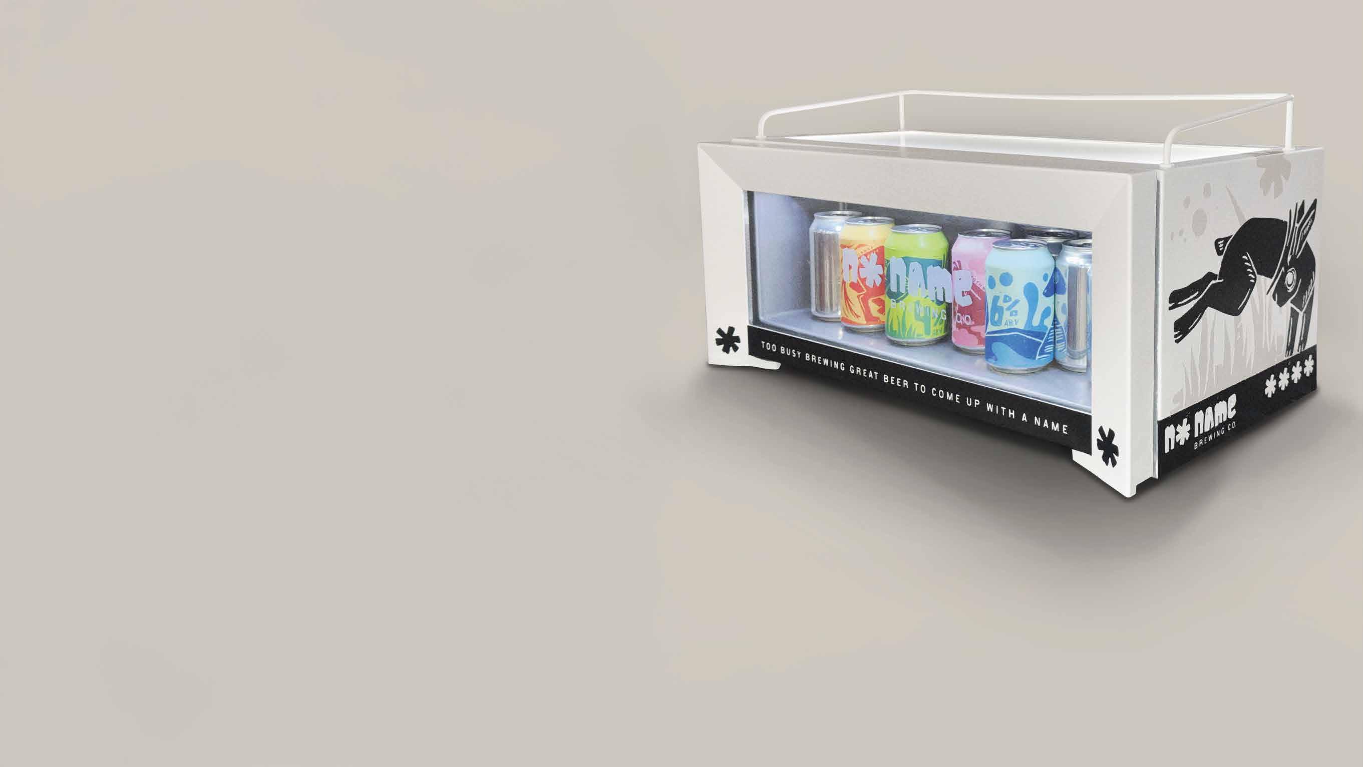
this custom vestfrost countertop fridge doubles as a merchandising tool, ideal for liquor store counters or back bars. echoing the box’s monochrome exterior, it features logos on both sides and the front window.
cu denver college of arts and media and the illustration program
my current and past professors (for teaching me what i needed to know to complete this project and always responding to my frantic emails begging for feedback)
my supervisors, coworkers, and clients (for teaching me how to be a creative professional)
my peers in illustration and design (for all the inspiration and critique)
my laptop (for successfully running illustrator, photoshop, indesign, dimension, and safari all at once without bursting into flames)
redline contemporary art (for partnering with cu denver’s college of arts and media to exhibit this project)
too busy brewing great beer to come up with a name.