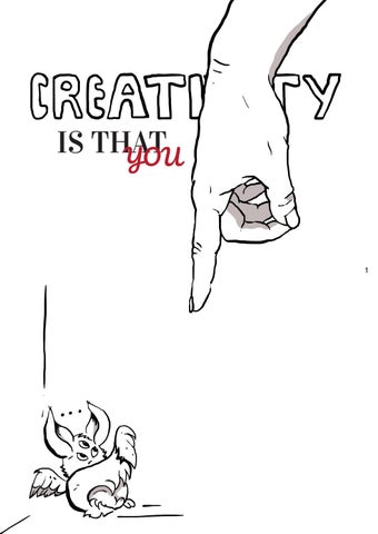
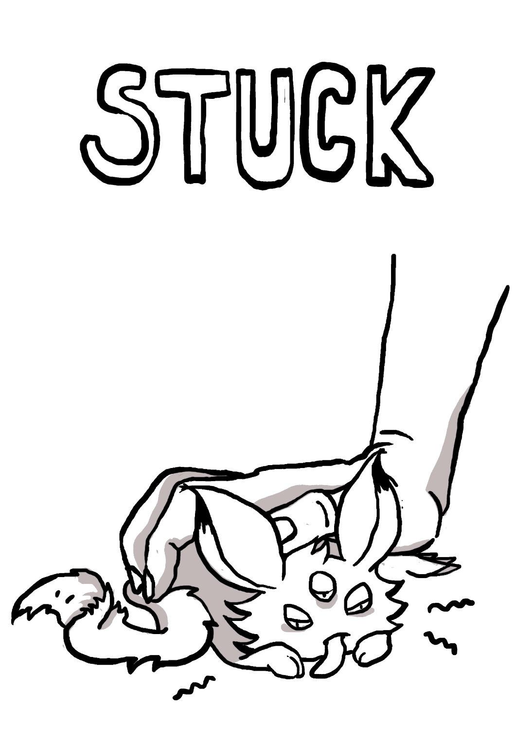
IS THATYOU
First eddition
Long thinking
Hours of redoing
Not sure if ever finished
or why do you see what you see and will see ...see you will see things...
Be patient, I have things to explain. Since this is not just A portfolio but a BOOKfolio I would like to specify why is it called this way and thus you will understand me and my style.
I will be fast, I promise. So you will see the best of my projects (or the ones I am most sentimental about, don’t judge me, we all have something we are proud of and others do not appreciate). You might be my future employer or a friend comparing their folio, it doesn’t matter just know that I have put my very best and great heart in every project, every line or dot, every cut I have made and I love what you will see (most of it) and I always seek to perfect my work. Do not look to find a style, uni is not a place where I could embrace ‘me’, long story...
Yes, your eyes might burn from colours and shapes but if you open Pinterest, eh, you can find tons of grids, similar minimalistic, plain, clean, simple, rectangular, three-colours-based designs that are trendy, nice looking and yet if I have to personalize my portfolio, I will choose to avoid those trends and try to be different.
Why a BOOKfolio? Because you are already reading about me and you will keep doing it (in case you are interested in my CV, etc.) and it won’t be only pictures - we no children, we read.
And so, welcome to my colourful and messy brain and try not to get sick.
15% 15% 20%
20%
when i am outside while sleeping under the shower while training when i close my laptop
when i call it
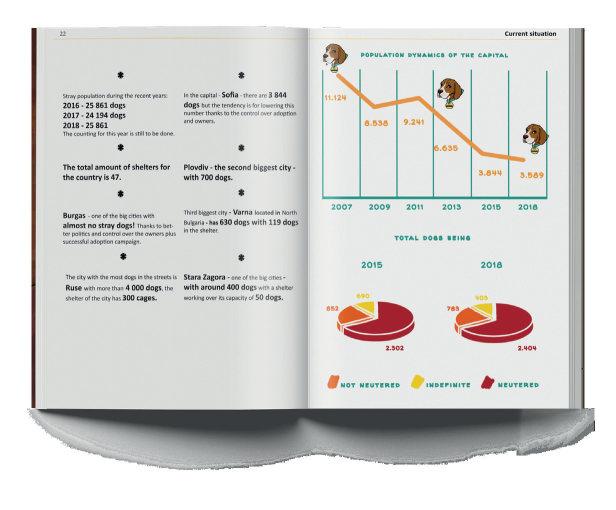
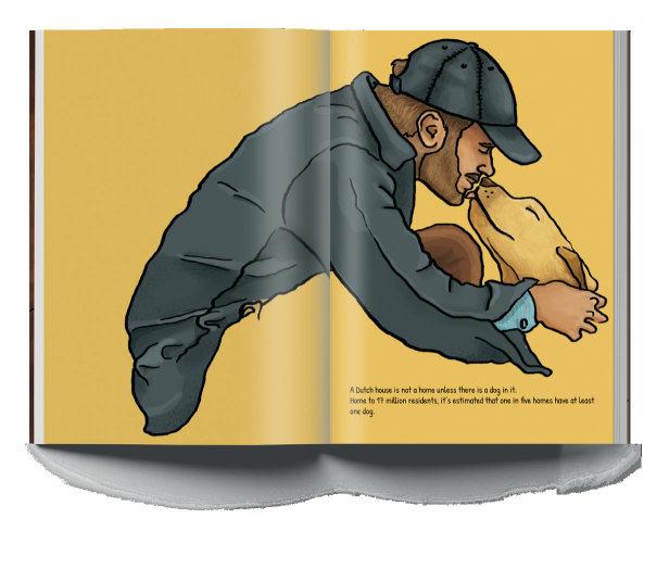
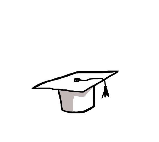
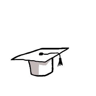
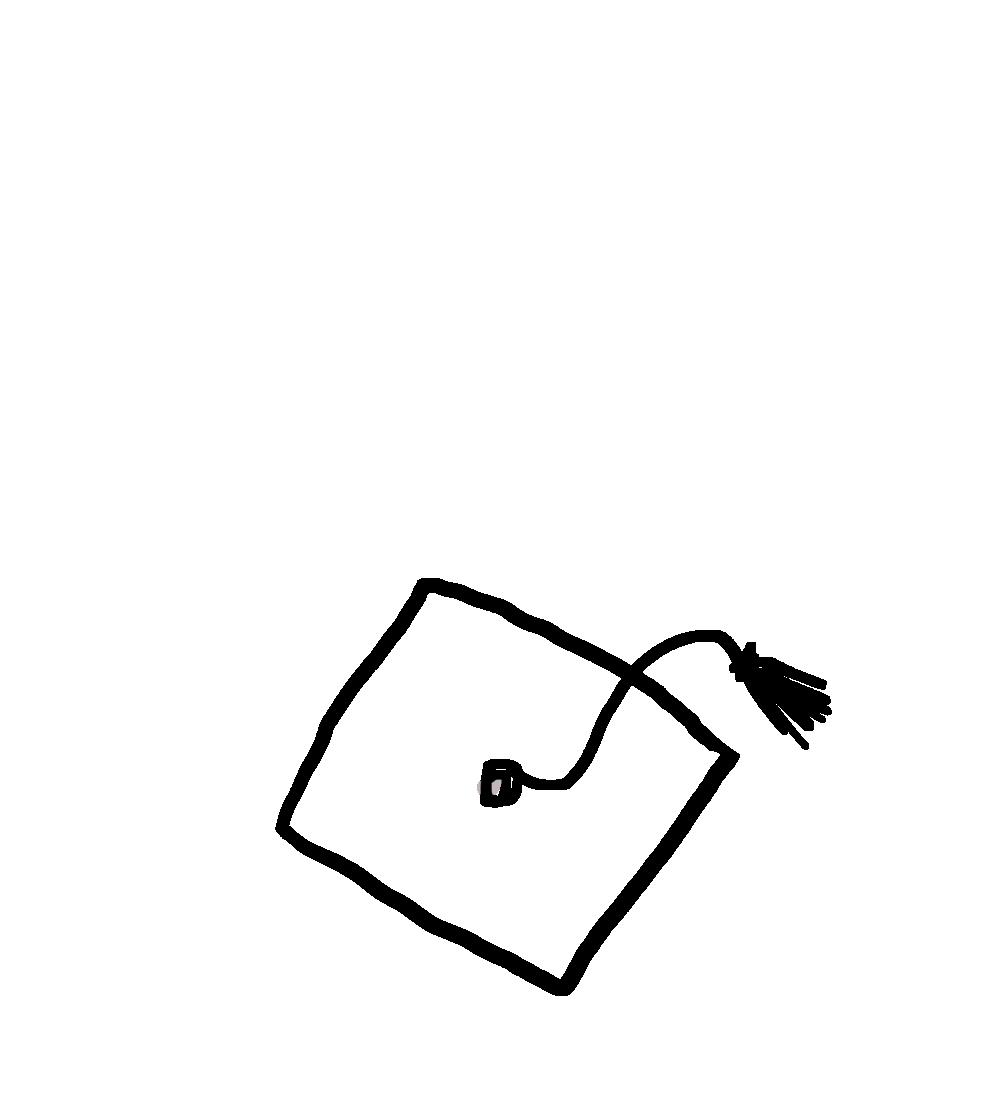
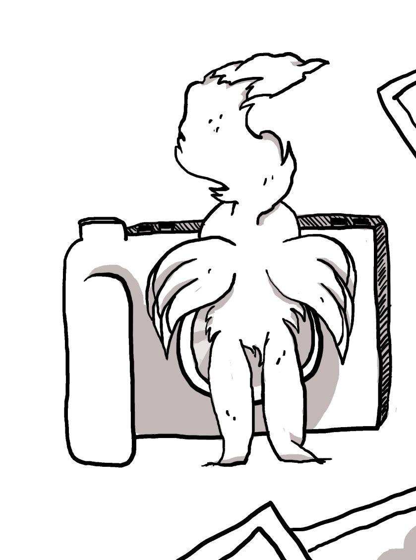
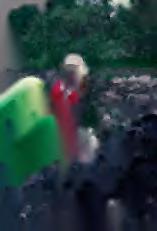
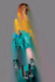
This is me holding my thesis project which was called ‘No Stray Bulgaria’ and in it, I was focusing on the problem with the stray dogs and how eventually people can help to solve it.
I presented in 45 mins while we were supposed to only occupy third of that time. Yet I got 110/110 and made my thesis teacher proud.
This is why I allow myself staring smiling from this page (because it is an actual proof of me graduating because I will not receive my diploma until a year and a half later since this is the Italian way).
This is the single moment that I was sure I can conquer the world and everything is possible, bright and optimistic. I still believe it but I am ready for all kinds of disappointment now, feeling grown up a little bit more than then.
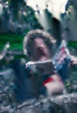
happily graduated
in italy we graduate with flower crowns
I am thinking, I am planning, We will see...
Level of knowledge:
Level of usage:
Level of knowledge:
Level of usage:
Level of knowledge:
Level of usage:
Level of knowledge:
Level of usage:
Level of knowledge:
Level of usage:
Level of knowledge:
Level of usage:
Level of knowledge: Level of usage:
Level of knowledge:
Level of usage:
Level of knowledge:
Level of usage:
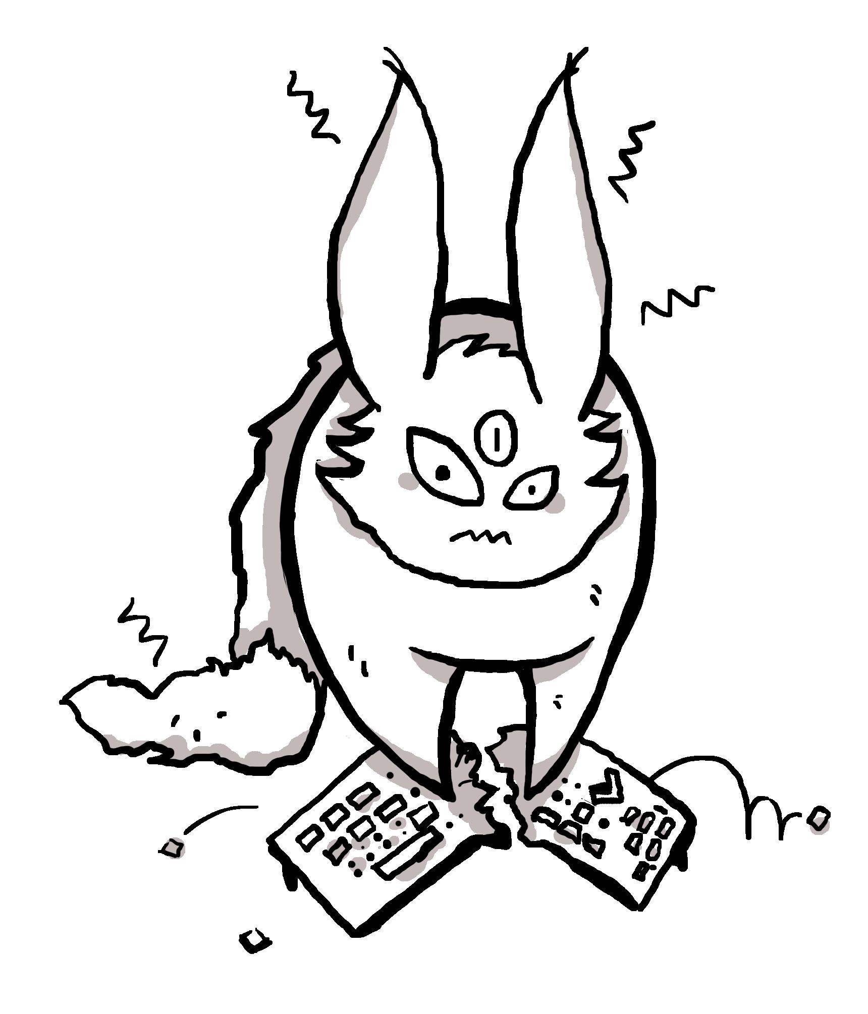
The urge of breaking the hardware when my own software does not work properly... Well sometimes that s****d file just makes my Ps crash and I just don’t know why... It is just dots per inch and they are only 300, tell me why? WHY?
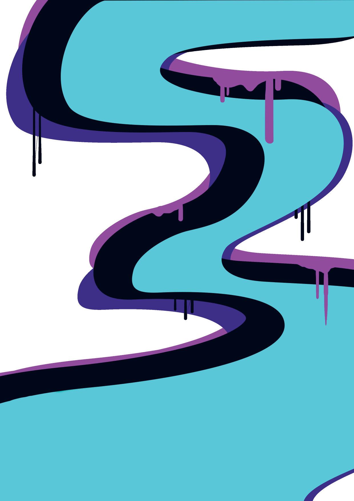
Digital illustration
Fashion illustration
Illustration course 2nd year
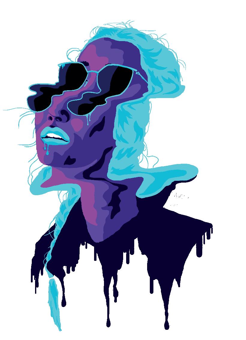
Digital illustration
Simplified portraits
Illustration course 2nd year
Digital illustration
Simplified portraits
Illustration course 2nd year
Digital illustration
Fashion illustration
Illustration course 2nd year
Digital illustration
Simplified portraits
Illustration course 2nd year
Digital illustration
Cut or Liquified
Individual project

you know what is it time for
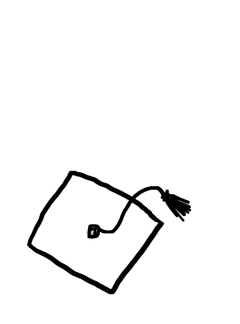
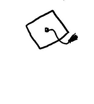
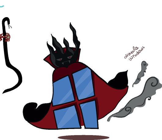
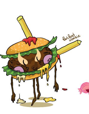
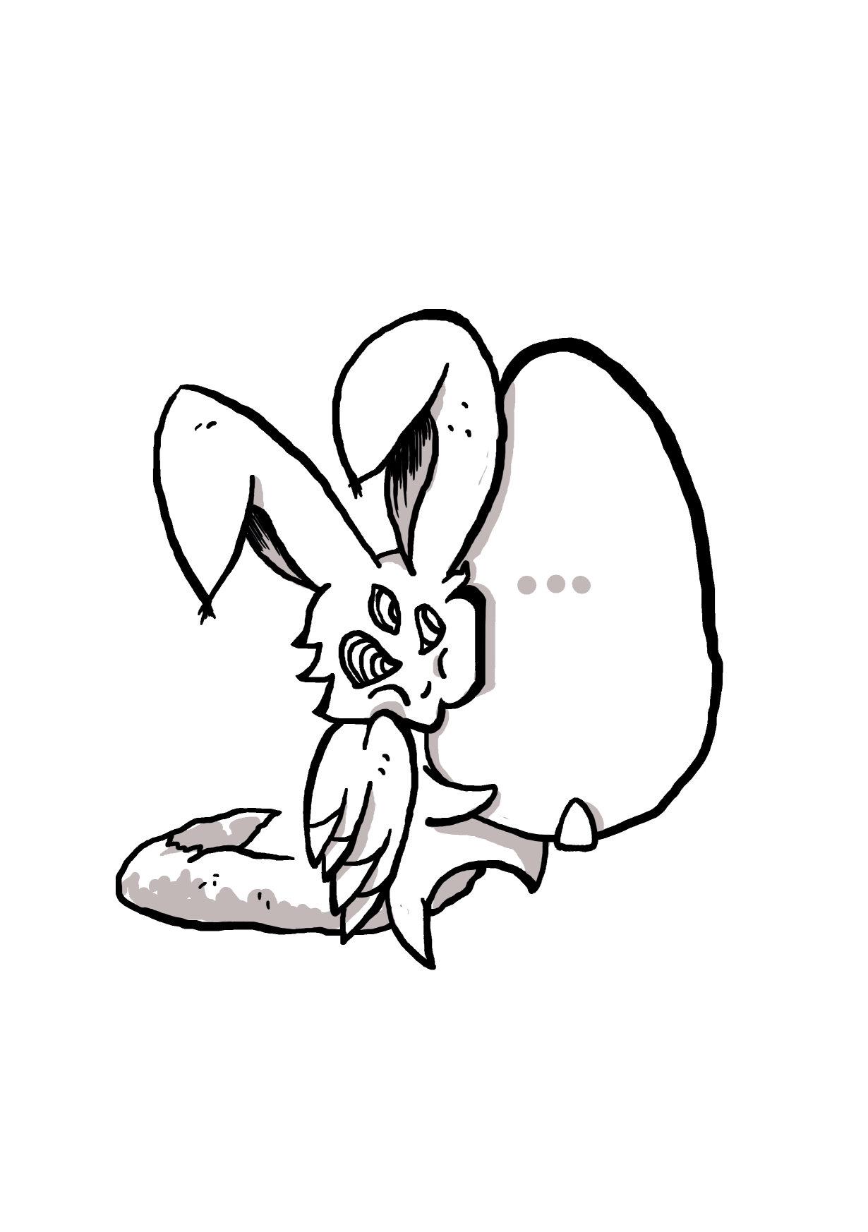
The booklet ‘My fears’ is the result of the project of the Layout class during the third year. The task was to create fictional characters related to us if possible. To illustrate them and incorporate them into something meaningful.
As a foreign student, my desire to represent the culture of my country to the others was always my top idea. At first, I wanted to draw characters which are taken from the folklore and since the stories about them are only passed through the generations by mouth each one of us has their visualization in their mind. But after a talk with my teacher, we decided it is better to move the subject into a more personal direction.
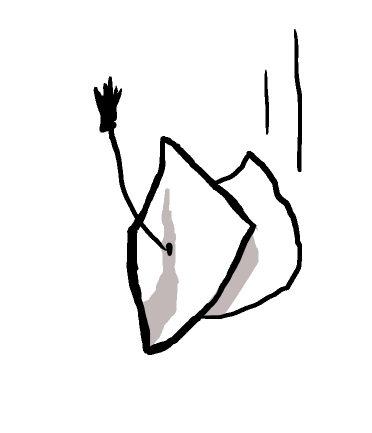
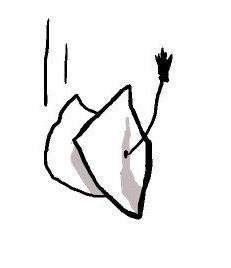
Then the new idea was born. There was nothing better than representing my fears. In my everyday life, there are multiple occasions in which the ice-cold sweat runs down my back in a panic attack. Those little things that make me freeze and doubt myself, pray for luck and cry when the chances have turned a cold shoulder. This is how I made a list of those moments and created my characters:
3 year
This is a nightmare for all of us. Those hours we spend in front of the screens have turned my laptop to a vampire who drinks my eyes. It is called ‘Windows’ because I am a PC user.
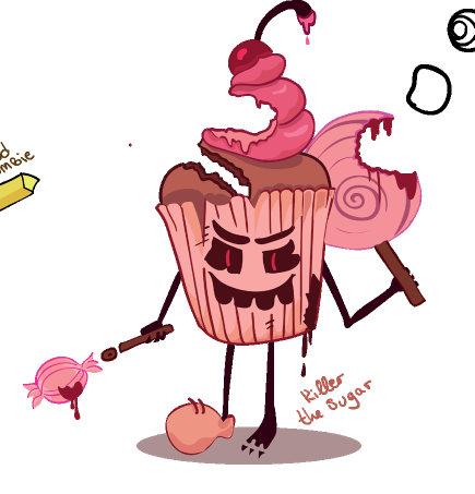
Not really a deeply personal problem but one some may relate to. I started living on my own and thus I became very disorganized when it comes to my meal schedule. And with no parents around a bowl of ice cream, cereal and marshmallow sounded like a satisfying dinner. Until it turned into a daily routine. Then the quantity of sugar became a threat like a killer...
I only said it will be once or twice... it became hundred once and hundred twice and having in mind how negative outcome it has... I imagined myself inside as a zombie. Even more, the desire for the hamburger never dies, it lives forever no matter how strictly I promised myself I will start eating healthy...from yesterday.
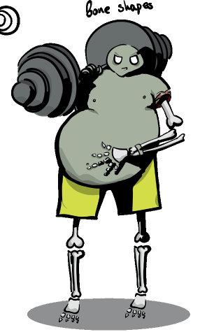
This is a bit hard to explain. Being a girl with shapes I am unhappy with my body most of the time. On the other hand, the skinny looking models are also disliked as they are lacking shapes and I have to find the balance between being fit and ok with my shapes but not thin. And how do I do that if my bones are heavy and fat?
For me, the most interesting was deciding on what surroundings I will include them. Where would I place them, what will I turn them into? The answer - Tarot cards. Why? Because I definitely imagined an old lady holding the Lone Chaser and foretell a future sucked in loneliness.
Unfortunately, during the year I did not have time to turn them into real tarot cards by drawing the back and printing them but I had fun representing my life into characters. There were more of them such as the Electricity Devilyou know, when the electricity stops or someone extorts the cable from the power and your computer just dies before you can save... this is pure evil. Maybe one day I will create a full deck of cards with different fears, one day maybe.
The university dream - friends, travel, fun is not always so pink and sweet, sometimes it is blue and bitter - not so many friends, even fewer real, not enough time and money to travel and not so much fun because of the lack of the first two. And there were hours when the loneliness came uninvited and sat quietly next to me. Started visiting more often until she chased me in my dreams on horseback like we were in the old wild west.
The hand-writing of the book explanations is on purpose because I wanted it to be more personal like I wrote it myself. Kind of gave the hand-crafted feeling by cheating and using a font and yet it worked well with my vision.
3 year
by me only
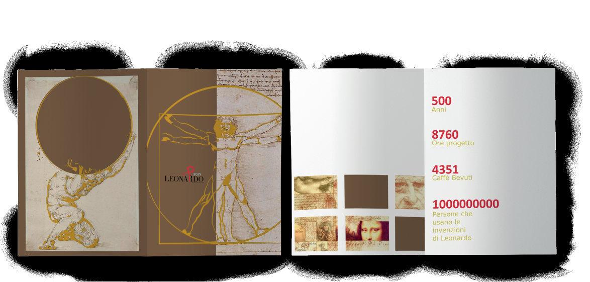
‘Celebrando Leonardo’ is in the honour of the 500 anniversary since the death of Leonardo Da Vinci.
Our task was to create a booklet with given images and information.
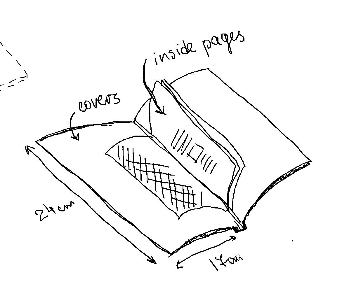
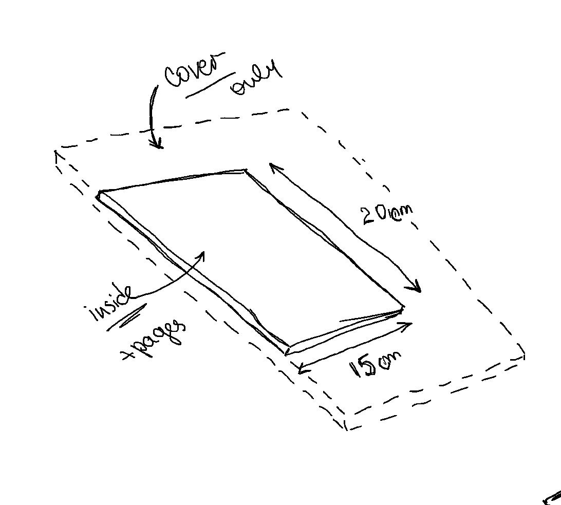
It was during the printing technique class last year where we were learning about the different types of printing effects. We had to choose and apply an effect on our project. Specify the type of paper and calculate how many sheets would be needed if it was for real printing.
For my project, I decided to divide the interior from the covers. Choosing different size and paper for both. The covers were bigger with heavier paper while the inside pages were less thick and smaller in size. On the covers, I wanted the yellow illustration and the red logo to be embossed and with hot foil. Because I knew this will affect the smoothness of the page, on the other side I put information and images which according to me wouldn’t be ruined by the embossing effect.
The final result in my mind looked well and interesting. I goal was to be different and intriguing because many people do not really spend much time reading the long brochures and throw them away. My focus was to make them preserve the booklet.
The task included also designs for T-shirts. I chose to recreate in vectors the most famous pieces from Leonardo because they are easily recognisable. I turned Mona Lisa upside down as a provocation for people to not only see but look and think. Even more, Da Vinci has been not just any artist but scientist, a man of knowledge and mechanics has been part of his art as well. So I decided to put a mechanic piece in the head of Mona Lisa to further stimulate the observer. We have seen Mona Lisa many times but have we seen her upside down?
‘MyMilano’ is my favourite project by far, like ever. This is like giving a person complete freedom but worst, a designer being set free is a powerful and yet dangerous thing - we go to extremes, well, maybe not all of us but me ( and other people I know ). We all have something we love writing and designing about and this was the deal here.
The project was given to us during our first year at uni and the teacher told us: ‘Having in mind you, guys, are all foreigners, show me what is
Milan for you? How you see it?’ So this is what I was waiting for: Italy is love, laugh, eat and gelato! For me, Milano was the place with the biggest number of gelaterias - places where they make and sell ice cream, and I was in heaven. Never have I known I love ice cream so much and here I understood what the city was for me - a never-ending variety of flavours. Not only had I have favourite flavours, but I had preferable places already. I could recommend and suggest places according to personal taste and time range. So, my idea was to create a guide for travellers for ice cream. All the places with their pros and cons, for people who insist on the taste and quality, for those who are looking for the insta spot and for those who wonder every time when they
stand in front of the gelato window what to get. I have mentioned the crowds and the best time to go, the location and the brand. All in one little A5 booklet.
In the design, I have used hand-drawings, illustrations and images. I have tried to make it as personal as possible. What was most difficult for me was not to go over the acceptable and become kitsch.
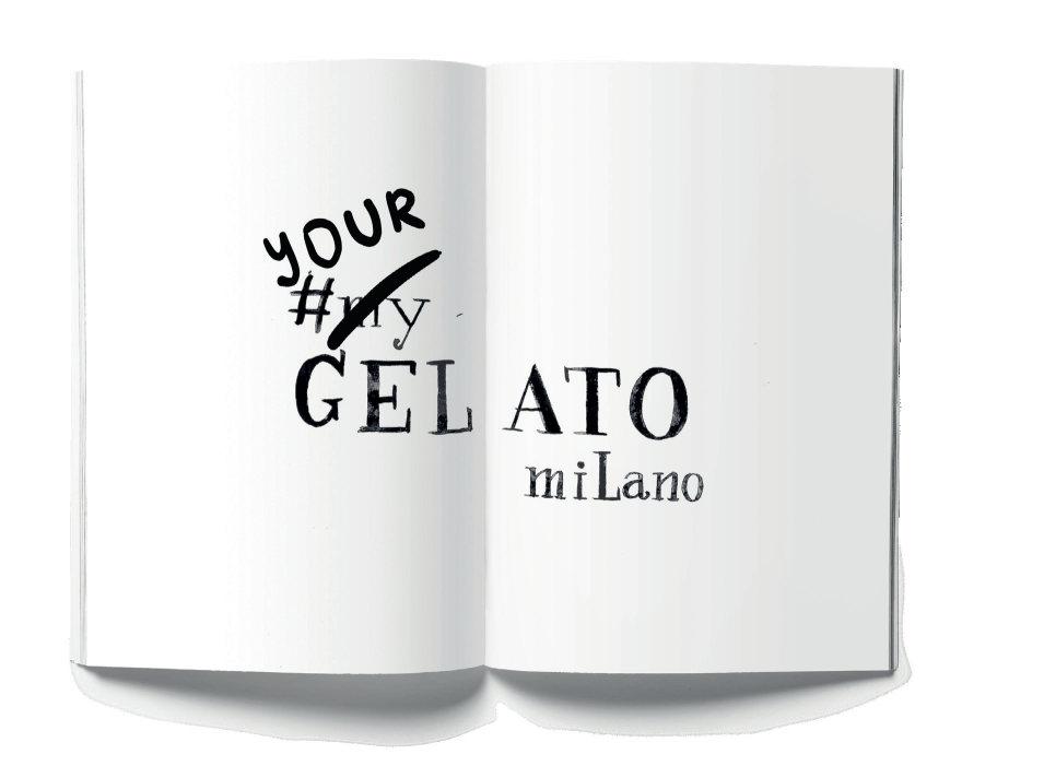
The title I decided to give to my project was ‘My Gelato Milano’ which I decided to put after a hashtag because my recommendations were directly related to the social media since most of the people in our time are looking for an instagrammable places. Also, the places have their own social media where people could double-check and because I was imagining turning the book into a blog where people can share their gelato stories and this way creating a community.
The teacher set a list of obligatory pages we had to include such as a map, content, directory. For me, it was a bit difficult to decide how to divide the city but then I chose to stick to the local districts but combined some of them and enlarged the areas in order to end up with a fewer number of fields.
Before giving the recommendations, I thought it would be nice to explain to the reader the components of the gelato - the ice cream and the cone and what they are made of. The ingredients they include and use to prepare gelato are thought to be a secret which is passed from generation to generation and thus the Italian ice cream is very different from the rest. For example, a real gelato could never be scooped into a ball.
People can easily see the difference between normal ice cream and gelato when it is served. Then the variety of tastes is another strength of the Italian gelato - they can make gelato from anything. Some of the places which I believe are not so famous and picture-perfect I have mentioned by stressing the quality of the ice cream. While the big commercial brands which usually have the perfect set for pics are lacking the abundance.
The directory was really important since I was restricted in space. The size of the booklet was A5 and it was impossible sometimes to include all the details such as the address of all the local gelato shops a brand may have. So the directory solved this problem.
In the end, the booklet ends up with the message: ‘YourGelatoMilano’ which is a call to action for those enthusiasts who are passionate to travel and try. For them to go out and maybe find some places that have not been included. To create their list of favourite gelateria-s.
‘Sensus’ is a project for which I have mixed feelings. It was the most difficult project I have ever made because it was a group project. People say: ‘do not work with your best friend’. I believed we would do great things but a team of two was not considered a group so we had to take in someone else too. And the problems started.
Our task was to create in a group a digital magazine or portal, website or blog with text, images and design all by us. The interesting thing was that it should not exist already. The teacher gave us several suggestions we could choose from and the one my group picked was ‘Sensus’. Its goal was to stimulate the senses of the reader. After the digital project was done, we had to individually turn it to a printed magazine. I choose to present to you the
printed version because with my group I had disastrous problems and misunderstandings. Happily, my printed magazine turned well.
As a team, we chose to divide each chapter according to its sense: vision, hear, touch, smell, taste, but relate this sense to an equal feeling: disgust, fear, sadness, happiness, etc. The mood was inky because it was inspired by the dark room experience: in a black-covered room, a person forces his all senses to work together. Plus, for each feeling, there was a specific colour chosen which was in good contrast with the black background. The sense of seeing was related to the feeling of disgust which took the yellow colour. The sense of hearing was connected to the feeling of fear which took the red colour and the sense of touching was
bonded with sadness which took the purple shade. All the stories were related to feeling and sense.
The first sense is vision. It connects with the feeling of disgust. The story is about a woman who is working on the case of a brutal murder. The house and the bodies are described with many details. The clues she goes through are repellent so as the reader follows the story, not fear but repulsion takes over them. The chosen colour is yellow and all the illustrations are only yellow. In my work, I love combining pictures with illustrations overlapping each other because I believe it makes the content more expressive.
The eyes are an important element of the story. There are several more eyes spread around the text to irritate the reader. Also, some elements break the lines. Many words are repeated following the shapes of the images and are coloured in yellow to act as part of the visual content, there are highlighted quotes also yellow. This is not to annoy the reader but to distract from the story as it may become too much with all the nasty narrative. And even more, I like playing with words so for me it was interesting to see how I can use the letters.
Another article covers the sense of hearing and the feeling of fear. While we were working on the digital version it was easier for us to introduce the provocation of the sense with multiple sounds recorded on the background of the text. And while the person scrolls or accidentally presses a transparent active area a scary sound is played. We recorded the sounds and took the pictures by ourselves for the whole magazine. The noises were usually inspired by horror movies such as opening a door, breaking glass, knockingthey were all connected to this specific story. There were less visual images since the sense of seeing was not of great importance. Thus the red colour matches the idea very well - it is not in such good contrast as the yellow and brings the scary mood.
Again I have drawn directly on top of the images to give hints to the reader for the topic of the story. There are quotes and sentences, words coloured in red to attract the attention of the reader and break the flow but there is less messing up with the words.
The magazine was supposed to have at least two articles, one advertorial, content page and covers. So the advertorial I have designed in the mood of the rest of the articles. Since the advertorial is not just and advertising but something deeper and more complicated my idea was to create it as another story of the issue.
The chosen brand was Heineken and so the narrative was about an accident caused by drinking. The product of the attention was the new 0% beer. Because of the brand, I chose for a complimentary colour the dark green shade. The design of the page was close to the rest. The idea was to hide the product and to make the reader understand its value, to realise the necessity of such a product, to believe in the good of choosing it. To persuade the consumer by telling them a story they can recognize themselves or a friend and carry the message longer.
3 year
by me onlyp s
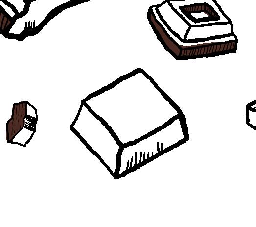
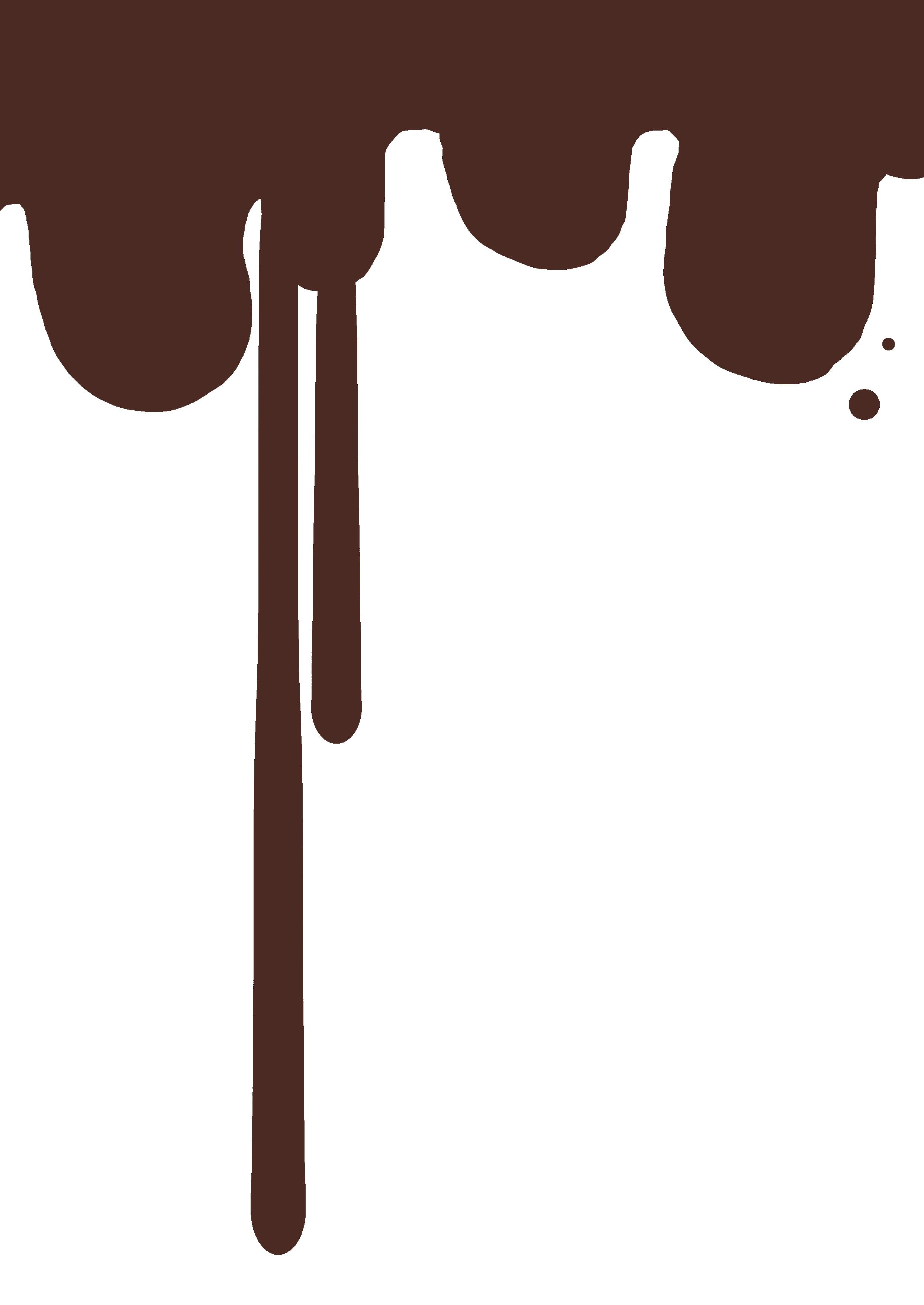
THE TASK : Create packaging for Easter eggs for the Italian brand Venchi for the 2 types of eggs: milk chocolate and a dark chocolate one.
MY IDEA: I was thinking about the process of creating the final chocolate product from its very beginning - from the bean to the liquid-smooth chocolate. In my imagination, there was the vision of a specialist chocolate maker and how precisely they work in order to achieve the final perfect look. So for me, this person had something magical, mysterious... For me, it became the fairy of chocolate. Based on that I created two characters for the two different packaging suggestions: one based on the magic of milk and chocolate and one dedicated to the pure dark chocolate egg created from the beans.
DESIGN: The wrapping paper was supposed to be a square and so I decided that for my design it will be better if they rotate the paper and use it as a rhombus. This way on the bottom I created the splash of milk or dark chocolate and on the top-the fairy.
WHY: Because I was thinking that Easter is a very magical holiday. So my idea for a campaign tag line was: ‘For a fairy Easter’.
Milk chocolate egg wrap
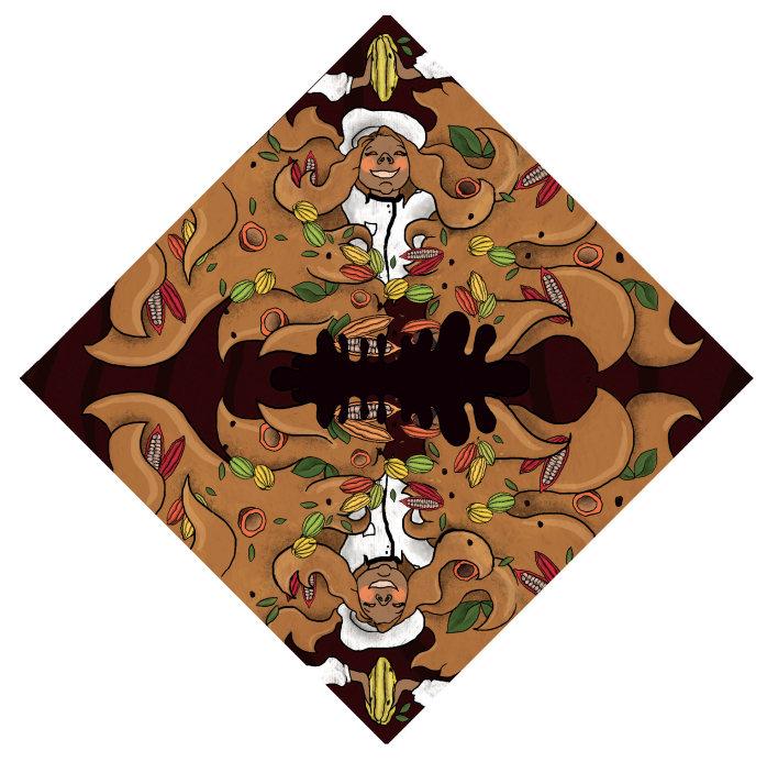
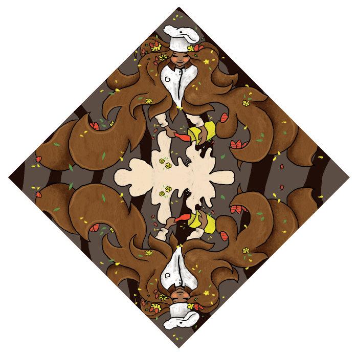
Dark chocolate egg wrap
3 year
by me onlyp s
THE TASK : Suggest single page advertising for a magazine.
THE TASK
for the two themes: Italian and Oriental-inspired designs. It should connect to the origin of cold tea and brand history. Two suggestions for each theme: for the peach flavour and for the lemon flavour. Design the sleek can packaging without changing the main features of the already existing design standards.
GROUP:
to the target are the pop-culture, the bright colours, the popup style of Art. So we took the decision to base our project on strong-contrasting pop-up colours. For the Italian theme, we agreed it will be interesting to connect to the old masters in Art and sculpture. For better organization, we decided to split the work so half the group was working on the Italian theme and I was focusing on the Oriental design. My responsibility was to find a concept and to develop it visually according to the decid ed elements.
MY IDEA:
East culture and common elements in their beliefs. According to the East nations, each year belongs to a different animal. For the two of these animals are the dog and the dragon. On the other hand, in front of the temples are placed statues of dragons or lion-dogs as they are thought to be guardians of the temples. My conclusion was that these two animals are import ant for the oriental culture and can be used to represent the

two flavours. The dragon is related to the red colour, hot, sun - which reminded me of the flavour of the peach.
The lion is connected to yellow, south, strength - for me that connected with the strong flavour of the lemon since it always creates the association of southern origin. In this way, my solution belonged to the aim of using different art forms such as sculptures.
MY PART: Researching, gathering and putting all the elements of the Oriental design together. Illustrating the final design for the sleek can for both flavours: peach and lemon. Creating a display for the two cans.
 Peach design Dragon left-facing in order to match the lemon can when displayed on a shelf.
Lemon design Lion looking right so it can face the dragon when placed in store.
Peach design Dragon left-facing in order to match the lemon can when displayed on a shelf.
Lemon design Lion looking right so it can face the dragon when placed in store.
The sleek design was created by using Ps and Ai, while the can was created in Cinema 4D. After which the design was imported onto the can inside the 3d program and rendered. All by myself. The design is preserving the standards of the original sleek given by the brand.
1 year by me only -
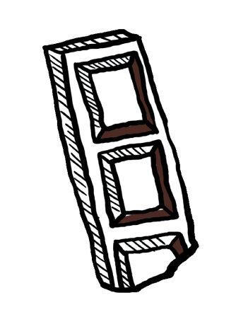
THE TASK : Create chocolate bar packaging for the Italian brand Vanini for four flavours of our choice.
MY IDEA: This project was given to us during the first year in university and the teacher insisted on using patterns. My wish was to create the pattern with the ingredients of the flavour. So I created the vector patterns and applied them on the packaging.
 by me
by me
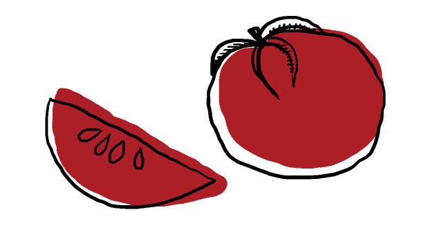
THE TASK : The well-known Italian brand Mutti is launching a new line of tomato products. A sub-brand with a different name which we needed to decide on. Create the logo and the packaging of the new tomato juice. After deep research on the brand and its competitors, give three suggestions: innovative proposal, middle and tradition proposals.
MY IDEA: For the logo, I was strictly applying the rules of the original Mutti logo because I believed that the customer will trust the new brand more if they know where it belongs. Mutti is a leader on the Italian market and launching a brand which competes on the market and seems to be unfamiliar to the user might lose the trust and the willingness of the customer to buy the product. Furthermore, Mutti is a brand with history and traditions and I believed it is good to represent their heritage in the new logo as well. The name came from the sentence: juice from Italian tomatoes which in short was JITTO.
DESIGN: About the labels I had separate visions for each one of them:
- for the traditional, I was inspired by the labels of the brand products, took the important elements and transformed them into the new conventional label;
- for the middle proposal, I chose to preserve the visuals of the ingredients but to simplify the label, make it transparent and more sophisticated;
- the new proposal is completely different from anything Mutti has done before. It is only illustrations and text. The label follows the shape of the bottle, which is also very different from what they offer;
The bottles I have created in Cinema 4D and rendered by myself. The research on the brand included the brand history and values, their competitors, target and brand identity. In the end, the question was which one would we choose and personally, I preferred the middle proposal since I think it will be easier to become a leading product on the market.
THE TASK : D1 Milano is an international brand for wristwatches and has a great variety of designs. They were launching two new collections on the market and gave us the job to create the packaging that was about to contain the watch. The idea of the brand was to make the user keep the box. The teams could choose to work only on one of the collections or both. Except for the box the team was supposed to design the manual, the warranty card and have in mind that the watch is placed in a cushion and the box needs to have the space for the tools which come with the watch. The second line of products was called ‘PolyCarbon’ and was supposed to be inspired by the new young generation. The two lines were very different from each other and the boxes were supposed to reflect this.
GROUP: Me and my group decided to work on both lines and customise the box design according to the line. We started from the box design. The question was: why people don’t keep the box? What happens with the watch and all the parts from the box if they throw it away? Every person has a place where they keep the everyday objects ready for wearing. Usually, this ‘storage’ place might be messy and there is a danger for the watch to get damaged. Sometimes in a rush, they take it off and leave it on a surface where it may fall. Our conclusion was that the customer does not keep the box, because it takes a lot to reuse it and put back the watch inside. So we wanted to create a piece of packaging which would be easy to open and close and the target will be stimulated to place the watch inside when they do not use it. To satisfy their needs, we designed the box to be composed of two compartments: in the first one which is on top and opens up is the watch with its cushion, while the second is underneath it and resembles a drawer where all the additional elements will be stored. We believed that
by making it bigger the client might decide to use the drawer for other small items.
The idea for the general line was to use the landscape of Milan - bring a piece of the city to all the customers around the world and if they gather three boxes they can build the scenery. We used the colours which the brand mostly connects to - black and white. For the black illustrations, we were planning to apply hot foil. In addition, we created a male box since the collection has female and male lines, which was with reversed colours.
The PolyCarbon box was inspired by the glitch culture. The neon theme is very popular on social media and has a strong influence in photography, interior, marketing and advertising. We found about the lenticular printing and decided to make our box with changing shapes by using this process. It is has been used on postcards for example where two images blend and from a different point of view, one of the two pictures is visible. The box was supposed to imitate a glitch.
MY PART: My presence in the project was from the beginning until the end. I was mostly responsible for the 3D design and rendering, I took part in the design of the warranty cards and manual, did all the last minute changes, worked on gathering the information about values, target, goals, moodboards, sketches - everything needed in a presentation, then putting all the elements together and presenting the final outcome. I have taken part in every single step of the work, helped with the illustrations and mostly calculated the actual size of the packaging by having in mind the size of the cushion and the other elements, then making a real-life, actual size dummy box. I learnt a lot from that project and I am happy I could work with the brand.
ANOTHER CHAPTER? GOSH...
something big something small something that doesn’t fitt at all
2 year by me onlyp s -
THE TASK : Create a nonexisting product and develop it as a brand. Come up with a brand identity and full strategy for launching.
MY IDEA: I am a person who takes decisions very difficultly. I doublecheck and think twice, trying to find all the pros and cons... So I told myself why not creating glasses which are able to measure the advantages and disadvantages in every situation and gives a recommendation.
How would it work? With an app which is connected to the glasses and where the user creates their avatar. In order to customize the glasses, the user needs to answer a quiz of questions to measure their personality and calculate their preferences. Then the glasses start giving an objective opinion according to the result of the quiz. In the website as well, the user can always check their profile, all the taken decisions, to adjust the preferences.
DESIGN: The idea of the visual elements used in the app and the campaign came from the
unknown symbols in our everyday communication. Sometimes we can not say the differences between two statements as well as we cannot see the difference between to similar at first sight choices. Then to avoid the embarrassment the user should use the product. The advertising is confusing such as a person feels when they have to decide and yet intriguing. When they don’t know, they should use my product - this is the idea of the campaign.

It is when the words touch our souls and we bleed bloodless.
When the darkness fades.
And the object starts to feel.
.
So here my idea was to represent the feelings which one may experience while reading.
Sometimes it might hurt reading what one cannot admit but deeply understands.
In those times one feels the heart squashing and breaking and in those moments one sets their soul free... Free to feel, to let go, to find peace.

Digital illustration individual assaignment inspired by the beauty of the female expressions in happiness


This is a university project for a friend who asked me to design a pop-up store for her project. It was supposed to be airy and light since it was related to her brand image. The brand itself was for furniture design inspired by the simple natural forms.
We imagined it based on wood and glass materials. To fit with her vision which was based on simple and clean lines and shapes, I suggested the store to have the configuration of a hexagon. To imply the idea of lines I decided to put the construction on ‘legs’ - frames - which hold the store in the air creating the illusion that the store is floating.
The windows let a lot more light to come inside and eliminate the need of an additional artificial light inside since the pop-up store was decided to be placed in malls and shopping centres where there is enough light. To avoid the complete exposure of the people inside the windows can be partly covered with advertising printed materials or so.
I liked the task because we as Graphic Designers in uni have never had the opportunity to learn and think of, plan and design anything like this. It was a challenge for me and I am not saying that what I have designed is possible, we have never studied how to build and choose materials according to the building in real life. I am happy that I could use my skills in 3D to help a friend.
The store is designed to create the illusion of a separate universe from what is around. It stands above the ground, persuades people to take the stairs, go up and immerse in the light atmosphere and experience the brand. Separate themselves from the others like they are on a cloud.
When looked from the sides the store will look like it is in the air and it is only holding to the frame. This is important for the mood it creates. When a customer steps inside, the idea is for him to feel like he is above the ground, of course, but like with no hard ground bellow, as they will fall. The concept is to cause the person to feel light, to feel the appreciate the brand value. The construction is based on wood and glass, aiming to relate to the cold, minimal and yet natural feeling of the furniture design. For me, it was important how these materials will go together without noticeable overuse. The idea of the product is to let a lot of light to come in the room, so the feeling inside the pop-up store was supposed to have this perception of illuminated space and thus it has no roof and dark walls stopping the light from the surroundings to penetrate the store.
These pictures were taken during the match between Milan and Frankfurt. The people I was able to shoot describe the enthusiasm of the supporters of the German team. I tried to shoot discreetly and without being noticed, but some of them saw and reacted.
Photography has a wide range of genres. For me, the most interesting is portrait photography. I love capturing emotions, expressions and actions, I like exploring the art of posing and character appearances. So in my style work, you will see
 The Superman of 21st century
The Silent greeting
The Superman of 21st century
The Silent greeting
 Four people shooting one model
inspired by guy bourdin
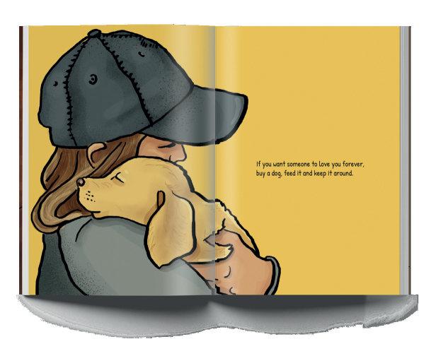
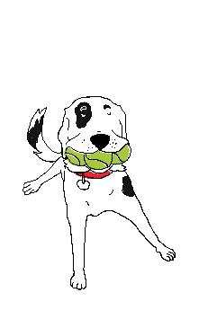
If you want someone to love you forever, buy a dog, feed it and keep it around.
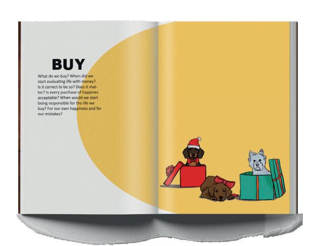
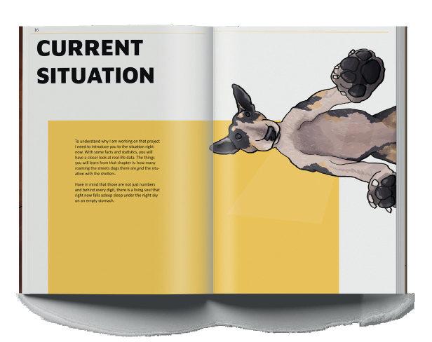
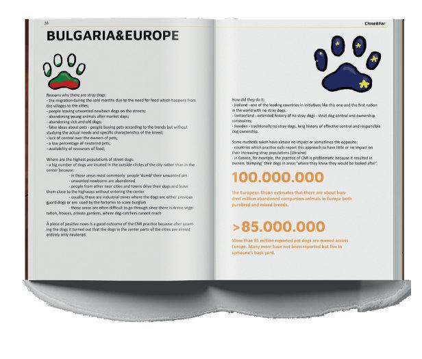
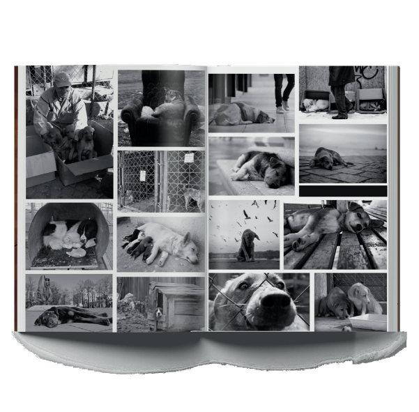
My thesis project is something I am deeply proud of. I devoted many hours and many days, sleepless nights and lost holidays in order to complete it. It is inspired by my love for animals and my intolerance against animal cruelty. In particular my love for dogs. In my country, there are many stray dogs and I saw potential in that direction for finding a possible solution to the problem.
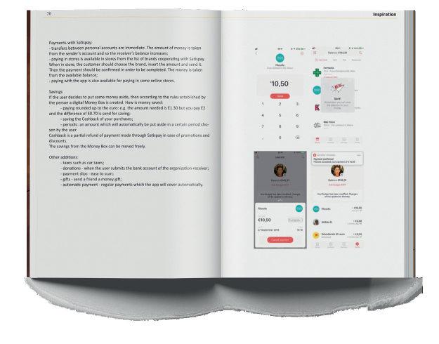
I have decided to find a way to help local nonprofit organizations to find donations. Many of them are only seeking help on social media but if they could expand their message maybe more people would be willing to donate. Furthermore, if the donation was made easy, with one click, maybe they would have an even bigger desire to help. So I had to find a way to for fast and effortless donations. I knew that my nation is not prone to use an app only for donating, they needed an advantage which will benefit them. An app through which their finance can be controlled. To have the ability to transfer money. But not a bank account app. So I came up with the idea of a paying-donating app.
An app which allows the user to pay in stores instead of using cash or card in a simple, accessible and fast way. I had to carry big research for competitors and inspirational similar apps to learn what the used technology is. To find out what the problems within the society are and if they would use such an app. To find the target, the goals, the values of the brand will be. To mention the differences between life in the city and in the countryside, to point out where the problem with stray dogs comes from starting from centuries ago and now. To give emotional and practical reasons why my app is worth it. It took me a lot of time and it was the best decision I could make, the project I enjoyed developing until the last dot.
The app is devided into two modes for ‘dog lovers’ (personal accounts) and ‘shelter mode’ for local shelters. The idea is to put in one place both the person and organization so they will have closer and direct connection. It will be easier for the dog lover to choose and donate. The local shelter will be provided wit instant help easy and fast. This way when a person wants to donate, the path to do this will be shorter than transfering money between banks or visit another website. That will encourage people to donate more. On the other hand, for the shelter there is the opportunity to reach more people at the same time.


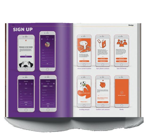
In its core, the project is a paying app which will acquire the user to register. During the registration, the user will be asked to grant access to the user’s phone contact list and link the Facebook profile. This can be denied in the beginning and completed later but will need to be agreed if the person wants to further work with the full potential of the app. The contact list is needed to provide the user with the opportunity to send money to another profile. Facebook connection helps with the ‘social’ part of the app, seeing who uses the app, who donates for what and supports which cause. Said so, the app is divided into two: first, the paying, second the donating.
The registration is completed when the person fills in general, personal and financial information. In the general information the user is asked to provide names and email as well as password. Then the personal information includes address, age, gender and city. Last but not least, the user needs to specify paying way. It is possible to choose between assigning a bank account or card in order to be able to transfer money between personal accounts or pay in the locations which work with the app, to donate, too.
The shelter user needs to go through the same steps in order to register the local organization. It is similar but instead of name, it is registered the name of the organization.


Both users at the end of their registration will be sent a small amount of money which later they need to confirm in order to asure the registered account is theirs.

to find my way to find the style i had to design a lot make mistakes make changes repeat keep designing
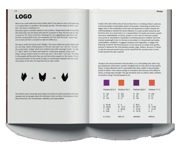
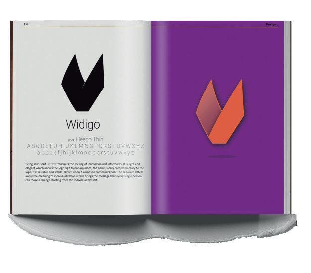
The app is under the brand name ‘Widigo’. The name unifies the words ‘digital wallet’ and ‘dog’. Letters shifting based on the two main pairs ‘wa-’ and ‘do-’ brought the combination ‘widigo’ which also combines two other messages inside: ‘we dig it’ / ‘dig it’ which is an idiom and stands for ‘understand, approve, enjoy something’; and ‘go’ which is kind of a call to ‘go now’ / ‘do it now’ / ‘act now’. The idea is that people will like what they use and start active support on the matter. The visual representation of the brand, its logo, is a combination between the two most vital shapes of the idea: the dog head and an open wallet.


The launcing campaign is based on the style of the app. It is isnpired by its colors and it is recreated with illustrations. The campaign will be realized online and offline with an emphasis on the offline campaign. There will be posters located on the window displays of the stores which accept payment with the app and also places like bus stops and metro stations.
For the online activation there will only be a post from each of the organizations which accepts to register in the app. They will upload the post and further call on their followers to join them and support them on the app. From them we expect a simple guidance of how to use the app. Their supporters will be more willing to accept the new technology from a trusted source.
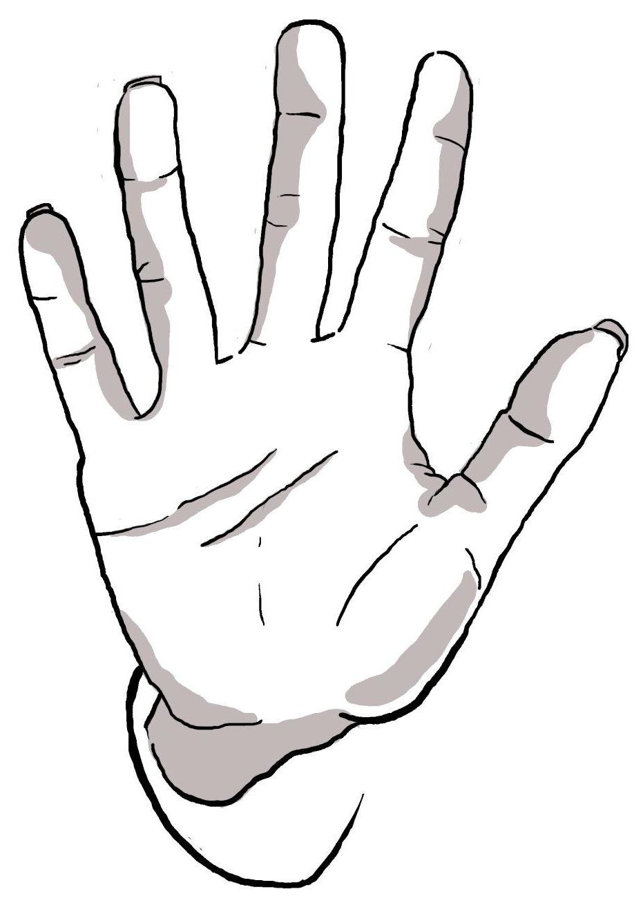
Each one of them is dedicated to a certain aspect from the app: paying, donating, adopting. The first poster represents the ‘pay’ possibility and its benefits when it is done from the app. The second is refering to ‘adopt’ a dog from distance through the app. People have different criteria when it comes to what dog would they want to have so with the app they can be the owner of their perfectly matching pet. The third one is connected to the ‘donate’ advantages: donate with the app easy and help many dogs from one place. It is inspired by the saying: ‘Give me a hand’ which is like saying ‘help me’ with different words.
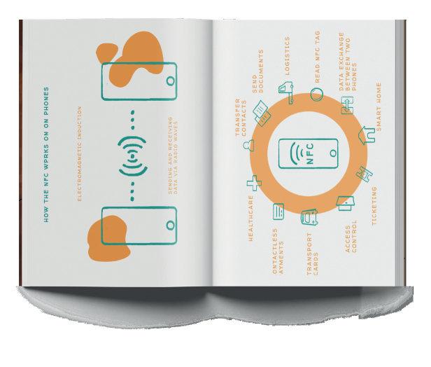
In the ‘dog lover’ mode, under the ‘My dog’ panel, after registering own pet, the user can turn on ‘lost mode’ from the dog profile any time and turn it off whenever the dog is found in case the dog has run away. This allows the user to track the path of the dog around the neighborhood and further only in the presence of other users around the dog. And if the dog is having the tag attached to its collar. Without the tag turning on the mode of lost dog is useless act since the app will be unable to locate the dog.
How it works? It is based on the technology of Bluetooth connection. Whenever the user has activated the lost mode, the dog lover will start receiving notifications for every update of the location of the dog. Other users who have the app in the range or the dog with the tag will be able to update the location without even being in the app or using it. They will be unaware and it will happen automatically.
How to get the tag? From the pet stores which allow the payment to be carried out within the app, there will be tags available for buying. On the tag: the name of the dog and the phone, etc. whatever the owner wishes to engrave.

In order for the user to know where they can use the app for paying, there will be a sticker located on the front door of a store / restaurant / etc. and on the cashier. The app will automatically point out the location in the paying section but there will be a QR code for further convinience.