Intro to Graphic Design Portfolio
Table of Contents
Monet Elrod
01.... Camera Raw and Select and Mask 02.... Vector Masking 03.... Sculpture Texture 04... Brick Wall & Grafitti 05.... Tracing 06.... 88 07.... Logo Design 08.... Restaurant Campaign 09.... Movie Poster 10.... Trifold Brochure 11.... Magazine
Camera Raw and Select and Mask
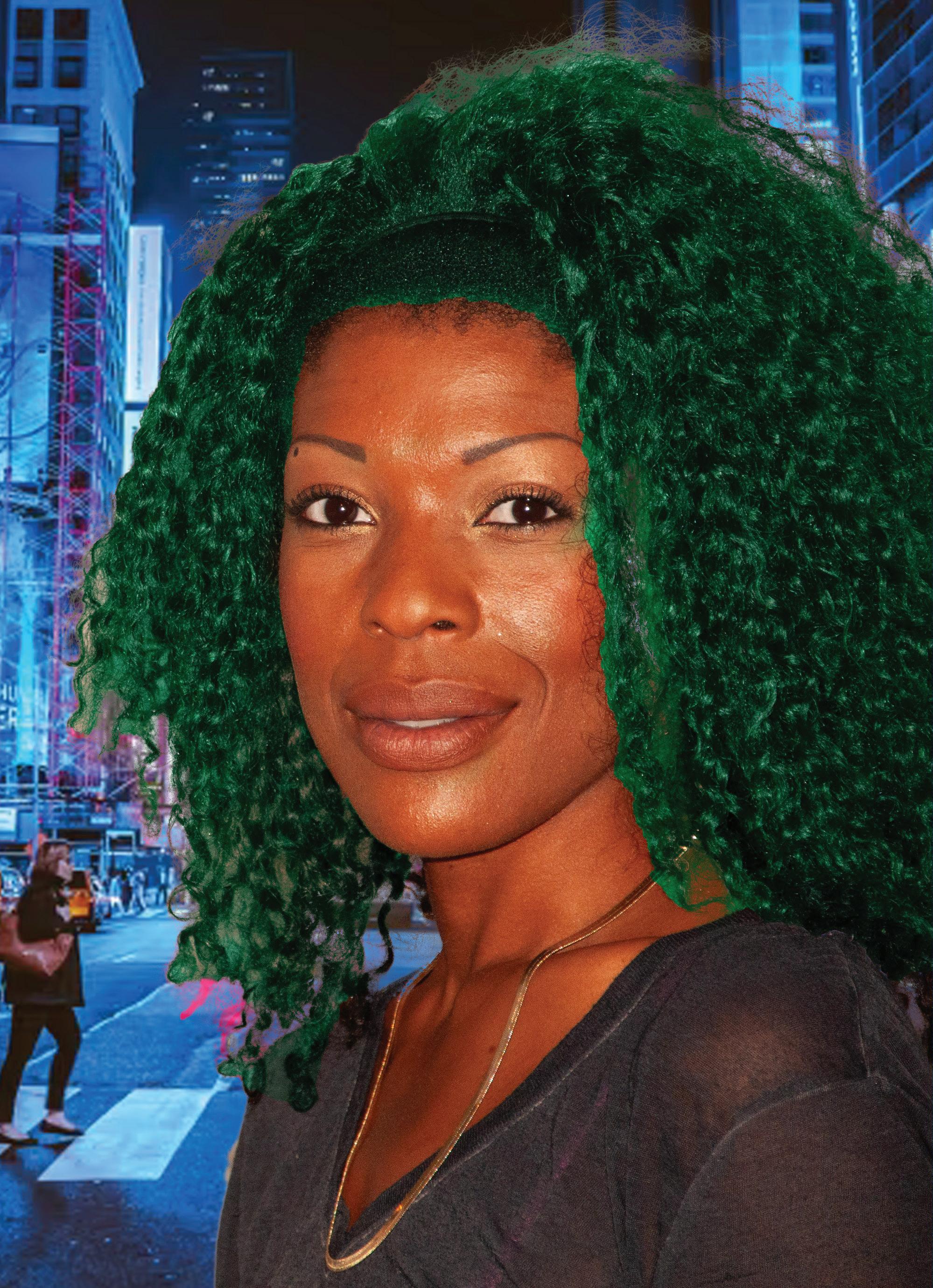
For this assignment I worked on a photo of a woman with curly black hair and changed the color of her hair as well as the background of the photo. Using various tools such as the selection tools and the masking and layering features, I could select the hair with fairly fine detail and apply a gradient. After applying the gradient I found an image online and put it as the bottom-most layer to make it appear they were in the foreground.
Monet Elrod

Vector Masking
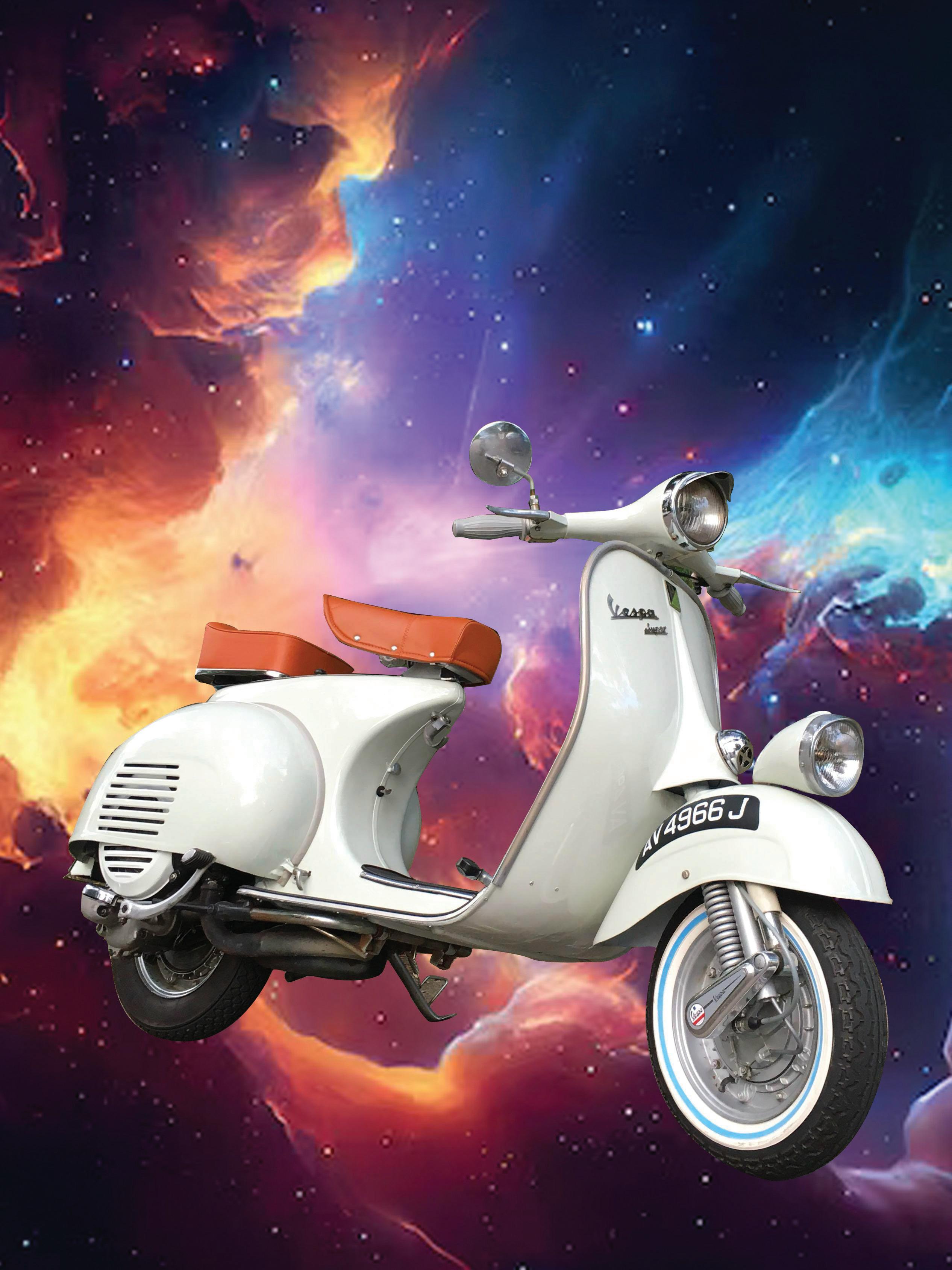
I began the project by copying the image of the Vespa and then pasting it into a new Photoshop file. I then chose the pen tool and selected paths in the drop down menu so I could begin outlining the shape of the Vespa. This took a majority of the time and was quite tedious but not very difficult. I then made a vector mask of the background and used that so I could separate the bike from the background and insert a new one. I found an image of space online and copied and pasted it into Photoshop.
Monet Elrod

Sculpture Texture
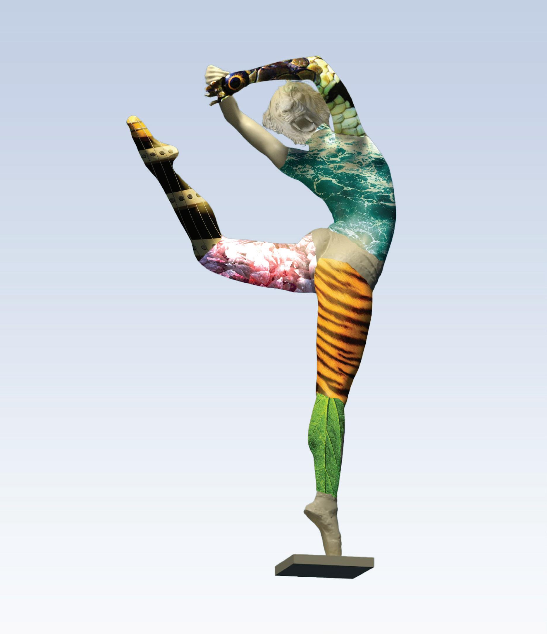
For this assignment I worked on utilizing the layering and masking tools as well as tools such as free transform, warp, puppet warp, and blending modes. Using these tools, I created effects that made objects look like they were affected by their surroundings or as if an object had different patterns or textures.
Monet Elrod

Brick Wall & Grafitti
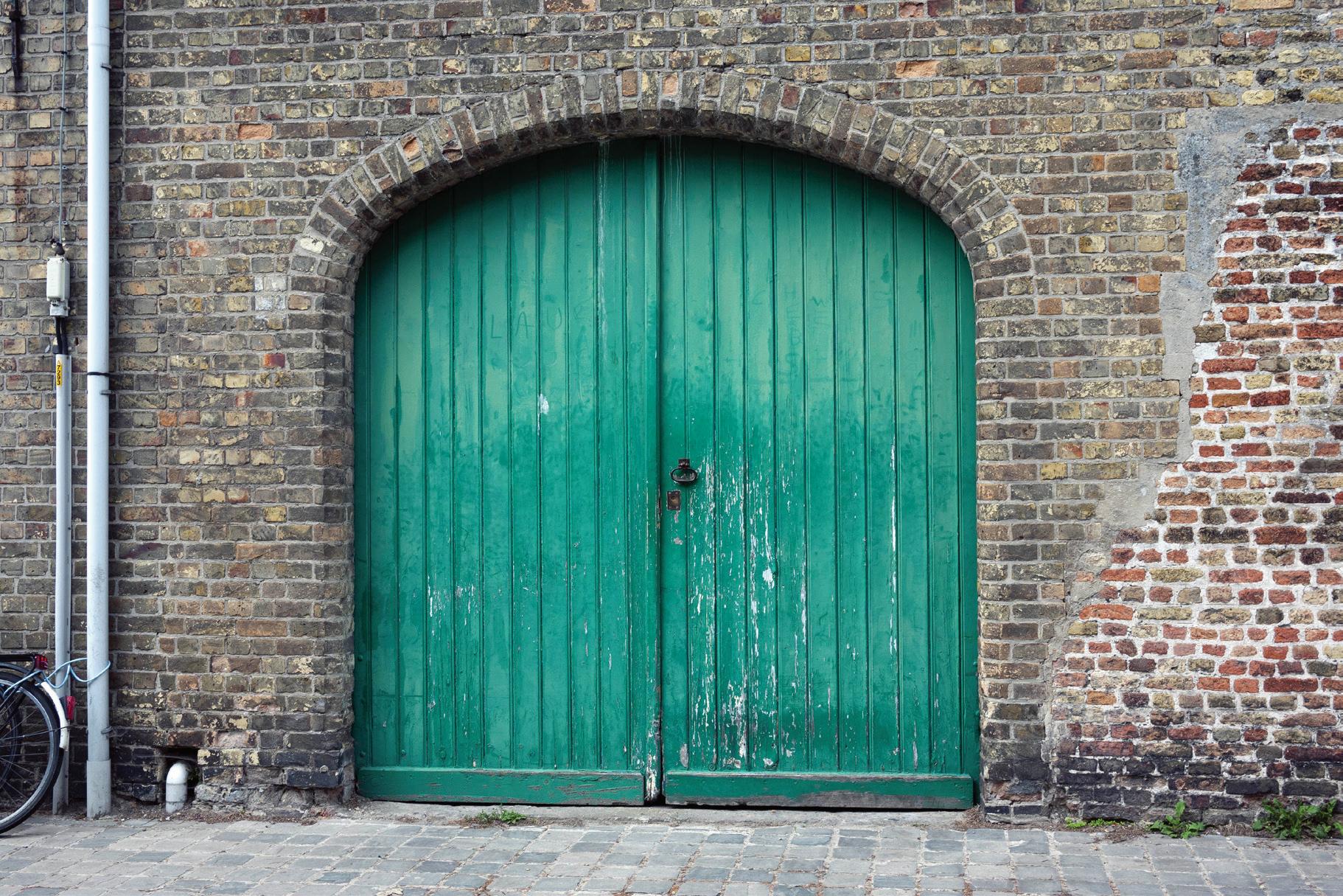
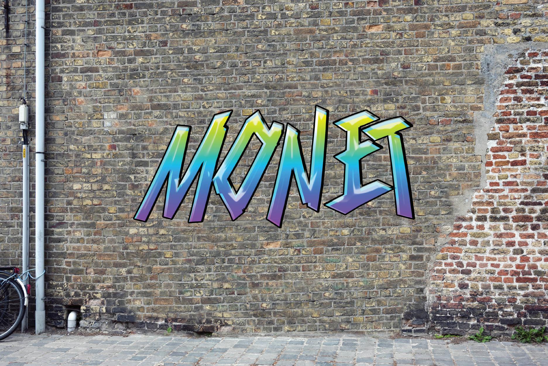
For this assignment we went over the various retouch tools that can be used to modify and cleanup images and elements of a photo. These retouch tools include the spot healing brush tool, the healing brush tool, the patch tool, content aware move tool, and the clone stamp tool. Using these tools, especially the clone stamp tool I was able to cover up the large green door that was previously covering the wall and replace it with bricks. I then placed a graffiti graphic over the wall with my name.
Monet Elrod


Tracing
For this assignment we had a tracing project where we had to trace over a cartoon character in Illustrator, I used bugs bunny as a template and traced him into Adobe Illustrator. In Adobe Illustrator the most fundamental tool used to trace is the pen tool, this tool utilizes the anchor point system. Starting the project I was unsure how to organize and go about grouping parts of this character. I ended up deciding to group his body by like colors, which for bugs bunny is pretty easy because his character only really has about 5 colors. For future projects I planned on grouping the layers by parts of the body and use more complex tools such as effects that can add shadows to the character.
Monet Elrod

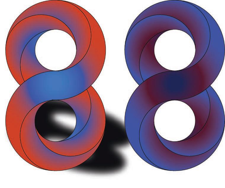
For this class project, we worked on tracing as well as color gradients within Illustrator. For the assignment that needed to be submitted the instructions were straightforward if you followed them closely although it was easy to get mixed up. The guidelines were the foundation of getting the final desired outcome.
Monet Elrod 88

Logo Design
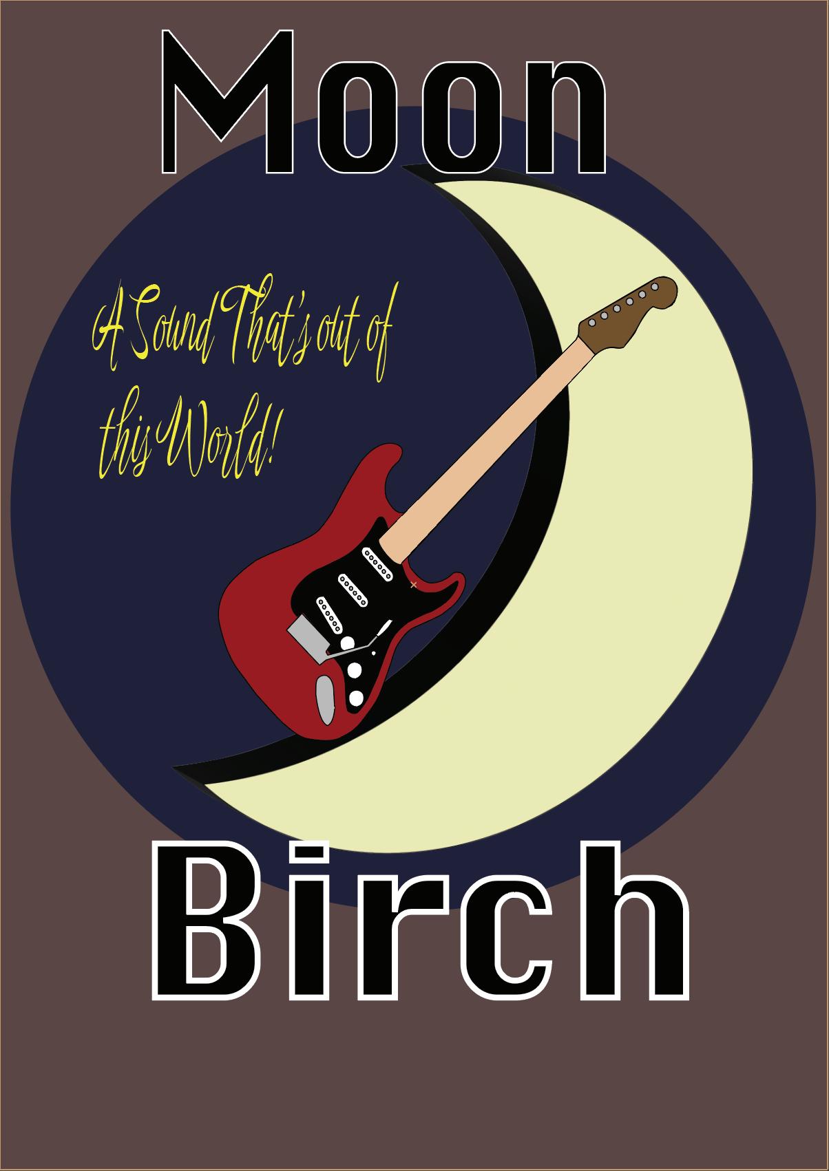
For this assignment I designed a logo for a fictitious brand I made up called Moon Birch. This fake brand made guitars, so for the theme of the logo I put an image of a guitar in front of a crescent moon. Using Adobe Illustrator I put the sketch I drew as the background for reference, I then used the pen tool to out line an electric guitar I found online, this part took the most time. After finishing outlining every part of the guitar I made a crescent shape by making two ellipses with the ellipse tool and cutting one out with the pathfinder tool. I then put up the title and motto to finish up.
Monet Elrod

Restaurant Campaign
For this project, I first designed my fictitious restaurant logo. I did this by going into Illustrator grabbing an image of a taco online and tracing it in Illustrator. I then designed the brand name and font and put it in an arc over the taco. I then placed the logo into a separate illustrator fil with the specified art board dimensions. This is when I made the final product and modified the design based on the format.
Monet Elrod

Movie Poster
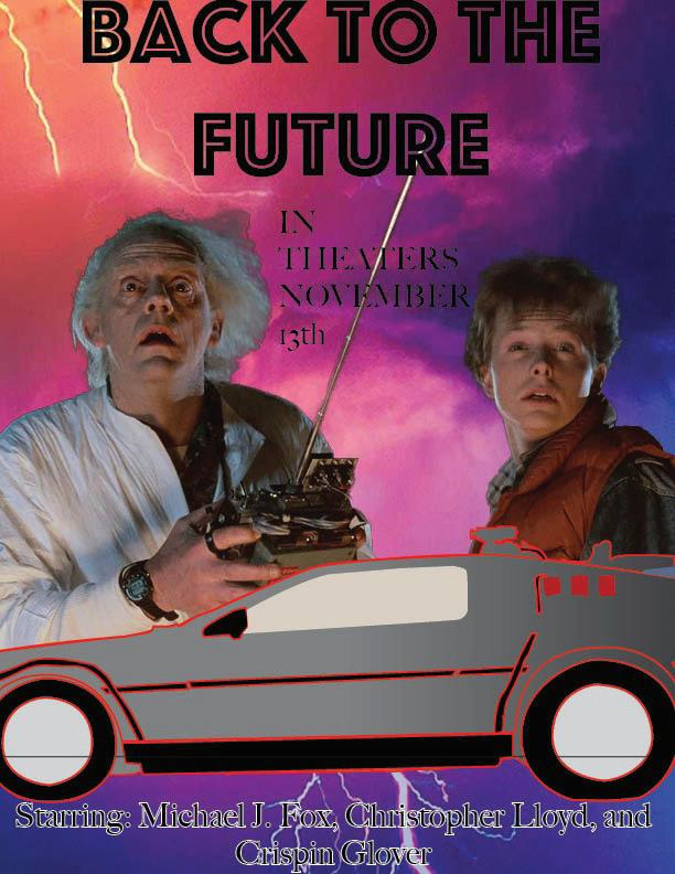
For this project, I designed a new poster for Back to the Future. Although not my favorite movie I have fond memories of binging the trilogy as a kid. We had to utilize all of the programs we've used so far for this project. I started by finding a scene of the two main characters online and pasting them into Photoshop. I then selected and masked the characters to separate them form the background. I then put in a new background that matched the theme of the original. I then began to create the main poster motif of the simple traced Delorean. I didn't get the final result on the car I wanted because I ran out of time but I think it turned out well enough. At this point, I placed both the work from Illustrator and Photoshop into Indesign and then designed the typography of the movie poster. I keep it more minimalistic compared to the stylized original. I overall like how it turned out but would make some changes with more time.
Monet Elrod

Trifold Brochure
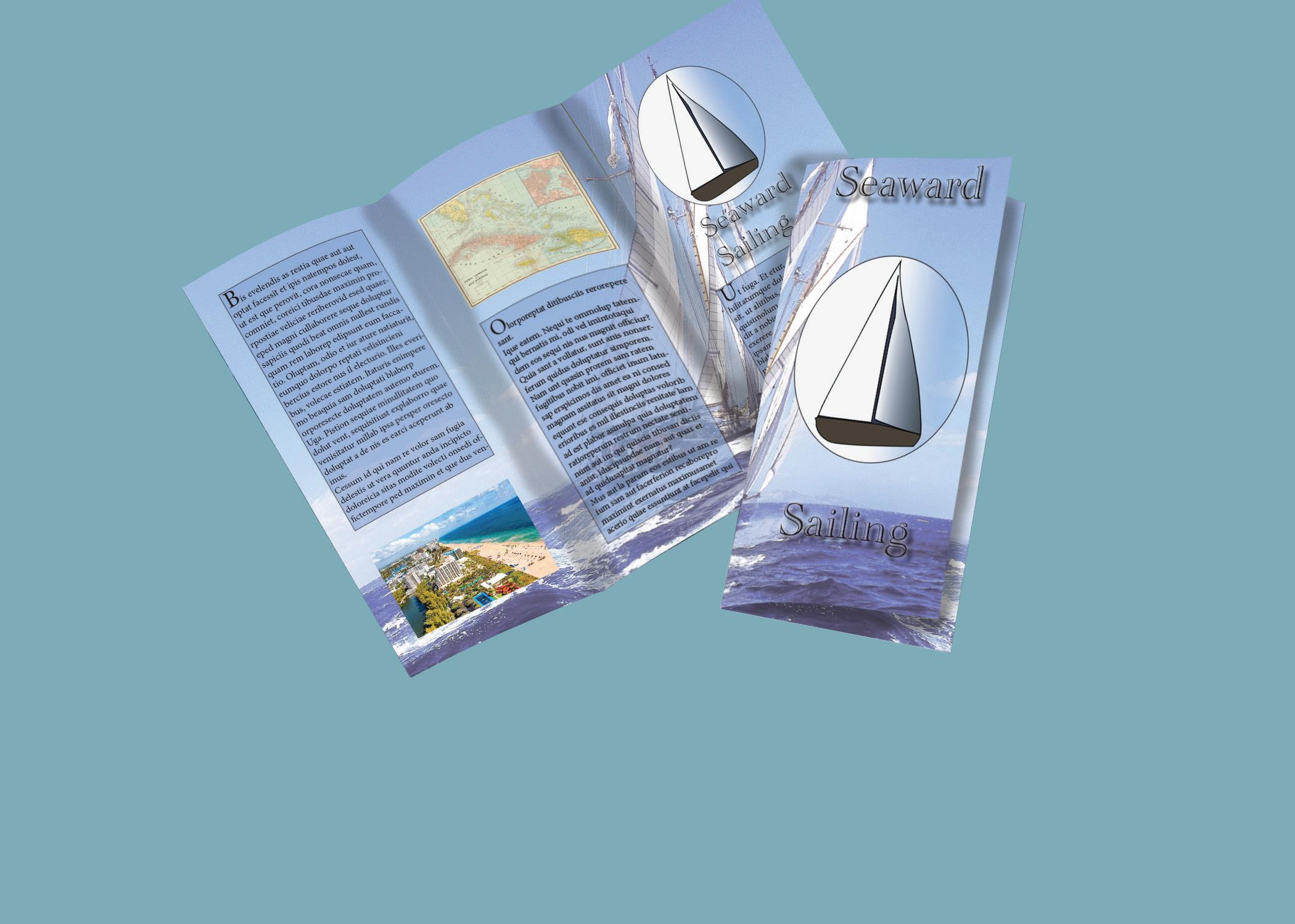
For this assignment, I designed a trifold brochure for fictional sailing classes. I started off by following the class instructions to design the trifold format. After I completed this I began working on the logo in Illustrator by tracing a sailboat into a more simplistic version. After that, I took a sailboat image and put it into Photoshop and lowered the opacity because I would use it for the background. I then added these elements to the InDesign file and put some placeholder text in text boxes with a light blue tint background to make the words more visible. I kept a fairly minimalistic design approach so I only added a few more images like a map and a scenic view image.
Monet Elrod

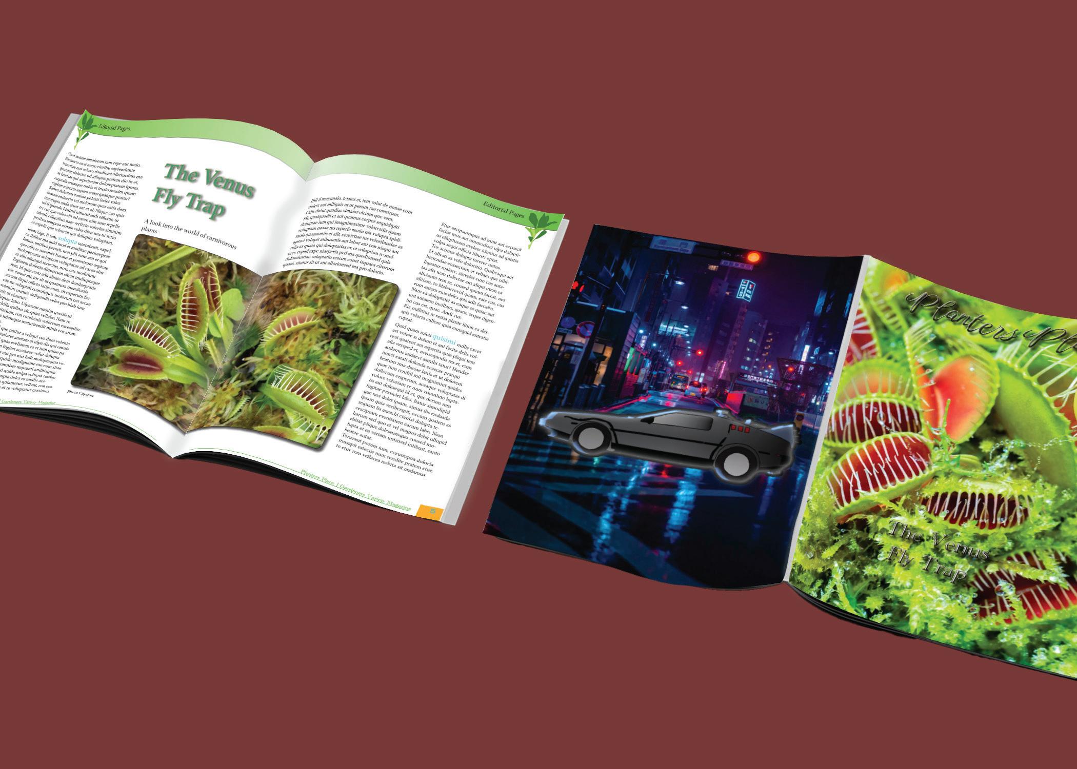
For this assignment, we continued working on the magazine we started last week. I had a good base already done with the magazine already having both ads and the back page of personal art. What I needed to complete this phase was the page layout, content, and cover page. The first thing I did was make a simple logo for the magazine in Illustrator. I kept the design simple and just made a minimalistic trace of a plant image I found online. I put this logo at the top of every page using the parent page feature and I put it on the cover. For the cover I wanted to feature a photo of the featured article in that edition so I took a high-quality picture of a Venus Fly Trap from online and ran it through Photoshop before pasting it on the cover. I then messed around with the font and effects for the magazine and edition titles. After I got something I liked I moved on to the first article. I tried keeping my design philosophy simple, so I just centered the body text and article title around a double-page spread image of a fly trap. This is also when I started making paragraph, character, and object styles. I made some highlighted words across both articles using the character style feature. I also made a pull quote for the second article spread. The second article was similar in design I just tried inserting the text and images that made the content easy to consume. I finished by making a simple table of contents page.
Monet Elrod
Magazine

Thank you Professor Schumy!
Monet Elrod
