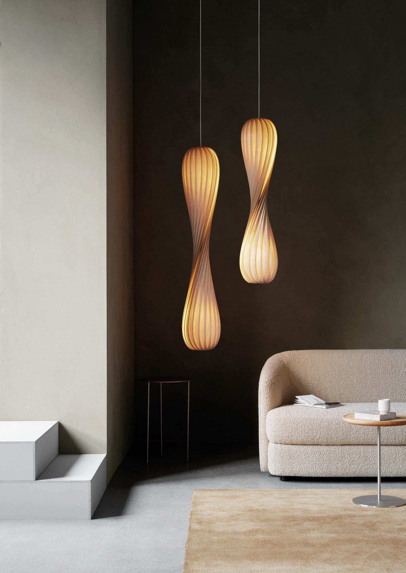
EUROLUCE REVIEW
MISSION ROCK, MICHAELIS BOYD
LONE BØDKER PEDERSEN, NORDLUX
KELLY HOPPEN, WOW!HOUSE INSTALLATION


EUROLUCE REVIEW
MISSION ROCK, MICHAELIS BOYD
LONE BØDKER PEDERSEN, NORDLUX
KELLY HOPPEN, WOW!HOUSE INSTALLATION


Welcome to issue #60 of darc magazine!
I trust you are all well and recovered from the busy month that was April – I can’t believe Milan Design Week/ Euroluce has been and gone already? With such a build-up to the show, it always catches me off guard at how quickly it passes, much like a good party that takes a lot of advanced preparation, which is then over in a flash! But darc returned with plenty of photos, memories, and inspiration.
In typical fashion, the Euroluce year of MDW is a big one for us, and as such, we dedicate a huge chunk of our editorial to it in this issue. Starting on p.32, you can delve straight into a vast range of new product launches, followed by an array of exclusive interviews - carried out by our Junior Journalist Ellie Walton - with some of the top designer collaborations unveiled at the exhibition. We have also scattered throughout some of our favourite installations from our week in Milan.
Turning away from our focus on the Italian show, also in this issue we are pleased to bring you a couple of stunning projects. Pictured on our front cover is the stunning Mission Rock residential complex with amenity spaces designed by Michaelis Boyd. I spoke with the project’s lead designer to discover more about the studio’s scheme and the influence of decorative lighting within it.
Our second project brings us back to the UK, where the rise of PBSAs is moving fast. The latest chic student digs have opened up in the heart of Nottingham with interior design completed by Ekho Studio. I caught up with Rachel Withey to understand the role of lighting in the stunning amenity spaces and how the building’s heritage played a strong role in the overall design. I wish I could return to Uni life and call dibs on a room in one of these new PBSAs – they’re a far cry from the crumbling, 1960s grey boxes I was more acquainted with! Coming up this June is the well-known Wow!house exhibition held at the Design Centre in Chelsea Harbour. With numerous high-end designers creating individual rooms in collaboration with various brands, we asked Kelly Hoppen to walk us through her design intentions for her living room in partnership with Visual Comfort.
And last but not least, this month we held our annual [d]arc awards party to announce and celebrate all of this year’s winners! It was a great night had by all, and I want to say another big thank you to all of our award sponsors and to everyone who submitted an entry, voted for their favourites, and came along to party the night away. In recognition of this year’s winning product in our Kit: Decorative category, we highlight the Nebula collection designed by Giovanni Luca Ferreri at Patrizia Volpato.
Our next issue of darc magazine will be our annual design directory, 3d. Please make sure your brand is correctly listed in the current edition, and if any changes or updates need to be made, that you bring this to our attention as soon as possible.
Now bring on May and June – quite possibly our two busiest months yet! We’ll be seeing you at [d]arc sessions Ibiza, Clerkenwell Design Week for our [d]arc thoughts talks programme, ICFF in New York, and 3 days of design in Copenhagen.
Over and out!

032
On Show: Milan Review Dive into our extensive coverage of Euroluce. We bring you the latest product releases, installations and designer collaborations.
042
On Show | Interview: Lasvit x Yabu Pushelberg Miles collection
044
On Show | Interview: Contardi x Studio Munge Picchio collection
046
On Show | Interview: Vibia x Francisco Gomez Paz Veil lighting system
050
On Show | Interview: Lasvit x Maxim Velčovský Loomo collection
052
On Show | Interview: Secto Design x Ilkka Kauppinen Adilo pendant
054
On Show | Interview: Lladró x Lee Broom Cascade porcelain collection
058
On Show | Interview: Preciosa x Michael Vasku Crystal Links range
060
On Show | Interview: Luceplan x Umat Yamac Posi portable collection
062
On Show | Interview: Michael Anastassiades Cygnet, Frame, and Floor Moblie Chandelier
Managing Editor | Helen Ankers h.ankers@mondiale.co.uk
Editor | Sarah Cullen s.cullen@mondiale.co.uk
Junior Journalist | Ellie Walton e.walton@mondiale.co.uk
Contributing Editor | Matt Waring m.waring@mondiale.co.uk
International Sales Manager | Rosie Jackson r.jackson@mondiale.co.uk +44 (0)161 464 4750
006
Mission Rock
Mission Rock is a newly developed residential complex in San Francisco, USA. With two residential towers boasting multiple amenity spaces, Michaelis Boyd was brought on board to create a harmonious, practical yet luxurious scheme.
010
The Place
Ekho Studio unveils its scheme for the latest purpose-built student accommodation in Nottingham, UK
040
Focal Point
Occhio: Dreamagination
056
Focal Point
PET Lamp: A Dialogue Among Weaving Light and Design
016
Design Evolution Part 2: Schwung
Continuing its passion for creating timeless lighting fixtures that are built to last, Schwung’s new floor lamp went through numerous iterations before the final version was ready for market.
018
Materials: Larose Guyon
Discover the whimsical creation of the Saule Collection by Canadian studio Larose Guyon.
024
Interview: Lone Bødker Pedersen
Product Manager at Danish lighting brand Nordlux speaks with darc about the design aesthetics and culture the brand adheres to, along with her role in trend predictions and material selection within the company.
030
On The Board: Kelly Hoppen
Light, Drama, and Serenity: The Living Room of the WOW!house.
066
In Focus: Nebula Collection
Check out the [d]arc awards winner in Kit: Decorative category by Patrizia Volpato.
Artwork | Dan Seaton d.seaton@mondiale.co.uk
Editorial | Mel Capper m.capper@mondiale.co.uk
Managing Director [d]arc media | Paul James p.james@mondiale.co.uk
Marketing & Events [d]arc media | Moses Naeem m.naeem@mondiale.co.uk
Chairman Mondiale Publishing | Damian Walsh
Finance Director | Amanda Giles a.giles@mondiale.co.uk
Credit Control | Lynette Levi l.levi@mondiale.co.uk
[d]arc media ltd | Strawberry Studios, Watson Square, Stockport SK1 3AZ, UK | +44 161 464 4750
Printed by Buxton Press, Palace Road, Buxton, UK ISSN 2052-9406

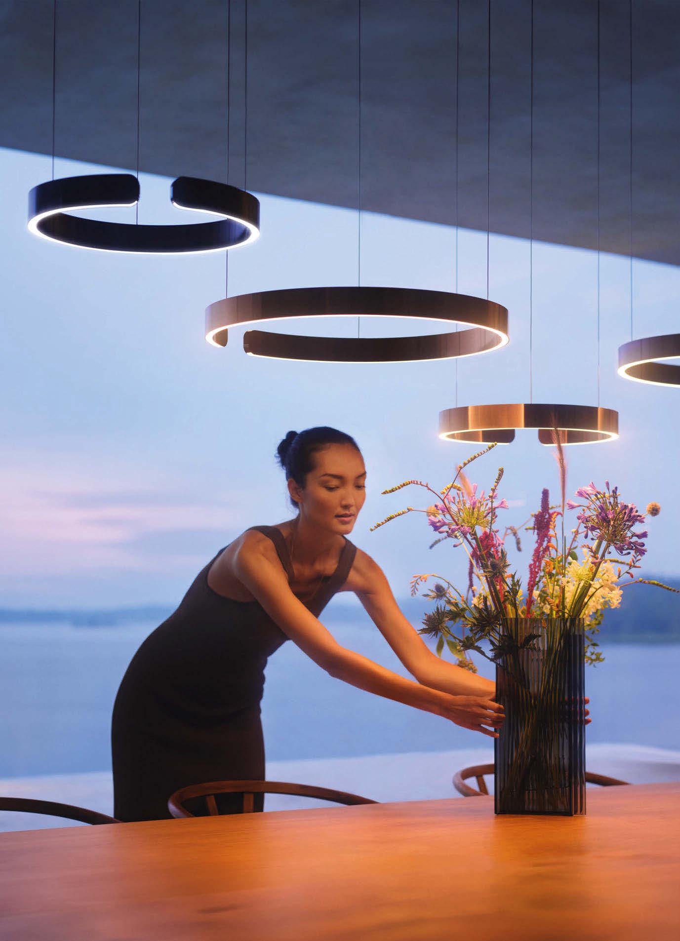
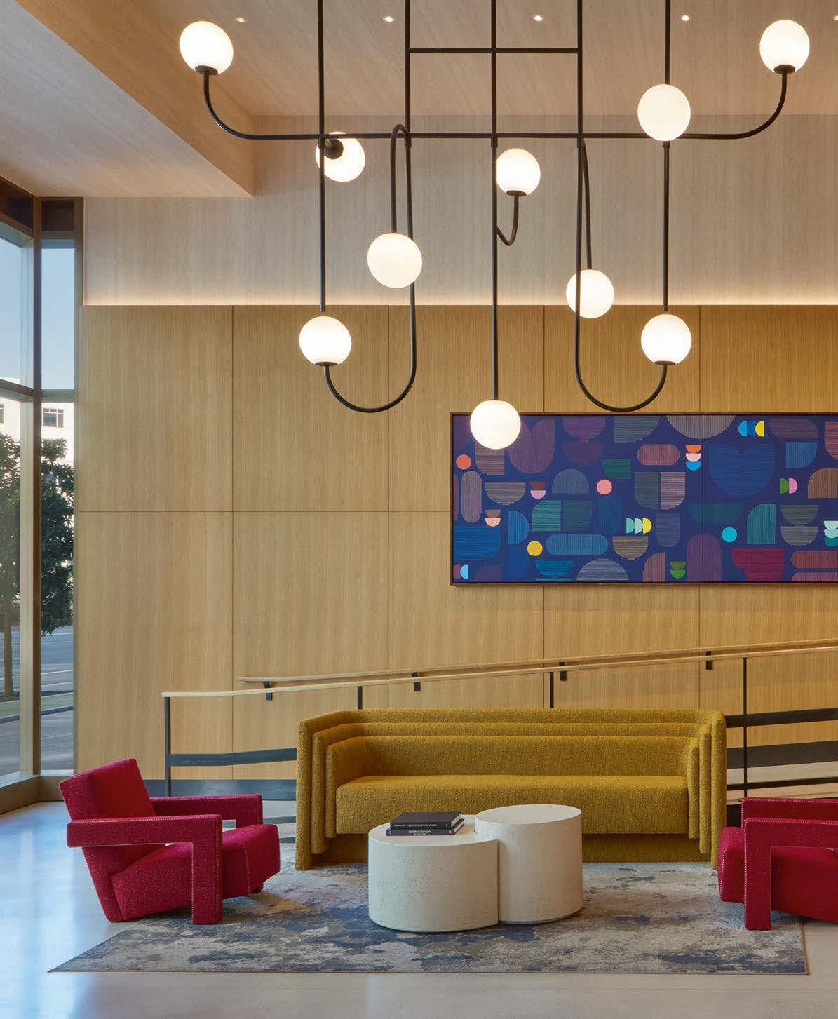
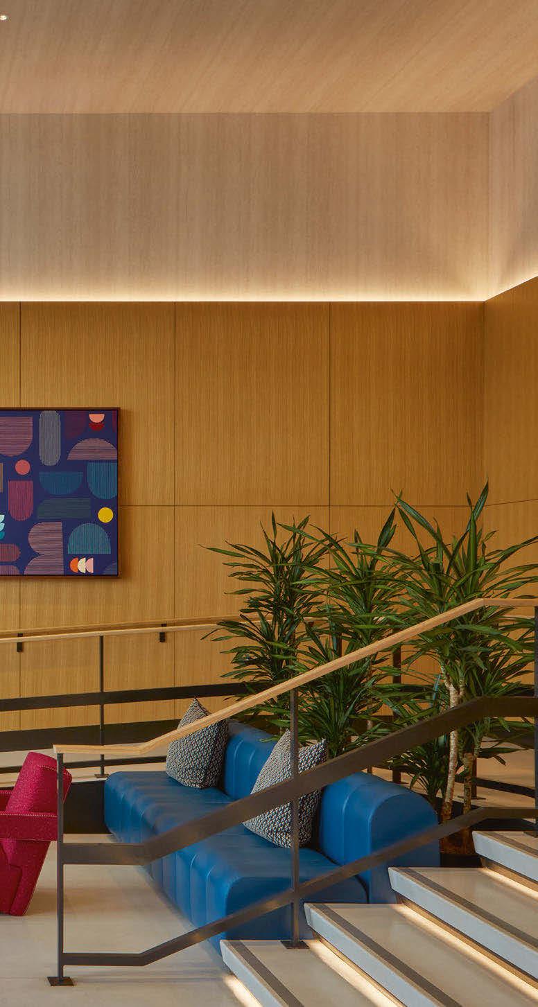
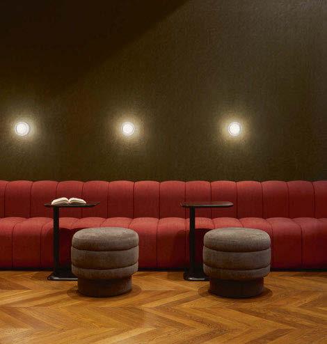
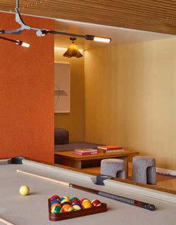
Mission Rock is a newly developed residential complex in the Bay Area of San Francisco, USA. With two residential towers boasting multiple amenity spaces, Michaelis Boyd was brought on board to create a harmonious, practical yet luxurious scheme.
London and New York-based architecture and interior design studio Michaelis Boyd was appointed to complete the amenity spaces for the Canyon and Verde residential towers in Mission Rock, San Francisco, which opened in 2024. Speaking with darc, Rina Kukaj, Partner at Michaelis Boyd’s NYC studio and Mission Rock’s lead designer walks us through the project’s design intentions and executions.
Both towers offer residents spectacular views over the San Francisco Bay and into the iconic Giants’ baseball stadium. Working in collaboration with real estate company Tishman Speyer, which Michaelis Boyd has crafted a series of projects with over the last decade, the areas developed by the team included entrance lobbies, mailrooms, lounges, games rooms, screening room, arcade, communal workspaces and kitchens, a podcast room, meeting rooms and external terraces, all aimed at enhancing convenience and fostering a sense of community.
Joining the project at a later stage, Kukaj and the team only had a couple of months to bring the brief to fruition for these varied spaces. The design concept for both towers was influenced by the studio’s approach to its renowned hospitality projects, blending the functionality of public spaces with the comforts and warmth typically found in a private home.
“The brief was to provide amenities that felt like an extension of a home filled with energy and colour to
“Lighting is critical to a space. It not only supports functionality, but it also adds an additional layer of artistry to a project, both interior as well as exterior.”
reflect the San Francisco palette: a blend of many styles and influences. Some of the forms and colour palette lean on the mission revival with a touch of mid-century modern,” she explains.
“We have been working with Tishman Speyer for several years, so we know each side’s general requirements and interests. Equally, we share a common ground on a desire to think outside the box and create something wholesome and unexpected for each project we approach. Here, it was no different. Mission Rock Bay Area was a fresh canvas with ample opportunity to achieve a new community and a sense of place.
“The project had a very short schedule for the interior design, so we all had to focus to ensure the design was on point from the very beginning.”
When asked what role the decorative lighting played, Kukaj explains that the approach for each area varied due to the building’s constraints or levels of natural light. “Some of the amenity spaces were located within the core of the building, where access to natural light was limited. These areas required special attention in terms of artificial lighting. Our intention was not to replicate natural light, but to use decorative lighting to introduce an additional layer of ambience and enhance the overall interior experience.” Some areas consisted of in-house custom-designed pieces by Michaelis Boyd, and elsewhere the team specified fixtures from brands including Allied Maker, Astro Lighting, Circa Lighting, Lightology, Pure Edge, Rich Brilliant Willing, Roll & Hill, Sonneman - A Way of Light, Tech Lighting, Vibia,


and Visual Comfort. These pieces were chosen to ensure the ‘eclectic home meets elevated boutique hospitality spirit’ came across. The lobby at Canyon features two custom-designed pendants, designed by Michaelis Boyd and fabricated by PTY Lighting, that respond to the expansive volume and ceiling height of the space. These fixtures were created not only to provide a sense of scale but also to introduce an element of playfulness, setting the tone for the eclectic and inviting atmosphere of the interior.
“We wanted to ensure this layer to the interior provided the additional touches of playfulness and charm throughout the amenities.”
Regarding the architectural lighting, the team made a conscious effort to keep these details simple and low profile. “The decorative lighting was carefully curated to accentuate key areas and provide the necessary functionality. Rather than relying solely on general illumination, we layered the interior with smaller, focused accents of decorative lighting. This approach not only addressed the practical needs of the space but also complemented its eclectic style, adding depth and visual interest throughout.
“Lighting is critical to a space. It not only supports
functionality, but it also adds an additional layer of artistry to a project, both interior as well as exterior.”
Local artwork was a key element to the interior spaces and formed a core part of the design’s brief from the very beginning. “From the outset, we were interested in local art and local artists. We also wanted to ensure the art complemented the subtlety yet boldness of the interior design palette. Ownership procured the art with support from an agency, but overall, it was a very collaborative process with all involved, and we are happy with the outcome.”
Reflecting on this as their first project in San Francisco, the Michaelis Boyd NYC studio is very pleased with the finished product. “The important thing is the amenities are continually in use by the tenants of the building,” says Kukaj. “They are using the spaces in so many ways and for so many purposes, which is wonderful to see.
“The project has been well received by our clients and, most importantly, by the new tenants. The amenities are always in use, and more recently, the project has won best amenities in San Fran, so we are delighted.”
www.michaelisboyd.com
Lighting
Lighting, Lightology, Pure Edge Rich Brilliant Willing, Roll & Hill, Sonneman - A Way of Light, Tech Lighting, Vibia, Visual Comfort Images: James McDonald
Using decorative lighting to add layers of interest and artistry, the team at Michaelis Boyd has successfully created luxurious residential-feel yet practical spaces for the commual amenity areas of these residential towers at Mission Rock.
NOTTINGHAM, UK
There has been a notable shift in the rise of purpose-built student accommodation (PBSA) in the UK in recent years. The need to attract student populations to UK universities and also the deliverables in products from manufacturers are key to this movement towards luxury student housing.
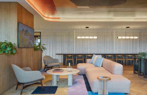
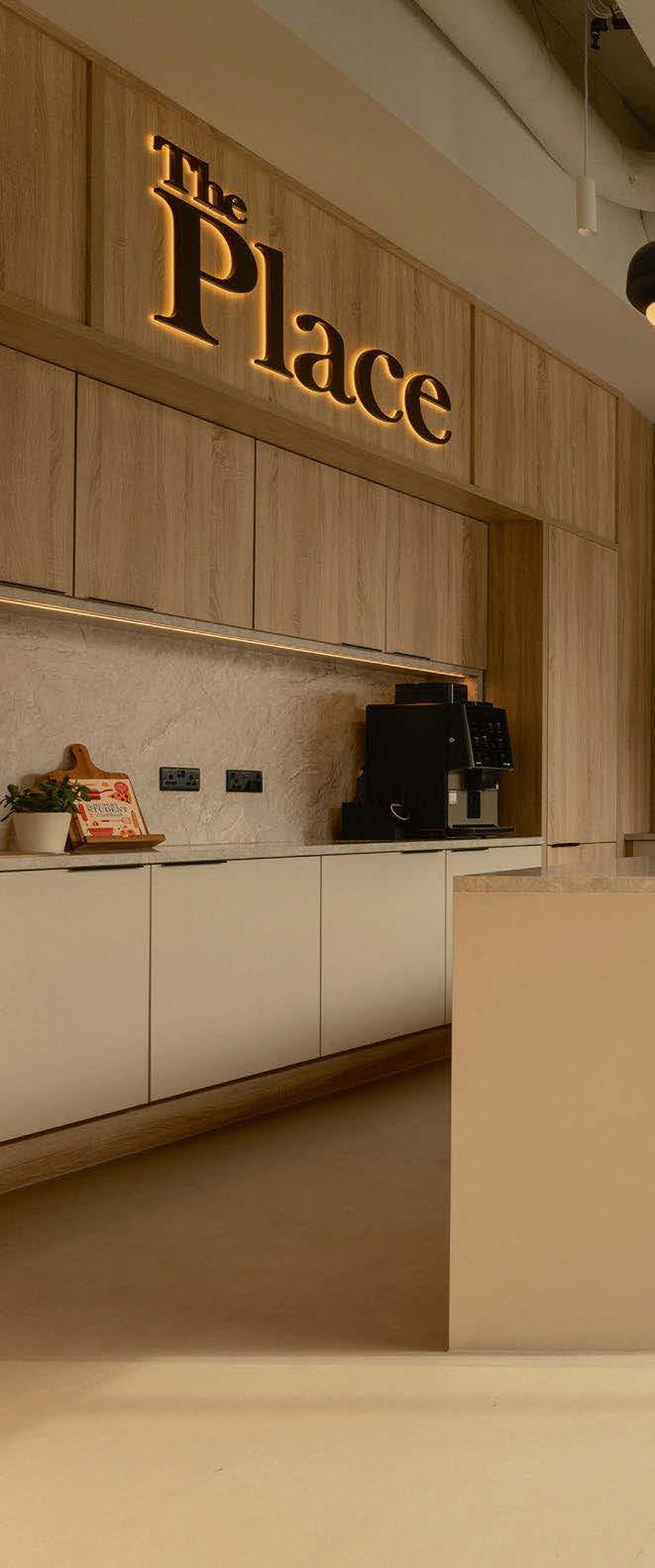
The Place is a brand-new development located in the heart of Nottingham and is a market first for developer and owner McAleer & Rushe (MRP). Comprised of 409 units, the development aims to ease the supply and demand imbalance of Nottingham’s undergraduate population. Belfast-based architects Consarc were responsible for the design, while Ekho Studio completed the interior design, from room finishes to the scheme’s amenity spaces on the ground floor and 11th-floor roof terrace.
The Place saw the redevelopment of a brownfield site on the city’s Queen’s Road, adjacent to the railway station. The 11-storey, BREEAM ‘Excellent’ rated building is managed by Homes for Students under its Prestige Student Living brand. It offers a mix of ensuite and undergraduate studio residences, alongside generous amenity spaces, including a gym, private dining room, and 360° rooftop terrace and sky lounge offering spectacular panoramic views over the city.
Focusing on the 100sqm amenity area on the complex’s ground floor, darc’s editor, Sarah Cullen, spoke with Rachel Withey, Co-Founder and Designer at Ekho Studio, to explore the team’s first collaboration with MRP and the design concepts for this new student development. “Purpose-built student accommodation (PBSA) is a particularly vibrant market in the UK right now,” she says. “Historically, students lived either in halls of residence or in shared houses, under the aegis of private landlords, where standards could be very unpredictable. We are delighted to be part of the maturation of this flourishing market with projects like The Place, whose imaginative design, with its
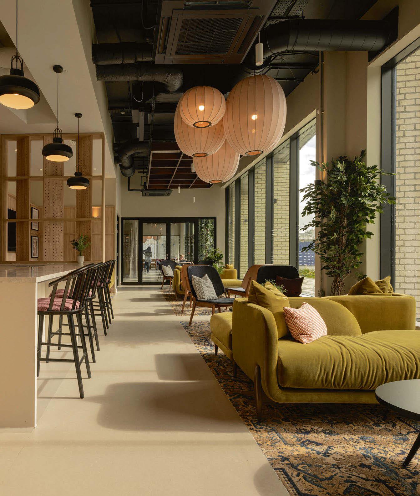
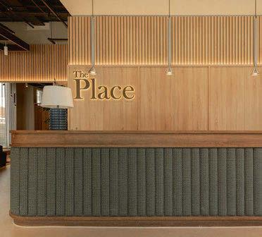
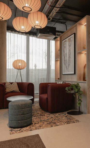
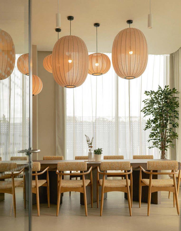
seriously ‘grown up’ members club feel, offers students not only contemporary comfort and security, but also study, fitness, gaming and social spaces - with proper design credentials.”
Pulling from their years of experience in commercial design, Withey and her team were able to intertwine a practical space for varied usership while also maintaining a high level of luxury.
Wanting to keep the series of spaces open in the amenity area and avoiding a blocky, compartmentalised atmosphere was one of the main challenges the team faced. Successfully placing furniture and lighting subtly suggested designated areas throughout, while maintaining a sense of flow and wayfinding.
“In contrast to a lot of workplace projects where the client is also the end-user, one of the most exciting things about PBSAs is you have quite a lot of freedom when it comes to their design, because the brief is
generally based around facilities and a target audience,” says Withey. “Generally, you have a lot of freedom to propose an aesthetic brief in the first instance. “To begin with, we focus in on the project’s location, its locality, and the building’s architecture. We would then look for a link between the interior and the architecture.”
For The Place, there were three main threads to the design concept: heritage, process, and locality. With regards to heritage, the site itself was historically famous for iron, steel and lace production. Taking the lace production angle further, the team took inspiration from the journey of threads weaving together to form a lace pattern to form the process element.
The lacing industry also played a key role in Withey’s product selections, choosing light fixtures that embodied notes of delicate textiles juxtaposed with metallic accents as a nod to the industrial,
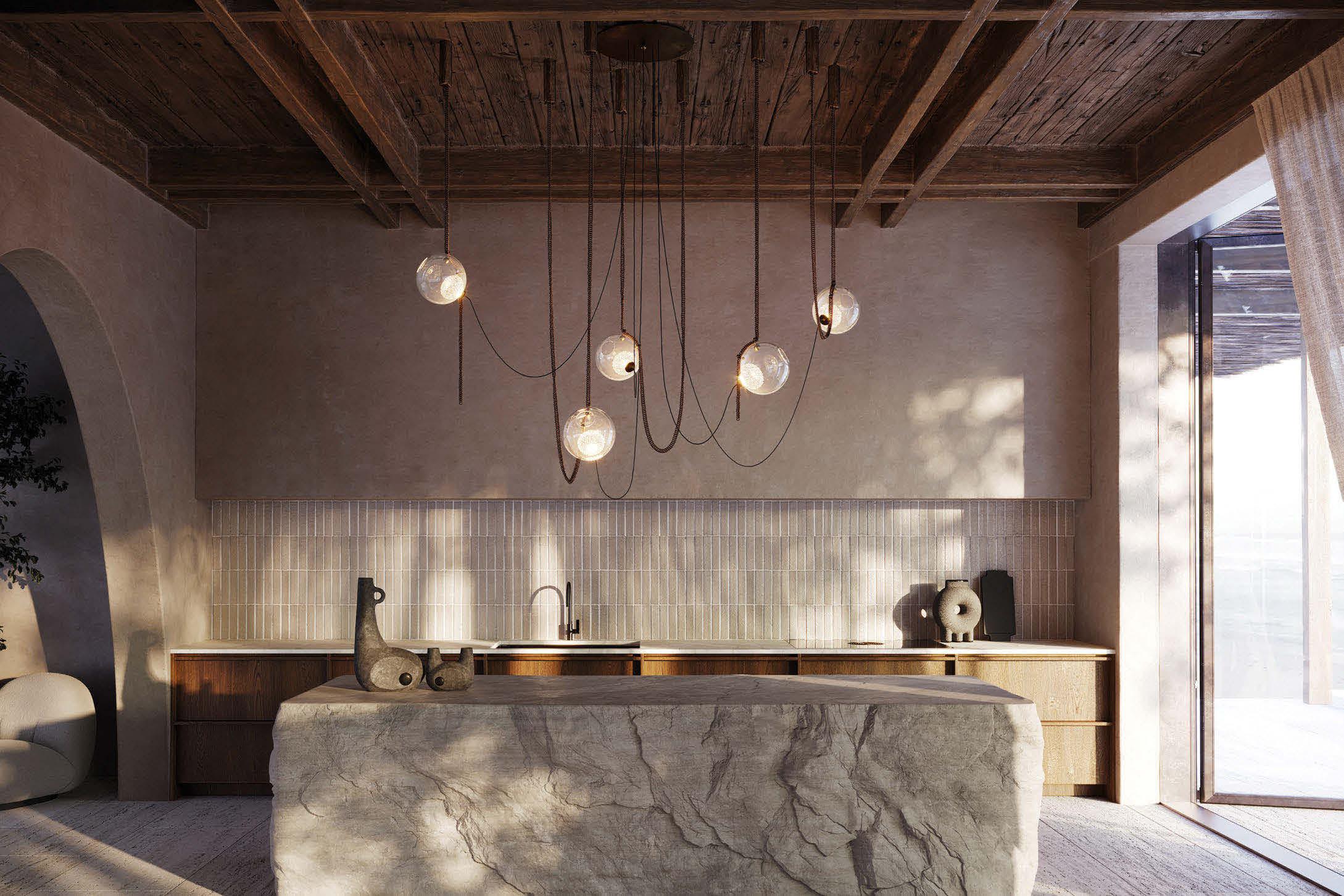
manufacturing machinery. Notably, the variety of Made by Hand pendants diffuse a soft light through knitted shades in muted colours. Elsewhere, the Pholc fixtures above the reception desk provide a striking contrast in bright, polished chrome and linear silhouettes. Lastly, the locality element was inspired by the building’s placement on Queen’s Road, which was constructed in 1843 and named as such in preparation for Queen Victoria and Prince Albert’s visit to the city on route to Belvoir Castle, 20 miles to the east. It is one of the UK’s finest regency castles and dates back to the 11th century. It added the luxury note of inspiration to Withey’s scheme, with notes of maroon and gold scattered throughout the textiles, soft furnishings and decorative lighting, such as the Flowerpot VP1 pendants by &Tradition.
When it came to balancing the architectural lighting fixtures with the decorative, Withey admits most of the time there are not dedicated lighting designers on the PBSA projects. However, over the years, she has developed the skills needed to create a harmonious scheme that meets the needs of the project and its end-users.
“I am by no means a lighting designer, it’s a specialist skill I really appreciate and I’d never want to say that I am; in the same way it annoys me if someone says
they’re an interior designer when not. But, I do love working with the lighting as its key to the schemes.”
The approach Withey and her team took for the lighting scheme began with zoning the space, identifying the features and circulation points where track lighting will be used to aid wayfinding. “These are the areas where we’d generally put the track lighting and the smaller fittings, so people are drawn to the areas with the big feature pendants.”
Taking into account the furniture placements, some pendants were able to drop lower in areas with low seating, creating varied levels of lighting.
“Predominantly, we used task lighting for wayfinding and as a backdrop to the feature lighting. The balance can be very off if you start going for similar size fittings throughout and subtly guide people to feed off into different areas.”
Speaking of her final impressions on the completed project, Withey reflects: “We’re really pleased. It was a new client for us, and they really put a lot of trust in our dedicated team to drive the design. We built really great working relationships to the point that we are now working together on their next PBSA project in Glasgow. To me, that is one of the biggest compliments.” www.ekho.studio
IMAGES: LEFT: BOOTH SEATING WITH MAROON INTERIOR TO ARCHED AREA FEATURING &TRADITION PENDANTS, RIGHT: MEETING SPACE WITH SEPARATING CURTAIN AND MUUTO TABLE LAMPS

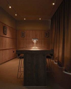
THE PLACE, NOTTINGHAM, UK
Interior Design: Ekho Studio
Lighting Specified: &Tradition, Galvani, Made by Hand, Muuto, Pholc
Images: Stevie Campbell
Ekho Studio has brought an elevated, elegant design to the brand new student accommodation in Nottingham city centre. Using layered lighting that subtly emphasised the historical threads throughout the scheme added points of interest while also guiding people through the space.
Architectural lighting sat quietly in the background, offering wayfinding and allowing the decorative fixtures the room to be the focal points of the space.
DESIGN EVOLUTION
CREATIVE STUDIO

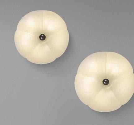

For Part 2 of our Design Evolution, Schwung presents its new floor lamp, which completes the Hana collection. Continuing its passion for creating timeless lighting fixtures that are built to last, Schwung’s new floor lamp went through numerous iterations before the final version was ready for market.
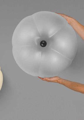

The meticulously crafted Hana lighting collection expands its design language with the introduction of Hana floor (Hana means ‘flower’ in Japanese) - a natural evolution that completes the enlightened family alongside the Hana flush mount (suitable for both ceiling and wall mounting) and Hana table lamp.
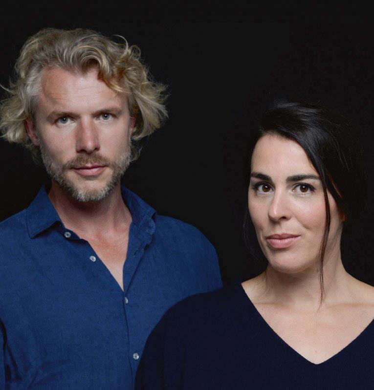
At Schwung - which emerged a decade ago from the shared vision of Rudi Nijssen and Dominique Sente (pictured), premised on a deep appreciation for the timeless and the enduring - everything is handcrafted. Hana floor is no exception. This harmonious interplay between light and form elevates spaces of every kind, bringing a serene and calming ambiance.
The crowning jewel is a delicate yet resilient milk-frosted, handblown glass cloche, secured by a matching brass button - also found on the base - that serves as a dimmer, granting precise control over the
mood. This refined fusion of material and beacon evokes a quiet, captivating glow.
All Hana prototypes were developed, from concept to creation, under one roof. This fully in-house journey, guided by the precision of Schwung’s own research and development team, ensures the final piece reaches its form through a process of refinement, intention, and care. To honour its promise of enduring beauty, Hana Floor has undergone a suite of thoughtful tests - each one a silent ritual of patience and pursuit.
The outcome is a soulful and tactile creation - born of artistry and care - designed to stir the heart and serve as a cherished heirloom for years to come.
www.schwung.design

Discover the whimsical creation of the Saule Collection by Canadian studio Larose Guyon. The pendant that is redefining lighting as kinetic art, blending meticulous hand craftsmanship with poetic design to create pieces that move, shimmer, and transform the spaces it occupies.
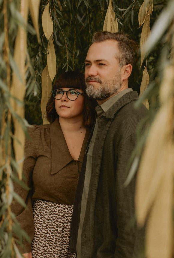
Félix Guyon and Aubrée Larose, the visionary founders behind Larose Guyon, always knew they were destined for the world of design, long before their creative paths ever crossed. Their mutual fascination with light fixtures became the foundation of a partnership grounded in artistry, function, and emotion. For them, light is more than mere illumination; it’s poetry in its purest form.
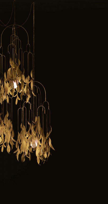
This belief gave birth to Larose Guyon, a studio devoted to crafting handmade lighting pieces that embody the beauty of nature while forging a deeper connection between people and their environments. Their latest creation, the Saule collection, is a poetic interpretation of the willow tree, capturing its graceful movement through a whimsical, kinetic design.
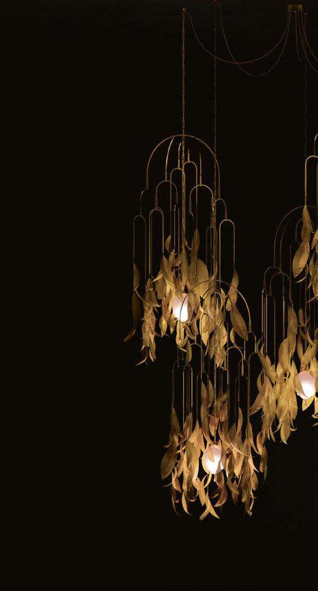
The Saule is defined by its hand-shaped leaves that are suspended from elegant, curving brass arches, each crafted with care to reflect the gentle sway of willow branches. Inspired by the principle of equilibrium, similar to a baby’s mobile, the fixture responds softly to the surrounding air, casting mesmerising reflections as the brass leaves shimmer in motion. “We wanted to design a fixture to capture the essence of movement in a simple, natural way – just like the gentle rustling of wind through leaves,” says Guyon.
The kinetic element is a cornerstone of the Saule collection, imbuing each fixture with a sense of life and dynamism. The movement encourages interaction,
allowing the light to breathe with its environment and subtly shifting the mood of the space it inhabits. The fixture’s organic elegance is amplified by the sculptural composition, where the brass arches rise like tree branches, bringing both volume and height.
“For a long time, we have wanted to incorporate mobility into our fixtures, to create a visual dance reminiscent of nature’s rhythm. The inspiration from the willow trees led us to explore designs that allow for movement within the light, reflecting the dynamic interplay between light and shadow,” says Larose. “Throughout the design process, we focused on capturing the essence of the willow tree’s beauty, ensuring that each piece in the Saule collection embodies grace while providing functional lighting. This journey has not only elevated our artistry but also reinforced our commitment to creating designs that connect with nature’s poetry.”
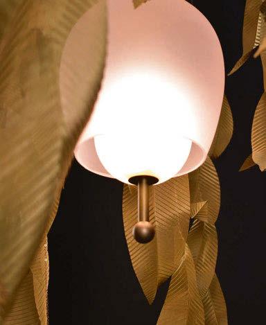
Adding to the fixture’s delicate balance is a soft pink glass globe, which serves as the light source. Paired with a smaller, suspended globe, this design detail is evocative of delicate ripened fruit and introduces gentle warmth and depth. The subtle contrast of glass and metal adds complexity and charm – each choice in material is thoughtfully considered to elevate the composition.
Creating Saule was a year-long endeavour filled with exploration and refinement. The design process
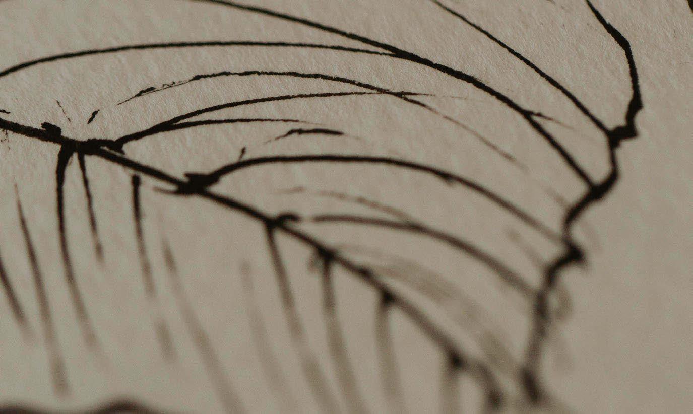
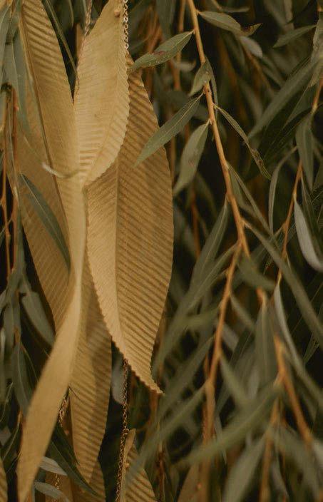
Each leaf is individually hand-cut, ensuring that no two pieces are exactly alike. Once cut, the leaves are pressed into a custom-designed mould, created by Guyon and 3D printed in-house, to imprint a rich, textured surface.
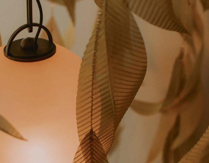
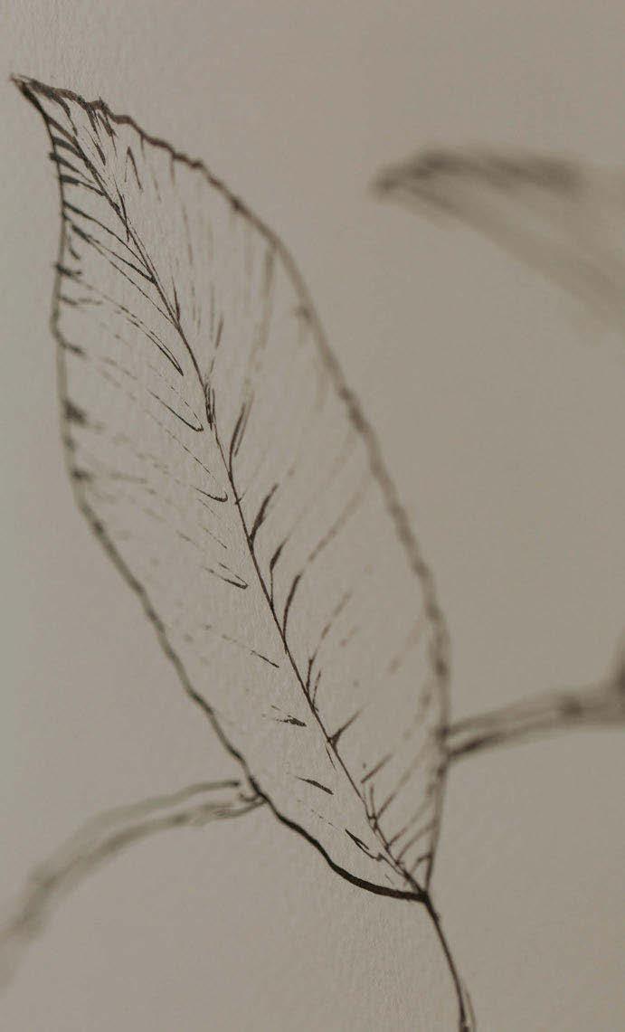
After moulding, every leaf is handshaped to create a natural, organic flow, allowing the brass fabric to move and settle like real foliage. This meticulous, hands-on process highlights the craftsmanship at the heart of Saule, bringing a sense of authenticity to each fixture.
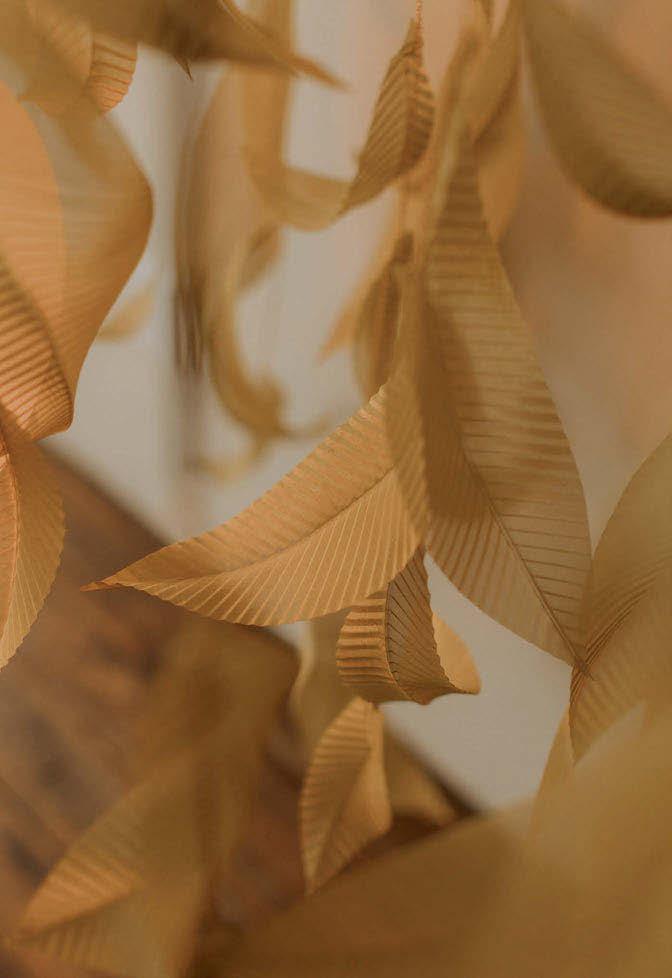

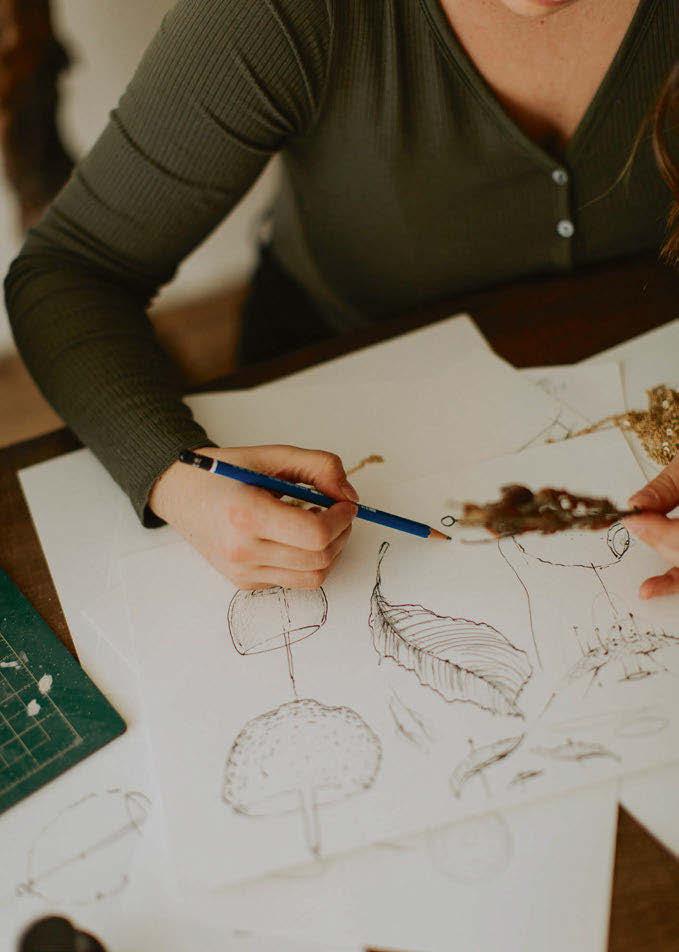
guided by a desire to echo nature’s forms and imperfections, embracing asymmetry, texture, and movement. Jewellery-like details, including brass chains and golden finishes, enhance its overall aesthetic, resulting in pieces that feel both precious and grounded.
Each brass leaf is meticulously handcrafted in Larose Guyon’s Verchères studio, where their team of artisans shape the metal to evoke the fluidity of nature. The process is detailed and timeintensive, beginning with the selection of high-quality materials and continuing through refined techniques that produce rich textures and lifelike forms. Much like fine jewellery-making, the work requires exceptional precision, care, and an artistic eye.
“Each leaf is treated like a miniature sculpture,” the team explains, “imbued with both artistry and intention.”
The process of creating the leaves begins with a tightly woven fabric made from brass fibres. Each leaf is individually hand-cut, ensuring that no two pieces are alike. Once cut, the leaves are pressed into a custom-designed mould, created by Guyon and 3D printed in-house, to imprint a rich, textured surface. After moulding, every leaf is hand-shaped to create a natural, organic flow, allowing the brass fabric to move and settle like real foliage.
This meticulous, hands-on process highlights the craftsmanship at the heart of Saule, bringing a sense of authenticity to each fixture.
Maintaining consistency while honouring the individuality of each handcrafted element is a balance Larose Guyon has refined over the past decade. Their experienced team adheres to rigorous quality standards without compromising the organic beauty that makes each piece unique. The result is lighting that transcends function – each fixture is a shimmering work of art.
Available in a variety of sizes and configurations, the Saule collection was designed with versatility in mind. This stems from the founders’ backgrounds in interior design and their deep understanding of spatial needs.
“We understand the importance of adaptable design,” they note. “By offering multiple variations, Saule can seamlessly integrate into a range of interiors, from expansive entryways to cosy, intimate spaces.”
Larose adds: “When it comes to design, there are no strict rules. That’s the beauty of using our pieces, they can elevate and transform any space.”
This adaptability is key to Saule’s charm. Envisioned as the “jewellery of interior spaces,” the collection enhances any room much like a statement necklace elevates an outfit. Whether placed in minimalist, modern, rustic, or eclectic settings, the fixture’s fluid elegance transcends stylistic boundaries. The founders add, “our pieces are made to transform and elevate any environment.”
At its heart, Saule is designed to inspire. It invites people to pause, reflect, and connect both with nature and with the artisanal craftsmanship behind each detail. The hope is that every piece sparks a sense of wonder, offering a serene and timeless presence that lingers long after the light is switched off. With Saule, Larose Guyon captures nature’s poetry in motion and brings it into the home.
www.laroseguyon.com
Images: Larose Guyon, Chanel Sabourin

Product Manager at Danish lighting brand Nordlux speaks with darc about the design aesthetics and culture the brand adhere’s to, along with her role in trend predictions and material selection within the company.
Established in 1977, Danish brand Nordlux has since grown to produce and distribute lighting across more than 50 countries. With a passion for inspiring people to make the most of lighting, it is dedicated to bringing great lighting with top-end technology at a competitive cost for a wide audience.
The Nordlux Group consists of three brands: Nordlux, Design For The People, and Energetic. Nordlux provides attractive, value-for-money light sources and luminaires, while Design For The People focuses on award-winning Danish design products. Energetic provides LED products (mostly lamps) with the newest technology.
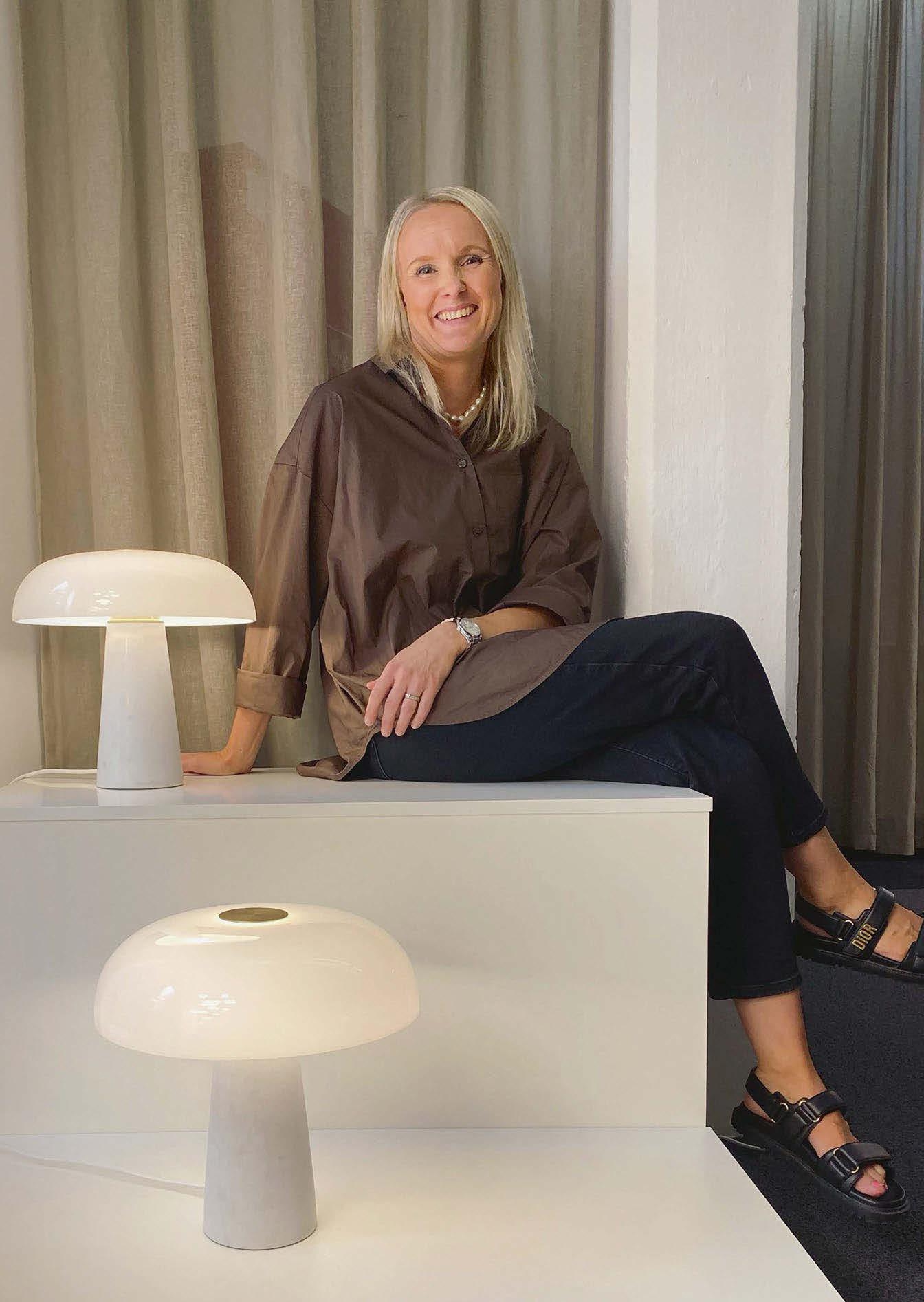
Speaking with darc, Lone Bødker Pedersen at Nordlux discusses her journey into the design world and how she became Product Manager at the brand.
Bødker Pedersen grew up in Aalborg, Denmark, where she continues to live with her husband and two boys. Aside from her career in product design, she has a keen interest in the world of fashion and interiors while also taking pleasure in spending time with her family, travelling, and CrossFit.
I quickly worked up the ranks to a management position and then on to be a buyer. This is where I realised I have a passion and keen eye for colours and materials, and looking further ahead than the current trends. My interest in interiors then led me to a sales role at a design practice where I was able to use my skills from the fashion industry, and where I really found my career focus. Doing such versatile roles gave me a well-rounded perspective on the challenges within interior design and the products I was working with.
“We have also developed a design DNA that is established by key phrases we stick to in the process, ‘made to last’ being one... I look at materials that age well, that adapt to different settings and consider them based on the overview of CO2 emission as well. ”
“Lighting has always been a fascination of mine, and the impact it has on a space. This prompted my move to Nordlux where I started in Press and Brand focus, which gave me a great understanding of the company culture and DNA. I would be asked my opinion on product launches, future planning ideas, trends within the market, and it felt very natural for me to give my perspective and ideas, which led me to my current position here at Nordlux.
“I studied business but didn’t go on to university,” she says. “[But] I think I knew from an early age my career would be in something creative. I grew up surrounded by a family passionate about the arts, but I gravitated most to my grandmother, who was a tailor. She taught me how to sew and about the differences in materials, patterns, and spotting trends. As I grew up, my passion for interiors grew, and I knew I could uplift these skills to guide my career.
“I started my early career working in fashion, where
“I’m currently in charge of all the creative material and design briefs for our external designers for decorative lighting. I also visit the various shows across the globe that cover lighting and interiors to keep up to date and know what’s new. I work closely with our technical manager, who helps with structural elements and the finer details. Also, I’m working with our suppliers to follow the production and quality very closely from the initial design, to receiving material swatches, to the first product sample, if there are changes or adaptations needed, right through to the final, ready-to-sell product. I
“Light for me is a mood maker in a room, it’s the final touch, and without these light spots, there would be no feelings... It’s how we can create light and shadow to give the space depth and atmosphere, and how the true effect and colour of the other elements like paint and fabrics are seen to our naked eye.”
also oversee the design protection and trademark of product names.”
When it comes to trend predictions and market responses to product launches, Bødker Pedersen takes inspiration from her travels. “A mix of many things inspires me, but I would say travel inspires me most; capturing how different cities make trends their own, from architecture, interiors and fashion. I also take inspiration from the traditional styles from the past, walking through Milan or Paris and observing the classic, vintage lighting and thinking how it can be adapted to a more contemporary look, tastefully pulling the past into the present. For me, Italian designers from the 1950s and 1960s produced some of the best design ever made, and that goes for lighting, furniture, and perhaps even fashion.”
When it comes to inspiration for a new design at Nordlux, the team takes inspiration from the brand’s Danish heritage and contemporary view on lighting. “We have also developed a design DNA that is established by key phrases we stick to in the process, ‘made to last’ being one. Lighting that lasts for many years and is timeless in its design. I look at materials that age well, that adapt to different settings and consider them based on the overview of CO2 emission as well. We also try to keep our decorative option retro-fit, but will base the decision
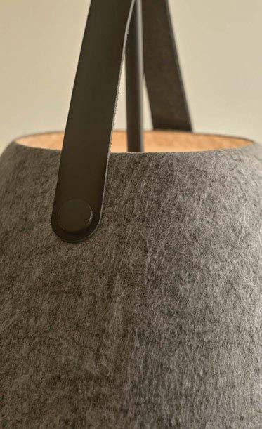
IMAGES: THE STRAP COLLECTION, HIGHLIGHTING MATERIAL VARIATIONS.


to use integrated LED if we feel the design requires it.”
Bødker Pedersen continues, explaining how a light is so much more than an accessory or piece of furniture. “Light for me is a mood maker to a room, it’s the final touch, and without these light spots, there would be no feelings. There is a rule from Frida Ramstedt’s Interior Design Handbook that says we should have five to seven lighting points in every room, more than what we initially think. It’s how we can create light and shadow to give the space depth and atmosphere, and how the true effect and colour of the other elements like paint and fabrics are seen to our naked eye.
“For me, lighting should bring atmosphere and the finishing touches to a space. We have a Danish term called Hygge, which means cosy and content. For example, at home I will always switch just my Talli floor lamp on in the corner of the living room, this light is just hygge for me, I really love the ambience it creates and what makes my home feel more than just a home, but a cosy place for me to enjoy.”
Reinforcing the idea of longevity, she goes on to explain that a product’s “made to last” quality is one of the key elements a well-designed product should hold. “For me, it’s a mix of the design itself but also the way the materials work together and how they

are put together, which of course needs to maintain functionality and look aesthetically pleasing in every setting.”
When asked whether she has a signature design aesthetic and if that influences the brand’s direction, Bødker Pedersen explains that she aims to route everything back to the Scandinavian and Danish way of working. “What is significant to us and our best successes is when we work with the mixing of materials, for example, the Strap series combines metal, leather and now felt. We also provide different colours of the leather so the end user can decide this on installation to complete the look. We see this works well and will continue to work this way. We also mix the shapes we use, both organic and geometric, to create a counterbalance effect within the collection.”
Continuing, Bødker Pedersen explains that one of the most frustrating aspects of product design is realising when a design cannot be brought to fruition as you intended, despite many iterations and attempts. “[This is especially true] with lighting, where we want the light output to be beautiful and uniform.” On the flip side, she adds: “The most rewarding part is receiving the feedback from our internal team, our customers, and the interior designers and then
seeing how our lights are used on such a variety of projects, both residential and commercial.”
With reference to technology, like many, she regards fixed LEDs as one of the best and worst developments within product design. “It has been so innovative to create new designs and shapes, however, we have found a market that still very much prefers the retrofit option, and it’s finding the balance to meet the needs of the end-user but not having to compromise on great design.”
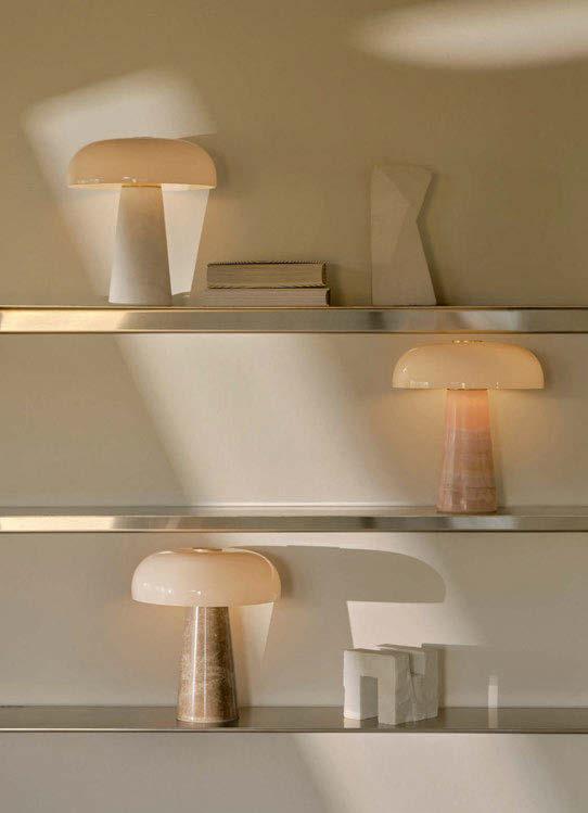
Reflecting on one of the most significant moments in her career, Bødker Pedersen highlights her work on the Glossy table lamp, the first product she launched. “I worked with Danish designer Maria Berntsen, who thought of a small acrylic table lamp with a mushroom shade that was initially for outdoor use. However, I found something within the shape so distinct and recognisable, so I wanted it to be more exclusive in the materials chosen and change it to an interior lamp. We looked at what materials would work and have the right effect, which led us to look at marble for the base. We then added the small brass detailing and developed the shiny, or should I say glossy, glass shade. Our Technical Manager also developed the inner side of the shade so there would be no dark spots or shadows. I feel the product is my
“The most rewarding part [of design] is receiving the feedback from our internal team, our customers, and the interior designers and then seeing how our lights are used on such a variety of projects, both residential and commercial.”
total darling. It has won a Red Dot design award, and we have now developed it further, creating a mini version using Pink Jade, which I found inspiration for at Clerkenwell Design Week 2024, where I saw many coloured stones with that almost translucent effect.”
Summing up what it means to work with light, Bødker Pedersen describes it as “life-changing” yet retracts that for sounding too cheesy! “Light has such a big effect on so many people, so I do stand by that, even though it is just light. We are actually doing something to change people’s lives. We are lifting people’s quality of life with light.”
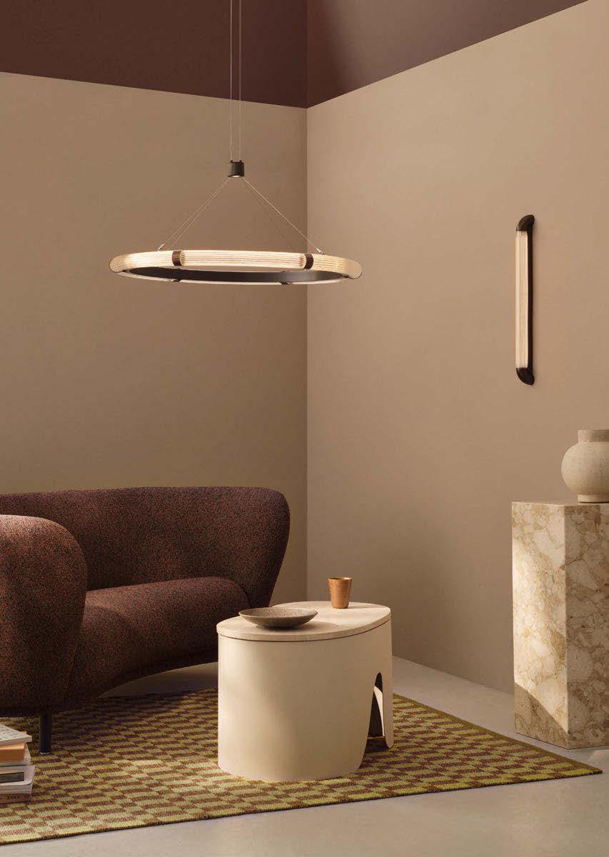
Catching up on current trends, we asked what Bødker Pedersen is observing in the industry at the moment. “I would say shape-wise, it seems to be chubby shapes and volume items that fill up a space. In lighting, we are seeing bigger pendants that fit this, too. Materials like fabric, in particular Linen and Tyvek, are also popular. I feel the fabric gives the same experience as opal glass, where the light is warm, and we can appreciate it most. Regarding colours, it is the warm, earthy tones. Black is not as popular at the moment and is being replaced with more chocolate brown
tones. I also think we will still see burgundy even later in the year, as it has been dominated in fashion, and I think it will follow in interiors. Chrome and stainless steel were among the top trends at 3 Days of Design in Copenhagen last year, and I think we will continue to see these cooler metals. Wood has never been out of style, but we are seeing a shift from the lighter wood to the darker, which adds warmth and richness to the products.”
Looking ahead, what can we expect from Nordlux?
“We will continue with our current successes, but we will be looking into new materials, moving away from metals and looking more at stone and fabric and the more organic materials. In terms of colours, we will be continuing with the neutral none-white pallet, such as beige and brown. We will also move away from the brushed and shiny brass and look more at the antique brass, which I feel is more timeless.”
Catch some of the brand’s timeless pieces on show at Clerkenwell Design Week this May in the Light exhibition at the House of Detention.
www.nordlux.com
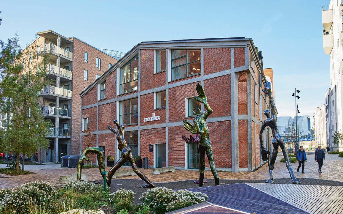
IMAGE: NORDLUX HQ, AALBORG, DENMARK
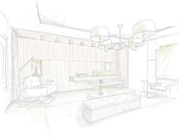
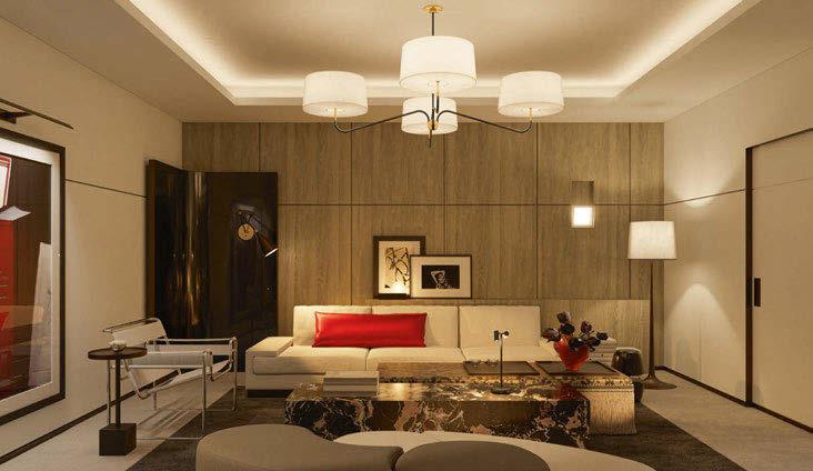
When I was invited to create a living room in collaboration with Visual Comfort for the WOW!house, I knew from the beginning that the lighting would be the hero of the space. For me, lighting is not just about function - it’s about emotion. It sculpts the space, sets the tone, and above all, brings everything to life. In this concept, every decision has been made to heighten the elegance and serenity I bring to my projects.
The WOW!house is an immersive celebration of style, but it’s also an invitation to pause and reflect. I wanted the space to fill guests with warmth from the moment they step in, and that begins with the lighting. My design always starts with my purist philosophy and in this scheme, lighting acts as the punctuation - bold, refined, and quietly powerful. [1]
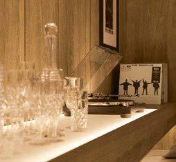
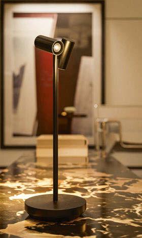
The room is bathed in warm, ambient light. Nothing too bright, nothing clinical. I chose deeply layered lighting to achieve that rich, cocoon-like effect. [2] This means a harmony between downlights, decorative accents, and hidden LED strips [3] that wash across textures, subtly accentuating everything from the opulent velvet upholstery to the gentle curves of the furniture.
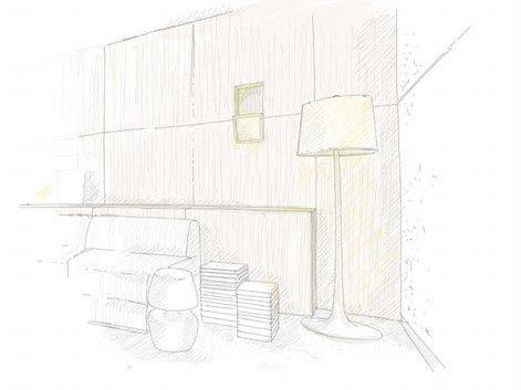
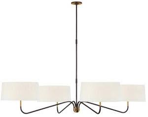
One of the centrepieces is a Visual Comfort Canto Grande chandelier, designed by Thomas O’Brien [4] - a sculptural moment suspended in the space, drawing the eye upward and playing with dimension. The curving lines of the Oscar Large Sculpted floor lamp , designed by Barbara Barry [5] also adds a sculptural quality to the room. It’s less about brightness and more about mood. I always think of lighting as choreography. It should dance, not shout. So, everything is dimmable, intuitive, and precisely positioned to guide the eye and soften the space. Particularly important in this project was the interplay between light, texture and material. Light connects all the different materials in the room. Against the neutral and earthy palette with accents of rich browns, warm terracottas and soft ochres, light bounces and reflects in beautiful, understated
Built on the Design Avenue of Chelsea Harbour’s Design Centre, WOW!house is a one-of-a-kind showhouse stretching 600sqm. 22 full-size rooms and outdoor spaces - each uniquely designed by world-class interior designers, working in collaboration with globally recognised design brands and suppliers - are on show 3 June - 3 July, 2025. Kelly Hoppen was tasked with creating a living room in collaboration with Visual Comfort. darc discovers her design intentions for the space below.


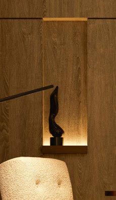
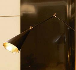
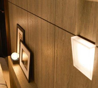
ways. I incorporated brushed brass fixtures to catch the light just so, giving off a golden glow without it ever feeling too ostentatious. In collaboration with Visual Comfort, we were able to use lighting pieces that echo the design language of the room: bold lines, organic curves, and effortless sophistication. Each piece stands alone as a design element while also contributing to the overall harmony of the room. Integrated wall lights sit within a panelled wall [6] while the library sconce is installed in a cut out niche within a wooden screen. [7]
My overall aim for the Living Room was to create a calm and harmonious atmosphere, bringing together vintage and contemporary elements. Unexpected accents run through artworks to upholstered items to create the perfect sitting room. Ultimately, the lighting in the WOW!house isn’t just something you see - it’s something you feel. It creates a sanctuary. A space to sit and experience design with every sense. And in a world that’s constantly rushing, that feeling is, quite simply, a luxury. www.kellyhoppeninteriors.com | www.dcch.co.uk/wowhouse
This April, the darc team descended on Milan once again to discover the latest decorative lighting offerings. This year, the team were out in full in order to cover Euroluce, exhibits, and showrooms in the city. Check out some of our highlights over the next few pages.
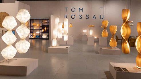
Tom Rossau
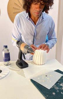
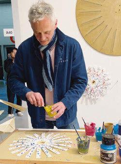
At this year’s Euroluce, Tom Rossau showcased a large selection of its new and existing designs alongside its signature craftsmanship; with live workshops on the stand, which was designed in-house by Nicolai Haastrup of the brand’s design and product development department.
What sets the brand apart is its dedication to local, handcrafted production. Each fixture is built by skilled craftspeople in its Copenhagenbased workshop. This was brought to life on the stand with Rossau creating unique, paint-splattered artworks side-by-side with Richard NankaBruce from the production team, who assembled multiple ST906 mini table lamps.
Alongside this, sat the anniversary edition of its iconic TR4 pendant. Rooted in the company’s heritage,
yet enhanced with contemporary refinements, the TR4 has been a core feature of the brand over the last two decades. With an elegant, organic form and warm glow, the TR4 is formed in the brand’s signature birch veneer. Also on show was the brand’s wellrecognised TR7 series, which was covered in depth by darc’s junior journalist, Ellie Walton, in our previous issue. Make sure to check it out and discover the full design and manufacturing process of this collection.
www.tomrossau.com

J. Adams & Co
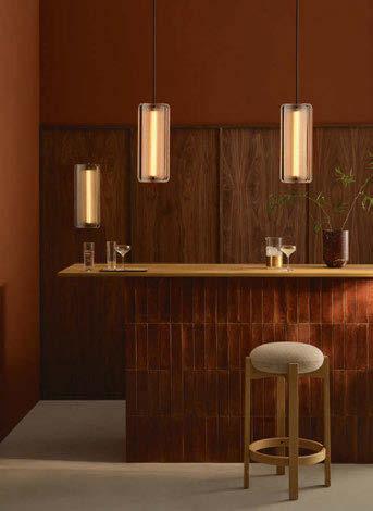
The UK-based lighting brand J. Adams & Co debuted three striking new collections - Apex, Talbot, and Strata Circular - during Milan Design Week. Blending materiality, craftsmanship, and innovation, each piece redefines contemporary lighting with a perfect balance of form and function.
The brand also featured at Fourfold exhibition, which brought together a curated selection of four lighting, furniture and accessory brands into one space.
At the exhibition, J. Adams & Co was joined by Bomat, creators of custom-made, exquisite rugs and carpets, Bieke Casteleyn, renowned for its meticulously designed, high-end furniture, and Designs of the Time, celebrated for its avant-garde, nature-inspired textiles. www.jadamsandco.com
Images: Jake Curtis x Hannah Bort
Designed for both residential and commercial settings, Pendulum - available in three shades, white, black, and brick red - seamlessly fits into homes, offices, cafés, hotels, and more, bringing elegance and functionality wherever it’s placed.
Designed by Matej Štefanac, the piece is precisely balanced with a counterweight that keeps the lampshade stable. The shade can rotate from +90° to -90° and swivel 360° around its vertical axis, offering complete flexibility.
Pendulum can be used as a focused task light for reading or working, or switched to ambient lighting for a relaxed atmosphere. Its LED light source remains hidden regardless of the lamp’s position, and is softly diffused through the shade, minimising glare. Pendulum is built for longevity, with each part designed to be easily disassembled, ensuring repairs are straightforward and affordable. www.intra-lighting.com

Zafferano
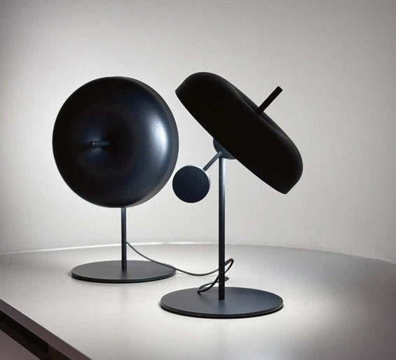
The anticipated Zafferano Lampes-à-porter portfolio has expanded with new cordless, portable, and rechargeable lamps that offer maximum freedom of use. These are practical and versatile solutions, suitable for both indoor and outdoor spaces, meticulously crafted and customisable.
Alongside these, the Zafferano AiLati Lights portfolio offers mains-powered lamps in various materials – blown glass, ceramic, metal, and polycarbonate – characterised by a synthesis of aesthetics, functionality, and modularity. Pictured, is the Pina XXL by Zafferano Lampes-à-porter. Following the success of Pina, Zafferano expands this collection of battery-operated, portable, and rechargeable lamps with a floor version. Its tilting head allows for precise light direction. The touch control on top of the shade enables users to switch the lamp on and off, adjust the light intensity (dimmer), and select the colour temperature (2200, 2700, or 3000K). Available in matte white, titanium, bronze, and matte gold die-cast aluminium, with 12 to 13 hours battery at full power. www.zafferanoitalia.com
Brand Van Egmond
The quiet strength of the smallest seed, awakening beneath the earth, reaching through the darkness towards the light, and ultimately blossoming. The Blossom collection embodies the remarkable power of transformation and growth. It captures the mystery of life, distilled to its purest essence. Brand Van Egmond’s Blossom invites the natural world into an interior, capturing the delicate yet powerful essence of growth and renewal. Each light echoes the graceful unfolding of petals, offering both warmth and elegance to any space. With its soft light, Blossom brings harmony and serenity. With Blossom, lighting becomes more than just illumination, it gently embraces nature’s transformative power. “‘Just as light is a necessity for a flower to blossom, beauty is essential for an interior to truly flourish,’’ says William Brand, Founder and Blossom’s designer. www.brandvanegmond.com


Vosco
Ambientec
Vosco, designed by Nao Tamura, is inspired by tools that have been part of everyday life for generations. In a forest, trees that are tall and straight are selected for furniture, while curved, knotted, or irregular wood often goes unused. We seek to honour these qualities, giving new value to materials that have been overlooked. By transforming these woods into something that integrates into daily life, the brand hopes to create objects that will be cherished for years to come. www.ambientec.co.jp

Kando Bover
Introducing the Kando collection, a new line by Joana Bover that combines aesthetic allure and functionality. Named after the Japanese concept of ‘Kando’, which signifies profound emotional impact and satisfaction, this collection features luminaires that emit a soft, inviting light through unique materialsribbon fabric for indoor settings and nautical cord for outdoor environments - encased in a Teka wood structure that doubles as a handle. www.bover.es
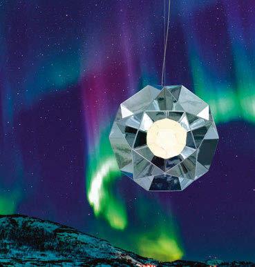
Designed by BIG, Arctic consists of geometric components that break apart and reassemble into modular structures, creating a dynamic interplay of light and reflection. The final form is an Archimedean solid stripped of its outer faces, with a structure defined by projections from the centre of its pentagonal edges. At its core lies a diffusing sphere, onto which truncated pentagonal pyramids are mounted. www.artemide.com
Image: Pierpaolo Ferrari
The moment when molten glass becomes a solid yet infinitely delicate is the inspiration for Under Pressure, a new collection that captures this transformation and the exciting tension it creates. This visual effect is further accentuated with technical elements, such as a centre-line threaded rod that penetrates the glass globe and brings a touch of geometric regularity and industrial elegance. www.brokis.cz
Image: Martin Chum

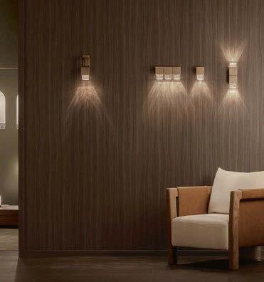
A collection of nine wall sconces and pendants unite in concentric, geometric form yet offer a diversity of configurations plus chromatic and textural light and shadow interactions. Molten glass is poured into a hand-chiselled wooden mould, producing a textural imprint on the surface of each block. Available in a choice of brass or bronze casing and five desaturated glass hues: ice, guava, honey, mint and smoke. www.articolostudios.com
Image: Thomas De Buryne Photography
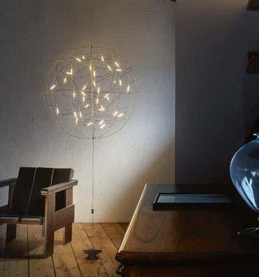
Pòta!
Catellani & Smith
The Pòta! pendant has a spheroidal structure, crafted in brass, and is available in two sizes - a 50cm diameter (with 18 ELV LEDs) or 85cm (with 36 ELV LEDs). The model comes with a white hemispherical base and a blue cable. The pendant version with plug driver and ceilingto-floor installation shares the same dimensions and lighting elements; the difference lies in the distinctive anvil-shaped counterweight that adds balance and character. www.catellanismith.com

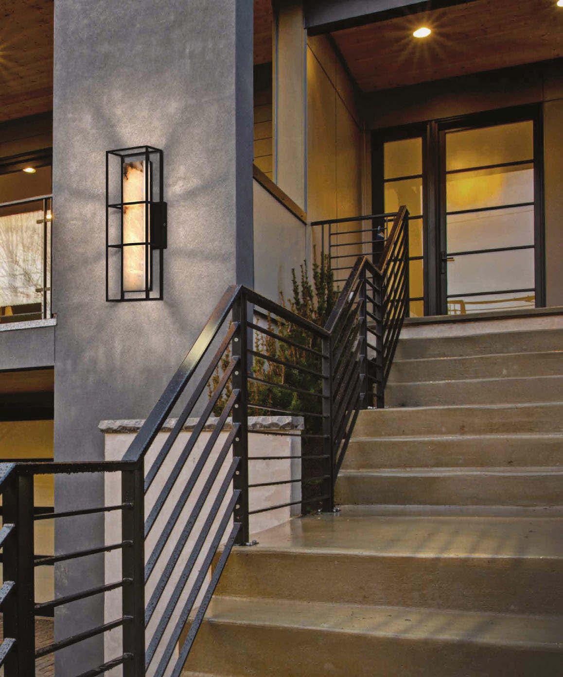
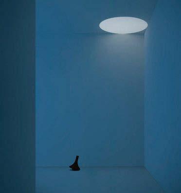
Davide Groppi
Designed by Omar Carraglia, OneOff is a mobile floor or table lamp that evokes the suspension between light and shadow. A special optical system focuses a perfect circle of light on the ceiling to create a precise, almost metaphysical effect. Light can be transformed, becoming colour and suggesting unique atmospheres. An essential gesture that shapes new perceptions and designs space with the lightness of intuition.
www.davidegroppi.com
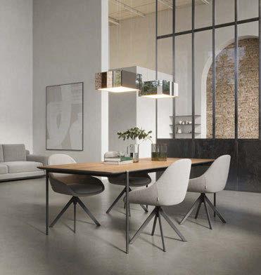
Mirror cube
Formagenda
The Mirror Cube is the latest addition to the Mirror Suspension family and has main character energy: bold, striking, and impossible to ignore. With its strong cubic volume and planar light diffusion, it blends classy elegance with modern futurism. Both geometric and reflective, it shapes the space around it, adding depth and dimension. The Mirror Cube comes in three different finishes: clear mirror, smoked grey mirror, multicolour mirror. www.formagenda.com
Cilia David Pompa
Cilia blends handwoven palma with precise industrial elements, creating a refined balance between organic warmth and architectural clarity. Light and texture interact to craft striking contrasts and ambient atmospheres. With a timeless, sculptural quality, this collection seamlessly fuses tradition with modernity. In the future, the brand will offer different diffuser lenses to adjust the light’s angle, giving the user even more ways to play with the ambiance.
www.davidpompa.com
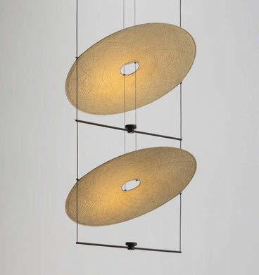
Allumette by Francesca Lanzavecchia, is a project that focuses on the theme of the traditional chandelier with arms, redefining its aesthetic parameters. The luminous parts in transparent PMMA at the ends of the arms have been developed to create an effect of suspension in space. In juxtaposition with the solidity of the metal structure, the softness of the textile cables contributes to the dynamism of the design.
www.foscarini.com

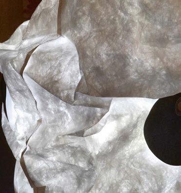
Maap by Erwan Bouroullec is a wall-mounted lamp composed of a light element equipped with four LED sources and a cross-shaped iron support that magnetically secures the lamp body made of Tyvek. This casing is available in four sizes (Wall 1, Wall 2, Wall 3, and Wall 4), depending on the number of light modules mounted on the wall. At full extension, Maap can cover up to 4-metres in width, while its height remains at 160cm. www.flos.com

During this year’s Euroluce, Grau presented its Plug & Play collection for lively vibes. Following its showcase at Milan Design Week 2023, Grau transformed its celebrated art project Campfire into a market-ready product. Campfire is a unique luminaire in the shape of a 160cm tall glowing campfirea statement piece for foyers, shop windows, lofts, and lounges. www.grau.art

Ingo Maurer
The Munich-based lighting team reimagines the humble dish holder in an atmospheric context, detaching it from its utilitarian purpose and assigning it a new aesthetic role. It consists of five simple white porcelain plates arranged vertically. Hidden behind them is a narrow, backlighting LED strip. The light is not merely diffused - it is absorbed, refracted, and reflected in subtle gradients of brightness. www.ingo-maurer.com
Image: Giuliano Koren
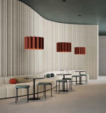
In a strategic partnership with Italian lighting icon Panzeri, Luxxbox unveiled new acoustic solutions at this year’s Euroluce. Kurtain is an acoustic pendant inspired by the fluid movement of draped fabric, crafted from biodegradable wool for a soft, organic aesthetic. Designed for high-performance sound absorption, it is available in three sizes, 77 colours, and features dimmable LED technology. www.luxxbox.com
LedsC4’s new launches follow its philosophy of “Light for better living,” with creations that stand out for their design, versatility, functionality, and sustainability. A notable highlight is Hop, designed by Nahtrang Studio, featuring pure lines that evoke fluid movement. “All the innovations represent our vision of light as a transformative element that defines each space’s identity,” says David Rodríguez, General Manager of LedsC4. www.ledsc4.com
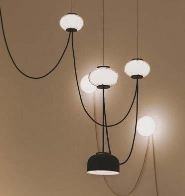
Bodo Sperlein transformed the historic All Saints’ Anglican Church in Brera into a space where design becomes a dialogue between tradition and modernity. In the lighting realm, LZF showcases its innovative creations in certified wood veneer, crafted through its exclusive Timberlite process. The brand presents the Voliere and Osca collections, alongside the premiere of the Arabesque light, inspired by Spain’s rich cultural heritage. www.lzf-lamps.com

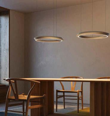
Lodes completes its Tidal collection with a new suspension version. The main body has been redesigned with a double-shell structure that balances the direct and indirect light to minimise glare, while adding a dynamic twisting effect to the ring’s asymmetrical shape. Available in two versions: the standard model with suspension cables approximately fourmetres long, and a rise and fall model equipped with a sophisticated winding mechanism. www.lodes.com
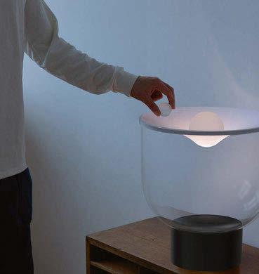
Martinelli Luce
Grammoluce is characterised by the Lycra elastic fabric that covers the borosilicate glass structure, which, when deformed by glass spheres placed on it, acts as a switch and dimmer for the lamp. Depending on the number and weight of the spheres placed on the fabric, the lamp changes intensity and tone of the emitted light using a dynamic white LED source. This is the third collaboration with Habits Design, completing a trilogy of projects on the theme of light and gestural interaction. www.martinelliluce.it
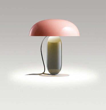
The new Gambosa fixture, available in two sizes, looks like a balanced sculpture in sophisticated colours. Its creator, Mathias Hahn, has provided a modern take on the table lamp, a design that challenges the product’s traditionally static and rigid nature. The shade is available in pale pink or black, opaque versions that provide a direct light, or in opal methacrylate for softer illumination. The stem is available in orange and moss grey and the base in stone grey. www.marset.com

Ronex
Roger Pradier
Brossier Saderne and Roger Pradier, members of the Rivalen collective, respectively presented the Ronex and Carex wall lights, created in collaboration with Pyrex as well as the Atelier pendant light, designed by Studio A.S.L Paris.
The Ronex wall light, designed by Stéphane Joyeux is available in aluminium, G9 LED, IP65-rating, and 15 colour options. www.roger-pradier.com
The collection comes in 18 shades, creating virtually endless creative possibilities. Each nuance has been curated to give architects, interior designers, and clients the freedom to create extraordinary spaces through strong colour accents or harmonious compositions. Colors by Occhio will be available to order for selected pendant and mobile luminaires from the Mito, Gioia, Sento, io and lui series in 2026. www.occhio.com
Image: Laura Thiesbrummel

Hempla Sanctuary
Sofia Hagen x Zumtobel
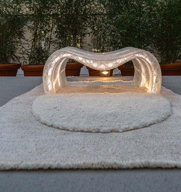
Hempla Sanctuary - “Meditation Pit-Stop”was a unique interactive installation which blended mindfulness with advanced design, ancient craft, sound and light at Zumtobel Lighting’s new Milan headquarters. The Hempla seat made of clear 3D printed sugar comes with integrated LED lighting. When incorporating lighting within the structure, it emphasises the holistic experience, glowing smoothly through the translucent sugar shapes for a soft, ephemeral glow. www.sofiahagen.com | www.zumtobel.com
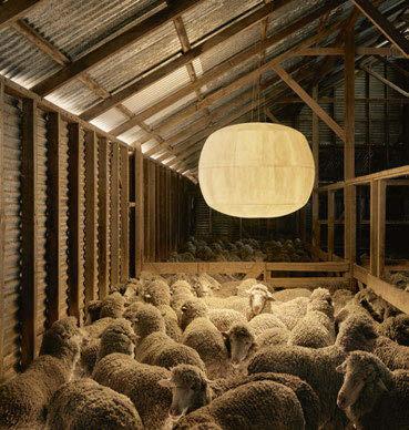
In a fusion of heritage and innovation, Australian designers Studio Truly Truly partnered with Rakumba to launch Big Glow, a revolutionary take on the classic glowing sphere lighting archetype. Big Glow represents a shift in sustainable lighting design, utilising a blend of Australian wool and plant-derived compostable fibre. www.rakumba.com
Image: Josh Robenstone
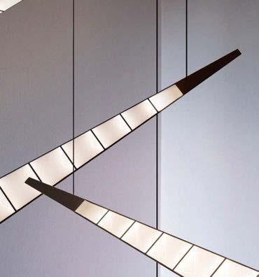
A lamp with a strong personality, defined by its dimensions and abstract form, which encloses each of its components within the simple, closed volume that characterises it. “With this project I tried to combine the fascination for artificial structures and clear and decisive forms, evoking at the same time the movement that contrasts with the static nature of formal research,” says designer Duccio Maria Gambi. www.tooy.it
FOCAL POINT
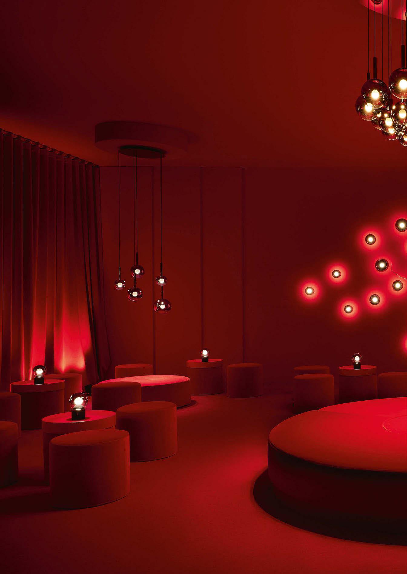
Inspired by the fusion of dreams and imagination, ‘Dreamagination’ transported visitors to a world of colour, innovative surfaces, and unique styles. Behind flowing curtains, dreamlike worlds unfolded, inviting you to explore. Occhio presented itself in a colourful way in the first part of the exhibit: colours by Occhio became a vibrant expression of creativity and design freedom. The focus was on luminaires from the Gioia series – presented in breathtaking nuances of blue, green, red, and violet. The colours lend the iconic luminaires a completely new expressiveness in a curated palette of 18 inspiring colours.
A few steps later, a powerful, mystical world opened up: dark chrome expands Occhio’s stylistic diversity with a fascinating surface that’s perfectly aligned with interior design trends. The depth and brilliance of dark chrome lends any room a sophisticated touch – and for the first time, Occhio also presented its classic Mito in a high-gloss finish.
The ‘Red Saloon’ (pictured) in the centre of the glass pavilion created a statement – a powerful, monochrome display in deep red that embodied pure opulence. Here, the entire Luna series unfolded its radiance in an ambience that combined intensity and sophistication. Luna pura, Occhio’s first wireless light, created unique lighting moods – from cool moonlight to romantic candlelight. At the centre of this extraordinary presentation is Lunanova – a reinterpretation of the classic chandelier.
Coro and Coro moon in gleaming gold were the highlights of ‘Dreamagination’’s light apricot lounge. The new lighting series combines a clear, minimalist design with fascinating innovations. They are available as Coro with zoom optics or a fixed lens, or as Coro moon with Occhio’s fireball light source. Their minimalist design incorporates the popular Occhio features – including “touchless control” and “colour tune” to Occhio air.
www.occhio.com
Image: Laura Thiesbrummel


Renowned creative duo George Yabu and Glenn Pushelberg, internationally known as Yabu Pushelberg, have released the latest evolution from their Miles Collection: a new table lamp released exclusively for Milan Design Week 2025.
Resonating with the same lyrical elegance and formal clarity as its brothers and sisters in the original collection, the Miles table lamp has been created to add a more intimate scale to the composition. It invites a quiet moment of reflection, where light becomes both sculpture and source. Inspired by the parallels between musicmaking and glassblowing, Miles strikes a harmony between precision and spontaneity.
The latest iteration continues the successful collaboration between Lasvit and Yabu Pushelberg, which began with the Cipher collection in 2017. The collaboration arose through an admiration for the brand’s exceptional craftsmanship and their shared alignment with their design vision. Together, they felt empowered to transcend the physical limitations of artisanal glassmaking and imagine without constraints. A collaboration that the pair have described as “liberating”.
Like Cipher, which became a modular lighting staple in hotels and residences worldwide, Miles is designed to be versatile, equally at home in residential spaces, creative studios, or hotel lobbies.
“It’s about giving light a voice, says Yabu. “With Miles, we wanted to tune that voice to something lyrical – something with a soul.”
Like a soloist emerging from an orchestra, the table lamp refines the essence of the collection into a standalone statement. Its form, which is made from the elegant interplay of fluted glass and metallic elements, is evocative of the silhouette of a brass instrument. The design of the Miles collection was informed by the visual and procedural similarities between glassblowing and musical performance. Observing the controlled breathwork, timing, and physical coordination required in shaping molten glass, the designers drew visual parallels to the techniques used in playing brass instruments, which guided the formal and conceptual development of the collection.
The Miles table lamp exudes rhythm and tactility. Its fluted interior catches and plays with light, transforming the piece from a functional object into a sculptural form. “We wanted to create something that doesn’t just sit quietly on a surface,” says Pushelberg. “We wanted to create something that engages the space and the person in it.”
As the Miles collection continues to evolve, its latest iteration as a portable table lamp felt like a natural extension of the original design language. The transition from the larger sculptural forms to this more compact version came easily to the designers; drawing from the trumpet silhouette that defines the series, the duo found that mirroring or modifying the flared ends allowed them
to organically reimagine the piece without losing its identity. “It’s almost like working with a vertebra”, Yabu observes, referring to the way individual forms can stack and shift, suggesting both rhythm and structure.
The simplicity and versatility of the single or double flared form allowed the team to adapt the piece for different functions without compromising the language of the series. “It all made sense,” adds Yabu. “It came from one shape, not just a linear tube, it has movement.” The new table lamp captures that movement in a form, underscoring Lasvit’s commitment to timeless design and modular evolution.
Looking ahead, Pushelberg hinted that a pendant version could be the next step for the Miles collection, he made note that it would be perfectly suited for vertical architectural spaces such as a stairwell. “An extended pendant would be really beautiful,” he notes. “It would bring elegance to spaces where light and height meet.” The pair also reflects on the nuances of proportion, noting how the singular flare functions differently depending on its orientation.
“When it goes downward, it just feels more natural,” Yabu says, suggesting that their approach to design is as much about intuition as it is about form.
When asked what kind of soundtrack would best describe the Miles collection, Yabu and Pushelberg didn’t hesitate to answer with the apt association with Miles Davis; however, they said not just because of the collection’s name, but also likened the moody elegance and emotional nuance both the lighting and music of Miles Davis share.
“There’s something about how Davis draws out the music,” adds Pushelberg. “It’s sombre, it’s moody – it seduces you slowly.” The designers likened the experience of the light to visual jazz: shifting, layered, and atmospheric. Just as Davis’s compositions meander between tension and resolution, the Miles table lamp plays with gradients of light, starting to dim then moving brighter, however, never quite revealing everything all at once, creating an ambience like a great piece of music.
Glenn reflected further on the sensual quality of the piece, suggesting that the light truly comes alive after sunset. “It’s all about night, seduction, and sex,” he says. “Something is compelling about it when the world goes dark, and the lamp starts to glow, it feels intimate.”
www.lasvit.com | www.yabupushelberg.com
Image: Lasvit
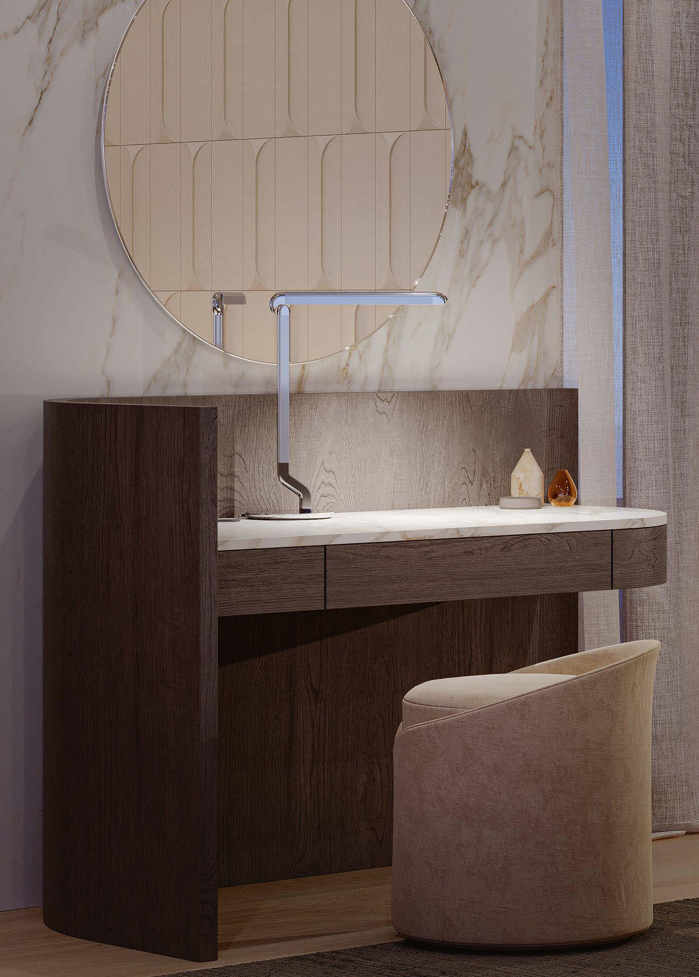

The new Contardi Picchio collection of wall and table lights designed by Alessandro Munge were unveiled at Euroluce. Read below an interview with darc’s editor about his debut lighting collection.
At Euroluce, Contardi presented Picchio, the new collection designed by Alessandro Munge. Inspired by the biomechanics of the woodpecker it combines aesthetics and functionality in a perfect balance between nature and technology, transforming light into an intuitive and sophisticated experience.
darc’s editor sat down with Alessandro Munge and Enrico Passeri, the studio’s Managing Director, at the show, to learn more about the inspiration behind the product and why the designers felt their was a gap in the market for it.
Reinterpreting the concept of a reading lamp, the interior designers aimed to create something they were keen to specify in their own hospitality projects. Inspired by the posture and movement of the woodpecker, the lamp features a jointed structure that recalls its iconic gestures. The diffuser, which resembles a beak, opens and tilts to precisely modulate the light, while the essential and functional joint ensures maximum freedom of movement.
Out of admiration for the studio, Contardi approached Munge and his team with the opportunity to create a product for the brand. Munge viewed this as a great chance to develop a product they always seek when specifying for hotels. The aim was to blend functional design with stylish and sophisticated aesthetics.
“It’s an advantageous position to be in as the specifier,” Munge explains.
“You see a gap in the market, and you fill it. It makes a lot of sense. It’s easy to come up with a design, but to put something unique on the market - that’s very difficult. When you’re at a show and moving from booth to booth to booth, you begin to spot similarities but with subtle differences. But we don’t want to be slightly different. We want to be different.
“As artists, you always want to be unique, but the world is so big, and product is such a massive part of the design industry. In our work, we just don’t believe in the philosophy of doing the same thing over and over. When a project is done, it’s done in our eyes. We just won’t repeat it.”
An interesting observation Munge had picked up on while staying at various hotels is that fact that a lot of desk lamps are placed awkwardly on a table underneath the television. His aim was to create a task light that was adaptable to these inflexible spaces, allowing the user more
freedom to direct light accordingly. And when the lamp is not in use, it is folded away to create a sculptural point of interest in the room.
The resulting reading lamp is a dynamic and sculptural object that encourages playful interaction from the user.
The research of materials and finishes plays a key role in the customisation of the collection, which is available in aluminium and leather, with colour variations that range from contemporary minimalism to warmer interpretations.
Munge explains that it was an intentional decision to contrast a woodpecker’s natural, soft, feathery aesthetic with the lamps’ chosen materials of aluminium and leather. The woodpecker’s silhouette and movement played a stronger role in the product’s inspirations, as the arm and head of the lamp mimic the hinged movement of a woodpecker standing vertically on a tree.
Munge continues, elaborating on the leap from interior design and architecture into the world of product design: “This new foray into product design has been nothing short of exciting. It’s a lot more challenging than interiors.
“It’s easy to draw a product, but a hell of a job to produce it and to get all the mechanisms to work. You have to rely on your partnership with the manufacturers to ensure they’re getting it right. Contardi’s technology and engineering department is amazing.
“It’s easy to envision the product and see it, but then to understand how it got here [pointing at the product on the stand] is part of the fun.”
During the research and development stages, Munge took 3d printed prototypes to his studio and asked for direct feedback and constructive criticism from his team – which they did. “It was amazing. So from that, we went through a couple of iterations and as a result, they could see themselves specifying it, which is a real positive.”
Picchio combines aesthetics and functionality, offering practical, durable and adjustable lighting thanks to its ergonomic design and advanced LED technology.
It comes in different versions – wall lamp and table lamp – designed to adapt naturally to residential, contract and hospitality contexts. www.studiomunge.com www.contardi-italia.it INTERVIEW
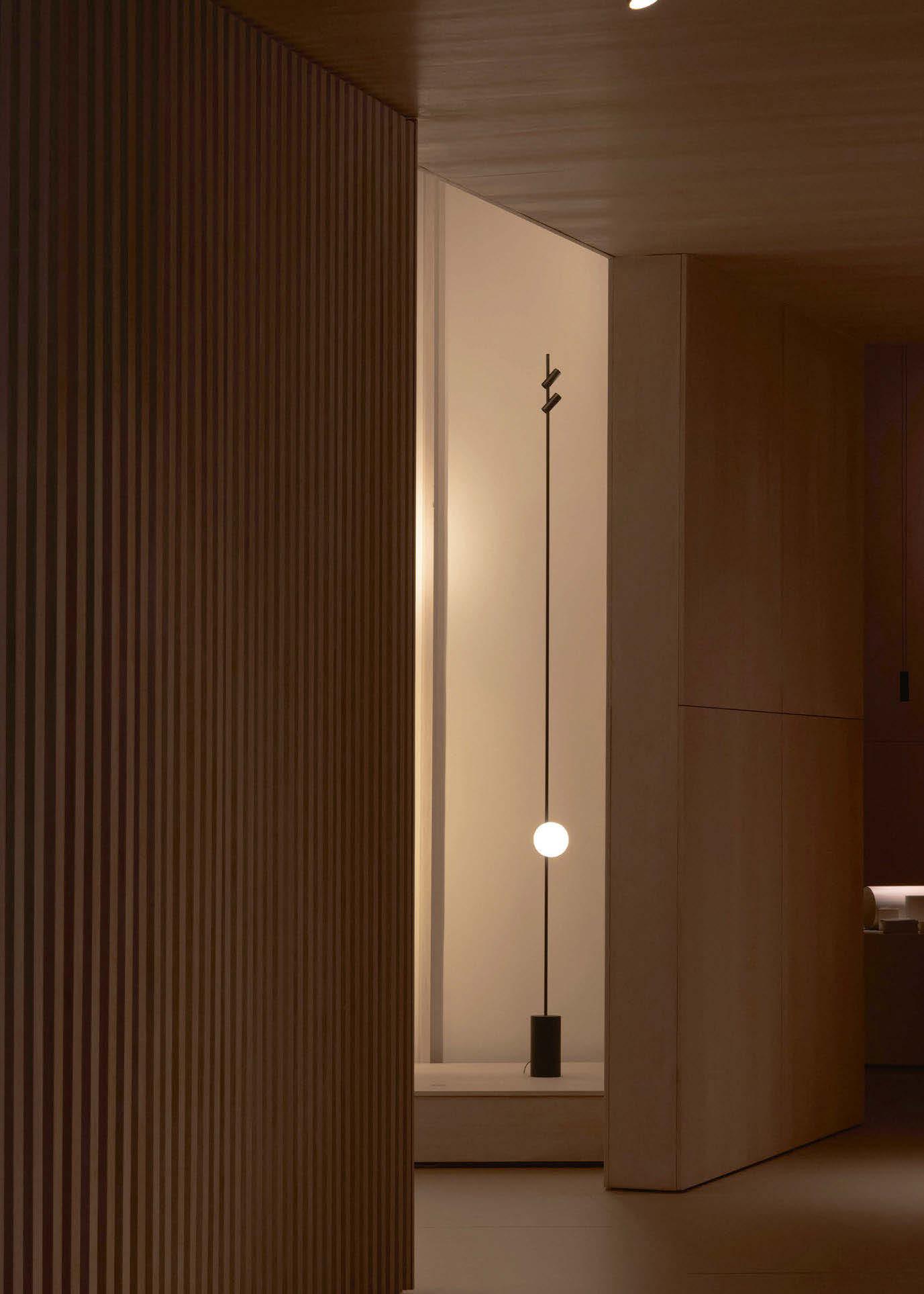

At Euroluce, Vibia unveiled Veil, a groundbreaking lighting system designed by Francisco Gomez Paz, that reimagines the relationship between illumination, architecture, and the human scale.
Moving away from the often rigid, large-scale lighting systems tied to architecture, Veil introduces a more intimate, object-like approach.
Essentially, Veil is a toolkit for shaping light with freedom and simplicity. “Lighting systems are typically designed at an architectural scale, but Veil shifts toward the human being,” explains Gomez Paz. “It’s a system that behaves like an object that is dynamic, approachable, and adaptable.”
At its heart, Veil is ingeniously simple: its slender profile conceals positive and negative cables, allowing electricity to flow discreetly.
Lighting elements, including spotlights, diffused spheres, linear lights, and cylindrical paper shades, seamlessly clip onto the profile exactly where needed, are easily adjustable and rotatable for full personalisation.
Crafted from lightweight yet durable aluminium, the profiles are finished with a soft, matte texture that blends seamlessly into any architectural setting. The diffused spheres offer a warm, ambient glow, while the linear lights provide precision and direction – all designed to rotate effortlessly along the Veil’s rail, adapting to the user’s every need.
The name Veil itself alludes to the delicate way the system conceals its inner workings. “It’s just a simple aluminium profile, with a cleverly veiled cable inside,” says Gomez Paz. “The concept is almost naive in its simplicity, but it opens up infinite possibilities.”
Initially driven by a desire to create a flexible, minimalistic lighting toolkit for the home, Veil has evolved into a fully modular system suitable for residential and commercial settings alike. Its minimal expression, in structure, scale, and visual language, makes it feel almost invisible in a space, giving centre stage to the light itself rather than the fitting.
“The real challenge,” Gomez Paz shares, “was finding the minimum expression of a lighting system. Once you achieve that, the system disappears, and you allow light to sculpt the space instead of the object.”
Working between his studio in Argentina and his adopted home in Italy, Gomez Paz approaches design through a deeply hands-on methodology, putting a huge emphasis on the importance of prototyping everything
themselves. Gomez says: “Ideas don’t come from sitting at a desk, they come from working with your hands, experimenting until a simple solution suddenly appears, almost unexpectedly. Veil’s revolutionary cable concept was born from this tactile process, demonstrating that the simplest ideas are often the most powerful.”
Designed to be dynamic, Veil allows its users to create and customise their own configurations via an upcoming app-based configurator, making it accessible to both designers and homeowners seeking a tailored lighting experience.
Reflecting on the collaboration, Gomez Paz speaks warmly about his experience working with Vibia: “It’s been a beautiful dialogue, full of trust and creativity. Seeing the final pieces here for the first time is an emotional moment. I can’t wait to bring [Veil] into my own home.”
Launching Veil at Milan’s Euroluce, the beating heart of the design world, was a natural choice. “For me, Milan is everything in design,” he says. “Every other year, Euroluce sets the rhythm for our industry. I’ve been designing for Euroluce for years, so this moment is both personal and professional. It’s an incredibly strong platform to introduce a new collection.”
In a world increasingly drawn to personalisation and modular living, Veil offers a new way to interact with light. No longer a static fixture, light becomes an adaptable companion, shifting with mood, need, and space, inviting users to create their luminous environments. In Veil, Gomez Paz and Vibia have created something truly rare: a lighting system that feels both profoundly technical and deeply human.
Gomez Paz concludes the interview, summing up his passion for light saying: “Light, to me, is a strange kind of energy, both material and immaterial. It has the power to completely shape a space. You can change the entire atmosphere of a room with the right lamp. That duality is what drew me to lighting design in the first place. It allows people to experience and inhabit spaces in different ways. Light isn’t just functional, it’s emotional, architectural, and deeply expressive. It’s a complex idea to sum up, but for me, it’s essential to how we live and feel in the spaces around us.
www.vibia.com | www.gomezpaz.com
Images: Vibia
MILAN, ITALY
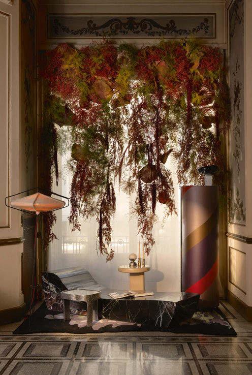
One of the darc team’s highlights of their trip to Milan was the L’Appartemento by Artemest. Celebrating its 10th anniversary at this year’s Milan Design Week, Artemest presented its third edition of the residential installation that sees a variety of rooms eclectically transformed by six acclaimed international interior design studios. The installation aims to celebrate the world of Italian craftsmanship and design through the lens of these globally renowned designers in an exclusive venue that opened its doors to the public for the first time.
Located at the Palazzo Donizetti, a stunning 19th-century traditional Italian manor house, the six rooms were transformed using a selection of extraordinary furniture, lighting, home décor and art from Artemest’s finest artisans, brands, and artists.
The Foyer by Simone Haag [1]
This space was an elegant prelude to the experience where natural textures met bold compositions, and colourful accents stand in perfect harmony with the palazzo’s original charm. Engaging with its architectural and design language, Haag drew on the palazzo’s Italianate resonance, allowing the beauty of its historic fabric to sing against the intentional juxtaposition of contemporary collectible art and design crafted by Italy’s modern-day design vanguards.
The Reading Room & Studio by Nebras Aljoaib [2]
A refined and inviting space that merged classical architecture with bold, modern designs. Aljoaib chose to move away from the typical desk-centered layout often associated with home offices or libraries. Instead, the seating is placed at the centre of the space, creating a more inviting and relaxed atmosphere. The Marina Light
Blue Chandelier by Bottega Veneziana serves as a striking focal point, effortlessly bridging the classical and the modern.
The Grand Salon by Meyer Davis [3]
Dubbed ‘La Sirena’, this living room embodied allure and seduction, a space suspended between ancient myth and contemporary design. “We wanted to create a space that invites guests to not just observe, but to engage, discover, and be transported. Through layers of texture, light and form we created an experience that blurs the line between past and present, fantasy and reality to evoke a timeless allure,” says Will Meyer and Gray Davis.
The Dining Room by Romanek Design Studio [4]
The grandeur of convivial Italian gatherings was expressed by a dynamic mix of textures and materials to create a sophisticated atmosphere. “I wanted to meet the room’s grandeur with a sense of uniqueness and calm, a space where one can finally exhale and truly relax. To transform a room that initially feels overwhelming into one of serene beauty - a room designed to be enjoyed and lived in, not just admired from a distance,” says Romanek.
The Entertainment Room by 1508 London [5]
This room was a reinterpretation of the 19th-century salon as an eclectic space inspired by the most prestigious members’ clubs and designed to foster connection and creativity. Despite its relatively small footprint, the space presented 15 distinct vignettes, meticulously curated, creating an experiential journey filled with moments of joy and playfulness.
The Bedroom by Champalimaud Design [6]
An artistic retreat where colourful glass, contemporary sculptures, and handpainted wallpapers create a new world of elegance. “The whimsical, cinematic appeal of the vanity room leads into the elegant and relaxed bedroom where we carry on the palette of reds, creams, and metallic tones,” explains the design team. www.artemest.com

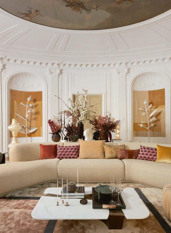
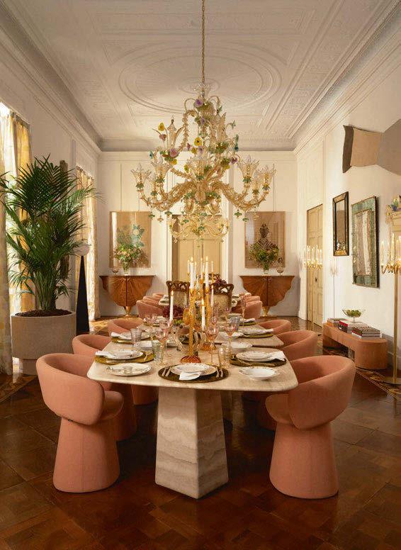
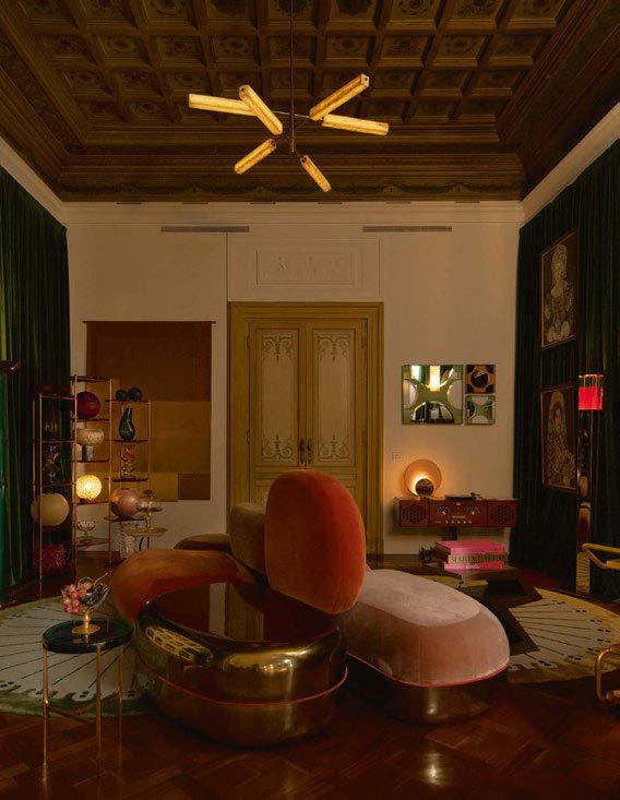
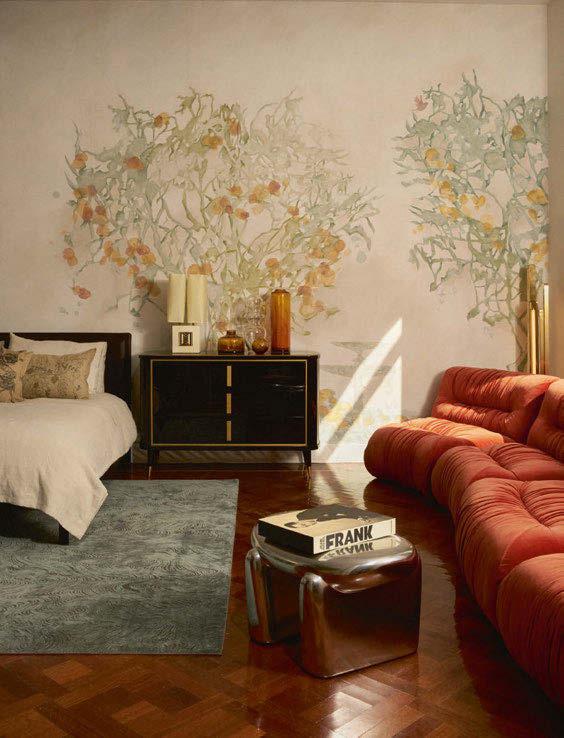
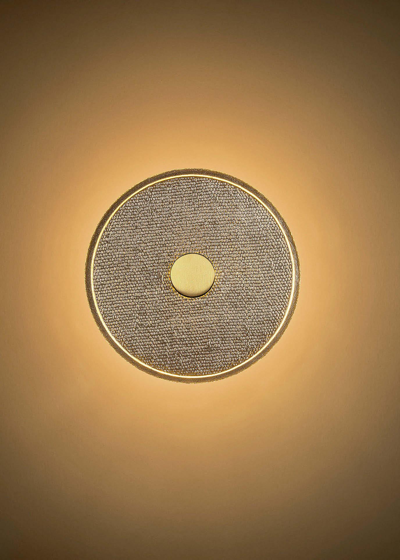

Lasvit’s latest creation, Loomo, is where tradition meets innovation, and light becomes a tactile, sculptural experience. Conceived by Lasvit’s Art Director Maxim Velčovský, Loomo invites people into a world where fabric is fossilised in glass and light dances across woven textures.
At this year’s Euroluce at Salone del Mobile 2025, Lasvit unveiled Loomo, a new lighting collection that combines tradition, innovation, and the transformative power of glass. Designed by Maxim Velčovský, who is known for his ability to reinterpret objects with a sense of irony and historical reference, Loomo captures the delicate, tactile spirit of woven textiles, fossilised forever in luminous glass.
The origins of Loomo lie in Velčovský’s ongoing experiments with imprinting fabric textures into molten glass. Following a large-scale installation at Palazzo Isimbardi for Milan Design Week 2024, where he explored the potential of three-dimensional surfaces, Velčovský began to develop a method he calls “textile fossilisation”, which embeds the intricate weave of cloth into flat sheets of glass. This is achieved by placing a glass sheet over a textile structure and imprinting it, so that every thread and every dot captures the light. As one moves around the Loomo, the glowing ring becomes more apparent, and the structure reveals itself, playing with the user’s perception of light and surface.
The result is quite frankly mesmerising due to Loomo’s circular glass forms with a golden hue, its surface appearing woven and tactile from the front yet smooth to touch. As the viewer moves, the perception of the lighting changes – the ring of light fades, replaced by the intricate pattern of the weave, blurring the line between light and sculpture.
Beyond its immediate visual impact, Loomo addresses a deeper design challenge: how to structure light itself.
Rather than relying on exposed light sources or diffuse sources, Velčovský has embedded them above and behind the glass plates. Light is drawn into every crevice of the woven imprint, softly emanating outward and creating a glowing halo effect on surrounding walls.
“You need a structure to capture light,” says Velčovský.
“Without it, light just passes through. But with Loomo,
the glass becomes an active participant; it holds the light, bends it, and reflects it back with texture and warmth.
The collection debuted in two sconce sizes, designed for residential, commercial, and hospitality spaces. Whether placed individually or composed into larger wall installations, Loomo offers architects and interior designers a new way of animating surfaces, replacing static artworks with dynamic, ambient compositions. Though rooted in technological precision, Loomo is deeply emotional. Velčovský notes that Loomo sits somewhere “between moonlight and technical lighting,” merging the soulful softness of natural light with the craftsmanship of contemporary design. Visitors to Euroluce found themselves instinctively drawn to the tactile surfaces, running their hands along the glass, trying to grasp the elusive source of its glow.
“People don’t expect it,” Velčovský tells darc, with a smile.
“They try to grab the light itself.”
Velčovský also channels a broader historical reference in Loomo one which is informed by the ancient relationship between textiles and architecture. When early humans moved out of caves and began building shelters, they often used branches to create woven frameworks, which were then covered with mud – a kind of primitive wall construction.
“In that sense, weaving was one of the first architectural techniques,” he reflects. “In Loomo, we return to that primal idea, weaving structure, capturing light, building atmosphere. The techniques and legacy of ancient times continue to inspire me. “
Though Loomo currently exists as wall-mounted sconces, Velčovský hopes that the concept could evolve into ceiling applications or larger sculptural installations. “We’re testing different interpretations, perhaps a chandelier version,” he says. “This is just the beginning.”
www.lasvit.com
Image: Lasvit

Adilo, the latest pendant from Finnish lighting brand Secto Design, was revealed for the first time in April in its full sculptural form after years in quiet development. Visitors to both Euroluce and the LaCividina showroom in Milan’s Fashion District witnessed the transformation first-hand: from an unassuming flat-packed disc to a graceful, spiralled luminaire that seemed to bloom in mid-air.
Designed by Finnish artisan and industrial designer Ilkka Kauppinen, Adilo is more than a light fixture – it’s a study in movement, material, and intentional design. Its elegant mechanism allows the lamp to unfold with a single, fluid motion. The result is an object that merges the poetic with the practical – a visually striking pendant that redefines how we think about lighting, sustainability, and form.
Though Adilo may have debuted as a prototype this April, its origins stretch back 14 years. Speaking with darc at Euroluce, Kauppinen described the product as “a journey that never stopped giving.” Originally conceived as a side project exploring geometry and natural patterns, the design lay dormant for over a decade while Kauppinen pursued work in furniture and product development.
“It wasn’t until I left my full-time job that I had the space to revisit this idea seriously,” he explains. “The form, the mechanism, the light behaviour – they all evolved organically over time. The breakthrough came with the folding system. People struggled to open the early models, so I designed a new mechanism that made it intuitive. Watching it open for the first time, fully formed – that was a moment I won’t forget.”
Staying true to Secto Design’s Nordic DNA, Adilo is crafted from certified Finnish birch, a material synonymous with the brand’s signature architectural slats and warm minimalism.
What sets Adilo apart is its innovative use of 3D-printed components that allow the complex yet seamless folding action.
For Kauppinen, wood is more than a medium – it’s an ethos. He tells darc, “I’ve worked with wood all my life. It’s the language I speak; however, combining it with technical components lets me push the material further to create things that weren’t previously possible.”
Sustainability is a key tenet not only in the material but in the very philosophy of the product. Adilo ships flat-packed in a slim, efficient profile, a quiet rebellion against the bulky, wasteful packaging often associated with lighting.
“Instead of sending 200-litre boxes across the world, we’re sendingafractionofthat,”saysKauppinen.“Thatreduction in logistics has a real environmental impact.”
This aspect aligns perfectly with Secto Design’s longstanding commitment to eco-conscious production and local craftsmanship. As with all Secto pieces, Adilo is manufactured in Finland using FSC-certified wood, assembled by hand, and designed to be both durable and timeless.
Adilo’s launch marks a pivotal moment for Secto Design –not just because it introduces a new product, but because it marks the first commercial light designed by Kauppinen in collaboration with the brand. The partnership was sparkedatFinland’sHabitarefair,whereKauppinenmetTua Björklund, a longtime Secto advocate and industry figure.
“We instantly shared a value system – respect for craft, form, and functionality,” he recalls. “From there, it just made sense.”
The lamp debuted at two landmark locations during Milan Design Week: Euroluce, the biennial lighting exhibition at Salone del Mobile, and the LaCividina showroom in Milan’s Fashion District alongside Secto’s award-winning Kumulo pendant, recipient of the iF Design Award 2025, and a technically reimagined Owalo pendant.
The response to Adilo has been more than aesthetic. With its modularity, easy installation, and adaptable character, it holds clear appeal for both residential and commercial settings. While final production models are still in the works, interest from architects and interior designers has already begun.
For Kauppinen, this debut marks his first commercial lighting product, a deeply personal milestone. He finishes telling darc: “It’s been an unexpected journey, but now that it’s out in the world, I’m excited to see where people take it, what spaces it ends up in, and how people experience it.”
www.sectodesign.fi
Images: Secto Design
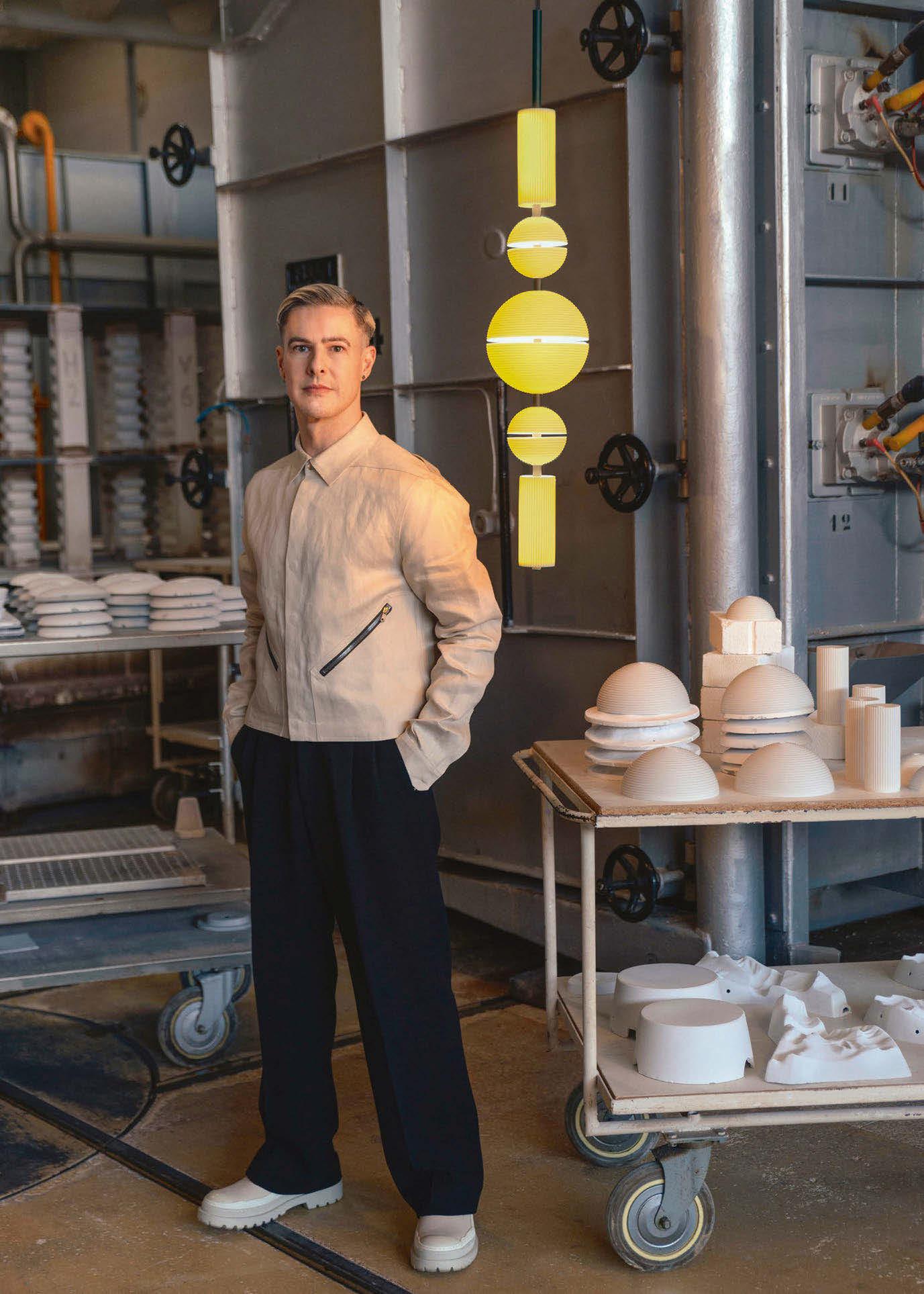
Cascade is a lighting collection created in collaboration with renowned British designer Lee Broom, who brings a fresh perspective to porcelain lighting. His concept merges porcelain craftsmanship with a contemporary vision.
Lee Broom was inspired to create Cascade after being invited by Lladró to visit the porcelain factories in Valencia, Spain, where he learned the traditional process of crafting porcelain. It was here where he was transfixed by the beautiful craftsmanship and saw the similarities in porcelain to Japanese rice paper. The idea of rice paper then consequently conjured images and memories of paper lanterns, one of the oldest and most enduring lighting designs in history, which then became the foundation for Cascade.
Paying homage to the cultural and material heritage of these iconic creations, Broom set out to test the boundaries of porcelain. His vision was to create a contemporary light fixture that expresses the seamlessness and ethereal quality of translucency.
The result is a collection composed of two pendants and a wireless table lamp, each defined by minimalist geometry – clean spheres and cylinders articulated by crisp horizontal and vertical lines.
Broom envisioned Cascade as an object with dual identities. When unlit, it stands as a sculptural form in classic, pure white porcelain, serene and understated. When illuminated, however, Cascade undergoes a remarkable transformation where the porcelain’s natural translucency comes alive. A luminous shift to a warm, amber-toned glow, evocative of candlelight, comes alive with porcelain layering and LED technology.
When collaborating with a brand, Broom approaches design differently than he does with his own label. With his brand, there is no brief; his design simply begins with a blank canvas. Working with a brand like Lladró still offers creative freedom, but exploring those ideas within its factories. The materials themselves introduce limitations; working with porcelain, for instance, imposes its own unique challenges due to it being a living material that shrinks unpredictably, by about 10%, during the firing process. Achieving the balance, precision, and symmetry that Broom’s designs demand became far more complex when working with a medium that is so inherently fluid
Broom observes that some of the simplest designs are hard to perfect telling darc: “Additionally, we had to consider how the various components connected without compromising the delicate porcelain, as well as how to integrate materials like acrylic. The Lladró team are experts in porcelain, but they also found the Cascade one of the most challenging fixtures despite its simple appearance.”
Euroluce not only saw the first collaboration between Lee Broom and Lladró but also the first Broom has done outside of his brand. The collaboration itself began when Lladró invited Broom to work with them – an offer that he readily accepted. Having long admired the brand and its evolution over time, Broom was particularly drawn to their progressive spirit and knowledge of past collaborations with peers like Jaime Hayon.
“Working with Lladró offered a fresh opportunity,” says Broom. “I’ve had brands ask to collaborate on a project for years, but at the time it just wasn’t right to do something outside of my own studio. However, the timing eventually became right, and I saw this as an opportunity to keep the practice fresh and to immerse myself in a material and process outside the familiar realm of my own studio.”
When asked about the atmosphere Cascade creates, Broom reflects on the inspiration of paper lanterns. He notes that lanterns often evoke feelings of celebration or mark significant life events, such as birthdays or commemorations of loved ones. This emotional resonance is amplified when multiple Cascade pieces are hung together, creating a visual effect that brings a sense of joy, celebration, and pleasure. In the past, Broom’s previous works tended to be influenced by brutalism and modernist aesthetics, and have carried a darker tone, but Cascade represents a shift towards something more jubilant – a tone more aligned with the Lladró brand ethos.
www.lladro.com | www.leebroom.com
Image: Lladró / Lee Broom
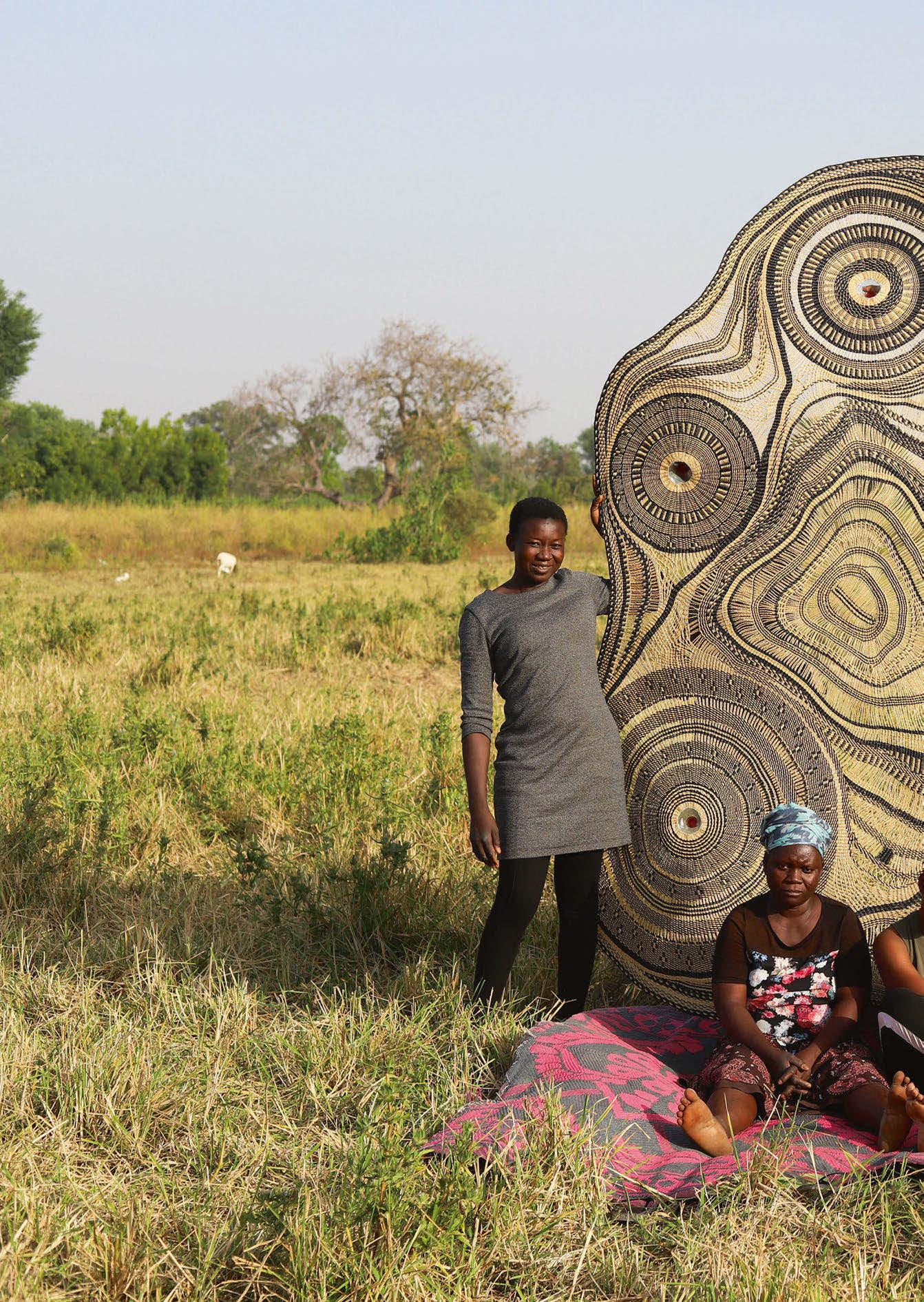
Making its Euroluce debut in April, Pet Lamp is an integrated and global project based on the reuse of plastic bottles. It connects environmental action, craftsmanship, and the principles of industrial design in a constant dialogue with artisan communities from all continents.
As certified by the B Corp seal, Pet Lamp responds to the most advanced sustainable and regenerative business model. Unlike companies that only pursue profit, Pet Lamp meets the highest standards of transparency and social and environmental responsibility.
In 2012, the Pet Lamp project took shape in Colombia with artisans from the Cauca region, displaced by the guerrilla war in Bogotá. PET bottles are transformed into lamps through the application of traditional basketry techniques. This first collection (as well as those that followed year after year), was exhibited at the Rossana Orlandi gallery, Milan, to great international acclaim for its fresh and innovative approach, becoming one of the gallery’s flagship projects.
Without losing its initial focus on environmental awareness, the product’s development has led to a deeper exploration of its anthropological dimension. Each new collection is based on a set of technical requirements and the use of the plastic bottle as the core of the product, which maintains the connection between the lampshade and the electrical components.
Pictured is craftspeople holding the Gurunsi pendant, a collection that emerged as an interpretation of the traditional architecture of northern Ghana, crafted by the master weavers of The Baba Tree. The adobe and branch structures that form the Frafra family compounds, typical of the region, inspire each lamp, where every curve and knot tells a story of organic growth and familial connection.
This fixture was featured on the brand’s Euroluce stand, creating a stunning point of interest while providing a soft illumination. Each lamp is equipped to meet modern needs, featuring electrical installations that support both 110V and 220V, and a foldable design that simplifies transportation and assembly.
www.petlamp.org
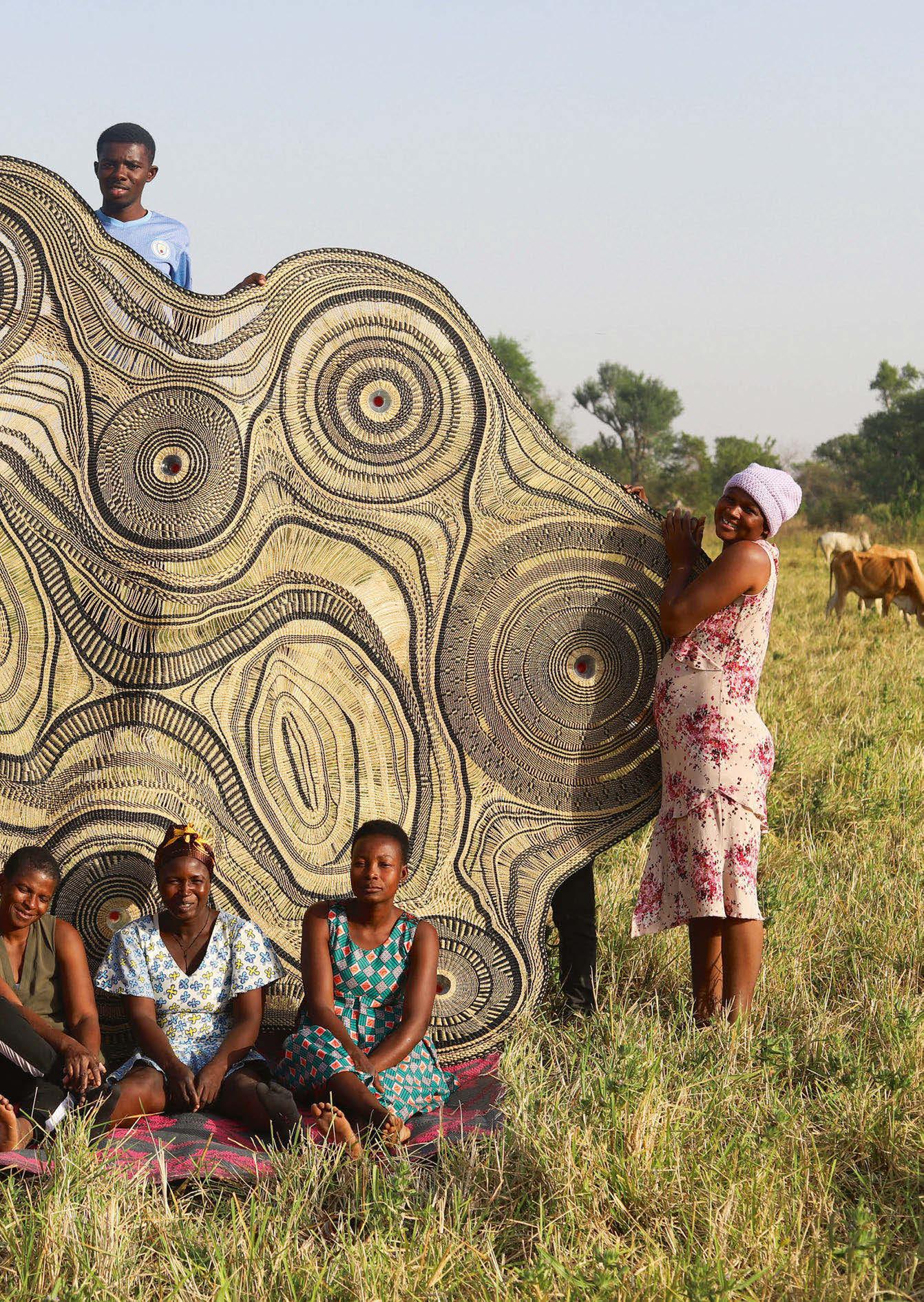
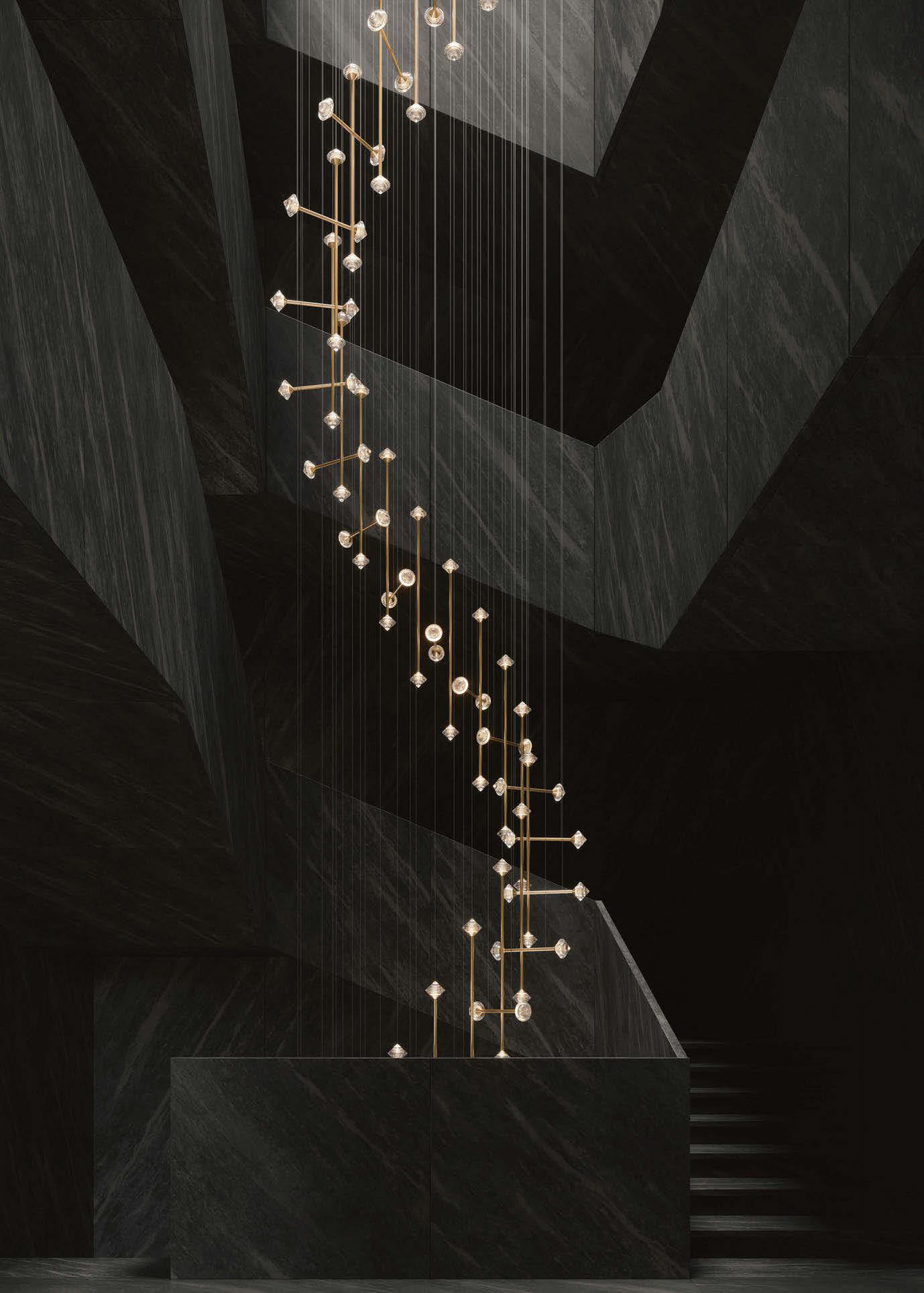

At Euroluce, darc caught up with Michael Vasku, Creative Director of Preciosa, to delve into Crystal Links, a striking new collection that redefines decorative lighting through curated designs and boundless possibilities for custom composition.
Crystal Links is a new lighting concept designed to bridge the gap between architecture and interior design. Speaking about the collection, Vasku describes how Crystal Links blends linear precision with creative chaos, offering a modular system that caters to a wider variety of spaces and moods.
The inspiration behind the new collection is informed by the structure and fluidity of urban landscapes and the geometric precision of modern architecture, such as the glowing windows and bustling streets of metropolitan life. The metal tubes denote a bustling city’s intersections of roads, places, and people, whereas the bicones are inspired by the light that glows from apartment windows amidst the city’s rush.
“We call it Crystal Links”, began Vasku, outlining the project.
“It’s a mix of orthogonal design and chaotic design. At its core, Crystal Links features a series of crystal bicones, either sharply cut or organically bubbled and arranged along slim rods.”
The design allows for different compositions from strict, geometric grids to spontaneous, flowing installations. The crystals themselves glow with soft, internal light, thanks to an ingenious system where LEDS inject light into the edges of each crystal, enhanced by the inner silvering technique that creates a rich halo effect without revealing any technical components.
The motivation by Crystal Links was clear: there was a noticeable absence in the market for crystal installations that fit with contemporary and minimalistic interiors. The result is a system that offers hard-edged, modern forms while preserving the intricate beauty of Bohemian glass craftsmanship.
“Crystal is traditionally decorative and is often dismissed by architects who prefer clean and structural forms. We wanted to change that – to create something that would speak to architects and designers alike,” explains Vasku.
The production process itself is rooted in traditional techniques. Each crystal component is mouthblown and then
cut out by hand, with intricate facets carved manually by skilled artisans. For the bubbled crystal, a chemical reaction involving soda is introduced during the blowing process, embedding tiny air pockets within the crystal mass. These bubbles play a crucial role in enhancing how light travels through and reflects off the material, making the entire structure shimmer and glow uniquely.
One of the biggest challenges during the development was achieving the desired lighting effect. Vasku and his team had a vision to create an original and sophisticated glow that would not be achievable by simply placing an LED behind the crystal, which led to the development of the right chip and internal structure. This development took months to perfect and was only completed a few weeks before Crystal Link’s debuted in Milan. The entire process from concept to production spanned around nine months to complete, a timeline the team mastered to unveil at least two major designs a year.
The fixture offers a modular approach, hands creative control to the client while maintaining a thoughtful, developed aesthetic foundation. When asked about the atmosphere that the Crystal Links creates, Vasku highlights its versatility: “It can be structured and disciplined, or it can be wild and creative. It’s a simple design at heart, but it’s extremely versatile, which allows interior designers to craft something unique without starting from scratch.”
Reflecting on the significance of presenting Crystal Links in Milan, Vasku didn’t mince his words: “Milan is the centre of the design world. Many cities have tried to compete, but none have succeeded. Milan is the place to be for design, there is no way around it.”
www.preciosalighting.com
Image: Preciosa


During Euroluce 2025, Luceplan unveiled its latest collaboration with British multidisciplinary designer, Umut Yamac, revealing the Posi table lamp, a portable table with rearrangeable light-up flowers.
The name Posi derives from the word ‘a small bunch of flowers, which essentially is where the concept for Posi began.
Yamac conjured the idea for Posi with the desire to create an emotional object where someone would have to add objects to a vase to create light, taking inspiration from Ikebana, the Japanese art of flower arrangement - “living flowers”.
The stems, which are offered in various heights, are finished at the ends with elegant diffusers made of satin-finished opaline techno-polymer. These are available in three geometric shapes: cylindrical (in two heights), conical, and circular.
When connected to the base, the stems light up with an LED filament that comes to life. These stylised forms evoke the delicate outlines of flowers, giving the stems a sense of natural lightness.
The development of the Posi took four years to complete as Yamac found the balance between the form and shape. In the end, it was clear that the design needed to be abstract yet still familiar, hence the final choice between forms like cones and cylinders, all of which are suggestive of a flower.
Discussing the challenges faced during the development of Posi, Yamac tells darc: “I think one of the biggest challenges was finding the right balance between creating something decorative and ensuring it remained practical and functional.
“There was also a major technical hurdle, which we worked through with the team at Luceplan, specifically, figuring out how to make the connections both secure and seamless. There aren’t any other table lamps that allow you to rearrange the elements in this way, so it required developing an entirely new technical solution. It’s been quite a challenge, but then again, I think all the best projects come with a bit of difficulty.”
How the Posi works is through the simple touch of the lower part of the base, allowing the user to easily switch on or off and adjust the light intensity while preserving its clean and minimalistic aesthetic. This visual harmony enables Posi to seamlessly integrate into any environment, showcasing its refined character even when turned off, thanks also to the premium materials of its structure, including brass and aluminium. The smaller variants of the Posi offer three elements within the base, whereas the larger allows up to
five elements. The vase base and individual flowers will be available to buy in both and to purchase individually, allowing the user to reconfigure the arrangements depending on how they are feeling.
The Posi is available in three finishes, silver, aluminium, and black, with the stems matching the corresponding colours. In terms of the shades, given the design’s small and lightweight nature, it was crucial to find the right balance in material. Although prototypes performed well on paper, practical use, especially for an object meant to be handled frequently, presented challenges. In the end, Yamac and Luceplan selected a polymer material for the shades, ensuring greater durability, easier cleaning, and better resistance to dust accumulation. When asked about the atmosphere the Posi aims to create, the designer explained that the intention was to evoke a sense of warmth and familiarity. Yamac hopes the lamp will spark the feeling of playfulness within a space, something that could emotionally connect with people through the familiarity of its forms.
“We all need bits of joy in our day-to-day lives,” Yamac says. “Objects can play an important part in bringing that emotional resonance into everyday environments.
Regarding future developments of the lamp, Yamac remains open but cautious, acknowledging that extending the Posi collection would require maintaining the original spirit – the balance of natural references and lightness, while thoughtfully evolving the typology. “The challenge,” he explains, “is how you retain the essence but expand the language.”
Posi is more than just a lamp, it is about “activating an object”. The vision was to create something that not only lights a space but also interacts with it and its inhabitants. By enabling users to place, move, and rearrange the stems, the object becomes more generous, more personal, and more alive.
Yamac finishes saying: “Flexibility is key, individual elements are intended to be available separately, allowing users to replace, add, or modify their arrangements over time.”
www.luceplan.com | www.umatyamac.com
Images: Alessandro Ruffini, Kanat Akar
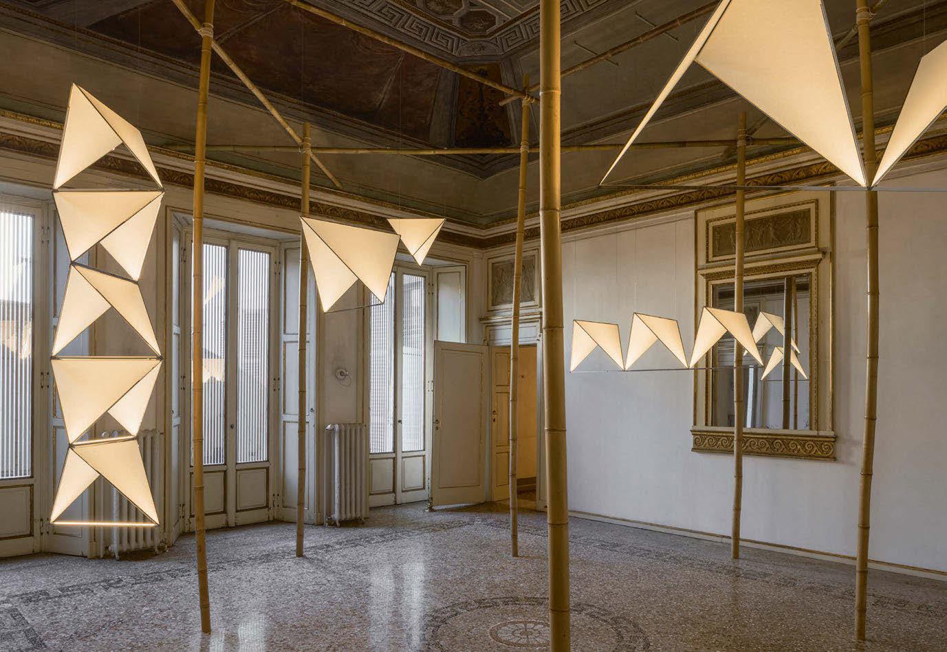
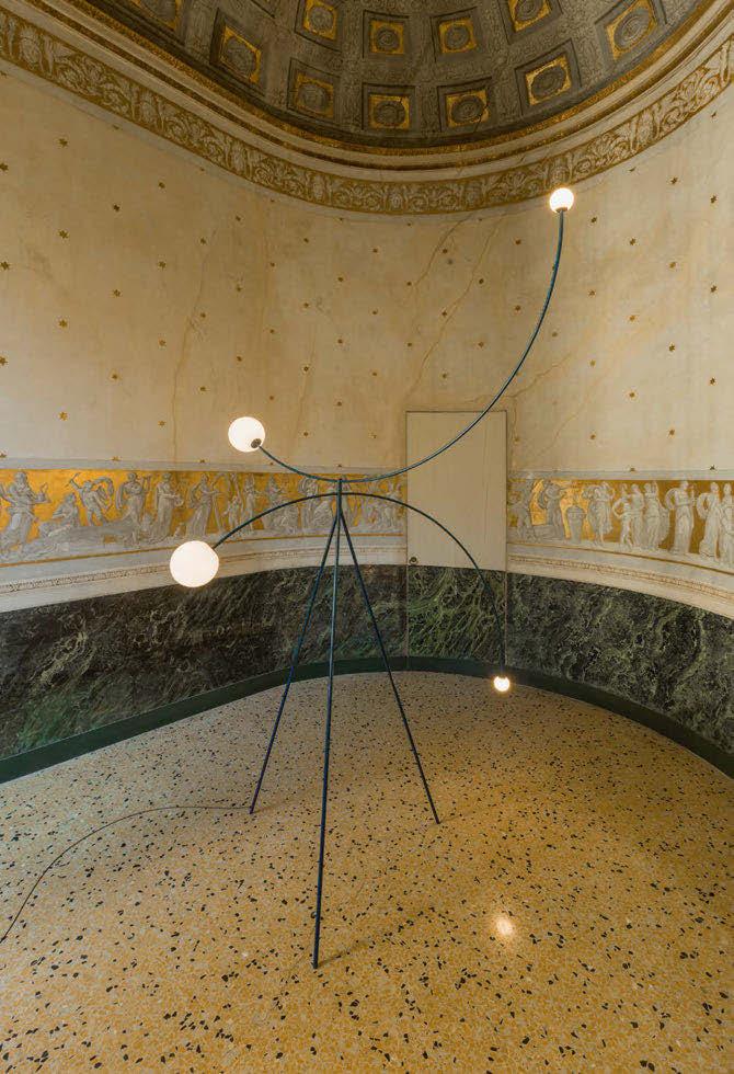


In a rare gesture of both reverence and rebellion, the Cypriot-born London-based designer unveiled his latest collection within the hallowed walls of the Jacqueline Vodoz and Bruno Danese Foundation, during Milan Design Week. This year’s collection marked a significant moment for Michael Anastassiades, not only in form but in narrative.
Tucked away from the frenzy that is Milan Design Week, Michael Anastassiades’ latest exhibition unfolded inside the now defunct Jacqueline Vodoz and Brune Denese Foundation, a mid-century Milanese palazzo, which has since disappeared from public access. The building, once a hub for radical postwar design, became the unlikely but poetic host for installations that were much more about memory than their form. Anastassiades is blessed with the good fortune to have a close affiliation with the foundation as well as its owners, having first visited the space as an up-and-coming designer in the 1990s.
Anastassiades tells darc magazine: “It was the first time I had been back in that space since I first visited as a young designer. It felt like the right moment.”
Understanding the architectural and symbolic weight of the building’s importance, Anastassiades approached the installation with a philosophy of minimal intervention where each room was engaged, not overwritten. He allowed the space to breathe, to resonate with artefacts of its past while subtly guiding visitors through his own unfolding of the story. For the welcoming of archival displays to the vaulted Sala Ovale, every transition was both spatial and emotional.
The installation began in the first Salone with the Cygnet, a series of luminous forms inspired by the geometry of Alexander Graham Bell’s tetrahedral flying machines. Each Cygnet is built from equilateral triangles of Japanese washi paper, internally lit by hidden sources. Cygnet’s design is informed by the designer’s childhood memories of flying kites in Cyprus – spending days in the sun crafting and chasing delicate paper constructs into the sky. The connotations of lightness and flight were important to Anastassiades to translate in the installation piece, however, constraints with the foundation meant the lights couldn’t hang from any frescoes or ceilings. By using a bamboo structure and an invisible wiring system, the team could achieve the illusion of the kites flying. The bamboo structure became a necessary functional element but also transpired into part of the wider narrative.
Anastassiades elaborates: “Bamboo offered a lightweight, modular solution. It’s a sustainable material, and we used traditional lashing techniques – just rope, no screws or nails – so everything could be disassembled, reused, and repurposed.”
He adds: “Of course, this isn’t a new invention. Bamboo scaffolding has been used throughout Asia for centuries, even for the construction of skyscrapers. What we did was reinterpret that tradition – strip it back, refine it, and allow it to function not only structurally, but sculpturally. It frames the space without dominating it.”
The result is delicately luminous sculptures that hover, refract, and disappear depending on one’s vantage point. “They’re always flying,” says Anastassiades, “and at a certain angle, they catch the light and remind you they’re still there.”
Moving through to the Sala Doppia, Frame reinterprets the window not as an aperture, but as an idea. The series evokes three seminal moments in 20thcentury art, such as Marcel Duchamp’s Fresh Widow and Renè Magritte’s surrealist frames, but also the more architectural experiments of Ellsworth Kelly. Here, the “window” becomes both object and absence – something to see through and something to see.
The installation features open square configurations of aluminium grids (1x1, 3x3, and 7x1), imbued with fine LED light strips. These minimal structures transform into luminous thresholds, portals of reflection and possibility. Hung above a table, the Frame does not assert itself as a traditional light fixture but rather, it becomes an atmosphere, a shifting suggestion of space and form. Its reflective surfaces interact subtly with the room, fading into its environment while quietly reorienting it.
The exhibition concludes in the Sala Ovale, where a single Floor Mobile Chandelier punctuates the domed fresco. This is an extended version of the original in a patinated deep Prussian blue, a colour choice dictated by the room’s ethereal palette. The fixture walks the fine line between monument and mirage; balanced, yet dynamic, its form evokes movement even in stillness.
In contrast to the installations around it, Halesia, Anastassiades’ co-branded portable lamp with Italian-based lighting brand Alessi, operates on an entirely different register. Named after the snowdrop tree, the rechargeable table lamp is both functional and gestural. Two mirrored bell forms nest into one another; twisting the upper half dims or brightens the light. The polished steel reflects its setting and its users, creating a fluid interplay between object, table, and conversation.
Although Anastassiades had previously designed for Alessi, this project marks the first co-branding between the two. The collaboration allows the designer to explore new markets and scales without compromising the design language. “It’s still me,” he says. “It’s the same philosophy, just adapted to a new context.” What binds Cygnet, Frame, Halesia, and the Floor Mobile Chandelier is not merely a consistency of aesthetic but of intention. These are not lights in the conventional sense; they are objects of quiet provocation – architectural kites, conceptual windows, flowering plants. Each piece is designed not just to illuminate space but to activate it, to offer viewers a glimpse into a more poetic mode of perception.
“Everything has a reason,” Anastassiades reflects. “Whether it’s paper, bamboo, aluminium, or patinated steel, materials are never decorative. They carry the weight of memory, of message, of method.”
www.michaelanastassiades.com | www.alessi.com
Images: Nicolò Panzeri

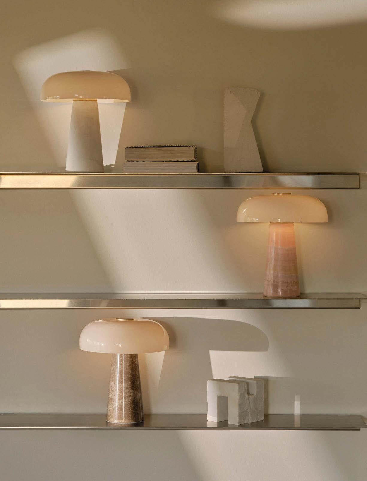


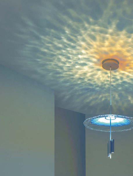
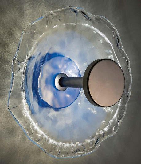
IN FOCUS

giovanni luca ferreri
Patrizia Volpato
What is the concept behind the Nebula collection?
Nebula is born from the ‘light’ of nebulae that contemporary telescopes are able to capture. These are evocative images that we sought to simulate through the reflections created by blown glass.
How long have you been working on Nebula for?
The collection was developed over approximately one year, during which various light and optics tests were carried out. We also created at least three prototypes before reaching the final outcome.
What was the most challenging aspect of producing this piece?
The fact that we were not sure we could reproduce, by analogy, the ‘light’ that nebulae convey.
What materials and technologies have been used, and can you describe the design process?
Nebula is mainly composed of two materials: Murano blown glass and metal, which form its structure. During the prototype production phase, we realised that blown glass alone did not fully satisfy our design vision for the lighting fixture. Therefore, we decided to “pull” the glass by hand, a technique that plays a fundamental role in the result we achieved. Another important element is the light source itself, which serves a purely technical function. The design process of our collections - as well as our bespoke creations - always starts from a concept. Once the brand’s artistic direction approves a concept, the technical team begins the engineering phase, followed by prototyping. Our products are only launched on the market after they have been fully produced at least once, ensuring the highest quality standards.
What makes this product different to other lighting products available on the market?
What truly sets our Nebula collection apart is the reflection that spreads across the walls in a play of light, shadow, and unexpected colours. Until now, there was nothing on the market designed
specifically to decorate spaces indirectly through the use of light and shadow. We believe this is why the collection has achieved such remarkable success in such a short time. In fact, in addition to winning the [d]arc award, just one month after its market launch, it also received two LIT Awards and the Master Prize Award.
What does it mean to you to win a [d]arc award?
Winning a prestigious award like this represents far more than a simple accolade for a lighting company - it is a mark of excellence and innovation recognised by the international design community.
The [d]arc awards, judged by a panel of some of the most influential lighting designers in the world, celebrate creativity, technical expertise, and the emotional impact of lighting projects and products. For a company like ours, receiving such an award means that our commitment to pushing the boundaries of design, quality, and craftsmanship is not only acknowledged but also celebrated on a global stage. It validates the work of the entire team - from the initial creative concept through engineering, prototyping, and final productiondemonstrating that our vision resonates with both experts and the broader market.
Moreover, the [d]arc awards boost brand visibility, strengthens our reputation, and builds trust with clients, architects, and designers who seek excellence and originality in their lighting choices. It serves as a powerful motivation internally, inspiring us to continue innovating and investing in our passion for creating pieces that are not only functional but also profoundly artistic.
Winning the [d]arc award is not just a victory for a single collection - it is a recognition of our company’s ability to shape the future of decorative lighting.
Please describe the product in three words. Unique, surprising, cosmic.
www.patriziavolpato.it


One product, many looks.
