“hello”
Molly Sergeant
Portfolio in support of an application to Interior Architecture, University of Brighton
‘Trapped’
Exploring the word ‘trapped’ through different media.
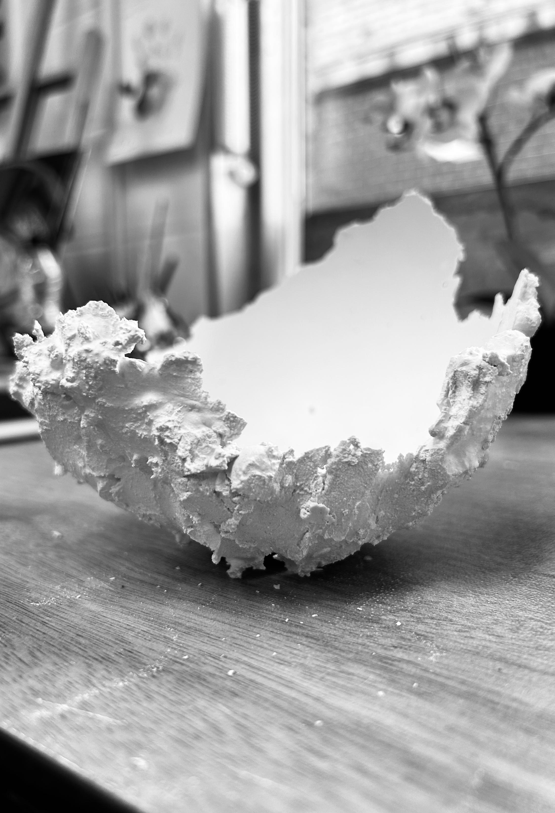
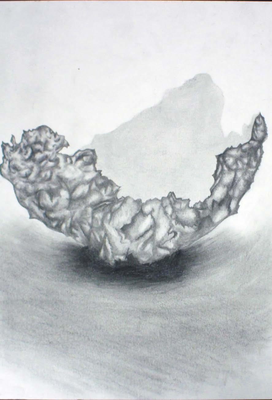
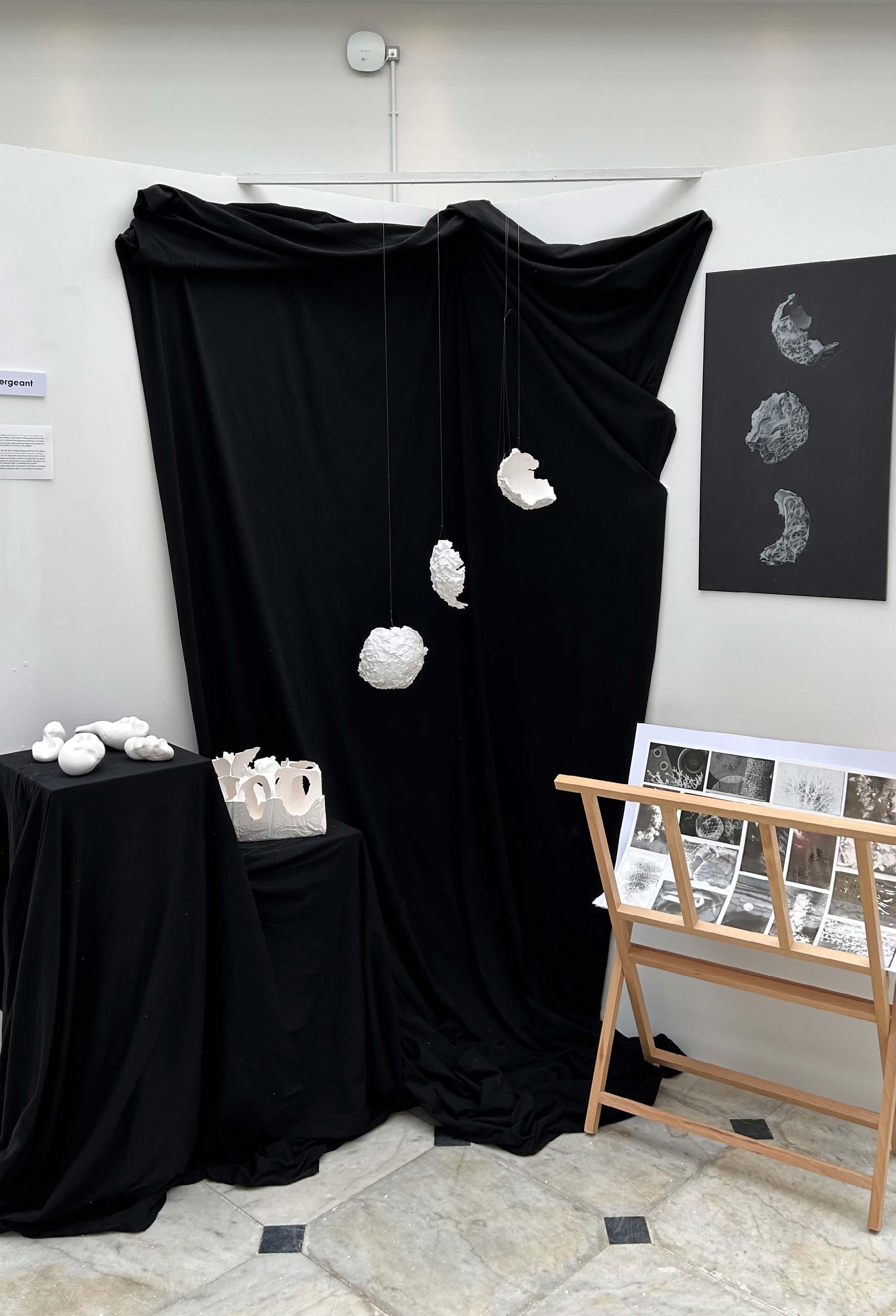
Pictured on the right is an A3 white pencil and charcoal drawing on black paper. One of the final pieces of the project, which was initially inspired by Maria Bartuszova, whose work I enjoyed at The Tate Modern. She created plaster sculptures, by filling balloons, which then left her with an interesting mould of the item she decided to recreate. Reversing her process, I decided to cover balloons in plaster, layering it on, after I let it go off and become more of a paste than a liquid. This allowed me to create ‘bowl’ shapes in which I then hung and photographed (overleaf).
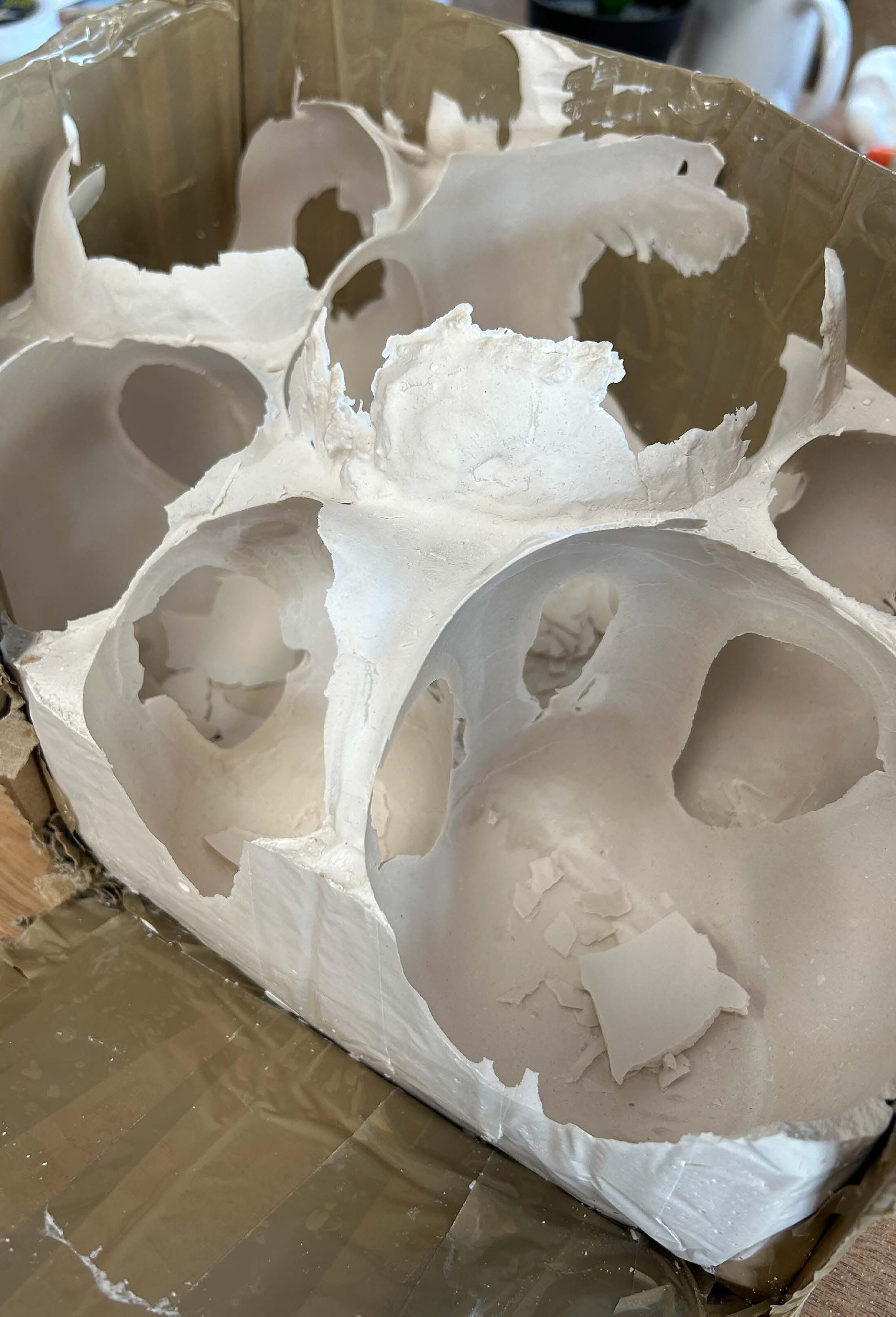
I also created a sculpture by constructing a box using cardboard and tape, ensuring any gaps were completely sealed, to prevent the plaster from seeping out. I then placed balloons inside of the box and held them down, whilst filling the box with plaster. Once set, I carefully pierced the balloons, allowing them to deflated and be easily removed from the box, leaving behind a sculpture with concave shapes. This also left me with some very delicate layers of plaster, which I took out of the handmade box, by cutting it up and peeling it away. The photographs captured show the intricate details of the plaster and how delicate the plaster really is.
For my final piece, I decided that the hanging plaster moulds were the most effective as they accurately represented the word ‘trapped’. Instead of the plaster being trapped inside of the balloon, like Maria Bartuszova typically did, I decided to trap the balloon inside of the plaster. This worked really well and left a delicate, interesting-texture sculpture behind.
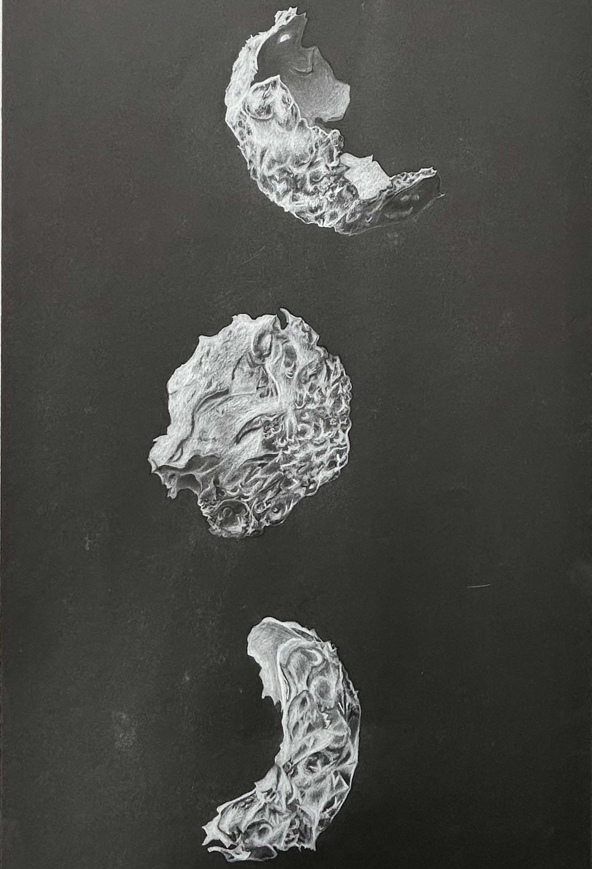 White pencil and charcoal on black paper
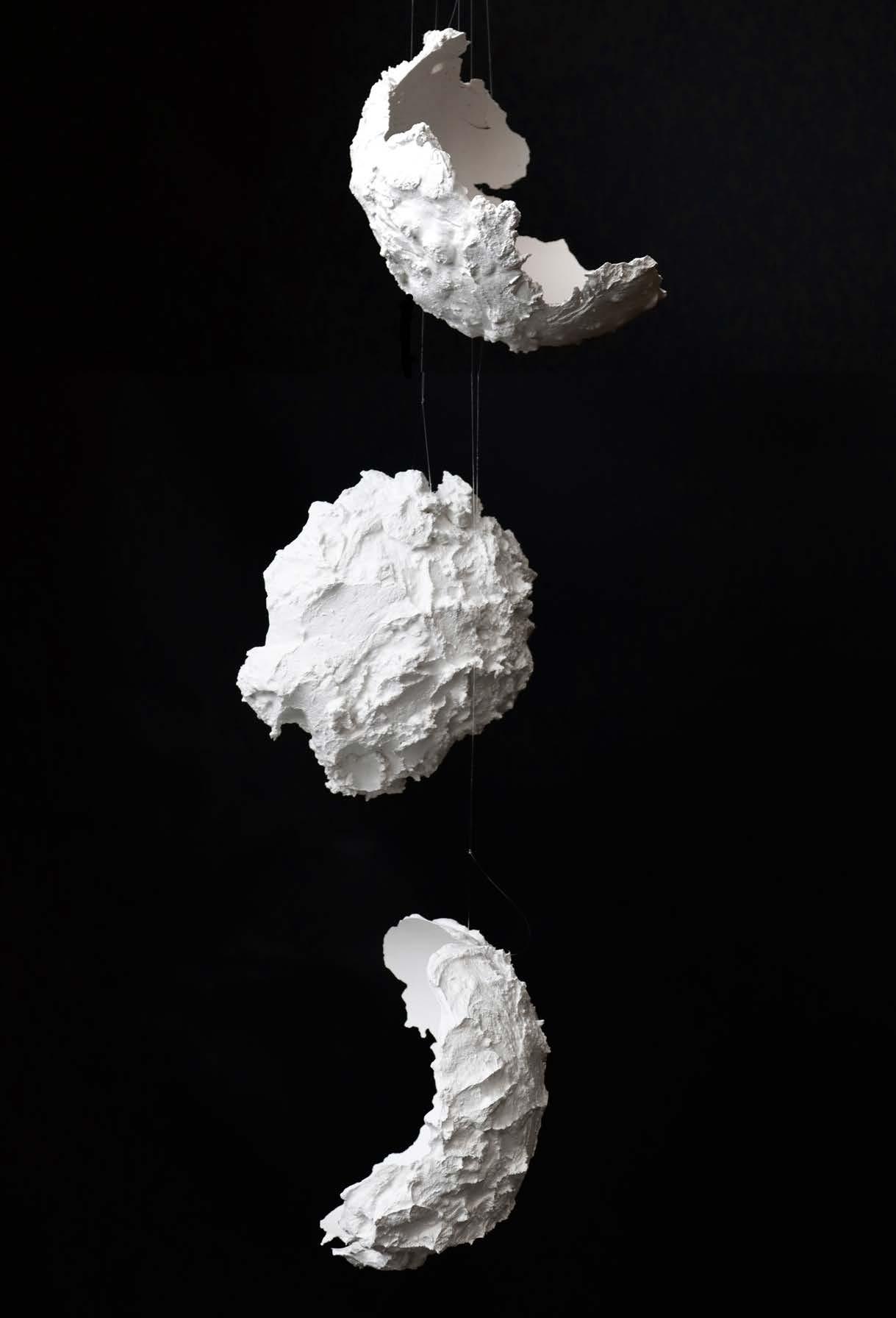
hanging collage
Photography
of
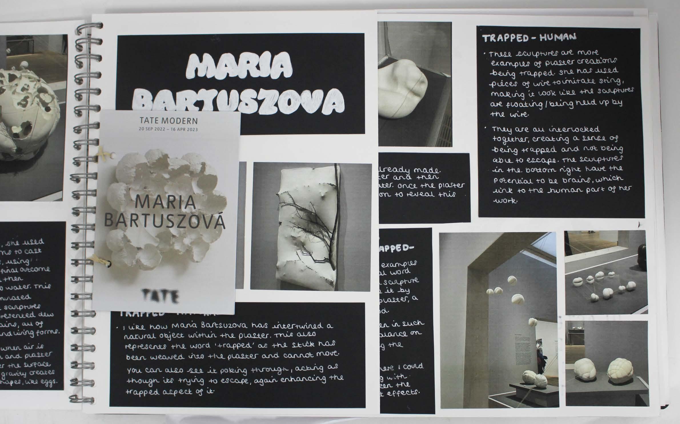 Artist research - Maria Bartuszova
Design and construction of plaster mould to contain inflated balloons
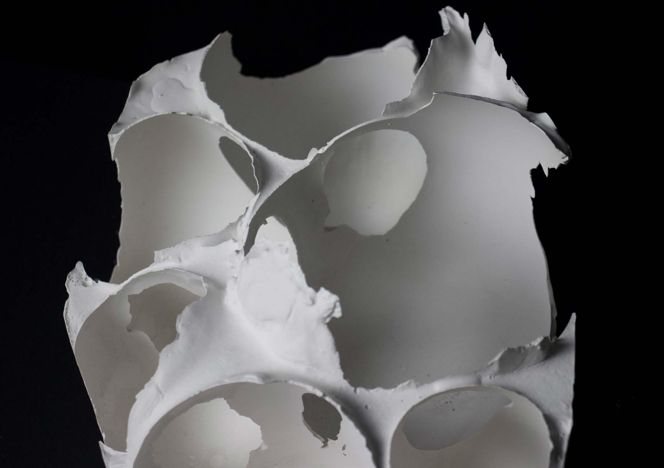
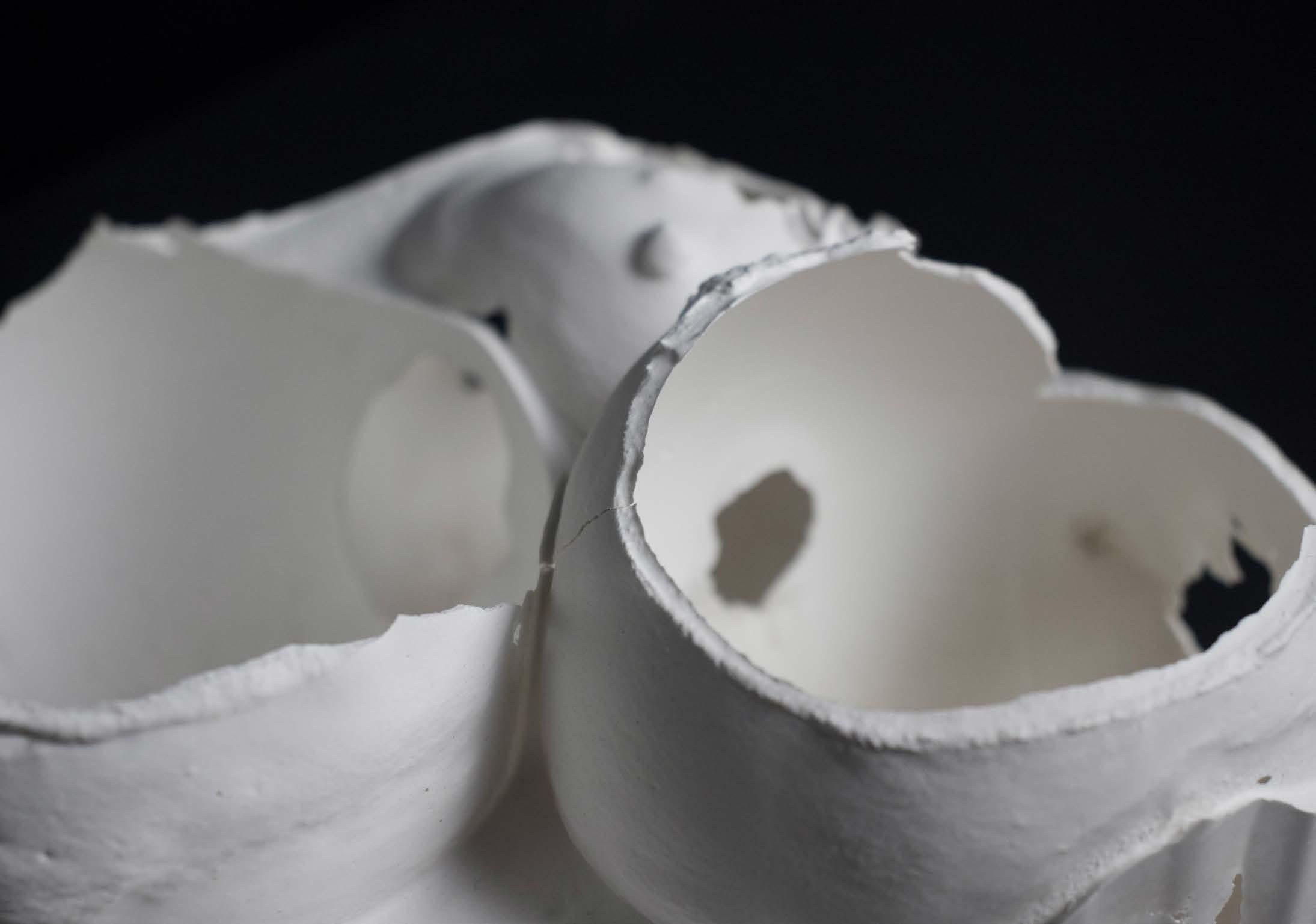
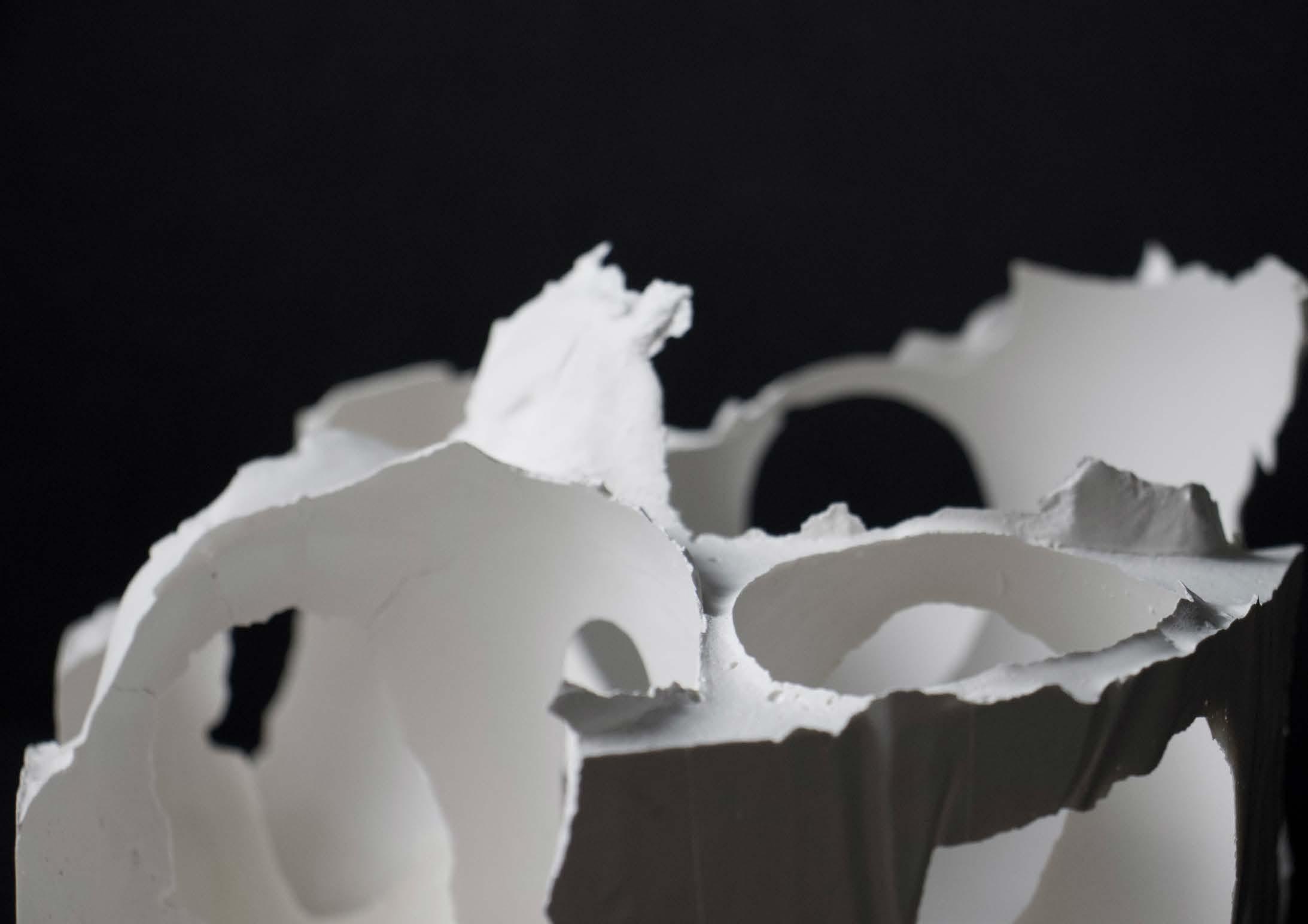
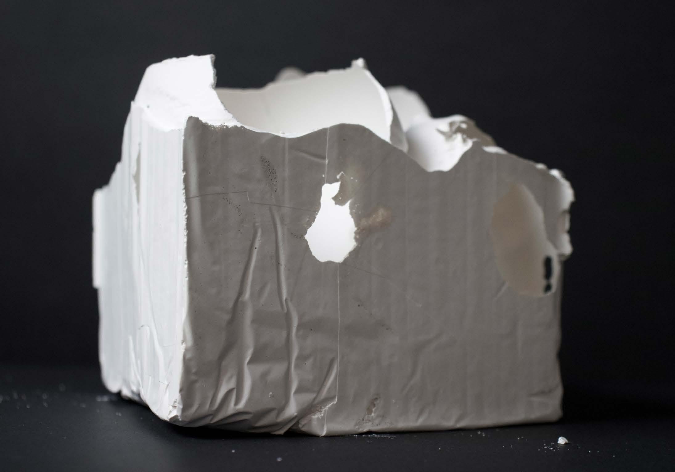 Photography of plaster
 Plaster mould of balloon exterior Study in pencil
‘Stacked’
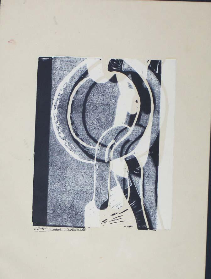
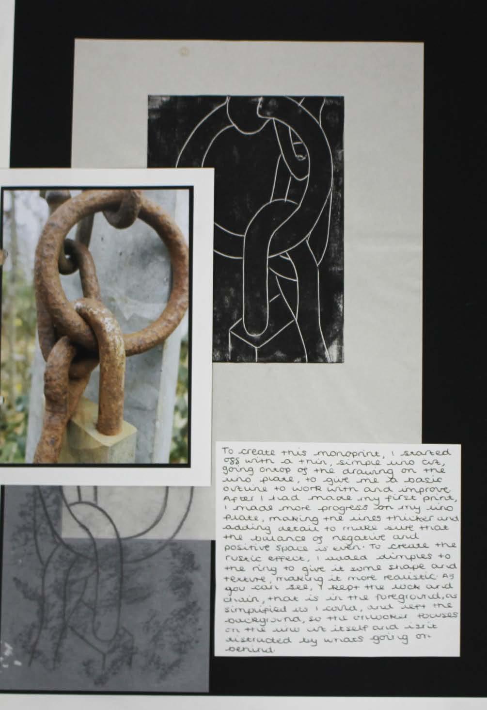
The inspiration for this project was the word ‘stacked’. The objects used and therefore the theme created throughout was mechanical. On the left are copies of lino prints I produced onto coloured card and tissue paper, of a chain and padlock. The overlapping and use of different paint to print was effective as it created a shadow effect, posing an interesting image.
The lino below was what the linos on the right originally looked like, but having worked into it, we were left with the prints on the right, which are much more detailed and effective.
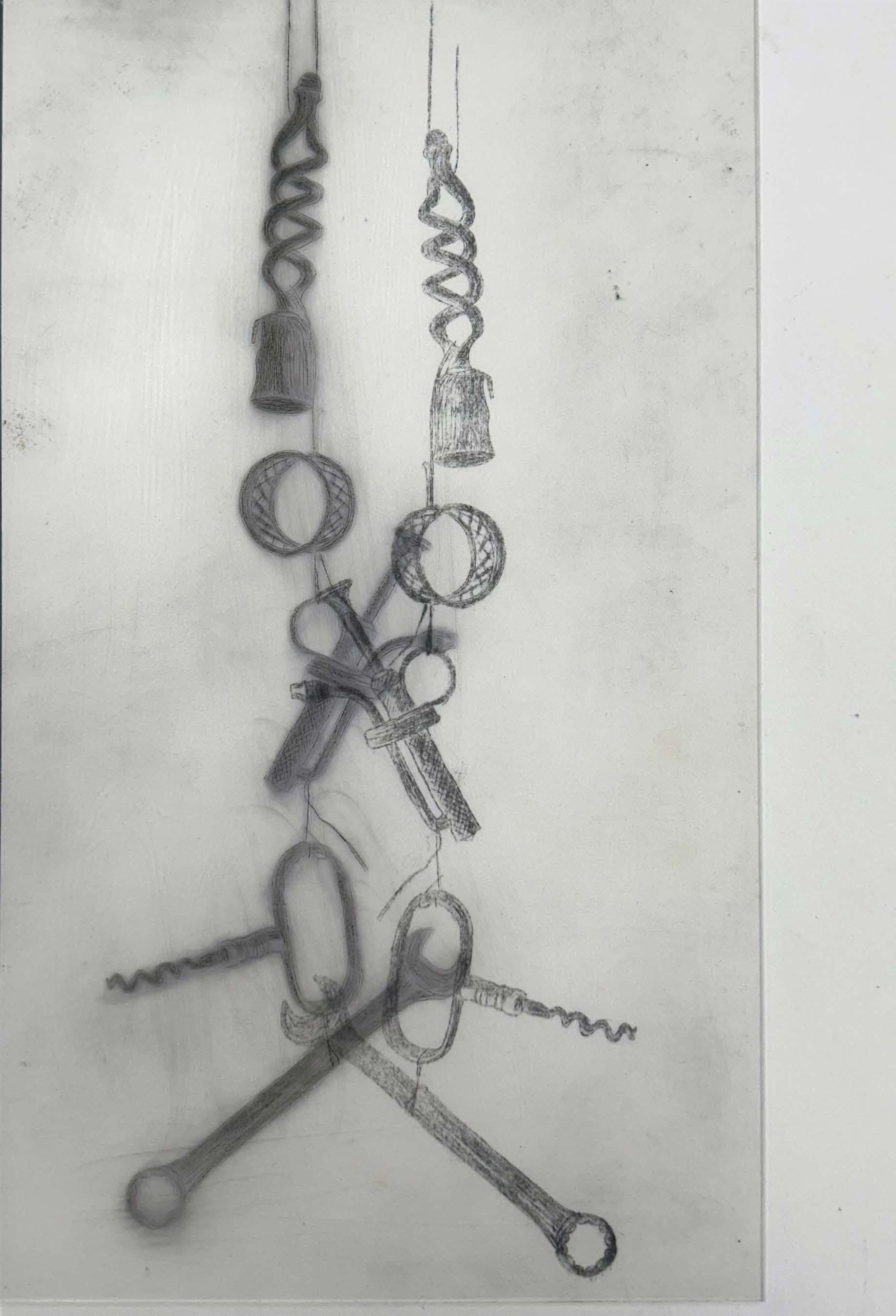
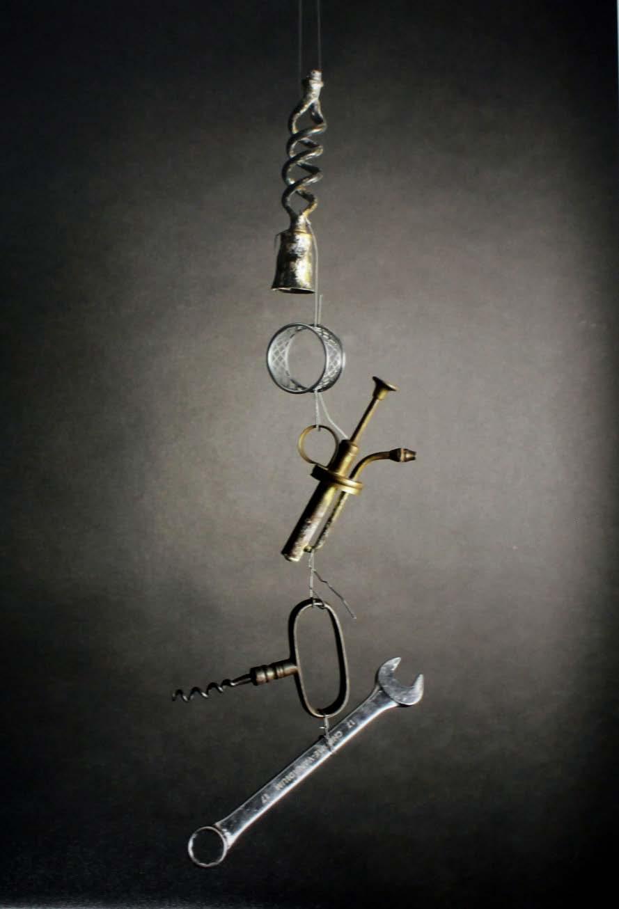
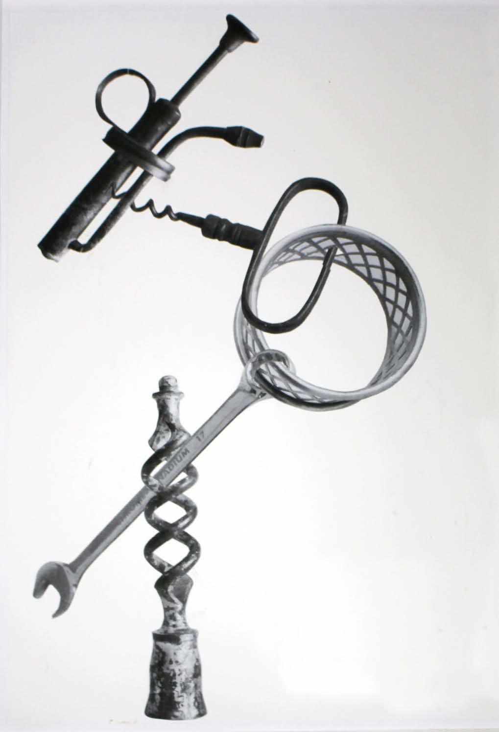
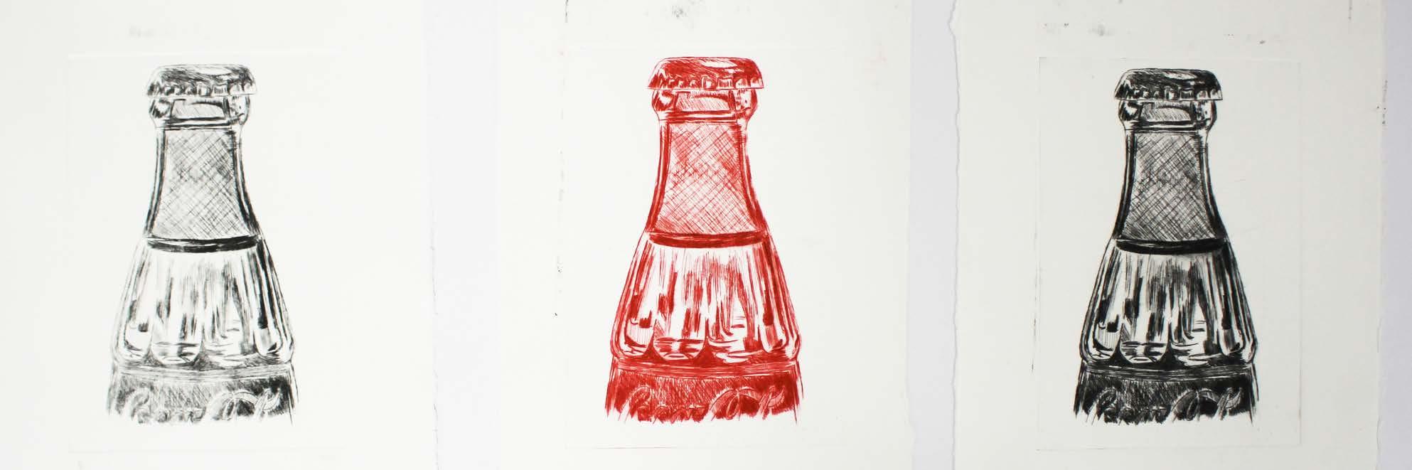
Staying on the mechanical path, I combined many metal and handheld items together, to create a 3D hanging piece, in which I turned into a drypoint etching. This was effective as I managed to capture the intricate details of each item, making them realistic and intriguing. The composition of this piece also took a lot of thought. For example, the spanner had to be hung in a certain way because if not, it would slide through the piece of string or affect the hanging piece overall, by knocking the others out of place.
Following this, I used the same materials to create a collage, which I then further developed into a coffee painting. The inspiration of coffee painting came from the first lockdown, when lessons had to completed at home. This meant that I had to become resourceful and use what I had in and around my house, not including artistic materials for example, paint. Coffee worked particularly well for this piece as it meant that I could build up high levels of contrast in certain areas by using more concentrated coffee and water.
Finally, to add variety to this project, a piece that I decided to create was a tonal drawing. This was particularly effective as I was able to create contrast between each of the appliances, which worked really well. I also did this drawing on a large scale, which allowed for a lot of detail to be used, making it more interesting.
Final exhibition - ‘Trapped’
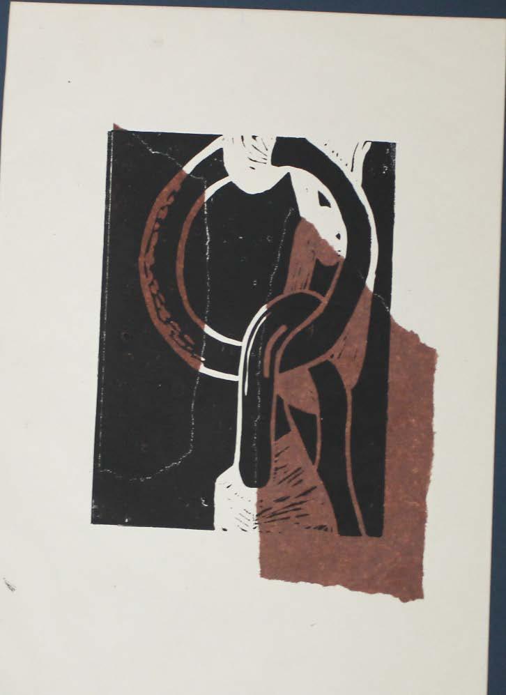
Lino on tissue
 Drypoint etching

 Drypoint etching Studio photography
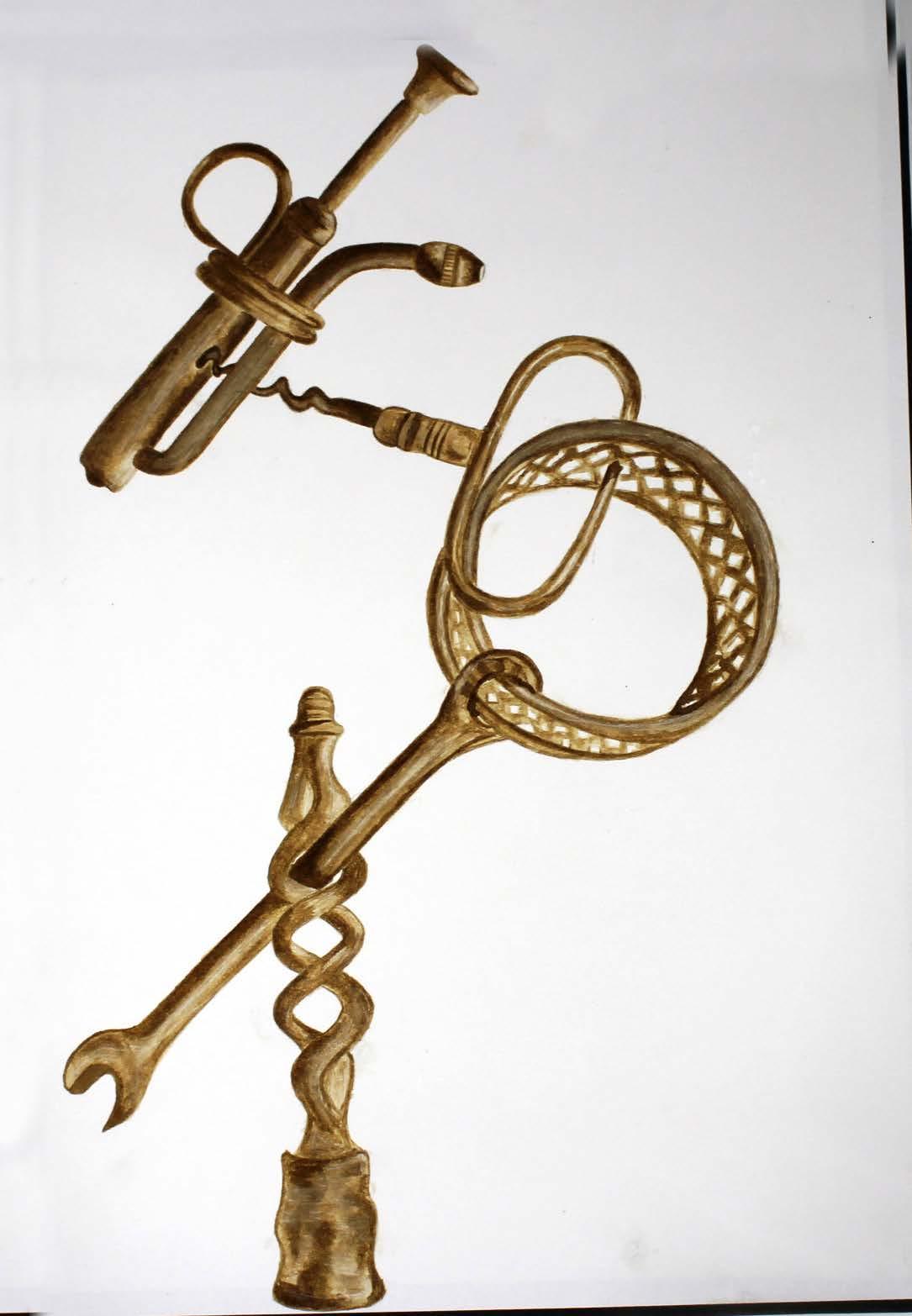
Coffee painting Collage
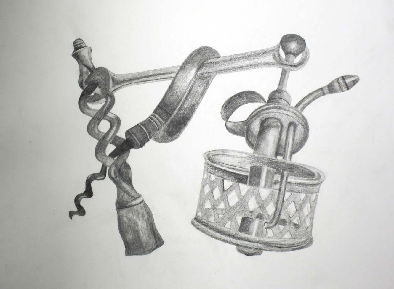 Pencil observation
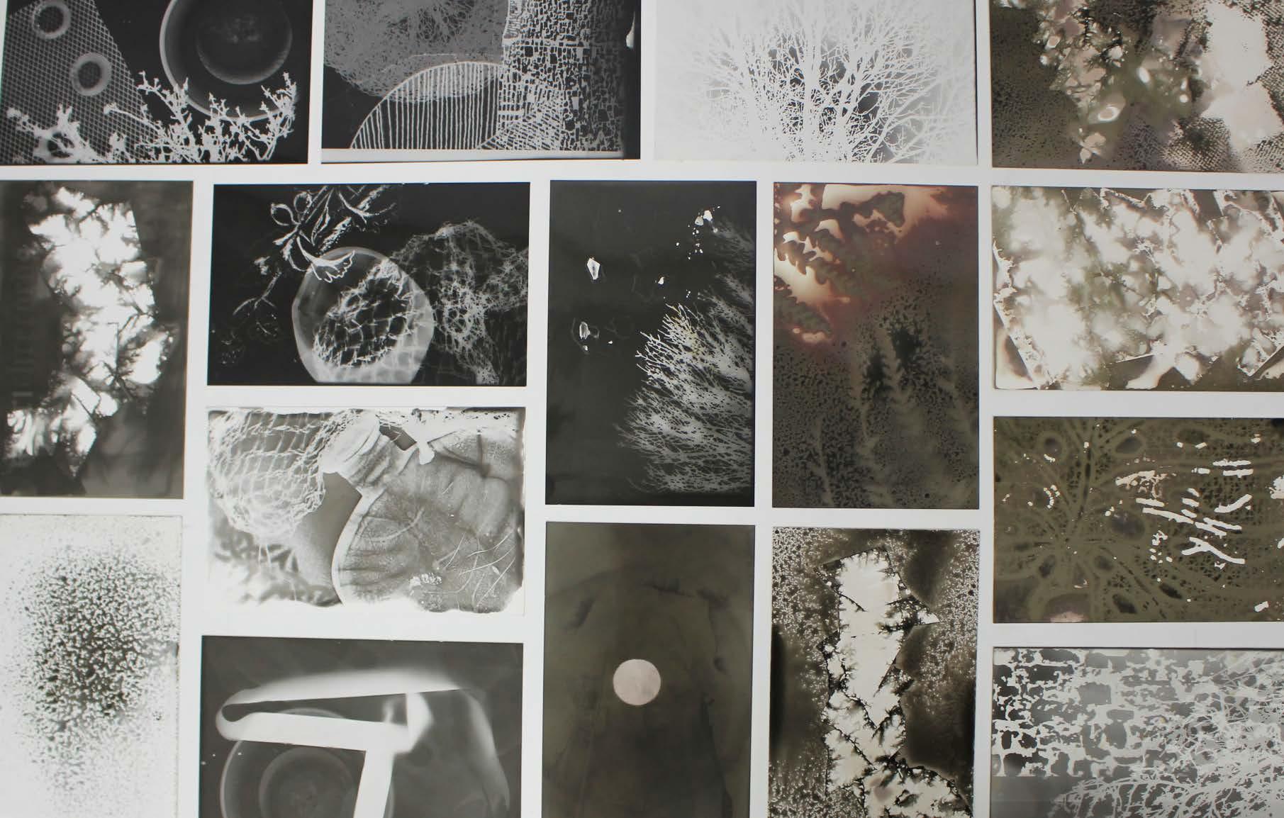 Cyanotype
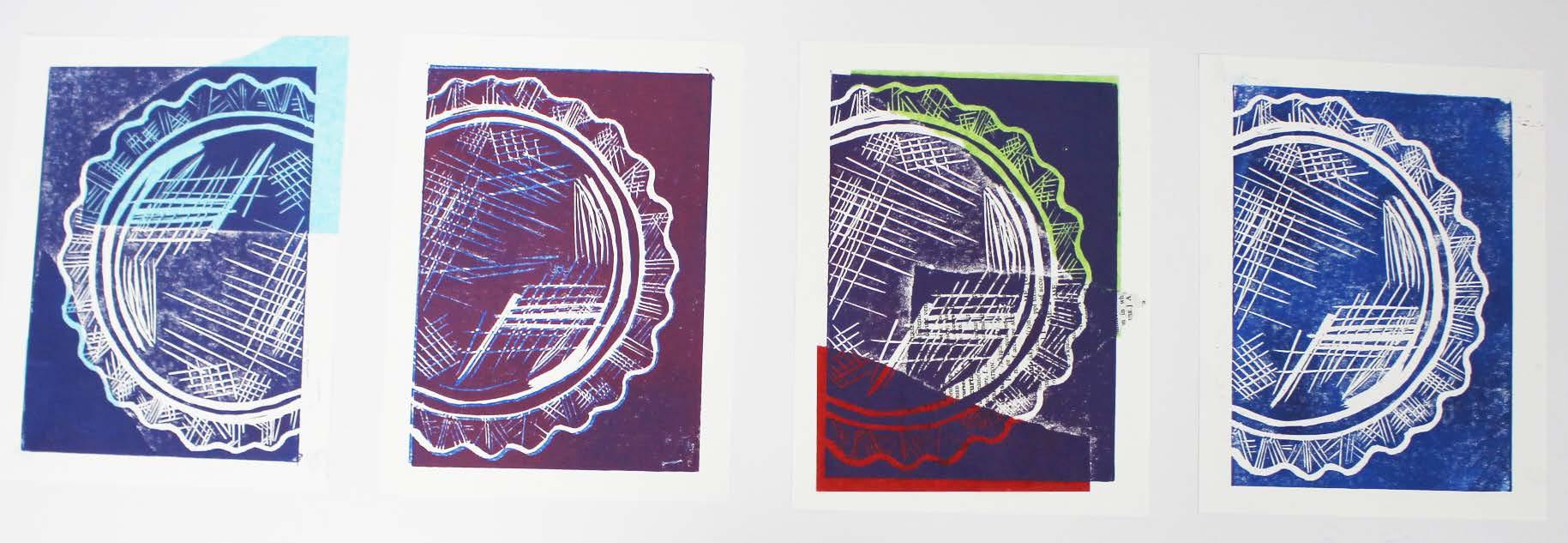
Lino
Drypoint etching
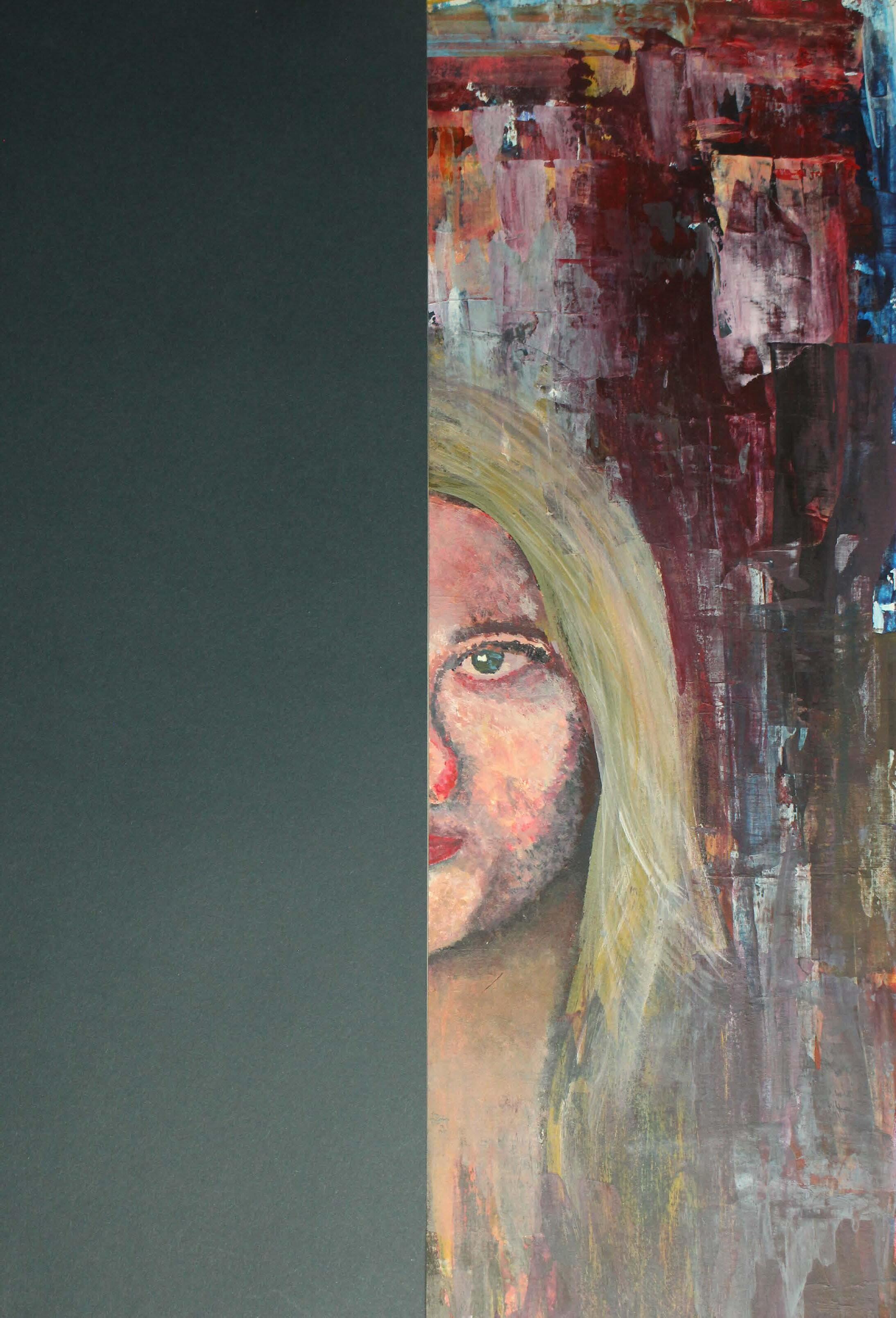
‘Sensory’
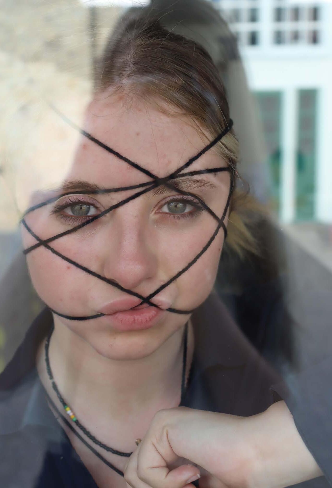
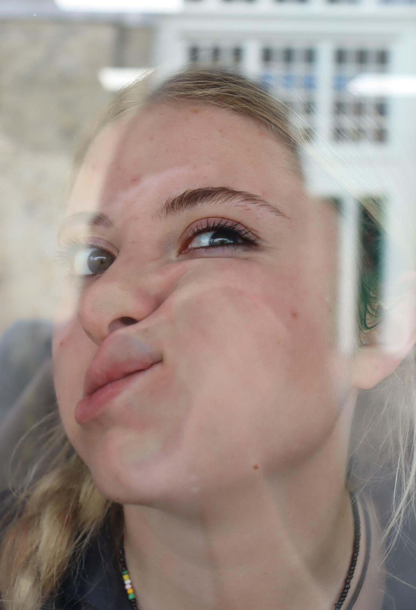
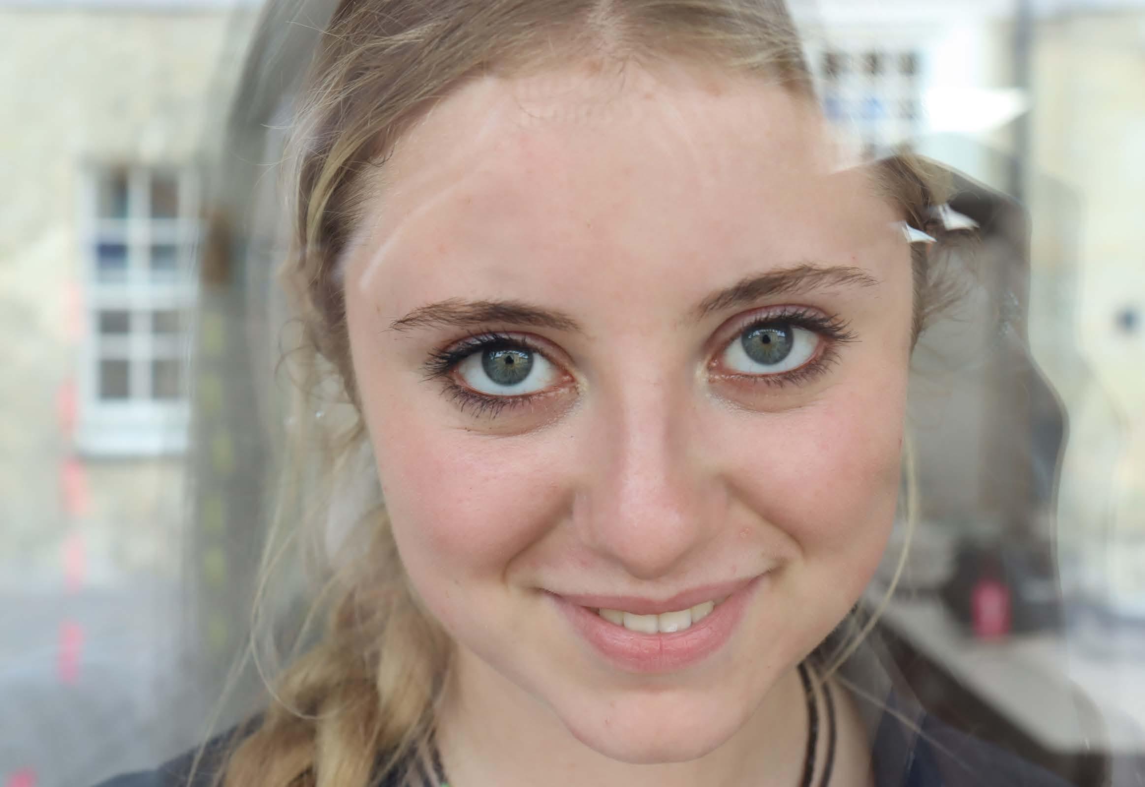
Exploring dysmorphia. This project was inspired by the word ‘sensory’, the idea of exploring the word sensory through art captivated me. After much scrolling through Pinterest and flicking through books, the idea of exploring dysmorphia was decided.
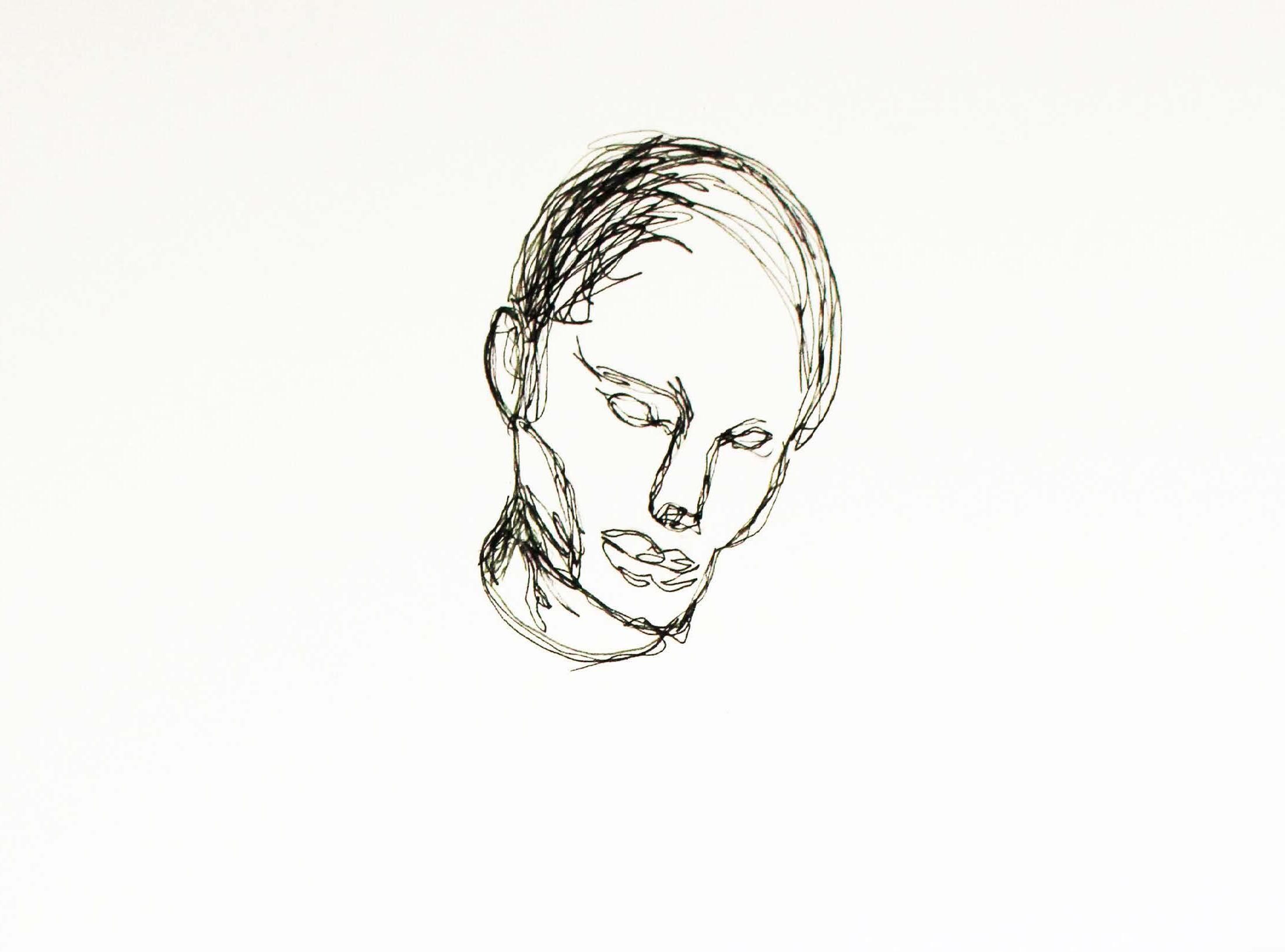
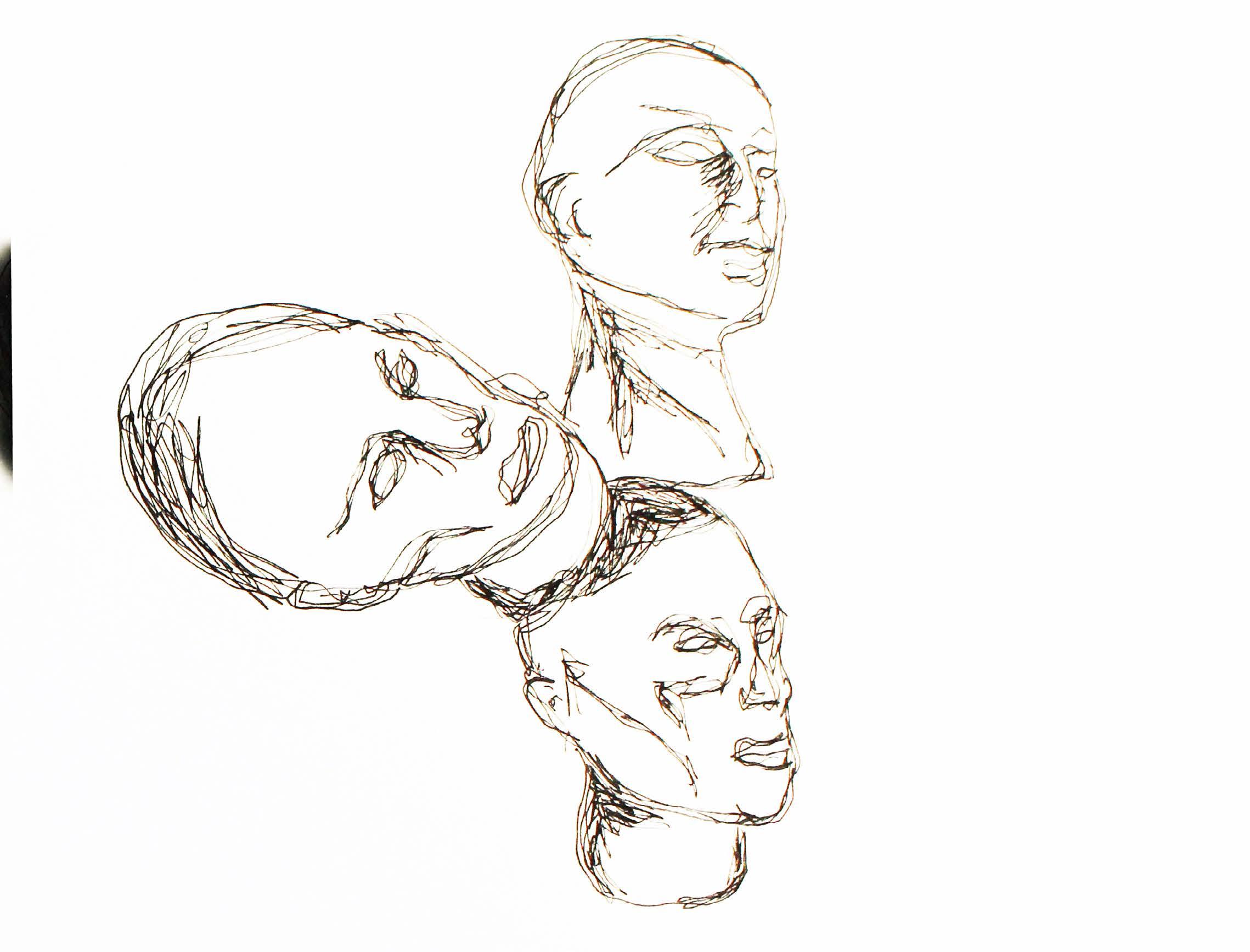
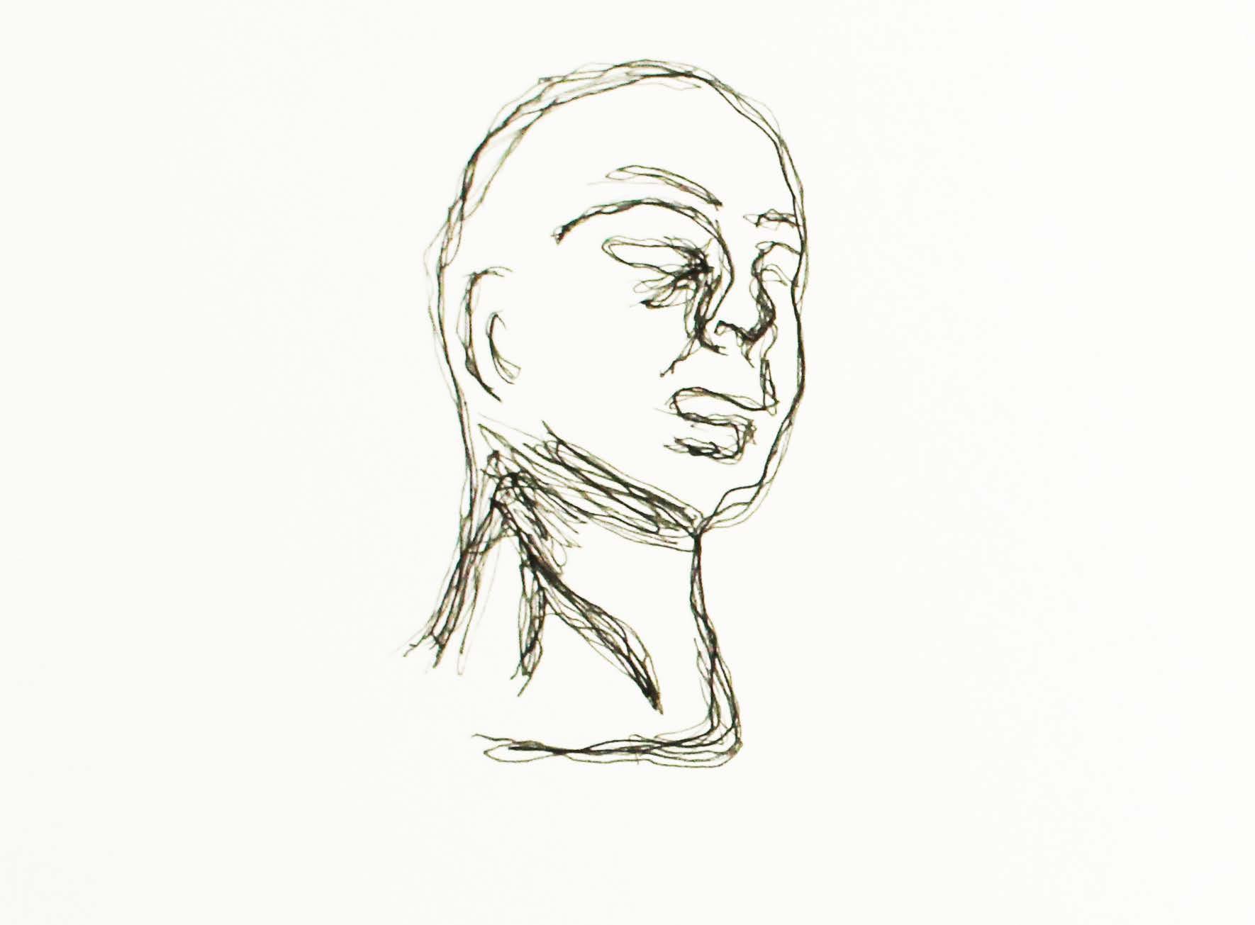
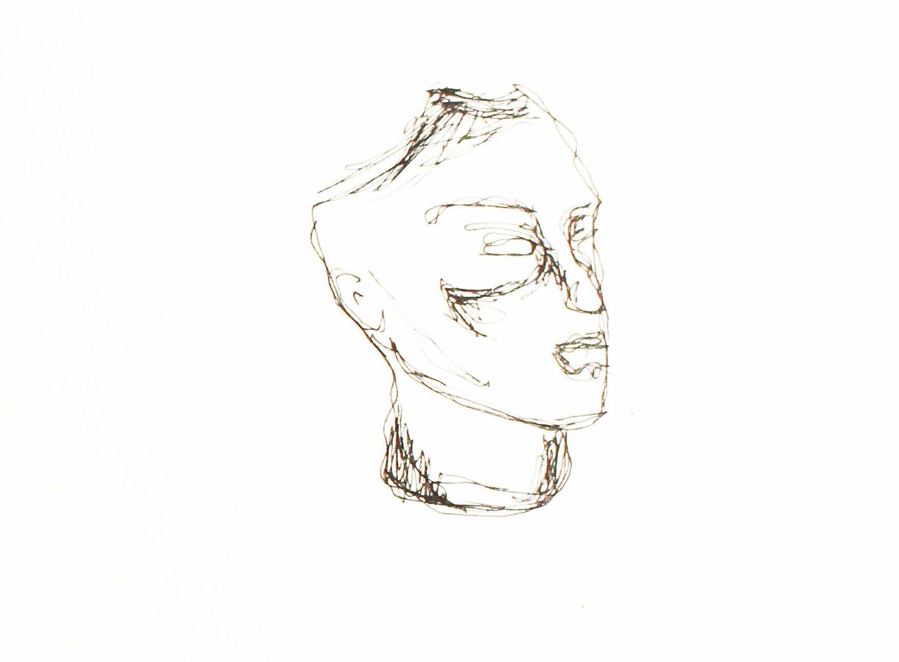
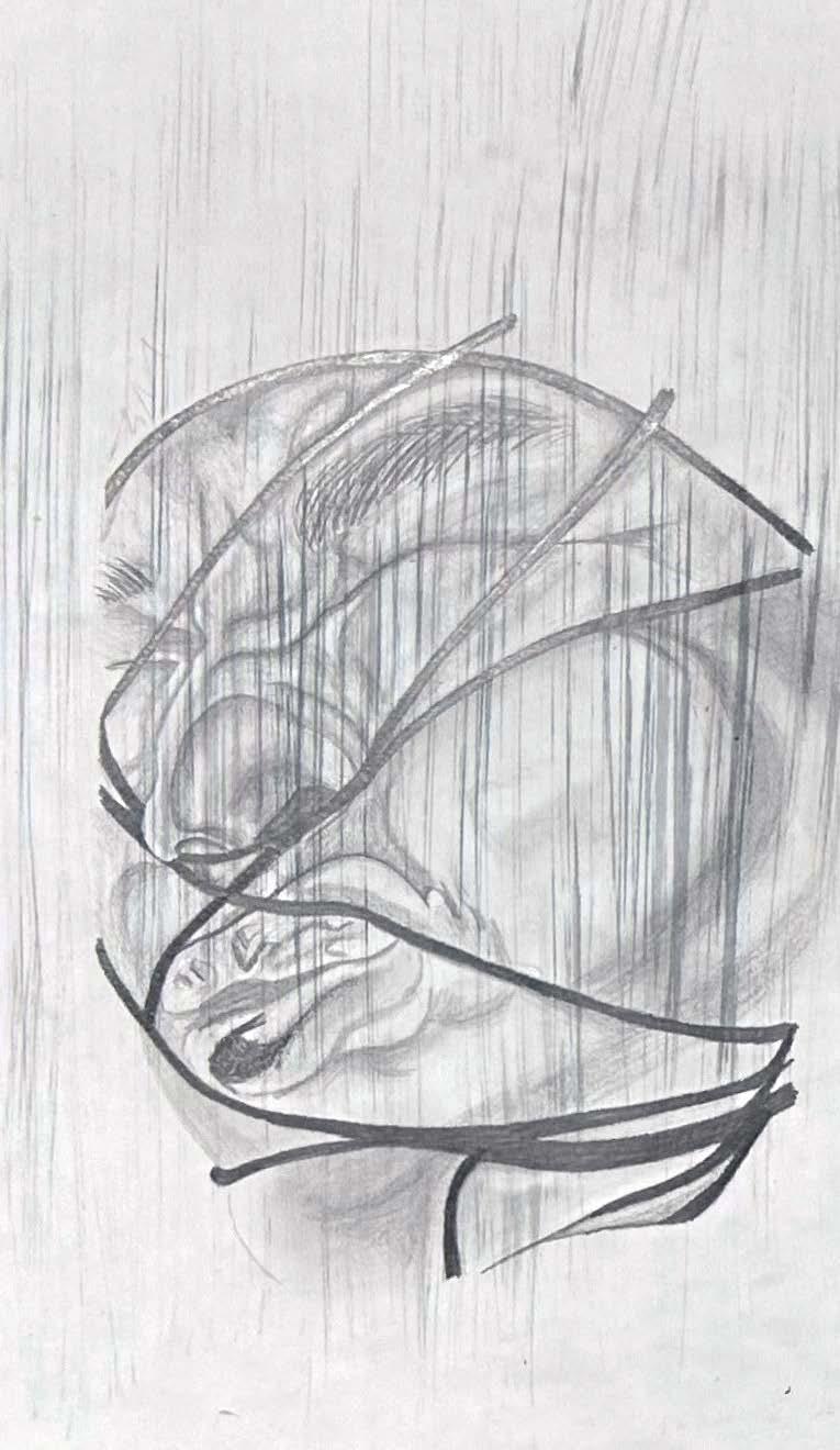
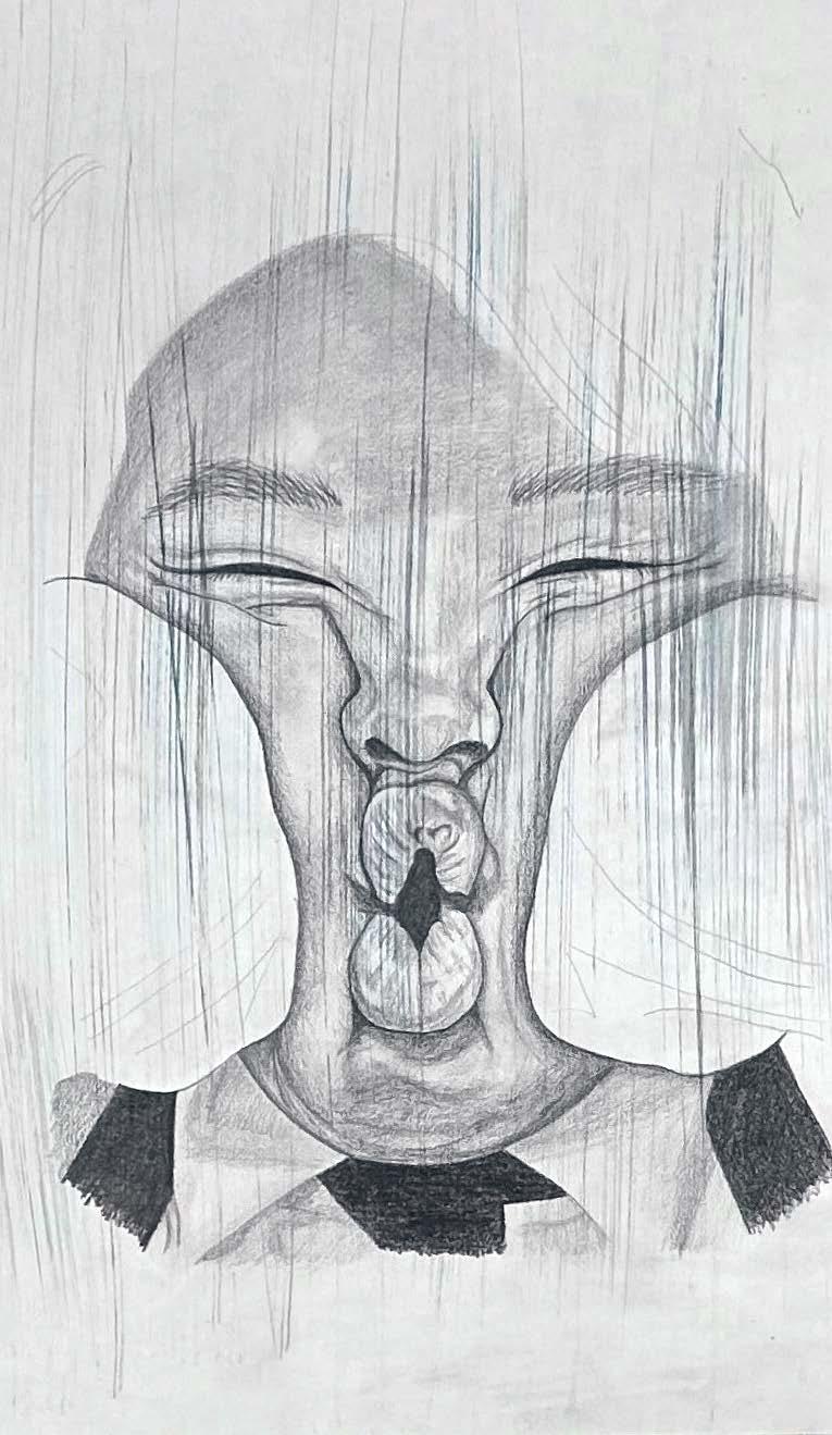
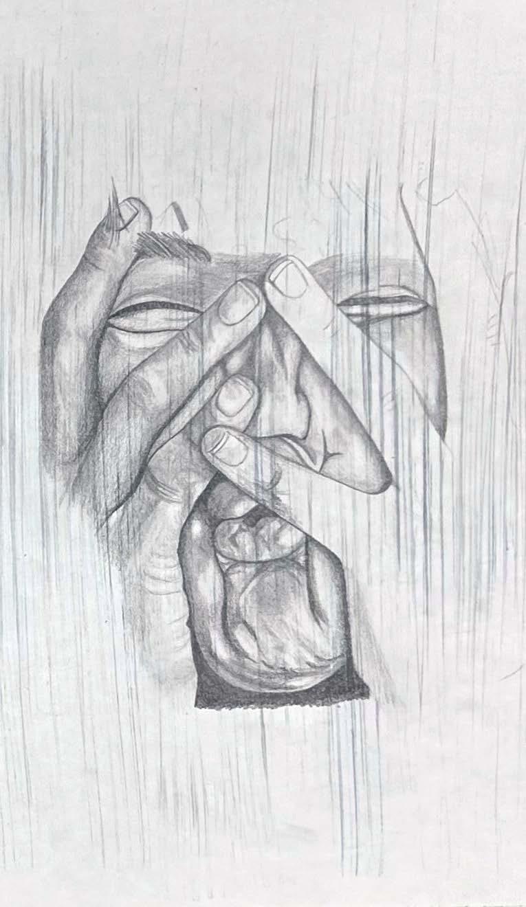
The first artist explored - which inspired the start of the project - was Maggi Hambling. Through her expression of faces, the primary medium she uses is graphite, along with different tonal values to enhance particular features. This further inspired me to start off my project with continuous lines drawings, using a fine liner to create the portraits overleaf. To investigate this further, colour fine liners were incorporated into the drawings, enhancing the state of dysmorphia throughout.
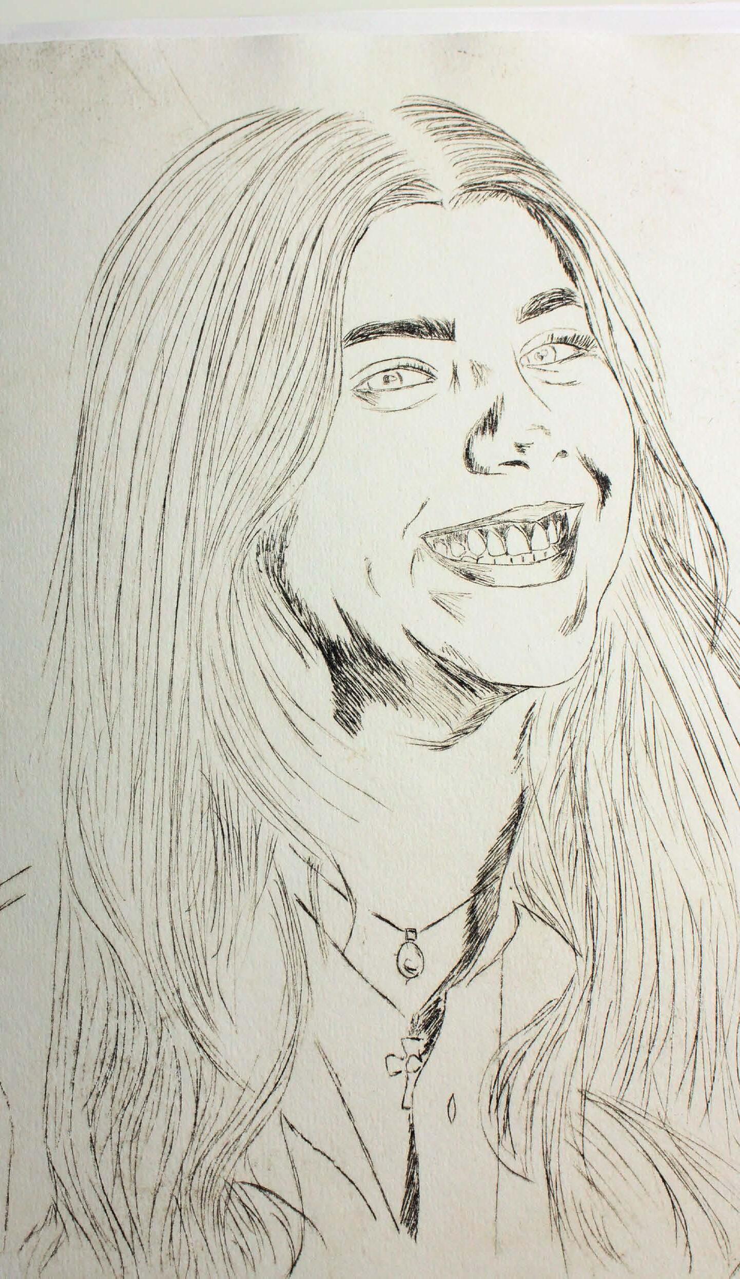
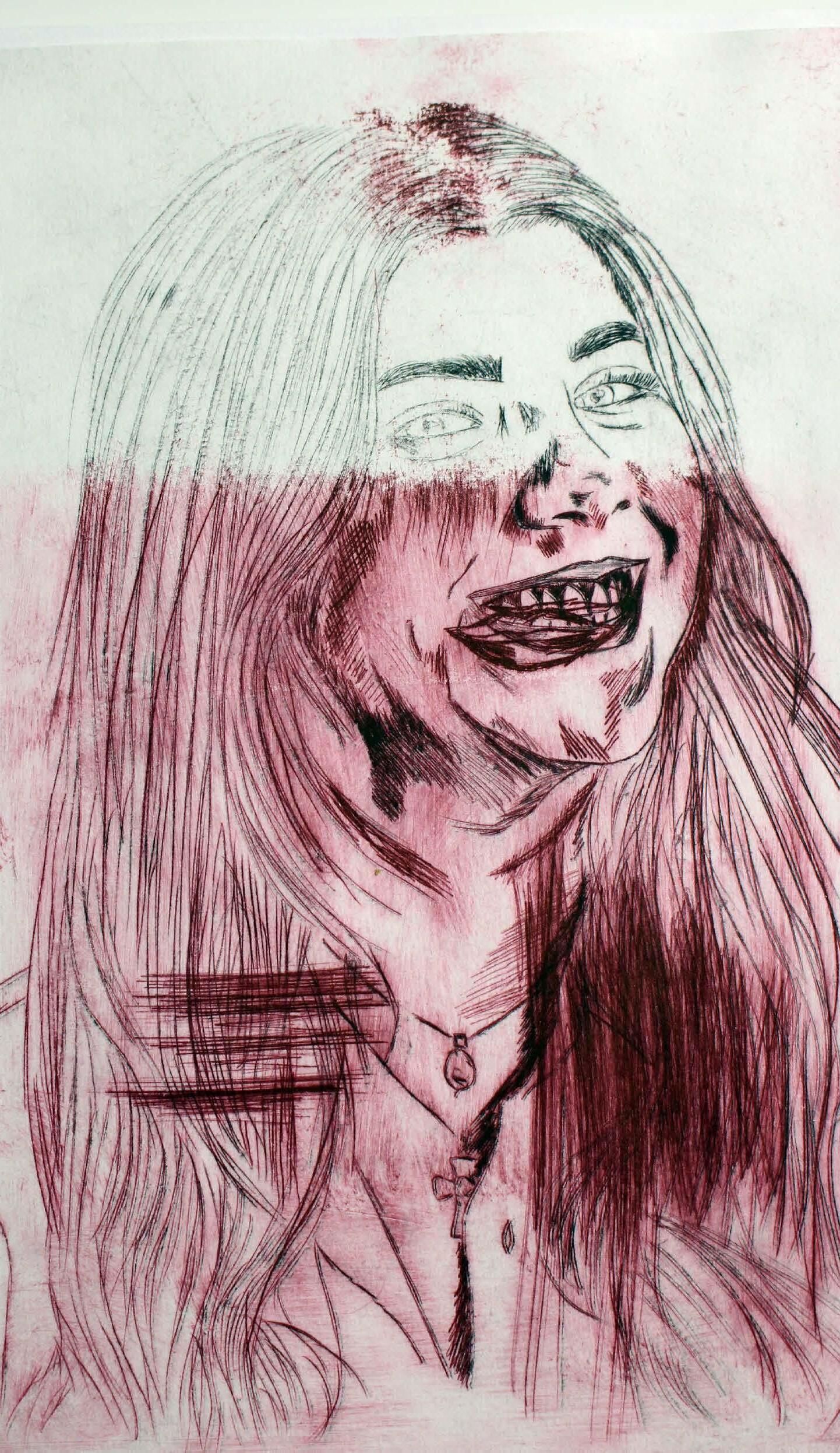
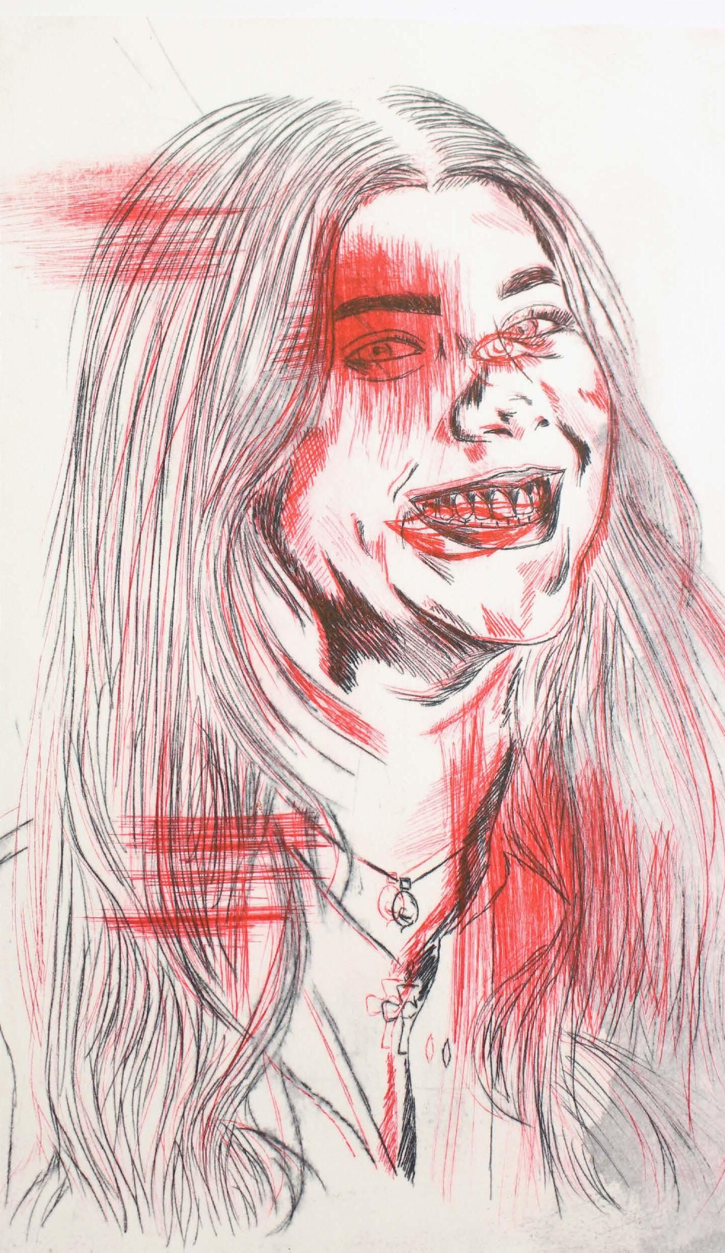
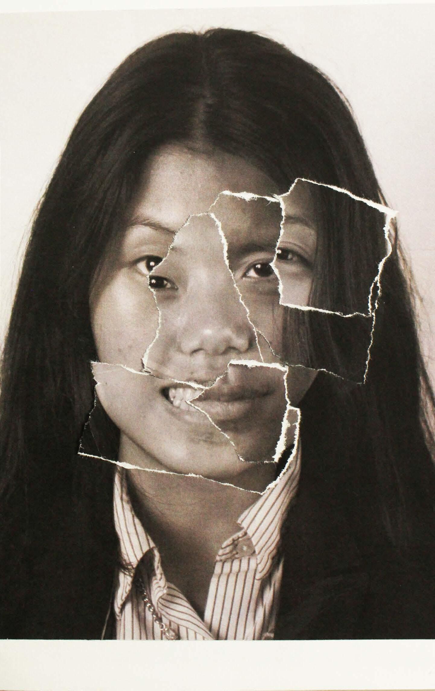
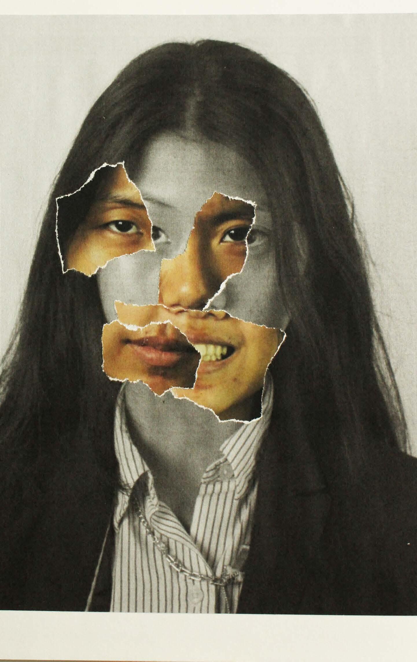
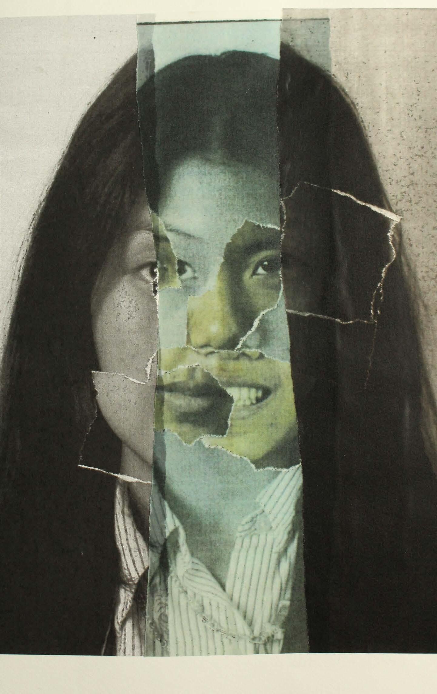
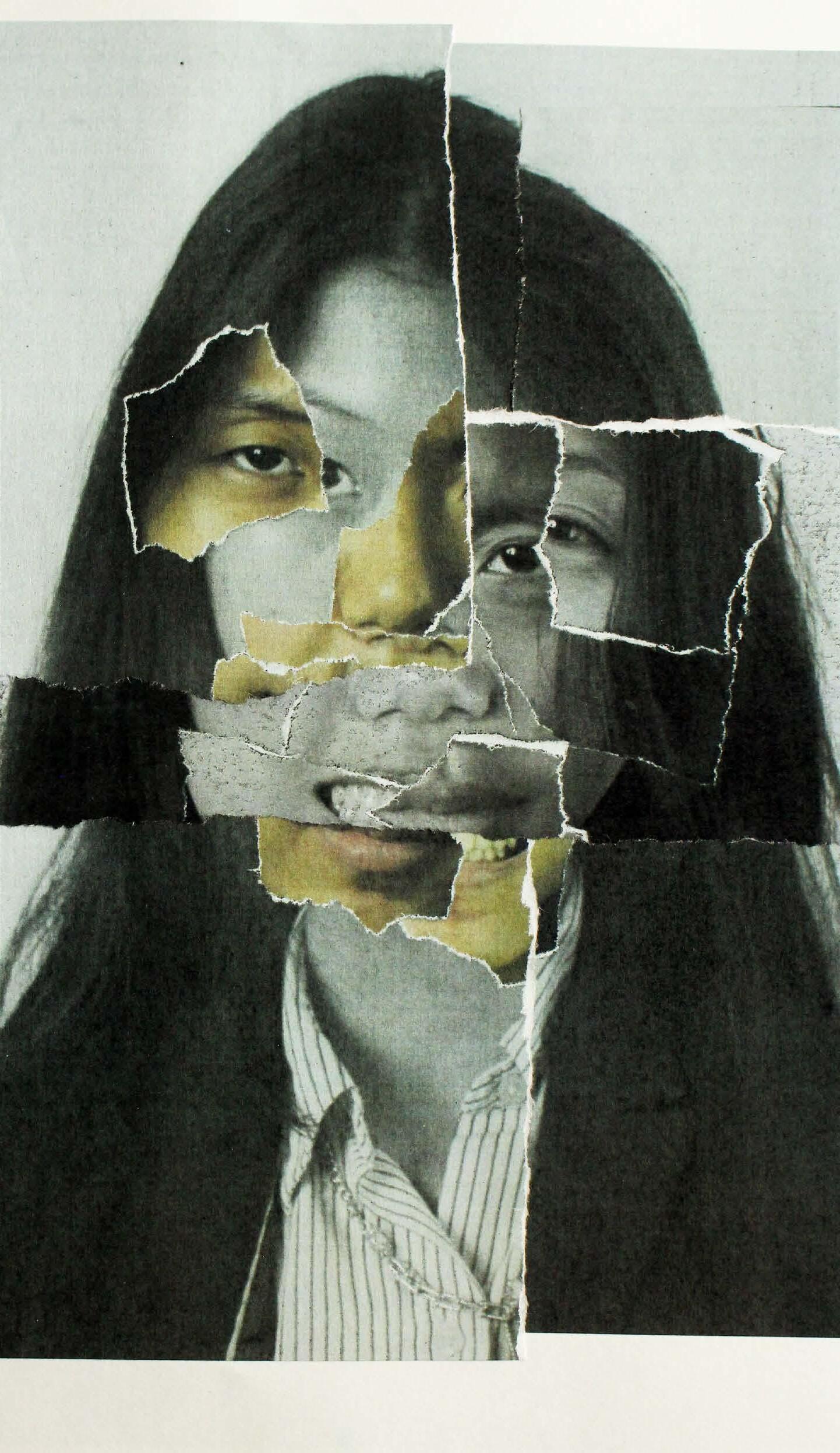
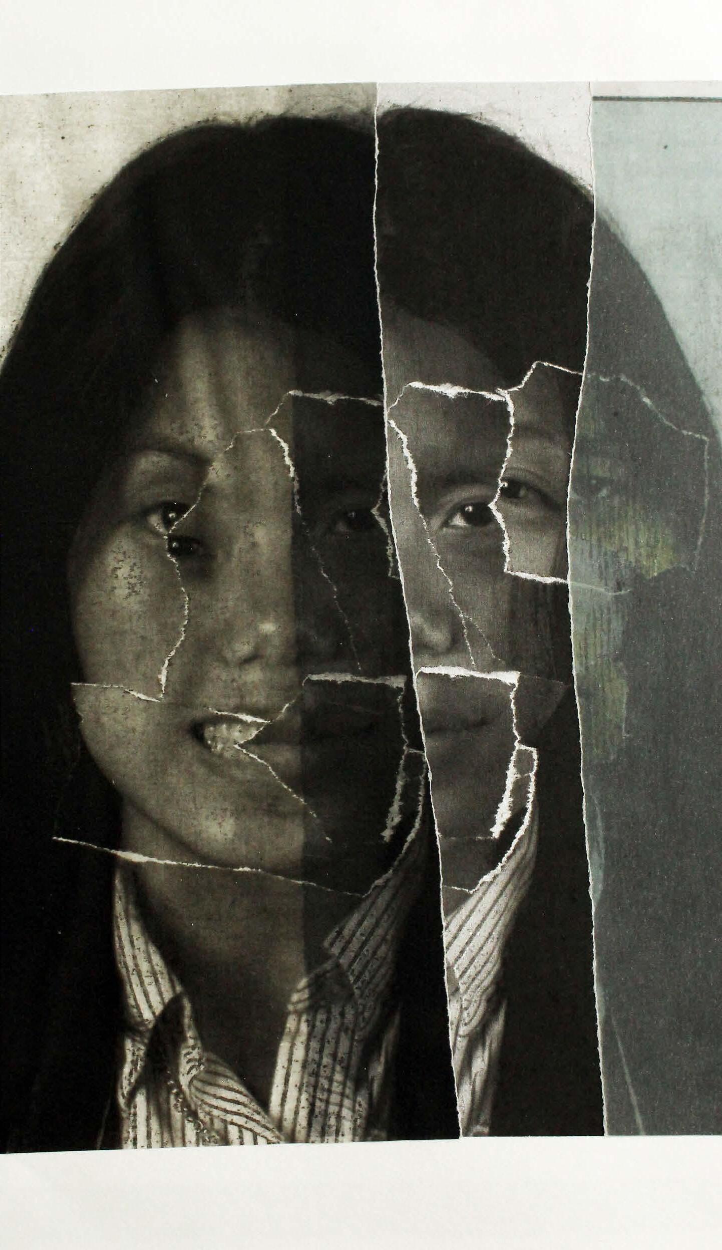
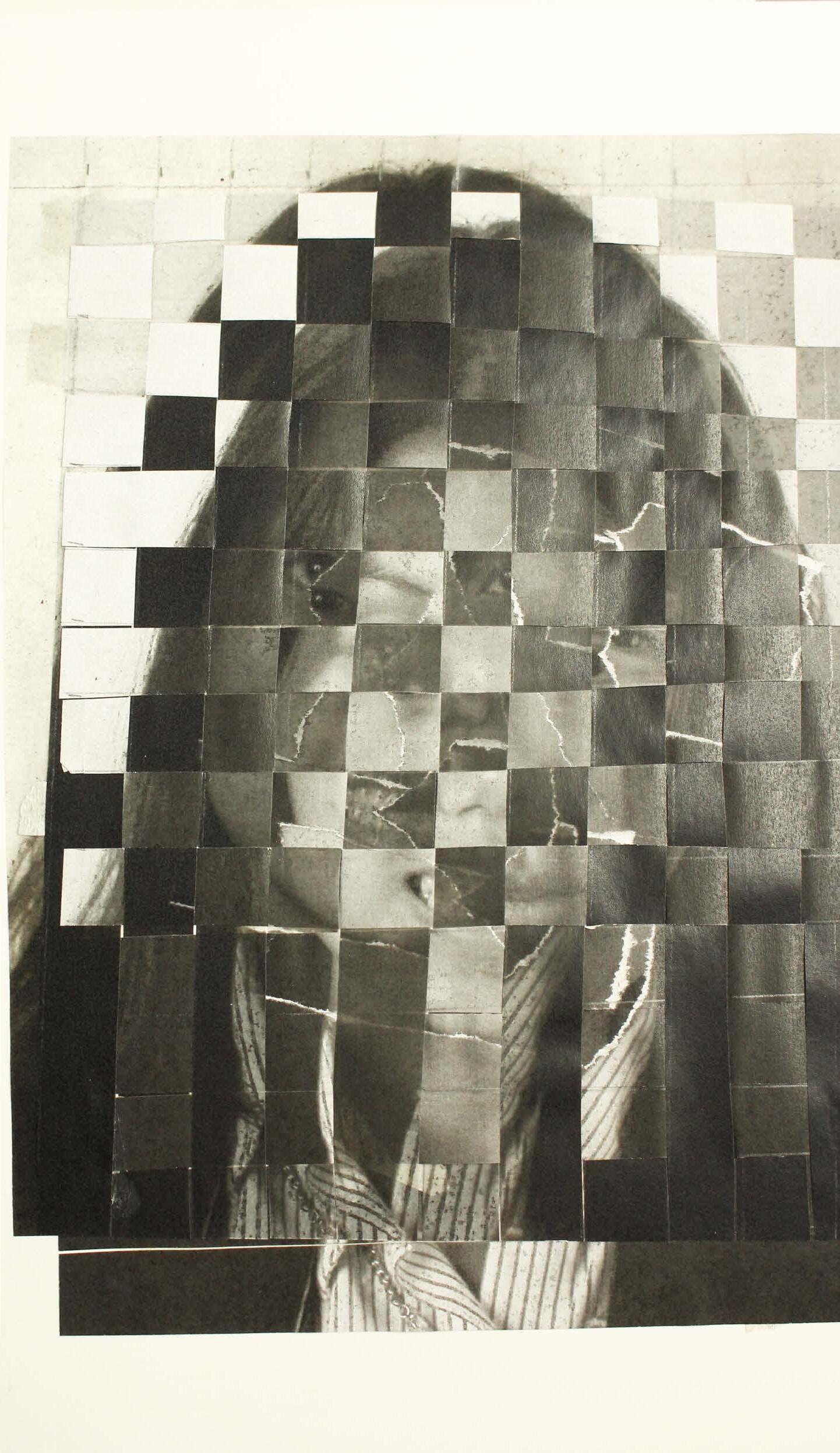
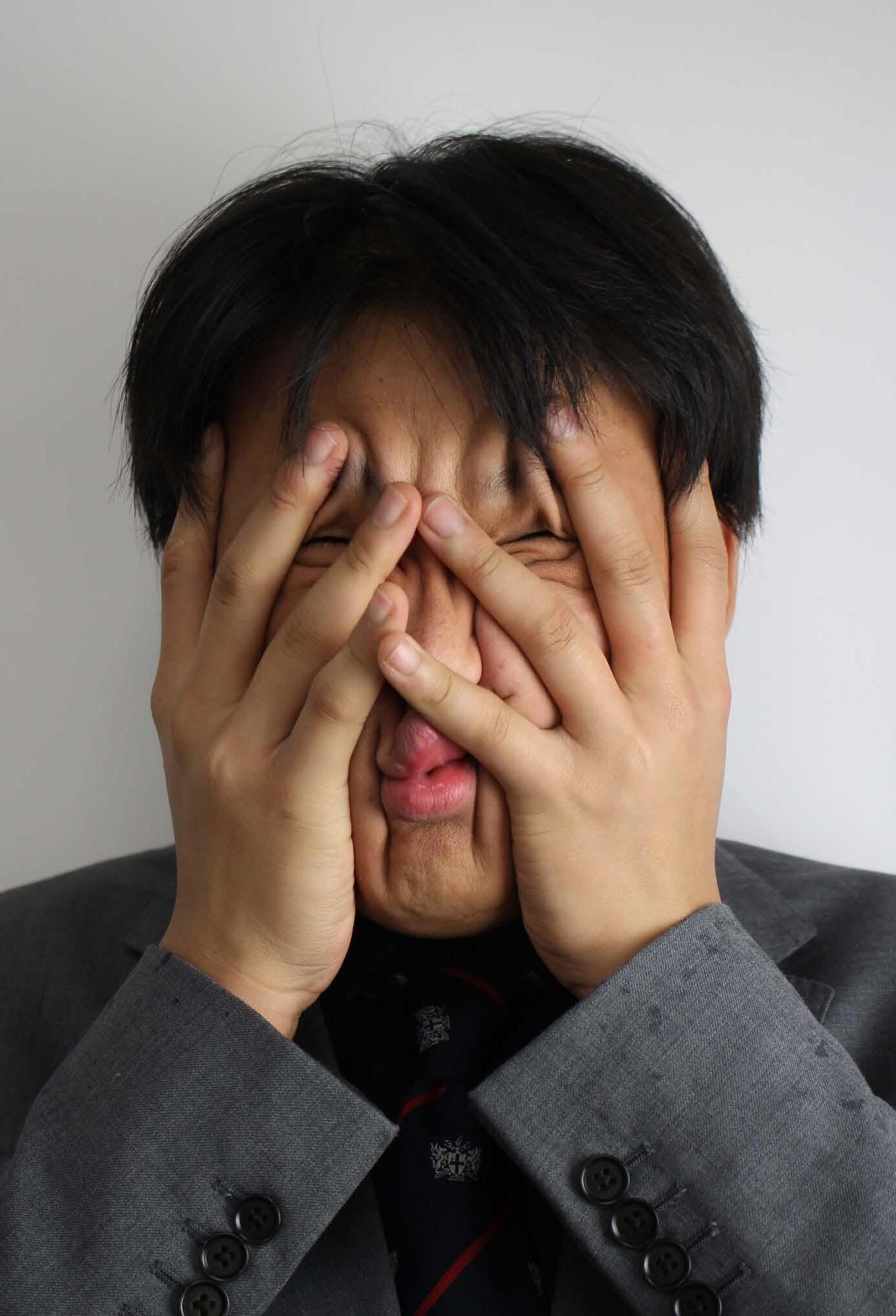
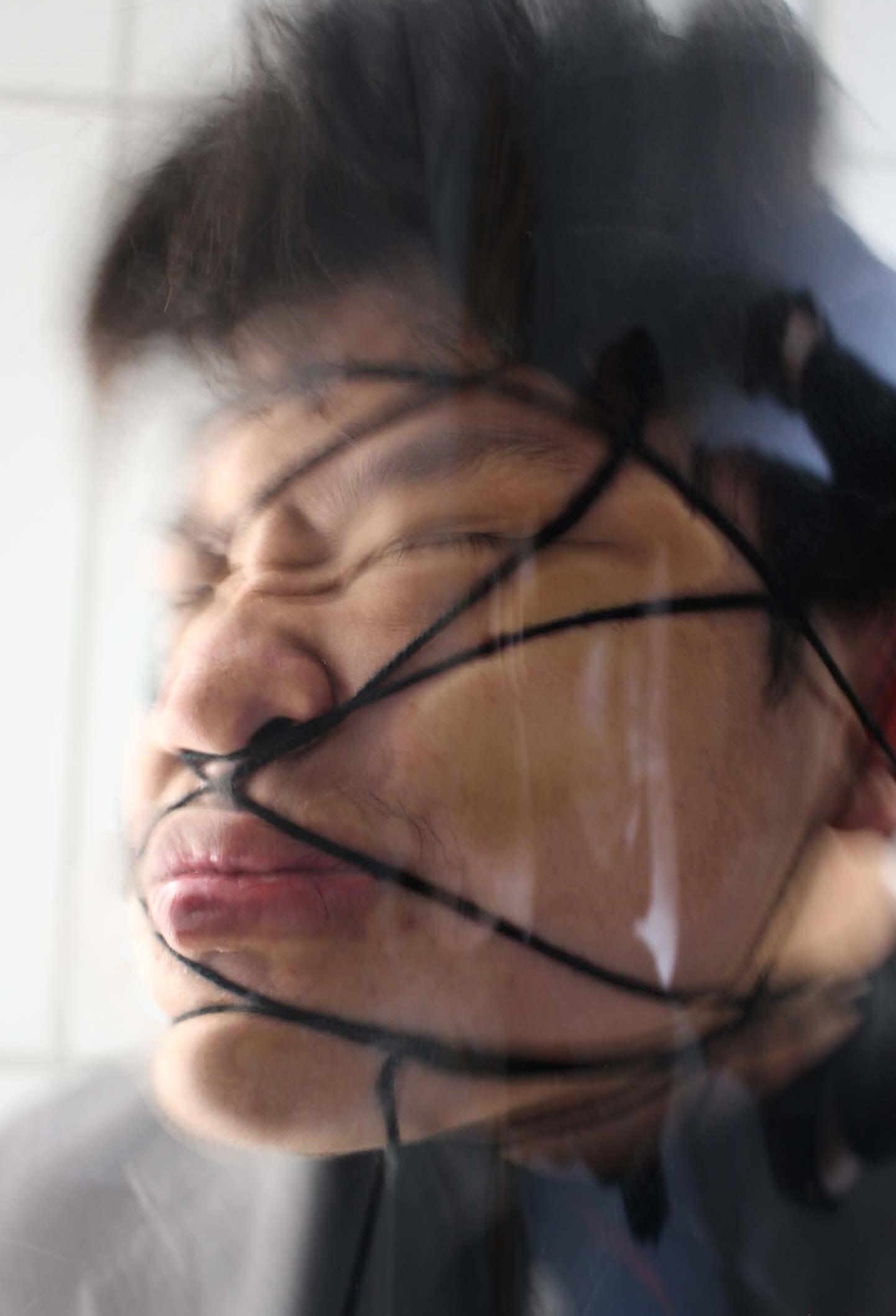
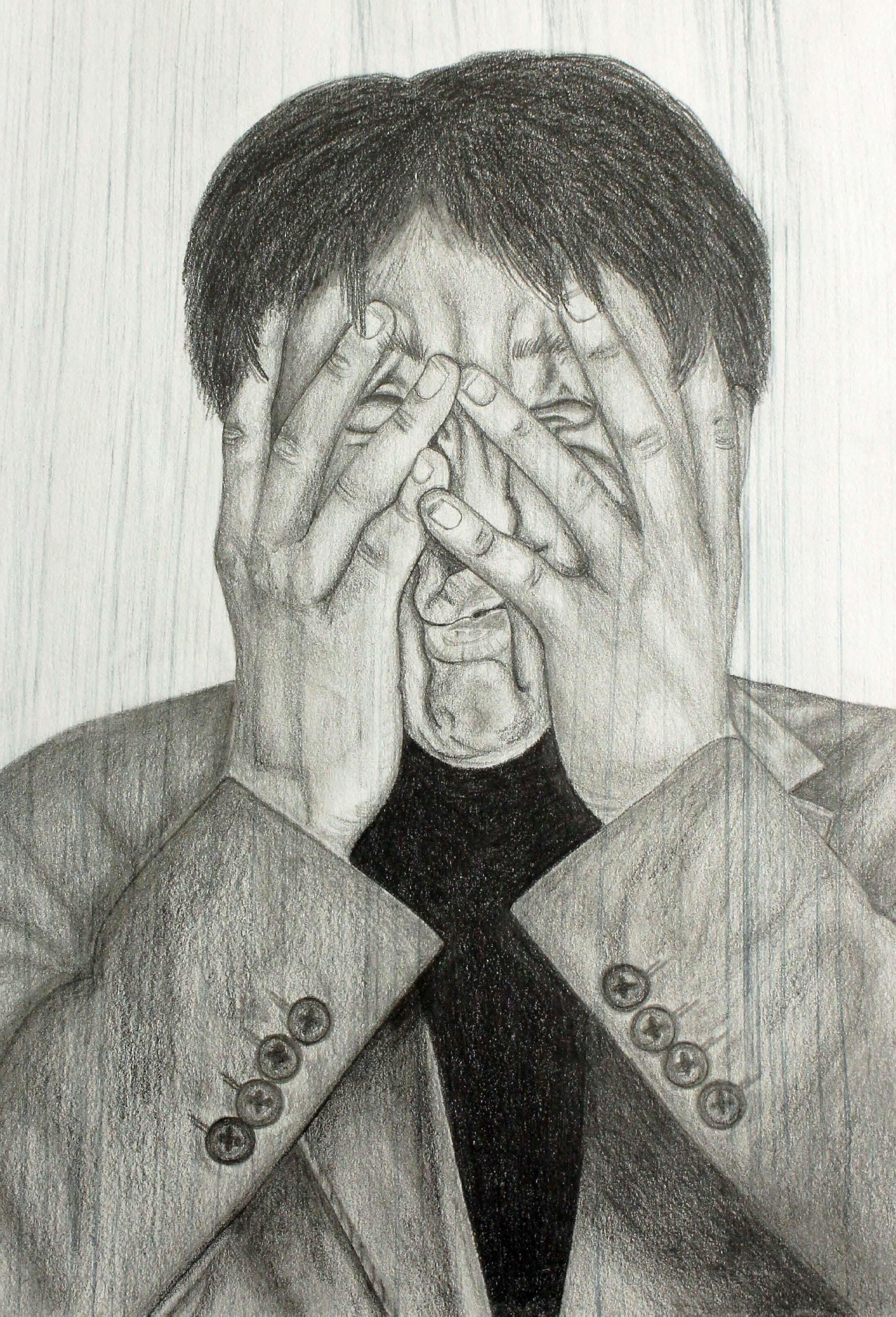
Moving on from linear and reductive drawings, the next artist through which inspiration was sought was Francis Bacon, who had a distinct style to his work. A common theme that occurs throughout his work is the distortion and graphic take on portraiture and human bodies. Delving deeper into his work and exploring the themes he used, the aspect that captured me was the use of triptych, as it almost displays a sense of movement throughout the three pieces. To incorporate Bacon’s work into my own and practice his style, I completed a photoshoot, in which I then used to experiment with different mediums. An example of this was the drypoint etching. This was chosen because the linear style created could convey a harsh, realistic portrait. Having experimented with different colours of ink, it was evident that brown and red mixed together portrayed the style of Francis Bacon well throughout the pieces, along with the scratches and cross-hatching over the piece, displaying a sense of morbidity and adding a grotesque feel. Again, to explore dysmorphia within the human face, the idea of collages was favourable, as this enabled me to distort the face by hand, mixing different photographs that were pulling different expressions, much like Francis Bacon’s work.
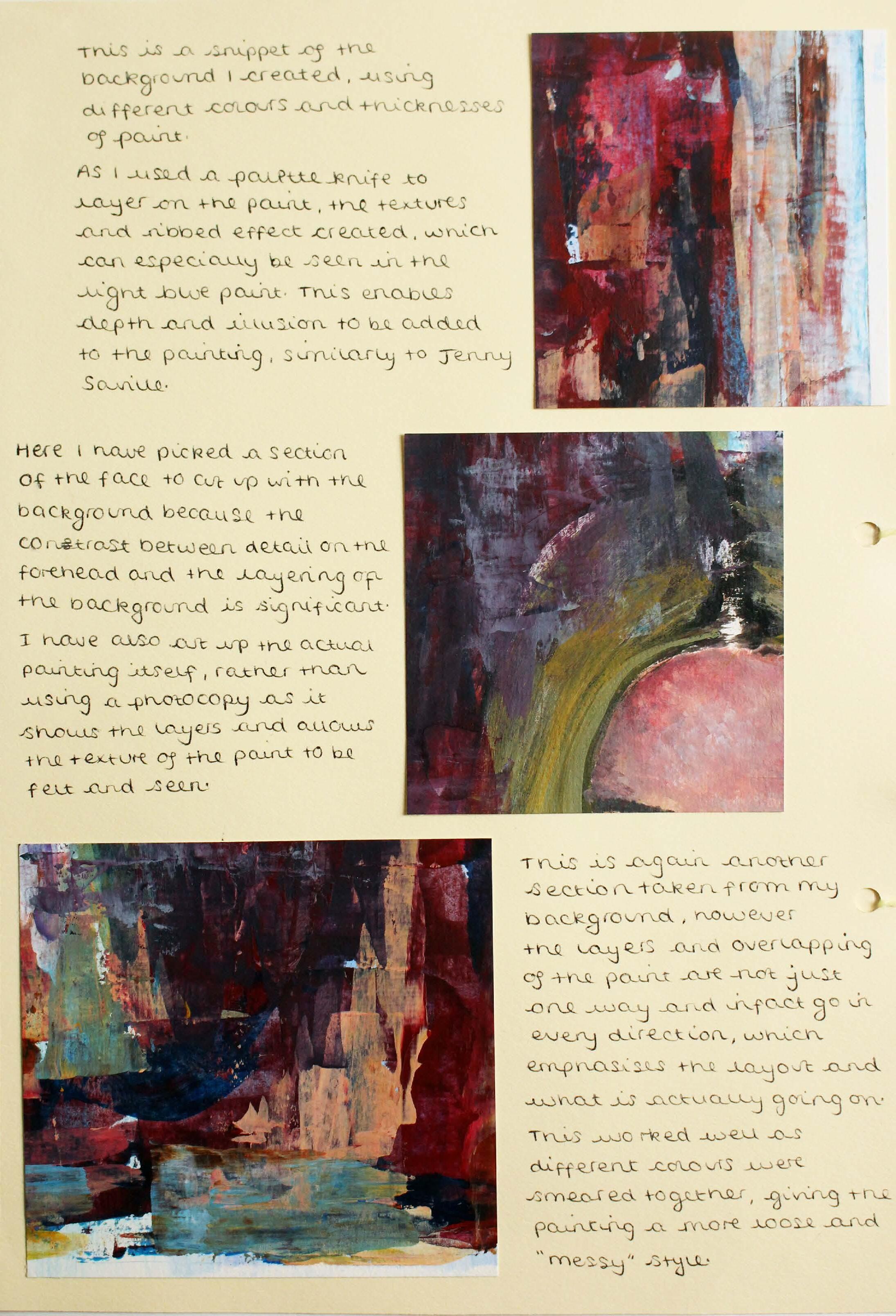
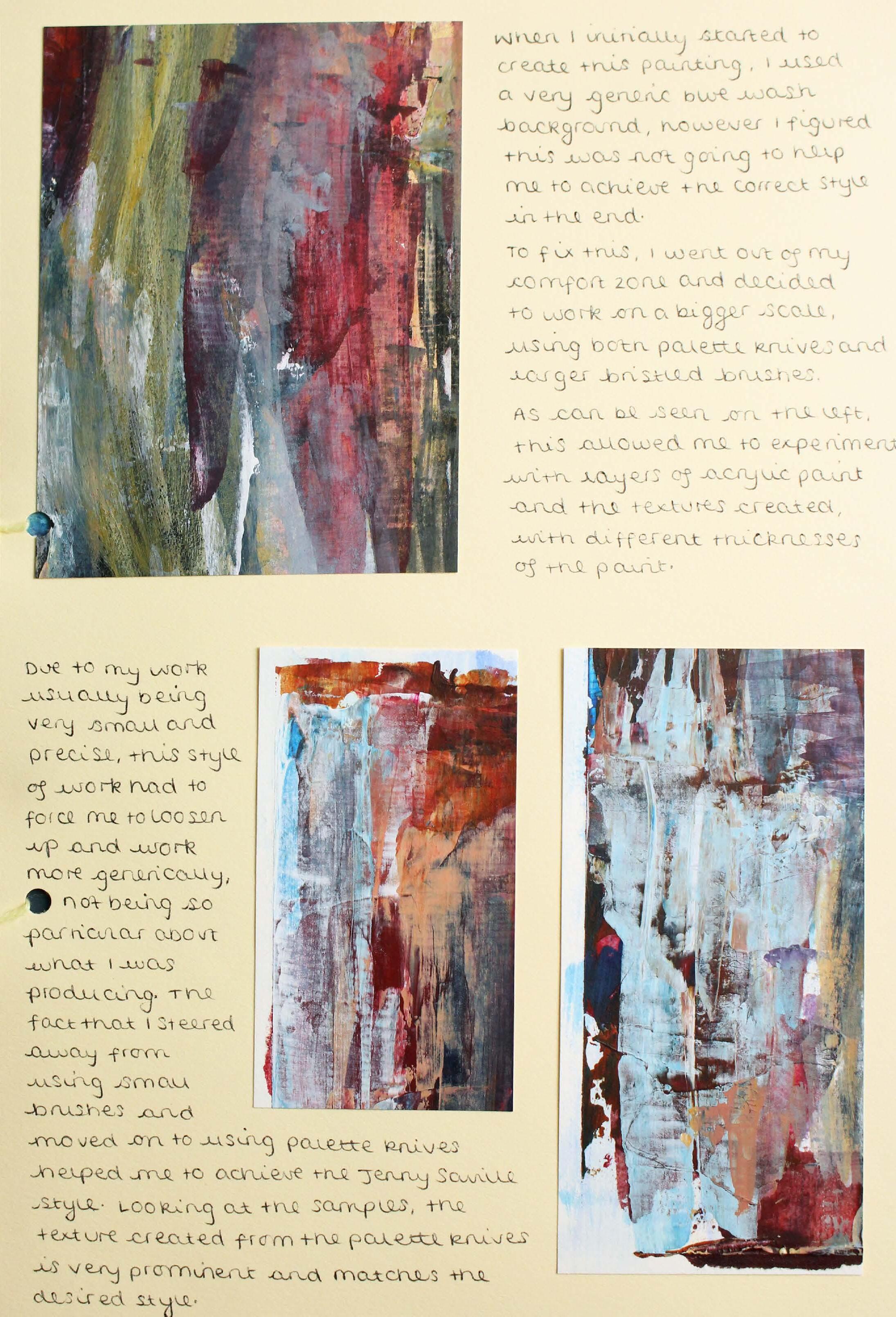
The third and final artist explored within this project was Jenny Saville. She was chosen because of her use of oil paint and what she created as a result. This also allowed me to extend my comfort zone and experiment with a different medium. More so because she does not use oil paint in the traditional way, instead she uses a palette knife to apply paint to the canvas, enhancing the texture created within the work. Not only this, but her use of colour captivated me as going back to the beginning of the project, I incorporated colour into the continuous line drawings as I felt as though this enhanced the sensory aspect. As we can see from her work, she uses both bright colours and human faces within her illustration, making her the perfect artist to study.
The final section of this project entailed photographic exploration, which allowed me to capture clear, focussed images to further push the sensory aspect of the work. Having cropped and edited the images to make them a better fit, I then turned one image into a hyper-realistic tonal drawing. This was then converted into a 3D piece, by printing the drawing onto fabric, stuffing the fabric and then sewing into the drawing. Then trapping the stuffing and making areas bulge more than others. This enhanced the sensory aspect of the work through the touch of it. Finally, relating back to a Francis Bacon feature, I created three consecutive tonal drawings, representing a triptych, much like Bacon’s work. This meant that I managed to link all of my findings back into one of the final piece’s of the project.
Exploring dysmorphia
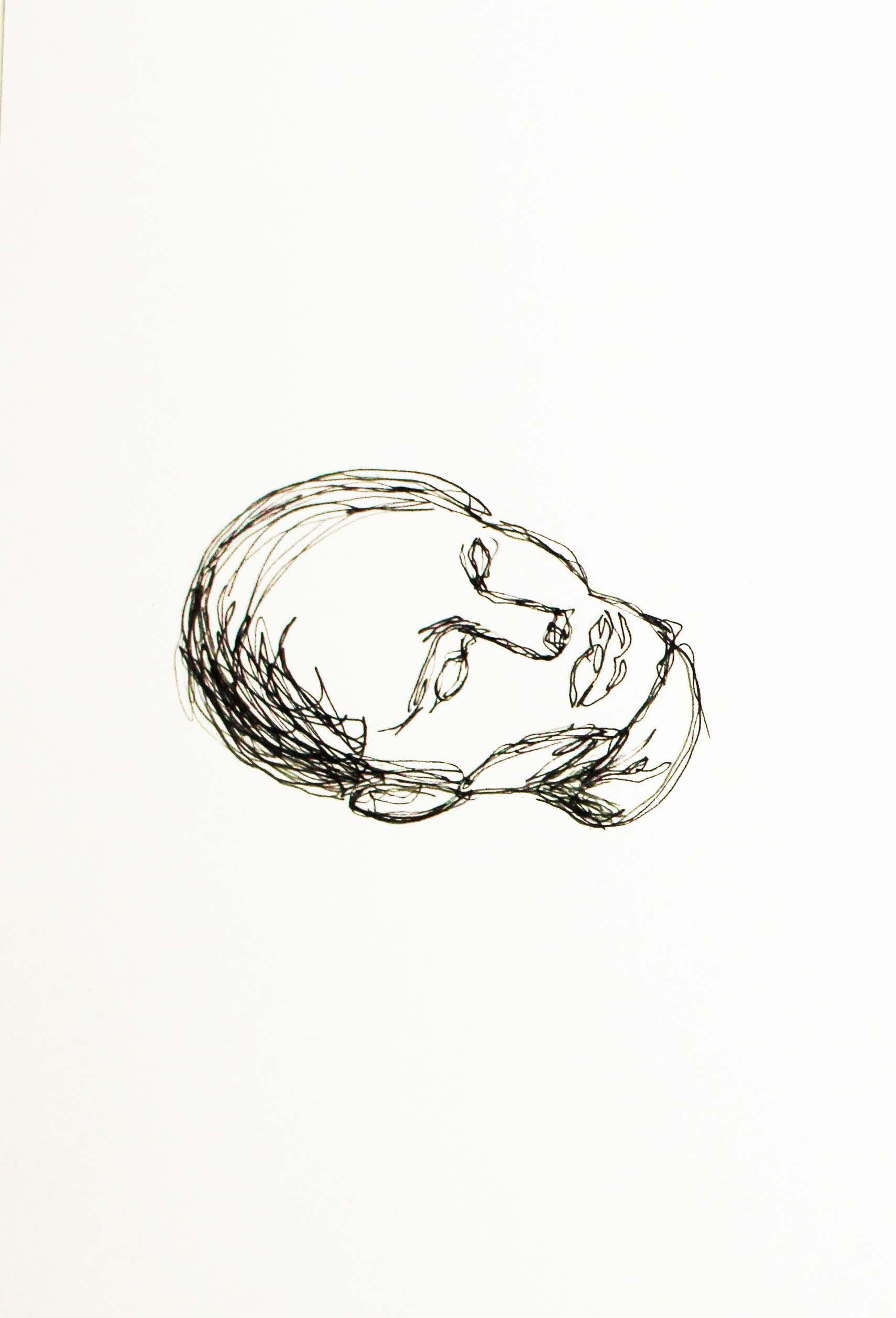
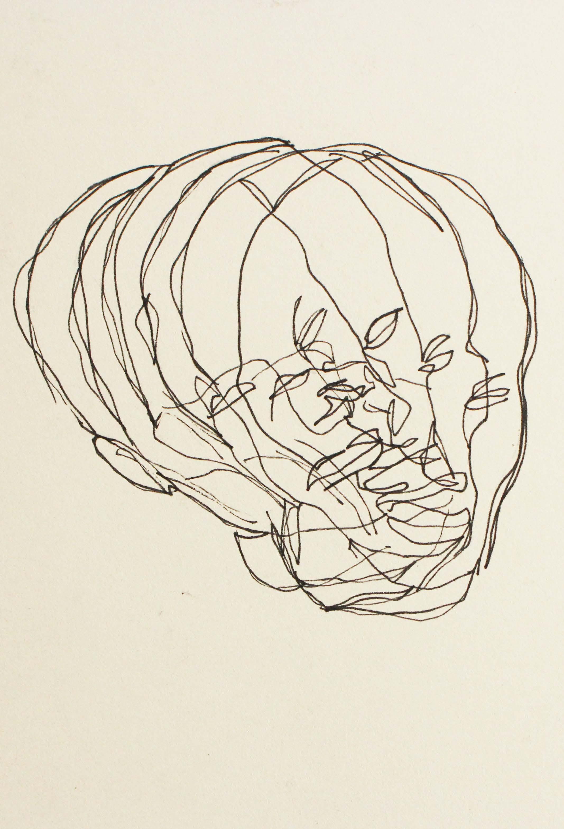
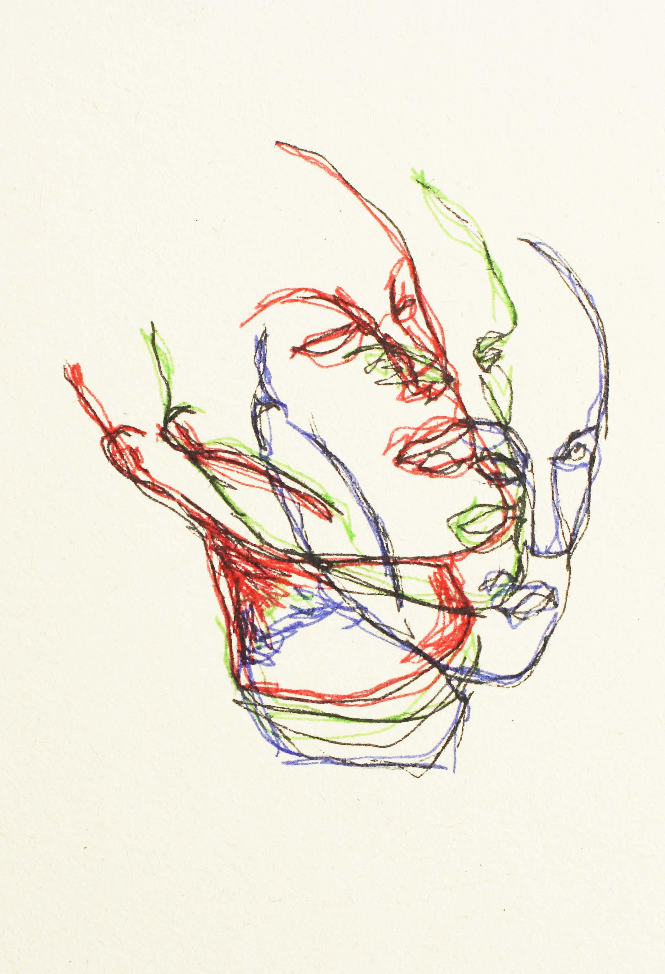 Continuous line drawing in black and coloured ink
Continuous line drawing in black ink
Continuous line drawing in black and coloured ink
Continuous line drawing in black ink
Drypoint etching
Collage
Acrylic
 Photographic exploration
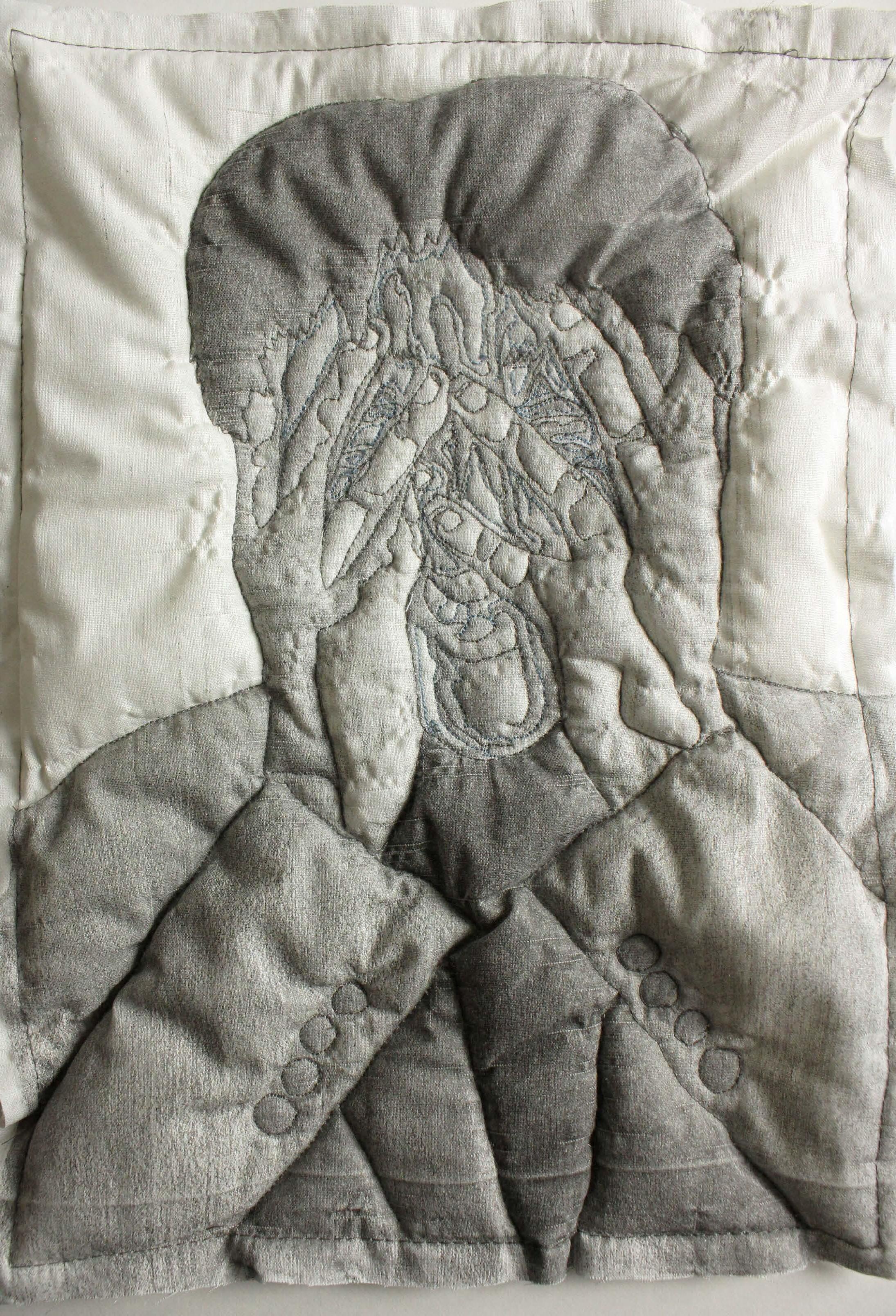
3D fabric
Pencil drawing
Pencil drawing
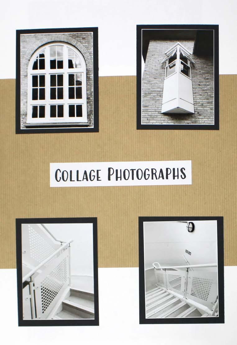
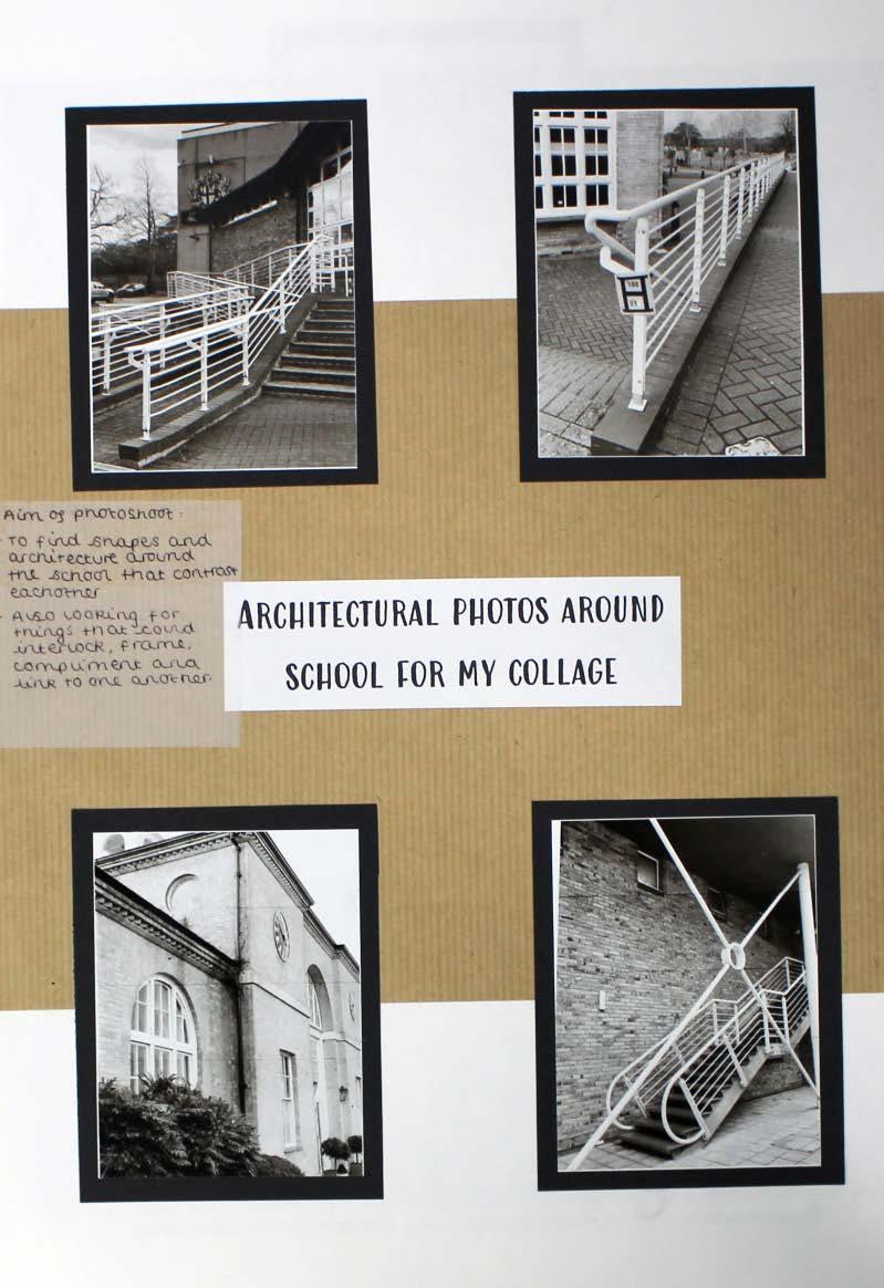
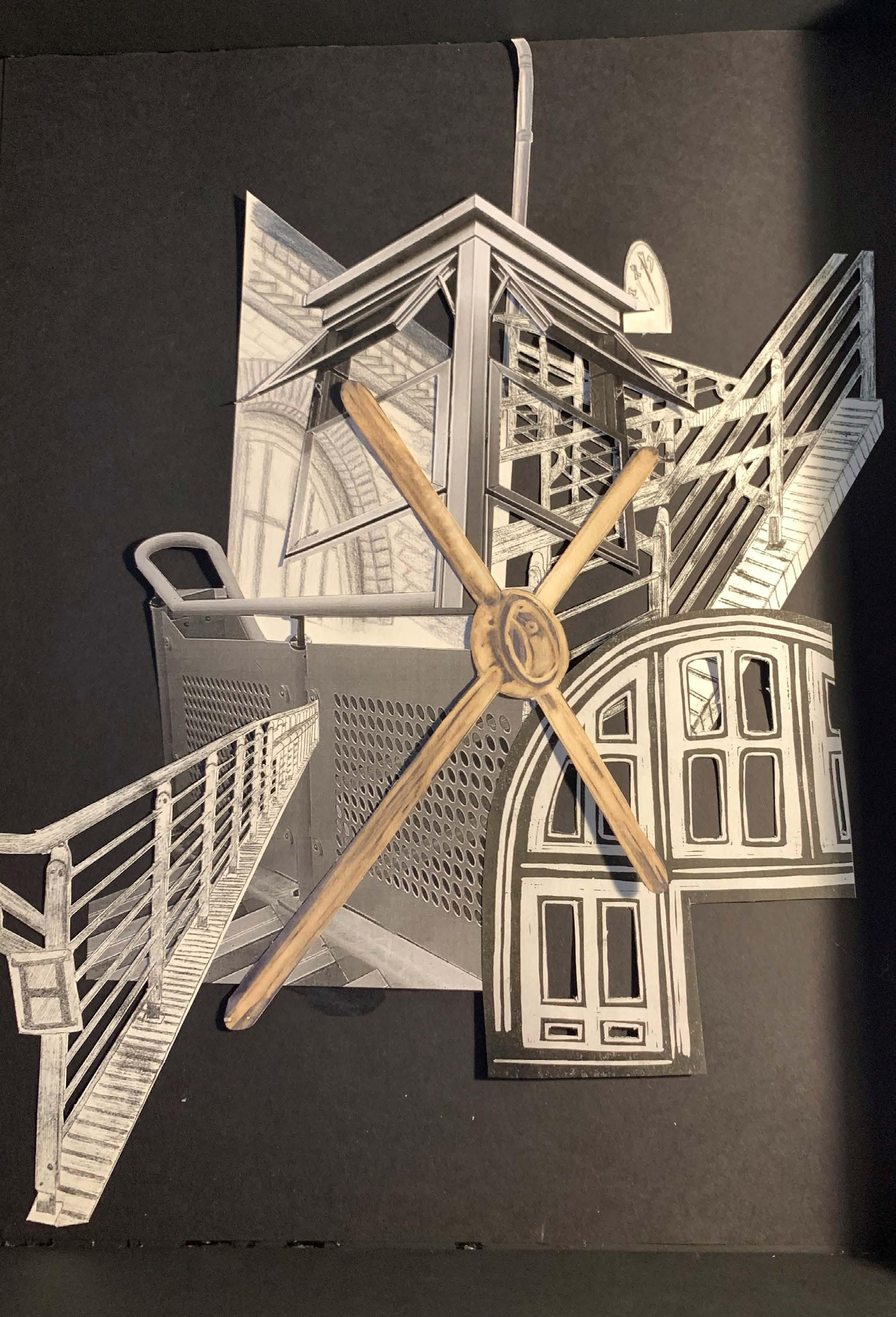
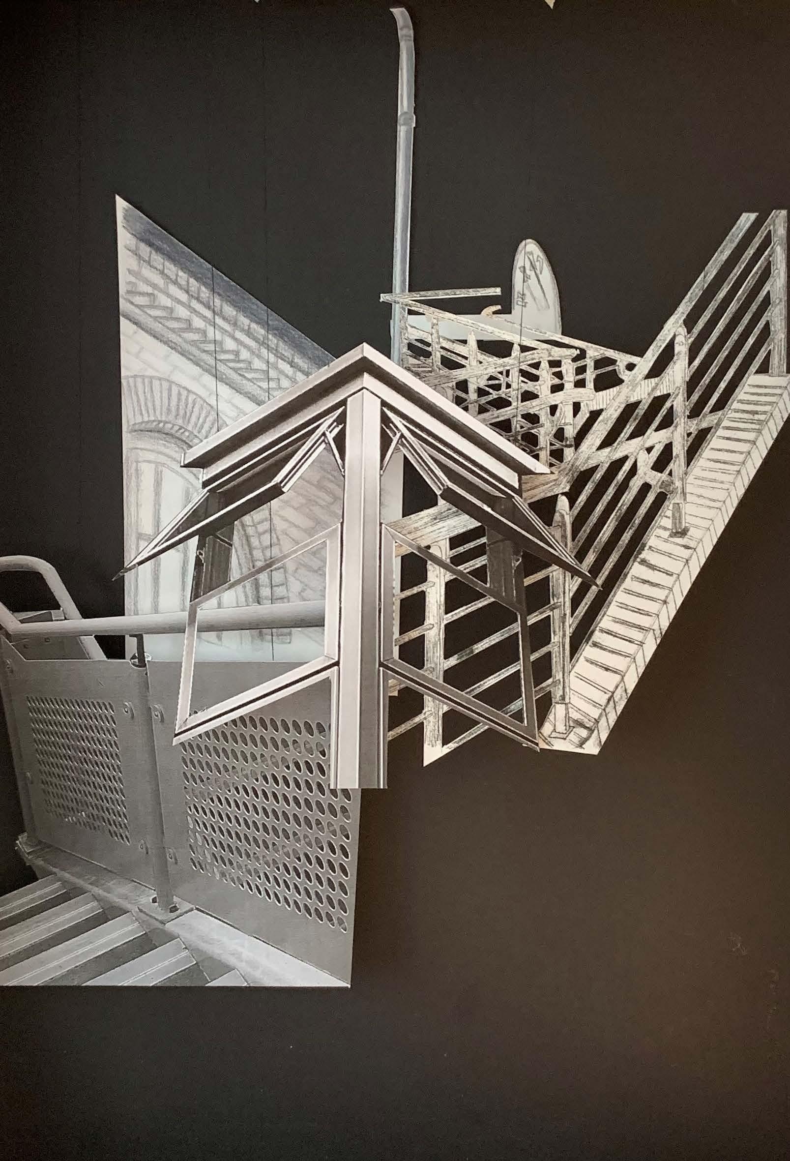
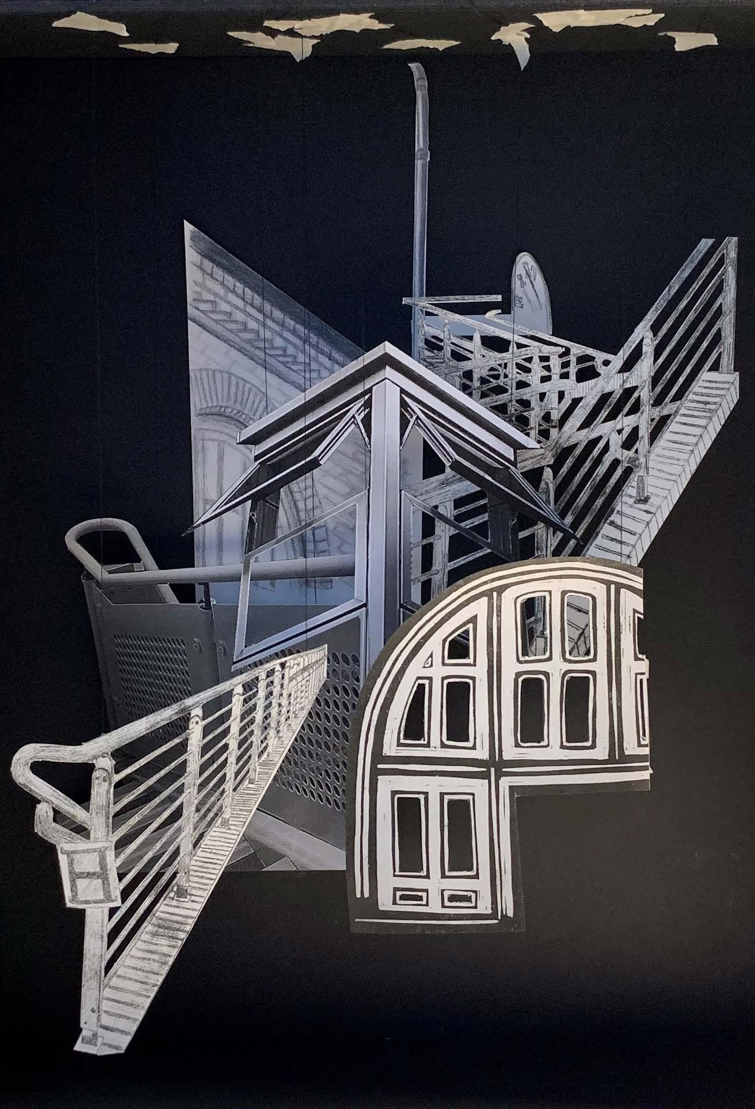
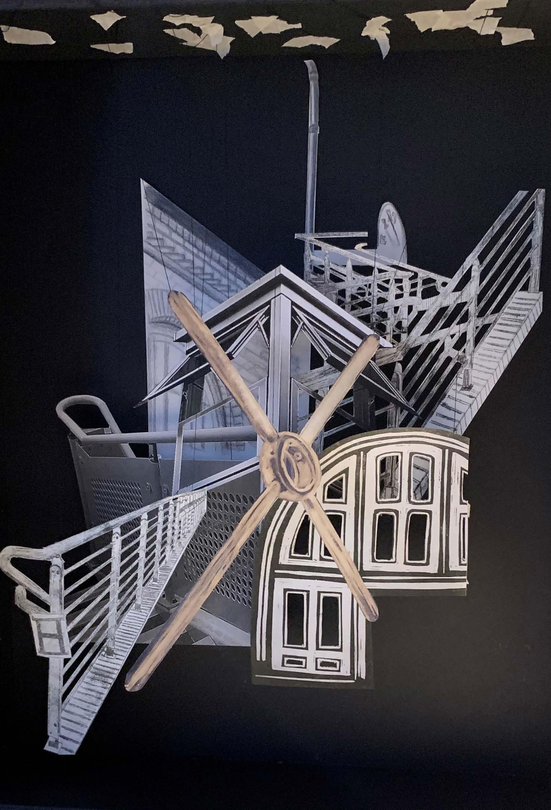
‘Architectural exploration’
Intrigued by architectural form, this project began with a photoshoot of architectural features, which I then cropped and turned black and white. Having done this, the idea to turn each photo into a different medium of artwork caught my attention.
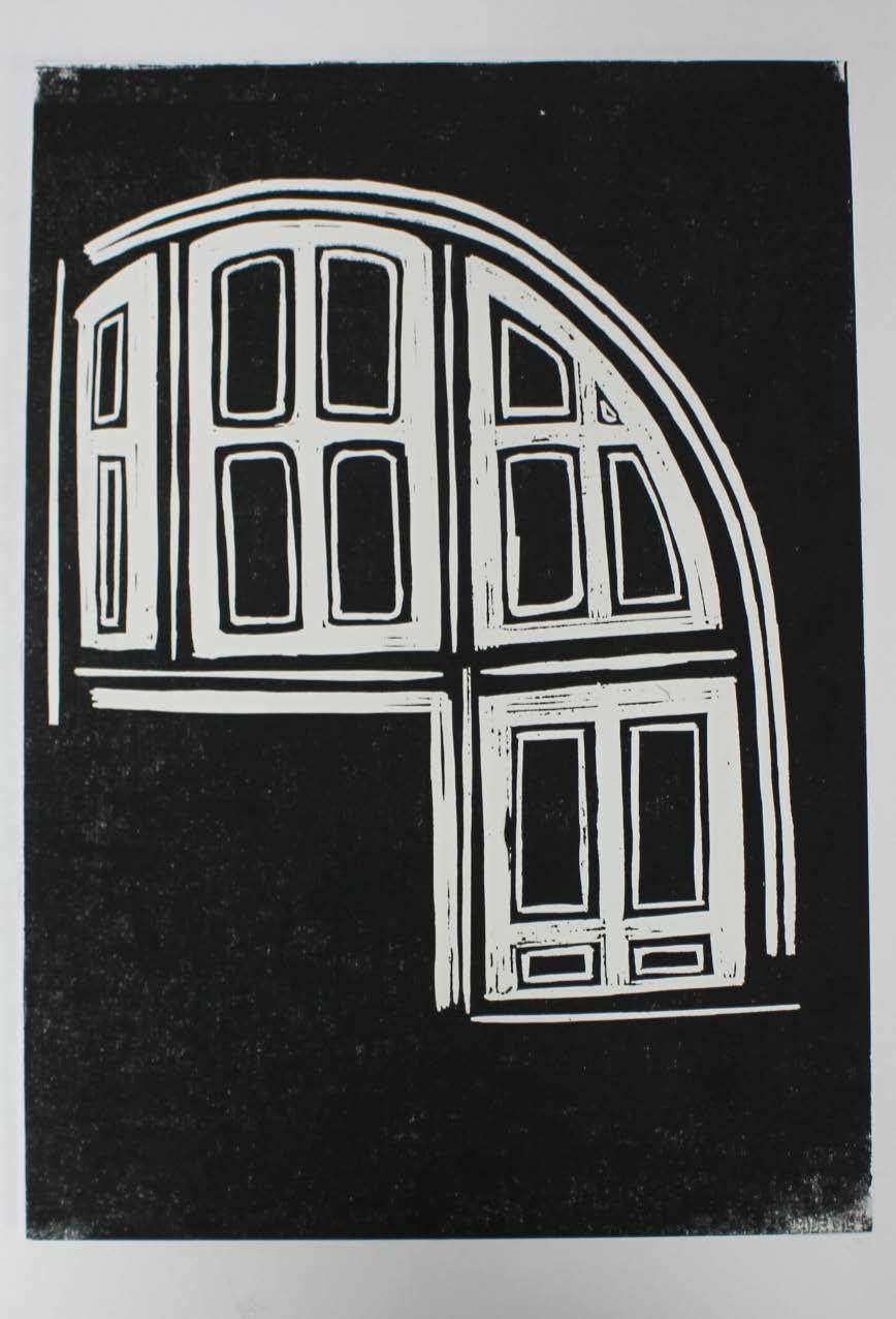
The first medium explored was lino. The photograph of the window was used to create this, as it was the most effective photograph, due to its simple yet effective shape. Using lino meant that I could capture the different tones of the window. Sticking to two tones meant that the final result was very effective and engaging. By not printing the full window and leaving a section of it incomplete, this creates a sense of interest for the on-looker as unanswered questions form.
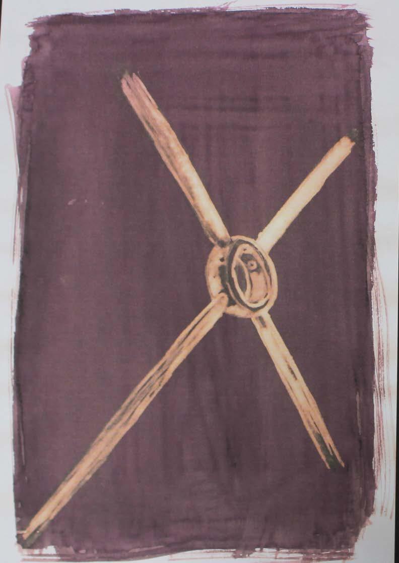
The second medium used was ink and bleach. This was a new technique, that I had not used before, however I found it worked well with this particular feature. The contrast of the bleach against the ink allowed me to build up and add a 3D sense to the work, which worked well in company with the other artwork.
The two photographs of the railings were both turned into drypoint etchings because of the level of detail they showed. Drypoint etchings allow for both delicate and accurate lines to be overlapped, creating the final result of a hyper-realistic etching.
Following a similar style to the drypoint etching, the final medium used was a coloured tonal drawing, which allowed me to add intricate detail to the brick work and window of the building - a key aspect of the architecture.
For the overall piece, not only did I use the work I had created, but I also mixed in the photographs I had taken, for a wide variety of mediums.
Once all the artwork had been created, the layout and construction of each piece had to be carefully decided, making sure no pieces were hidden by one another. After much consideration, I then carefully hung each illustration one by one, using black thread, to blend in with the colour of the box I had made. I secured each one in place using masking tape, when I was happy with the positioning. This then allowed each of the pieces to hang freely and gently sway with the movement of the surrounding air.
 Lino
Lino
Preparation of elements for hanging display
Dry-point etching, photography, bleach, pencil, lino
Ink and bleach
 Construction of hanging display
Drypoint etching, photography, ink and bleach, pencil, lino
Construction of hanging display
Drypoint etching, photography, ink and bleach, pencil, lino
“goodbye”
Thank you for taking the time to look at my work. I hope you enjoyed it.
piece
etching, photography, ink and bleach, pencil, lino
Final
Drypoint