Table of Contents:
• Molloy Crest
• Molloy Logo
• Molloy Lock-Up
• Molloy “AM” Logo
• The Marist “M”
• Improper Usage
• Color
• Fonts
• Examples

• Molloy Crest
• Molloy Logo
• Molloy Lock-Up
• Molloy “AM” Logo
• The Marist “M”
• Improper Usage
• Color
• Fonts
• Examples
Originally designed in 1957, Molloy’s official school crest has since been redesigned with modern finishes.
The Beehive represents a sense of activity, family, and community at Molloy. 1892 is the year Brother Zephiriny founded St. Ann’s Academy in NYC.
Our school motto: Non scholae sed vitae translates to Not for school but for life.
The Marist M is a symbol of our commitment to the Marist Brothers mission.
The Rampant Lion represents excellence in academics.
The year Molloy was established in Queens.
Archbishop Molloy High School’s logo is one of the two main identifiers. The logo is a stamp of quality and it can be used on any internal or external publication. The Molloy logo should never be recreated. Only official logo files should be used in communications, including print, web, and apparel.
The primary color for our logo is Pantone® 301. It can be used on backgrounds and photos, but it must maintain legibility.

* Do not use our old logos.
The Molloy Lock-up is one of the two main identifiers. The Lock-up contains the school crest “locked-up” with bold Molloy text. The Lock-up should be used on applications such as memos, flyers, powerpoint presentations, and stationery, including letterhead, business cards, and programs.
LIGHT BACKGROUND
DARK BACKGROUND
The Molloy “AM” logo is designed for use with items associated with school life and athletics.
TWO COLOR ON LIGHT BACKGROUND
ONE COLOR ON DARK BACKGROUND

TWO COLOR WITH WHITE OUTLINE ON DARK BACKGROUND
TWO COLOR ON DARK BACKGROUND
The Marist “M” is an element within Molloy’s school crest. The “M” represents the Marist Brothers and is a tribute to Mary Our Good Mother. Also, it contains an interlocking “A” and “M” representing “Ave Maria”. The twelve stars are a scriptural symbol of the 12 apostles. It can be used as the primary element in print and web materials related to religious/faith based activities or events. Please note that the new version of the “M” is simplified for legibility.
*Do not use old logos
Here are examples of practices to avoid:
Do not stretch or distort.
Do not rotate.

Do not insert anything on top of the logo.
Do not use other school’s colors.
Over the years the color of “Molloy Blue” has taken many forms. Today we use a pallet of blues for various applications. They can be used in combinations as demonstrated below.

RBG: 0, 75, 135
CMYK: 100, 53, 4, 19
WEB: # 004B87


RBG: 0, 32, 91
CMYK: 100, 85, 0, 36
WEB: # 00205B
RBG: 0, 163, 224
CMYK: 67, 2, 0, 0
WEB: # 41B6E6

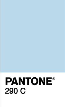
RBG: 185, 217, 235
CMYK: 23, 0, 1, 0
WEB: # B9D9EB
Our laptop and desktop PC’s are equipped with fonts such as Times New Roman, Calibri, and Arial. However, when creating printed and digital applications several additional fonts have been selected to deliver a consistent look across applications and signage.
Century Schoolbook Regular
Century Schoolbook Bold
Century Schoolbook Italic
Century Schoolbook Bold Italic
Helvetica Regular
Helvetica Light
Helvetica Bold
Helvetica Italic
Helvetica Bold Italic
Futura Book
Futura Medium
Futura Bold
Futura Medium Italic
Trajan Pro regular
Trajan pro Bold
Calibri
Calibri Bold
Calibri Italic
Calibri Bold Italic
Nexa
Nexa Bold
Nexa Italic
Nexa Bold Italic
An example of a serif font, Century Schoolbook is used for a “classic” look in body text and headlines.
An example of a sans-serif font, Helvetica is used for a more “simple-modern” look in headlines and body text. Coincidentally, the Helvetica font was originally designed in 1957.
An example of a sans-serif font, Futura is used for a more “friendly-modern” look in headlines and body text.
Trajan is used for an “Ivy-League” look in headlines. Trajan Pro should not be used in body text.
Calibri is a modern sans-serif font used in body text.
Nexa is a sans-serif font used for an “ultra-modern” look. It can be used in headlines and body text.


