
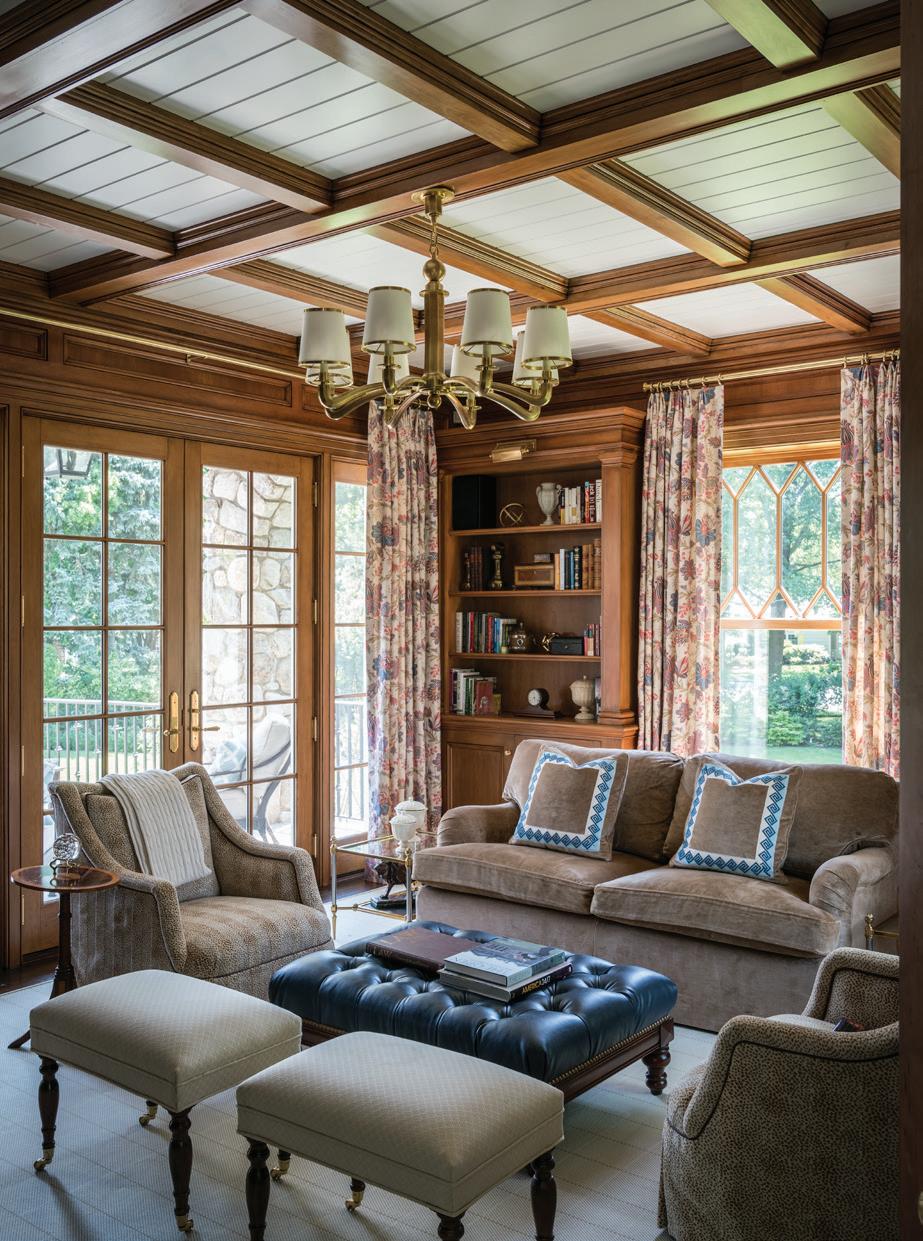
A MY AIDINIS HIRSCH INTERIO R DESIG N amyhirsch.com n 203 661 1266
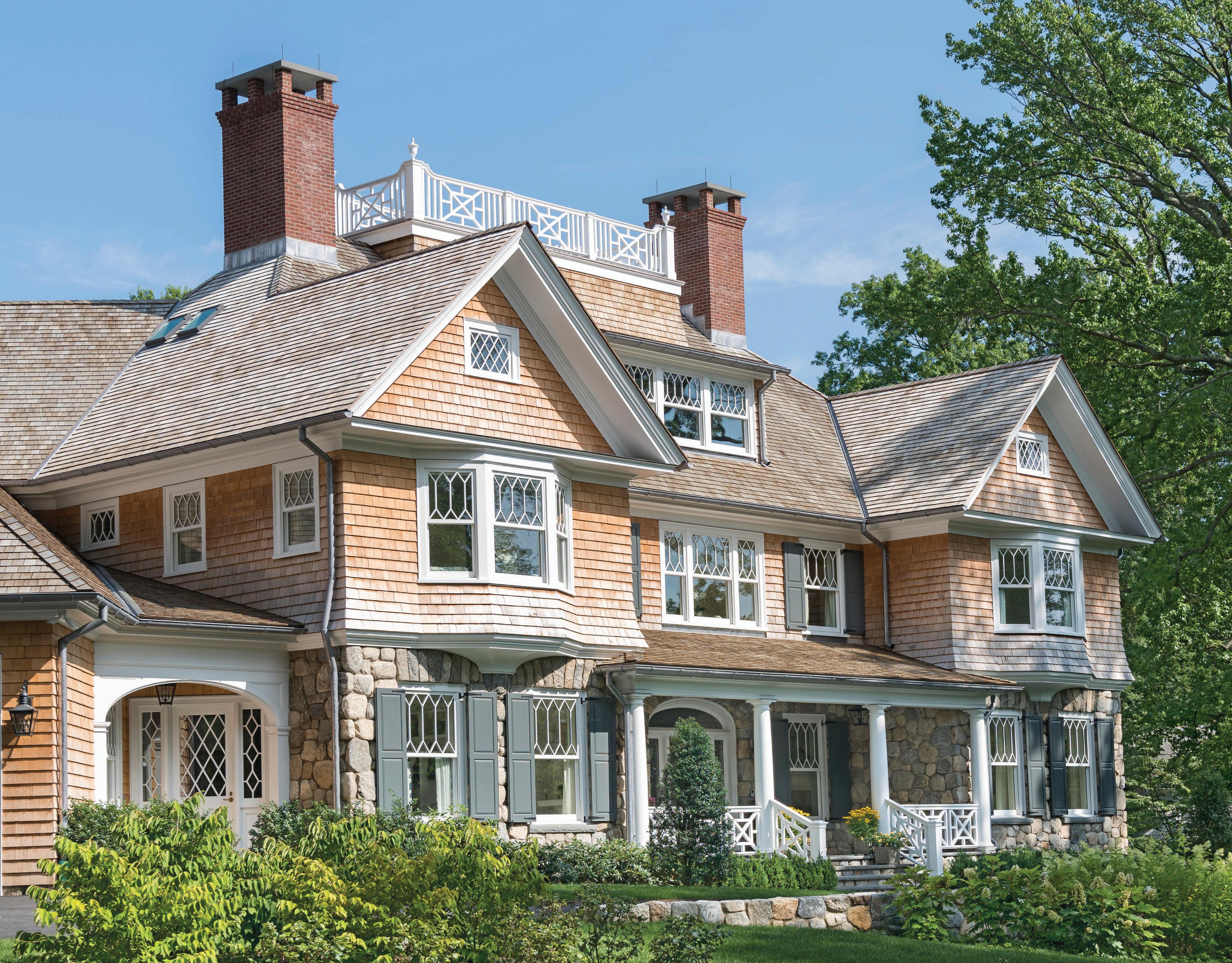
TEL. 203.622.7000 WWW.VANDERHORNARCHITECTS.COM 41 WEST ELM STREET GREENWICH, CT


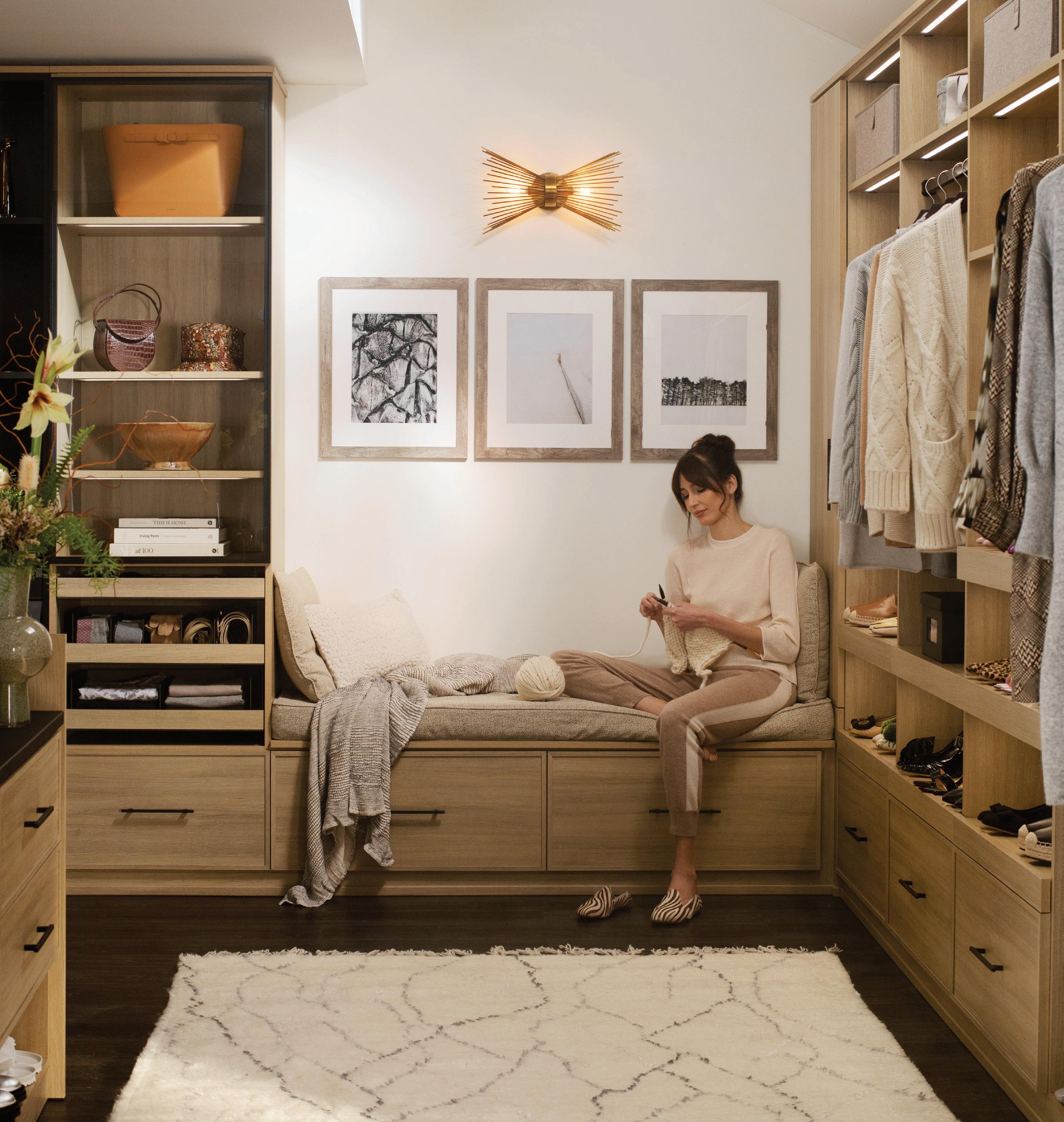
CALL OR VISIT US ONLINE TODAY TO SCHEDULE YOUR COMPLIMENTARY DESIGN CONSULTATION CONNECTICUT 565 WESTPORT AVENUE, NORWALK 203.924.8444 WESTCHESTER 16 SAW MILL RIVER ROAD, HAWTHORNE 914.592.1001 @caliclosetsct CALIFORNIACLOSETS . COM MAKE ROOM FOR ALL OF YOU ©2023 California Closet Company, Inc. Each California Closets® franchised location is independently owned and operated. CT HIC #0657205
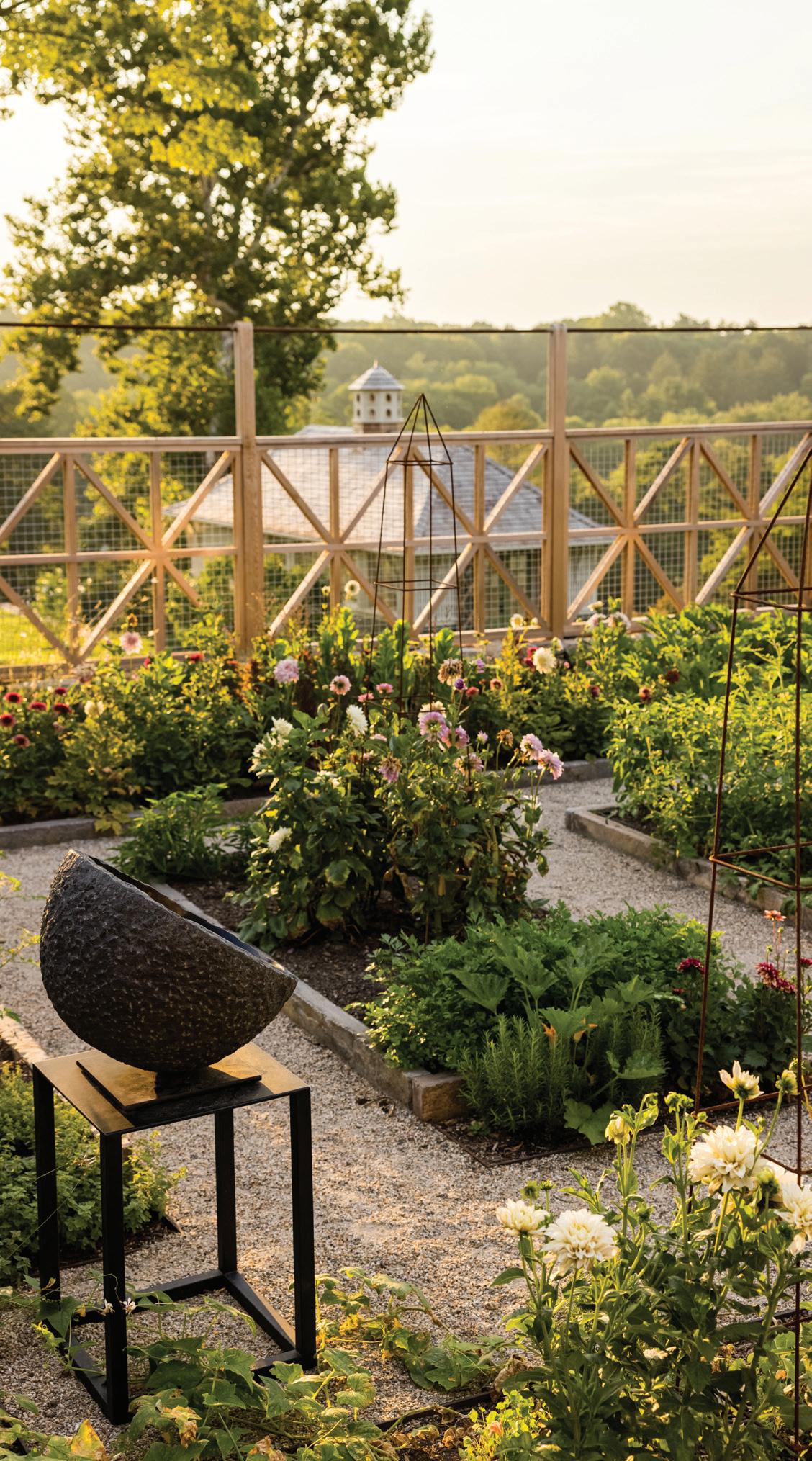

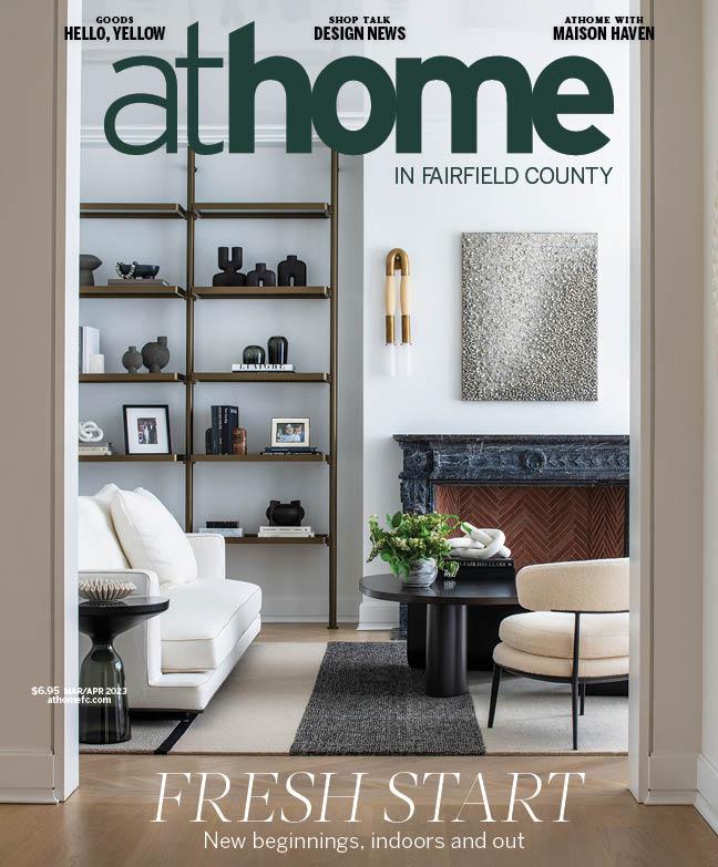
athomefc.com 6 features departments contents MAR/APR 2023 ATHOME IN FAIRFIELD COUNTY MAR/APR 2023, VOL. 18, NO. 1. ATHOME IN FAIRFIELD COUNTY (ISSN 1941-9503) is published five times annually (Mar/Apr, May/Jun, July/Aug, Sept/Oct, Nov/Dec) by Moffly Media, Inc., 205 Main St, Westport, CT 06880. Periodical postage paid at Westport, CT, and additional mailing offices. POSTMASTER: Send address changes (Form 3579) to ATHOME IN FAIRFIELD COUNTY, PO BOX 9309, Big Sandy, TX 75755-9607. US subscription rates: $19.95/1 year, $34.95/2 years; Canada and foreign US$40/1 year, US$70/2 years. vol. 18 | issue 1 32 10 EDITOR’S NOTE A cutting garden by James Doyle Design Associates. 12 GET THE GOODS Color: Yellow; Wavy Wicker; Potting Shed Finds 18 GETAWAY Embrace the Hudson Valley beauty of Wildflower Farms on the cover nima design | photography adam kane macchia 22 SHOP TALK Local design news, the latest collections, haute happenings and more 80 ATHOME WITH Maison Haven comes clean 32 VIEW FINDER A landscape transformation takes root in Greenfield Hill. 38 MIX MASTERS An NYC-based design duo brings balance to a family home. 50 PALETTE CLEANSER Calla Cane creates a calm and cohesive space in Greenwich. 64 CUSTOM BLEND Nima Design delivers contemporary compromise for design-savvy clients.




Tel: 203.489.3800 | IG: @charleshiltonarchitects | hiltonarchitects.com
editorial editor
Megan Gagnon megan.gagnon@moffly.com
assistant editor
Veronica Schorr
veronica.schorr@moffly.com
advisory editor
Donna Moffly donna@moffly.com
contributing editors
editorial director
Cristin Marandino cristin.marandino@moffly.com
editor, new canaan•darien Julee Kaplan julee.kaplan@moffly.com
editor, fairfield living; stamford; westport•weston•wilton
Diane Sembrot diane.sembrot@moffly.com
art
senior art director
Garvin Burke garvin.burke@moffly.com
production director
Tim Carr tim.carr@moffly.com
assistant art director Lisa Servidio lisa.servidio@moffly.com
digital
digital director of content strategy
Diane Sembrot diane.sembrot@moffly.com
digital marketing manager Rachel MacDonald rachel.macdonald@moffly.com
digital assistant Lloyd Gabi lloyd.gabi@moffly.com
sales & marketing publisher, fairfield living publisher-at-large, greenwich
Jonathan W. Moffly jonathan@moffly.com
publisher, greenwich Andrew Amill andrew.amill@moffly.com
publisher, westport•weston•wilton Gabriella Mays gabriella.mays@moffly.com
publisher, new canaan•darien Gina Fusco gina.fusco@moffly.com
publisher, stamford
Karen Kelly-Micka karen.kelly@moffly.com
associate publisher, athome Robin O’Hara robin.ohara@moffly.com
account executive
Hilary Hotchkiss hilary.hotchkiss@moffly.com
account executive
Morgan Howell morgan.howell@moffly.com
partnership and big picture manager
Kathleen Dyke kathleen.godbold@moffly.com
events director
Rachel Shorten rachel.shorten@moffly.com
sales assistant
Lemuel Bandala lemuel.bandala@moffly.com
business assistant
Eillenn Bandala eillenn.bandala@moffly.com
business president Jonathan W. Moffly
chief revenue officer Andrew Amill
editorial director Cristin Marandino
director of content strategy Diane Sembrot
business manager Elena V. Moffly, elena@moffly.com
cofounders John W. Moffly IV & Donna C. Moffly
creative director-at-large, athome Amy Vischio amy.vischio@moffly.com
Fairfield County Magazine is a registered trademark owned by Moffly Media. The opinions expressed by writers commissioned for articles published by athome in Fairfield County are not necessarily those of the magazine.
FOR QUALITY CUSTOM REPRINTS/E-PRINTS, please call 203-571-1645 or email reprints@mofflymedia.com

athomefc.com 8
vol. 18 | no. 1 | mar/apr 2023 PUBLISHERS OF GREENWICH FAIRFIELD LIVING NEW CANAAN • DARIEN • ROWAYTON WESTPORT STAMFORD and athome magazines 205 Main Street, Westport, CT 06880 . P hone: 203-222-0600; email: mail@moffly.com ADVERTISING INQUIRIES: Lemuel Bandala: call 20 3-571-1610 or email advertise@moffly.com TO SUBSCRIBE, renew, or change your address, please email subscribe@athomefc.com, call 877-467-1735, or write to athome in Fairfield County Magazine, 111 Corporate Drive, Big Sandy, TX 75755. U.S. subscription rates: $19.95/1 year (5 issues); $34.95/2 years (10 issues); $44.95/3 years (15 issues). Canada and foreign, US $40/year. Prices are subject to change without notice. ALL RIGHTS RESERVED No part of this periodical may be reproduced without express permission of the publisher. ©2022 athome in

As an editor, part of my job is to predict the future; always alert to the shifts that shape our design industry. But can we ever really know what’s coming next? The last few years have certainly humbled our collective forecasting abilities. One thing I do know, in talking to homeowners and designers, is the agreement that “simplify” has become a post-pandemic mantra, regardless of the trends that come and go. Now more than ever, our homes need to be a refuge from the chaos and stress of our daily lives. Executing these transformations is not so simple, of course. That’s when we turn to our local pool of talent, enlisting their expertise to declutter, renovate, and refresh.
SCAN
TO EXPLORE HOW TO SCAN: OPEN, AIM & TAP


For Britt and Damian Zunino, the husband-and-wife team (and A-List Awards judging panel alumni) behind Studio DB, the challenge came in the form of readying a large 1800s home for a family of Tribeca transplants (p. 38). With a deft touch, they turned out a clean and contemporary space, elevating what the owners loved (the house’s good bones) and reimagining the elements that felt dated (dark and heavy wood). In Greenwich, Calla McNamara of Calla Cane focused her sights on a Backcountry barn (p. 50). By opening windows, lightening wood, and adding a heavy dose of white paint, she was able to streamline the existing Americana aesthetic into a Zen, Swedish-inspired retreat. A black exterior—in addition to walls of stained black wood inside— adds welcome contrast and provides a quiet backdrop for climbing flowering vines and the surrounding idyllic grounds. Finally, we visit an Old Greenwich project by Maripi Aspillaga of Nima Design (p. 64). I only recently discovered her work and was immediately impressed with her ability to artfully craft inviting and elegant rooms. Check out the spa-like sanctuary she created for her clients—among a long list of other memorable modern moments—and you’ll agree she’s worth a follow.
MEGAN GAGNON Editor megan.gagnon@moffly.com


athomefc.com 10
editor’s note / SPRING FORWARD
I don’t need a crystal ball to tell you that the A-List Awards season is approaching. Entry for the design competition begins on March 1st, and I look forward to seeing all of your freshest work; from gardens to gut jobs. See all the details and submission guidelines on our site: athomealistawards.com. PHOTO: BOB CAPAZZO

Tischler WindoWs and doors. Uncommon. Uncompromising. Tischler und s ohn (U sa ) l td. s ix s uburban avenue, s tamford, c T 06901 Telephone 203/674/0600 Architect: Shope r eno Wh A rton A SS oci A te S p hotogr A phy: D A niel Mil S tein p hotogr A phy
goods/COLOR
COLEEN
The scalloped arm sconce;
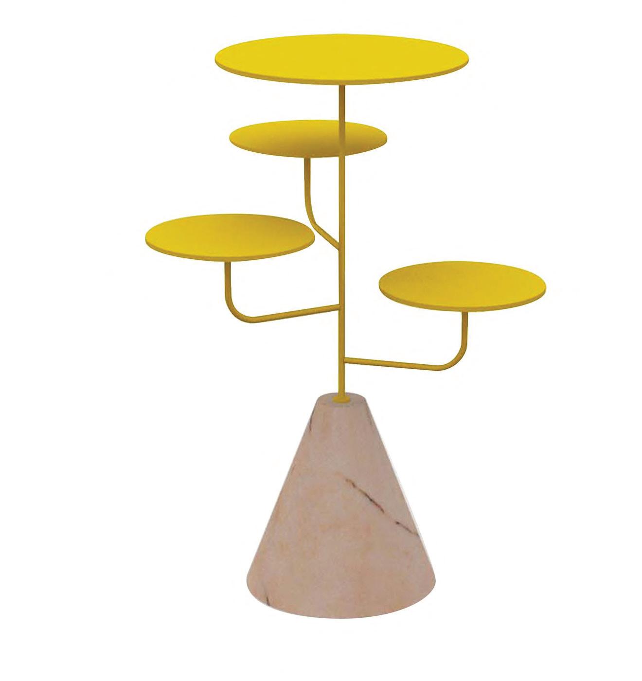


“the yellow i incorporate into much of my work adds that bit of sunshine, and i just feel like that is something there is never enough of.”



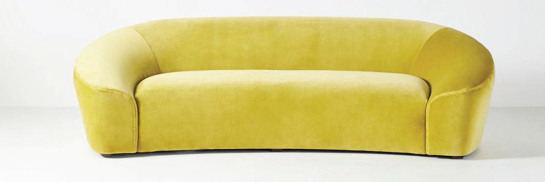

—kerri rosenthal, kerri rosenthal
coleenand company.com 7
athomefc.com

IMAGES COURTESY OF DESIGNERS/BRANDS
SAY HELLO TO YOUR NEW FAVORITE SUNNY SHADE
by megan gagnon
12
3
1
KERRI ROSENTHAL It’s Complicated table; $6,500. Westport; kerrirosenthal.com
AND COMPANY
$1,575.
MODA DOMUS Footed wine glass; $210 per glass. modaoperandi.com
6
PATTERSON FLYNN Bracco broadloom in Summertime; price upon request. pattersonflynn.com
4
RAAWII Duplum mirror; $325. Design Within Reach, Stamford; dwr.com


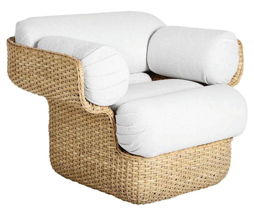
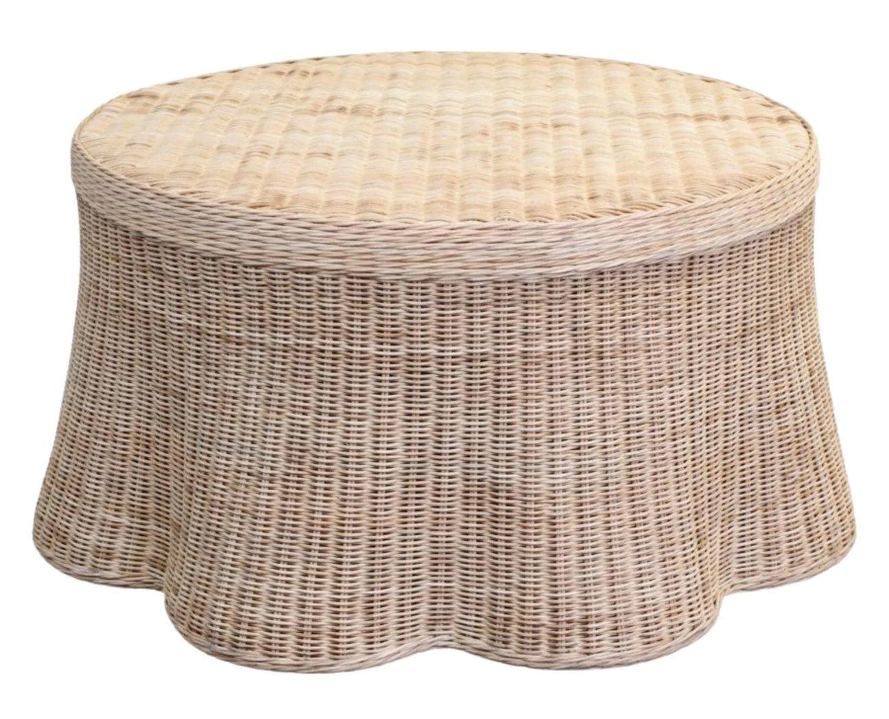
goods/WOVEN WAVES
WICKER AND RATTAN GET A PLAYFUL EDGE
“a fresh take on traditional wicker craftsmanship,


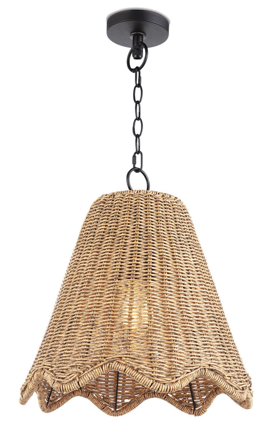



beautiful addition
athomefc.com
IMAGES COURTESY OF DESIGNERS/BRANDS
1 COOPER CLASSICS Auden wall mirror; $498. Found, New Canaan; foundand design.com
2 THE WELL APPOINTED HOUSE Scalloped round wicker coffee table; $1,781. Greenwich; wellappointed house.com
3 REGINA ANDREW Summer outdoor pendant; $525. Chloe Winston Lighting Design, Norwalk; chloewinston lighting.com
4 OKA Talasa rattan tray; $130. Westport; oka.com
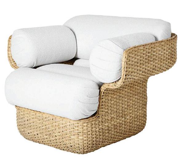
5 GUBI Basket chair by Joe Colombo; $3,999. West Out East, Westport; westouteast.com
6 BLOOMINGVILLE Wavy rattan bowls; $90 for set of three. burkedecor.com
7 AMANDA LINDROTH Wavy wicker orchid baskets; $45 for set of three. amandalindroth .com
14
—melissa hawks, owner, the well appointed house, llc
2 6 4 1 3 5 7
these fun scalloped-edge pieces make a
to any space.”

Exquisite. Experiential. Effortless. 203.938.0900 info@homefrontfarmers.com : homefrontfarmers.com : @homefrontfarmers Words rarely used to describe vegetable gardens. Words frequently used to describe ours. Your property is an extension and reflection of your lifestyle and impeccable taste. Homefront Farmers understands this.The organic gardens we design, build, and maintain are works of art that blend seamlessly into your landscape. Our expert farmers take loving care of your ‘homestead’ to produce exceptional tasting vegetables, fruit, honey, and maple syrup all season long for your family Delight in the joy and satisfaction of growing your own food at home… effortlessly. YARD TO TABLE SINCE 2011 A RIVERSIDE FENCE COMPANY
goods /ROOM TO GROW
“having a potting shed is a great way to feel organized and prepared as a gardener. i recommend having a large table or countertop with a mix of drawers and open shelving below and some open shelving above.”
—miranda gould, master farmer, homefront farmers
ALL THE MAKINGS FOR A PERFECT POTTING SHED athomefc.com
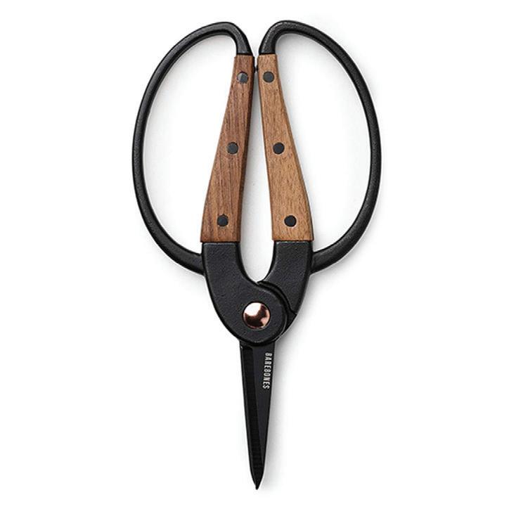
1 BAREBONES Garden scissors; $48. Outdoor Design, Fairfield; od-l.myshopify.com
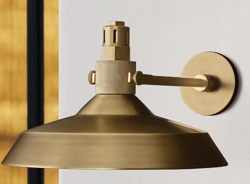
2 RH Condorcet metal shade sconce; from $725. Greenwich; rh.com
3 FERM LIVING Orb watering can; $139. fermliving.us

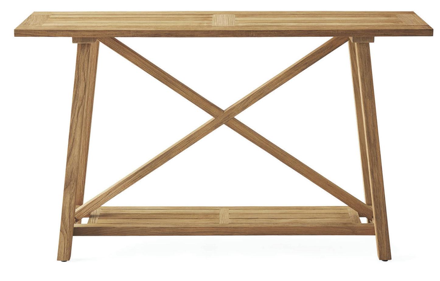
4 SERENA & LILY Crosby teak console; $1,498. Westport; serenaandlily.com
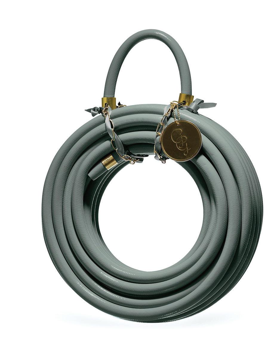
5 GARDEN GLORY Eucalyptus Leaf garden hose; $129. Gardenglory.com
6 KINGSTON BRASS Widespread bridge faucet; $130. Bender, Norwalk; benderplumbing.com

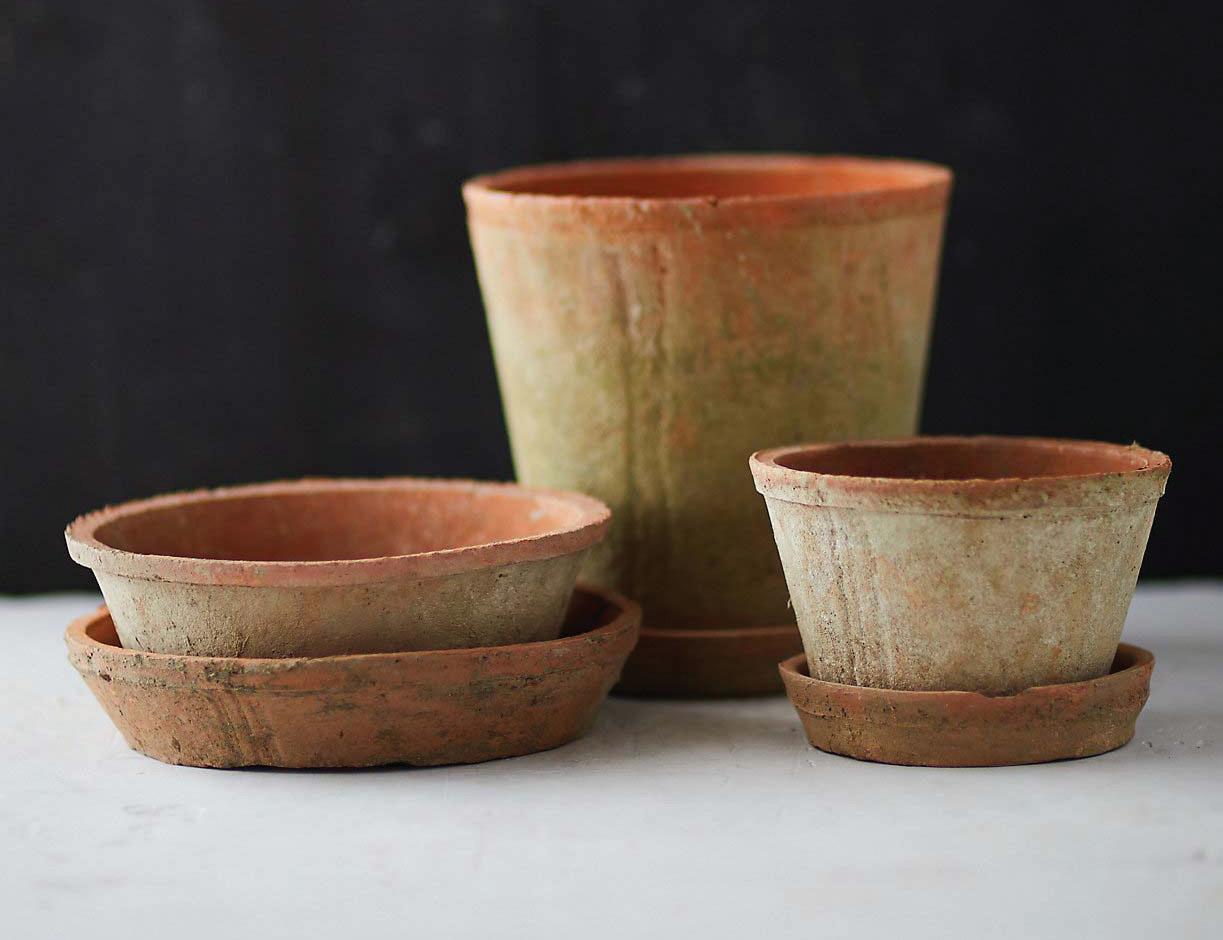
7 TERRAIN Earth fired clay dish and saucer; $60 for set of three. Westport; shopterrain.com
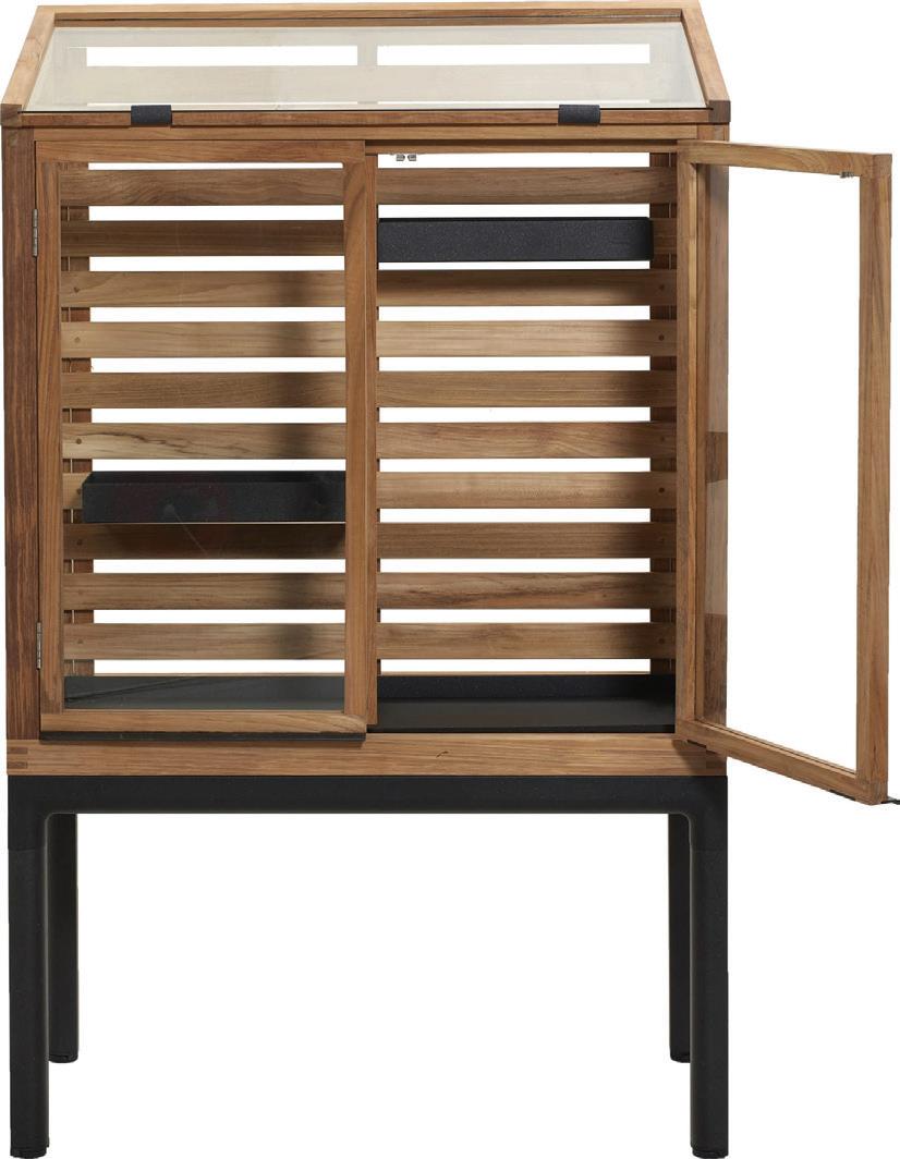
8 CANE-LINE Drop greenhouse; $5,560. cane-line.us
IMAGES COURTESY OF DESIGNERS/BRANDS
16
8 5 3 6

getaway
by megan gagnon
Super Natural
Escape to WILDFLOWER FARMS, where upstate ease blends with luxury accommodations
The Hudson Valley has exploded with hospitality options over the last few years, beckoning city (and suburb) dwellers to discover a quieter, slower pace, complete with bucolic landscapes, picturesque mountain ranges, and lakes and streams that weave along wooded trails. The
latest addition—and perhaps the most-anticipated—is Wildflower Farms, a country-chic retreat with Auberge Resorts Collection amenities on 140 secluded acres in Gardiner, New York.
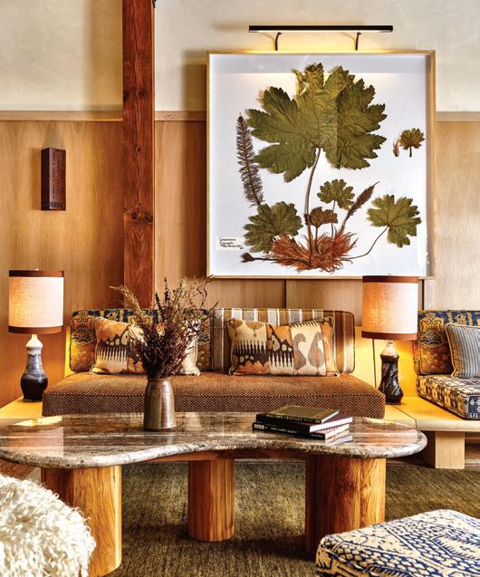

Owners Kristin and Phillip Rapoport know all too well about the necessity of the weekend reset. After many trips from NYC to Gardiner—where they’d initially visited for rock-climbing excursions—the couple bought a home in the area. Years later, they acquired the land that would become Wildflower Farms, a site that was once a tree nursery, set against the background of Shawangunk Ridge (“the Gunks,” as it’s known locally). They enlisted the help of business partner Zachary Kleinhandler, and now—as managing directors for the resort—the Rapoports invite
guests to fall in love with the region, too.
Stroll the orchards, get your hands dirty with a tour of the namesake farm, and take
advantage of seasonal activities, including those happening at Maplehouse, an interactive education center where visiting chefs test new recipes and

DESIGNER-APPROVED
DESTINATIONS
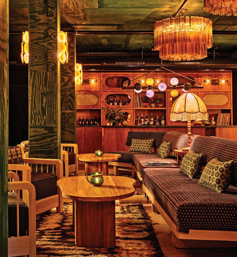
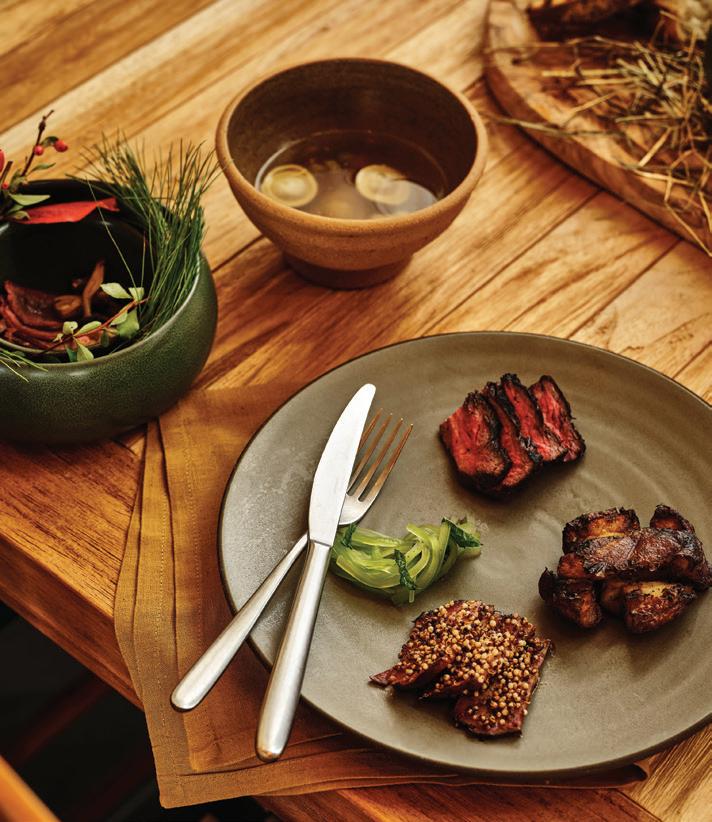
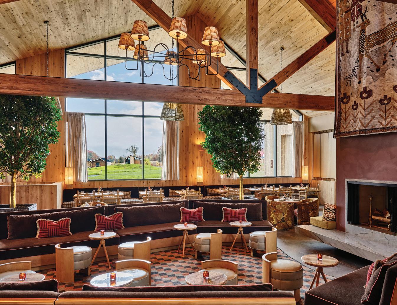
left: Enjoy live music and local beverages in The Green Room. middle: The best seats at Wildflower Farms are outside, among the 360-degree Hudson Valley views right: Black angus tartare—topped with fresh yolk and served with burnt sourdough—from Clay’s creative menu.
PHOTOGRAPHY: AUBERGE RESORTS COLLECTION athomefc.com 18
above: The Great Porch includes an all-day menu, ensuring you’ll never want to leave. left: A view outside the hotel shop, which stocks garden-inspired goods.
MEET FLOWCODE, THE NEXT GENERATION OF QR CODES


Go ahead, try it out. Point your phone’s camera at the Flowcode to scan.


getaway
and textiles in shades that coordinate with the changing leaves.
And those eggs you collected earlier while visiting the chicken coop? They can be prepared for you at the resort’s restaurant, Clay, ensuring a true farm-totable experience. Chef Rob Lawson utilizes local ingredients (many grown or raised on-site) for his New American menu. Pairing a Berkshire pork chop or dry-aged porterhouse with wine from one of the carefully selected New York vintners will only make your meal more memorable.
GET A ROOM
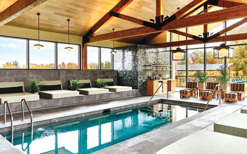
local artisans host pottery and baking workshops. Don’t forget to schedule a treatment at Thistle—the gorgeous spa dedicated to wellness and therapeutic bodywork—after a day’s hike or foraging mission.
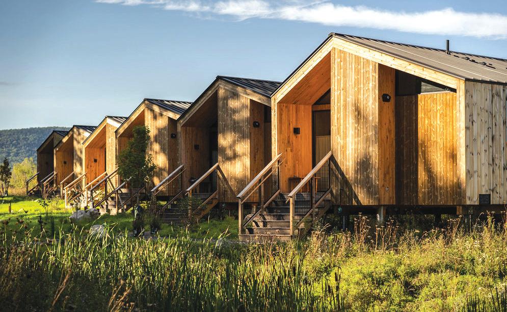
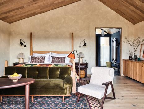
A trip back to your cabin— one of 65 on the property— reveals minimalist architecture and décor inspired by the surrounding land. Design firm Ward + Gray pulled together warm wood, rich leather, handmade accents,
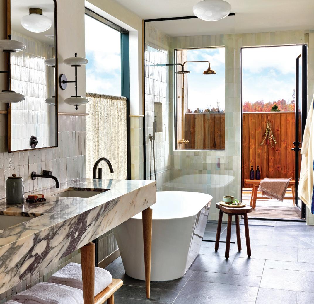
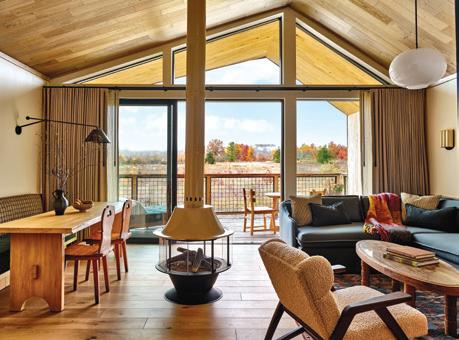
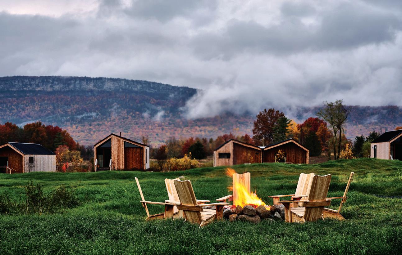
The best place to end your day (or start your morning) is sitting around the giant fire pit on The Great Porch, an open-air anchor and gathering spot at the center of the property’s entrance. Grab a cozy chair and a craft cocktail, and take in the sweeping views of Hudson Valley’s natural beauty.
Wildflower Farms

2702 Main Street Gardiner, NY 12525 aubergeresorts.com/ wildflower-farms
GARDEN VARIETY
There are multiple places to unwind in the Meadow Cottage, including at the built-in window seat, in front of the gas fireplace, or in the freestanding soaking bathtub.
SUITE LIFE
With 1,150 square feet inside and additional outdoor space, there is plenty of room to spread out in the Ridge Suite. Bring the whole family, knowing you can indulge in the private cedar hot tub, when necessary.
OUTSIDE, IN
The Bower Cabins offer a chance to take in the canopy of surrounding trees from your personal terrace.

PHOTOGRAPHY: AUBERGE RESORTS COLLECTION
With floor-to-ceiling windows in each cabin, you’ll always have the best view.
above: Sample the seasonal culinary selection in Clay’s elevated rustic dining room.
above: Get back to nature among the fields of namesake wildflowers.
athomefc.com 20
left: Take advantage of the outdoor shower in the Ridge Suite. top, right: The saltwater pool at Thistle sits at the heart of the spa. bottom, right: Cottages were designed to blend seamlessly with the landscape.

All New. All You. VOTING ENDS MARCH 13 EVERY VOTE COUNTS! YOU PICK THE WINNERS! BESTOFGOLDCOASTCT.COM Who will be voted THE BEST? Scan and Vote Now! Presented by:
shoptalk
 by veronica schorr
GET ORGANIZED
ORNARE BRINGS LUXURY STORAGE SOLUTIONS TO GREENWICH
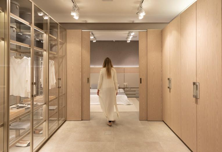
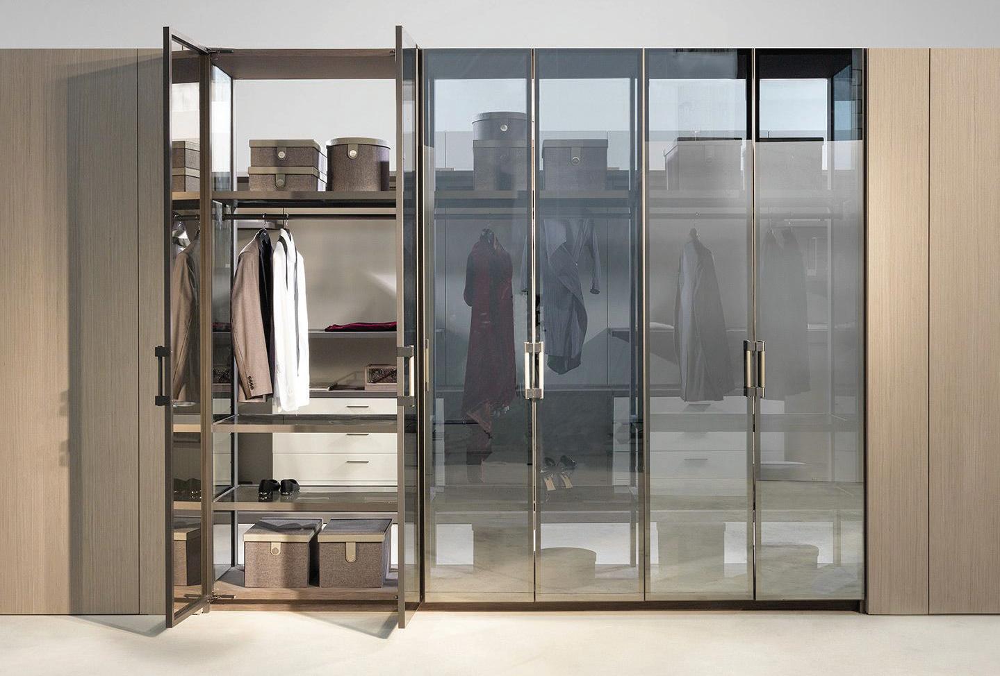
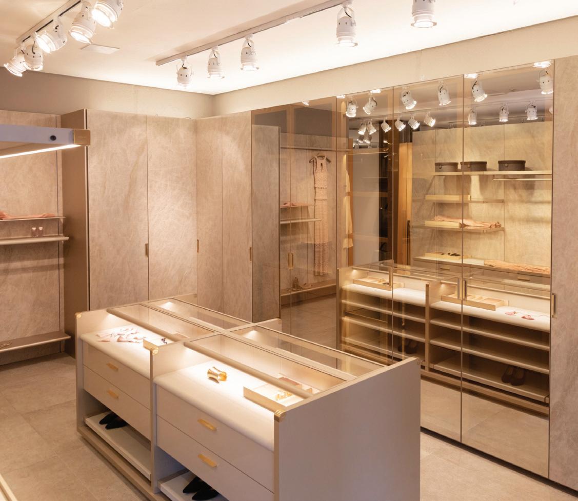
Not all closets are created equal, especially when they’re dreamed up by Brazilian-based Ornare, a company known internationally for its eco-friendly approach to elegant organization. For over three decades, Ornare has attracted the upscale market’s projects with its phenomenal commitment to producing high-quality cabinets, closets, kitchens, wall system panels, home theaters, furniture, and bathrooms. Its eighth design studio and showroom in the United States (and 25th location internationally) has now found a home in Greenwich. Known for its value-driven and sustainable products, Ornare uses FSC (Forest Stewardship Council) certified wood in all its production channels. But that’s not the only thing to get excited about; the tech-savvy company also offers 3D project planning services via virtual reality glasses and digital applications, allowing customers and business
partners to easily preview their next dream closet, kitchen, or cabinet system in a truly immersive experience. Interior designer Laura Michaels, who recently collaborated with Ornare to create a two-story closet for her Greenwich client, can attest to the company’s vision of creating a truly timeless, ethical brand: “I knew I had to implement the Ornane quality into my design, no question. From leather drawer details to beautiful hardware, there was no detail that was overlooked.” Michaels’ dreamy showcase design features floor-toceiling space towers with LEDbacklit mirrored glass, leather drawers, exclusive hardware pieces, and biometric locks. If you’ve been itching to plan your next home project, now’s the time to pay Ornare a visit—they’re waiving design fees for new clients. 34 East Putnam Avenue, Greenwich; ornare.com

COURTESY OF ORNARE THE LATEST DESIGN NEWS
above, left: Mylene Del Nero runs the Greenwich showroom. below, left: A modern, minimalist dream closet. right: Closet systems are manufactured at their São Paulo headquarters.
athomefc.comw 22
above: Everything can be illuminated when your closet is completely custom.




the premier home design competition awards Visit athomealistawards.com to learn more about getting on the 2023 A-List. Enter beginning March 1st! You have to be in it to win it ! PLATINUM SPONSOR GOLD SPONSORS in fairfield county
ALL IN THE FAMILY
INTERSTATE + LAKELAND LUMBER OPENS DESIGN CENTER IN WESTPORT

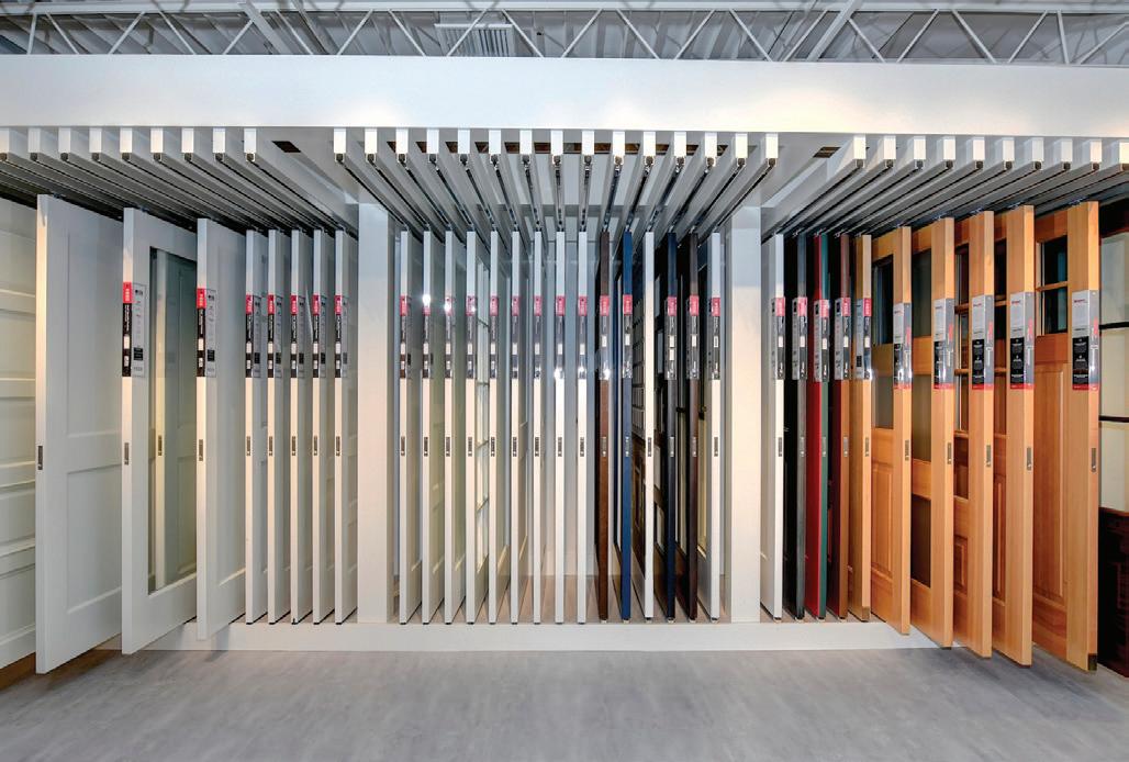
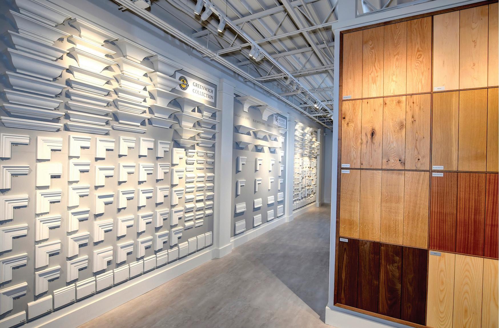
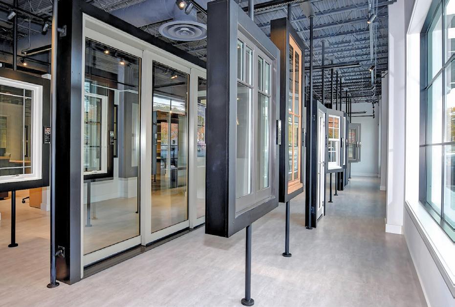
Shelly Kahan, owner of Interstate + Lakeland Lumber, has opened another design studio—this time in the town of Westport. Kahan has proudly lived in Westport for nearly 30 years and is the third-generation owner of his family’s business. The new space is loft-chic with an edgy, urban appeal, featuring abundant natural light, a minimalist approach to displays, and high ceilings with dark, steel beams. Shelly, whose first love was architecture, says the team wanted the new center “to communicate the clean, smooth aesthetics of modern architecture. This stands in contrast to our Greenwich space, which has more of a traditional focus with its wooden floors and ceiling. Our Design Centers are spaces where people can come in and truly envision what their home could be like.”
Westport, he continues, is “a community that demands the best, and that’s exactly what we’re going to provide. I was out with one of our salesmen, and he suggested we find a little space to establish a presence in town, show off our millwork capabilities. Bringing my family business to the town I raised my family in? It was a no-brainer.” Interstate + Lakeland is an

enterprise that’s now on its fourth generation, having long bested the arguable belief that family businesses do not endure beyond the founders. This one has not only survived, but thrived, evidenced in the shiny new footprint in Westport. Whether you’re a homeowner, builder, or designer, Interstate + Lakeland’s new destination in Westport has everything you need to make your home design plan a reality.
800 Post Road East, Westport; interstatelumber.com
PHOTOGRAPHY BY J C MARTIN
above: The Marvin Skycove display projects luxury window options into the open air.
above: Display of hardware
above: The Westport center has the largest selection of handles, knobs, and locks in the region.
left: The moulding profile wall. below: A snapshot from the ribbon-cutting ceremony at the new design center.
shoptalk athomefc.com 24
below: A wide array of doors to choose from.
FEELING BLUE
DUMAIS MADE GO ULTRA-VIBRANT WITH THEIR NEWEST RELEASE
The latest bright idea
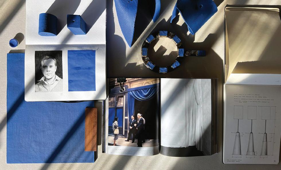
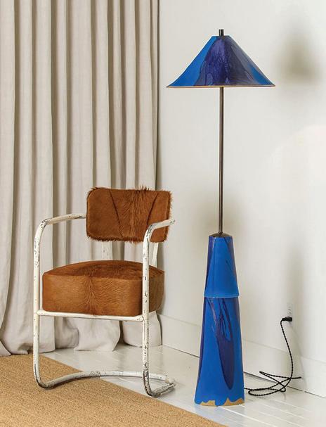
from collaborative couple Kevin and Charlie Dumais has resulted in a capsule devoted to one color. Dumais Made, their eponymous ceramics line, has announced the release of a new collection inspired by French artist Yves Klein’s “International Klein Blue.” This blue hue’s main ingredient is ultramarine, a color which was originally derived from lapis lazuli. Many years ago, Renaissance painters would ground up lapis lazuli and use it in their frescoes and fine portraits. The pair has taken inspiration from this deep, enchanting blue to create
Eternal Spring
simple yet vivid lighting fixtures: from shelf-topping table lamps to substantial floor lamps that anchor the design of large spaces. The ceramist and his designer husband went through countless experiments before landing on the correct ratio of opacity, texture, and tone. Each lamp is topped with handmade, archival parchment shades featuring silk threaded stitching. The project is “the product of two perfectionists having fun … a labor of love.” All products are proudly handcrafted in Litchfield, CT, using slabconstruction techniques and are available to purchase online at dumaismade.com.

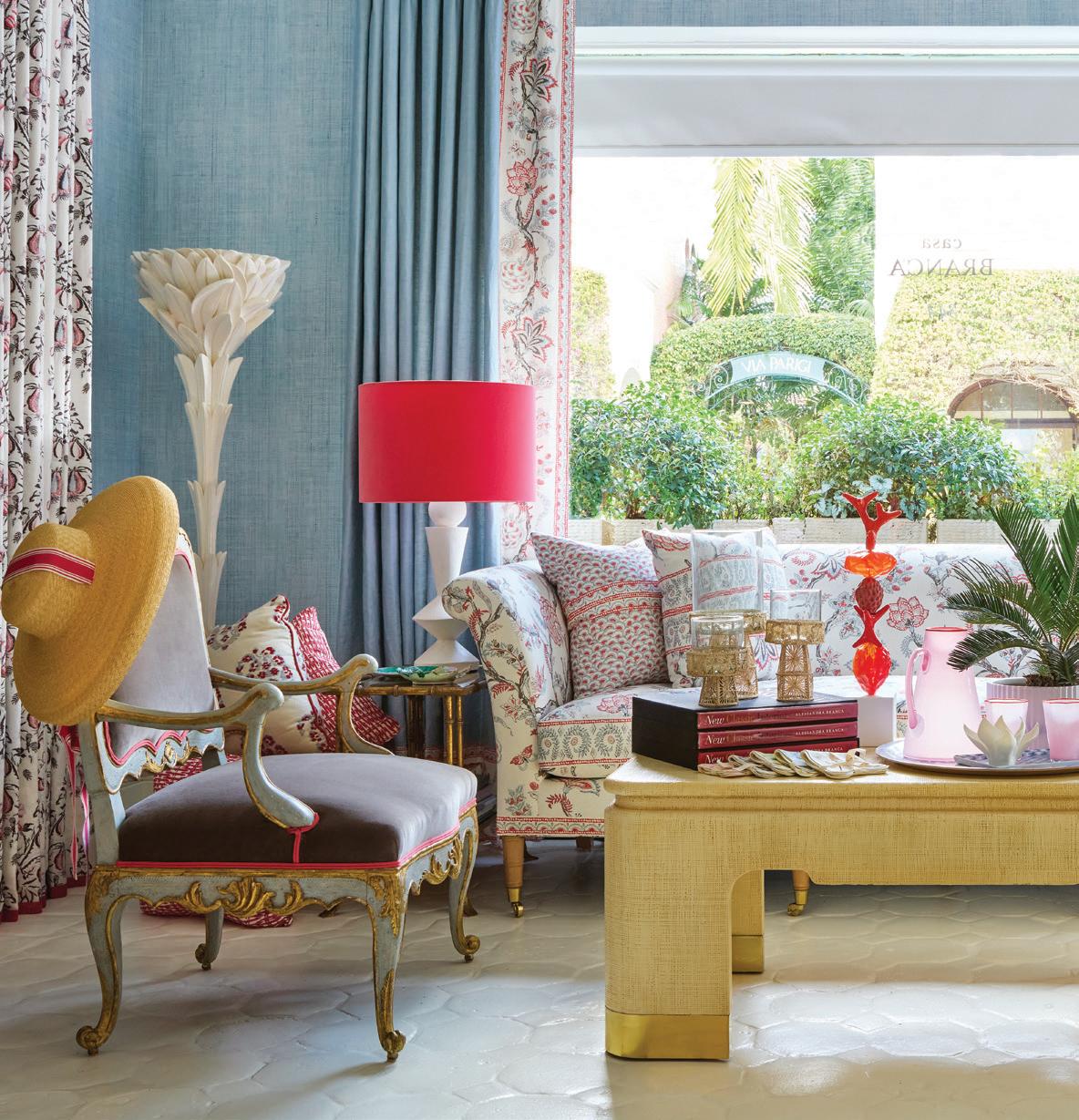
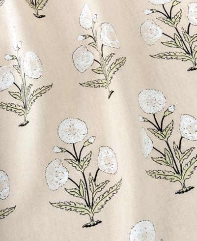
Primavera is in the aria! Casa Branca’s Spring collection, Primavera, is the brand’s ode to eternal spring. The new collection of textiles, wallpapers, and furniture from designer Alessandra Branca is bright, bold, bubbly, and full of gorgeous details. Pattern names like Madagascar, Audrey, and Rosa Rigata lend themselves to the Primavera collection’s theme of “long dormant beauty … and the welcome brightness of longer days.” Primavera by Casa Branca features linen fabric and clay-coated and paperweave wallpapers. A new linen fabric colorway, Nero & Tennis, is also making its debut. Undoubtedly taking its hints from mother nature, the collection has designs with both bold line-graphics and intricately drawn florals, the latter of which are seemingly inspired by antique textiles. Or, as Casa Branca more astutely puts it, the Audrey textile, for example, is “a chintz with a twist.” If you’re as ready as we are to put the snow and cold behind us and embrace sunnier days, you can shop the Primavera collection online at casabranca.com.


MAR/APR 2023 25 shoptalk
above: The newest collection is on display at Casa Branca in Palm Beach.
above, left to right: Audrey linen fabric in Blue & Leaf; Madagascar wallcovering in Foglia; Papavero linen fabric in White & Celery.
above, left: Ultramarine Edition Mooring floor lamp; $4,200. above, right: Ultramarine Edition Cereal lamp; $800. below: Collective inspiration from the Litchfield studio.
Freshly picked papers and patterns from CASA BRANCA ’s latest collection
PHOTOS: COURTESY OF DUMAIS MADE; CASA BRANCA BY CARMEL BRANTLEY
Homecoming
BURR SALVATORE ARCHITECTS opens downtown Darien office

Ryan Salvatore, a Fairfield County native, has partnered with Mary Burr, AIA, to form Burr Salvatore Architects. Salvatore ran a construction company in Darien years prior, eventually founding Ryan Salvatore Design in 2015. Burr and Salvatore both previously worked for A.M. Stern Architects, where the pair first met. Salvatore eventually left to form his own firm; Burr joined him years later. Their next adventure, Burr Salvatore Architects, with its new office in Darien, will keep them close to the community they’ve both served for over a decade. Burr Salvatore is committed to their ethos of a “collaborative, client-driven approach” to everything they design. “We recognize that we are in a service industry, and we pride ourselves on being good listeners. A lot of people say that, but we make it a part of our process: more than any one design solution, we like to present options … our clients become ingrained and invested in the design process,” says Burr. The firm’s portfolio, according to Burr, “includes a wide range of styles, but all are united by our unwavering commitment to what we consider the
GROW PROS
JAMES DOYLE DESIGN ASSOCIATES RELEASES STUNNING BOOK
essentials of good design: attentive listening, careful consideration, and thorough execution.” Whether you’re in the market for a spring reno or a new dream house, be sure to visit Burr Salvatore Architects for a consultation.
815 Boston Post Road, Darien, burrsalvatore.com
From Greenwich to Martha’s Vineyard, to Normandy, Palm Beach, and Bel Air, James Doyle Design Associates’ new publication showcases the firm’s visionary works of landscape architecture around the world. With strong roots in garden design, JDDA are contemporary practitioners of landscape architecture who aim to create solutions that are sustainable, beautiful, and futurelooking while still grounded in classical design principles. At a time when natural aesthetics and a connection to nature are
at the top of everyone’s list when it comes to design elements, JDDA’s gorgeous projects remind readers (and viewers—the illustrations and photographs are unparalleled) that “the art and practice of placemaking begins with an expanded sense of respect and responsibility for our natural communities,” according to James Doyle. Aptly titled Intersection of Nature and Art, JDDA’s collection demonstrates a true evolution of work, the span of which runs the gamut from bold and contemporary to refined and traditional. The common thread? The contrast of designed elements with natural environments, married in a way which only years of experience, reflection, and a deep personal philosophy of craft could afford. With a foreword by the renowned sculpture artist David Harber and over 270 pages of inspirational designs that transcend the realm of art, you’ll want to pick up a copy of James Doyle Design Associates’ Intersection of Nature and Art, out now from The Images Publishing Group.
 above: The firm, pictured from left to right: Aaron Opalka, Smaranda Rusinaru, Elliot Royce, Alessandro Fancelli, Michael Roque, Ryan Salvatore, Mary Burr, Carlos Velez, Kat Vavilov, Daniela Peralta, Robert Chapman, and Elizabeth Whittington.
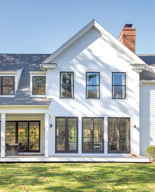
above: A modern take on a New England farmhouse in Stamford designed by Burr Salvatore Architects.
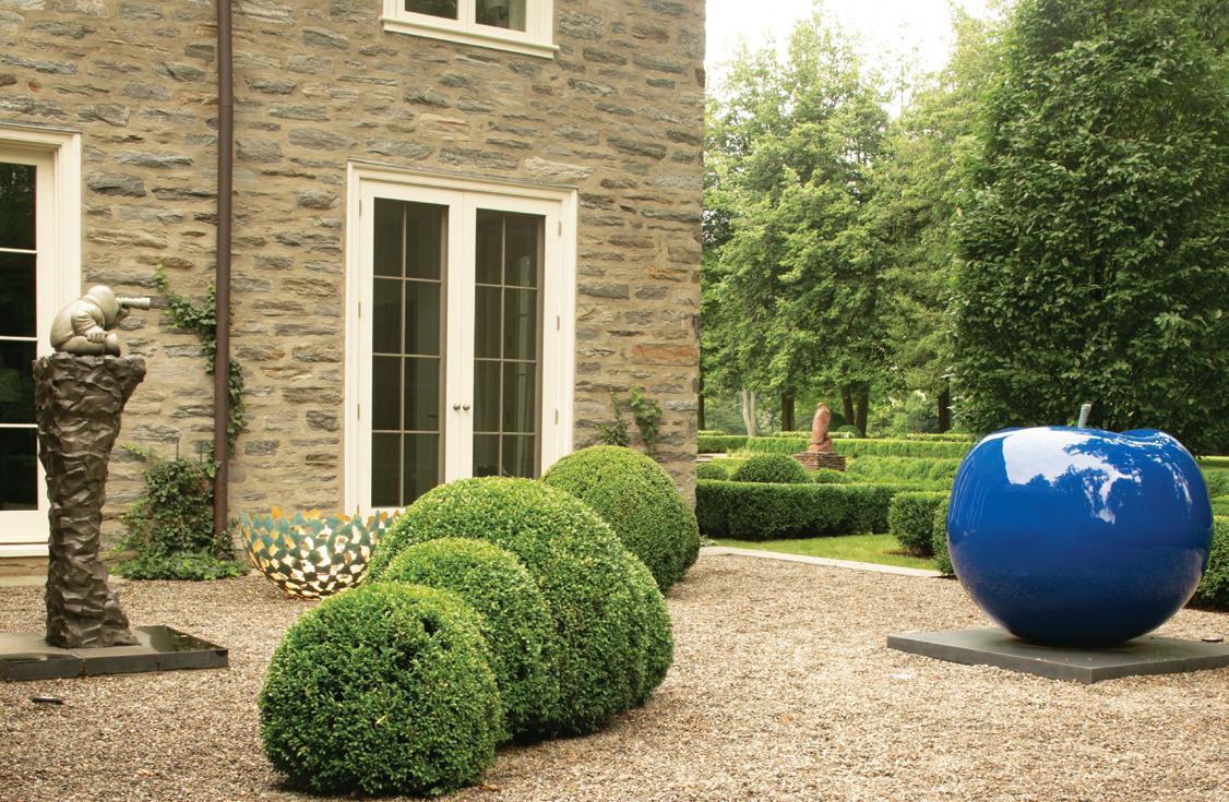
above: Lisa Pappon’s Blue Apple is on display in this sculpture garden.
COURTESY OF BURR SALVATORE ARCHITECTS; JDDA GARDEN BY NEIL LANDINO
shoptalk athomefc.com 26

Visionary Architects, Builders and Landscape Architects
YOUR NEXT PROJECT STARTS HERE
PROMOTION NAROZHNIISTOCK.ADOBE.COM
Thompson Raissis Architects
As a boutique architecture firm practicing for over 30 years, Thompson Raissis Architects continues to offer clients in Fairfield County and beyond high-end architectural design with a truly unparalleled level of personalized service.


Principal Scott Raissis works hand-in-hand with each of the firm’s clients throughout every step of their project, from the initial design sketches through construction and home ownership.

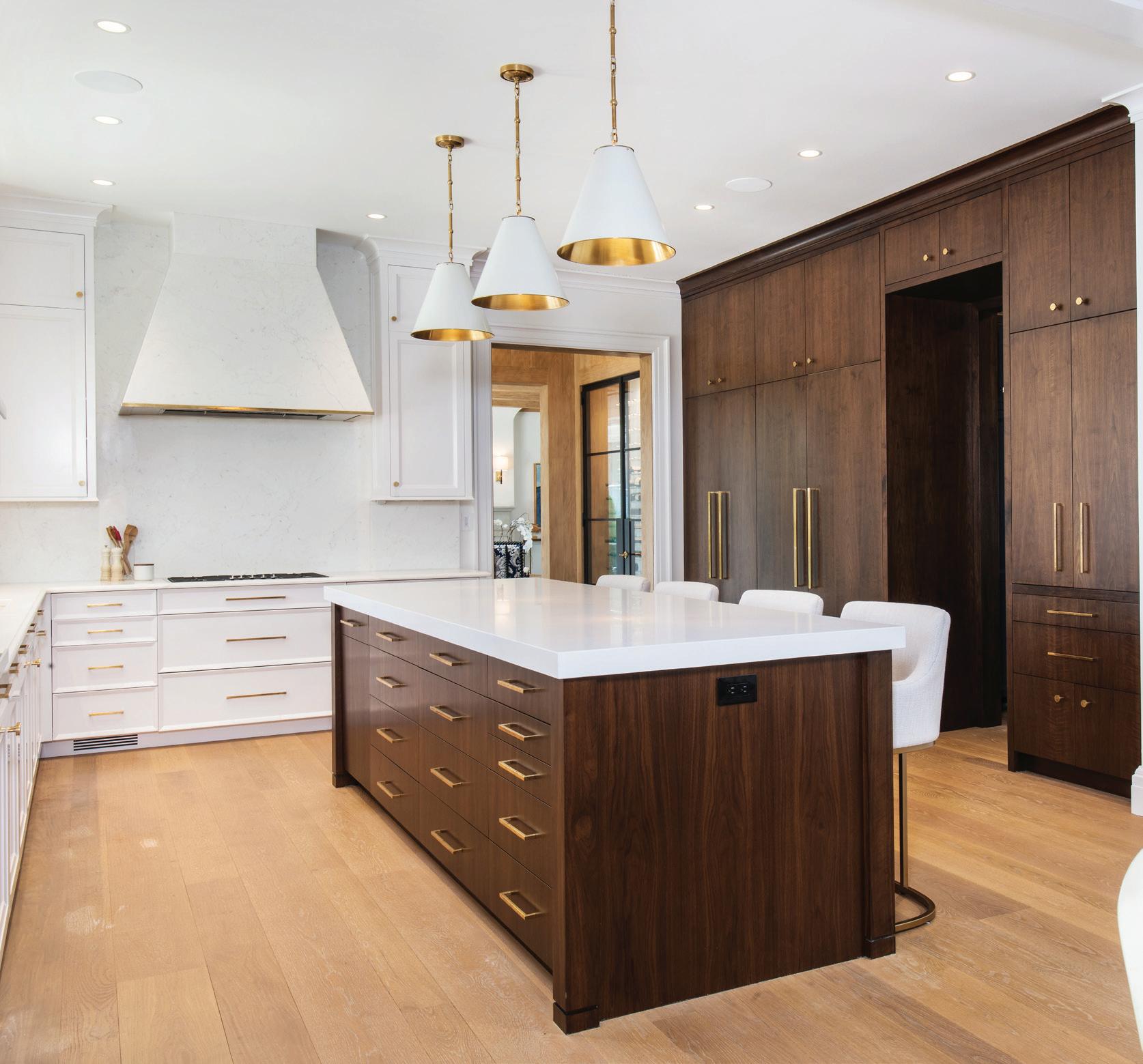
Scott’s approach seamlessly blends classically-inspired elegance with contemporary technology and practices
to create designs that offer timeless beauty while responding intuitively to the unique requirements of each client and site. Whether it's a challenging waterfront location or a scenic country estate, Scott and his team have the design expertise to maximize the property’s potential. Their decades of experience working with skilled contractors, tradesmen, and craftsmen ensure that every project meets TRA’s uncompromising standards of aesthetic beauty and construction quality while being delivered at the most competitive price.
Scott’s unwavering commitment and attention to detail allow TRA to craft beautiful, bespoke homes that are perfectly designed to meet each client’s needs while enhancing their property and enriching their daily lifestyle. It is the reason that so many clients return to Thompson Raissis Architects time after time, entrusting Scott with all of their design needs. “Scott’s attention to detail was incredible”, raves one such client, “Not only did we end up with the house we have always wanted, we enjoyed the process every step of the way.”
MAR/APR 2023 29
Scott Raissis Thompson Raissis Architects
PROMOTION
381 Boston Post Rd, Darien, CT 06820 (203) 399-0100 tr-architects.com
ankee Custom Builders specializes in extraordinary custom homes and renovations in the tri-state area. Based in Greenwich, Connecticut, the company is on the rise and is known for its ability to make the complexities of homebuilding a positive experience for all involved. Founder Justin Meneguzzo established Yankee Custom Builders in 2015 as a precision management firm that promotes forward thinking, excels in communication, and provides comprehensive professional
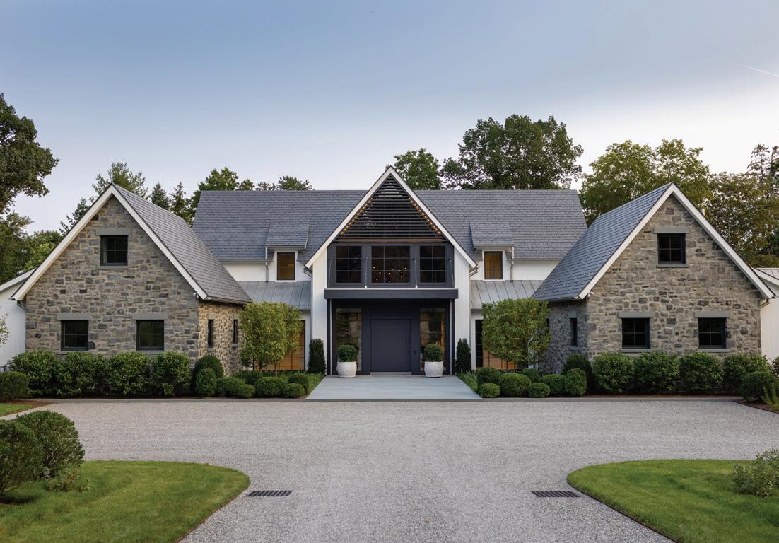
services.
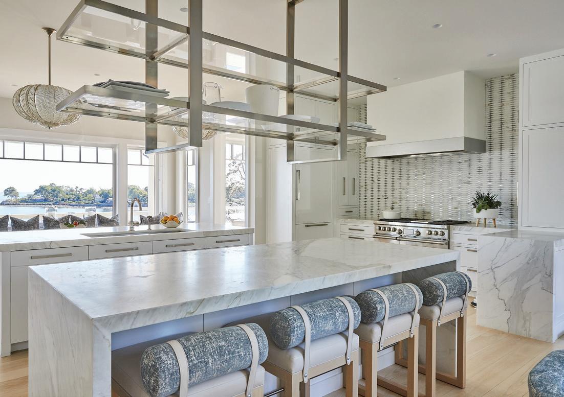
Yankee Custom’s craftsmanship, quality materials, clear budgeting and scheduling, and knowledge of refined products culminate in homes that capture the imagination of clients and architects alike.
Yankee Custom Builders is dedicated to the craft of building fine residences that endure for generations. Their expertise in managing and building custom projects— working in tandem with the client, highly regarded

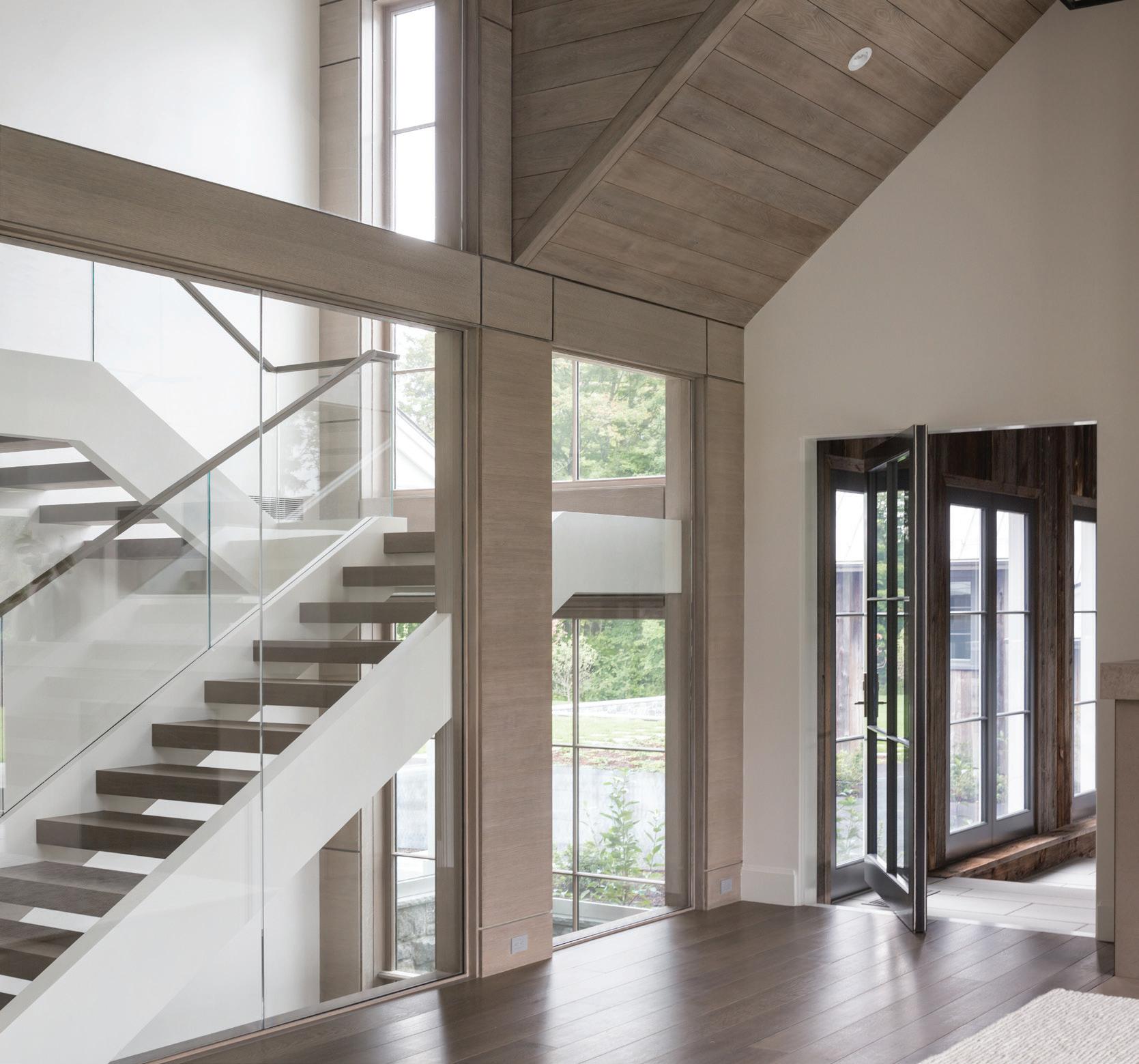
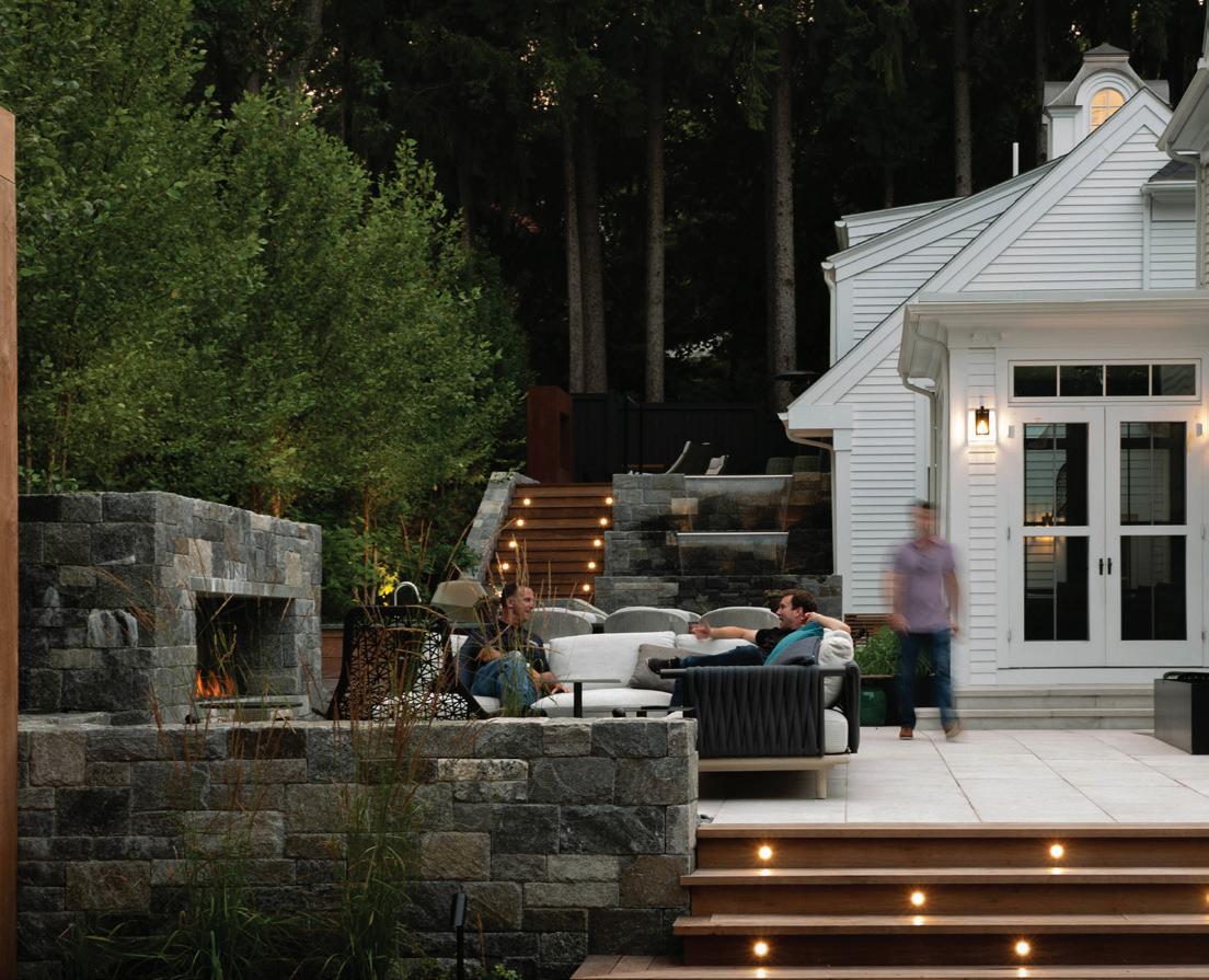
architects, engineers, designers, and allied trades— is becoming well known in the Northeast. Justin notes, “It was always my goal to have my own company. I wanted to bring the best industry practices to be on par with the craft of construction. Everything I love about building and working with good people has completely shaped Yankee Custom Builders and our growing reputation. We are all about service, quality, and attention to the client.”

athomefc.com 30 PHOTOGRAPHS COURTESY OF JEN HOLT, AMY VISCHIO, NEIL LANDINO
PROMOTION
Michael D’Angelo
Michael D’Angelo Landscape Architecture
michael@m-d-l-a.com
(203) 592-4788
m-d-l-a.com
Michael D’Angelo Landscape Architecture

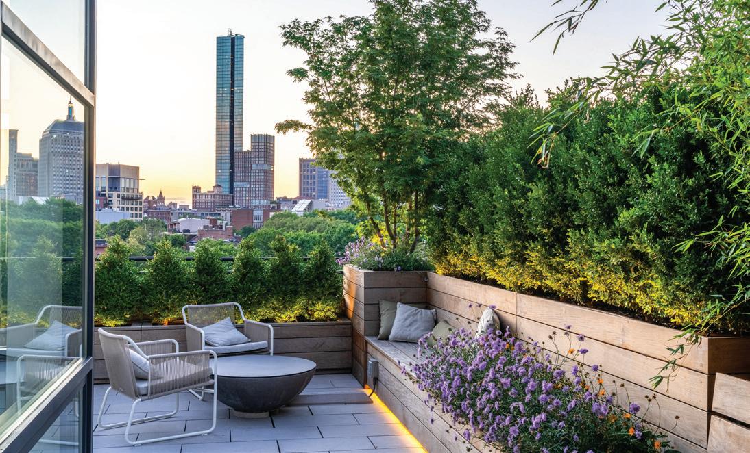
With offices in Connecticut and Massachusetts, Michael D’Angelo Landscape Architecture focuses on creating contemporary landscapes throughout New England. The firm has experience designing challenging coastal properties, suburban landscapes, and a large portfolio of urban roof terraces and courtyards. We also provide design services for real estate developers, institutions, and corporate clients. While our designs are clean-lined and simplistic in


approach, a high-level of detail, thought, and craftsmanship are apparent in the final products. Designs often incorporate large massings of plant material for visual impact, creative use of paving materials for scale and texture, and typically have a strong lighting component that enlivens the space at night.
Clients appreciate our ability to seamlessly manage a project from beginning to end, our relationships with key craftsman, vendors, and contractors, and our ability to find creative solutions.

MAR/APR 2023 31
PROMOTION
athomefc.com 32
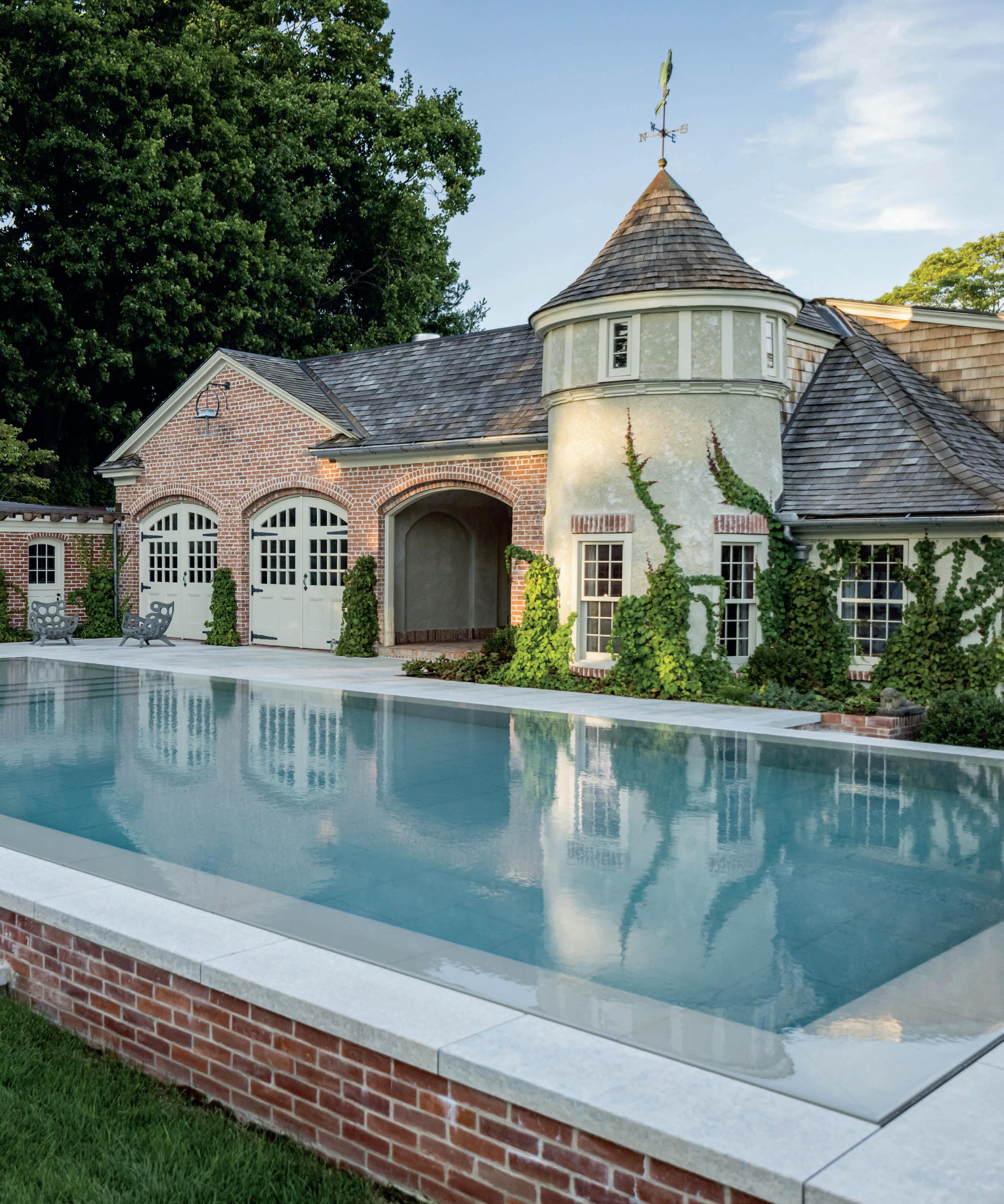
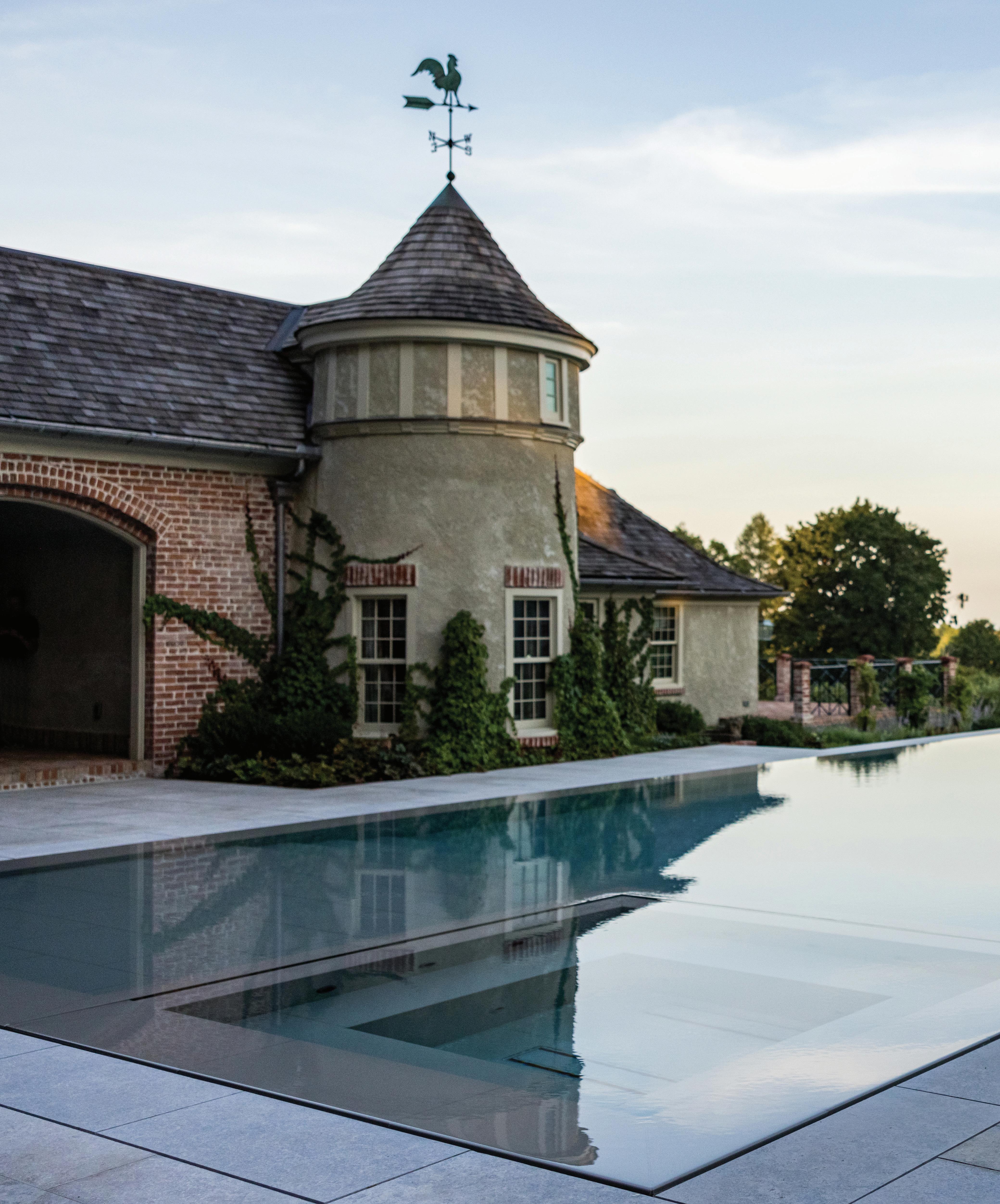
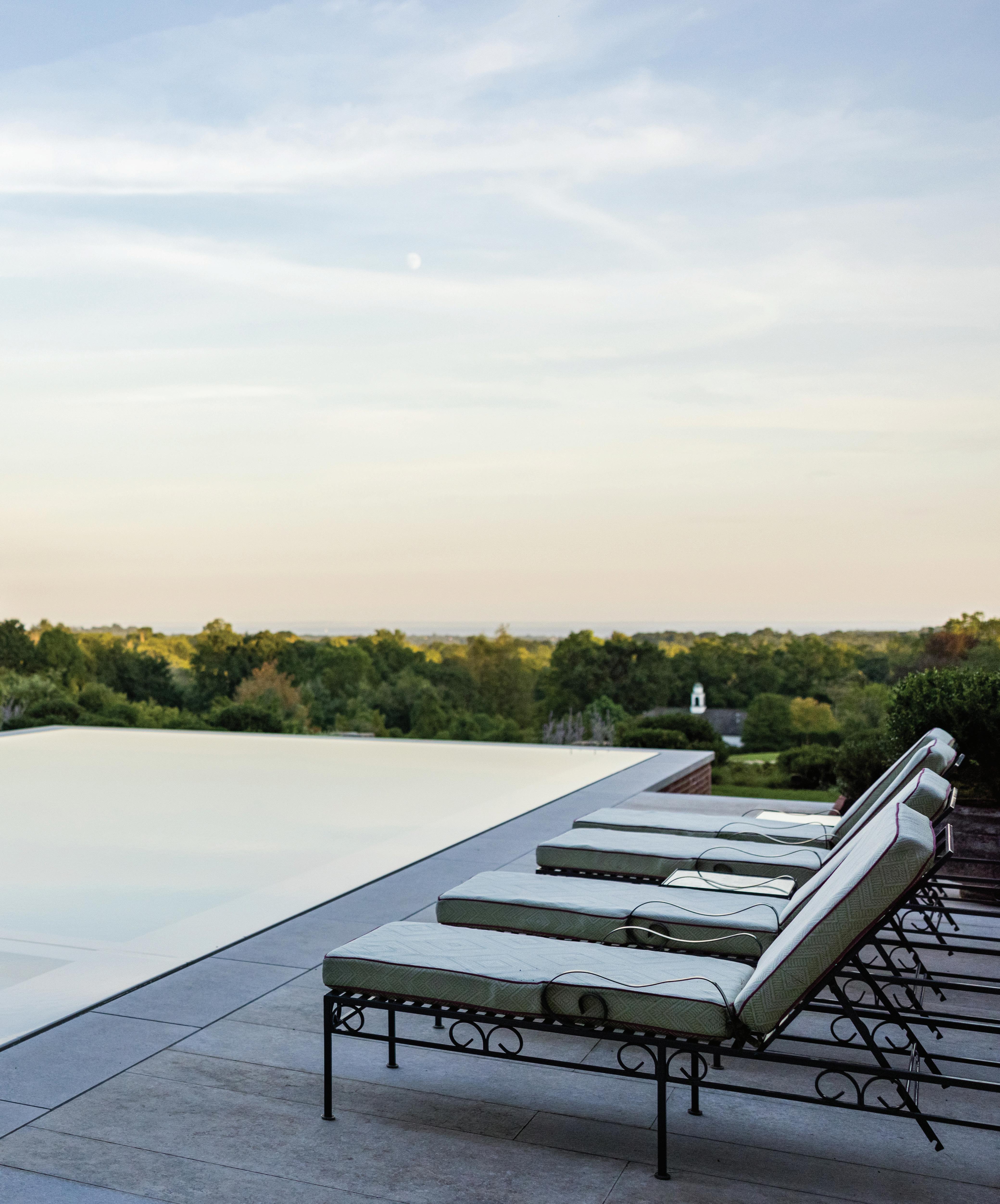
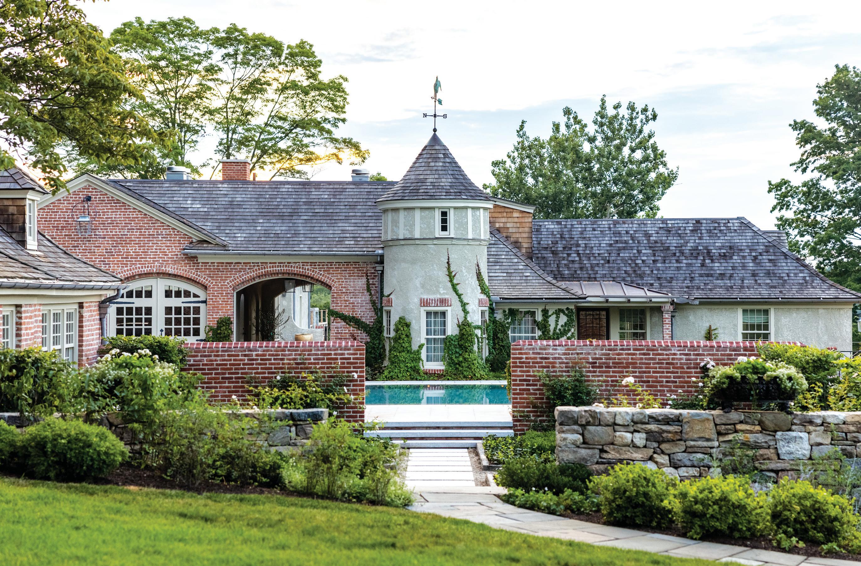
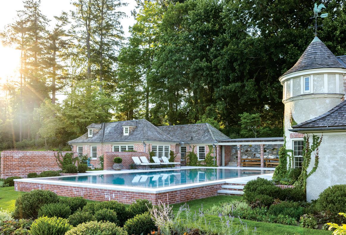
this photo: Once an asphalt parking lot, this prime area was reclaimed for a new pool. Located at the highest point on Greenfield Hill, swimmers have views across Long Island Sound.
VIEW FINDER
Collaboration, a creative vision, and the revelation of a new vantage point in Greenfield Hill
MAR/APR 2023 33
interview with justin quinn & heather harris, james doyle design associates photography by allegra anderson
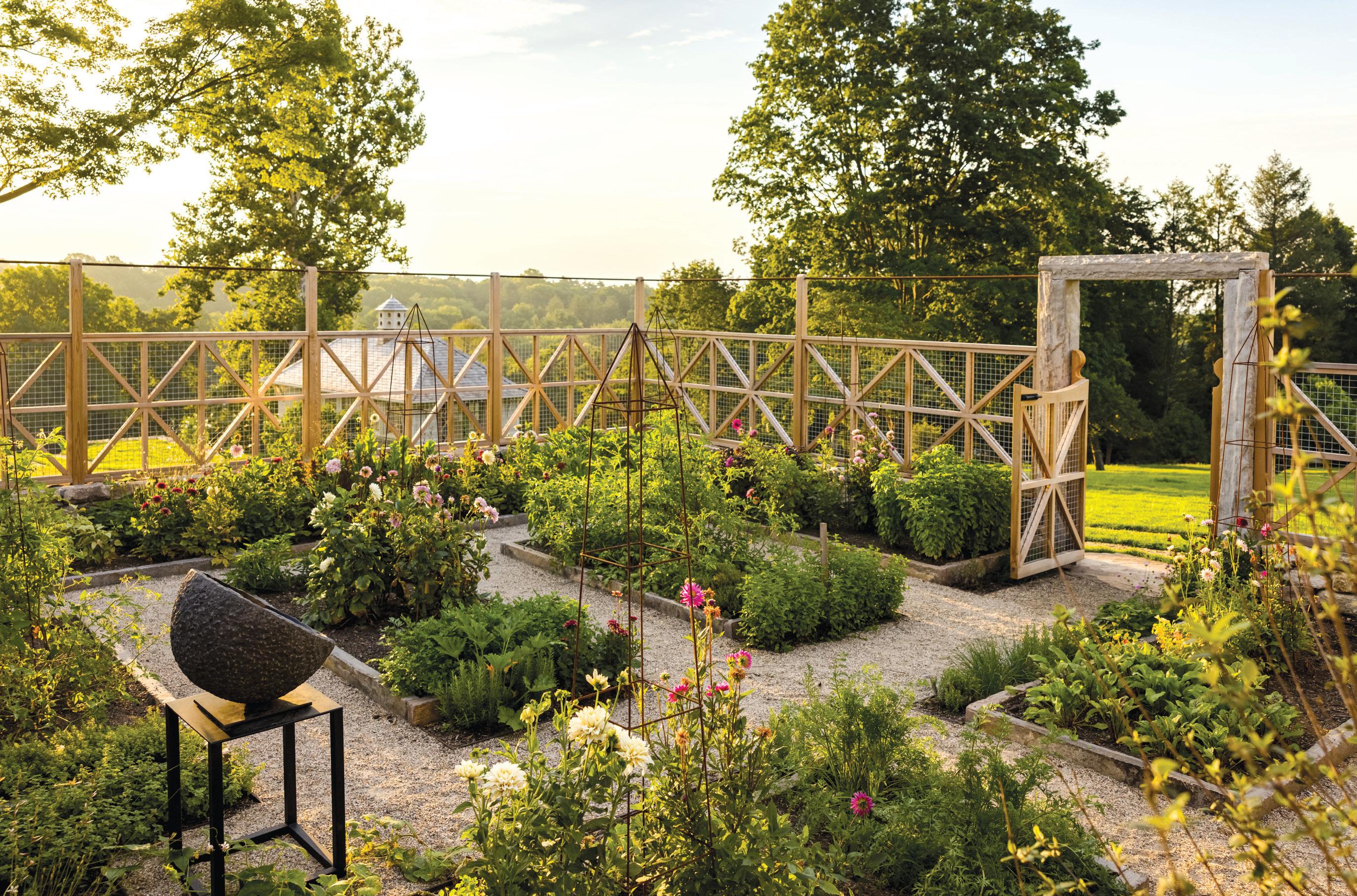
above: Tuteurs stand ready to support summer’s tomatoes and dahlias in the cutting and vegetable garden. this
athomefc.com
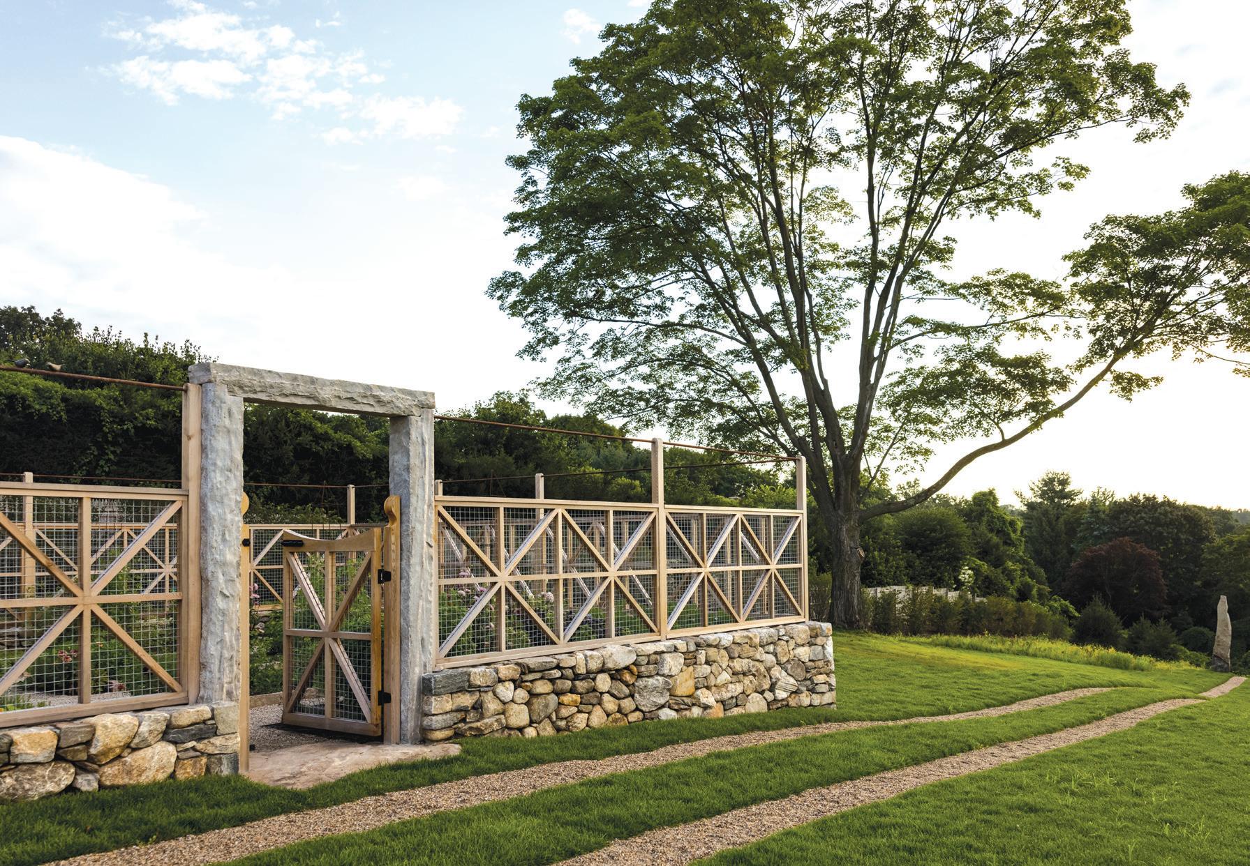
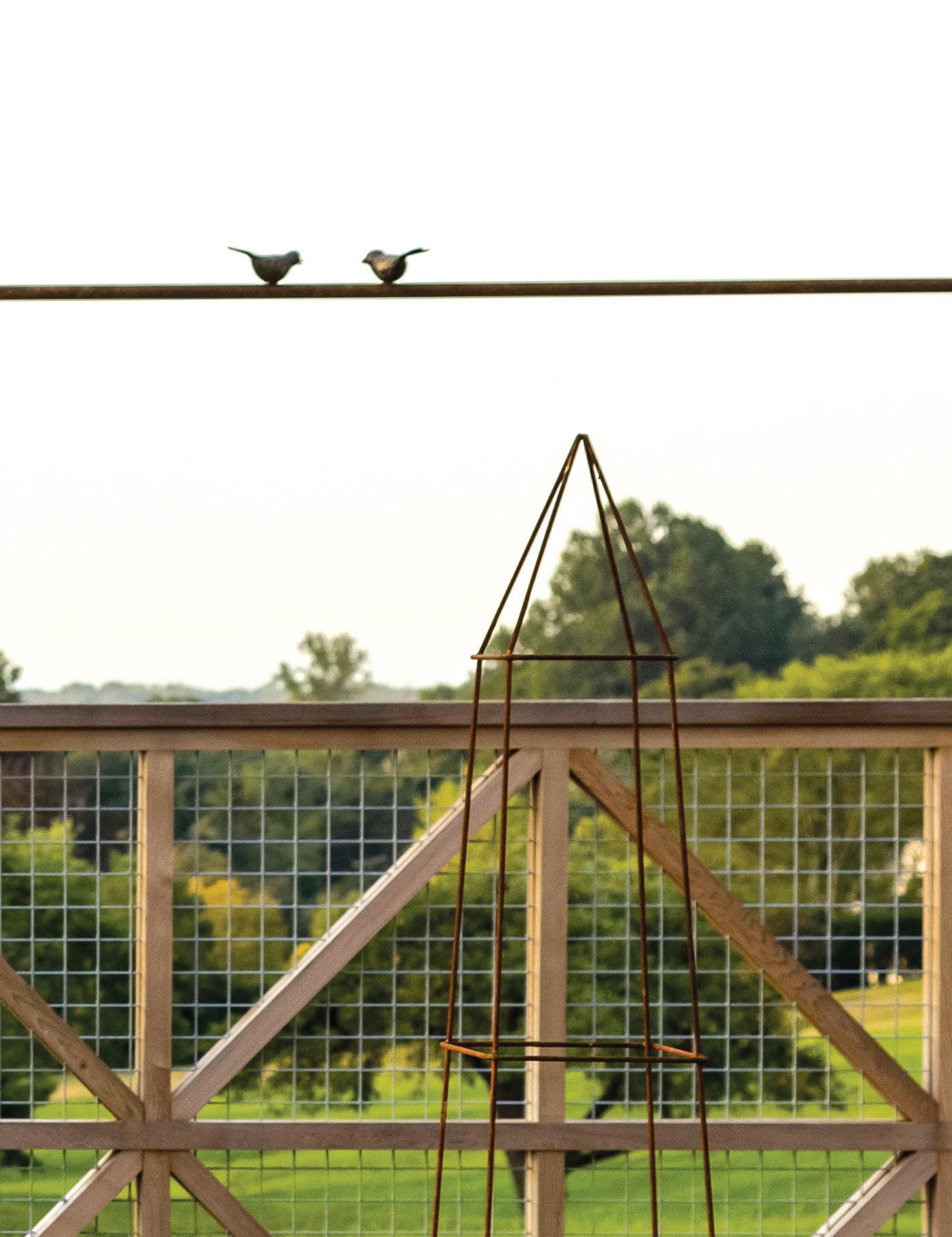 photo: Garden fencing adds charm and keeps deer out. right: Bronze lovebirds atop the garden fence.
34
Who lives here?
Justin Quinn: This family lives on the property that abutted this site on top of Greenfield Hill in Fairfield. They purchased the property next door with the intention of renovating the house, the cottage and some of the outbuildings. Paulo Vicente is the project architect on the outbuildings, carriage/ pool house and garden shed. The project was a bit backwards in that it started with the landscape and pool.
The pool was in the same spot?
JQ: No. The new pool is where all the cars used to park. Heather Harris: All the buildings that you see are original; nothing is new around the pool, but they all used to be the garage area. The idea was, instead of having all the cars park there and be the focal point (which you can see from the main house), move the pool there, and that becomes the new focal point, instead of looking at a parking lot.
JQ: That was an idea that originated in Vicente’s office, and then we were brought in and rearranged the vehicular circulation. Vicente rearranged the access to the garage doors, and then we recaptured a big portion of the site. It’s one of the best vantage points, and on a clear day, you capture these long views to the Sound. It’s kind of a surprise in a way. You don’t think you can be that far up and still see the water.
Tell us about the design plan.
JQ: We’re still working on the site, and we’ll probably be there for a long time. It’s not a garden that happens overnight. We start by creating a road map for the entire property, looking at conceptual ideas and conceptual connections and how the spaces will work together.
How long did this project take (so far)?
JQ: We started construction in late summer 2020, but design work started winter of 2019. There was a heady architectural component with Vicente’s work, and then we transitioned to some of the hardscape. The following summer, we went back and did the bulk of the planting. One of the couple’s daughters was getting married, and we found out that she wanted to have the wedding on the property, so we had to rush and finish the first push in mid-August 2021.
Tell me about the cutting garden.
JQ: Our plan had included a relatively traditional geometric layout of the garden beds, to serve this cutting garden component, but there are also some veggies in that garden. We knew that the wife was concerned about the deer, so we always had a plan to enclose it. Once we started construction, Heather and I developed this detail for the decorative cedar fence with the hidden mesh. Heather took many trips back and forth with the wife to populate the beds.
HH: In terms of building the garden, it was a pretty hands-on experience, because we had the beds laid out on paper, but it’s great when the client’s involved with it; measuring the pathways, making adjustments. We decided to do the steel edging so the plants can grow in the pathways. That hands-on
experience doesn’t always happen, but when it does, the final product is much better than we originally had planned. And the nice thing about this garden is that it’s towards the edge of the property that no one really goes to, so now people have a reason to head there. In the future, the plan is to have an orchard around the garden area. There will be even more reason to visit that side of the property.
JQ: The mason, Chris West, introduced us to designer Matt Bier. We sketched out the idea for the fence and these guys—who are really dedicated to their craft—developed these mock-ups and really went the extra mile; even the way they added the patina to the top rail of the fence. There’s a lot that’s left up to interpretation, and they did a great job elevating that space a bit. On one of the rails, we added these two little lovebirds, which was a sweet detail, especially as we were in a rush to get the project done for the wedding.
How does the design of the house affect your landscape design?
JQ: Our work is rooted in some tradition, with traditional materials, but the execution is clean with a touch of contemporary. The pool is obviously very contemporary, and one of the things that’s interesting is that it’s a large-format tile pool and it almost appears as if the paving goes into the pool, which is pretty uncommon for the Northeast. It was a labor of love for everyone involved.
HH: They leave it full going into winter, so when it freezes, it looks like a solid block of ice.
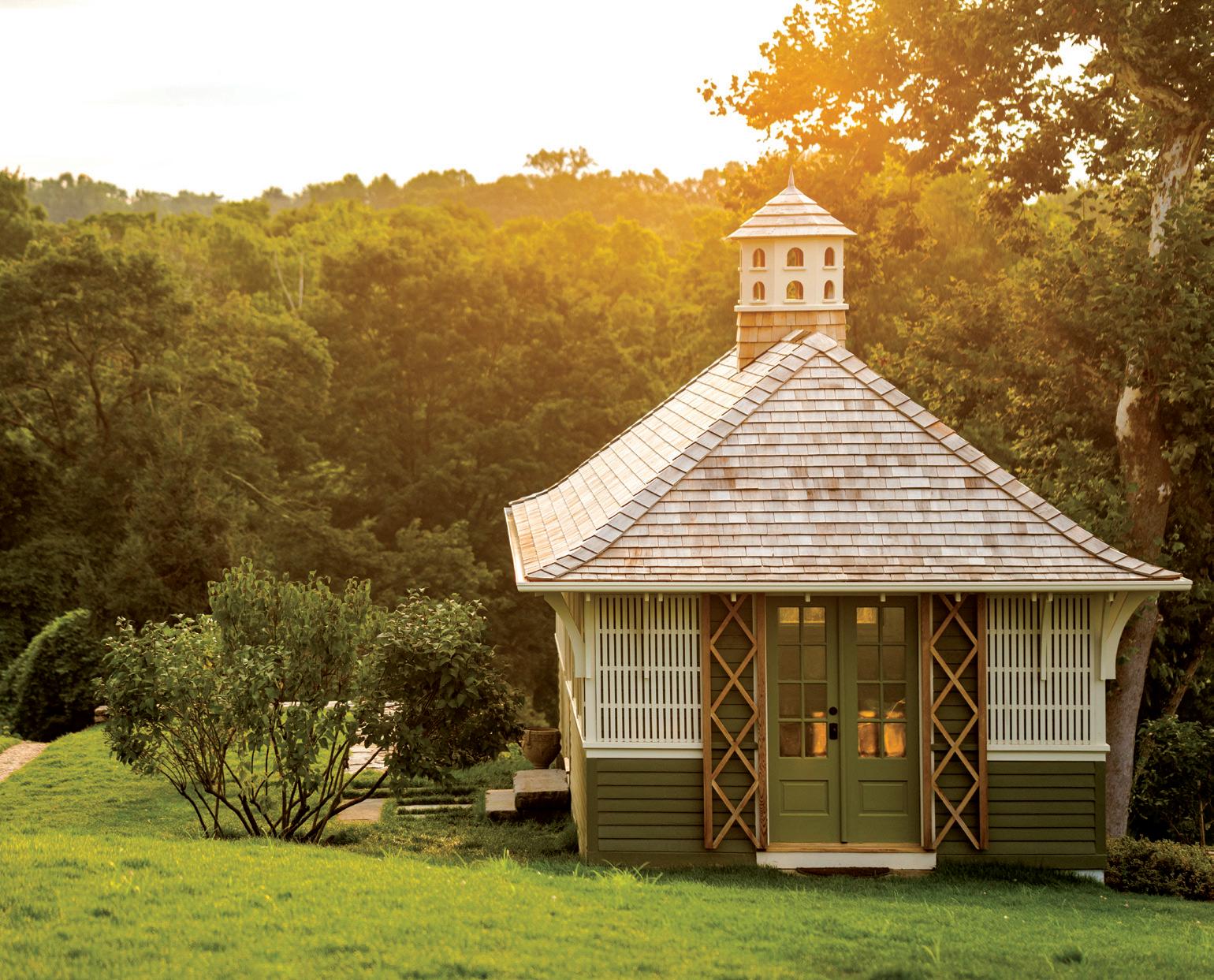
above: Vicente Burin Architects reimagined an old chicken coop into a destination artist studio. A stately lilac was transplanted and now anchors the corner of the structure.
MAR/APR 2023 35
36
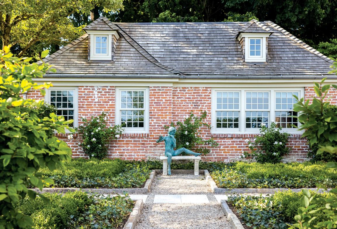
above: Loose plantings frame the main walk from the house to the pool garden. The turret in the distance is planted with Boston Ivy, softening the structure and providing seasonal interest. below, left: The same brick seen at the cottage repeats on the swimming pool. A freestanding brick wall parallels the pool, defining the space. below, right: A garden comprising of four plants; Hornbeam, English ivy, New Dawn Rose, and Boxwood creates an understated palette and provides a stage for the client’s sculpture.
athomefc.com
Do you have a favorite part of the project?
JQ: I like the pool, but I also like the cutting garden, especially the way we created that entrance into it, which feels meaningful. Right now, that’s my favorite spot.
HH: The pool. I’ve never built anything like this before. Working with all the contractors and consultants for this pool, it definitely was an experience I wouldn’t trade anything for. For the tiles, we had to figure out everything from scratch. Any time you work on a project, and you’ve never done it before, that makes it more special.
interview by megan gagnon
Resources:
Landscape Architect: James Doyle Design Associates, Greenwich; 203-869-2900; jdda.com
Architect: Vicente-Burin, Fairfield, 203-319-9571; vbarchitect.com
General Contractor: Tallman Building Company, Westport, 203-254-3055; tallmanbuilding.com
Irrigation: Summer Rain Sprinklers, Cos Cob, 203-629-8050; summerrainsprinklers.com
Landscape Installation: Freddy & Co., 203-855-7854; freddyandco.net
Pool Contractor: Meehan & Ramos Pools, Stratford, 203-378-8900
Arborist: Tree-Scape & Fitch, Woodbury, 203-797-1839; tree-scapeandfitch.com
Mason: Chris West Company, Fairfield, 203-255-9940
Fencing: Matt Bier, Stamford, @matt_bier
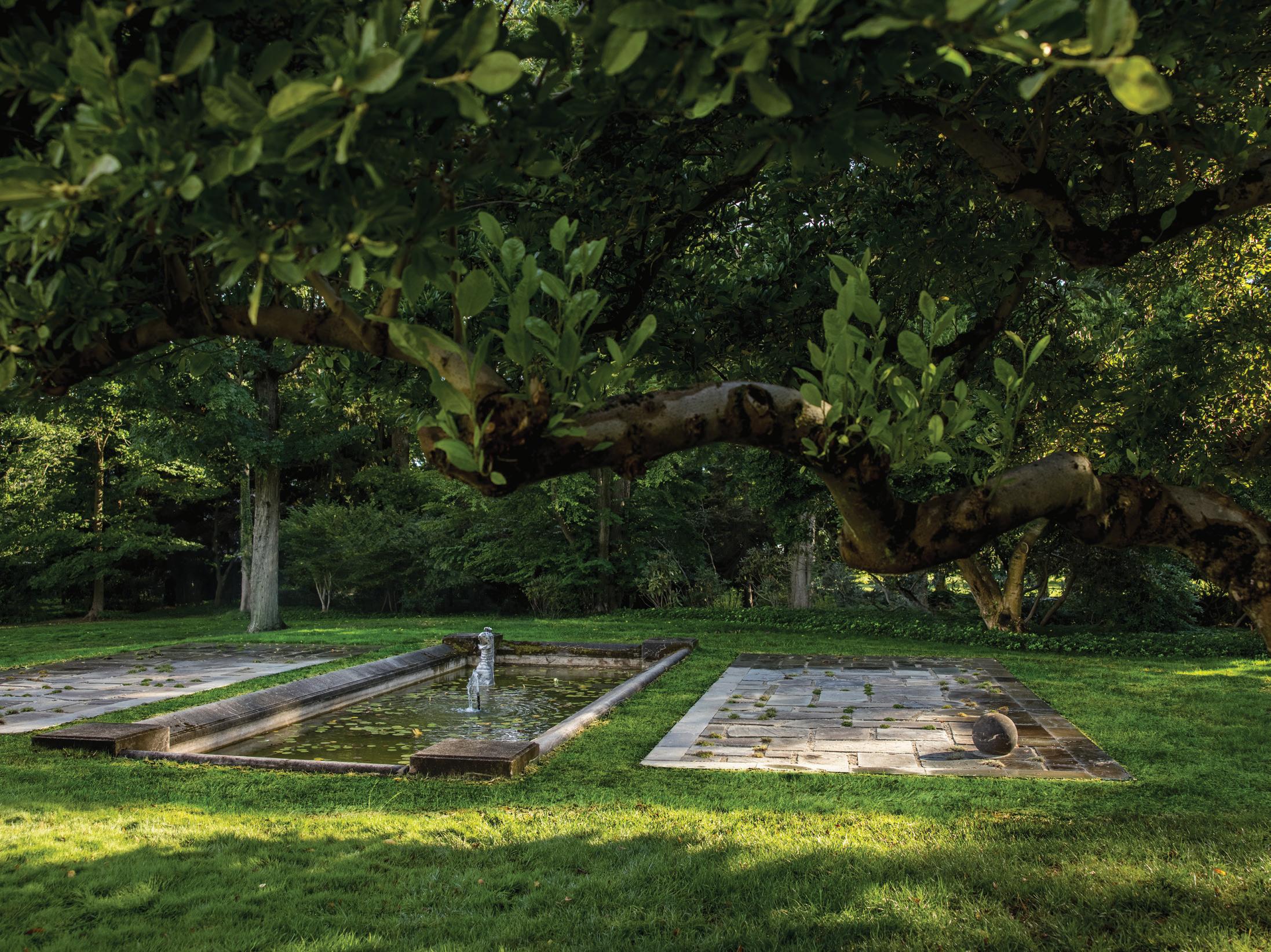
above: Refurbished stucco walls and steps planted with New Dawn Roses and Hydrangea provide a plinth for the 1927 French Manor-style home. left: New terraces comprising of antiqued stone match the patina of an existing fountain.
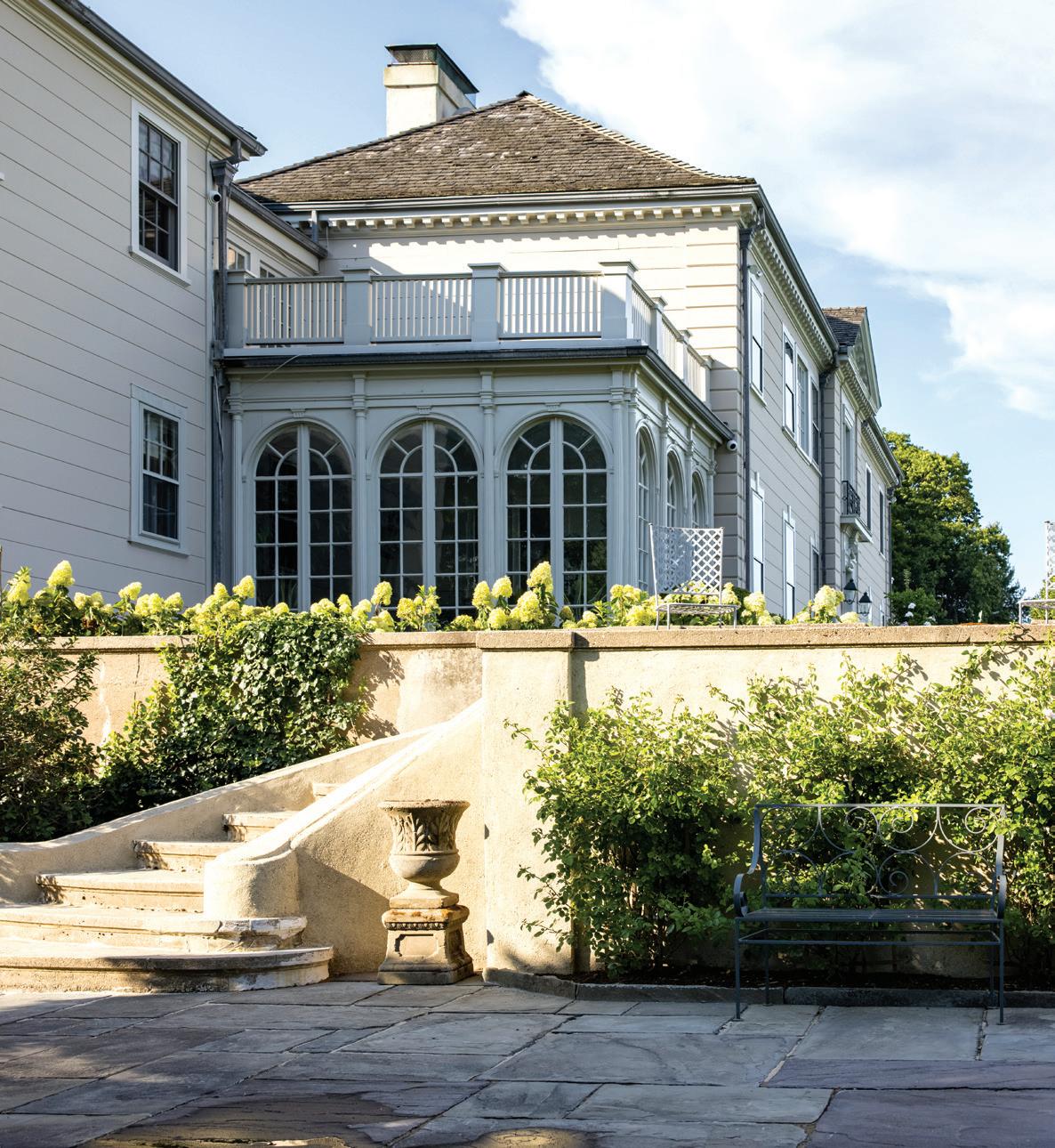
clean and contemporary meet 1800s tradition in a balanced home built for a bustling family
athomefc.com
MIX
38
MASTERS
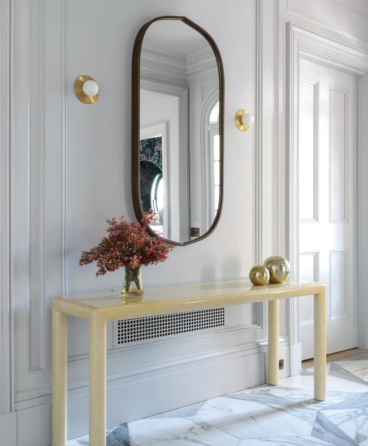
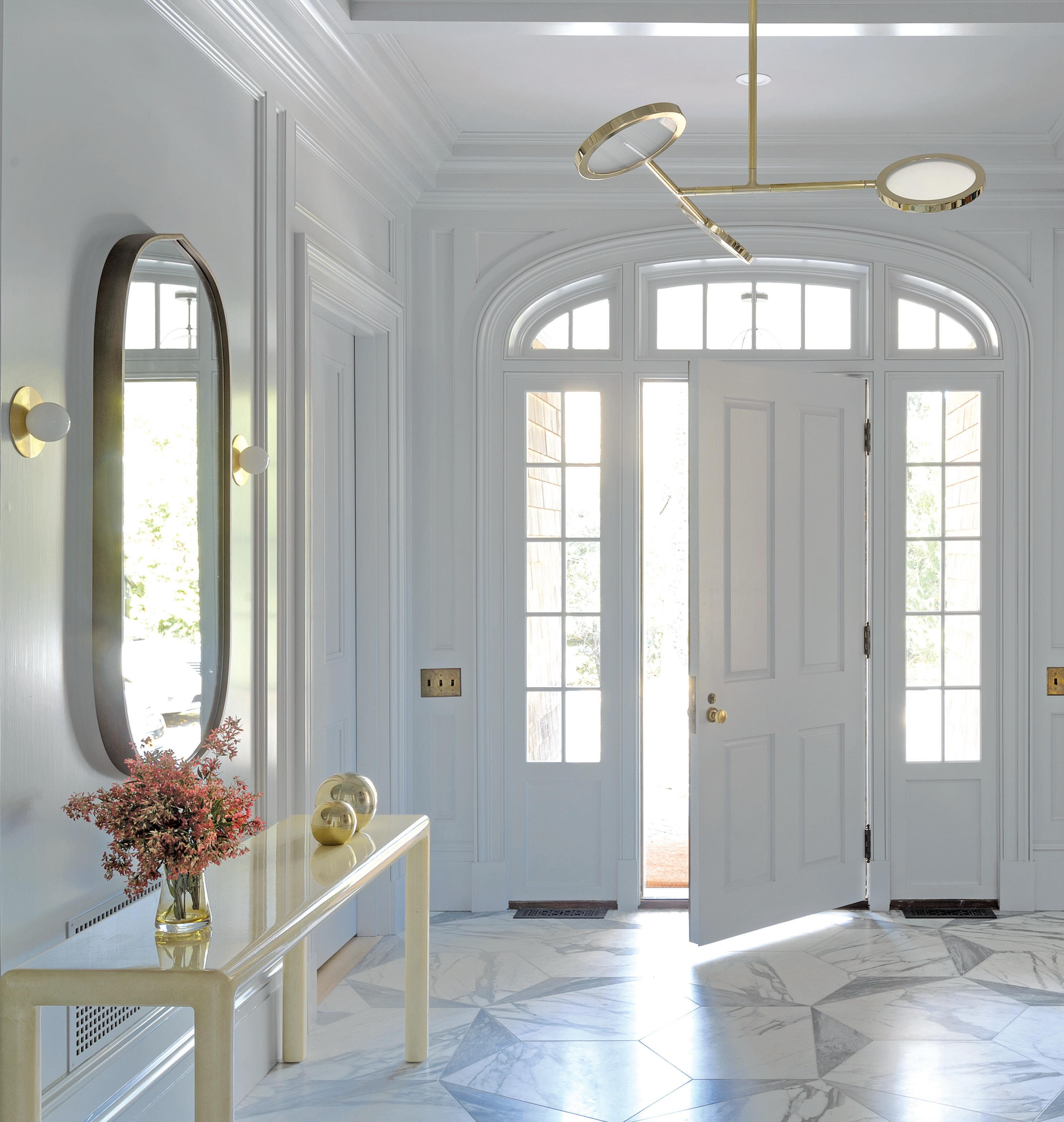
 above: A Crate and Barrel oval mirror hangs between two Allied Maker gold sconces. left: Allied Maker’s Mini Orbs lighting fixture in brass frames the stunning marble entryway.
MAR/APR 2023 39
interview with britt and damian zunino, studio db photographer matthew williams
above

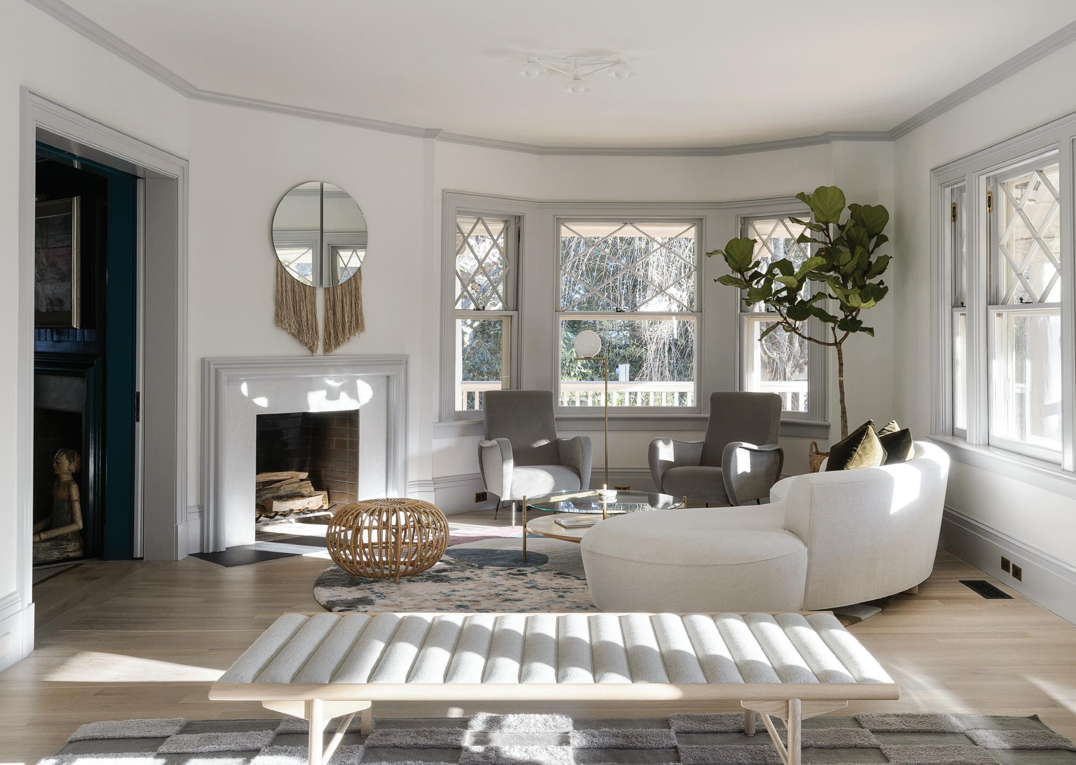 : The entry living room hosts a black lacquer piano with a Tobias Scarpa chair and a Menu daybed. right: A white, curved Prestige Furniture sofa with a Yield Design circular coffee table and two Pamono mid-century velvet lounge chairs take center stage in the main living room. A Ben and Aja mirror with decorative beige fringe and a green fig tree from Nielsen’s complete the room.
Who is the client, and what did they want?
Britt Zunino: The clients are a family who were moving from Tribeca to Connecticut. They have two small children, and they wanted a fresher look. I think they were struggling a bit with leaving the city.
Damian Zunino: They wanted to bring their New York sensibility to the new place, but they loved the bones of the house.
What’s the history of this house (as you know it)?
DZ: The original house was from the 1800s. The family of five who preceded the current tenants completed an addition, some restoration, and a new kitchen. But all of that was 20 years old by the time our clients bought the house. The bones of the house are amazing. The detailing is great; there is a lot of wood paneling, heavy wood, and we wanted it to feel a lot lighter, fresher, and cleaner while still celebrating the tradition of the house.
Did the outcome of this project surprise you in any way?
BZ: I’m pleased with the outcome. I feel like we were able to achieve what we wanted, which was to keep the integrity of the house— keep the bones—while still making it feel fresh and modern. The previous addition is obviously more traditional. And the interiors were just from a different era—heavier and darker—so it needed a little breath of fresh air. And that’s not to critique that work at all; it was just about introducing the next generation of the house for a new family. It feels like this project is true to the identity of our firm, while also feeling like home to our clients. That’s really important to us. We do a ton of projects with families, including this particular one.
DZ: We try to get to know our clients really well, ask a lot of questions, and tailor the design to how they live and use their space. We want to help them create something that feels like them.
Can you tell me about the gorgeous marble entry hall and how that developed?

BZ: Originally, the entry floors were wood, but we really wanted to have a greater sense of arrival. We wanted to make it more dramatic and much more functional, because the clients use this entrance a lot. It was clear that the previous wood floors had wear and tear, so it seemed like a logical choice to do a hard finish there. We came up with a custom design and started looking at different artists who inspired us. Then we started looking at the studio of Cy Twombly, who has a very similar tile in Rome. That’s how it sort of evolved. We custom made the tile out of marble slabs so they’d be quite large.
DZ: It was originally square, large-format tile, and we had them waterjet cut the slabs to size and pattern.
BZ: We also made a dining room table that was custom to the project, and we used the same marble for that.
The art throughout this home is exquisite and provides pops of color. Tell me more about these pieces.
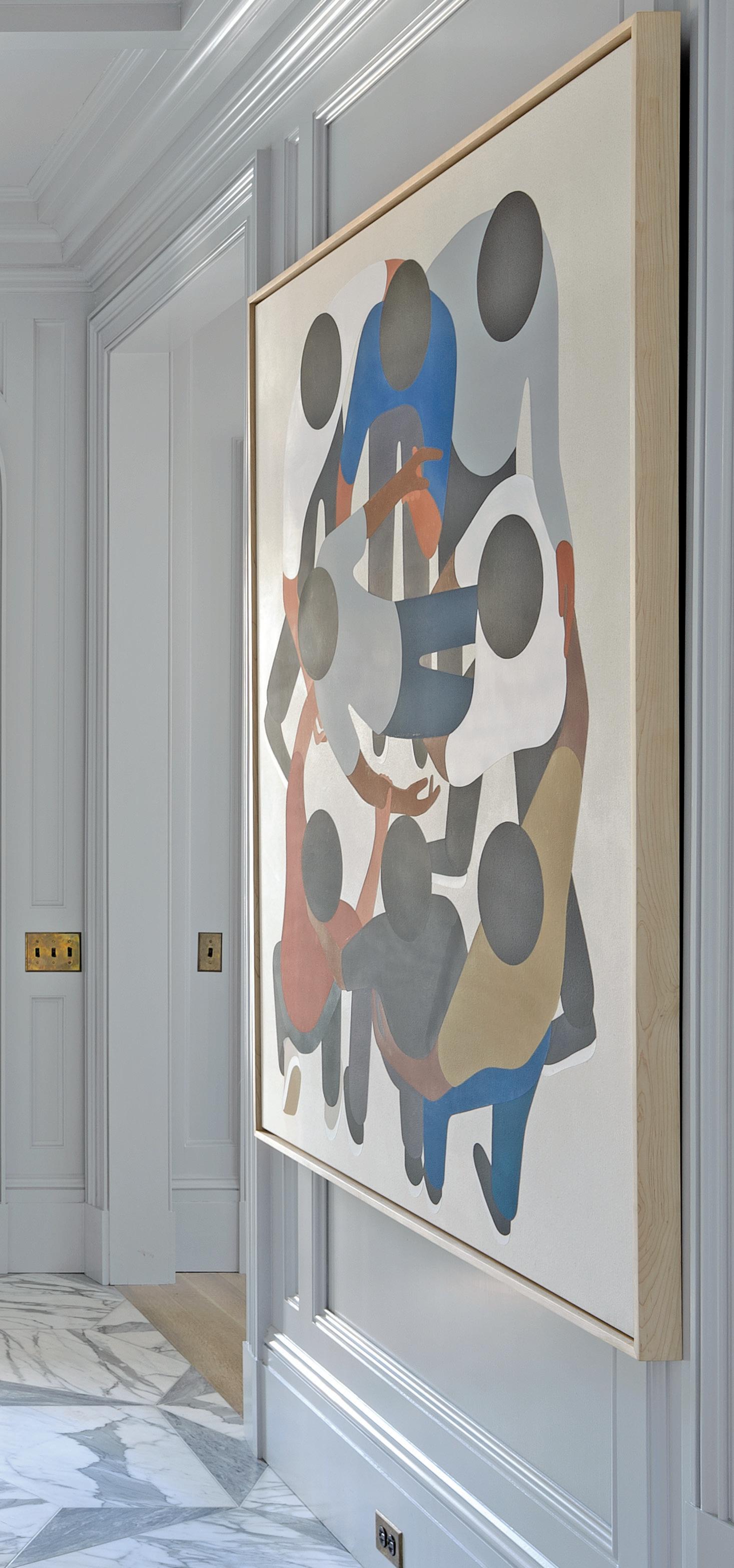
BZ: The art came with the client. They are a big fan of Geoff McFetridge and have collected his work for a long time.
DZ: We had gone to our clients’ apartment in the city and documented what art they had, so it was definitely a part of the design process and a good jumping-off point for a lot of the rooms.
MAR/APR 2023 41
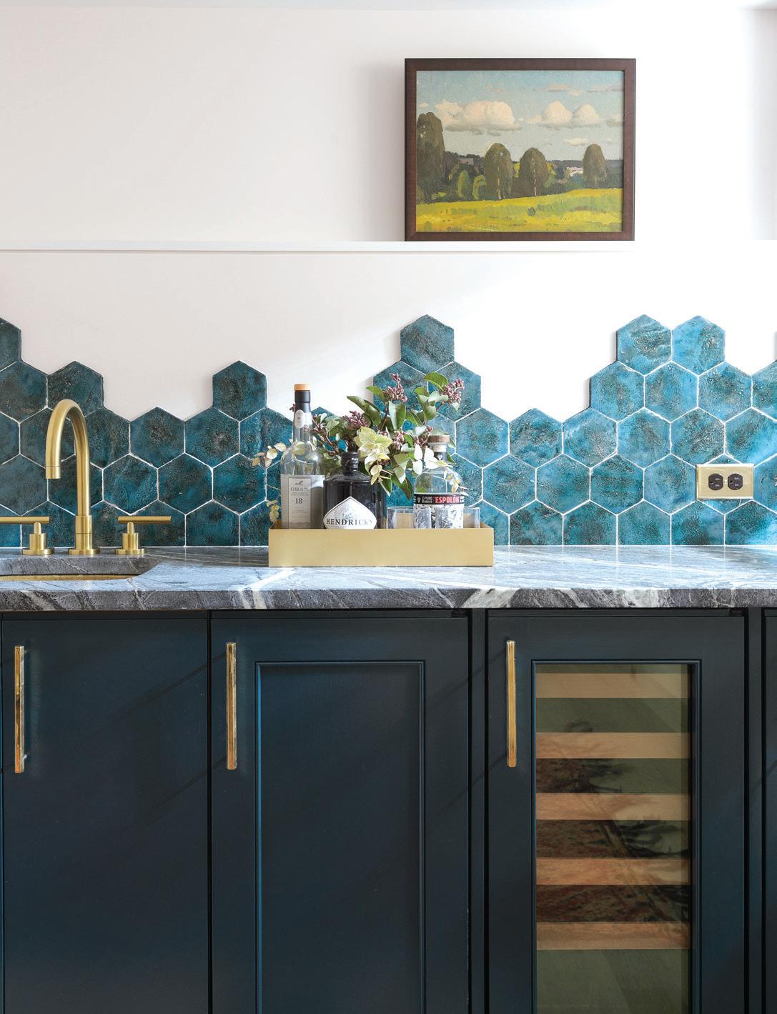
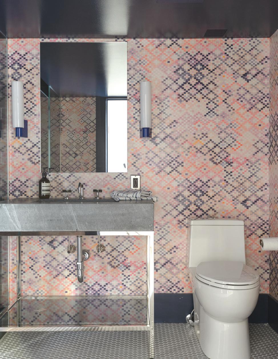
above: Abigail Borg wallpaper and marble countertops push the powder room towards maximalism. this photo: The blue wooden cabinets with matching hexagon tiles are accented with golden hardware.
What’s your approach to designing such a large home where you’re balancing a mix of high-impact rooms and minimalist spaces?
BZ: We wanted to have drama, especially because the house itself has these architecturally dramatic moments. We wanted to celebrate them but at the same time be somewhat restrained. The powder room was a great opportunity to go crazy, because you’re not going to be spending a lot of time in there, and it’s a great place to have extravagant wallpaper alongside marble. And then there’s the library, which is bold; but the living room is relatively quiet, and the dining room is pretty minimal.
DZ: There are a lot of soft, airy, very well-sunlit rooms, so it’s nice to have the library as a dark, cozy moment that all these other spaces can radiate off. That contrast is powerful. It makes the library even more dramatic.
BZ: It’s a big house; each room should have its own identity, and there should be a common thread throughout, but I think there needs to be some differentiation.
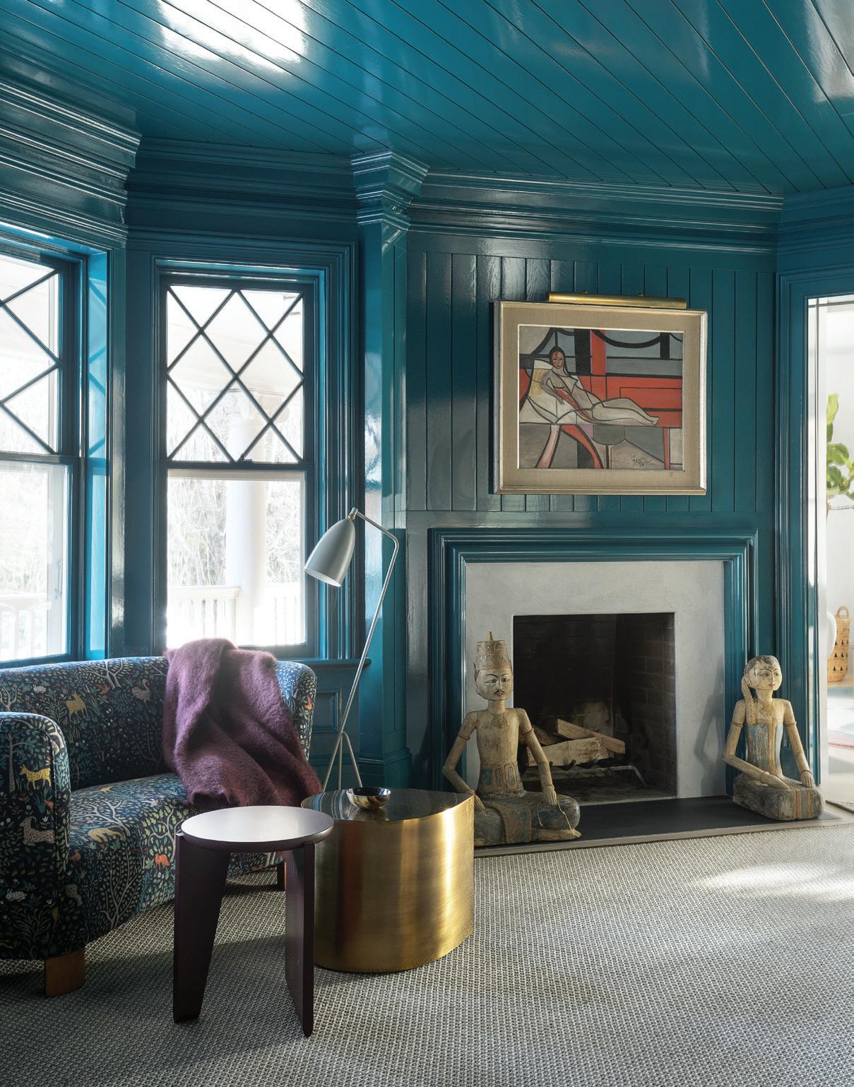
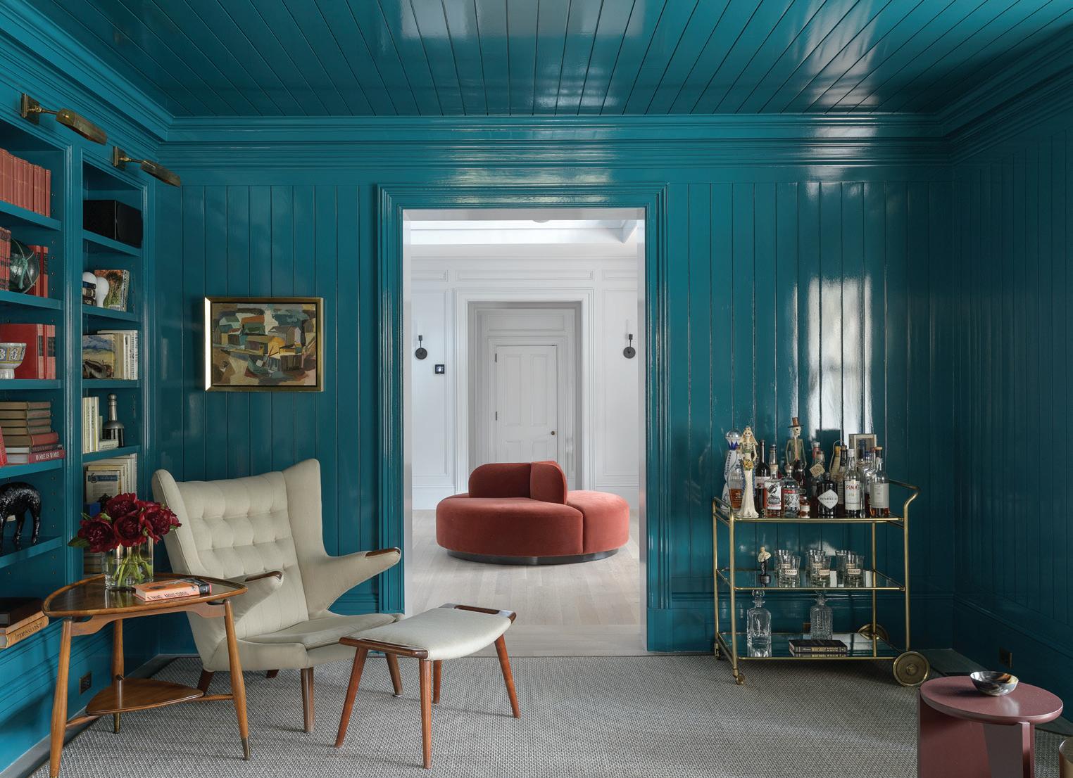
Tell us about your process for designing that teal, high-gloss library.
BZ: It was originally oak paneling, and very dark. Our clients didn’t really respond well to it. And I think because this room is a passageway from the grand foyer into the living room, I felt like we could go a bit bolder. There’s a fireplace in the room, and the high gloss reflects the fire in a really cool way. We leaned into doing something pretty bold. You’ll see the turquoise and that teal color throughout the wallpaper in the powder room and in a custom rug in the living room.
athomefc.com 42
“We like to embrace the juxtaposition and tension between the traditional detailing of the house with contemporary furniture and lighting.”
—damian zunino
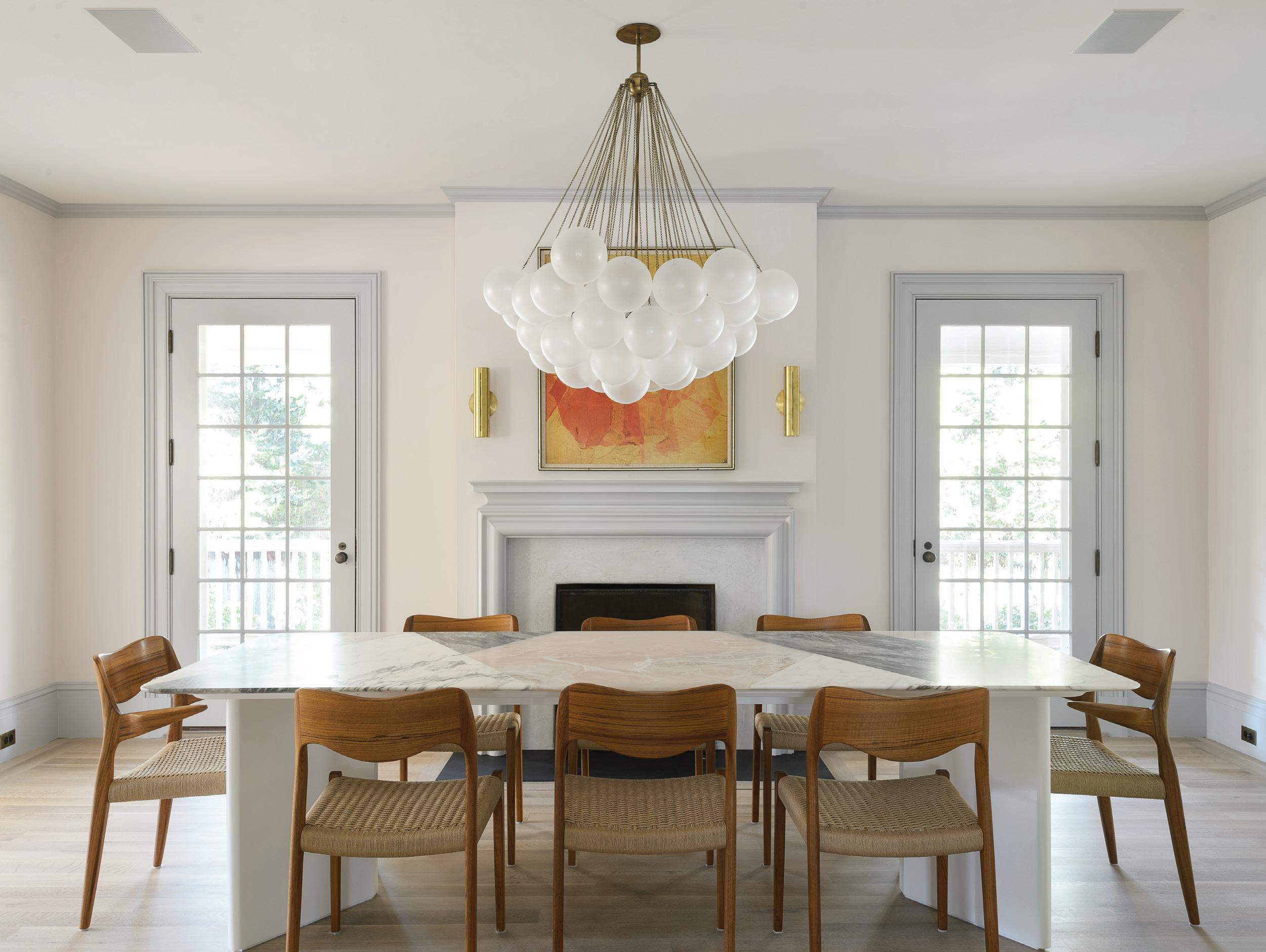
this photo: The design team selected a custom pink onyx table and surrounded it with wicker chairs from Design Within Reach. For lighting, an Apparatus pendant hangs above the table, and sconces from Allied Maker are placed above the fireplace.

MAR/APR 2023 43
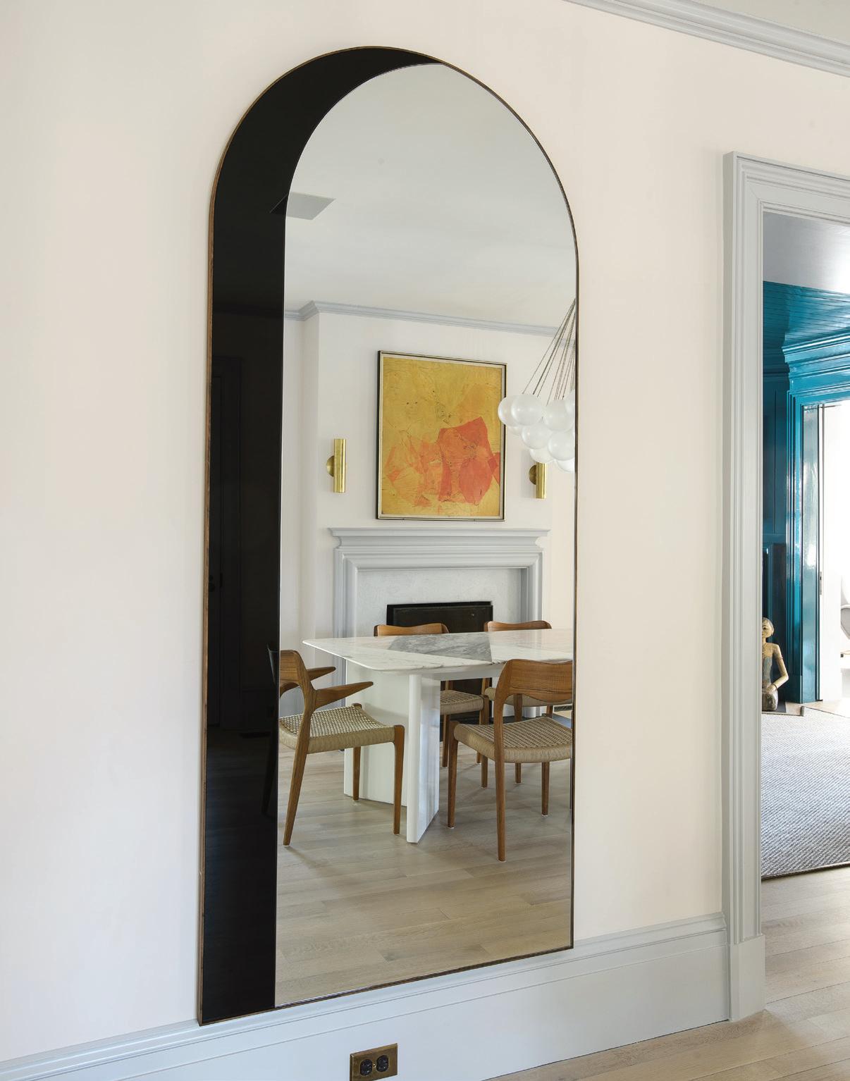
top row, left: A tall accent mirror brings dimension to the dining area. top row, right: The library is all blue, accented with gold decor and a painting hung above the white marble fireplace. bottom row, left: Egg Collective’s Wu Side Table in dark brown and a Florin brass bar cart outfit the library for entertaining. bottom row, right: A David Weeks mobile hangs over a custom round sette covered in a red fabric from Kravet.
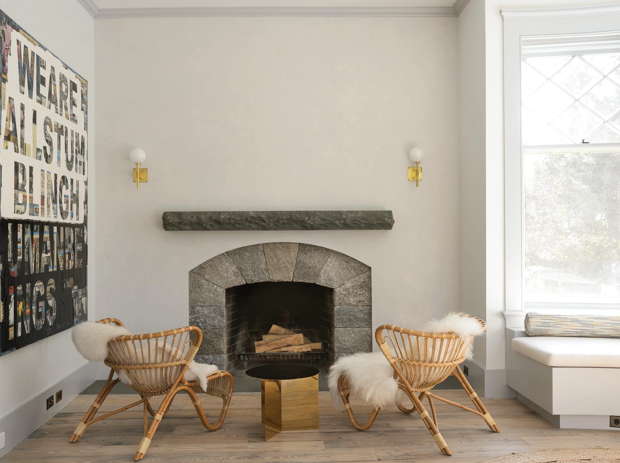
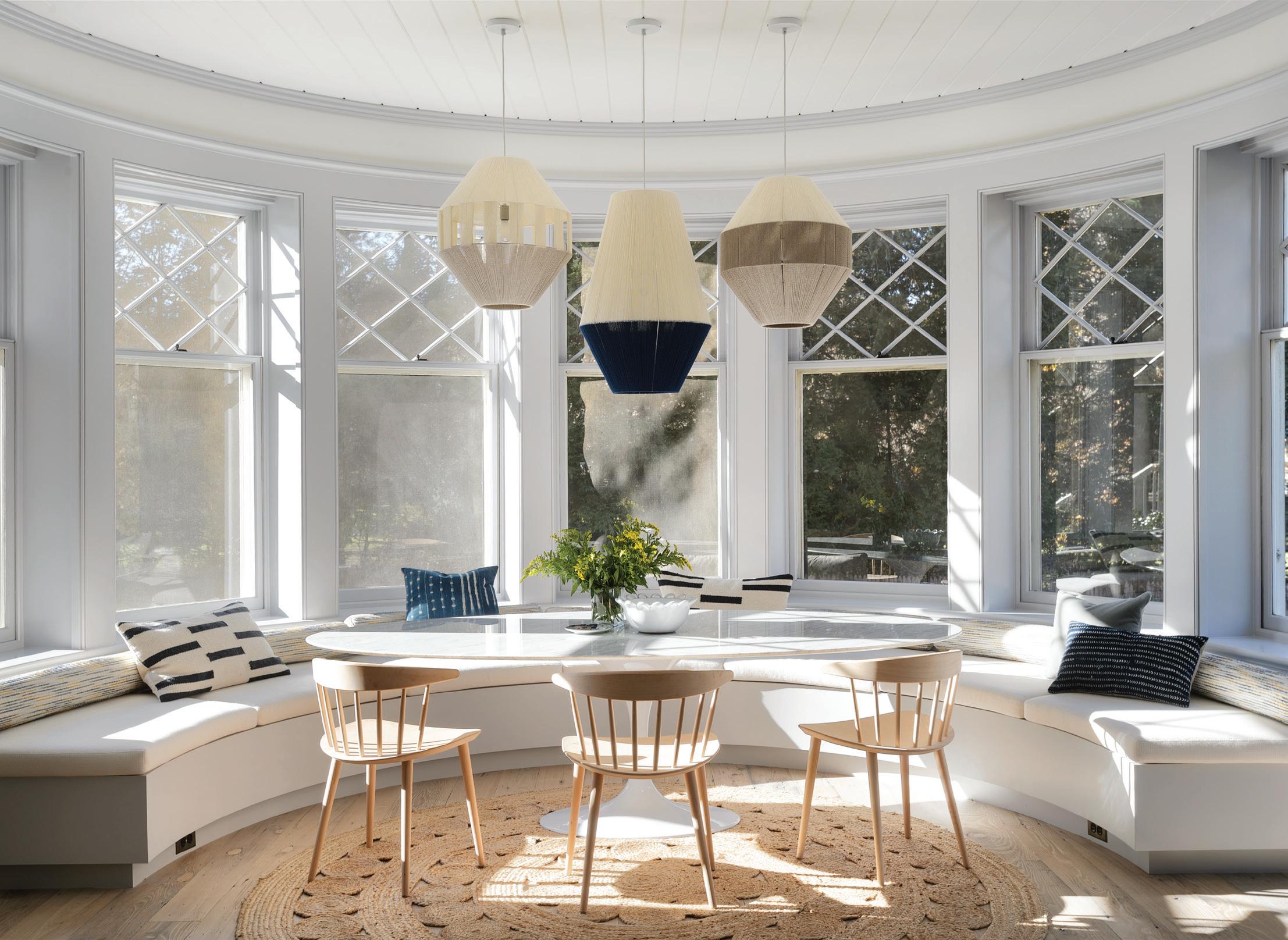
above: Studio DB selected an NJ Modern oval marble dining table with Jørgen Bækmark’s wooden J104 chairs. Pop & Scott monochromatic Dream Weaver pendants hang over the dining table. right: Wicker chairs from The Line surround a brass side table from A+R store. Two gold Allied Maker Bastion sconces decorate the wall above the fireplace.
MAR/APR 2023 45
“They wanted to bring their new york sensibility to the new place , but they loved the bones of the house.”
—damian zunino
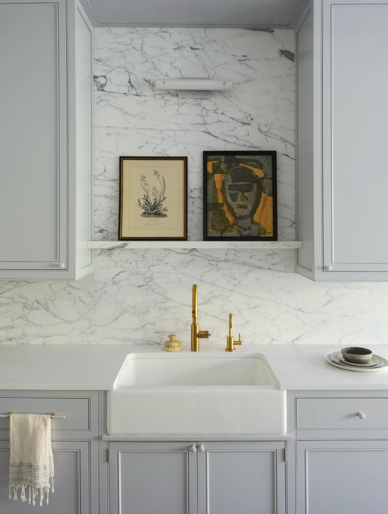
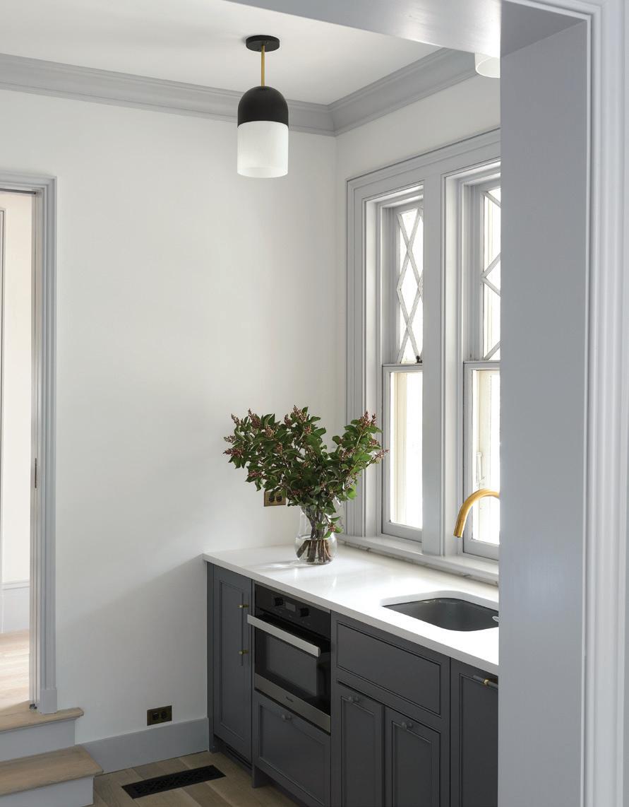
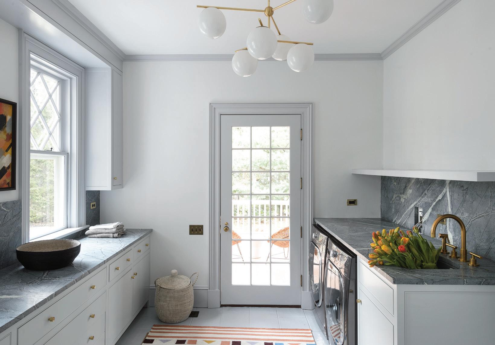
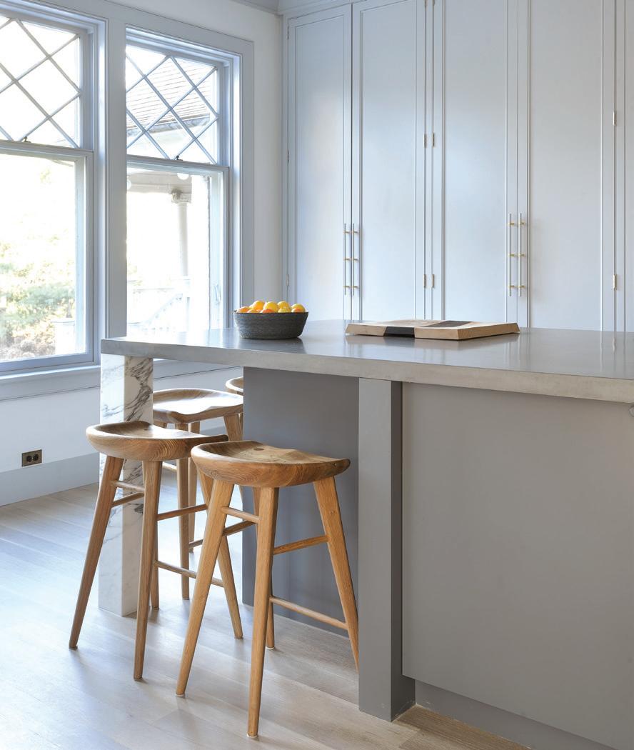
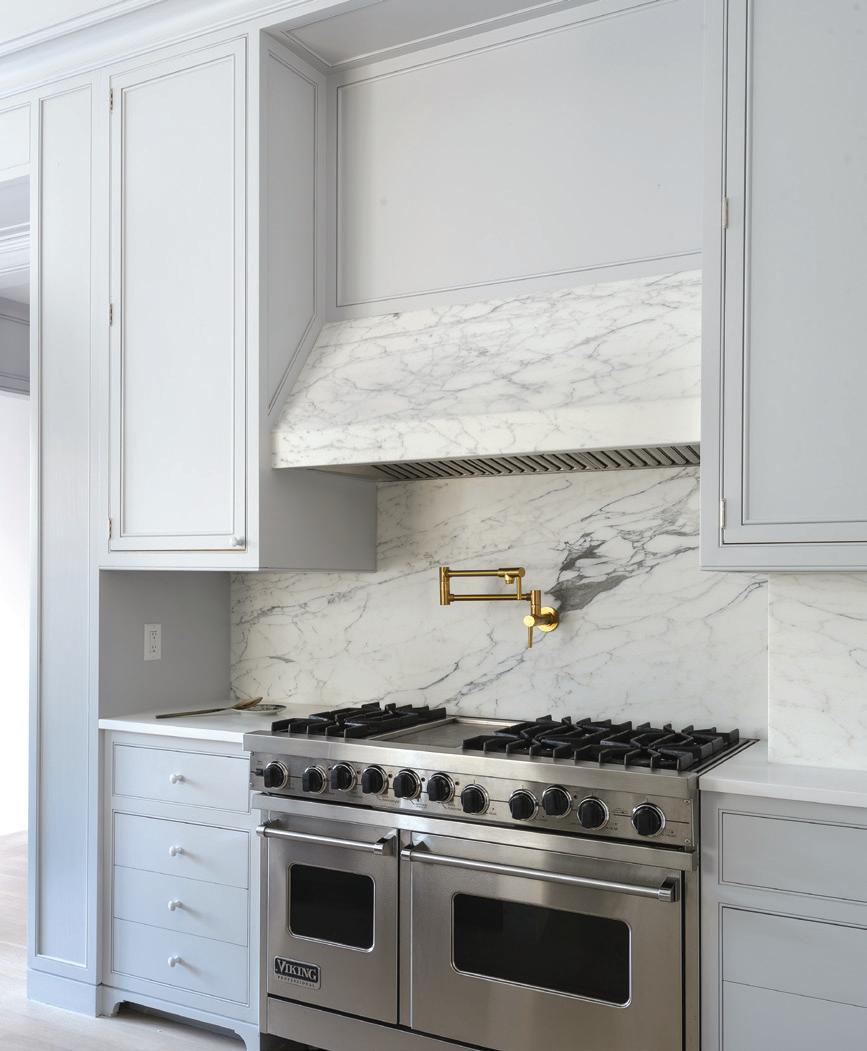
top row, right: Oak stools pull together the light gray island in the kitchen. top row, middle: Art leans on the matching marble shelf, which floats over the kitchen’s brass sink. top row, right: A Statuario Tucci marble backsplash and gray cabinets contrast the gold hardware hovering above the silver stove. bottom row, left: The pantry features cabinetry in a darker gray shade than the rest of the kitchen. bottom row, right: A white and gold Cedar and Moss Opal pendant matches the Richard Watson brass pulls.
If this had been a smaller space, would your approach have been different?
BZ: I don’t think so. I think we usually try to have at least one room where we convince the client to go a little darker, even if it’s a small house, or even if it’s just isolated in a bathroom somewhere. I think it’s fun to do that.
DZ: We like to embrace the juxtaposition and tension between the traditional detailing of the house with contemporary furniture and lighting. We really like that balance. Having a room like the library makes the furniture more exciting, and that makes the traditional detail in the house read more, too, as opposed to it all being from the same exact era. And I think the same applies with the paint choices. Having a bold room makes the light rooms feel lighter and makes the bolder room feel more dramatic.
The staircase in this home is breathtaking. Did you center the design around this architecture in any way?
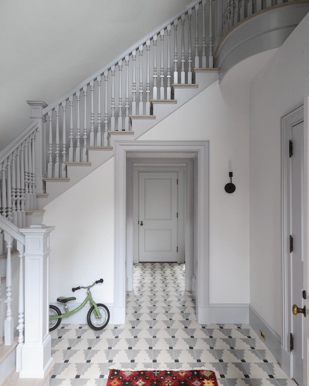
DZ: The family that lived there previously had this great triple-height staircase. There was a lot of dark wood but no furniture. It was this large, special space, so we wanted to activate it. One of the ways we did that was with this dramatic David Weeks light, which was very challenging to install in a 40-foot-tall space. It’s visible from all the levels and creates volume within the space. It’s truly a sculptural, artistic piece.
BZ: The staircase and atrium were painted a dark, mossy green.
DZ: We really tried to lighten it all up. It has light coming in from different sides, so we wanted to embrace the lightness of it, the volume of it, and the way it connects all the levels. Then we designed this round, multi-directional sofa and used a more dramatic rust color. BZ: At one point, we considered changing the railings and modernizing it, but we ended up deciding against it. We gave it a uniform color so that it’s more about the silhouette and less about the finish.
We love the light fixtures in every single room. Tell me about how you chose them.
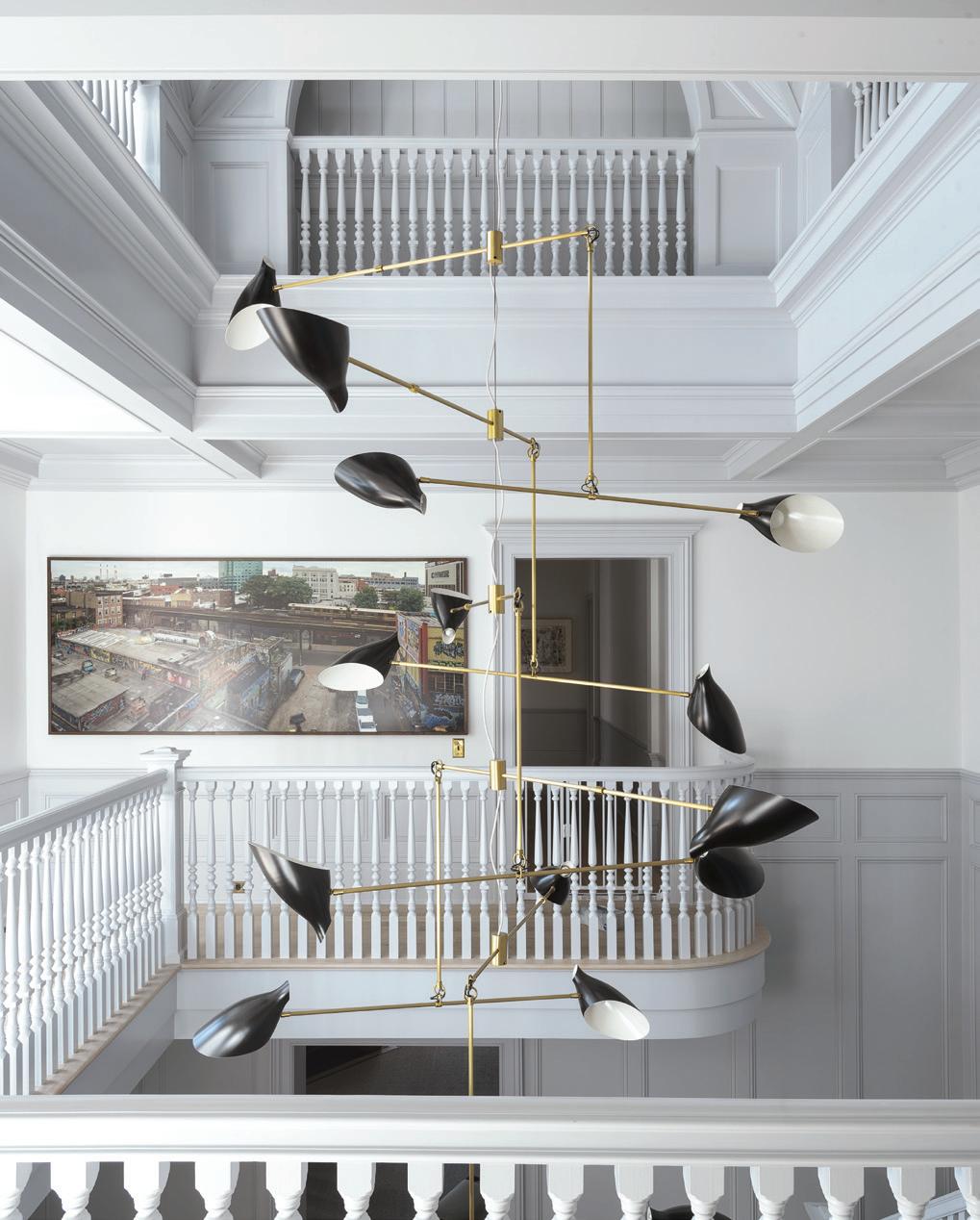
BZ: We work with families a lot. We normally select lighting fixtures that children won’t be able to reach. We do tend to spend more money on lighting for that reason but were comfortable with doing dramatic lighting here, because we were less worried about it getting damaged. We love lighting, and we love interesting shapes, so a lot of our projects usually have some dramatic light fixture.
What was your favorite part of this project? What was your biggest challenge?
BZ: I have a lot of favorites. I don’t think we changed the house too much. We only did major construction on the second floor, where we combined a few rooms to make their primary bathroom. I love that we were able to give the materials and furniture a whole new life for a new family. The kitchen was a big inspiration. That was originally a cherry kitchen. They didn’t want to rip it out, so we adapted it: we kept some of the existing millwork and added that giant, concrete island, which was a feat! That was a challenge, because it’s one continuous slab of concrete.
DZ: The challenges are what make it fun and keep it interesting. Architecturally, the biggest challenge was the primary bathroom. It was previously a bedroom and is directly above the dining room. Figuring out the plumbing and how to structurally reinforce it for the slab and the bathtub was a fun challenge. When you’re working within a new space, it’s
athomefc.com 46
above: A David Weeks chandelier in contrasting satin black and brass hangs in the hall. below: A Cedar and Moss black sconce accents the white and gray detailing on the stairway and baseboards.

MAR/APR 2023 47
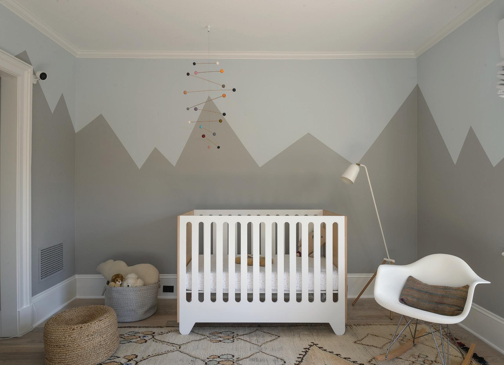
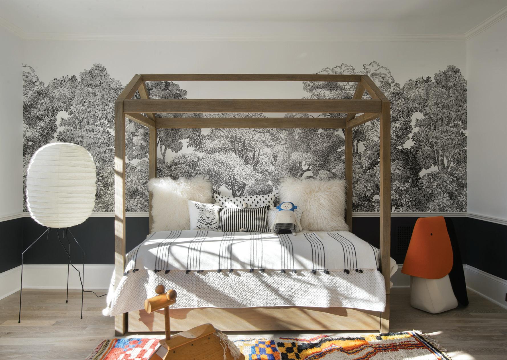
top row, left: A white crib sits atop a detailed Moroccan rug. top row, right: A teak step stool sits below the green sink in the kids’ bathroom. A transparent Object and Light sconce is above the sink. bottom row, left: Pink patterned wallpaper by Quercus & Co. lines the wall. Urban Electric Sconces are beside the mirror. bottom row, right: A white Artware floor lamp keeps things light next to a Restoration Hardware bed. A detailed monochrome Rebel Walls Bellewood Black Toile mural decorates the wall.
always a challenge to expand upon the existing framework.
BZ: It’s like doing surgery on the old part of the home; you have to decide what to take out and what to leave, without it looking like a hodgepodge.
How much of your own experience as parents informs your design plan for a family home?

DZ & BZ: A lot.
DZ: (Laughs) We have four kids. Our oldest is off to college next year. We understand how people want to live. People want their house to feel elegant yet not “dominated” by kids, while keeping everything familyfriendly.
BZ: I think people just live differently with kids. When you have a beautiful home, you want everyone to be able to use it and not worry about it.
DZ: When we’re selecting fabrics, and detailing, and materiality, we know that durability and ease of maintenance are critical parts of that selection process. But equally as important is not making it look like it was designed solely for that purpose. We also love to design kid’s spaces—spaces that are whimsical and fun—and we’ve found that parents love them, too. A lot of the things that are fun for kids are actually fun for everybody. We’re always thinking of how spaces will look in five, ten years.
BZ: Especially because kids age out of things. I think it’s also about having that conversation with clients and encouraging them to put up that coloring book wallpaper—
DZ: Like the wallpaper in the playroom!
BZ: —because it’s not permanent, and you can always take it down a year from now, or in five years. Educating our clients that it’s okay to do something fun and whimsical, especially because kids are only small for a short amount of time, is really important to us.
DZ: And, by the way, that wallpaper takes a very long time to get through! We’ve had the same kind up in a family vacation home for nine years, and only about one quarter of it is colored in!
BZ: It’s also important to keep in mind that kids are always going to want to be where the adults are, anyway.
DZ: And family is about being together, at the end of the day.
interview by veronica schorr
Resources:
Interior Design & Architect: Studio DB, New York, NY, 212-608-6379; studiodb.com
General Contractor: Hobbs, Inc, New Canaan, 203-966-0726; hobbsinc.com
Specialty Painting: SR Painting Inc, Norwalk, 914-413-6727
Plaster: StoneCreek Studio Decorative Painting, Wilton, 917-669-8740
“It feels like this project is true to the identity of our firm , while also feeling like home to our clients.”
—britt zunino
athomefc.com 48
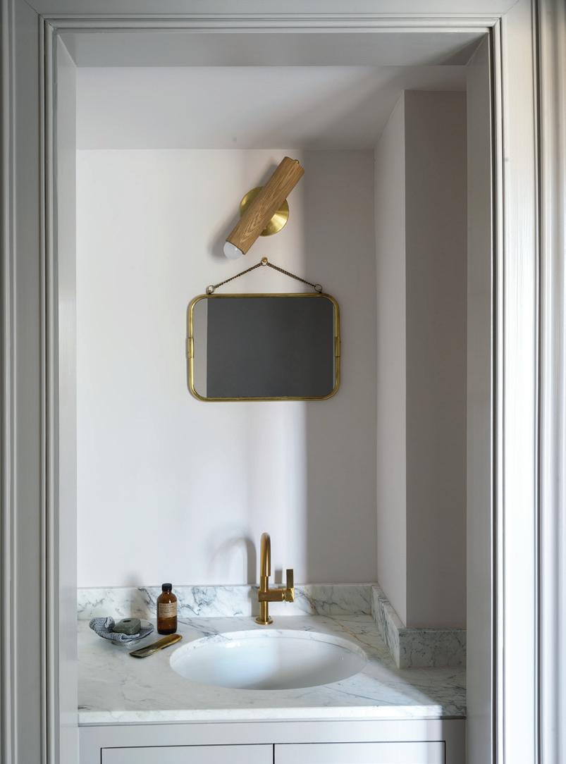
this photo: Black and white photos line the wall, coordinating well with black sconces and gray and white trim. right: An aged brass sconce from Apparatus matches the Newton Decorative Hardware detailing on the sink in brushed brass.

MAR/APR 2023 49
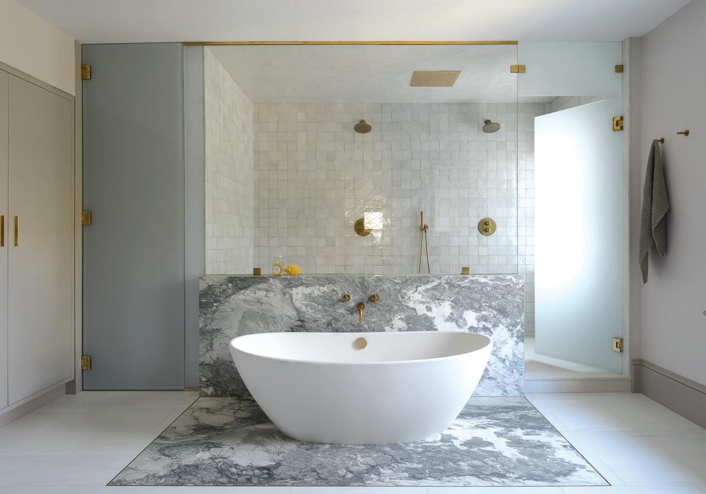
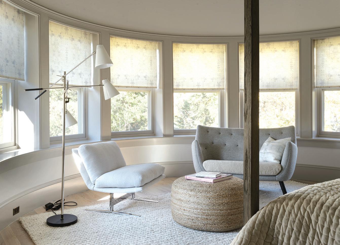
above, left: In the primary bathrom, a white freestanding tub stands out against gray marble and gold brass fixtures. above, right: A Holland & Sherry upholstered lounge chair with a House of Finn Juhl sofa is paired with a CB2 pouf. A white Design Within Reach floor lamp sits in the corner. Blindtek Designer Systems rolling shades with sheer lining soften the room. this photo: Apparatus aged brass sconces sit on either side of the primary bathroom’s mirrors.
palette cleanser
calla cane brings her signature neutrals and the nuances of nature indoors for a lighter, family-friendly home
 interview with calla m c namara, calla cane // photographer carina skrobecki
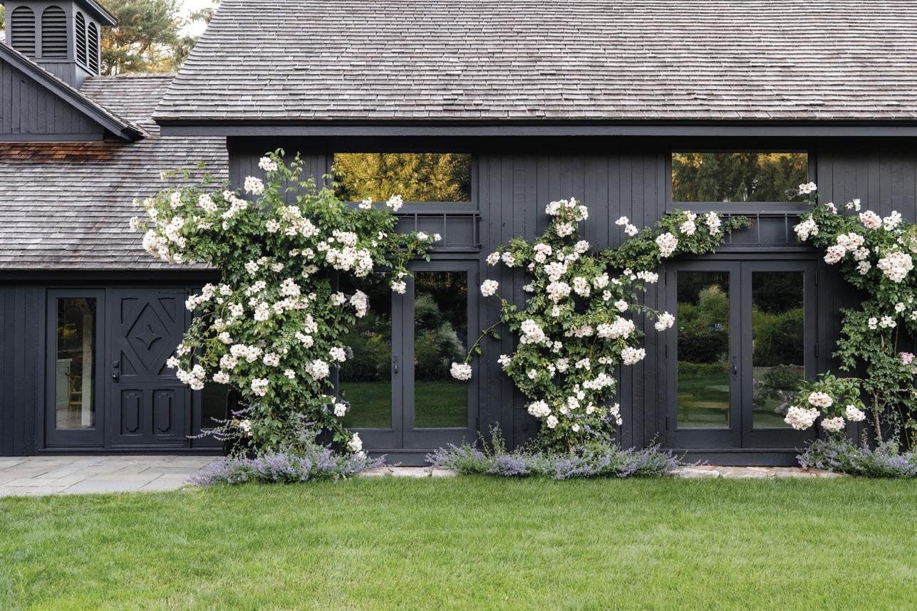
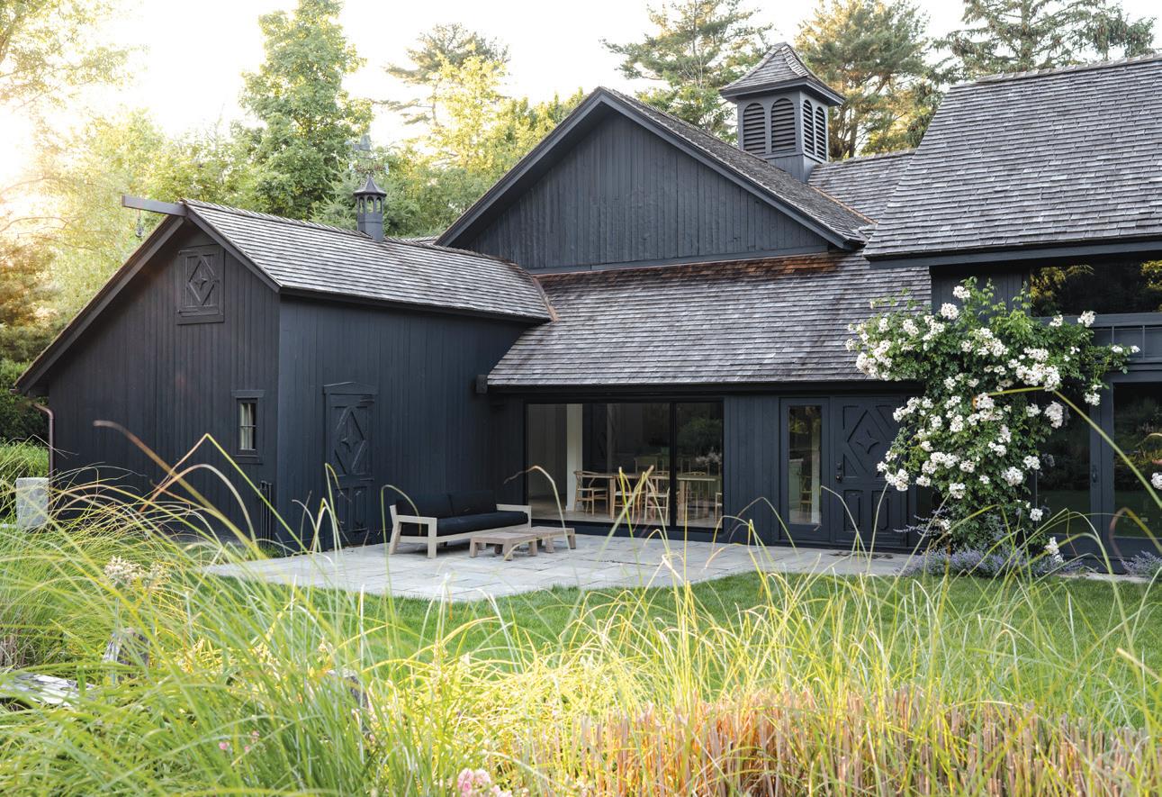
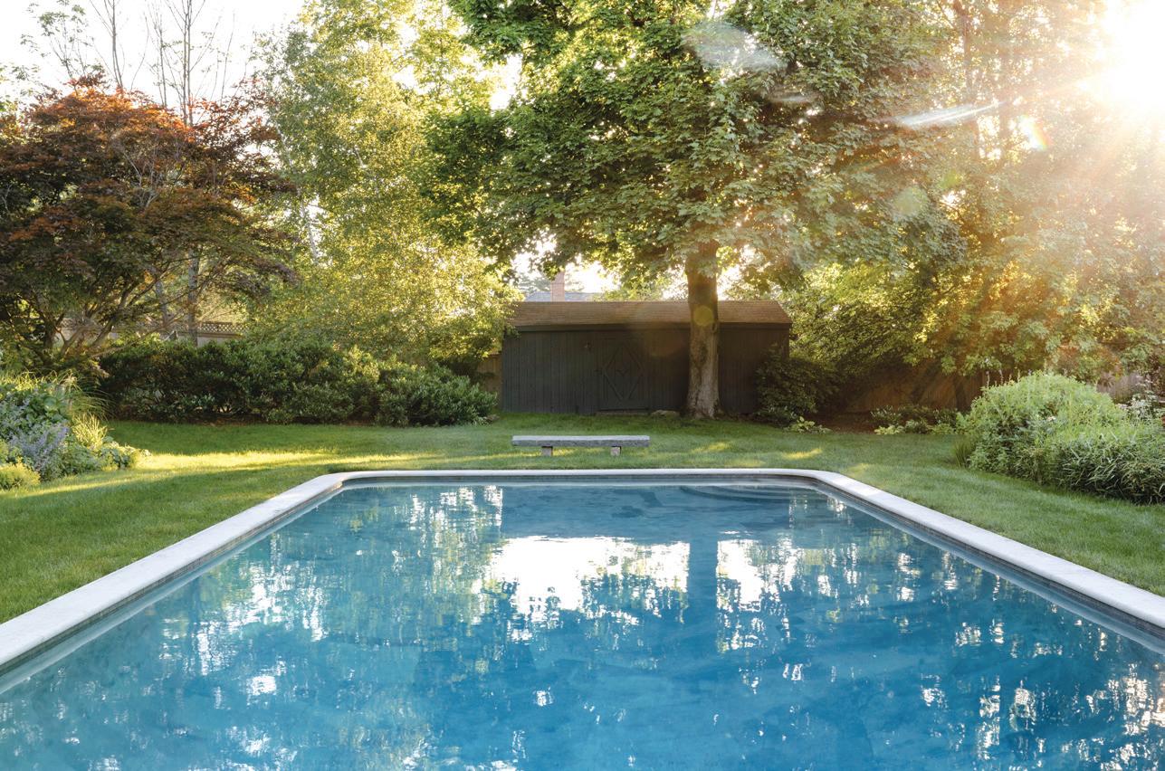
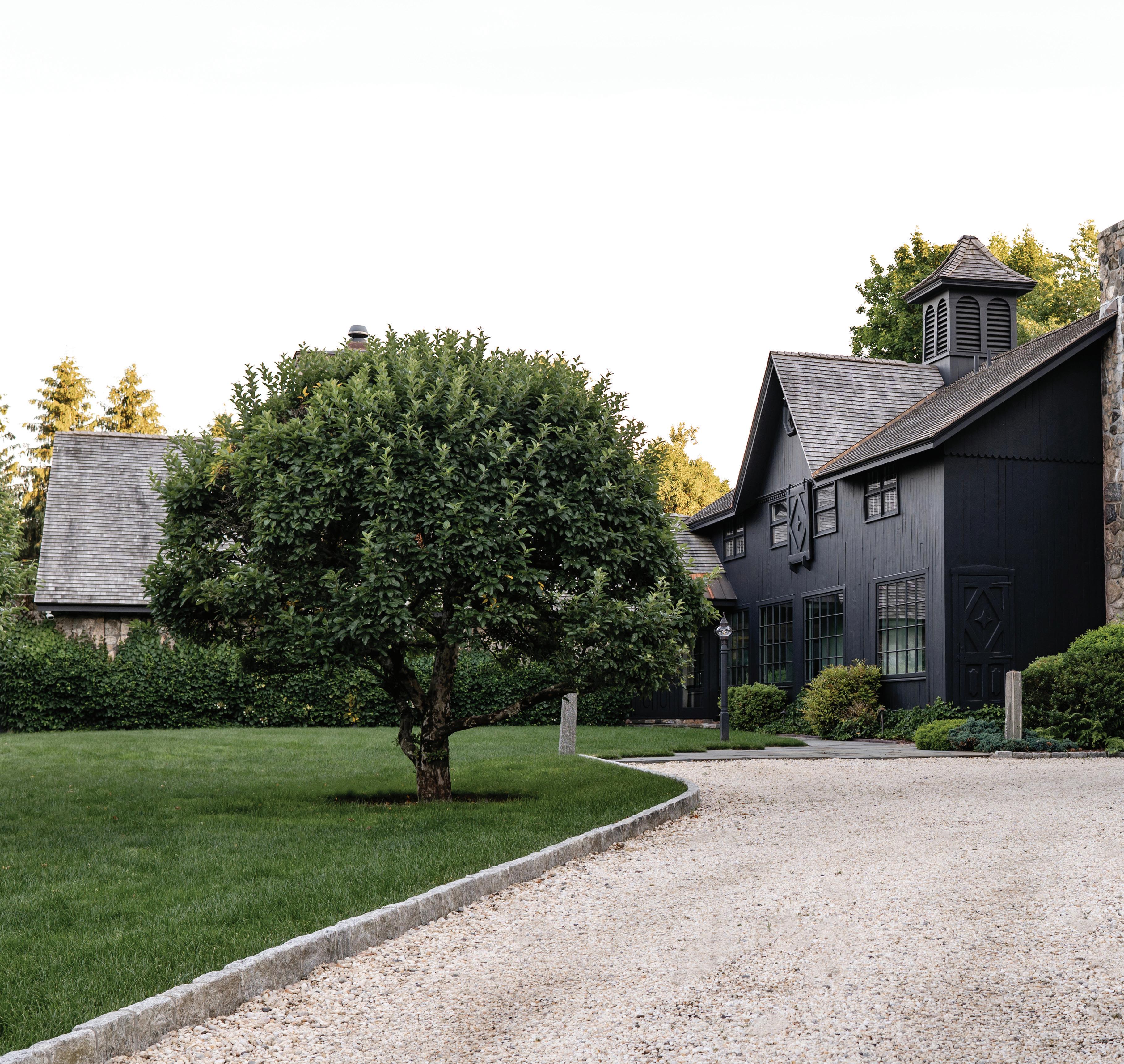
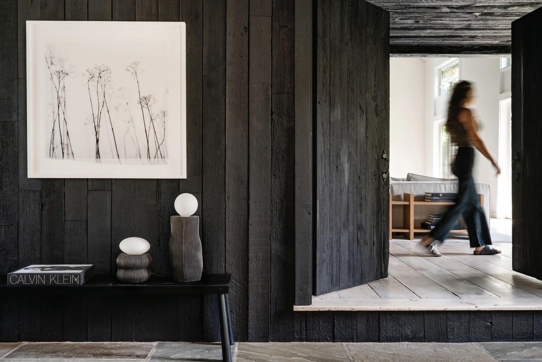
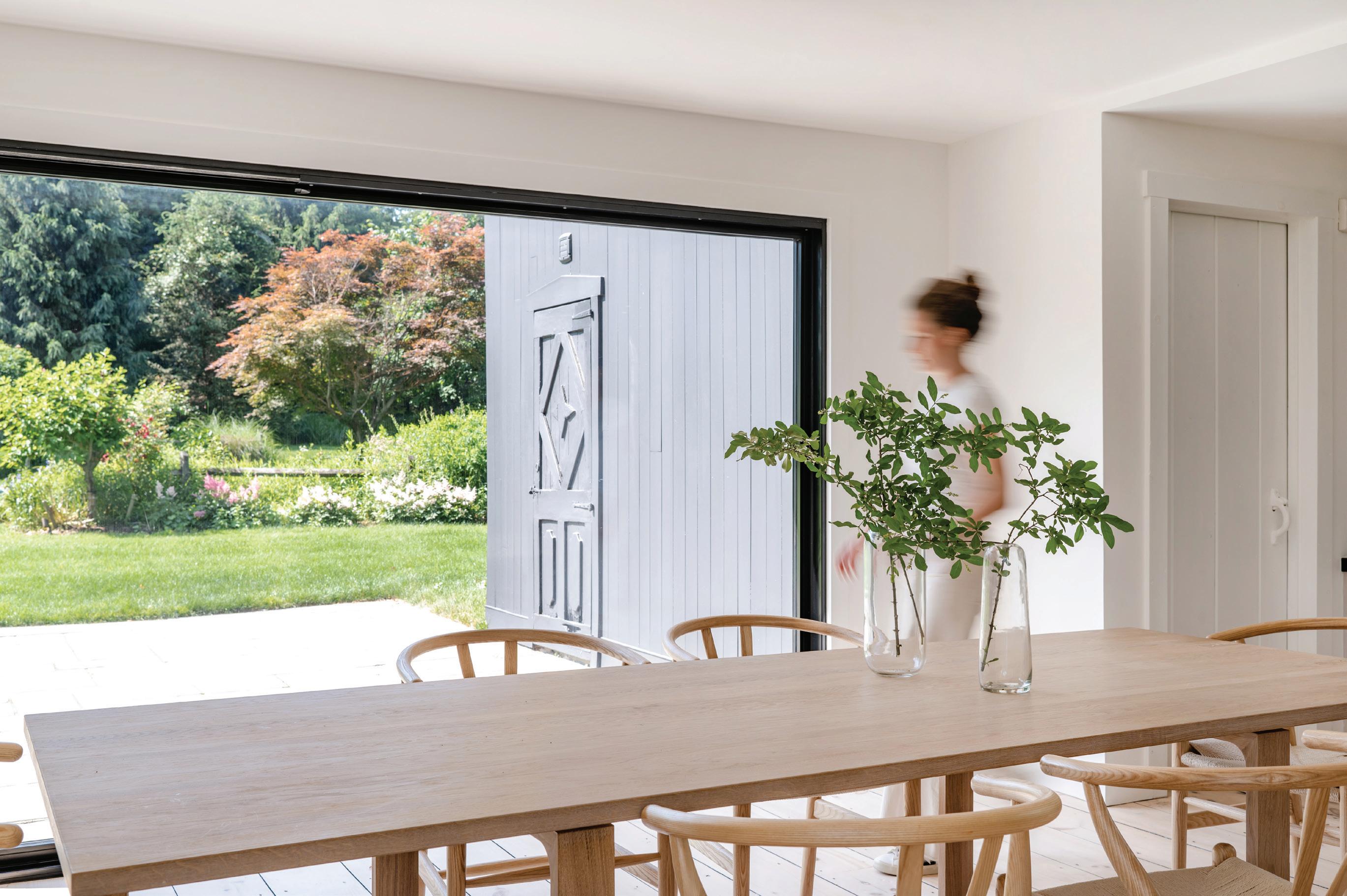
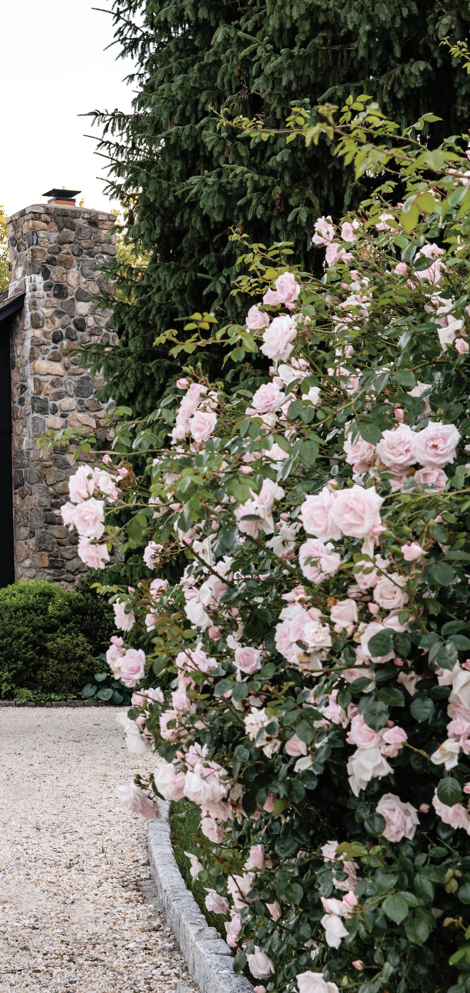 above, top: The exterior slider was replaced with a custom metal sliding door. above, middle: The pool is encompassed by English gardens and wisteria-covered arches. above, bottom: Climbing roses planted by the previous owners bloom in early spring. left: The exterior of the 1800s converted barn was painted black.

What was the initial direction of this project? Did the final destination change over time as your work progressed and as the client responded to the transformation of their space, or was the focus steady?
The owners purchased the property during the pandemic. They gave us a strict, three-month timeline to renovate, furnish, and hand over the home. They wanted the home to feel lighter and more family-friendly for their three young children; a place centered around the idea of family gathering together and relaxing. The vision for this home was clear to us on our initial walk-through. With such a tight timeline, we needed to make all of
the major design decisions on the first day. We coordinated with Kramer Lane Construction to have all trades on site for the walk-through so that everyone was ready to hit the ground running immediately after closing. Our biggest challenge was the timeline, but we were lucky enough to be collaborating with a team that we have worked with in the past, so the process was relatively seamless.
What were some of the client’s non-negotiables (if any)?
Their main goal was to lighten up the home and make it feel familyfriendly and durable for their three kids. We focused on incorporating
MAR/APR 2023 53
above: The original accordion doors were replaced with a large custom slider, providing uninterrupted views of the backyard. opposite page: The entry wood was stained black, bringing forward the texture and creating a visual transition between the great room and the kitchen. Art is by Cas Friese.
“When you really begin to study the art of charm , you realize it is often the result of natural materials weathering the years and their inhabitants together.”
—calla m c namara
stain-resistant materials throughout. They had seen our work before and felt confident in our design direction, so they were relatively hands-off, which made the big reveal even more fun!
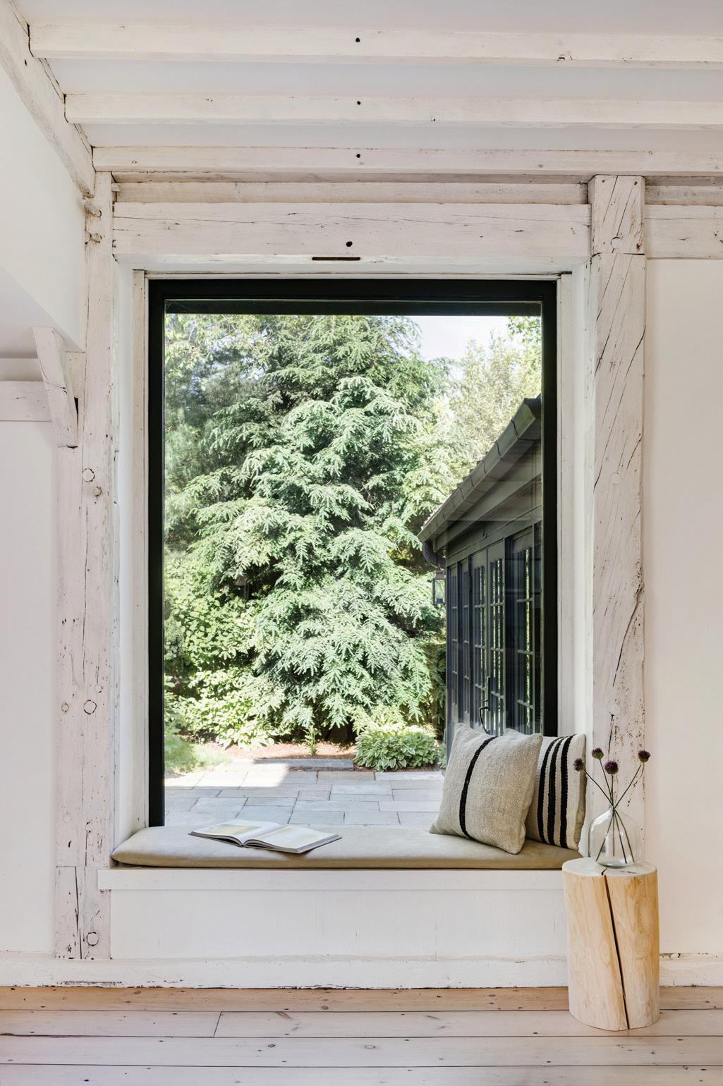
That window seat in the kitchen is one of the most beautiful ones we’ve seen lately. How did that nook come into being?

The window seat was pre-existing and a main focal point in the kitchen. Our goal was to let your eye wander past the glass and bring nature into the space. We removed the existing window grills, painted the frame of the window black, and stained the existing antique wood to a light, Swedishinspired palette. The dark frame draws your eye to what is just beyond it. Rather than calling your attention to the cushion with a pattern or strong
fabric, we finished off the bench with a simple and durable vegan suede.
Can you speak to this concept (bringing the outside in, and/ or the inside out) and how it influenced your design choices?
The property and the original structure of the building had such inherent charm; we knew it was our job to carefully edit the interior finishes and help to curate the exterior views. The original home was beautifully done but had an Americana, barn-inspired interior. We felt that the seriousness of the interior finishes was at odds with the playfulness of the outside landscape. The homeowners talked about how important it was for their city kids to have a yard to play in, as they had especially enjoyed watching them run through the garden on their initial visit to the home.
athomefc.com 54
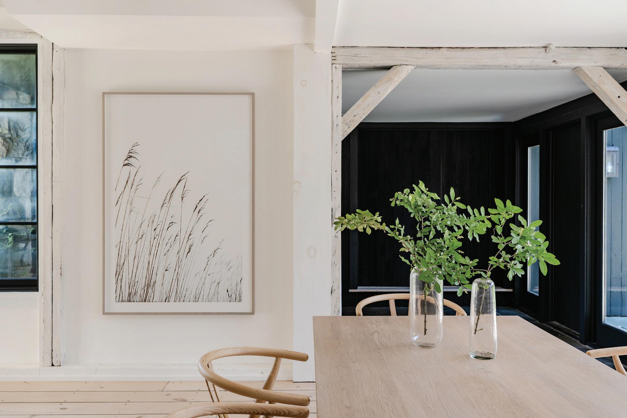
above: Kid- and kitchen-friendly fabrics were used on the window seat cushions and counter stools to create an inviting space for everyone to gather. opposite, top: Beautiful beams of varying woods were finished with white stain and are a perfect transition (and backdrop for more Cas Friese art) into the black-stained entry. opposite, bottom left: The existing window grills were removed, and the frame of the window was painted black. opposite, bottom right: The hallway highlights the contrast between lightened floors and darkened windows.

MAR/APR 2023 55
athomefc.com 56
“I think all homeowners want to make their new space feel like home. they want it to feel fresh but also familiar .”
—calla m c namara
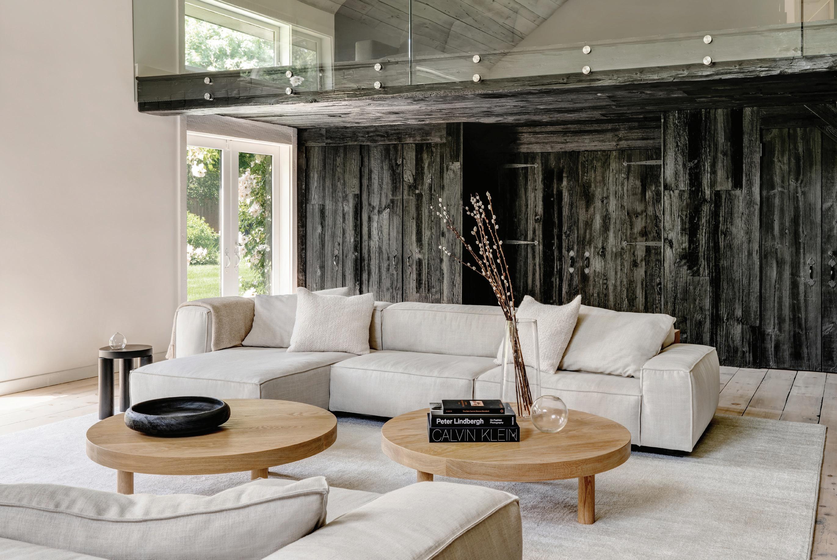
The different wood treatments in what was once a classic barn are unexpected. Tell us about your vision there. There were so many eye-catching elements in the interior of the home, including a variety of different woods; some old, and some pretending to be old. We worked to create a soothing blend of finishes that allowed some of the texture to melt into the background. We knew that each piece would stain differently, so we had to be thoughtful about how to treat and layer the different pieces of wood to avoid ending up with something that felt inconsistent or unfinished.
This issue is all about transformation. What does that word mean to you as a designer?
I think all homeowners want to make their new space feel like home. They want it to feel fresh but also familiar. When we are brought onto a project, we believe our role is to make the home or space the best version of what it is. So, transformation, for us, is not changing a farmhouse into something that is inappropriately modern; instead, we view it as an opportunity to improve on an existing design and bring pieces of our clients’ lives into the space.
MAR/APR 2023 57
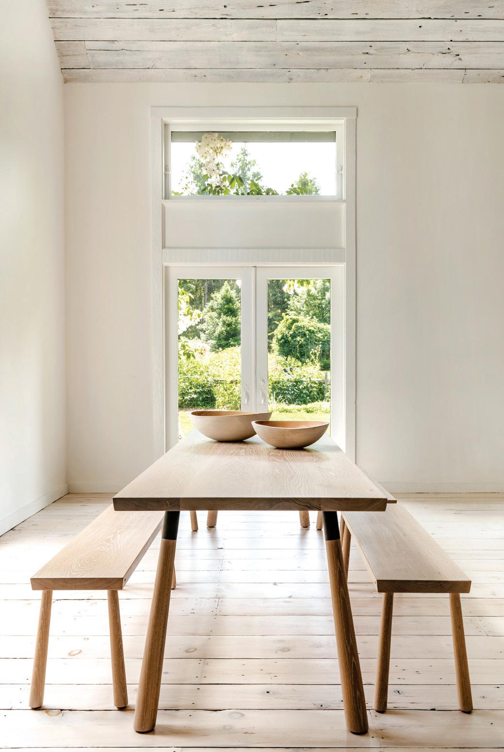
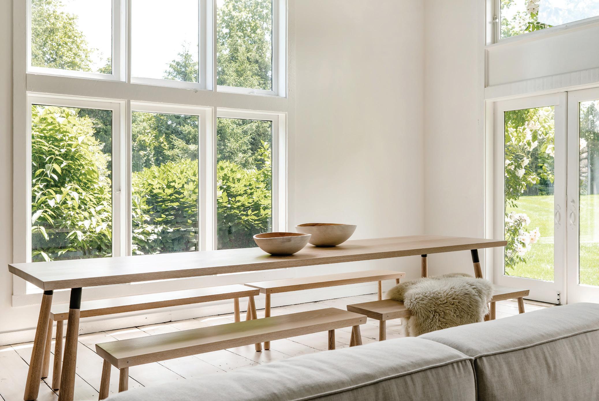
below: The palette of this room was completely transformed from reds and browns to white walls and black-stained wood. The texture of the wood allows natural light to bounce off, creating a silvered look similar to Shou Sugi Ban. opposite, left: Sunshine filters through double-height windows. opposite, right: The barn wood ceiling was painted white to brighten up the great room. opposite, bottom: A simple yet elegant wood table has plenty of room for friends and family, plus an unbeatable view.
By layering different neutrals, you’ve injected an incredible sense of warmth into these spaces. What would you say to someone who is excited by neutrals, but hesitant about using “too much” black, white, beige, or gray in their home?
We are often inspired by nature. The colors we pull on have an organic element to them. Our first instinct as designers is always to find the places you want peoples’ eyes to naturally rest, whether it is an architectural detail, a view, or a piece of art. This project had several architectural features and exterior views that we wanted to capture, and we wanted some of the varying wood tones and texture to be quiet enough to let you see past them. I find that the neutral colors allow you to guide peoples’
eyes to these focal points and create a sense of calm in the space. We believe that neutrals give you space to live. We like to leave homeowners room to introduce pieces of themselves into the space: things like art, family photos, kids’ toys, accessories, and whatever else they choose.
Tell us about the grounds.
The grounds are perfectly idyllic. You approach the house down a long, meandering gravel driveway lined with flowering apple trees. The property is both manicured and natural. Climbing roses cover the backside of the original 1860s barn, and the pool is surrounded by wisteria-covered arches and flowering beds.
athomefc.com 58
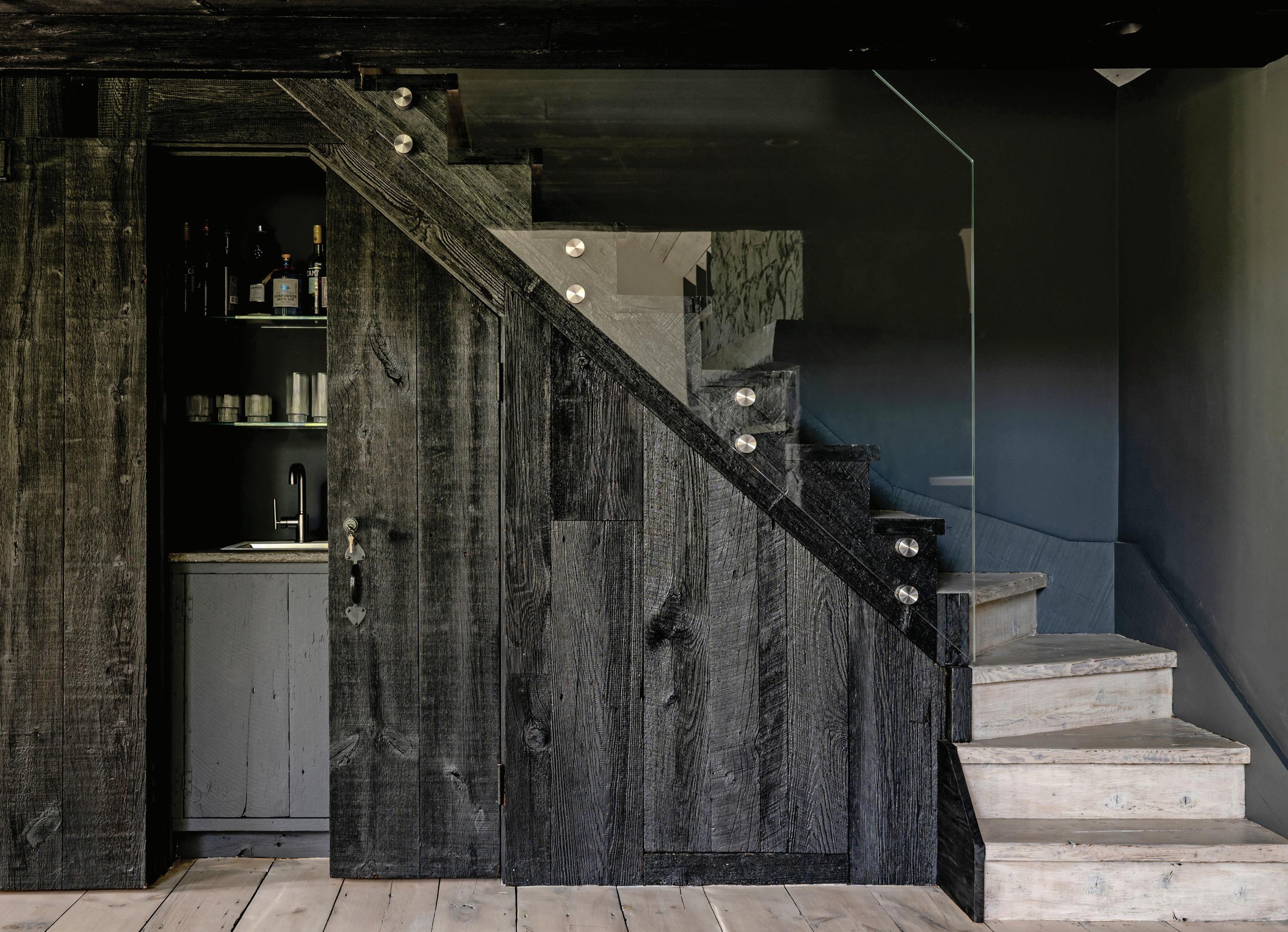
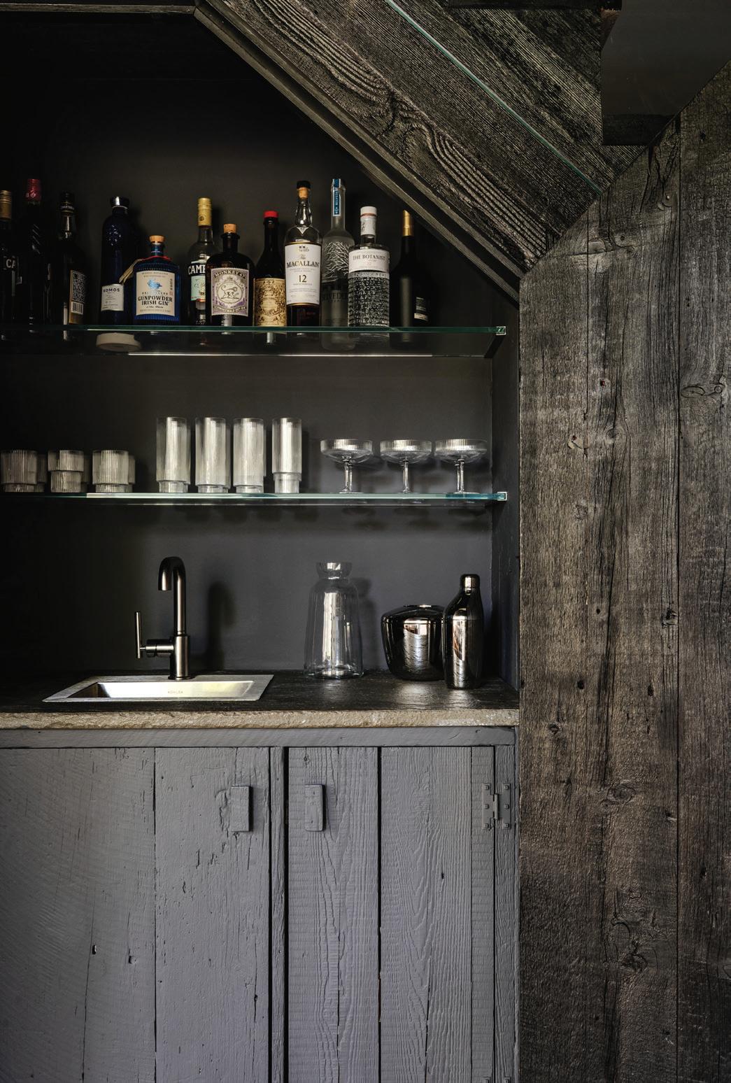
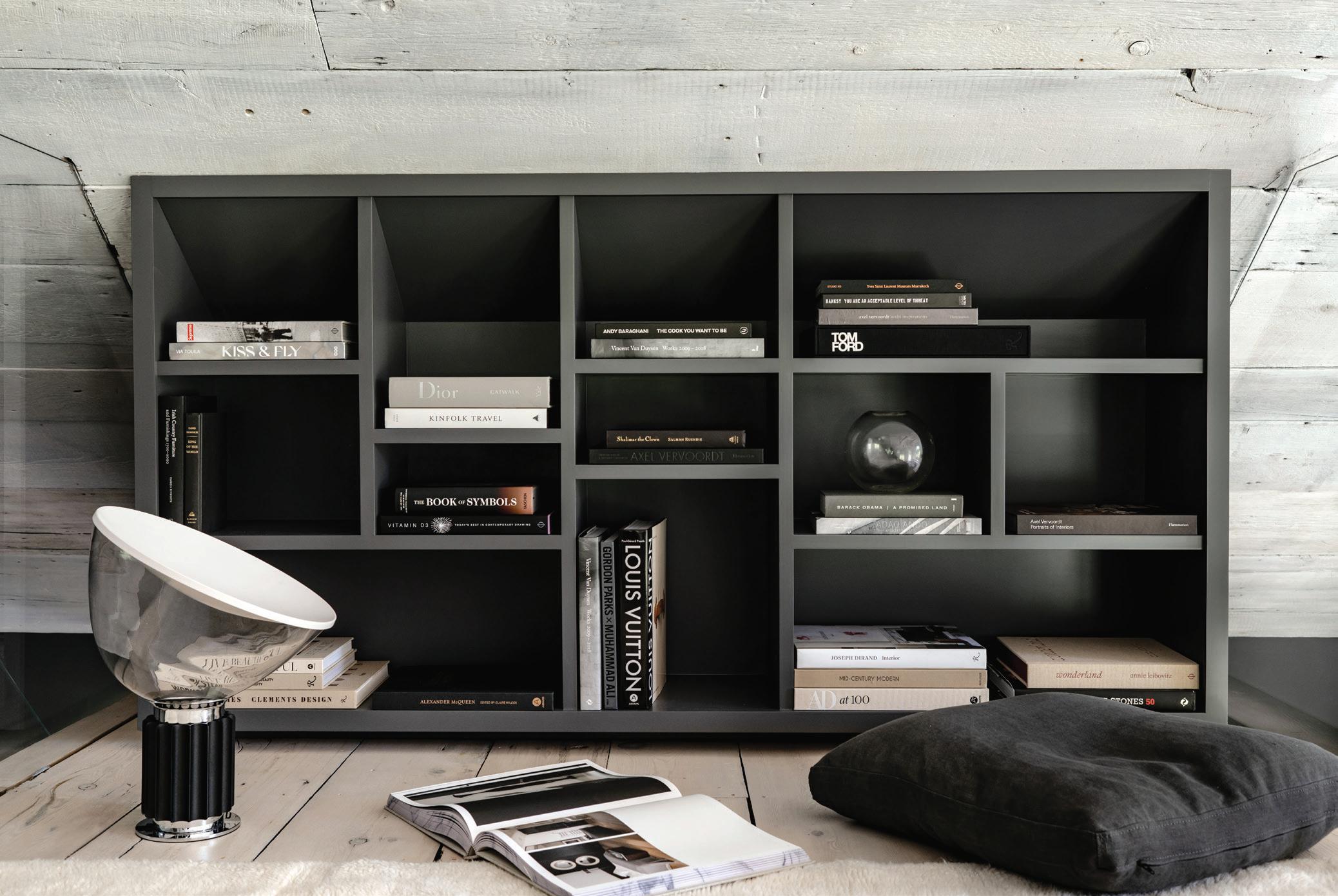
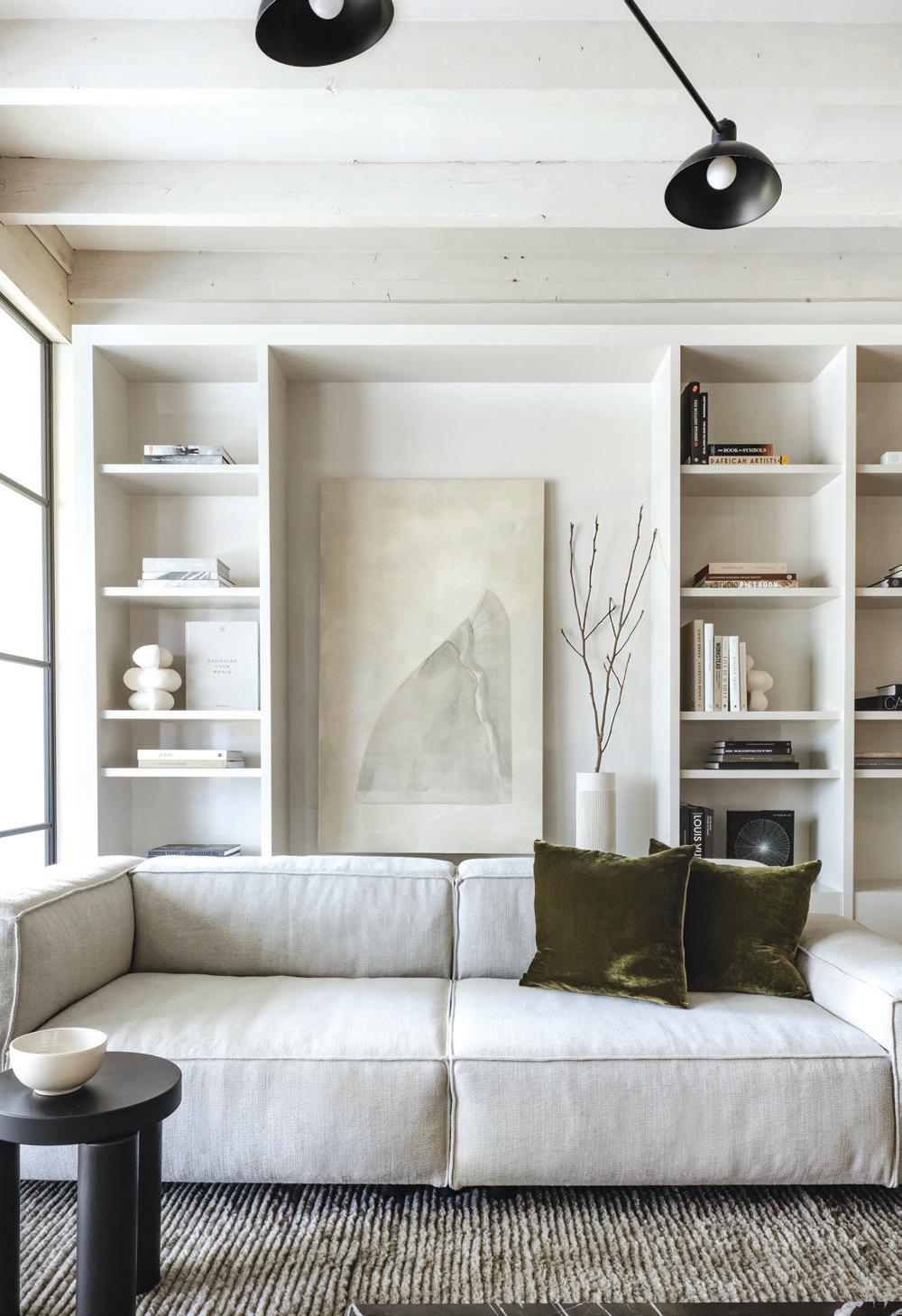
above: The original, red barn wood was stained black, and the staircase was updated with modern glass panels. opposite, top: A closet in the loft was removed and replaced with a custom bookcase to create a cozy reading nook. opposite, bottom left: The stone fireplace was painted, and the wood mantle was stained black. opposite, bottom right: The concealed wet bar was painted and updated with new glasses, shelves, and a new faucet.

MAR/APR 2023 59
“We believe that neutrals give you space to live . We like to leave homeowners room to introduce pieces of themselves into the space: things like art, family photos, kids’ toys, accessories, and whatever else they choose.”
athomefc.com 60
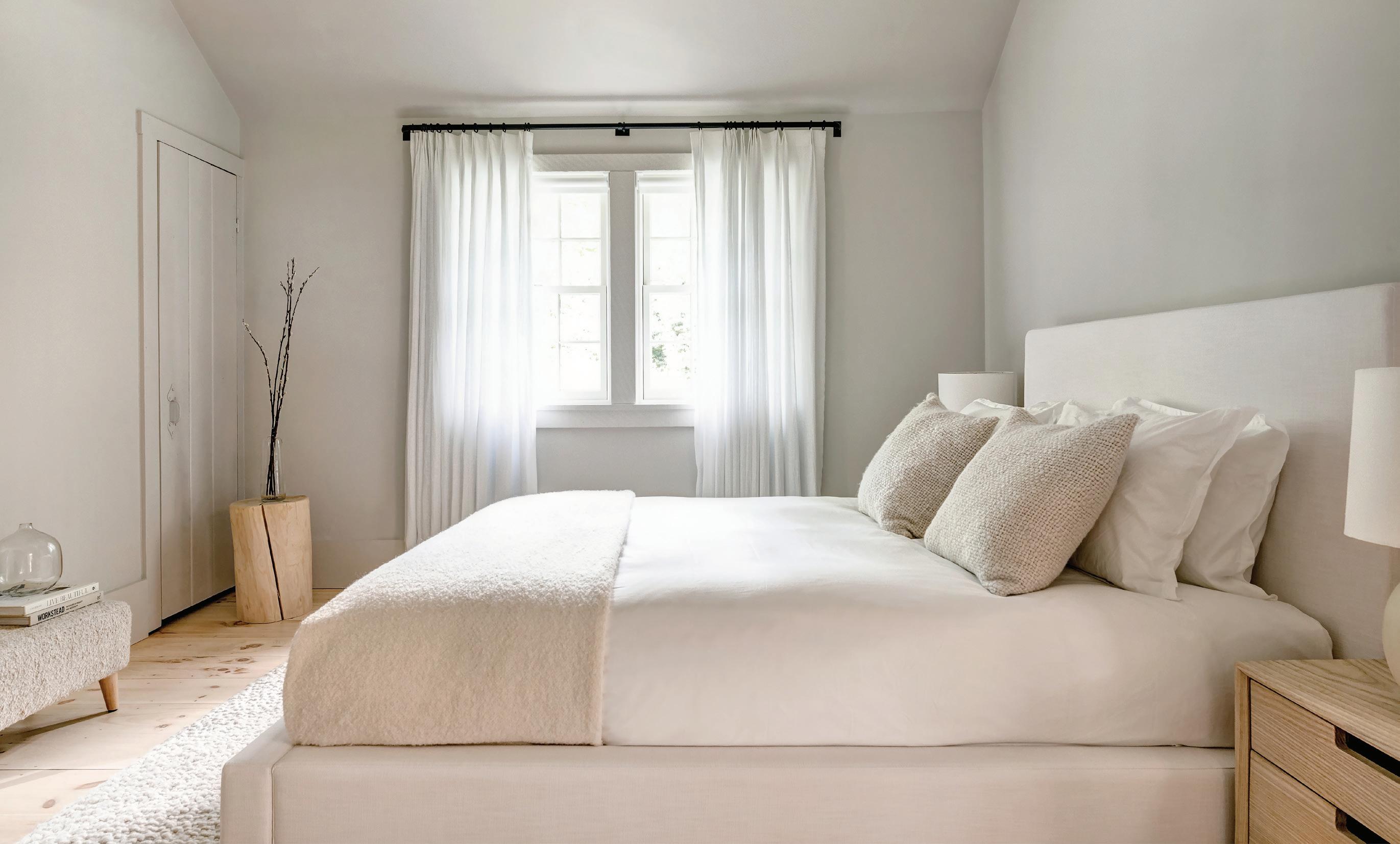
above: The guest room is a simple and soothing space layered with textured fabrics and materials.
—calla m c namara

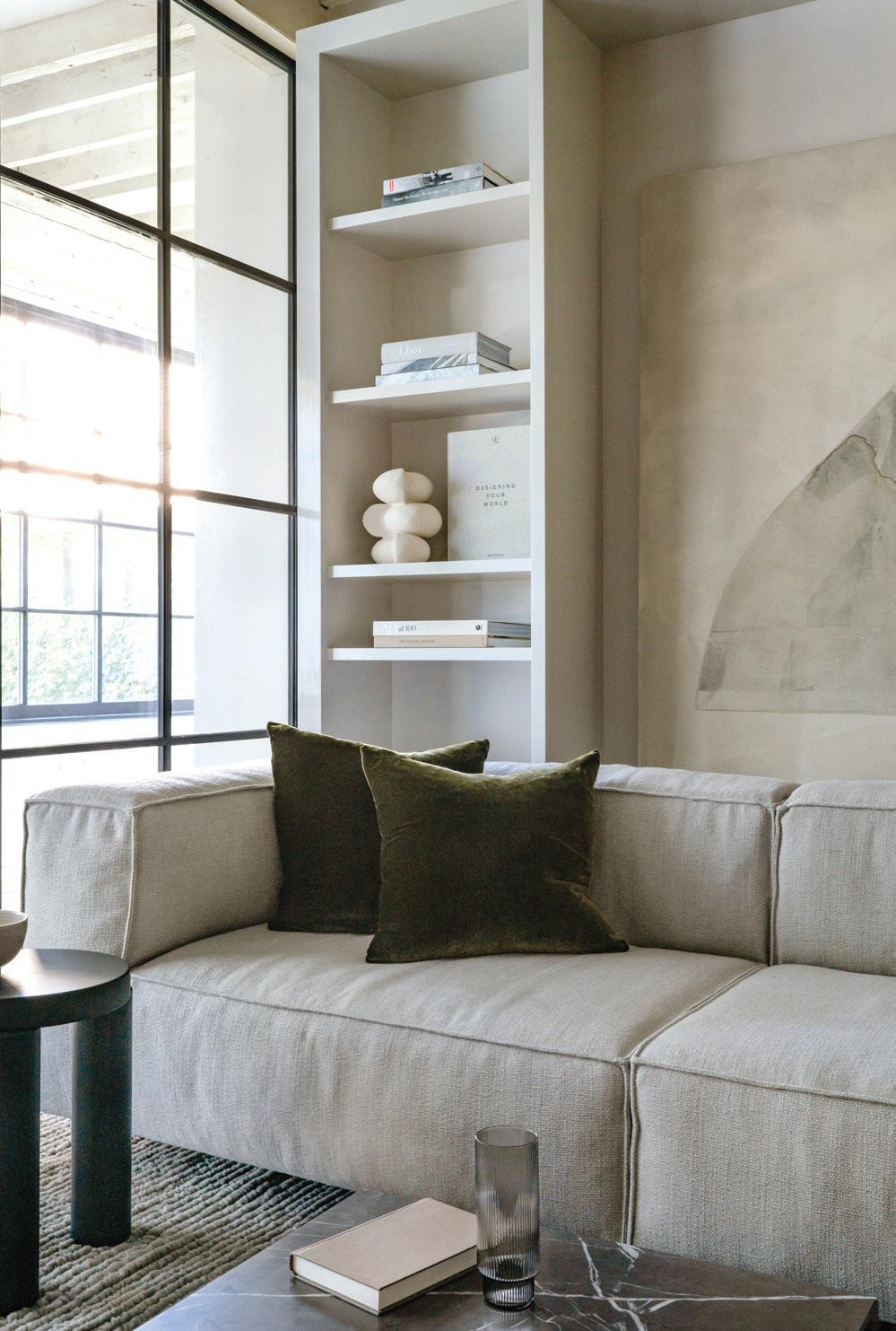
MAR/APR 2023 61
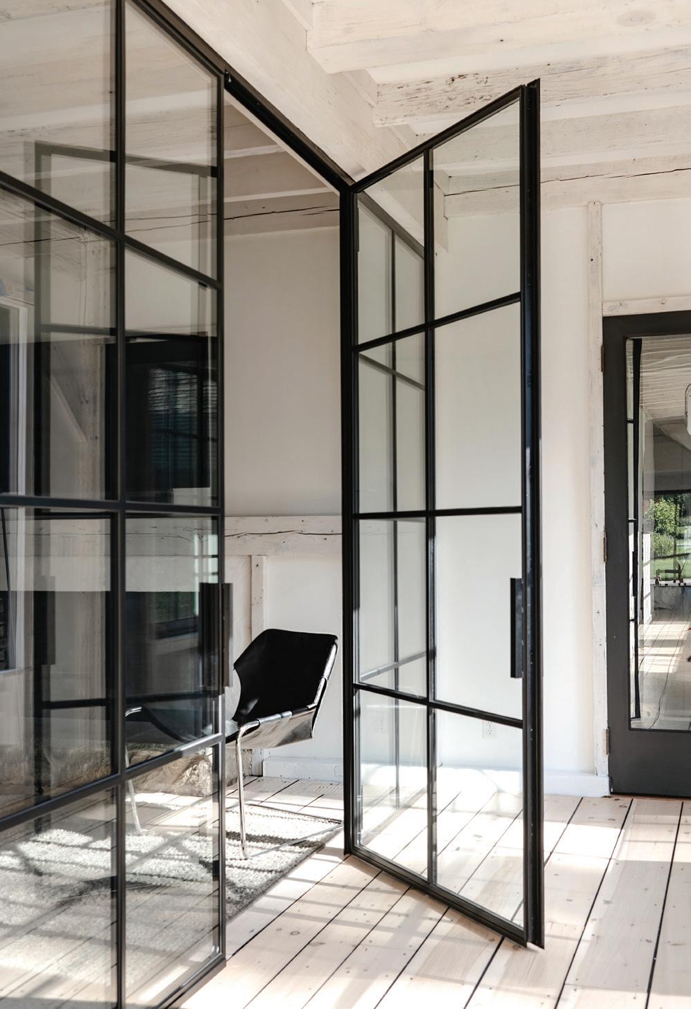
top, left: Steel-framed doors were added to this living room to create a hallway and home office.
top, right: The home office features custom built-ins. bottom, left: Living Divani’s Neo Wall sofa lets the client kick their feet up after a long day in the home office.
bottom, right: Glass doors by Klar Studio help keep out noise while letting in light.

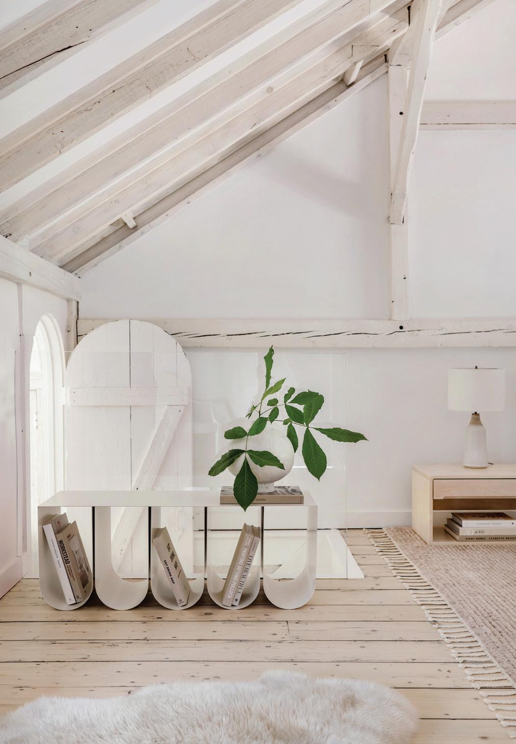

athomefc.com 62
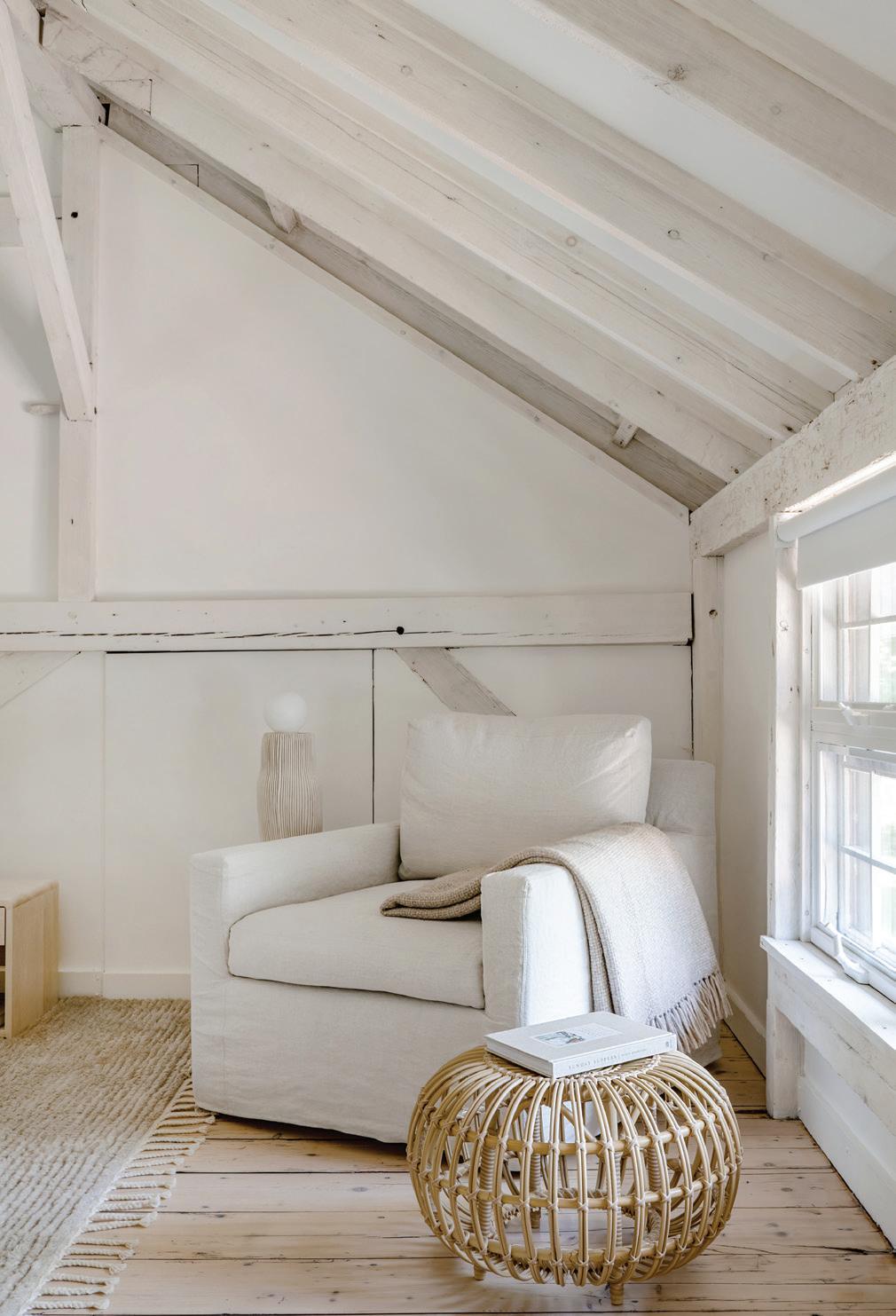
top and bottom, left: The Early American-style stair railing was replaced with a piece of glass, opening up the space and allowing more natural light to pass through the sunken closet. above, right: The colors and textures of the primary bedroom’s furniture play off the colors and textures in the wood beams. bottom, right: A relaxing, sun-soaked reading area in the primary suite.
Having accomplished the very refined and difficult goal of imparting a sense of “slowing down” and enjoyment of the more nuanced details of the home, do you feel as though you’ve done exactly what you set out to do?
I am not certain that we thought about slowing down. I would say that we were focused on appreciating the natural beauty of the home and property, but maybe that is slowing down. We believe that you can always feel when a space has been well-lived-in. As designers, we know better than anyone that you cannot recreate the perfectly imperfect moments that an old home offers. You can come close, but it never fits
together in the way that an old home’s puzzle pieces age together in unison. When you really begin to study the art of charm, you realize it is often the result of natural materials weathering the years and their inhabitants together. We deeply appreciate this type of charm, and we aim to educate our clients about it so that it may continue to exist.
interview by veronica schorr
Professionals:
Interior Design: Calla Cane, Rowayton, 475-208-4888; callacane.com
Build: Kramer Lane Construction, Stamford, 203-515-8541; kramerlane.com
MAR/APR 2023 63
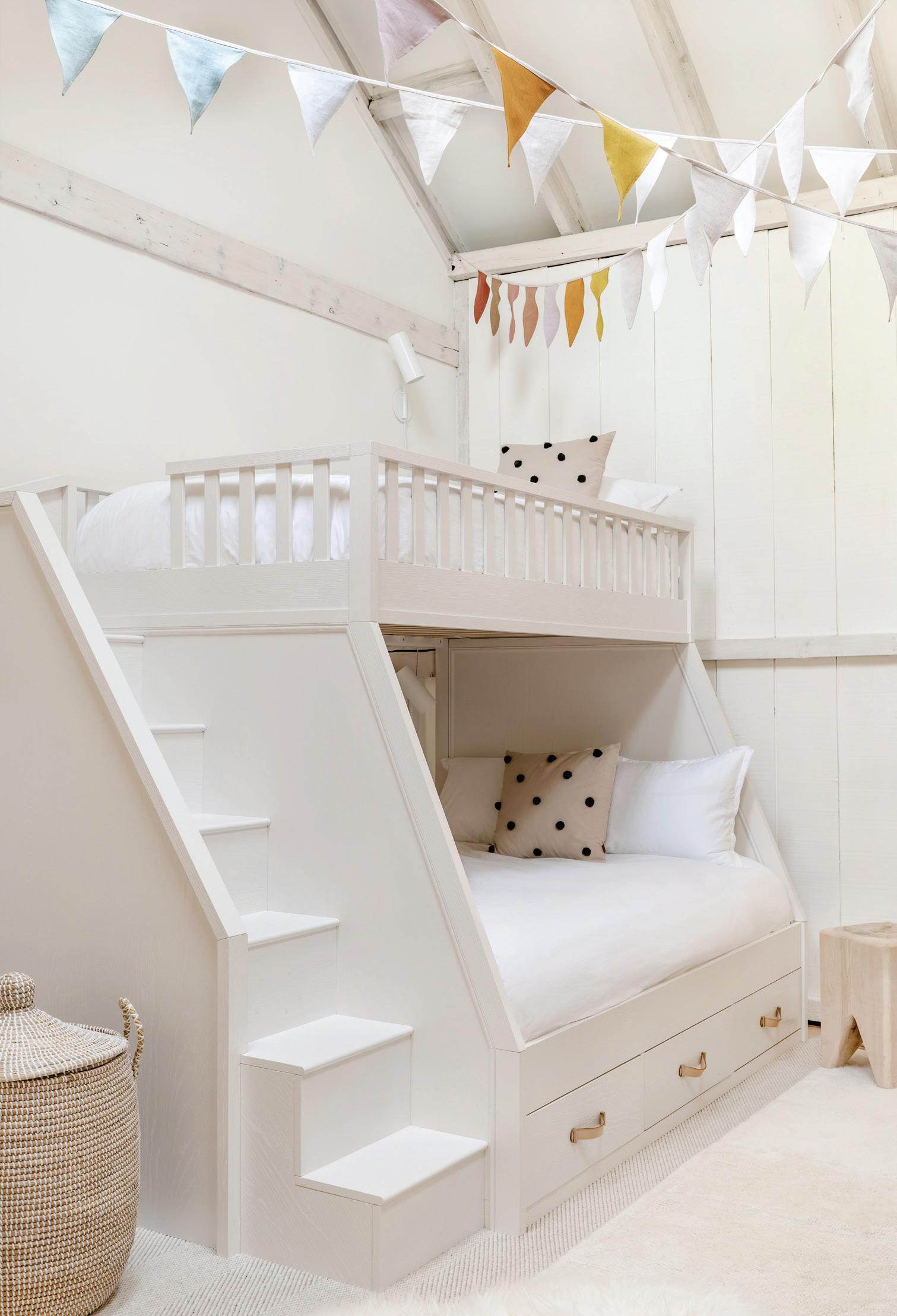
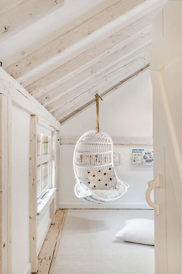
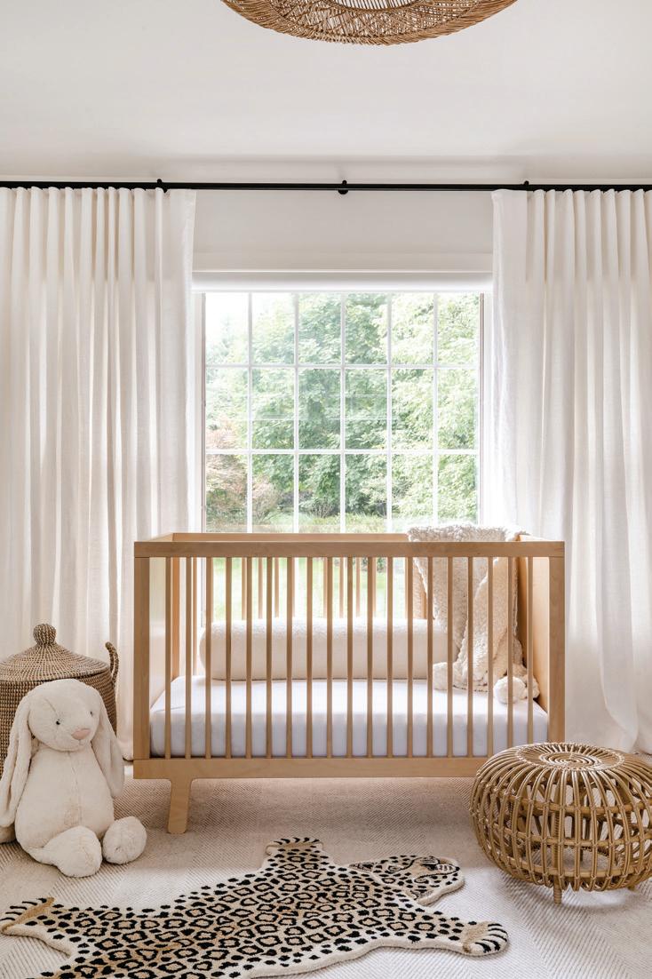
above: Existing wood paneling was stained white, and the addition of bunkbeds updated this space to create a kid-friendly oasis. top, right: Kids and adults will want to hang around this fun and playful space. bottom, right: The light-filled nursery has neutral colors for easy updating (and to encourage calm and restful naps).
CUSTOM
 this photo: The modern farmhousestyle home was designed by Wadia Associates and features large windows to connect the inside of the home to the outside.
BLEND
A designer helps her clients find compromise for a romantic, classic-inspired modern home that’s balanced and bright
 interview with maripi aspillaga, nima design photographer adam kane macchia
How did you approach this project? What were your main goals?
My approach is to think about who is going to live in a space. At the end of the day, the work I do is to provide a service to a family. It’s important to make sure that whatever I do makes them happy. I always try to think of this emotional aspect when I design. Sometimes, something can look nice, but nobody uses it, because it’s not practical or close to where people want to gather. I try to think about where my clients will be and balance functionality with beauty. These clients and I have been friends for a while. The fun part was that they are a couple, and each person has a very different aesthetic! The challenge was to find a happy middle for them.
Who are the clients, and what did they want?
The husband loves the Italian style. He’s very well informed about design trends and isn’t afraid of trying new things. He went to Italy just to spark some inspiration and to gather materials. So, he had a very modern, Italian aesthetic in his head, and meanwhile, his wife wanted more of a romantic, French-modern style. I think that’s what makes this whole thing very special; it was a real collaboration between me and them. They were both very involved in the process and in the design. With these clients, I was pushed out of my comfort zone, working with materials and finishes I wasn’t used to and that I wouldn’t necessarily have thought of.
athomefc.com 66
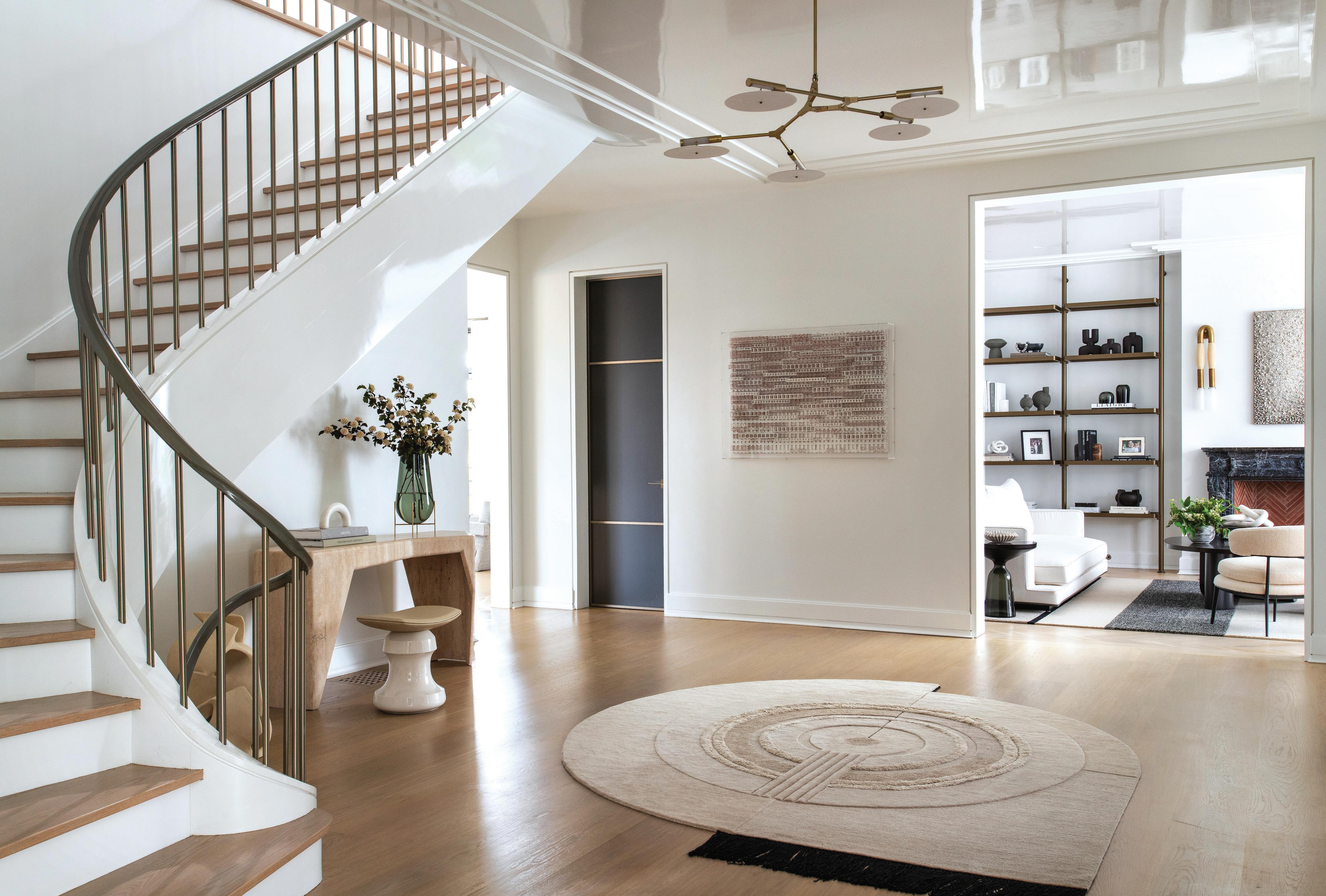
above: The hallway foyer features a curved staircase, high-gloss white paint on the ceiling, and a Lindsey Adelman chandelier.

MAR/APR 2023 67
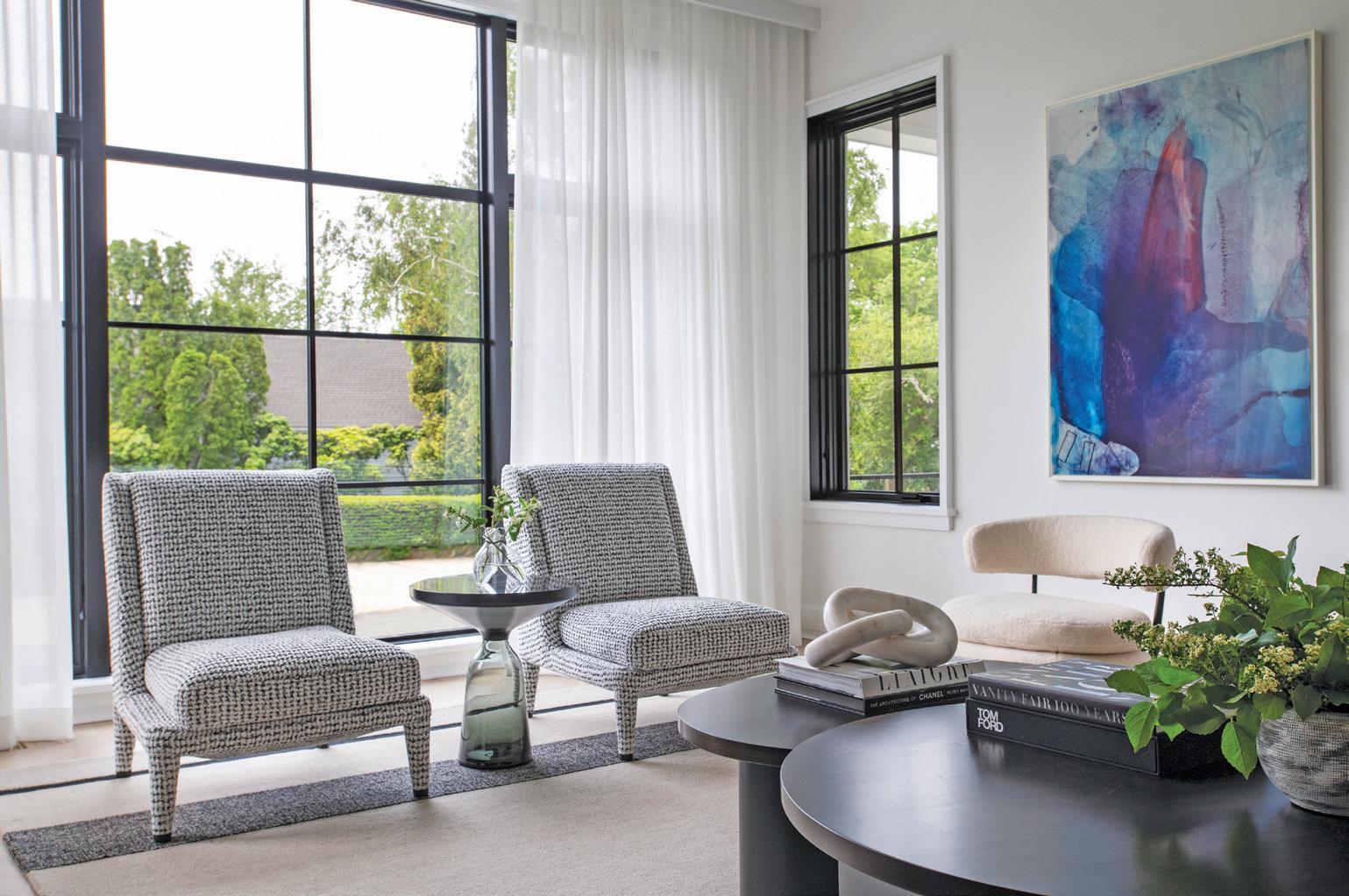
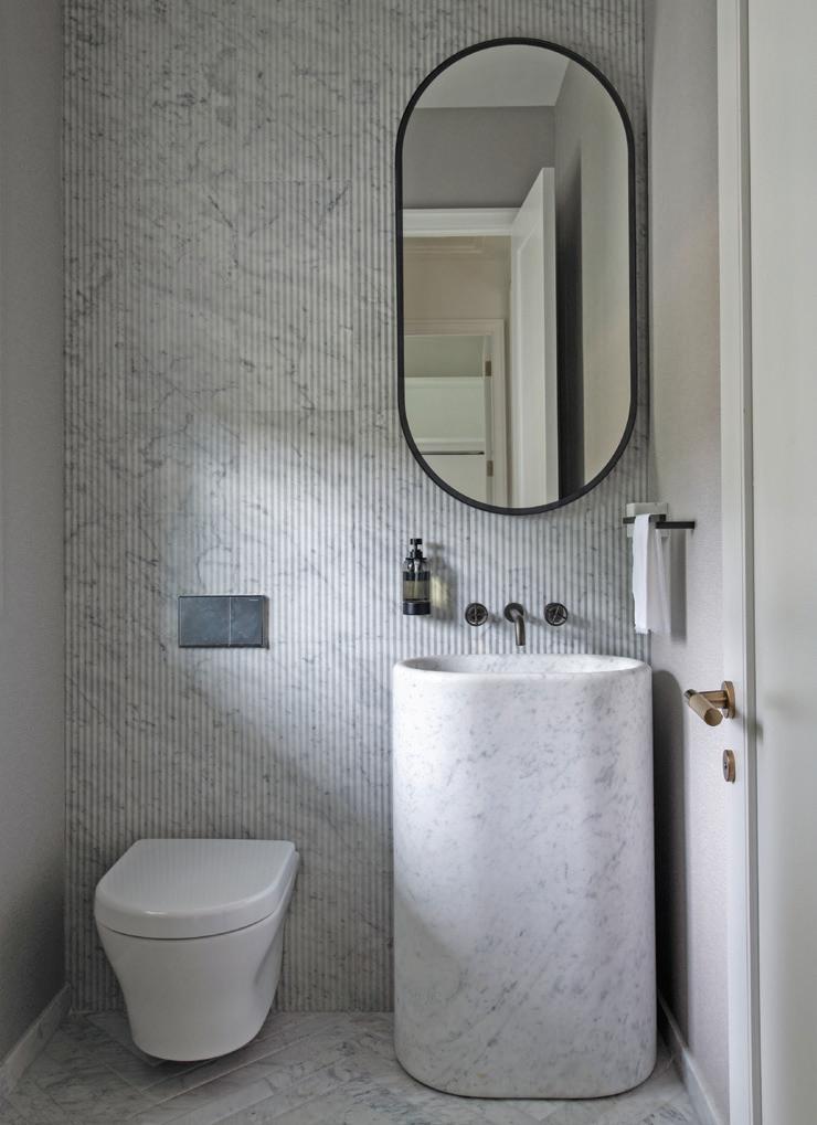
above: A limited color scheme is relaxing yet elegant in the living room. The standing sculpture is “Head in the Clouds” by Laurence Perratzi, and the wall sconces are from Apparatus. below, left: Natural light and high-gloss ceilings keep things airy and bright. below, right: A textured marble tile is the backdrop for this powder room. The freestanding basin was made from a solid piece of Bianco Carrara marble.
We love the entry hall. How did proportion play into this design plan?
Because of my architectural background, I’m always very focused on precise proportions. We were very mindful with all the measurements, especially with light fixtures. Getting the right size is key to making sure the light isn’t overpowering the space. In the foyer, we used a light fixture that feels very subtle but at the same time looks like a piece of jewelry. I wanted to make sure we could see the stairwell and console table, so it was all about balance. I also like looks that are softer and homier. I always start with multiple options for the layout.
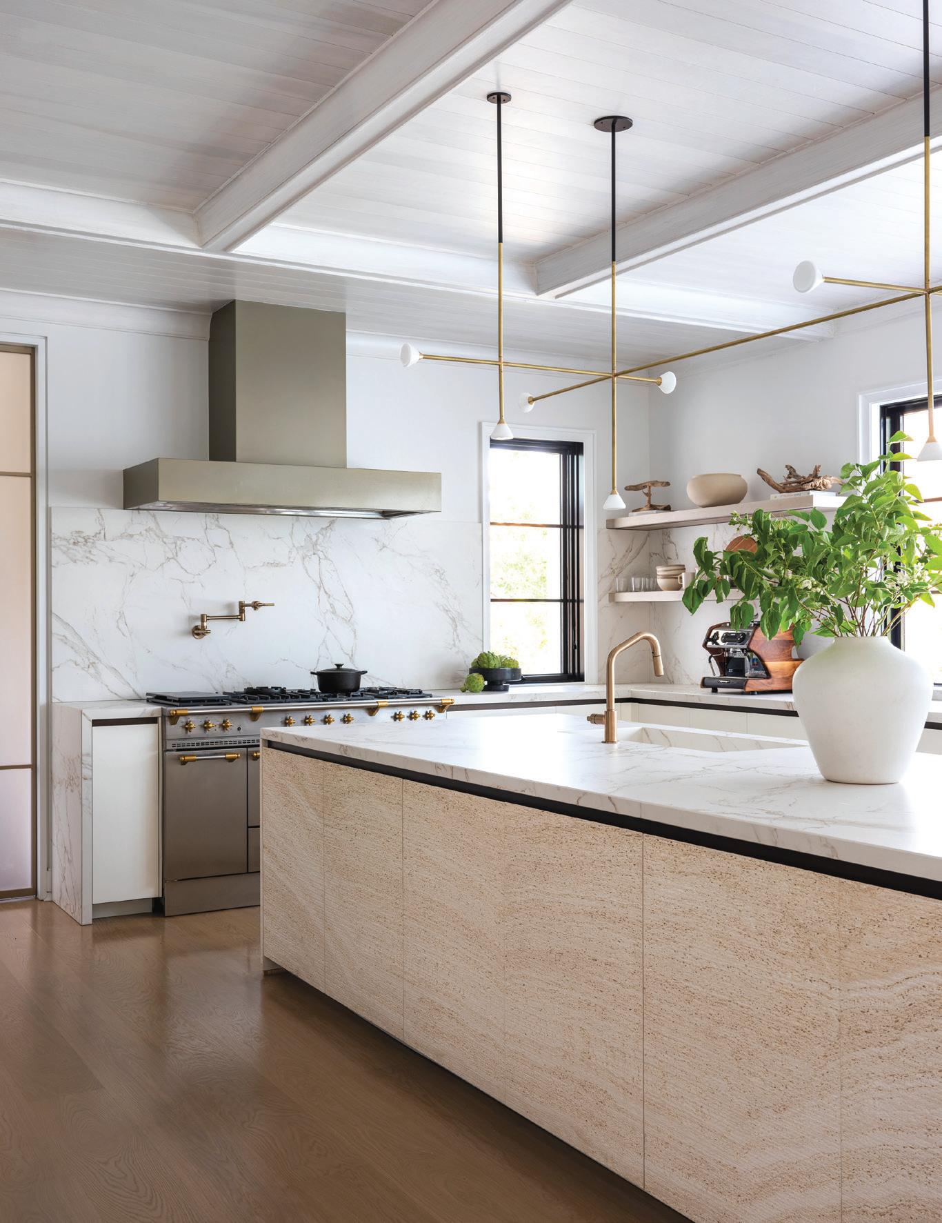
Tell me more about the kitchen design. It’s a massive kitchen. When I first started the project, before the cabinets
arrived, you just saw this huge space, and it was almost daunting, in a way. The island is about 20 feet long, and the materials throughout the kitchen are unique. It was all about balancing the fact that it had such a large scale with achieving a cozy, livable, and harmonious feeling within the space. We didn’t do upper cabinets; we opted for open shelving in wood, which made it a little warmer, since the island is Travertine marble. We did a lot of trial and error, but it ended up looking great. The lighting fixture is a custom pendant. I knew it had to be big, but at the same time, I didn’t want it to overpower anything. It’s very whimsical and delicate, and runs almost the same length as the island, but feels very light—not like it’s taking over the space at all, or like it’s heavy. My client tells me that the kitchen is where they spend most of their time. It’s like the heart of the house.
athomefc.com 68
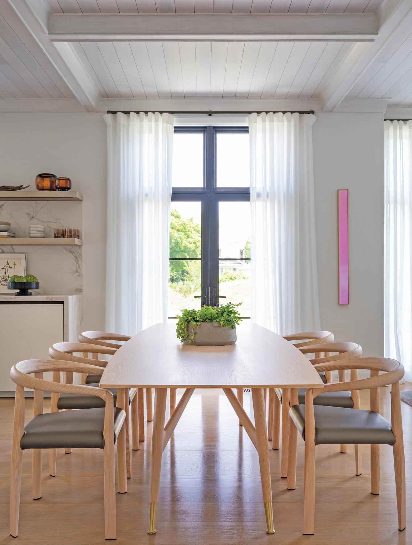
above, left: The island features Travertine stone and a custom brass chandelier by Roll & Hill overhead. above, right: The dining area complements the neutral palette in the kitchen. The pink artwork is by Thomas Devaux.
MAR/APR 2023 69
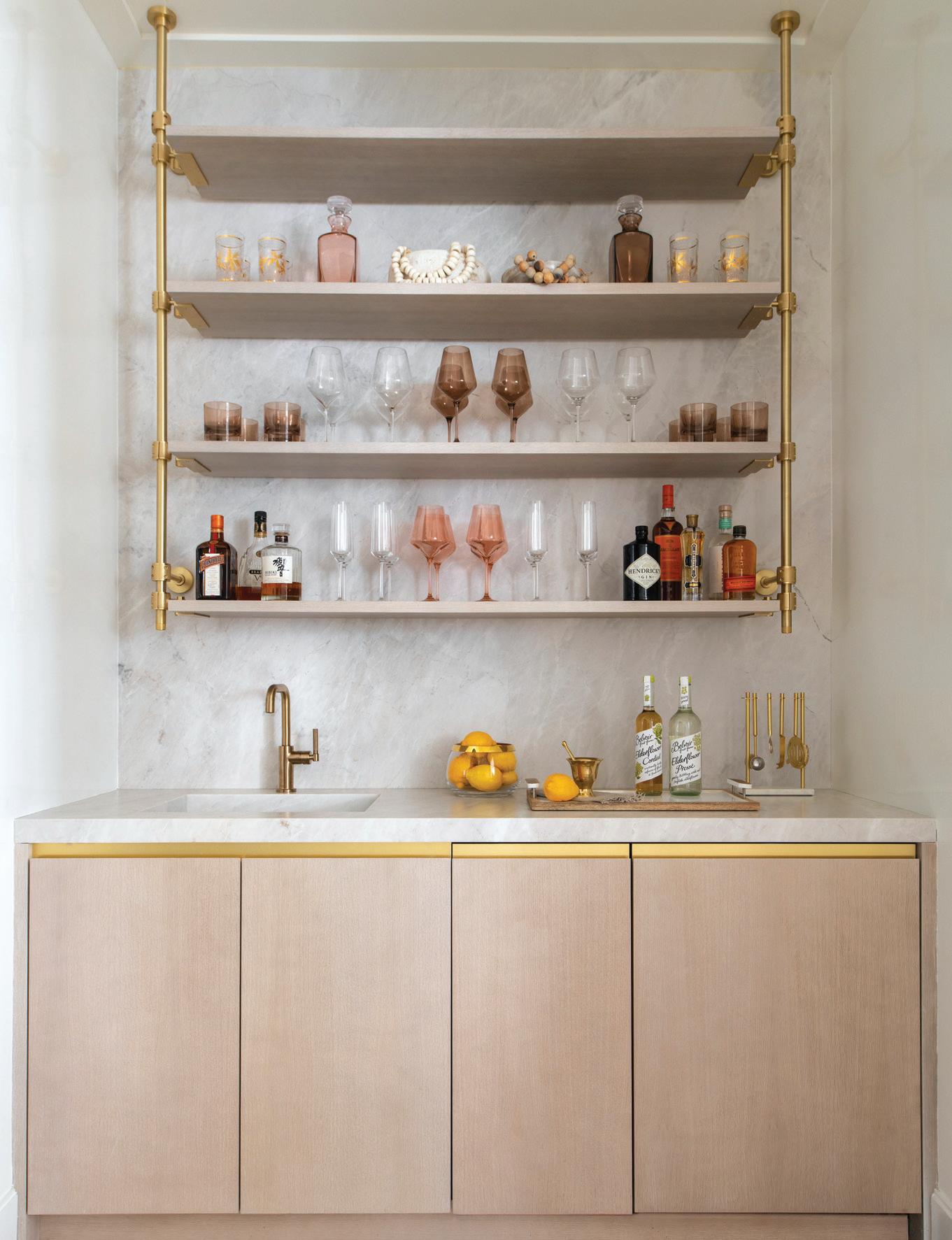
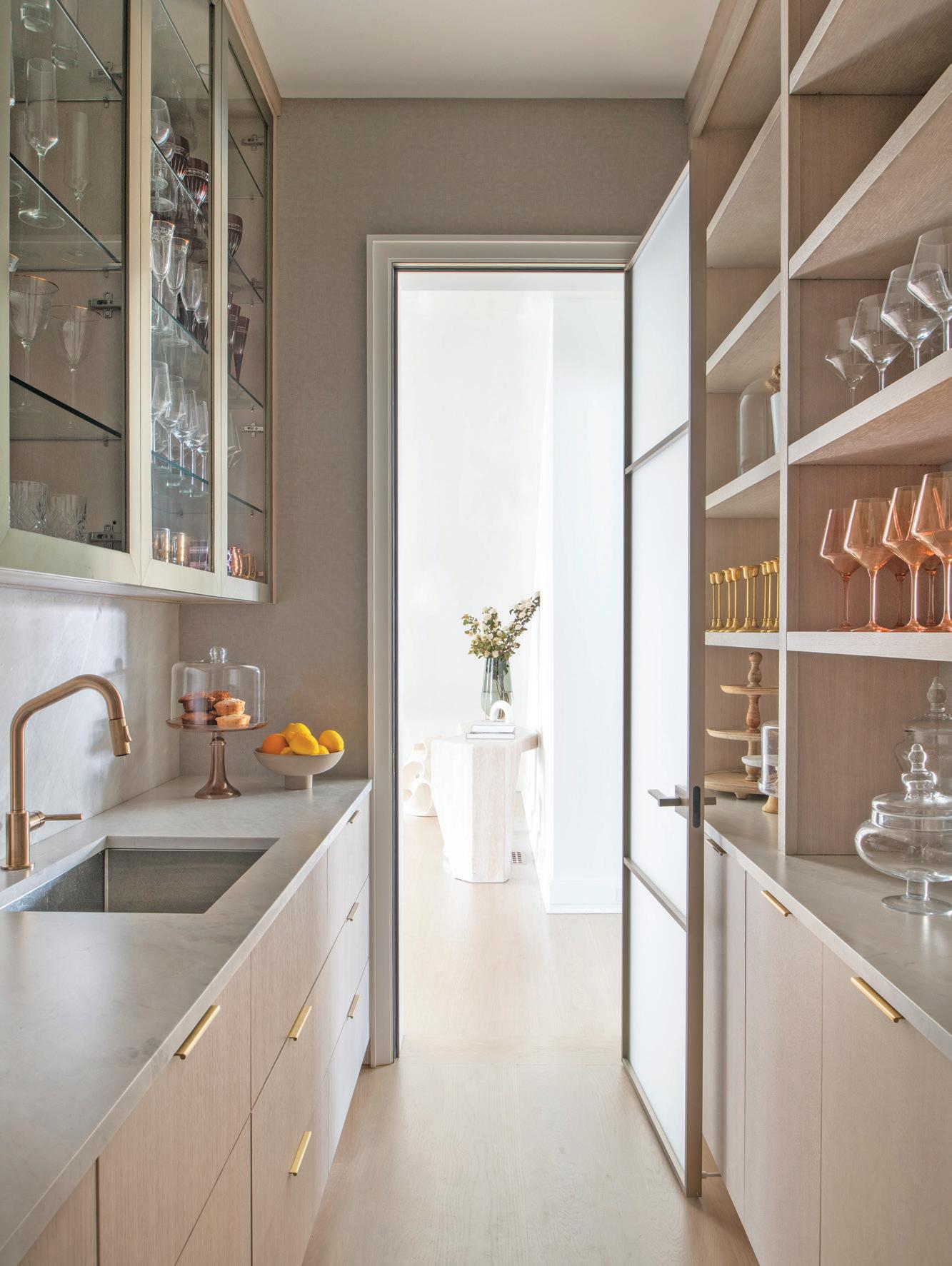
above, left: The butler’s pantry features custom-made white oak cabinets with natural quartzite countertops and backsplash. The Litze faucet by Brizo adds a brass accent. above, right: In the bar area, the same finishes continue the story.
“I was pushed out of my comfort zone, working with materials and finishes I wasn’t used to and that I wouldn’t necessarily have thought of.”
—maripi aspillaga
How would you describe your aesthetic as a designer?
I have a master’s degree and background in architecture. My interest in interior design came after. I tend to be more contemporary, opting for a spacious, clean look. Because I’m an architect, I’m always thinking about the flow of the house and symmetry. I am a big believer in “less is more.” When I design, I don’t take on many projects at a time, because I get very involved with my clients. I try to really understand how they live and involve them as much as possible. Even if it lengthens the process, the outcome is better.
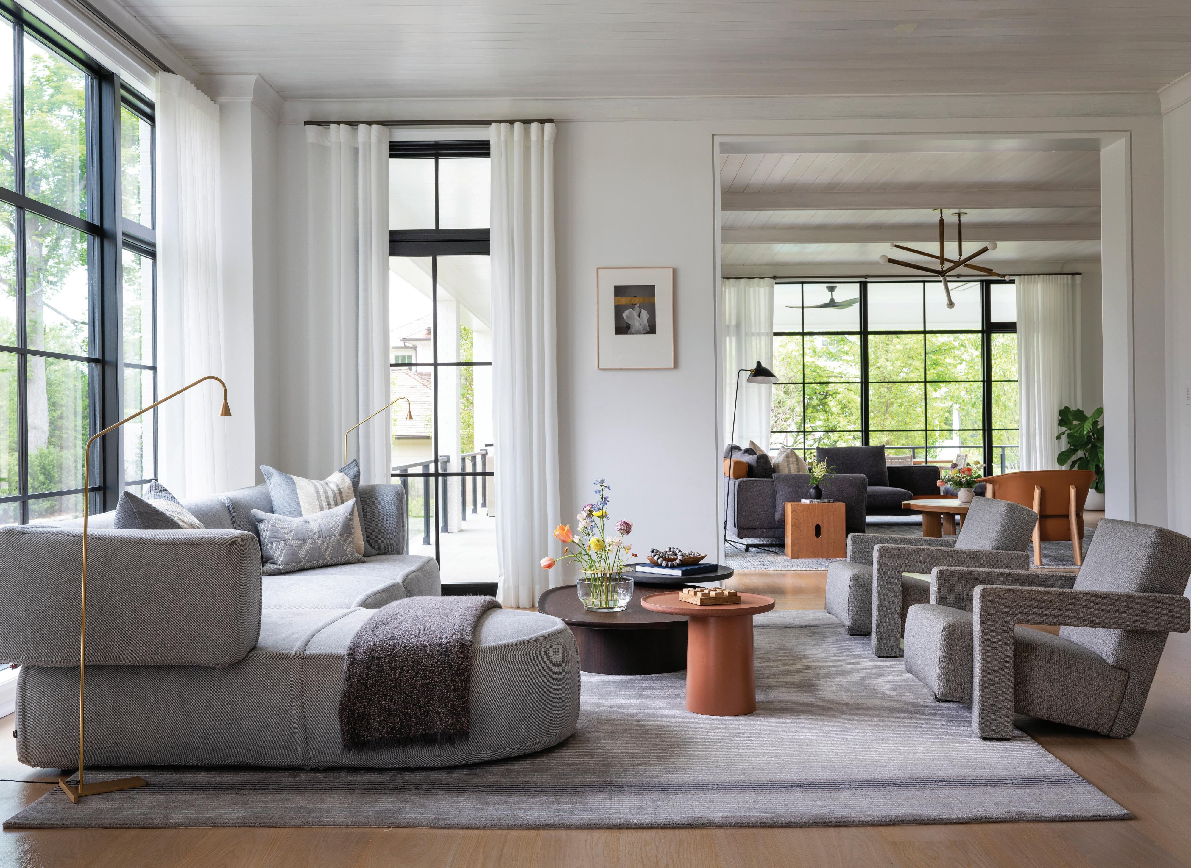
Could you tell me more about the art piece on the wall in the family room?
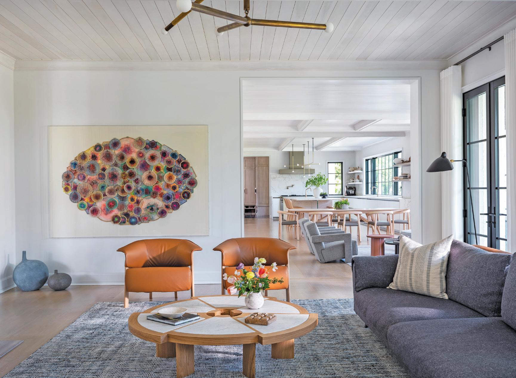
That was done by a South African artist, Lyndi Sales. I try to use her work whenever I can. She has such intricate work. This was a commissioned piece that I worked with Emmanuelle G Contemporary Art gallery in Greenwich to find. My clients love art, and they’re not afraid of using it. The husband is from Spain, and he loves to get pieces from Europe. It’s not usually well-known work—it’s more up and coming—but he has a great eye.
“Textures and shapes are taking over the design world; curvy sofas , soft materials; more than just patterns.”
—maripi aspillaga
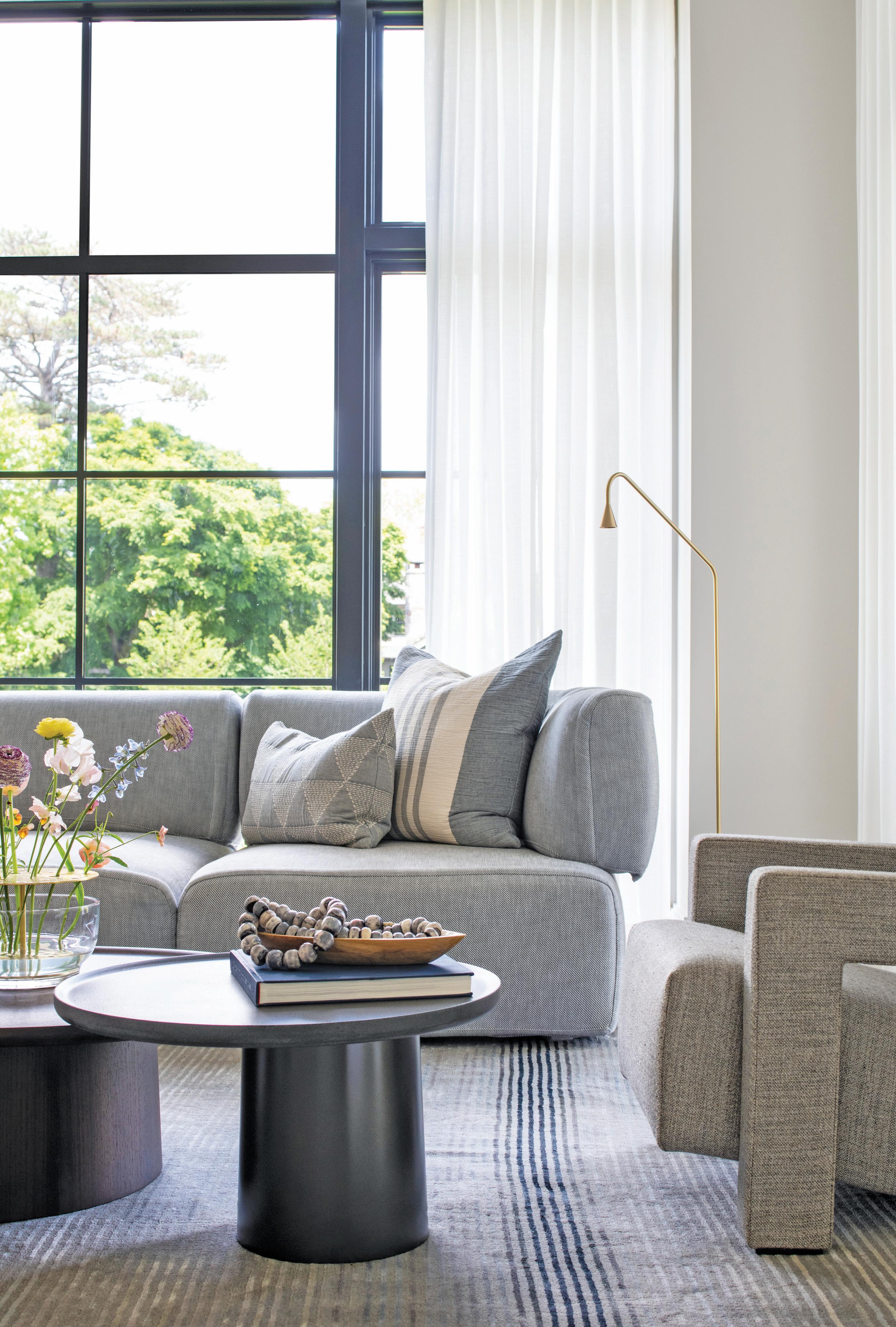 this photo: Freshly picked flowers add color to the relaxed gray palette. opposite page: A casual seating area off the kitchen provides an informal area for family to gather.
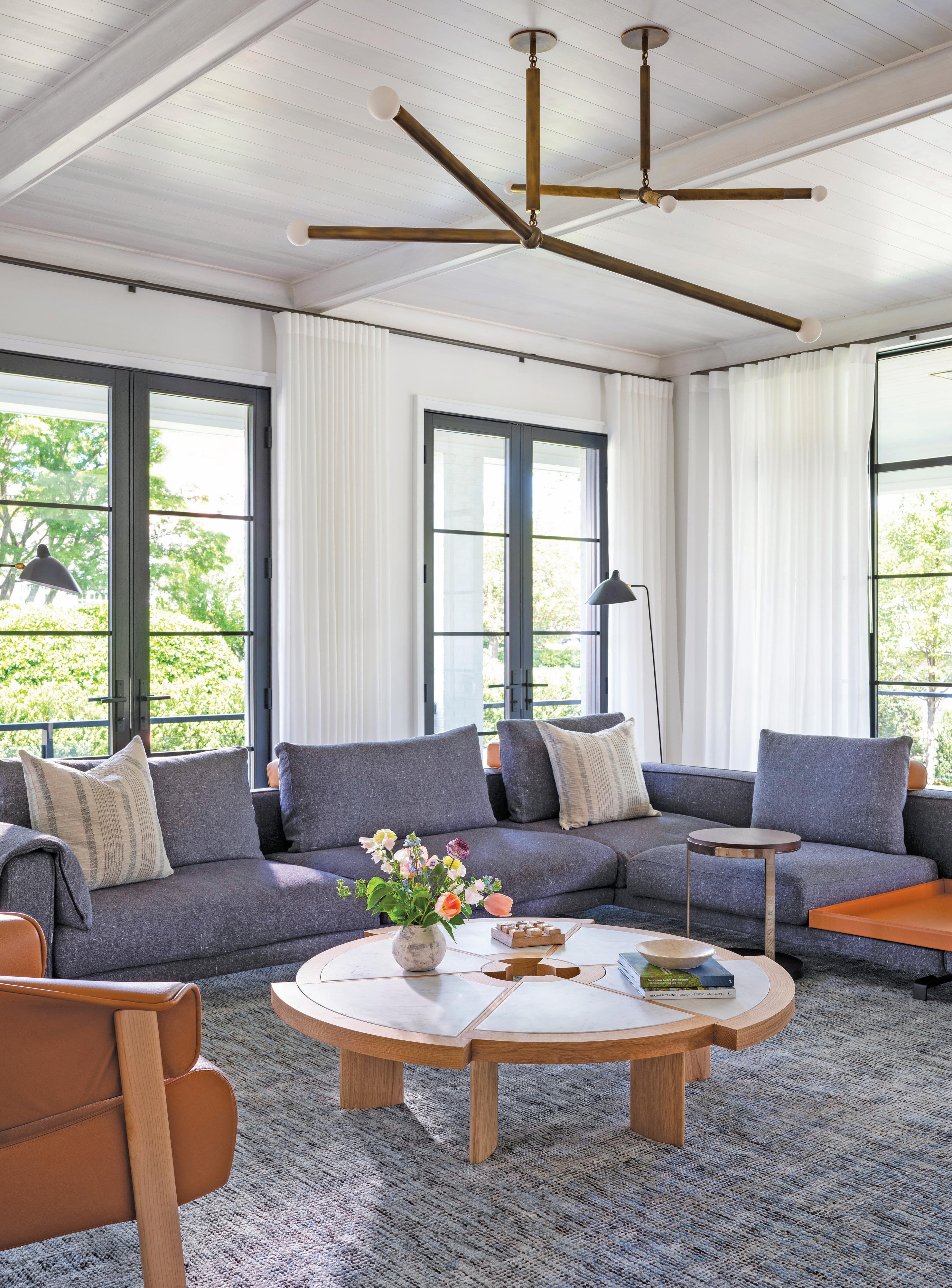 this page: The family room is accessed directly from the kitchen and has hanging Arrow light fixtures from Apparatus.
The office has these lacquered walls that are really bold. How did you land on that choice?
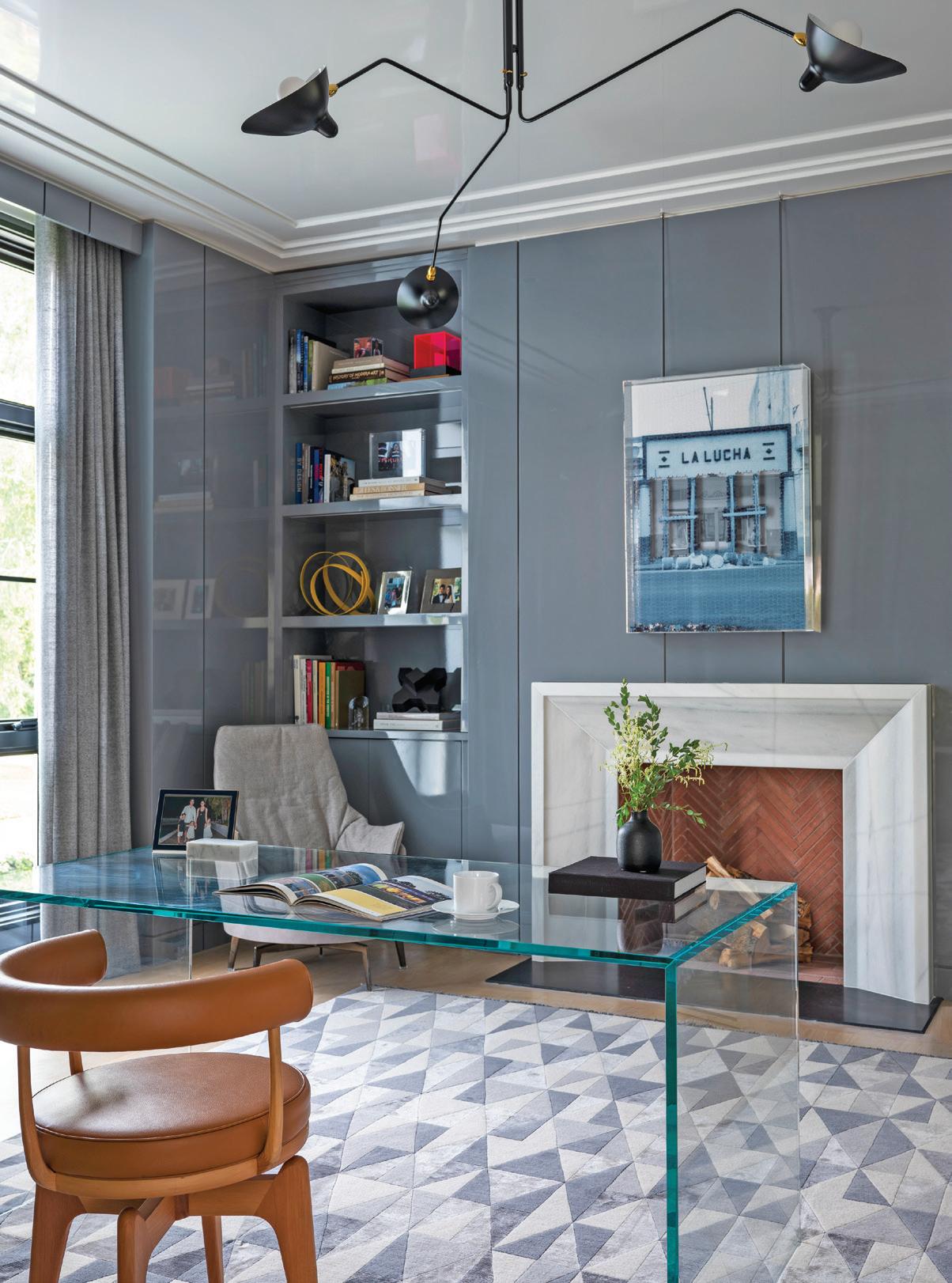
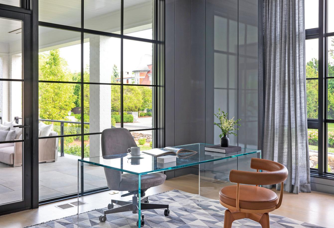
That room was meant solely for the husband. I wanted to make sure it was very masculine. He wanted something dark, and I suggested we do a high-gloss, lacquer finish. We wanted to go bold and completely opposite from the rest of the house. It’s actually not too dark, though, because of the natural light that comes in through the windows. It’s more dramatic. He wanted to do more traditional-style paneling, but I thought we could do “random” panels—and it doesn’t hurt that I have a wonderful cabinet maker who I knew could do these asymmetrical panels perfectly. Ninetynine percent of the furniture is from Europe—not just in this room, but throughout the home—either from France, Italy, or Spain.
 above: A light fixture by Serge Mouille draws attention to the high-gloss ceilings. left: The home office has high-gloss lacquered walls and a graphic rug from CC Tapis. bottom, left: A beautiful piece by Lindi Sales adds a pop of color and texture to the family room. The leather chairs are by Cassina. bottom, right: The designer stands in the completed living room.
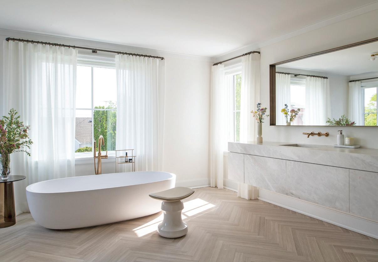
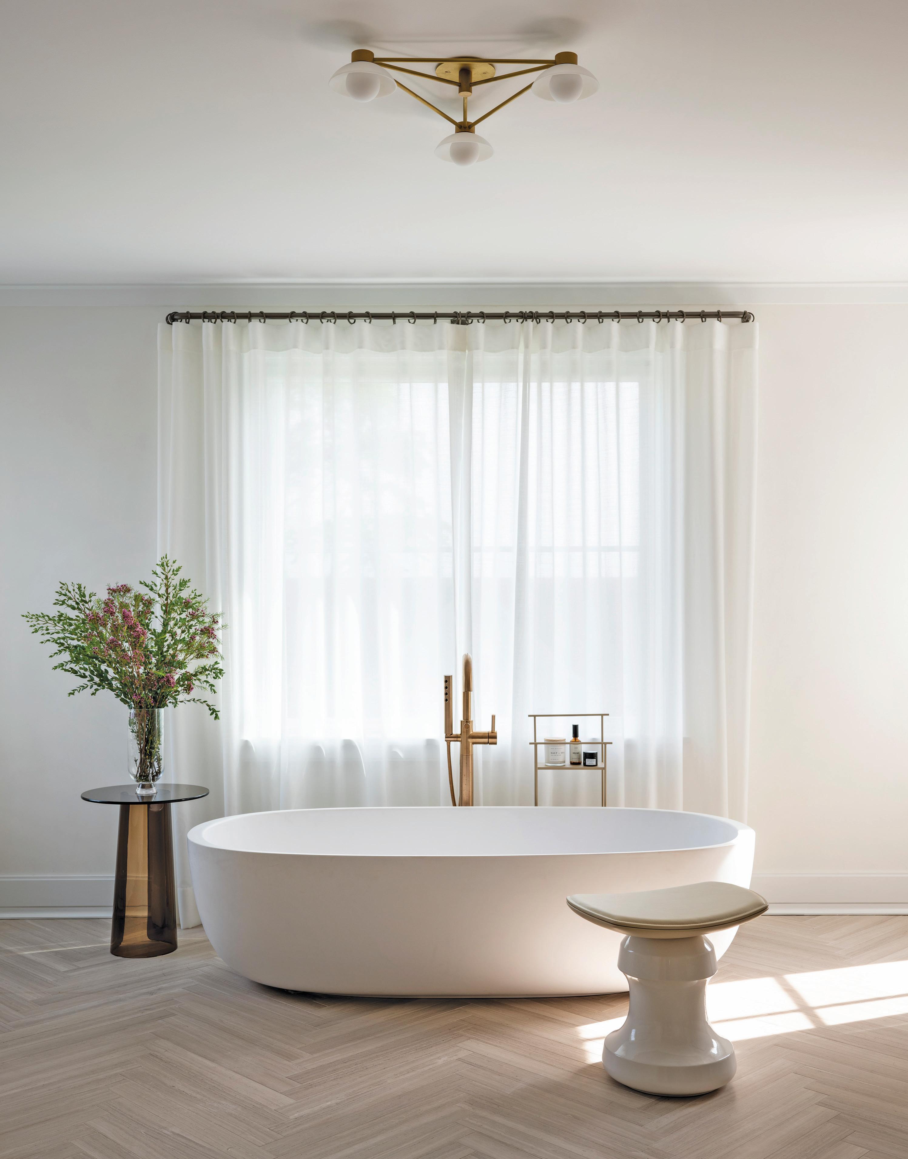 this photo: The client requested a spa-like experience in their home.
A gorgeous freestanding tub and tons of natural light achieve that end.
“It’s good when you get out of your comfort zone and try new things , because it really pays off.”
—maripi aspillaga
The primary bathroom is such a serene space. Tell me how you got there.
They wanted to have a spa in their house: something very romantic, serene, and soothing. That’s why we did custom vanities in a natural quartzite that has this beautiful, romantic, warm tone that matches perfectly with the floor. All the marble is from Italy. It’s so beautiful, and it almost looks like wood. It’s a herringbone, but it’s so warm. The client wanted to use brass, and we incorporated it in a way that was muted. The design is almost tone-on-tone. Everything is nearly the same color, but with different textures. The walls are treated with a subtle, plaster finish. The whole experience of the space is warm, inviting, and romantic.
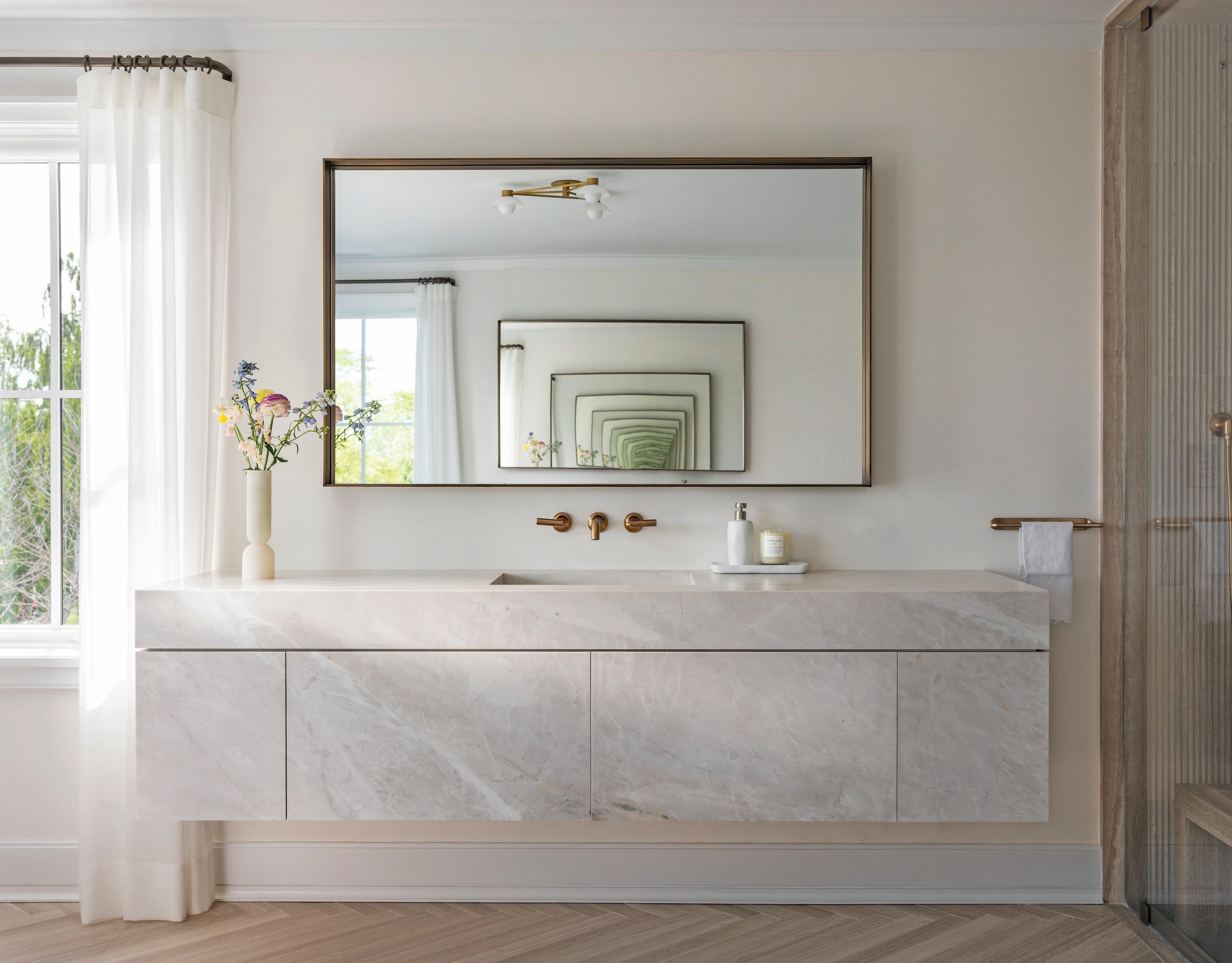 this photo: A wall- mounted quartzite vanity was custom made for the primary bathroom. above: The design team used a specialized plaster finish on the walls.
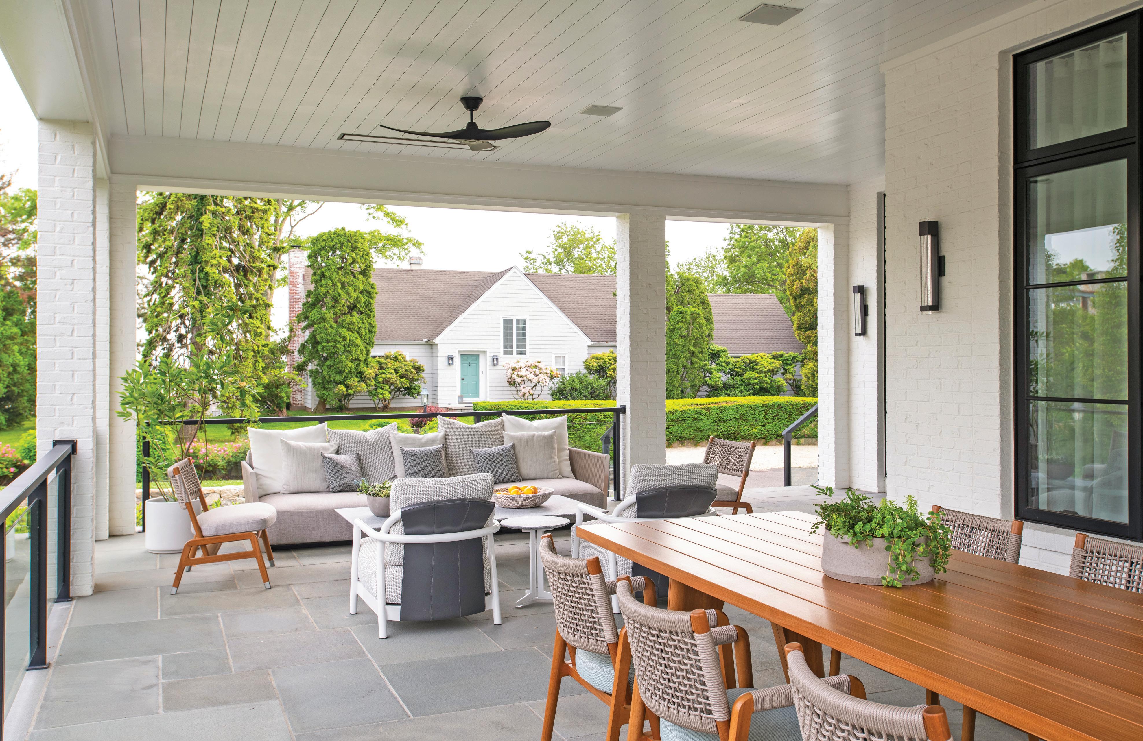
This home has the ultimate patio space. What was the direction from the client on this space, and how did you put your own spin on it?

The clients love to entertain, so they wanted a large table, and thankfully there was enough space for that. I tried to make the table as large as possible for them and to ensure the outdoor seating was as comfortable and sturdy as indoor seating. The patio space is lounge-focused. We made sure to include heaters so they can use it year-round to hang out and have cocktails.
What kind of trends do you think we can expect to see for Spring 2023 and beyond?
I’m seeing a lot of combinations of different types of materials. People are
finally starting to shy away from more typical whites, creams, and trends like that. I am seeing a lot of stone being used, and less “clean” looks. Herringbone floors, which you’d think are more traditional, keep coming up, too. As far as trends, I would definitely say: finishes and textures. Textures and shapes are taking over the design world; curvy sofas, soft materials; more than just patterns.
What was your biggest takeaway from this project?
I think my biggest lesson was about trying to find the perfect balance between what my clients want and what my aesthetic is. This project definitely pushed my boundaries; there were a lot of challenging moments when I didn’t know where our path was going to take us. But when we put everything together, it made so much sense. I think that’s my biggest
athomefc.com 76
above: The designer kept it comfortable and contemporary on the porch, carefully selecting materials and finishes for the outdoor furniture that mimicked the look and feel of interior pieces.
things, because it really pays off. And the clients are so happy! They ended up buying the lot in the back, and we’re designing a massive pool house now. This project is just getting bigger and bigger, and I’m so excited.
What changes are you seeing in the design world that excite you?
I have noticed a big difference between pre-pandemic and post-pandemic design. Clients are now more open to investing heavily in their homes. I think everyone wants to make their homes very livable now. For some reason, I’ve been doing a lot of pool houses. I have three or four projects lined up right now! But I think, in general, people are more willing to entertain in their homes and to invest in making their homes beautiful. Living more “in” than “out” is definitely a huge change.
interview by veronica schorr
Resources:
Interior Design: Nima Design, Old Greenwich, 646-436-7685; nimadesigninteriors.com
Architect & Construction: Wadia Associates, New Canaan, 203-966-0048; wadiaassociates.com
Custom Millwork: Sterling Custom Cabinetry, Bridgeport, 203-335-5151; sterling-custom.com.
MAR/APR 2023 77
above: The large, covered porch is an entertainment area for the client. A lounge and dining area both allow for easy conversation and a natural flow from cocktails, to dinner, and back.
PHOTOGRAPHY VIDEOGRAPHY SOCIAL MEDIA




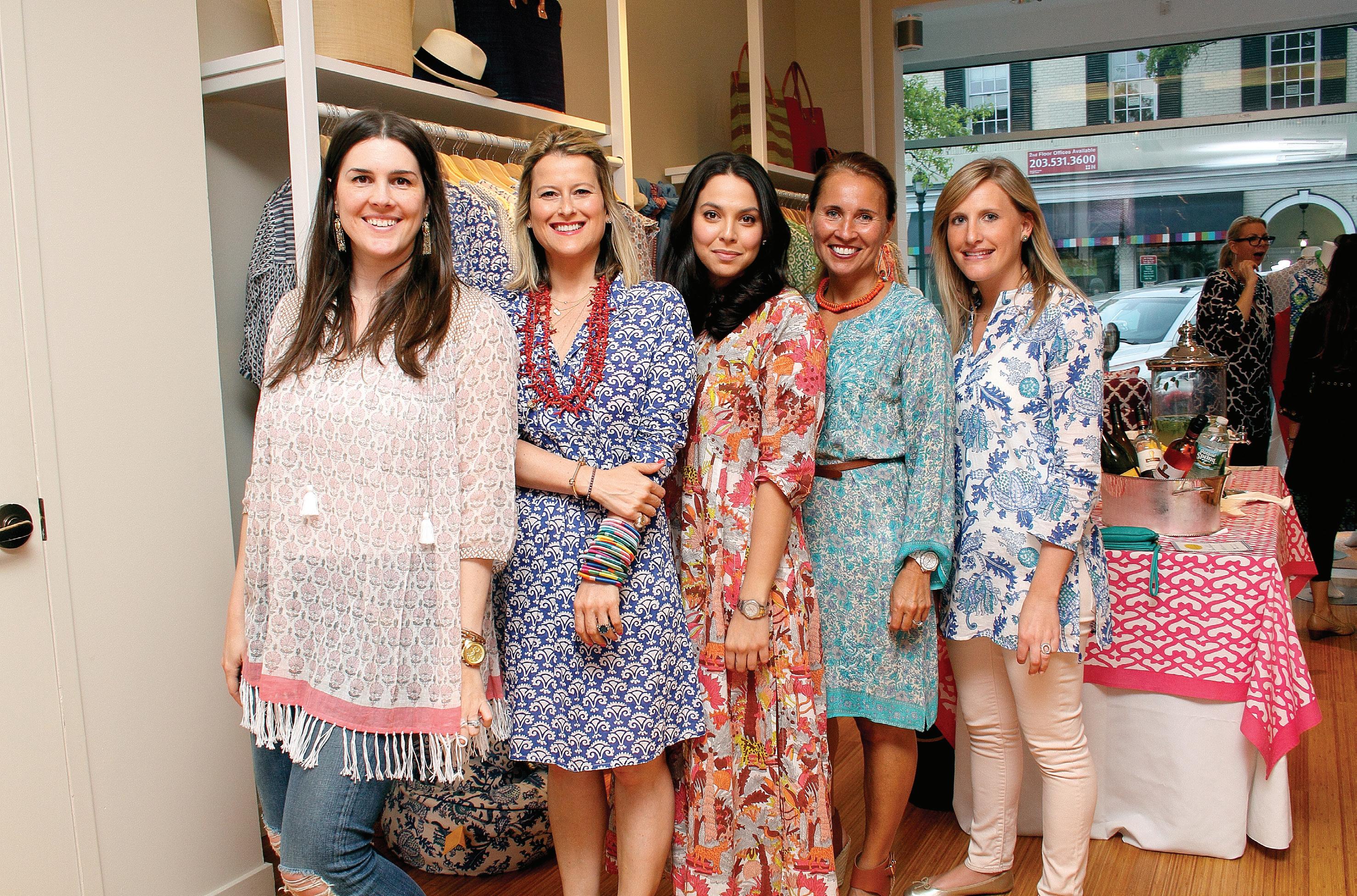


Moffly Media is one of the leading providers of professional event photography and marketing services in Fairfield County. We capture compelling, high-quality images of individuals and groups at meaningful events. With our wide range of capabilities from video to social media, Moffly will customize a marketing program that’s just right for you.






 PHOTOGRAPHY BY: BOB CAPAZZO, KRISTIN HYNES, MELANI LUST & MARSIN MOGIELSKI
LEARN MORE! CONTACT KATHLEEN GODBOLD AT KATHLEEN.GODBOLD@MOFFLY.COM OR 203.571.1654


MAR/APR 2023 79 BUILDING & HOME IMPROVEMENT California Closets, californiaclosets.com 4, 5 Charles Hilton Architects, hiltonarchitects.com 7 Douglas VanderHorn Architects, vanderhornarchitects.com 2, 3 Gault Family Companies, gaultstone.com Cover 4 Garrett Wilson Builders, garrettwilsonbuilders.com Cover 3 prutting.com 9 Cardello Architects LLC, cardelloarchitects.com 13 Thompson Raissis Architects, tr-architects.com 29 Tischler und Sohn, tischlerwindows.com��������������������������������������������������������������������������������������������������������������������������11 Yankee Custom Builders, yankeecustombuilders.com 30 LANDSCAPING & LANDSCAPING ARCHITECTURE Homefront Farmers LLC, homefrontfarmers.com 15 James Doyle Design Associates, jdda.com 17 m-d-l-a.com 31 amyhirsch.com Cover 2, 1 23 celebratinghope.givesmart.com 27 21 78 19 insiders’ list
JENNIFER BAKKER & CORRIE JACKSON of Maison Haven

FAMILIAR FACES SHARE THEIR LOCAL FAVORITES
One more item to add to your spring-cleaning checklist: a call to Corrie Jackson and Jennifer Bakker of Maison Haven. The decluttering duo promises to bring style to your home organizing plan, whipping your pantry, mudroom, and closets into photo-ready spaces. We checked in with the UK transplants to talk cleaning house, Connecticut living, and tips for a seasonal refresh.
The one thing that always makes me feel at home is…
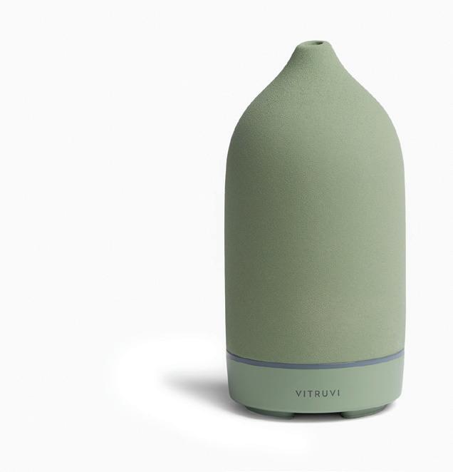
Corrie Jackson: my Vitruvi oil diffuser. I love the Boost blend for mornings and lavender at night.

Jennifer Bakker: my teapot and a cuddle with my Cavapoo.
I love living here because…
CJ: the seasons are so Hollywood: white winters, technicolor springs, steamy summers and gorgeous falls. I’m from the UK, where most seasons are gray and mild, so I never take this for granted.

JB: Corrie nailed it!
My favorite designfriendly organizing tools are…

CJ: leather weave baskets from Rejuvenation. They elevate any space.

JB: Yamasaki open weave baskets. I’m yet to find a pantry they don’t transform.
The spots in our own homes we struggle to keep clutter-free are…
CJ: my entryway. Everything is organized and labeled, but my kids are terrible at putting their stuff away. It would be easier if my family moved out!
JB: my basement. It tends to become a dumping ground that requires monthly attention.
My latest local obsession is…

CJ: brunch at Terrain (followed by a stroll around the store).
JB: Raphael’s—the best thing that’s happened to Greenwich of late.
I can’t live without…
CJ: my morning coffee and my evening bath.
JB: a daily walk in nature. Oh, and ginger kombucha!
My best advice for someone ready to dive into spring cleaning is…
CJ: Start with the zone that makes you want to scream the most. Once you’ve conquered that, you can conquer the world. Or hire Maison Haven!
JB: Don’t let the task overwhelm you. Break anything down into small 30-minute wins.
maisonhaven.com
@maisonhaven
PORTRAIT BY JULIA D’AGOSTINO; BINNEY PARK AND PASTRIES BY GARVIN BURKE; ALL OTHER IMAGES COURTESY OF DESIGNERS/BRANDS
right:
Corrie Jackson (left) and Jennifer Bakker
above: Leather baskets from Rejuvenation right: Jackson’s favorite Vitruvi diffuser below: Binney Park’s movie set scenery
above: Yamasaki open weave baskets keep pantry items in view.


1599 Post Road Eas t , Westport CT 0 68 80 | Office: 203-259-3333 | Fax: 2 03-255- 1199 | info@garrettwilsonbuilders.com GARRETTWILSONBUILDERS.COM 1599 Post Road Eas t , Westport CT 0 68 80 | Office: 203-259-3333 | Fax: 2 03-255- 1199 | info@garrettwilsonbuilders.com GARRETTWILSONBUILDERS.COM


Stone lasts for generations. Celebrating 160 years. WESTPORT SHOWROOM 203.227.5181 Exceptional Products, Personal Service. BETHEL SHOWROOM 203.790.9023 gaultstone.com STONE & LANDSCAPE SUPPLIES


 by veronica schorr


 above: The firm, pictured from left to right: Aaron Opalka, Smaranda Rusinaru, Elliot Royce, Alessandro Fancelli, Michael Roque, Ryan Salvatore, Mary Burr, Carlos Velez, Kat Vavilov, Daniela Peralta, Robert Chapman, and Elizabeth Whittington.
above: A modern take on a New England farmhouse in Stamford designed by Burr Salvatore Architects.
above: Lisa Pappon’s Blue Apple is on display in this sculpture garden.


 photo: Garden fencing adds charm and keeps deer out. right: Bronze lovebirds atop the garden fence.


 above: A Crate and Barrel oval mirror hangs between two Allied Maker gold sconces. left: Allied Maker’s Mini Orbs lighting fixture in brass frames the stunning marble entryway.

 : The entry living room hosts a black lacquer piano with a Tobias Scarpa chair and a Menu daybed. right: A white, curved Prestige Furniture sofa with a Yield Design circular coffee table and two Pamono mid-century velvet lounge chairs take center stage in the main living room. A Ben and Aja mirror with decorative beige fringe and a green fig tree from Nielsen’s complete the room.


 interview with calla m c namara, calla cane // photographer carina skrobecki


 above, top: The exterior slider was replaced with a custom metal sliding door. above, middle: The pool is encompassed by English gardens and wisteria-covered arches. above, bottom: Climbing roses planted by the previous owners bloom in early spring. left: The exterior of the 1800s converted barn was painted black.


 this photo: The modern farmhousestyle home was designed by Wadia Associates and features large windows to connect the inside of the home to the outside.
 interview with maripi aspillaga, nima design photographer adam kane macchia


 this photo: Freshly picked flowers add color to the relaxed gray palette. opposite page: A casual seating area off the kitchen provides an informal area for family to gather.
 this page: The family room is accessed directly from the kitchen and has hanging Arrow light fixtures from Apparatus.


 above: A light fixture by Serge Mouille draws attention to the high-gloss ceilings. left: The home office has high-gloss lacquered walls and a graphic rug from CC Tapis. bottom, left: A beautiful piece by Lindi Sales adds a pop of color and texture to the family room. The leather chairs are by Cassina. bottom, right: The designer stands in the completed living room.
 this photo: The client requested a spa-like experience in their home.
A gorgeous freestanding tub and tons of natural light achieve that end.

 this photo: A wall- mounted quartzite vanity was custom made for the primary bathroom. above: The design team used a specialized plaster finish on the walls.


 PHOTOGRAPHY BY: BOB CAPAZZO, KRISTIN HYNES, MELANI LUST & MARSIN MOGIELSKI

