
Create Where








Pattern
PRETTY IN PINK
Michelle Morgan Harrison pushes boundaries with rosy hues and bright ideas
THE LOVELY BONES
An architectural gem is updated with papers and paint
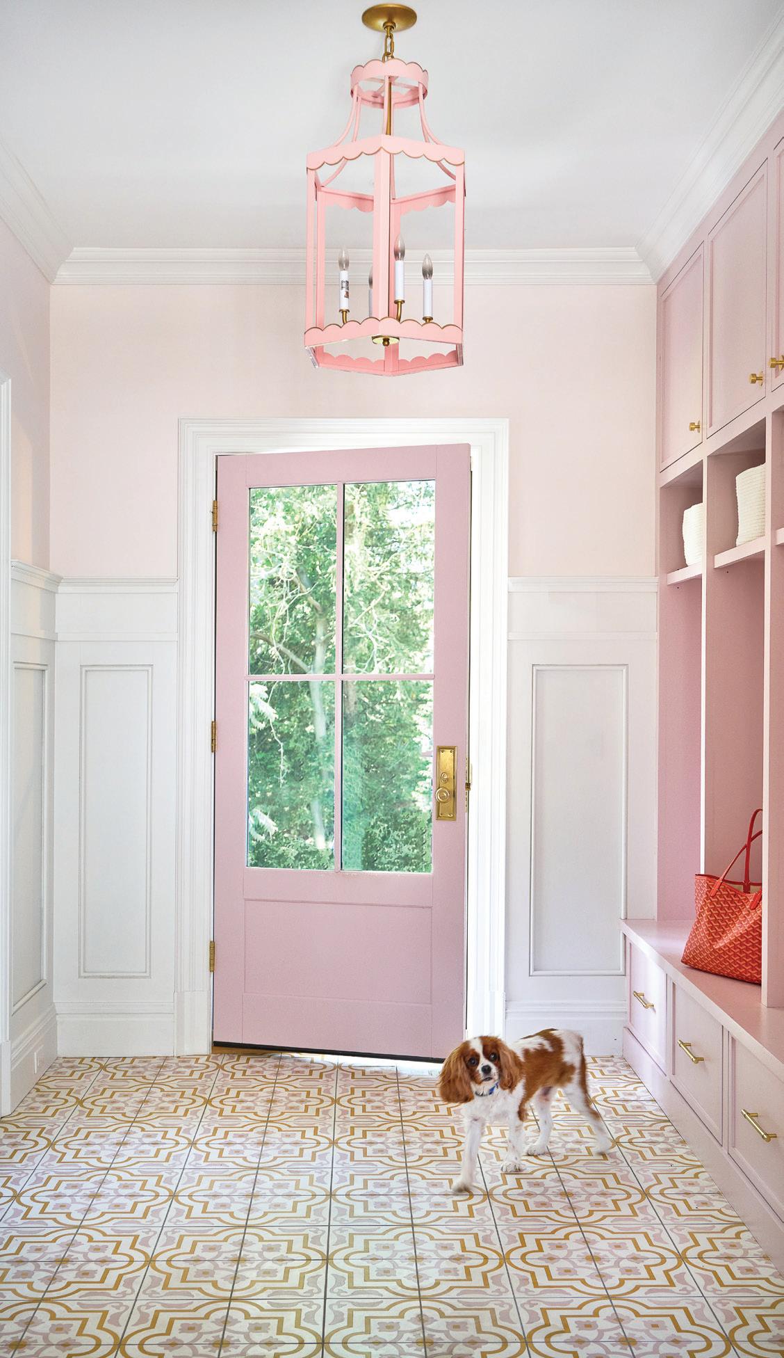
A cheerful pink mudroom by Morgan Harrison Home
vol. 20 | no. 2 | summer 2025
editorial editor Megan Gagnon megan.gagnon@moffly.com
advisory editor Donna Moffly donna@moffly.com
contributing editors
editorial director Cristin Marandino cristin.marandino@moffly.com
editor, custom publishing, stamford Elizabeth Hole elizabeth.hole@moffly.com
editor, new canaan•darien Eileen Murphy eileen.murphy@moffly.com editor, westport•weston•wilton Samantha Yanks samantha.yanks@moffly.com
art
senior art director Garvin Burke garvin.burke@moffly.com
production director Tim Carr tim.carr@moffly.com
assistant art director Lisa Servidio lisa.servidio@moffly.com
digital
digital marketing manager Rachel MacDonald rachel.macdonald@moffly.com
digital assistant Lloyd Gabi lloyd.gabi@moffly.com
digital assistant Jeffrey Garay jeffrey.garay@moffly.com marketing executive marketing director Kristina Herman kristina.herman@moffly.com
sales & marketing publisher, greenwich, athome, stamford, ocean house Jonathan W. Moffly jonathan@moffly.com
publisher, westport•weston•wilton Gabriella Mays gabriella.mays@moffly.com
publisher, new canaan•darien Gina Fusco gina.fusco@moffly.com
account executive
Hilary Hotchkiss hilary.hotchkiss@moffly.com
account executive
Morgan Howell morgan.howell@moffly.com
account executive
Liz Norfleet liz.norfleet@moffly.com
partnership and big picture manager
Kathleen Dyke kathleen.godbold@moffly.com
sales assistant Lemuel Bandala lemuel.bandala@moffly.com
business assistant Eillenn Bandala eillenn.bandala@moffly.com
business president Jonathan W. Moffly
editorial director Cristin Marandino
business manager
Elena V. Moffly elena@moffly.com
cofounders
John W. Moffly IV & Donna C. Moffly
founding creative director Amy Vischio

TO SUBSCRIBE, renew, or change your address, please email subscribe@athomefc.com, call 877-467-1735, or write to athome in Fairfield County Magazine, 111 Corporate Drive, Big Sandy, TX 75755. U.S. subscription rates: $19.95/1 year (5 issues); $34.95/2 years (10 issues); $44.95/3 years (15 issues). Canada and foreign, US $40/year. Prices are subject to change without notice. ALL RIGHTS RESERVED No part of this periodical may be reproduced without express permission of the publisher. ©2025 athome in Fairfield County Magazine is a registered trademark owned by Moffly Media. The opinions expressed by writers commissioned for articles published by athome in Fairfield County are not necessarily those of the magazine.
FOR QUALITY CUSTOM REPRINTS/E-PRINTS, please call 203-571-1645 or email reprints@mofflymedia.com
PUBLISHERS OF GREENWICH FAIRFIELD LIVING NEW CANAAN • DARIEN • ROWAYTON WESTPORT STAMFORD and athome magazines 205 Main Street, Westport, CT 06880 . P hone: 203-222-0600; email: mail@moffly.com ADVERTISING INQUIRIES: Lemuel Bandala: call 20 3-571-1610 or email advertise@moffly.com
athomefc.com


editor’s note / SPARKING JOY

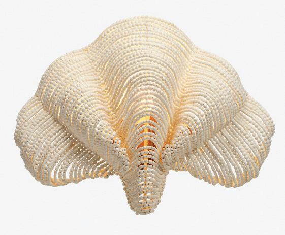
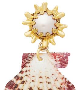
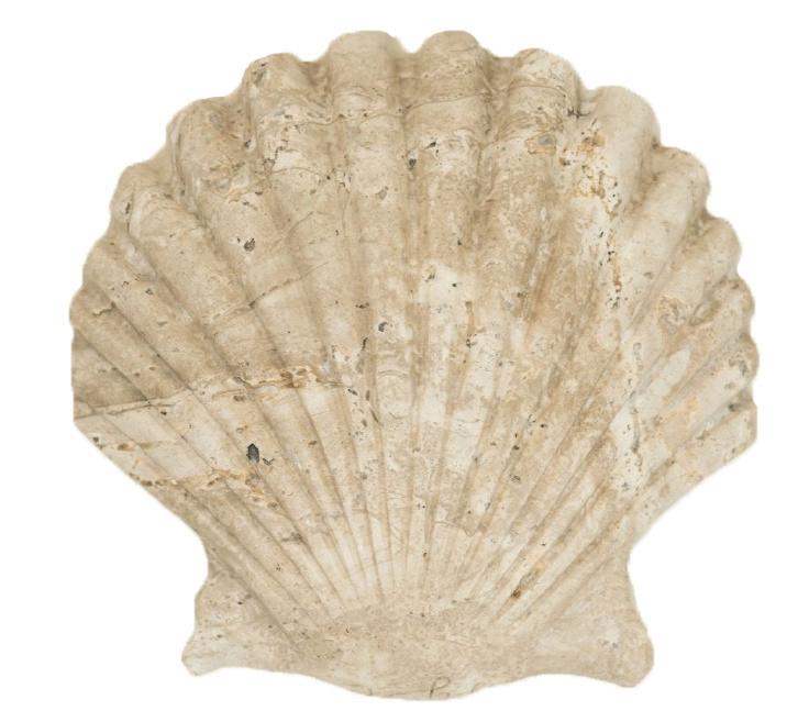
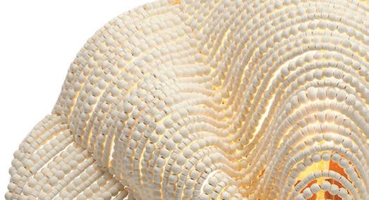
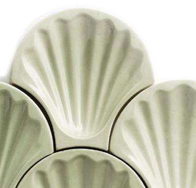
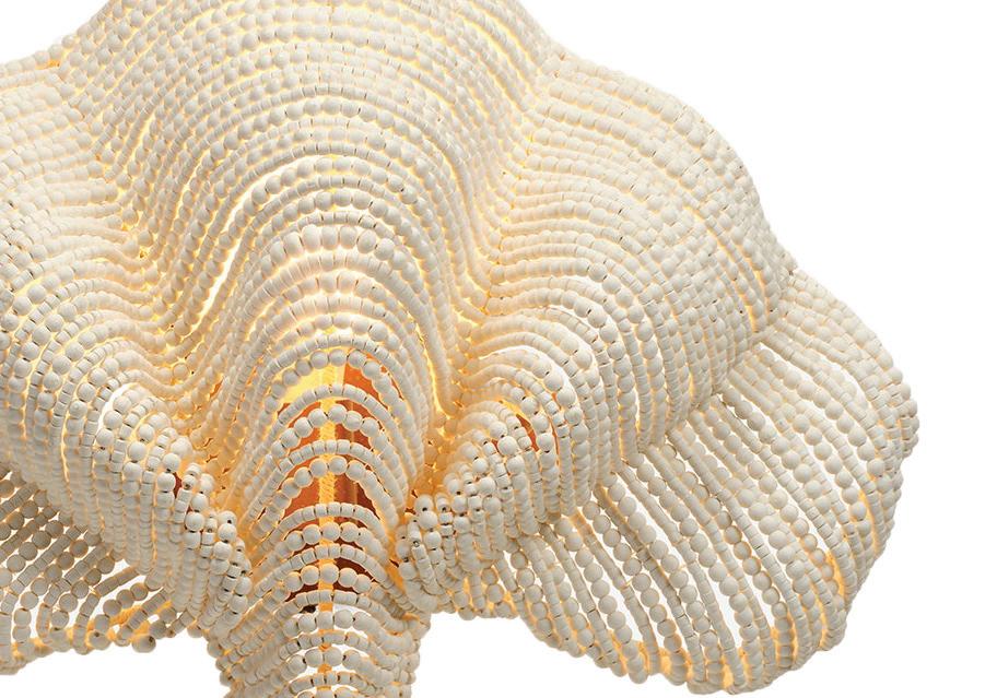
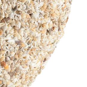
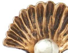
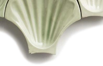
Collecting seashells is one my favorite things to do at the beach. It’s also become a bit of a vacation ritual for me, and I always return home with a few treasures tucked into my suitcase. Lately, I’ve been thinking about creative ways to display my finds around the house. Not in a Pinterest-perfect way, but one that feels more organic—little reminders of beach combing in Puglia, Punta Mita, Boca Raton. So, I’ve been delighted to see them everywhere lately, from scallop shell candlesticks to sculptural conch pendants. There were too many to include on just one Goods page (p. 14) that I had to add some here, too. I hope they serve as reminders to embrace the things that bring you joy, to surround yourself with objects that spark memory and meaning.



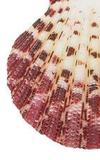
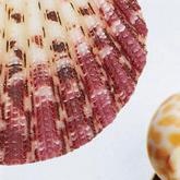
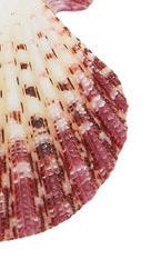
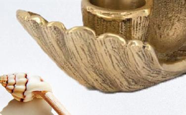

After all, our color issue celebrates the bold, the layered, the lived-in, with homes that don’t shy away from pattern, paint or personal touches. In Darien, British designer Elizabeth Hay took on the task of transforming a blank-slate new build for a young family (p. 28). Armed with her signature block-printed florals and a fearless use of color, she turned white-on-white rooms into warm, welcoming spaces full of texture, charm and thoughtful details. Designer Michelle Morgan Harrison is no stranger to color, but a recent project for a pink-loving client pushed her palette further than usual (p. 42). With each phase, the client encouraged her to go for more, dialing up the print-mixing and challenging Harrison to step outside her comfort zone—in the best way. Meanwhile in Greenwich, Nina Carbone took a quieter approach, using soft, muted tones to carve out inviting corners and serene, streamlined living spaces (p. 58), proof that color’s power lies just as much in subtlety as in statement.
Color, in all its forms, is about emotion. Whether it’s a daring paint choice or a seashell placed on a shelf, these details are deeply personal, and I hope this issue inspires you to lean into the hues and pieces that speak to you. And if you’ve brought that spirit to life in a project of your own, we’d love to see it.
Submissions for our annual A-List Awards are accepted through May 30th, and we invite you to share your work with us—bold, understated or somewhere beautifully in between.


MEGAN GAGNON Editor megan.gagnon@moffly.com


PHOTOS: BOB CAPAZZO
left: Syel Collective travertine shell catchall; $215. above: Hors d’oeuvre long picks by Two’s Company; $12. Available at Beehive, Fairfield
left: Ariel earrings by Brinker + Eliza; $188. below: Scarlett candle holder by Doing Goods; $60. MADE IN CT!


by megan gagnon
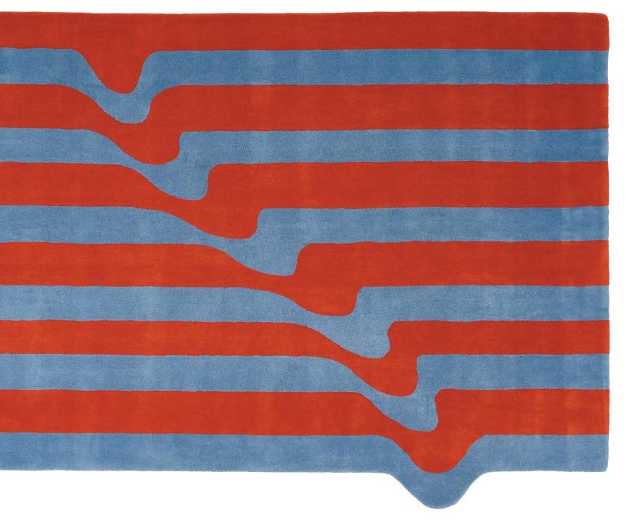
PIECES Salerno Rug in Sangue Blu; starting at $1,195. pieceshome.com


4
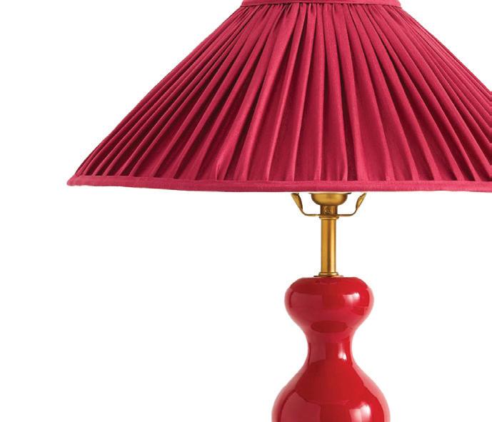
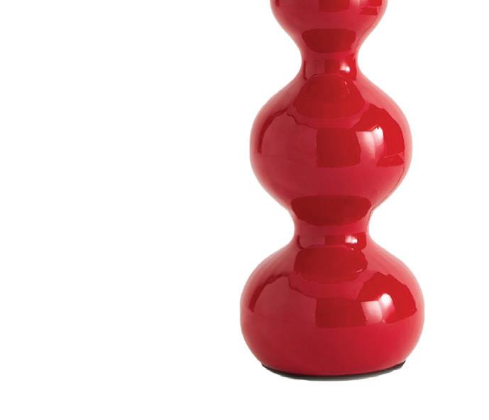
POOKY The Wobster table lamp; $278. pooky.com










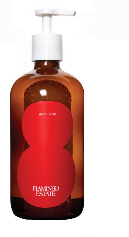
FLAMINGO ESTATE


Tomato hand soap; $46. Terrain,Westport; shopterrain.com



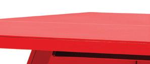
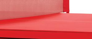
RS BARCELONA You and Me Monochrome ping pong table; starting at $6,650. rsbarcelona.com 3


Terrain,



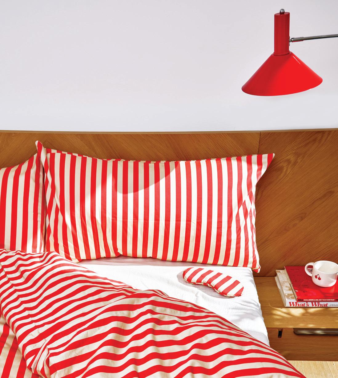
“we incorporate red into a lot of our projects—and a little goes a long way! a trim, a piping, a lampshade, a pillow—you don’t need to add a ton of it, and it can still feel like the star of the show.”


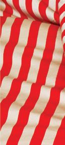
—jessica bauers and molly young, by interiors BIG NIGHT x FAR WEST Stripe duvet; $250 for queen. bignightbk.com




6
OOMPH Grace Bay mirror in Bolero; $1,650. Greenwich; oomphhome.com

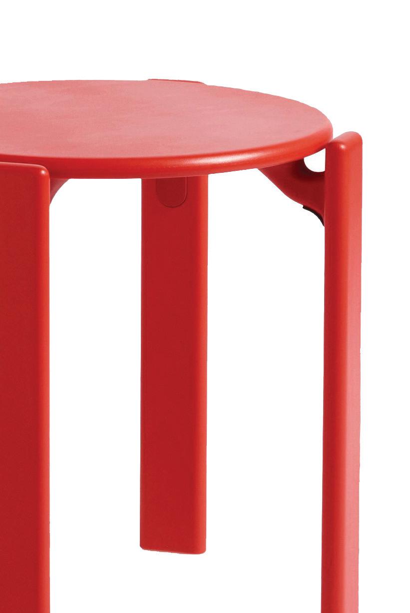
5 HAY Rey stool; $545. Design Within 8

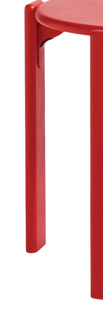




Reach, Westport, Stamford; dwr.com





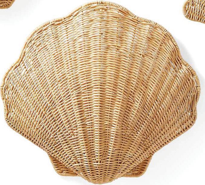
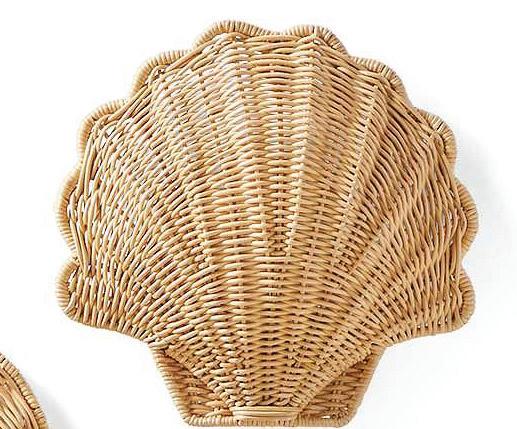









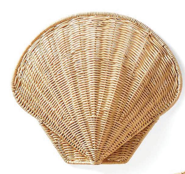

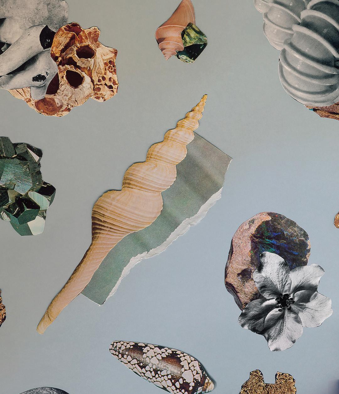






“we consider seashells to be nature’s antiques—delicate treasures that, when used thoughtfully, can add a unique and timeless touch. just remember, moderation is key; overdoing it can easily cross into tacky territory.”

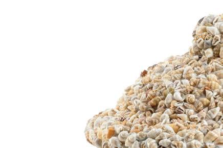










Westport; serenaandlily.com


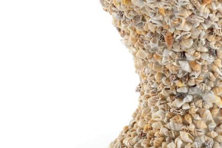


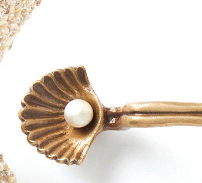




—taylor mattos & cindy rinfret, rinfret ltd.
One Source For All of Your Property Management Needs
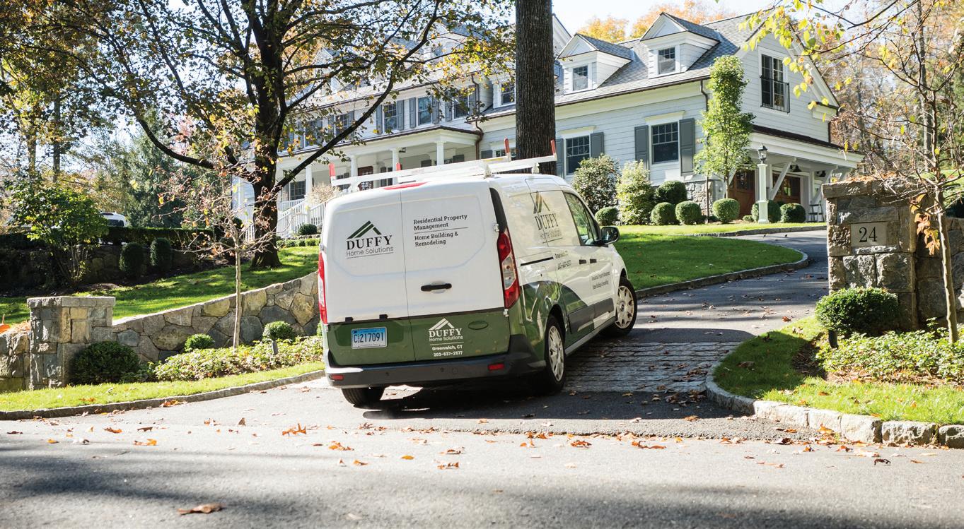

Home maintenance service providers can be hard to find and schedule. When you become a Duffy Home Solutions Property Management Client, we handle it all for you. As trusted home building and maintenance experts in Greenwich, CT for over 25 years, we have experienced, trained professionals on staff, and our fully equipped vehicles are ready to respond whenever you need us. When you have a home related issue, you simply call us and we will take care of it, keeping your home beautiful and problem free. We become your single source for all of your property management needs.

Home Watch Services Caring for Your Home
While You’re Away
Whether your property is an investment, second home, or you are planning extended absences, you need a trusted source to monitor your property and handle any issues in your absence. Home Watch is a comprehensive service designed to keep vacant properties secure, maintained, and in optimal condition when homeowners are away.
goods/NEOCLASSICAL




1 GINORI 1735
















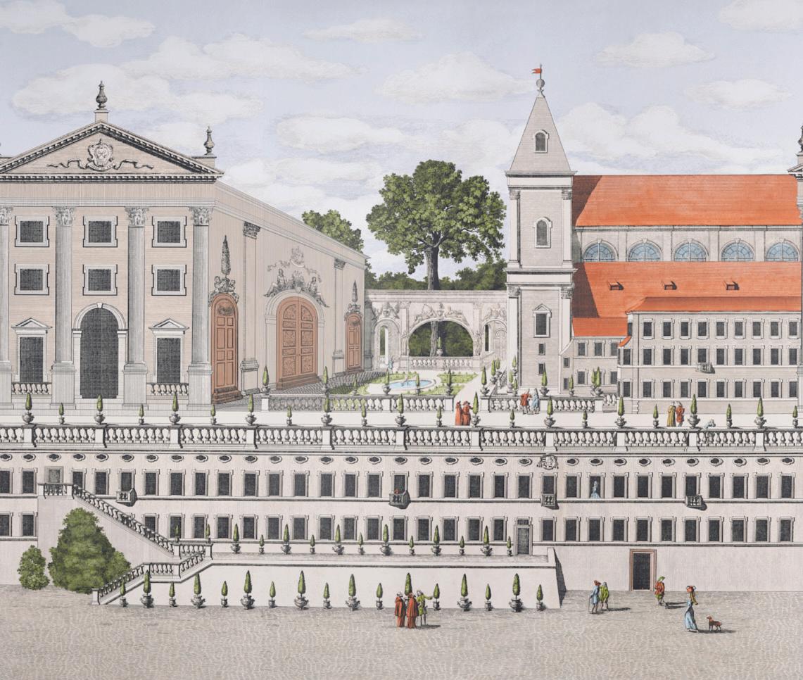
“talk about an immediate sense of history, space, and drama, my piazza firenze panels do it all. add them to a wall or on a panel and the chic quotient is immediately upped.”
—johnson hartig, libertine




















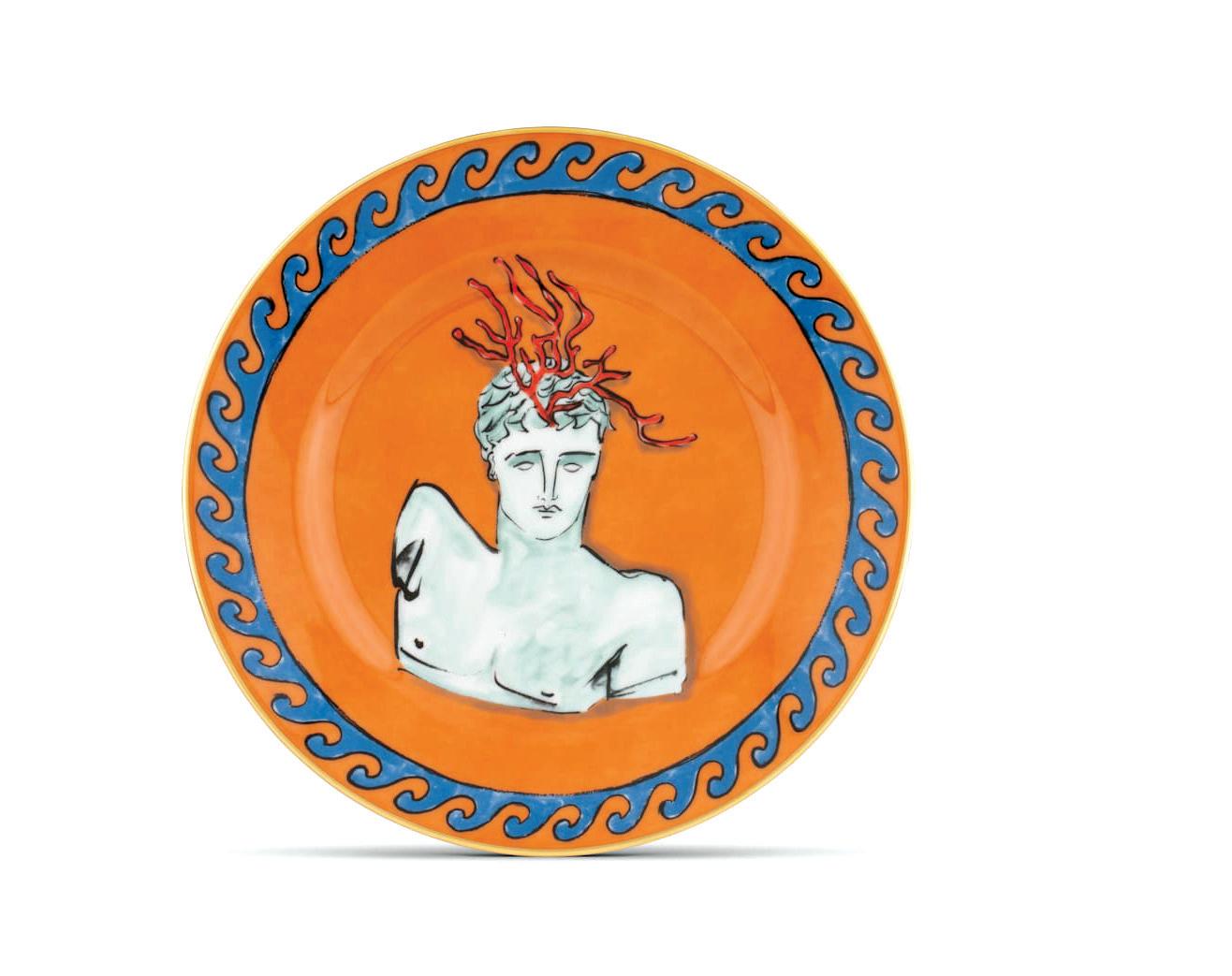
Il Viaggio di Nettuno dessert plate; $108. Saks Fifth Avenue, Greenwich; saksfifthavenue.com
2 SCHUMACHER
Piazza Firenze panel set by Johnson Hartig; to the trade. schumacher.com
3 ARTERIORS
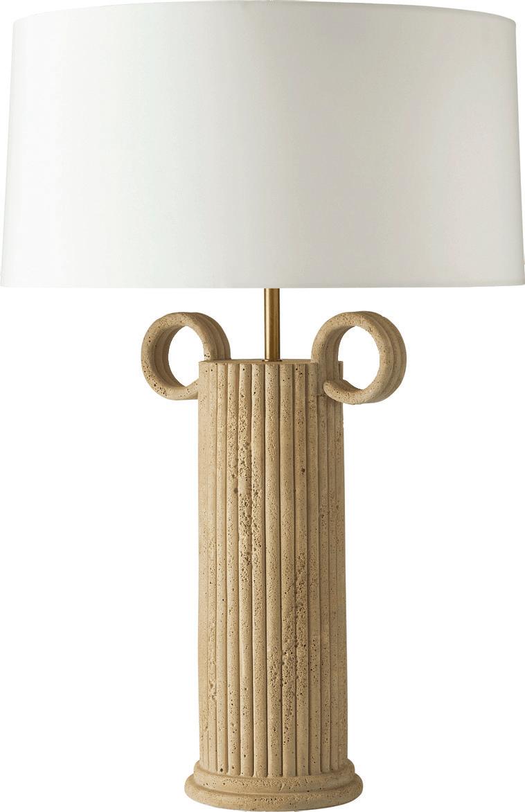
Eros lamp; $780. Schwartz Design Showroom, Stamford; schwartzdesign showroom.com
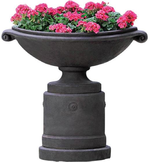
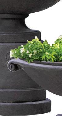
4 CAMPANIA Medici planters; starting at $1,109.99. wellappointed house.com
5 THE ANTIQUE AND ARTISAN GALLERY
Neoclassical mirror with gold gilt; $2,800. Stamford; theantiqueandartisan gallery.com
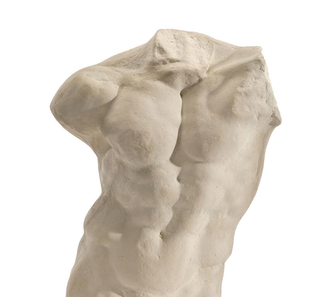
6 MADE GOODS Kempsey freestanding sculpture; $1,700. madegoods.com
7 DECORATIVE CRAFTS
Athena marble obelisk; starting at $85. decorativecrafts.com
8 CENTURY
Venetian king bed with canopy; to the trade. Fletcher Wakefield, Stamford; fletcherwakefield.com






DOUGLAS WRIGHT Douglas C. Wright Architects
HEIDE HENDRICKS Hendricks Churchill
JOSH GREENE Josh Greene Design
MELISSA REAVIS Hollander Design


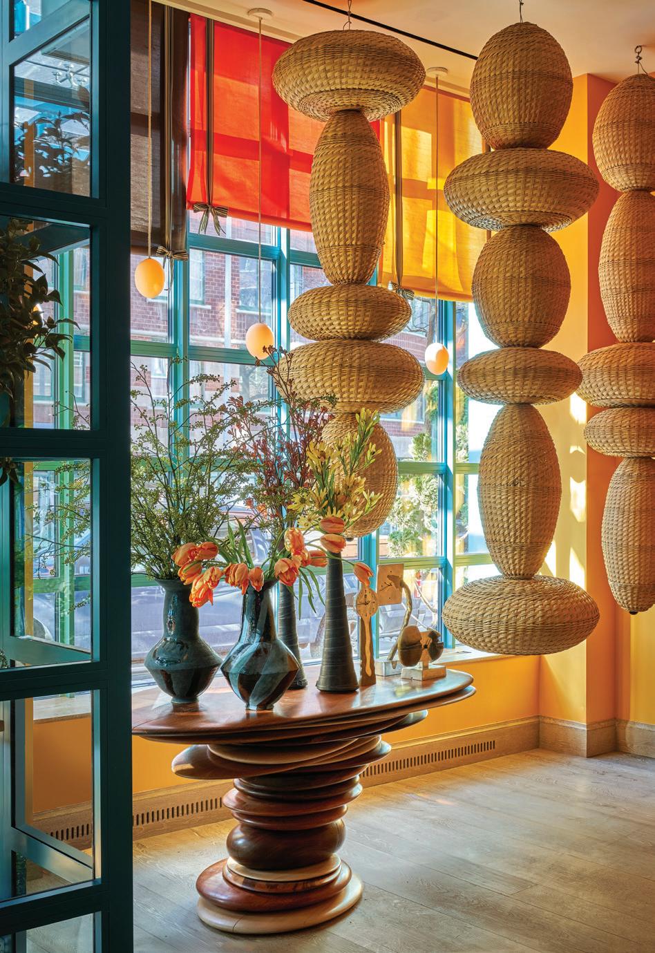
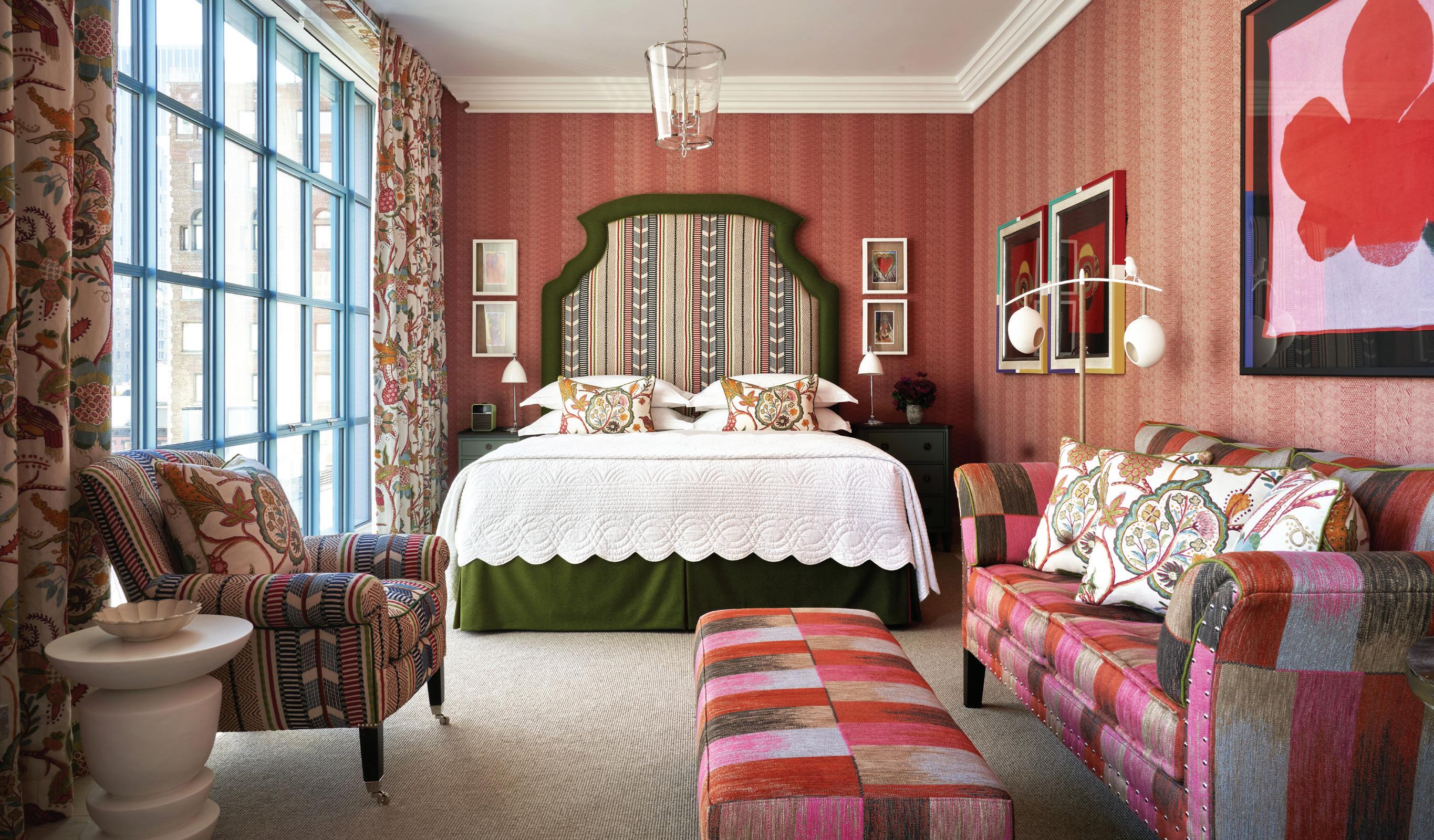
In Tribeca, where cobblestone streets meet a palette of brick reds and industrial grays, Warren Street Hotel makes a brilliant entrance. Drenched in blue and topped with a flash of yellow, Firmdale Hotels’ latest New York property is anything but subtle— and that’s precisely the point. Joining the ranks of its stylish siblings—the Crosby Street Hotel in SoHo and The Whitby Hotel in Midtown—this downtown gem is a bright new chapter in the brand’s design-forward legacy. Designed by architecture firm Stonehill Taylor, the building’s striking façade is just the beginning. Inside, British designer and Firmdale founder Kit Kemp, alongside daughters Minnie and Willow, has worked her magic, bringing her signature maximalist mix to life once again.

this photo: Risco Terrace is the perfect spot for both sunrise yoga and an intimate sunset dinner for two. left, above: Capullo Landing anchors the entrance into Naviva.
left, below: From Copal’s dining space, guests can view the copperclad bamboo lounge.
above: Warren Street’s cant-miss façade left: Woven sculptures by Argentine artist Cristián Mohaded hang in the lobby. below: Kemp’s bold mix is on display in a luxury junior suite.
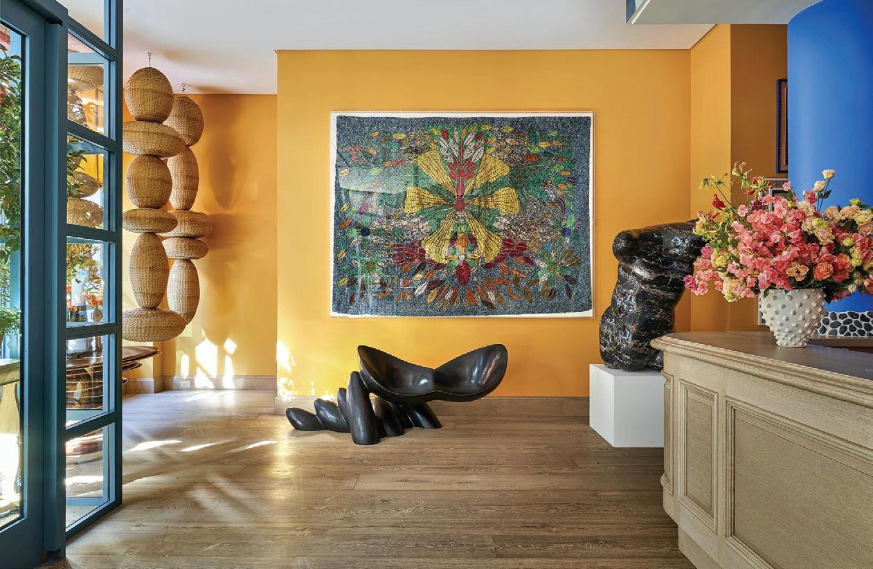
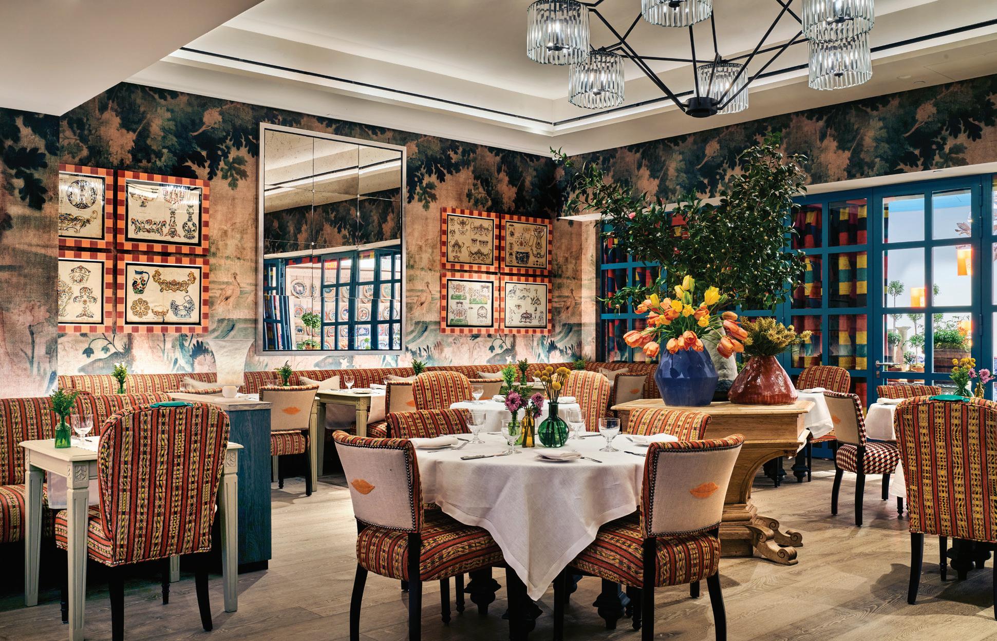
left: Entering the lobby, guests are greeted with art and color. right: Even in a muted palette, there are plenty of prints on display. below: The restaurant’s dining room is packed with personality.
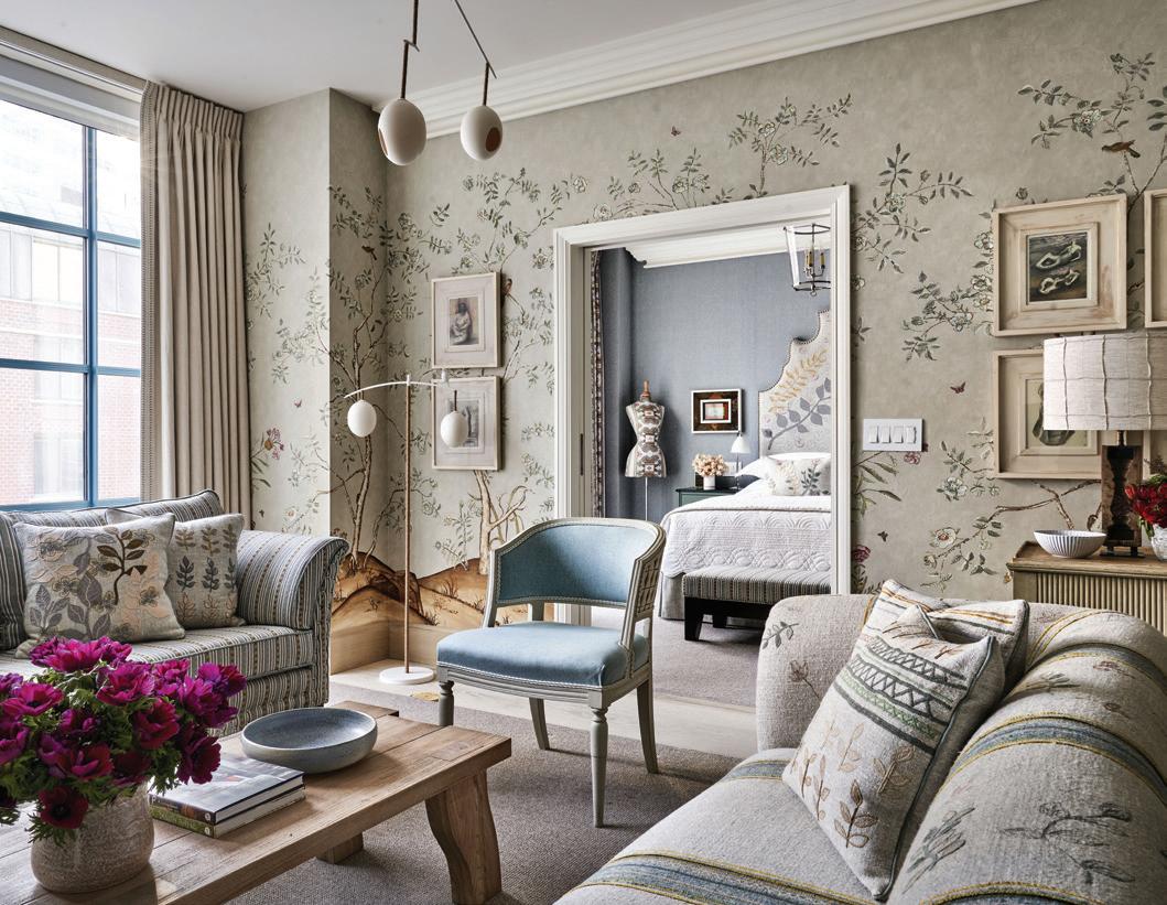
Beyond those blue doors, Kemp’s kaleidoscopic vision for boutique hotel living unfolds in full color. Dopamine-boosting buttercup walls provide a bold backdrop for a collection of sculptural stone, floating woven towers and framed textural works that pay homage to the neighborhood’s history as a 19th-century textile hub. There is art everywhere, with over 700 pieces commissioned or created from Kemp’s Design Studio, making every corner worth exploring. And on each seat, settee and sofa, an opportunity for unexpected upholstery, including fabrics from Kemp’s latest collaborations with Christopher Farr Cloth and GP&J Baker.
Each of the 69 individually
designed rooms and suites is a jewel box, offering views of lower Manhattan through floor-to-ceiling windows. For those fortunate enough to book a suite with terrace access, a Kemp-designed private residence awaits, where eclectic furniture, bespoke lighting and a carefully chosen color palette transform the space into an intimate, luxe apartment. The living area invites you to relax in front of the fireplace or by the windows, with thoughtful details like a record player and a selection of vinyl, setting the perfect mood. A separate bedroom features a statement headboard, generous space for dressing and a desk, while the adjoining bathroom is a marble-clad sanctuary, anchored
by a silver soaking tub for the ultimate in relaxation.
Dining at Warren Street Hotel is as thoughtfully curated as the interiors themselves. Begin your day with a proper English breakfast, linger over afternoon tea served on Kemp’s signature Spode china, or ease into the evening with cocktails and a modern brasseriestyle dinner at Warren Street Bar & Restaurant, where the menu is served all day. Private dining can be arranged under the skylit roof of The Orangery, a luminous space that connects to the guest-only Drawing Room. With its inviting sofas, flickering fireplace and help-yourself honor bar, it’s the kind of setting that feels tailor-made for slow mornings or a quiet nightcap.
86 Warren Street New York, NY 10007 firmdalehotels.com
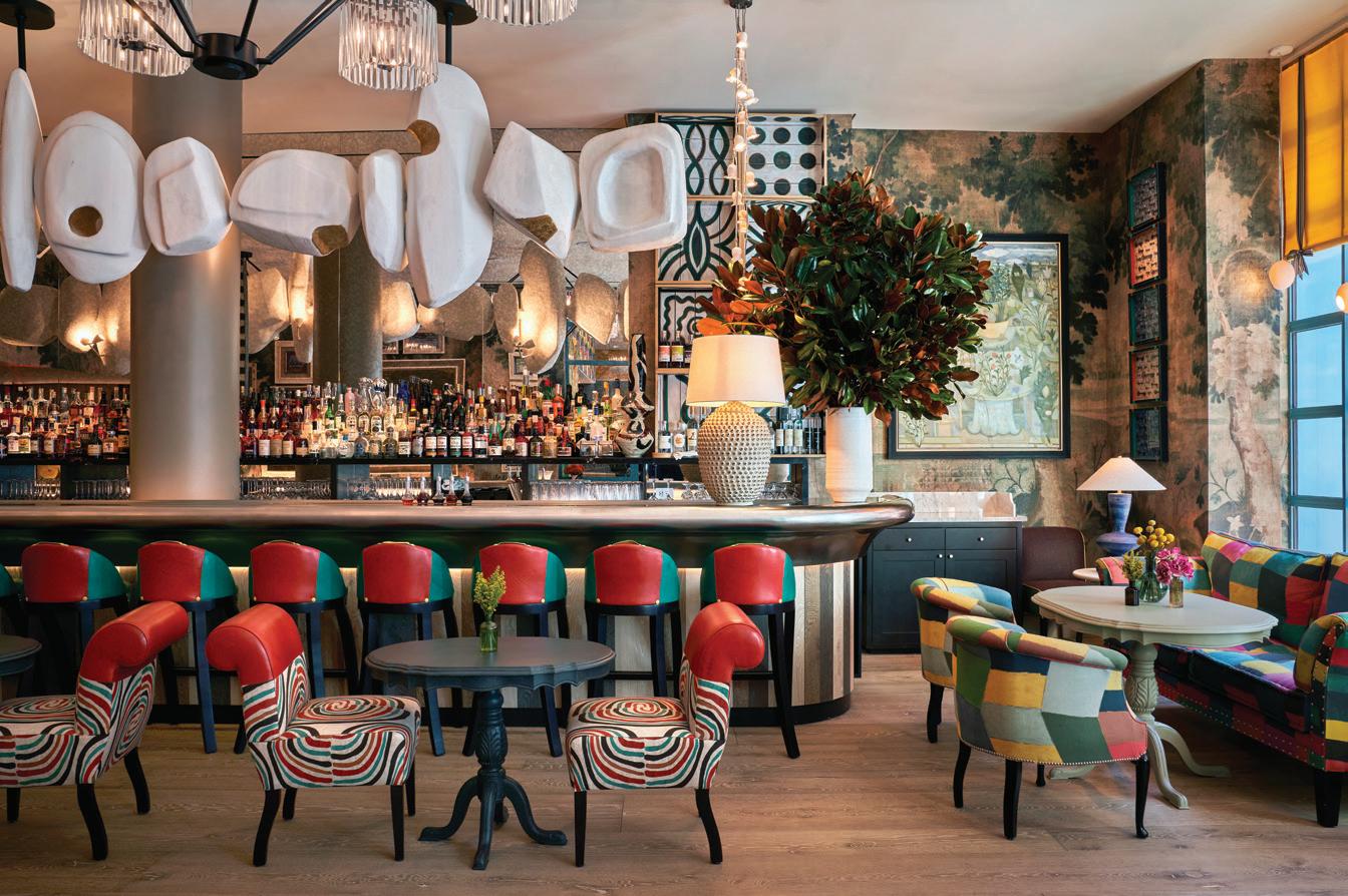
above: The contemporary sculpture that hangs over the pewter bar was commissioned especially for the space.
shoptalk
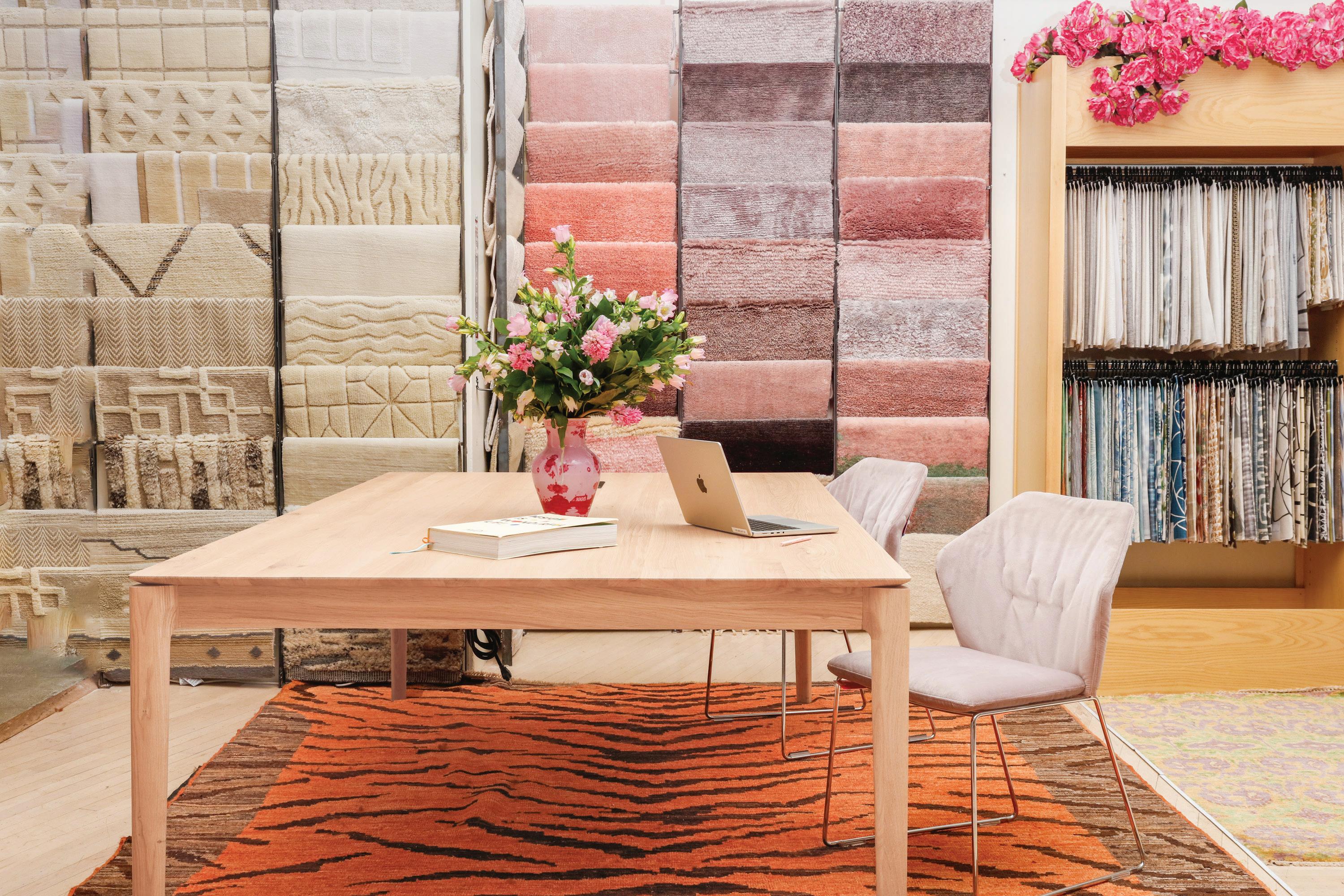
TREASURE TROVE
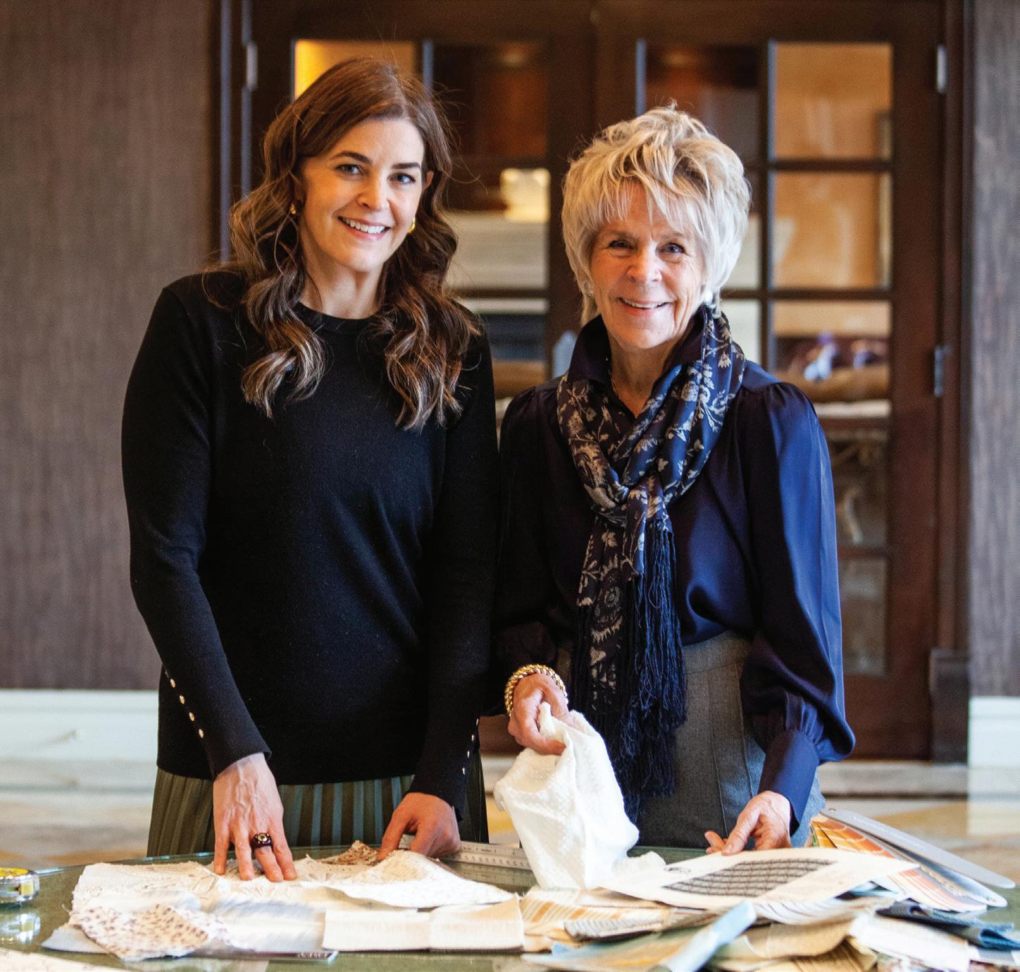
For decades, abc carpet & home has reigned as one of New York’s most beloved and boundary-pushing design destinations—a multisensory space stocked with handwoven rugs, artisan-crafted furniture, sculptural lighting, dreamy décor and one-of-a-kind vintage jewelry. Now, the iconic brand brings its magic to Greenwich Avenue.
The two-floor, 12,500-squarefoot space is a natural extension
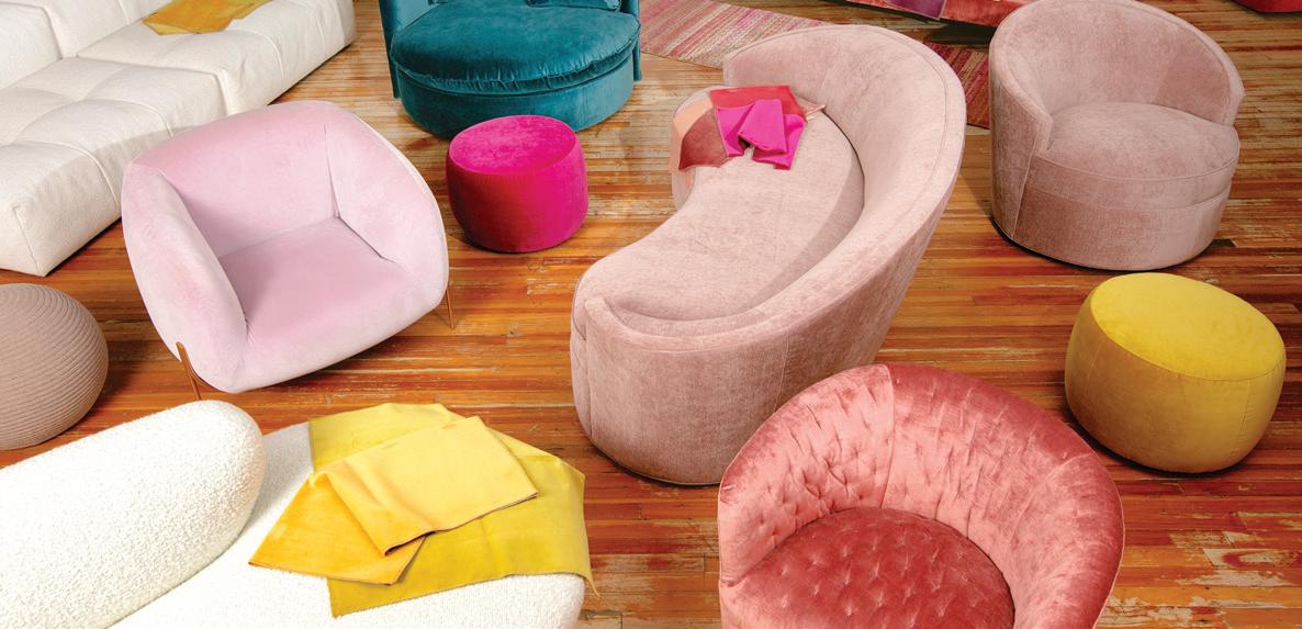
of abc’s ethos: immersive, layered and inspiring at every turn. Exploration is part of the fun, whether you have plans to upgrade your spring table with rainbow-hued stemware and candy-colored crystal candlesticks or you’re looking to punch up your living room with pastel upholstered pieces.
abc carpet & home 181 Greenwich Avenue, Greenwich; abchome.com
above: There are plenty of rugs to choose from in the new Greenwich Avenue space. below: Colorful custom furniture options abound at abc carpet & home.






Story Line
Little Greene takes a nostalgic nod with its latest wallpaper collection
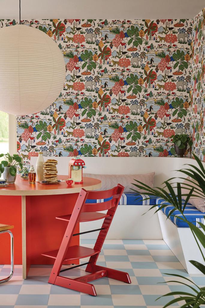
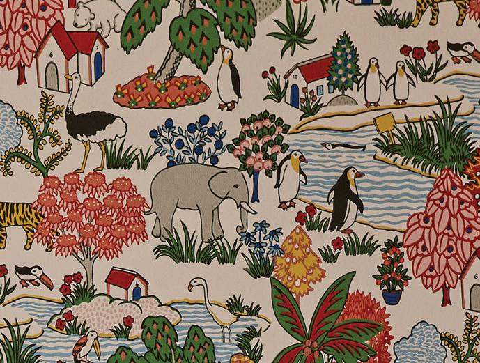
F or Storybook Papers, the British brand dug into their National Trust archive to dream up eight designs that evoke the magic of childhood. Pulling from vintage toys, decorative textiles and original illustrations—including those by the beloved children’s author Beatrix Potter—each wallpaper tells a story steeped in history. Spot the elephants, ostriches and penguins in Animal Kingdom or the vintage-inspired chicks and ducks in Riverside Capers. Additionally, the much-loved Broad Stripe wallpaper returns in fresh, joyful colorways, while the flocked Nip & Lassie design introduces a unique textural element, celebrating Potter’s Herdwick sheep in an irresistibly tactile finish. Designed to delight all ages, there are options for every space that could use some cheerful change. littlegreene.us
ROOM SERVICE
Delamar Greenwich Harbor is getting a glamorous refresh
In its first major renovation in 25 years, the beloved waterfront fixture has tapped design legends Bunny Williams and Elizabeth Lawrence of Williams Lawrence for a grand reimagining— marking their luxury hospitality debut.
Williams and Lawrence are set to unveil a striking new lobby and a 1,570-square-foot penthouse suite with a rooftop garden to take in the boat-lined harbor view. In addition, the hotel is planning on updating sixty-five guest rooms, layering modern amenities with Delamar’s signature blend of coastal charm and European elegance. With the transformation already underway, the reworked spaces are set to debut this summer.
Take It Outside
RH OUTDOOR Greenwich dives into sun-proof style

Make sure you’re sitting pretty this summer, with help from RH Outdoor Greenwich. Their newest outpost on Greenwich Avenue is the brand’s first-ever standalone gallery dedicated to outdoor living. The immersive space showcases their fan-favorite collections, alongside fire tables, umbrellas, lighting, rugs and décor. Debuting exclusive designs like Striata, Sedona Cane and Lagos, the gallery highlights RH’s commitment to craftsmanship in solid teak, all-weather aluminum and woven textures. Visitors will also have access to RH Interior Design, ensuring expert guidance to transform patios, balconies and poolside retreats.
RH Outdoor 264 Greenwich Avenue, Greenwich; rh.com
above: The Striata teak chaise is wrapped in handwoven all-weather rope.


MEET FLOWCODE, THE NEXT GENERATION OF QR CODES





Go ahead, try it out. Point your phone’s camera at the Flowcode to scan.
Make a Splash
ORME BY KAST BRINGS BOLD COLOR TO CONCRETE
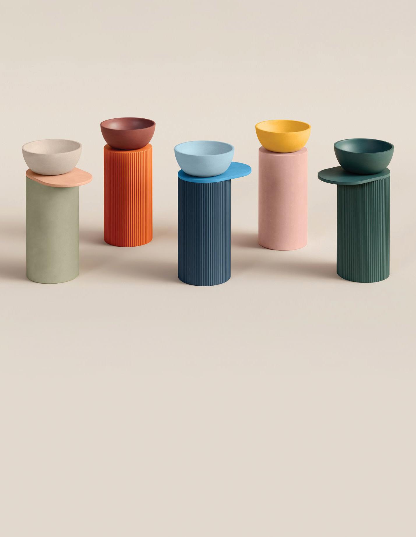
Ready to rethink your sink? Kast is here to redefine your daily routine, one beautifully crafted basin at a time. Featuring soft curves, a distinctive pill shape and Kast’s signature flawless finish, Orme is as much a work of art as it is a functional fixture.
Designed for both countertop and wall-mounted installations, this versatile basin offers a sleek, modern aesthetic that plays well in a variety of spaces—whether you’re styling a minimalist retreat or a statement-making powder room. Available in 28 colors, from moody charcoals to sun-kissed pastels, Orme lets you dial up the drama or keep things understated. kastconcretebasins.com

Into The GLOSS
Luke Edward Hall brings his bright ideas to The Lacquer Company
B
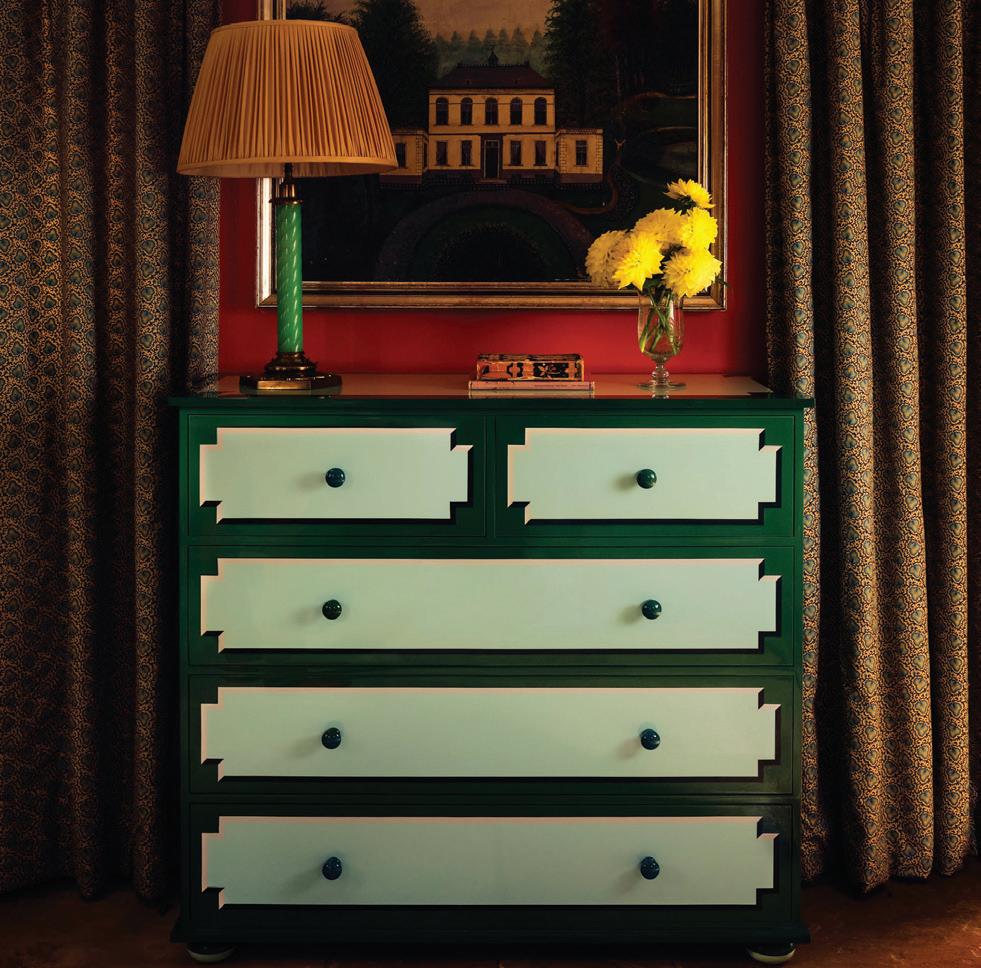
ritish artist Luke Edward Hall infuses The Lacquer Company’s latest collection with his signature brand of playful sophistication. From coffee tables to nightstands and catchall trays, each of the eight high-gloss, Regency-style pieces features hand-applied trompe l’oeil details and a rich, vibrant color palette—designed for interiors that crave tradition with a bold twist. thelacquercompany.com


Prints Charming

PETER DUNHAM ’s signature style, captured in a new book
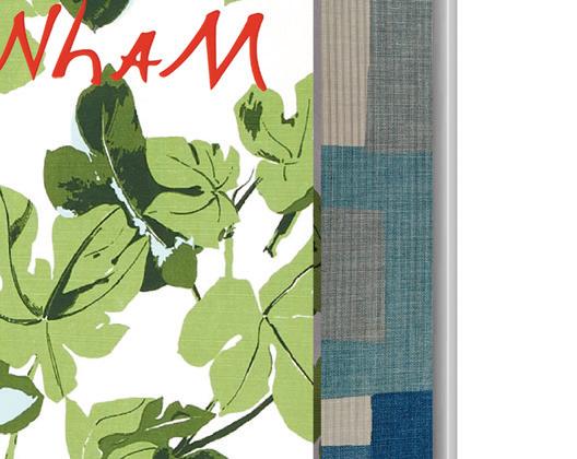
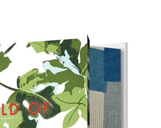
Few designers strike the balance between bold and timeless quite like Peter Dunham. Known for his confident use of color, pattern and lived-in layers, the Los Angeles-based designer has cultivated a style that’s equal parts effortless and elevated.

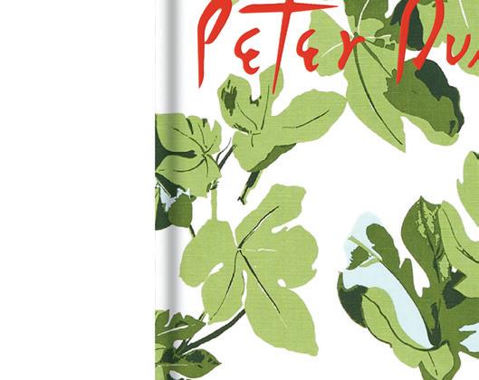
Now, Dunham invites us for a peek into The World of Peter Dunham, showcasing a dozen of his most captivating projects, from sun-drenched California estates to chic New York penthouses— not to mention his own homes, including a Parisian pied-à-terre. Throughout, Dunham weaves together the design philosophies that define his work: Color, Rhythm, Togetherness and Nature, each chapter offering an intimate look at the inspirations and influences behind his aesthetic.
athomefc.com
above: Each of the basins is made to order, according to your bespoke needs.
this photo: The Benedict chest of drawers comes in four colorways.
above: The World of Peter Dunham: Global Style from Paris to Hollywood by Peter Dunham, edited by Stephen Drucker; $75.
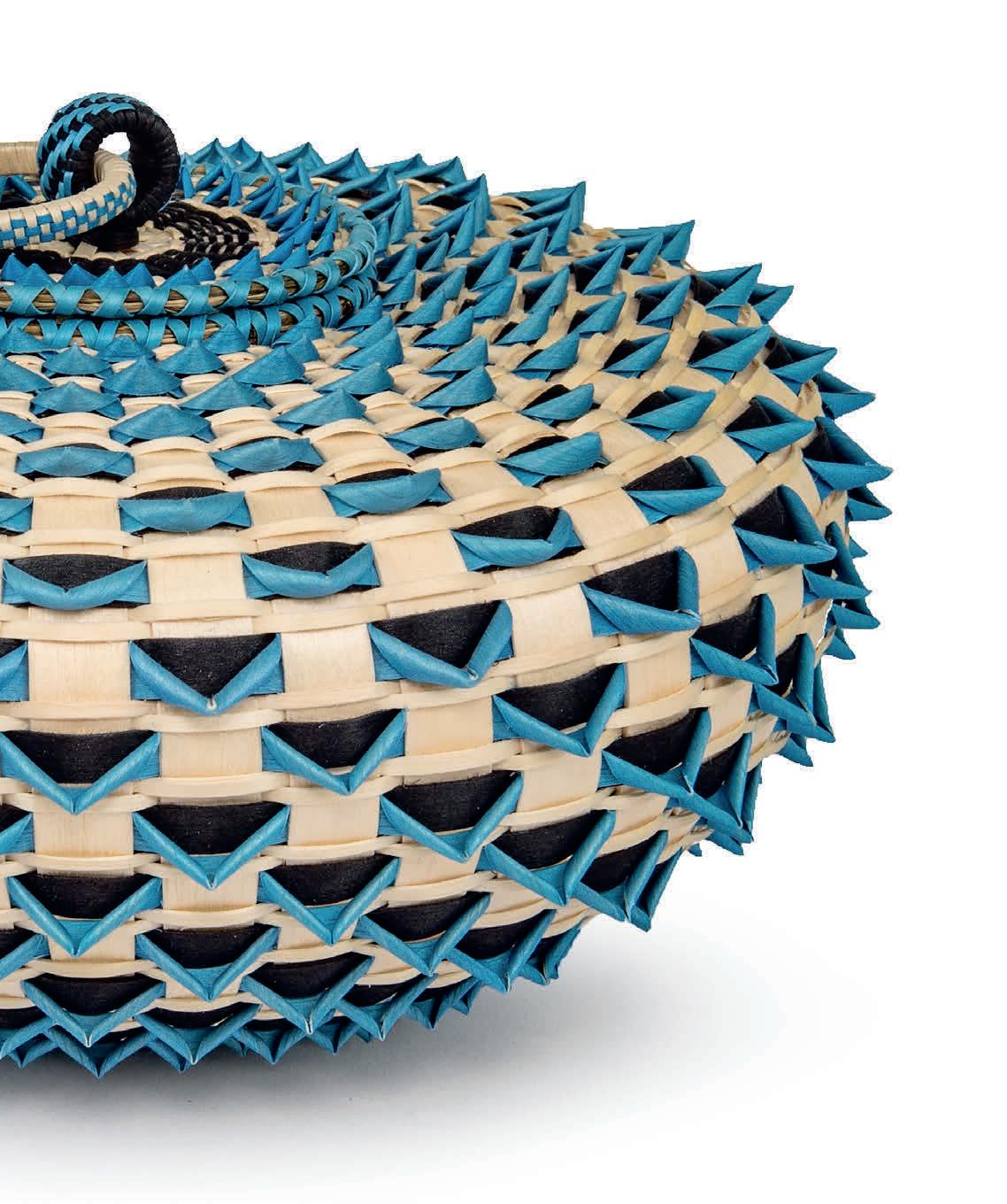
Jeremy Frey: Woven
June 5–September 7, 2025
Bruce Museum Greenwich, CT BruceMuseum.org
Jeremy Frey (Passamaquoddy, b. 1978), Blue Point Urchin (detail), 2016. Ash, sweetgrass, and dye, 5 x 9 x 9 in. Collection of Dr. and Mrs. Ari and Lea Plosker. © Jeremy Frey. Image courtesy Eric Stoner
MIX MASTERED
Playful patterns, a bold palette and plenty of global finds enliven this darien home
Interview with ELIZABETH HAY, ELIZABETH HAY DESIGN // Photography by MATT KISIDAY // Styling by FRANCES BAILEY
this
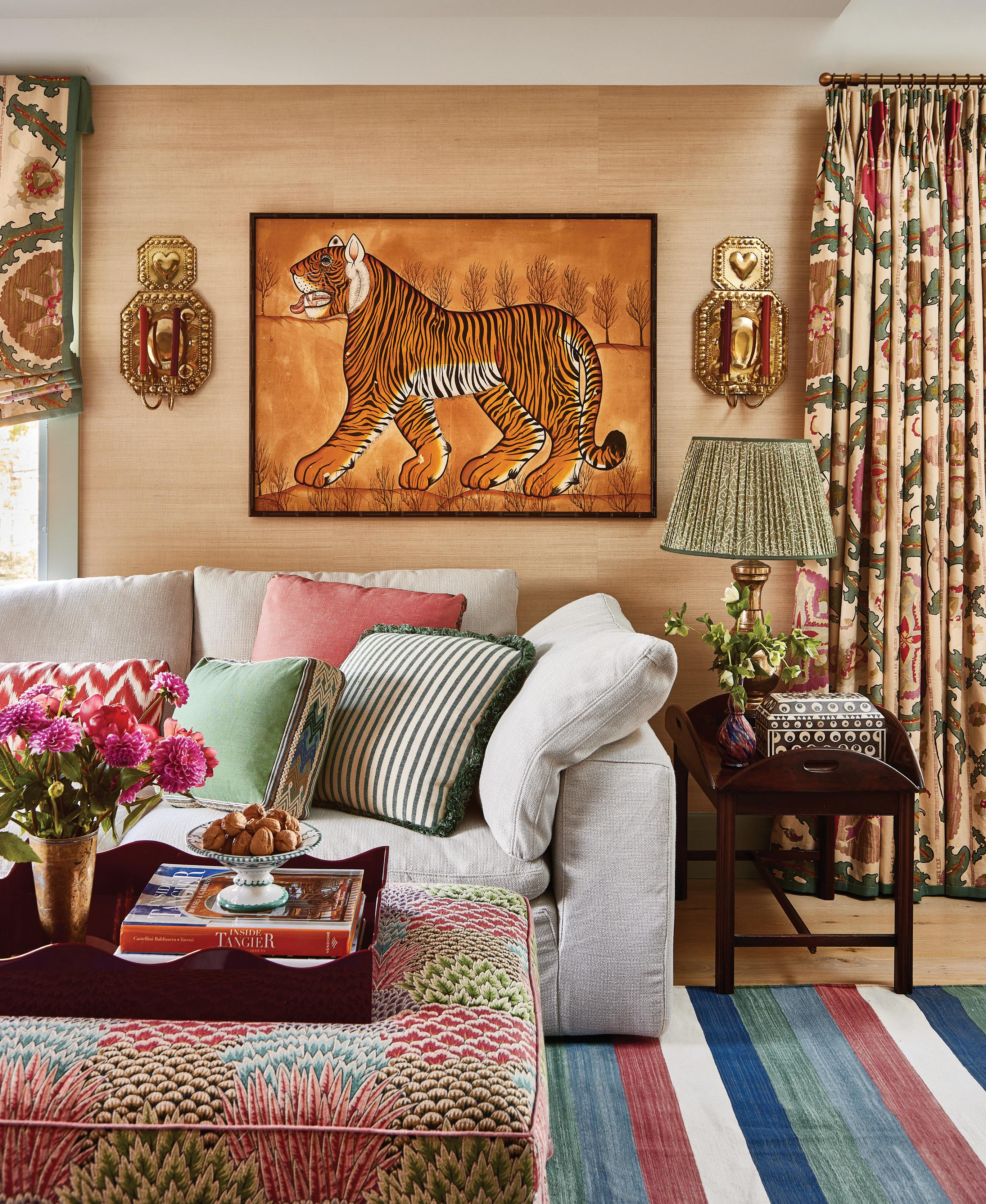
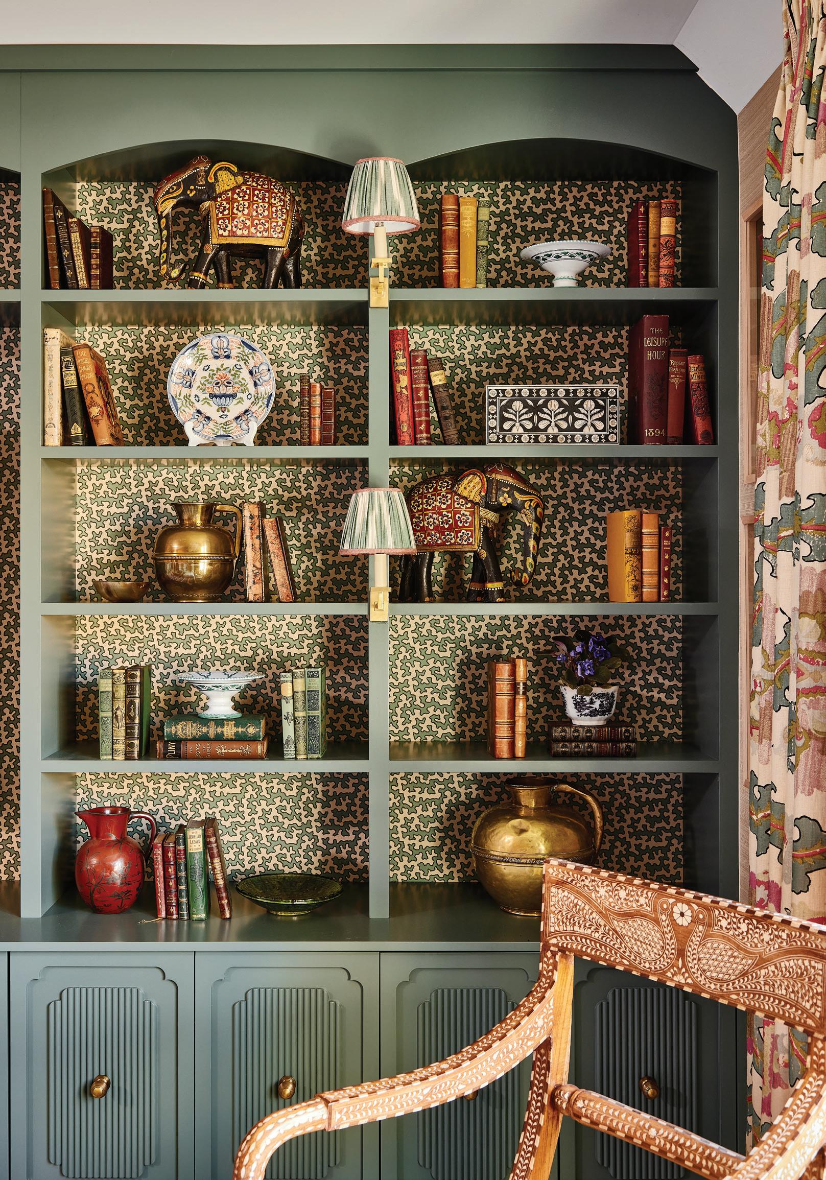
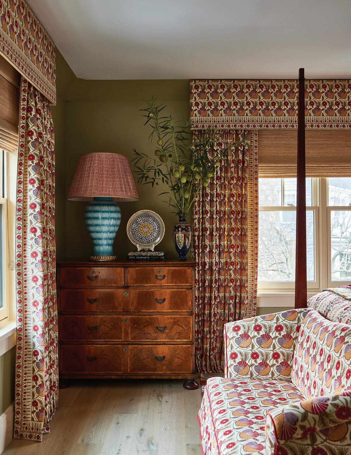
photo: Against the neutral grasscloth backdrop, Hay was able to go bold with Robert Kime’s Tashkent drapery on the windows.The Batik tiger artwork comes from Hay’s own collection and is flanked by vintage brass Swedish sconces. opposite page: Squiggle Aqua by Sibyl Colefax & John Fowler backs the green bookcases, with library lights by Vaughan. The chair, a John Rosselli & Associates find with an inlaid design, adds another layer to the eclectic collected feel.
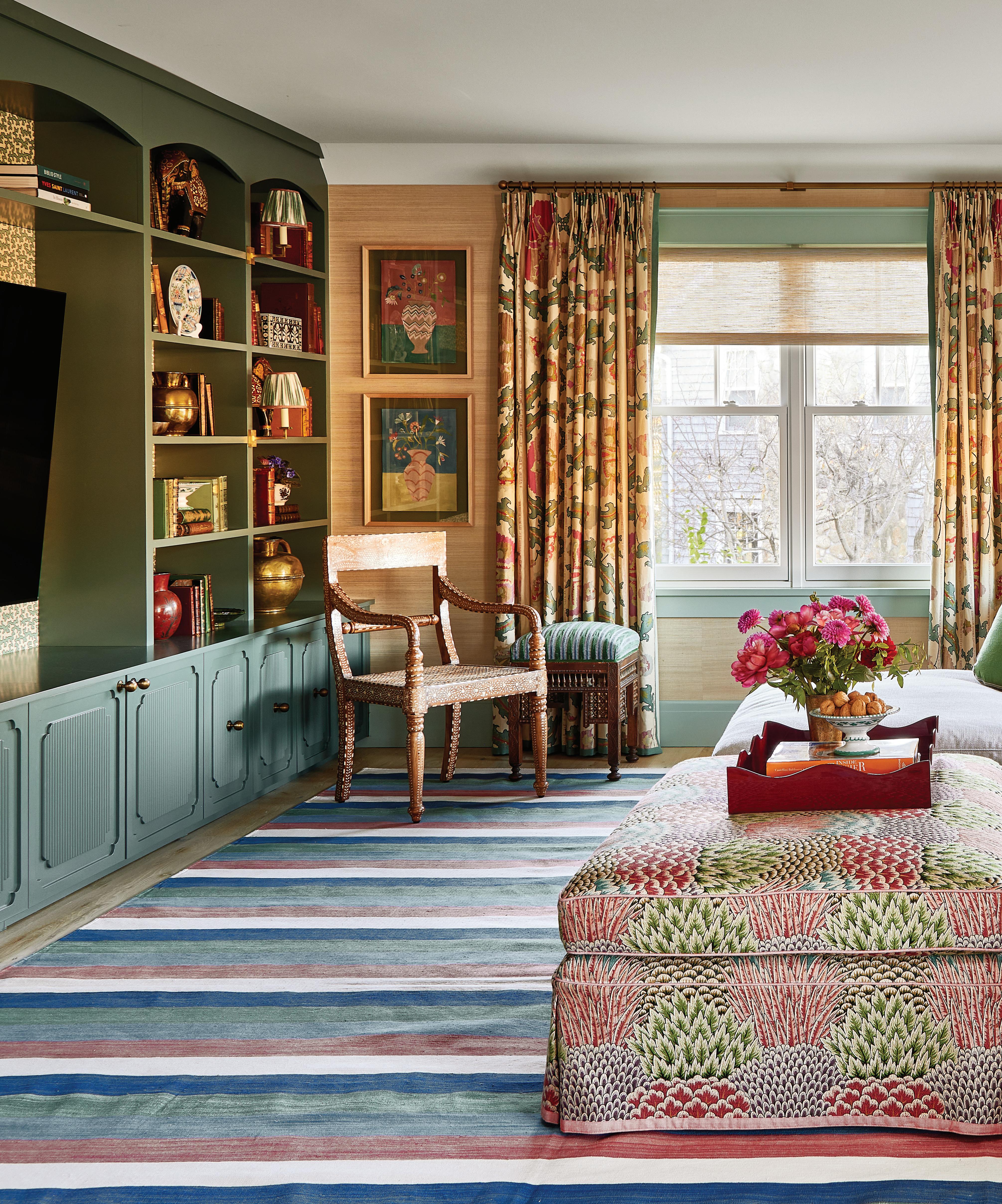
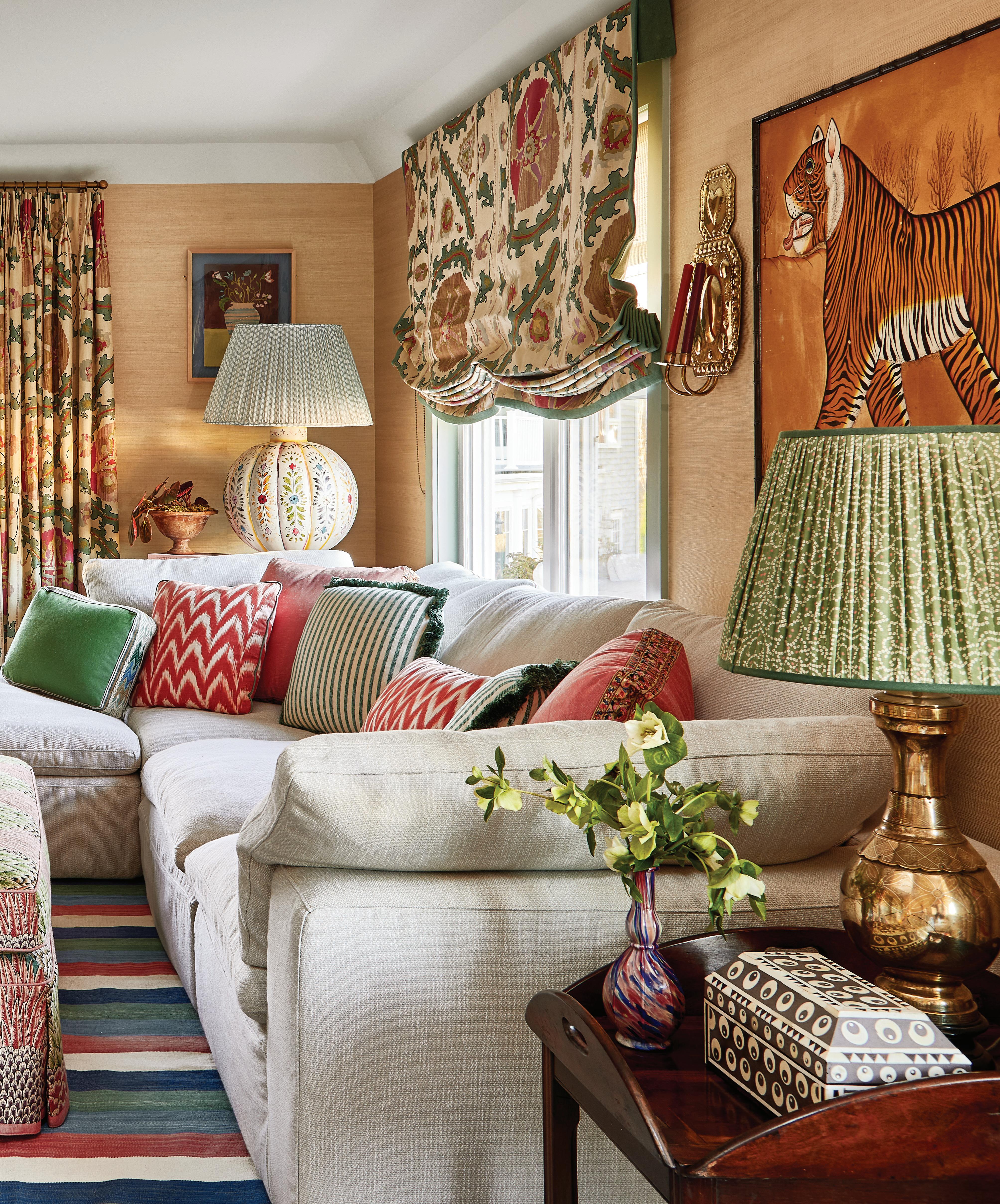
this photo: The ottoman is covered in Pienza Multi by Clarence House and includes the palette for this living room, a mix of warm greens, reds and blues.
Who lives here?

They’re a young family. They’d recently moved out of the city during COVID and wanted a bit more space. They have two kids now, but at the time they just had one.
The house was a new build, done really nicely, but it just felt quite sterile. It was all white, and they wanted to inject a lot of personality into it and make it feel a lot cozier.
The clients knew your style, but what were their asks beyond adding personality to a white new build?
It really was a bit of a blank canvas, and it was obviously built to a very high standard. There were really nice finishes, and everything was
done pretty beautifully, but it just felt very generic.
The wife loved my use of color and pattern and felt that my projects just felt like really cozy homes, and that’s what she wanted to achieve here.
We did that with clever use of wallpapers and paint colors, lots of big rugs. In the bathrooms, the color and wallpapers make such a huge difference.
Did you have a jumping-off point with a color or a pattern to create a palette for the house?
Not really. After a number of meetings with her over Zoom, I flew out there and presented
two or three schemes for every room, and it organically evolved from there.
Their brief was for their master suite. They wanted it to feel really serene and not too busy, just very calming with the pale blues and pinks. She already had a mood board that she’d been thinking about for a while, and she’d already done some things to her dining room.
How does your process typically start?
Every client is so different. You know, some clients come to me, and they love what I do, but they also have an idea of what they want for their house, and they’ve put a lot of thought and effort into it already. They have mood boards and things like some specific fabric.
above: A wooden spindle bench sits at the entry, which includes artwork by Sydney Albertini against Palm Stripe wallpaper in Sea Green by George Spencer.
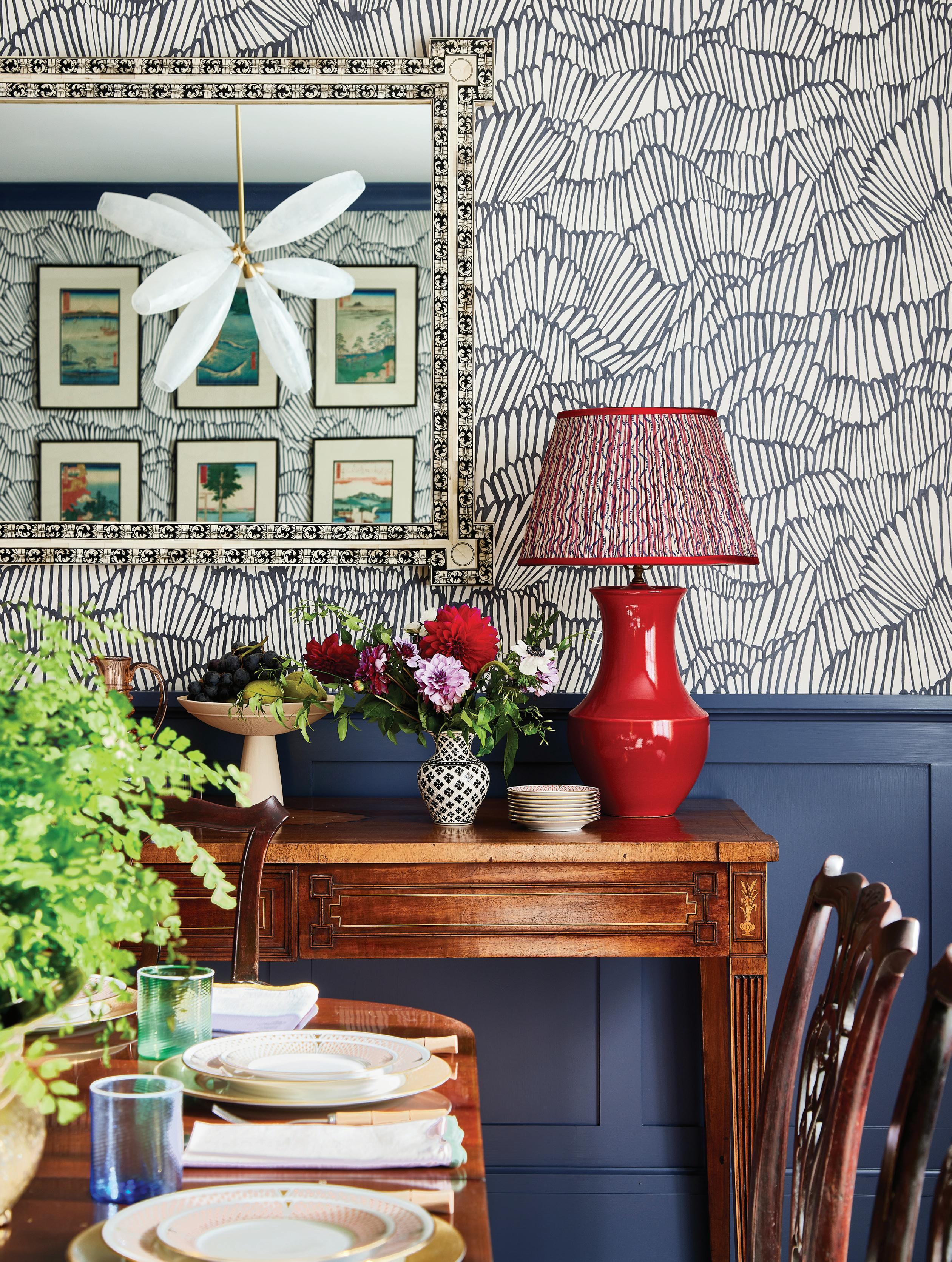
this photo: In the dining room, a cherry-colored Stephen Gerould lamp is topped with a red-and bluestripe pleated silk lampshade.
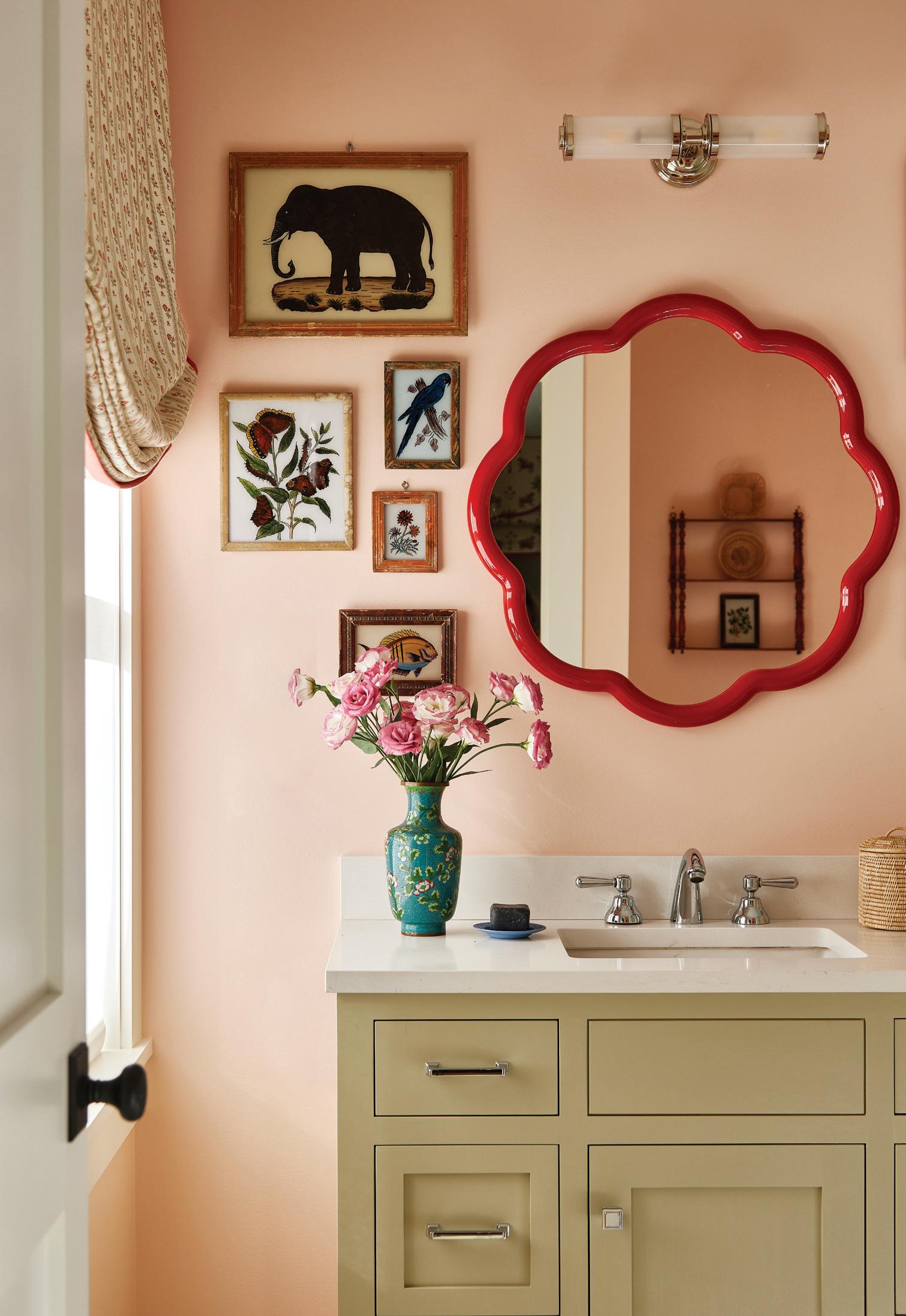
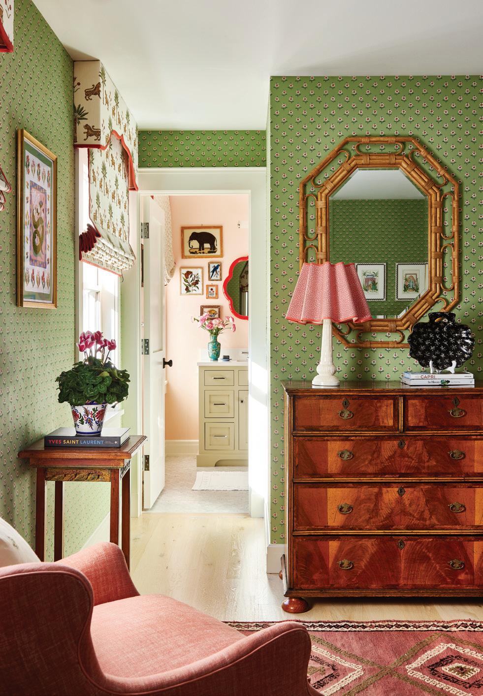
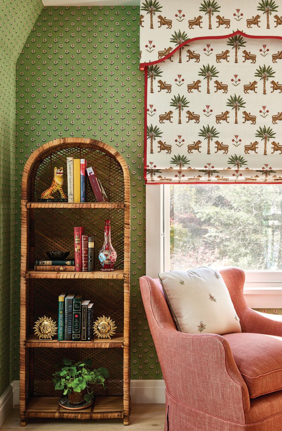
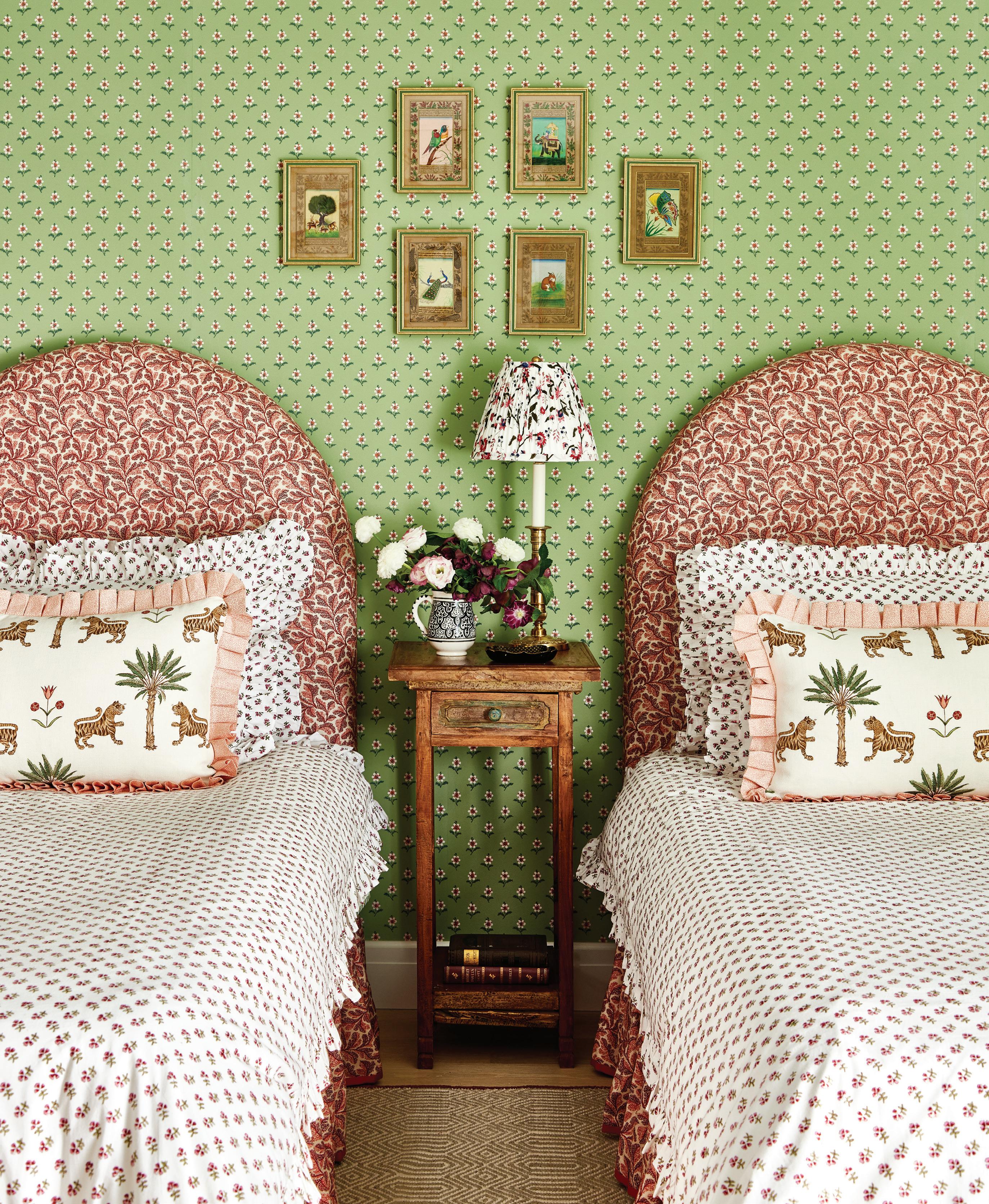
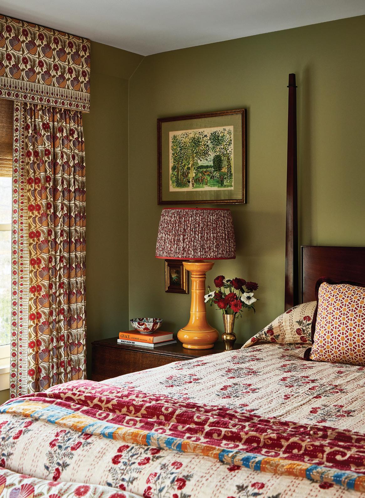
above: A sweet scallop-edge mirror pops against the walls of this bathroom, painted in Blushing by Sherwin Williams. right, top: This bedroom, papered in Ipswich Sprig by Adelphi Paper Hangings, includes a mix of green and red shades. right, bottom: Continuing the tiger motif, Hay trimmed the windows with Schumacher’s Tiger Palm fabric. opposite: Small-scale floral prints, on the walls and bedding, make this bedroom bloom.
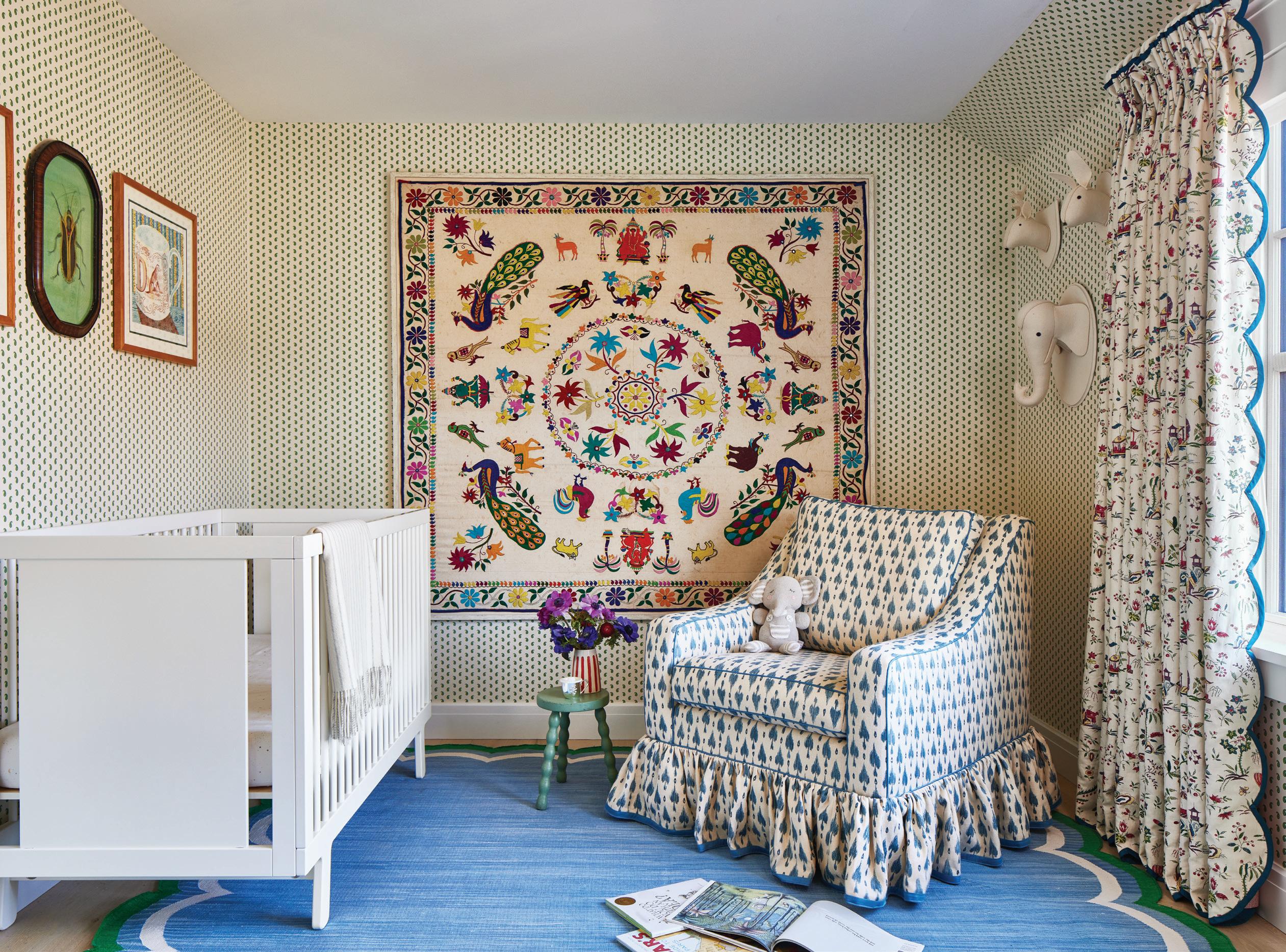
: A
more pattern,
above
framed antique textile creates a fun focal point in the nursery. For
Hay used Peter Fasano fabric on the skirted chair.
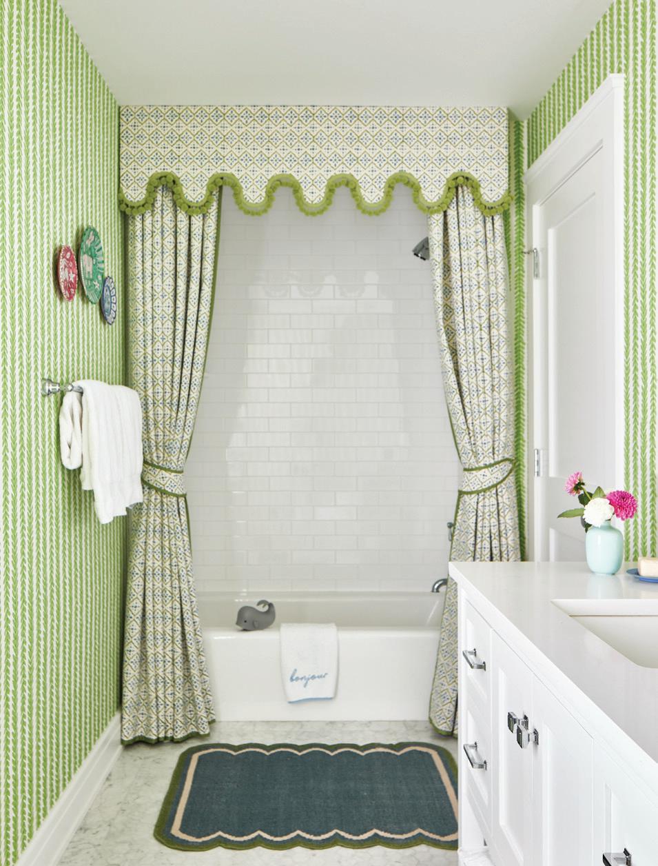
right: This kids’ bathtub gets a formal frame, with a scalloped edge that mimics the bath mat.
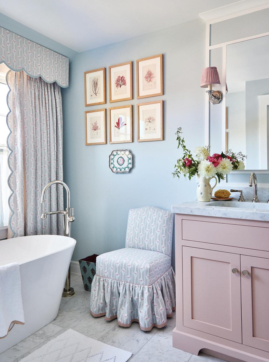
far right: Pastel shades and beachy botanical prints elevate this bathroom.
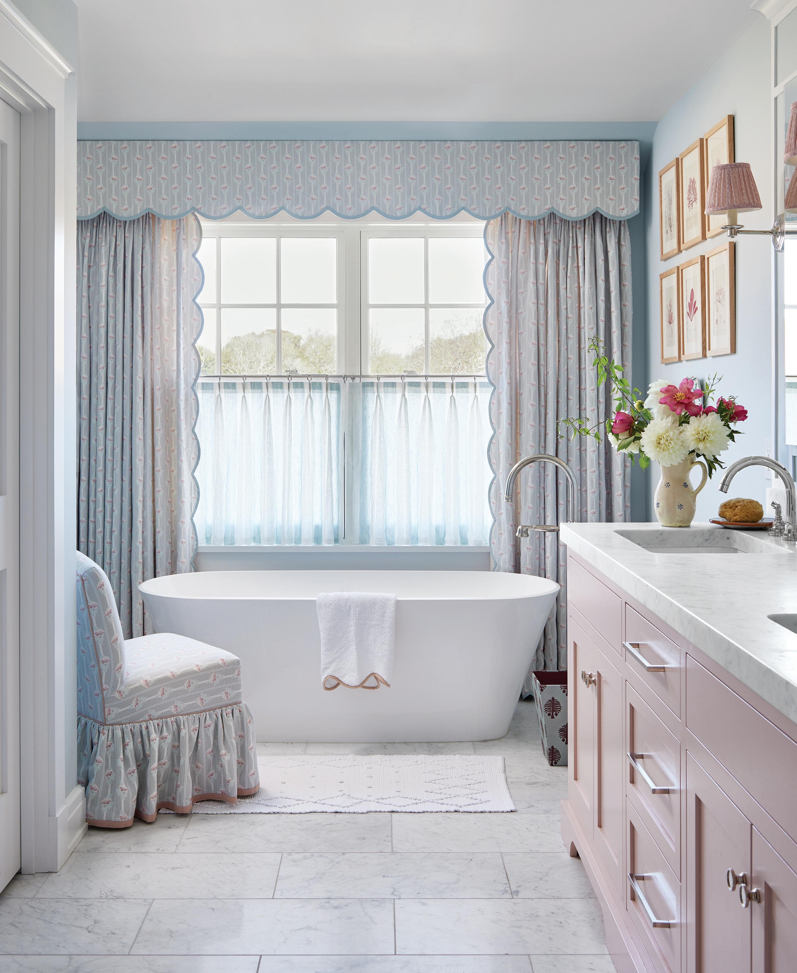
this photo: In Hay’s homes, even the bathrooms get custom upholstered pieces and drapery. She opted for Angelique by Nine Muses for this sunlit space.
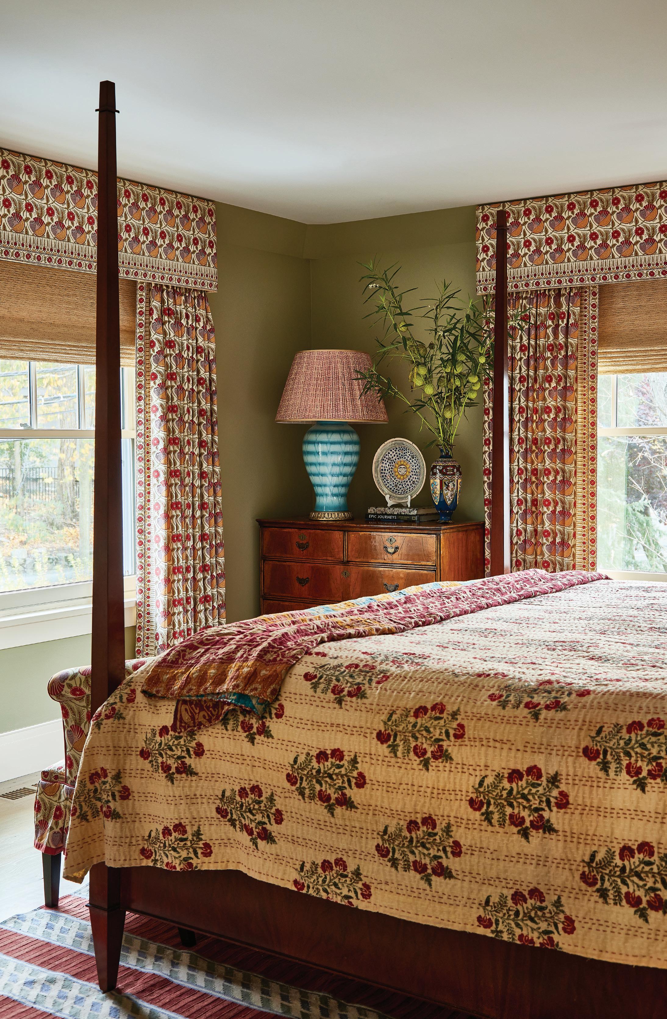
left: This room became Hay’s favorite, layered with Pierre Frey’s Le Manach, Indhira block printed florals.
“I just love creating layers and patterns in my projects. Obviously, you can create that through textures as well, but for me, it ’ s always been color .”
—ELIZABETH HAY, ELIZABETH HAY DESIGN

above: The berries on Antoinette Poisson’s Baies wallpaper have red, yellow and green tones that repeat throughout this bathroom, including the mirror and Schuyler Samperton window treatment. left, top: Sage by Sherwin Williams creates a warm, green base for this bedroom. left, bottom: Hay added an unexpected burst of blue with a Stephen Gerould lamp.
that they might love that they’ve had saved for ages and want to use, and they give me a lot of information. And then other clients, like one I have at the moment for an enormous project, literally just said, “I love what you do. Can you just kind do that [laughs]?” She hasn’t even shown me one inspiration image or anything.
The first thing I do is really build a rapport with the client, and I try and get to know them as well as I can, because for me it’s a bit like giving a present. You need to know someone quite well to give them what they want.
Tell us about these bathrooms.
The bathrooms were just white walls, white carpentry, simple gray and white marble. I really had fun with wallpapers and paint colors in there, especially the kids’ bathroom with the window treatments or scalloped shower treatments.
In the guest bathroom, I used that fun
Antoinette Poisson wallpaper, which is off that of green bedroom.
Why is color so important to you as a designer?
I just love creating layers and patterns in my projects. Obviously, you can create that through textures as well, but for me, it’s always been color.
I’ve just always been drawn to a lot of color, and I love looking at different color combinations. I love the type of layered interiors that you can keep going with and keep adding to.
I don’t necessarily want someone to walk in and think, “Wow, this is an Elizabeth Hay design.” I want someone to walk into a house and see the people that live there, rather than see me. And I hope I do achieve that.
And I mean, I just dress colorfully. I can still look at very modern, simple, neutral interiors
and appreciate them. But for me, they just don’t bring me joy. Color brings me joy.
What are some favorite colors that you’re using right now?
I always love pinks and greens, and I love yellow walls. I don’t turn my nose up at any color. A lot of people are snooty about purple.
Do you have a favorite room or a favorite moment from this project?
I have to say the guest bedroom is my favorite room, which is the one with the green walls and the Pierre Frey floral Indian fabric. I am slightly biased about that room, because that fabric has just always been one of my all-time favorites.
RESOURCES:
Interior Design: Elizabeth Hay Design; elizabethhaydesign.com
Drapery: Julie Thome Inc., Redding, juliethomeinc
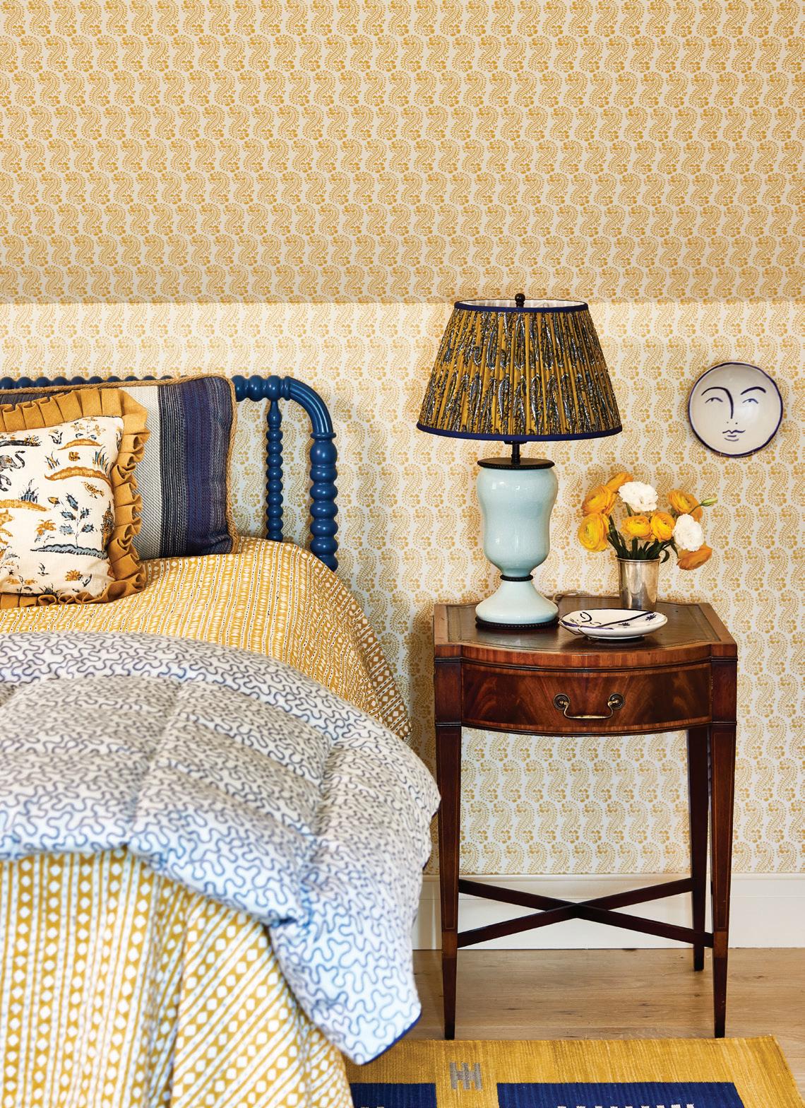
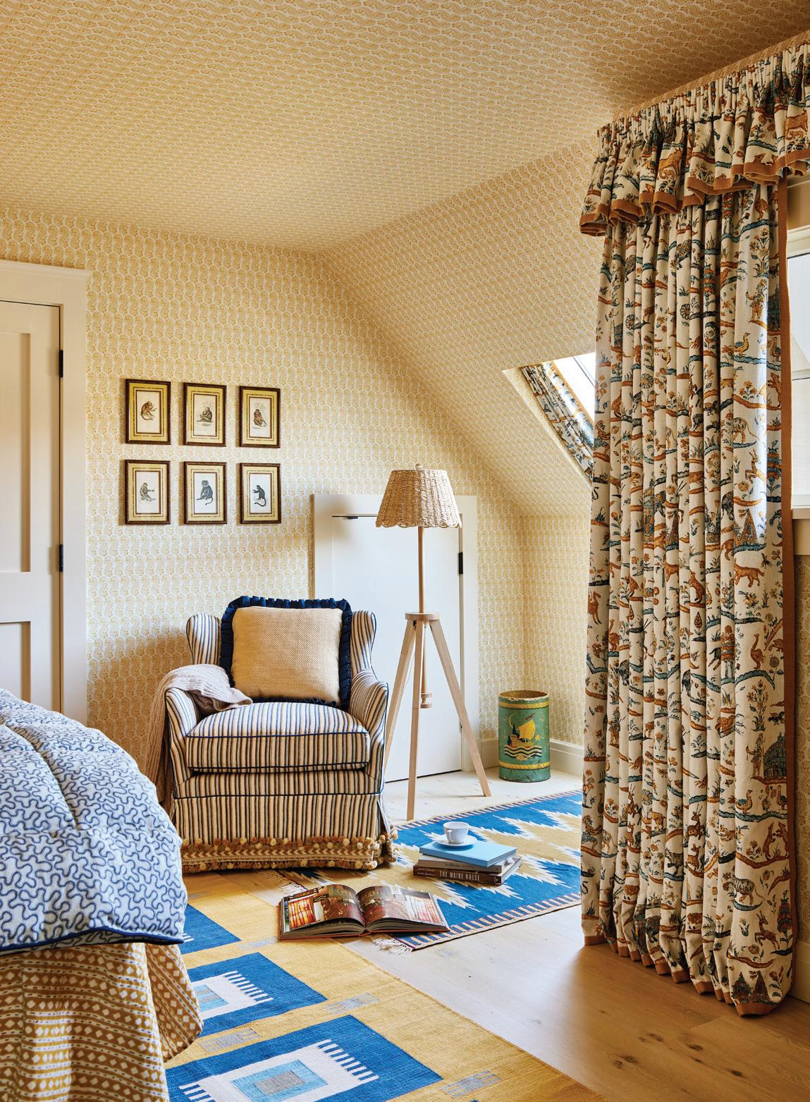
left: A Bunny Williams Home lamp tops the nightstand next the blue spindle bed. right: This cozy corner is papered in Molly Mahon’s Lani print, with Lisa Fine’s Indian Story on the windows.
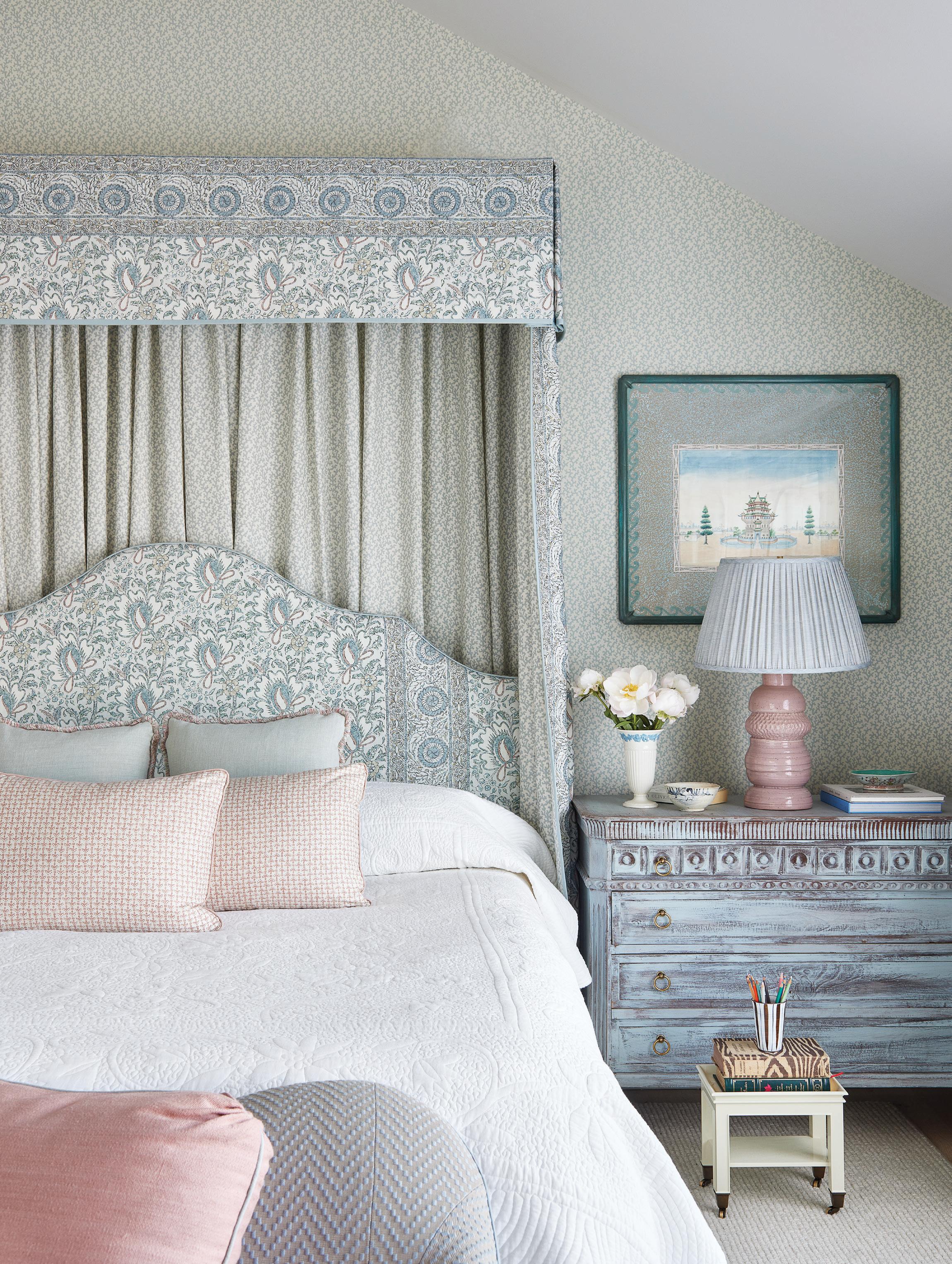
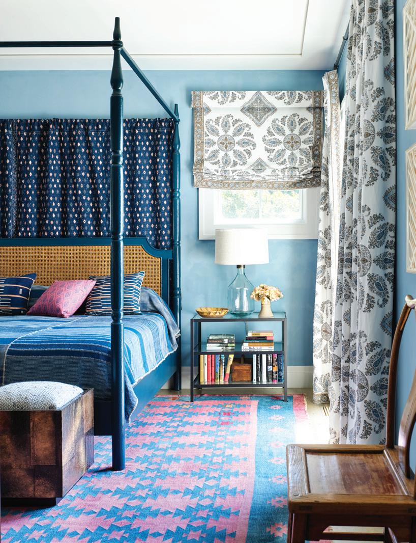
this photo: Soft blues and blush tones, layered textiles and a canopy bed create a dreamy retreat in the primary bedroom.
Taking on tradition with rose colored glasses
PRETTY IN PINK
Interview with MICHELLE MORGAN HARRISON, MORGAN HARRISON HOME
Photography by JANE BEILES -

Who lives here?
They are a young family with two smaller kids. The husband played professional hockey, and the kids needed space to play, too. They had been in a smaller lot in town and had been dreaming about a bigger lot with lots of playing fields.
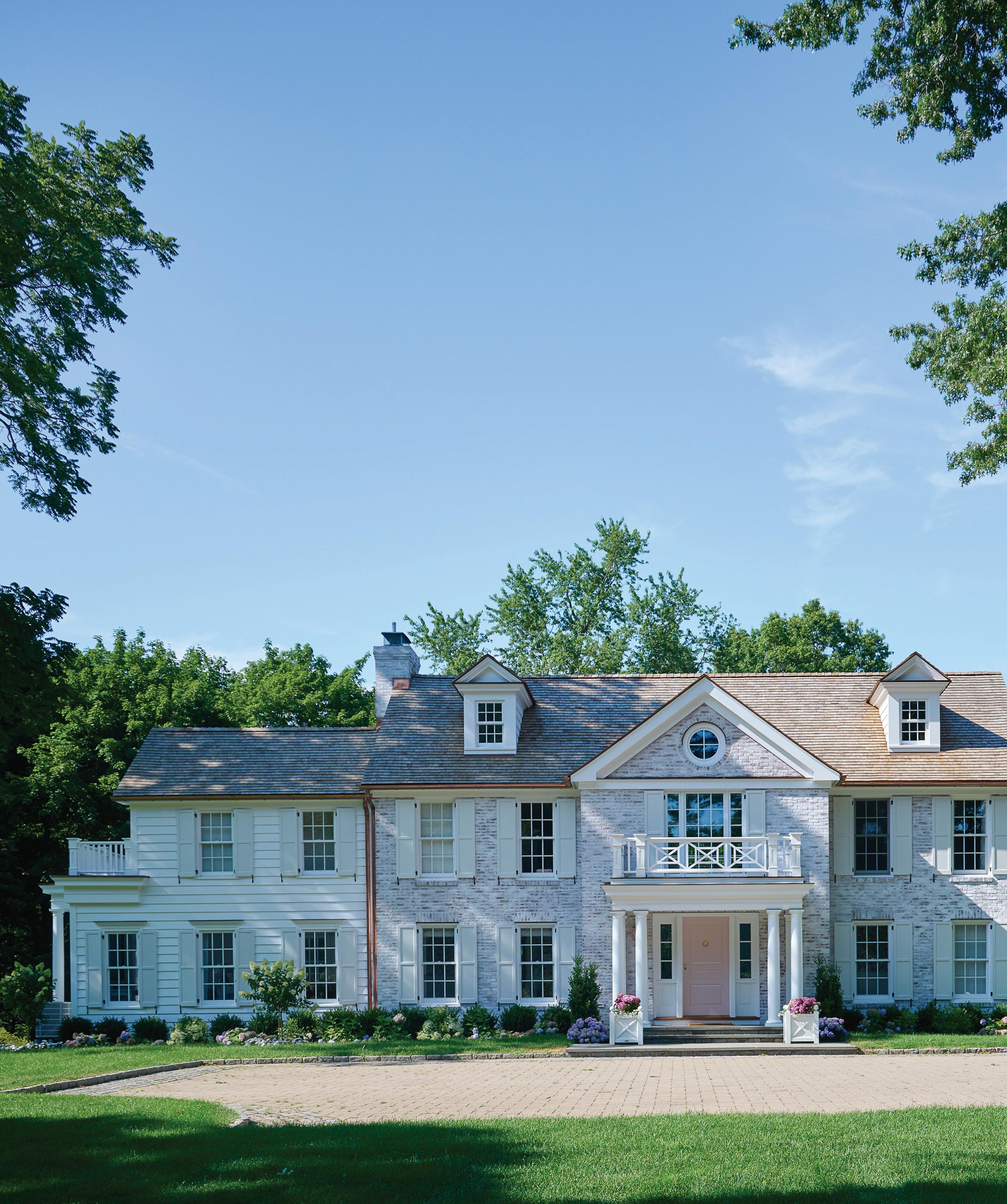
They found this fabulous lot, but the house had this kind of Tuscan look. We worked with Schettino Architects on the house and added a brick façade. The layout of the house basically remained the same.
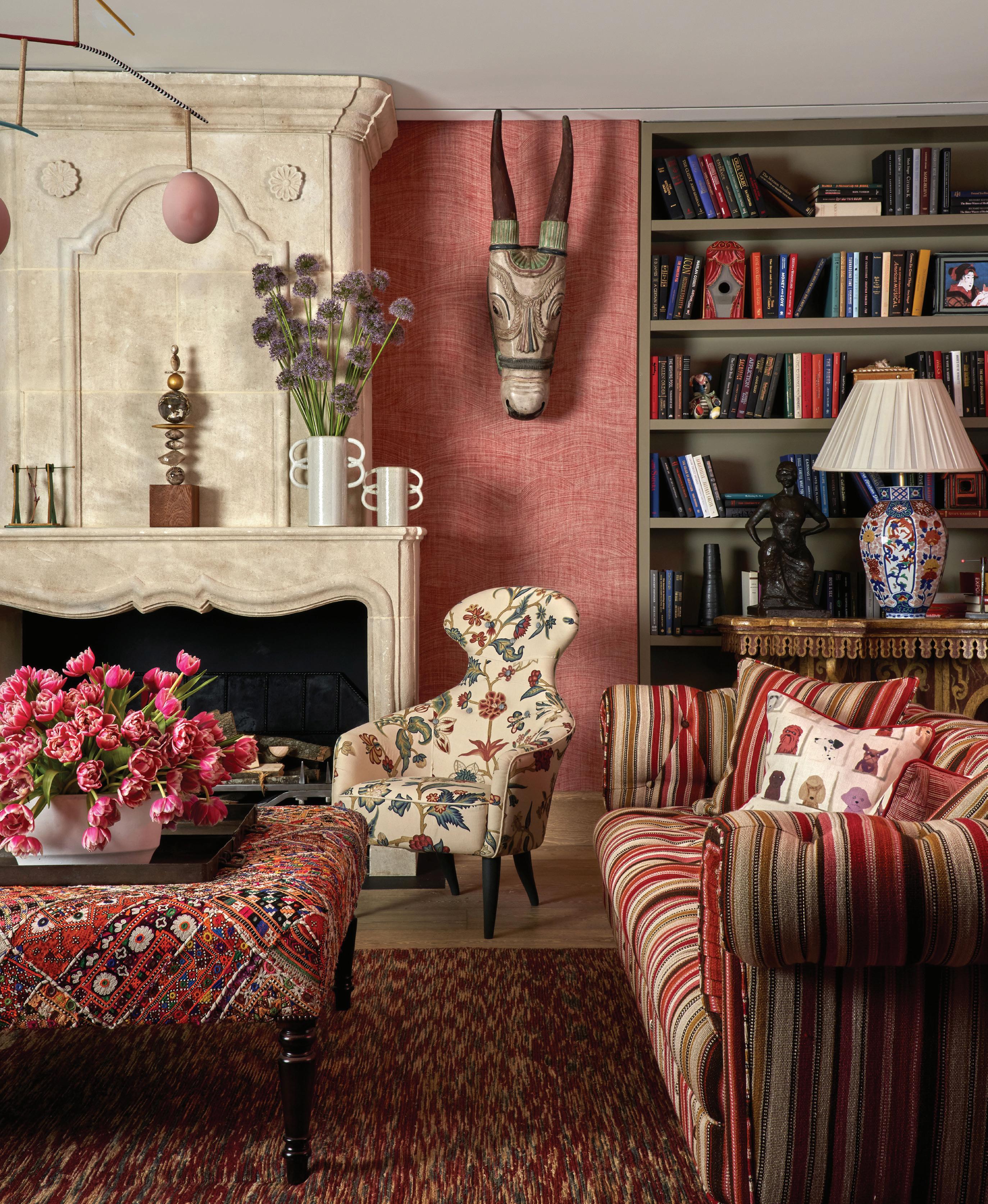
It was really about the transformation, and the wife loves pink. The husband leaned more into the light blues, so the living room became a blend of the two of them.
And we really played with color. We started by bringing her trays of prints and asking her to pick what she liked. Once we saw what she gravitated to—which was definitely “more is more”—it was really quite fun to design.
When did you decide on the pink front door?
It was discussed early on, and her husband initially said, “No,” that it was a bridge too far. But then, when we got into the brick and we lime washed it and saw the white shutters, we realized it was perfect. And that pink is the same pink that we’d already painted the cabinets in the mudroom.
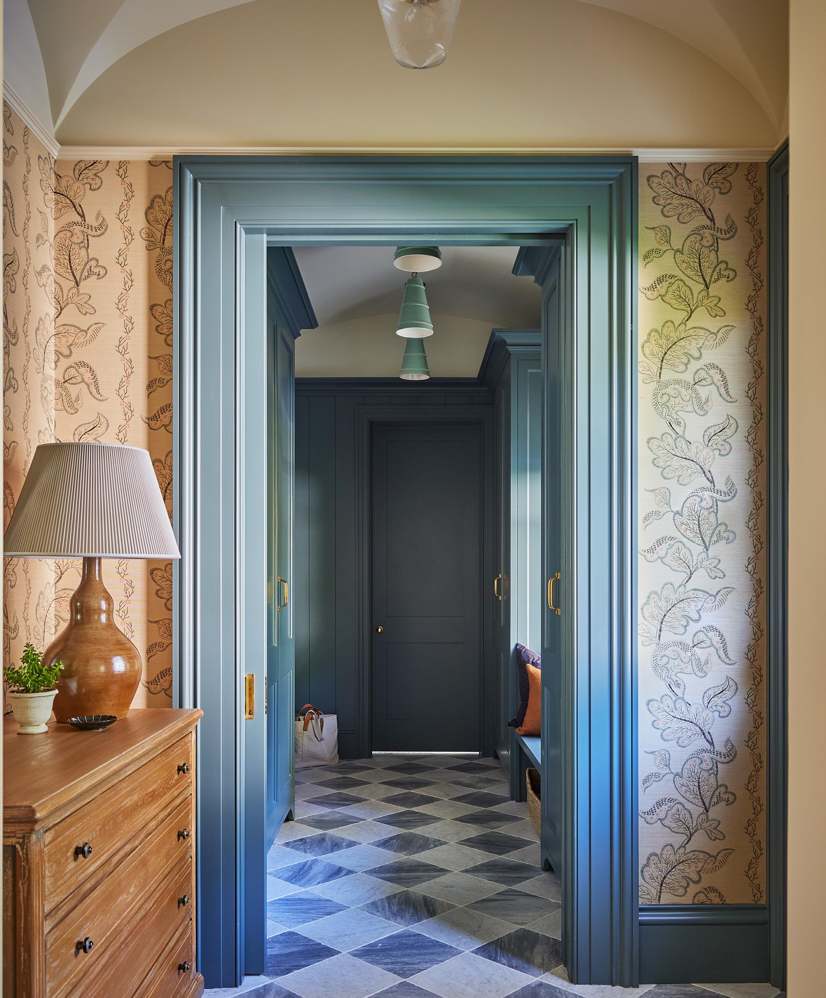
above: Benjamin Moore’s Paris Romance on the mudroom door and millwork pairs perfectly with orange accents in the clé concrete tile, a Goyard tote and even the family dog. opposite: The traditional home keeps its classic charm, with a bold pink front door that adds just the right pop of personality.
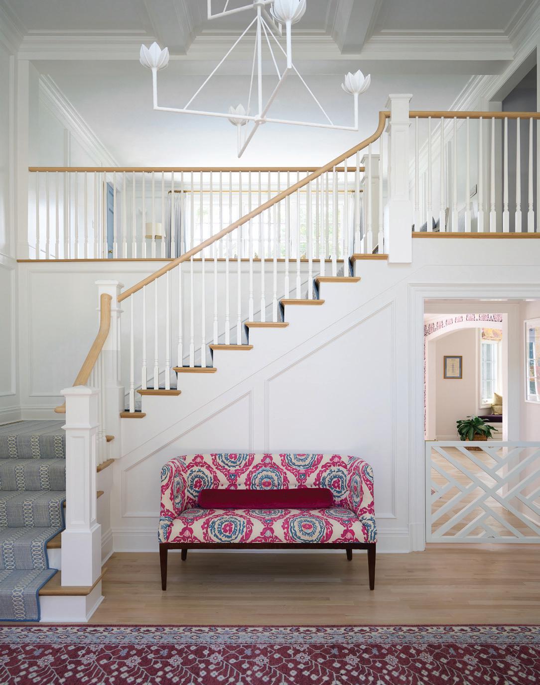
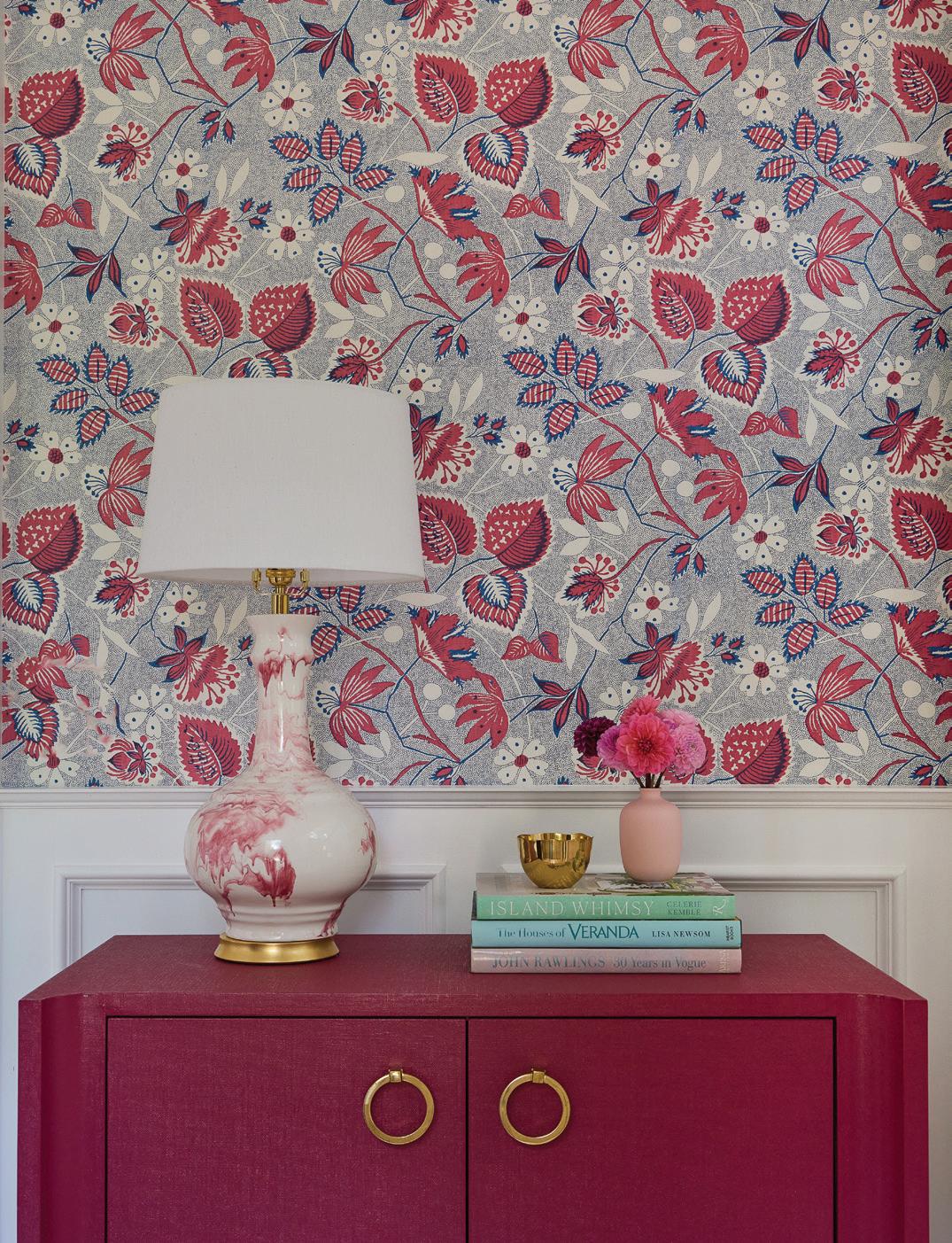

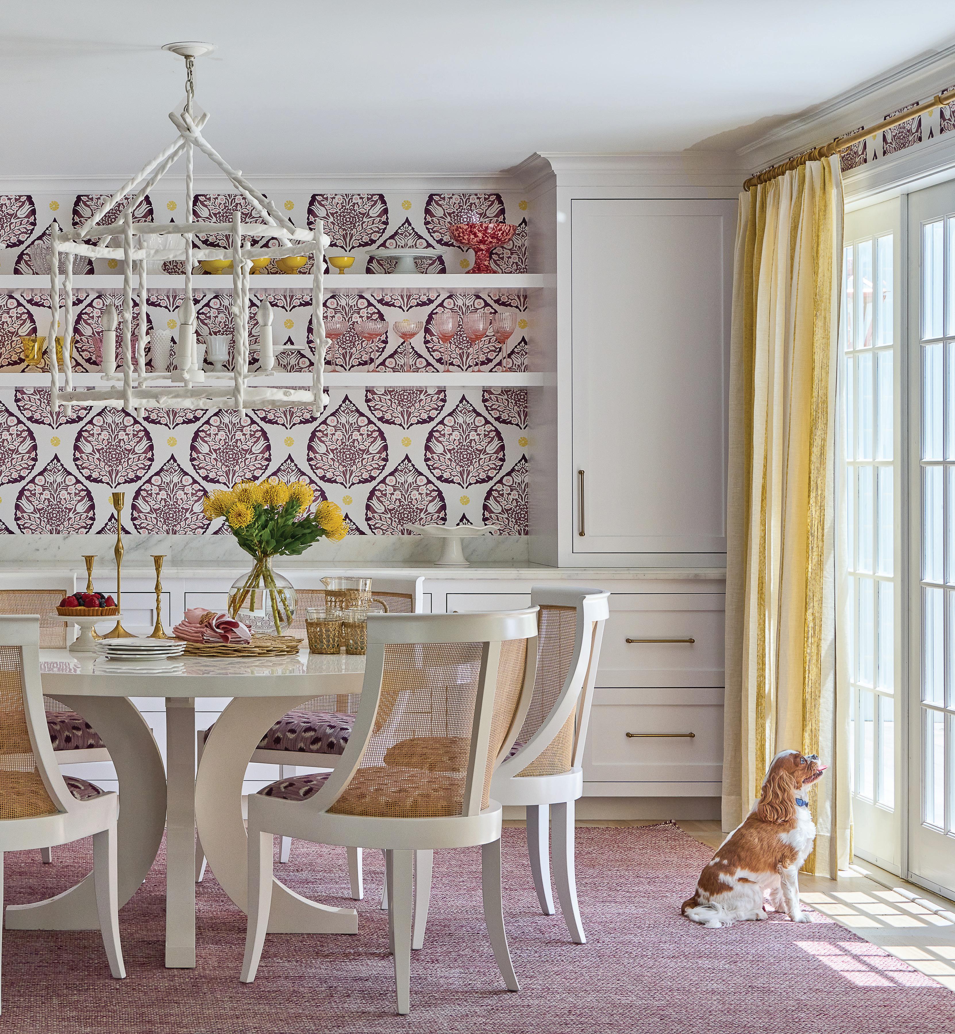
this photo: The breakfast room is papered in a custom-colored Lotus print by Galbraith & Paul. The plum shade shows up on the Kravet upholstered Villa & House dining chairs, and the yellow reappears on the Zimmer + Rohde striped sheer curtains. top, left: From the foyer, guests get a glimpse of the fuschia and blue tones that appear throughout the house. bottom, left: In the front hall, a Thibaut floral backdrop sets the scene for a marbled Hwang Bishop lamp, its swirls of raspberry perfectly complementing the coordinating cabinet.
Tell us about this kitchen.
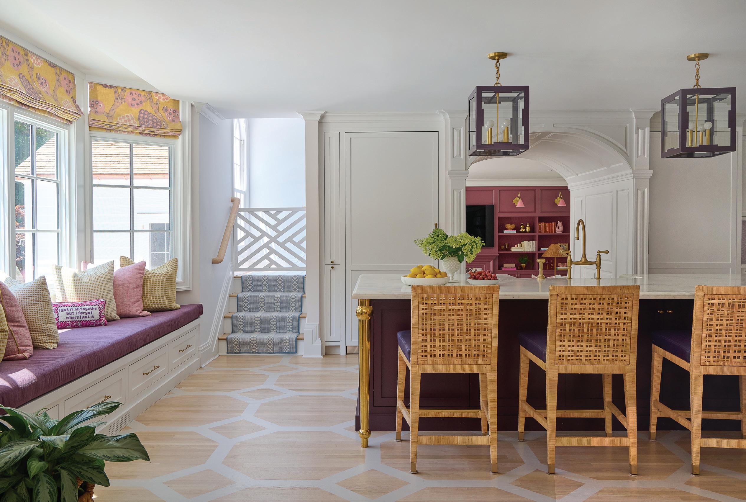
It’s obviously a lot of fun with all the color, but the original layout had the breakfast table in the bay window, and she really wanted a big seating area. They entertain a ton and are always having people over. It was important for her to have a lounge area in the kitchen where people could sit and have a cocktail while talking and hanging out. We also created that whole breakfast bar, which became an extra serving space.
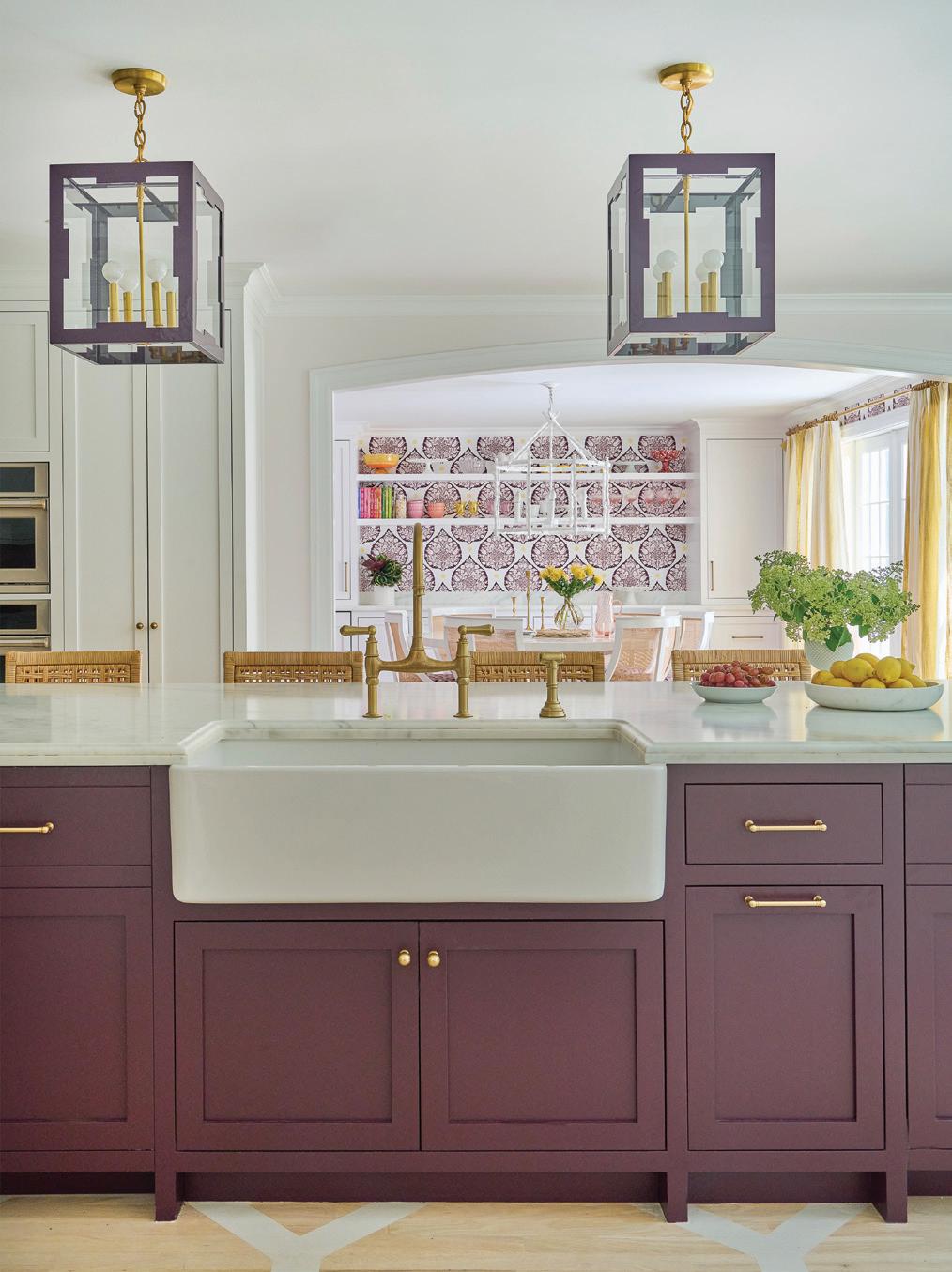
I think the biggest thing was finding something special for the backsplash. That was a big challenge. We did a marble backsplash with a custom color, which was pretty special. Then we added a custom hood, bringing the brass in. The walls are the most subtle shade of pink.
Do you find pinks to be hard to work with?
Exceedingly so. It can look like cotton candy or Pepto-Bismol in a heartbeat. I can’t tell you how many times I’ve cut a pink color to 25%.
And that’s why finding this one, I was like, “Oh, that’s a good one!”
this photo: Shelly Denning painted the octagonal linking design on the kitchen floor, creating a graphic moment in the colorful kitchen. below: Coleen & Company painted lanterns hang over the generously sized island.
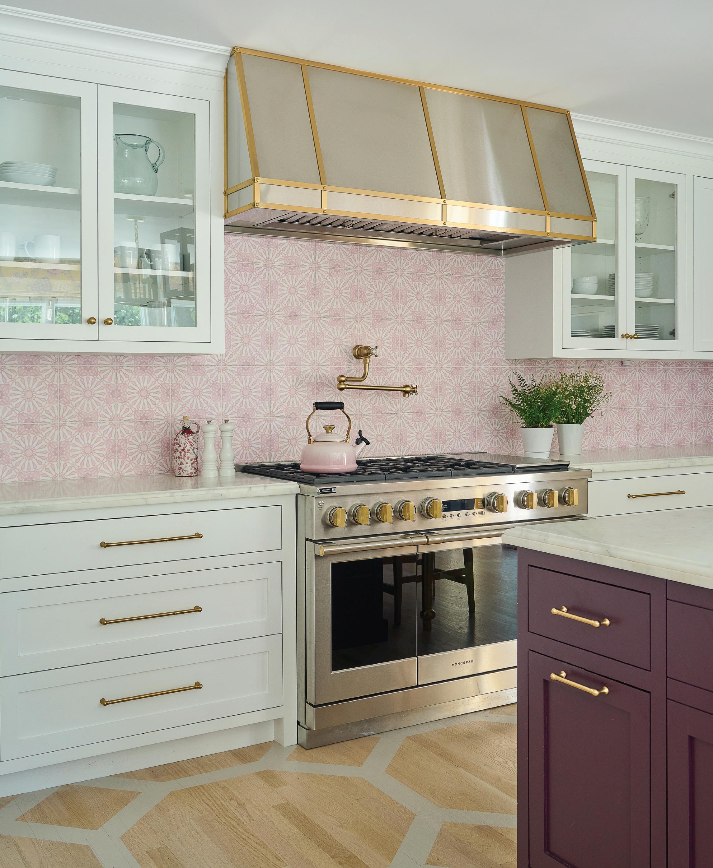
this photo: Harrison’s team collaborated with Stone Impressions to customize the Mossalli marble backsplash in the home’s signature pink hue.
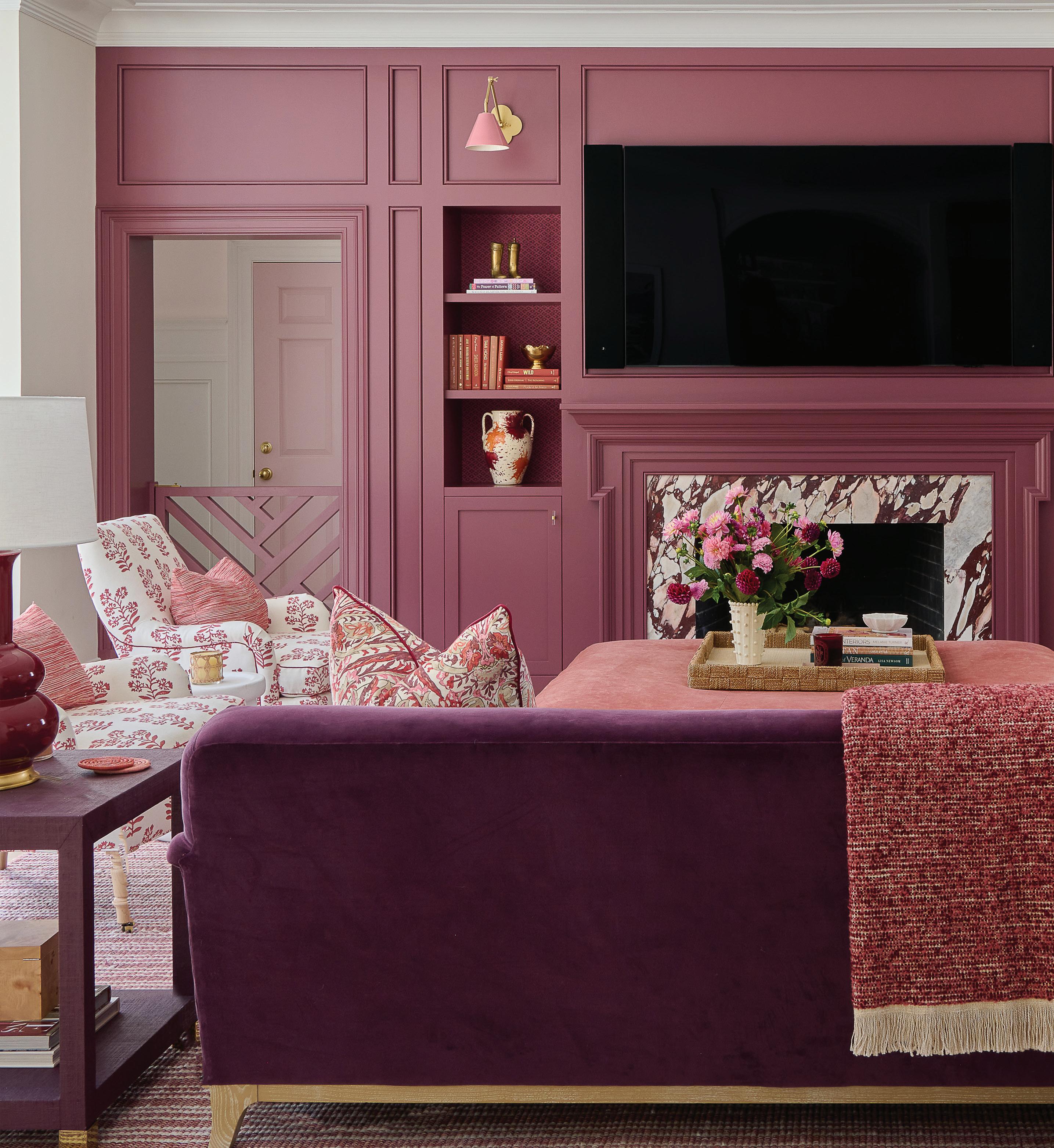
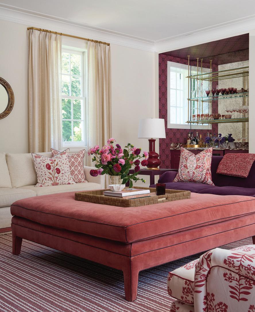
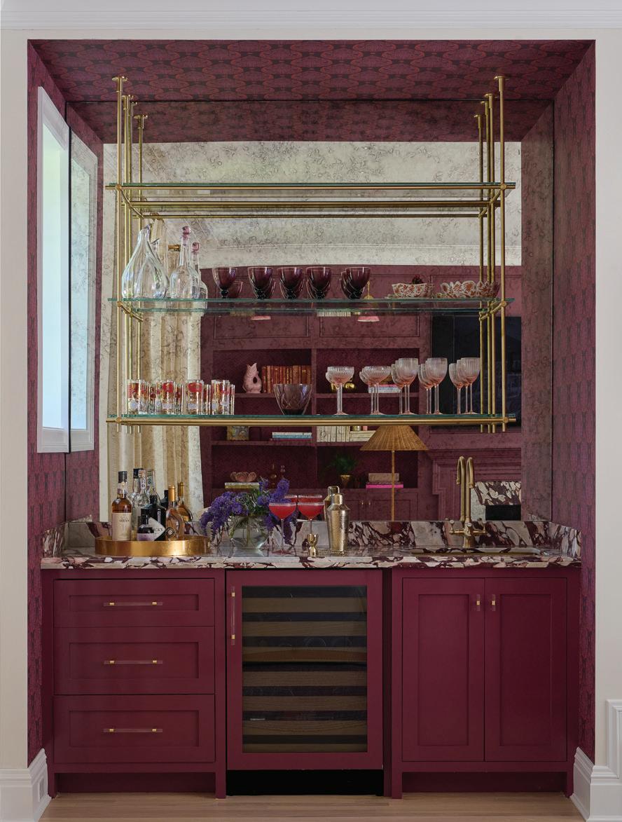
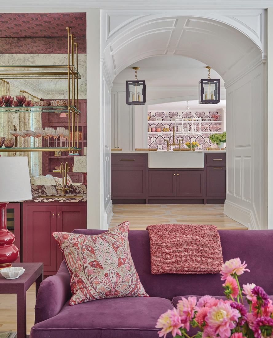
this photo: Adventurer by Little Greene drenches the family room, crowning the Calacatta iola fireplace from ABC Stone. top, right: An ottoman in Osborne & Little rust velvet anchors the seating area. middle, right: The mirror-backed bar includes brass shelving and the same stone as the fireplace surround. bottom, right: Beyond the Hickory Chair sofa, the kitchen and breakfast room come into view.
Did you know from the start that this was going to have a lot of bold color?
Yes, because of her existing house. She wanted it everywhere. She had a lot of blue and pink and a lot of a bold pattern and print in her existing house, but it was a different vibe. So, we knew that’s where we were going. And we did more unexpected things with the colors, which I think was really interesting.
Do you have a favorite room or moment from this project?
There’s something kind of fun about walking in through the pink door
into that foyer space that tells a story for the whole house.
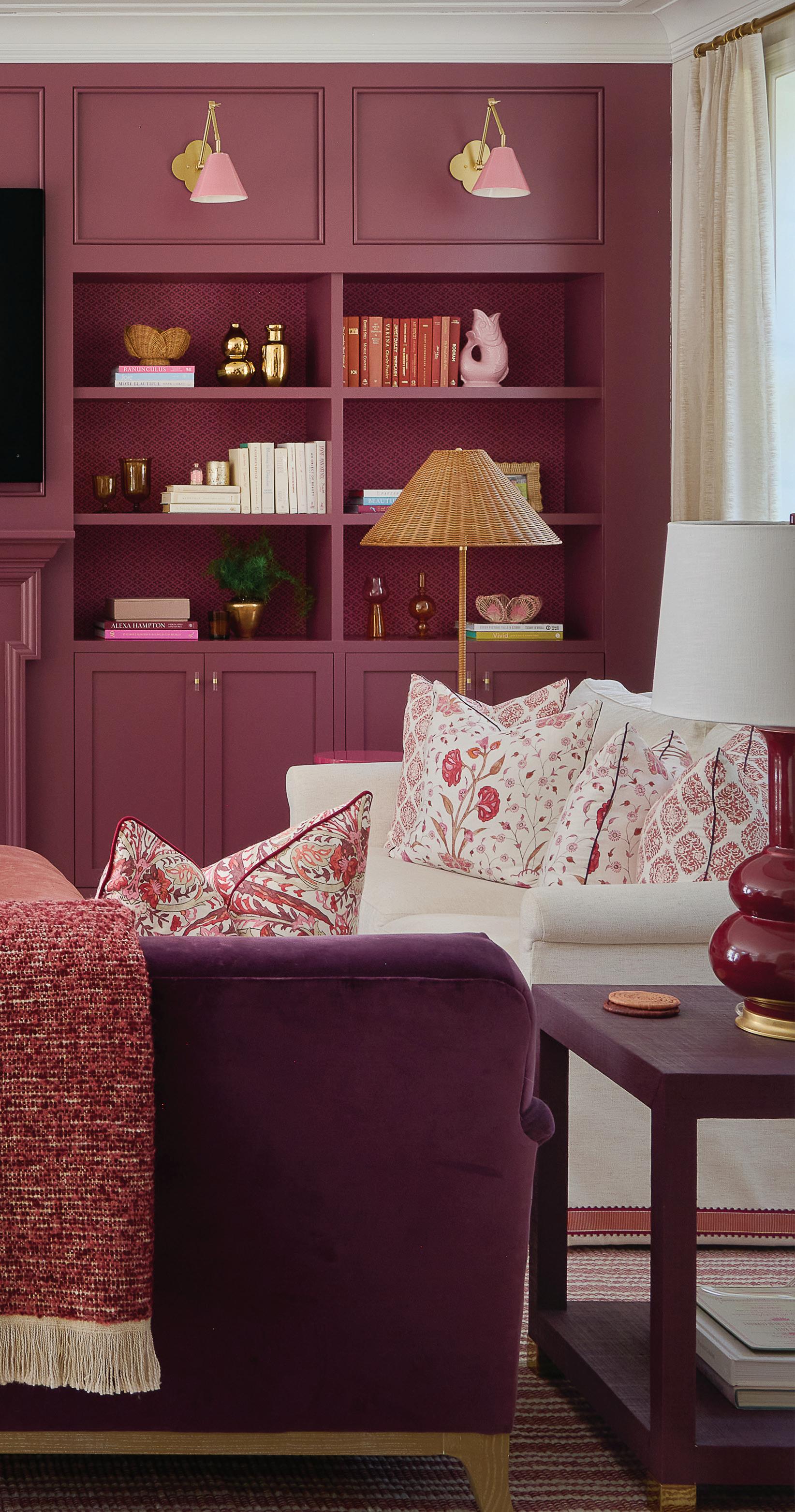
I really think that the family room is pretty divine, because it’s moody and it’s just layered and comfy. I have to say that’s probably my favorite. The color is called Adventurer by Little Greene, and it’s a cross between maroon and eggplant, a grapey tone. I love the Hwang Bishop sconces over the bookshelves, which are backed with custom-colored Galbraith & Paul paper. And then there’s the wet bar with the Calacatta Viola marble. The living room also came together really well, and it was the closest to her original vision. It’s where we were able to bring in the blues, and I love that kind of claret with the brighter blue.

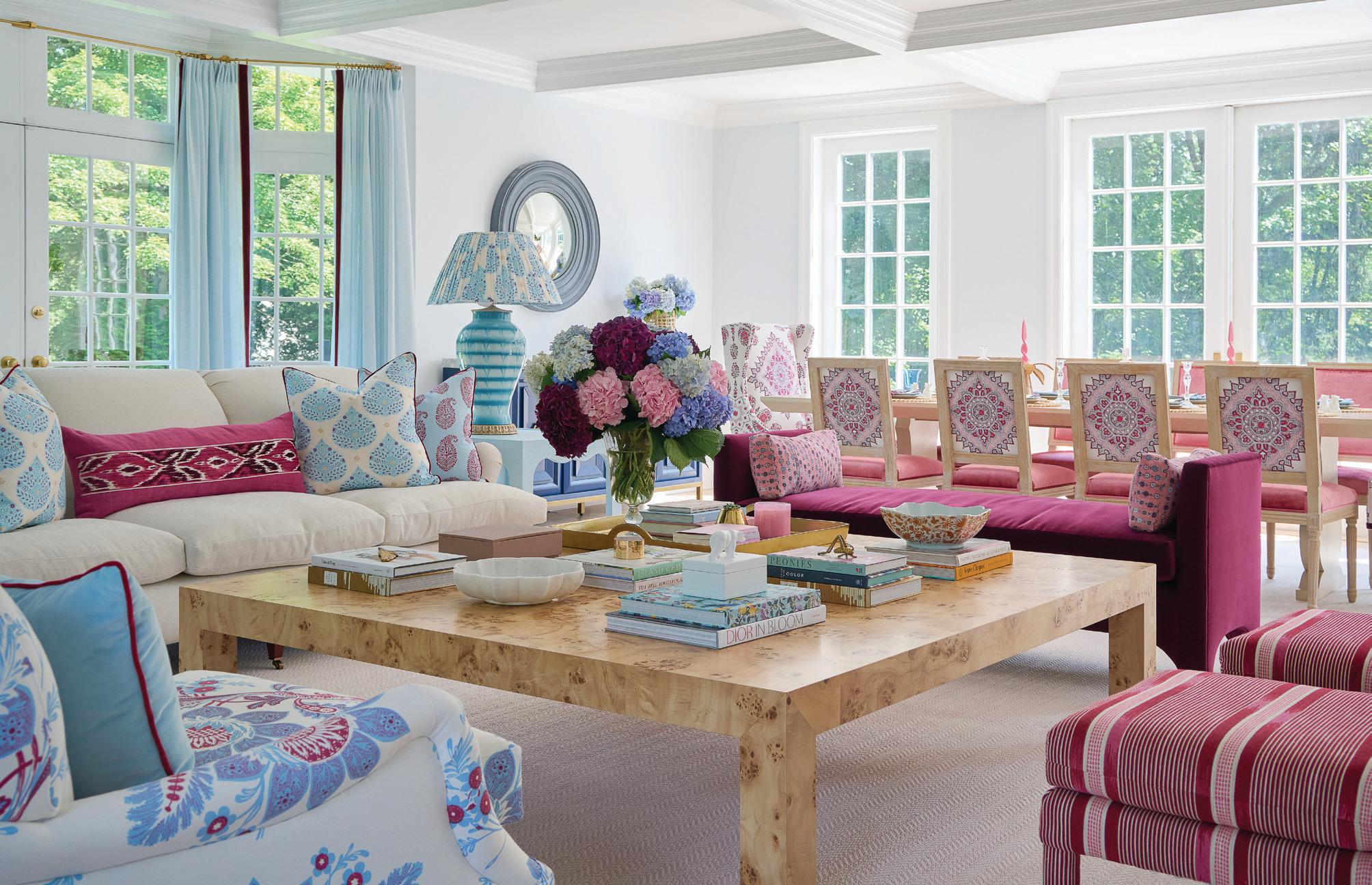
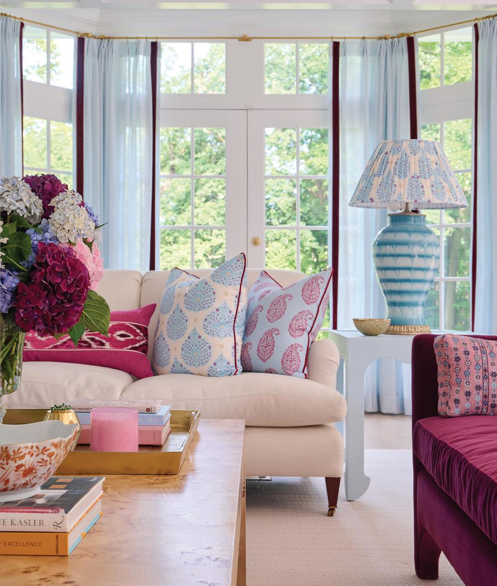
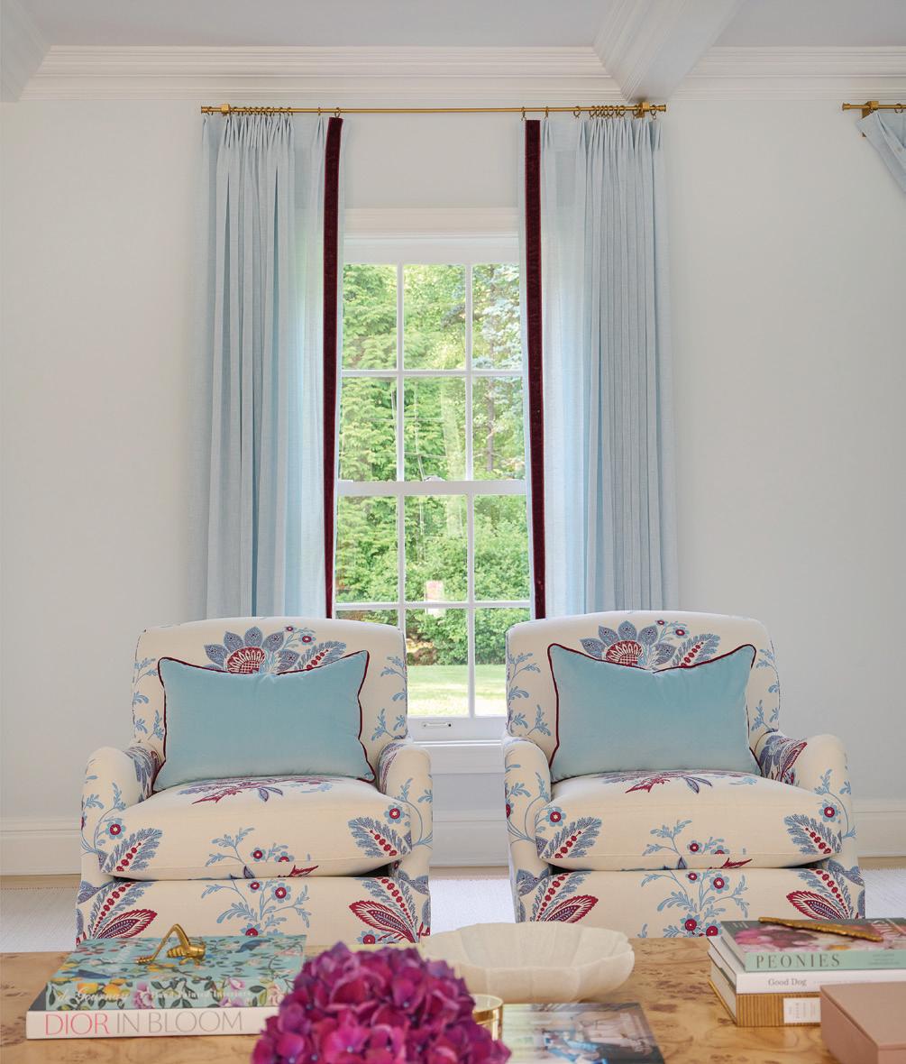
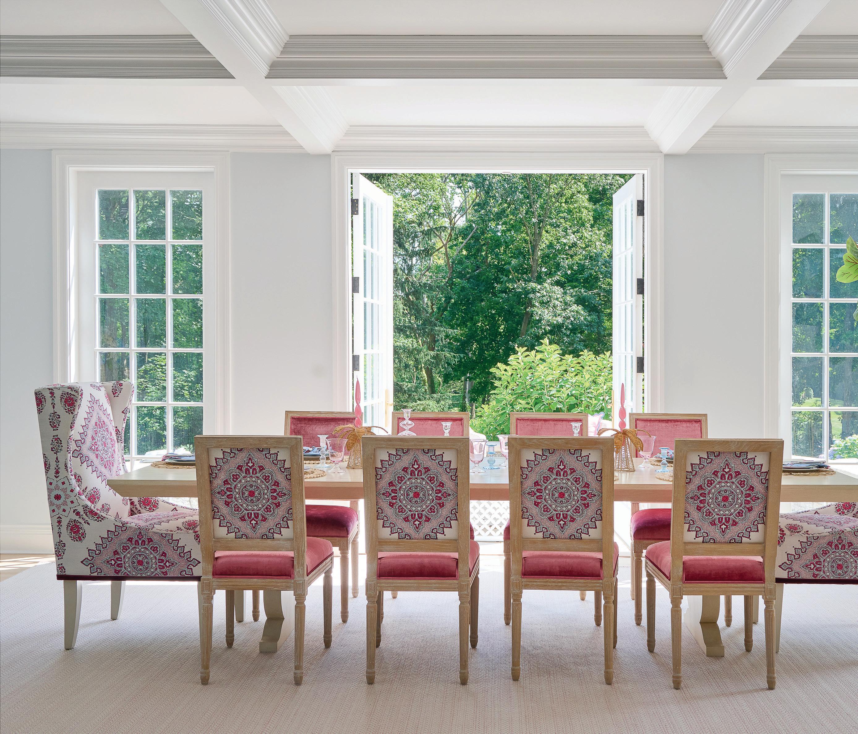
top: Around the burl wood coffee table, a layered mix of the home’s bold palette. bottom, left: Even the lamp shade gets some pattern, alongside coordinating pillows. bottom, left: Highland House chairs in Quadrille fabric are finished with velvet cushions. opposite page: Harrison was able to use the clients’ existing dining chairs, refreshed with Quadrille linen.
We loved doing the accessories for this house. It was so much fun. I went to Found in New Canaan, and the owner let me into the basement, and I just went crazy down there, finding ice cream bowls and things like that. We bought vintage glassware and then sourced pieces from all over; all the pink things.
And I have to say, I love embracing yellow again.
Tell us about this office.
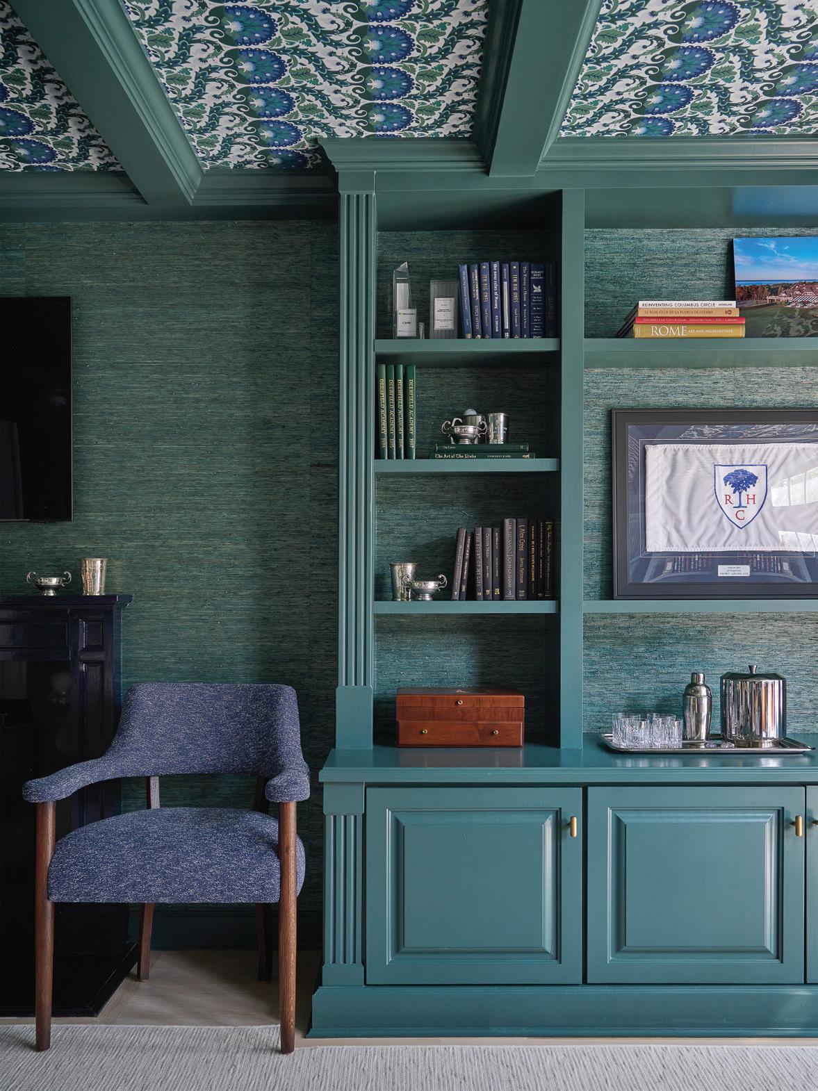
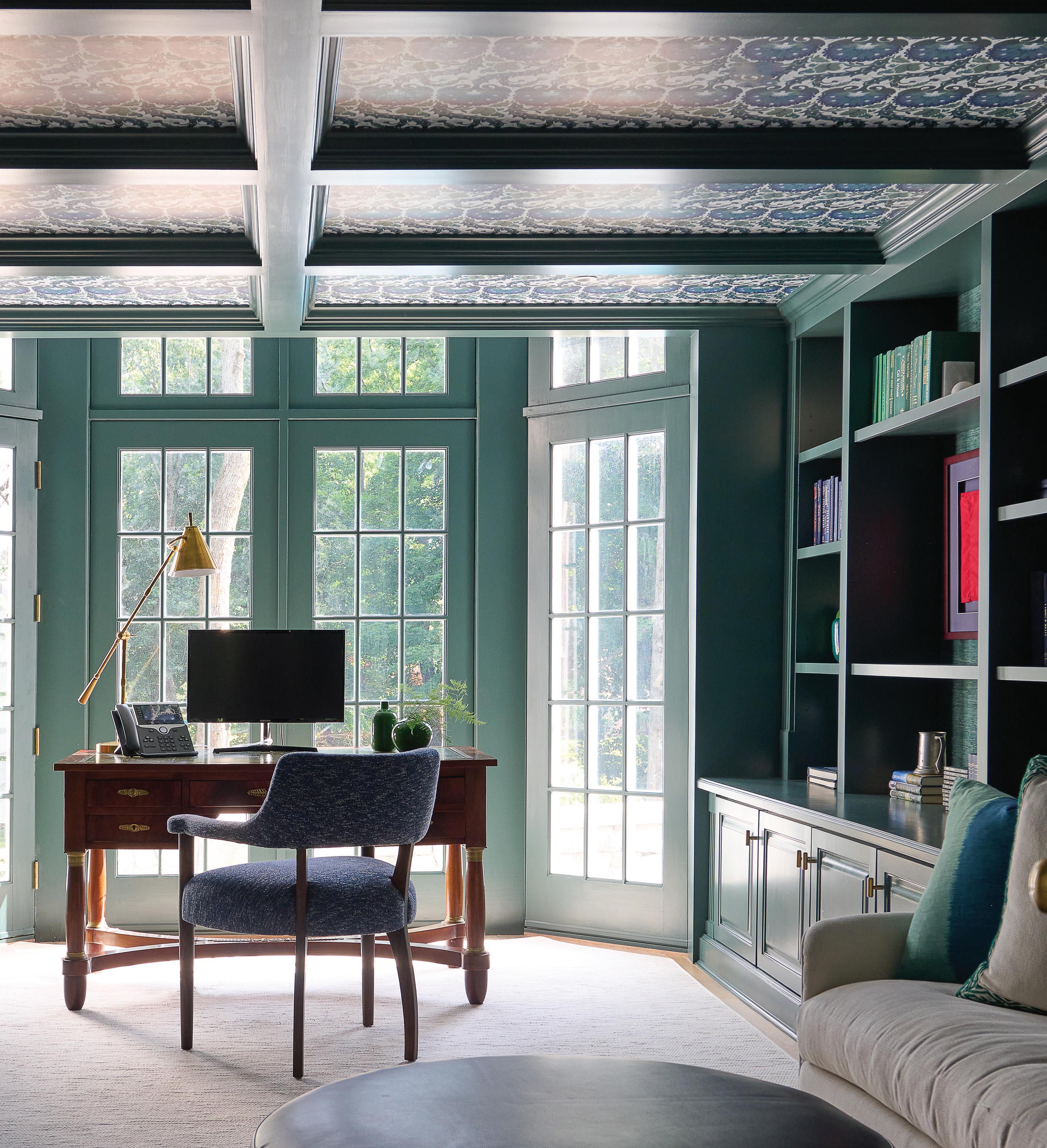
He loves green. So, we landed on a combination of greens and navy. That was an existing office, and we added the coffer detail and then the wallpaper and paint. We did a green grasscloth from Phillip Jeffries on the wall, and then we did the ZAK + FOX on the ceiling, which is where we pulled the palette for the room.
We painted the mantel in Dock Blue from Little Greene, and all of the cabinetry color is Hidden Falls from Benjamin Moore.
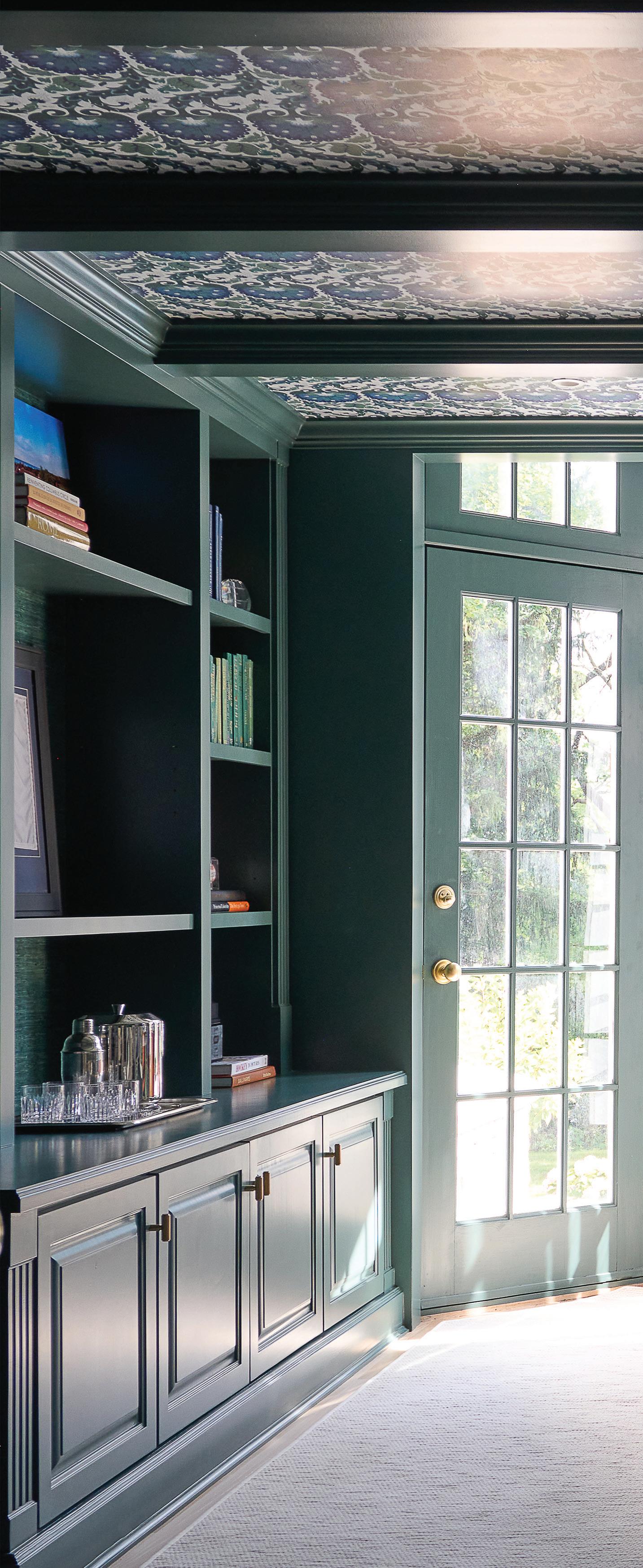
above: Phillip Jeffries grasscloth in the husband’s office pulls the same blue-green tones from Benjamin Moore’s Hidden Falls. opposite: French doors offer a beautiful view of the yard, while above, Harrison adorned the ceiling with ZAK+FOX paper, an eye-catching detail worth looking up for.
This kids’ space is super fun. Tell us about it.
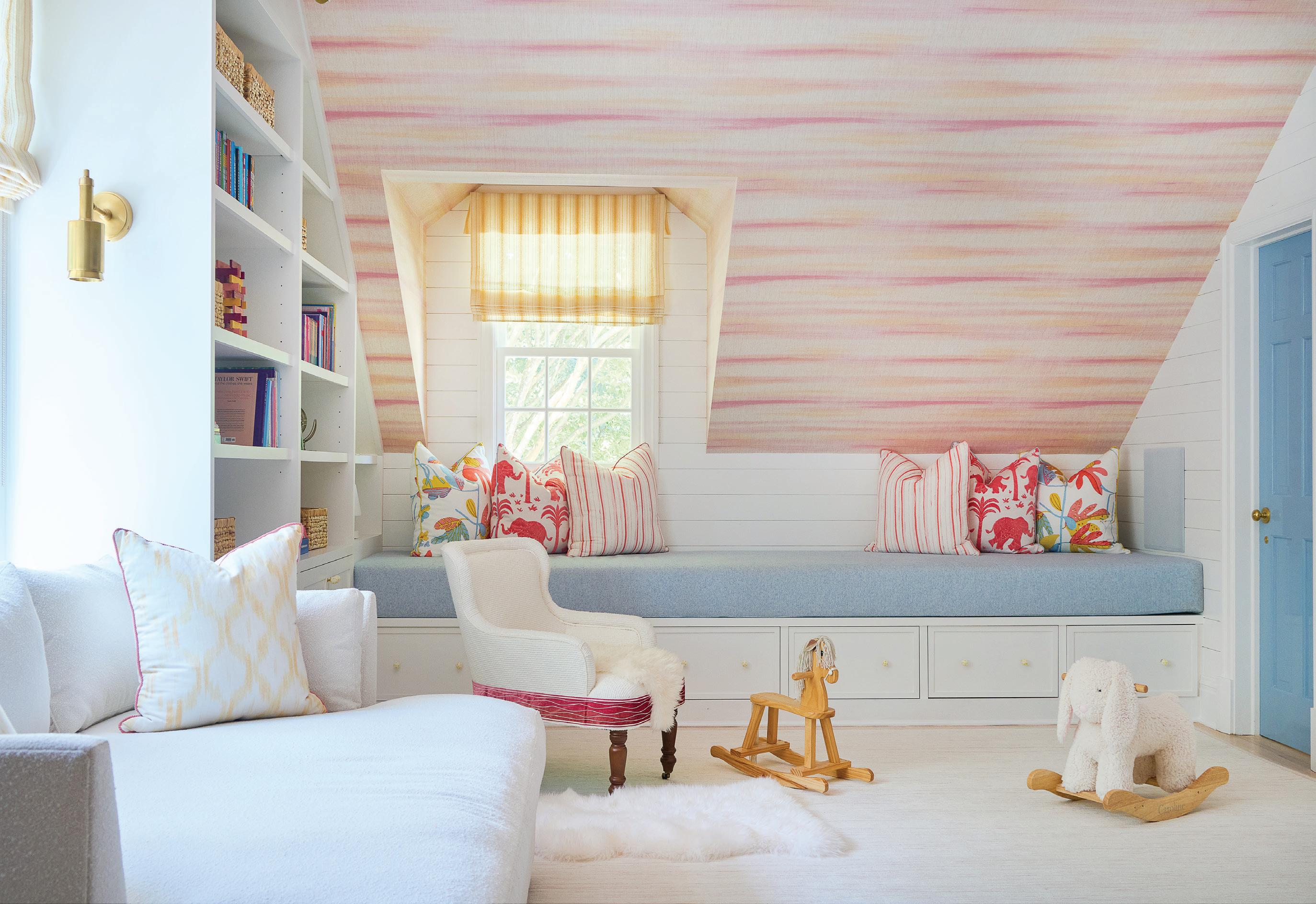
The addition of the mudroom meant that we were able to expand the playroom on the second floor. We knew that she really wanted yellow, and then we added some blue and pink in there, too. I immediately thought of this Thibaut line for the wallpaper and some pillows. We did a custom penny tile on the bathroom floor, which was super cute.
There are lots of fun bathroom moments in this house.
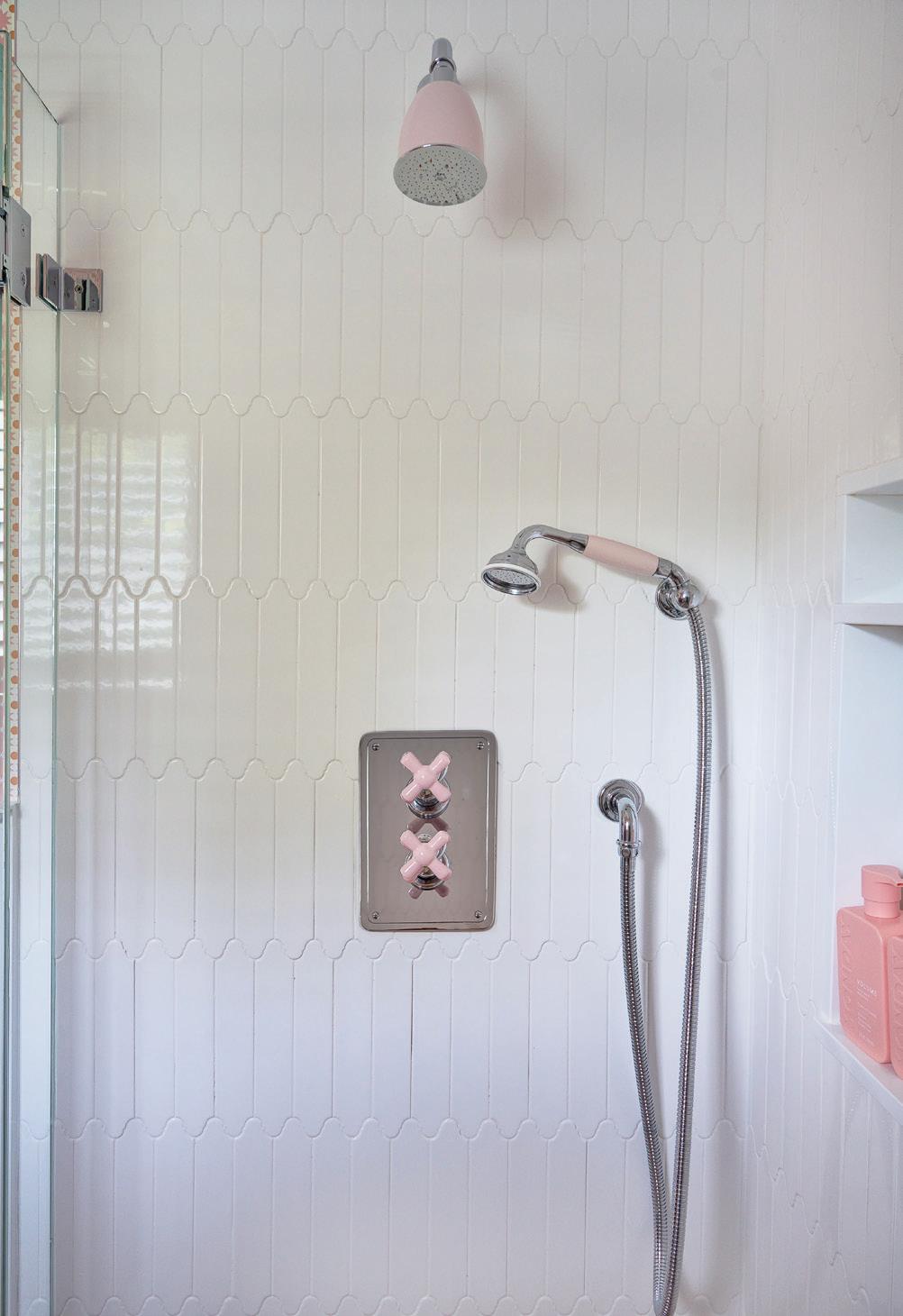
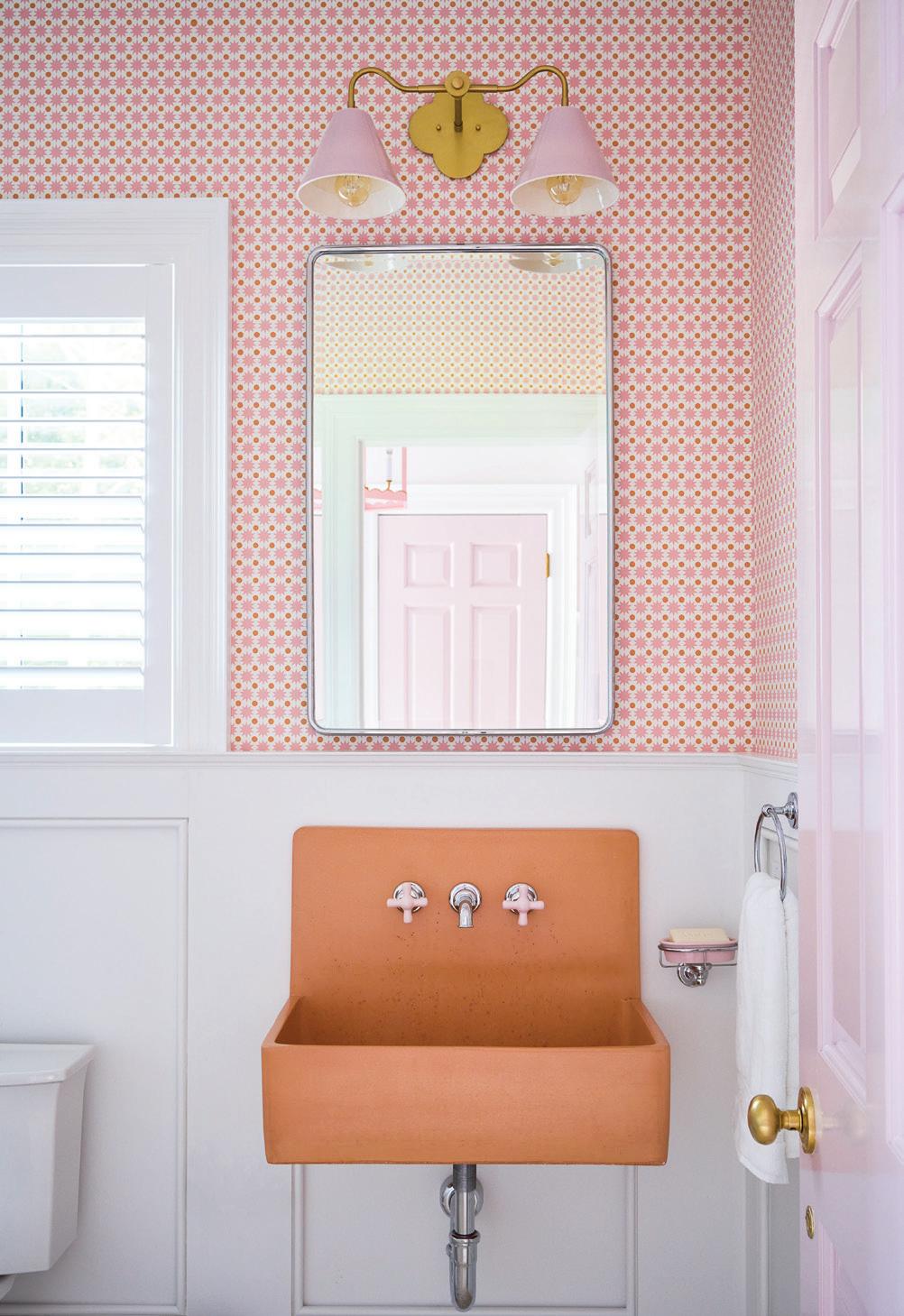
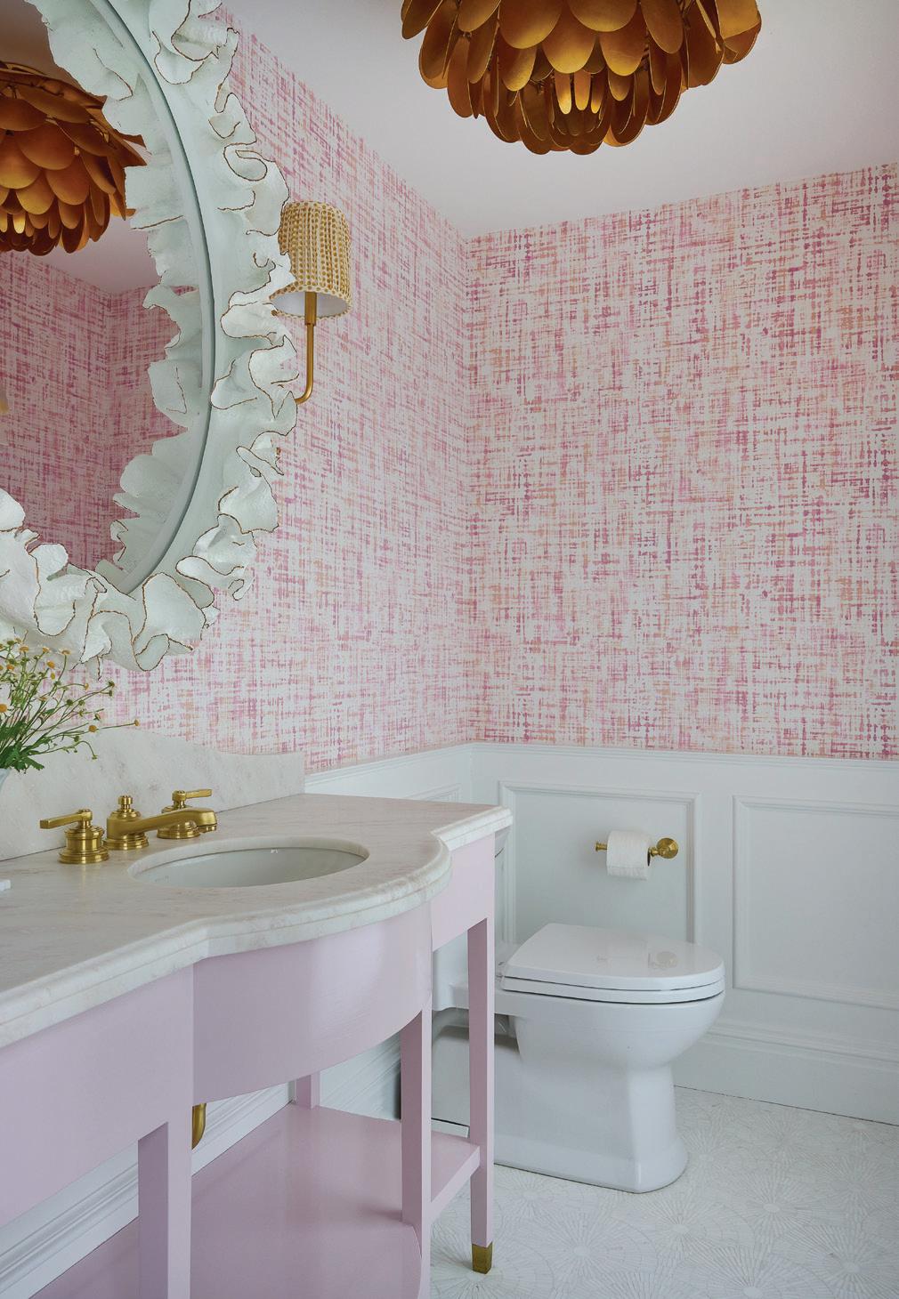
Yes, the formal powder room has a pink sink. The one off the mudroom has an orange sink with porcelain pink handles and a pink shower.
What was the biggest challenge?
Honestly, the biggest challenge was for me to wrap my head around ‘More is more,’ you know? You have to let loose and have fun with it. My brain works a certain way, and it was just fun to kind of break out of the mold and just think, “Why not?” So, the biggest challenge was also the most fun part of it.
“ You have to let loose and have fun with it . My brain works a certain way, and it was just fun to kind of break out of the mold and just think,‘Why not?’”
—michelle morgan harrison, morgan harrison home
above: Thibaut ombré stripes create a candy-colored ceiling in the playroom, where the windows are topped with sunny shades. opposite, top left: The design team laid out a pattern with the penny tile, which pulls from the Schumacher paper on the bathroom walls. opposite, top right: The bathroom off the mudroom includes a splash of clementine on the concrete sink, finished with pink taps. opposite, bottom left: More pink fixtures in the mudroom bath, which play off the playful shapes of the Glazzio tile. opposite, bottom right: A Visual Comfort & Co. artichoke pendant hangs in the formal powder room.

Why is color so important to you?
Color is important, whether it’s subtle or bold; the way it’s layered, the way it can make you feel cozy, make you feel calm, the way it can energize. So many emotions are tied to color, and I think this house makes you happy. I think that’s the important thing. Not everyone gets to play every day. That’s what’s so fun about this.
RESOURCES:
Interior Design: Morgan Harrison Home, New Canaan; morganharrisonhome.com
Architect: James Schettino Architects, New Canaan; schettinoarchitects.com
Builder: John Hummel and Associates, Greenwich; johnhummel.com
Landscape Design: Fair-Way Landscaping, Old Greenwich
above
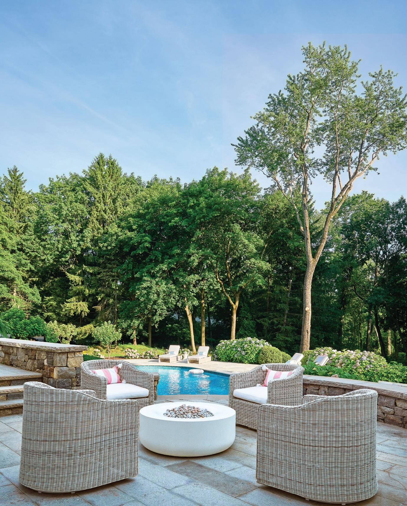
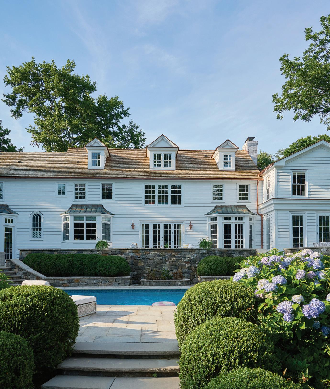
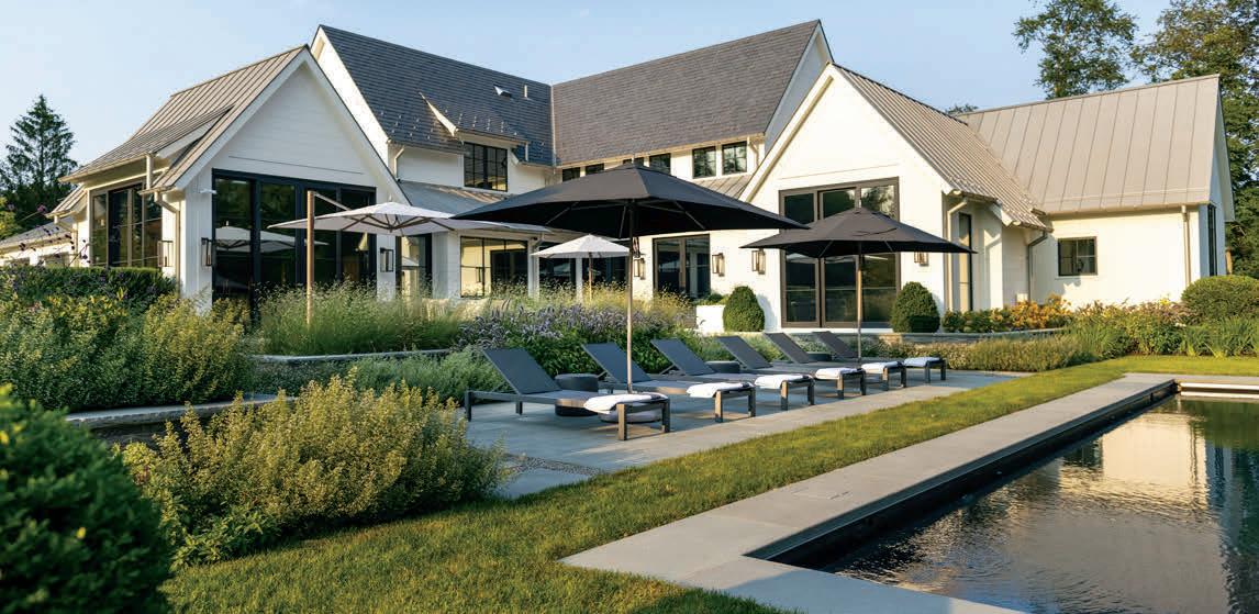
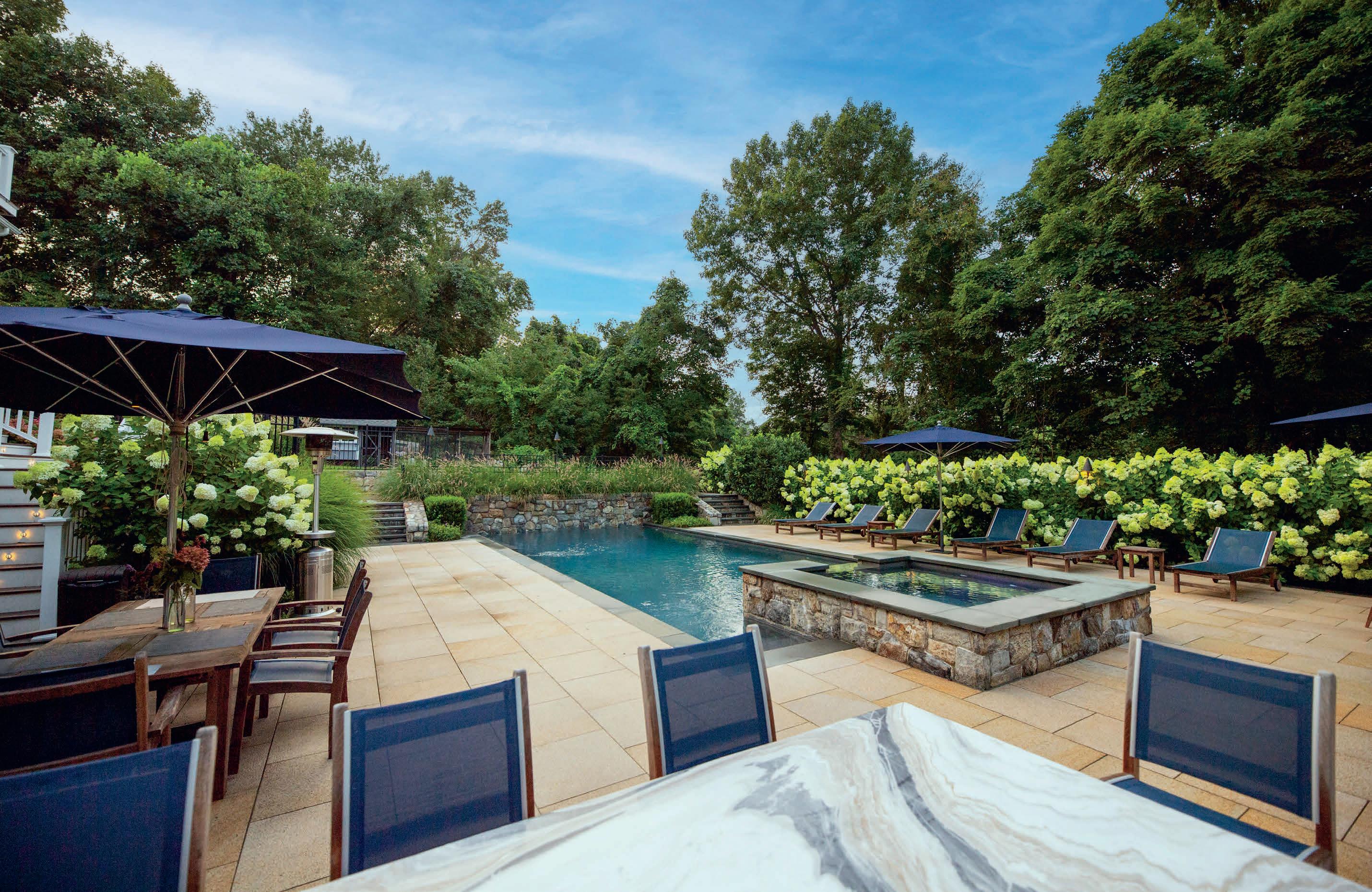
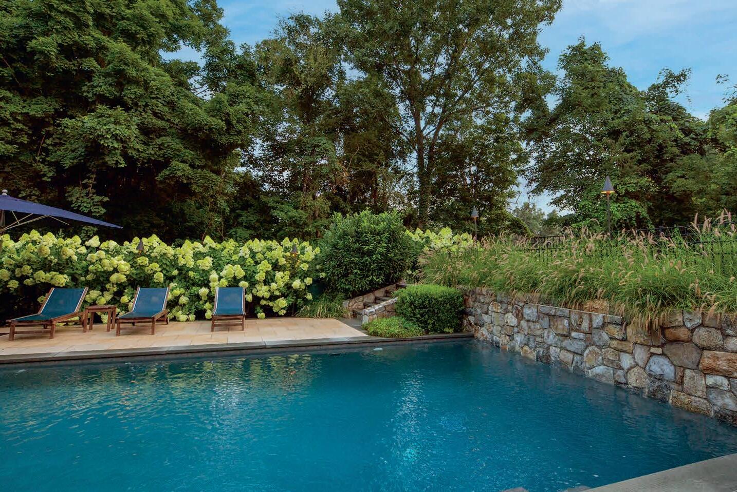
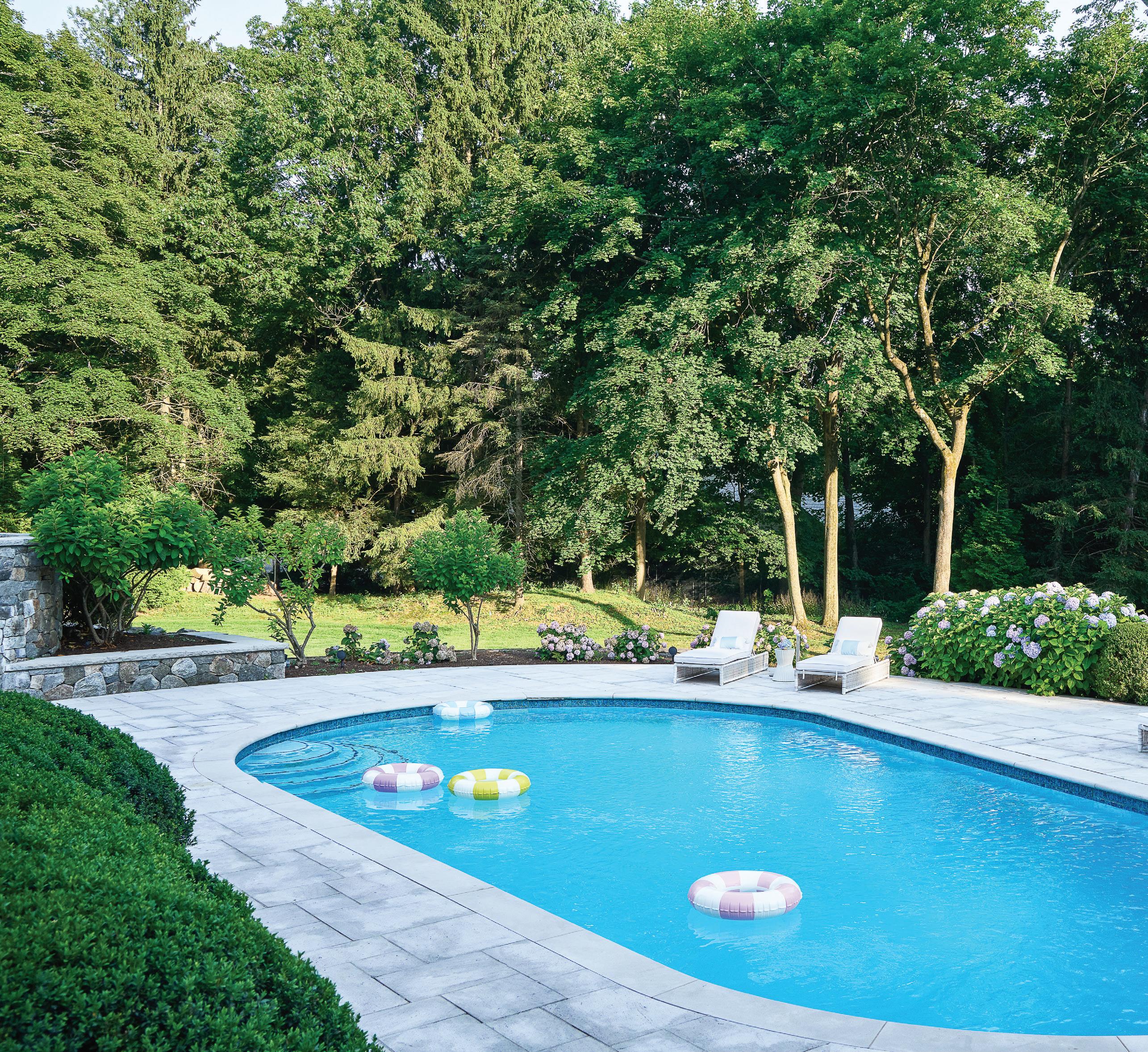
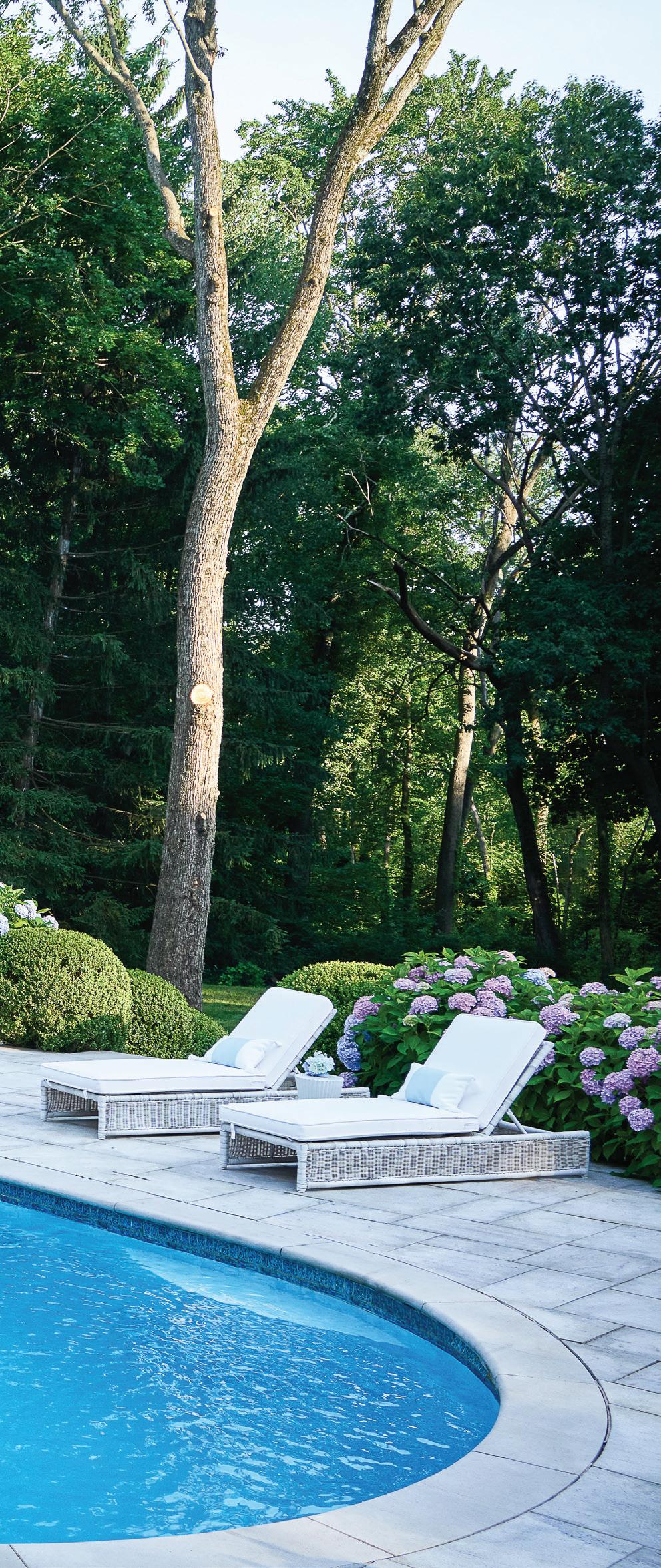
: Pastel pool rings match the blooming hydrangeas that frame the patio. top, right: Guests can warm up in the Serena & Lily chairs that surround the firepit. bottom, right: A picture-perfect summer view.
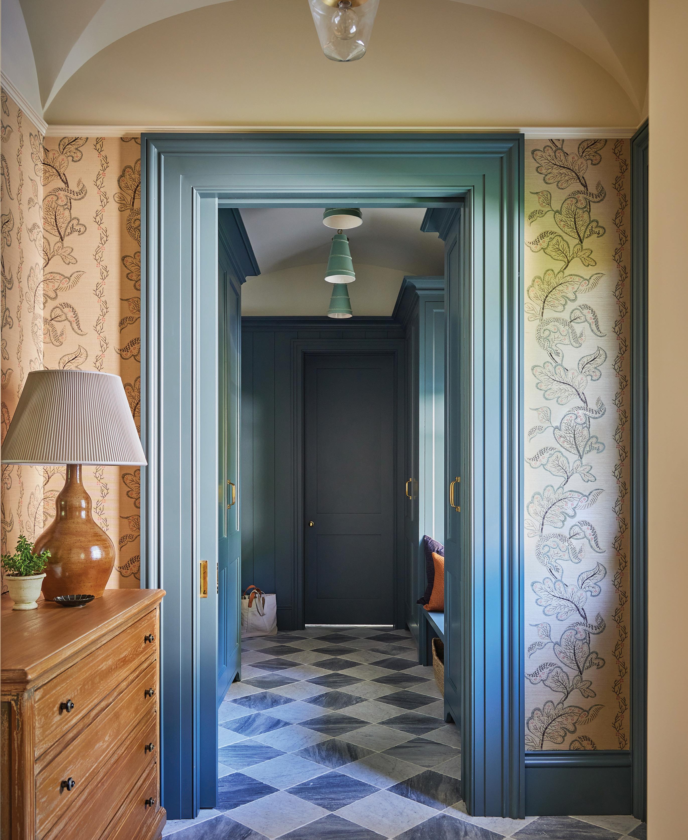
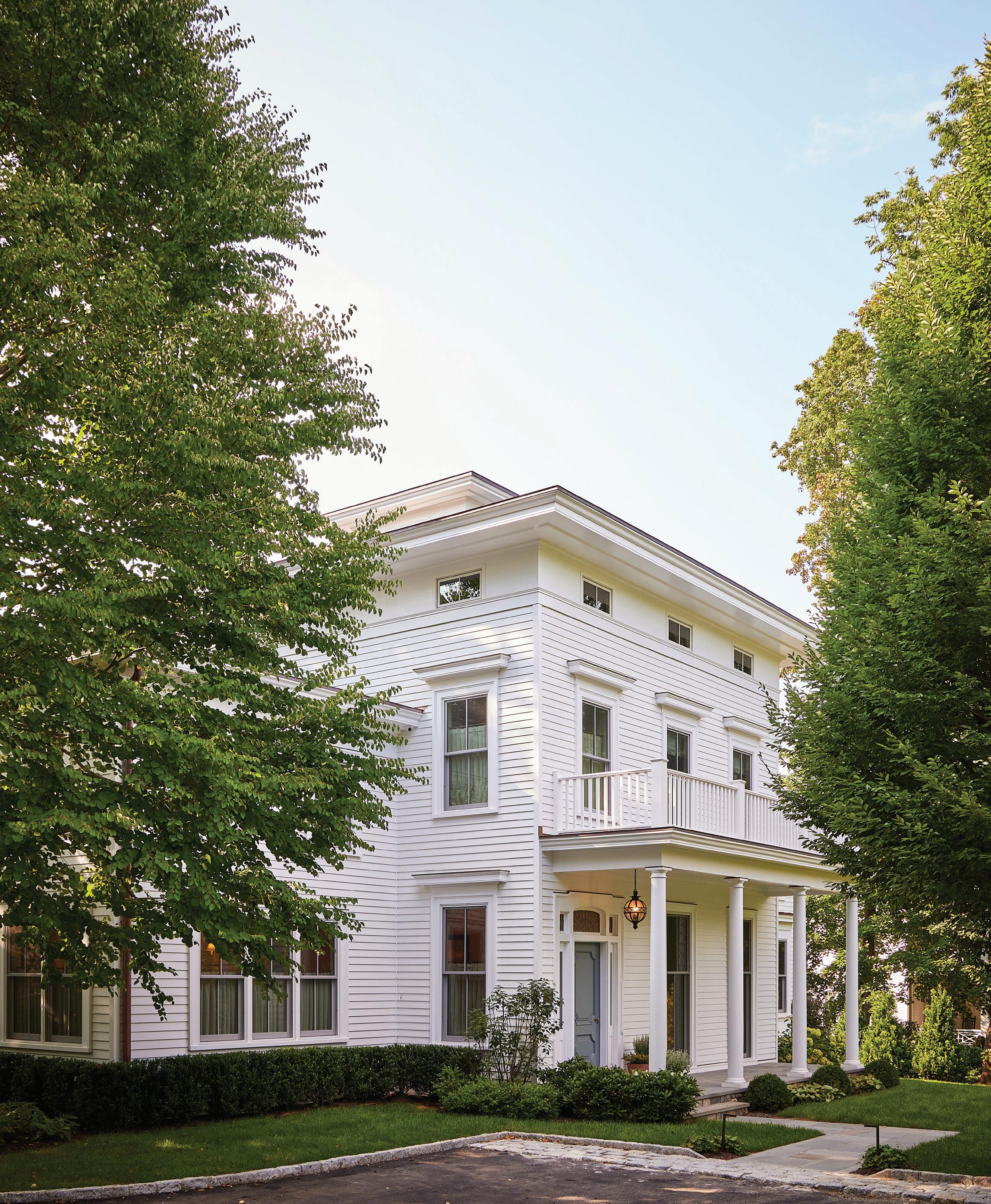
this photo: The mudroom entry sees the most daily traffic, so Carbone ensured it was just as beautiful as the front entrance. Sister Parish Sintra grasscloth plays well with the Benjamin Moore Knoxville Grey trim. opposite: Carbone worked with Howard Kelly of HK2 Architects to restore the home while respecting its classic roots.
THE LOVELY BONES
A designer deftly adds color to a character filled home
-
Interview with NINA CARBONE, NINA CARBONE INC
Photography by KATE S. JORDAN
Styling by MEGAN AVEDESIAN
Who lives here?
It’s a family that bought the house during COVID, sight unseen. The home was renovated in the ’90s in certain places, but it wasn’t aesthetically amazing. It didn’t necessarily function well, just because of all of the piecemeal renovations.
They got to live in it for a while during COVID, before signing on with an architect, and then I came on board. They had a lot of time to be really thoughtful about the layout and how it worked for their family, which includes two daughters.
The wife loved the idea of not making it a huge wide-open space. She liked separate rooms, because I think their previous home was more open. They were ready for something that felt a bit more traditional in terms of the organization of space.
What sort of architectural changes did you make to the interior?
We knocked down a whole section of the back of the house that was added on in the ’90s, added a second stairway in the back of the house, added a
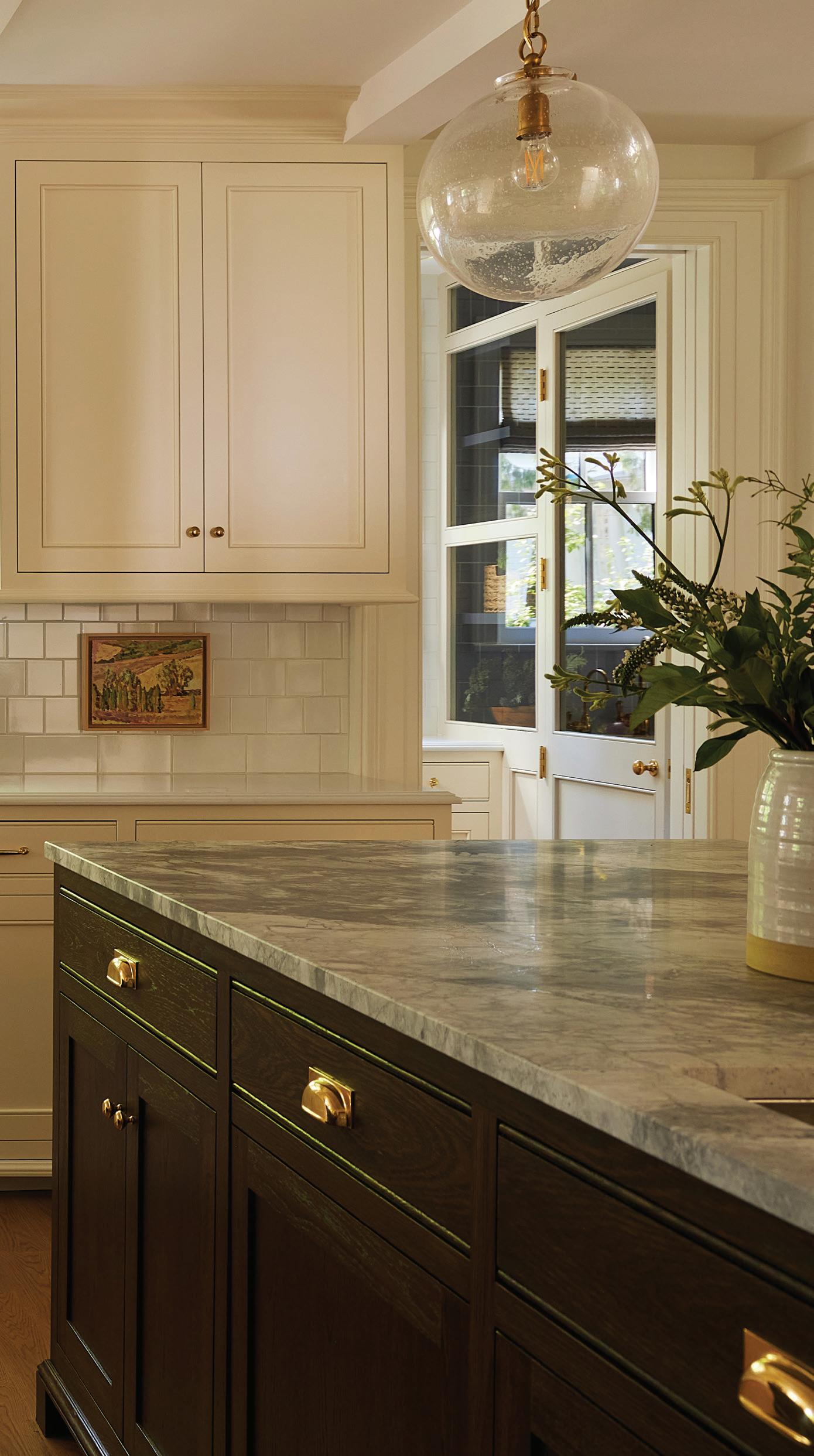
family room, added a kitchen and actually dug out a basement. In terms of percentage of the house, we probably added about 30 percent to that total.
Is all the beautiful molding original?
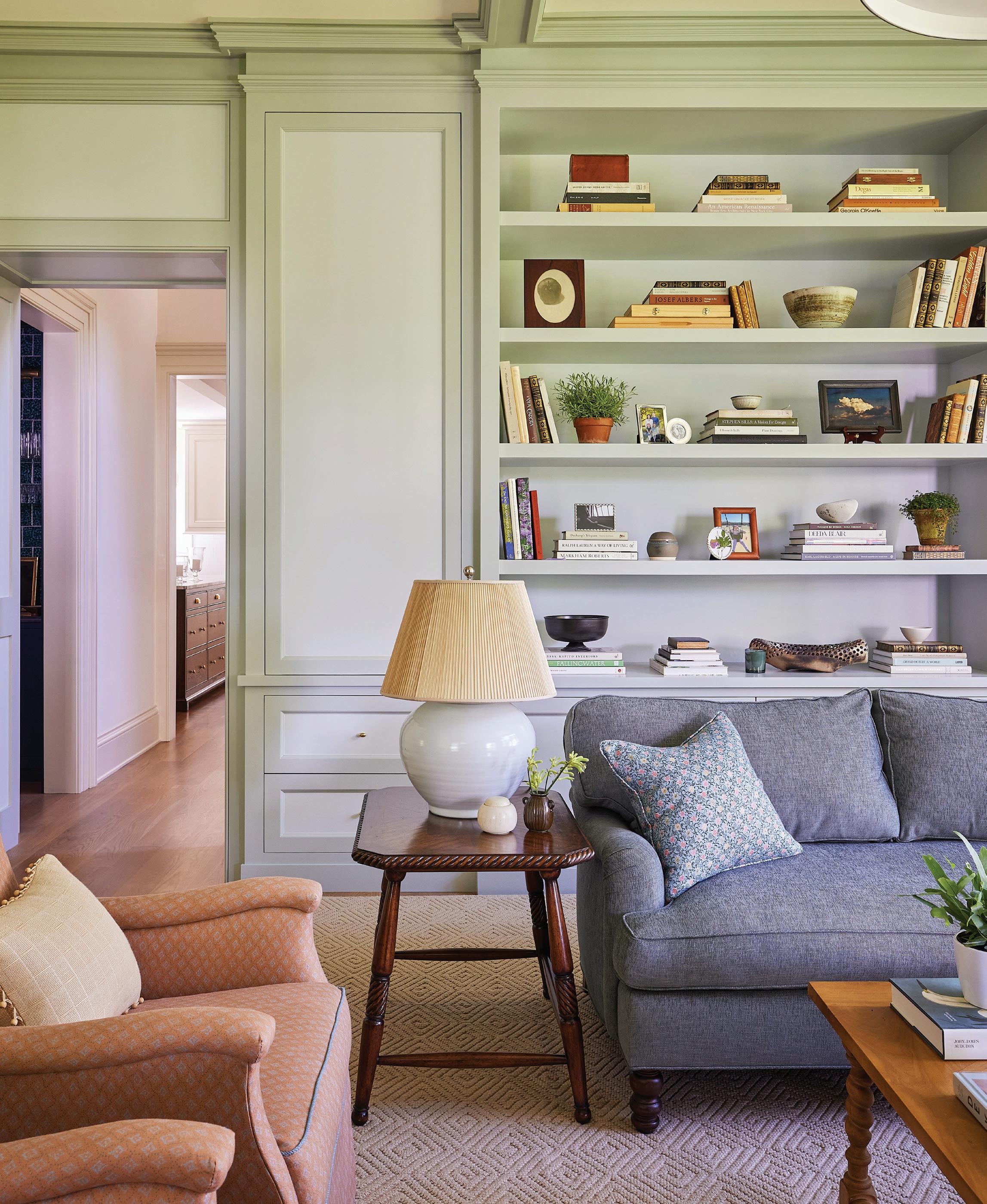
The plan was to keep as much as we could and mimic for the newer portion, because it was original Italianate molding. The house had beautiful bones, and we wanted to make sure that we were true to that in a considered way.
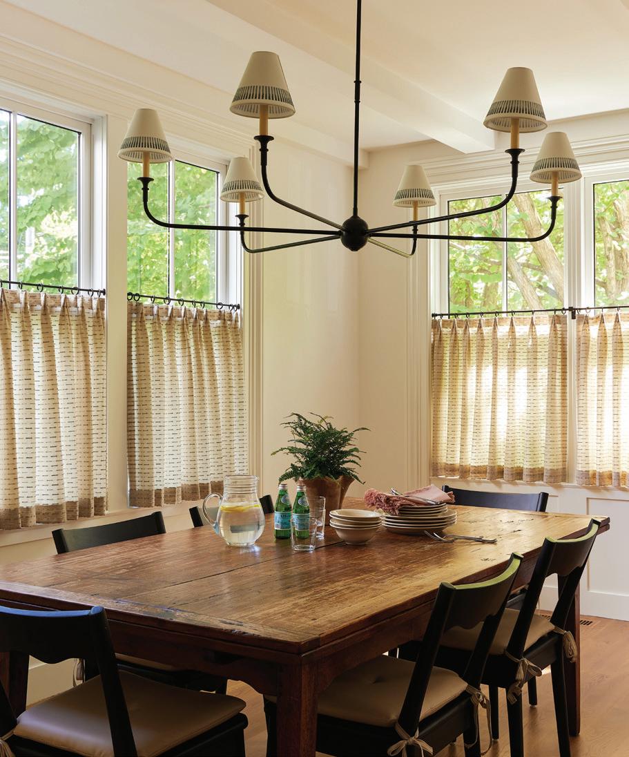
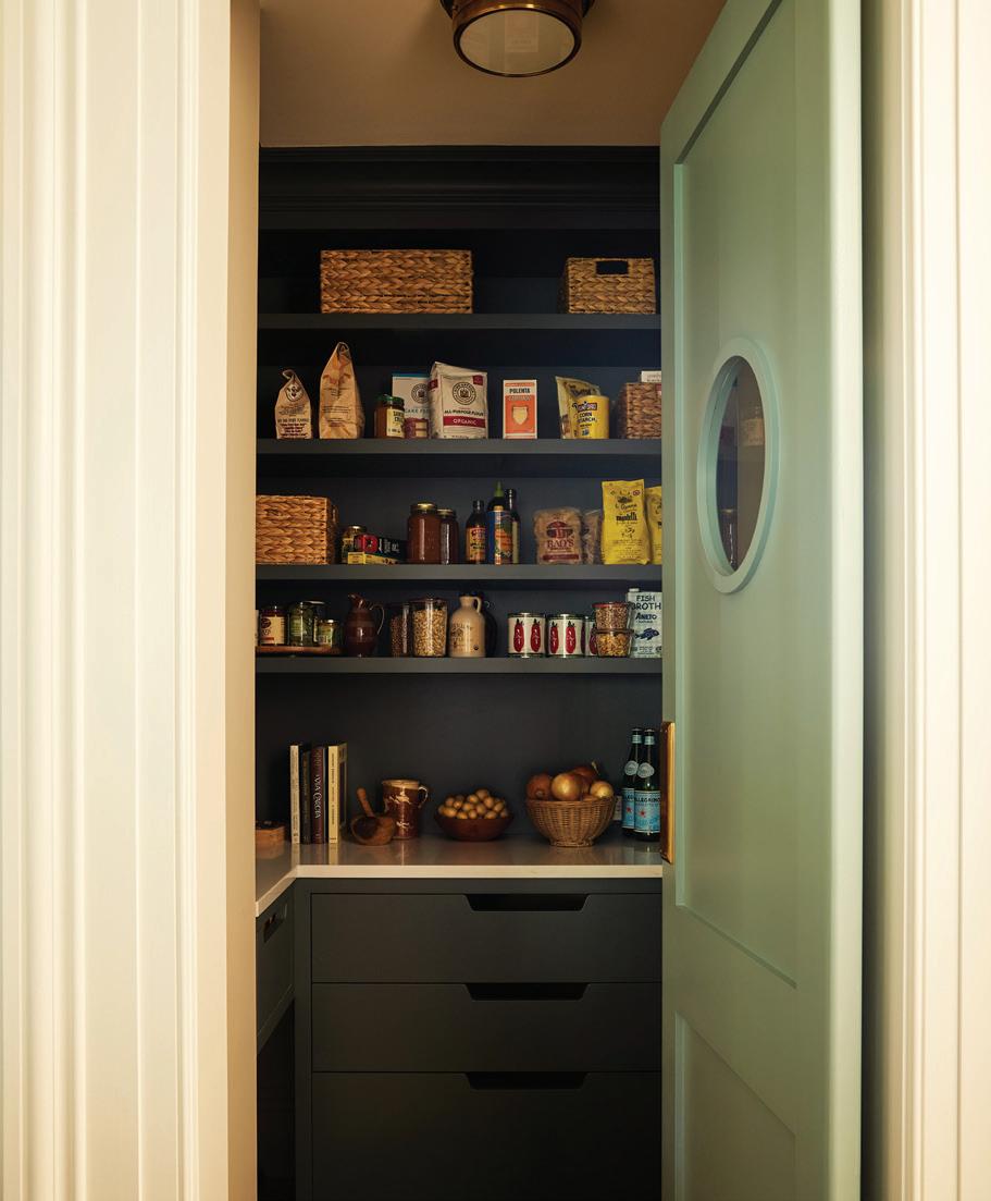
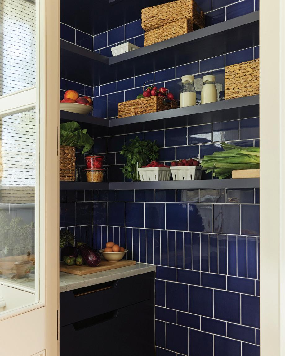
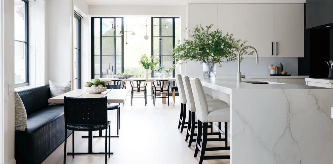
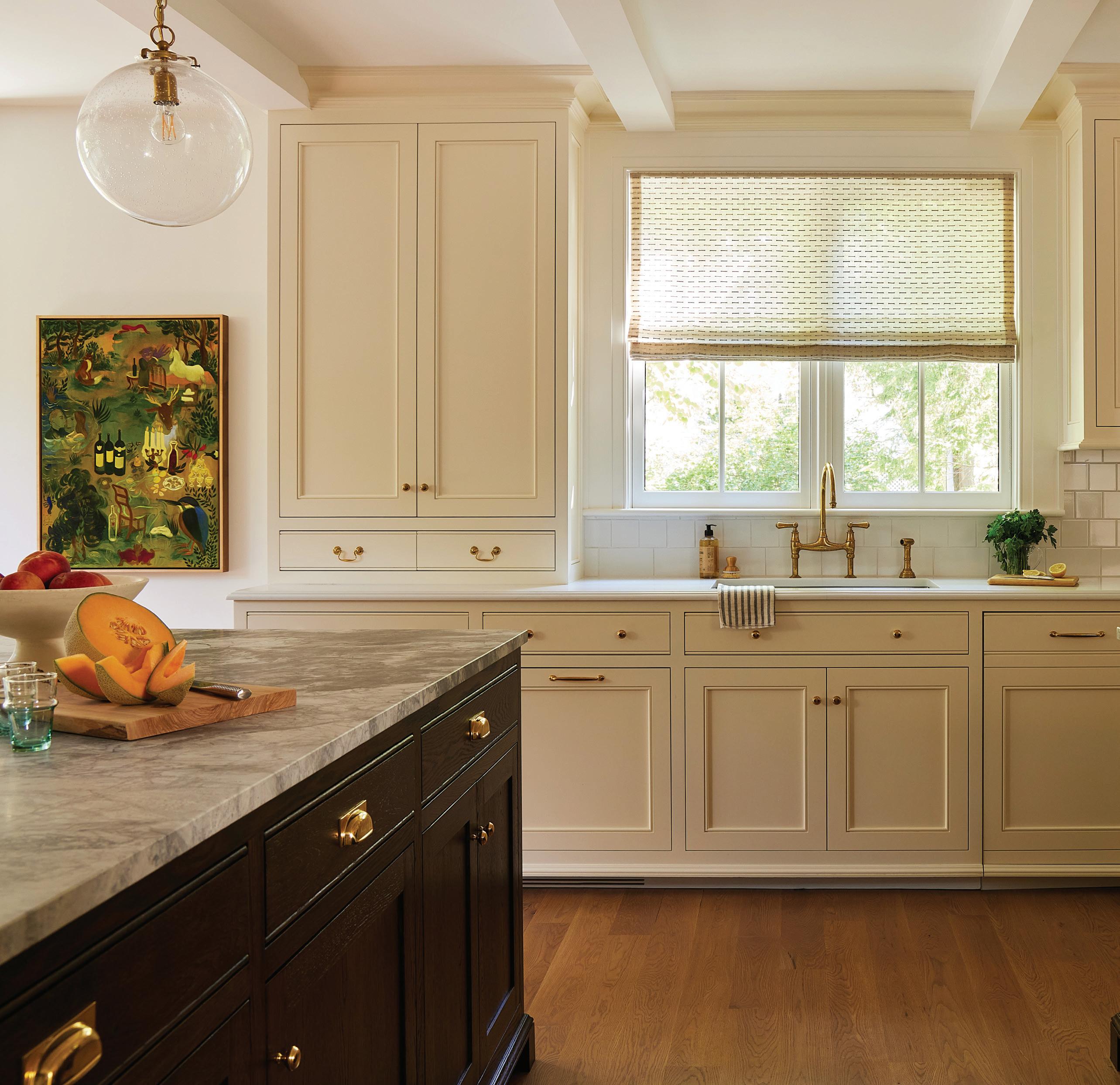
this photo: The spacious kitchen is a clean and neutral space, with cabinets painted in Benjamin Moore’s Mayonnaise and pendants by Visual Comfort & Co. top, right: Cafe curtains add charm while allowing for light to stream in. middle, right: All of the pantry goods are stocked behind a swinging door with a porthole window. bottom, right: The client was thrilled to add a larder to store her produce, and keep it off the island.
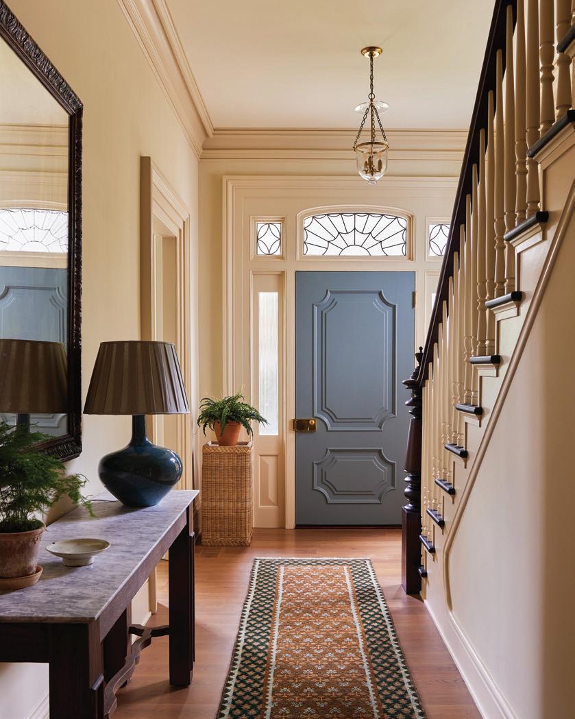
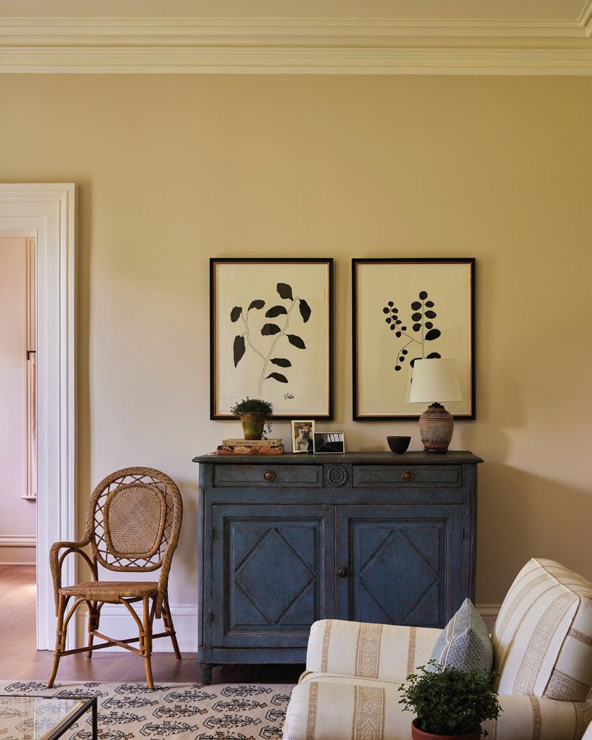
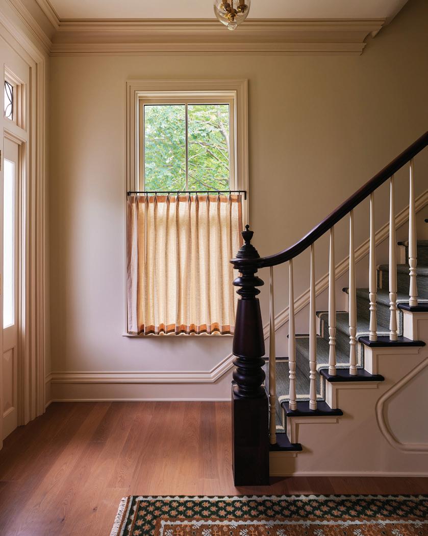
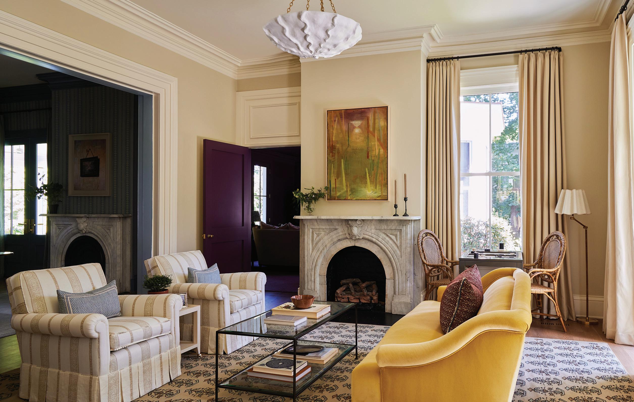
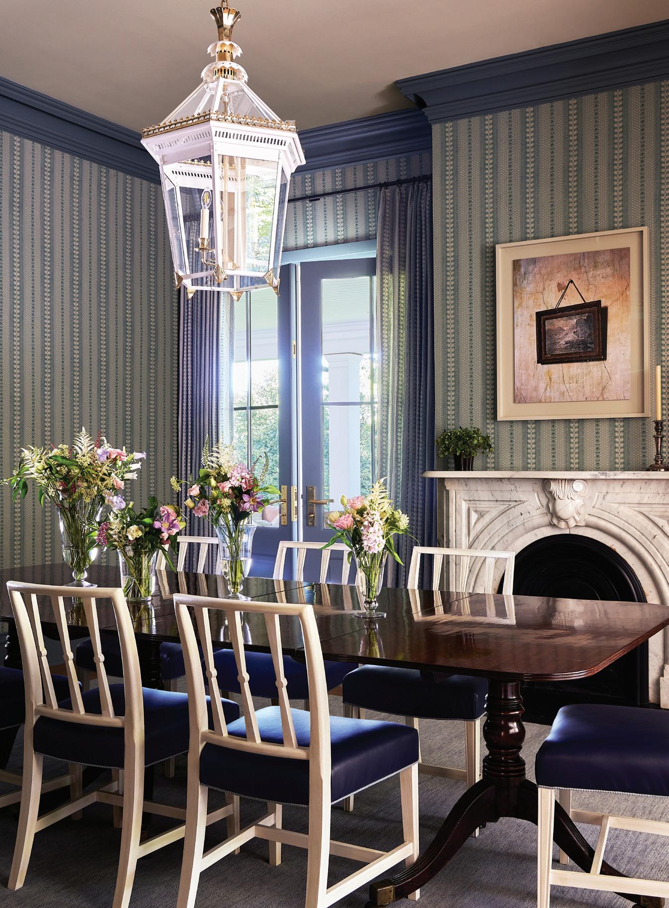
above, left: A Ward + Gray runner in the entry sets the tone, offering guests a first glimpse of the home’s signature patterns. above, center: Carbone opted for Farrow & Ball’s Lime White on the living room walls. above, right: The entry is trimmed in Matchstick by Farrow & Ball. below: There are plenty of seats to choose from in the inviting living room, but the settee in Schumacher’s Gainsborough velvet is perhaps the most enticing.

What were their asks for the design? How did they want this house to feel for them?
She was a wonderful client and only wanted us to show her things that we liked, and we had a long introductory period with the family prior to them signing on. They had looked at a bunch of different homes that I had done, and she liked color—especially blues—but didn’t want it to be overwhelming.
She really wanted the rooms to flow, and she wanted them to have a softness to them, because the light in certain rooms, particularly in that front living room that has the yellow sofa, is really beautiful at certain times of day.
She was a true function person, so we really paid attention to that. It informed so many of her decisions, from fabrics to wallpaper. In that way, I think she was really easy to present to, because she was very clear in what she wanted, and we were able to get on the same page pretty easily.
Was color always a big part of your plan, or did that evolve as the project continued?
It’s funny, I love color, but I’m drawn to really warm tones. We wanted to
be judicious in our use of color around the house.
She wanted it to feel happy and joyful, and she also loved blue. In a lot of ways, it was about giving her that blue but also making it feel a bit more interesting than just one blue room after another. And then playing with the tones of blue, a bit off from the ones that you’re used to seeing. There’s no straight navy, right?
We also wanted the scale of the furniture to really feel like it fit the home. We made sure that we could use some of the antiques that she already had, and work in some of those brown wood tones that come from those pieces, but also make sure that floor plans functioned in a way that supported their everyday life.
You have such a fun mix of wallcoverings and patterns in here. What’s your strategy for print mixing?
I love a small print. It’s my total wheelhouse. So, I’ve always navigated myself to smaller prints, but we knew the architecture was so beautiful. The windows were gorgeous, and we didn’t want to cover them up with a lot of print in the major common rooms.
We went with wallpaper strategically in the powder room and went
left: Carbone dressed the dining room in Alice Sergeant’s Jasper print, both on the windows and walls. right: The family’s serveware is stocked in a Nickey Kehoe credenza.
“ Because it feels like the darkest room in the house, we wanted to embrace that .”
—NINA
INC
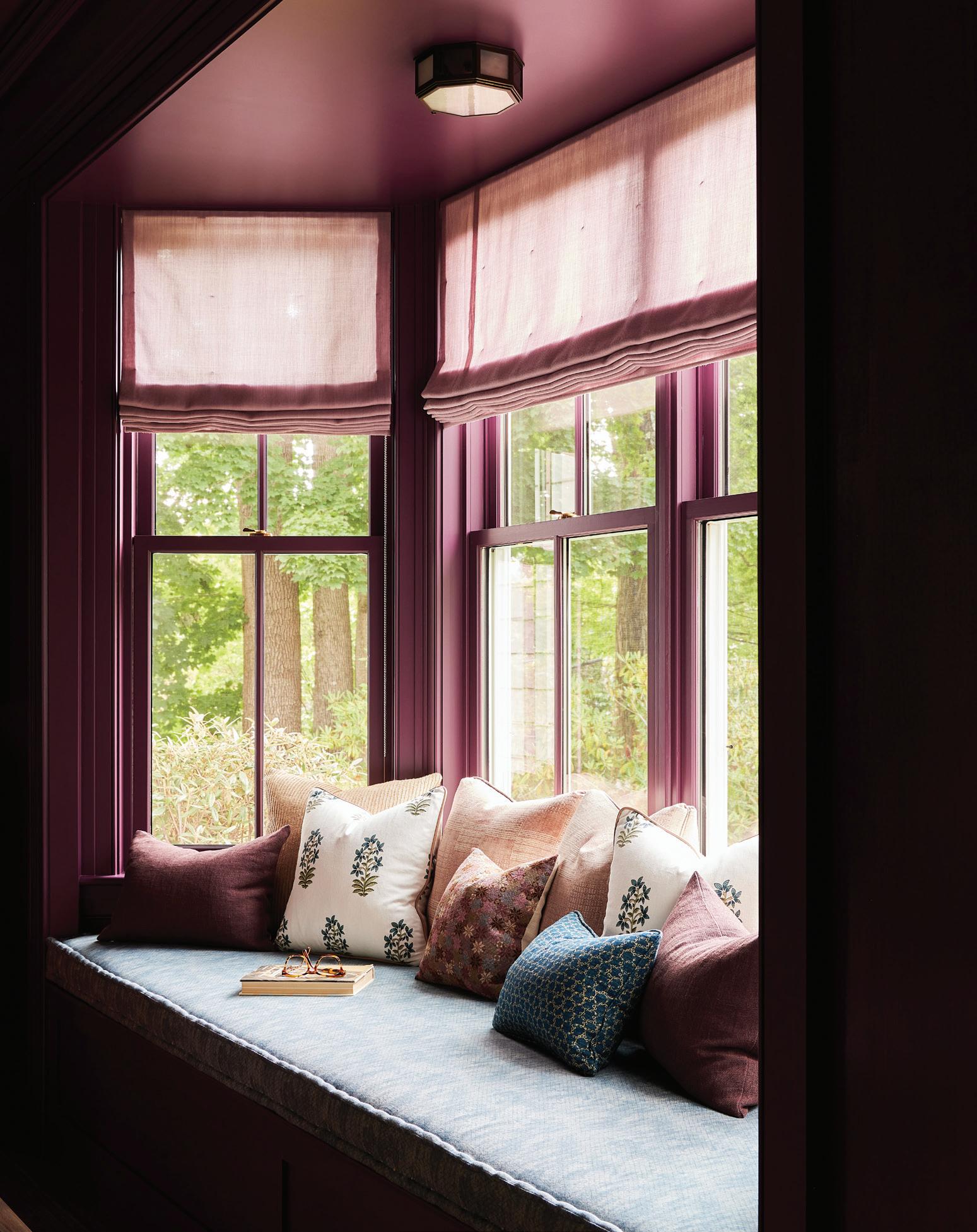
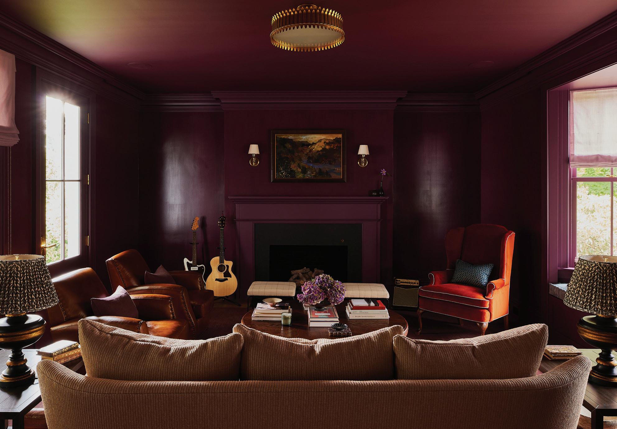
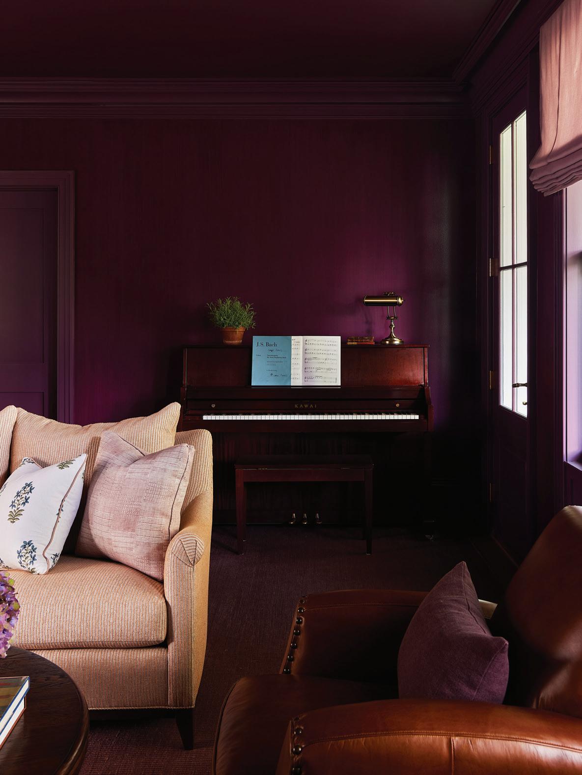
above, left: Isabellle Favette created the strie effect using Benjamin Moore’s Bottle of Bordeaux. above, right: An Urban Electric Co. fixture lights the welcoming window seat. below, right: The moody music room includes a Hickory Chair sofa for its audience.
CARBONE, NINA CARBONE
this photo: Farrow & Ball’s Skylight on the paneling inset contrasts with Light Blue on the trim in the airy family room.
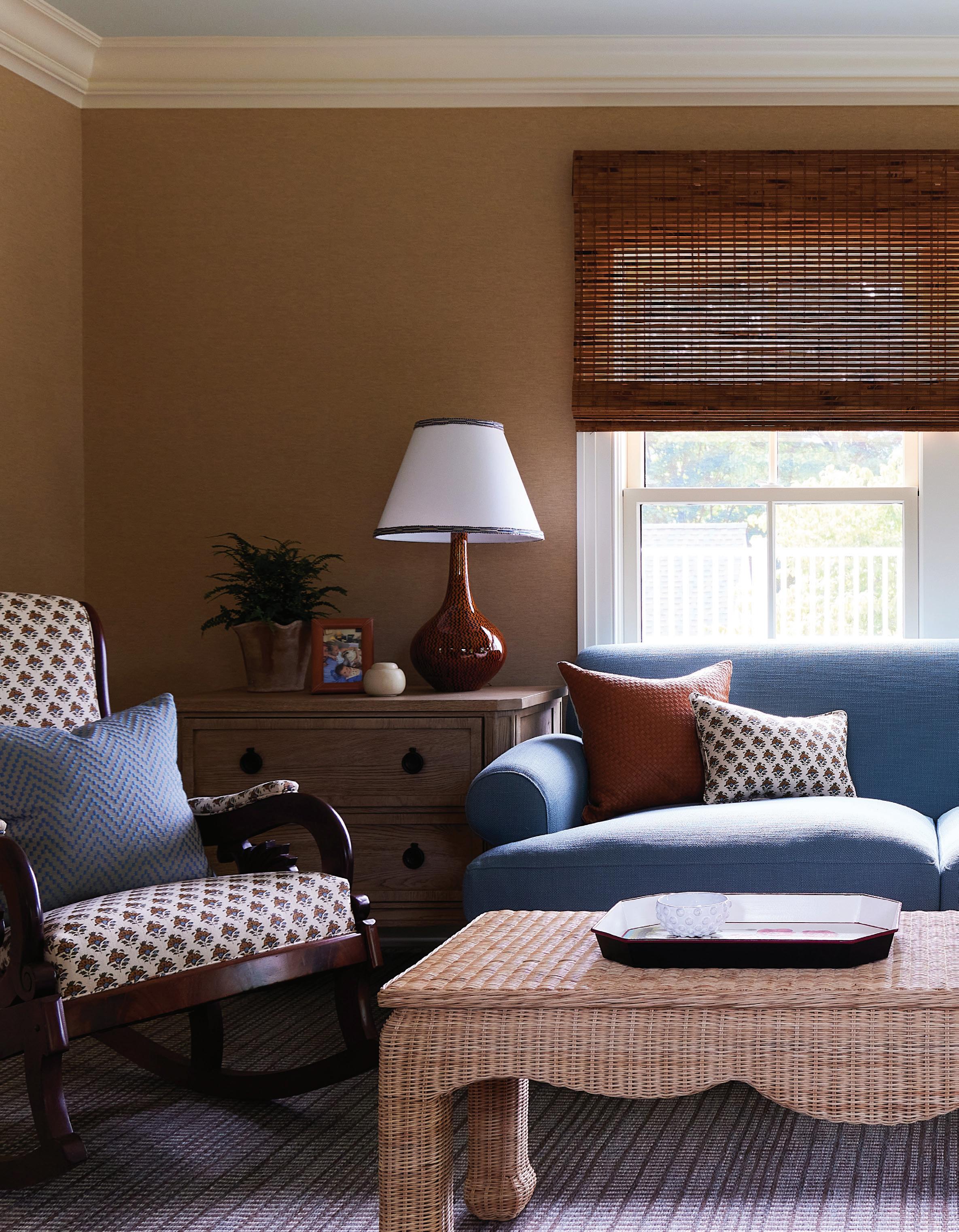
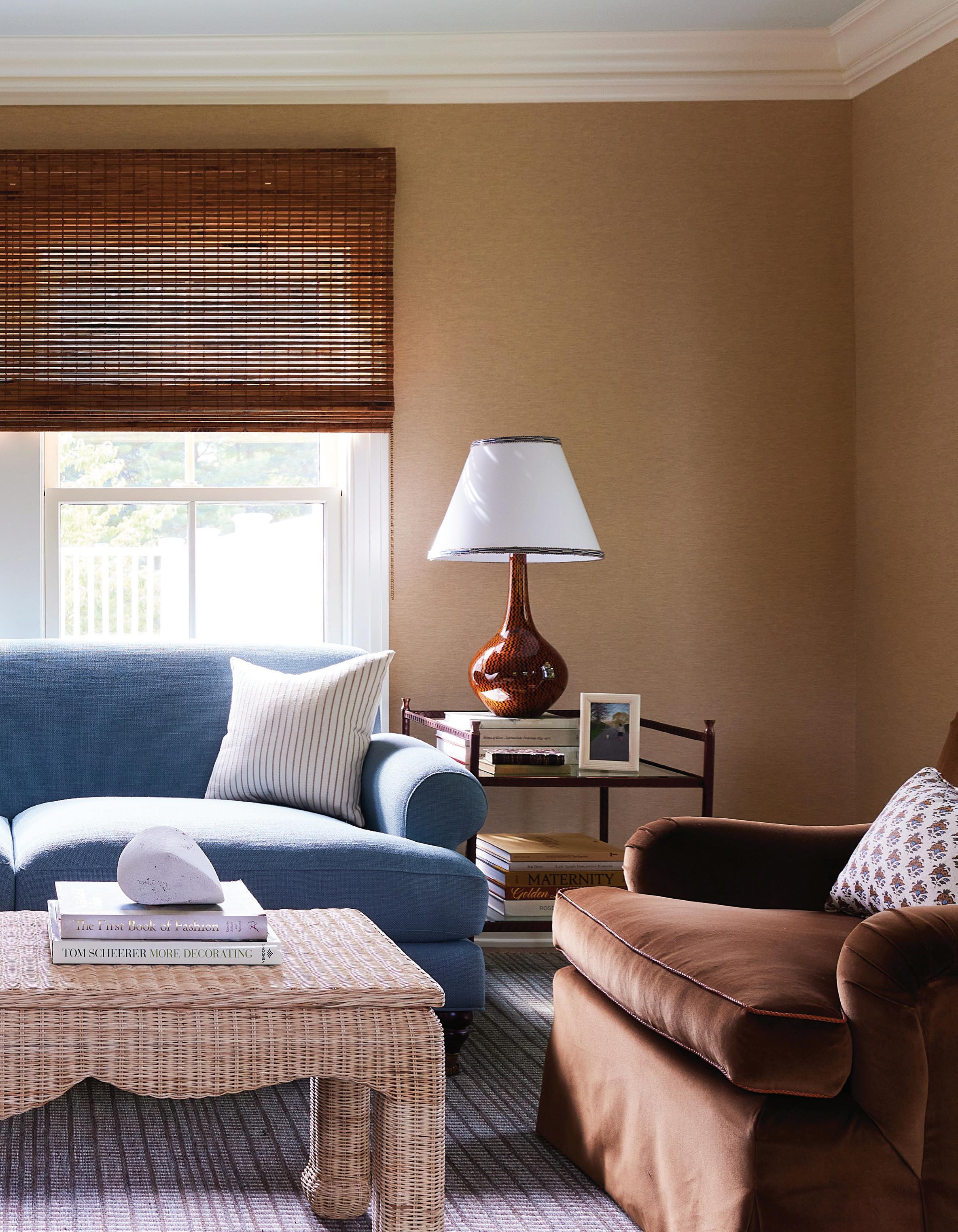
this photo: Carbone paired the clients’ favorite blue shade with warm browns in the office. A Mainly Baskets coffee table adds texture among the other soft surfaces.
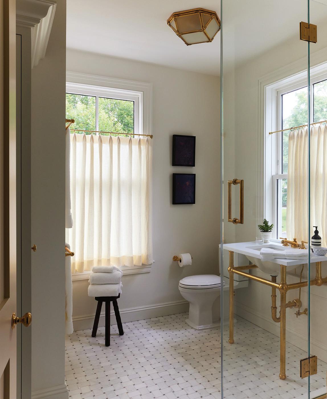
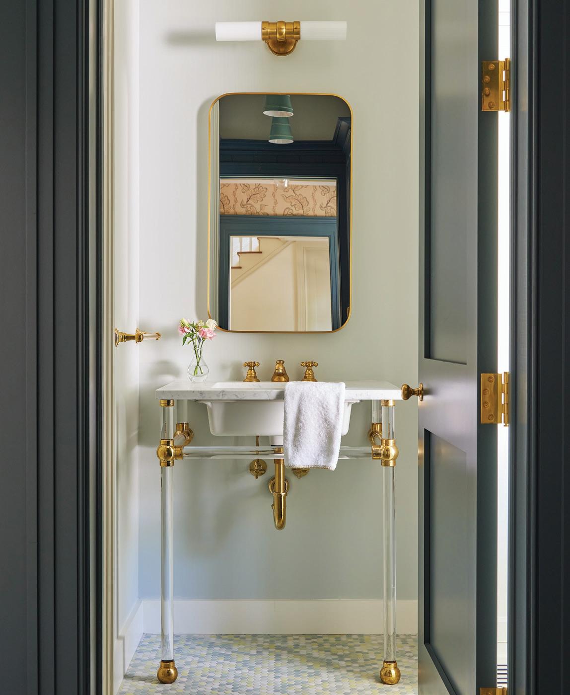
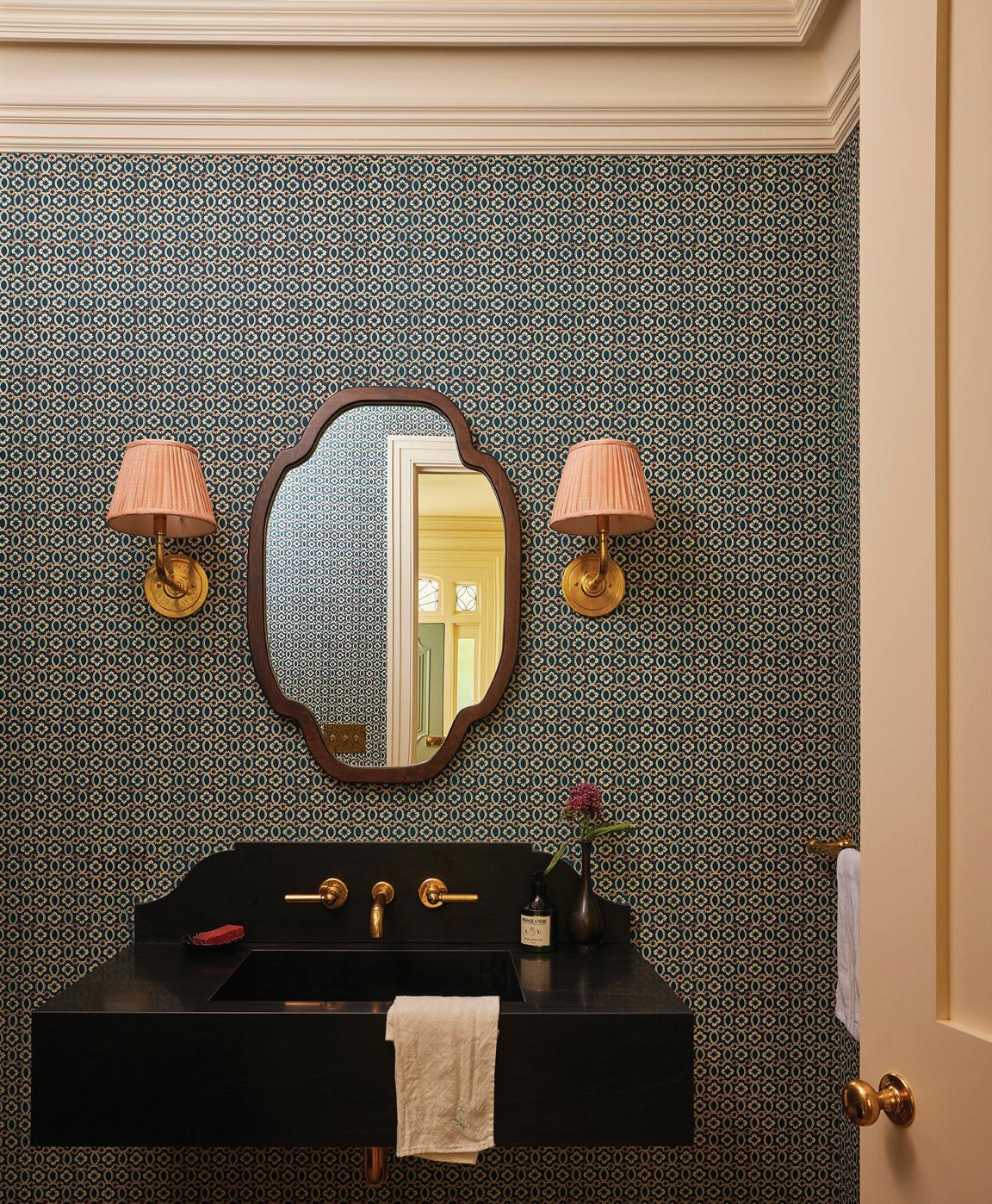
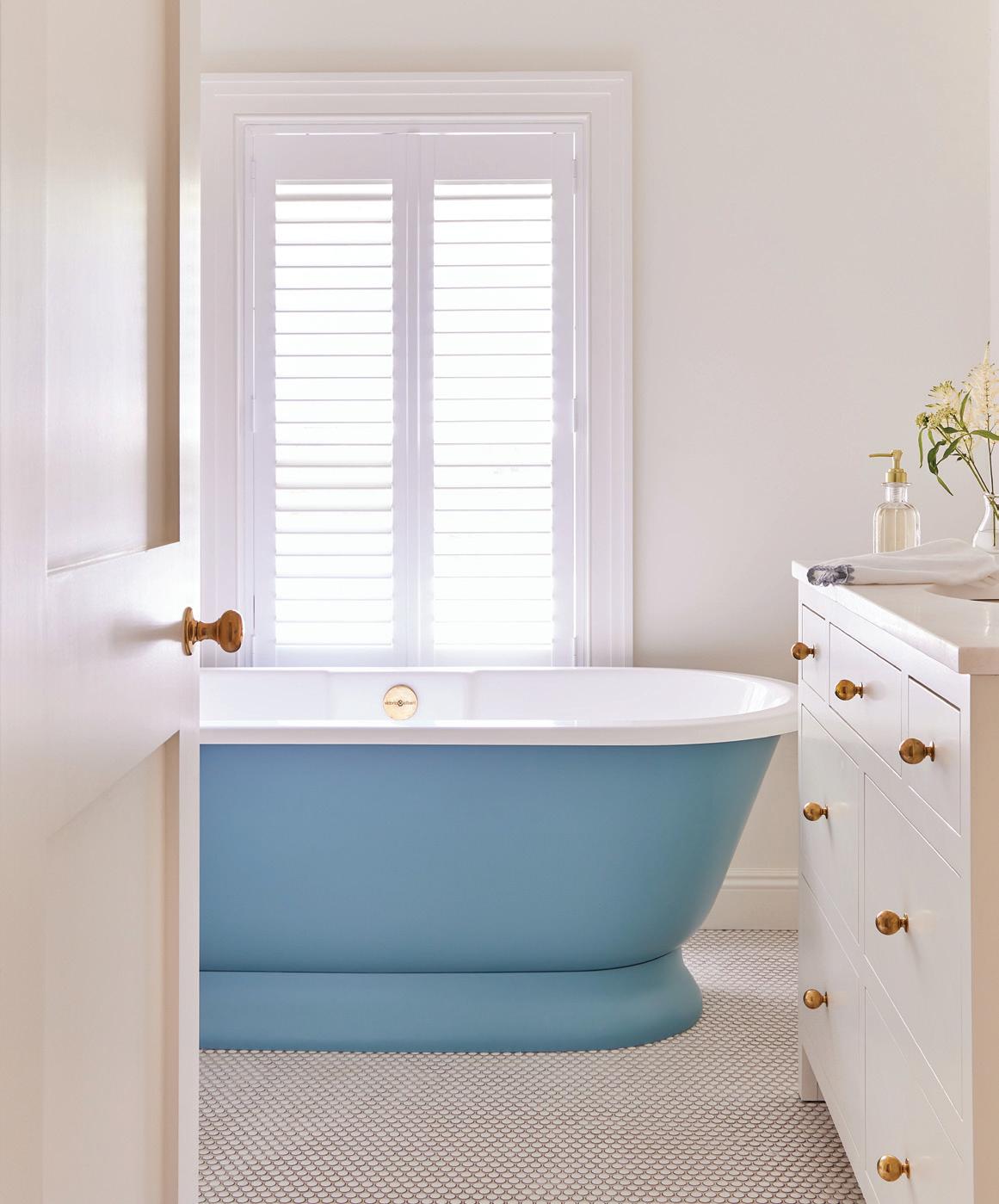
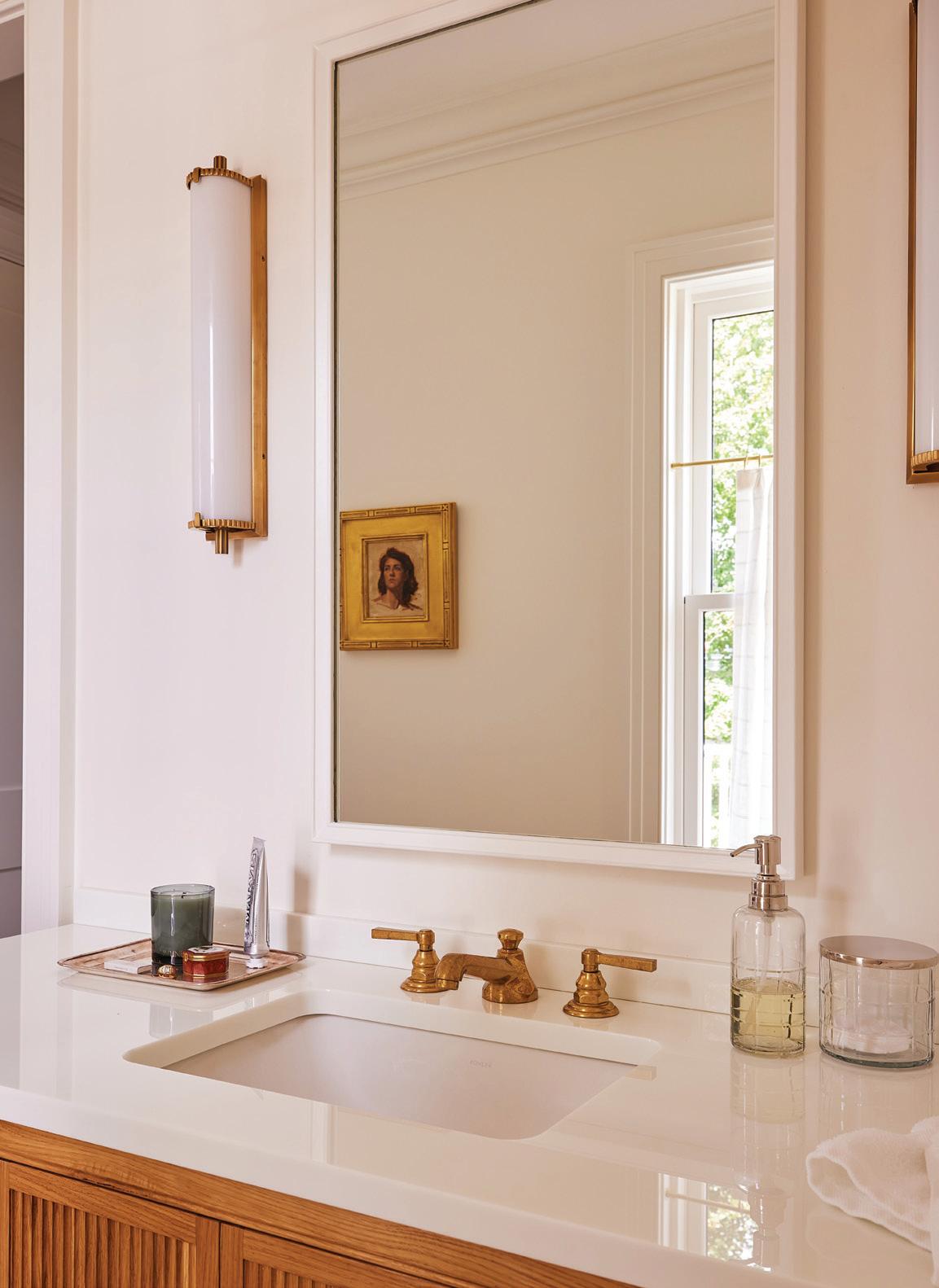
top, left: A mix of crisp whites, rich brass and natural light creates a polished guest bathroom. top, right: A sink with Waterworks faucet and level handles is mounted on a wall papered in Fleurs & Entrelacs by Antoinette Poisson. bottom, left: To create a softer take on the mudroom’s blue-grey millwork and cabinetry, the designer chose Benjamin Moore’s Oystershell for the adjoining bathroom. bottom, right: In one of the daughter’s bathroom, a Victoria & Albert tub creates a colorful focal point.

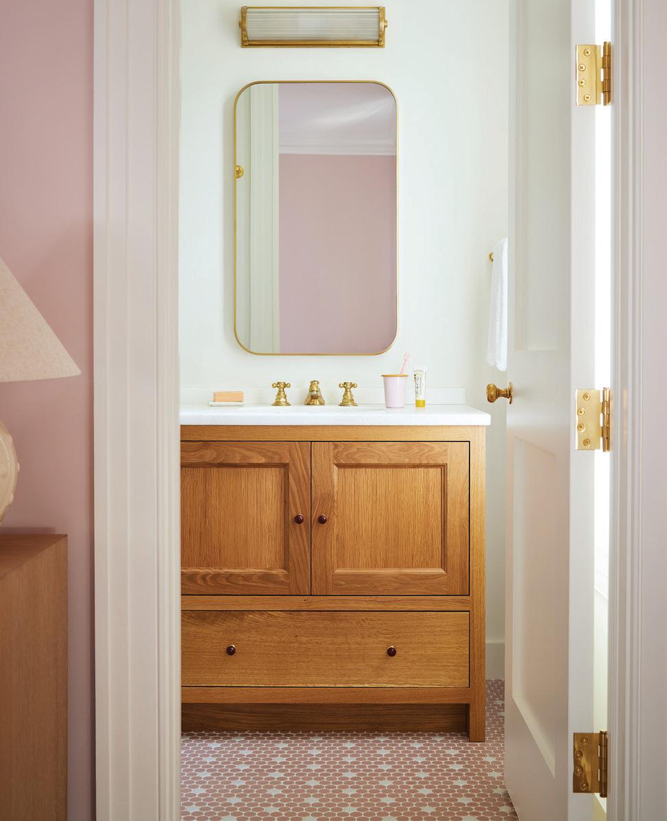
with more of a grasscloth in her primary bedroom. In the dining room, we liked the idea of a stripe, because it felt very Greenwich and traditional, but we wanted to have a little bit more fun and loosen it up a bit, because I would also say this family’s not serious. I wanted the house to reflect a levity that the whole family really has.
Tell us about this purple room.
We always called it the music room, because her daughters play guitar, they play drums, they have the piano.
It’s the darkest room in the house, and it’s also not connected to any other room. So, it’s truly its own destination, in and of itself. Because it feels like the darkest room in the house, we wanted to embrace that. We felt like all the other rooms have a white or an ivory or beige base to them, but we wanted to kind of go darker and richer in there. I think if you have that many rooms to work with, it’s nice to have what I call a “winter room.” It’s an aubergine color, and she was just all in on the purple.
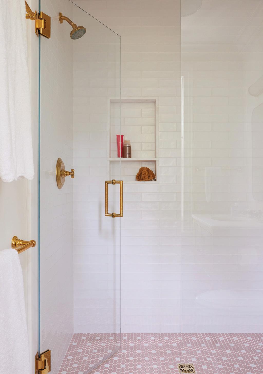
this photo: Farrow & Ball’s Calamine creates the perfect pink for this girl’s room. right & below: Most of the bath surfaces, including the gloss pink penny tile, were sourced from Greenwich Tile.
“The house had beautiful bones , and we wanted to make sure that we were true to that in a considered way .”
INC
—NINA
CARBONE, NINA CARBONE
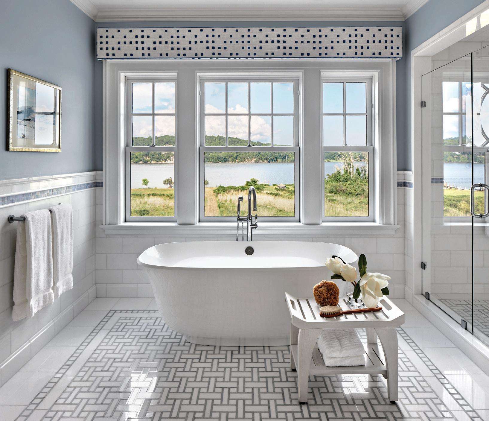
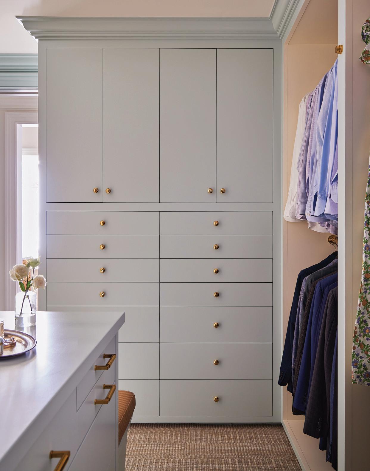
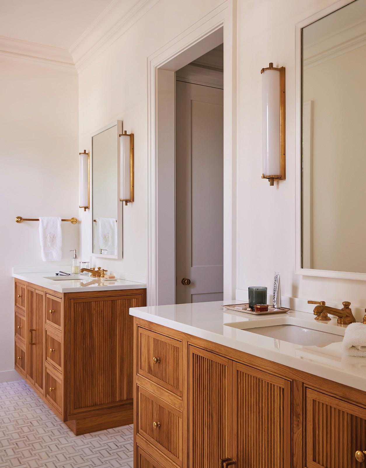
above, left: Antique brass bath lights by Visual Comfort & Co. flank a Josh Greene Kallis medicine cabinet. above, right: The primary closet offers plenty of storage behind doors and drawers painted in Benjamin Moore Woodlawn Blue. this photo: Custom vanities sit on the marble basketweave tiled floor.
Do you have a favorite room or moment from this house?
I love the kitchen, which is so nice and large. They love to cook, and like so many families, they hang out in the kitchen.
She also wanted a scullery and a larder and would laugh at how funny and ridiculous those two rooms sounded. But they give her joy and laughter.
The scullery is just off the kitchen, and it’s just flows from the kitchen. It has the same cabinetry, but it has windows on both sides. The larder is another place where we used a lot of color with the tile. It’s like a blueviolet color that you really don’t see unless you turn the corner into the space. The different tile sizes create a pattern that gives a nice backdrop.
And then another favorite space is the living room. I just feel like I want to entertain in that room, and I’m not a big entertainer at all. Or I could just sit on the sofa and read.
But the feel of the space, it has that intangible vibe you get from a house, especially from an old house.
What was the biggest challenge for you?
As we went along with the construction, we realized that we had room in the mudroom to do more of a dome ceiling. I struggled with that ceiling quite a bit, but I think we landed in a nice place. And we wanted to focus on the mudroom entry, because frankly, this is where the family is coming in and coming out. We wanted to give it just as much attention as we did the main entry and make it feel special.
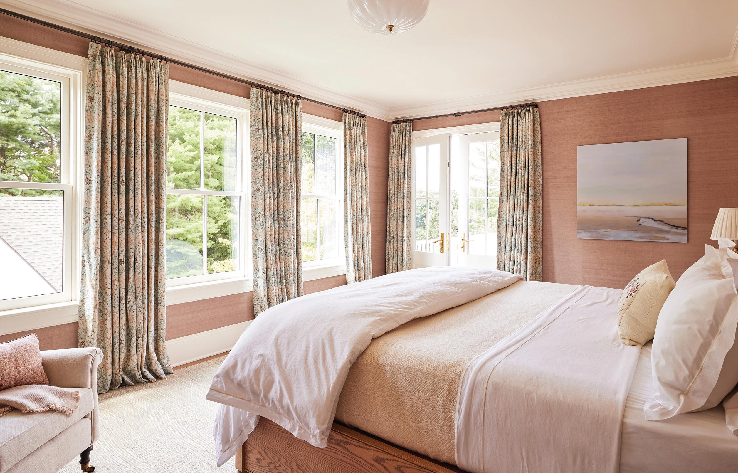
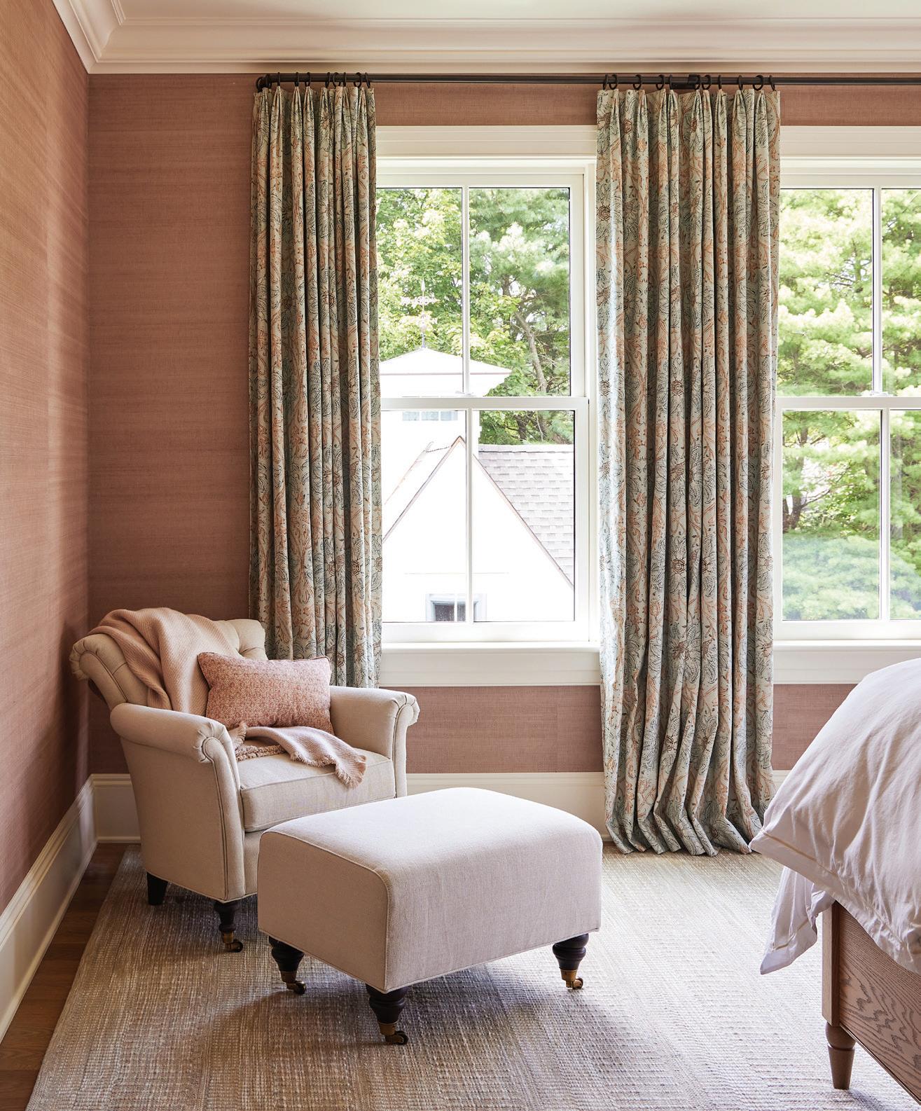
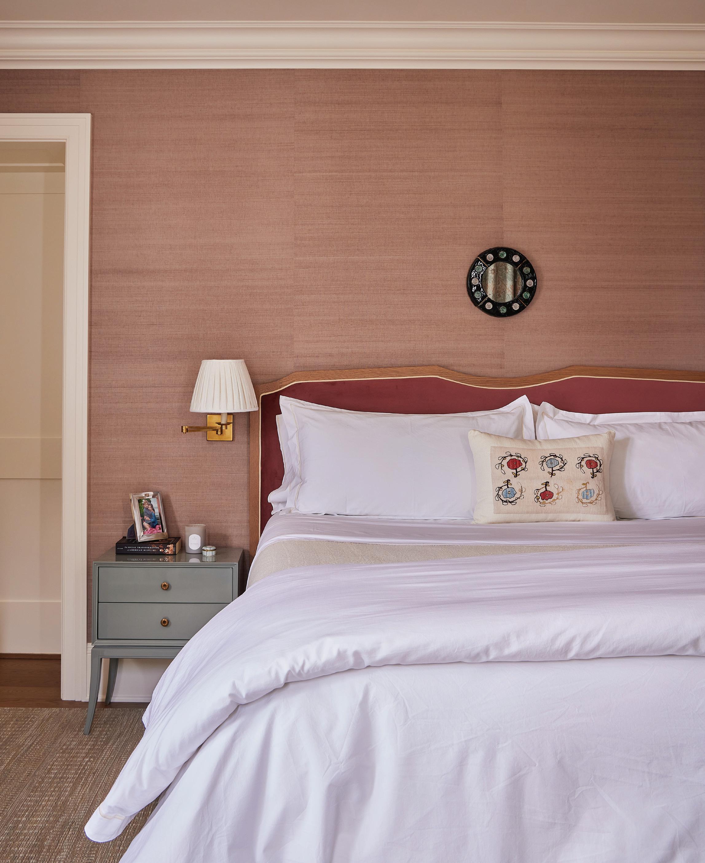
this photo: The calming primary retreat is wrapped in Misty Rose grasscloth wallpaper by Gregorius Pineo. above: Hodsoll McKenzie’s Kingsley Indienne print frames the windows with florals.
“I don’t envision rooms without at least a little amount of color in them.”
—NINA CARBONE, NINA CARBONE INC
Why is color so important to you?
I don’t envision rooms without at least a little amount of color in them. I’m not a real formal person, and for the most part, I want the design to feel accessible and joyful. It just adds to the whole dimension of the room.
RESOURCES:
Interior Design: Nina Carbone Inc, New York; ninacarbone.com
Architect: Howard Kelly, HK2 Architects; hk2arch.com
General Contractor/Builder: Robert Lewandowski, RL Construction; 203 667-1794
Owners’ Rep: Hillary Corbin, HL Corbin, 202-262-1902; hc@hlcorbinllc.com
above: A vintage mirror hangs above the bed, made with crisp white linens.
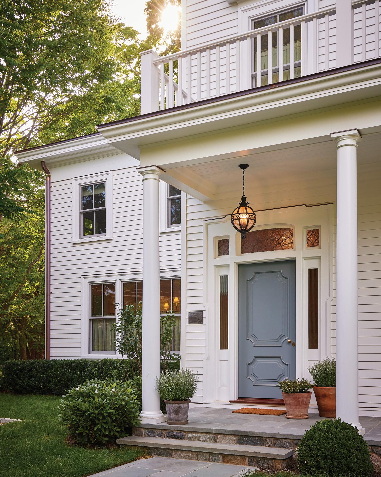
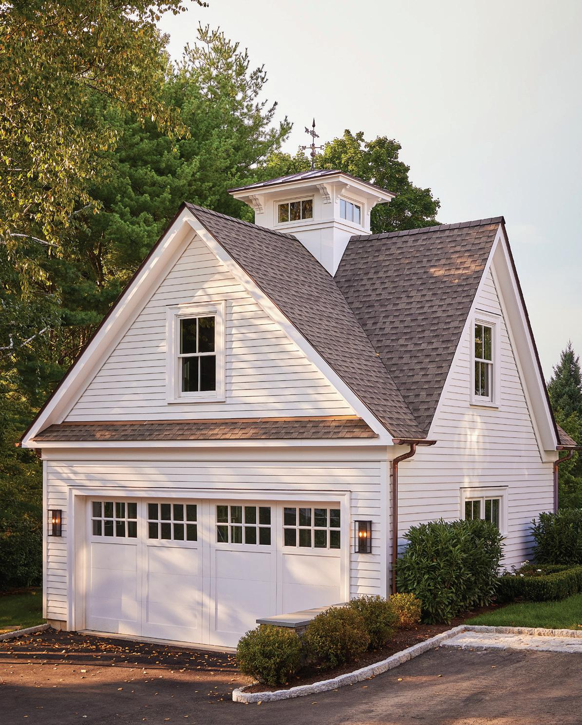
below: The garage, crowned with a weather vane, complements the home’s timeless exterior.
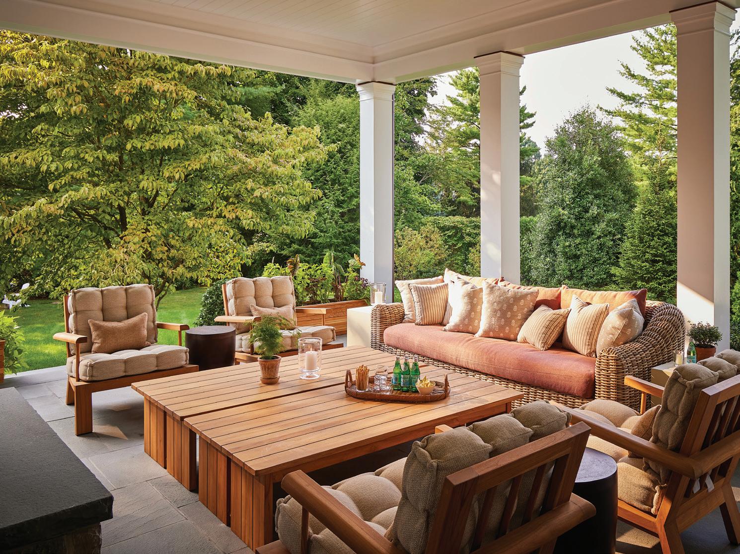
above: A pendant by Hudson Valley Lighting Group lights the home’s entrance. right: The back porch includes inviting Four Hands chairs and a wicker sofa with upholstered bench seat.


HOMES WITH HOPE – GATHER ‘ROUND THE TABLE 2025 THANK YOU, DESIGNERS, FOR AN INCREDIBLE EVENT YOUR CREATIVITY & GENEROSITY MAKE THIS EVENT POSSIBLE!



Patricia Scanlan Designs PHOTOGRAPHY


THANK YOU SPONSORS & PARTNERS FOR YOUR GENEROUS SUPPORT





Barbara & Greg Joseph • Lauren & Brian Schiller • Jane & Ben Carlin
Molly Alger & Jay Dirnberger • The Rabinowitz Charitable Foundation
Karen & Toly Spheeris
hwhct.org

Moffly Media is one of the leading providers of professional event photography and marketing services in Fairfield County. We capture compelling, high-quality images of individuals and groups at meaningful events. With our wide range of capabilities, Moffly will customize a marketing program that’s just right for you.

ELEANOR BANCO
FAMILIAR FACES SHARE THEIR LOCAL FAVORITES
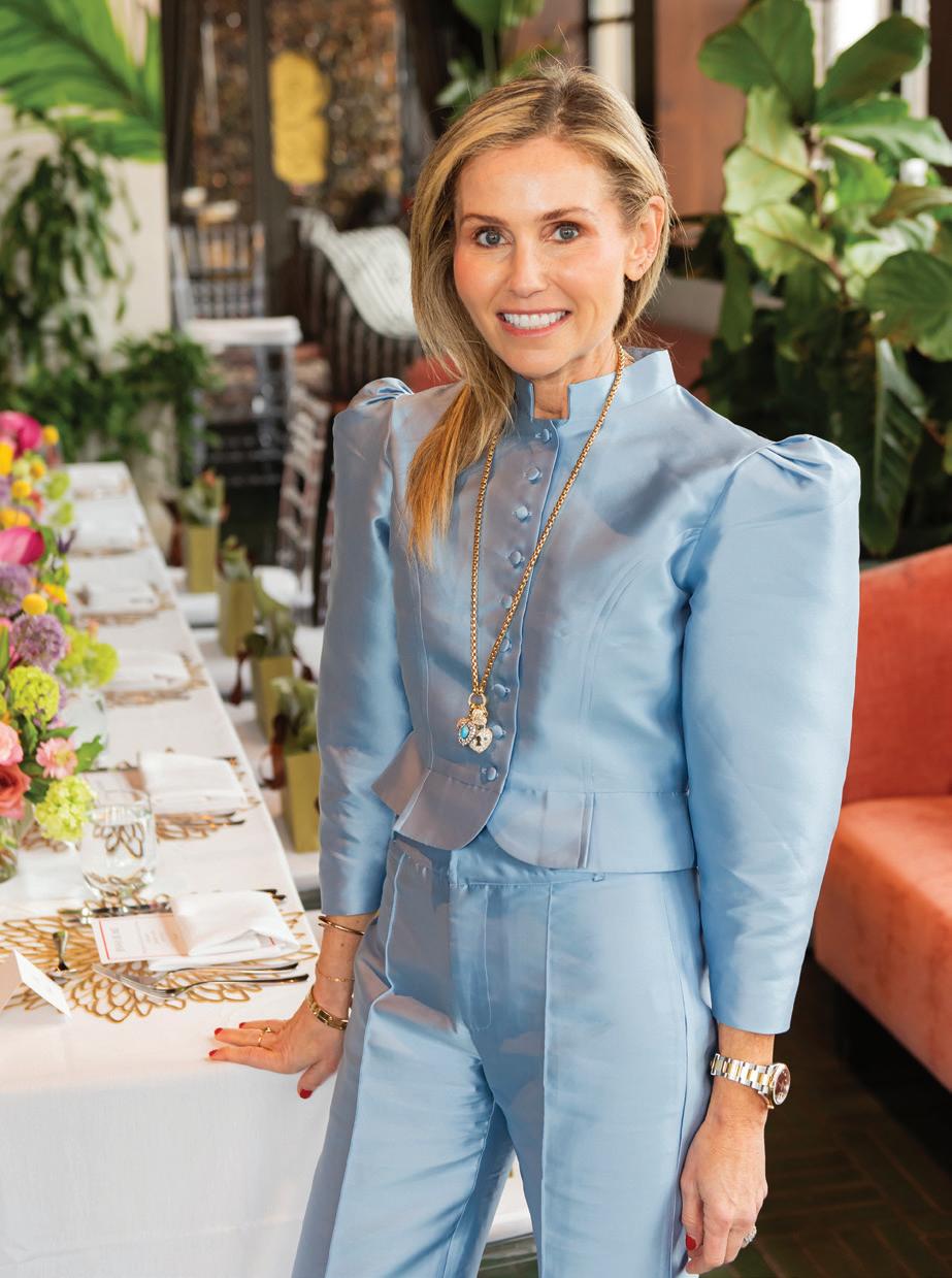
The one thing that always makes me feel at home is… being with my husband and kids.
My guilty pleasure is… Diet Dr Pepper.
I would describe my style as… fashion forward and polished.
Some interior designers I’m loving right now are… Neal Beckstedt! He’s designing the house that we’re currently building in New Canaan.
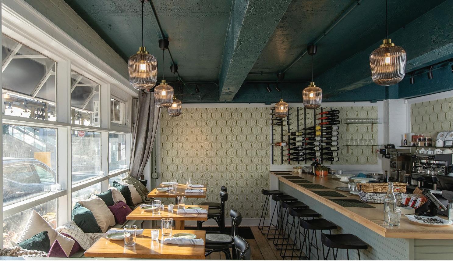
My latest local obsession is… Allium Eatery in Westport.

fashion, trends, etc., this juxtaposition is good. I love seeing things that have stood the test of time, experiencing a new beach I’ve never touched, a hike, an historic site.
My favorite thing about living here is… the idyllic town setting, which I vowed to never take for granted.
My five favorite pieces in my home are…
1. the cashmere throw on the couch
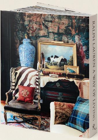
2. beautiful, useful things like my coffee table book collection
3. the moody light in our living room
My favorite weekend activity is… reading The New York Times and FT Weekend with an almond milk iced coffee; being social or not; sleeping past 6:15 a.m.
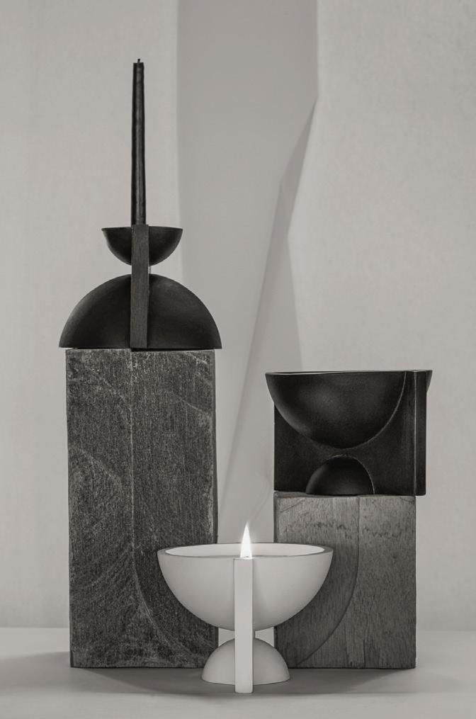
My go-to housewarming gift is… a House of Good candle. It’s a female-founded brand based in Fairfield, CT, which produces amazing clean-burning candles (sustainable wax and cotton wicks). The candles are packaged in incredible handmade vessels, which are meant to be objects in the home well after burning.

4. paintings by my kids
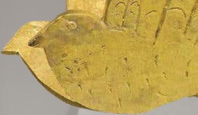
5. bird wall sconces by Alekos Fassianos




strategy, she’s a fashion force in her Canaan neighborhood haunts. We

As the face of Banco Connect, Eleanor Banco is known for harnessing the power of community, producing alternative shopping experiences that catapult rising designers and amplify established names. Beyond strategy, she’s a fashion force in her own right—never shying away from a statement look, whether front row at Fashion Week or visiting her New Canaan neighborhood haunts. We caught up with the stylish mom of two to talk travel, inspiration and a brand-new home to house her fabulous wardrobe.

My favorite place in the world is… anywhere that I can discover beauty or inspiration, mostly from the natural world. With a day job focused on material,


above: When it comes to guilty pleasures, Diet Dr Pepper is Banco’s go-to.
capture the Greek artist’s style. left: The Origin Først candles by House of Good.
right: Banco always brings her fashion A-game (here in Max Mara) to The Glass House Summer Party.
this photo: Allium Eatery in Westport is one of Banco’s favorite local spots.
above and below: Ralph Lauren A Way of Living is one of Banco’s prized coffee table books.


