TRENDING COLOUR
PALETTE -

TRENDING COLOUR
PALETTE -
NATURAL LOOK
26 COLOURS
The allure of the trending Astro Dust shade is what sets these two hues apart. Mystic and Jazzberry effortlessly complement both small and large-scale furniture designs, capturing the essence of space exploration and the dusty, desolate landscape of Mars.
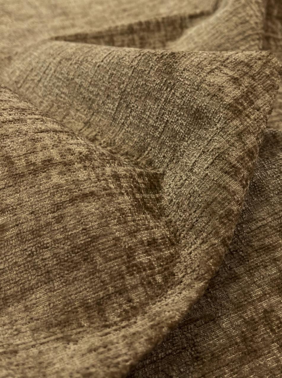
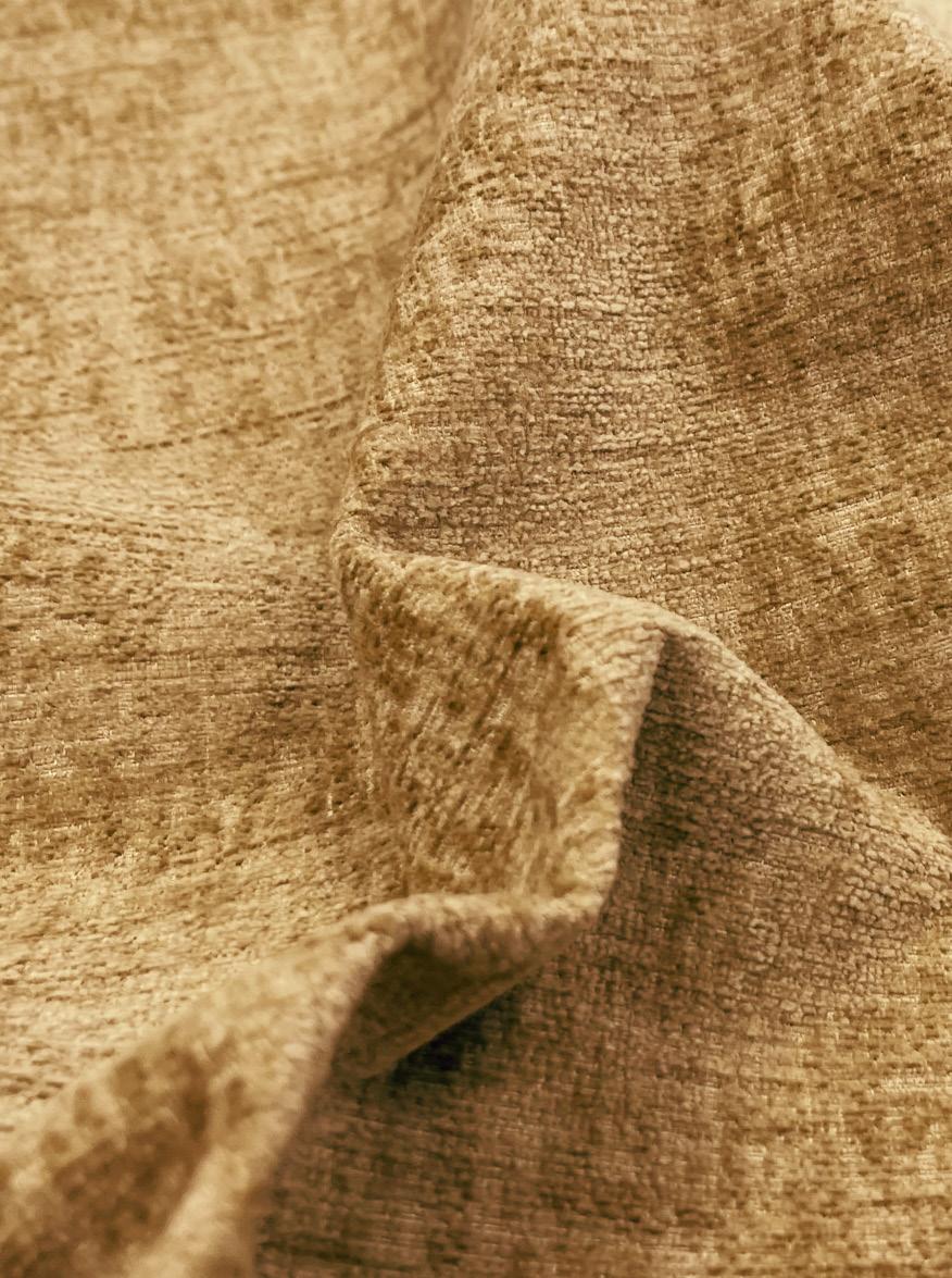
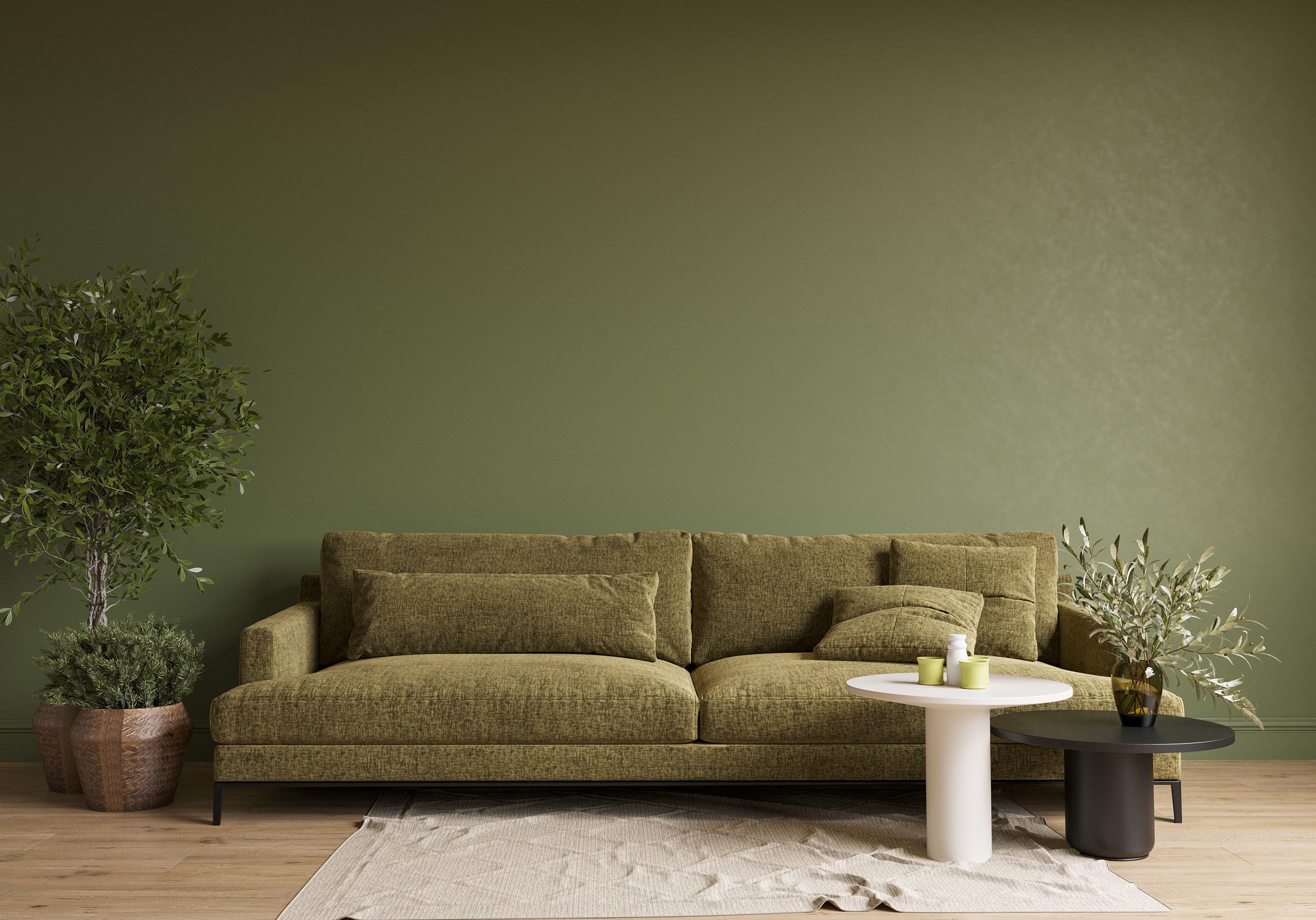
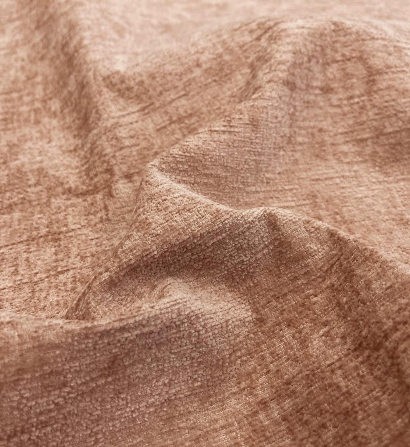
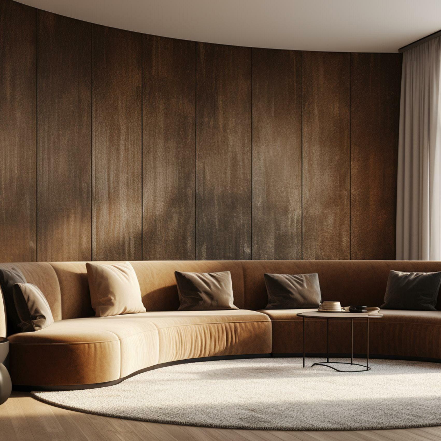
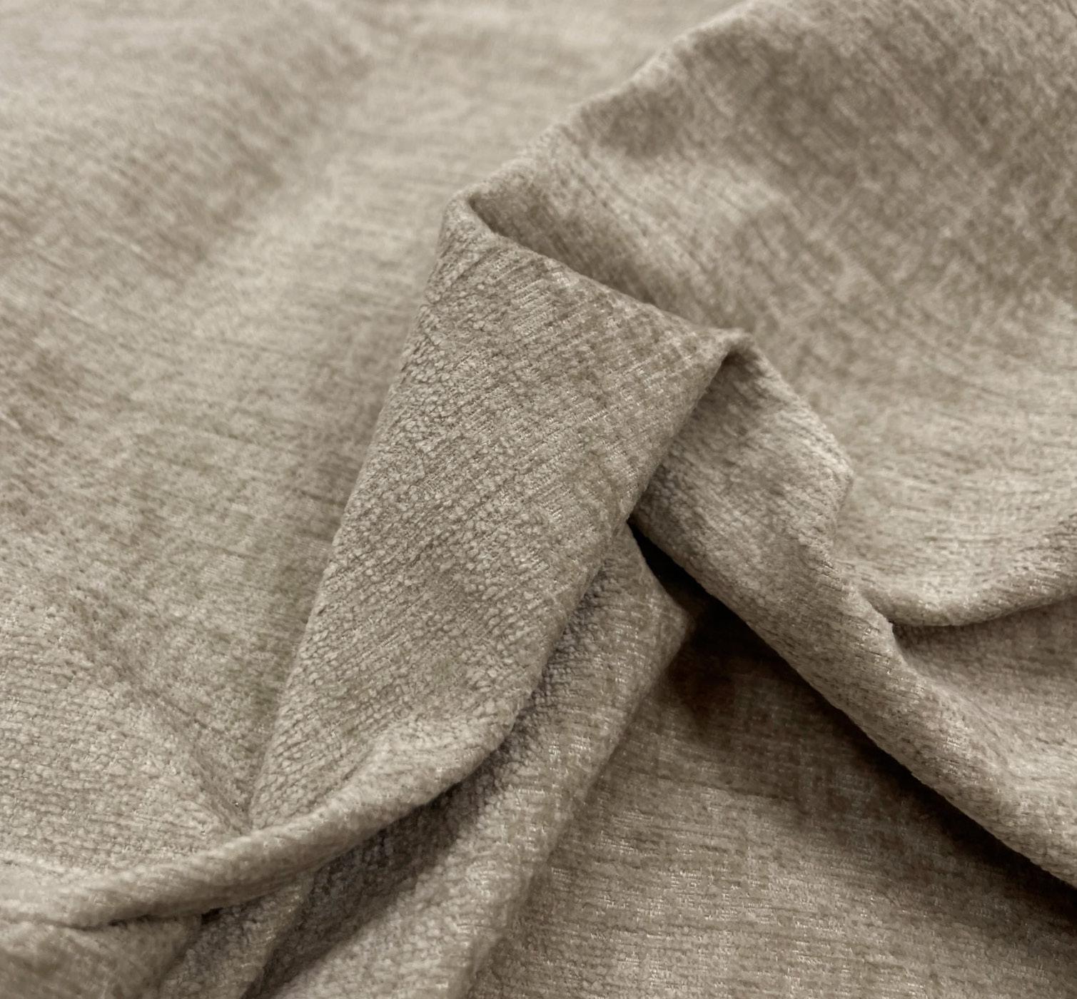
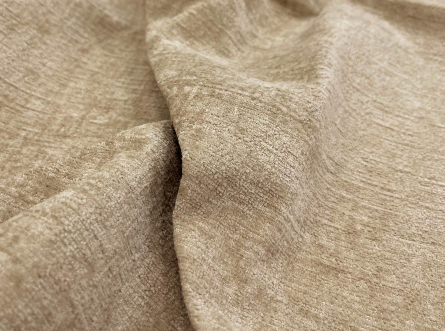
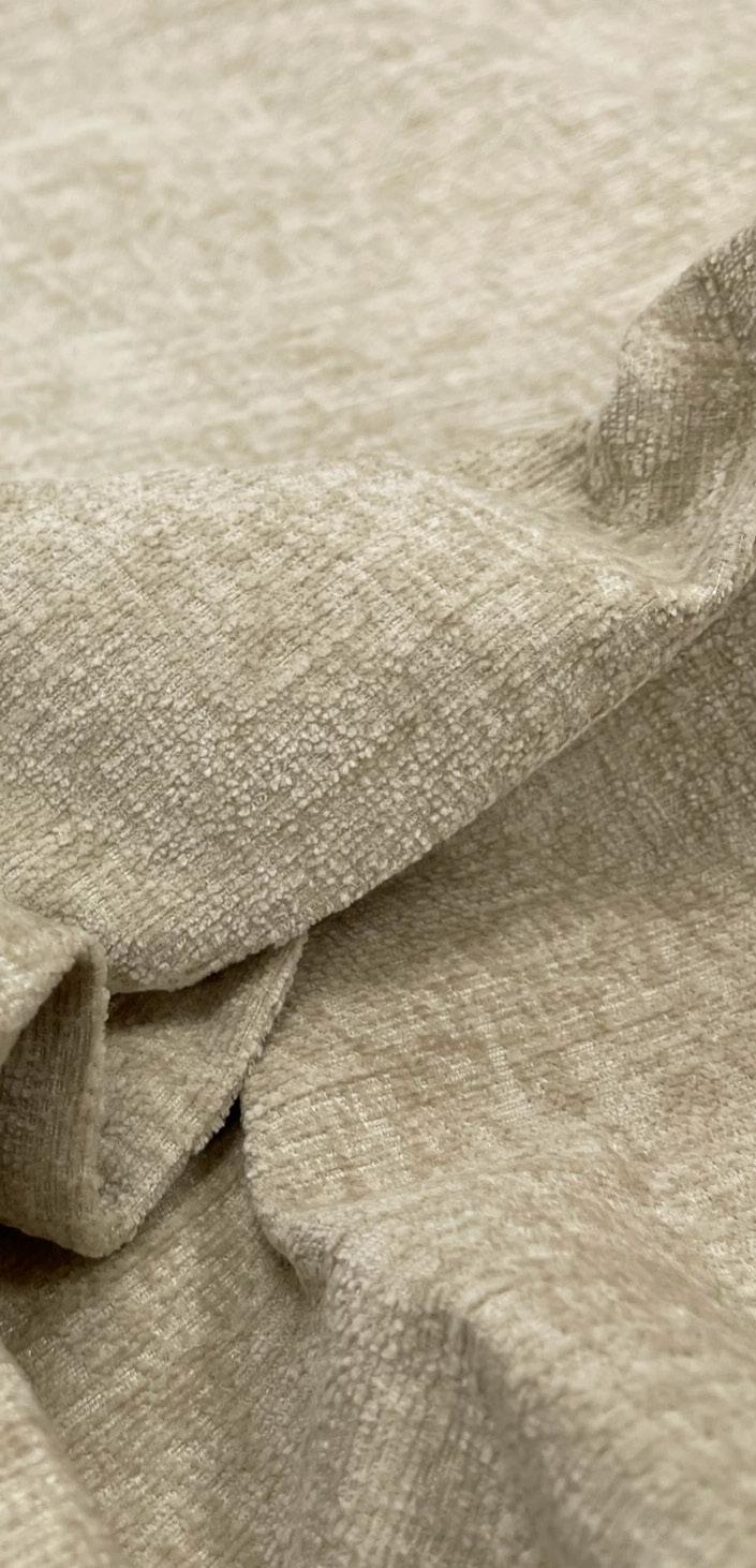
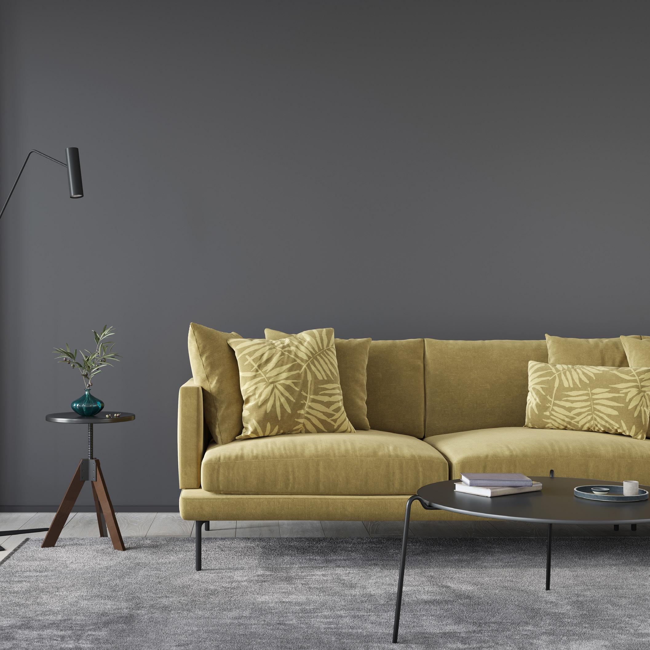
Warm and natural tones are key. Saturn and Fawn are the perfect bronze tones to warm up a space. These shades provide an uplifting and positive impact, with nature inspiration at their core, they offer a practical and versatile colour palette that is easy to implement.
Complementing cool-toned neutrals, greys, and whites beautifully, this vibrant hue serves as either a refreshing accent or a bold centerpiece, depending on the design concept. As a dynamic turquoise, it reflects the growing focus on wellness, celebrating nature by drawing inspiration from marine life and immersive digital environments.
“Glacier is a vibrant hue characterised by its refreshing blend of blue and green tones. It belongs to the mint family, offering a cool and invigorating aesthetic.”GLACIER
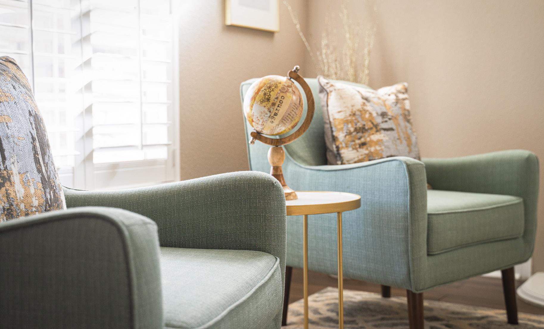
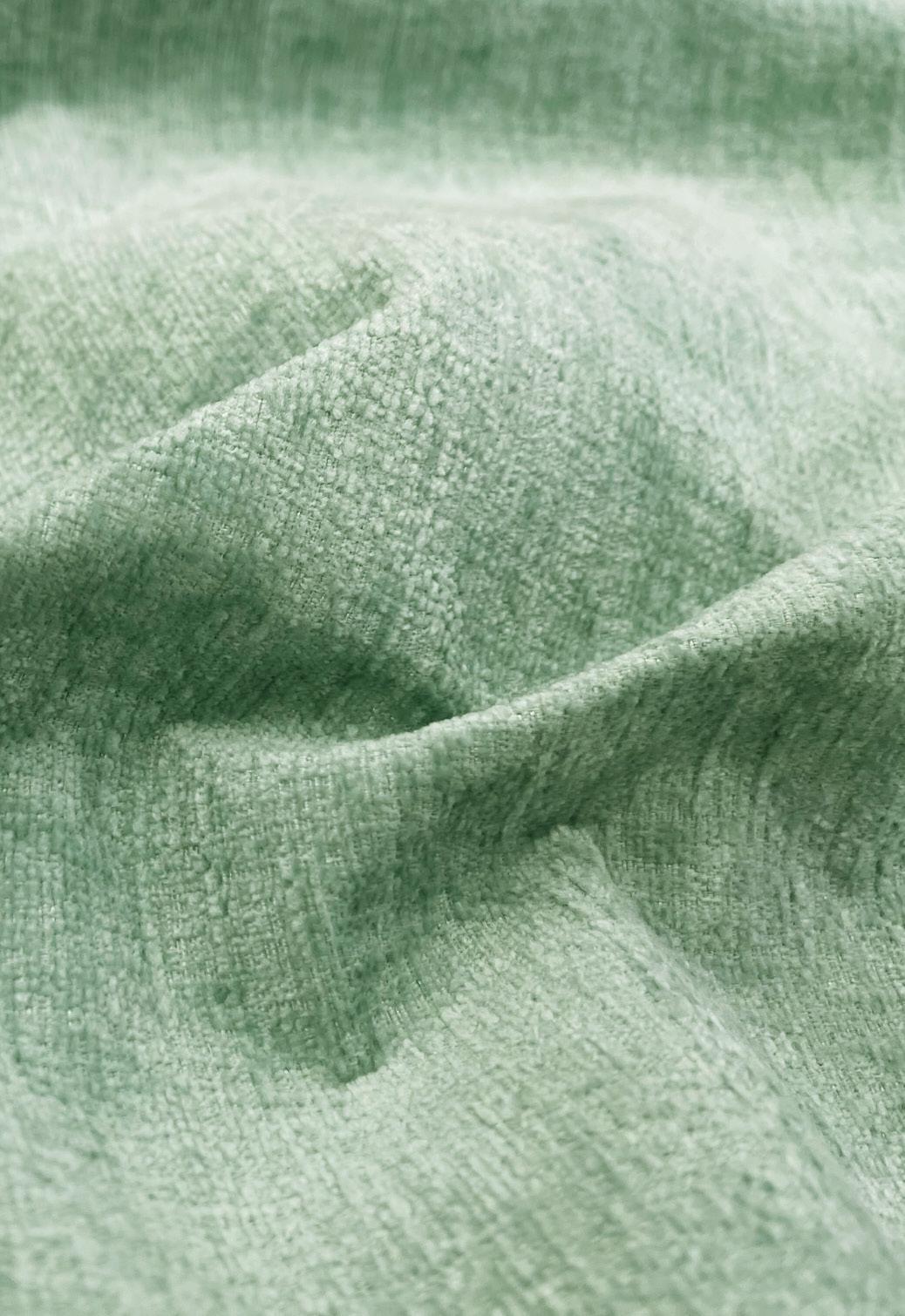
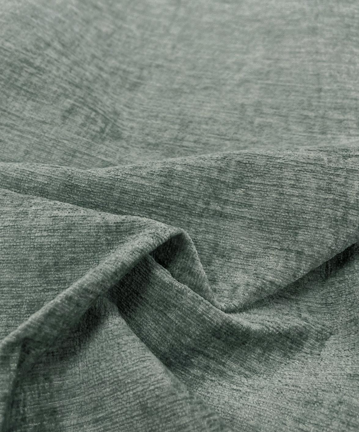
Calming, Fresh and Minimalistic the ‘Sail’ shade. in the Brooklyn range. . The shade is reflective of a desire for modertation, balance, and unintrusive energy as consumers seek to reflect inward.

As we embrace the natural world, green can work as a simple splash of colour or pose as high drama, take all the attention.
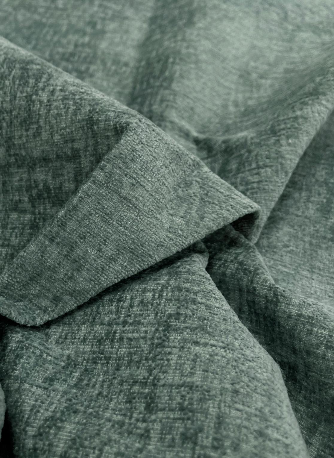
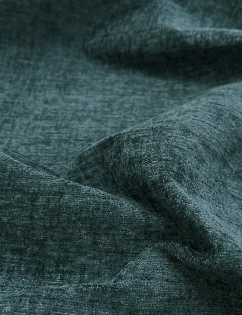
The Seaweed shade in the Brooklyn range brings a warm and earthy feel to any design, providing a grounding and rich yet relaxing touch. This versatile shade works well not only on period shapes but also beautifully complements modern and contemporary designs.
 SEAWEED
Bringing your designs into the world of green. This seductive, warming and welcoming shade is here to elevate all furniture shapes from modular to contemporary and curved, this fabric and colour works wonderfully on domestic upholstery pieces.
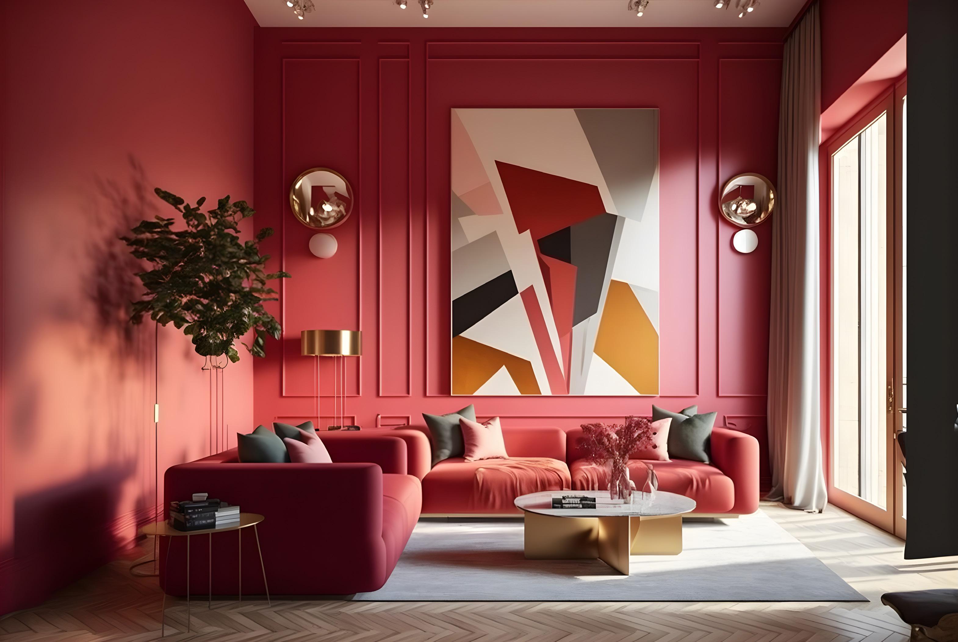
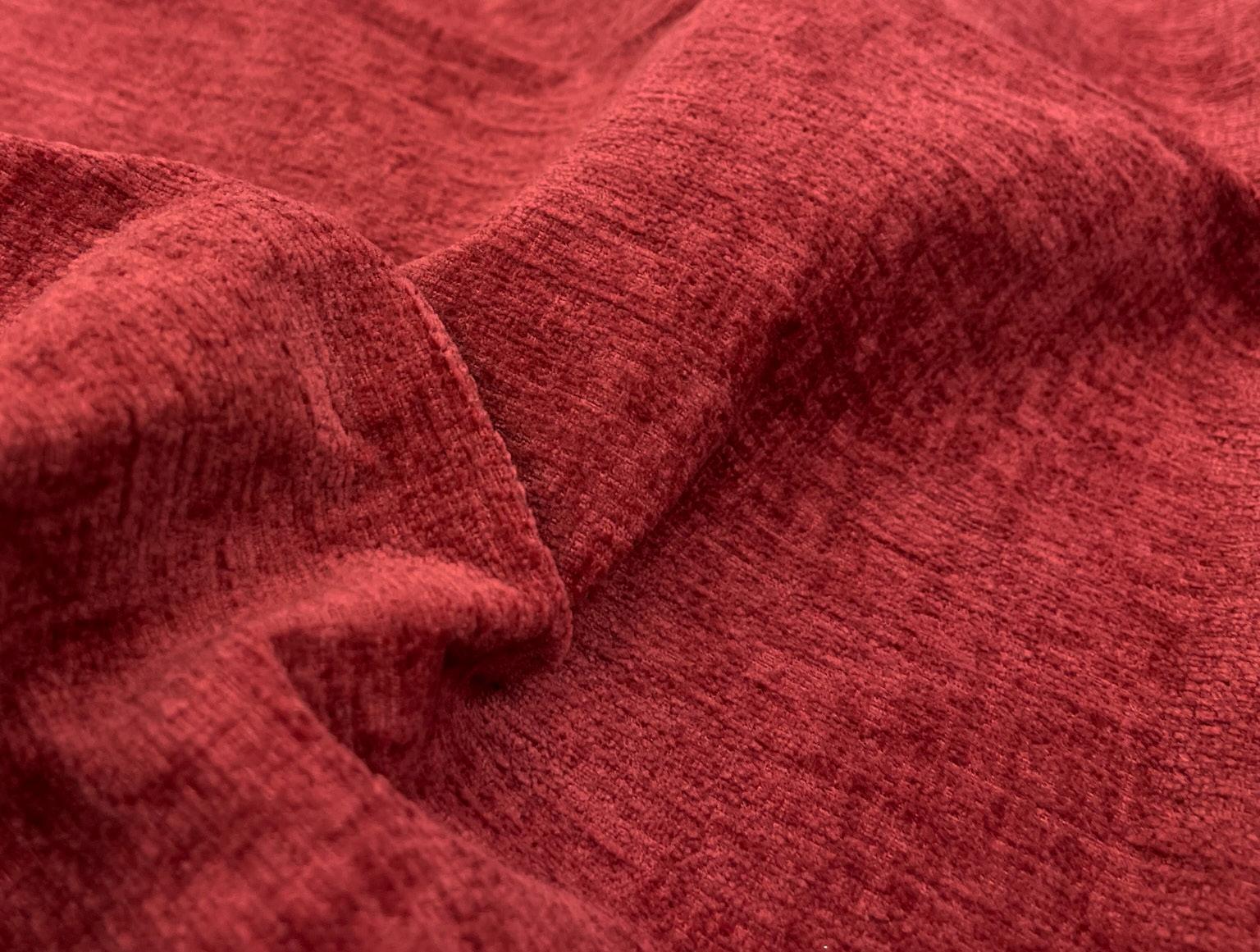
This energetic red is an attractive, saturated, and stimulating shade that sparks interest in the use of positive colours for interior design and upholstery.
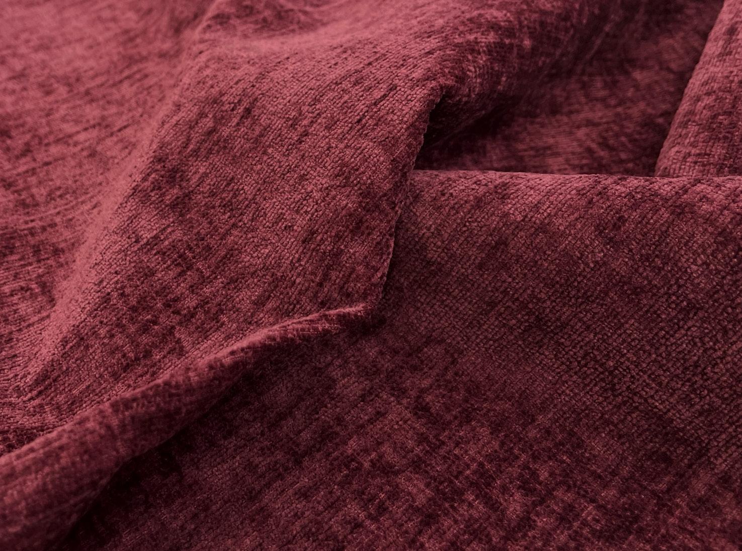
This luscious red serves as the mid-tone between our Melrose and Mystic shades in the Brooklyn range. Carnelia is an intense pinkish-red-orange hue with a raspberry blush. Reminiscent of a sunset, it is designed to awaken our senses, enliven upholstery designs, and ignite inspiration for colour palettes. The perfect pairing tones are Melrose and Fireside, while contrasting with Hummingbird and Honeysuckle creates a striking retro palette.
 CARNELIA
ELEGANT AND TIMELESS, THIS WHITE TONE IS THE CORNERSTONE OF MOST DECORATING SCHEMES.
Lace complements all colours within the Brooklyn range, serving as the ideal match for any fabric pairing. The warm undertone of this colour adds depth to the white shade we all know and love. Lace can make a statement on a sofa or provide a subtle accent on a chair or cushions. It’s also a fantastic colour for bedrooms, enhancing headboards and accent pieces.
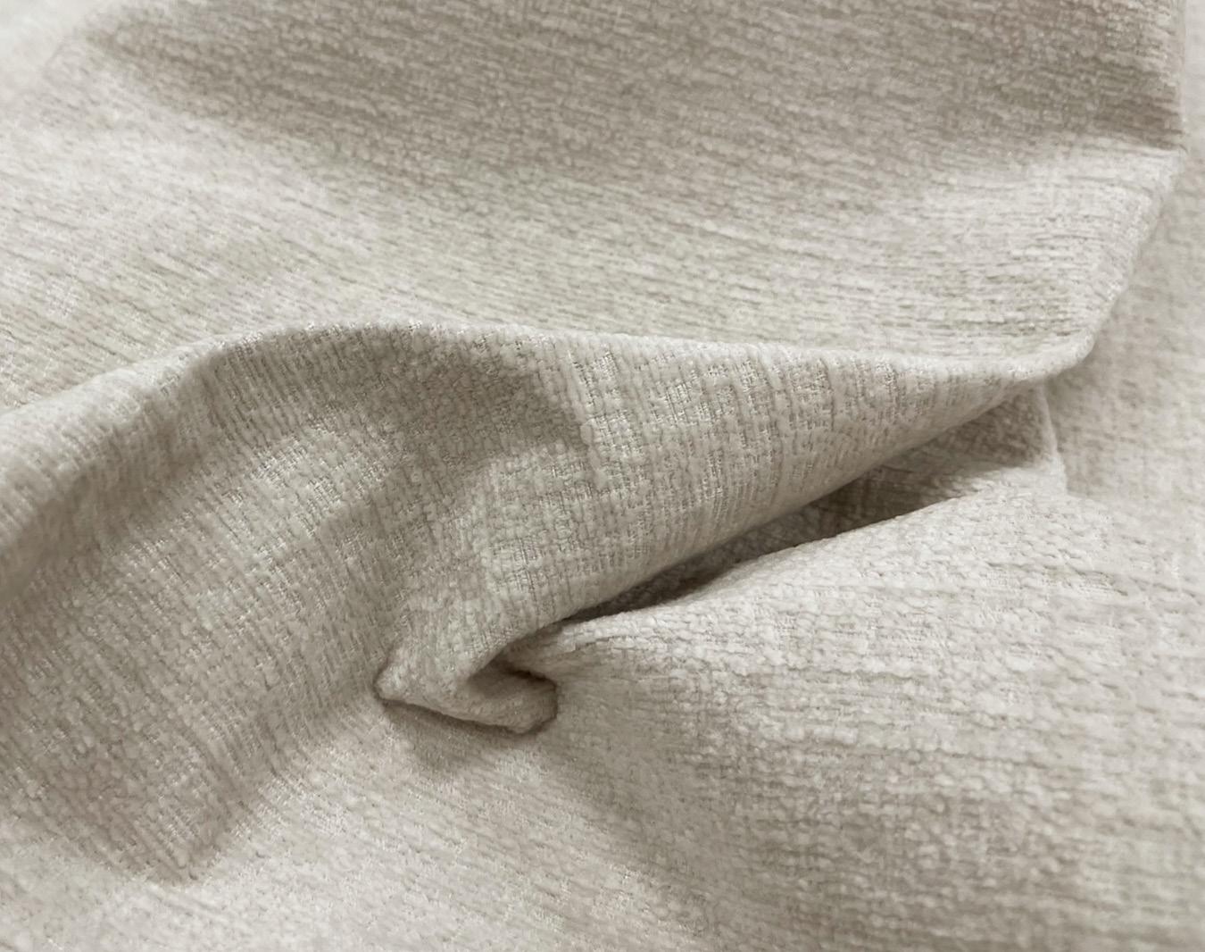
“Whether your style is scandinavian, coastal or contemporary, Lace is the perfect shade.”
HUMMINGBIRD - THE INSPIRATION BEHIND THIS SUMPTUOUS COLOUR IS TO CRATE AN ENCHANTING YET TRANQUIL FEELING, THAT TRANSLATES TO THE AMBIANCE IN ANY SPACE.

Winter-inspired blues warm the heart and soul of any space. Pairing perfectly with creams, reds, and greys, these three sophisticated colours are rich, vibrant, and ideal for any upholstery project.
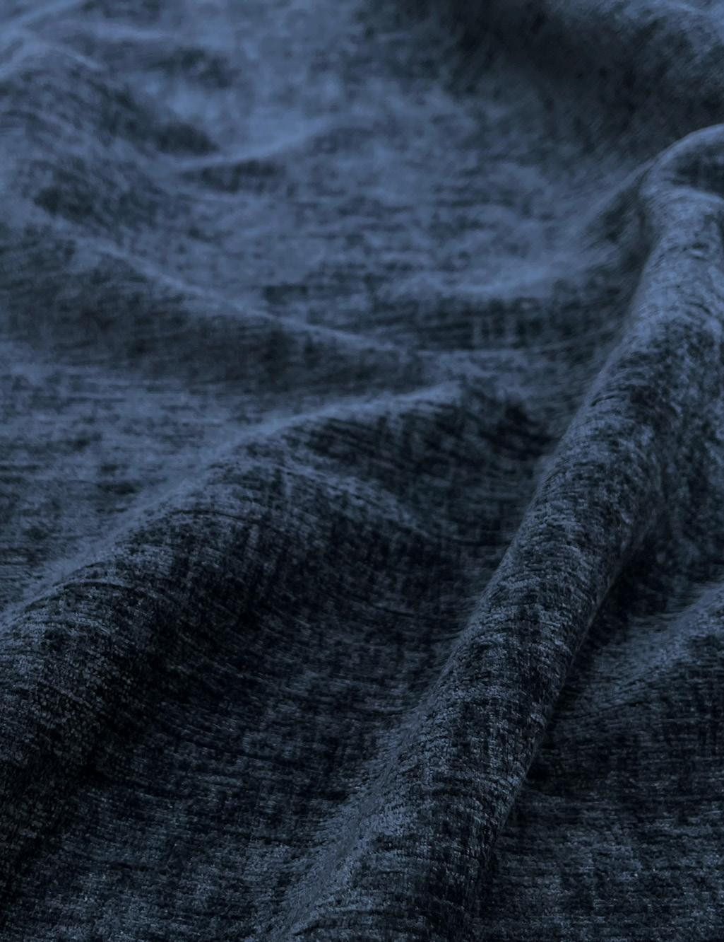
 SPRUCE MONSOON
HUMMINGBIRD
SPRUCE MONSOON
HUMMINGBIRD
THREE SHADES THAT EMIT TRANQUILITY, WARMTH, AND CALMING QUALITIES. SIMPLE YET SWEET, THE MODERNISM MOVEMENT FOR FURNITURE SHAPES IN TRENDY AND INVITING NEUTRALS IS THE MOVE FORWARD WE DESIRE FOR UPHOLSTERY DESIGNS.
Green remains significant due to its connection to nature. The rapid pace of current lifestyles and the need to spend more time at home make the vitality of wildlife especially attractive.
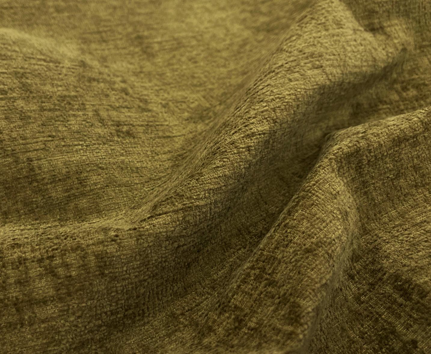
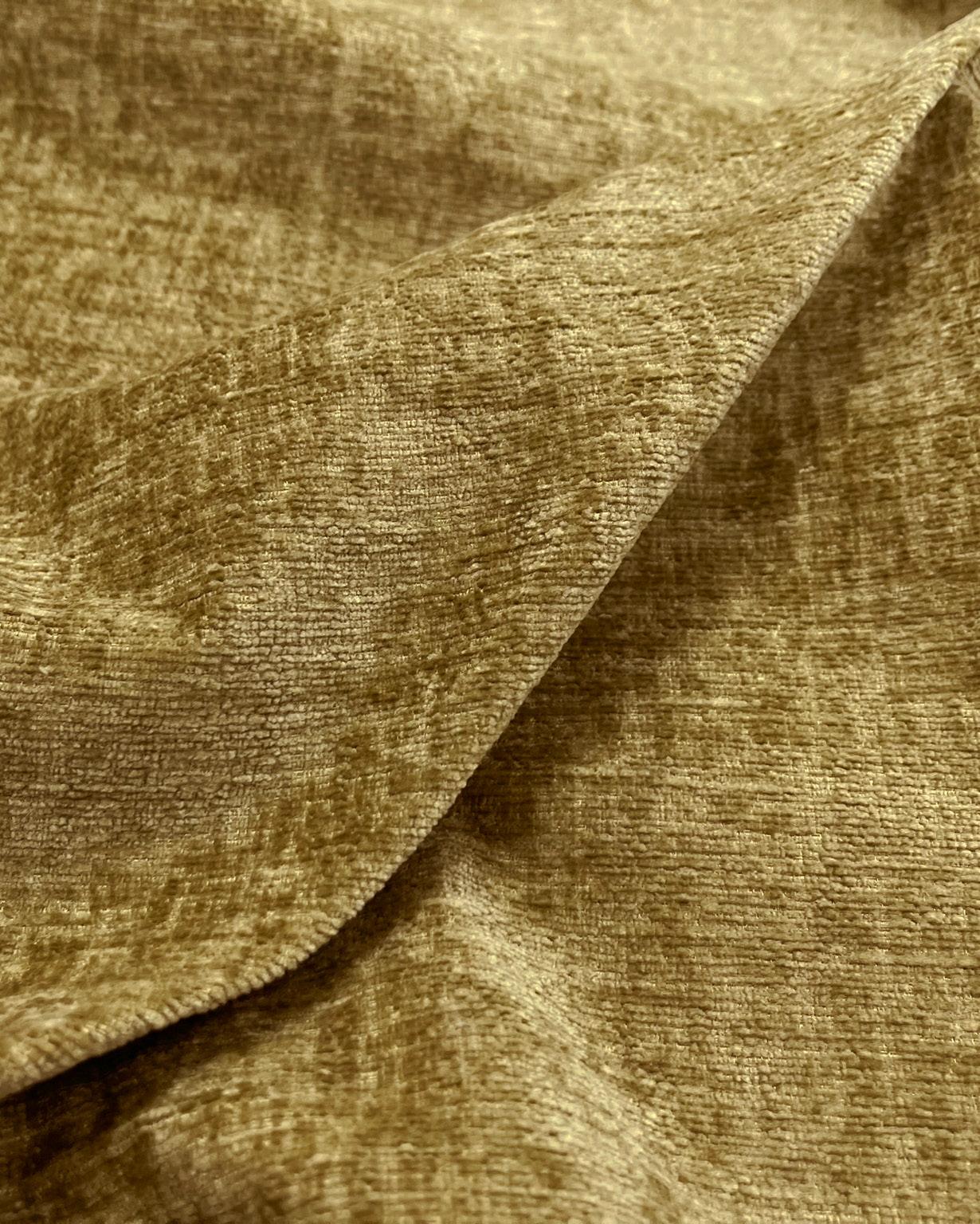
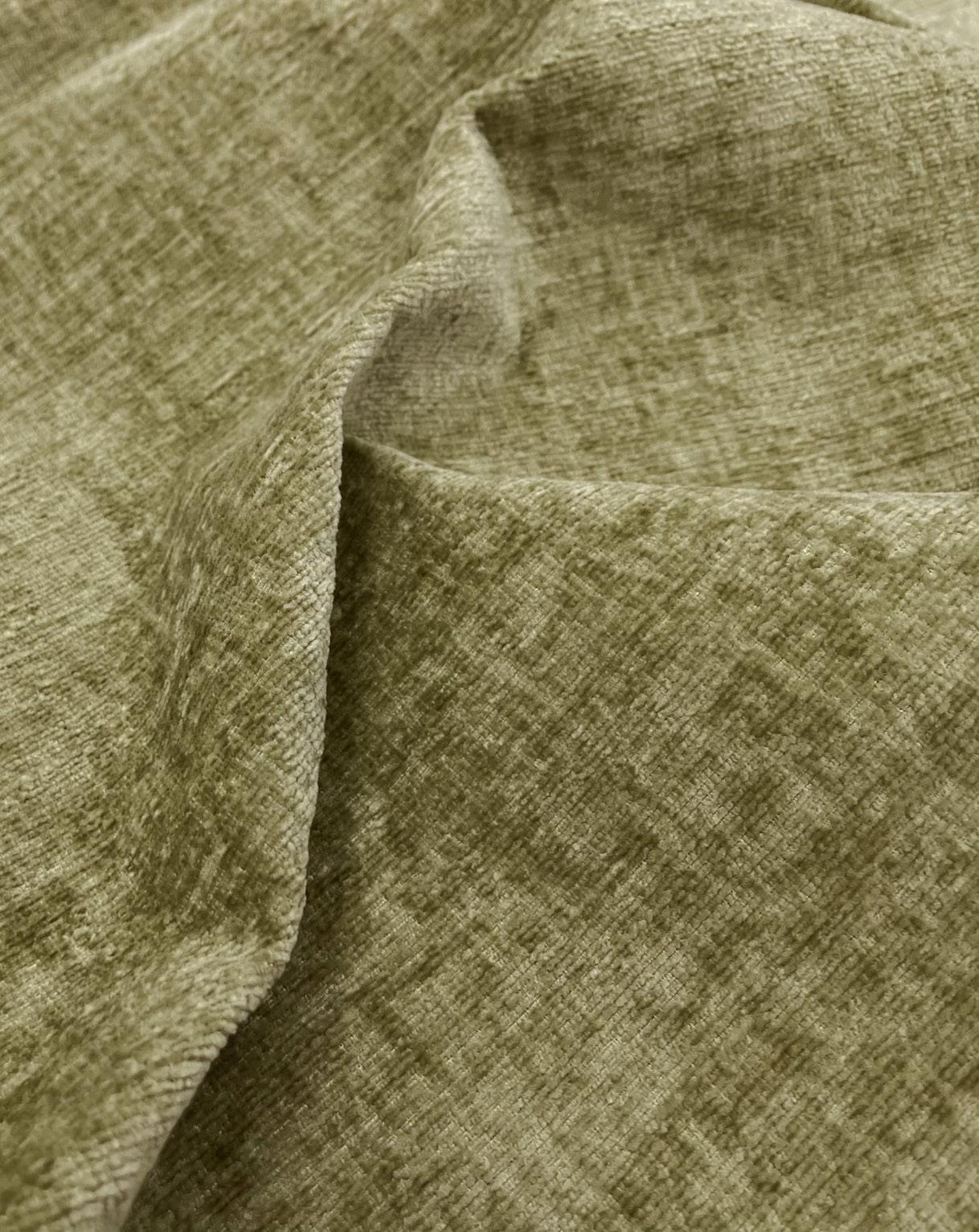
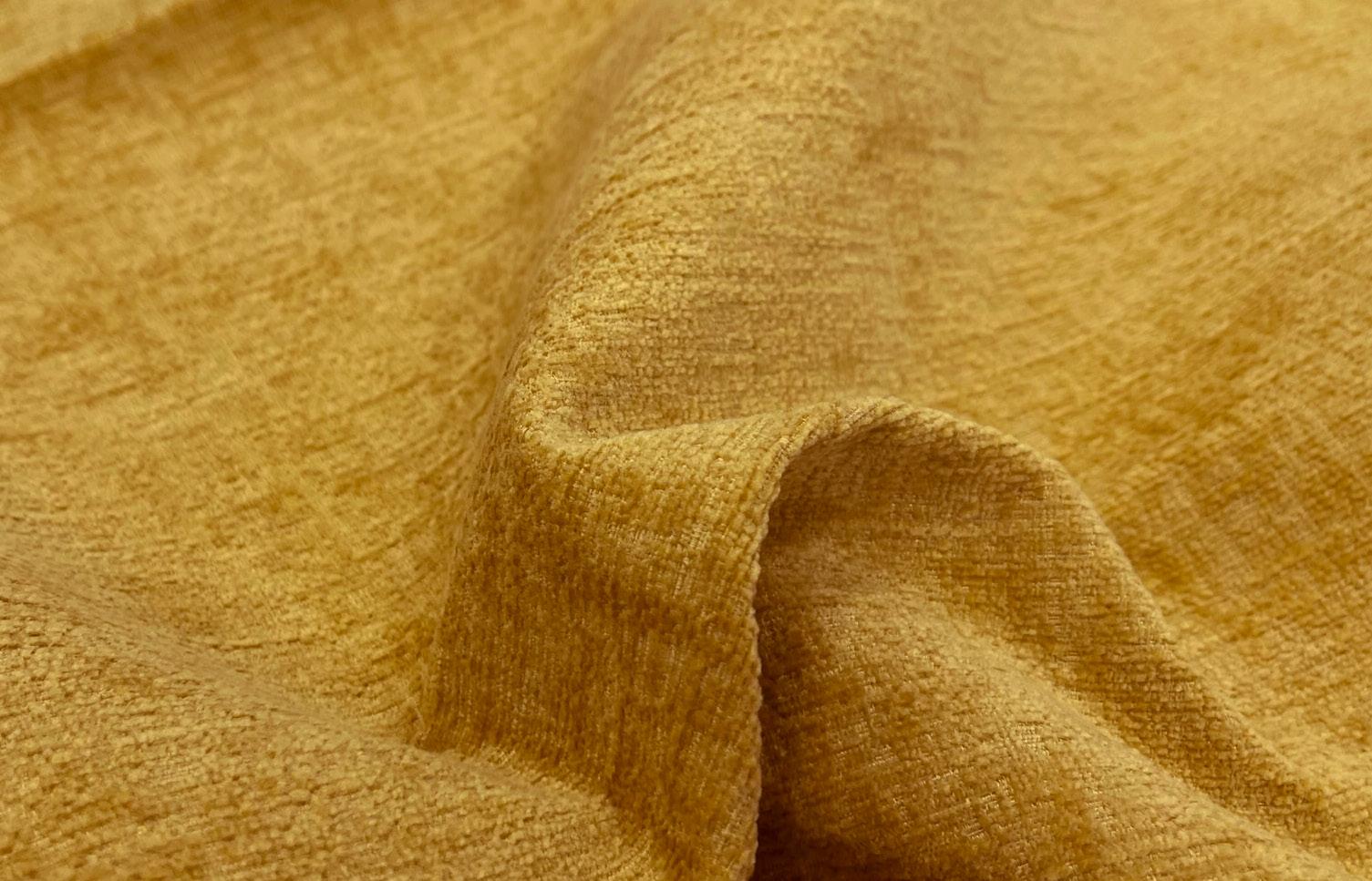
Calm and peaceful, it is suited for contemplation, rest, and reflection. Soft golds with a greenish undertone are trending colours moving forward, echoing the global movement towards sustainable development and reconnection with the natural environment.
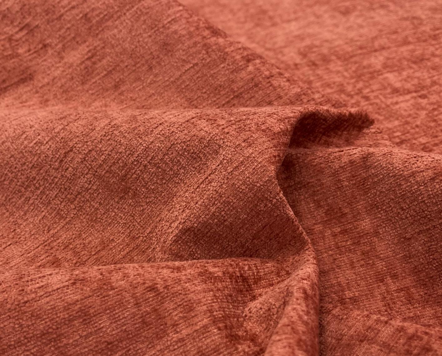
This vibrant shade of burnt orange has made a comeback, featuring a refreshed appearance and renewed interest. Fireside is an energizing and warming colour that we eagerly anticipate seeing across various furniture pieces. It contributes dynamic energy to a room without being overly dominant. As an earth tone, it possesses a natural grounding effect that instantly makes people feel comfortable and warm.
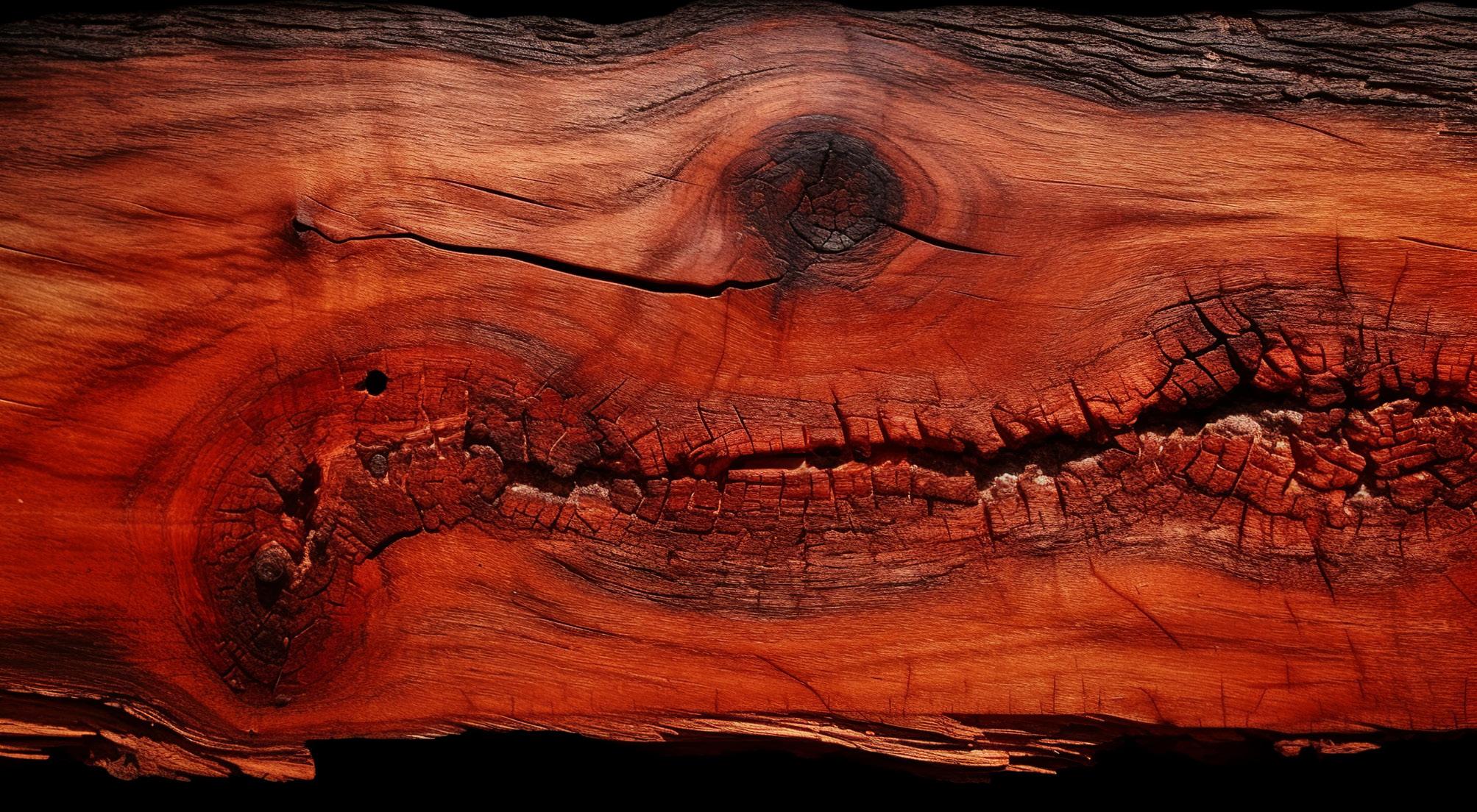
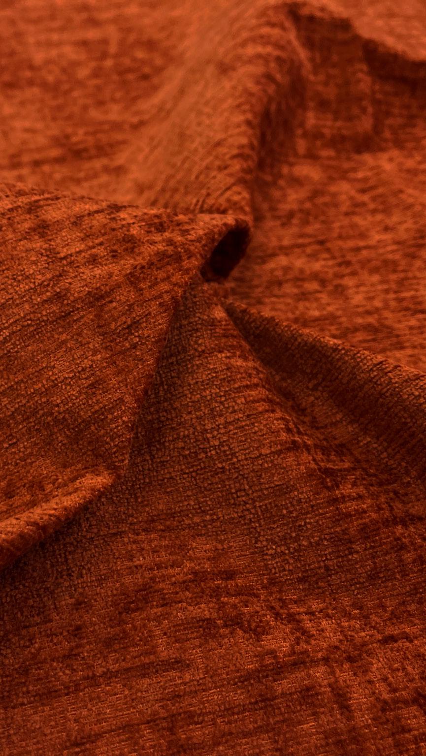
“A powerful, earthy, and striking reddish-orange, Fireside is the “IT” color of the range”
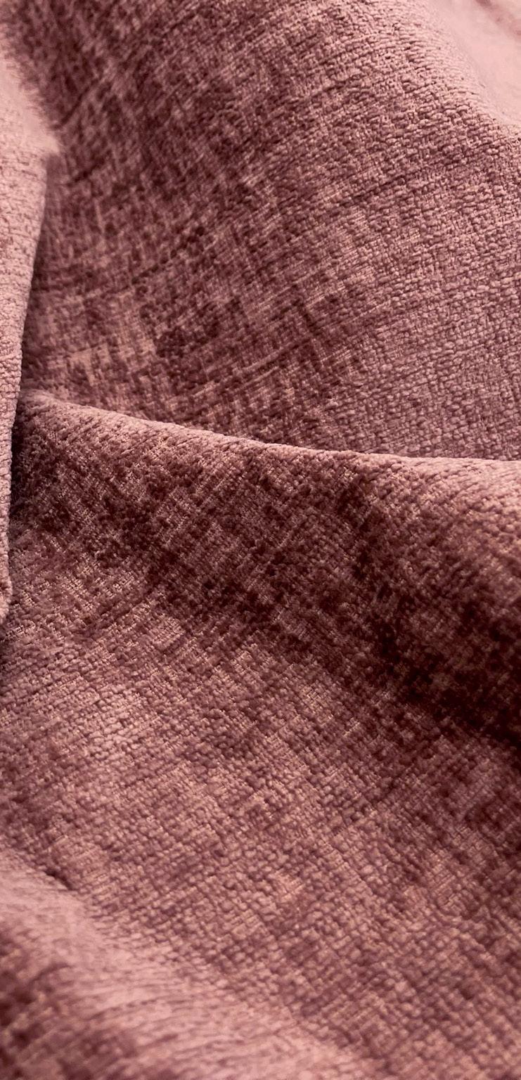
Radiating warmth, a close relative to red, with the energy and punch of orange. Adding presence to any space, the terracotta-toned Melrose is rich and natural in character. This trendy shade is a perfect match for mid-century modern style, pairing beautifully with rose pinks, rusty oranges, and reds.

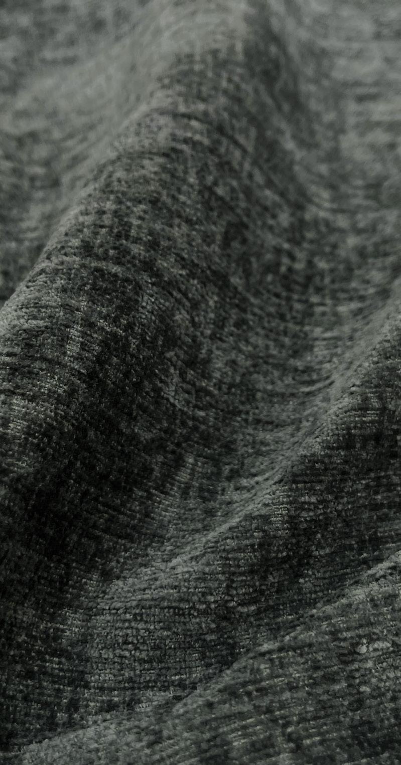
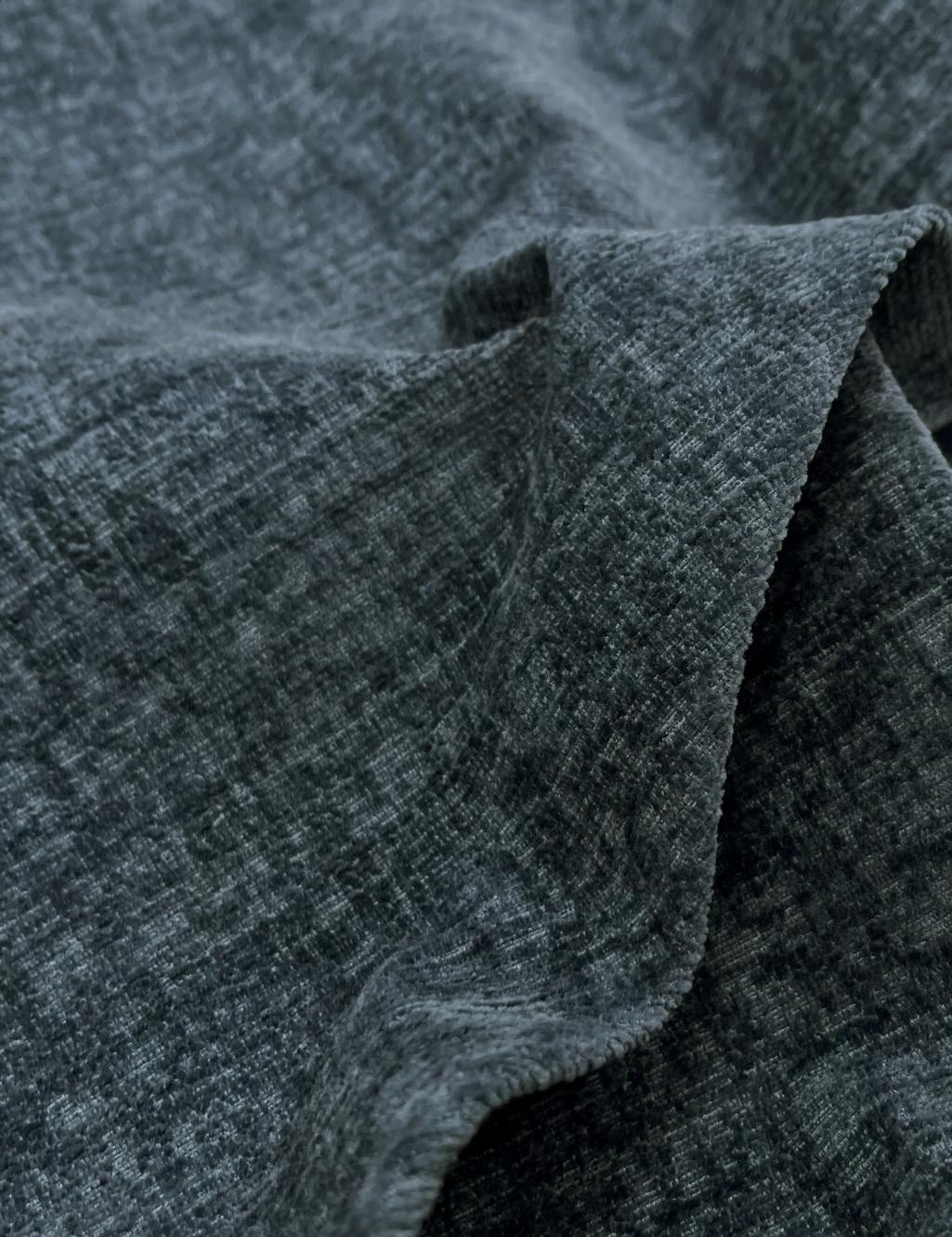
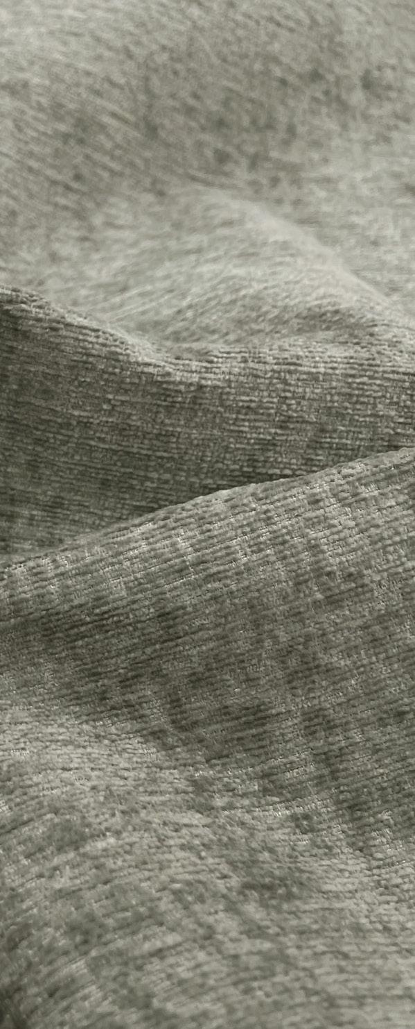
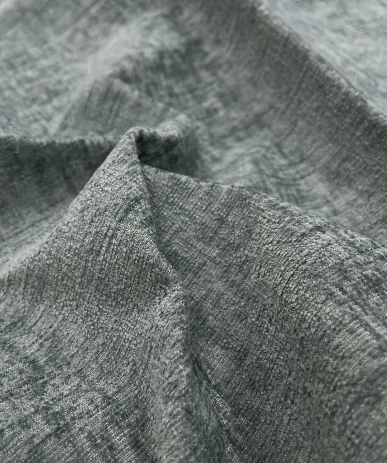
GREY OFFERS A BLANK SLATE FOR HOMEOWNERS TO ADD THEIR PERSONAL TOUCHES TO A SPACE WITH ACCESSORIES SUCH AS CUSHIONS, FOOTSTOOLS, AND BEANBAGS.
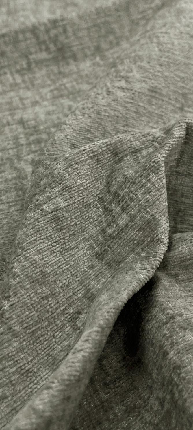
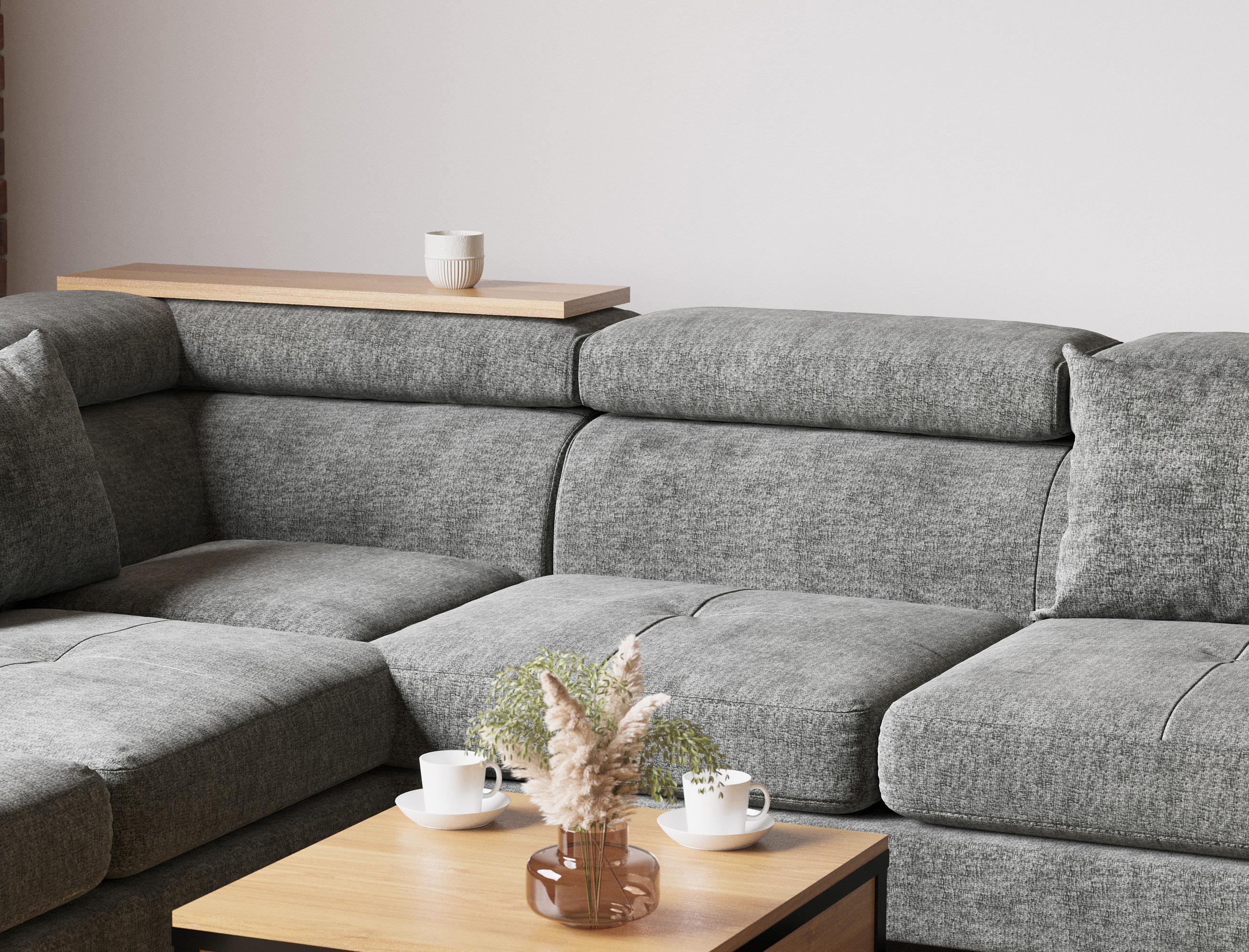
Grey, being one of the most popular colours in interior design, owes its versatility to the myriad of shades it can be paired with in the Brooklyn range.
The deep and rich colour of honeysuckle evokes happiness and provides a sense of positivity. With warm colors experiencing a retro revival, the energy and optimism this fabric can bring to a design can instantly elevate any space.
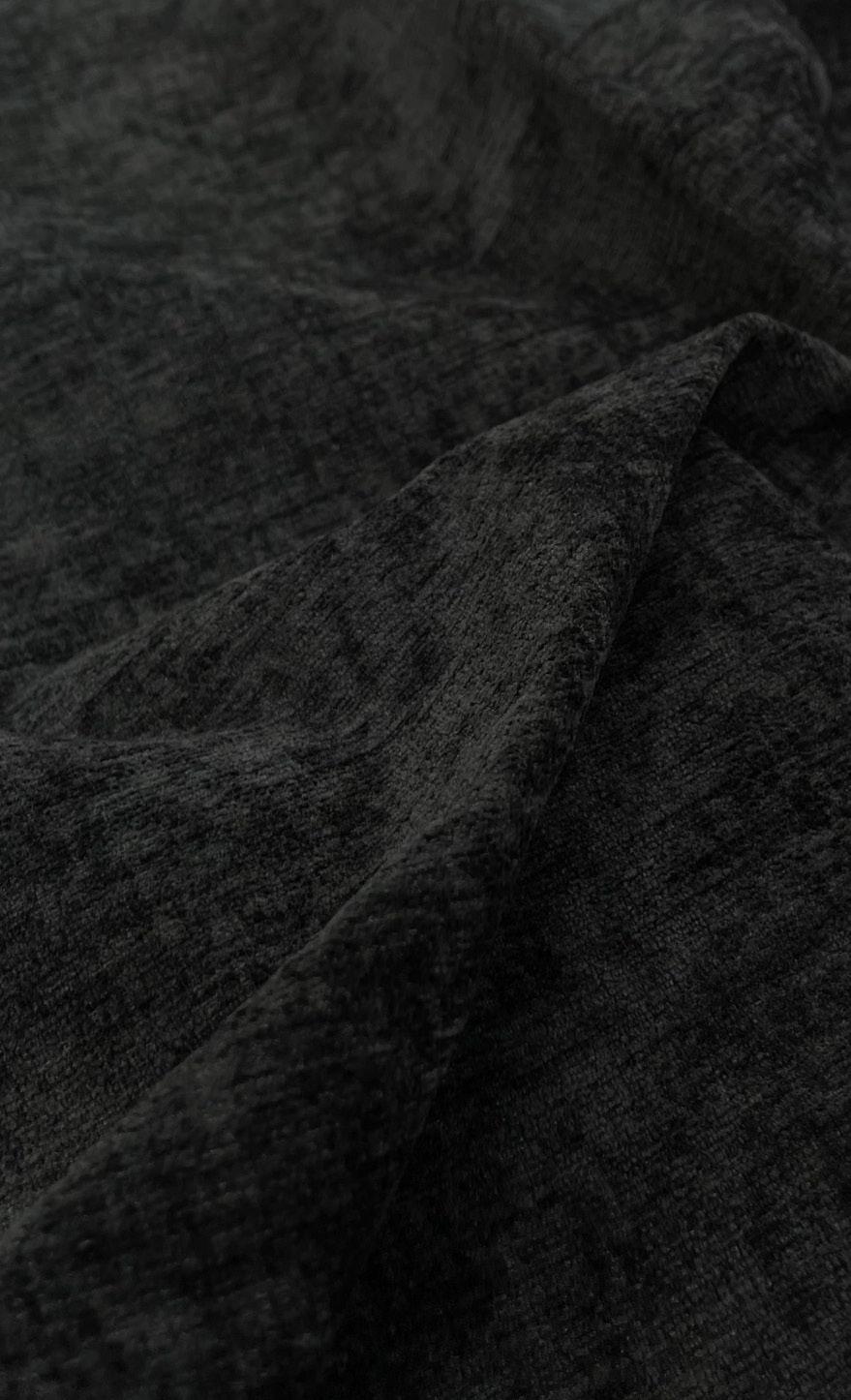
“Dramatic, rich and fascinating. Black is here to make a statement”