M E G A N E. M Y E R S ARCHITECT, INTERIOR DESIGNER, LEED AP
T A B L E O F C O N T E N T S PROFESSIONAL WORK 1 STUDENT WORK 2 FURNITURE 3 CROCHET 4 COSTUMES 5

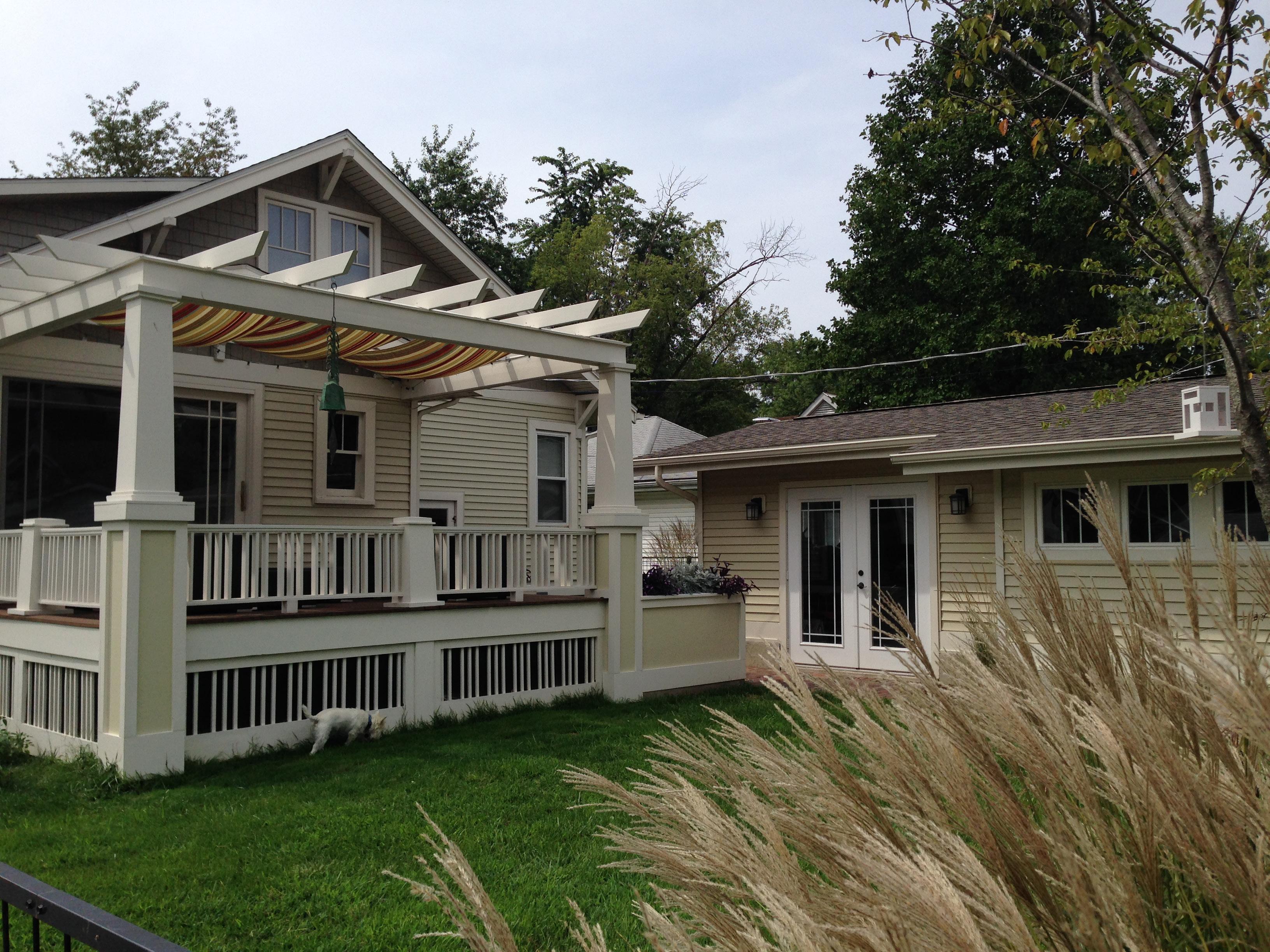
Built in 1926 by Teresa (Mueck) Petri, this bungalow was one of the first houses built on McPherson Avenue, then a dirt road. It is a typical St. Louis style bungalow with the gable facing the street. It was built as a single floor house with two bedrooms, bathroom, living room, dining room, kitchen, attic and full basement.
The house has been continuously owned by the family (Petri, Kaveler, Myers), and is now home to the great-granddaughter and great, great grandchildren of Teresa & Hugo Petri. Five generations of the family have lived in this house, but it remained practically unchanged and unaltered from the original construction until 2004.
Megan and Dave Myers acquired the house in a bit of disarray. After nearly seventy-eight years, the house was in need of some TLC. The original wood floors had been carpeted, the bathroom had no shower, the porch covered with AstroTurf, and all of the exterior details covered with aluminum siding. As architects and graduates of the Frank Lloyd Wright School of Architecture, Megan and Dave saw the house as an opportunity to try out their ideas by renovating it themselves (and some help from their families). Megan used the house as her final project in architecture school, taking it from “grandma’s house” to something new. The house has been in constant renovation for the past ten years, with the bulk of the work completed between 2004 and 2006. What you see now is a complete, custom built, architect designed home.
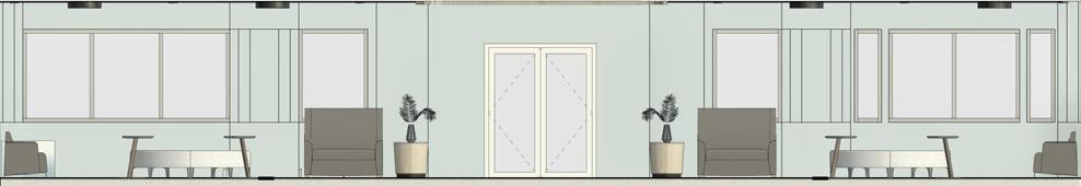
Upon entering, most guests remark “I wasn’t expecting this from the outside.” While the inside is a surprise, the outside was re-imagined as a fun bungalow from the 1920’s. Old family pictures revealed the original details and were used as a guide to re-detail and rebuild missing features on the exterior of the home. While it may look like a regular bungalow, all decisions were made with the goal of creating a unique, one-of-a-kind home. From the custom designed and built front and back porch skirts and railings, to the off center oversized front door, and row of windows, each detail, interior and exterior, was designed to make one at ease, and comfortable. You must come in and experience the surprise for yourself!


The paper mask project is the first project I teach/lead in Architectural Design I and has proven to be a student favorite year after year. Each student is given a base pattern of a basic skull with full instructions on how to build it. They are asked to build the mask pattern as is so they can understand their tools, how to use them, and how to translate a pattern on paper into a 3D object. They are then required to design and build their own custom mask, making a minimum of 50% modifications to the original as well as document the new pattern pieces to scale (1:1).

Outcomes: Learn to develop an idea/concept, learning all about form, scale and proportion, model building skills, develop scale drawings/ patterns.


The intent of this project is to design a wall that articulates natural daylight. Students are challenged to work with light as a ‘medium’ to design a south facing wall that captures, manipulates and modulates light and its dynamic qualities. This project introduces students to the concept of designing in section and elevation to maximize the understanding of light and the elements needed to harness and alter that light to create a unique and memorable experience.
Outcomes: Understanding natural (direct, indirect, diffused) vs artificial light, how light in combination with form/depth/mass can transform or define space.


The Trail Shelter is a small structure that is intended to be an open air refuge for hikers, campers and/or fisherman and is located at a local nature preserve.
This is the first full structure that Architectural Design I students are asked to design. The process begins with a site visit and hike of the trails which allows students to understand the full context of their site - views, sounds, smells, vegetation, wildlife, wind and sun.

Outcomes:
Research and Site Analysis

Concept - they learn to explore and develop one (or more) main concept or idea and are encouraged to weave all design decisions into this idea. Design - Large focus on scale and proportion, function, and user experience. Students are encouraged to think about every aspect of experience from the approach from the trail to the interior of their shelter. How does it feel, how does it look, how does it blend in, or how does it stand out?
Presentation - Verbal and Graphic
Students learn how to tell the full story of their design/project through drawings/ boards as well as how to verbally articulate the story.


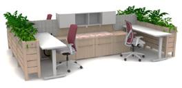
In ADID 400 the semester is focused on competing in three different competitions, the IDEC Student Competition, the IIDA Student Competition and the Steelcase Student Competition. All of these competitions vary in scale, project type and length giving the students a nice variety of pathways to really hone their design and presentation skills. As seniors with several years of design classes under their belts, I spend the semester with them focusing on user experience which includes space, form, focal points, and layering of elements like light, material and color.


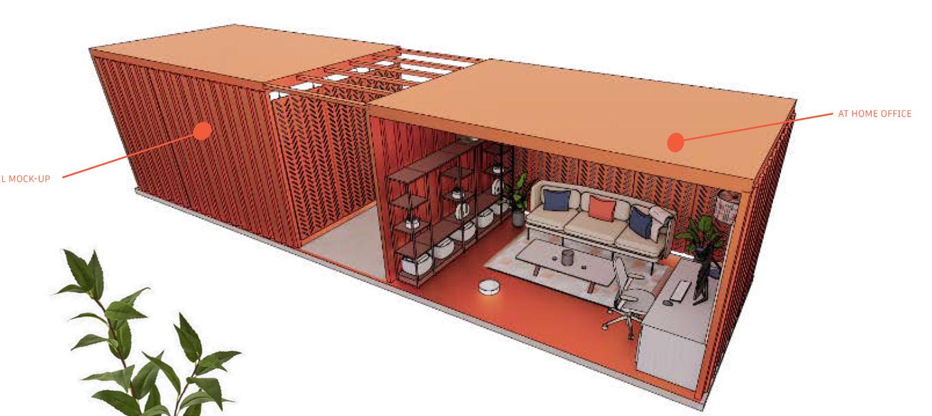
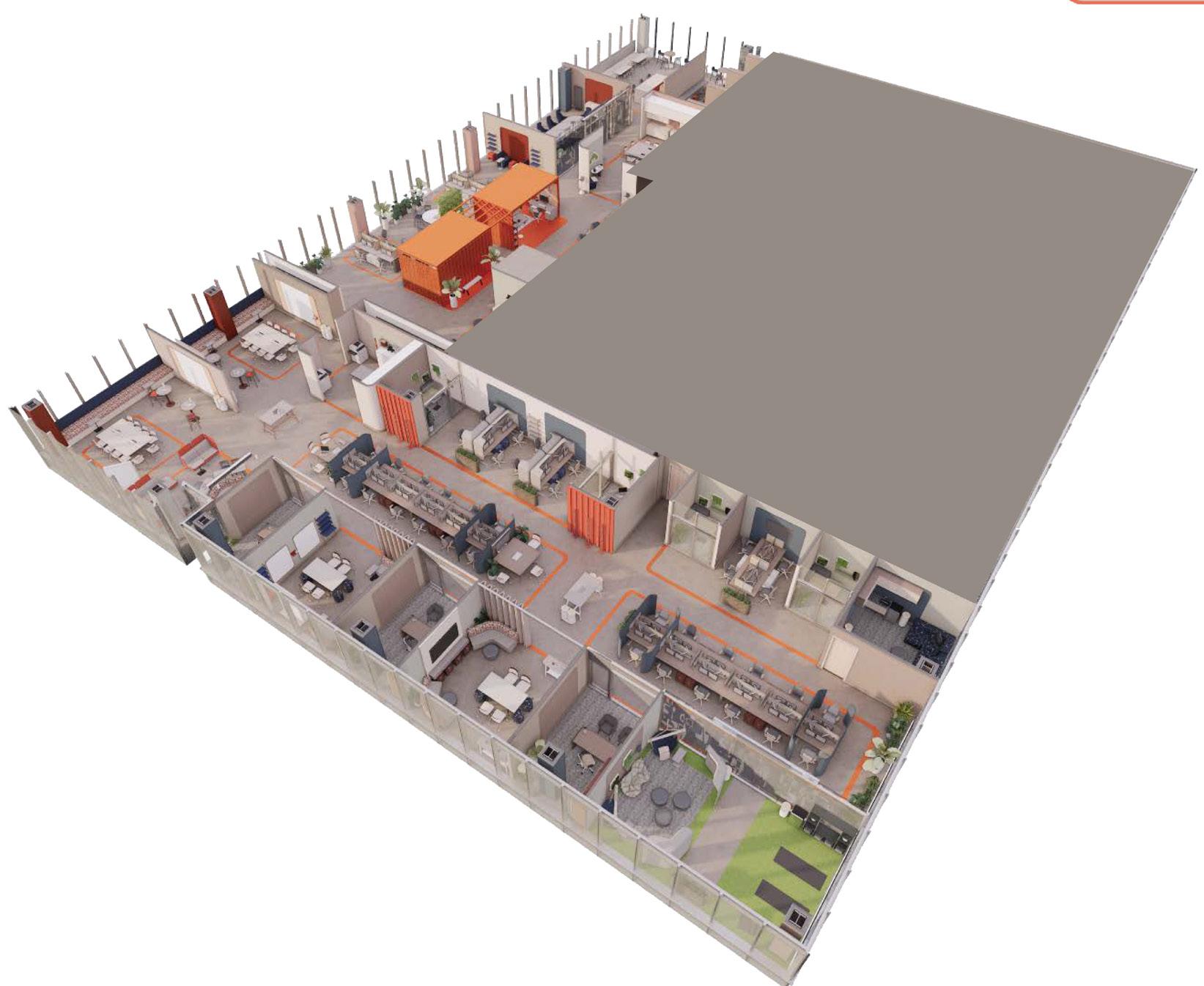
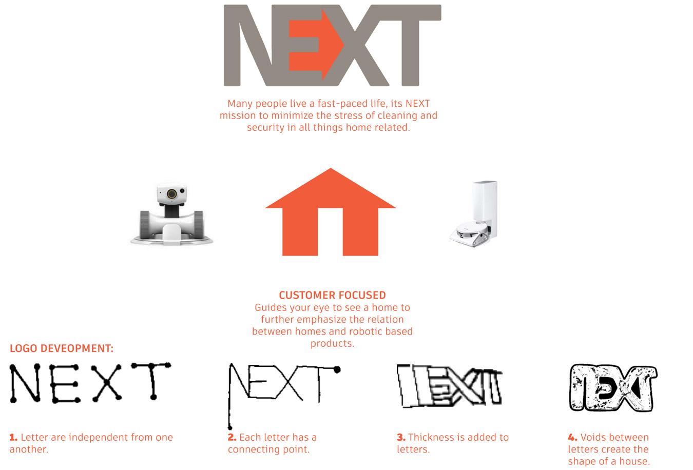
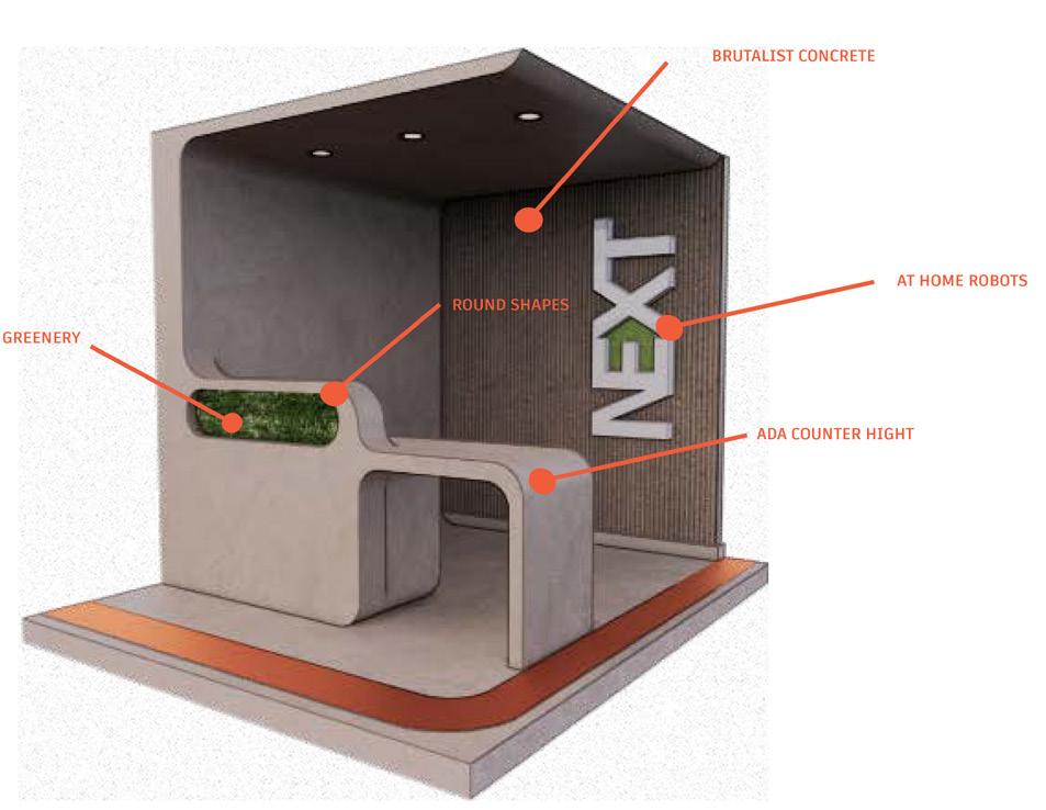
Elliott Beach // Fall 2021


STUDENT WORK
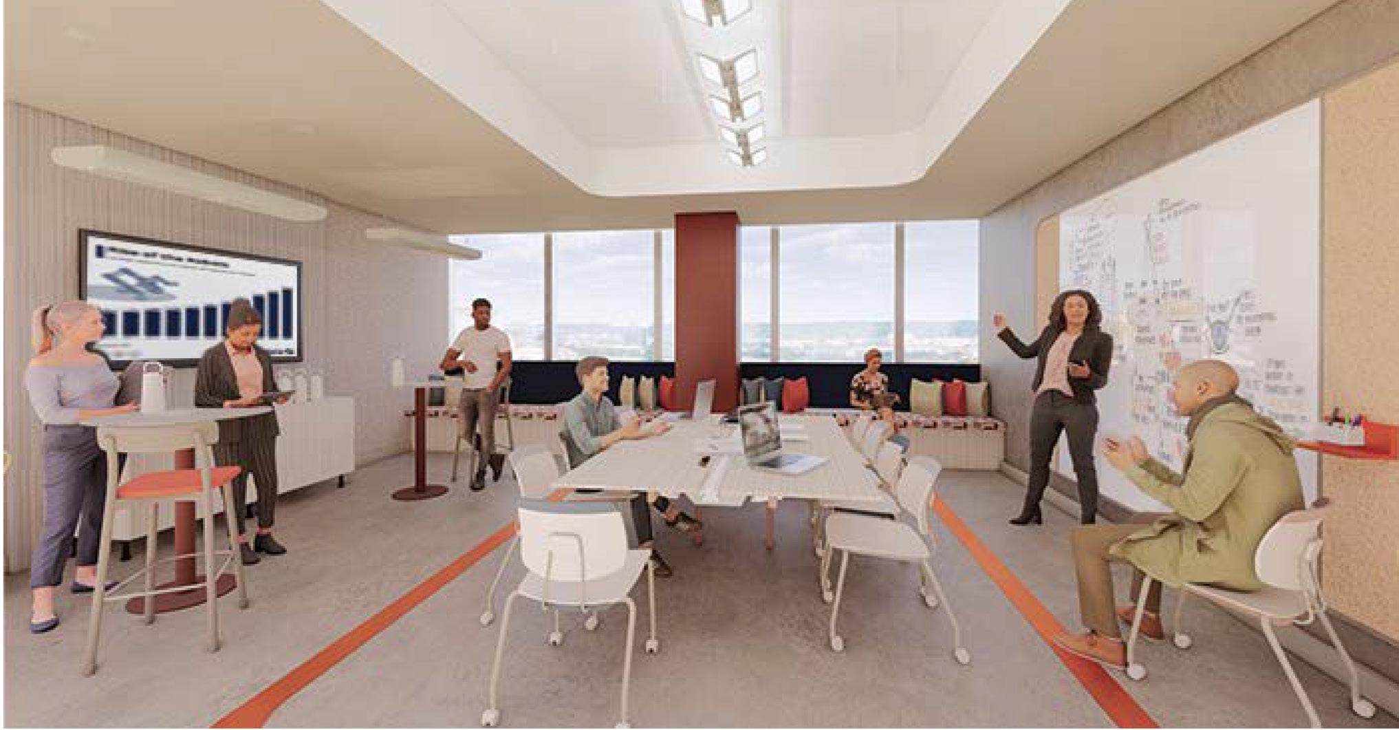
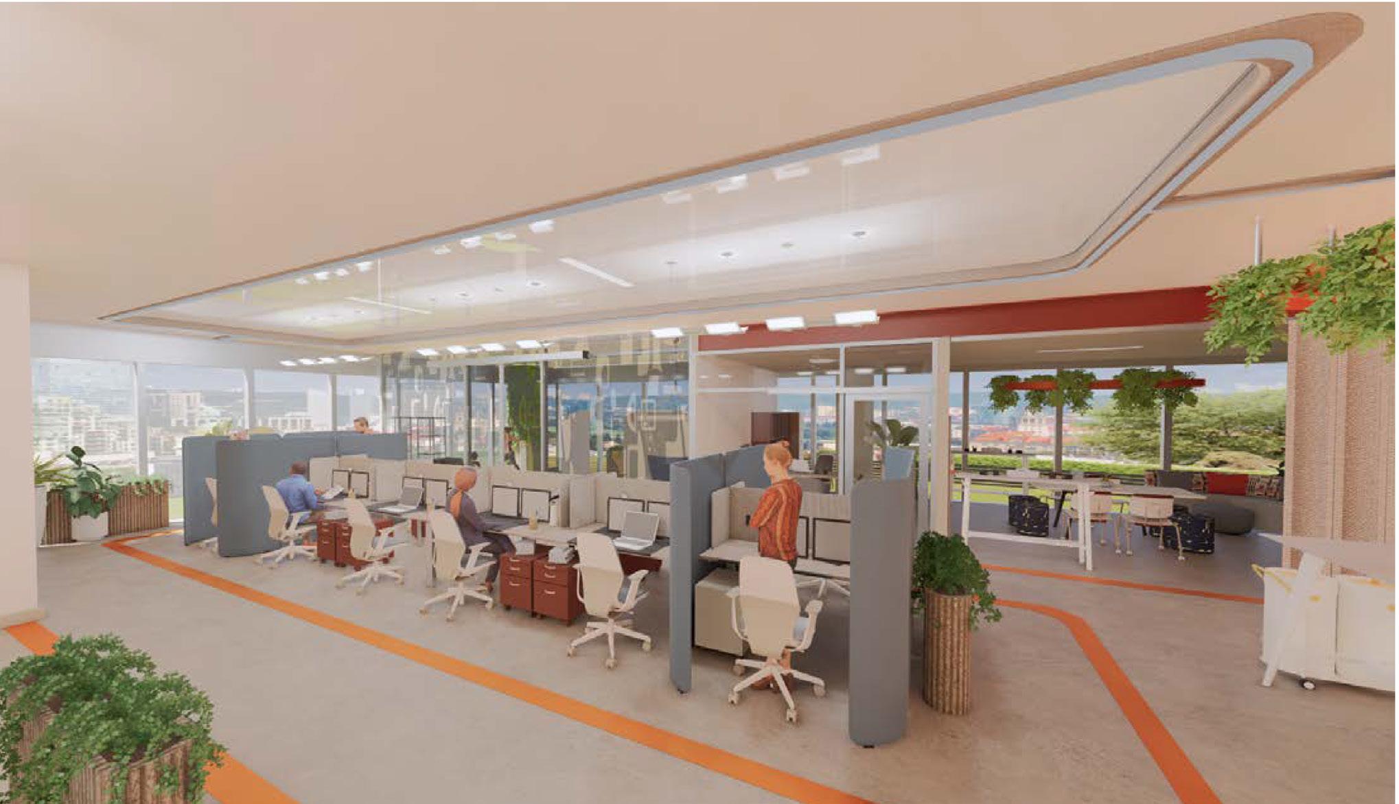
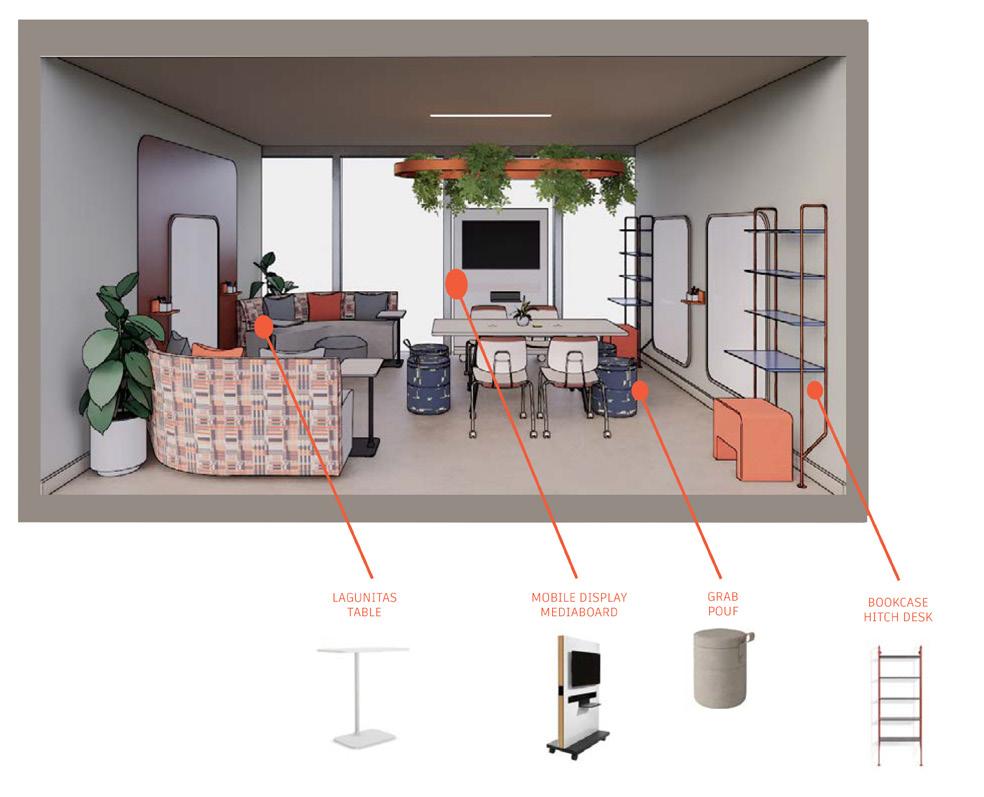
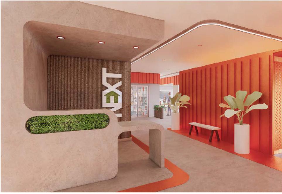
Steelcase Next Student Design Competition
Katharine Segrave // Fall 2022
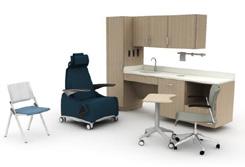
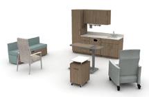
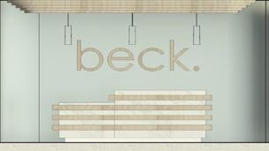

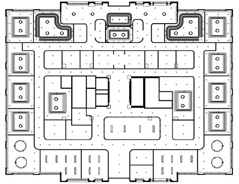
Beck Behavioral Health Clinic is in Saint Louis, Missouri

This facility focuses on creating a relaxing medical experience and is available to patients by appointment only The purpose of this clinic is to provide each client with thorough medical treatment while being immersed in the nature inspired surroundings within the facility


The concept ‘Beck’ simply comes from the definition of the word It means “a mountain stream ; a brook with a stony bed or following a rugged course ” It’s other meaning is “to give attention to by a nod or wave Both applications of the word are relevant through this design The brook, as referred to in the definition, is a very calming presence within a forest Its sensory elements make for a serene environment around it The clients, in this case, are often following a rugged course throughout their own lives, and Beck is a place for these people to receive help and grace
The client's also use this space to ‘call attention to’ their own internal struggles and acknowledge that the help they need is in this safe place Beck is a place that is calming and appealing to the senses, as well as a place for physical, emotional, and psychological healing
The floor plan follows a mostly symmetrical design that is separated by each specialty, as well as separated by patient spaces and caregiver spaces The flow of the floor plan starts out in the middle on the north wall and is evenly distributed throughout by the adjoining rooms and corridors, like that of a mountain stream The lighting considerations are kept very simple and organic, mimicking the organic shapes within nature The ceiling details are meant to imitate a ripple within a small stream of water The material selection is meant to be inspired by the elements of nature itself The use of birch wood is used widely throughout as well as terrazzo flooring, marble reception desk, and light blue wall color in each space to allow for the appeal of the outdoors to come into the interior Subtle, dark fabrics are used throughout, as well as a small amount of pattern Plants are also featured in each space, to improve air quality and to add another element of nature to the space Beck Behavioral Health Clinic is meant to make the client’s feel soothed, relaxed, and one with nature as they begin the process of healing,

Lighting Considerations


Floor Plan: NT S
Reflected
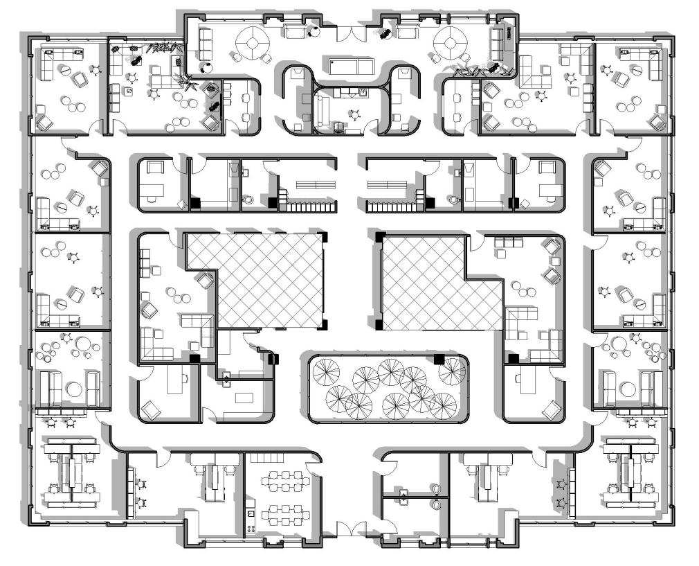


PROBLEM


SENIOR RESIDENTS MOVING INTO AN ASSISTED LIVING OFTEN FEEL LONELY AND ISOLATED. THEY ENJOY THEIR INDEPENDENCE AND OFTEN FEEL LIKE THEY LOOSE THAT ONCE THEY MAKE THE MOVE.

SOLUTION
CREATE A HOME LIKE ENVIRONMENT WITH OPTIONS FOR RESIDENTS. INCLUDE PET THERAPY AND OTHER ACTIVITIES TO ENCOURAGE ENGAGEMENT AMONG RESIDENTS.


CONCEPT: “THAT 70’S FEELING”


1970’S TRENDS FEATURE EARTH TONES ,TEXTURED FABRICS AND GEOMETRIC SHAPES BRINGING A SENSE OF BALANCE AND WELLBEING THAT WAS ONCE FAMILIAR TO RESIDENTS. TRENDS THAT COME FROM THE 70S ARE ROOTED IN NOSTALGIA BRING COMFORT FOR RESIDENTS DURING THIS LIFE CHANGING TIME. TO HELP EASE THE TRANSITION, A THERAPY DOG WILL SERVE RESIDENTS DURING THE DAY. RESIDENTS WILL HAVE THE OPTION TO EAT IN THEIR ROOMS BUT ARE ENCOURAGED TO EAT CATER MEALS WITH OTHER RESIDENTS.

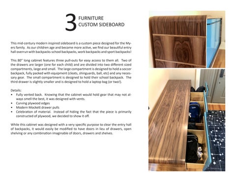
This mid-century modern inspired sideboard is a custom piece designed for the Myers family. As our children age and become more active, we find our beautiful entry hall overrun with backpacks-school backpacks, work backpacks and sport backpacks!
This 80” long cabinet features three pull-outs for easy access to them all. Two of the drawers are larger (one for each child) and are divided into two different sized compartments, large and small. The large compartment is designed to hold a soccer backpack, fully packed with equipment (cleats, shinguards, ball, etc) and any necessary gear. The small compartment is designed to hold their school backpack. The third drawer is slightly smaller and is designed to hold a laptop bag (or two!).
Details:
• Fully vented back. Knowing that the cabinet would hold gear that may not always smell the best, it was designed with vents.
• Curving plywood edges
• Modern Mockett drawer pulls
• Celebration of material. Instead of hiding the fact that the piece is primarily constructed of plywood, we decided to show it off.
While this cabinet was designed with a very specific purpose to clear the entry hall of backpacks, it would easily be modified to have doors in lieu of drawers, open shelving or any combination imaginable of doors, drawers and shelves.


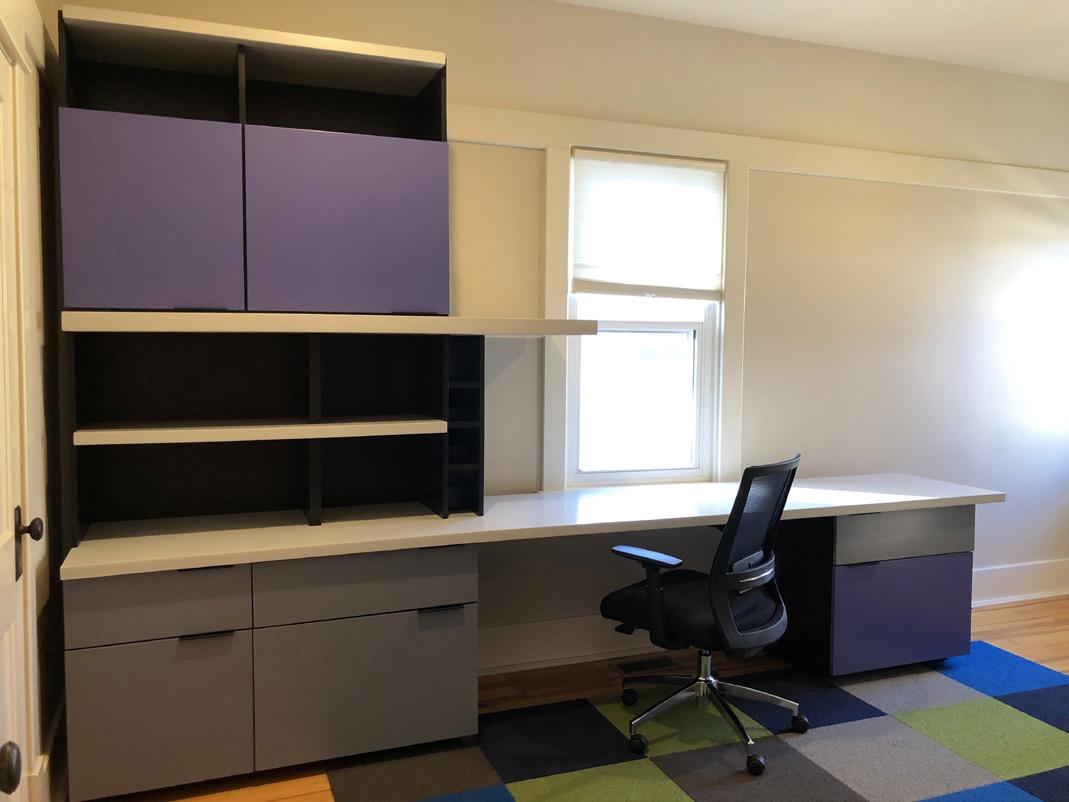
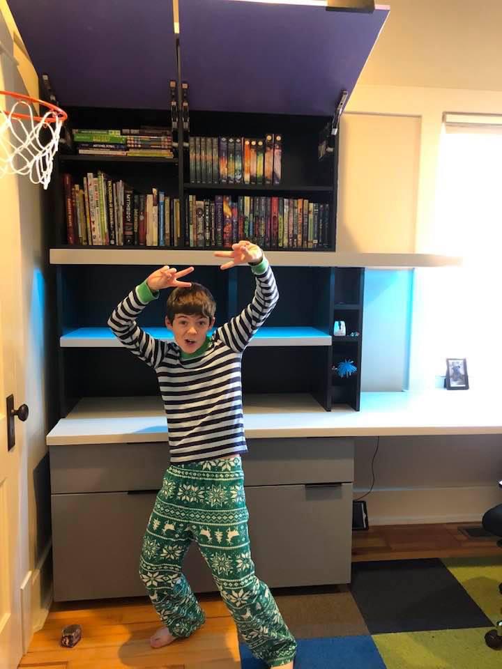
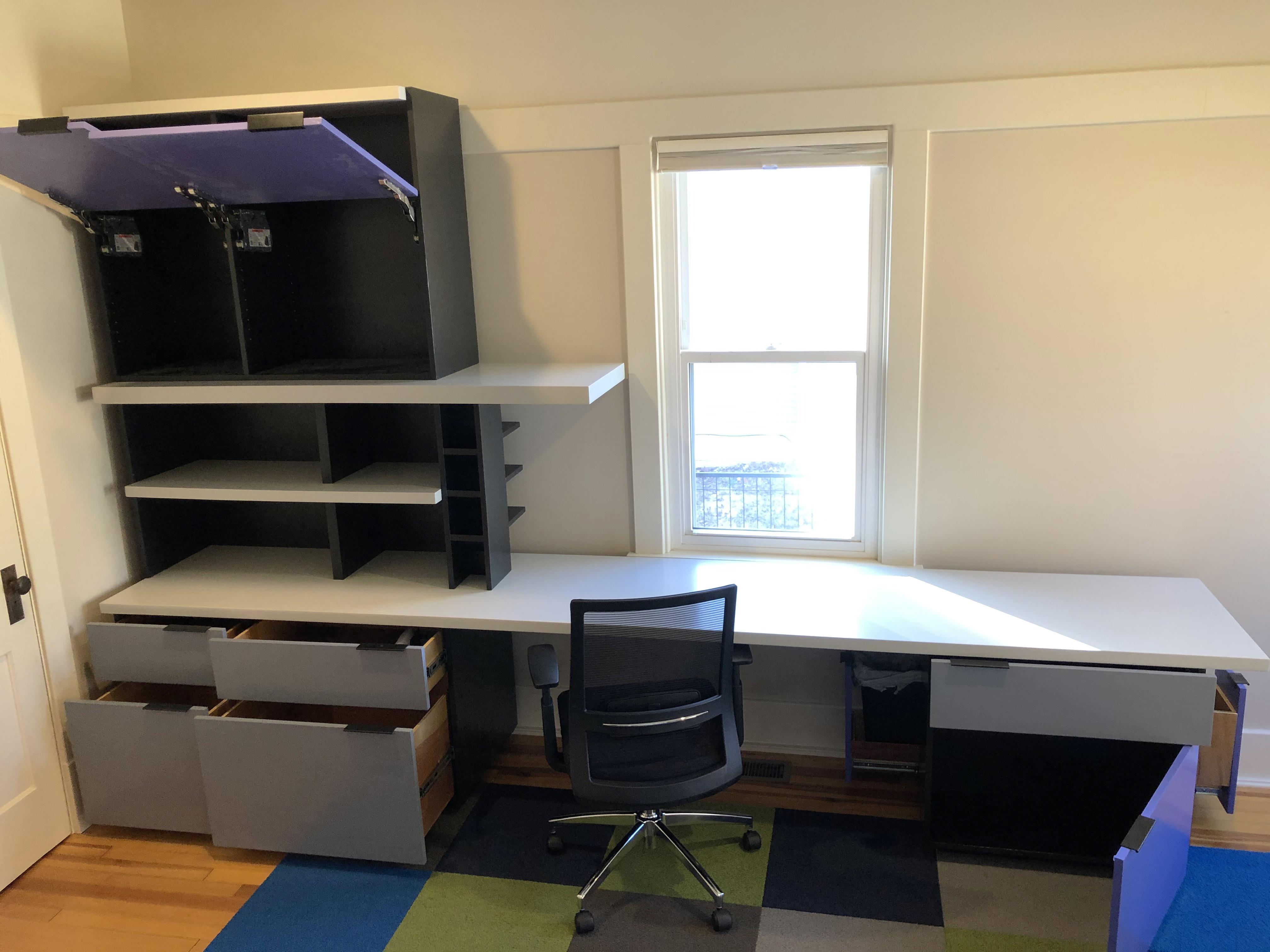
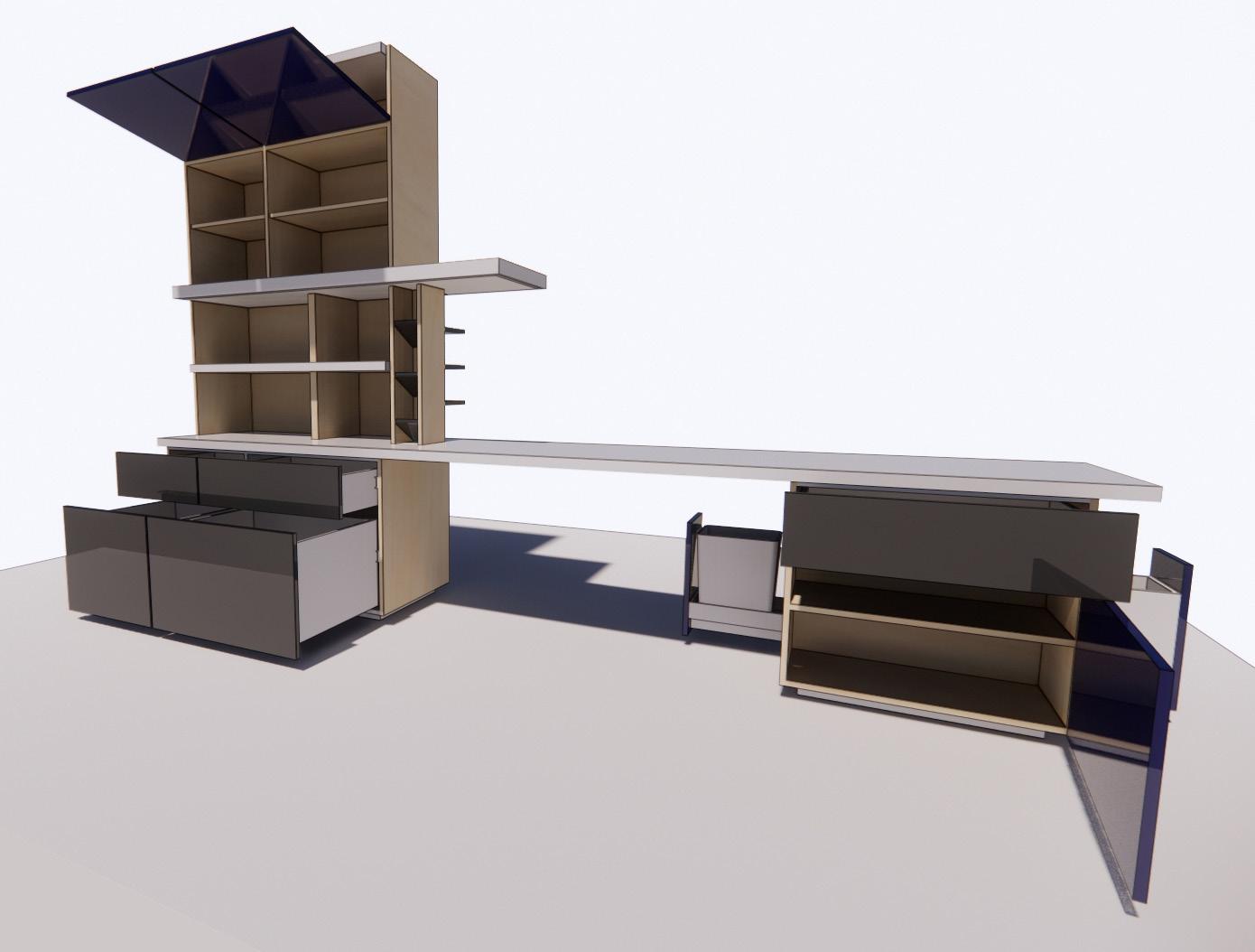
This desk is a custom piece designed for the Myers family’s oldest son just before his 11th birthday. This design was a collaboration between the whole family with input and ideas from all. There are a lot of fun nooks and crannies that are great for kids, but this is definitely a piece that is styled with classic modern lines and will age with him.

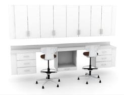
This piece of custom furniture was designed for the Myers family. It was based on the need for more storage. The dining room table became the central hub for all activity from homework to laptops to coloring books to board games and of course meals. The problem was we didn’t have a place nearby to store all of these items and our table was constantly a mess. This cabinet is a modern take on mid century furniture. The cabinet features six color-coded drawers (easy for a three and seven year old to navigate) as well as shelving for board games and laptops. We left no space unused in this cabinet (even the bottom kick plate is a hidden drawer for coloring books, markers and crayons) and loved designing and building it in our own work shop!


The day I found out I was having a baby girl I knew I wanted to learn to crochet and/ or knit so that I could make accessories, clothing, blankets, etc for her. I am self taught and over the years I have leaned on crochet, specifically amigurumi (stuffed toys) as a main hobby. For the first several years making amigurumi I only bought other people’s patterns. In the last couple of years, I have begun designing and making my own patterns.
The inspiration for the patterns comes from alien cartoon characters my mom used to draw on my paper lunch sacks every day, random drawings left around the house by my young daughter, movie or cartoon characters and sometimes just a random character that comes to life in my own sketches.


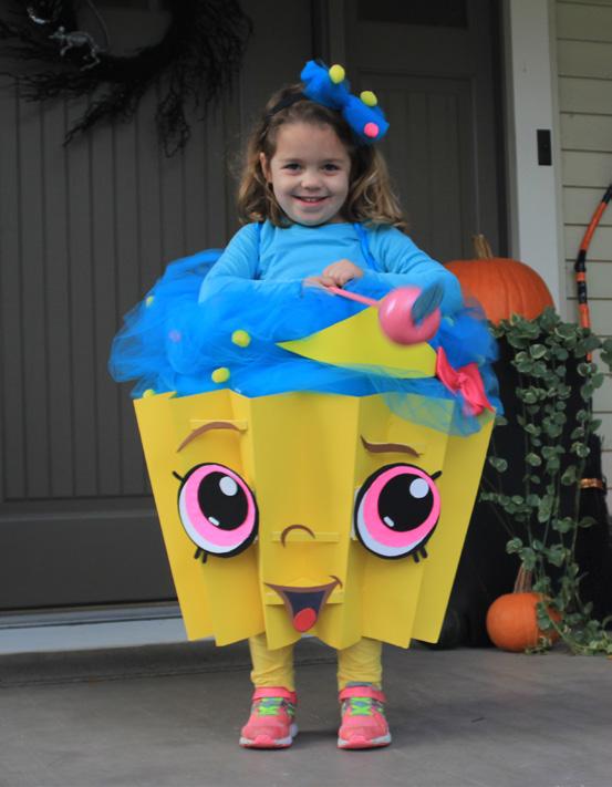
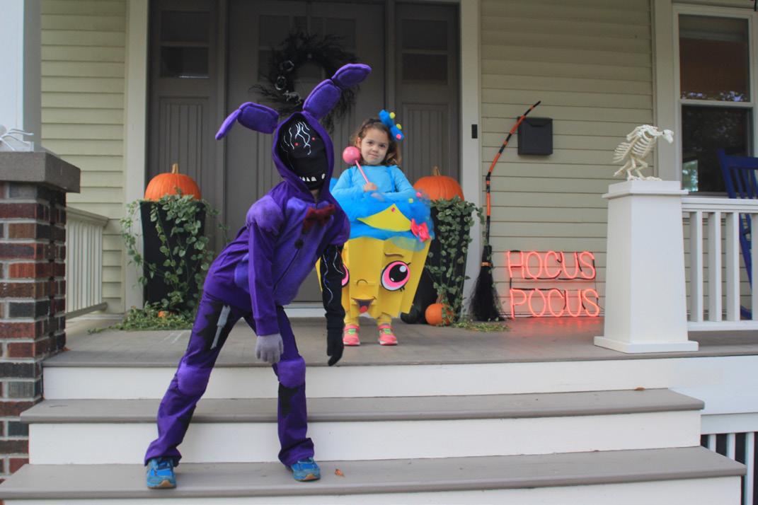
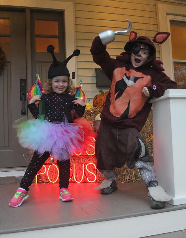
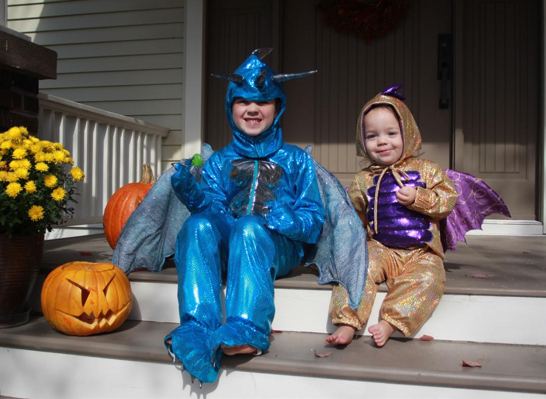
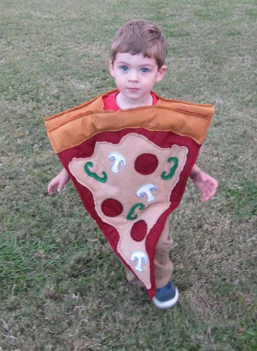
At the Frank Lloyd Wright School of Architecture we were taught that design is everywhere. During my time as a stay at home parent I found many ways to integrate design into my life, including making every single Halloween costume from scratch for my children.

Every year, each child was allowed to choose their own costume. The deadline for costume selection was/is the last day of July. The first week in August I then take them to the local fabric and art supply stores so that they can hand select all of the materials for their costumes. I have loved including them in every step of the process as it teaches them about budgeting, design and a willingness to jump in and do!
At times they were my harshest critics, asking me to remake something that didn’t quite match what they had envisioned. Showing them how to express their ideas and talk about design has increased communication skills not just for them, but for me as well.
Their costumes over the years have included pizza, a giant Shopkins cupcake, quidditch playing Harry Potter, an Indominus Rex, a rainbow butterfly (with lit wings), Five Nights at Freddy’s characters, dragons, a fairy, a mummy, a Hatchimal, a flying pig and more.