
MADRAS MANAGEMENTASSOCIATION 12 - 16 September 2022 Knowledge partner: presents


D e v e l o p i n g a n a l y t i c a l s k i l l s i s t h e n e e d o f t h e h o u r f o r a l l d e p a r t m e n t s o f o r g a n i z a t i o n s . H R P r o f e s s i o n a l s a c t a s t h e b r i d g e b e t w e e n m a n a g e r s a n d e m p l o y e e s . T h e y c o l l e c t a n d s t o r e a m a m m o t h a m o u n t o f d a t a a c c u m u l a t e d f r o m v a r i o u s p r o c e s s e s l i k e r e c r u i t m e n t , t r a i n i n g , e m p l o y e e p e r f o r m a n c e m a n a g e m e n t , e m p l o y e e e n g a g e m e n t s , l e a v e m a n a g e m e n t e t c . B e i n g t h e d a t a k e e p e r s a n d e v a l u a t o r s o f a p o o l o f d a t a f r o m h i r e t o r e t i r e , H R p r o f e s s i o n a l s a r e r e s p o n s i b l e f o r e m p l o y e e p e r f o r m a n c e a n d e f f i c i e n c y . A n a l y t i c a l s k i l l s t r a i n i n g f o r H R p r o f e s s i o n a l s w i l l h e l p i n c o n v e r t i n g m i n d s e t t o a d a t a s e t , u n d e r s t a n d i n g v a r i o u s d a t a a n a l y t i c a l f u n c t i o n s , a d o p t i n g t h e d a t a - d r i v e n c u l t u r e , e v a l u a t i n g a n d i m p l e m e n t i n g H R a n a l y t i c a l p l a t f o r m s , r e d u c i n g m a n u a l w o r k a n d p e r f o r m i n g s m a l l a n d w i d e d a t a a n a l y t i c s f o r H R f u n c t i o n s .
Brief Overview
U n d e r s t a n d i n g S t r u c t u r e d D a t a , P r e p a r i n g d a t a f o r a n a l y s i s , D a t a a n a l y t i c s f u n c t i o n s l i k e S e l e c t i o n , F i l t e r i n g , S o r t i n g , G r o u p b y , S u m m a r i z i n g , B a s i c s t a t i s t i c a l A n a l y s i s , D a t a V i z s k i l l s
M e t r i c e s , D i m e n s i o n s a n d m e a s u r e s
D e f i n i n g a n o r g a n i z a t i o n a l m e t r i c s a n d d e v e l o p i n g a n i n t e r a c t i v e d a s h b o a r d , D a t a a n a l y t i c a l t o o l s – F r e e o r P a i d , D a t a v i s u a l i z a t i o n b e s t p r a c t i c e s , A I - d r i v e n D a t a a n a l y t i c s
Course Curriculum
H R P r o f e s s i o n a l s
O v e r v i e w o f H R A n a l y t i c s w i t h a s a m p l e d a s h b o a r d – U n d e r s t a n d i n g
D e f i n i n g D a t a P o i n t s a n d D a t a S e t s f o r a n a l y z i n g t h e H R D a t a
M i n d M a p p i n g & V a l u e S t r e a m M a p p i n g - I n c u l c a t e a n a l y t i c a l m i n d s e t i n
D e e p d i v e i n t o M e t r i c s A c r o s s H R D o m a i n e . g . : W o r k f o r c e A n a l y s i s , P r o d u c t i v i t y a n d p e r f o r m a n c e a n a l y s i s , S p e n d A n a l y s i s a n d T r a i n i n g n e e d a n a l y s i s
Days Curriculum 1 2 3 4 5
HOW TO TAKE YOUR BUSINESS FORWARD WITH PEOPLE ANALYTICS


If you're having people problems at your workplace and you're unable to determine the cause, you are most likely in need of workforce analysis. You might be obscured with a whopping number of metrics that describe what's happening to your workforce, rather than telling you why it's happening.
A GUIDE TO THE WHAT, WHY AND HOW OF ANALYTICS IN HUMAN RESOURCES
People analytics, also known as workforce or HR analytics, is the method of collecting and analyzing quantitative and qualitative people data such as absence figures, job performance, and benefits and correlating them to overall business performance in order to optimize the e ect that employees have on business outcomes.
WHAT ARE PEOPLE ANALYTICS?
A survey from Deloitte states that only 32% of companies are ready for people analytics, meaning that most organizations lack the accurate and consistent data collection necessary to utilize them. What advantages do these businesses stand to gain from adopting this HR strategy?
The success of a business depends on its people. To determine the value of employee data on a business' success, HR needs to be able to talk numbers. For example, HR departments can use data from training and onboarding to analyze the potential impact of recruitment on business outcomes.
H R Agility
WH Y P AEOPLENALYTICS?
In a recent survey by Deloitte, nearly 94% of HR leaders say that agility and collaboration are critical to their organization's success. If HR aims to be agile, leveraging analytics should be a priority. What are the outcomes of your various HR practices? Where do employees need your attention most? HR analytics will be the key to measuring HR needs and making smarter people decisions.
HR is in a phase of transformation away from focusing on process, and towards becoming a more people and business-oriented field. A crucial component of this transformation is the switch away from reporting data, and towards useful analytics that connect multiple data points, visualize patterns, and drive strategy. This shift promises to provide more predictability by highlighting future trends and disruptions so that you can stay prepared.
S trategic insights
B usiness success
9
TRACK YOUR SUCCESS RATE
Analyze across di erent factors like satisfaction levels, the latest evaluations, and tenure to identify employees that pose a flight risk. Now that you know which employees are a flight risk, determine the root cause. If it's because of a high workload, possible solutions include employing more resources or improving your processes.
GROWBUSINESSYOURCANANALYTICSPEOPLEWAYSHELP
01
Wouldn't it be great to address employee issues before they develop into workplace problems? Identifying the root cause of issues early-on can give you an advantage in dealing with them. For instance, you can detect when employees are in danger of leaving the company.
PROACTIVELY IDENTIFY PROBLEMS
Workforce design is shifting toward team orientation. The workforce is seeing an increase in millennials and Generation Z workers. With the new generation come changes in employee expectations and needs. People analytics can help identify ways to adapt to those changes. You could use existing employee data to conduct an analysis of HR practices and their success rates. This can lead to better HR practices that meet evolving employee expectations.
02
S uggestion
S uggestion
If you've set a new benefits policy, analyze if it has increased the retention rates. See how your benefits policy a ects the cost of your business.
9
TRACK HISTORY
04
I N CR E AS E RETE NTIO N
GROWBUSINESSYOURCANANALYTICSPEOPLEWAYSHELP
S uggestion
It’s just as important to observe the trends of the past as the trends of the present. Data matures over time as business scenarios evolve. Finding the relationship between past and present trends can lead to better decision-making in the long-term.
03
Using people analytics, monitor and analyze risk factors that happened during particular time periods and devise feasible plans to avoid shortfalls.
47% of HR professionals have named employee retention and turnover as a top challenge in the 2018 SHRM/Globoforce employee recognition report. Losing a top performer or failing to determine the reason for turnover can be detrimental to an organization's health.
As the stats show that the highest turnover is from new employees, you can focus on determining solutions to increase retention of new hires.
GROWBUSINESSYOURCANANALYTICSPEOPLEWAYSHELP
Optimizing people analytics in every stage of the recruitment process can elevate the quality of your hires and reduce the time of your hiring process. Studies reveal that recruiters spend only 6 seconds on their initial fit or unfit decision and spend 80% of the resume review time on six data points: Name, current title & company, previous title & company, previous position start and end dates, current position start and end dates, and education. This process often overlooks potential resources who could add value to the business and stay longer.
9
You can start measuring the resignation rates for each department, location, and role to find out why people are leaving. Are they top performers, managers, or new employees?
Use detailed metrics to analyze across age, tenure, performance, and compensation.
A correlative analysis will provide comprehensive retention statistics. For example, if the overall turnover rate is 12%, 2% are top-performers, 8% are new employees, and 2% are employees with over 5 years tenure, which group should you focus your attention on?
S uggestion
05
Using di erent methods for calculating retention lets you discover potential areas of risk and can help you focus on improving HR practices.
H I RE THE R IGHT P EOPLE
S uggestion
Use your existing data, like performance or the competencies and skill-sets for a particular job and predict the ideal traits a potential hire should or shouldn't have.
A decline in performance a ects productivity and, in turn, your business' revenue. An employee's performance–good, bad, or mediocre–relies on a multitude of factors. Your presumed high-potential new hire might not be performing up to your business goals, and your gold-star performer might be on the verge of burnout. Why could this be? A dreadful onboarding process, lack of a skilled mentor, or less opportunities for growth are all potential possibilities. People analytics can assist in decoding performance, giving you opportunities to develop your evaluation methods.
To improve candidate experience, give and ask for feedback even if you are not hiring a candidate. Evaluate feedback and check for opportunities to enhance your hiring process and candidate experience.
9
Relying on automatic decision support gives you the numbers that objectively identify the best characteristics that fit your business.
06
Perform an analysis of the di erent talent pipelines that attract the most relevant and quality candidates and invest in the right sources.
TAP INTO POTENTIAL AND PERFORMANCE
GROWBUSINESSYOURCANANALYTICSPEOPLEWAYSHELP
Analyzing di erent variables can help construct a positive evaluation system. If there's a lack of feedback that's restricting an employee's performance, then you can enforce a continuous, 360-degree feedback system including self-appraisal where employees can showcase their talents. If it's because of ine cient training, then you've got to improve your training program with good facilitators and better resources. Having the combination of the right skill sets and personalities is essential to a company's success. By eliminating the trial and error method, analytics will refine the process and reduce skill gaps.
Get the statistics on your employees' potential versus their performance. Identify top-players and people who require training.
Check for consistency in performance across appraisals and goal completion, and analyze gathered feedback.
S uggestion
9
GROWBUSINESSYOURCANANALYTICSPEOPLEWAYSHELP
Analyze rewards, salary hikes and promotions with performance levels to know if your e ectively rewarding performance.
L&D is transforming from a training center to a commonly accessible space. With analytics in hand, you can check if your company's L&D program is e ective, what learning methods attract employees, their pace of learning, and more.
07
Corporate learning and development is taking a new pace with the rise of online learning.
Check for employee engagement levels during the course. Perform a continuous assessment of the impact of your learning initiatives on employees' performances and measure how long they are taking to completely work up their skills. This will help you tailor your learning program, helping you improve the skills of your employees
CREATE EFFECTIVE LEARNING AND DEVELOPMENT ACTIVITIES
You can gather feedback about your training programs through a feedback survey and analyze the data. Ask precise questions about the course content, e ectiveness, and so on. Develop di erent surveys based on experience. With these insights you can create courses that cater to the needs of inexperienced and experienced employees alike.
S uggestion
9
GROWBUSINESSYOURCANANALYTICSPEOPLEWAYSHELP
REINVENT EMPLOYEE ENGAGEMENT
08
Gather data from pulse surveys where each survey focuses on one particular variable that you'd like to research. For example, one survey can focus on the employee experi ence, another on growth opportunities, and another can cover role-based issues. This will present you with a crystal-clear idea of what's happening with your workforce.
Engagement is a major concern in the HR environment. It's important to remember that employee engagement is a two-way street, and that it's not a goal, but a journey. Consistently analyzing engagement levels, and specifically measuring employee sentiment, performance, and experience will yield decisive insights. When the numbers indicate your turnover is high or employees have negative work experiences, your overall engagement measurement will be low as a consequence.
S uggestion
With enough data you can develop strategies and programs that build a thriving work culture where employees can be their true selves, and go the extra mile.
GROWBUSINESSYOURCANANALYTICSPEOPLEWAYSHELP
9
In a dynamic workspace, it's important to know how employees are performing. We are moving away from rigid hierarchies, and towards a broad network of interconnected teams with a flat structure. Businesses need to find and develop leaders who can thrive in times of change, lead creatively, and share knowledge.
GROWBUSINESSYOURCANANALYTICSPEOPLEWAYSHELP
Analyze the qualities of teams under each manager. This will allow you to identify managers with highly engaged teams, with top-performers, and high output volume.
Understanding the leadership qualities driving these statistics will help you define your business’ successful leadership traits.
IMPROVE LEADERSHIP
9
Today's leaders expect to be in a continuous learning environment. Identify skill gaps, predict your future needs, and craft leadership programs that actually work.
09
S uggestion
10
HRMUST-HAVEMETRICS
1 2 3 4
A monthly HIRING VS ATTRITION report will help keep tabs on your hiring pace and retention rates.
TIME TO HIRE can give insights on which role takes longer to fill and how to improve your hiring process.
10
COST PER HIRE helps in calculating ROI and making better investment decisions.
EARLY TURNOVER will help you analyze the reasons why new hires quit so that you can improve processes.
HRMUST-HAVEMETRICS
A PERFORMANCE VS POTENTIAL report iden tifies top performers and employees with training needs.
7 106985
ABSENCE REPORTS give insights into attendance patterns, ensuring that working hours are not abused.
The LOP & OVERTIME metrics aid in error-free payroll processing and determine ways to reduce costs.
APPRAISAL REPORTS help to keep a track of employee performances in the long-run.
can help to understand the reasons for employ ee behavior and improve your processes.
Using REVENUE PER EMPLOYEE you can measure your employees' productivity.
FEEDBACK REPORTS
Lack of HR software supporting analytics
Connecting siloed data from multiple systems (like HR, IT, and Finance)
Identifying trends and predicting outcomes
Determining the right business questions to ask
Connecting relevant data to form meaningful patterns
ANALYTICSPEOPLEINCHALLENGESADOPTING
Lack of technical expertise
A ANALYTICSWORKFORCESTARTGUIDESIMPLETOWITH
No two organizations are the same. That means the questions you need to ask will also be di er ent because your business goals will be di erent. Once you identify those goals, you can ask the right questions. Everything will fall into place from there.
It's not about how big your data source is, but how well you use it. Choose the right technology that can integrate with finance or IT systems. If you're concerned about a ordability, an HRMS supporting analytical features o ers a competitive advantage.
START WITH "WHY" - ASK THE RIGHT BUSINESS QUESTIONS
GATHER. ANALYZE. DERIVE INSIGHTS
Track your progress and come up with new ideas if your current plan isn't working.
Collaborate with technology experts to analyze di erent patterns and trends. When you get an overall idea, drill deeper and segment your statistics into departments, locations, and performance to correlate with business outcomes like sales, costs, customer satisfaction. This analysis will help in leading you to a comprehensive understanding of your workforce.
Now that you have the statistics to back up your decision-making, look for cases in which problems can be solved using your data. Experiment with di erent solutions, use "what if" analysis, and work out tangible responses. Create a well-defined action plan, implement, and evaluate it.
TURN INSIGHT INTO ACTION AND TRACK YOUR SUCCESS
51 HR Metrics Cheat Sheet 51 of the most important HR metrics


Basic Microsoft Excel Manual

A cell, outlined in green below, is an individual block within a table in which you can enter values, such as words or numbers.


This is a row
What are rows and columns?
Microsoft Excel is a spreadsheet application that is commonly used for a variety of uses. At its core, Excel is a table consisting of rows and columns. Excel is composed of rows and columns and uses a spreadsheet to display data. Features include: calculation, graphing tools, pivot tables, and a macro programming language called Visual Basic for Applications.
Inserting rows and columns
Rows, outlined in red below, are a horizontal group of cells. Columns, outlined in blue below, are a vertical group of cells.
1. Select the entire row below where you want to add the new row.
To Add a Row:
What can I do with this?
The data within a table can be sorted by any column, which means that the rows can be ordered by last name or first name alphabetically, by the ID number ascending or descending, by the amount paid ascending or descending, or by the date. You can also filter the data in the table to have only specific values show.

This is a cell
SECTION II: Cells, Rows, and Columns
SECTION I: What is Excel?
This is a column
What is a cell?
2. Right click, select Insert
1. Select the column to the right of where you want to add the new column
To select an entire row: Select the number of the row
To select an entire column: Select the letter of the column.
To select multiple rows or columns

To Add a Column
Use the Tab key to move horizontally to the right. Hold the Shift key and press the Tab key to move horizontally to the left.
Excel organizes a data sheet by numbering the rows and lettering the columns.


1. Select the entire first row
3. Select the entire last row of the range of data
Selecting Entire Rows and Columns
1. Select the first cell in the data range.
3. Select the last cell in the data range.
SelectORthe beginning range of data, drag the cursor to select the range of data
Use the arrow keys on your keyboard to move from one cell to another
To select a range of data:
2. Hold the Shift key.
Navigating through your spreadsheet doesn’t have to be difficult. Using some very simple keystrokes, you can move from one end of your spreadsheet to the other faster than using the scroll bar.

2. Hold the Shift Key
Moving Between Cells
Section III: Navigation
2. Right click, select Insert.
Selecting Multiple Rows and Columns
Use the Enter key to move vertically downward. Hold the Shift key and press the Enter key to move vertically Selectingupwards.Multiple Cells
SECTION IV: Formatting
1. Select the cell or cells to format
SA Engineering College
To Format a Cell:
2. Right click and select Format Cells.


Formatting in Excel allows you to change the appearance of cell s or the appearance of the spreadsheet as a whole.CellsFormatting cells allow you to change the appearance of the value within the cell without changing the value, such as converting number into a currency or percentage value.
The Format Cells dialogue box will appear
8
To Choose a Table Style:
To convert a numeric value into an accounting value: Select Accounting from the list of Categories.


1. Select the range of cells to include in the table.
2. Choose Table located on the Insert tab.
a way of formatting data so that data may be sorted. Tables also display rows in alternating colors to make the data easier to read.
Choosing a Table Style to Create a Table
Click ATablesOk.tableis
The Create Table dialogue box will appear.
2. Select Format as Table.
To include headers in the table, select the My Table has Headers checkbox.

To Create a Table from the Home Tab:
3. Follow the steps listed above to create a table.
Adjust the Table Style
To Create a Custom Table:
1. Select the range of cells to include in the table.
2. Choose Format as Table.
If you selected a range of data to include in the table, the table contents will already be populated in the Where is the data for you table field.
Creating or Deleting a Custom Table Style

1. Select your data
Select the table, and choose the Table Style located on the Design tab.

The New Table Quick Style dialogue box will appear.
The Preview box allows you to view the table before completing formatting changes. Select OK to apply the table to your data.
To Delete a Custom Style: 1. Select Format as Table 2. Find the custom style located within the Custom section 3. Right click on the style, select Delete.

10
4. Select any of the table elements to format the table as desired.

To Set this Table as a Default Table: 1. Select the Set as default table quick style for this document option
3. Select New Table Style at the bottom of the dropdown menu.

2. Choose the More button.
2. Select Convert to Range.
Formatting Table Elements
Removing a Table Style
2. Table Style Options contains various table formatting options.
This will clear the table style but the data will still remain in a table format.
To Remove a Table Style from and Existing Table:
To Convert an Existing Table to a Range of Data:


3. Select Yes
To Format the Elements of a Table Style:
1. Select the contents of the table.
Converting a Table to a Range of Data
1. Select the table.
3. Choose Clear.
1. Select the contents of the table.
Banded Columns Shades every other column in the table.
Pivot Tables
Header Row Creates a row at the top of the table for headers.
2. Select Pivot Table located on the Insert tab.


The Create PivotTable dialogue box will appear.
First Column Shades the entire first column the same color as the header row.
3. Select the desired checkboxes to change the format of the table.
Total Row Creates a row at the bottom of the table populates a total sum for each column.
A pivot table is a data summarization tool within Excel. A pivot table can sort, count, total and average the data within a table or spreadsheet.

1. Select any cell in your data range.
To Insert a Pivot Table:
Last Column Shades the entire last column the same color as the header row.
Banded Rows Shades every other row in the table.
Initially, the spreadsheet will appear blank.
1. Click on any cell in the Grand Total row
3. Click Ok.
The PivotTable Field List is located to the right.
You can also drag and drop a field into a Pivot table Area within the dialogue box.
Pivot Table Areas:
2. Select Value Field Settings from the menu.
Row Labels Adds rows to the table based on fields in that area; Values Performs an Auto Sum action in the table based on the fields in that area.
To Change the Summary Calculation Value:
13
A new worksheet will be added for the pivot table.
Report Filter Filters the entire pivot table based on fields in that area

Column Labels Adds columns to the table based on fields in that area;
In a pivot table, you can sort and filter like you can with any other data range.
Excel will automatically select the data for the pivot table. Excel will also automatically select New Worksheet as the destination for the pivot table.
4. Choose the fields to see by selecting column headers within Choose Field to Add to Report
Greater Than
Highlight Cells Rules
To highlight cells which contain data greater than a specific value: 1. Highlight the data range.
3. Hover over Highlight Cells Rules to reveal the menu of different rules.
Using the highlight cells rules, you can highlight cells in your data that are greater or less than a value, between or equal to a value or contain a specified or duplicate value.
This will open the Value Field Settings dialogue box:
The Values field will change to the selected calculation.

4. Click Ok
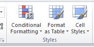
Conditional Formatting
Conditional formatting allows you to change the appearance of a cell, based on criteria that you define, using predetermined rules in Excel.
2. Select the Conditional Formatting tool
3. Choose the calculation you want to summarize.
4. Select Less Than to open the Less Than dialogue box.
2. Select Conditional Formatting.
The cells which contain a value greater than the value you specified will now appear with the cell formatting which you selected.
4. Select Greater Than from the menu to open the Greater Than dialogue box:

6. Select the type of formatting from the dropdown menu.

7. Select Ok.
5. Enter the value that you want to set as your lower limit for the Greater Than condition.
To highlight cells that contain data less than a specific value:
Less Than
1. Highlight the data range.
3. Hover over Highlight Cell Rules.
The cells which contain a value between the two specified values will now appear with the cell formatting which you selected.
4. Select Between to open the Between dialogue box.


The cells which contain a value less than the value you specified will now appear with the cell formatting which you selected.
6. Select Ok.
5. Enter the value that you want to set as your upper limit for the Less Than condition
2. Select Conditional Formatting.
cells between two specific values:
ToBetweenhighlight
3. Hover over Highlight Cells Rules to reveal the menu of different rules.
1. Highlight the data range.
5. Enter the lower limit in the first box and the upper limit in the second box
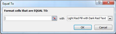
To highlight cells equal to a specific value:
Equal To
7. Select Ok.
2. Select Conditional Formatting
1. Highlight the data range.
6. Select the cell formatting.
5. Enter the value that you’re looking for.
2. Select Conditional Formatting.
The cells which contain the specified value will now appear with the cell formatting which you selected.
7. Select Ok
To highlight cells that contain a certain character(s):
3. Hover over the Highlight Cells Rules
17
3. Hover over Highlight Cells Rules.
7. Select Ok.
Text That Contains

5. Enter the character(s) you’re looking for.
4. Select Equal To to open the Equal To dialogue box.
4. Select Text That Contains to open the Text That Contains dialogue box.

6. Select the type of cell formatting you wish to use.
6. Select the type of cell formatting you wish to use.
1. Highlight the data range.
2. Select Conditional Formatting.
4. Select A Date Occurring to open the Date Occurring dialogue box.

6. Select the type of cell formatting.
The cells which contain the specified character(s) will now appear with the cell formatting which you
The cells which contain the specified date or date range will now appear with the cell formatting which you ToDuplicateselected.Valueshighlightcellsthat contain either duplicate or unique values:

Aselected.Date Occurring
1. Highlight the data range.
To highlight cells that contain a certain date or date range:
5. Select the date or date range that you’re looking for.
4. Select Duplicate Values to open the Duplicate Values dialogue box.
2. Select Conditional Formatting.
7. Select Ok.
1. Highlight the data range.
3. Hover over the Highlight Cells Rules.
3. Hover over Highlight Cells Rules.
1. Highlight your entire data range.
The cells which contain either duplicate or unique values will now appear with the cell formatting which you selected.
Top 10 Items
5. Select either Duplicate or Unique from the drop down menu.
4. Select Top 10 Items to open the Top 10 Items dialogue box.

The cells which are in the top selected number will now appear with the cell formatting which you Toselected.identify the bottom 10 items select Bottom 10 Items instead of Top 10 Items.
Top and bottom rules can be used to highlight cells that are the top or bottom ten items or the top or bottom ten percent. They can also be used to identify items above or below the average.
To highlight cells that are the top 10 items in your data:
7. Select Ok
Top/Bottom Rules
19

6. Select the type of cell formatting you wish to use.
5. Enter the number of items to identify.
6. Select the type of cell formatting you wish to use.

2. Select Conditional Formatting
3. Hover over Top/Bottom Rules.
7. Select Ok
6. Select the type of cell formatting you wish to use.

7. Select Ok.
The cells which are in the top selected percentage will now appear with the cell formatting which you Toselected.identify the bottom 10 percent select Bottom 10 Percent instead of Top 10 Percent.
To highlight cells that are in the top percentage of items in your data:
20 Top 10%
3. Hover over Top/Bottom Rules
1. Highlight the data range.
4. Select Top 10% to open the Top 10% dialogue box.

2. Select Conditional Formatting
5. Enter the number of items to identify.
1. Highlight the data range.

To highlight cells that are above the average value of your data:
4. Select Above Average to open the Above Average dialogue box:

Above Average
2. Select Conditional Formatting.
Select the type of cell formatting you wish to use. Select Ok. The cells which are above the average value of your data will now appear with the cell formatting which you selected.

To identify items below the average value select Below Average instead of Above Average.
3. Hover over Top/Bottom Rules.
1. Highlight your entire data range.
2. Select Conditional Formatting

3. Hover over Data Bars
22
Data Bars
Conditional formatting in Excel can be used to convert cells with numeric data into a bar graph. Two bar graph options are gradient and solid filled graphs.
To convert data into a bar graph:

23
2. Select Conditional Formatting.
4. Select a color scale.
To add a color scale to data:
The data cells will now be displayed as a color scale based on the value of the cell.
Color Scales
You can use the Color Scales rules to color the cells in your data based on their numerical value. Color Scales makes it easier to visualize the data.

3. Hover over Color Scales
1. Highlight the data range.
4. Choose either Gradient or Solid and select a color for the bar graph.
The data cells will now be filled with a gradient color based on the value in the cell.

The New Rule dialogue box will open.
If the rules outlined above do not cover what you need, you can create your own rule.
New Rule
To create your own rule:
1. Highlight the cells in your data range.


2. Select the Conditional Formatting tool.
3. Select New Rule.

To clear conditional formatting:

25
Clear Rules clears any conditional formatting rules from the selected cells, the entire spreadsheet, the table, or the pivot table.

1. Hover over Clear Rules
8. Select Conditional Formatting.
4. Select the Rule Type.
Each rule type will change the appearance of the dialogue box, as it changes the rule description.
Clear Rules
2. Select the range for which to clear conditional formatting.
This will open the Conditional Formatting Rules Manager dialogue box:

1. Select Conditional Formatting.
Select the formatting rules for dropdown to view rules for the current selection or any other worksheet or table within the workbook. You may add, edit or delete a rule from the Conditional Formatting Rules Manager.
Manage Rules

2. Select Manage Rules.
Manage Rules allows you to view, edit, delete, and add rules. To manage conditional formatting rules:

For this example we will select Delimited
5. Choose the appropriate data type.
SECTION V: Separating Text within a Cell
3. Select the Data tab
1. Insert a blank column to the right of the column containing the merged data.


2. Highlight the column of full names.
When data is combined within a cell, such as a first and last name, Excel is able to separate this data into two cells.

4. Select Text to Columns.
9. Select the data format for each column. For this example select General.
The Convert Text to Columns Wizard dialogue box will.

To separate data within a cell:
To separate a column based on punctuation characters, select Delimited. To separate a column based on spaces between each field, select Fixed Width.
6. Select Next.
8. Select Next
7. Choose your delimiters for the text separation. For this example select Space

The Z A descending button is used to sort data from the highest to lowest values.
SECTION VI: Sorting
10. Select Finish.
The Sort action, circled in blue below is used to alphabetically organize data.


2. Highlight the column.
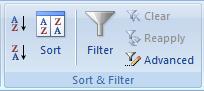
Sorting options are located in the Sort & Filter section.
The A Z descending button is used to sort data from the lowest to highest values.
Data will be displayed as separate columns.

Sorting allows for alphabetic, numeric, color and even multi level organization.
1. Select the column to sort.
TAlphabeticalosortthedata
3. Select the Data tab.
alphabetically:

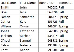
For this example we will sort by last name.

2. Select the A Z sort button to sort data from smallest to largest quantity.

For this example we will sort by Semester and then by Last Name using the following table:
A data table may also be sorted by using multiple criteria.
4. Select the A Z to alphabetize the data within the column.
ToNumericallynumerically sort data from lowest to highest values:

A Sort Warning dialogue box will appear. This will ask if you want to expand the selection or continue with the current selection.
5. Select Expand the Selection. This will sort the entire data sheet based on the column instead of just sorting the column selected.
Select the Z A sort button to sort data from largest to smallest quantity.
1. Select the column
Multi level Sorting
The data will be displayed alphabetically.
2. Select the Sort button, circled in red.
4. Select the appropriate name of the column to sort first. For this example we will use Semester.
8. Select Add Level to add additional criteria to sort by. The Then By criteria will appear.
7. Ensure the My Data Has Headers option is selected to differentiate between column headers and data.
5. The Sort On dropdown should remain as Values.
6. To alphabetically sort data, select A Z.


The Sort dialogue box will appear:
3. Open the Sort By dropdown.
1. Select the first column to sort.
10. The Sort On dropdown should remain as Values.

11. The Order dropdown should be A Z.
Sorting by Cell Color
9. Select Last Name from the Then By dropdown box.

To sort a color coded data table:
12. Click Ok.
The table will now be sorted alphabetically by semester and then by last name.
The Sort dialogue box will appear.
For this example we will organize the table with green at the top, yellow in the middle, and red on the 1.bottom.Highlight the column of cells to sort.
6. Select Add Level to add another sort criteria.

8. Select Cell Color from the Sort On dropdown
2. Select Sort.
3. Select Cell Color from the Sort On dropdown.
1. Open the Sort By dropdown.
4. Select the color to be displayed at the top of the data sheet from the Order dropdown.
2. Select the name of the column to sort.
7. Select the same column from the Then By dropdown.
5. Ensure On Top is selected.
9. Select the color to be displayed at the bottom of the data sheet. For this example we will use the color red.
32
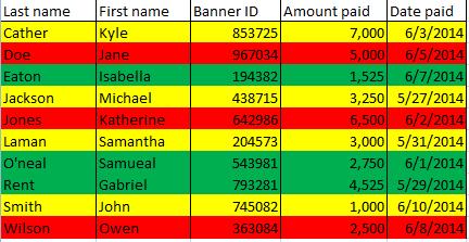
For example, data that contains five different colors would look like this:
10. Select Ok.
Your dialog box should now look like this:
33
If there are more than three colors in the data sheet: Follow the same process, but for each additional sort level added in the Sort dialogue box, select for each color to be displayed on top.


The data table will now be sorted by color.

3. Select Filter
1. Select the range of data to filter
Filters may be applied to each column of data. To apply a filter, open the dropdown menu and select the criteria to display.

3. Select the checkboxes you wish to display.
A dropdown arrow will appear to the right of each column header.
SECTION VII: Filters
1. Select the arrow to open the dropdown menu to filter.
Filters allow data to be limited to only display data which meets the criteria of the filter. Data which does not meet the criteria of the filter is hidden.
34
For example: to view all items that were paid in May:
To filter further than the options that are made available:
2. Unselect the Select All checkbox.
To apply a filter:
2. Highlight the headers of each column of data to filter. To highlight all header columns select the entire first row.
Once sorted, the data table will appear like this:

Enter the parameters for the filter in the Custom AutoFilter dialog box. Select 6/1/2014 from the calendar dropdown menu to the right of the Is Before dropdown. Click Ok.

The result will look like this:
A dialog box titled Custom AutoFilter will open.

35
4. Select the appropriate filter option to filter the data.
1. Hover over the Date Filters option. (This may also be displayed as column, text or number filters, depending on the contents of the column).
In this example, we will select Before
Basic Functions/Formulas
5. Click the Enter key on your keyboard to calculate the sum of all fields. Other functions are available by selecting the AutoSum dropdown
To add numbers in a column:
4. This will select all items within the column
Sums
36
This process may be used to filter any column.
One of the most commonly used functions of Excel is summation. If you have a data table for a single student with amounts and dates of payment, to find the sum of all payments, you would use the summation function.

2. Select Auto Sum located on the Formulas tab.

Section VIII: Functions and Formulas
3. Select the AutoSum button
Excel has many different functions and formulas which can be used to manipulate data in a variety of ways, such as sums, subtotals, averages, number counts, maximums, and minimums.

1. Select the cell directly beneath the last entry.
*All sort and filter functions can also be found from the dropdown Sort & Filter menu in the Editing section
Below is a sample data sheet for which we need to calculate the total amount paid for each semester.

One Level Subtotals
1. Select the Subtotal button located on the Data toolbar.
37
Other functions include: averaging the numbers in a column, counting the numbers in a column and finding the minimum and/or maximum numbers in the column.
Additionally, there is an AutoSum button and dropdown menu also located on the Home toolbar.

Subtotaling
The Subtotal dialogue box will open
To Subtotal a data sheet:
The Subtotal tool is used sum data by group. Subtotaling data eliminates the need to manually insert a row and perform a summation.


4. Click Ok.
2. Select Sum for the Use Function dropdown.
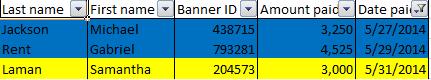
To subtotal this data sheet by semester:
1. Choose Semester for the At Each Change In dropdown.

To view the total for each subsection, select column 2

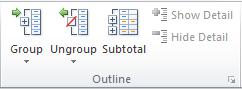
The subtotal hierarchy located to the left of the spreadsheet can be used to hide some of the data within the spreadsheet.Toview only the grand total, select column 1
To view all data, select column 3.
3. Choose Amount Paid for the Add Subtotal To field.
Subtotals will automatically be added to your data.
3. For the At Each Change in dropdown menu, select Semester.
The Subtotal dialogue box will open.
2. Select Subtotal on the Data tab.
Nested Level Subtotals
4. Choose to Use Function, Sum.
5. Choose to Add Subtotal To, Amount Paid.
Nested Level Subtotals are used to subtotal more than one level of data. For this example our list of data contains individual payers and semesters
1. Select any cell within your range of data

3. Choose to Use Function, Sum.
To add an additional level of subtotals:
2. For the At Each Change in dropdown menu, select Last Name.

1. Select Subtotal
40
6. Click Ok.
The first level of subtotal will be added to the data.
4. Choose to Add Subtotal To, Amount Paid.

5. Ensure the checkbox Replace Current Subtotals is unchecked.


41
6. Click Ok.
The second level of subtotals will be added to the data range:
Average
To remove subtotals from a data sheet:

2. Select the Auto Sum dropdown on the Formulas tab.


2. Select Remove All to remove all subtotals.
1. Select the Subtotal tool The Subtotal Dialogue box will appear.
Removing Subtotals
To find the average of a select range of data: 1. Select the cell directly beneath the range of data
3. Choose Average from the Auto Sum dropdown
3. Select Count Numbers.
4. Select the range of cells to calculate
5. Click Enter on your keyboard
1. Select the cell directly beneath the range of data.

43
Count Numbers
2. Select the Auto Sum dropdown.

To count the number of items in a range of data:

4. Select the range of cells to calculate.
5. Click Enter on your keyboard.
Maximum and Minimum
1. Select the cell directly beneath the range of data.
2. Select the Auto Sum dropdown.
3. Select Max or Min to calculate the maximum or minimum values


To calculate the Maximum or Minimum for a range of data:

6. Select the range of cells to calculate.
7. Click Enter on your keyboard to calculate the value.
CONCLUSION
People analytics are a business game-changer. Using profound insights about your workforce, you'll be able to find new ways to improve your business outcomes, monitor how your employees respond to them, and find out what they need and how best to provide it to them. With artificial intelligence (AI) gaining more traction, there is an opportunity to raise the bar and get to know your people better. More and more corporate giants are employing people analytics and are getting better outcomes as a result. That means people analytics are no longer a luxury, but a necessity for businesses of all industries that hope to remain competitive in the long-term.