MONICA FRAZIER
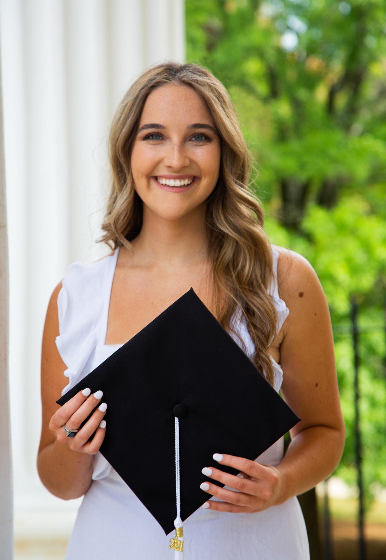
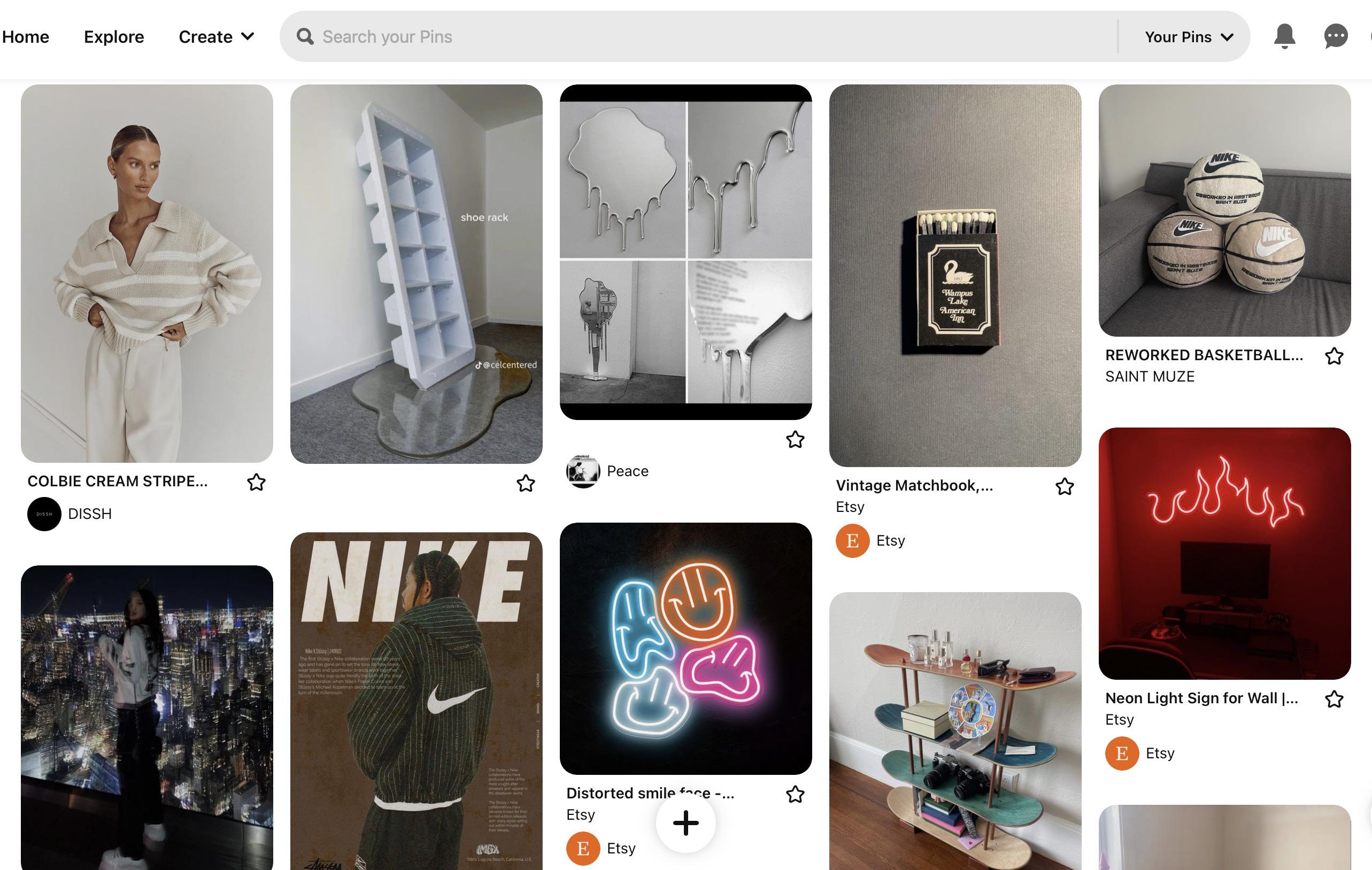
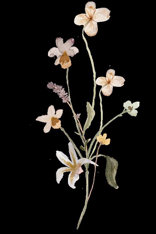
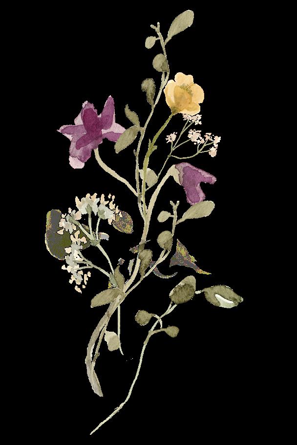
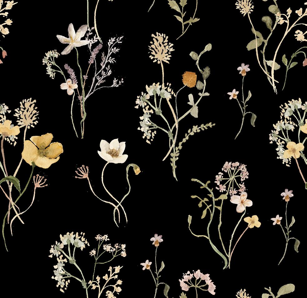
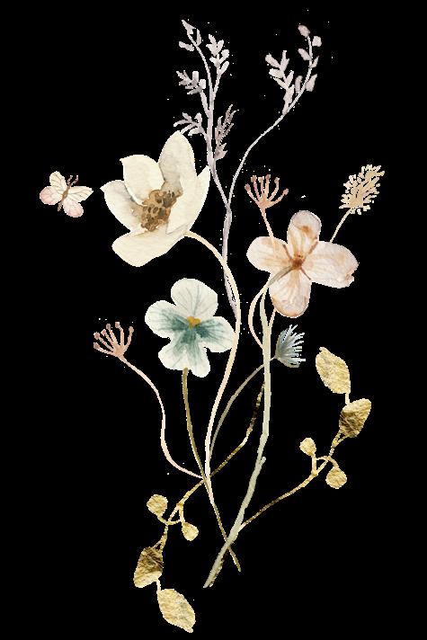
I would describe my design style as Modern Minimalistic. I am influenced by street style design and eclectic interests, favoring a neutral color scheme. My writing style is natural and friendly; However, I can communicate more formally when appropriate. My logo is derived from the Roman numeral eight because I’m one of eight children. I have a variety of interests- fashion, sports, music, travel- and wear many hats as a digital creator. I’m always working on new content! The mood board below represents my brand.
RGB: 122,129,153
CMYK:57,46,27,2
#7A8199
RGB: 196,207,220
CMYK:22,12,7,0
#C4CFDC
RGB: 232,236,239
CMYK:8,4,3,0
#E8ECEF
#D2C8EO
155,146,174
CMYK:15,20,1,0 RGB: 210,200,224 #9B92AE CMYK:42,41,17,0
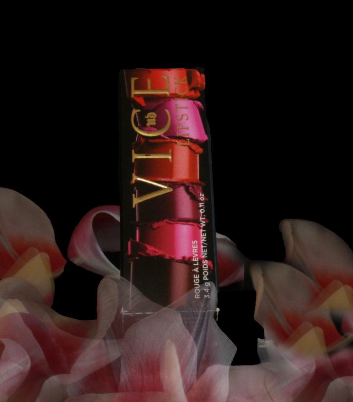
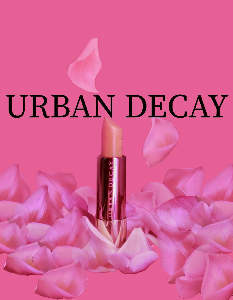
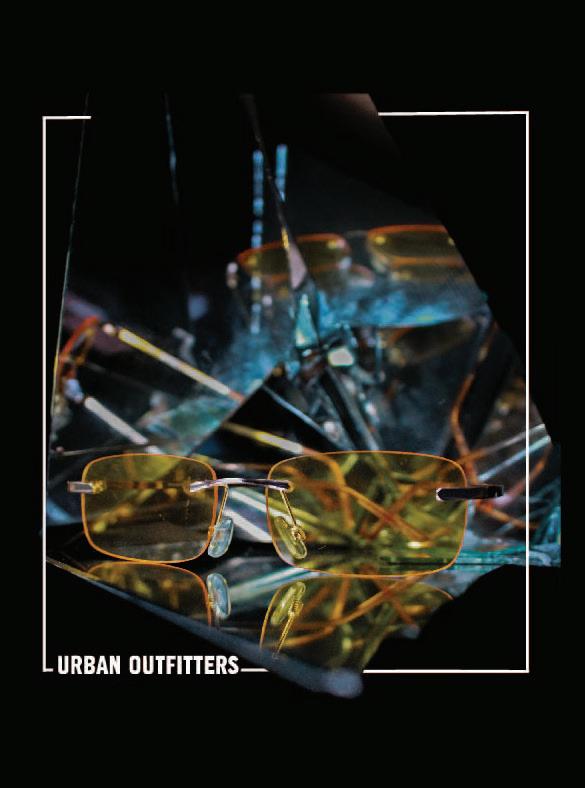
I am an Urban Outfitters enthusiast! A broken mirror became a set for this piece, and by using the “painting with light” technique, I created these images. In post production I added lines bordering the glasses to create a 3D effect. The technique used in this photoshoot was “painting with light”- the use of long exposure while adding another light source, like a flashlight. I dropped the petals while casting the light creating the wisps seen in the petals. The theme of this shoot was to adhere to the adult and young adult demographic of Urban Decay. The dark background and draping of petals evokes the seductiveness of the VICE packaging. The bright pink gives a more innocent/youthful approach to the same lipstick.
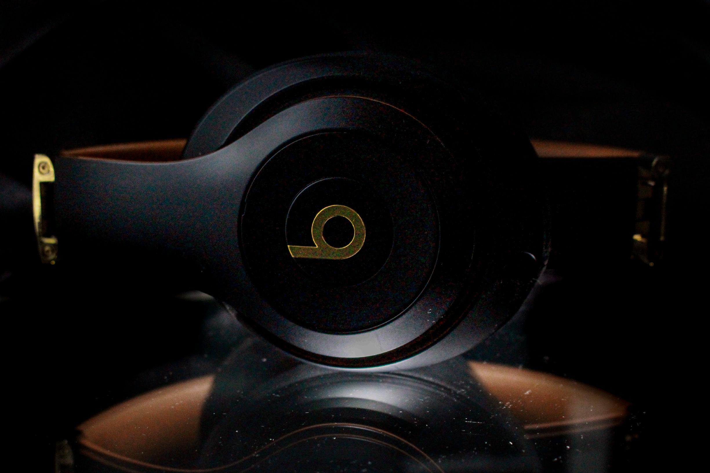
For this Beats shoot, I used natural light and controled light to create these images. By using a plexi glass desk the light shines from beneath, and the natural light from the window gives form to the headset. By placing a black T-Shirt behind I could darken the background in post to look like a solid back drop.
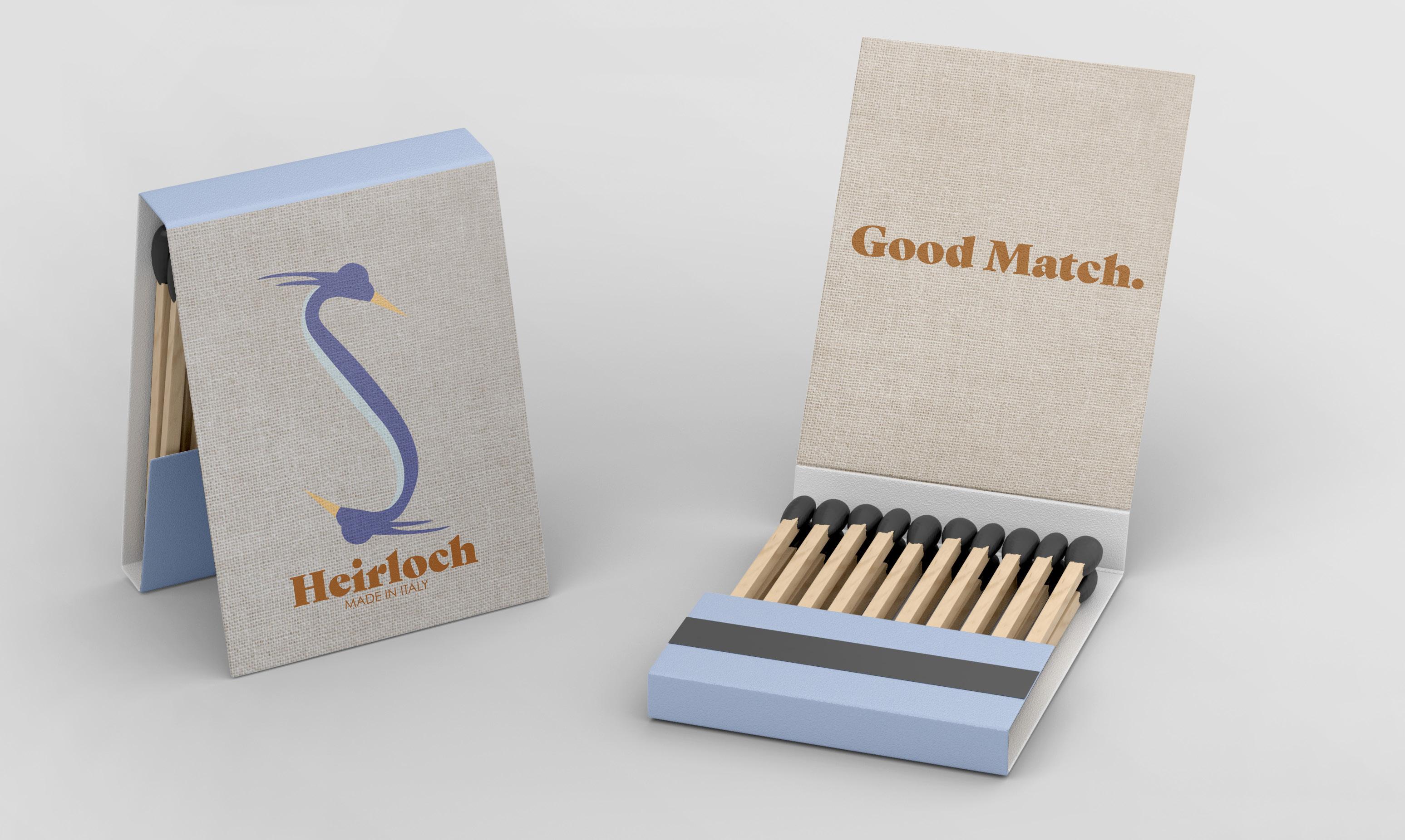
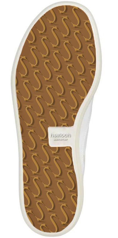
The client wanted a logo for a luxury brand of sporting goods. As an avid golfer, Mr. Sowers envisioned a logo with a blue heron (a bird found on courses) and wanted it to have an old money feel but modern look.

GIANNA EVERHART
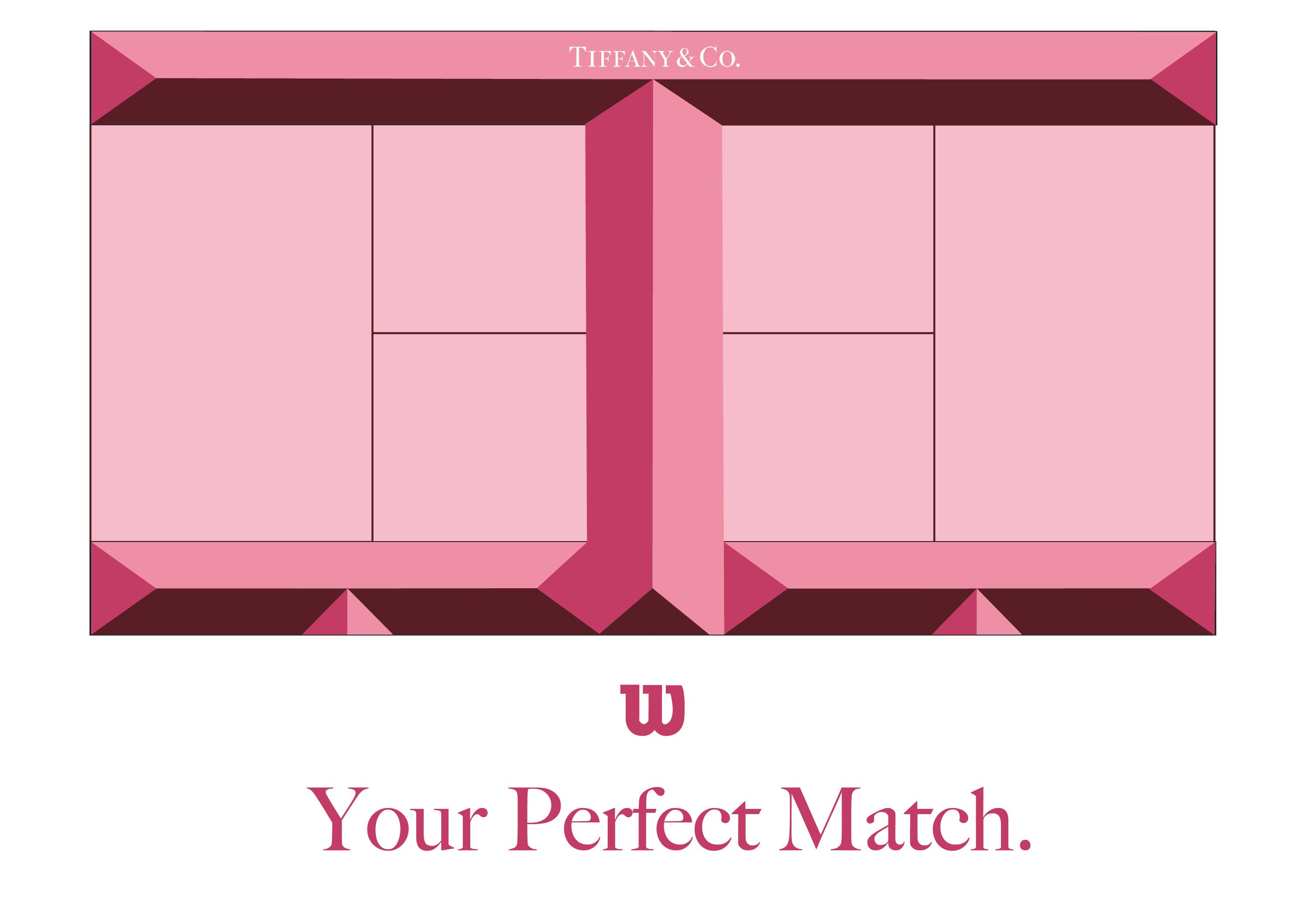
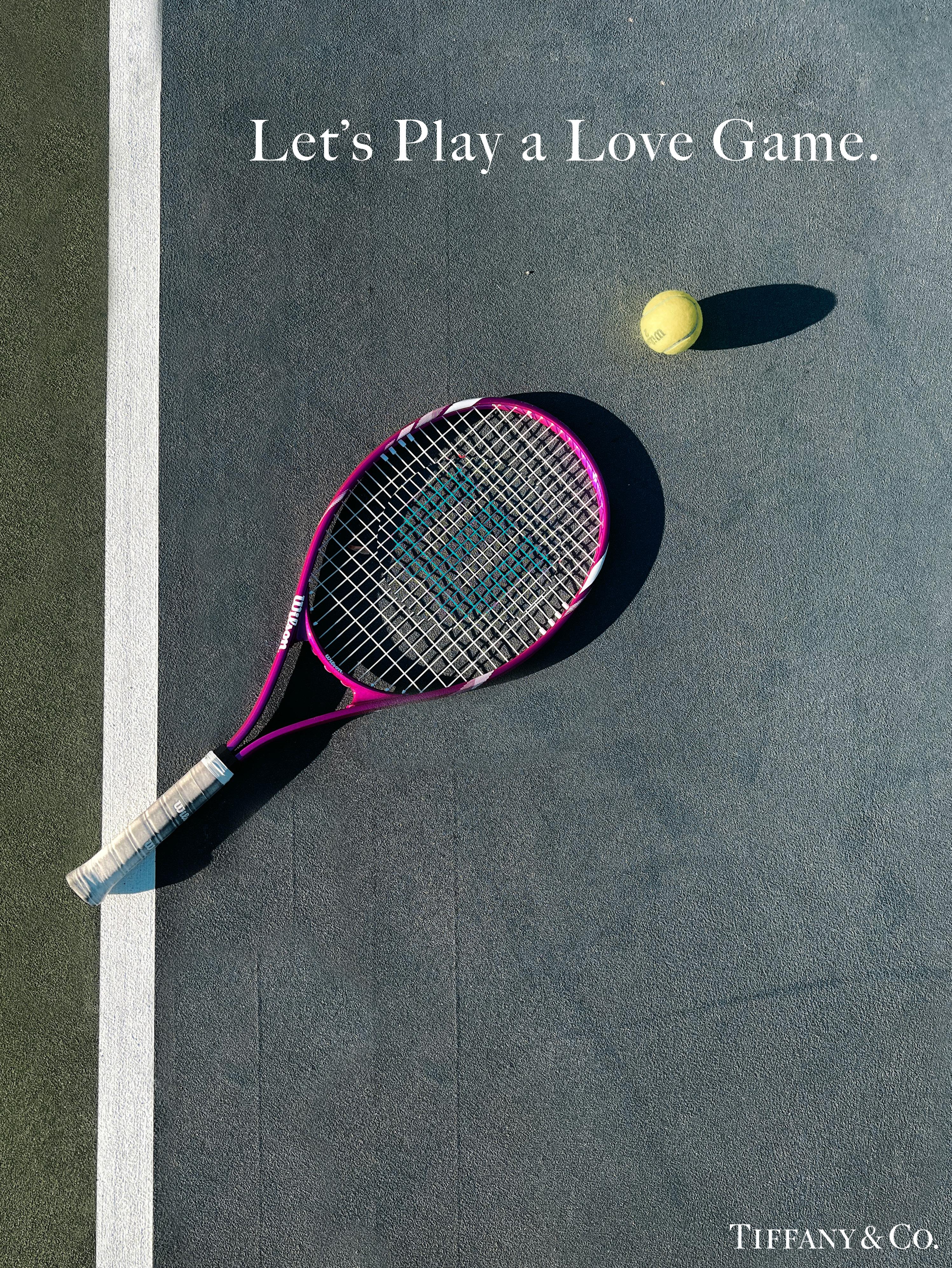
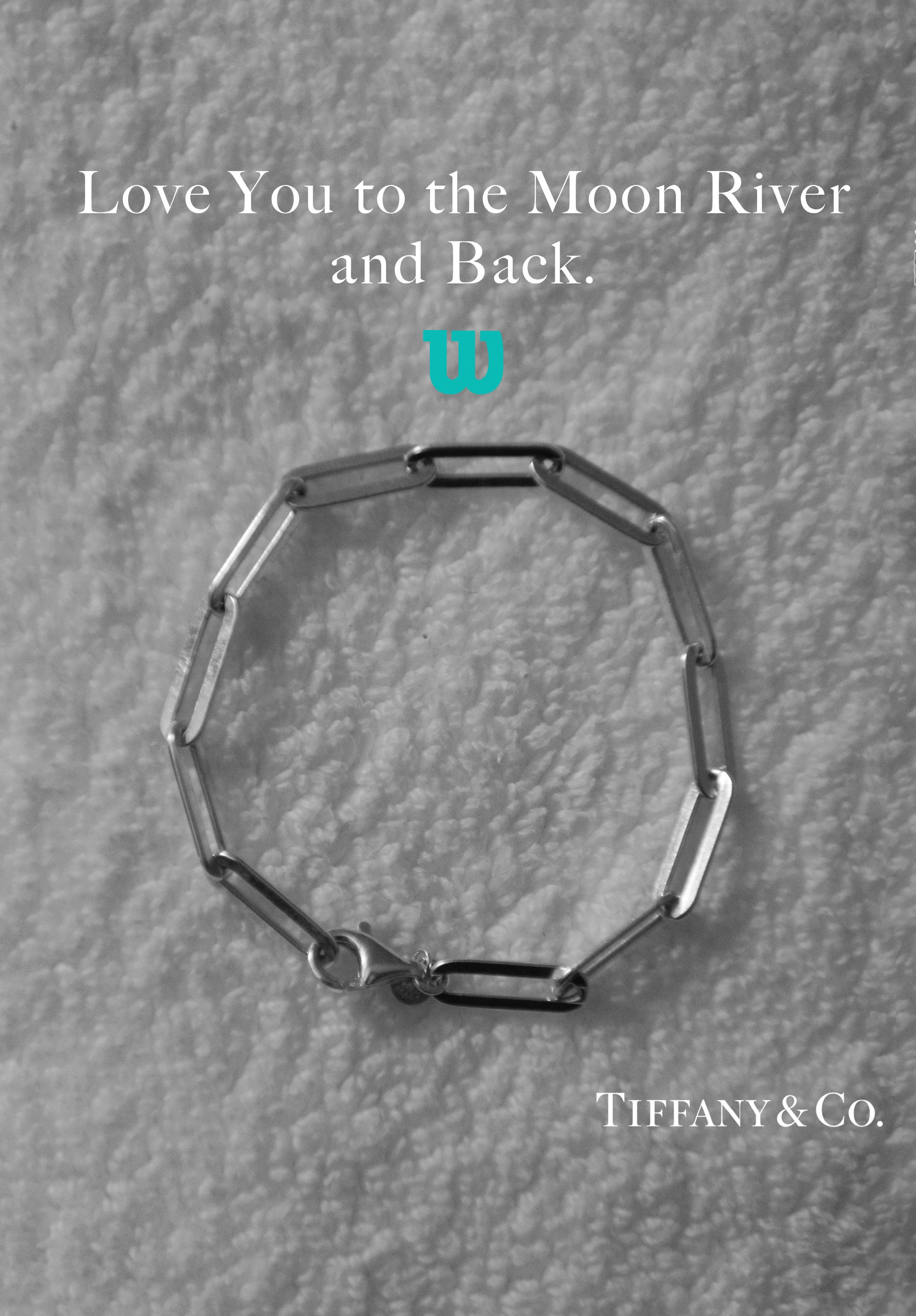
After the unveiling of the Tiffany x Nike collaboration the idea of Tiffany x Wilson hit me. There is usually a Tiffany twist on a product for whatever company they collaborate with. I created teaser marketing pieces that would be placed on social in anticipation. Tiffany usually creates a jewlery piece, and for this one a Tennis Bracelet would be appropriate. Each marketing piece embodies the verbiage of tennis terms with the integrity of Tiffany’s audience.
I designed and communicated with our vendors to create event assets for varying projects. I had hands on experience of events as a bartender from my time at Greenville Country Club, and I used that knowledge to help brides estimate ordering napkins, frost flex cups, and koozies. I even used that connection to help elevate the member experience with custom frost flex cups and koozies for our primier events like Member/Member and Member/Guest. I worked Member/Member and enjoyed hearing the positive feedback from the membership as I poured drinks.
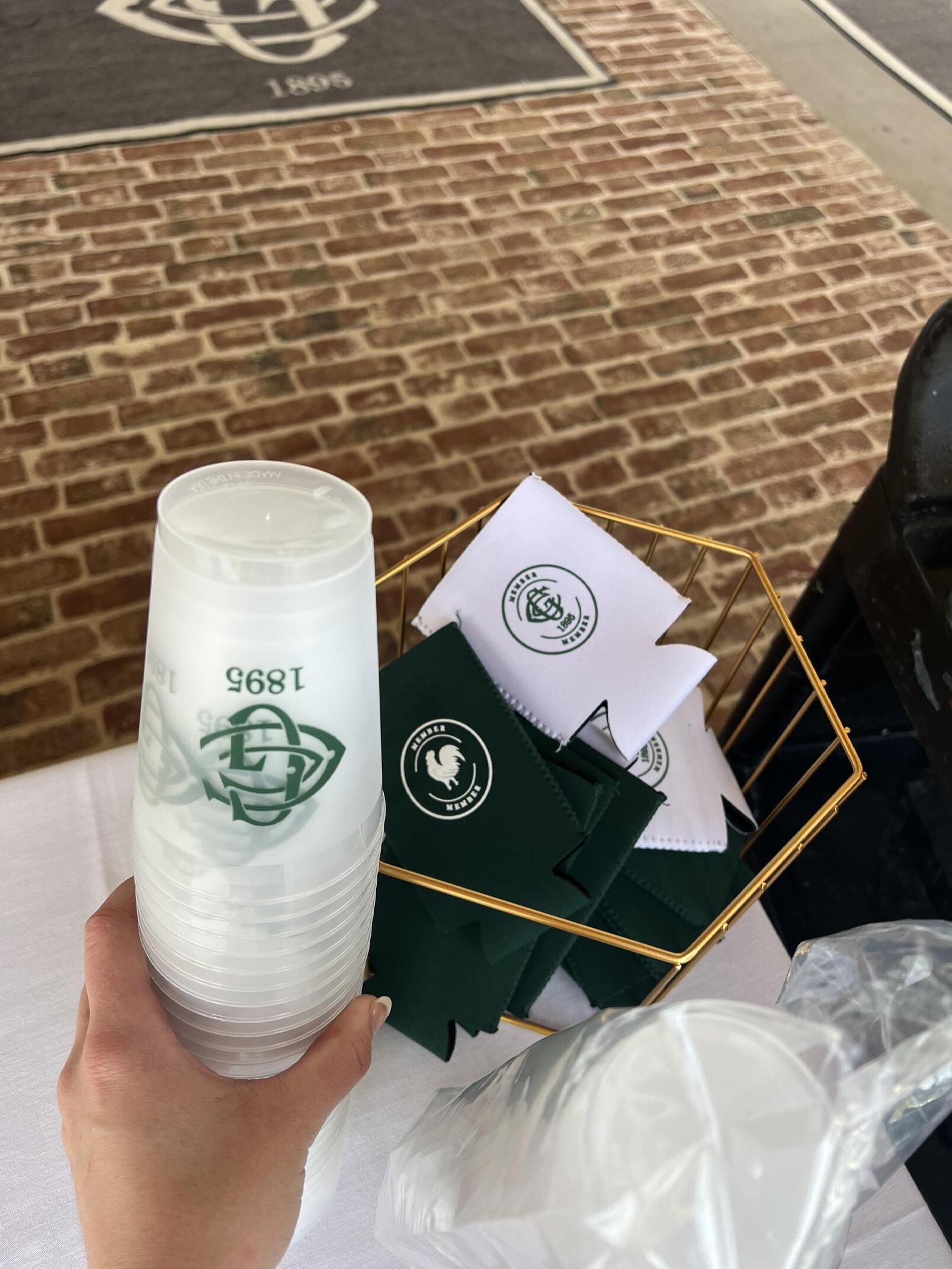
The classic GCC logo in their pantone color was created for events throughout the summer.


x 2.95”
Slim can beers have increased popularity so the club and I decided to include slim huggers. They were a hit amongst the wives during The Party.
Print Appeal carries digital downloads of templates for uploading your design. I would design in color and send to the client to help them visualize the look. The mockup needed to be in black and white and high quality vector illustrations for the printer to use.
I spent most of my time creating invitations, with event assets and signage close behind. My workflow started with getting a sense of the event and expectations for arrival and grandeur. I navigated the creative process, quoting, and ordering. I learned about many different print processes like thermography, embossing, and letterpressing. I worked hard to be fast and accurate, making sure to communicate proofs with the client to ensure flawless print.
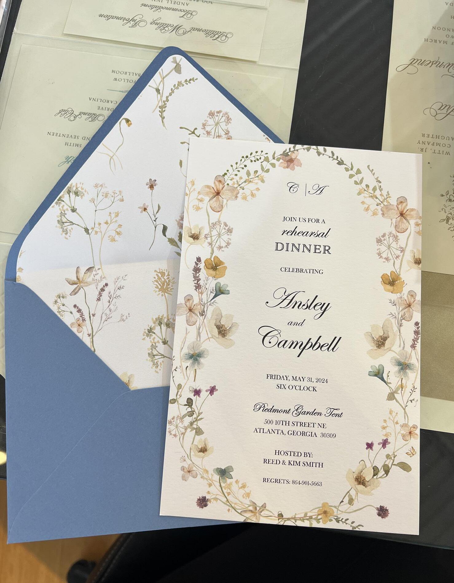
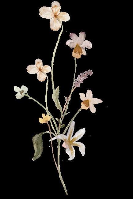
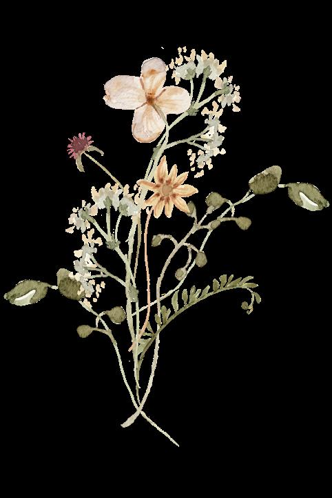
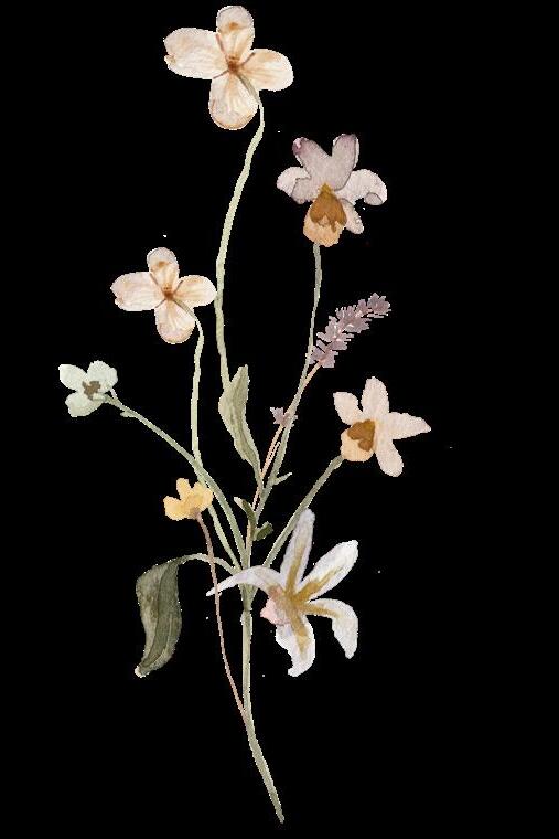
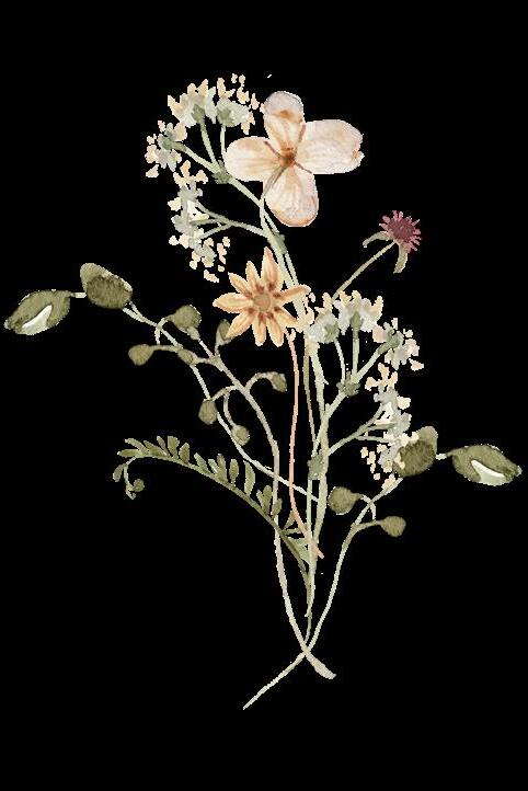
I created multiple assets for a Rehearsal Dinner starting with the invitation with a matching liner and complimenting blue envelope. The client wanted wildflowers throughout, so I incorporated it in the menu using the same typography for consistency. For the welcome sign I wanted to keep the attention on the content and added the flowers at a lower opacity to keep with the theme.
LENS
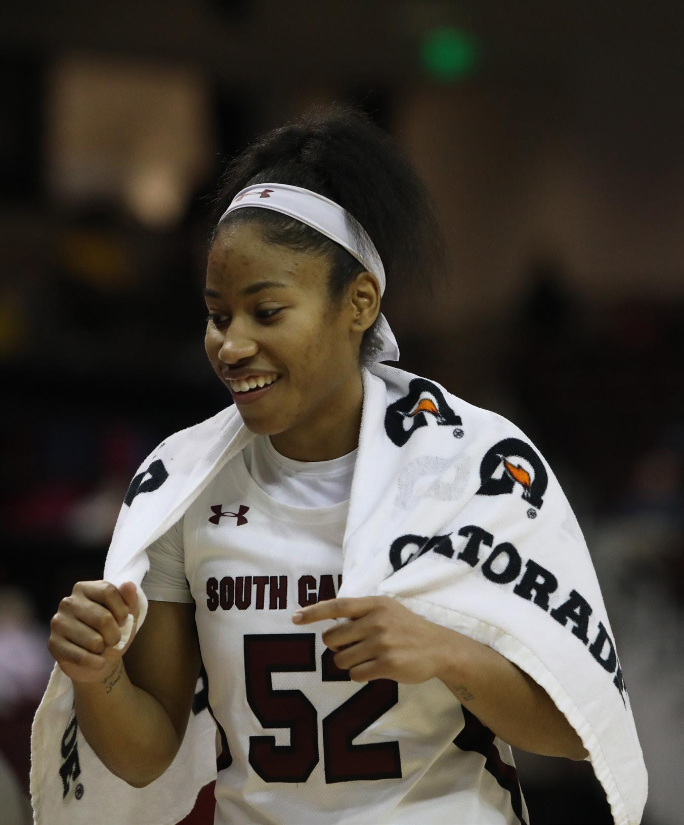
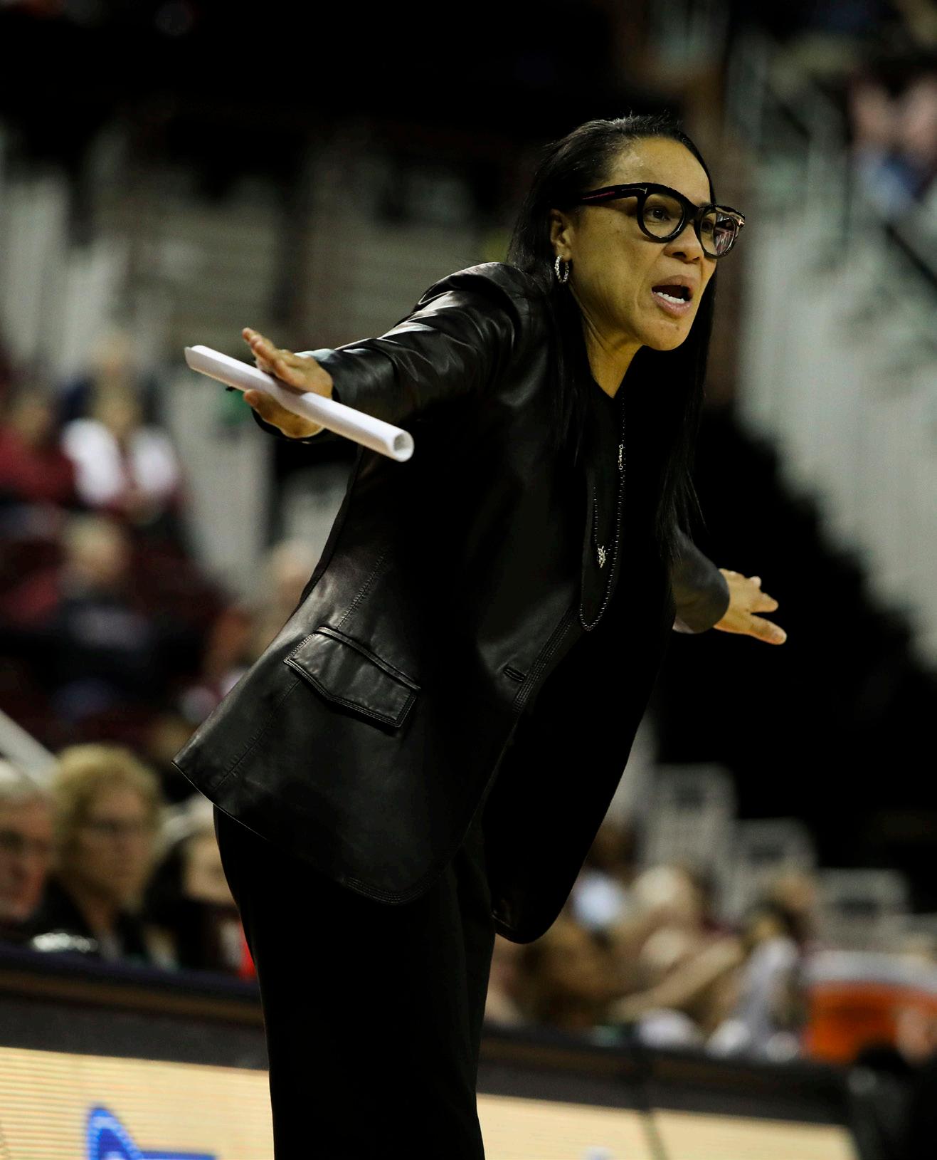
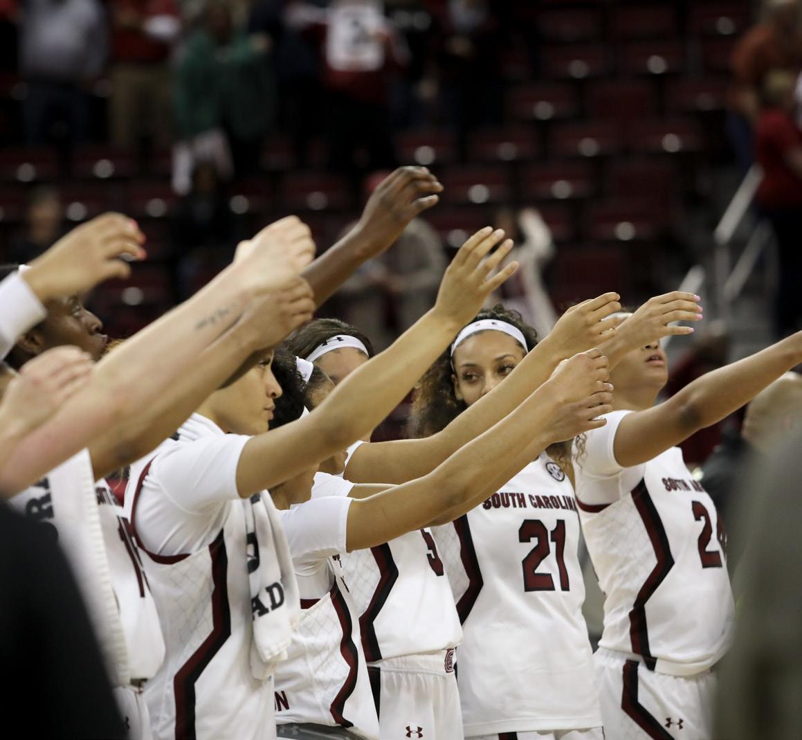
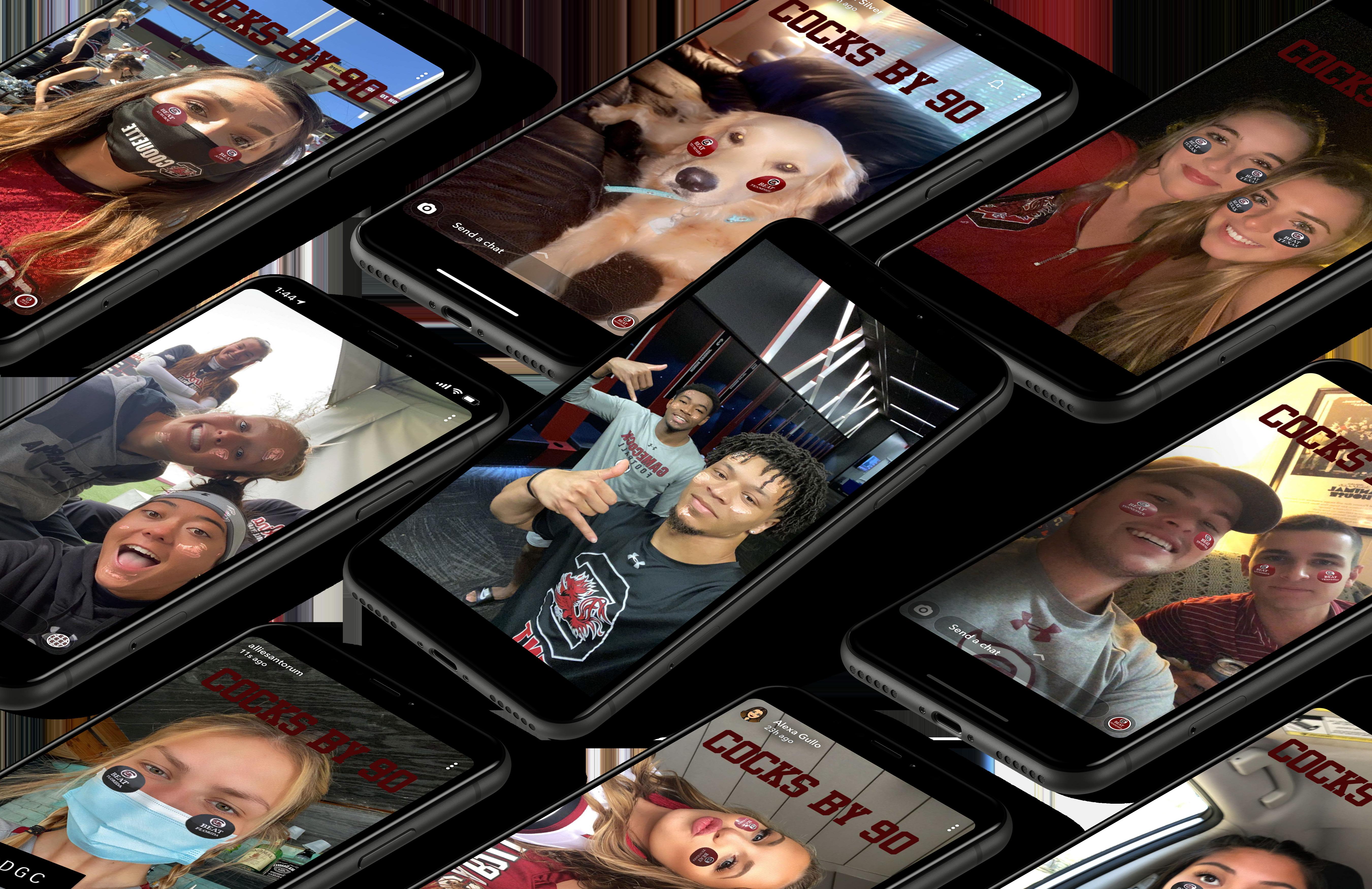
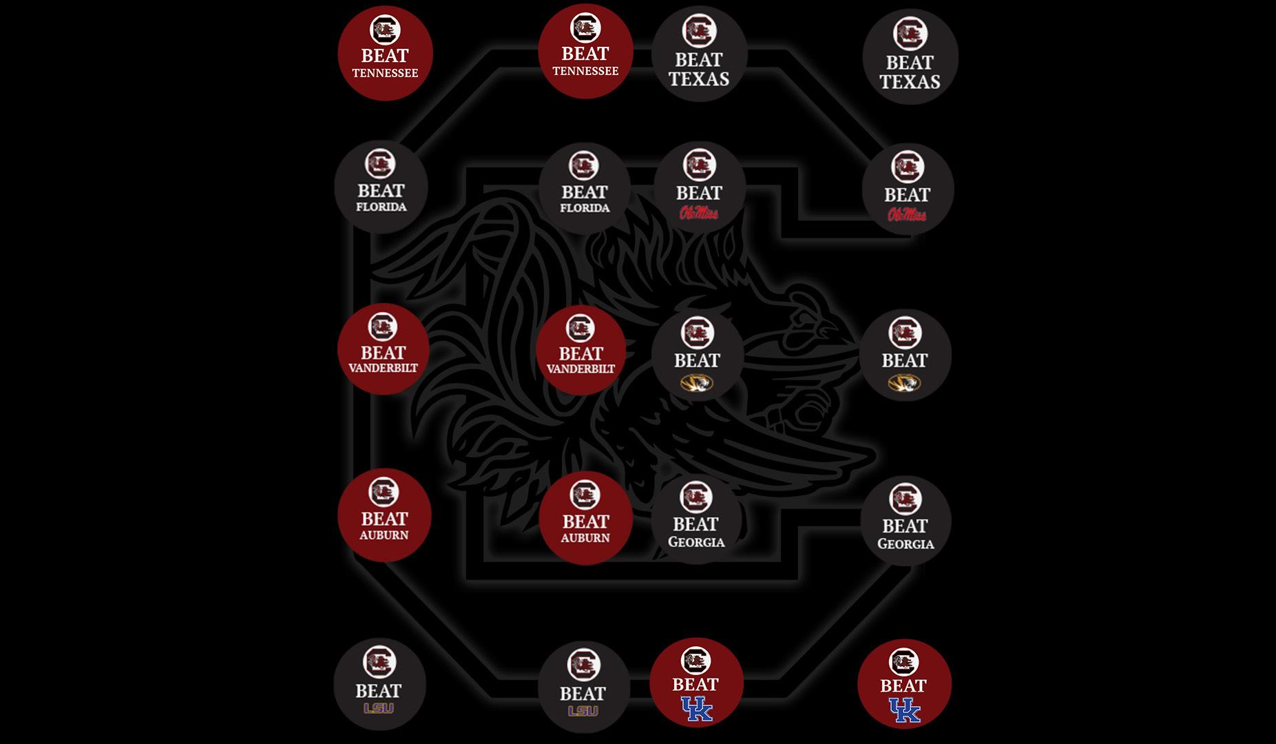
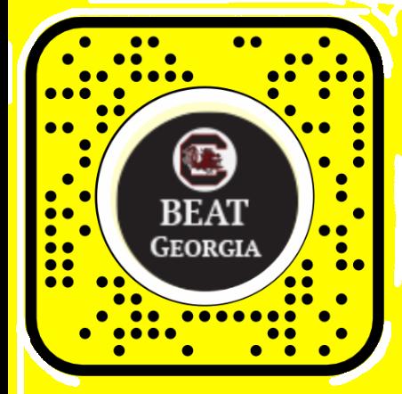
The pandemic made school spirit difficult to express especially during sports season. Inspired by the Gameday Stickers the Alumni Association makes- I created a Snap Chat lens that was updated each game with the opponents name and logo.
26
3 OCT 10 OCT 17 OCT 24
7
14
21
As of Jun 25, 2024 NOV 28
LENS SHARES LENS PLAYS FAVORITES
5
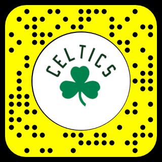
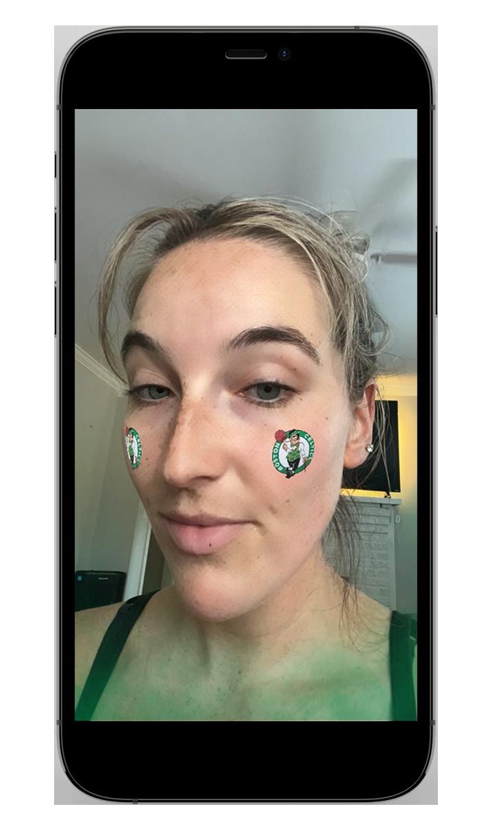
I created this lens for the 2023 NBA Finals and watched it become a successful lens. It increased popularity with their run this year as they won the 2024 NBA Finals. Unique aspects of this lens include the ball spinning and Lucky the Leprechaun winking.
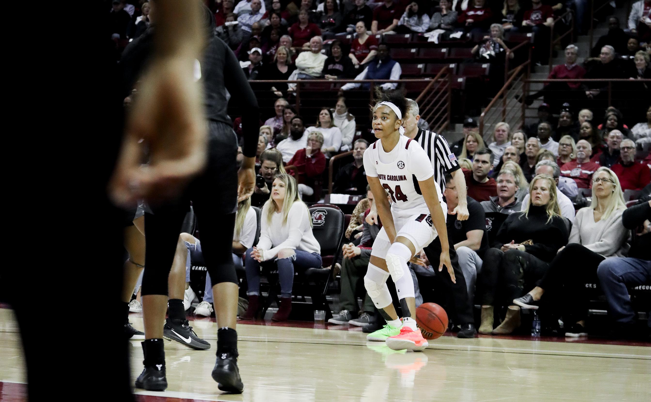
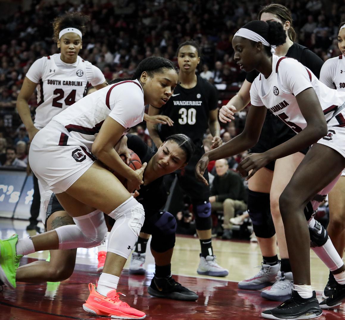
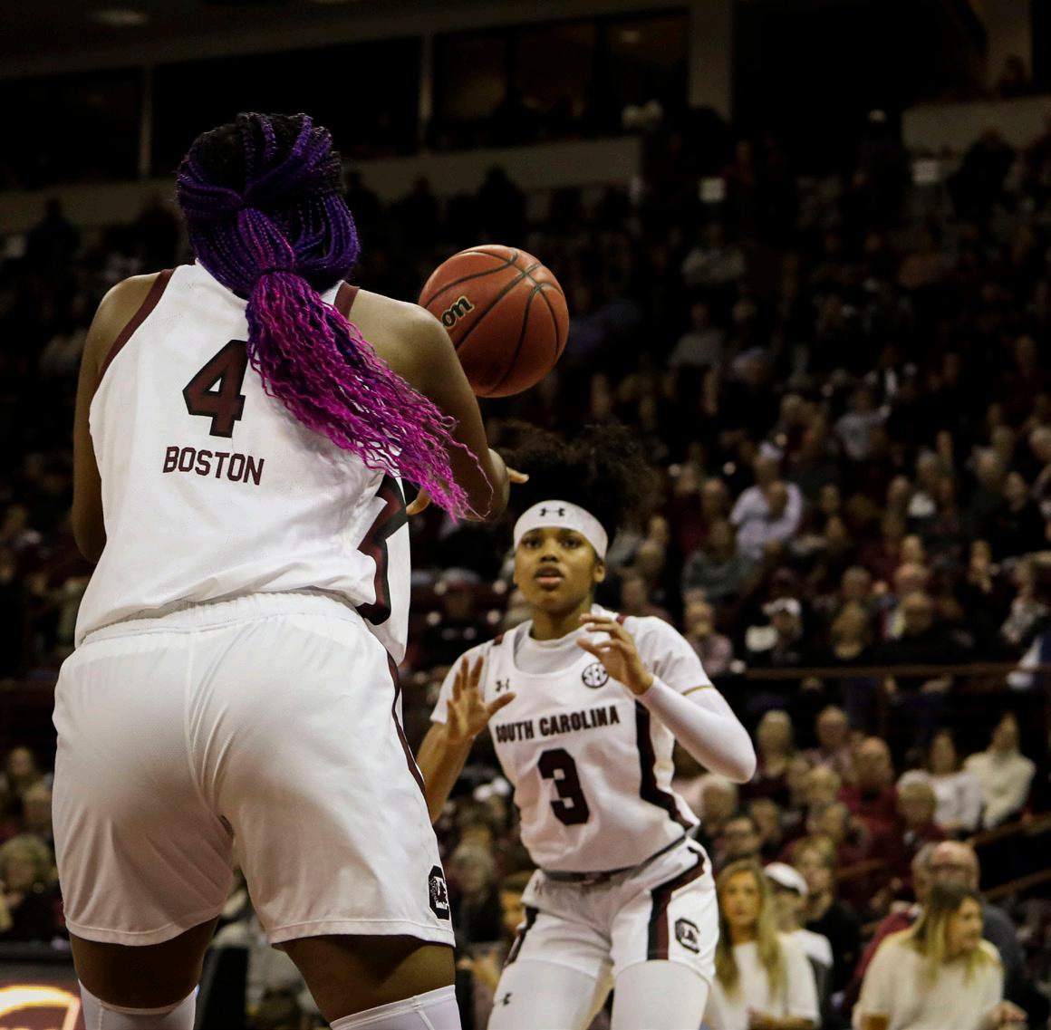
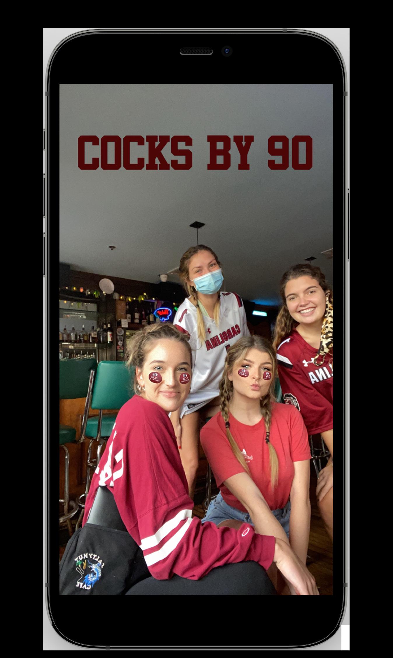
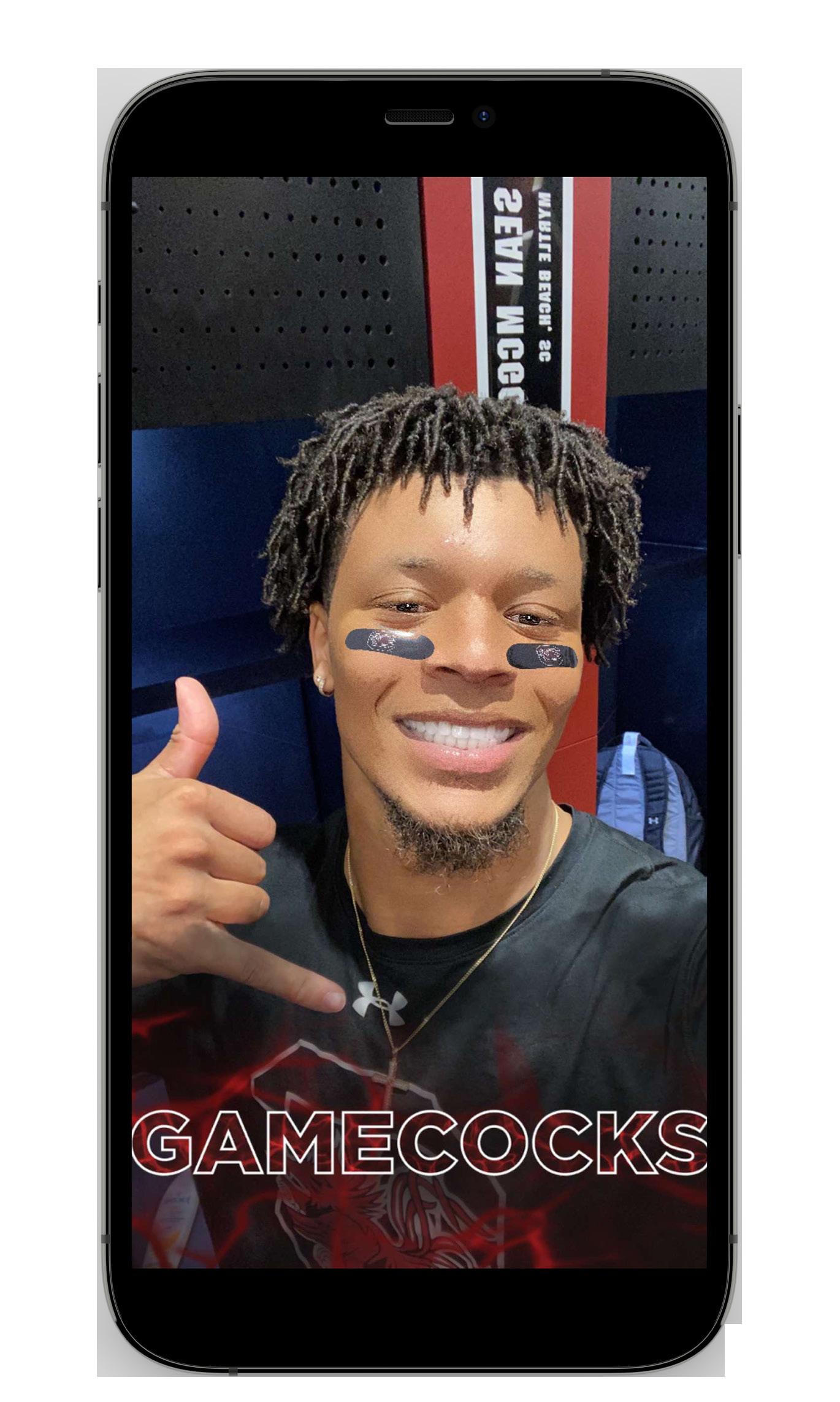
I created this lens for fan engagement at Gamecock sporting events. This lens gives each person eye black with a garnet lightning effect on the bottom.
*As of Jun 25, 2024
*As of Jun 25, 2024
Thank you for viewing my portfolio!
I am open to all roles under digital design, print design, and social media assets. I look forward to hearing from you soon. Sound like a good fit? Let’s get in touch!