Snippets of episodic memories as an experience where figments of the whole remain with you even after you’ve left the scene - almost like the postpurchase feeling of a coke bottle - flashbulb memories like VS. An overall idea of the
store, subject to an individual's experience. Finding multiple meanings and journeys beyond a red herring, likened to a Where’s Waldo book page if finding Waldo was not the goal.
COLLECTIVE COMMODITIES
MARINA J. GHOBRIAL
School of Architecture + Community Design
Pairing the two created an agency where users could discover a possible path, all equitable, rather than following the path.
I aimed to explore the realm of recognizability, not just recognizability on its own, but the repository it encompasses as it correlates to intentionality.
I was viewing these designed entities through the eyes of the client for their recognizability, but in actuality, the intention isn’t realized in the commodity itself, but rather the emotion and experience the commodity has to offer. The logic behind reaching beyond just tactile objects for purchase was to look for some commonality in essence across media in search of understanding this idea of longevity in modern-day, consumer-based society. I was viewing these designed entities through the eyes of the client for their recognizability. Furthermore, in actualitythe intention isn’t realized in the commodity itself, but rather the emotion and experience the commodity has to offer
Currently, my hypothesis stands that the intentionality of a commodity is not realized with the product, but rather that it extends to the emotion and experience one is meant to feel / remember / hold post-purchase.
"...if design is merely an inducement to consume, then we must reject design; if architecture is merely the codifying of the bourgeois model of ownership and society, then we must reject architecture..."
-Adolfo Natalini - Superstudio (1971), SuperDesign: Italian Radical Design
A Contemplation on the Unconscious Shopping Experience + the Grocery Store
Commodification of process has diluted critical thinking.
Advertisement
Amplify
Autonomy
Carve
Commodity
Conform
Consumerism
Curated
Cyclical
Discover
Emotion
Entity
Episodic Memories
Experience
Gondola Anchors
Happiness Machines
Hidden Persuaders
Identity
Lures
Nexus Object
Objective
Perception
Protest
Repository
Screen Printing
Signage
Signified
Signifier
Situtationism
Subjective
Marina J. Ghobrial
University of South Florida College of the Arts School of Architecture + Community Design mghobrial26@gmail.com
Chair Master's Project 2023-2024
Committee
Associate Professor
Associate Professor
Jeraldy Stephanis
Kim Abadir Wannemacher Jensen Architects Chief Marketing Officer
Nancy Sanders "...if design is merely an inducement to consume, then we must reject design; if architecture is merely the codifying of the bourgeois model of ownership and society, then we must reject architecture..." -Adolfo NataliniSuperstudio (1971), SuperDesign: Italian Radical Design
Mark Weston
Abstract Approach Repository
Origin Stories
Utopian Life
1960's Philosophy
Screen Printing
Hidden Persuaders
The Grocery Store Shelf Generators Directory Sectional Studies
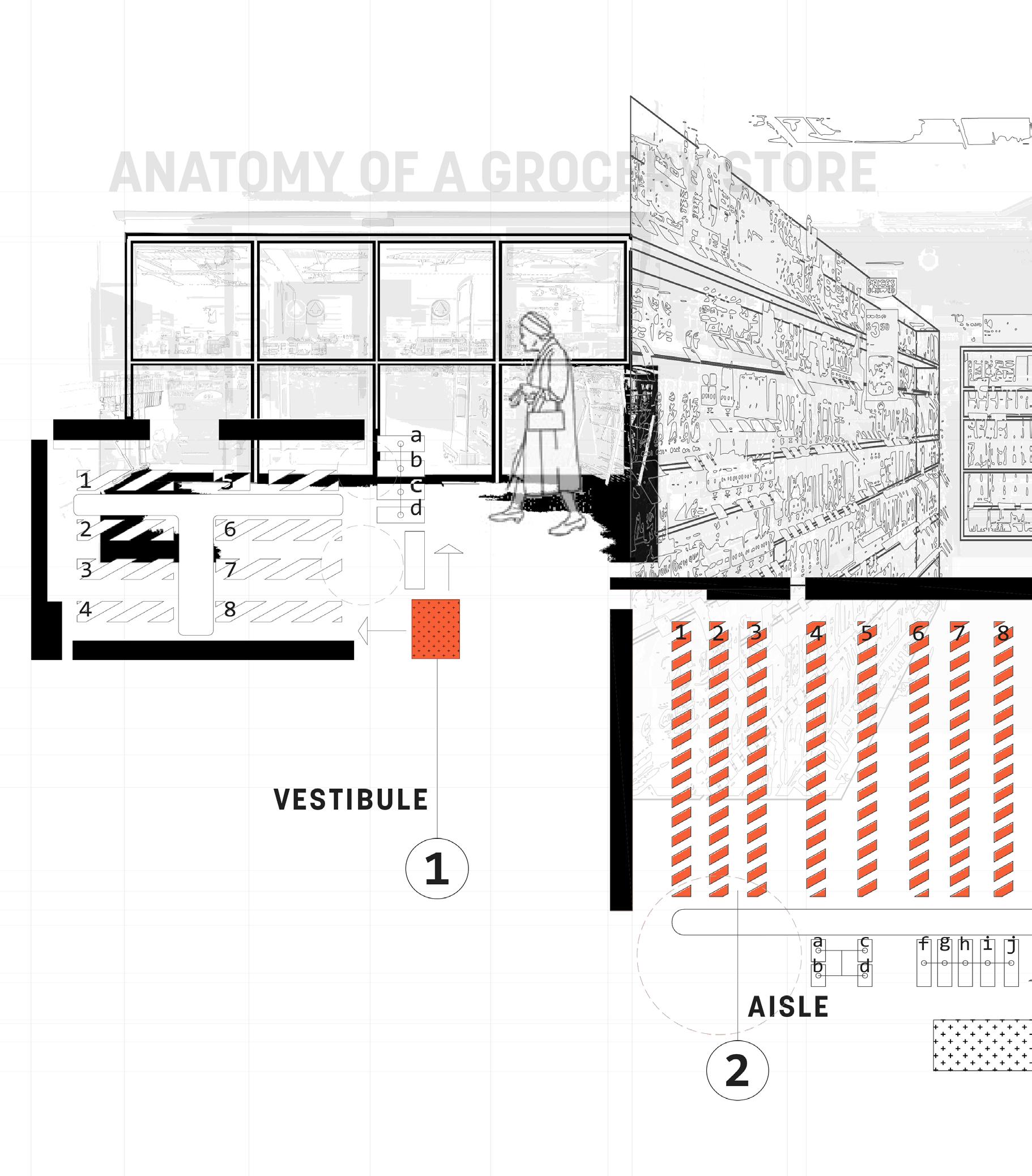
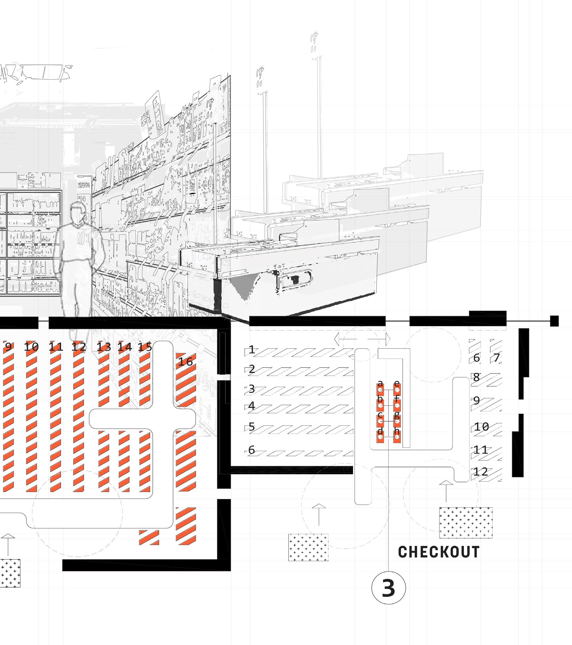
Anatomy of a Grocery Store
Points of Interest
Episodic Memories I
Episodic Memories II
as an object as an experience
Frivolous Advertising Contemplation
Abstract
Think of a soda. A candy dispenser. A currency. Modern society has developed a collective mind that I have always been interested in, which I learned was mainly a result of the marketing strategies that post-war advertisement efforts made to sell a commodity. Breaking down these entities into four design modes: objects, film, music + apparel from a larger spectrum of commodities - collages + diagrams exposed that these commodities were simply signifiers and the feeling post-purchase - represented in black ink - allowed the signified to emerge. Although each commodity was created for different utilities, they share a feeling bigger than the product. On a deeper level, I realized that through these six collages, I was viewing these designed entities through the eyes of the client for their recognizability, but in actuality, the intention isn’t realized in the commodity itself, but rather the emotion and experience of the commodity has to offer - The commodity becomes a spectacle. Soon after, modern cultures caught on to these ideas, and architecture collectives amplified the cause in the late 60s, but corporations were able to pivot in manipulating the public into thinking that they were making free choices and buying a product they desired when in actuality the feeling post-purchase remained. These principles are the epitome of the Grocery Store. Aisles filled with choices, give a false sense of freedom, but the intended path is laid out at the door. By stripping back these labels, breaking down aisles, and opening up the experience:
What is the Grocery Store?
In order to understand my methodology throughout this investigation - and to help follow my non-linear approach - anything written in this orange typeface will be subjective. My opinion/ stream of conscious/understanding/ analysis of whatever research I came across or complied in that moment. Think of it as two timelines in parallel universes, branching off, but then merging again to propel me forward in my exploration.
Research that aided my investigations written in this typeface are considered objective. Early, mid, and late findings that constantly shifted my mindset which helped me stay open-minded, become processoriented, and prevented me from being too rigid.
Approach
I aimed to explore the realm of recognizability, not just recognizability on its own, but the repository it encompasses as it correlates to intentionality. How these commodities came to be, rose in their discipline, and remain at the top - good or bad. During my research, I came across an entry by Per Galle, an architect + Professor in Denmark, who sought to understand the balance between the 3 characters in design intentionality while developing a commodity: the client, the designer, + the maker, and the 3 required understandings of each character: the design brief, design representation, and the artifact (or commodity) and the 11 actions in between the 2.
_I.01
First, the client produces a brief (action of type 1). Once he has interpreted it as being adequate (action of type 2), he hands it over to the designer. To initiate designing, the designer interprets the brief (action of type 3), then proceeds by his producing a design representation (designing as defined above), usually consisting of several sketches, drawings, descriptions, computer files, etc. (action of type 4), interpreting it as adequate (action of type 5), and submitting it to the client for approval. When the client has interpreted the representation (action of type 6) and communicated his approval to the designer (not shown in the diagram), the designer delegates further work to the maker by handing over the design representation to him. The maker, in turn, interprets the representation (action of type 7) and produces the artefact (action of type 8), interprets it as adequate (action of type 9), and submits it for approval by the designer who interprets it (action of type 10) and communicates his approval (not shown) to the maker. In the same way, presumably, the client will interpret (action of type 11) and approve the final artefact.
-"11 Step-Process" Design as Intentional Action, Per Galle
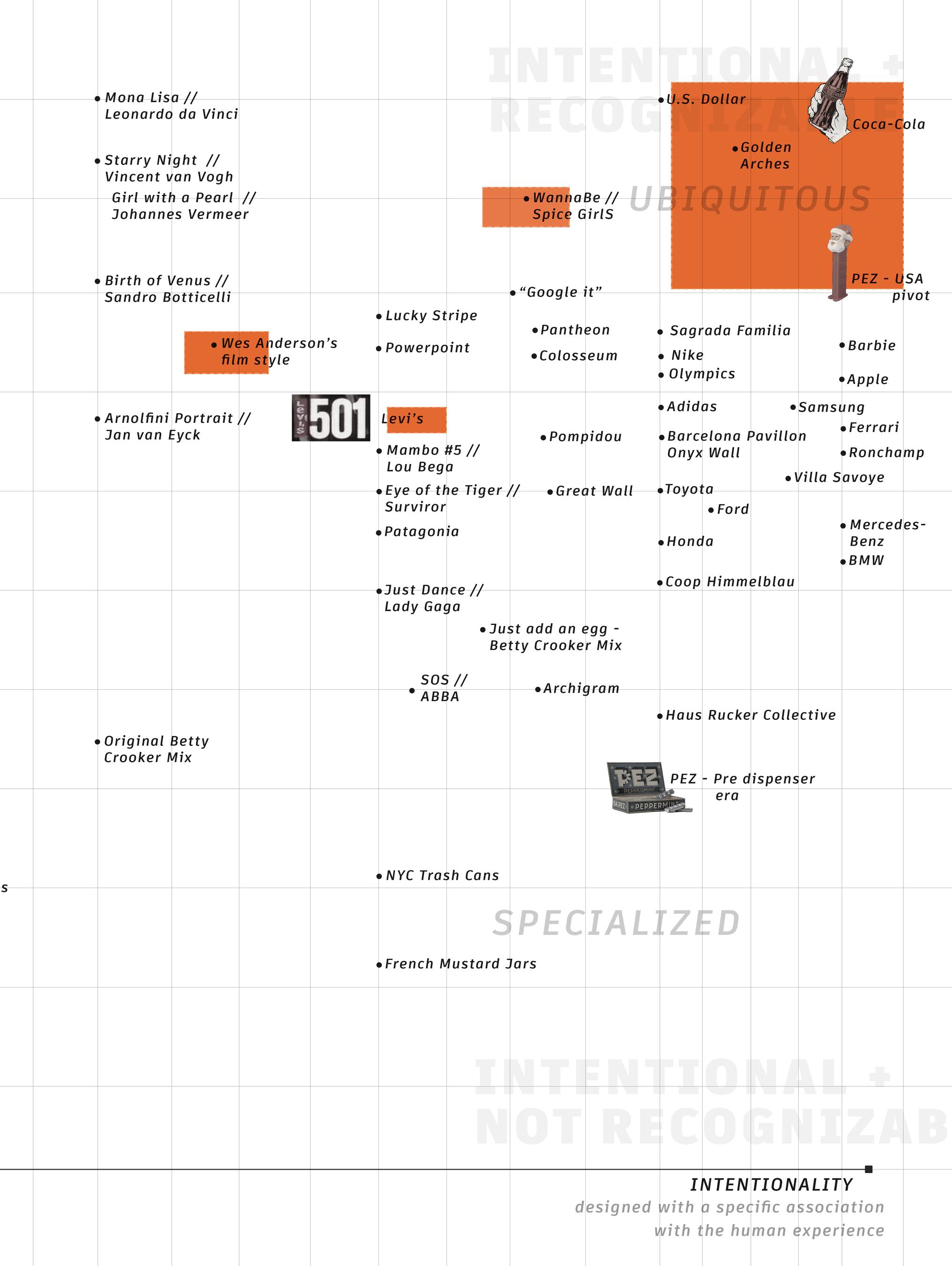
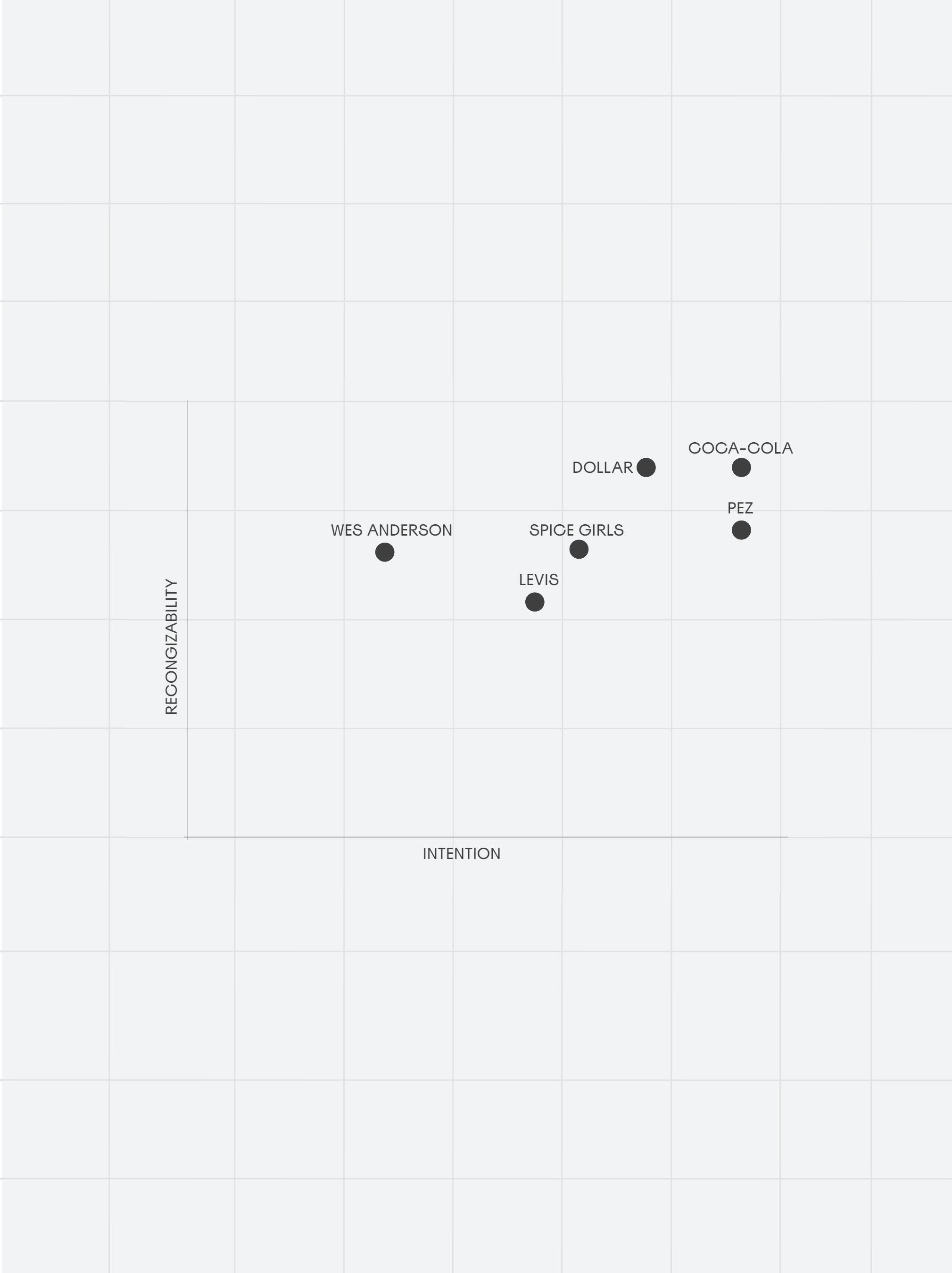
Keeping the logic of design intentionality in mind, I laid out the repository in my head of a small sample of commodities and spaces that I could easily recall. From this, I narrowed down 4 design modesobjects, apparel, film + music - which vary from intentionality, but all remain highly recognizable to look into further in order to understand the design purpose.
Origin stories
In an attempt to understand why these legacy brands + entities are still known today-in a time where trends are forgotten within a couple weeks-a deep dive into their conception, rise and methodology. I choose six entities across four design modes from the repository created:
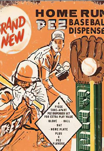
Coca-Cola : Object : The Hobble Skirt
PEZ : Object : Pfefferminz
U.S. Dollar : Object : Greenbacks
Spice Girls : Music : Manufactured Pop
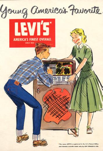
Levi's : Apparel : Red Tab Device
Wes Anderson : Film : Mise-en-Scene
The logic behind reaching beyond just tactile objects for purchase was to look for some commonality in essence across media in search of understanding this idea of longevity in modern-day, consumer-based society. Some entities double dip into the same draws - for example, Coca-cola is visual + tactile, similar to Levi's, although scale changes. A Wes Anderson film is most obviously known for its visual appeal, but his music selection is also particular enough to relate the musical world the Spice Girls live in.
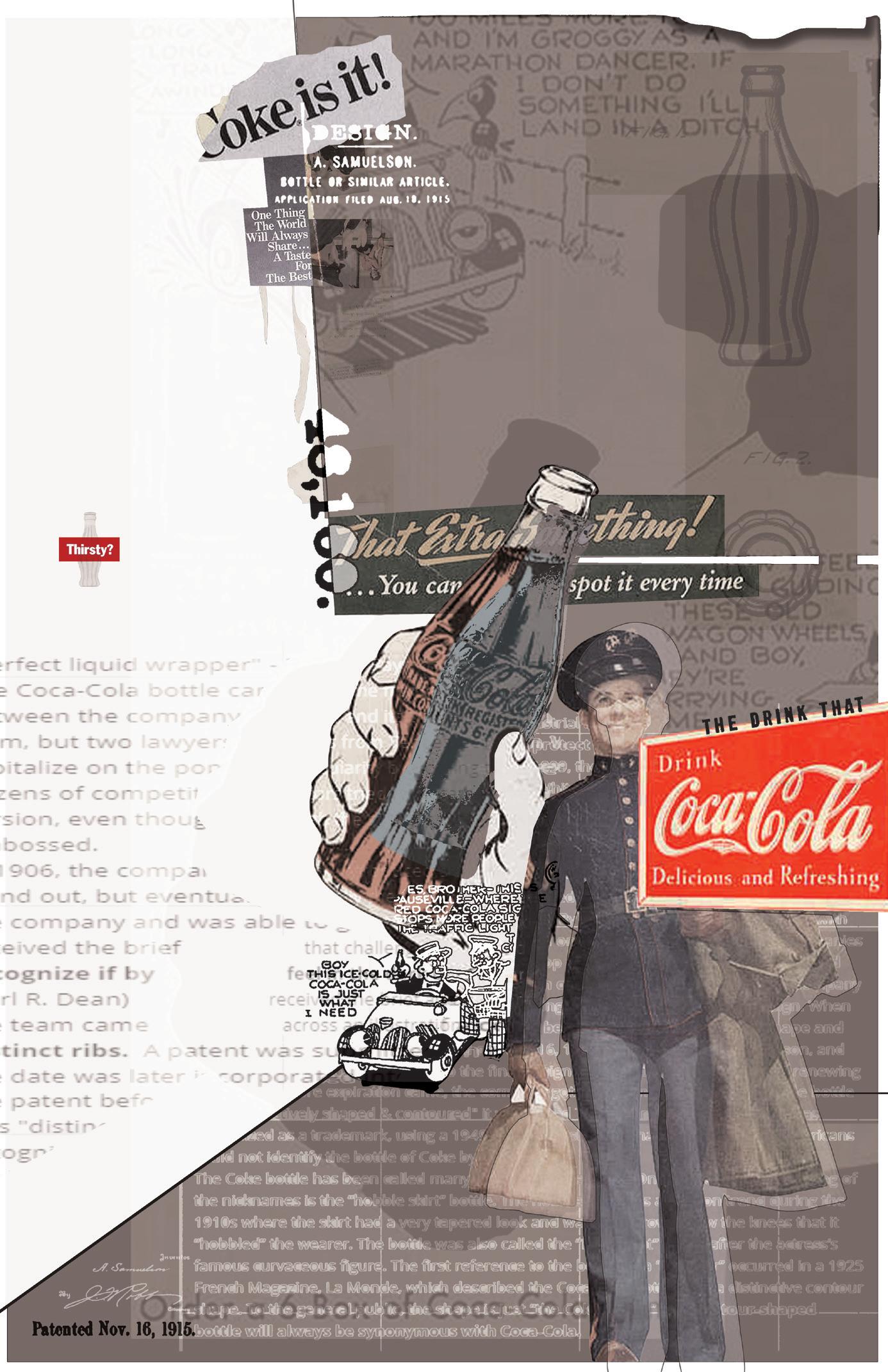
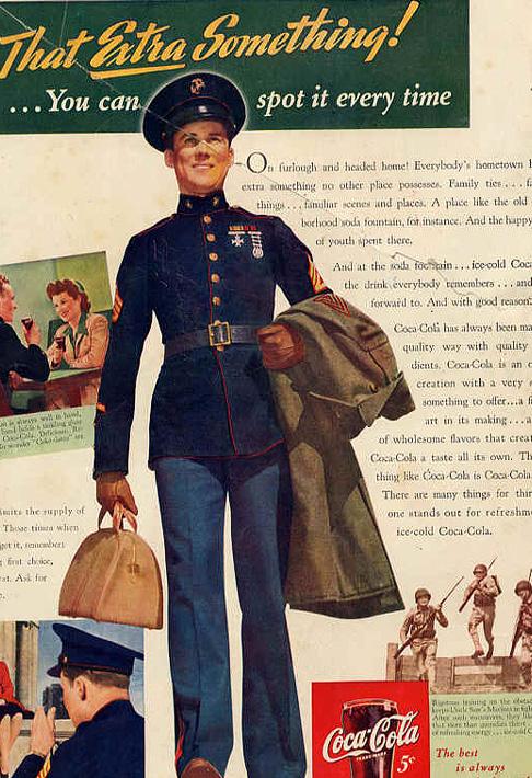
The Coca-Cola bottle came from the desire to protect the brand and was a group effort between the company and its bottlers. Before 1899, the drink was only sold in fountain form, but two lawyers from Tennessee (Joseph Whitehead & Benjamin Thomas) thought to capitalize on the popularity by bottling the beverage (The Coca-Cola Company, 2024). As the drink got even more popular, dozens of competitors tried to imitate the trademark to trick people into buying their version, even though the straight up and down bottles were required to have the logo embossed.
In 1906, the company introduced a diamond shaped label with a colorful trademark to stand out, but eventually the label would peel off. By 1915, the lead attorney pleaded with the company and was able to get $500 to expend on a distinctive bottle (The Coca-Cola Company, 2024). 10 glass companies received the brief that challenged them to develop a "bottle so distinct that you would recognize if by feel in the dark or
lying broken on the ground.” The Root Glass Company (Earl R. Dean) received the brief and had a meeting to begin to work on their design. When the team came across an illustration of a cocoa bean that had an elongated shape and distinct ribs. A patent was submitted on Nov. 16, 1915 under Alexander Samuelson, and the date was later incorporated into the final design of the bottle. After constantly renewing the patent before expiration came, the company got fed up and asked that since the bottle was "distinctively shaped & contoured" (Kratz, 2015) it warranted Trademark status. By 1961, it was recognized as a trademark, using a 1949 study that showed that less than 1% of Americans could not identify the bottle of Coke by shape alone.
The Coke bottle has been called many things over the years. One of the more interesting of the nicknames is the “hobble skirt” bottle. The hobble skirt was a fashion trend during the 1910s where the skirt had a very tapered look and was so narrow below the knees that it “hobbled” the wearer (Lockhart, B., & Porter, B., 2010). The bottle was also called the “Mae West” bottle after the actress’s famous curvaceous figure. The first reference to the bottle as a “contour” occurred in a 1925 French Magazine, La Monde, which described the Coca-Cola bottle with a distinctive contour shape. To the general public, the shape is just “the Coke bottle.” The contour-shaped bottle will always be synonymous with Coca-Cola (Lockhart, B., & Porter, B., 2010).
Signified emerges in black ink.
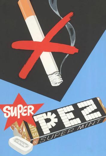
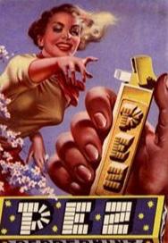
Pfefferminz
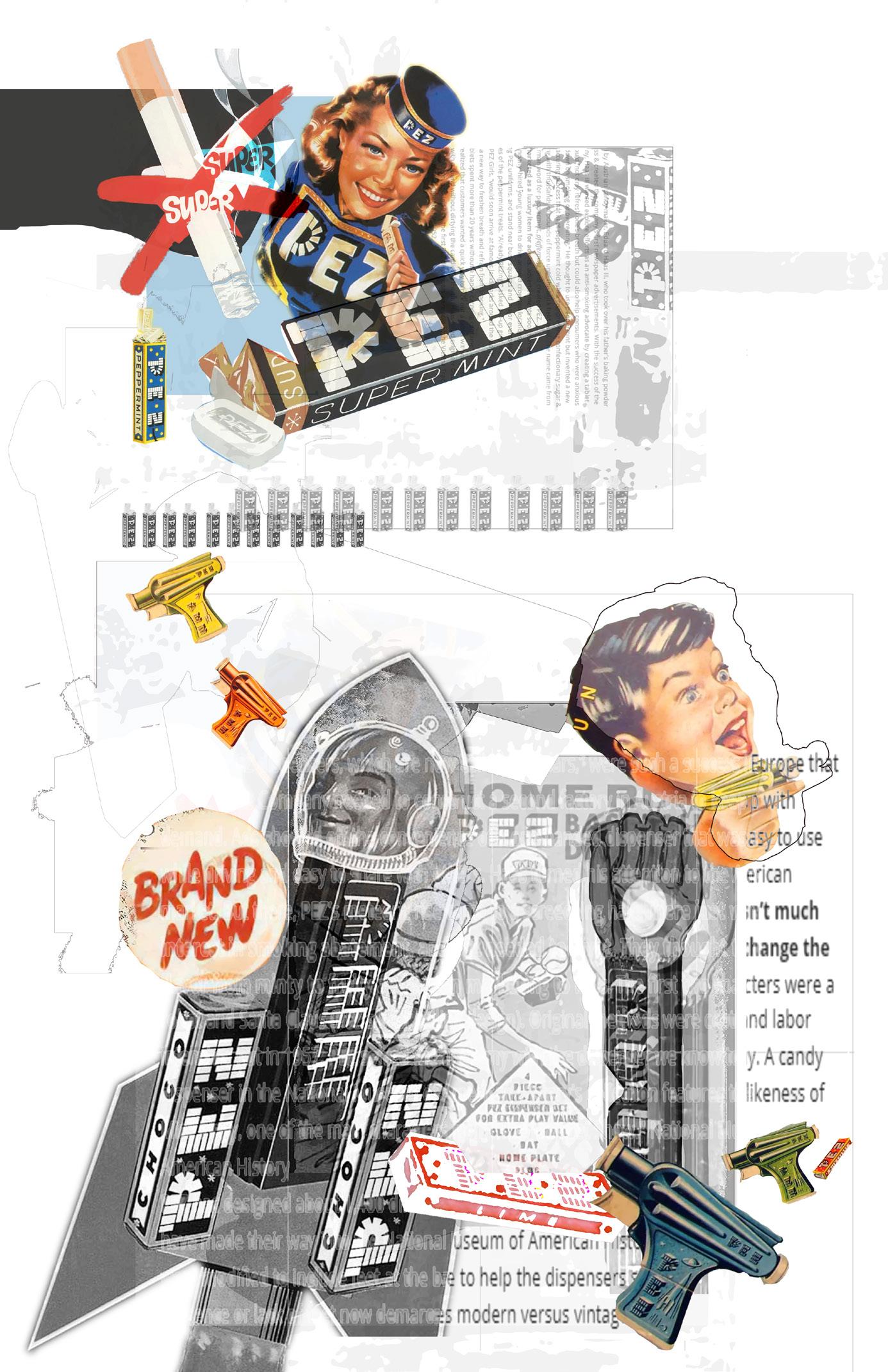
Started by Austrian candy maker, Eduard Haas III, who took over his father’s baking powder business & created the company’s first newspaper advertisements. With the success of the company, Haas III wanted explore efforts as an anti-smoking advocate by creating a tablet that would “not only refresh one’s breath but could also help consumers who were anxious to cut down on smoking or overeating” (Machemer, 2020). He thought to use peppermint but invented a new manufacturing process that kept peppermint cold while compressing confectionery sugar & flavoring with thousands of pounds of force until the brick held itself. The name came from the German word for peppermint, pfefferminz, and created PEZ.
First marketed as a luxury item for adults, advertisements soon turned into productions, the company hired young women to drive around crowded locations in PEZ-branded trucks, wearing PEZ uniforms, and stand near busy squares and major events to hand out free samples of the peppermint treats. “Already PEZing?” Asked pin-up girls in ads. The women, called PEZ Girls, “would soon arrive at famous landmarks around the world, offering the public a new way to freshen breath and refrain from smoking” (Machemer, 2020).
PEZ tablets spent more than 20 years without a handy carrying container. In the late 1940s, Haas realized that customers wanted a quick way to pick out a tablet with one hand, or share with a friend without dirtying the candies in the tin. Haas hired engineer Oscar Uxa to create a solution, and
in 1949, the first PEZ dispensers were sold at the Vienna Trade Fair. The U.S. patent was granted in 1952 (Peterson, 2016).
The first PEZ dispensers, which are now called “regulars,” were such a success in Europe that the Ed. Haas Company needed to construct a second factory in Austria to keep up with demand. Ads showed off the convenience of a one-handed dispenser that was easy to use while driving and easy to share with others. Haas turned his attention to the American market. But there, PEZ’s meteoric rise came to a screeching halt. There just wasn’t much interest in smoking abatement, and PEZ needed to pivot. They thought to change the flavor from minty to fruity and began marketing to kids. The first two characters were a robot and Santa Claus (PEZ’s best selling design). Original methods were costly and labor intensive, but in 1957, PEZ solved the anatomy with the dispenser we know today. A candy dispenser in the National Museum of American History’s collection features the likeness of Miss Piggy, one of the main characters from “The Muppet Show.”
Now, PEZ has designed about 1,400 different character heads and innumerable variations (Peterson, 2016). A few have made their way into the National Museum of American History, and PEZ dispensers were modified to include feet at the base to help the dispensers stand when on display. The presence or lack of feet now demarcates modern versus vintage dispensers for collectors.
Signified emerges in black ink.
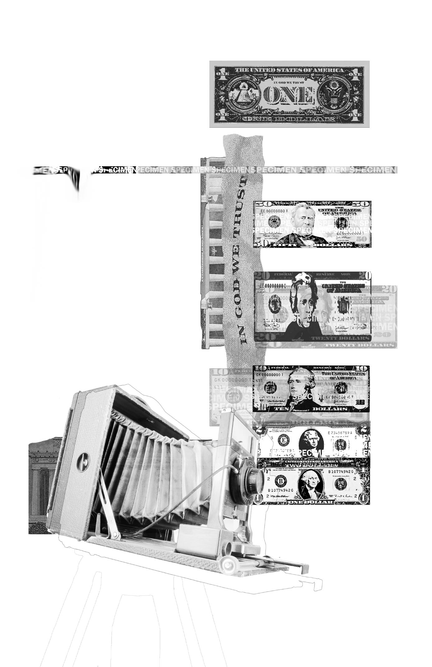
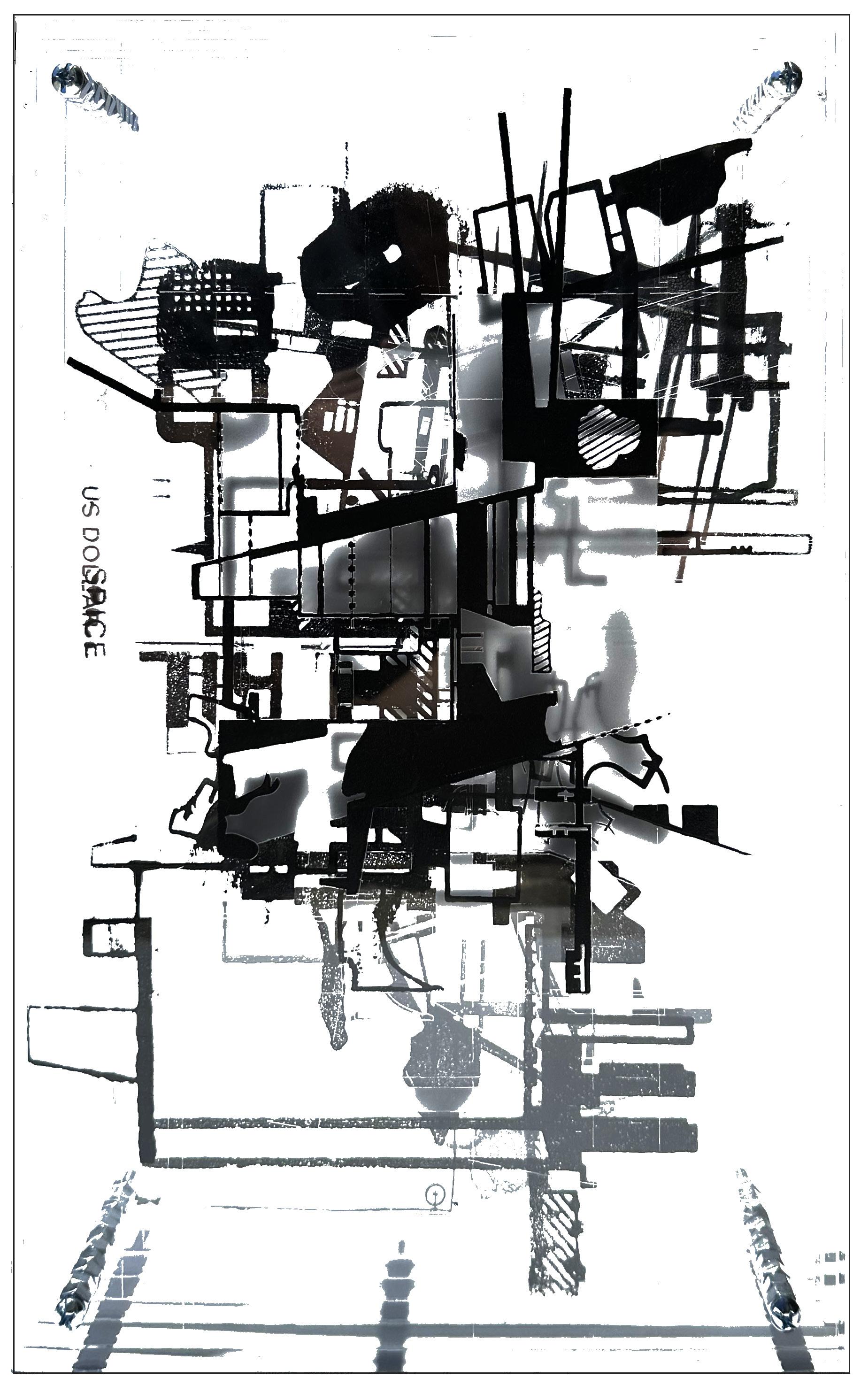
Greenbacks
Making money green was a late 19th century way to throw off counterfeiters - before the Civil War, currency was printed by state-backed and private banks in a variety of sizes. In 1861, the federal government began issuing its own currency to help finance the war. Bills would have the ink scratched off them to change the dollar amount or take photographs and pass them off as the real thing. To prevent this, one side of these bills was printed in a green-black ink which was less likely to fade according to Mark Anderson, a consultant at the Museum of American Finance, HENCE, the “greenbacks” nickname. Green also would not show up in black and white photos of that era (Crain, 2017), taking care of the second problem. Forwarding to 1929 when the federal government standardized the look, the green
on the back remained because green ink was durable, widely available, and associated green with “the strong and stable credit of the government” according to the U.S. Department of the Treasury’s Bureau of Engraving and Printing which designs and produces money. At this point, in an effort to lower manufacturing costs, the Federal Reserve made notes 30% smaller (GPO, 2024). Standardized designers are instituted for each denomination across all classes, decreasing the number of different designs in circulation; This standardization made it easier for the public to distinguish between genuine and fake notes. In 1996, the first significant design change in 67 years occurred to incorporate a series of new counterfeit deterrents (Chen, 2023).
Signified emerges in black ink.
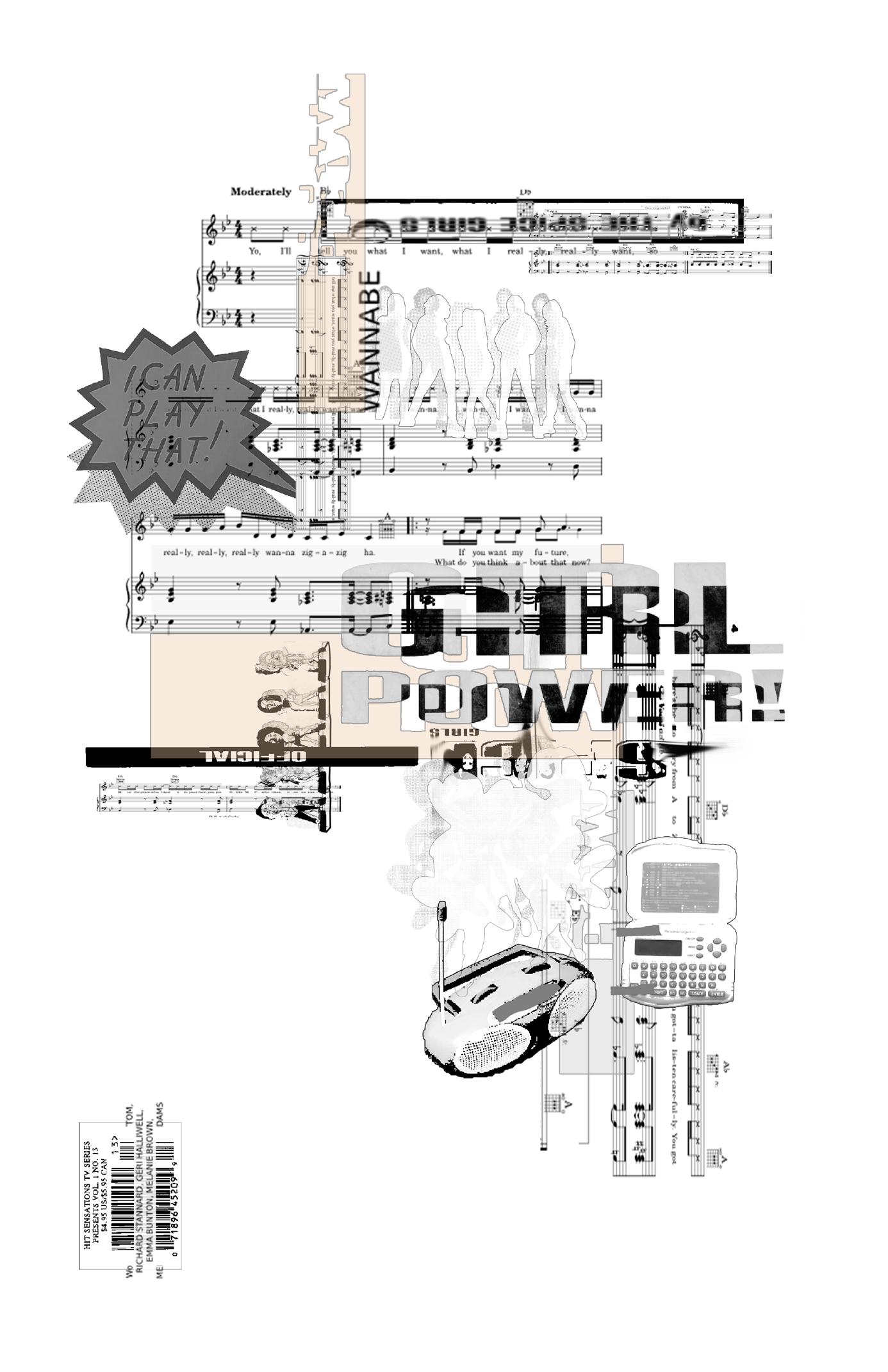
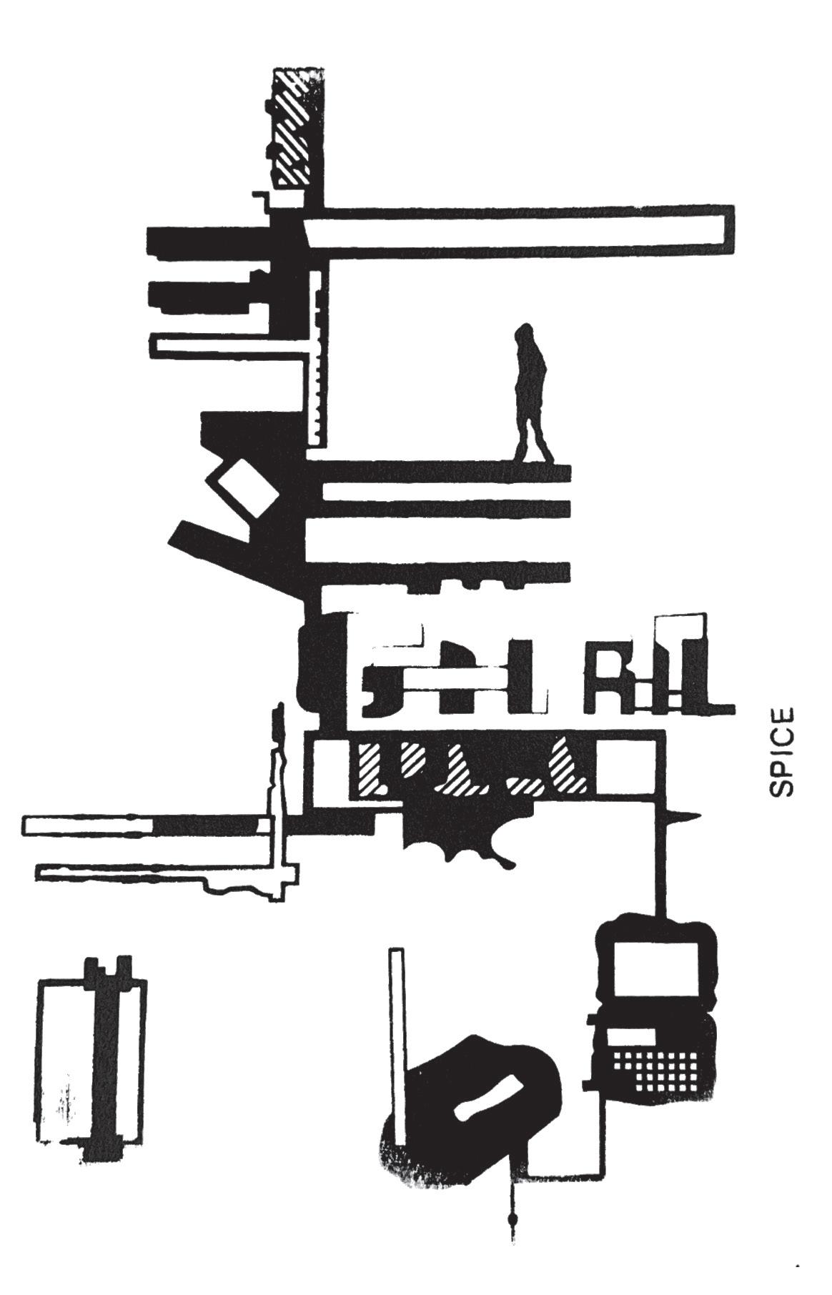
Manufactured Pop
On average, it took 2.29 seconds for a subject to recognize “Wannabe” by the Spice Girls (de Haas, W. & Wiering, Frans, 2010). The results were complied from a year-long study conducted where 12,000 people could play an Online game called Hooked on Music that contained 1,000 songs since the 1940s. Taking a deeper dive into “Spicemania”... How did the Spice Girls come to be. The casting call asked: Are you street smart? Extrovert? Ambitious? Able to sing + dance? (Taibbi, 2013). Hundreds of replies, five were chosen. The group went through roller coaster of issues with their original management, eventually leading them to steal their own master recordings from the office and find a team somewhere else. In order to get their debut album out, they would need a producer,
and with no management to help them look, they grabbed the first phone book they could find and called two other Elliot Kennedy’s before reaching the British producer they had in mind. In their first session, they composed four songs off the album (Leach, 2001). With these four in mind, the group wanted an upbeat tempo that would be the face of the album - thus “Wannabe” was born. The Spice Girls innovated the industry with their album in two ways: 1. The idea of songwriting identity, rock bands like Queen + the Sex Pistols had already been developing their own sense of space, but not yet in the world of “manufactured pop.” 2. Having a 50/50 split between them and their collaborators, having the ability to publish their own royalties, creating a closer sense to their craft.
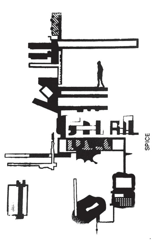
SPICE
“Wannabe” // Union + Solidarity between friends, power exercised by women over men.
“Say You’ll Be There” // self-explanatory.
“2 Become 1” // Bonding of lovers, sexually.
“Love Thing” // Not wanting to know anything about love after many disappointments.
“Mama” // Dedicated to the group’s mothers and deals with difficulties between mothers and daughters in adolescence.
“Who Do You Think You Are” // Presumptuous superstar life
“Something Kinda Funny” // Experiencing life together
“Naked” // Vulnerability of stepping into womanhood
“If U Can’t Dance” // Preconceived ideas about people and how they can be different.
Mixing pop styles throughout the album, the main message of their debut album - and their entire discography - is Girl Power + a sense of unity using methods both Madonna and Bananarama had used before (Dawson, 2005.)
Although the group received a multitude of critics aimed towards their sound, personalities, looks, their commercial success is undeniable, selling over five million copies in their first year, and hitting platinum ten times. (Leach, 2001)
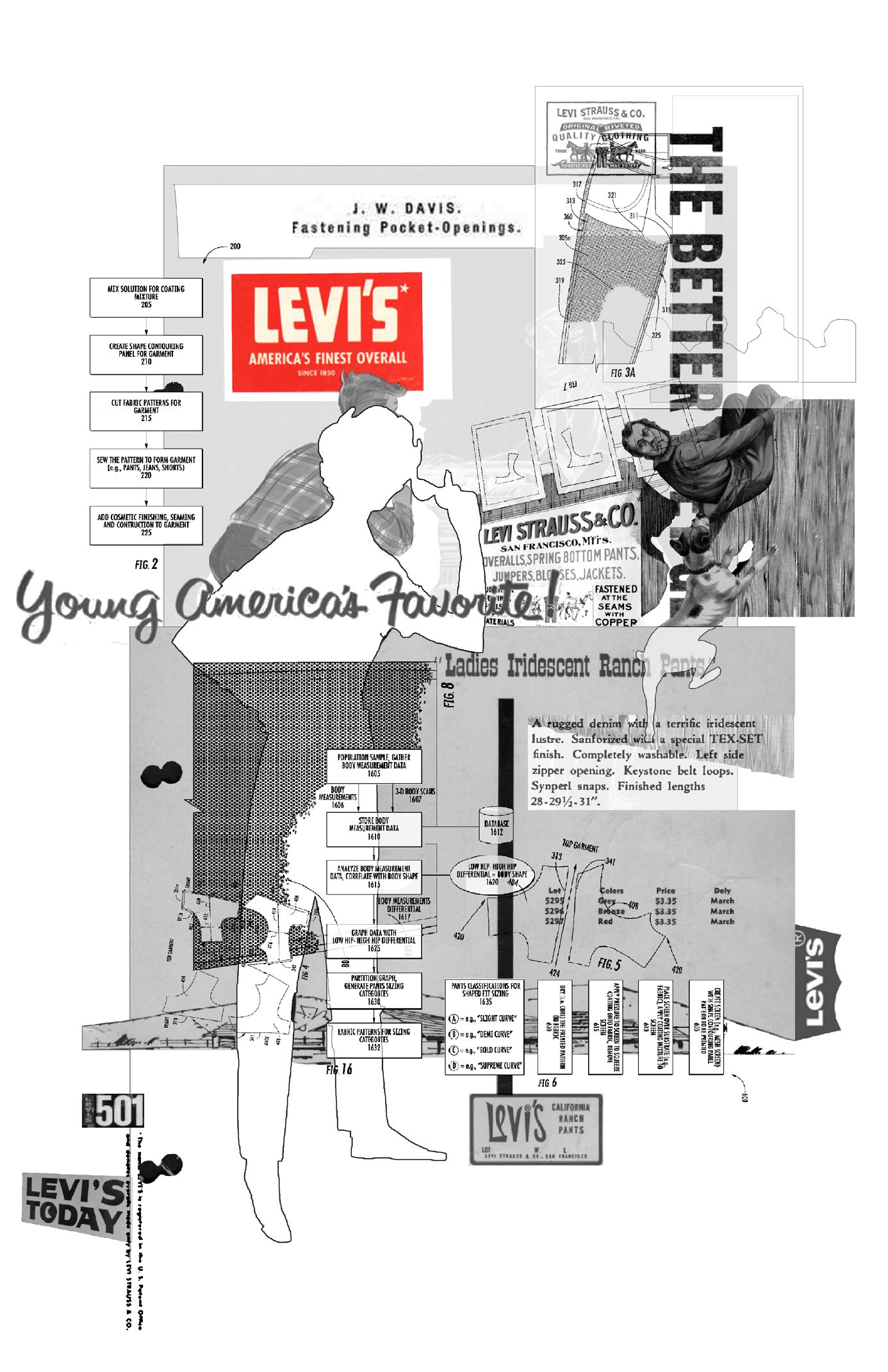
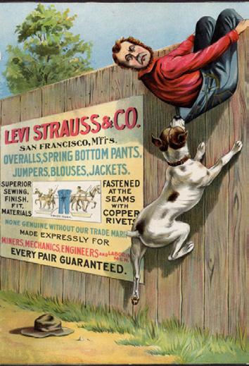
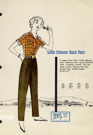
Red Tab Device
Founded in 1853 in San Francisco after Levi Strauss joined his two older brothers in 1846 in New York who owned an wholesale dry goods business. After making his way to California with news of the California gold rush, he opened his own dry goods business to serve the small general stores of the west, and had an important customer: a tailor named Jacob Davis. Davis had previously been tasked with tailoring a pair of pants for a local laborer that wouldn’t fall apart - he thought of the idea to put metal rivets at points of strain (pocket corners + base of the button fly.) The pants were a success and Davis knew he needed to patent the process but required a business partner - Levi Strauss, whom he had bought the cloth to make said riveted pants.
On May 20, 1873 the two men received a patent, and soon the first riveted clothing was made and sold (Levi Strauss & Co., 2019). Using the traditional fabric for men’s work wear, the “overalls” were a success until 1960 when baby boomers adopted the name “jeans.” Denim pants had been
around as work wear for many years prior, but the act of placing rivets for the first time led them to be called jeans. In 1886, the Two Horse trademark came about, depicting two horses attempting to pull apart a pair of waists overallssymbolizing the strength of the denim in the face of competition (Tulin, Laney, & Bieldfeldt, 2014). By 1934, Levi’s created the first ever line of jeans for women, who had previously been borrowing their husbands 501s.
The classic red Tab Device - legal name - has become the symbol of Levi’s, and in the 50s + 60s the company explored different colored tabs that would distinguish the different lines from one another. Due to the popularity of the jeans, the need to open offices in Europe and Asia was critical in 1965. Today, while Levi’s still stays close to their roots - constantly filing patents to protect the brand, and the company uses a research and development facility dedicated to design and prototyping.
Signified emerges in black ink.
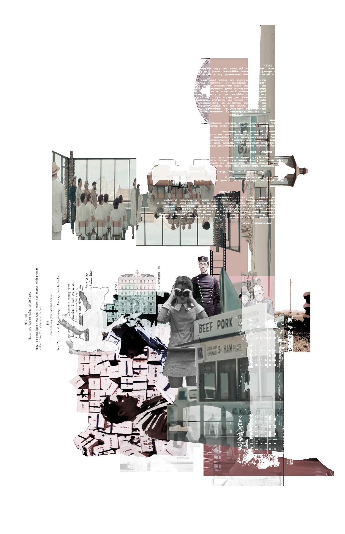
Mise-en-Scene
When someone thinks of a Wes Anderson film, they can typically call to mind the set up: an extreme close-up shot of an actor, perfectly in the center of the frame, with no emotion, or a sense of nostalgia brought by signifiers such as curated furniture, costumes, scenery, paintings, photographs or music. “With Anderson’s work being so instantly identifiable, often from a single frame ... No American director, not even Woody Allen, has a more recognizable aesthetic, a more consistent thematic style, or a stronger authorial voice” (Dilley, 2017). Anderson memorably employs deliberate shooting techniques such as slow motion and God’s-eye view to create his order. His style is credited with inspiring the new generation of indie films, such as Napoleon Dynamite, Garden State and Juno.
It seems as those whatever the film trend of the current time is, Anderson would be doing the opposite; If directors were leaning towards CGI &
3D in hopes of high box-office weekends, Anderson would shoot in stop-motion, if filmmakers were using HD film, he would still use old fashioned techniques such as mise-en-scene from the French New Wave (giving filmmakers complete control.) The New Yorker magazine film critic Richard Brody has written that “Anderson is one of the very few filmmakers whose images are instantly recognizable, whose name could even become adjectival.” On the flip side, his films have been called repetitive, small-minded, lacks deep meaning or self-indulgent. Anderson uses the same cinematographer, musical supervisor, and repeats actors across his films. A Wes Anderson film in general defies categorization: it is not a romance, and not an action thriller, nor a mystery, nor science fiction, nor fantasy, nor horror. Instead, each of his films is what could be perceived as a somewhat outrageous combination of elements of satire, fantasy, comedy, tragedy, farce, and drama.
Let's recap...
Recap
Each presented their own origin story:
After being known as a candy to curb cigarettes, PEZ needed to shift to an American market driven by children, and behold fruity flavors and bobble heads were assembled.
The US government was on a mission to lower counterfeits and discovered that green dye would fade less, and now the US Dollar will always be green.
The Coke Bottle as we know it emerged from the desire to ship coca-cola across the country + a design brief was sent out wanting a bottle design so recognizable, it could be known in the dark, or broken on the floor.
Five girls answered a casting call, and the result was an upbeat tempo that would be the face of their debut album - “Wannabe” by the Spice Girls which is still the most recognizable song since the 1940s according to a music study conducted on 12,000 people.
Levi’s became known as the most durable pair of jeans after a tailor had loyal customers reaching out to him for more.
Finally, Wes Anderson, who’s opposition to typical filming styles allow his frames to be instantly recognized for their scale, symmetry + composition.
Although different utilities, they share significance that include a pivot point + fear of being forgotten. On a deeper level, going back to the idea of the client, designer + maker, I realized that through these six collages, I was viewing these designed entities through the eyes of the client for their recognizability. Furthermore, in actuality - the intention isn’t realized in the commodity itself, but rather the emotion and experience the commodity has to offer .
The commodity becomes a spectacle.
Removing the designer from the action
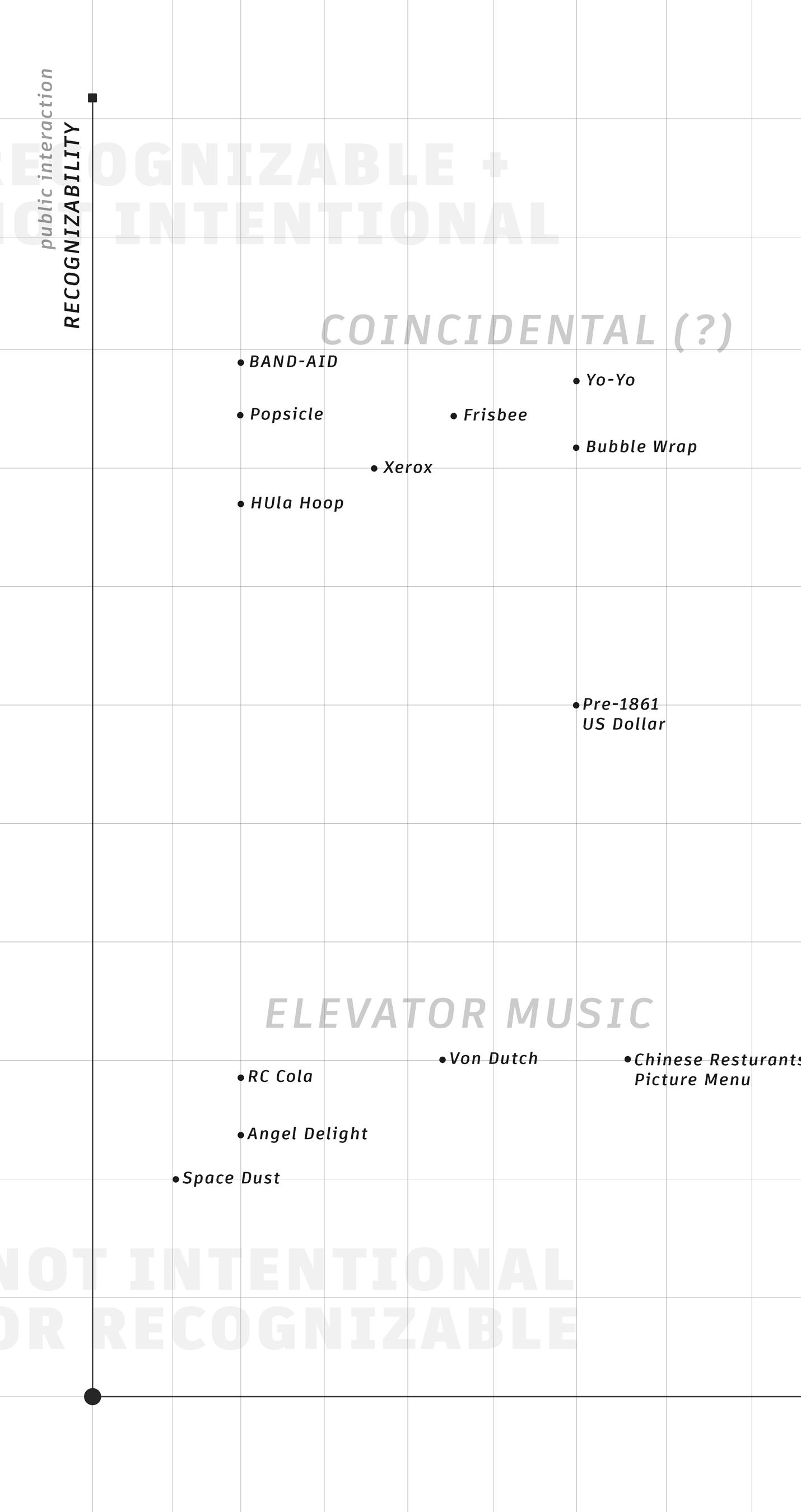
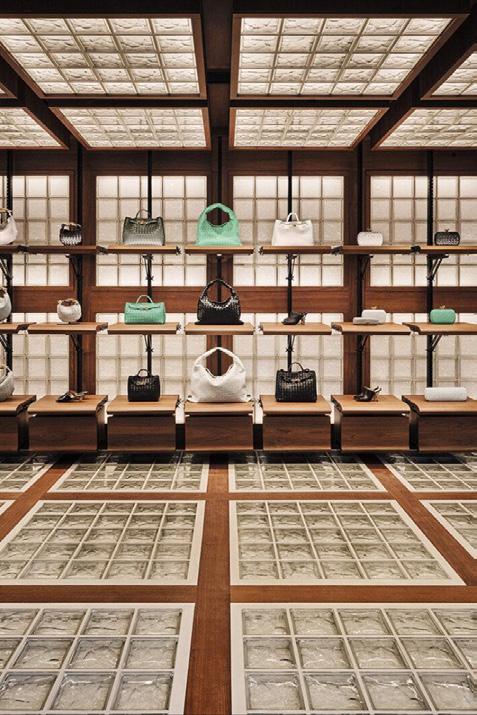
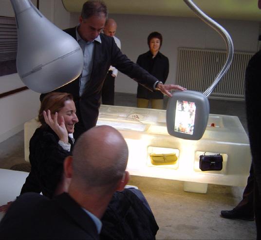
Elevator Music 1
The concept of a consumer-able entity being neither intentional or recognizable.
Search for Utopian Life + 1960s Philosophy
In search for meaning of the commodity as a spectacle, I decided to take a tangent off my original course. Currently, my hypothesis stands that the intentionality of a commodity is not realized with the product, but rather that it extends to the emotion and experience one is meant to feel / remember / hold post-purchase. The documentary Century of the Self (2002) directed by Adam Curtis was recommended to me in search for some foundational support for my hypothesis. The synopsis reads:
A deep examination about the rise of psychoanalysis as a powerful means of persuasion for both governments and corporations, and how it later helped influence the contemporary society of lifestyles and marketing (Curtis, 2002).
The docu-series follows Edward Bernays (1891 - 1995), the father of public relations + Sigmund Freud's nephew, and how he showed that Americans could want what they did not need in a way that connects mass-produced goods to unconscious desires to control the masses which resulted in a self-consuming society. Bernays was responsible for the shift in ideologies towards smoking Corporate America created humans that were essentially "Happiness Machines," and reasoned to emotion, not intellect.
Utopian life+
To root myself more in the era of when human association with consumerism went past the purchase, I dove into the practices of the 1960s.
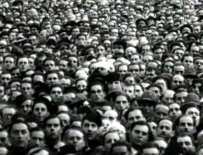
A fundamental use of submission in a post-war consumer filled America that linked mass produced goods to their unconscious desires - a shared mind of the crowd. The commodity is no longer a product, but irrelevant objects that become powerful emotional symbols of perception. “...Man becomes less active + more contemplative” -History and Class Consciousness (Debord, 1967).
There was no longer a danger of over production post-war and desires were given hierarchy over needs.
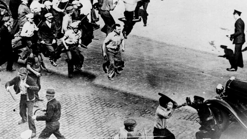
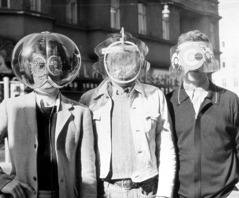
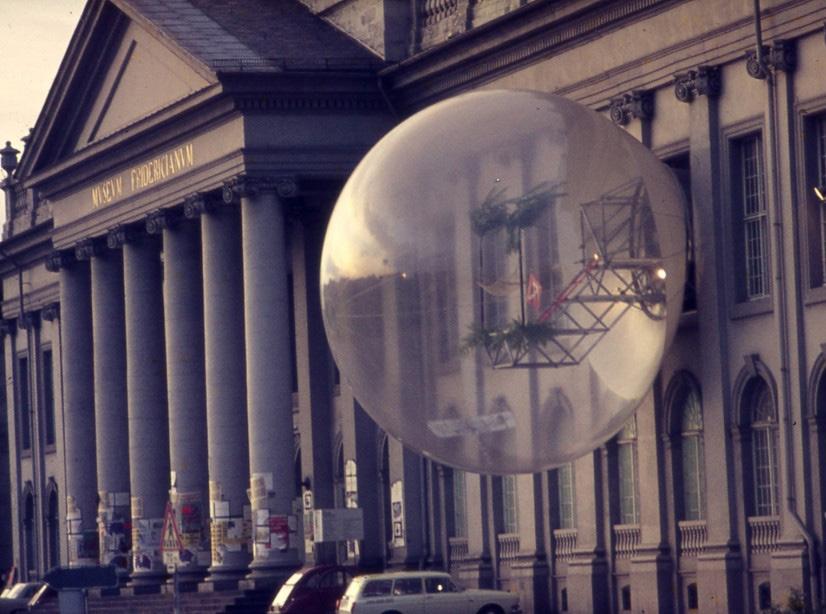
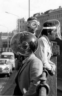
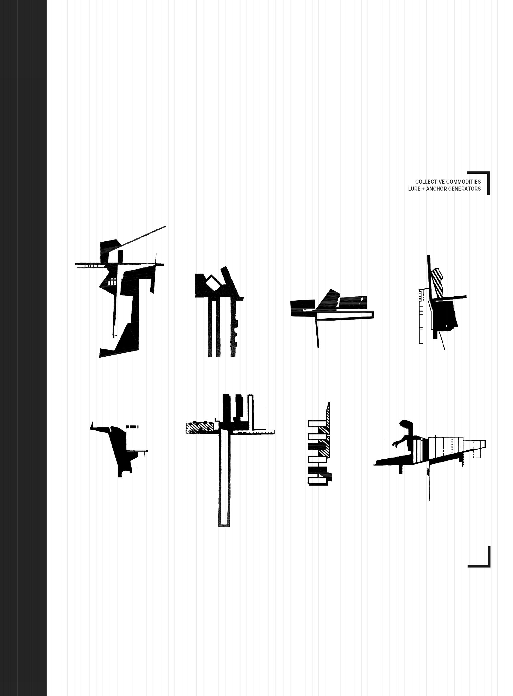
Over time, protests against corporations began to sprout up across the developed world that exposed motivation research and even architectural collectives such as Haus Rucker Co (_UL.05 - _UL.07), Superstudio and Coop Himmelblau who were rooted in Freudian principles that went against bourgeois lifestyles as seen in the Inflatable Movement² of 1968.
Although these efforts were commendable - companies simply pivoted to allow consumers to think they were in control.
A society that was “free” to create identity turned into one that you could buy. The notion that Americans were rejecting conformity was business’ greatest opportunity (Curtis, 2002).
1960s Philosophy
After learning about the influence of Edward Bernays, which implies a major influence of Sigmund Freud, architecture collectives began to protest the current model of time as mentioned before. The idea of the inflatable movement held a promise of mobility, movement, energy, and escape during an era of conformity.
More specifically, Haus Rocker Collective - a speculative architecture group that originated in Austria - used the societal climate to their advantage. They viewed architecture as a means of critique, and used society's awakening of corporation corruption as an opportunity (Moore, 2016.) They Used Situationist³ ideas of play as a means of engaging citizens, performances where viewers became participants and could influence their own environments, becoming more than just observers seen in installations such as Oase No. 7 (_UL.06) and the Mind Expanders series (_UL.05 + _UL.07)
3 A modern view of society as a series of spectacles, discrete moments in time, where the possibility of active participation in the production and experience of lived reality were eluded.
Nexus: 1960s + Collages
The question now is how to bridge the research that mainly concerned the protests of the 1960s with the six collages. The collages comprised of imagery that embodied the entityincluding original advertisements (_UL.08 - _UL.16) - The very thing that the protests were standing against: targeted advertisements + a loss sense of individuality. I sought out forms of representation that would tie all these loose ends, and help me iterate a process to find the commonalities I was seeking; That led me into the world of Printmaking⁴ - block printing, woodcut, etching, lithography, screen printing and beyond. Already knowing that the marketing giants era used the practice of screen printing to produce their advertisements, I thought it could be interesting to learn a new process that requires a new level of skill, and maybe shed a new light on the matter.
Advertisements during the second half of the 1900s regularly used screen printing for their marketing campaigns (i.e. Coca-Cola, Levi's, PEZ) because of the vast range of color choices of ink as well as the efficiency and accuracy of reproducing.
4
The artistic process based on the principle of transferring images from a matrix onto another surface - most often paper or fabric.
Original silk screens
Screen Printing
Screen printing, also known as silk screening or silkscreen printing, is the process of transferring a stenciled design onto a surface using a mesh screen, ink, and a squeegee⁵. The basic process of screen printing involves creating a stencil on a silk screen, allowing it to cure under a bright light after prepping the screen with photo emulsion, washing the emulsion once cured to reveal the stencil, and then pushing the ink to create and imprint the design on the below surface -in this case, Printmaking paper. The silk screens themselves come translucent with a number count that correlates to the number of holes per square inch in the silk. The higher the count = the more holes per square inch = a higher degree of detailed work as a result.
(Spira & Zanis, 2019)
The beauty of the silk screen - although I will admit was a learning curve - was that once the stencil was cured and washed, I essentially had a template for an infinite amount of prints. This helped me immensely later on in layering geometry for plan and section + iterating quite quickly.
TLDR:
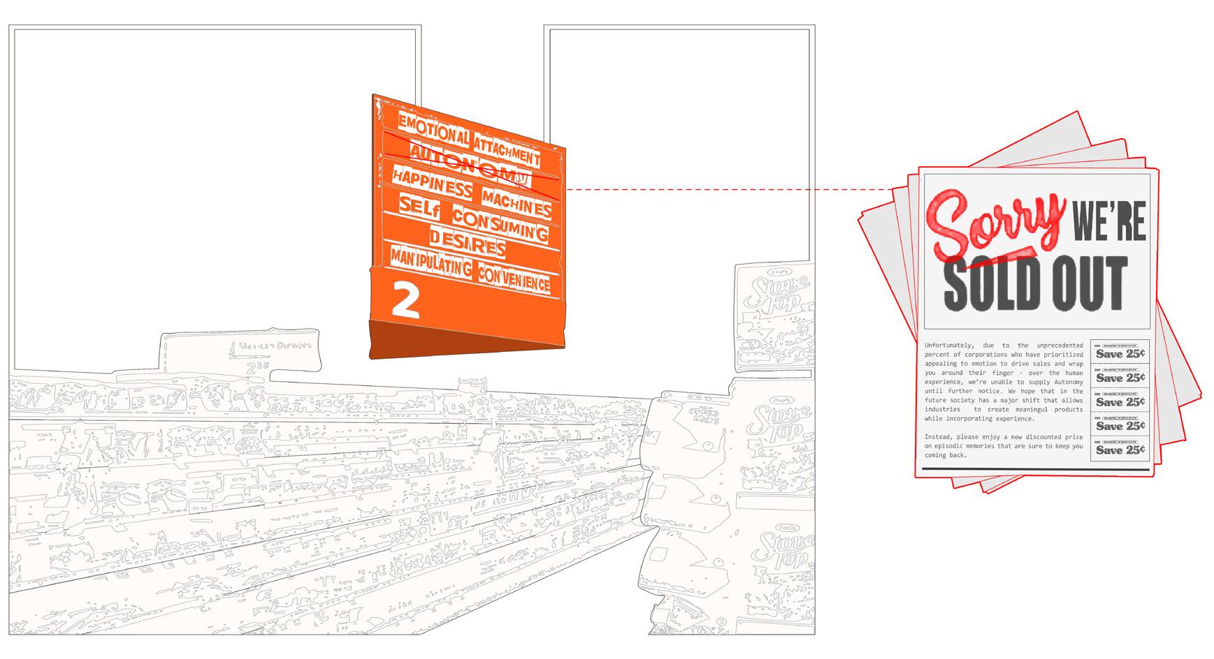
If Signifier⁶ = commodity, then Signified⁷ = black ink (Soon to be referred as "Hidden Persuader").
Screen Prints
After learning more about this history of this trans-formative era, I made an effort to strip down my original six case studies and critique. Diagrams were pulled from each collage that were meant to evoke the collective memory we share for these commodities. They were then created into stencils in order to screen print and reveal episodic-like memories of the original commodity with scale of their marketing strategies, hierarchy of brand identity + foreground/background in mind.
The signifier⁶ became the commodity, while the signified⁷ emerged in black ink.
Yet, the spectacle of the commodity doesn't end here. The spectacle extends to the places they occupy + live, the relationship between architectural environment + our individual perception of it.
Thinking of these spaces that commodity lives in, there are window displays, malls, hotels, and even hospitals that engage the user for biased reasons. Architecture has a commonality of utilizing the psyche to drive a person’s experience, without always prioritizing the journey. With this logic in mind, one route could lead me down to a grocery store. A false sense of freedom laid out by the bourgeois that we can engage in, with aisles filled with options, but in reality a path that takes precedence over the experience is laid out with one step inside.
Coca-cola : Object : The Hobble Skirt
PEZ : Object : Pfefferminz
U.S. Dollar: Object : Greenbacks
Spice Girls : Music : Manufactured Pop
Levi's : Apparel : Red-Tab Device
Wes Anderson : Film : Mise-En-Scene
_OS.02
_OS.04
_OS.06
_OS.08
_OS.10
_OS.12
Before arriving at the prints, vellum was laid over the original collages which expedited the process of extracting information to create the stencils for the silk screens. Keeping in mind the translucency of the vellum that bridged the collages and prints, the beauty of the screen print pushed me to layer them in order of least to most intentional + recognizable to the intentionality matrix⁸, a 3D spectrum.
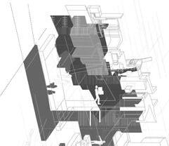
⁸ Refers to the matrix on _PAGE 10, a repository composed of a small sample of commodities and spaces positioned based on their level of recognizability juxtaposed with their intentionality.
Screen Printing 101
Step 1: Prepping your screen
Whether you choose to buy your screen or make it is up to you, but either way you will need to apply masking tape to the edges of the frame to stop the flow of emulsion.
Step 2: Applying Photo Emulsion
Mix the emulsion per instructions. In a dark room, hold the screen at 80 angle, and apply the mix at the top of the screen across the length. Take the squeegee and apply a thin layer of the mix down the length of the screen.
Step 3: Drying your Screen
Lay the screen flat side up in a dark room to dry - preferably overnight, but a minimum of 4 hours.
Step 4: Exposing your Screen
On the flat side of the screen, place your transparent paper with your image or your stencil in REVERSE on the screen, and place a piece of plexi-glass on top to ensure the image is in contact with the screen. Shine a bright light on the image, and let cure for around 20-45 minutes depending on the strength of the bulb, and the distance away from the image.
Step 5: Cleaning your Screen
Using a water spout with pressure, clean the screen. If cured properly, only the area that was not exposed to the light will wash away, thus revealing your printable image.
Step 6: Preparing to Print
Place your desired paper on a flat surface, and place your screen flat side down, marking it over the paper.
Step 7: Ink the Image
Double check that the screen is secure. Place a line of ink at the top of the screen and use the squeegee to glide the ink gently across the length of the screen to flood the image. Lift the squeegee straight up at the end of the screen. Repeat with more pressure to ensure the ink has transfered through to the desired paper/fabric.
Step 8: Finishing
Lift the screen straight up to reveal your design, and let dry.
Step 9: Repeat Endlessly.
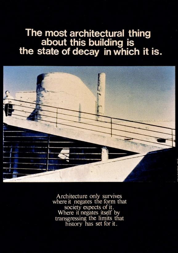
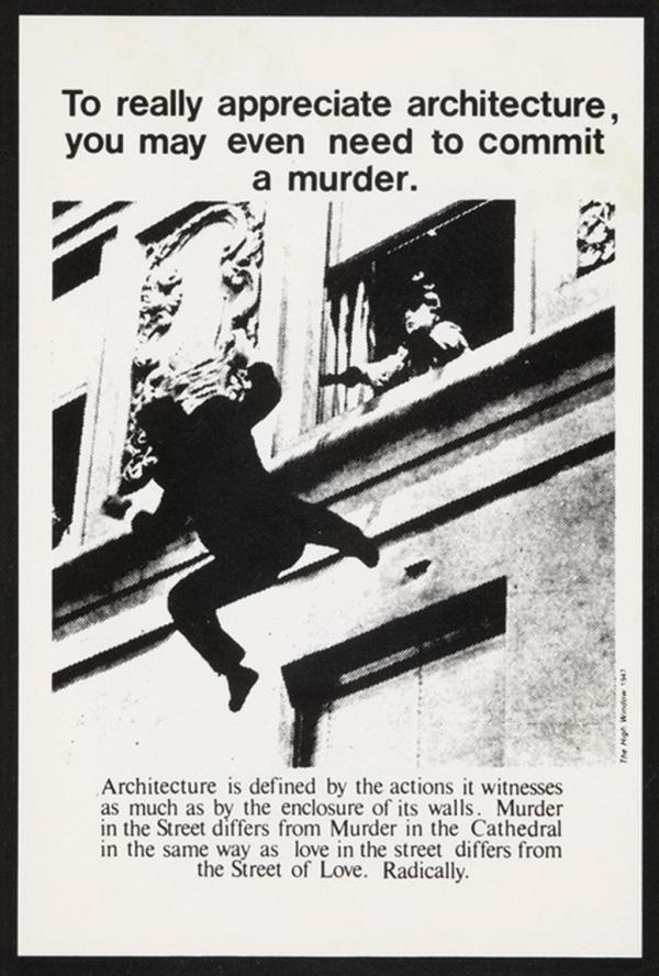
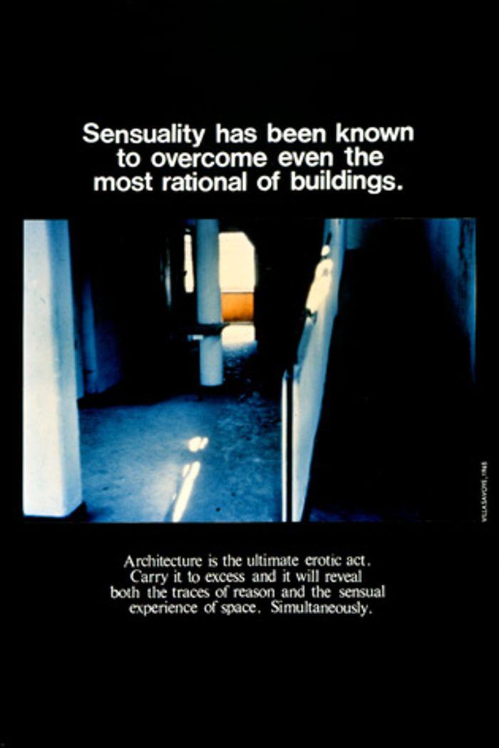
Using the idea of the Grocery store, and assuming the experience of the commodity doesn't end with the product - I took the prints, and created my own version of Bernard Tcshumi’s Advertisements (_SP.14 - _SP.16)a means of communication beyond built form. Do they pull out the same type of emotions / desires as the real product? From here on out I will refer to them as Hidden Persuaders⁹, as I see them as the underlying signifier of a purchase.
If the product is not as important as the emotion + experience after purchase, then maybe the meaning extends to the experience, and where it lives becomes invaluable - the Grocery Store roots itself in my mind.
_SP.08
_SP.09
_SP.10
9 A graphical extraction of the signified, more specifically, of a consumer-driven purchase.
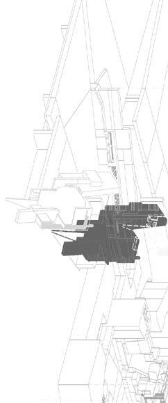
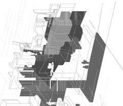
The Grocery Store
My exploration thus far has opened my mind to the strong connection to the Grocery Store. Architecture has a commonality of utilizing the psyche to drive a person’s experience, without always prioritizing the journey. A false sense of freedom laid out by the bourgeois that we can engage in, with aisles filled with options, but in reality a path that takes precedence over the experience is laid out with one step inside.
Enter: The Grocery Store
Grocery Stores are meticulously laid out, and promote a certain flow that leads to unnecessary purchases and a feeling of freedom. This relates to my exact realization that the point of a purchase on the commodities I analyzed isn't the actual goal, but rather the experience the purchase gives you. There is always a signifier (i.e. the product) and the signified (i.e. Hidden Persuader) The Grocery Store is just the physical embodiment of everything I've been curious about.
So, why a Grocery Store?
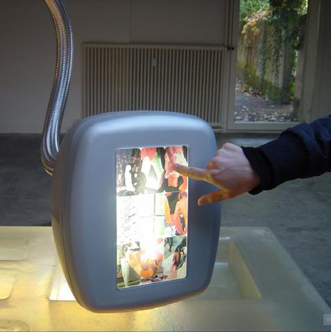
Window displays, malls, hotels, boutique stores and even hospitals are known to engage the user for biased reasons made possible with financial backing. Herzog & de Meuron are known for their partnership with Prada (_GS.02, _GS.04_GS.06), where they allow each company to do what they do best, usually revolving a high budget in order to produce at the quality expected of a luxury house. This creates a curated experience for the user that is highly crafted and meticulously which results in a return on investment. Everything from the entrance to the lightning, the finishes,
the scent and the shelves these consumer products lay on.
On the opposite end of the spectrum, Grocery Stores are built based off a prototype that maximizes efficiency of product placement, but also increases the percentage of unnecessary purchases. My thought was what if something as accessible, common, and almost forgotten such as a Grocery Store was treated in the same way fashion houses + boutique stores were... Prioritizing experience and interaction over economics, and amplify what's already known.
_GS.06
_GS.08 _GS.04
_GS.05
_GS.07
_GS.09
reality we’ve been given, even to the point of radially ranking the shelves based on highly ticketed items being eye level.
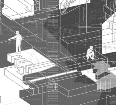
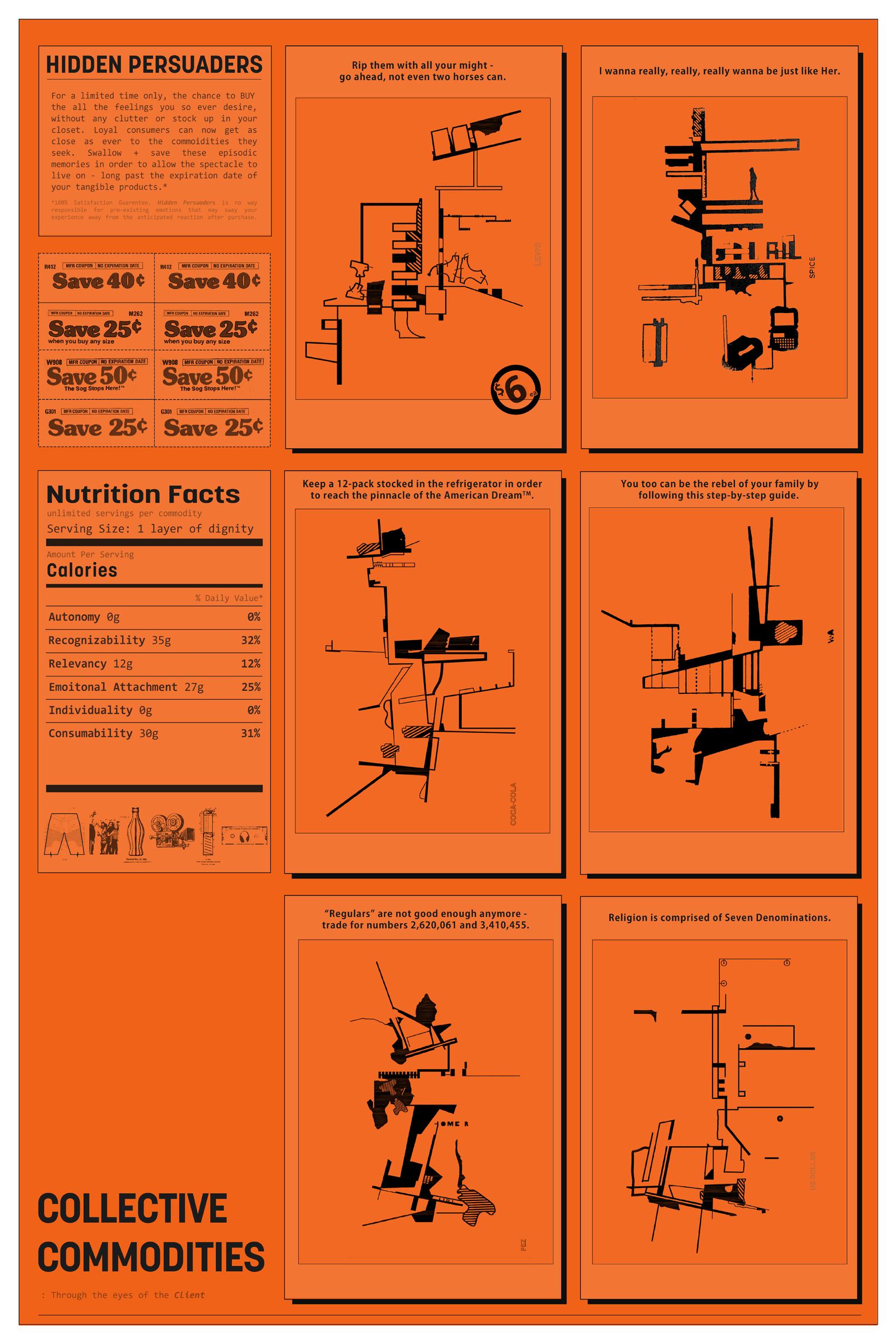
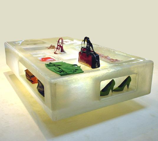
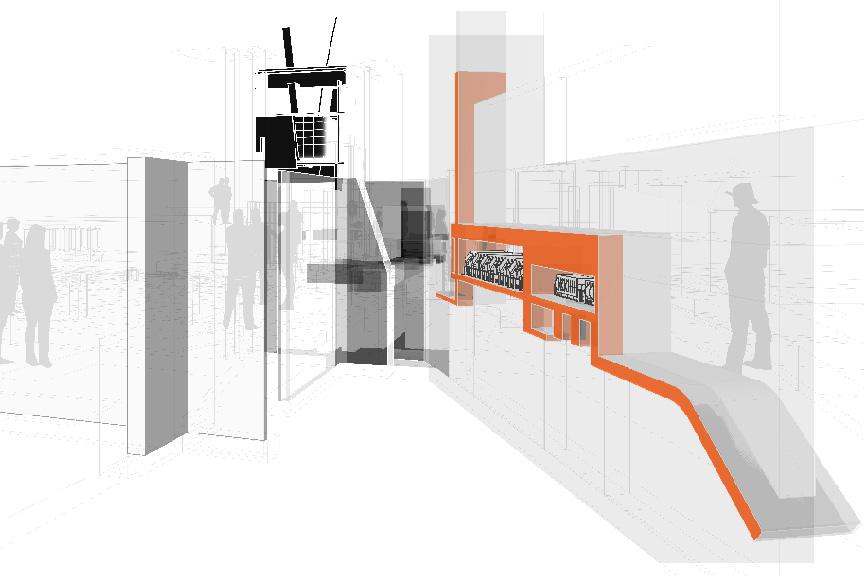
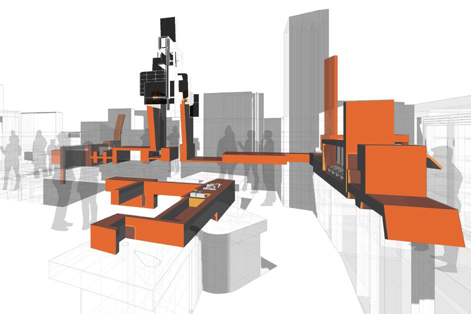
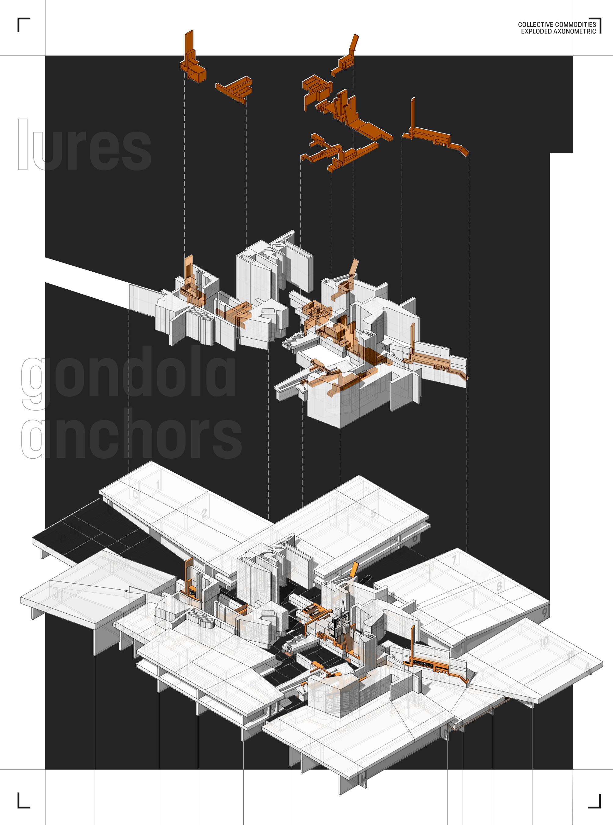
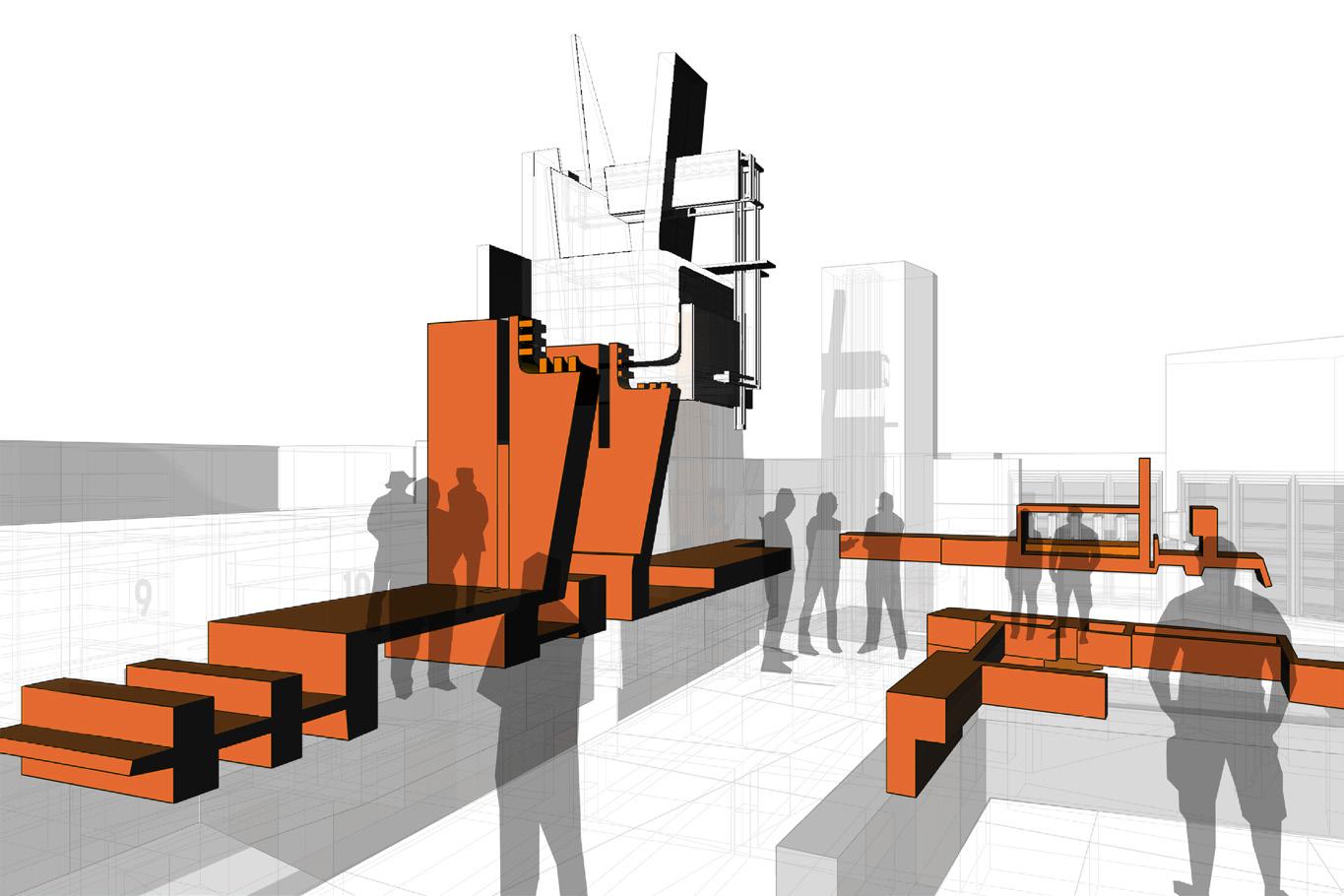
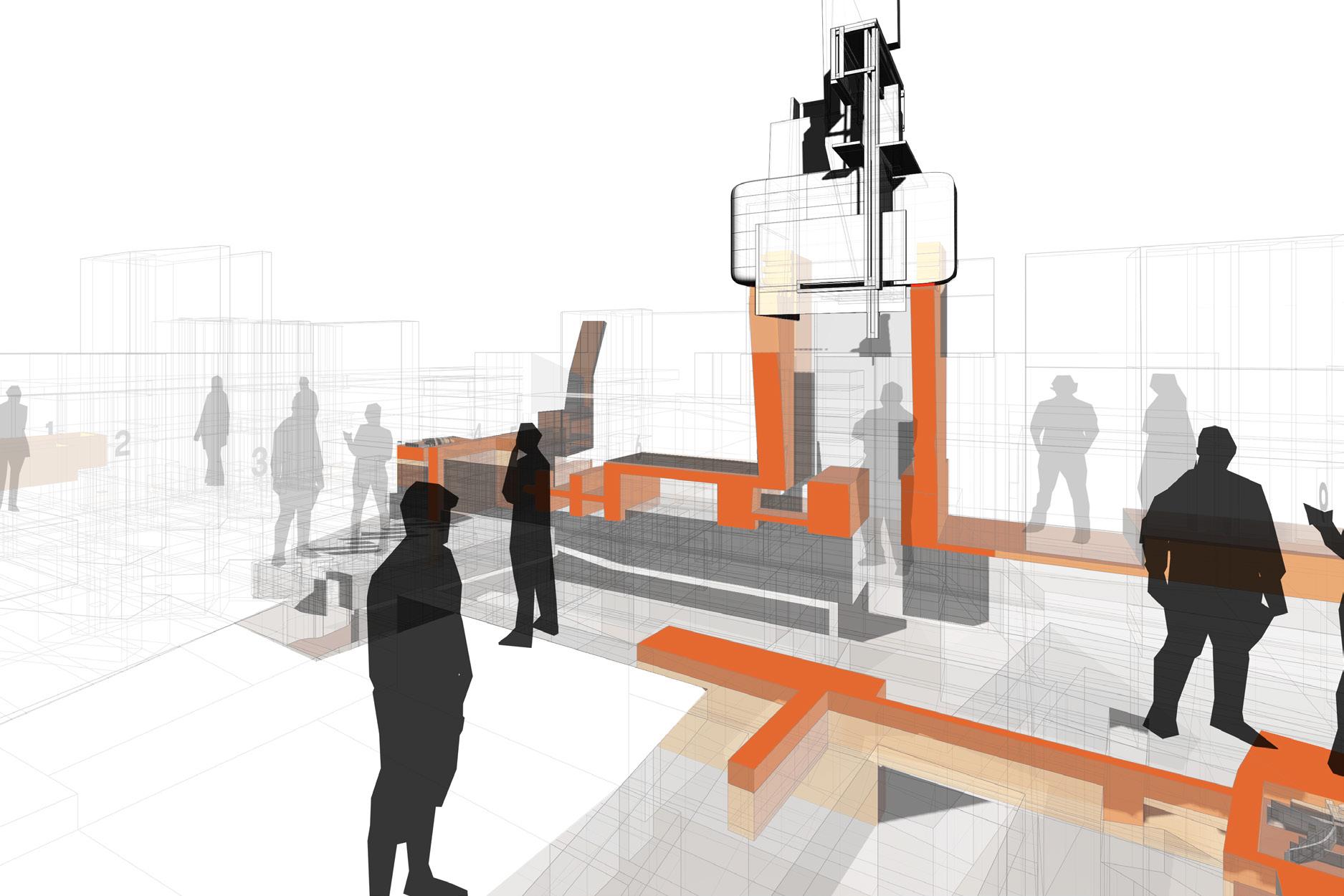
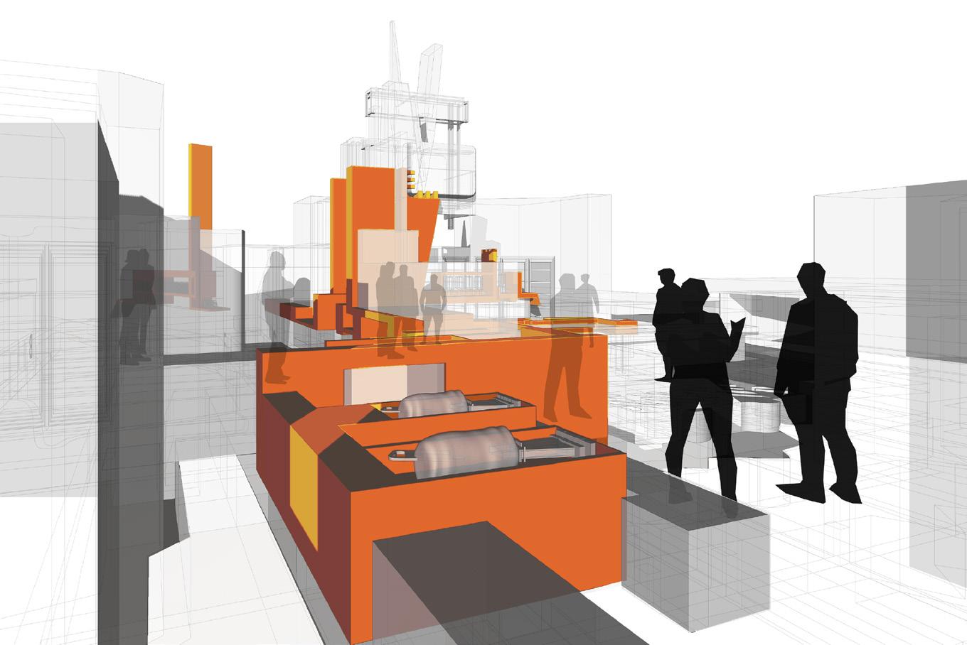
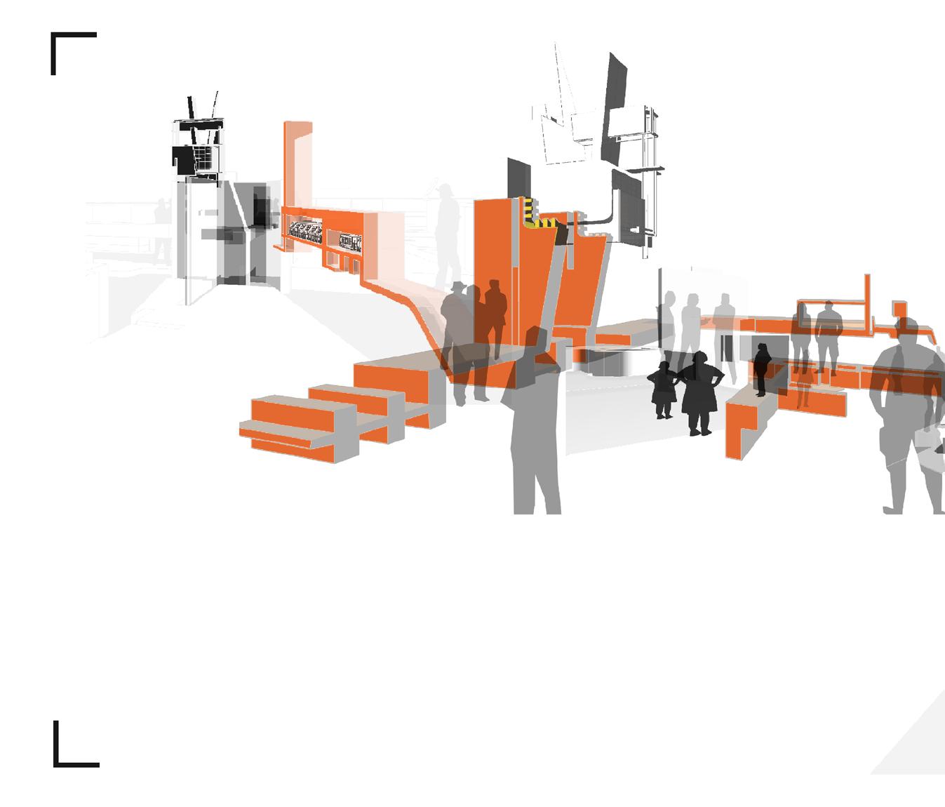
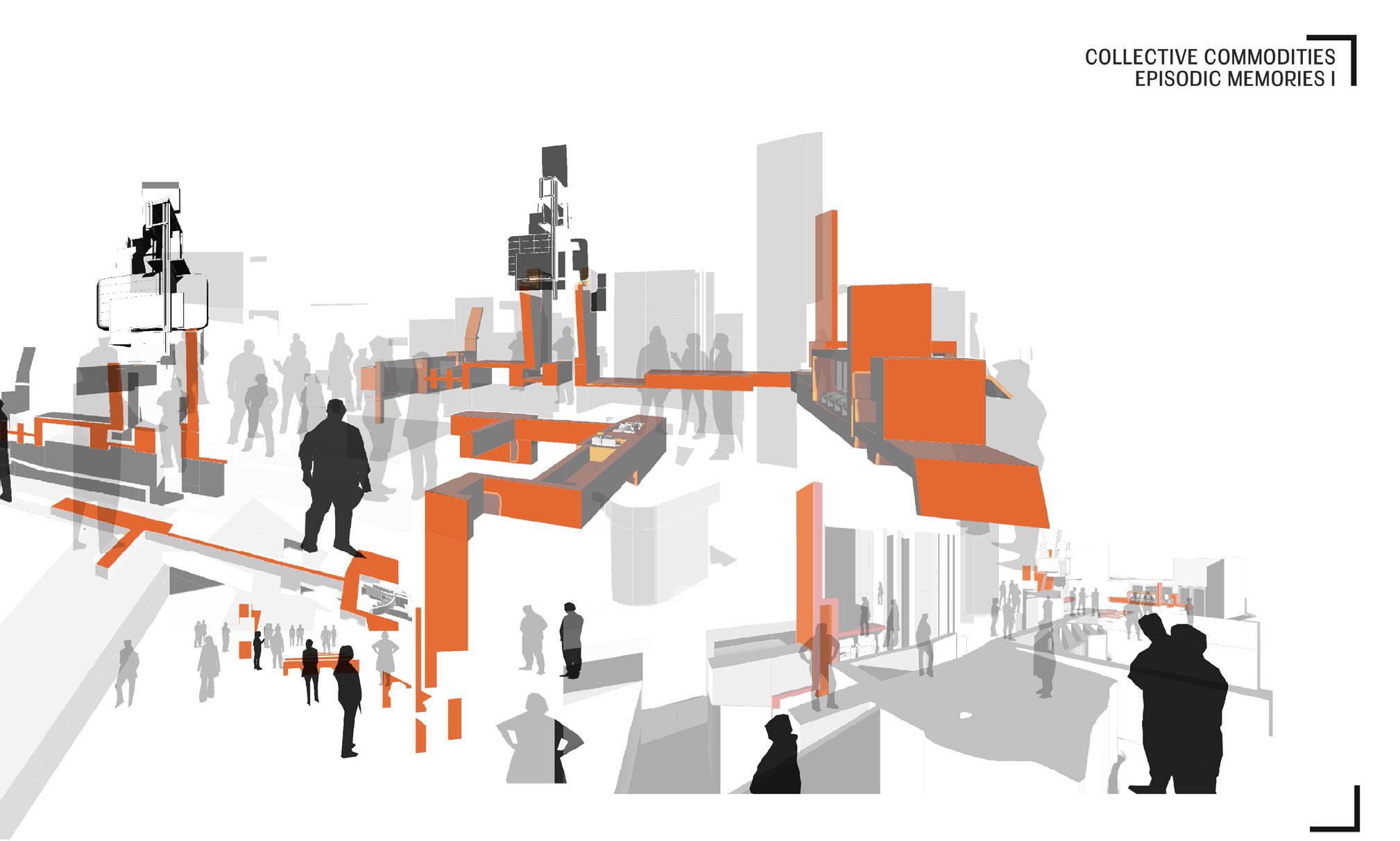
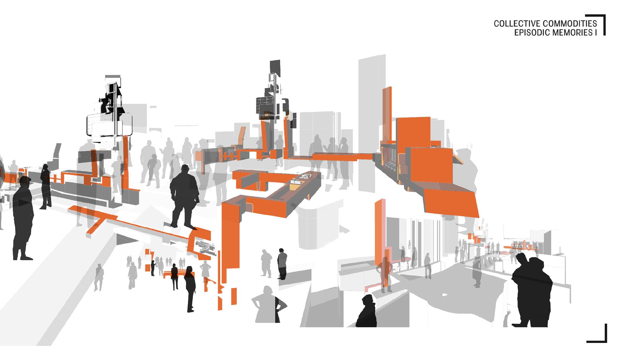
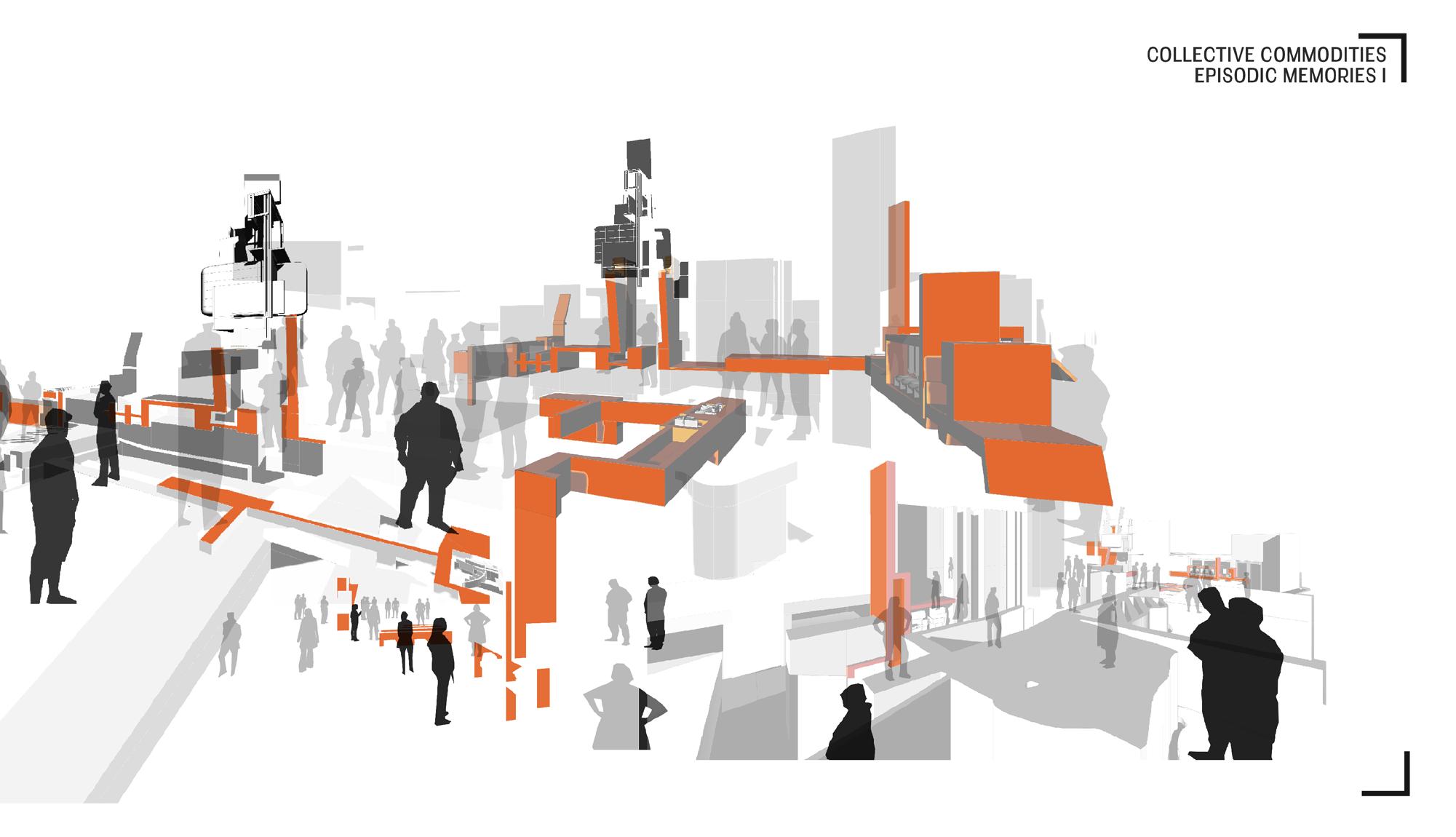
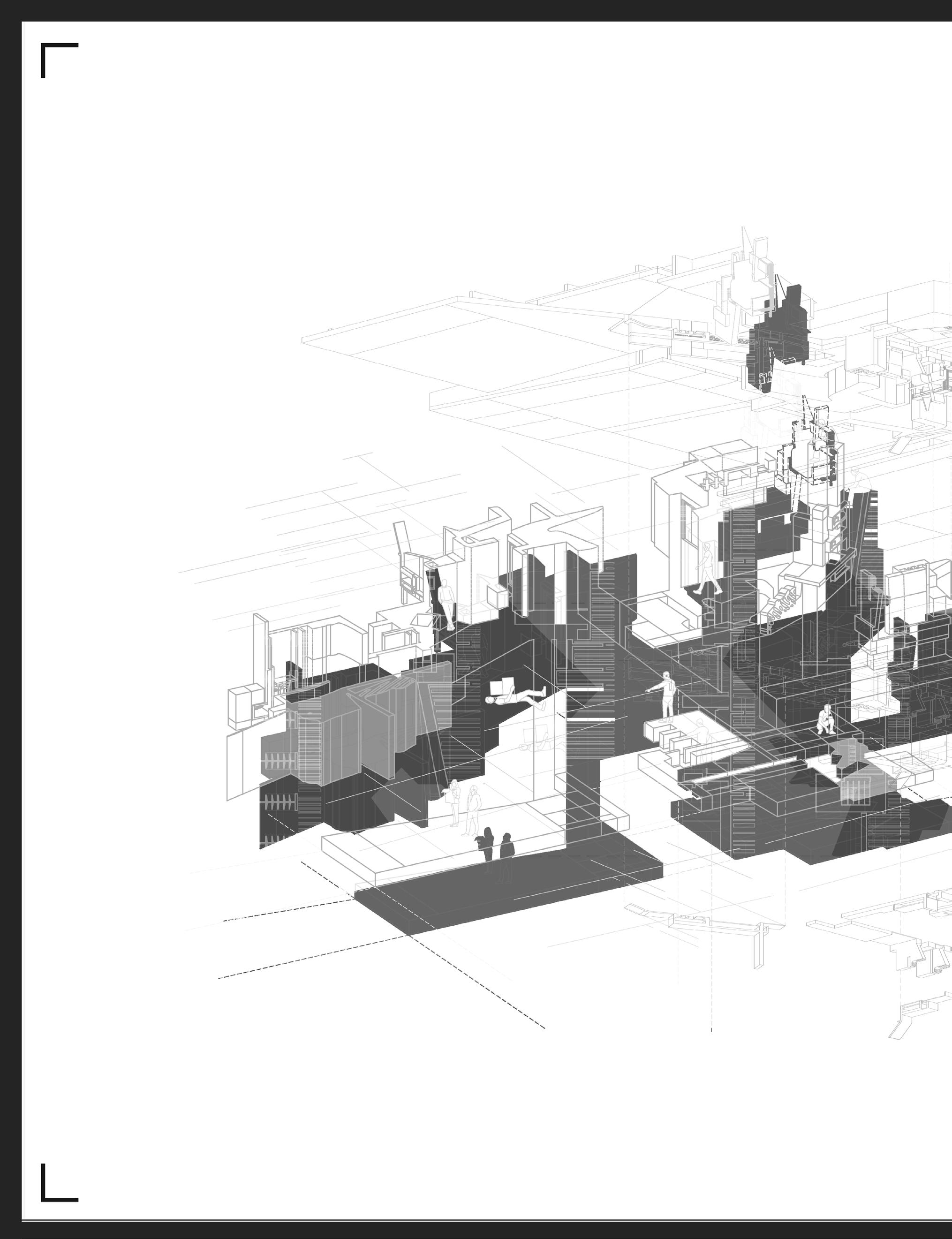
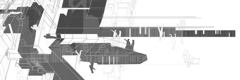
Lures
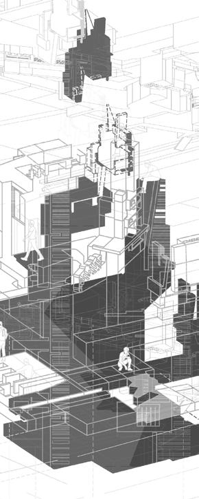
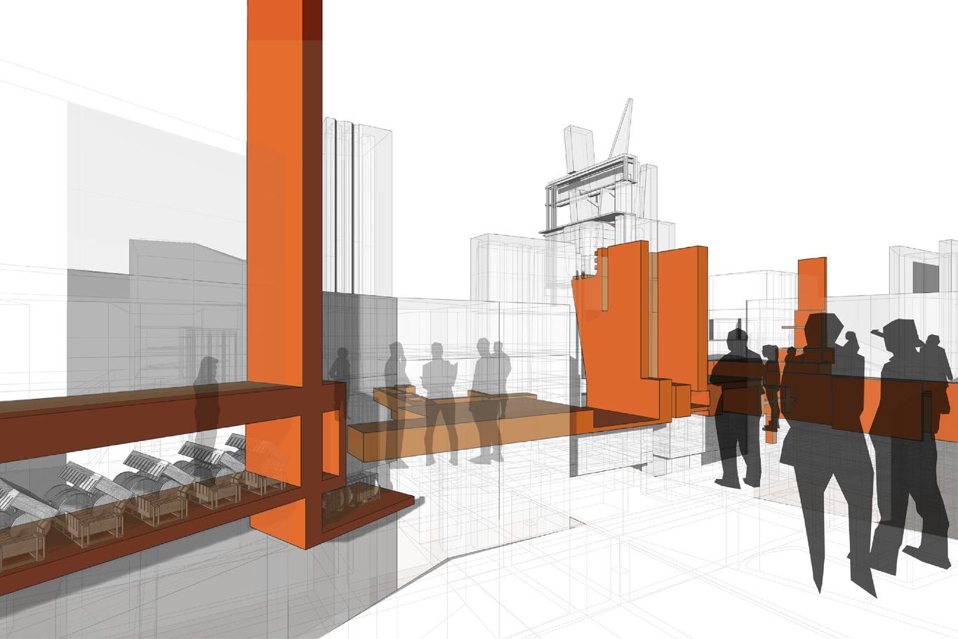
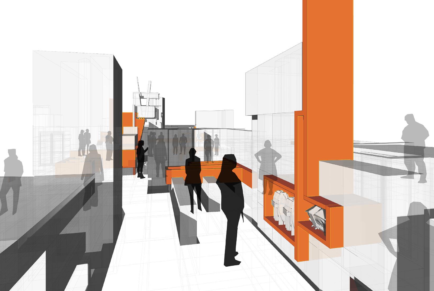
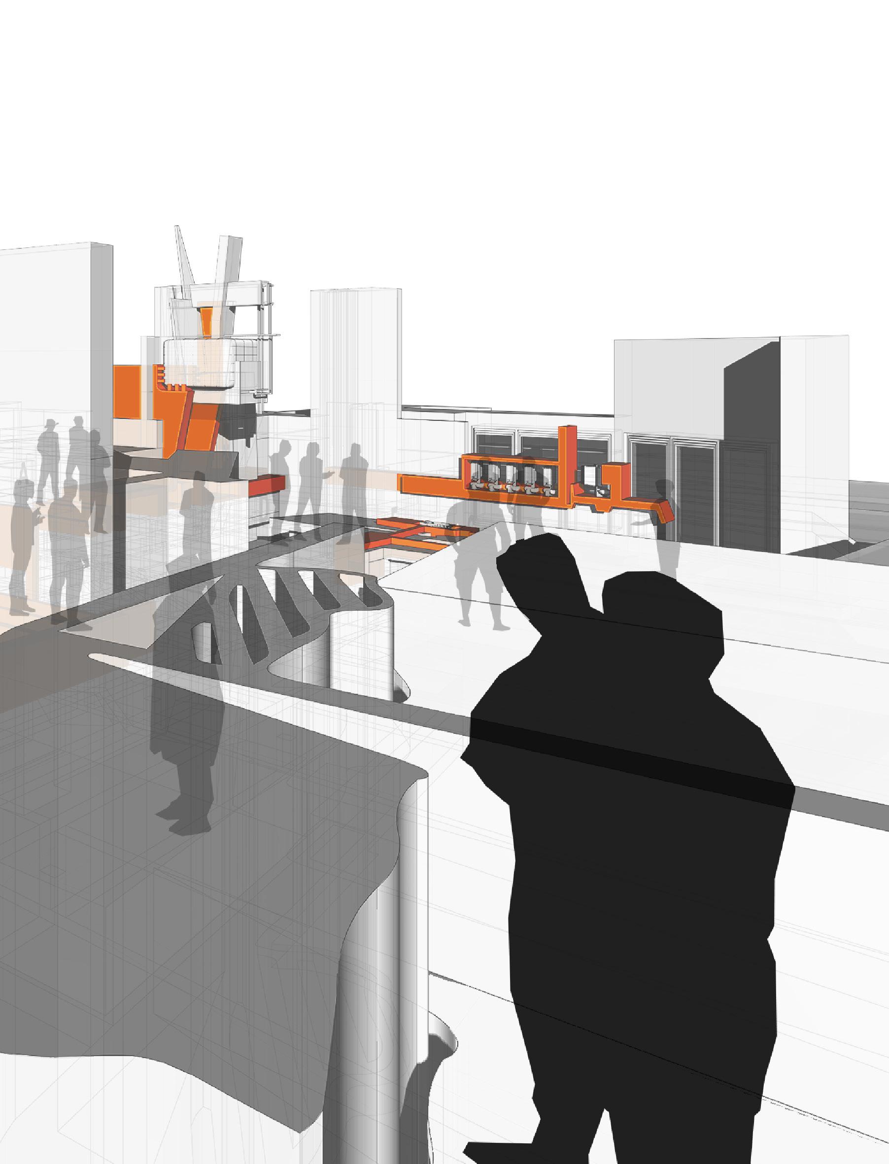
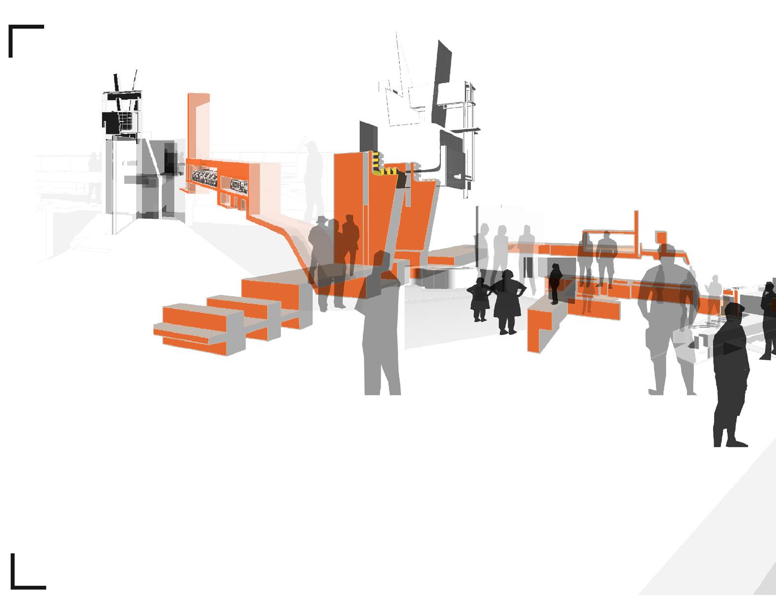
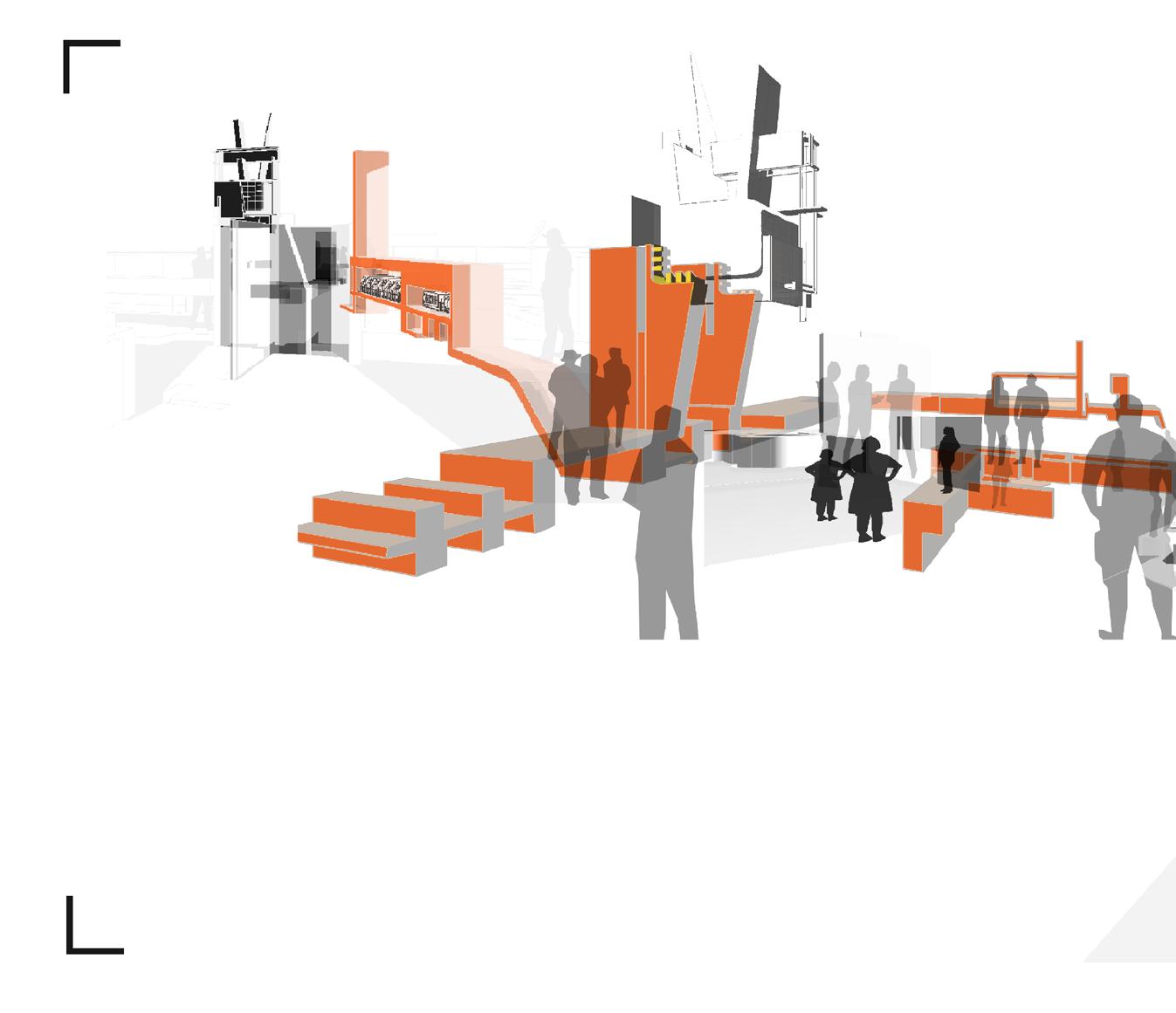
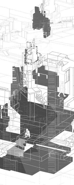
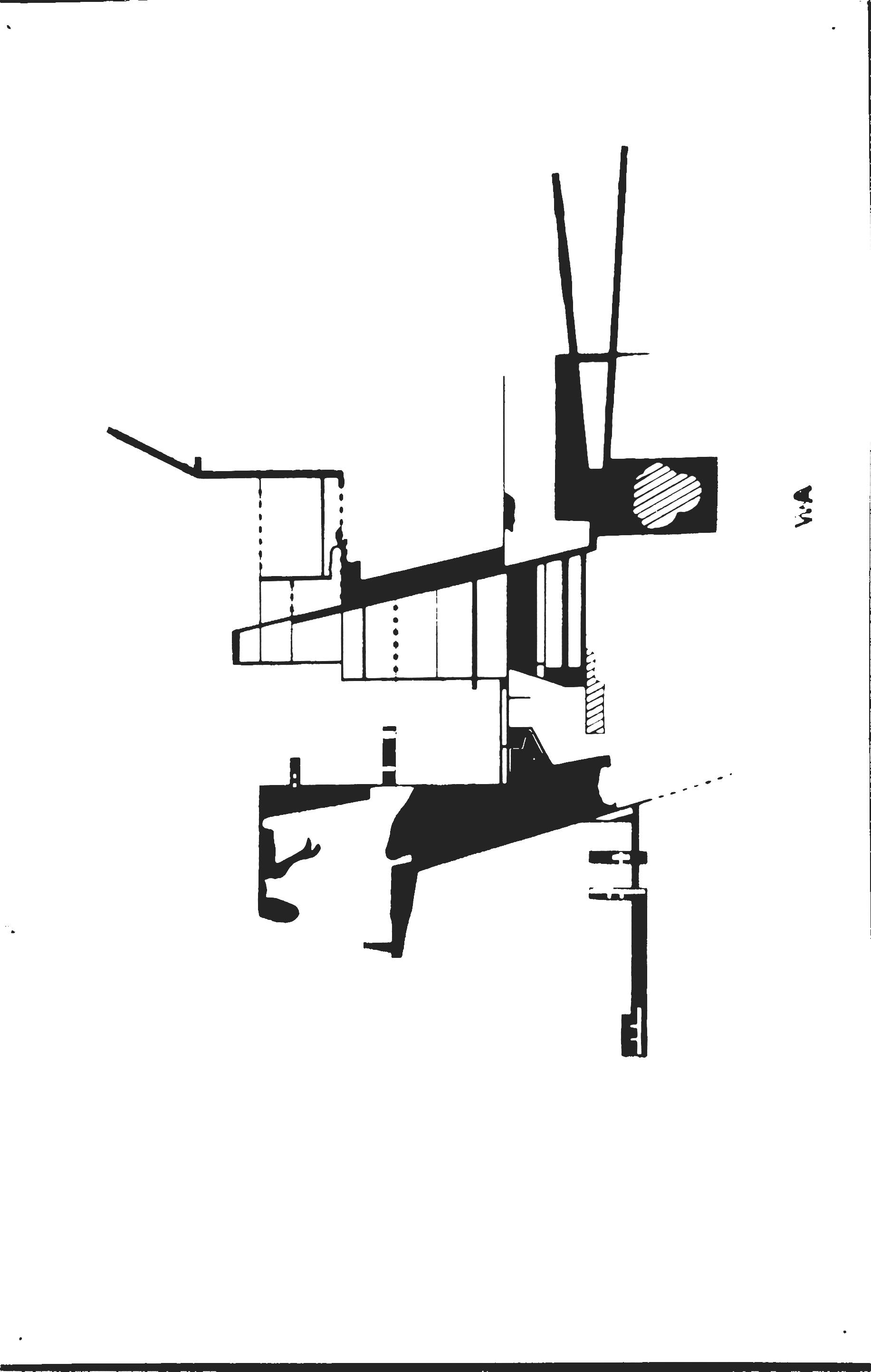
Taking the original prints, I extracted components and compartmentalized them in two sets: Lures10 - shown in negative, and gondola anchors11 - shown in positive. Screen printing helped me run through several iterations where the anchors rooted themselves into a field that vertically contracted the space so the lures could then carve into occupy the figure and become support for potential irrelevant objects. Pairing the two created an agency where users could discover a possible path, all equitable, rather than following the path. Instead of reinventing the concept of a grocery store, I leaned into the frivolous principles these corporations hold in high esteem and amplified their ridiculousness.
_GS.19
_GS.23
Conceptually, a visual enticement. Functionally, a holder for frivolous commodities.
Vertical, visual blockers in which the Lures latch onto.
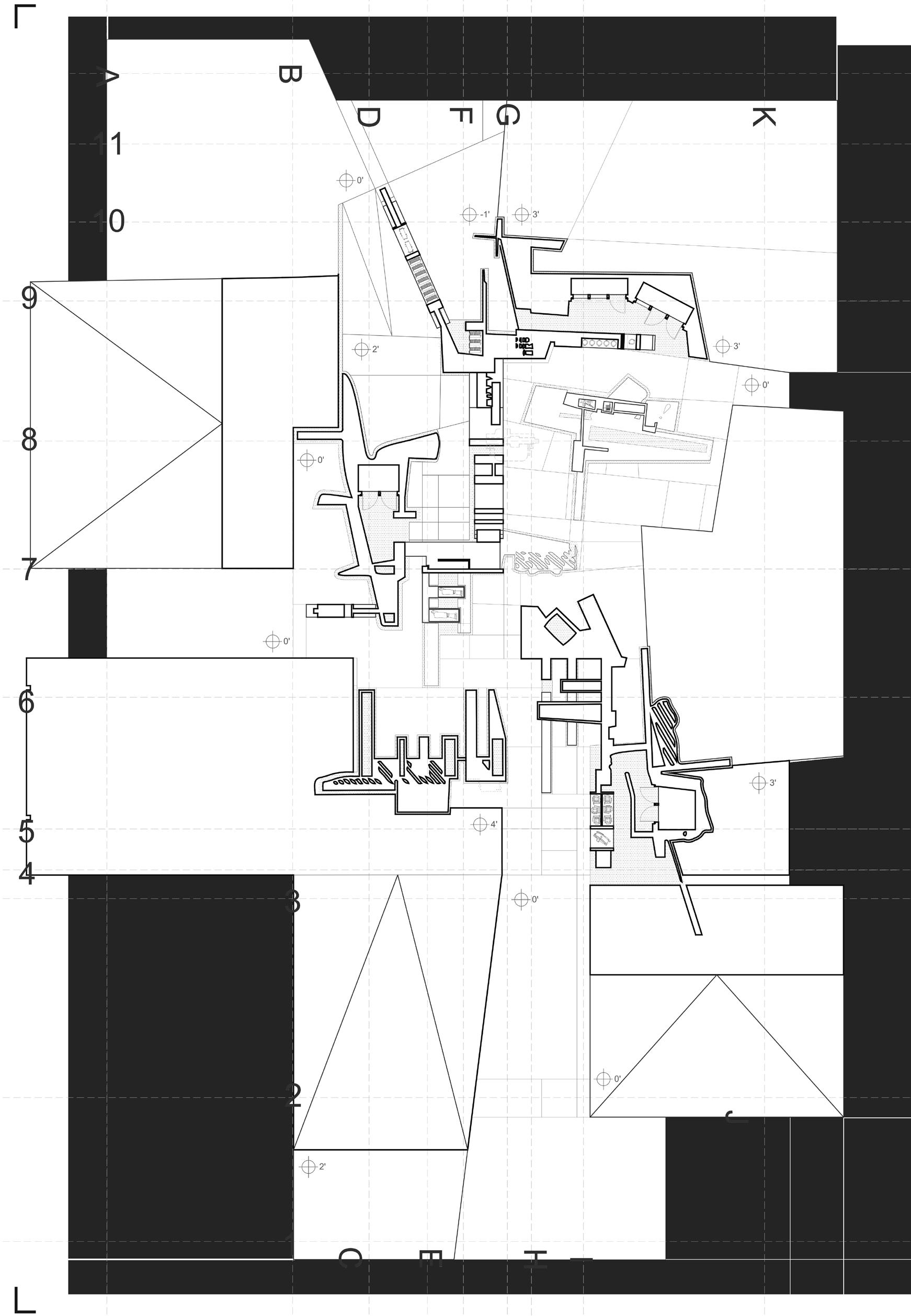
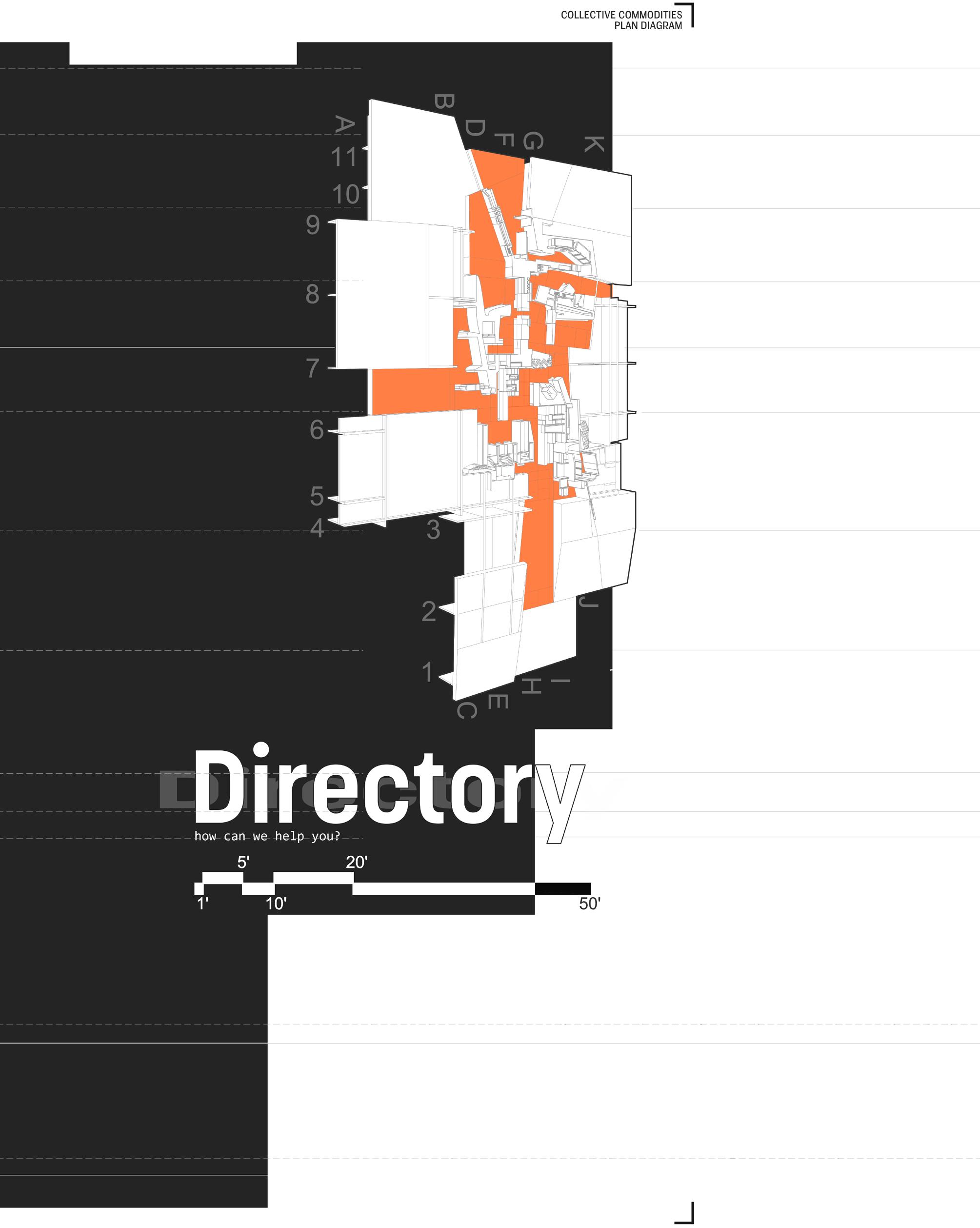
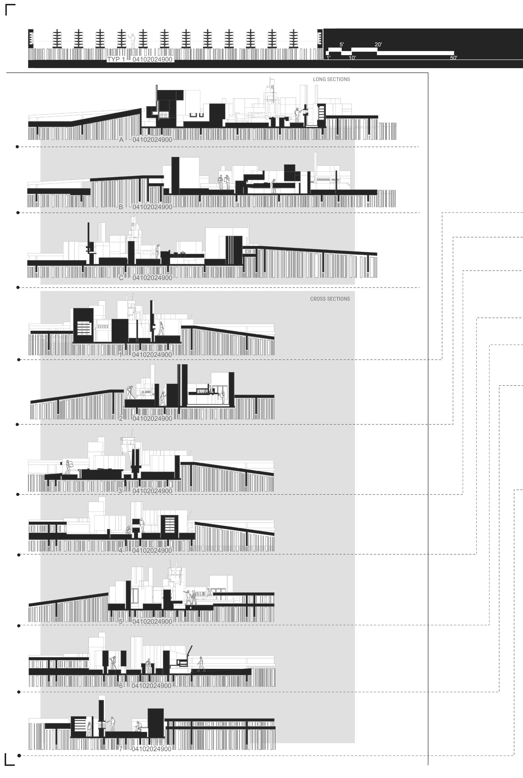
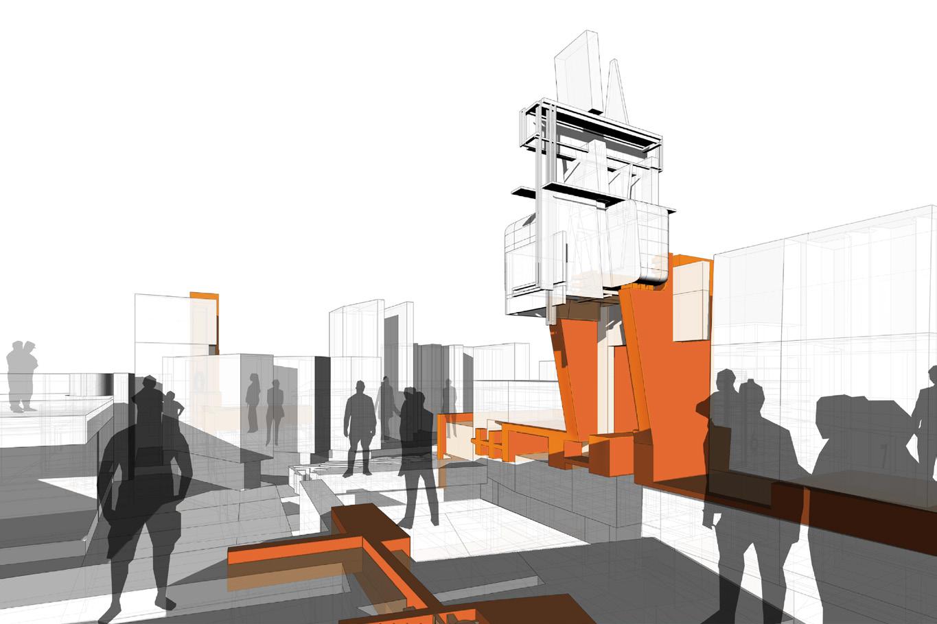
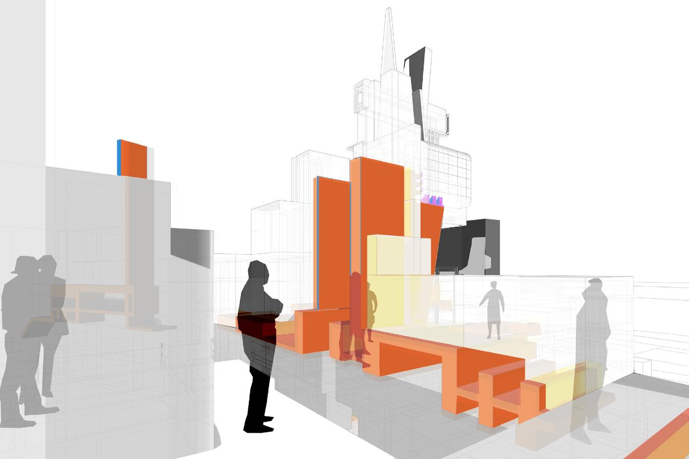
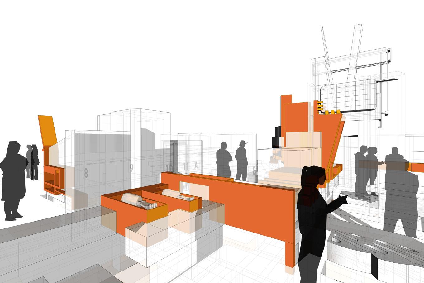
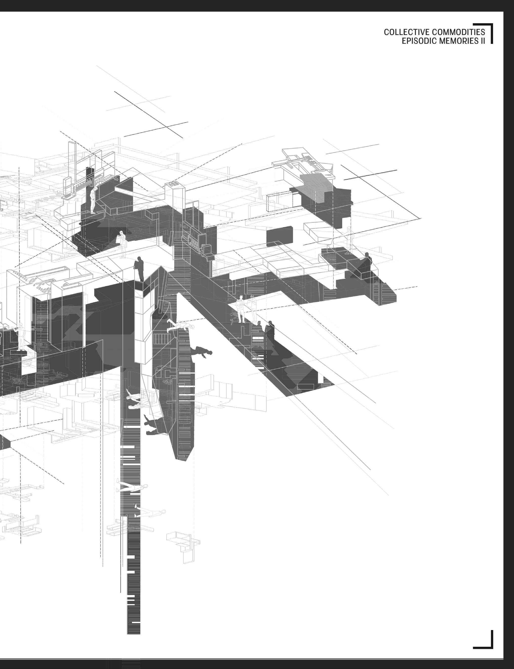
The Directory takes the rough square footage of a typical store and shows a snapshot of something I imagine to be much larger and change based on the user’s experience. Playing with the Lure + Anchor generators extracted from the prints, the anchors contract and expand, as well as use five facades. Nevertheless, some foundations remain. The scale remains fairly familiar, products may recall a previous memory, but looking closer, some elements have made a new meaning for themselves.
_GS.27
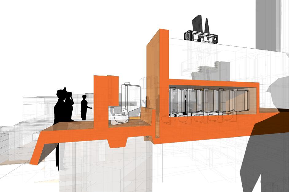
Something feels familiar, maybe the simplicity in form, maybe the scale, or the aisle signage represented as a constructed TV used as a way-finder throughout the store. This type of portrayal was used to entice the client to input their individual perception onto it, changing the journey.
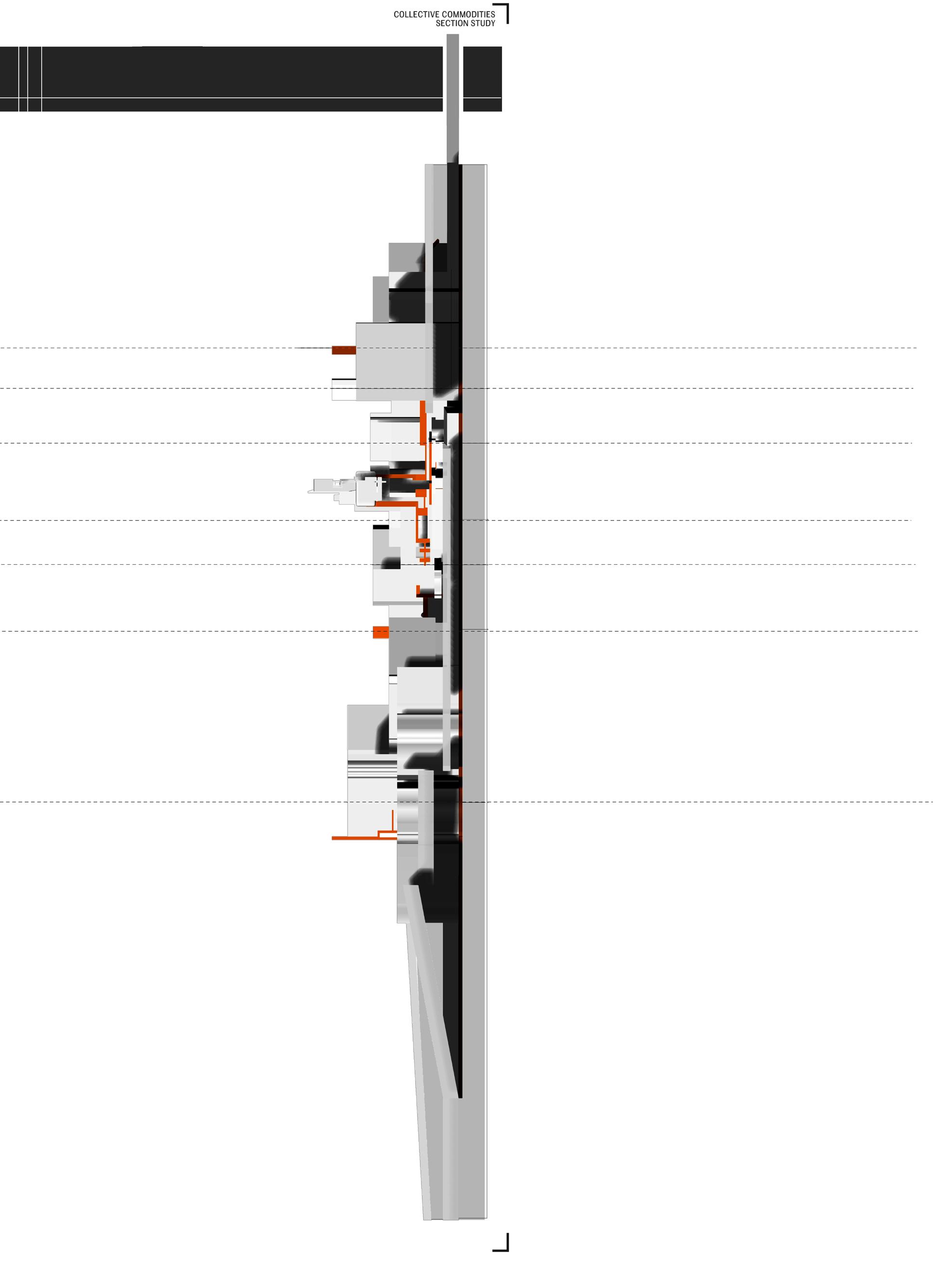
Looking in section, a typical store in long repeats aisles along the entirety of the square footage with larger walkways on the ends, leading it to be mundane in modality.
In contrast, carving into the gondolas allows for the lures to take form and create hierarchy within the new space, playing with thickness and verticality.
58
Products that are well known and price sensitive 250-300 items per AWG division that make areas. 60-80% are universal with the others to track sales of an item by UPCs that are being at the front end. The information is used for that must be adhered to so they may receive scans are required retails. A specific set of many stores for the retail shelf prices/tags. larger retailers maintain their own price zone. items are normally priced at the store level. of new retails for a variety of reasons: cost prices are all examples of price maintenance. register or scanning system. Refers to the gross retail for an ad; these markdown dollars are if the profit margin is still positive. Items intentionally reasons or to promote sales growth of the store differently than zone and is not any kind of a competitive weapon. AWG allows exception
sensitive to customers. Within AWG, there are make a difference to customers in their market others being specific to their region. Scans are used being sold (scanned) through the registers for payment on sal es of each item sold. Prices receive CPG or vendor monies on items sold; most regular prices that may be used by one or AWG supplies several zones per division and zone. This does not in clude DSD pricing. These level. Price Maintenance refers to the application changes, TPRs, manager specials, and ad maintenance. POS: Point of Sale refers to the cash gross profit dollars given up by having lower are sometimes made up by increased sales intentionally sold below cost for competitive store or department. An item that is priced special; sometimes as a mistake or used as exception pricing from the retailer’s price zone on
The act of electronically moving price changes this service for those that are utilizing their maintenance at a headquarters and “host” cases, price maintenance is handled through the POS System. Newer systems such as LOC built in and do not require a back-office software the POS. Inventory refers to the product in the retail. These values are added together to make independent retailers count inventory and use and determine a gross margin. Larger retailers retail, then when counted they are either long difficult to keep totals of retail at retail thus oriented. Display areas in stores that have items appearance. The retailer typically puts their them on display and out of the back room of to increase sales or eliminate excess inventory. priced by influencers outside of individual stores. within the store: grocery, deli, dairy, floral, etc.
changes into the back-office. AWG provides zone. Many multi-store operators do the other stores in the group. In most through a back-office software that in turn feeds LOC and Catapult have the functionality software package to efficiently manage the store. Each item has a value at make up the inventory at retail. Most use a factor to reduce the inventory to cost retailers keep a running count of inventory at long or short in inventory dollars. It is more most independents are gross margin items with strong price impression and bulk their large quantity buys in these areas to keep of the store. Items individual stores reduce inventory. These items by definition are not stores. Department refers to different areas etc. They have their own sales and margins
62
HINT: follow a path, page by page - just like reading a novel.
Commodity a section within a department, department. Sub-Commodity further delineation a sub-commodity of vegetables, which includes the grocery department. Items that are weighed such as fresh meat & deli, or at the front end, the pound. Tomatoes and bananas are items and pork chops are weighed and have a label front end. Products that are scanned at the product by UPC. The items are scanned, and customer’s bill and placed on receipt at the retail environment, is simply stated as the unaccounted-for is most commonly identified because of a cyclical annually) and financial reconciliation. In other they own to the physical count (book/ledger of merchandise). These losses are typically administrative errors (non-malicious billing receiving, spoilage throwaways, inventory or, 3) employee/customer theft. The percentage
such as vegetables in the grocery delineation of product. For example, corn is includes all sizes and varieties of corn in weighed in store either during packaging, end, as with fresh produce that is sold by items weighed at the front and hamburger label placed on the item to scan at the front end and are priced by the single and the price is recorded as a portion of the
end of the order process. Shrink, in the unaccounted-for loss of inventory. This loss cyclical inventory (ex. monthly, quarterly, other words, comparing what the books say (book/ledger ownership compared to a physical count typically attributed to one or more categories: 1) errors, price change errors, short/over miscounts, etc.), 2) vendor/supplier fraud percentage contribution of each of these three
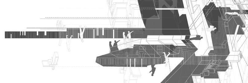
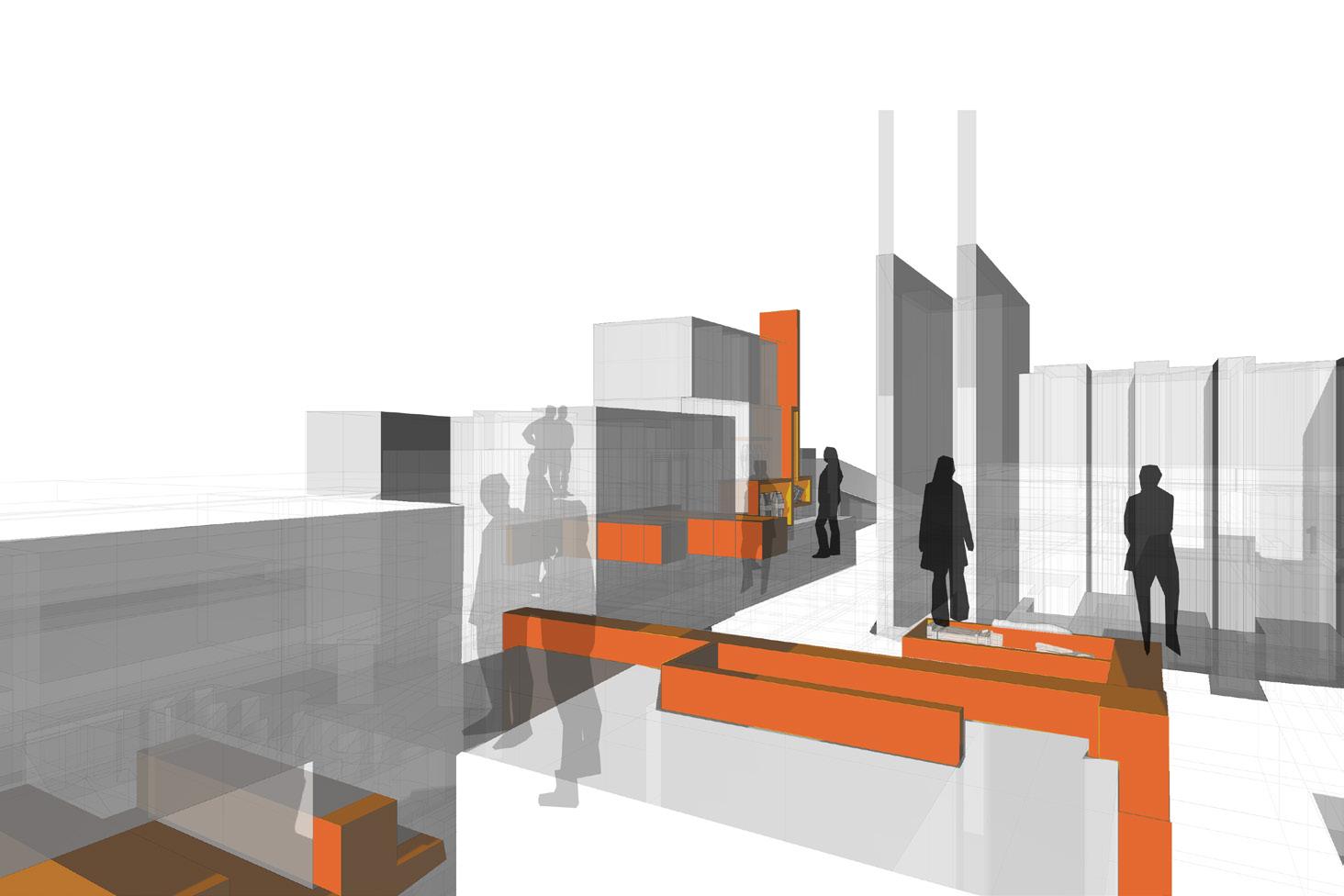
Zooming back out conceptually, The journey can then be replicated, altered or deleted before the next time someone visits. There’s something to be said about society actively being present in an experienc remember it after they are gone vs recalling the experience as floating in space.
memories as an experience where figments of the whole remain wit even after you’ve left the scene - almost like the post-purchase feeling of a coke bottle - flashbulb memories like.
Episodic Memories II, an overall idea of the store, subject to an individual's experience. Finding multiple meanings and journeys beyond a red herring, likened to a Where’s Waldo book page if finding Waldo was not the goal.
Finally, zooming 10x one last time, an
homage to the cyclical nature of consumerism
. An attempt to bring this process back to the kernel that started it all, advertisements of the irrelevant objects. Scattered around the store inside of lures held up by anchors, one could stumble upon any of them during their experience in the sore - represented in catalog ad style, bare bones and factual, model number and all.
Contemplation
Think back to a soda. A candy dispenser. A currency. Although the answer may not change, perhaps the perception has; and if it has not, maybe that's the point. The goal was not to invent, reinvent, or make better commodities and where they live, but to bring a new perspective through an architectural lens; The goal was to understand the underlying conditions that society has built for us to rattle different sifters, and still end up with a common set of cultural relevance (historically important or not) eight times out of ten. Looking back now, to think that the commodity itself was held in the heaviest weight class was narrow-minded thinking, and maybe on some level, we are conditioned to glaze over the roots. A bit cynical, admittedly, but that same cynicism led me down a rabbit hole in search of answers that I do not think being an idealist would have led me to. That is not to say that this is the only way the world works and that bad design prevails... This is why designers are needed more now than ever. The one commonality the six studies had cared for their respective craft, putting aside the psychological efforts they put in through various media to remain memorable. In an idealist view, maybe these designers knew that the goal was not to craft the "perfect" thing, but rather have a memory that can be extracted with the said thing - knowing that objects are not permanent.
The specific approach attempted to take something mundane as a Grocery Store - a place where people flow in and out weekly to fulfill basic needs - and experiment with the possibilities beyond shelves and products, where the function was not in the heaviest weight class. Notice that towards the end, original commodities are scattered around the "Store," but they do not seem to be the purpose, and thus no emphasis on them. The realization the whole time was that the commodities do not matter, and they are just there, and yet, they are designed. Attempting to follow the 11-step process from Per Galle (_I.01), the original commodities were my effort to take on the role of client, designer, and maker. A monopoly? Vertical Integration? Whatever it is, the realization that the visual result cannot be ignored, whatever the intended exploitation may be.
Looking at the deliverable as a whole, re-framing the conditioned way to navigate a curated, repetitive space such as a Grocery Store, broke me out of the box, literally and figuratively - hence my decision to look at it in a snapshot view. If there is no dedicated entrance or exit, you are simply in the midst of it, existing and absorbing, and will ultimately discover a way around it. As mentioned before, being selective with what remains familiar was key, because as I have learned, we are trained to recognize something as an outlier easily when it is in proximity to something familiar; This reinforced what is seen in society.
The commodification of process has diluted critical thinking, and I do not view critical thinking, in terms of design, solely as the objective analysis but rather as the most thoughtful view of an issue to form a judgment. Most often, no one is reinventing the wheel - only reinventing their perception of the wheel, and instead adding a new spoke, giving the illusion that the wheel is new... And I think that is what design is all about.
Inventory
Anchor Vertical, visual blockers in which the Lures latch onto _PAGE 51
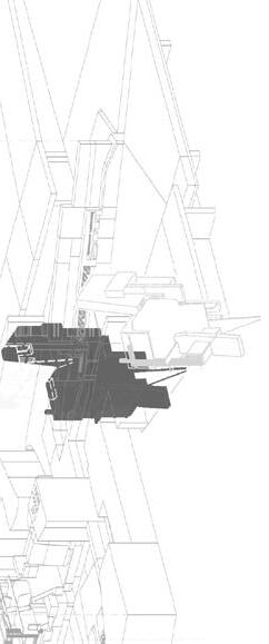
Directory A snapshot plan diagram of the Grocery Store _PAGE 52
Elevator Music The concept of a consumer-able entity being neither intentional or recognizable _PAGE 27
Episodic Memories Visual snippets that remain in the unconscious with one after they have left a physical space. There are two types of viewings: 1. As an experience: A point of view perception stitched together, and 2. As an object: Taking one self's out of the experience and recalling it somewhere in the void, where it is much more loose and fragmented _PAGE 66
Hidden Persuaders A graphical extraction of the signified, more specifically, of a consumerdriven purchase _PAGE 43
The Inflatable Movement The idea of the inflatable movement held a promise of mobility, movement, energy, and escape during an era of conformity _PAGE 31
Intentionality Matrix A repository composed of a small sample of commodities and spaces positioned based on their level of recognizability juxtaposed with their intentionality _PAGE 10
Lure Conceptually, a visual enticement. Functionally, a holder for frivolous commodities _PAGE 50
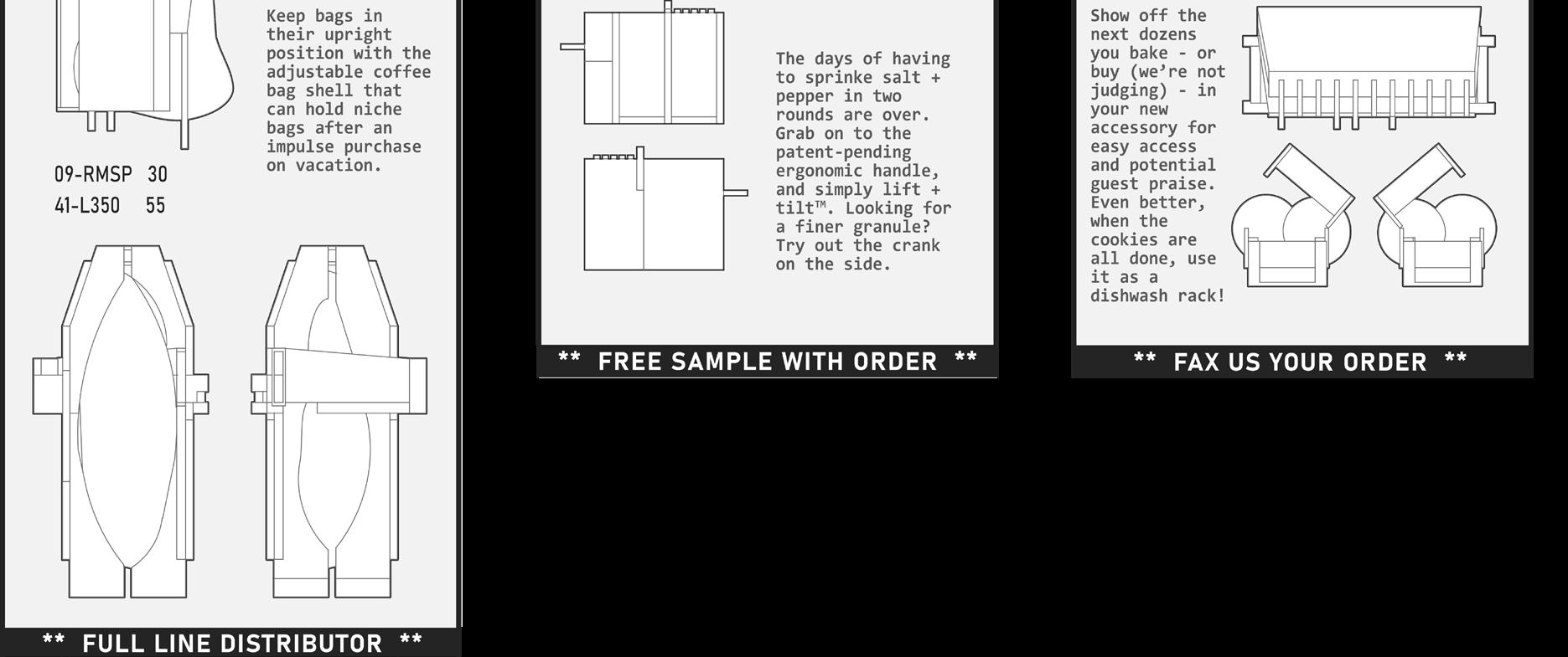
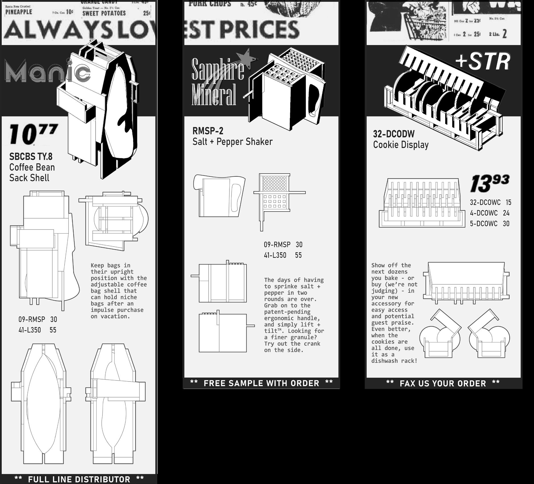
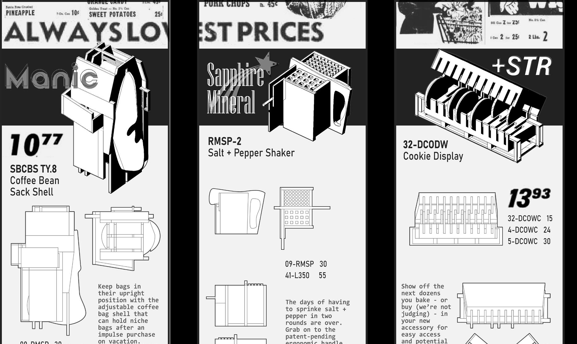
ManicTM For coffee lovers, a solution-oriented brand that seeks to help make coffee fun. Their most notable product being the Coffee Bean Holder _PAGE 70
NebulusTM Clean freaks unite - Engineer solutions to everyday problems to help capture dirt . _PAGE 71
A
Printmaking
C D
The artistic process based on the principle of transferring images from a matrix onto another surface - most often paper or fabric _PAGE 33
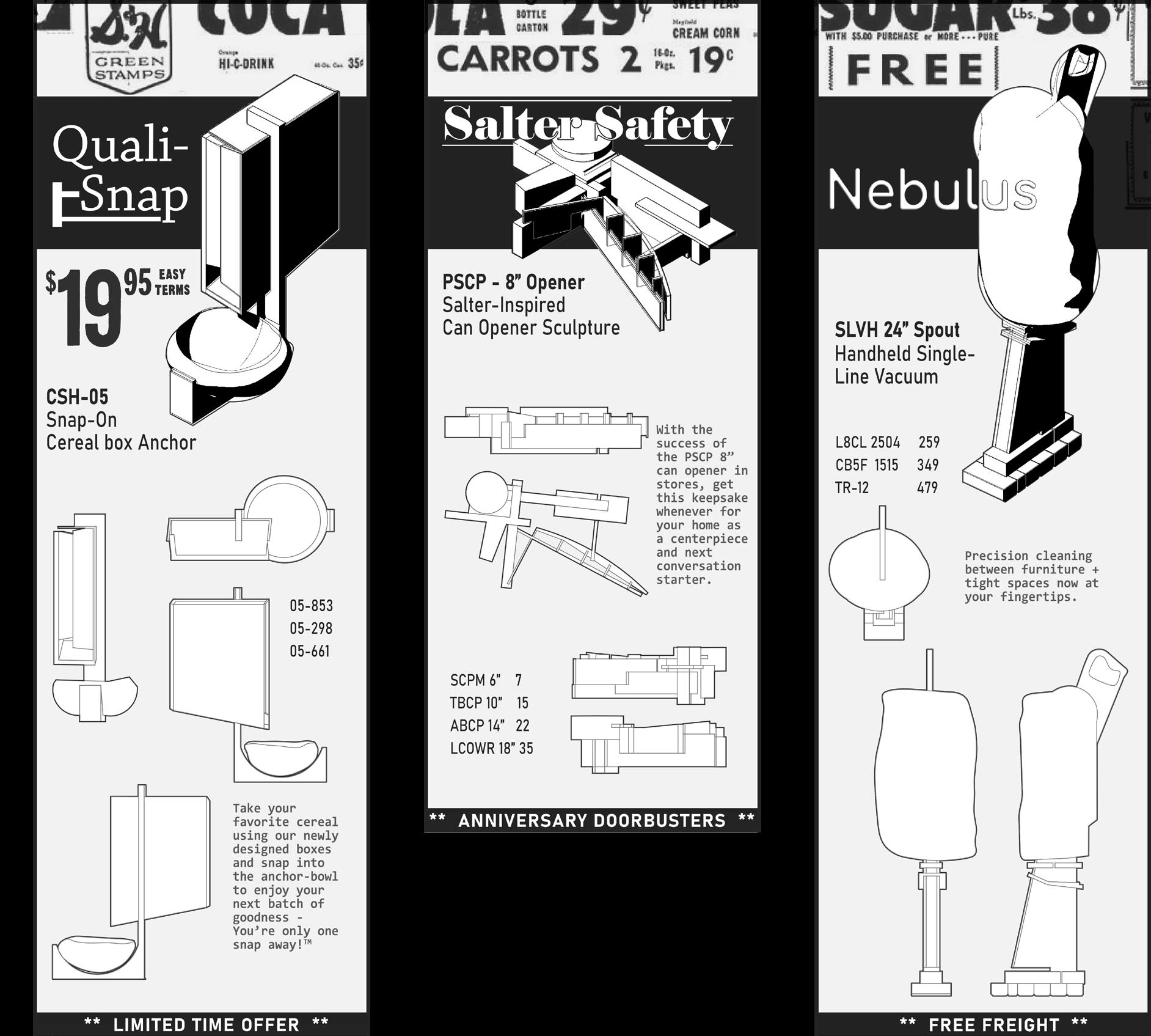
Quali-SnapTM A sister brand of +STRTM, designed specifically for the ways we eat and share food today, will be loved for years to come _PAGE 71
Salter SafetyTM Niche brand approach that takes household kitchen staples, and sculpts unique versions meant to be enjoyed for their simplicity _PAGE 71
Sapphire MineralTM More than just salt - a better for you brand that can help transform something your food to make it better while settling into your home aesthetic _PAGE 70
Signified The meaning behind the word, object, image or action that is being represented _PAGE 36
Signifier Word, object, image or action _PAGE 36
Situationism A modern view of society as a series of spectacles, discrete moments in time, where the possibility of active participation in the production and experience of lived reality were eluded _PAGE 31
Squeegee A rubber blade used in Printmaking to evenly spread ink _PAGE 35
+STRTM A company committed to your mental well-being by providing ways to keep your space clean and tidy _PAGE 70
Advertisement
6, 16, 32-33, 42, 71
Amplify 46, 50 Autonomy 44
Carve 50 Commodity 6, 8 9, 27, 29, 30, 36, 42, 72
Conform 30, 31
Consumerism 30, 71
Curated 24, 46, 73
Cyclical 71-72
Discover 26, 50, 73
Design
2, 4, 8, 9, 10, 14, 16, 18, 22, 27, 35, 41, 72-73
E
Emotion
6, 24, 27, 29, 30, 42
Entity 27, 32
Episodic Memories 66, 68
Experience
3, 6, 27, 29, 31, 36, 42, 45, 53, 66, 68, 71
G
Gondola Anchors
50, 53, 71
H I L N
Happiness Machines
29
Hidden Persuaders 42-43
Identity 20, 30, 36
Lures
50-51, 53, 57, 71
Nexus 32
O
Object 6, 10, 13, 30, 37, 50, 71, 73
Objective
7
P
Perception 30, 36, 54, 72-73
Protest 30-32
R
Repository 8, 10, 13, 39
S Screen Printing 32-33, 35-36, 40, 50
Signage 44, 54
Signified 6, 14, 16, 18, 20, 22, 24, 36, 43, 45
Signifier 6, 24, 36, 42, 45
Situtationism
31 Subjective 7
References
Brinkworth, Calvin, "Supermarket savvy: An analysis of psychological exploitation within grocery stores" (2017). Independent Study Project (ISP) Collection. 2603.https://digitalcollections.sit.edu/isp_collection/2603
Chen, J. (2023, September). 6 Discontinued and Uncommon U.S. Currency Denominations. Investopedia. https://www.investopedia.com/6-famousdiscontinued-and-uncommon-u-s-currency-denominations-4773302
The Coca-Cola Company. (2024). The History of the Coca-Cola Contour Bottle. The History of the Coca-Cola Contour Bottle - News & Articles. https://www.cocacolacompany.com/about-us/history/the-history-of-the-coca-cola-contourbottle
Crain, E. (2017, March). The fun history behind why money is green. Forbes. https:// www.forbes.com/sites/learnvest/2017/03/17/the-fun-history-behind-whymoney-is-green/?sh=58c3d0a2451d
Curtis, A. (2002, January 1). The Century of the Self. Thought Maybe. https:// thoughtmaybe.com/the-century-of-the-self/
Dawson, R. (2005, October). Beatlemania and Girl Power: An Anatomy of Fame. Web Archive. https://web.archive.org/web/20051004034358/http://people.pwf.cam. ac.uk/rd286/rock/beatlemaniagirlpower.html
Debord, G. (1967). The Society of the Spectacle. Princeton University Press. de Haas, W. & Wiering, Frans. (2010). Hooked on Music Information Retrieval. Empirical Musicology Review. 5. 10.18061/1811/48551.
Dessauce, M. (1999). The inflatable moment: Pneumatics and protest in ’68. Princeton Architectural Press.
Dilley, W. C. (2017). The Cinema of Wes Anderson : Bringing nostalgia to life. Columbia University Press.
GPO. (2024). Currency: History. Engraving & Printing. https://www.bep.gov/ currency/history
Kratz, J. (2015, June). The Coca-Cola Bottle: Celebrating 100 years of an American icon. National Archives and Records Administration. https://prologue.blogs. archives.gov/2015/06/08/the-coca-cola-bottle-celebrating-100-years-of-anamerican-icon/
Leach, E. E. (2001). Vicars of “Wannabe”: Authenticity and the Spice Girls. Popular Music, 20(2), 143–167. http://www.jstor.org/stable/853649
Levi Strauss & Co. (2019, September). Levis history. https://www.levistrauss.com/ levis-history/
Lockhart, B., & Porter, B. (2010). Tracking the hobble-skirt coca-cola bottle. https:// sha.org/bottle/pdffiles/coca-cola.pdf
Machemer, T. (2020, December). How PEZ Evolved From an Anti-Smoking Tool to a Beloved Collector's Item. Smithsonian Magazine. https://www. smithsonianmag.com/innovation/how-pez-evolved-from-anti-smoking-toolto-beloved-collectors-item-180976545/
Moore, D. (2016). Constant Nieuwenhuys. Spatial Agency. https://www.spatialagency. net/database/the.situationists
Peterson, S. (2016). Pez: From Austrian invention to American icon. American Palate.
Spira, F., & Zanis, L. (2019, December 17). What is printmaking?. The Metropolitan Museum of Art. https://www.metmuseum.org/about-themet/collection-areas/drawings-and-prints/materials-and-techniques/ printmaking#:~:text=Printmaking%20is%20an%20artistic%20 process,available%20techniques%20to%20include%20screenprinting.
Taibbi, M. (2013). Spice girls biography. Rolling Stone. https://web.archive.org/ web/20131002023840/https://www.rollingstone.com/music/artists/spice-girls/ biography
Tulin, K., Laney, D., & Bielefeldt, I. (2014, June). Shaped Fit Sizing System with Body Shaping.
U.S. Currency Education Program. (2024). The seven denominations. https://www. uscurrency.gov/denominations
"Jumping the Fence" Levi Strauss & Co. Strong Enough Against a Dog's Bite Advertisement _PAGE 33
"PEZ Girls" PEZ International GmbH Reaching for PEZ Advertisement _PAGE 33
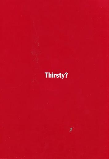
"The Drink that Keeps you Feeling Fit" The Coca-Cola Company Comic Advertisement _PAGE 33 "Thirsty?" The Coca-Cola Company Red text Advertisement _PAGE 33
"The most architectural thing..." Bernard Tschumi, Advertisements for Architecture 1976-1977 _PAGE 42 "To really appreciate architecture..." Bernard Tschumi, Advertisements for Architecture 1976-1977 _PAGE 42 "Sensuality has been known..." Bernard Tschumi, Advertisements for Architecture 1976-1977 _PAGE 42