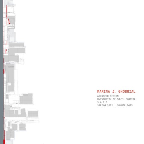
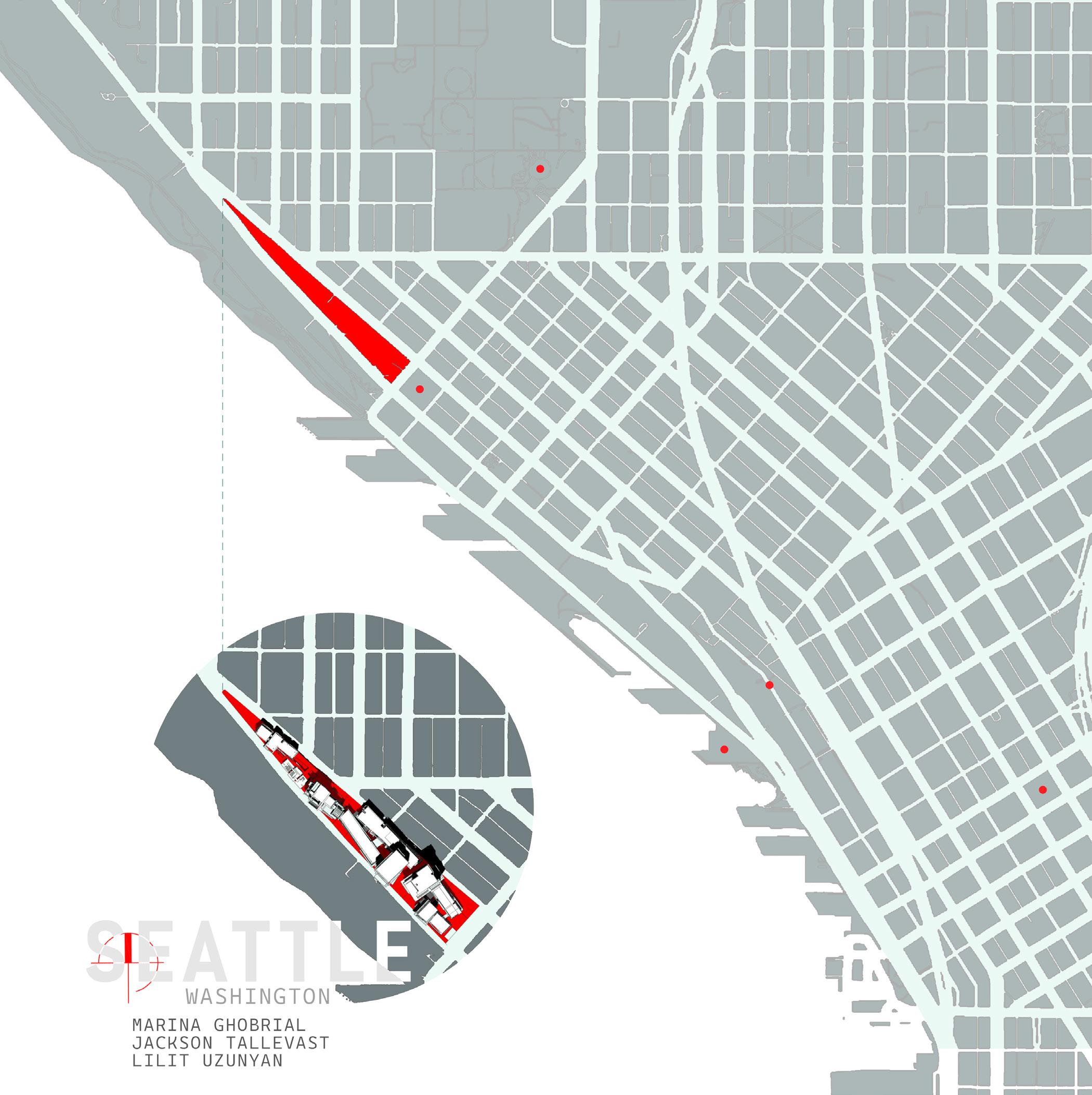
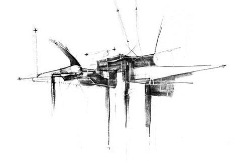
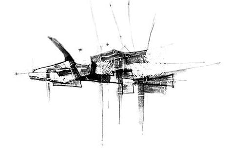
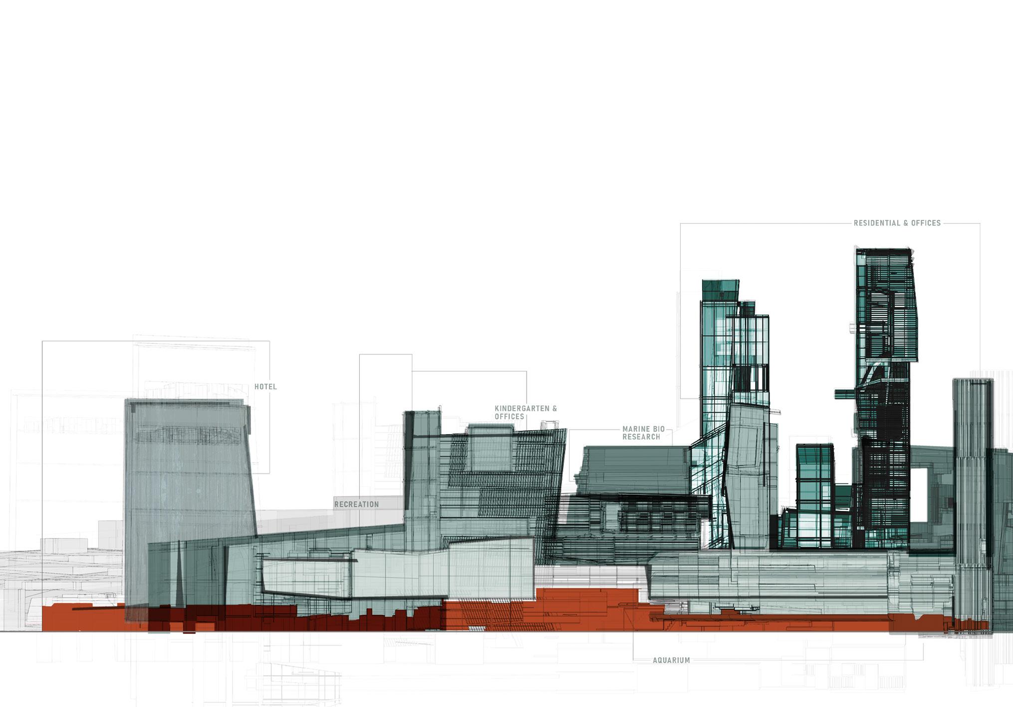
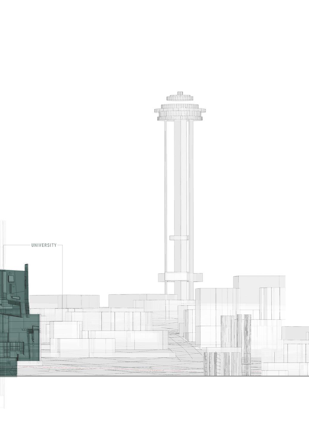
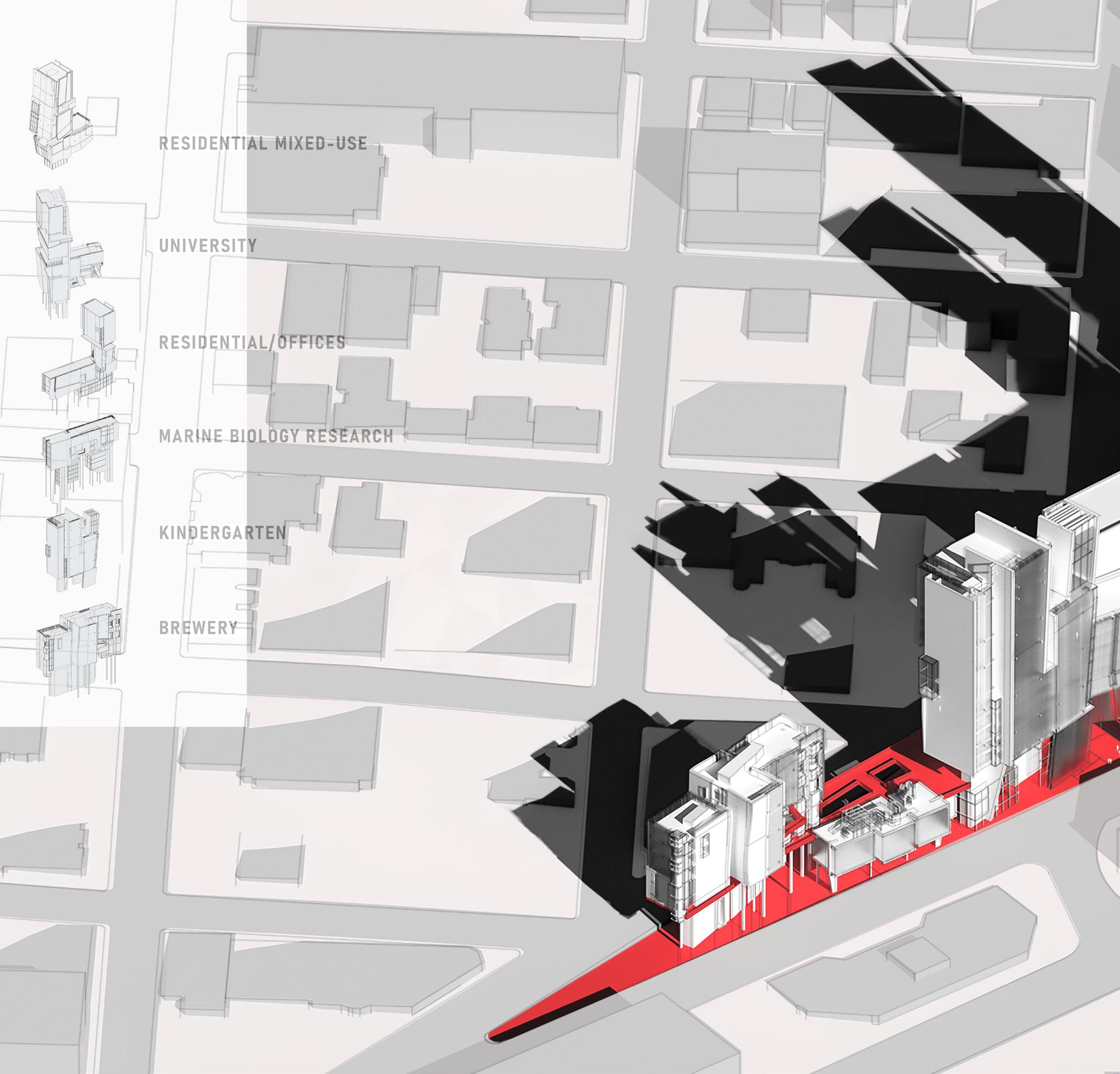
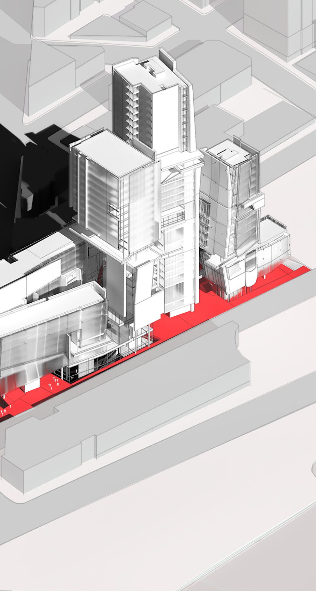
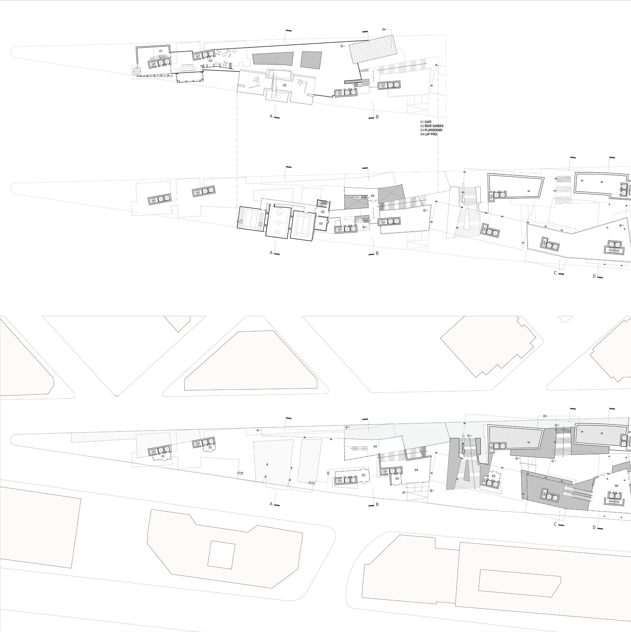
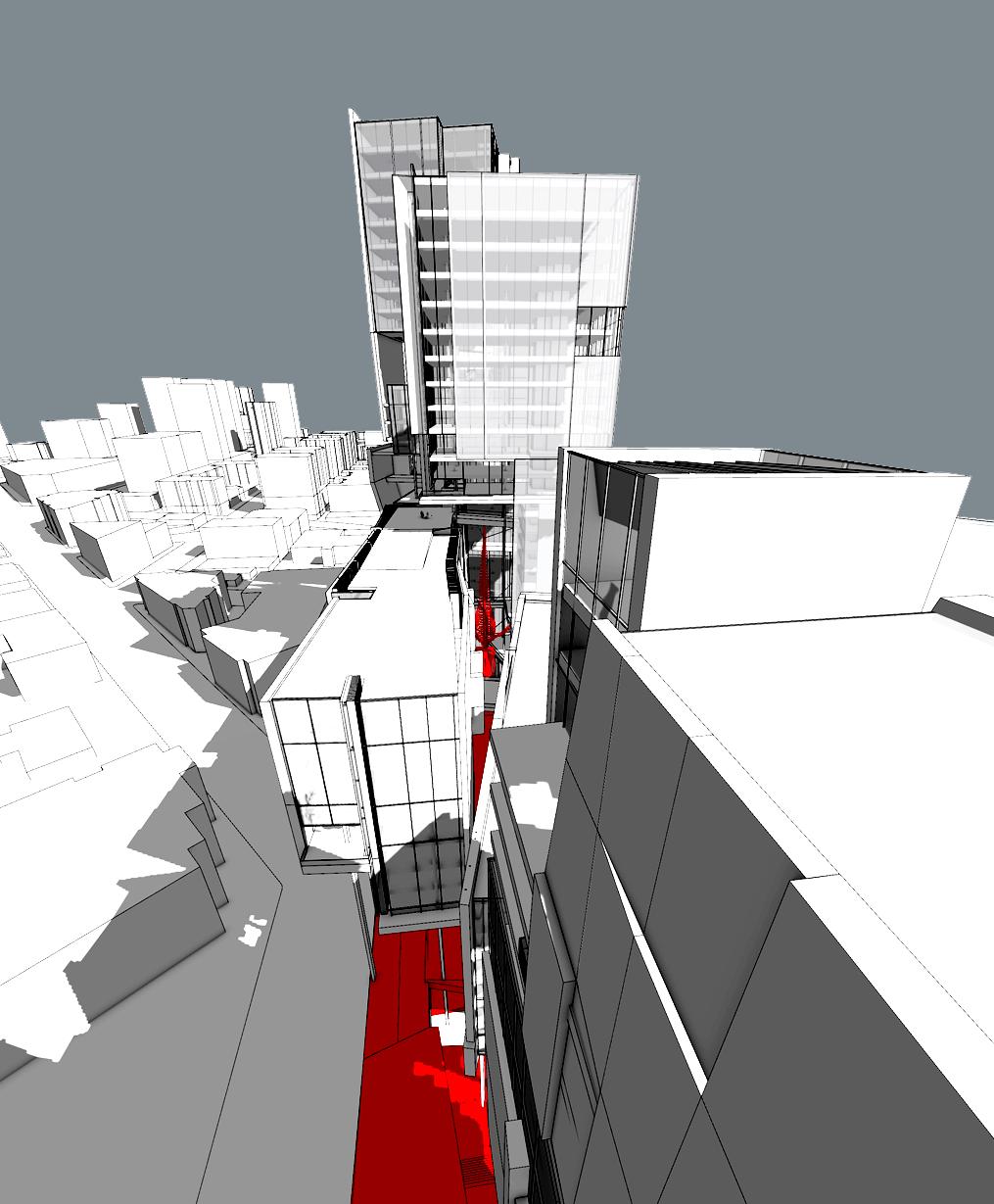
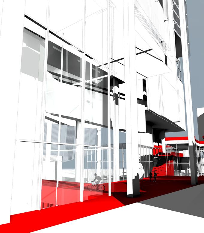
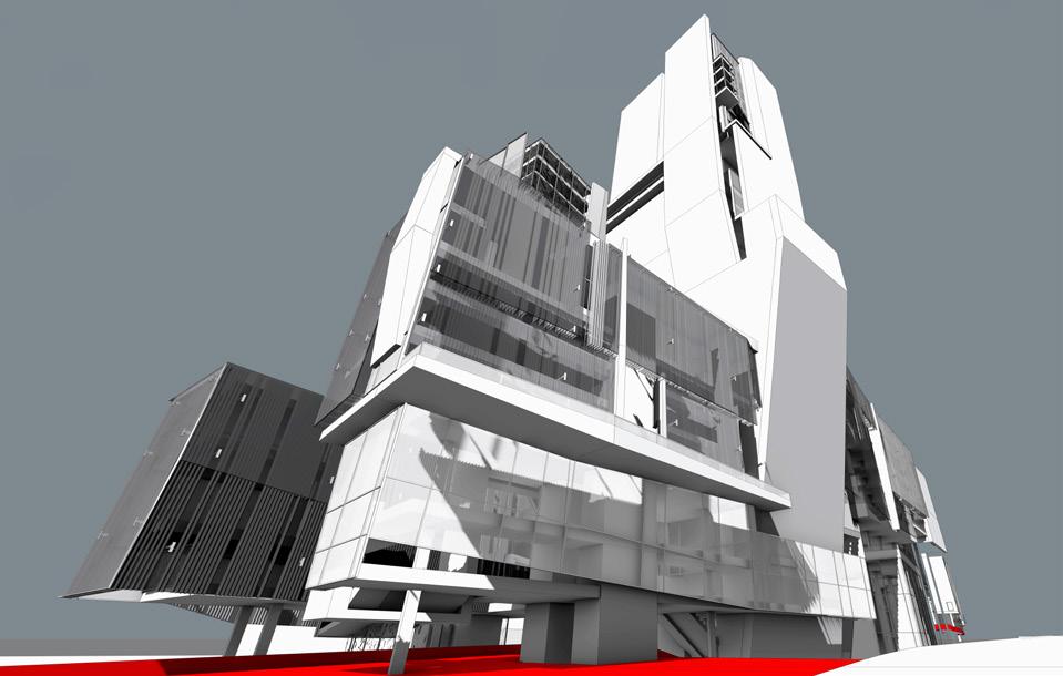
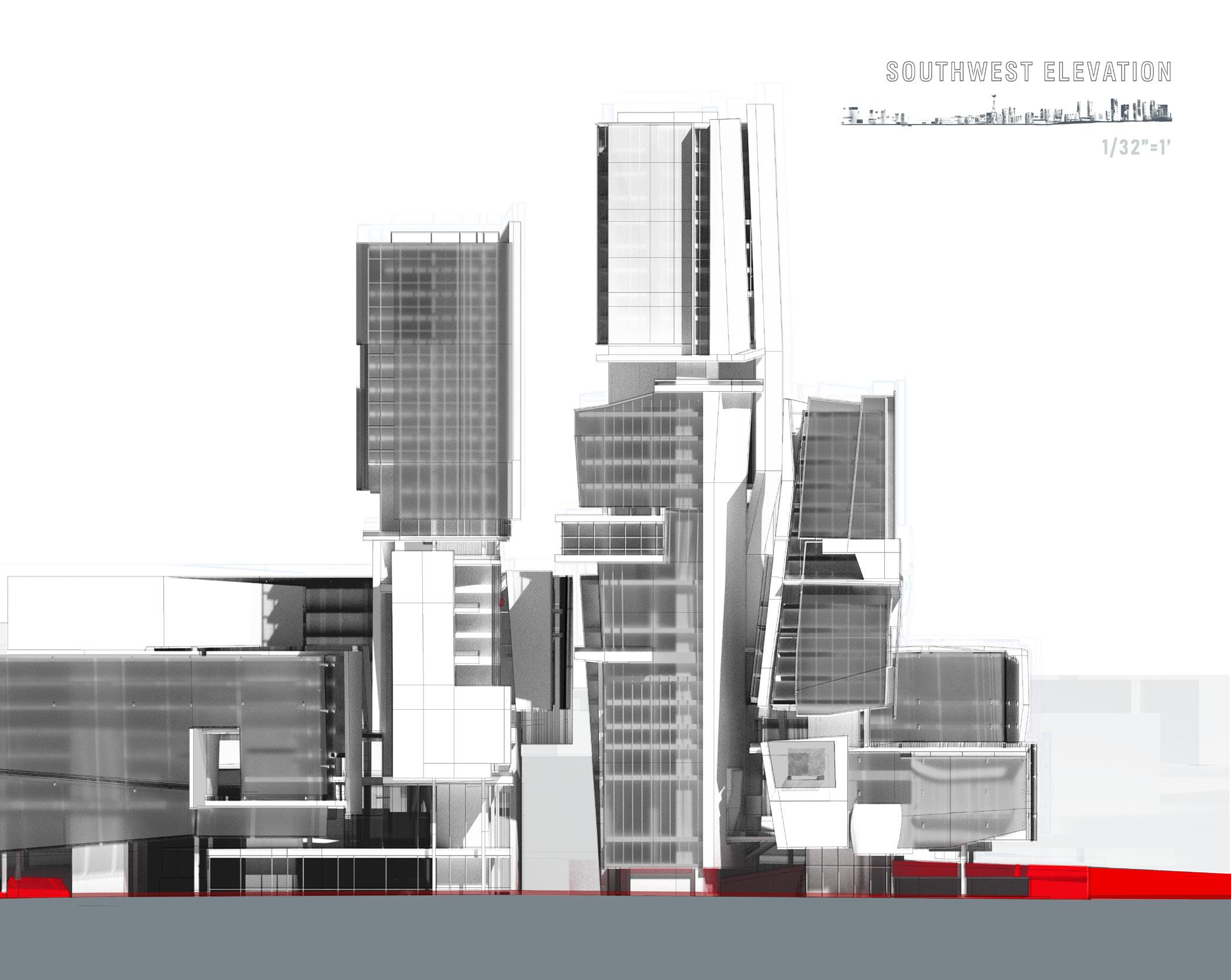
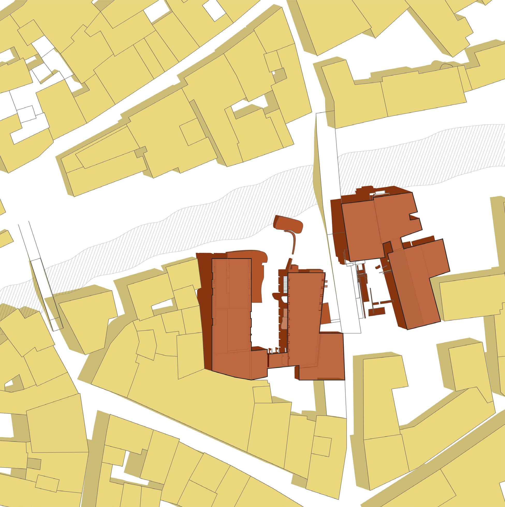
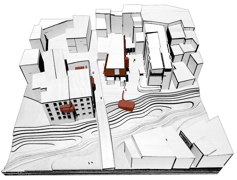
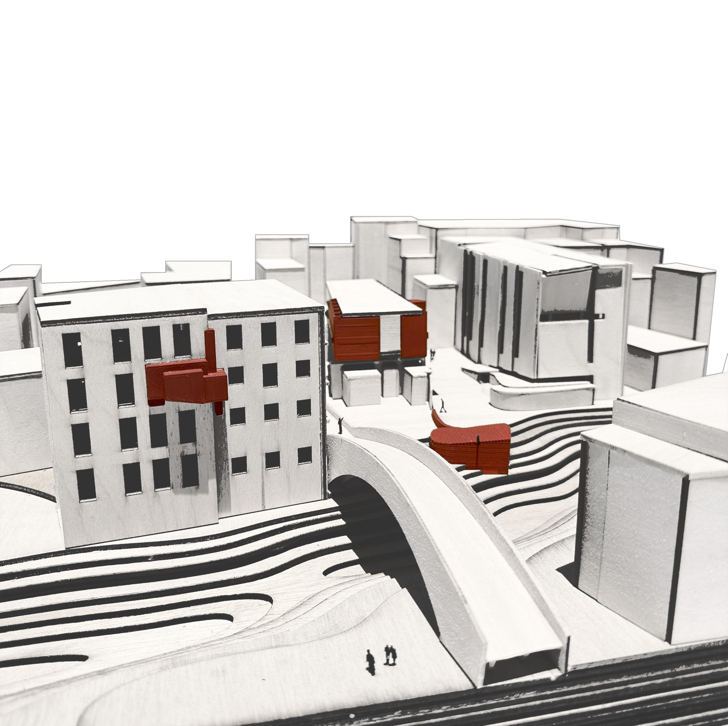
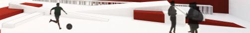
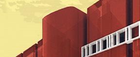
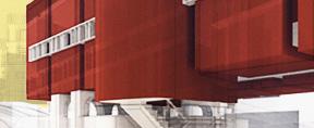
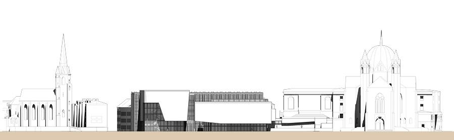
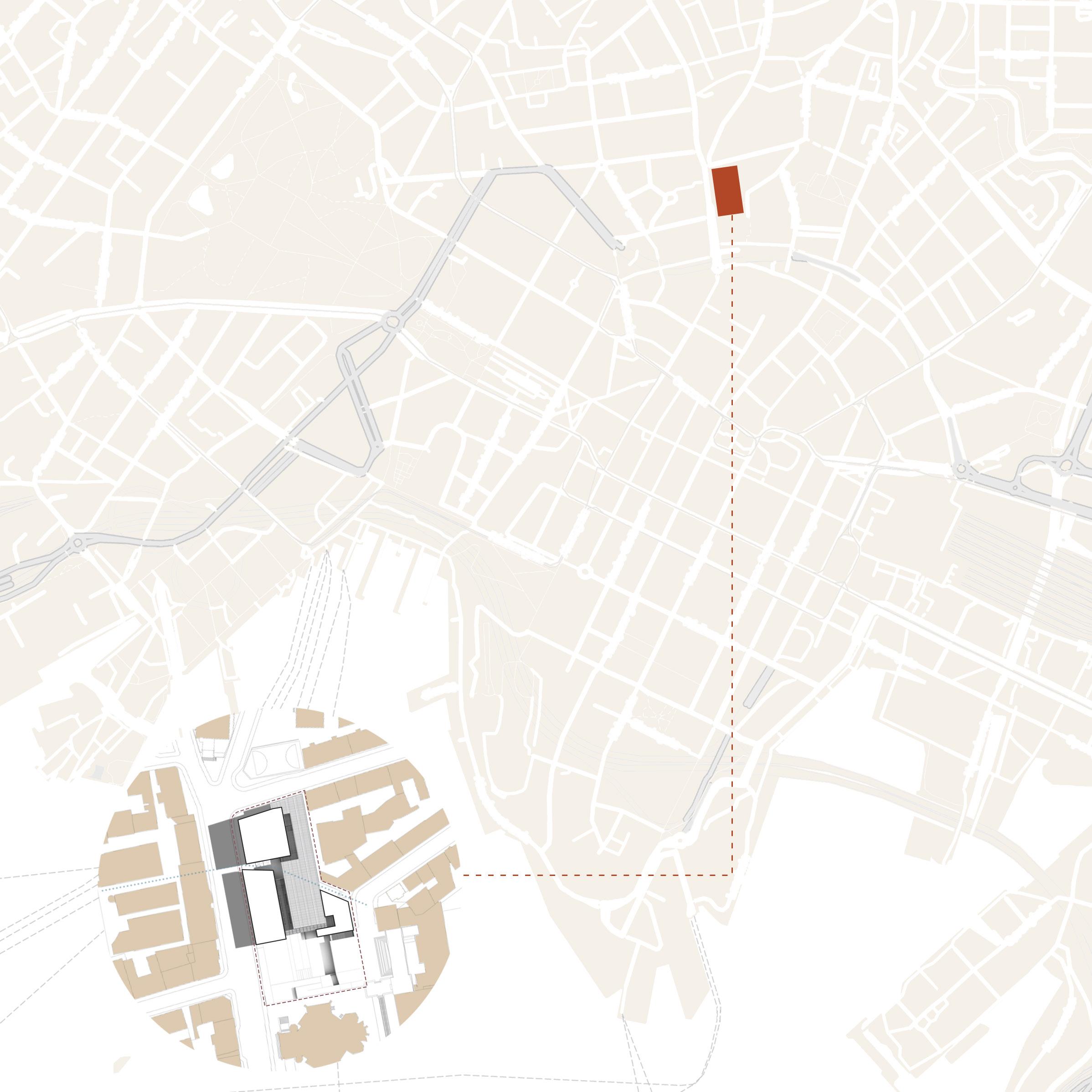
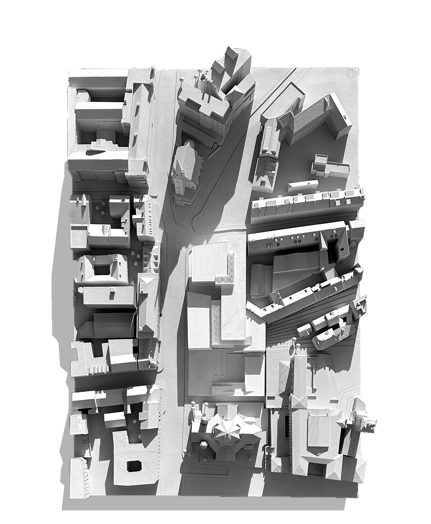
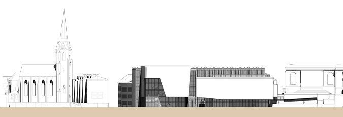
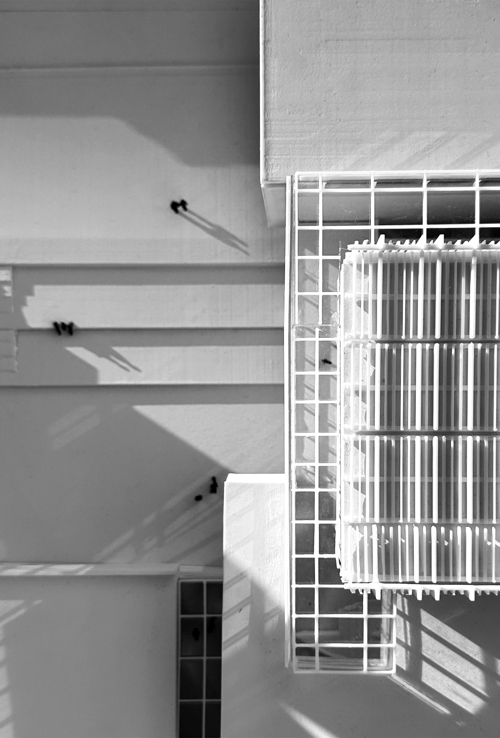
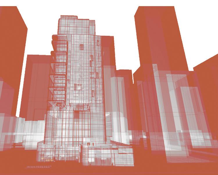
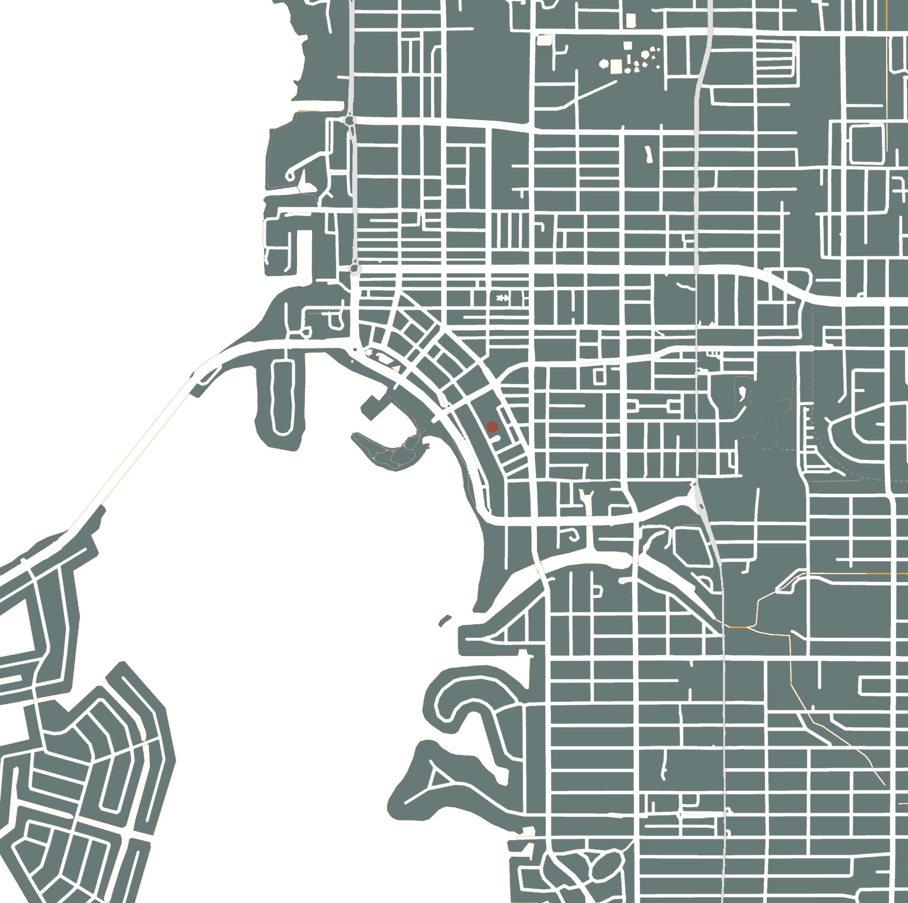
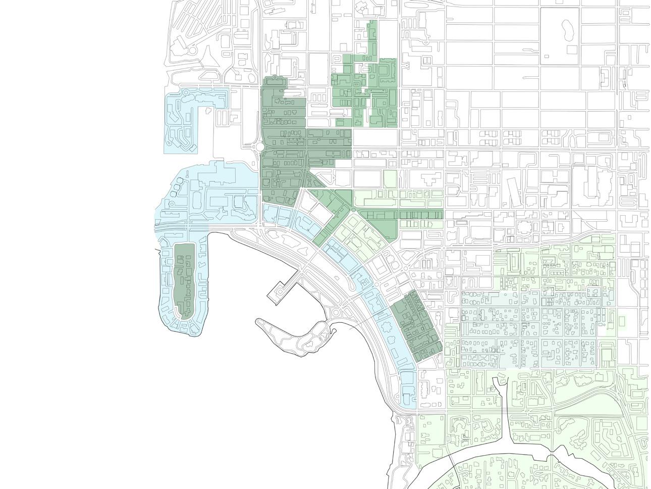
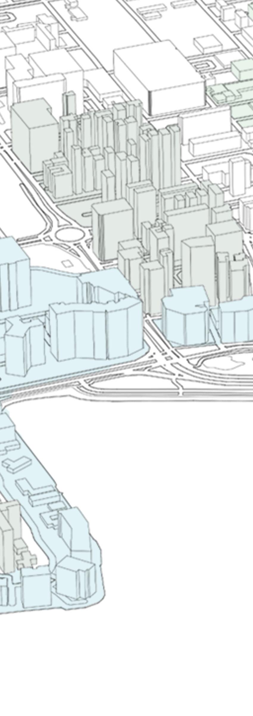
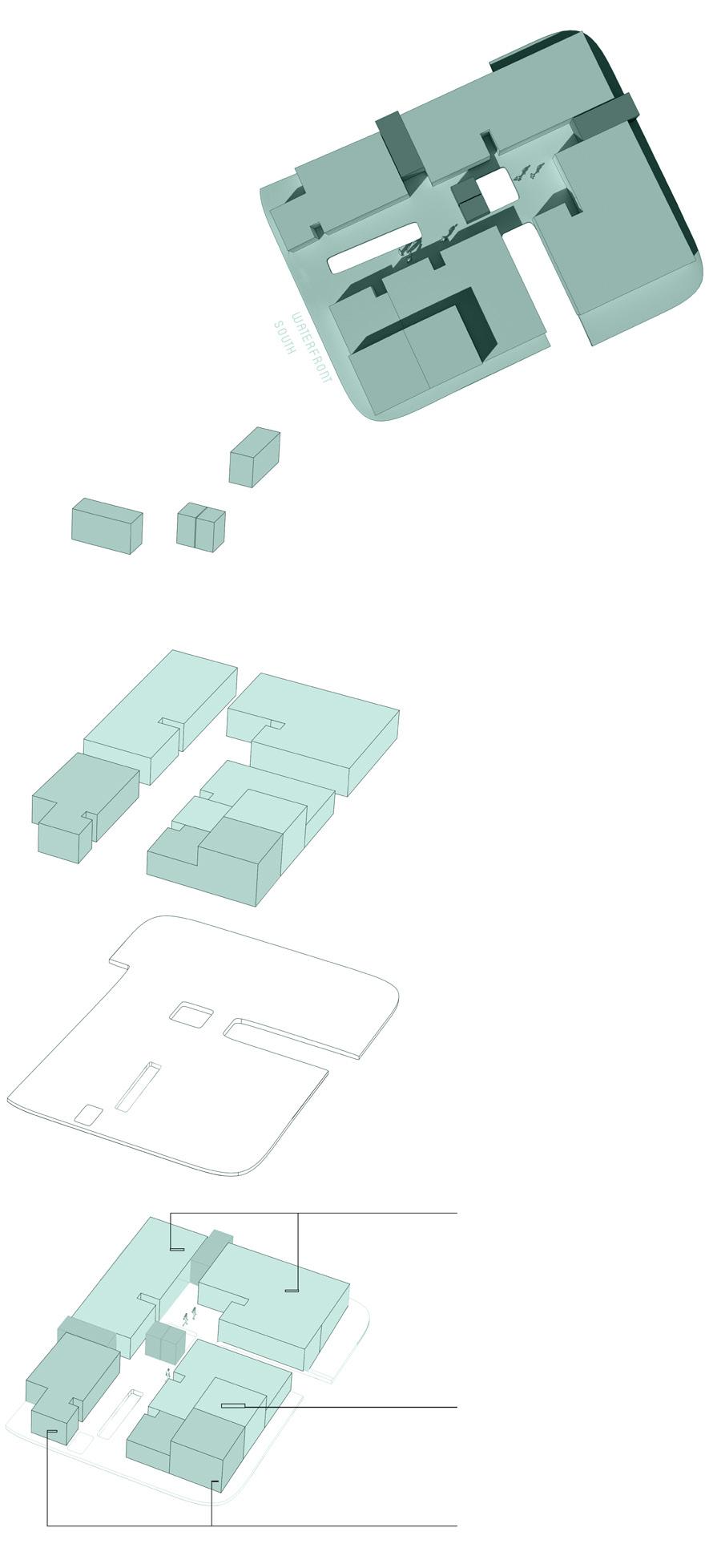
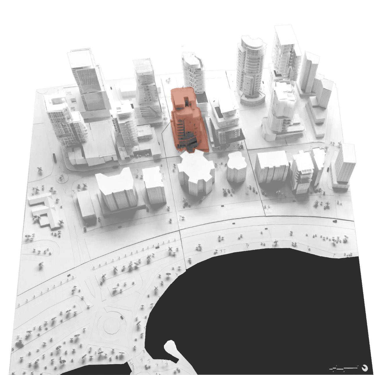
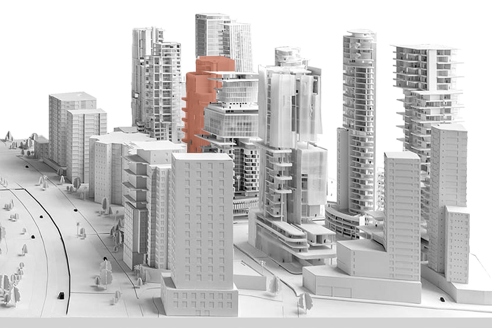
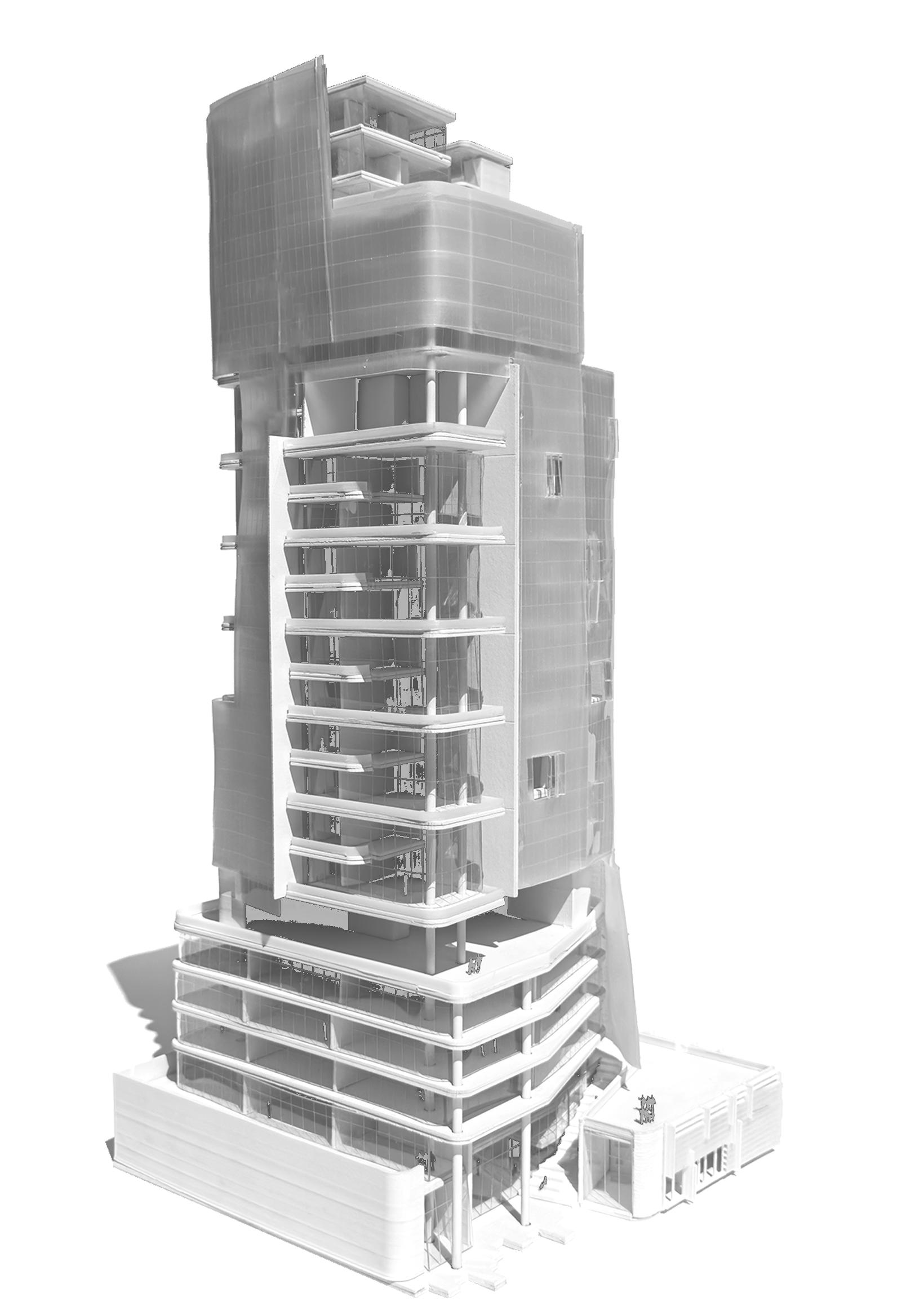
Located in an elongated, acute triangular lot nestled between Western Ave. and Elliott Ave., this quarter-mile long area was chosen to experiment with the idea of a new hub in Seattle, Washington. With the intention of bringing in density of other hot spots Seattle has to offer into this relatively low-story area, the goal was to activate the lot as much as possible, essentially creating a micro-city. Being adjacent to Olympic park, and knowing how much Seattleites like to bike, shaping a continuous, walkable path that is mainly open on ground level opened up the possibility to play with scale, form, and arguably one of the most important concepts of this project: void.
MICRO-URBANISM
SUMMER 2023
LEVANT KARA & MIRA TABBALAT
LOCATION:
SEATTLE, WASHINGTON
SIZE: 1,000,000 FT2
TYPES: RESIDENTIAL
OFFICE
COMMERCIAL EDUCATION RECREATION
A CASE STUDY IN SEATTLE
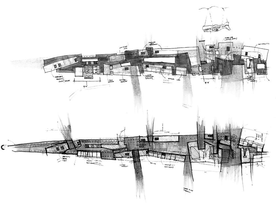
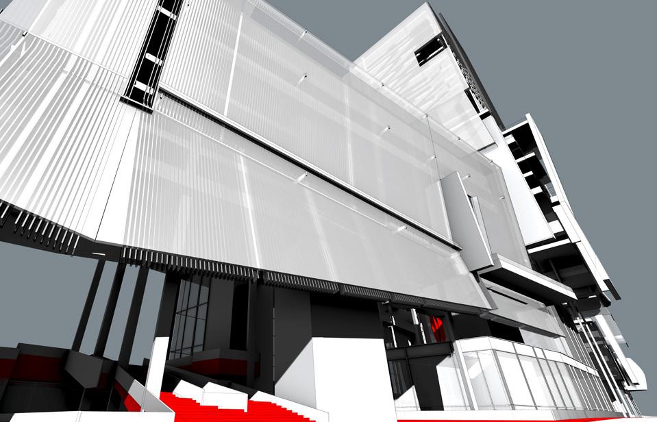
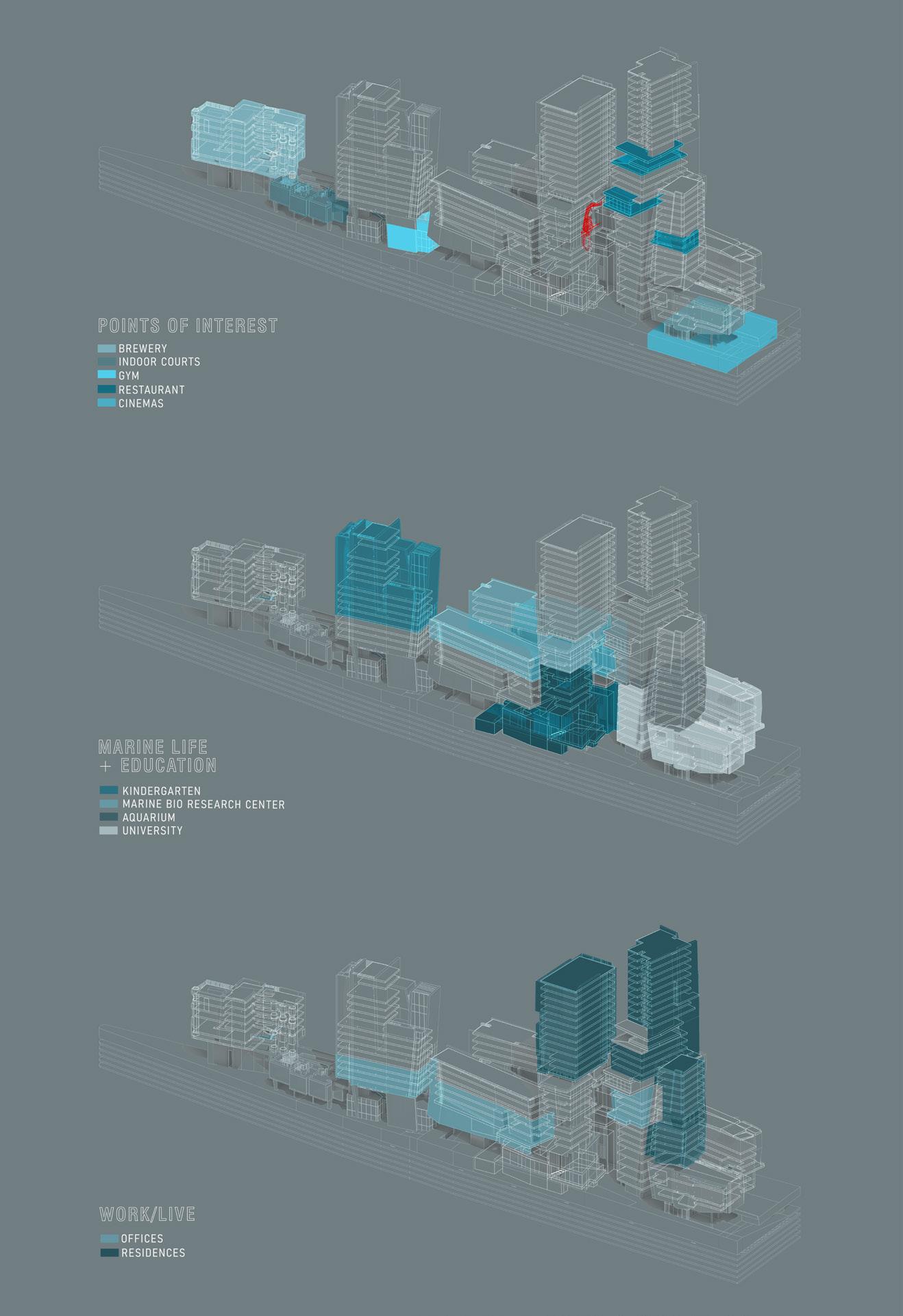
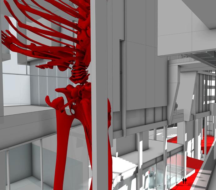
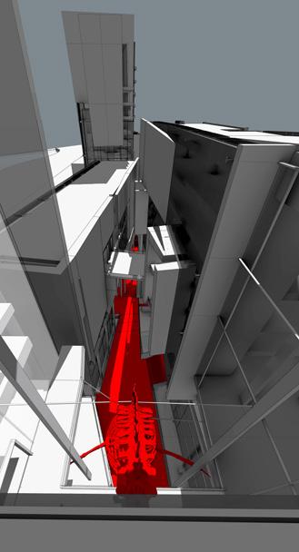
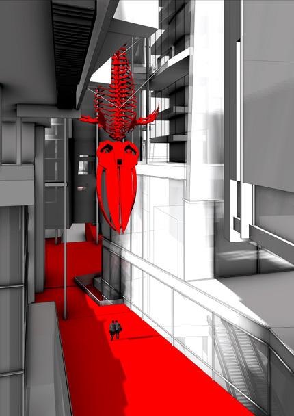
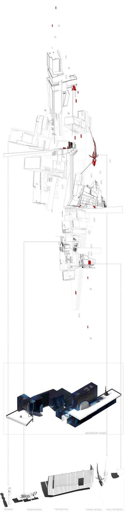
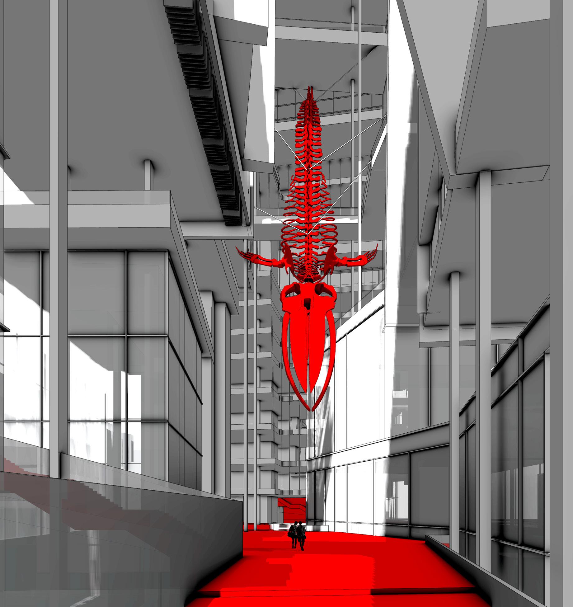
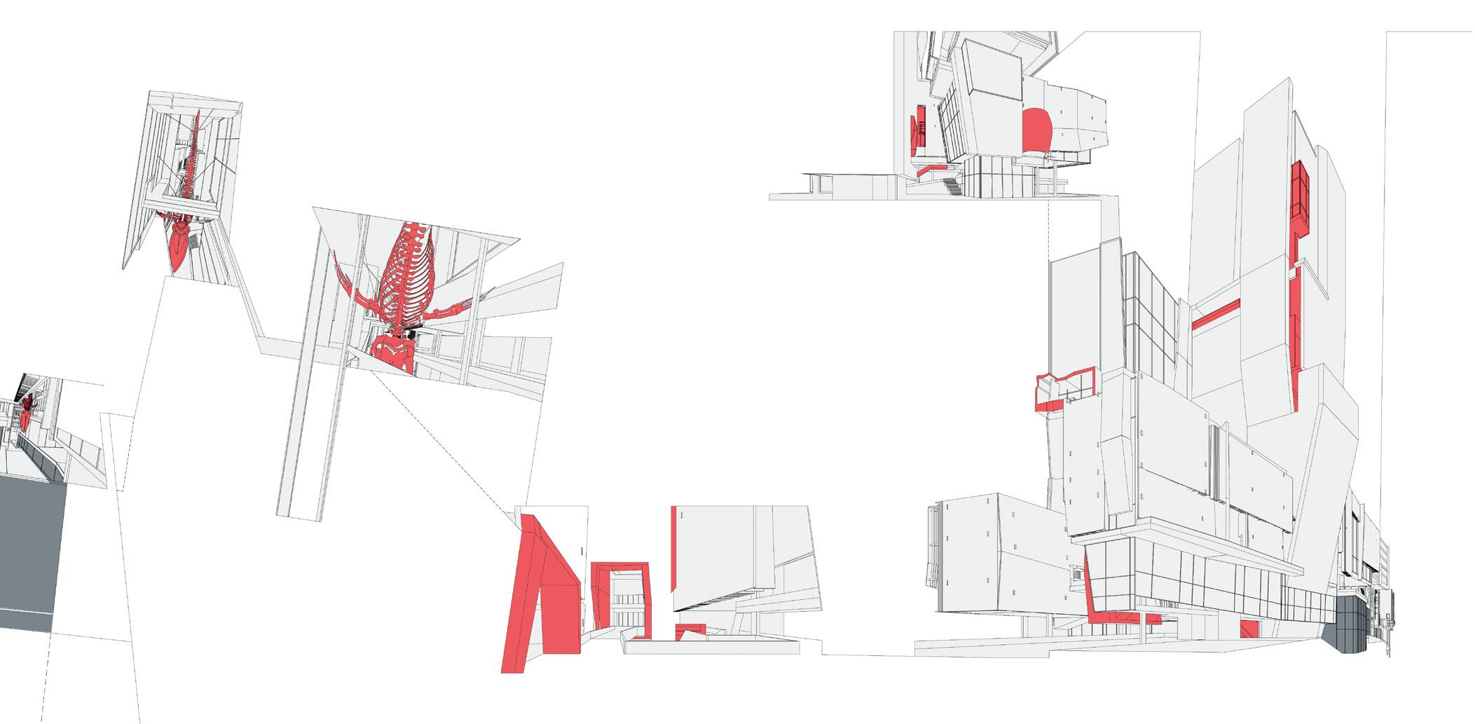
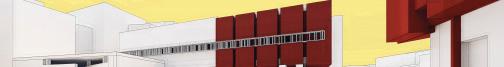
Conceptually, the project focuses on different typologies of Marine Life - A Marine Biology research institution, offices, and an aquarium - with supporting program for everyday life such as commercial and residences, and Points of Interests - such as restaurants, recreational areas, and a brewery - to keep the community engaged. The original Seattle Aquarium, located just east of this lot, is in deep need of an upgrade. By relocating a new aquarium here and using it as the anchor, and more specifically, replica bones of a whale hung in the heart of the site. The rest of the program was laid out in a way to connect spaces that needed close proximity, and strategically scatter Points of Interest to activate the entirety of the quarter-mile lot, both horizontally and vertically, indoors and out. Finally, a unifying, porous skin system that still holds identity to each individual structure.
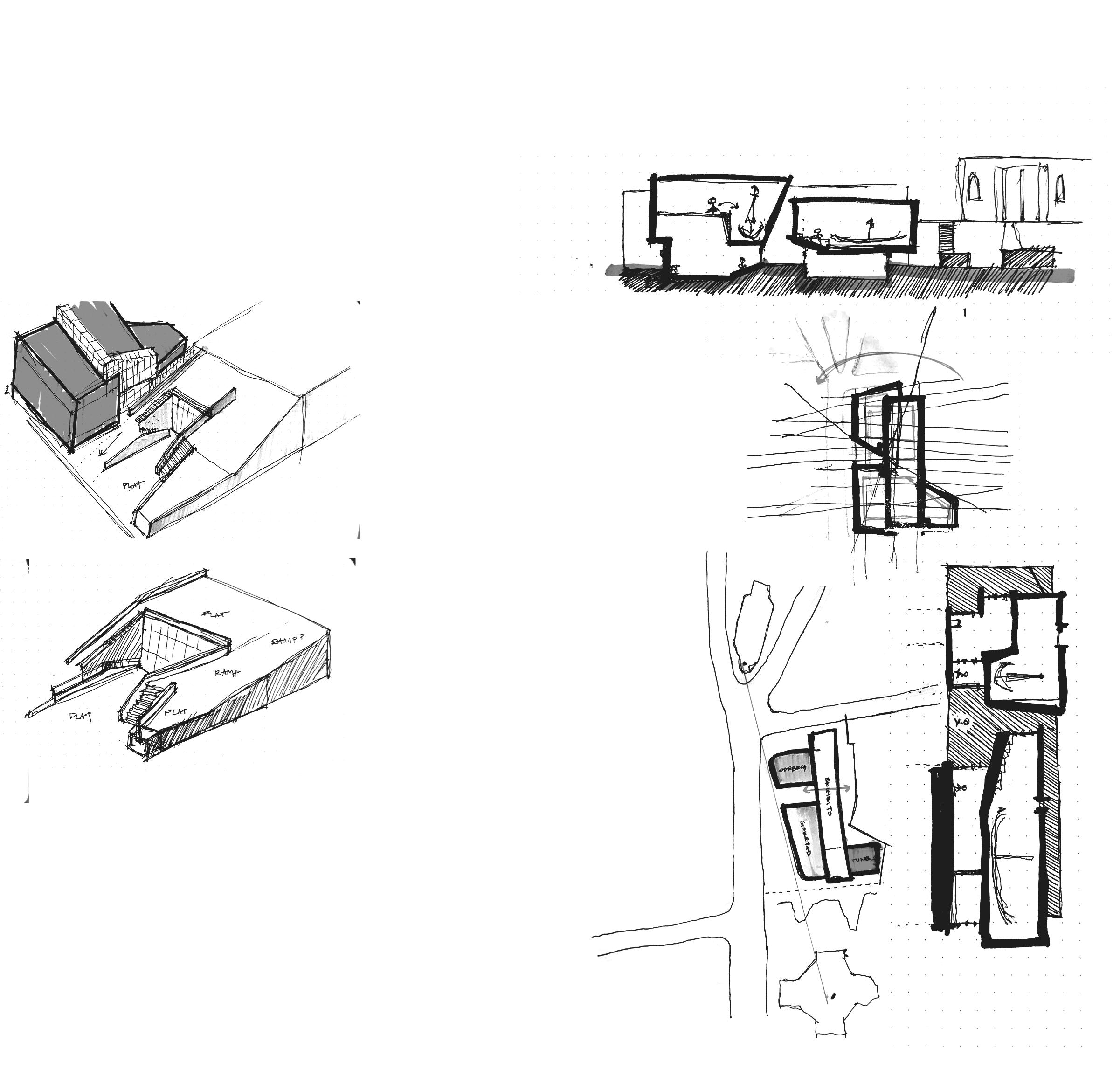
PROCESS
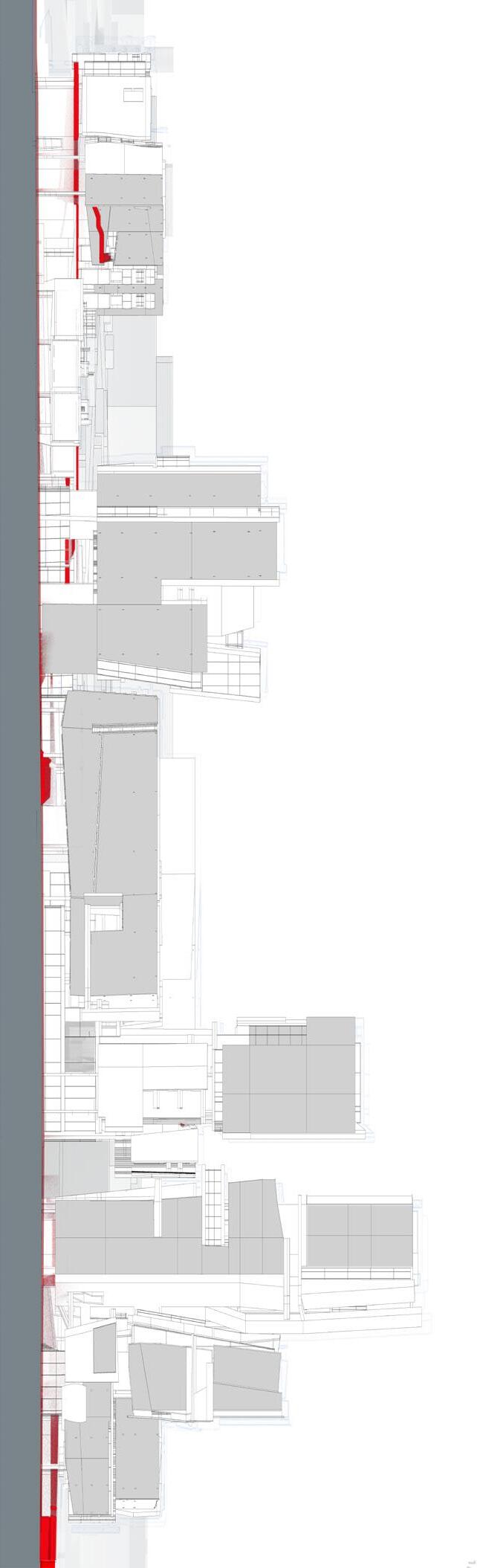
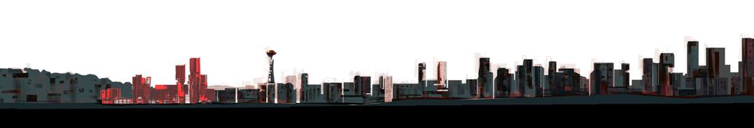
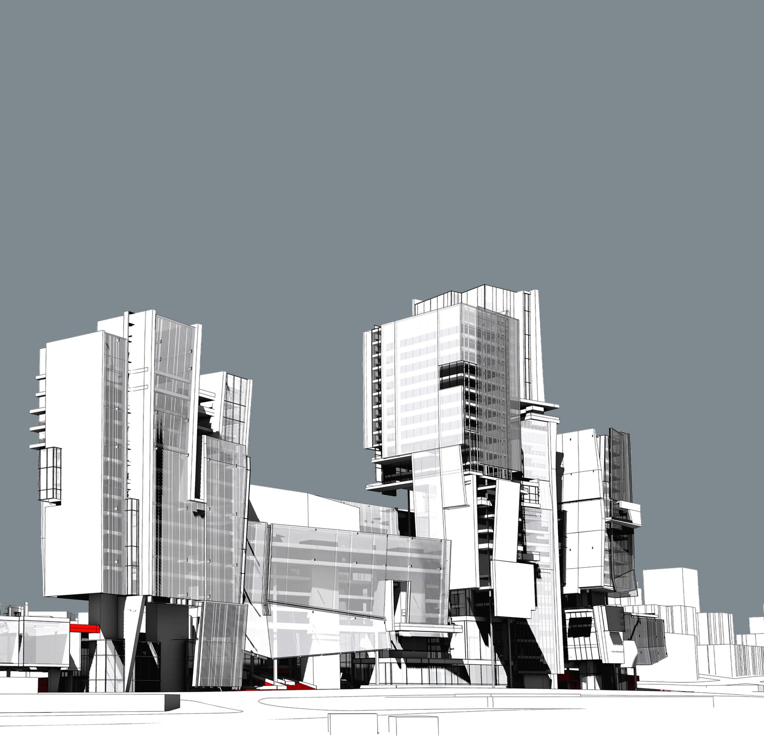
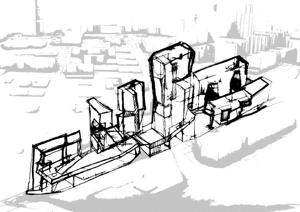
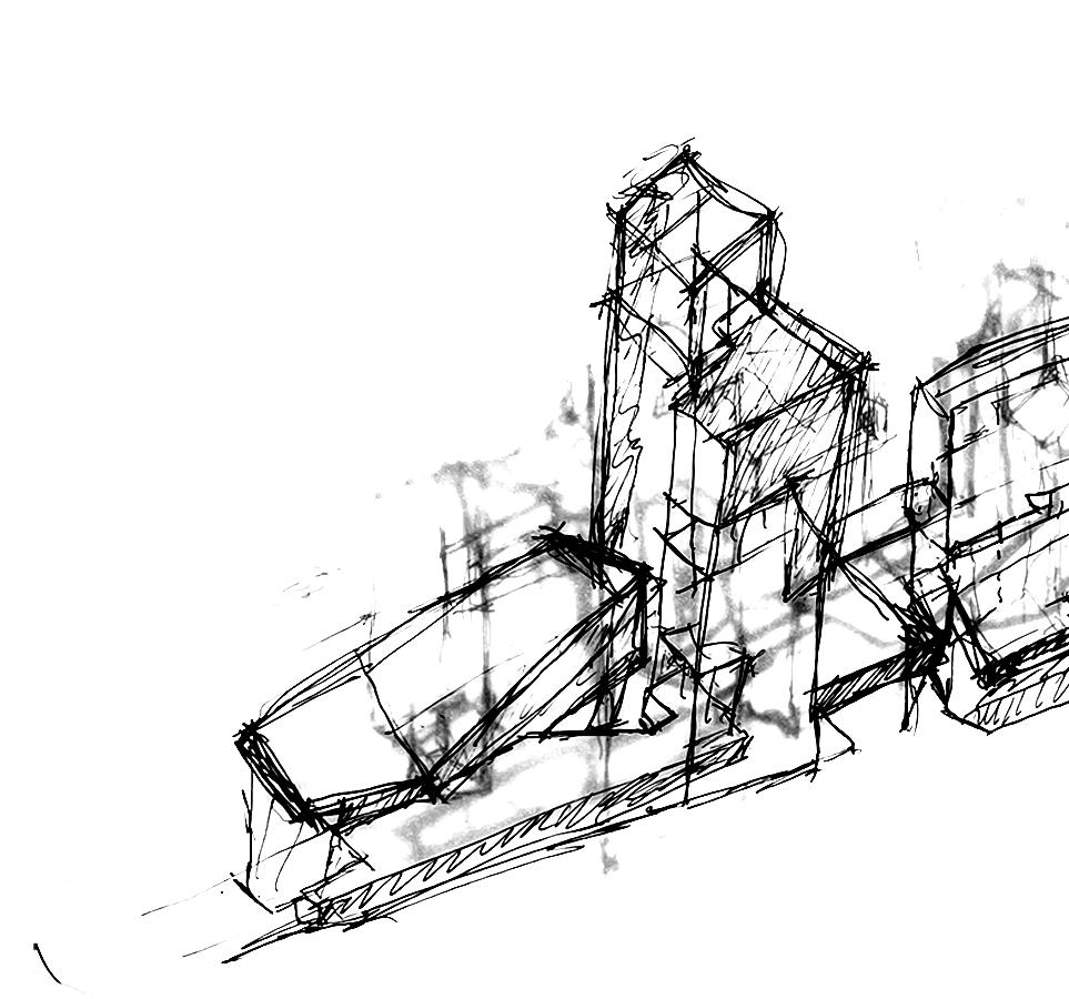
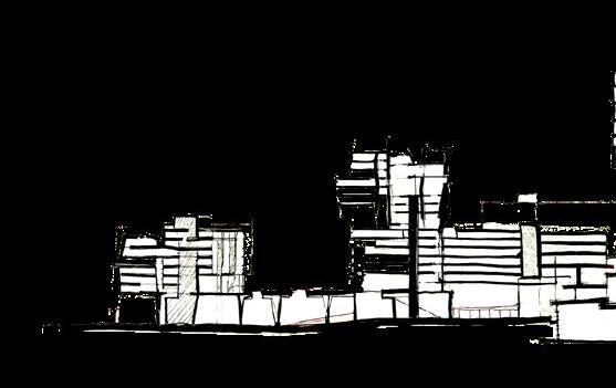
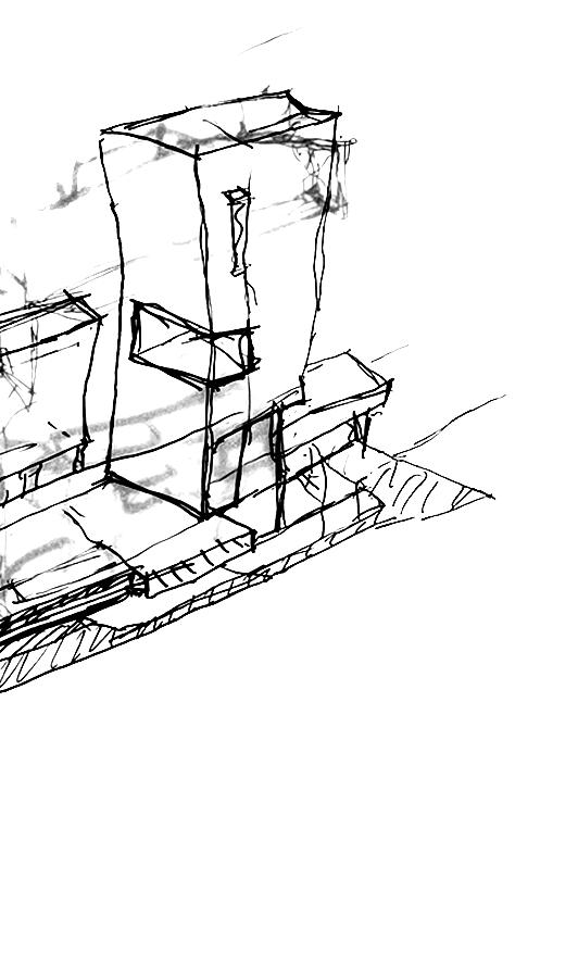
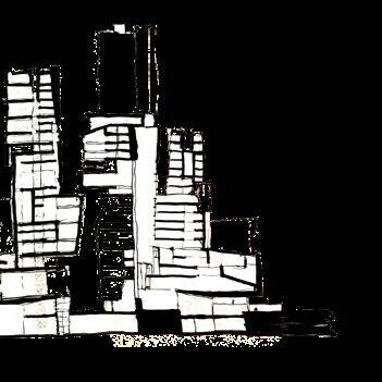
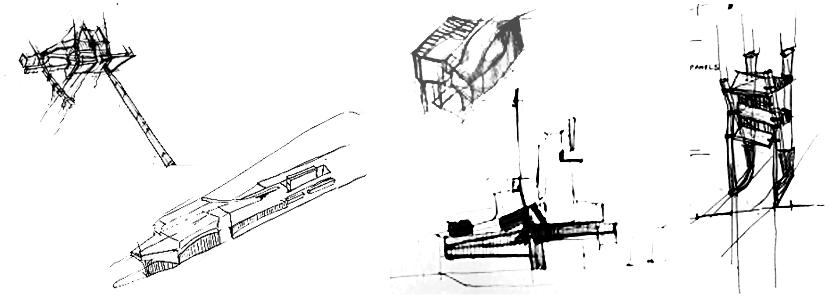
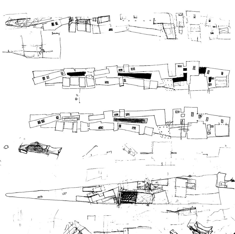
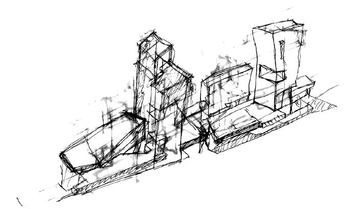
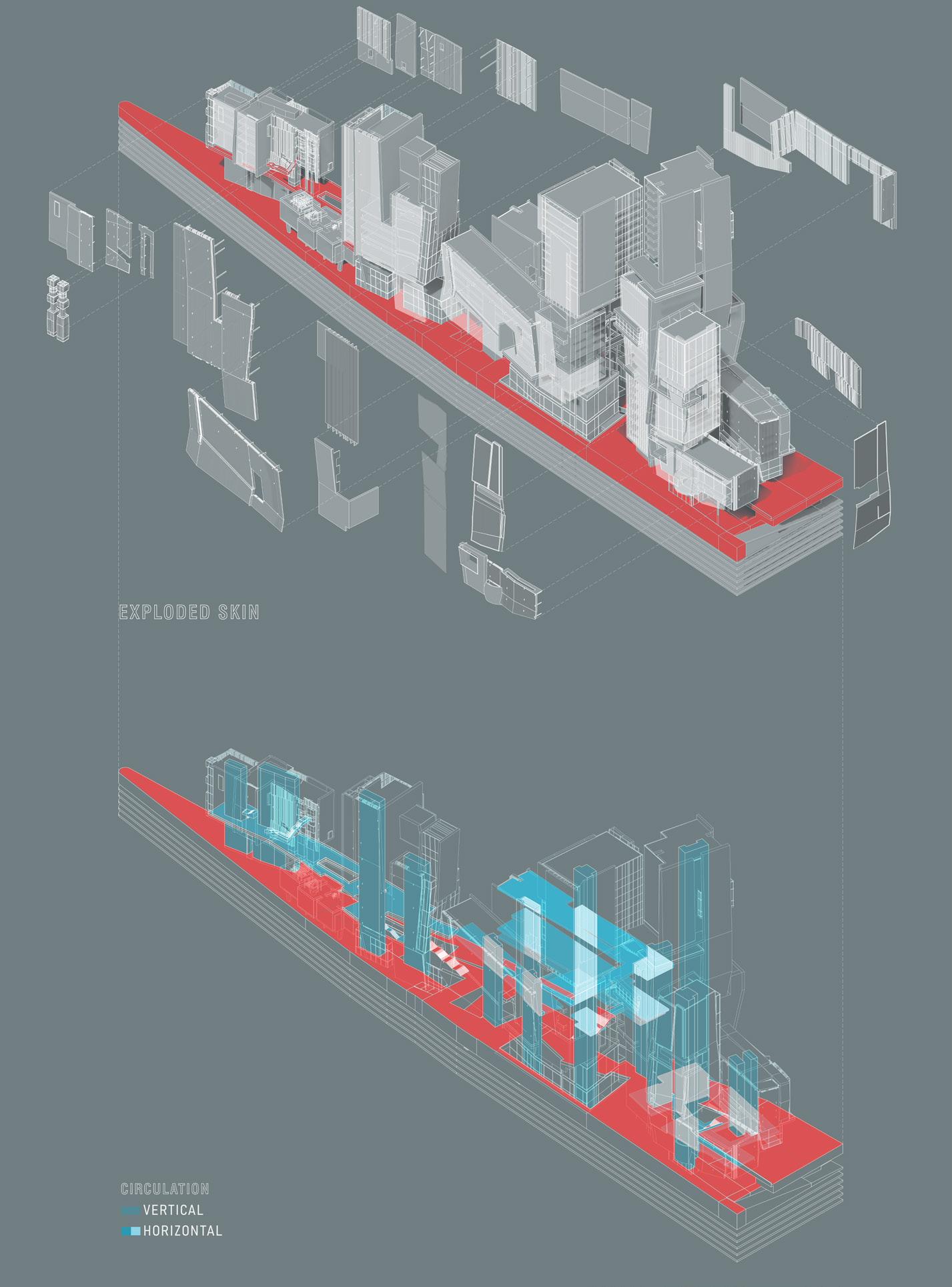
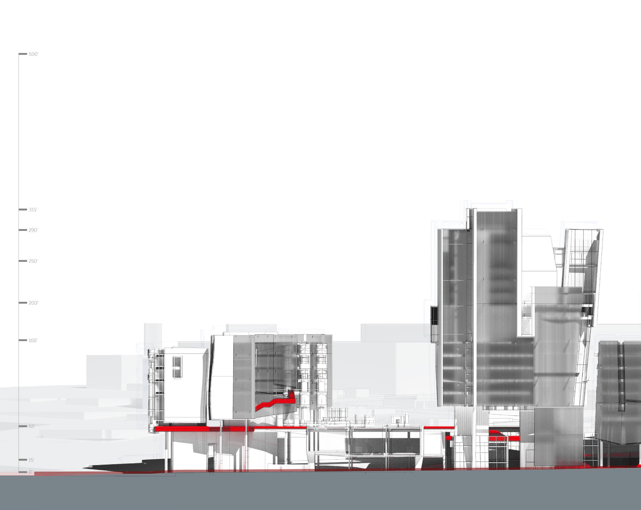
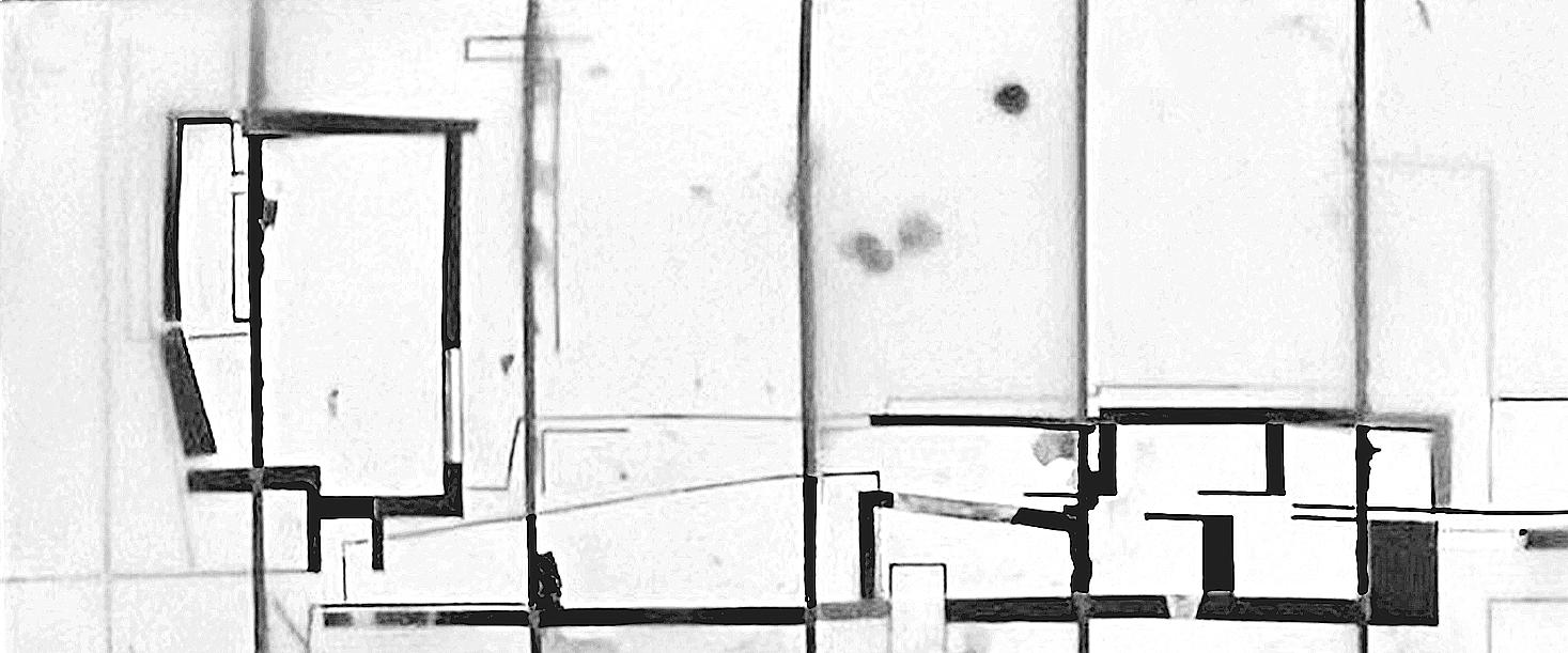
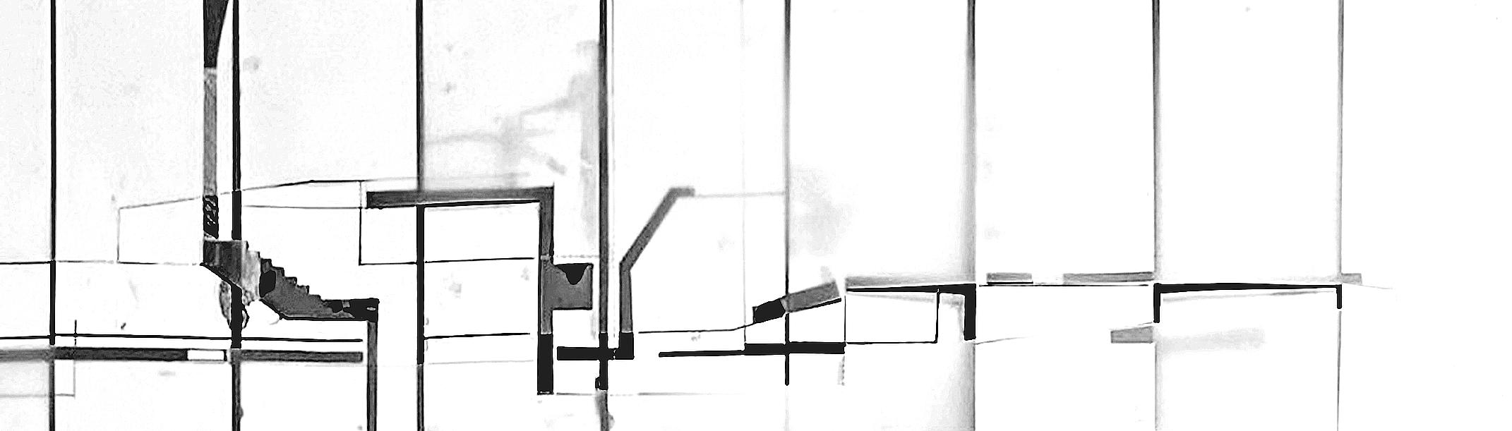
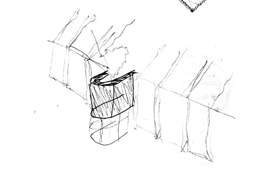
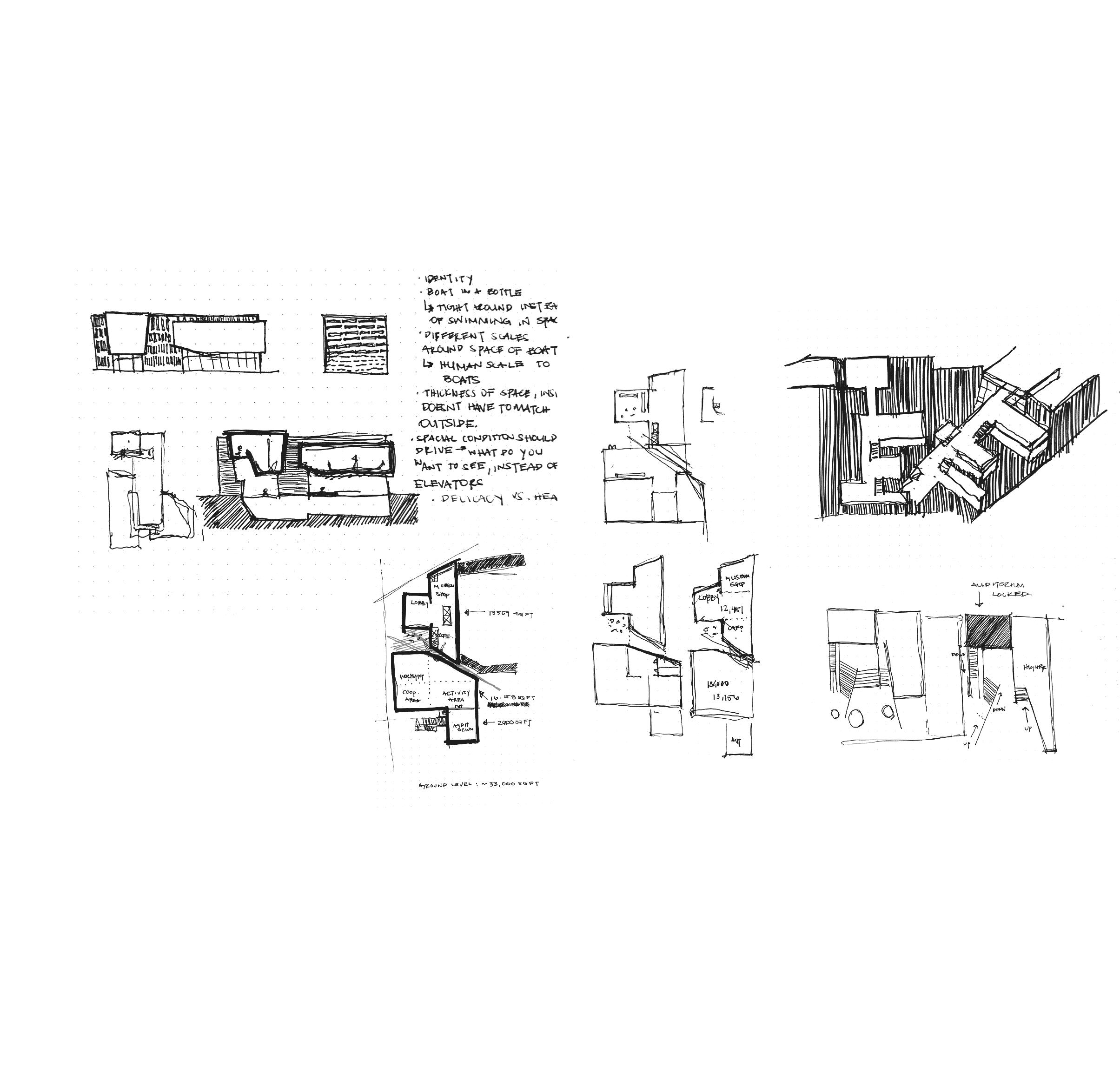
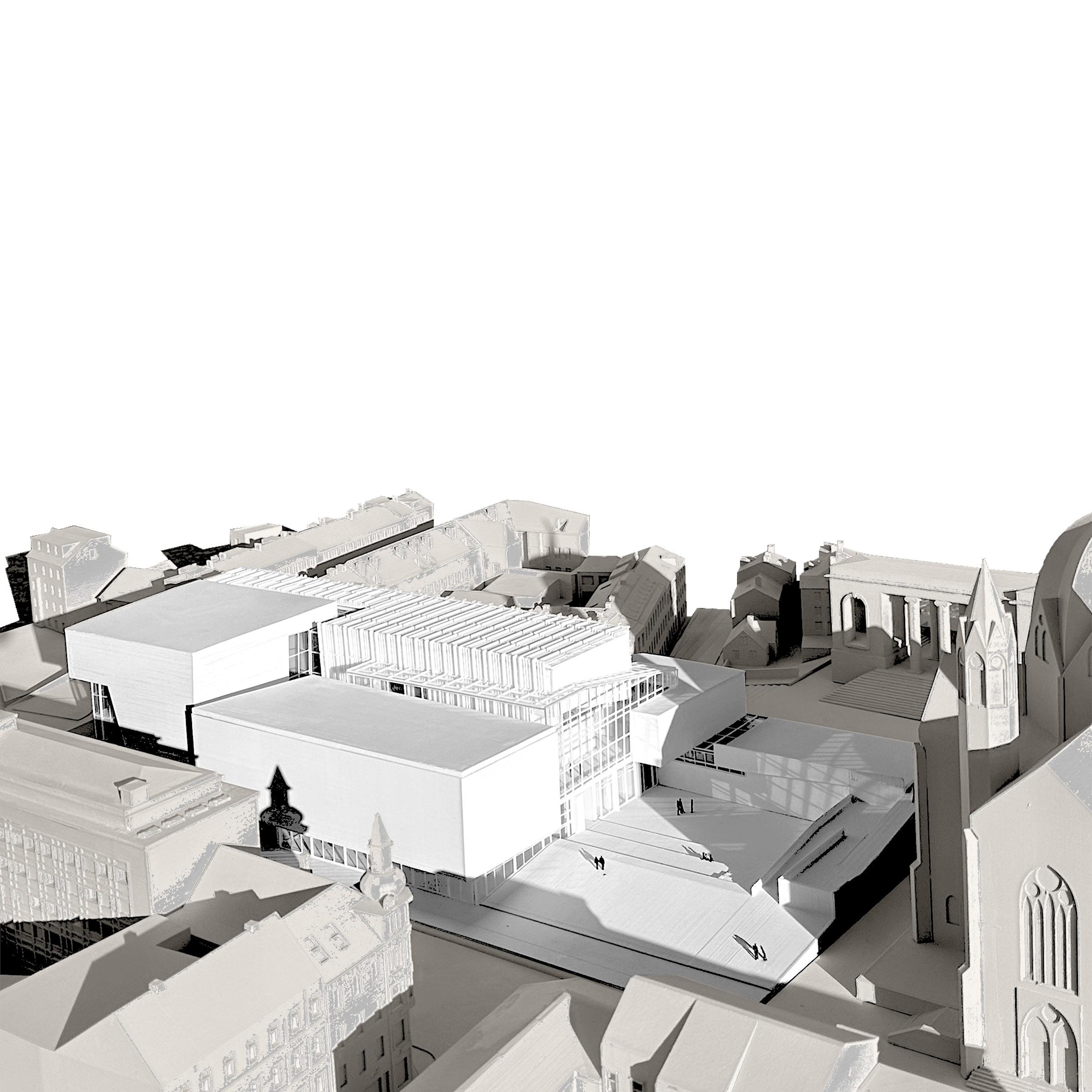
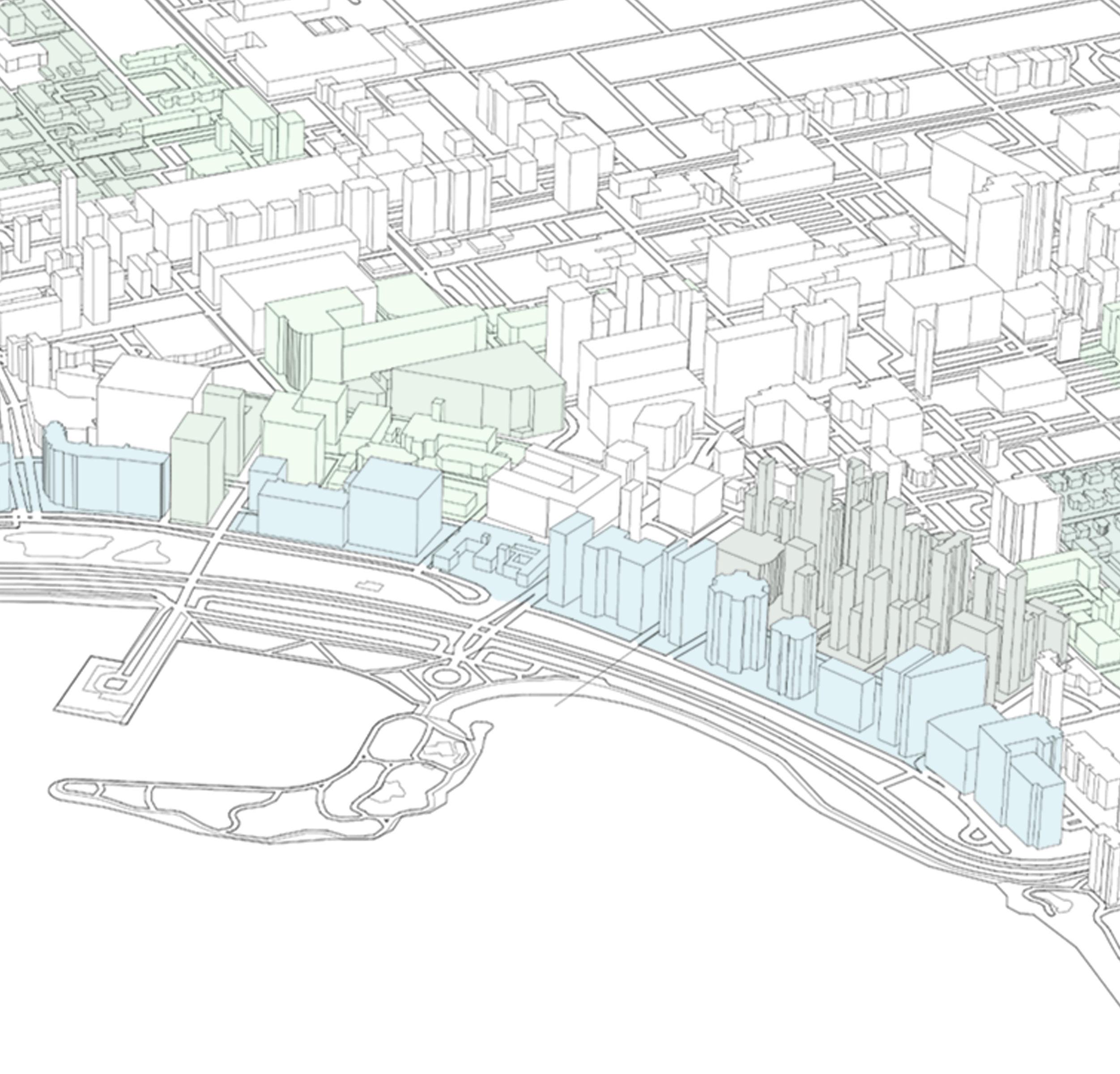
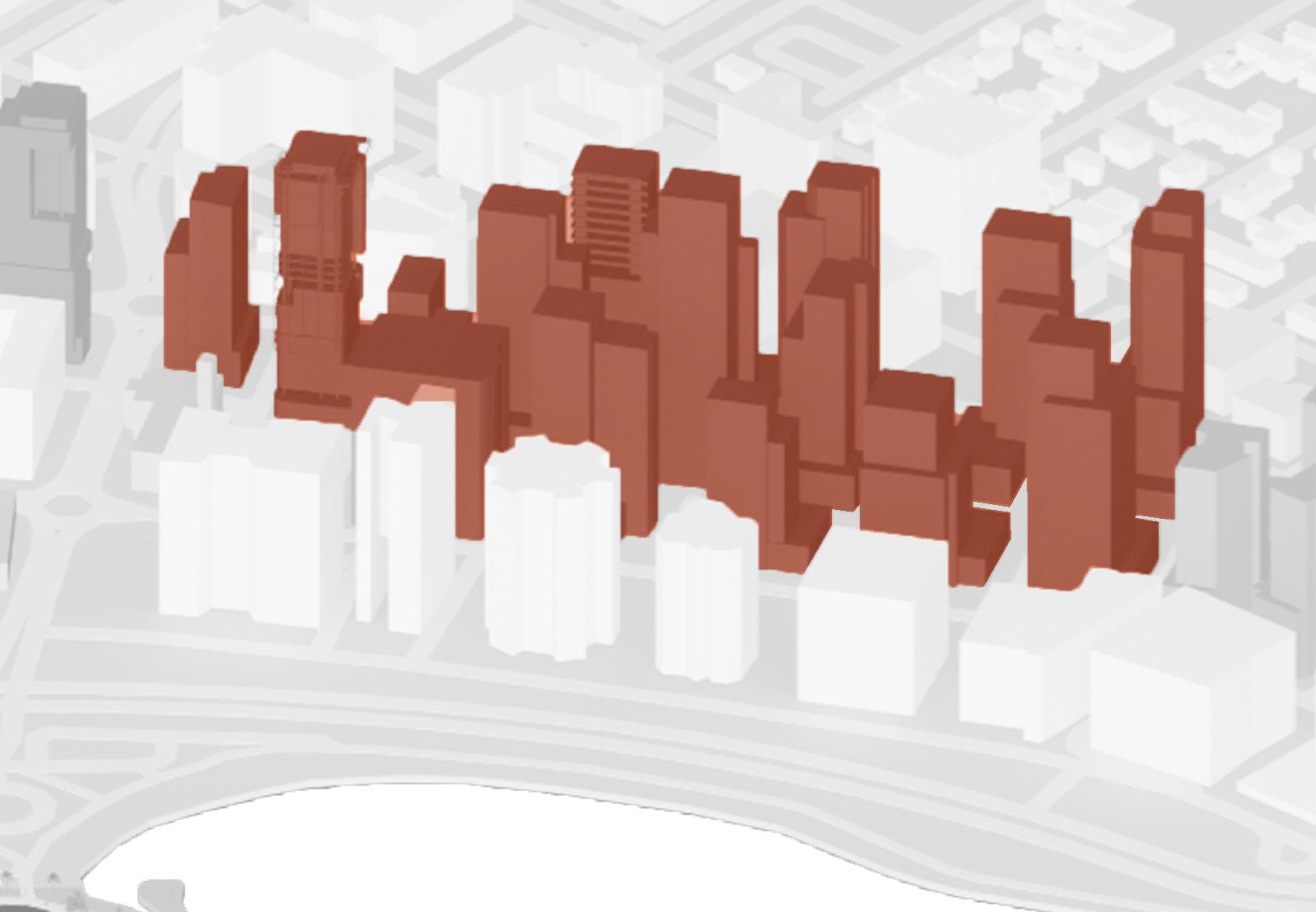
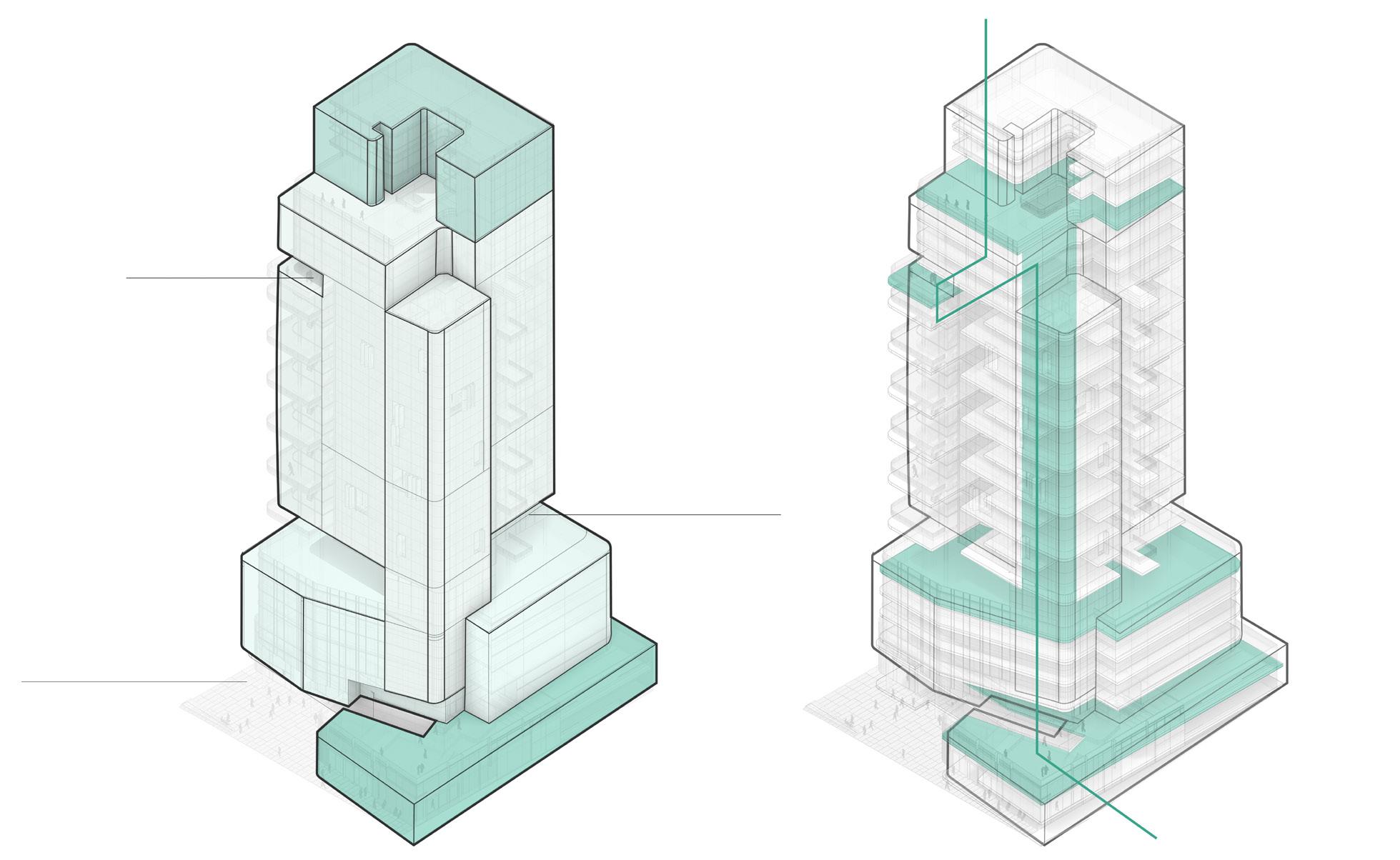
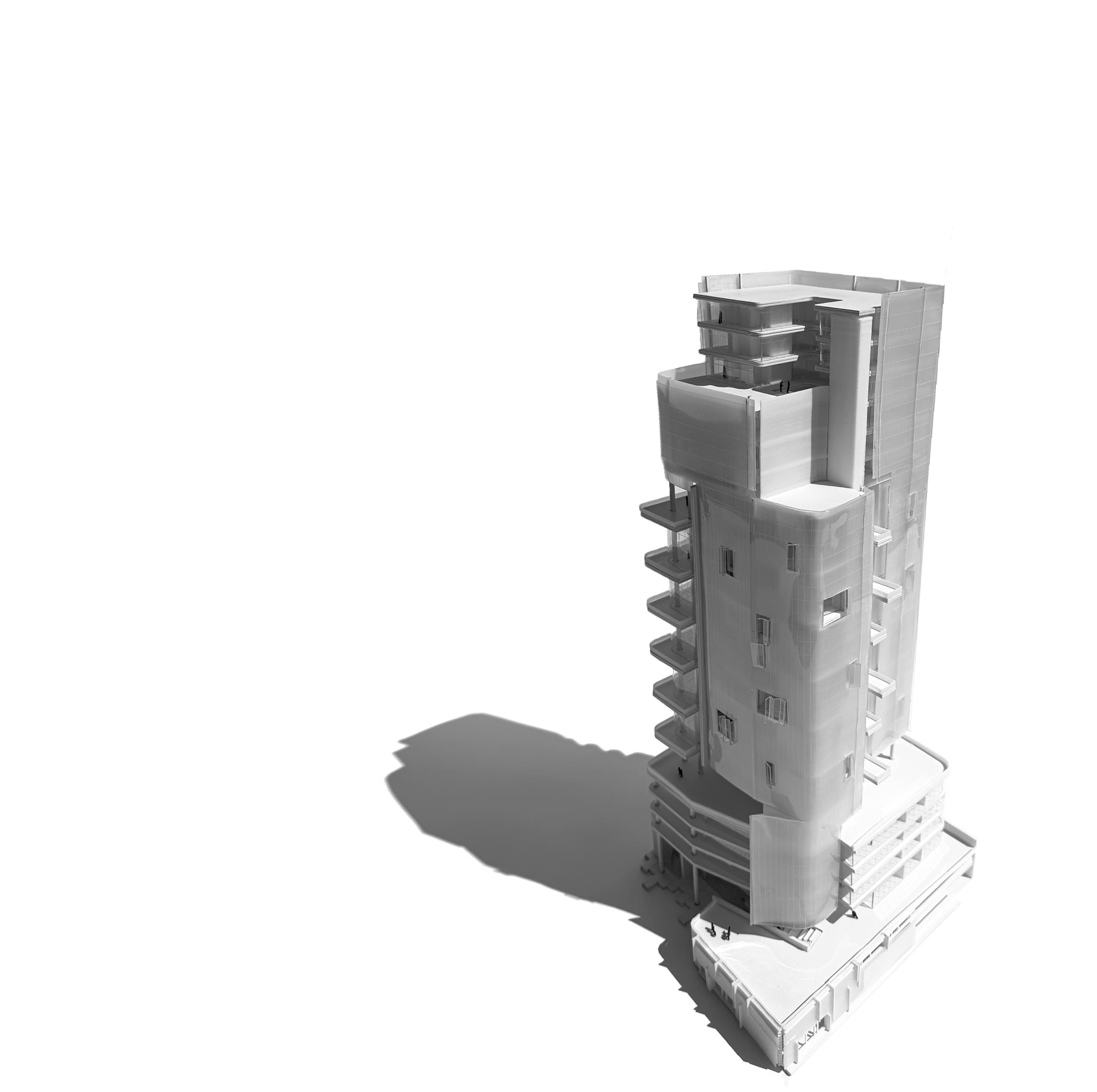
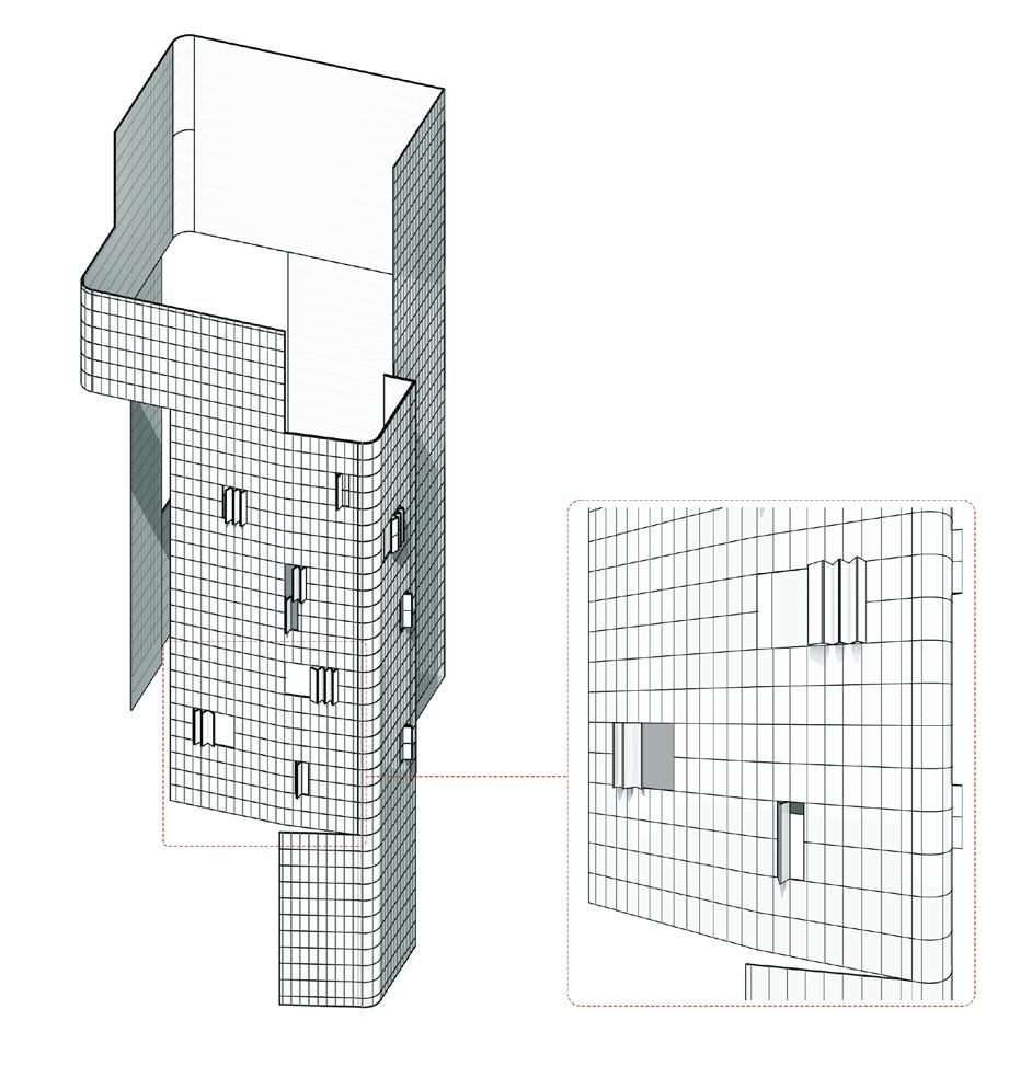
In order to define hierarchy early on, there was an emphasize on deciding what stood vertically, and what stretched horizontally. Sketching became a fast way to flesh out all ideas and options, and from there the team mashed past projects from various years together to get a even better idea of the potential skyline as seen below.
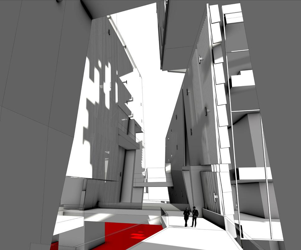
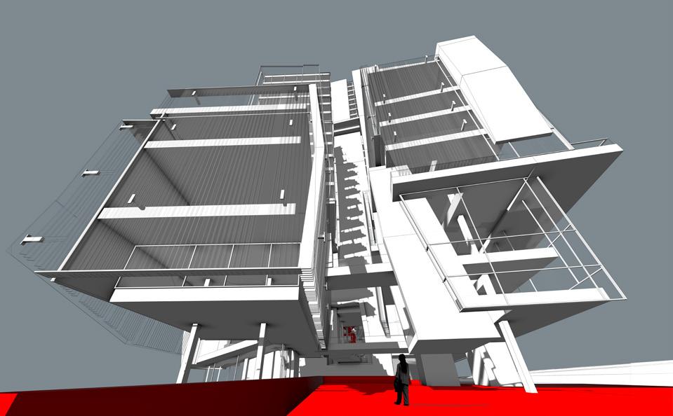
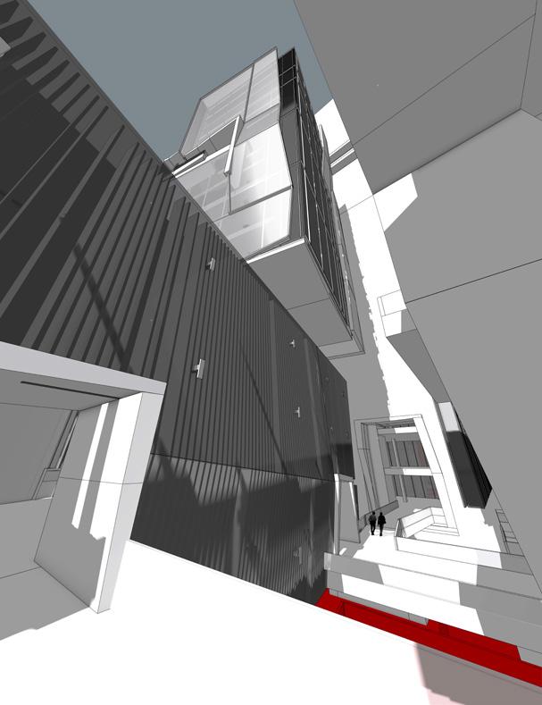
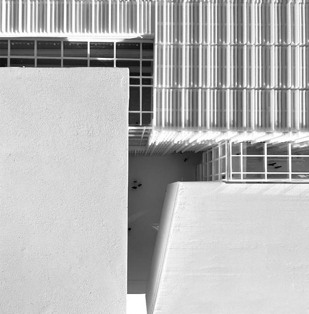
As mentioned previously, voids and tectonics became equally as important of moments as the internal spaces created. The nature of the triangular lot provided a basic framework for the hovering forms, but the program helped dictate the envelope’s tectonic visibility as well as when to contract and give relief to space.
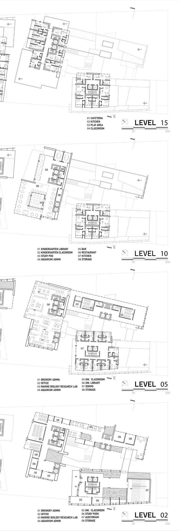
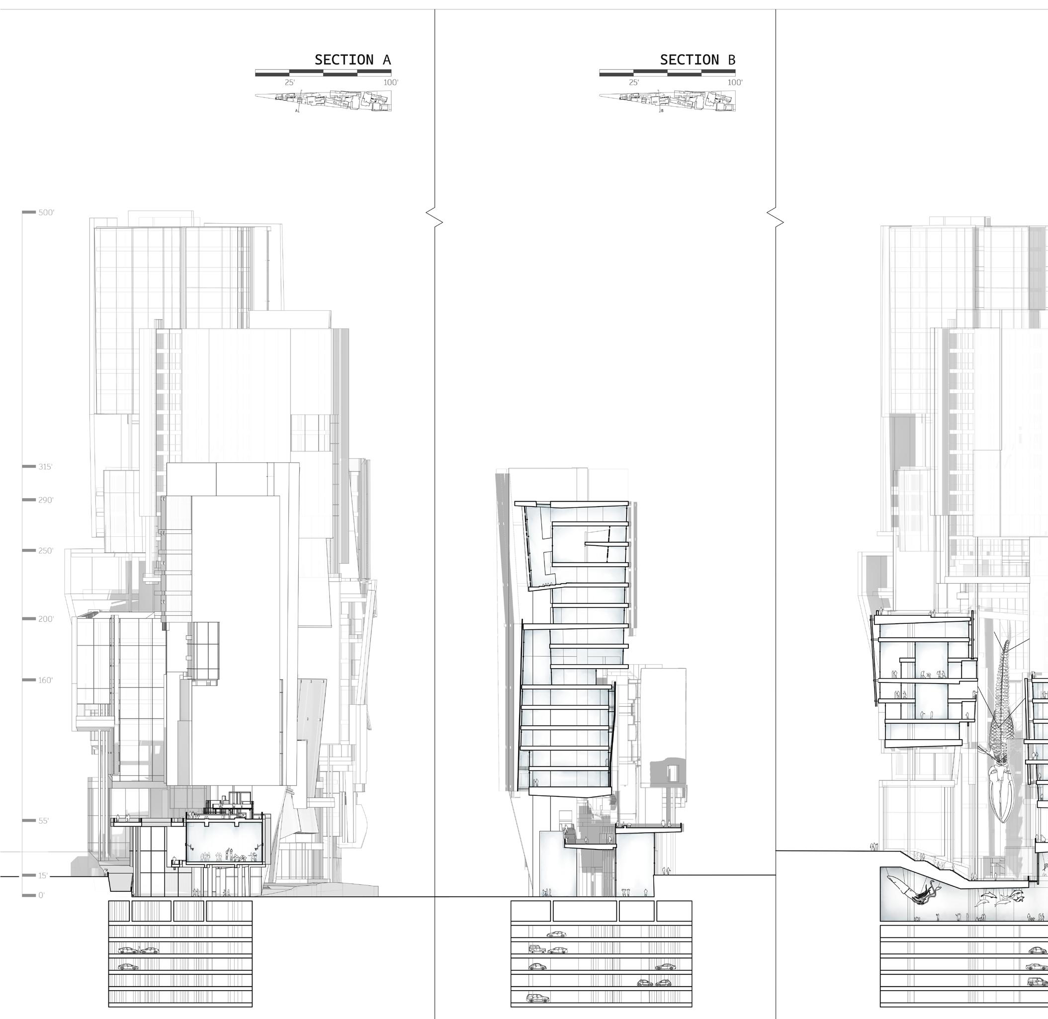
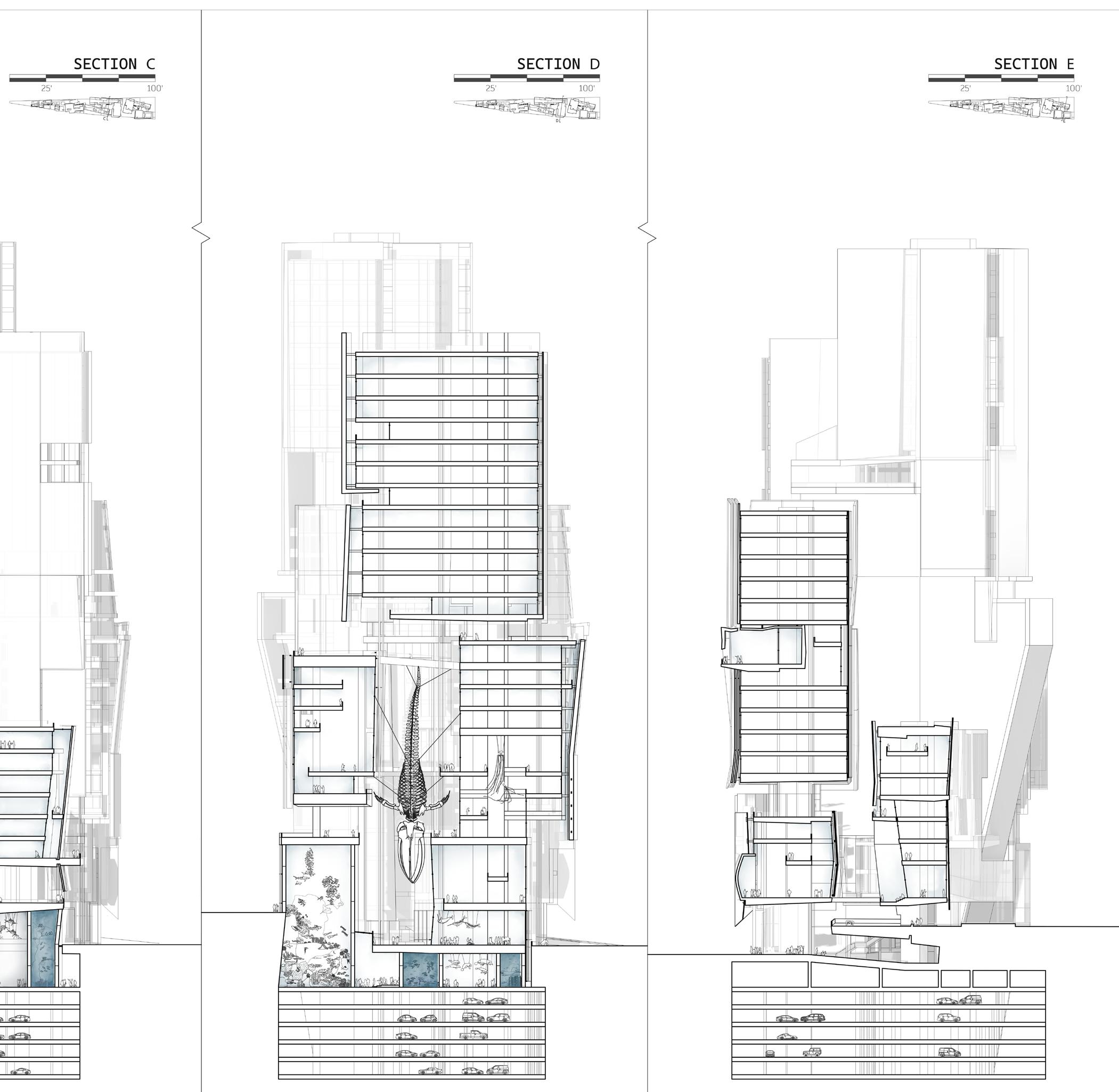
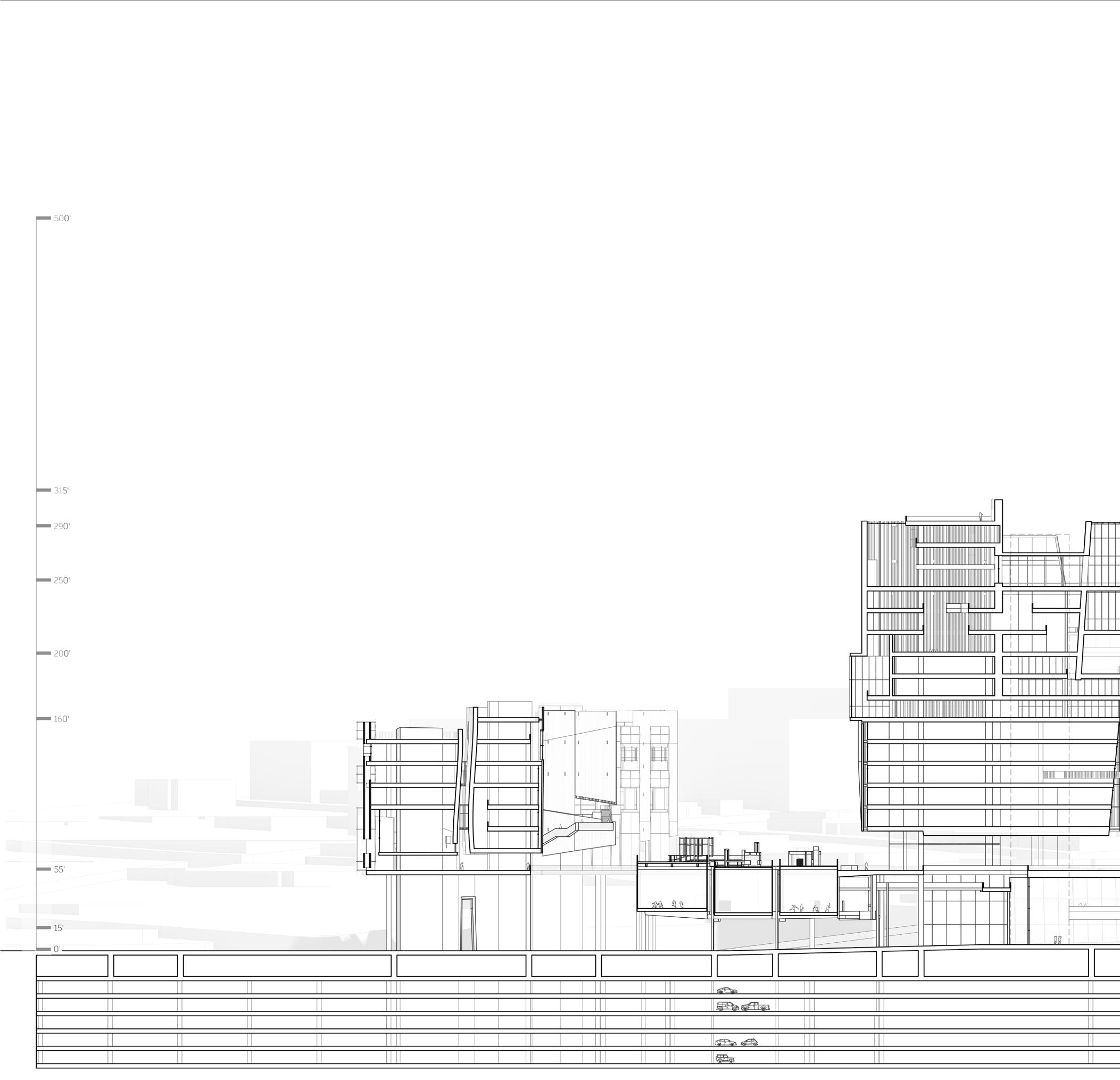
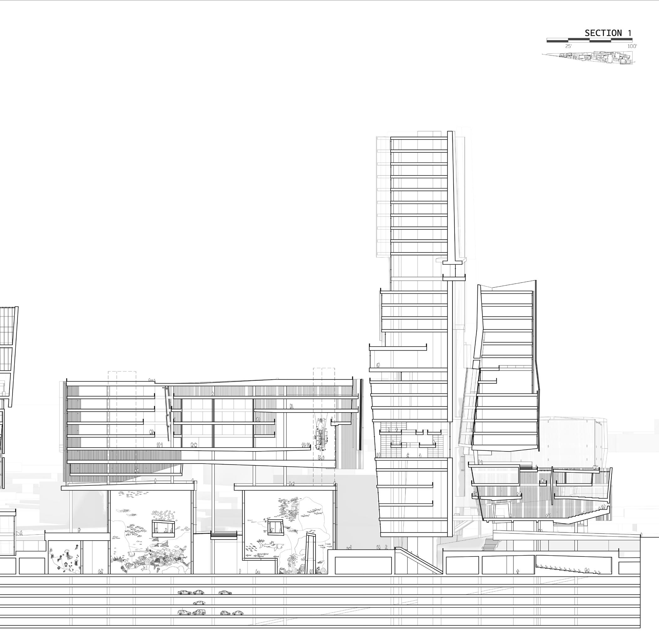
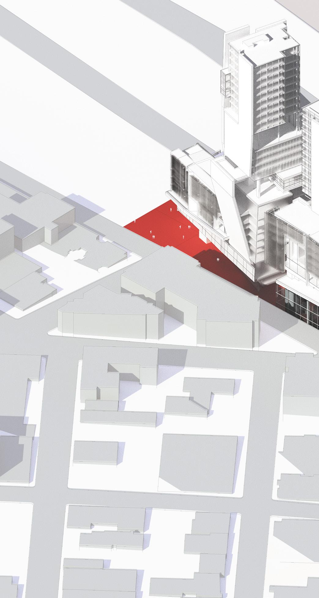
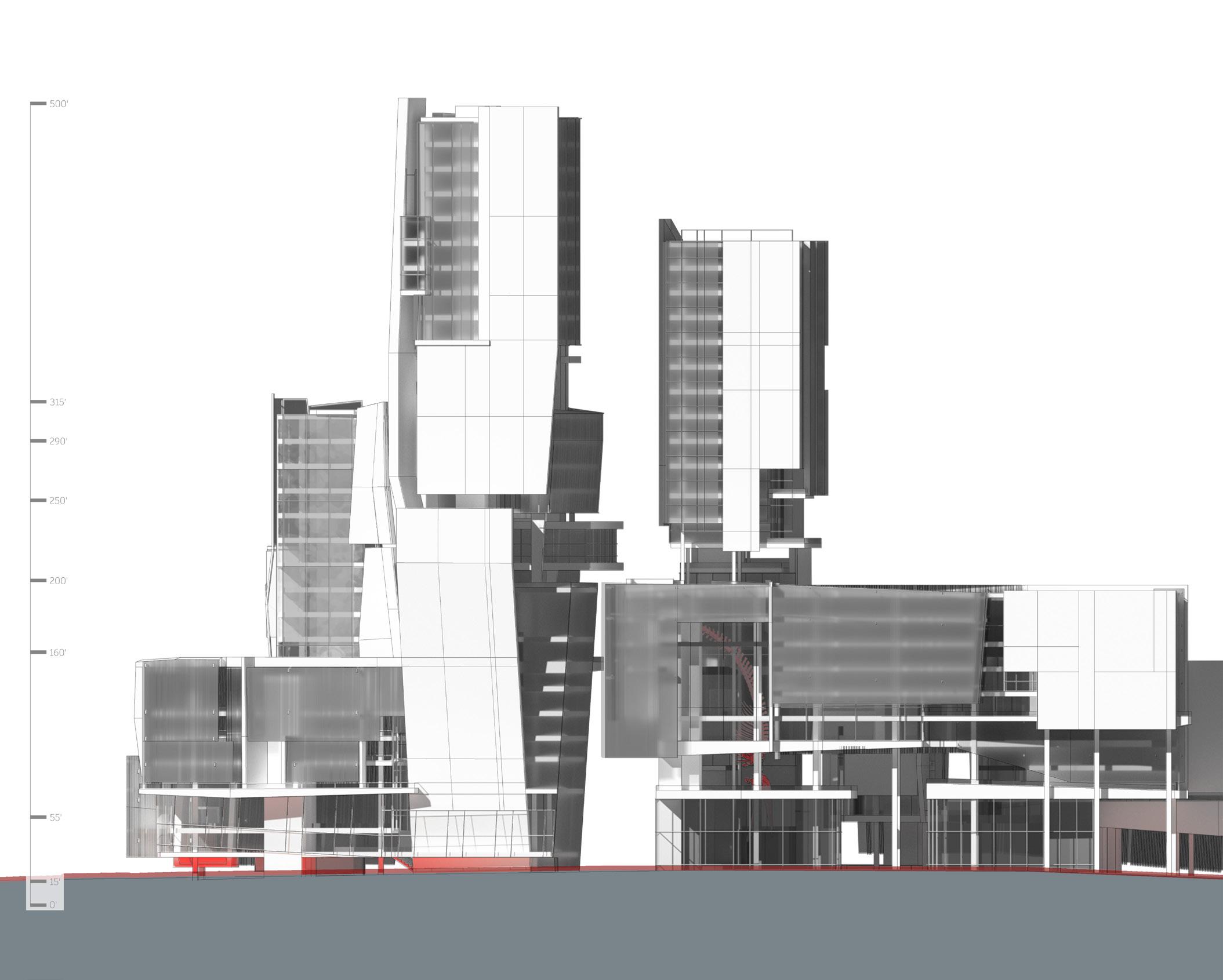
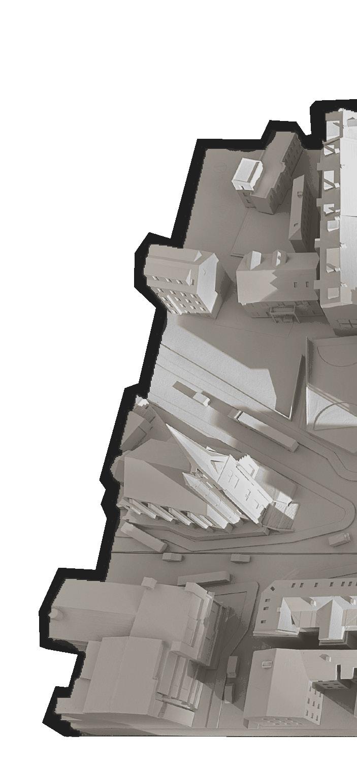
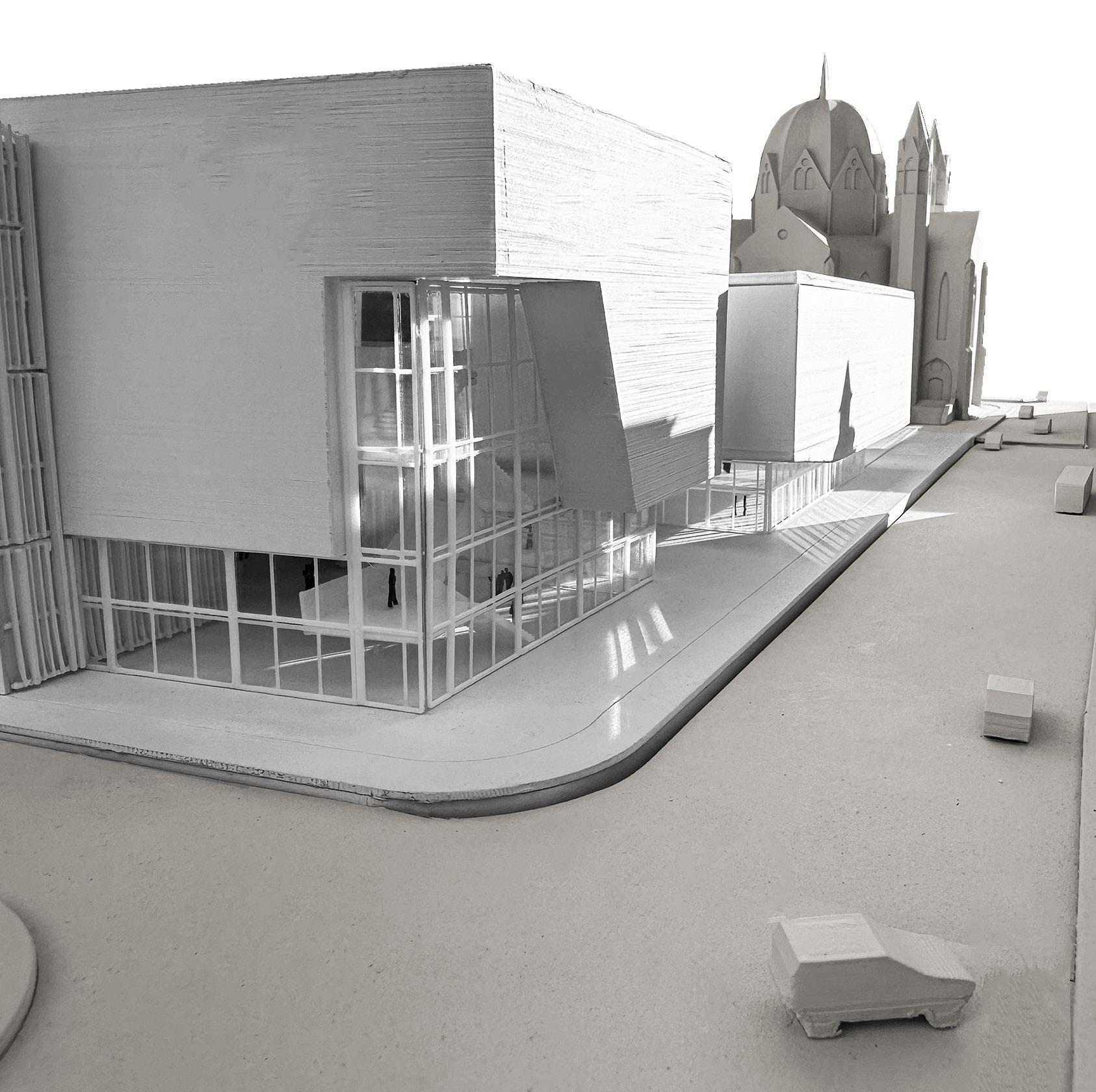
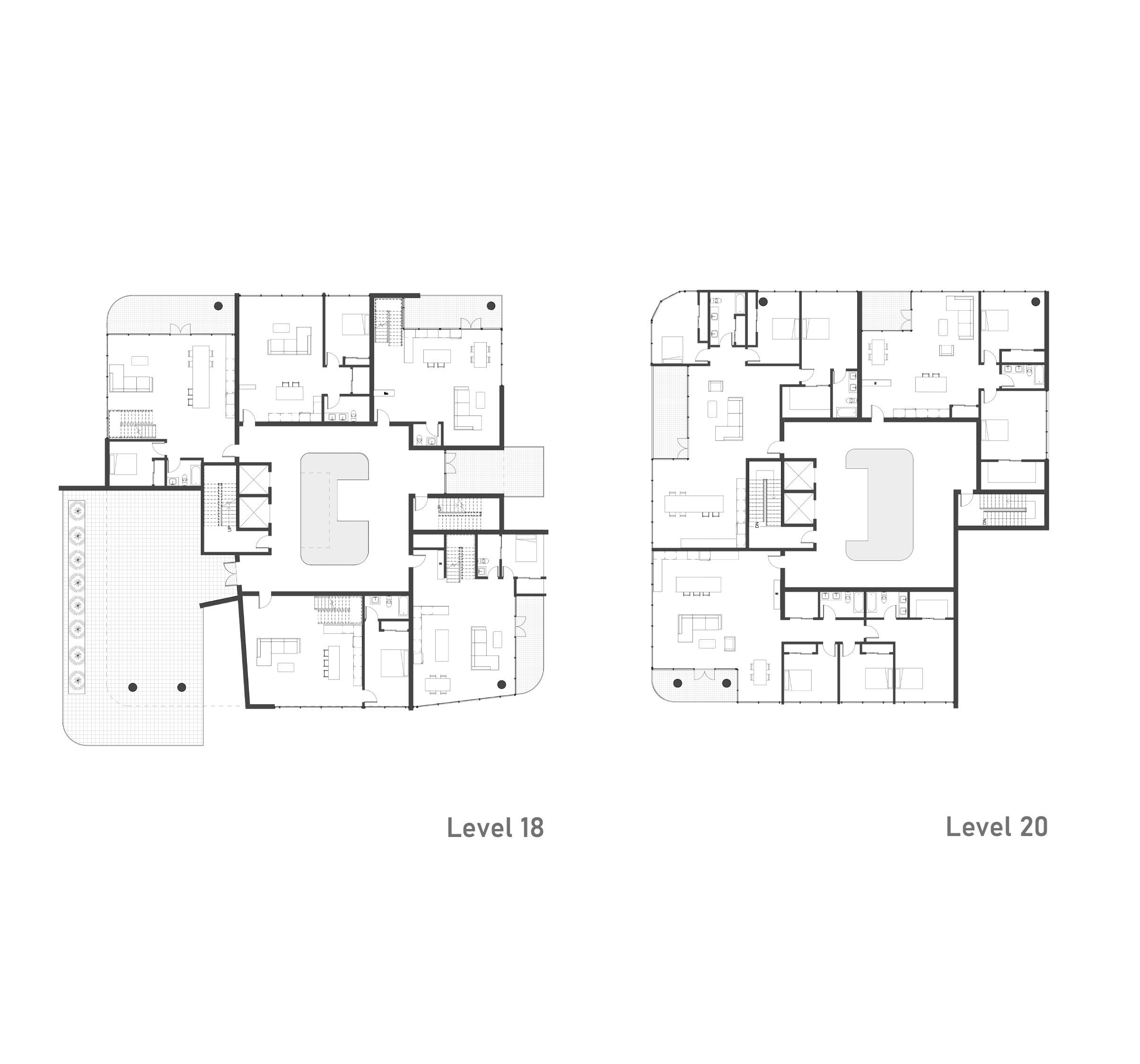
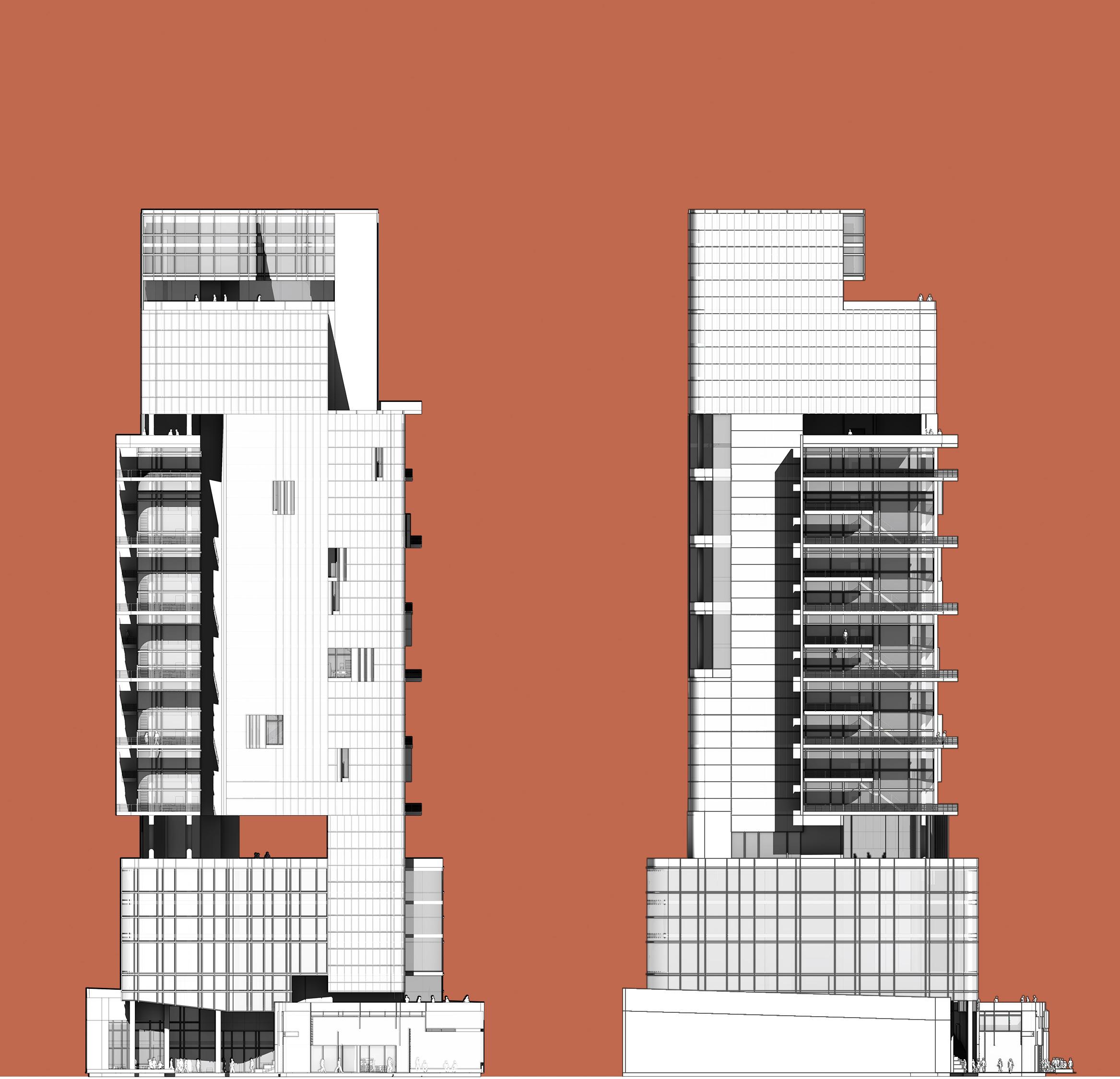
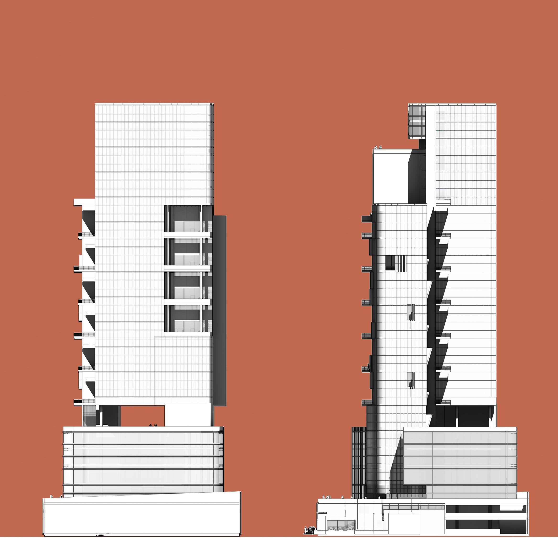
NORTH AND SOUTH GROUND
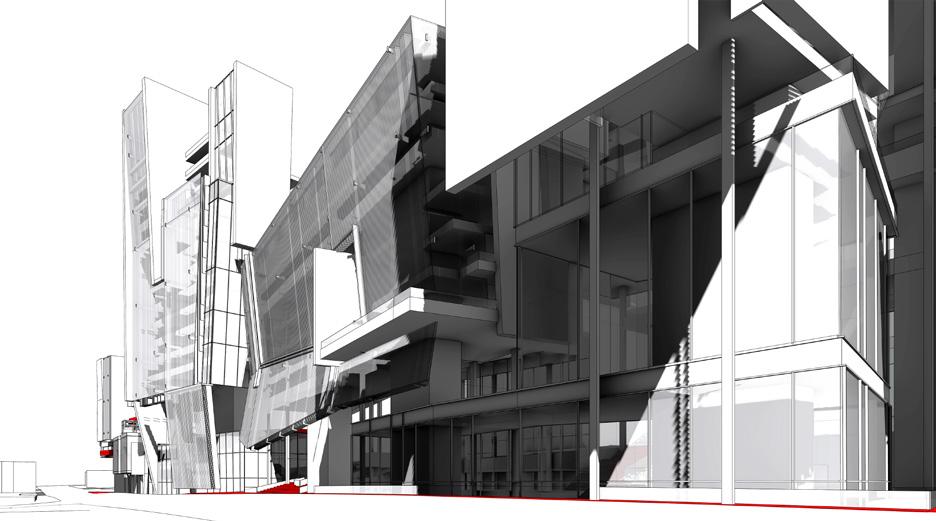
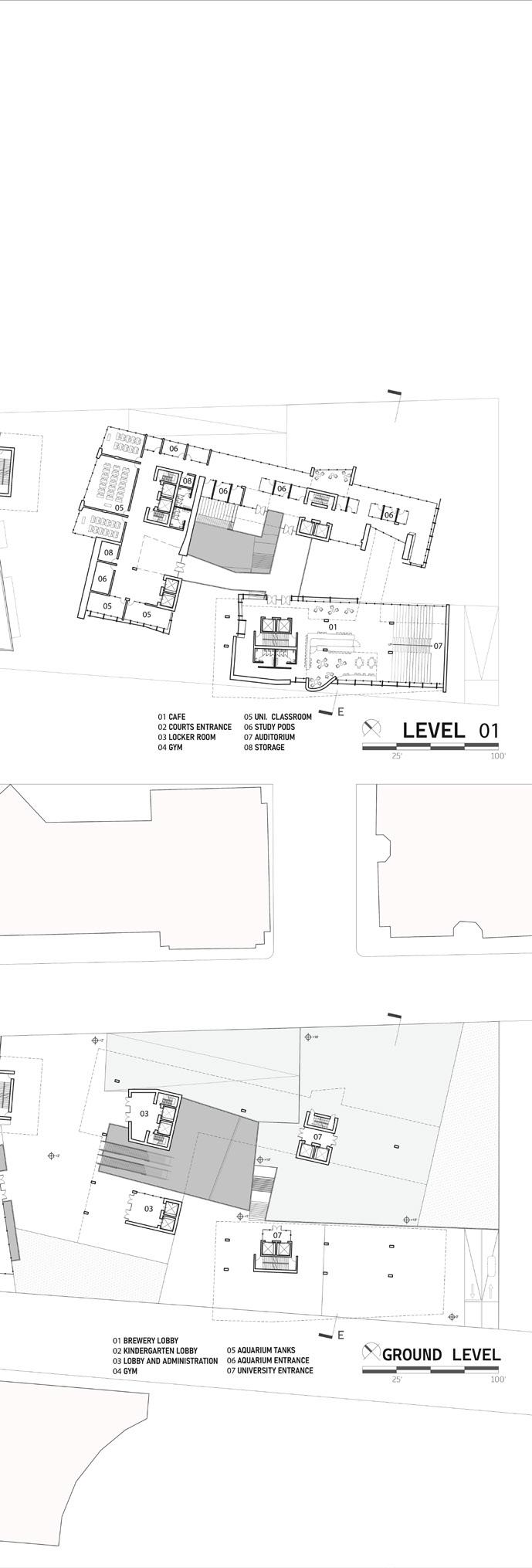
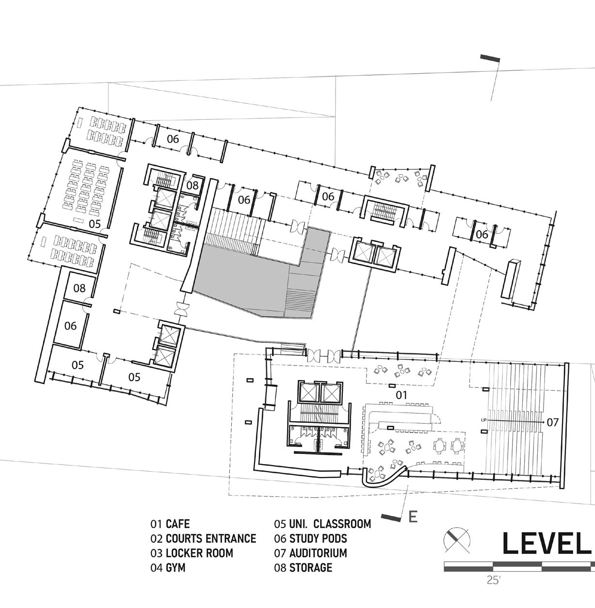
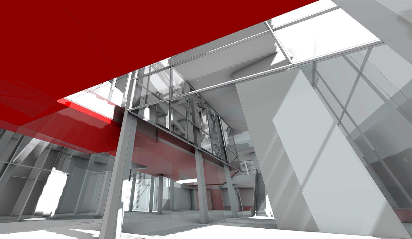
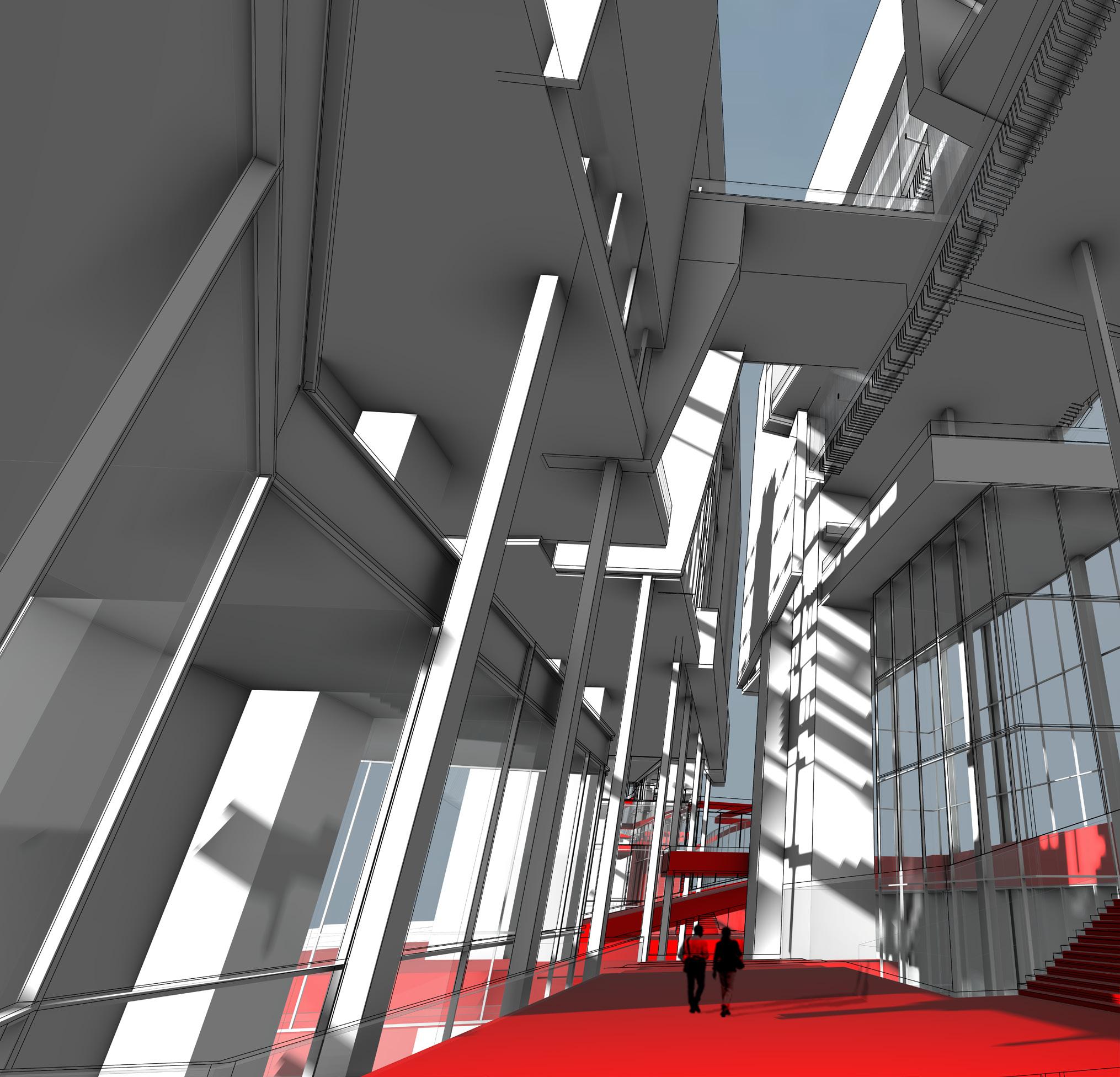
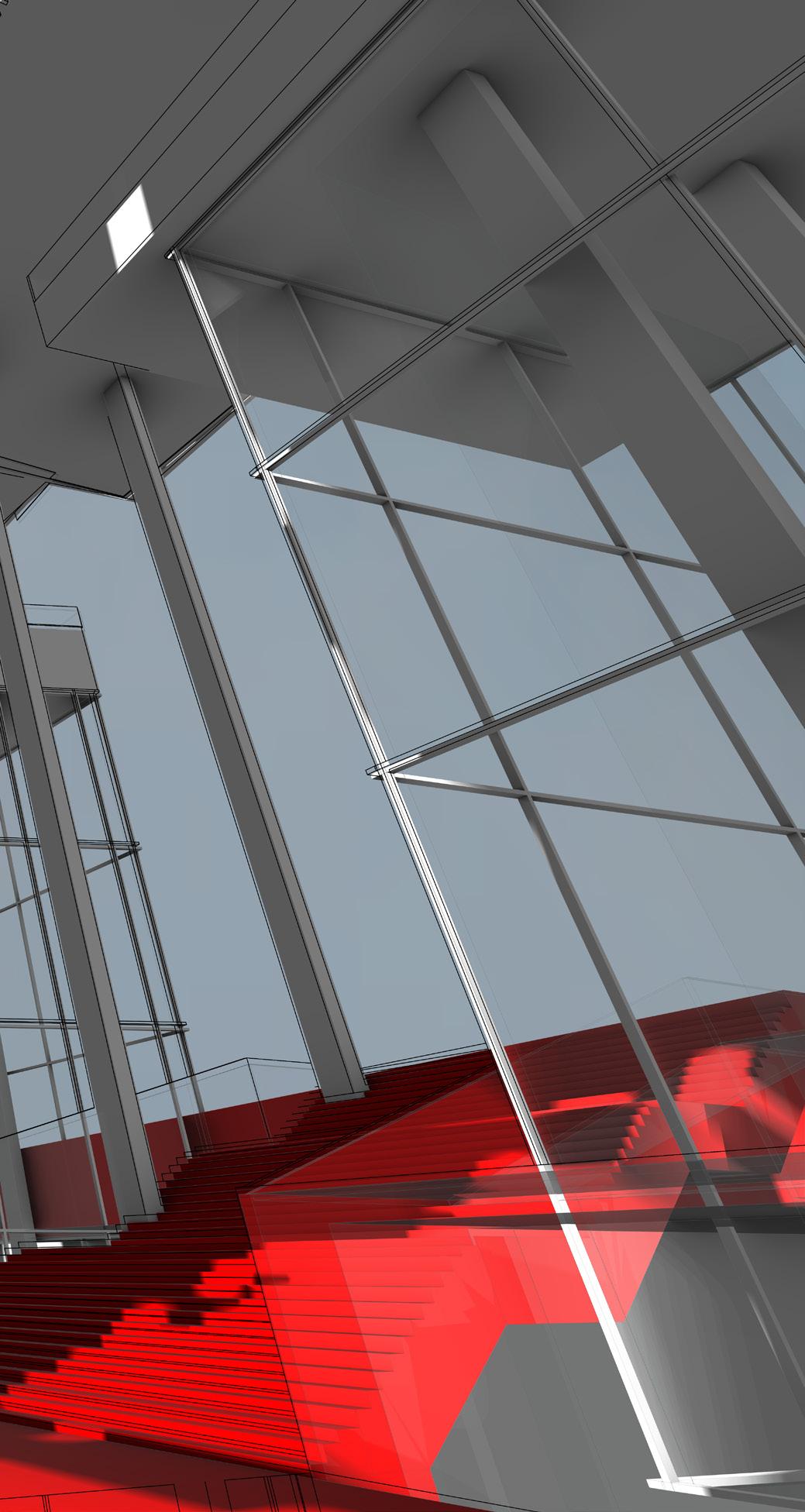
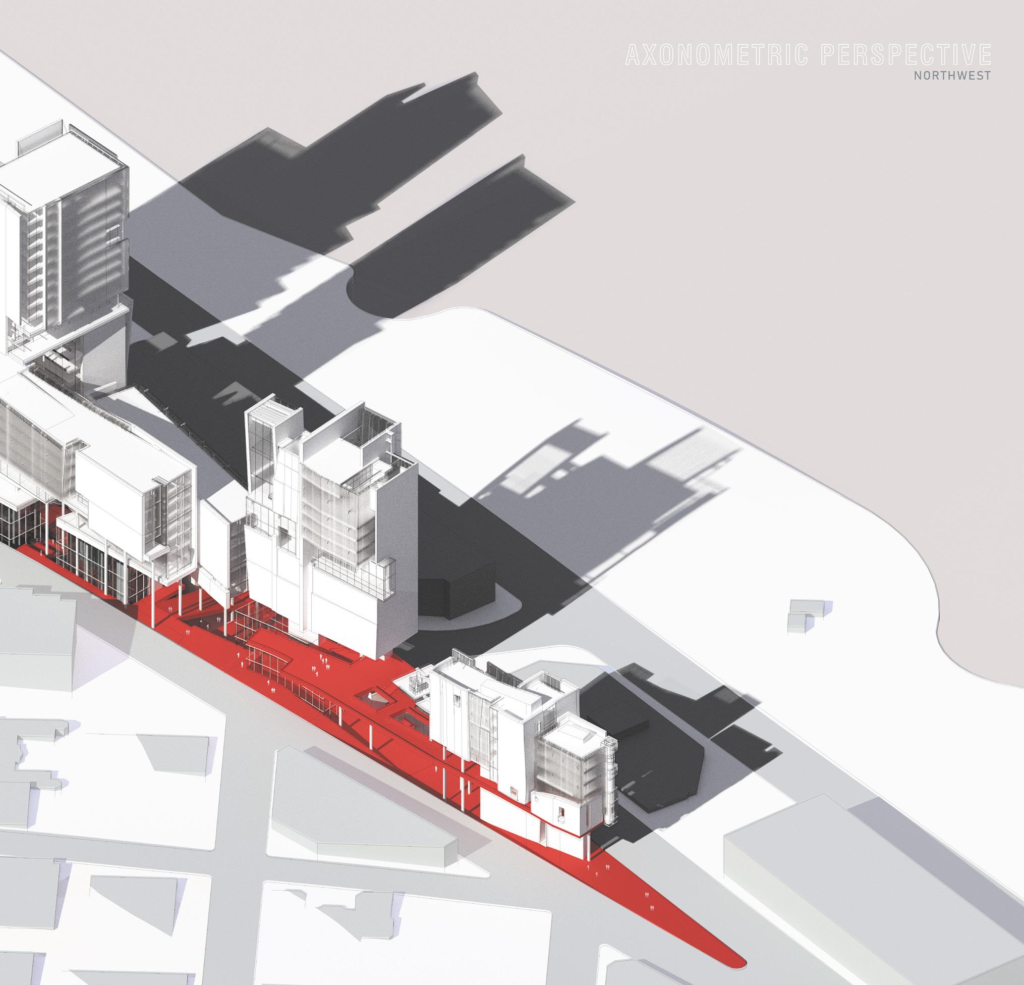
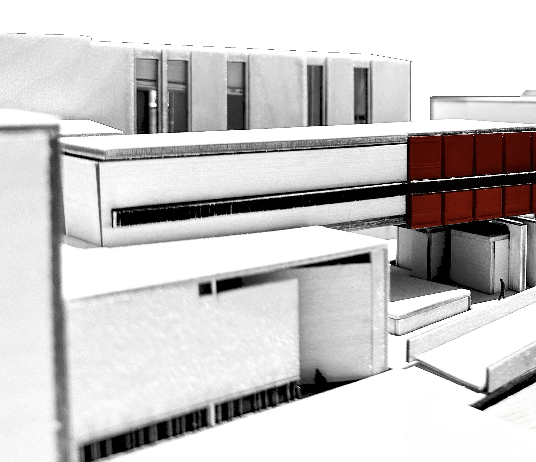
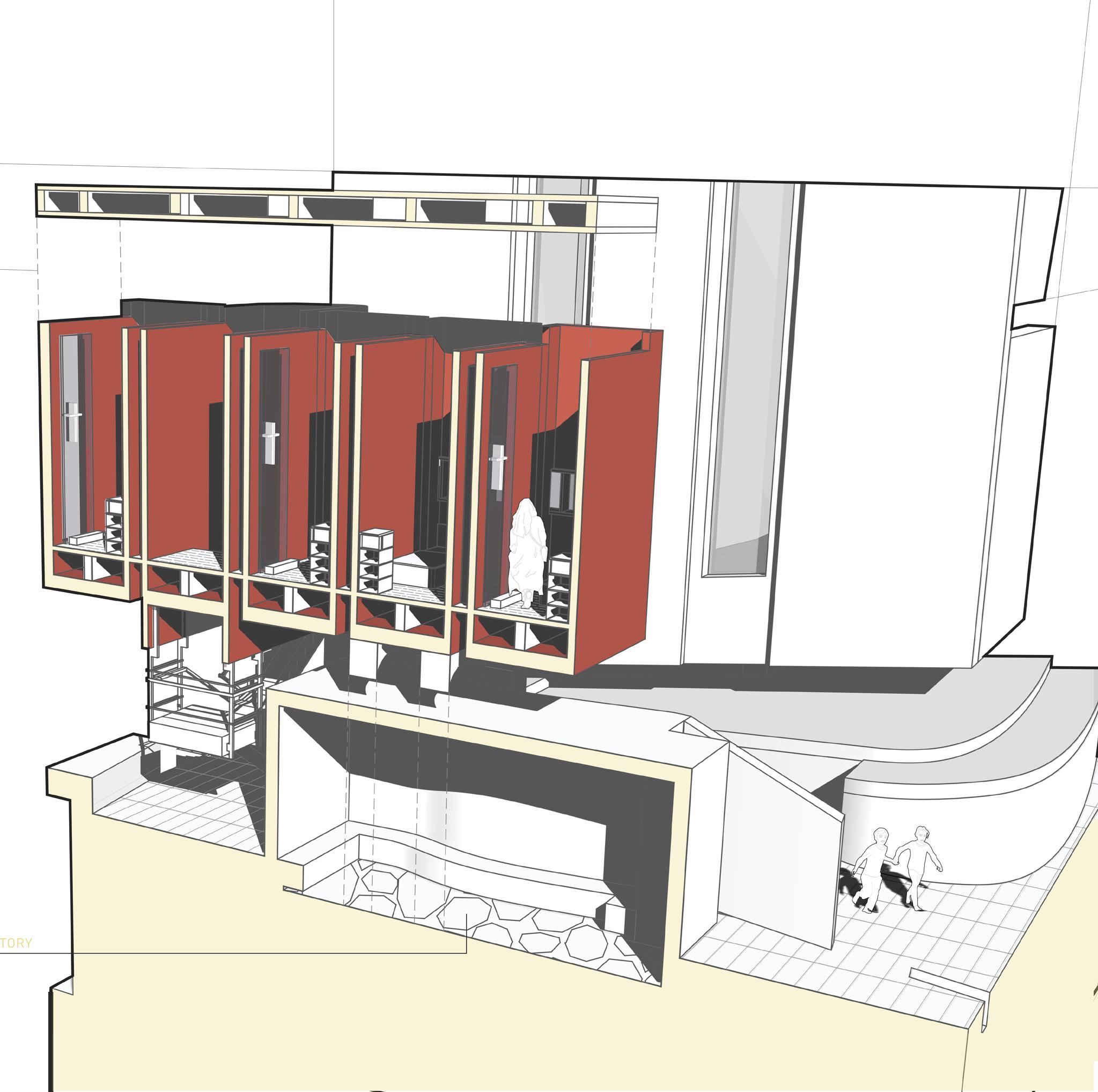
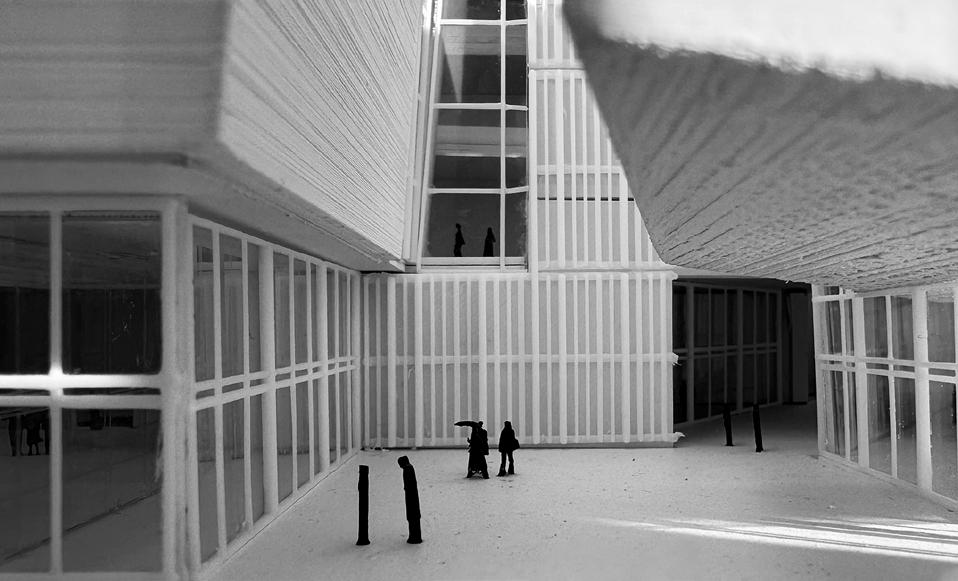
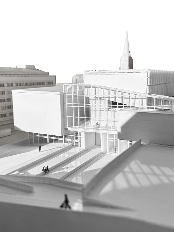
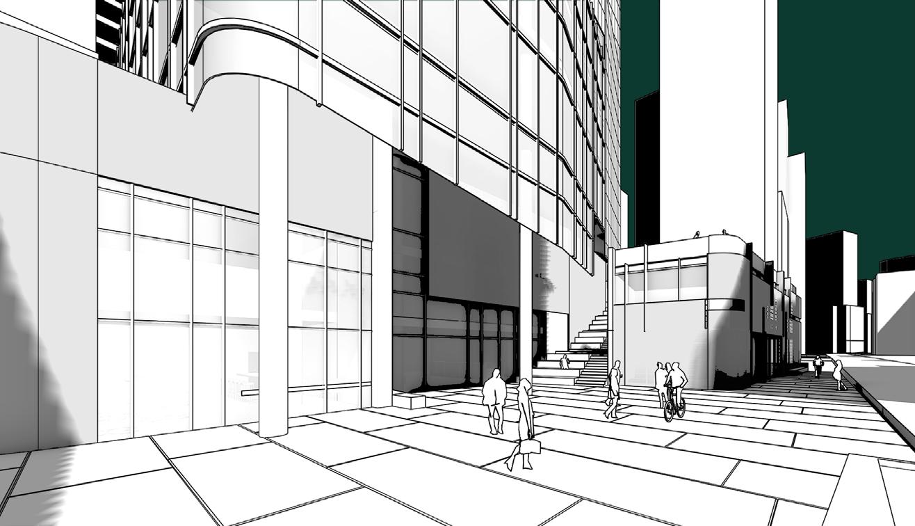
As the main entry points over the quartermile long, the challenge on the ground level was to connect multiple areas of varying heights. Using the southeast corner of the ground as 0 ’ 0” elevation, the north ground sits 20’ higher, on level with Olympic Park, just to the east to our excavated lot. The thresholds into structures stands at a small footprint in comparison to the lot, to allow light and free passage from one end to the other. By loading the ground with the bare necessities, space is opened for the main entrance of the aquarium which funnels people back down one level underground. The two levels just above the ground are filled with mainly public programs that includes recreation, more spaces for the aquarium, as well as study spaces, and classrooms in the marine-biology university, a protruding cafe and auditorium gathering.
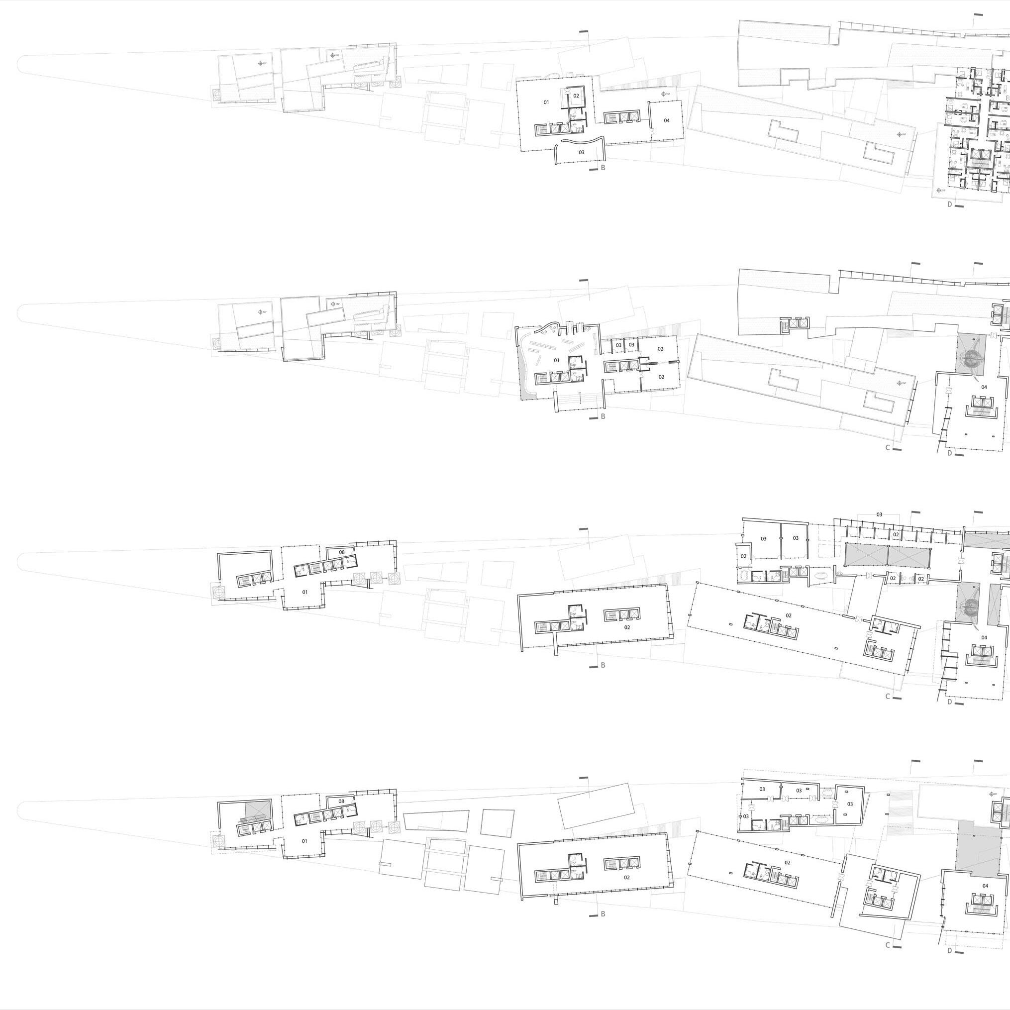
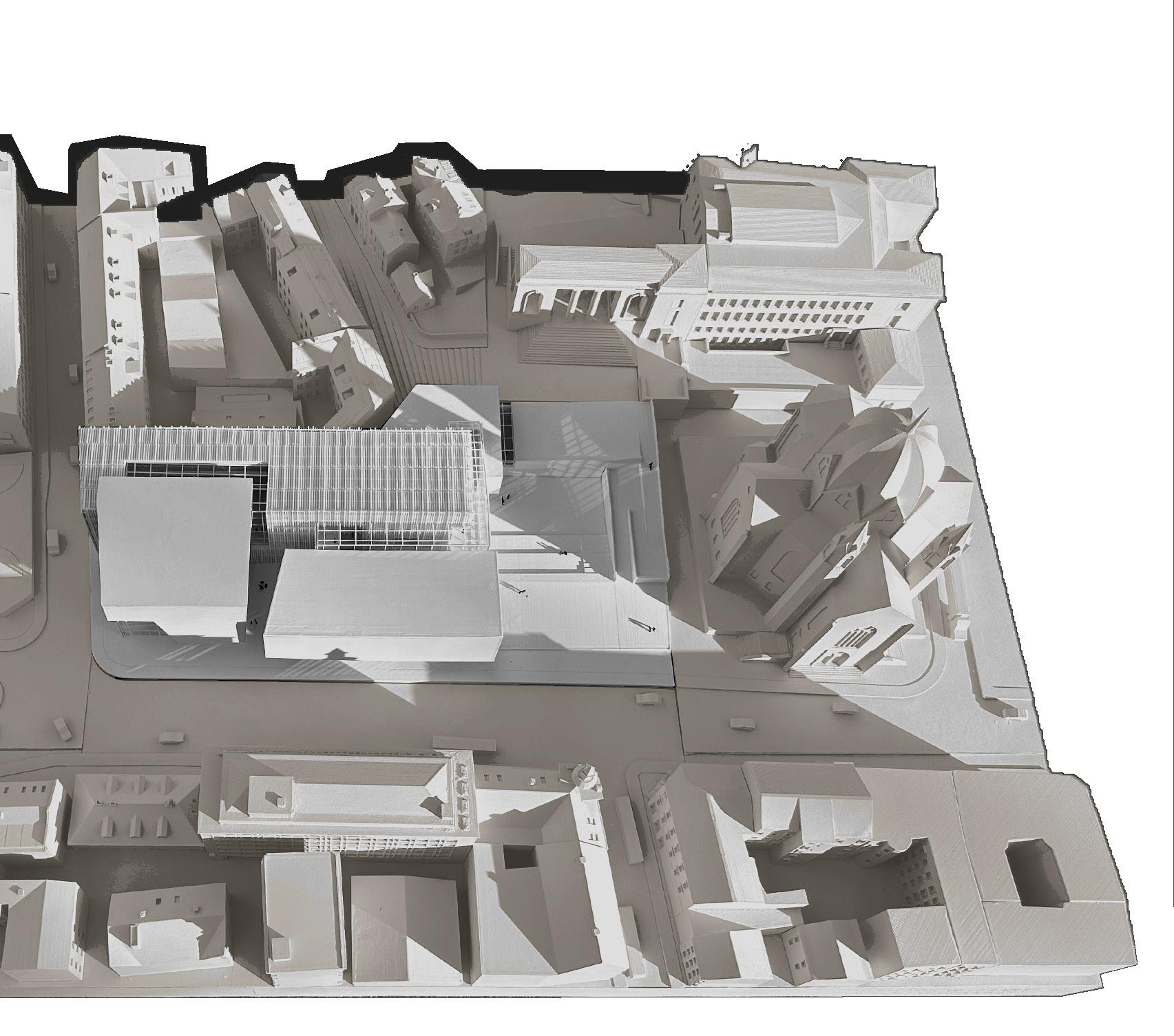
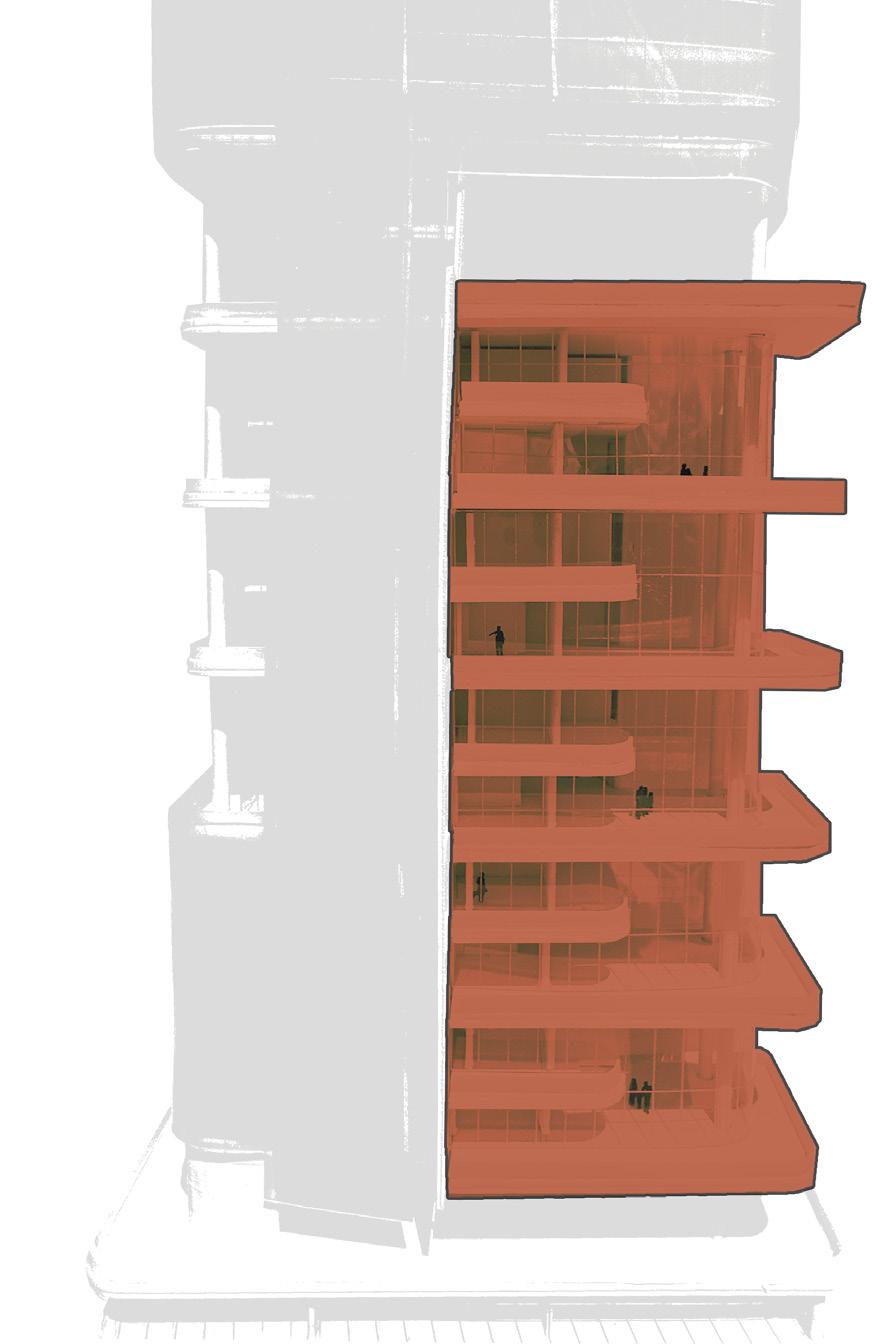
ABOVE GROUND
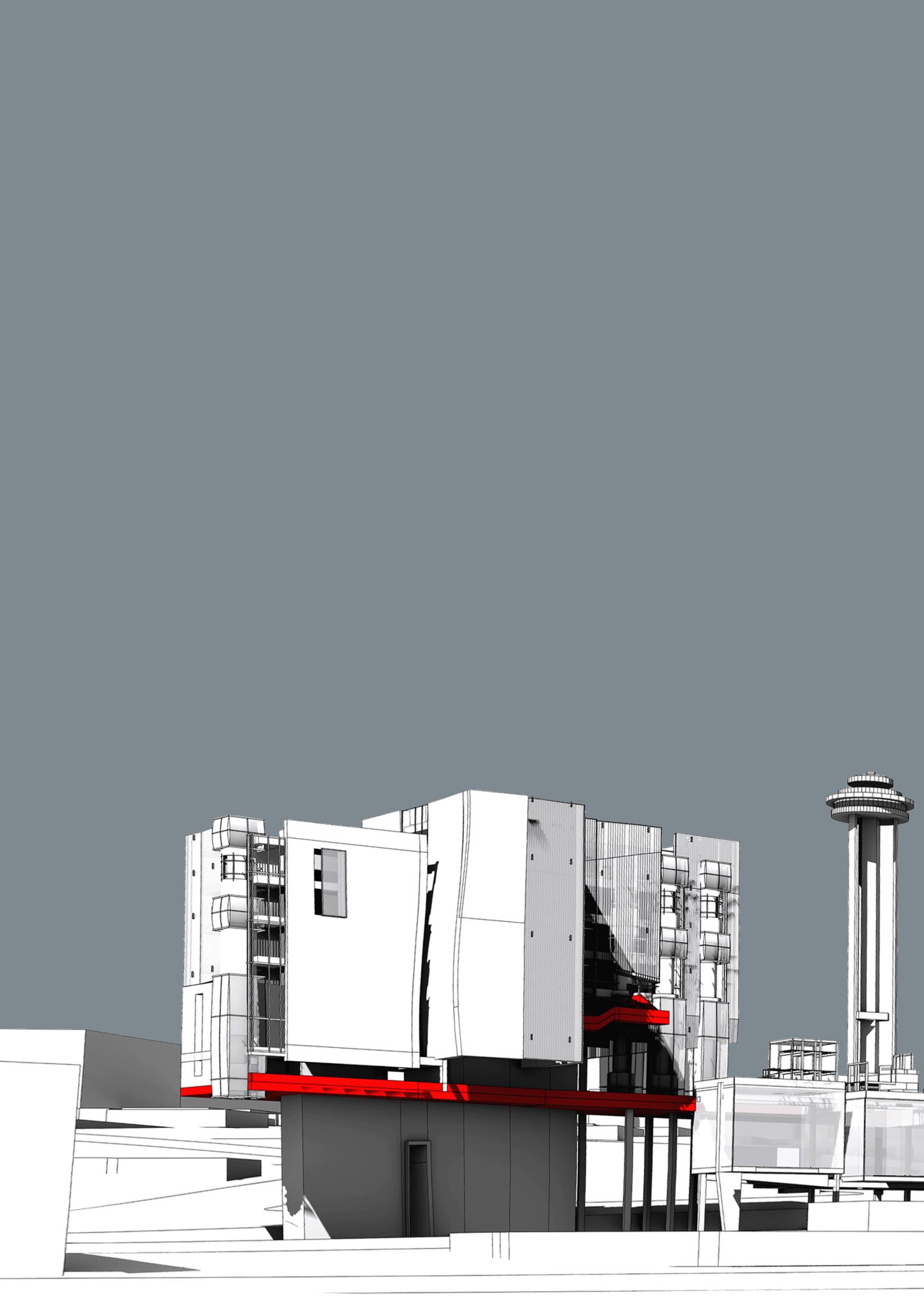
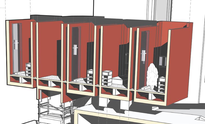
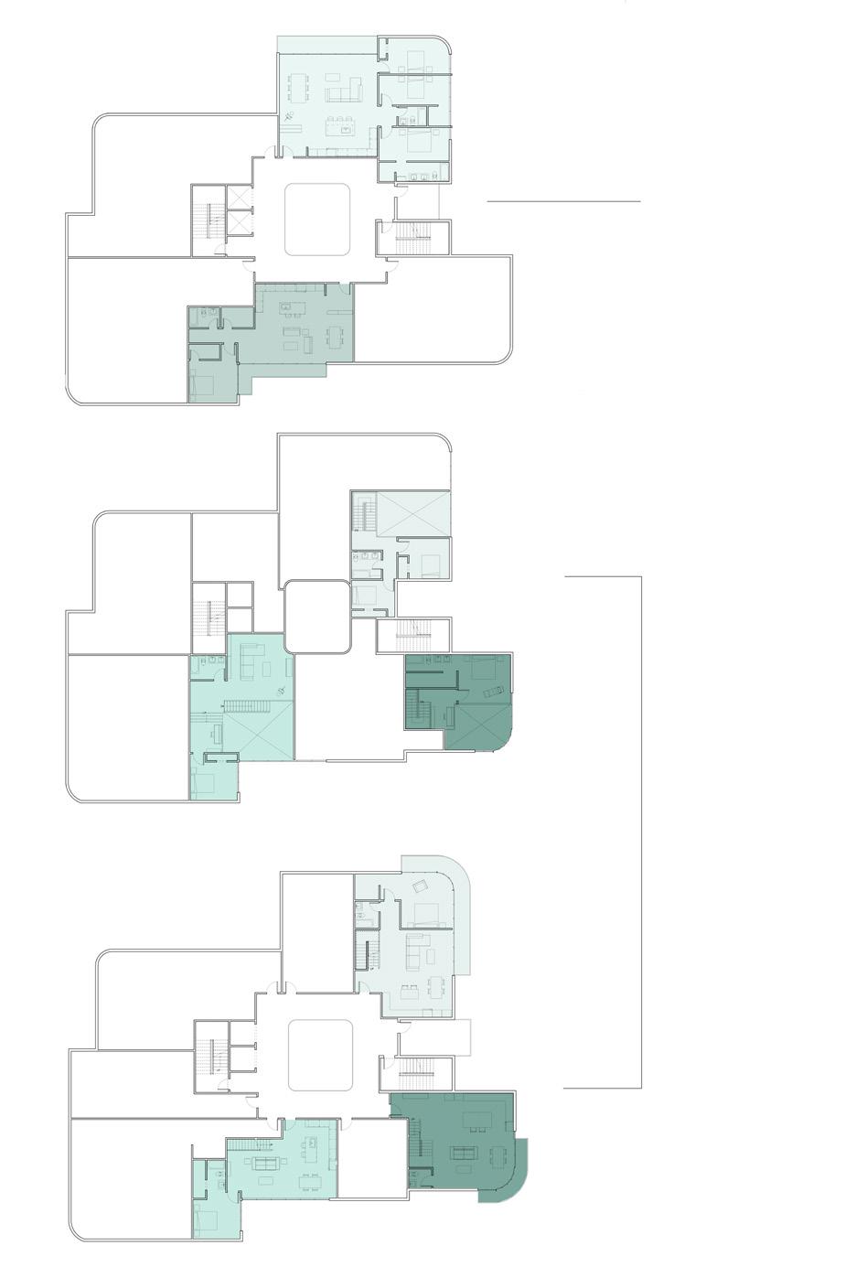
On the levels above, cut where a new set of program begins, starts the transition between public to private spaces. More space for the university that now sits adjacent to double-heighted lab space in the research institution, with walkways connected to the administration offices of the aquarium. Through this center catwalk, the bones of the anchoring whale tighten the feeling. By level 10, mixed program of restaurants, student housing and the kindergarten library is introduced, and the distinction of horizontal and vertical is shown by the roof elevation of the horizontal structures. Above that, the main chunk of residential units carry the towers up as well as a rooftop beer garden at the tip of the lot.
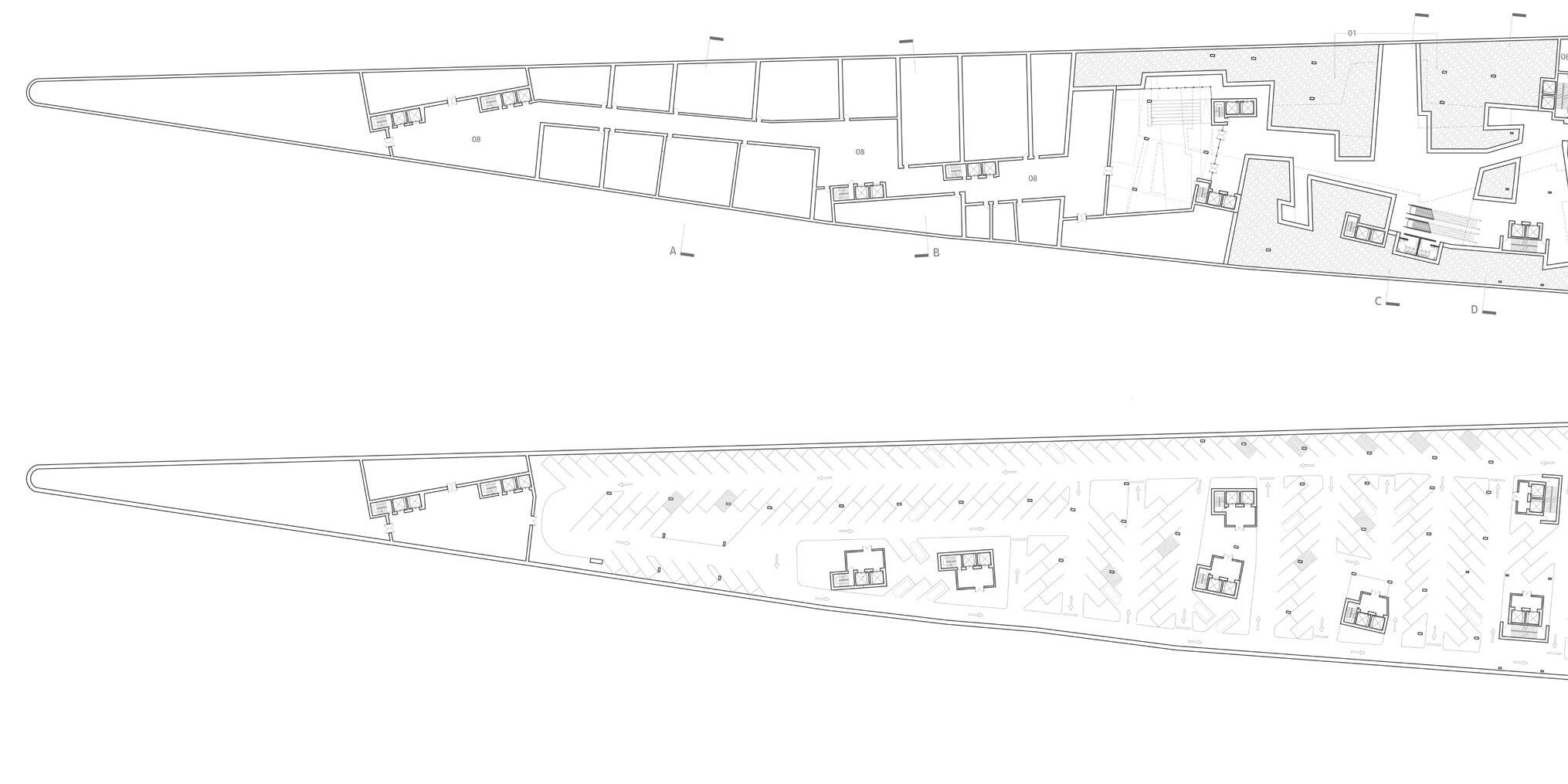
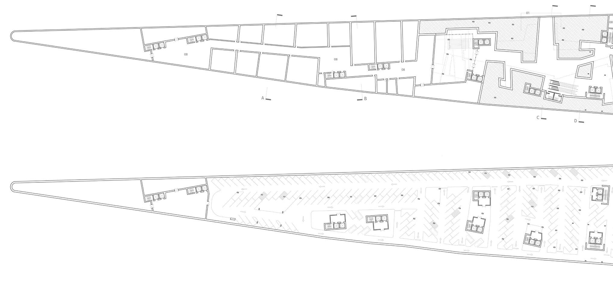
UNDERGROUND
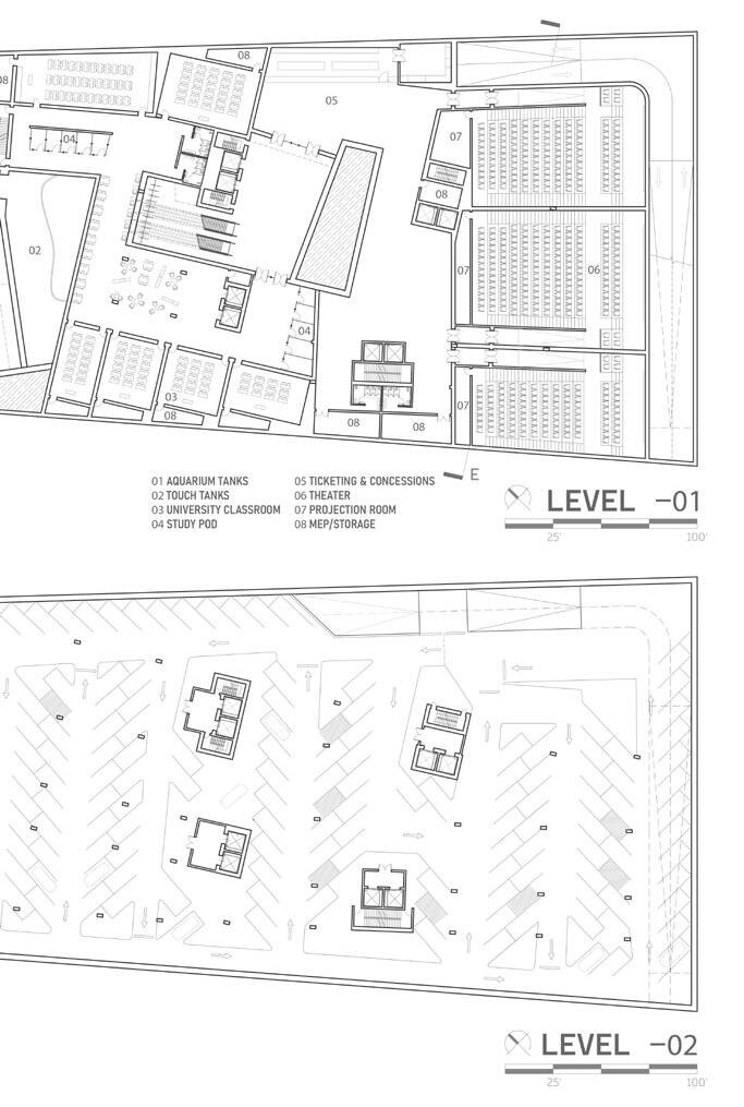
With the ability to excavated underground, the opportunity to place bigger chunks of program gave the levels above ground the porosity they have. Half is dedicated to various storage, mechanical and electrical rooms that hold whatever requires of the building. The other half is dedicated to more public program; The real portion of the aquarium is held, with tanks that puncture through the ground, and interactive exhibits such as a touch tank. Direct;y adjacent are a set of escalators from the ground level that guide you to either more university space that houses classrooms and study space, or the entrance to the cinemas with three, small theaters.
Starting with the diagram on the right, the highlighted portions show how the program stretches over the lot, and adjacency of those mixing programs. Adding on, the diagram on the left shows circulation between mixed programs, both horizontally and vertically, spaces connected horizontally being more public while the higher you go usually means the more private the space gets. On top of that, the skin diagram gives more information on the areas that are more opaque vs. translucent, and how the corresponding program determined that.
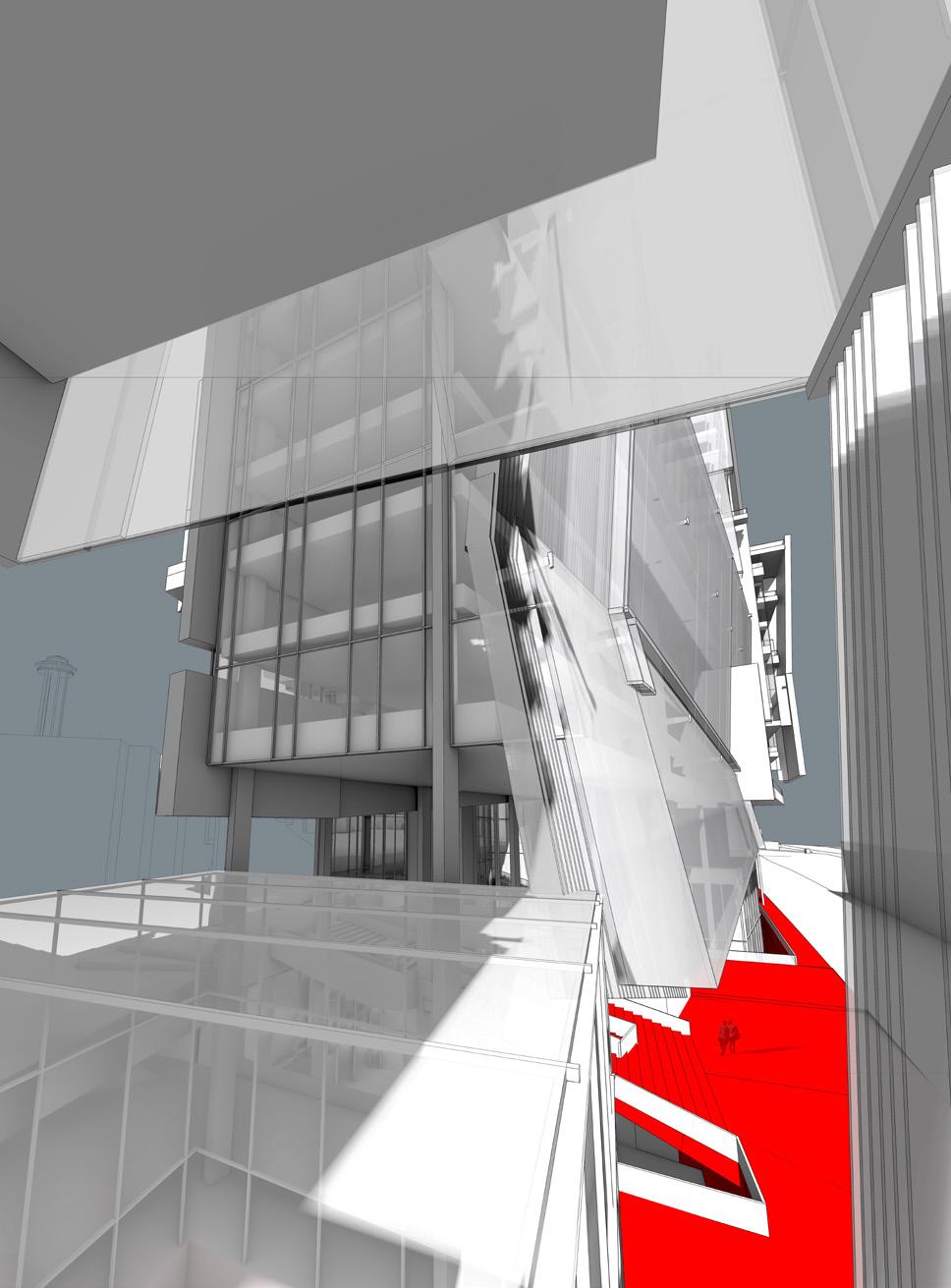
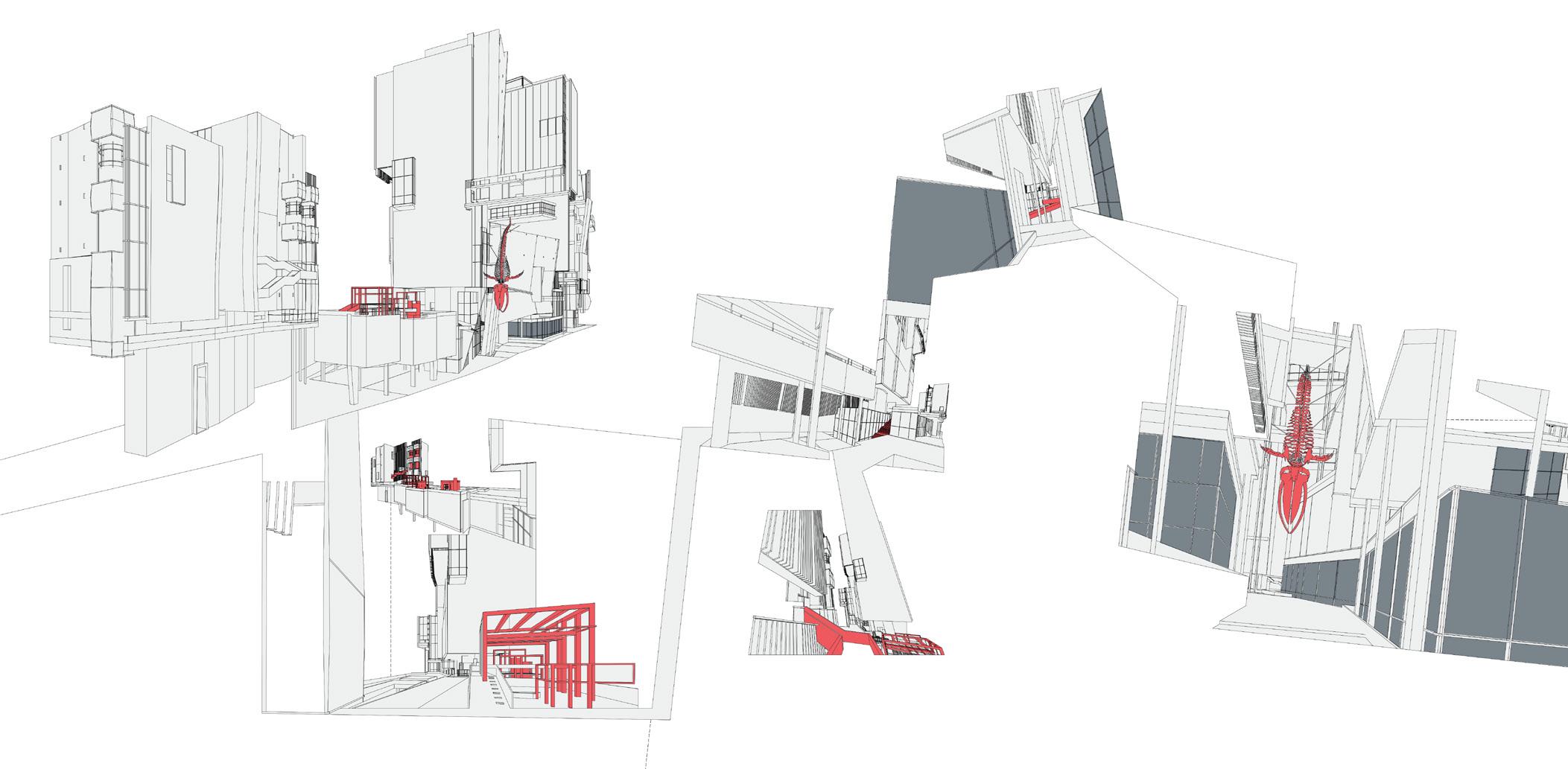
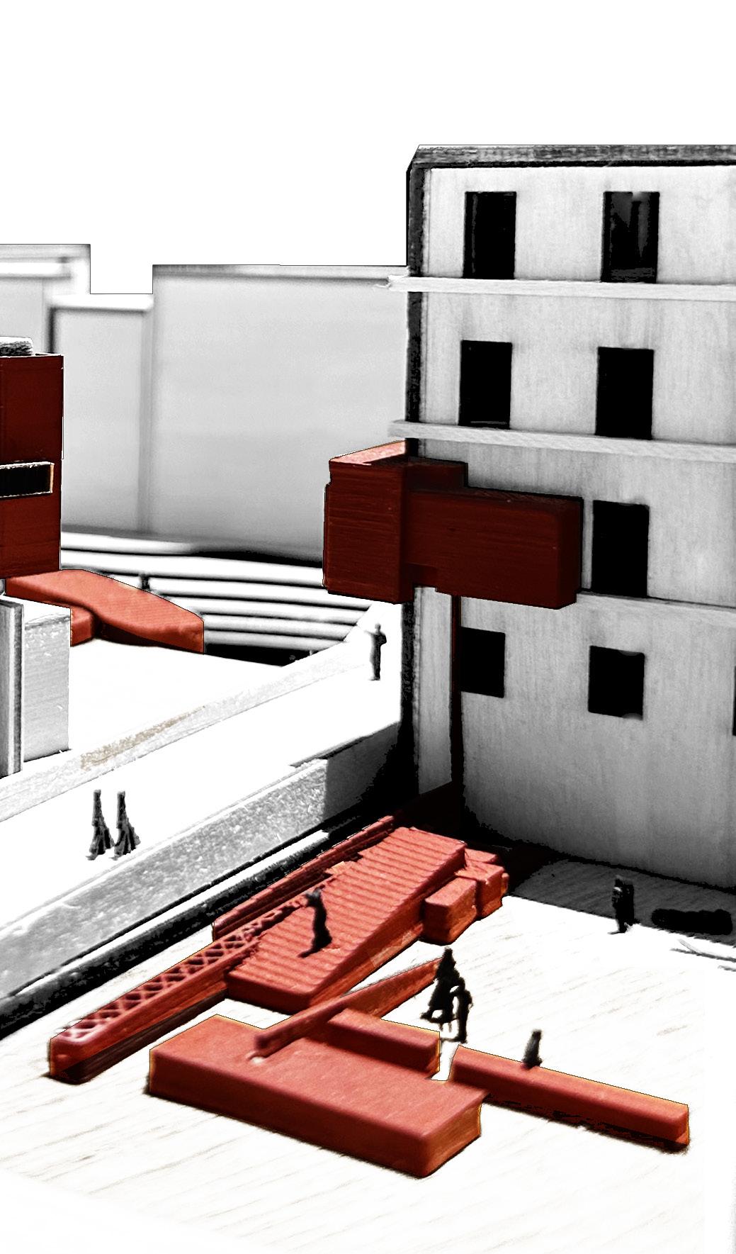
As the anchor of the project, not only is the whale hung between the aquarium and marine-biology research institution a way finder in any space, it also becomes an interactive object that changes the vantage point, depending on someone’s perspective.
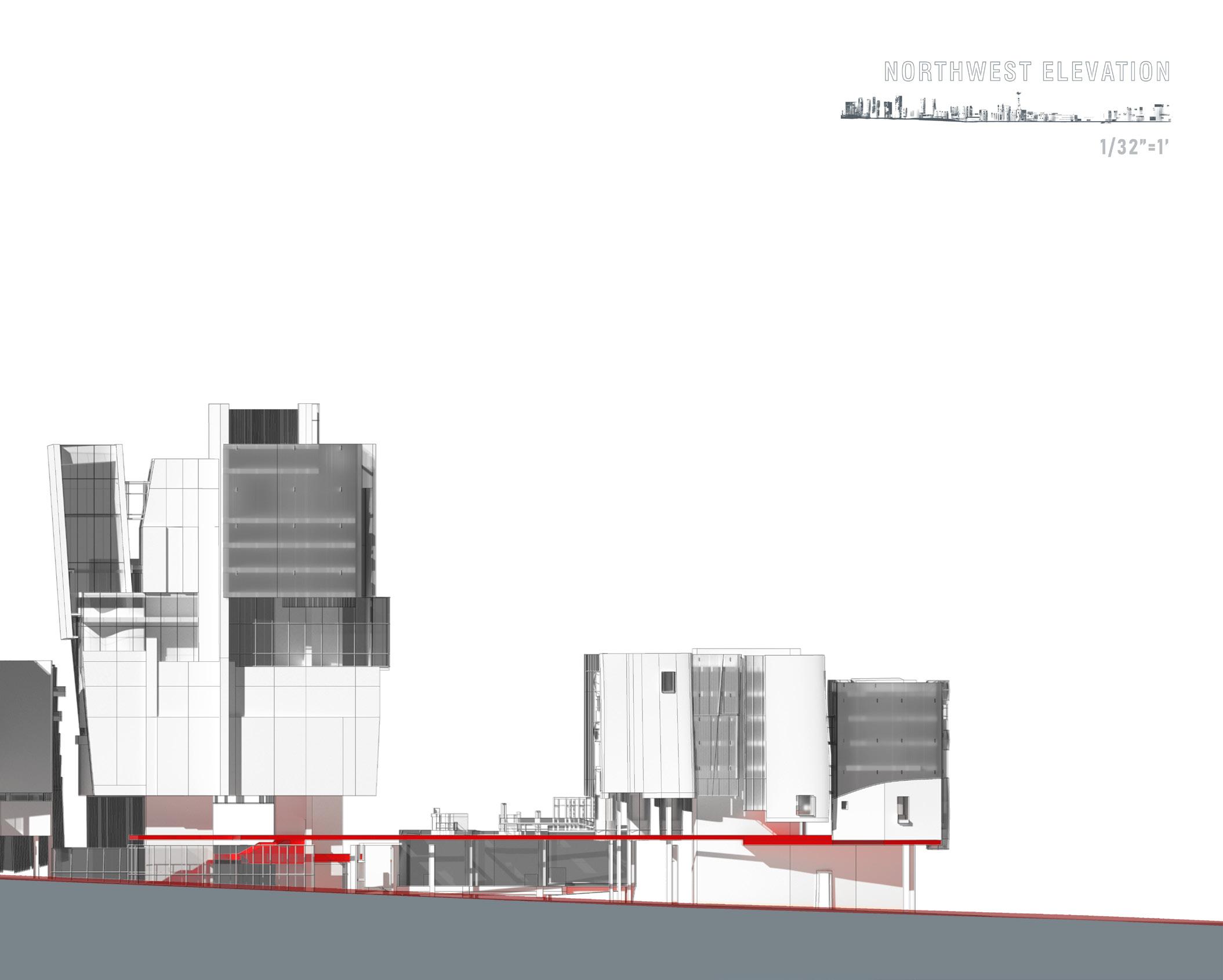
From northwest, the axonometric shows the breathing space the brewery has from the rest of the project at the tip. The elevated platform provides shade for the ground level below, as well as a space to view the city while enjoying a drink at another beer garden at this level. The recreational courts and children’s playground are also housed in the narrow wedge, as seen in the perspective below.
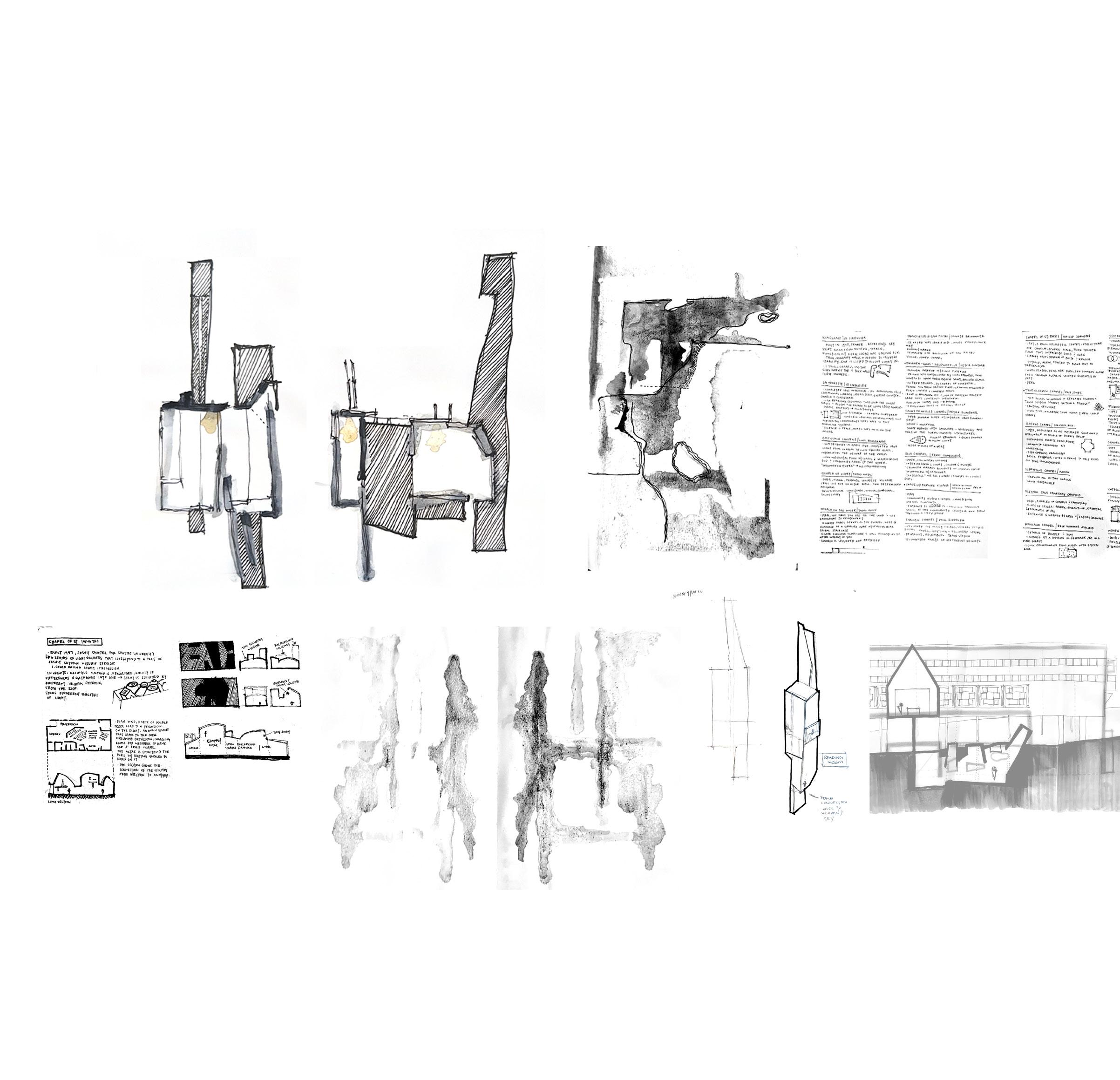
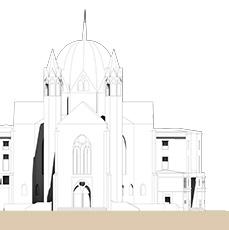
In the narrow streets, just over a bridge minutes away from Basilica Palladiana, lies the double-sided site of this project. Focusing on structural, circulation, material, and envelope systems seen throughout Italy, the project was twofold: first, a small reliquary on stilts informed by analytical and speculative studies. This foundation paved way for the second portion, the design of a monastery in urban historic fabric. Key factors include organizational clarity and spatial quality; Building details; relationship to context; experience of the occupant; Articulating landscape/ground scape, and resolution of interior space;
SACRED SPACES
THE RELIQUARY & CONVENT
SPRING 2023
NANCY SANDERS
LOCATION: VICENZA, ITALY
SIZE:
30,000 FT2
TYPES:
RELIGIOUS EDUCATION
PROCESS
Using countless precedents such as Le Corbusier, Carlo Scarpa, Peter Zumthor, Aldo Rossi, and Tadao Ando, the challenge was to understand the amount of attention and detail put into their work, and always be conscious of the human experience while designing; Not only in space, but in detail.
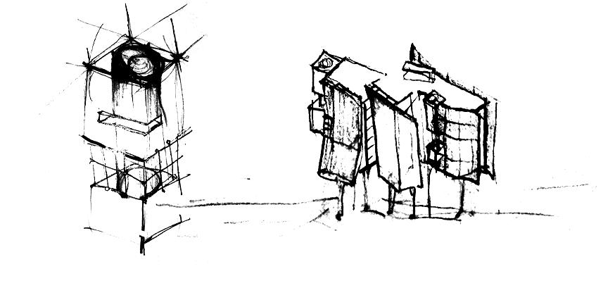
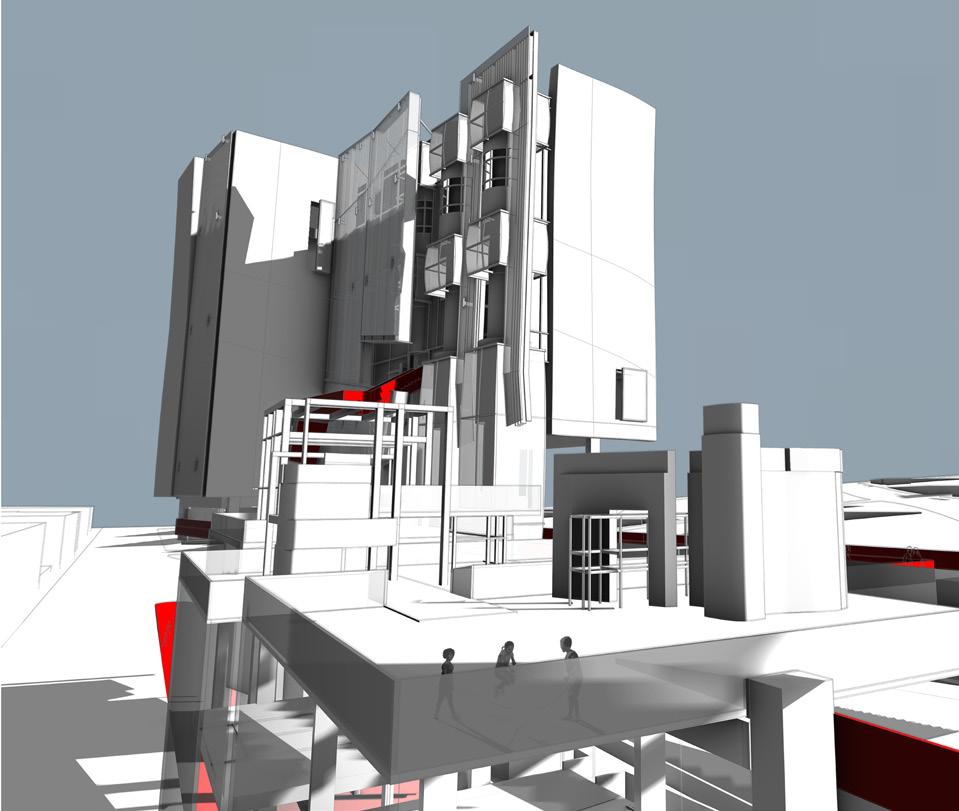
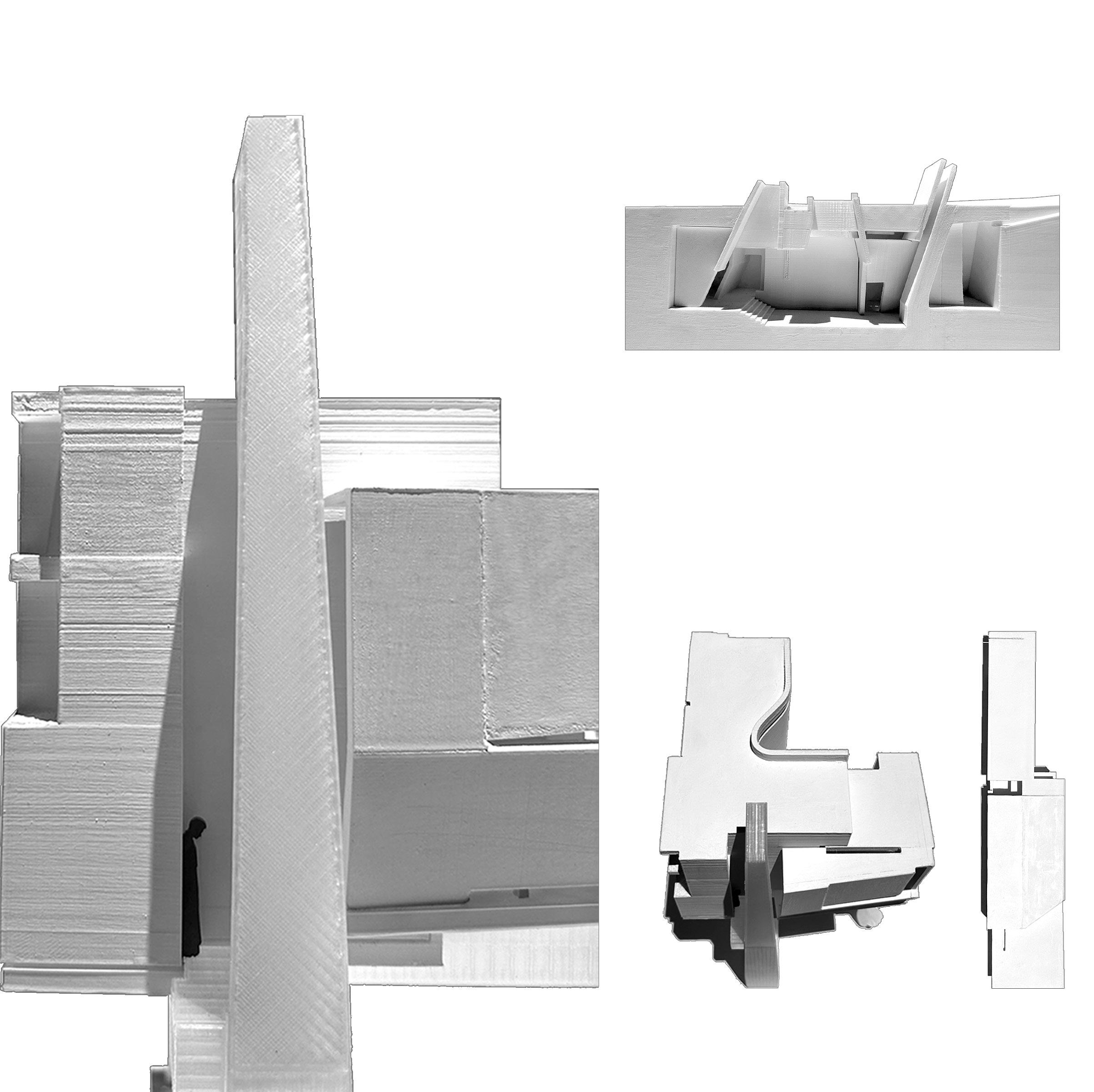
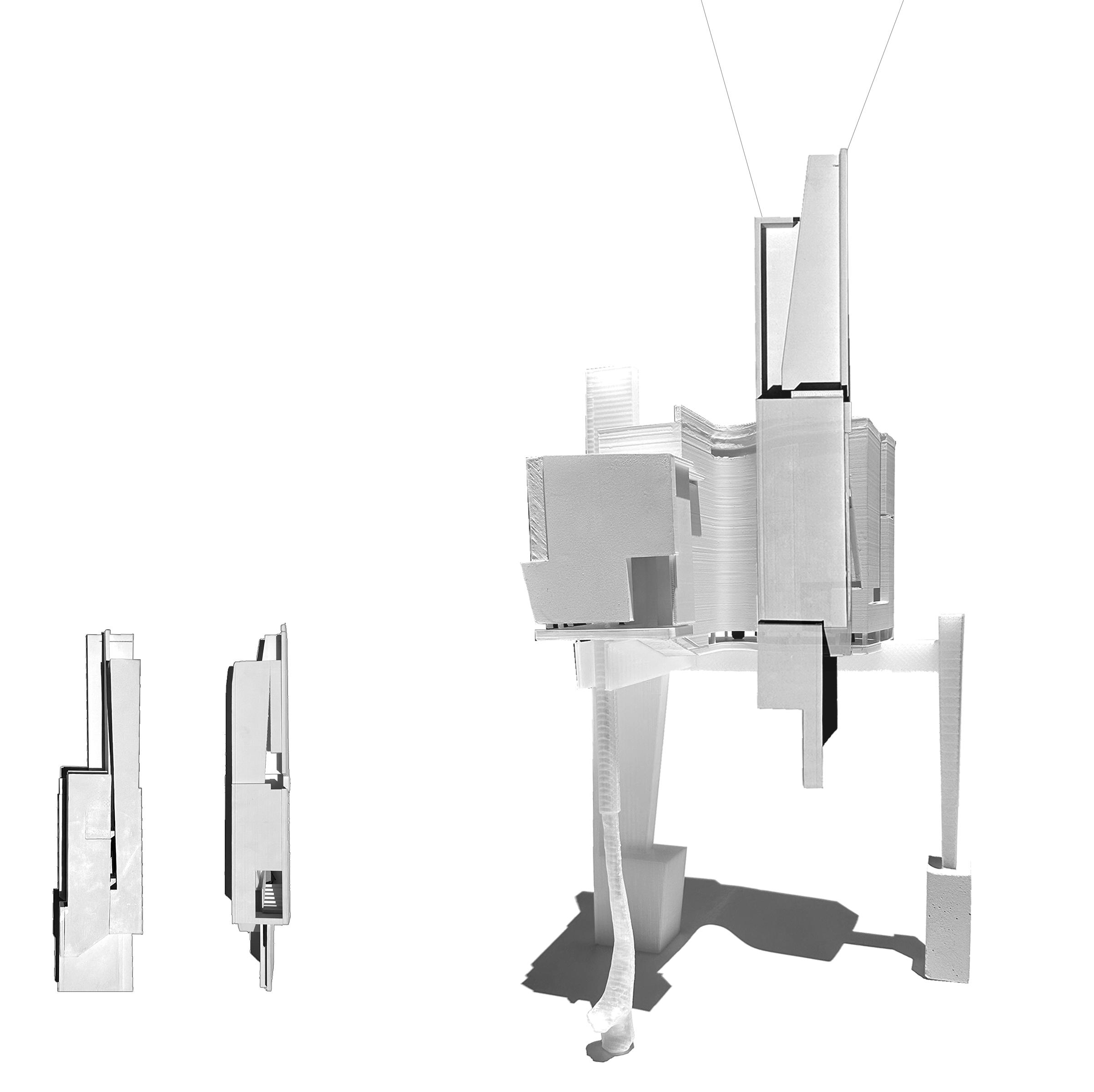
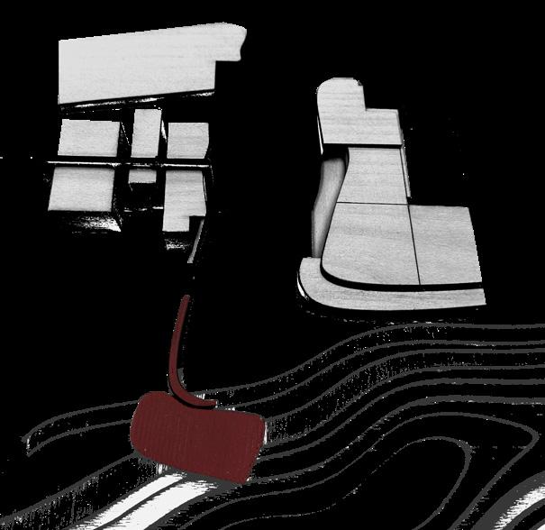
After analytic study, the Reliquary + Chimney was an opportunity to take what was learned from the masters and apply it to speculative 3D form, a reliquary on stilts that spatially connects to a vertical chimney. The reliquary houses St. Paul the Apostle’s 14 letters written to various groups during his time. 14 panels make up the envelope, propped up on the three stilts, each with a different quality: An autonomous object, represented as a wrist bone, his relic in Rome. One that reaches away - represented as a mile marker since his body was found miles away from his Basilica and finally, One that punctures the reliquary - which signifies his firmness in the faith
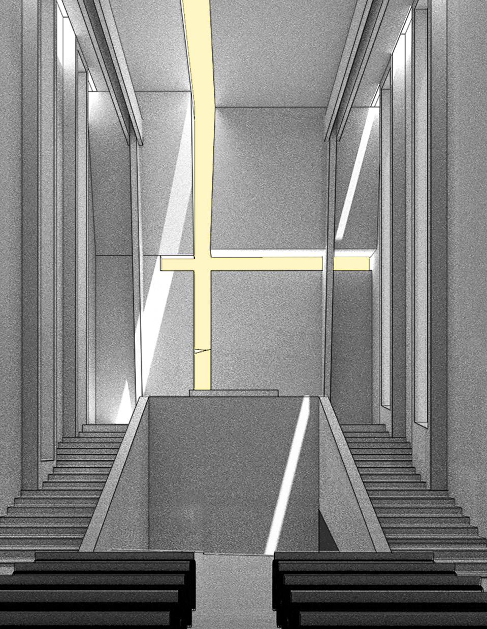
The chimney houses a narrow, towering staircase that lands at a quiet reading space for a visitor to read one of the 14 letters. The entire structure is housed at the Basilica of St. Paul in Rome called St. Paul Outside the Walls directly over the deep crevasse his body is currently in.
RELIQUARY + CHIMNEY
Playing off the idea of the 14 books St. Paul wrote, 14 panels of watercolor paper that were pressed into one each other, saving the memory from the previous one, signifying one historian passing history down to another. From there, the set of 14 cards were put on a light table to draw four sections of the reliquary and chimney, using the faint memory of the watercolor as reference.
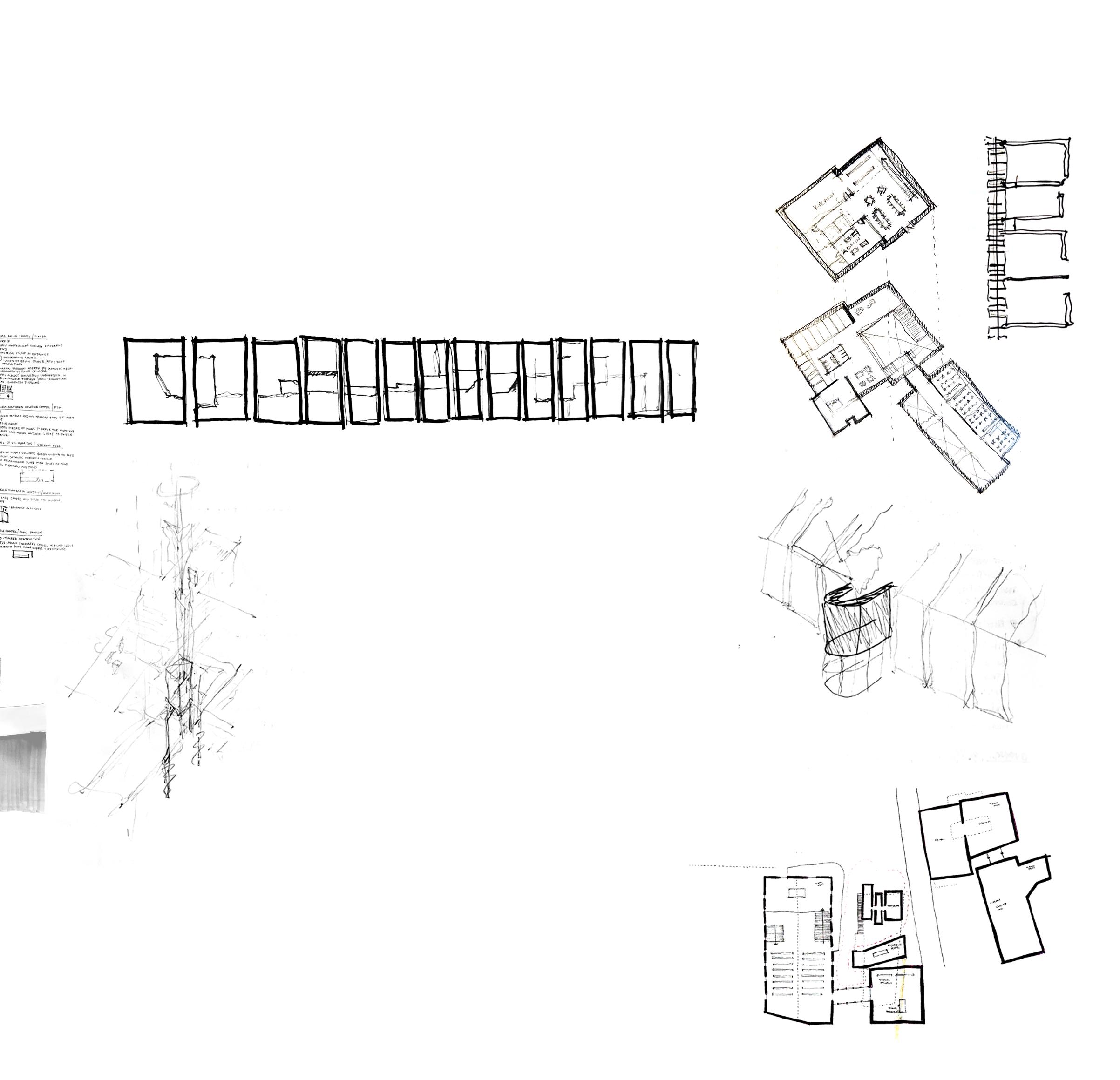
THE CONVENT
Just over the Ponte San Michele bridge, on either side, life at the Convent happens. Taking inspiration from Le Corbusier’s five points of architecture, a horizontal window with vertical fins houses the nuns - hovering over the quaint entrance just off the bridge - each nun has their own unit, modularly laid out. The majority of this side is either lifted from the ground or tucked in the underbelly of the new church and nun’s living quarters to create a free flowing-cloister between the church and barrier of the bridge. On the opposite side, Housed with orphaned children, the original structure stands still - acting as the visual bridge between new and old - the new being two play spaces attached to the outside of the facade, one for each level of children’s dormitories. On the ground, a playground inspired by Aldo van Eyck, that inspires the children to make something of the playground rather than vice versa. The balance of purity between nuns and children, plus their daily routines help determine the program. The original church attached to the new children’s living space is known as the Oratory of San Nicola da Tolentino, who is the patron Saint of children, conceptually ties the project together.
On the left, the ground floor emphasizes the scale of sacred spaces - a new, open to the public church vs. private, shifting oratories for the nuns. The free space on the ground allows for a cloister to allow the nuns to contemplate. On the right, the necessities for the children to begin their day with a small auditorium. On the floors above, shown below, living quarters for the nuns, which shows the gap between each unit to allow light to pass through their private prayer wall, made of onyx. The children’s living quarters, separated by gender, emphasizes the juxtaposition of the new play space against the repetition of windows from the existing structure.
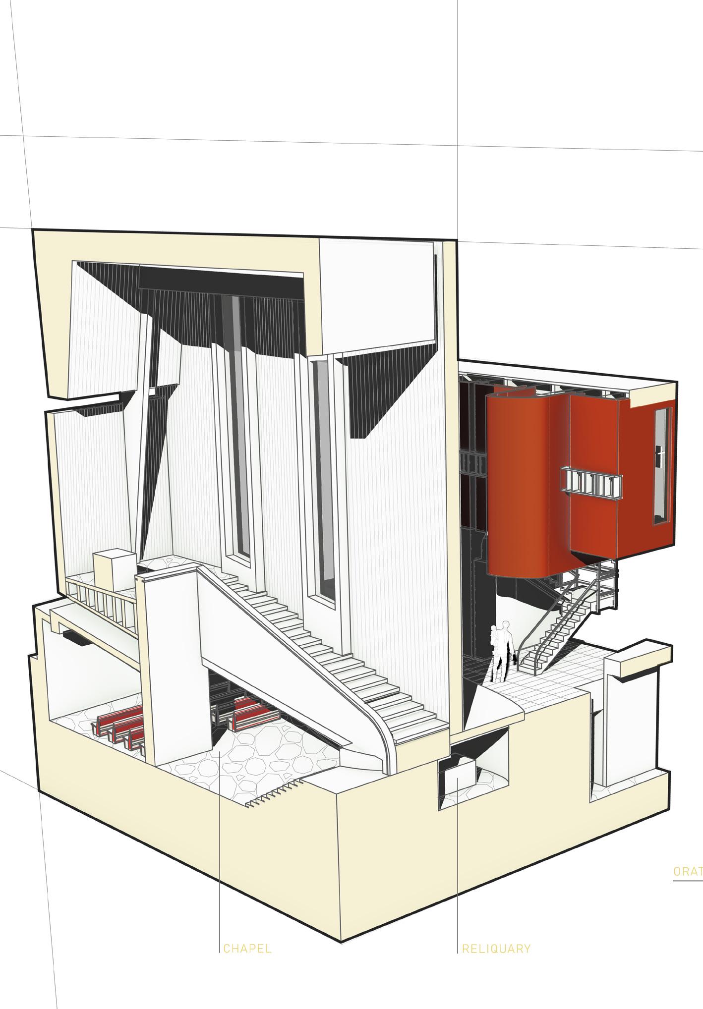
Below, the new church that splits into two just before the steps up to the Altar. Taking the steps underground leads to a small reliquary and chapel meant for a small group of nuns and children to use, as seen in Section A. Section B portrays the concept of the project as a whole, with unique,
UNDERBELLY
Highlighting the spaces sunken in the “underbelly” of the site, the chapel, reliquary and oratory become private, sacred spaces. Hovering above the oratory on the right, the modular aligning of the nuns’ living quarters showcases their humble, translucent prayer wall. One, bulbous unit breaks up the repetition, revealing a staircase to the ground level. Just in front of Oratories, a platform reaches to the water, with a small opening to allow the cloister to flow right through.
Overall, the convent aims to provide space where necessary, give duality to spaces that might not always be in use, and allow void to become space itself. Being situated in dense urban landscape such as Vicenza provided a strong framework for scale and proportion that was then broken at strategic spots to create a sense of identity in a historic fabric.
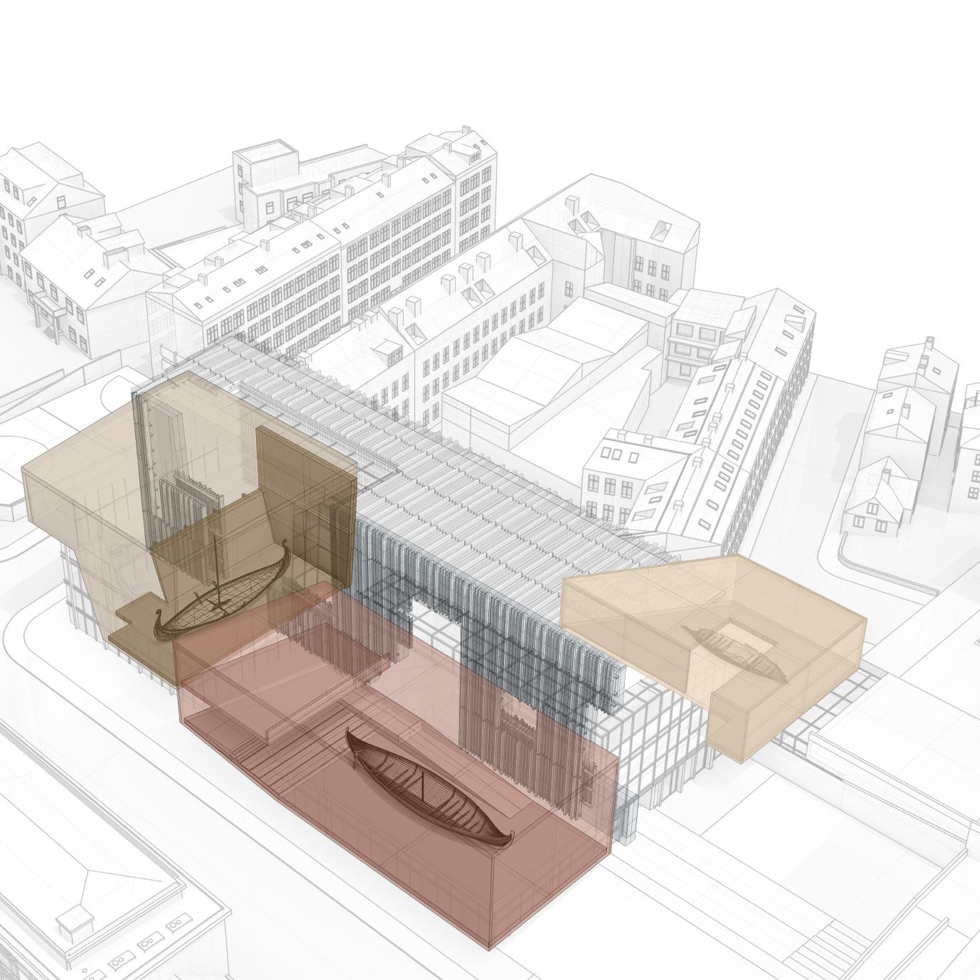
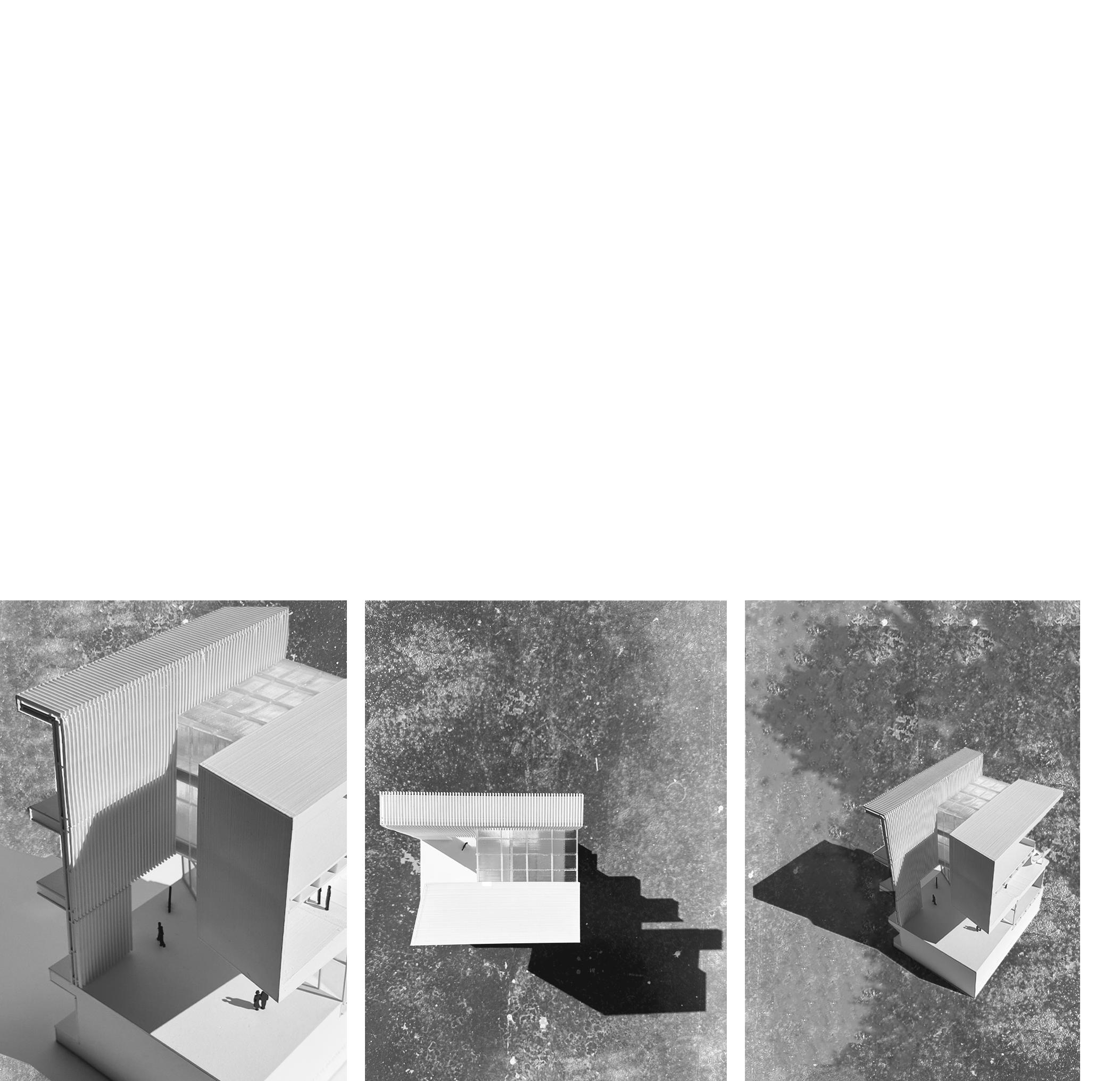
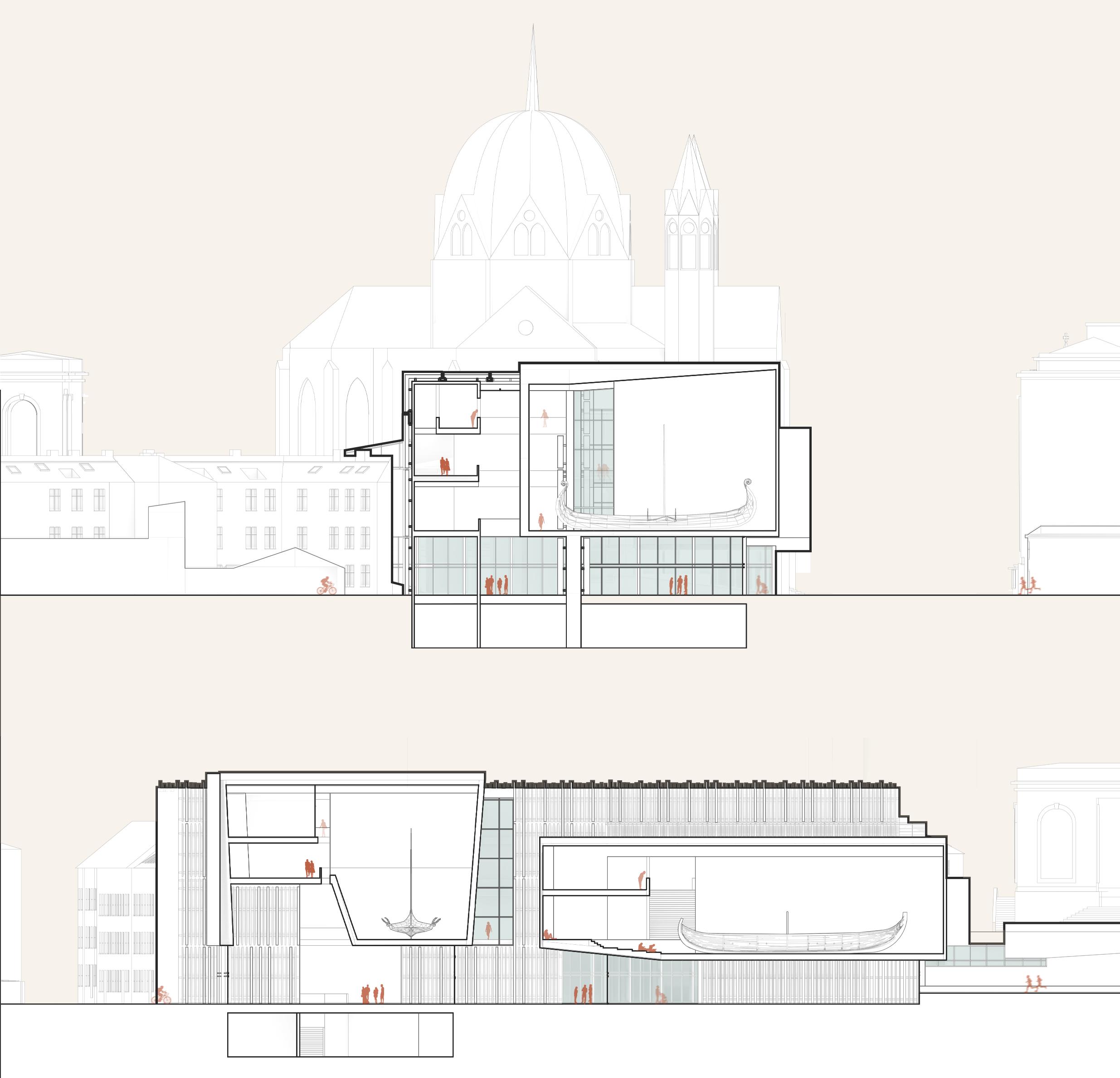
Located in a dense area of Oslo, the new Viking Age museum presented the challenge of creating monumental spaces that could house three ships of different proportions. More importantly, the relationship between building, site, and the context created opportunities for design expression, with emphasis on a plaza that could stand alone and connect visitors from one level of the city to another.
VIKING AGE MUSEUM
EXPLORING CURATED SPACES
FALL 2022
MICHAEL HALFLANTS
LOCATION:
OSLO, NORWAY
SIZE:
130,000 FT2
TYPES: CULTURAL
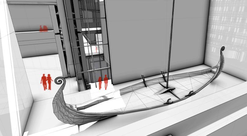
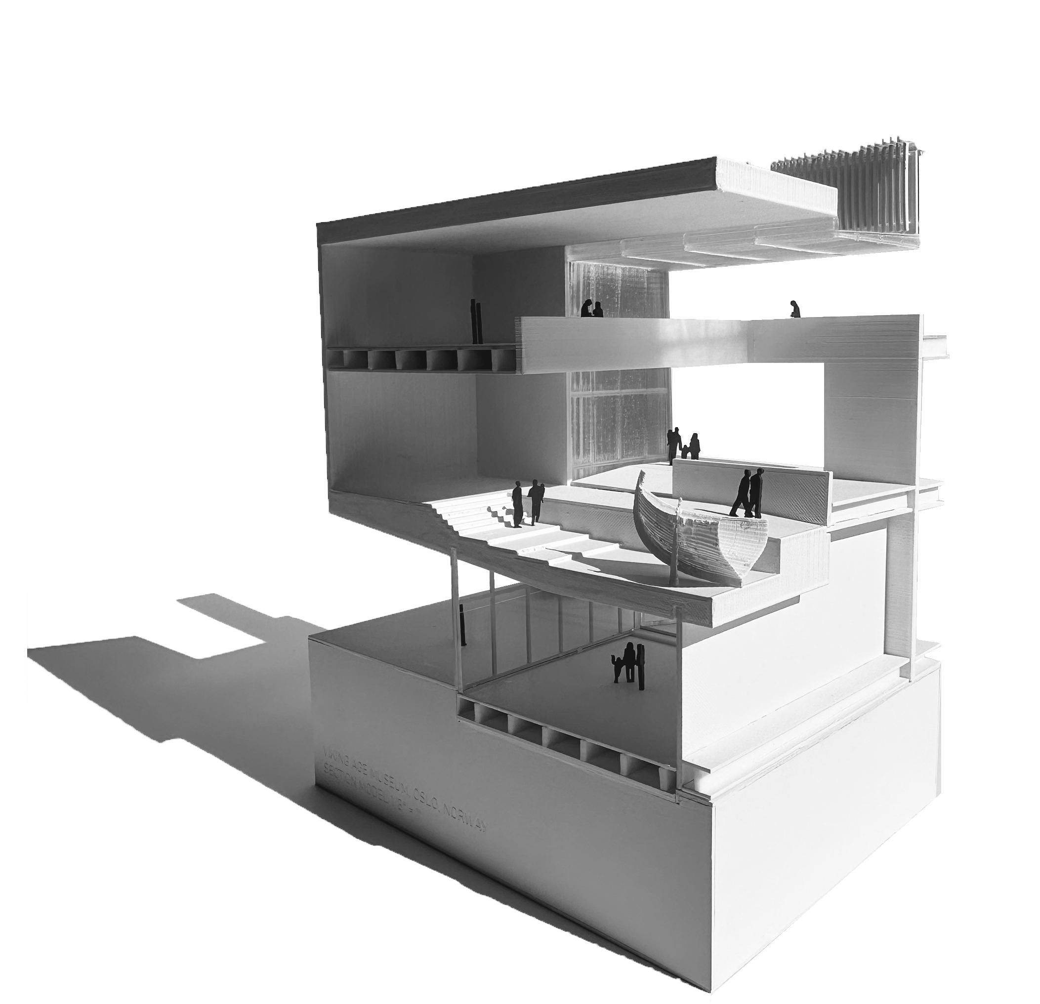
Programmatically, the museum is broken down into four parts. Three rectangles, stretched in different proportions to house the three ships. Each ship comes with its own qualities: Oseberg, the tallest of the three, Gokstad, the longest ship and Tune, the smallest, and by far the most withered. The fourth component is the long bar, which connects all three ships and showcases the smaller artifacts. Translucent spaces above control the light in the museum as well as both visually and physically creates a threshold from the bar to each ship, and provides a wayfinder for visitors to orient themselves. The plaza can stand alone as moment of pause for the people of Oslo, become an event space during off hours of the museum, or simply be used as shortcut from one level of the city to another.
PROCESS
Due to the density of Oslo, both in population and the urban fabric, there were many avenues to gain inspiration from. The mere size of each ship already gave a starting point for scale, and the community use and walkability of Oslo itself proposed questions of creating public spaces unassociated with the museum to entice more people, and allow them to experience some portion without needing a ticket of entrance.
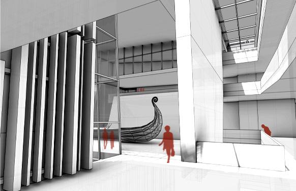
By locating the entrance on the internal courtyard of the museum, people from both directions would now be coming in the direction. The forms hovering above, housed the two larger ships - Oseberg and Gokstad, while also providing shade in the internal courtyard, contracting the space just before relieving it again upon entrance of the museum. In this spot, all three types of spaces connect: the solid form, the bar, and the threshold bridging the two.
Individual forms encase each ship, with enough space around to view them at different vantage points, including from different levels. As seen in the perspectives below, the threshold skylight creates a visual barrier that leads into each boat’s exhibit.
To the left, the ground includes both private and public spaces bisected by a covered walkway that connects an existing staircase from the north down to the internal, central courtyard. On the corner, the ticketing area welcomes guests before visiting the cafe, and beginning the museum exhibitions on the second floor. Parallel to the main street, a restoration studio with a children’s play area, before entering the auditorium that can also be used as a stand alone event area when the museum is closed. On the floors above shown on the right, each distinct ship is connected by smaller, exhibition spaces.
Highlighting all three material types and function of space, a portion of the Gokstad exhibition showcasing the carving of the ground that’s both used as a resting area, and a second vantage point. Above, a third angle of the 80’+ long ship, once again passing through the skylight. Three distinct facades further solidify the change of program, with the slightest peak of the ground tunnel that bisects the public spaces of the first level.
The simplicity of the sections emphasizes the scale of each ship in relation to the scale of the running bar that houses the majority of the exhibits and relation to the human scale as well as the city context.
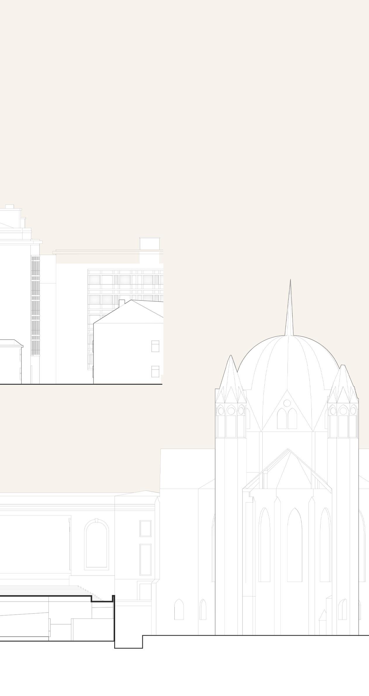
The west elevation below highlights the museum as a connector between the two churches on either side, with the entrance located in the first third of the composition as shown in the perspective dotted above. To the right, a view from the church on the plaza and inside a transitional space of the museum. In the far background, the point of the second church. The simplicity of the plaza allows spectators to take control of the space and have it fit their needs, while focusing on the different materials meeting.
As Sarasota continues to attract more and more people, Sarasota City Council has been exploring the idea of a new downtown Sarasota, one that adapts to the direction Sarasota is headed, which includes more high-rise. The brief was twofold: firstly, a city proposal that investigates a new skyline for Sarasota, including potentially zoning rules and secondly, isolating one zone, applying the rules, and envisioning a new detailed, downtown high-rise mixed use structure near the bay.
SARASOTA TOWER
RE-ENVISIONING SARASOTA’S SKYLINE
SPRING 2022
MICHAEL HALFLANTS
LOCATION:
SARASOTA, FLORIDA
SIZE:
260,000 FT2
TYPES: RESIDENTIAL COMMERCIAL CULTURAL
After meeting with Sarasota City Council, we began by envisioning both in 2D and 3D, what a new downtown Sarasota would look like and applying basic zone rules to help activate different neighborhoods.
ZONE 1
FAR of 5
-Setback from street 4’ + 4% of overall area of building
-Heights range from 18 to 28 stories
ZONE 2
FAR of 6
-Building heights range from 18 stories more north east and rise as they get further from Bayfront
-25% of the ground floor includes public space
-Setback from street 4’ + 4% of overall area of the building
ZONE 3
FAR of 7
-20% of lot should be dedicated to green space if over 300’
-Larger setback on heavy pedestrian roads - maximum 12’
ZONE 4
-Building should not exceed 80% of the total property
(does not include shading or cantilevers)
-Building podium should not exceed 48’
-If lot faces east, north step-back is greater
-If lot faces west, south step-back is greater
ZONE 5
-Building podium should not exceed 24’
-Buildings should not exceed 250’
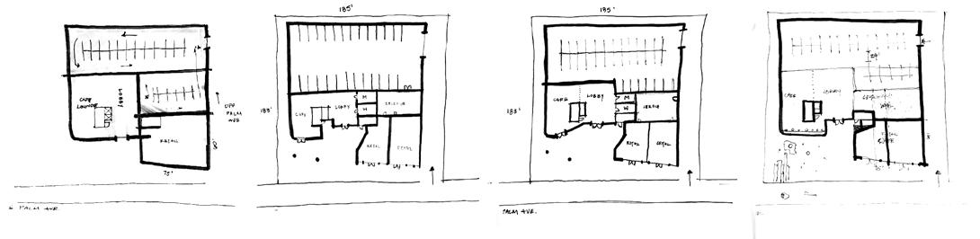
Zone four was ultimately chosen as the zone to zoom in on and imagine what a new downtown could look like. Rules were put in place to avoid stagnant, extruded buildings, but instead pushed dynamic structures. Firstly, the building should not exceed 80% of the total property, which does not include shading or cantilevers - this helped ensure public space on the ground level to activate the most walkable area. Secondly, the building podium should not exceed 48’ - this was put in place to maintain the human scale, promote safe walkability, as well as allow light to reach the ground level. Finally, arguably the biggest rule: if the lot faces east, the north step-back is greater, and if the lot faces west, the south step-back is greater. This rule allowed towers to stagger on a shared lot, creating equal views of the Bayfront drive for all residences. While zone developing, unit massing - as shown on the right - explored what a typical floor plate could look like, and more importantly how it could be broken down and interlocked with other units.
ONE LEVEL UNITS
SKIP-STOP UNITS
UNIT TYPE 1 2000 SQFT
UNIT TYPE 2 1500 SQFT
UNIT TYPE 3 950 SQFT
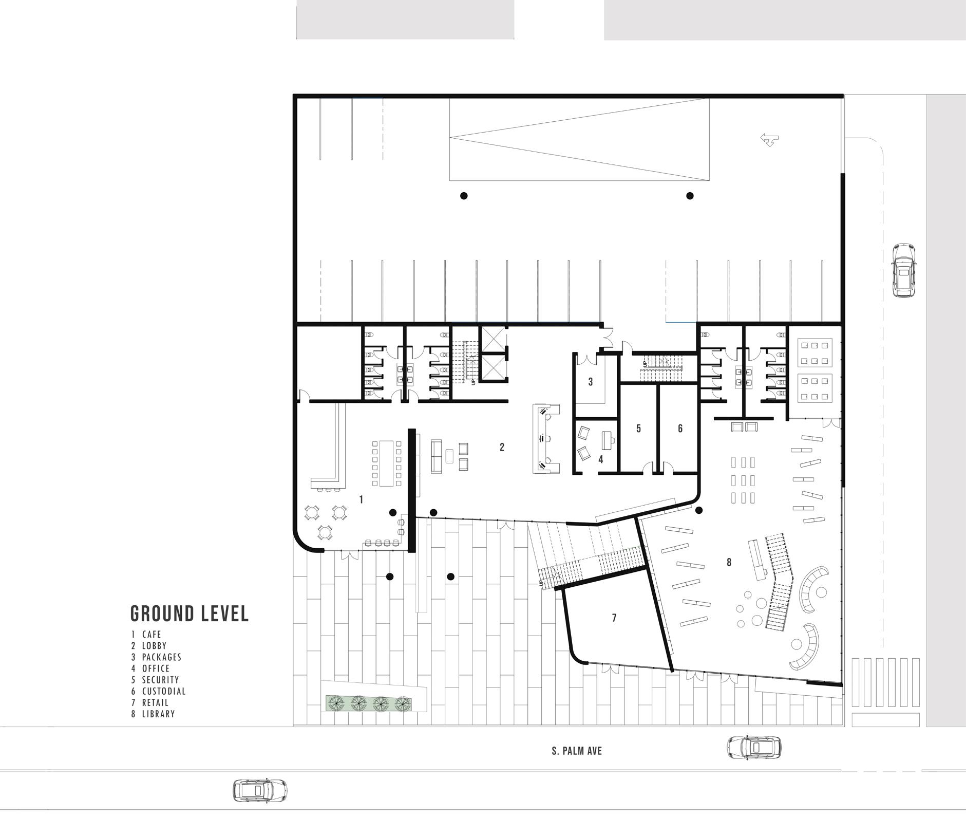
After dividing up lots, the result showcases a block of towers wedged between S Palm Ave. and S Ringling Ave, right behind Bayfront, using the proposed zoning rules.
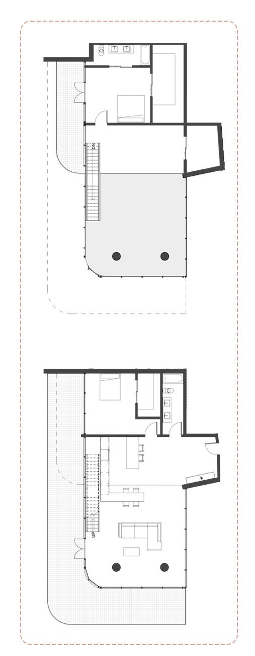
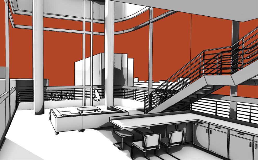
To help break down the scale of the tower, a double-heighted portion sectioned off by a deep cut into the facade, and peeled away from the skin that envelopes the rest of the residences, created transparent corner units with double-heighted living spaces, and two, stacked puncturing balconies. In the plan, the unit opens up to the kitchen, looking onto the living room framed by two structural columns, with a bedroom and bathroom tucked in by the door. The staircase lands at the back end of the unit, giving an overlook down to the living room, and an entrance to a second, smaller balcony.
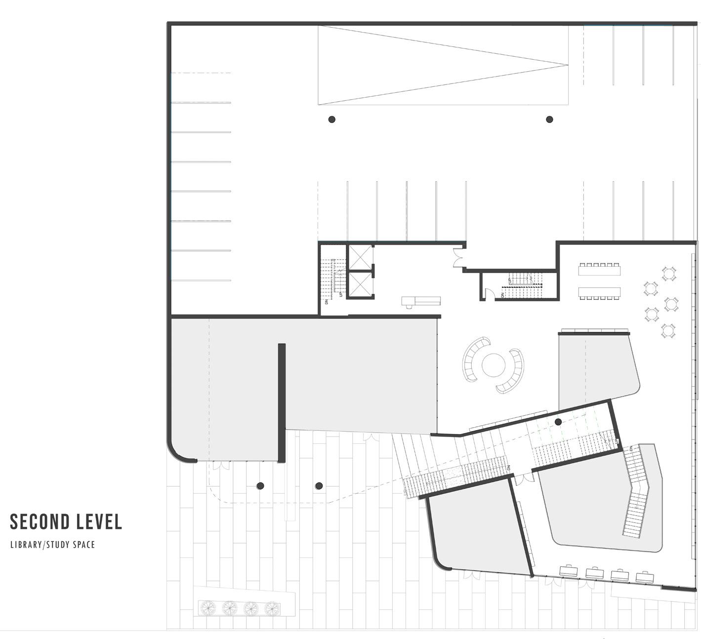
The ground floor opens up to the public with a cafe and retail, with a new proposed two story library that Sarasota is in desperate need of. Dissecting the lobby, and public street retail, is a grand staircase that ascends to the second level of the library, all the up to the rooftop, at the top of the building’s lower podium.
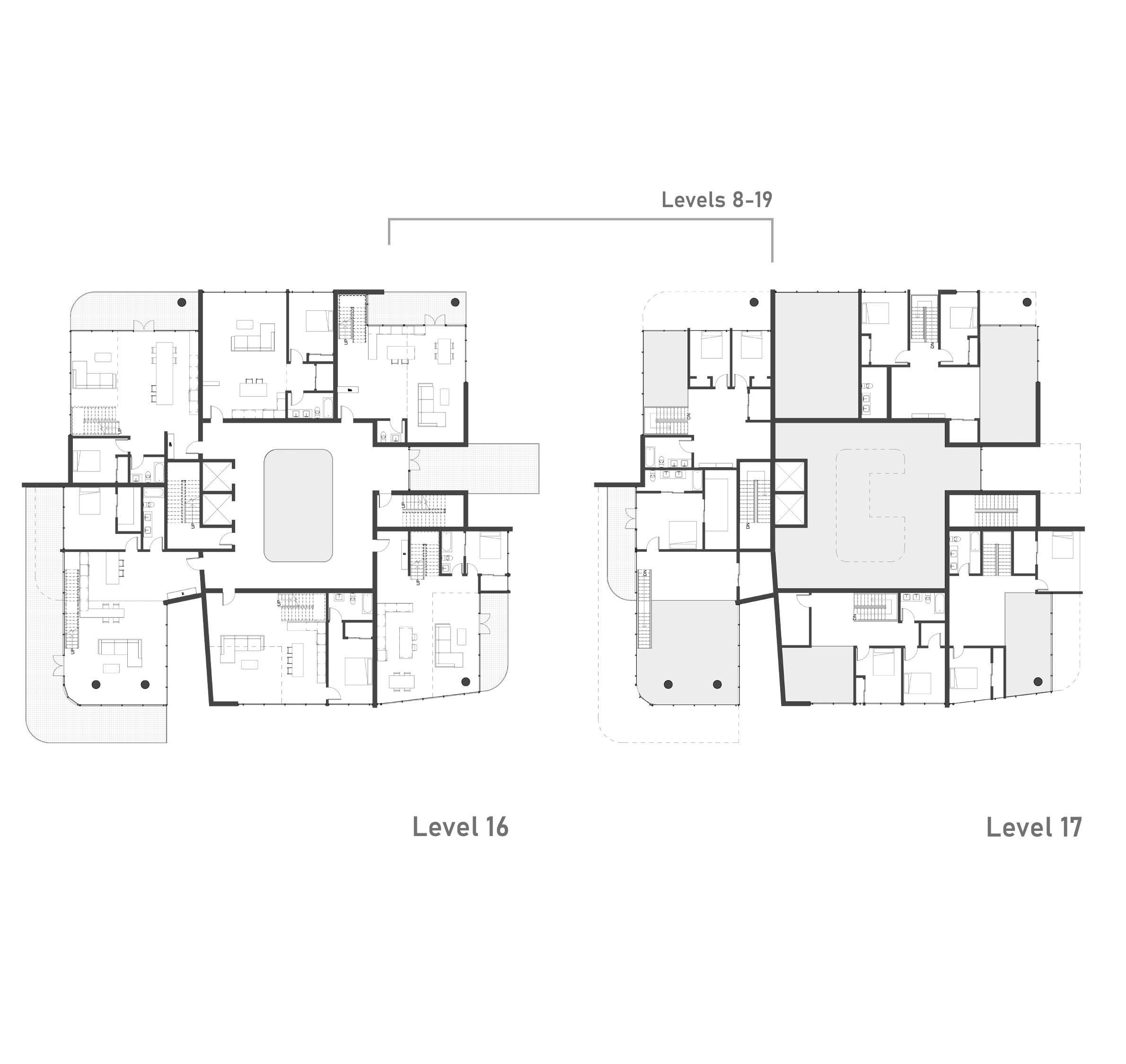
Typical first level of a skip-stop level. Two affordable units with one bedroom each, and three two story units, with their own balconies. A puncture through the center of the plate that spans two levels creates accidental meetings with neighbors as well as a shared terrace .
Typical second level of a skip-stop level. The double-heighted space looks over the living room, bringing in more light interally.
Similar to the first level of skip-stop, but replaces one unit with a larger shared terrace for residences, with a platform that pokes through the central atrium to allow for multi-level interaction.
Typical one-story, more spacious units with a staggering platform that pokes through the central atrium to allow for multi-level interaction.
The diagrams below depict the programmatic breakdown of the tower, with public spaces at the ground, offices in the lower third, and mainly residential units the rest of the way up with a rooftop, and restaurant overlooking the water. The circulation diagram below on the right highlights the most public levels, while the bottom left shows how the tower follows the set guidelines. Directly to the left, a perspective off S Palm Ave. which receives a decent amount of street traffic.
IF LOT FACES EAST THE NORTH SETBACK IS GREATER IF THE LOT FACES WEST THE SOUTH SETBACK IS GREATER
SETBACK OF 15’ FROM THE MAIN ROAD AFTER THE FIRST TWO LEVELS, WHICH REPEATS AFTER THE NEXT 4-6 LEVELS
PUBLIC SPACES
The envelope of the tower is made to look like one continuous, semi-opaque skin system made up of small vertical panels. The skin is then taken into the hands of the residents, who can open them up from their balconies for more direct sunlight into their space. This ever-changing skin gives the tower a unique look at any time and breaks down the scale of such a large structure.
SETTING THE SCENE
SUMMER 2022 WANNEMACHER JENSEN ARCHITECTS
Edgar Maradiaga
Hannah Ambrose
Israel Sanchez
Jamison Sweat
Jerri Stephanis
Joah Bury
Kinga Pabjan
Marina Ghobrial
Mary Alvarez
Mira Tabbalat
Stella Tran
Todd Willsie
Ulises Padron
Yoni Comhaire
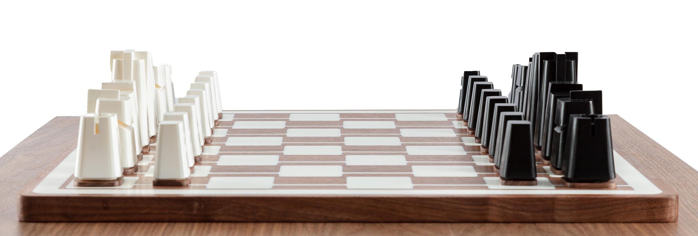
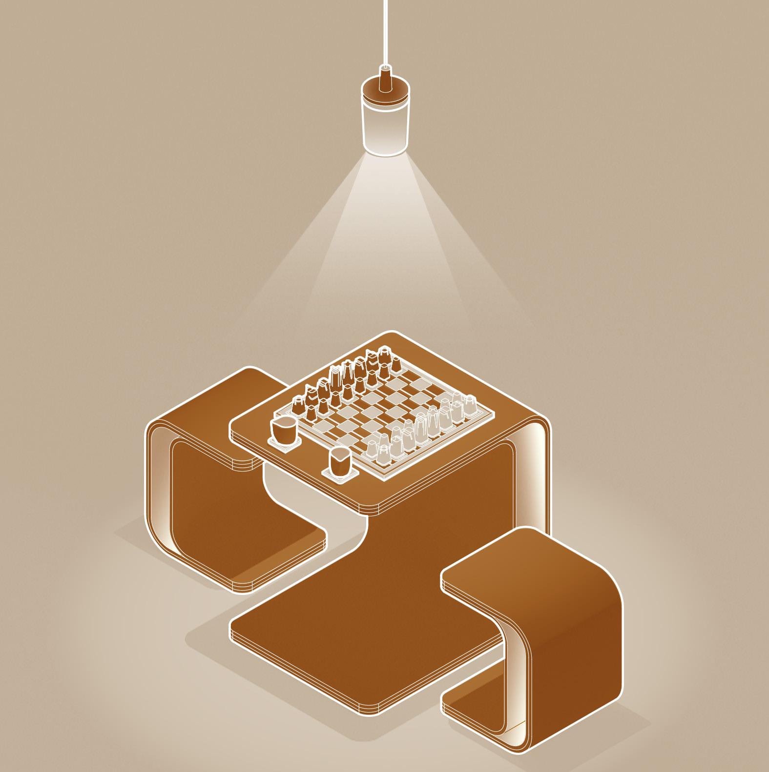
During my time at Wannemacher Jensen Architects, I was given the opportunity to work on an local competition in St. Petersburg held by the Atelier De Sosi. The WJA team collaborated to design and build NOOC, a collection of objects that celebrates architecture through detail, form, and storytelling. By re-imagining everyday objects found in a house, WJA explores form and function through a scene that can be found in the corner or nook of any home… a game of chess. The scene is set with a table, two stools, a chess board, two espresso cups, and a pendant light that illuminates the table scape and anticipates each player’s next move. Though each object serves a different function, a common theme unifies the collection through materiality and form. The scene encapsulates a moment in space and observes as two people come together for a game of chess.
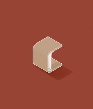
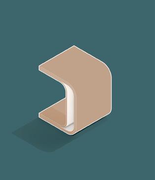
The chessboard is the generative device for all five NOOC objects. The pattern simultaneously considers and challenges the already established framework of a chessboard by re-imagining the checkered layout and introducing a new design that pays homage to tradition. Likewise, the form of the chess pieces is extracted from the board pattern while keeping the recognizable qualities of each piece. The chessboard establishes the minimal material palette for the five objects and becomes the unifying piece that brings the collection together.
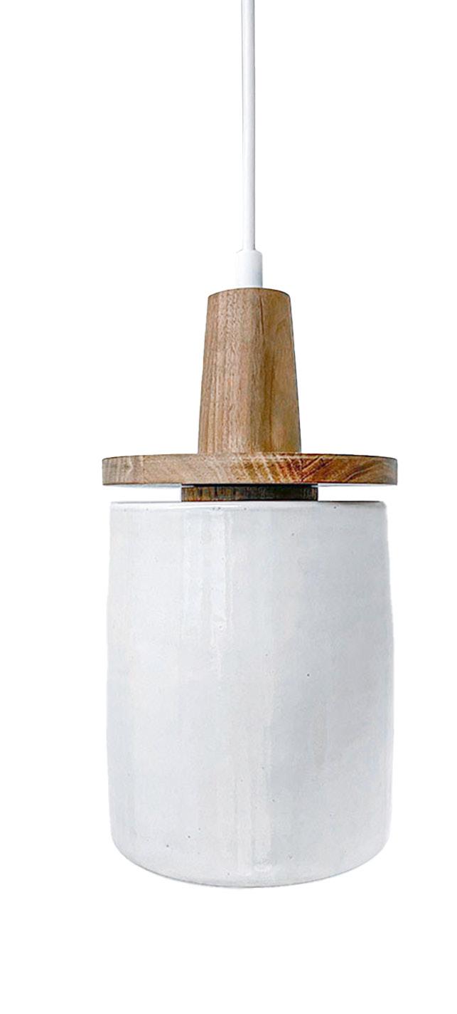
The pendant is designed to create ambient lighting to illuminate a table scape. The intent behind the design was to carry through the language established by the movement conventions of bending, turning, pinching, and wrapping found in the other objects. Like the other pieces, the pendant shows the play between two contrasting materials, with the ceramic shade highlighting the warmth of the walnut. The connection between the ceramic holder and the walnut canopy is celebrated through a small reveal. This separation reiterates the idea of a “nooc” at a much smaller scale.
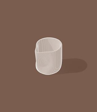
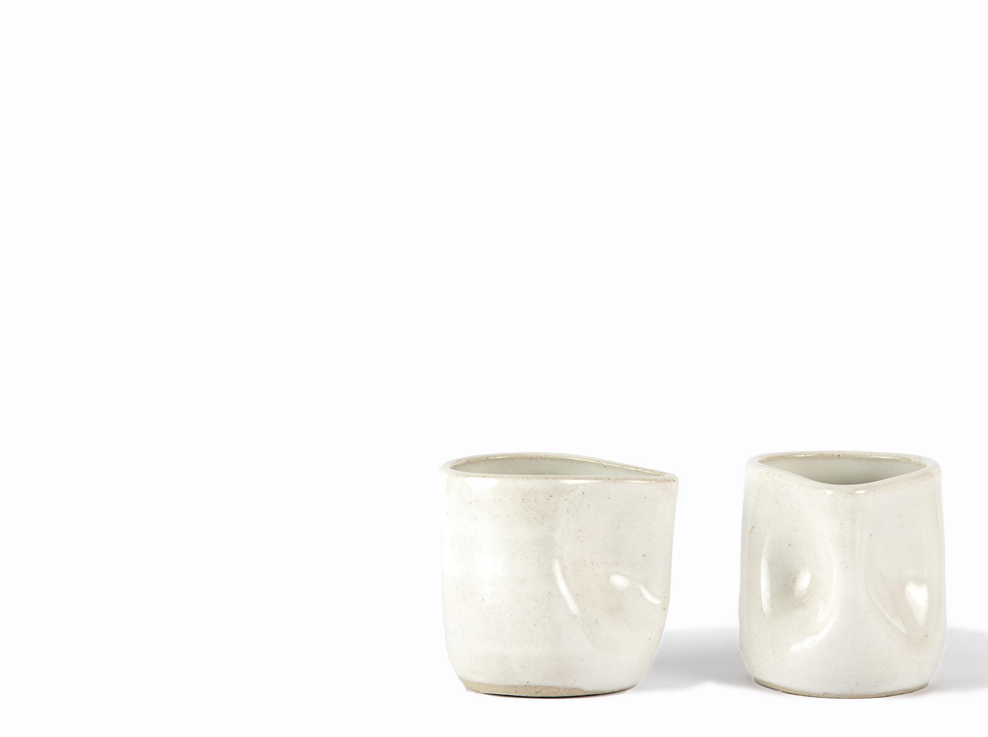
Throughout the collection, NOOC explores a series of movement studies used every day in the architecture discipline. Movements such as bending, turning, pinching, and wrapping become the driving force behind all five objects, including the ceramic espresso cups. The pinch where the hands would naturally grip the cup is reminiscent of the chessboard pattern. The pinched handle becomes not only a functional design choice but also further establishes the repetition of form from object to object.
COASTER ARRANGEMENT PLAN
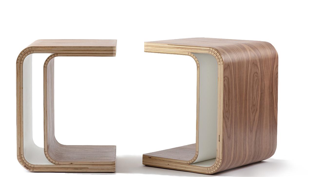
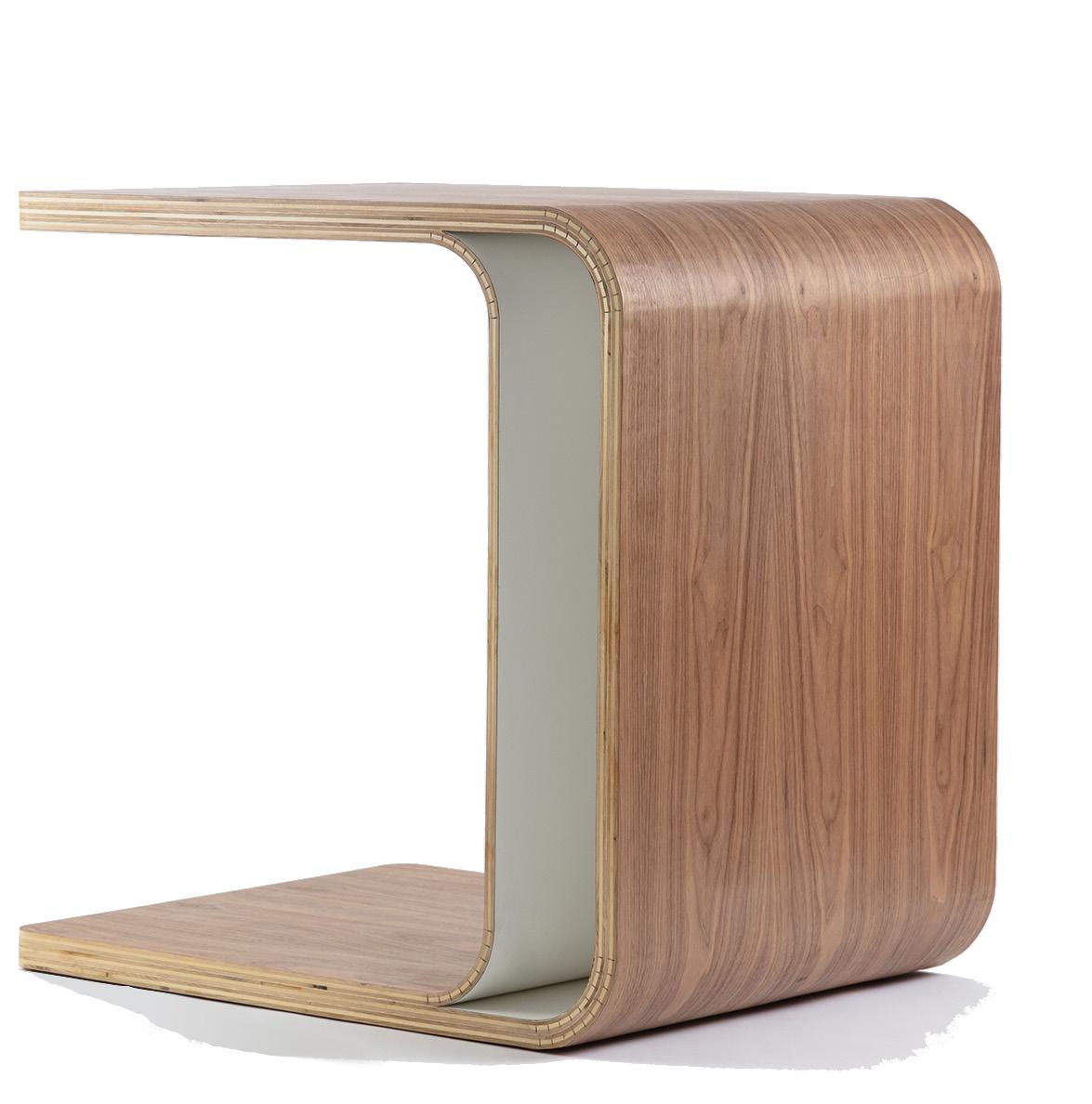
The stools and the table are situated next to each other as if having a conversation; the pair appear to be one sculptural piece. Together, they become the armature for all the objects as they hold and envelop the unfolding scene, a chess game. The stools form a continuous void or “nooc” with curved edges and corners. They are the reflection of NOOC through the space they create between the forms.
The design intent behind NOOC is to create a scene that can be found in the corner or nook of any home. This idea is reflected not only in the scene but in the form of each object. The table was developed through the movement study of “bending” to complement the bending lines in the chessboard pattern. A liminal space is created between the two planes by abstracting the idea of a table to two bending moves. This liminal space becomes a “nooc” at a smaller scale. It demonstrates how the repetition of form becomes a language recognizable in all five objects.