La Terra Dolce
Graphic Identity Guide
Graphic Identity Guide
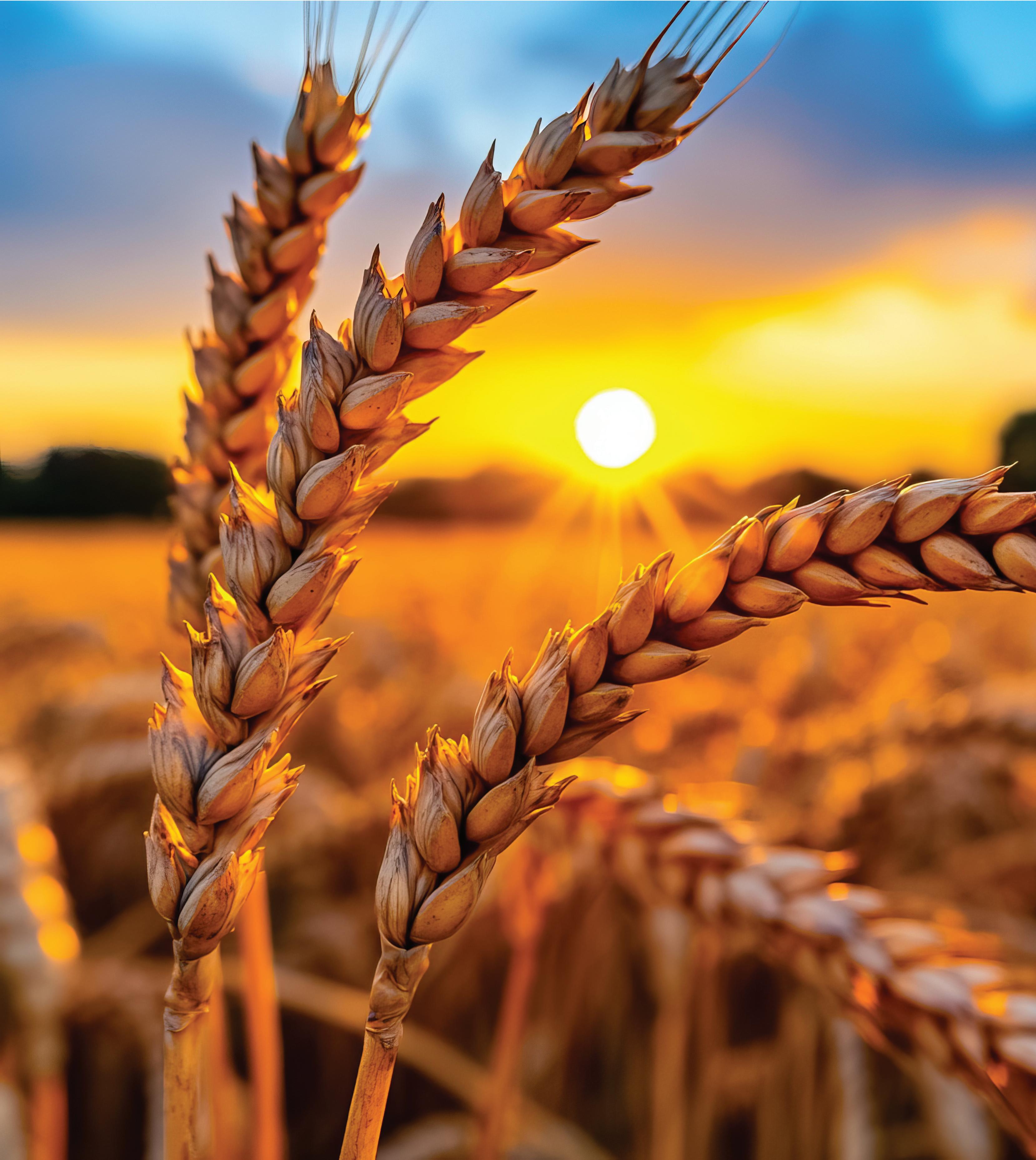
La Terra Dolce is a company that manufactures a comprehensive inventory of cereal grain products and emphasizes the nutritional value of its products, including whole grains and sustainable sourced ingredients and ethical farming practices. The main products made by the company are pasta and rice products. It also expands to baking products, breakfast cereals, breakfast bars, energy bars, frozen waffles, biscuits, and crackers. All of these products are under the Grains Group.
Wanting to represent what the company stands for and what its main purpose is, earthy colors were used for the logo. In relation to the earthy feel the logo consists of round edges as a correlation to the Earth and the land. Due to the company working with agriculture and farming, the yellow indicates the sun, an important element for grain plantations to grow, and the green indicates the land in which it is being planted at.
The viewer can see a grain wheat plant image on the logo as it is creating the illusion of hair in a smiley character. Creating a friendly character that children could be appealed and engaged to can perusade them to try the products. Detecting the products and wanting customers to purchase them it would be very benificial for La Terra Dolce. People tend to be attracted to products that seem friendly and fun and it is believed consumers look for that. La Terra Dolce makes products that the entire family could enjoy together.
The horizontal configuration of the logo is mostly used for this design. The text appears larger as it is placed next to the height of the logo.
The vertical configuration can also be used if is needed. The text does appear smaller due to it following the width of the logo.
The staging area helps allowing one to know where and where to not place the logo type and the logomark. The staging area is “1/4 X“ and it goes all around the logo type with the logomark as a guide to have the correct consistant space around the edges.
Pantone 144 C
Pantone Coated CMYK
Pantone 349 C
RGB
C: 0, M: 50, Y: 98, K: 0
R: 274, G: 148, B:33
C: 90, M: 33, Y: 98, K: 26
R:5 , G:106, B:55
La Terra Dolce logo comes in two colors but there is also the the white and black reverse application if needed. As shown below.
The font applied is not only used for the logo but also for the stationery and for any other needed materials. The fonts mostly used are Peachi Medium Regular, Peachi Bold, and Peachi Black Regular.
ABCDEFGHIJKLMNOPQRSTUVWXYZ
abcdefghijklmnopqrstuvwxyz
1234567890!@/#$%
ABCDEFGHIJKLMNOPQRSTUVWXYZ
abcdefghijklmnopqrstuvwxyz
1234567890
ABCDEFGHIJKLMNOPQRSTUVWXYZ
abcdefghijklmnopqrstuvwxyz
1234567890
It is recommended for the logo to be the minimum height of one inch and not to go below that size.
Minimum Height 1 inch.
Do not stretch and alter the logo.
Do not alter spacing or tracking of letters.
Do not place logo behind obscure objects.
La Terra Dolce
La Terra Dolce
Do not change colors of logo.
Do not place logo in busy background.
Spring 2025
GD 9 : Portfolio