Architecture+ Mimmi Mannila PORTFOLIO
a selection of
a selection of
ACADEMIC
4 milanolympics thesis project
14 balmain store interiors /construction
PROFESSIONAL
20 as oy hepokuja 9 pipe renovation-sauna
24 as oy westendin puisto pipe renovation-bathroom+
GRAPHIC DESIGN AND PHOTOGRAPHY page
30 as long as the moon shall rise poster
32 love fail poster
34 a sea symphony poster & instagram sories
36 piero portaluppi photographic survey
PUBLIC SPACE FOR A LIVEABLE REGENERATIVE CITY
-PORTA ROMANA FOR TOMORROW
THESIS PROJECT
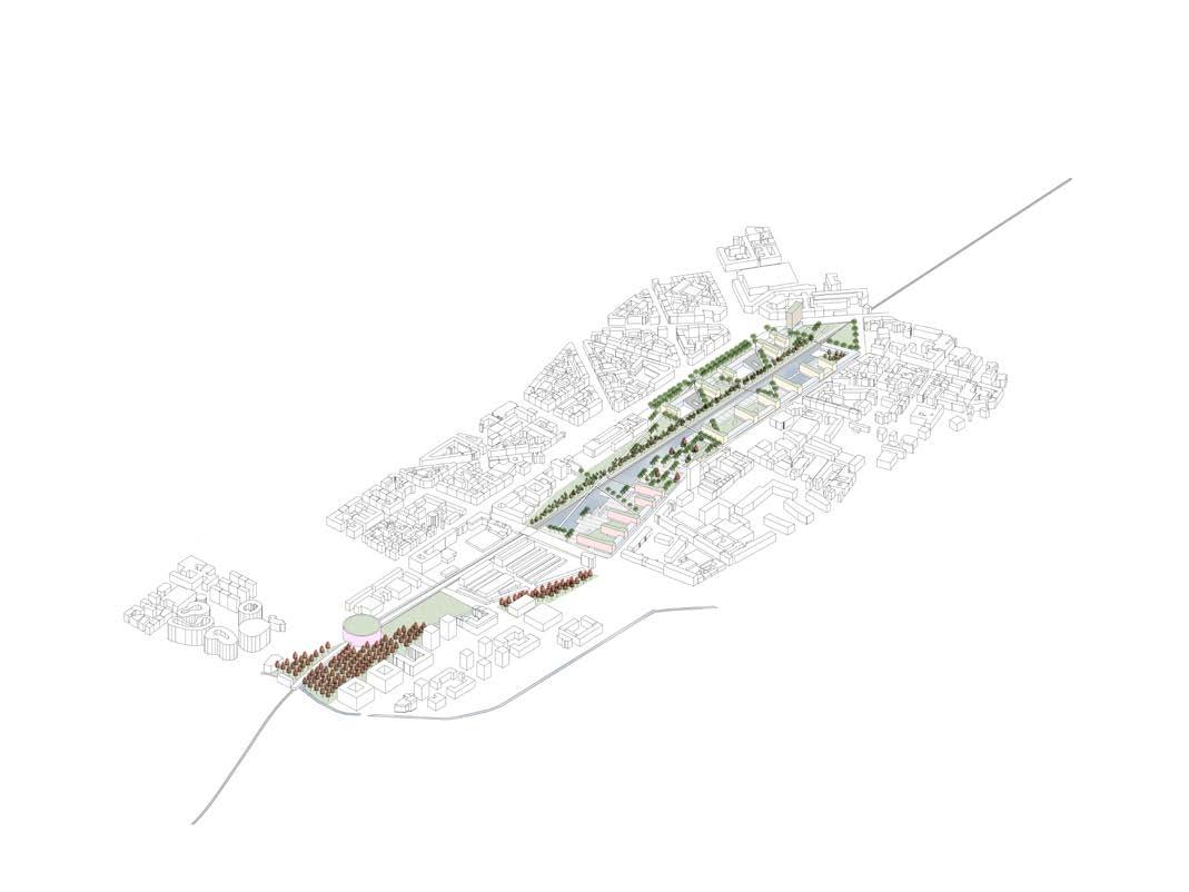
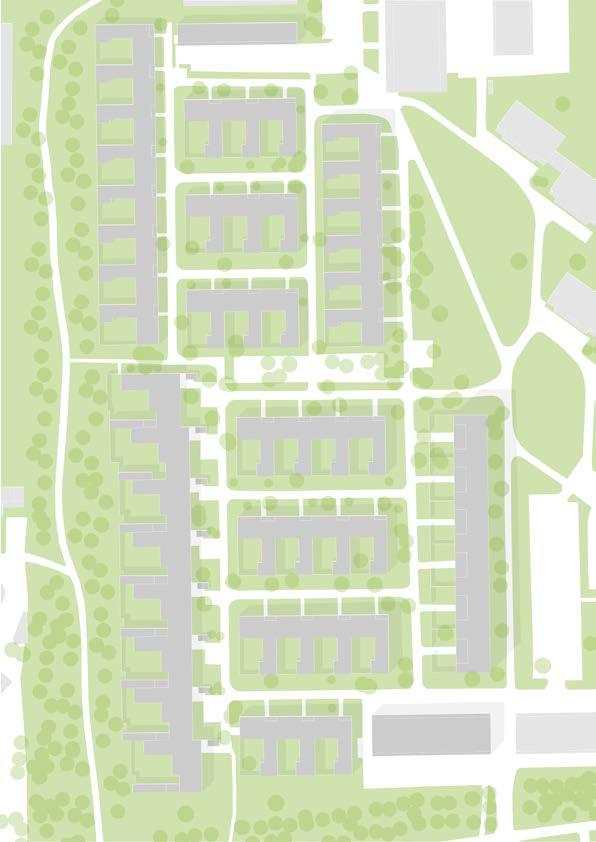
PORTA ROMANA-MILANO
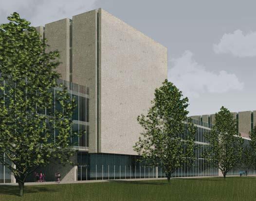
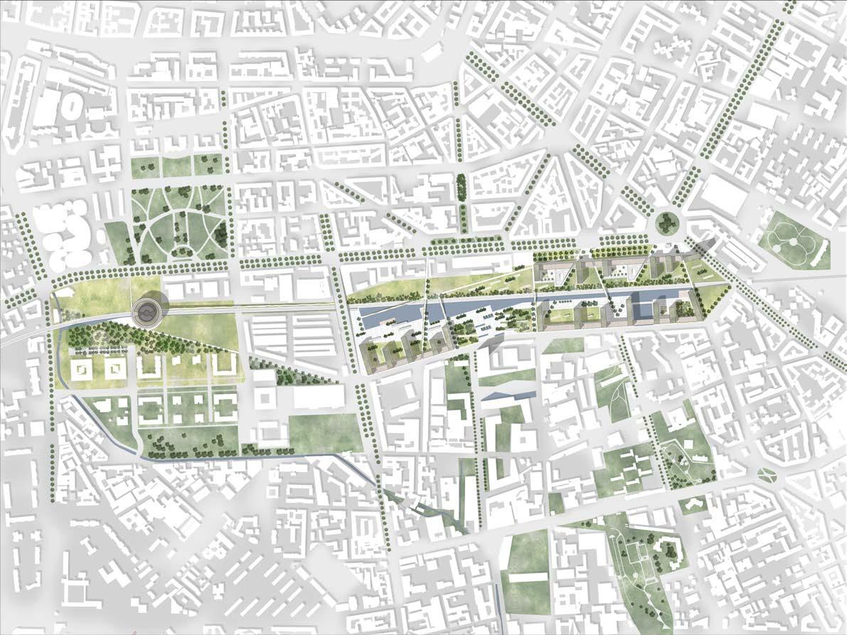
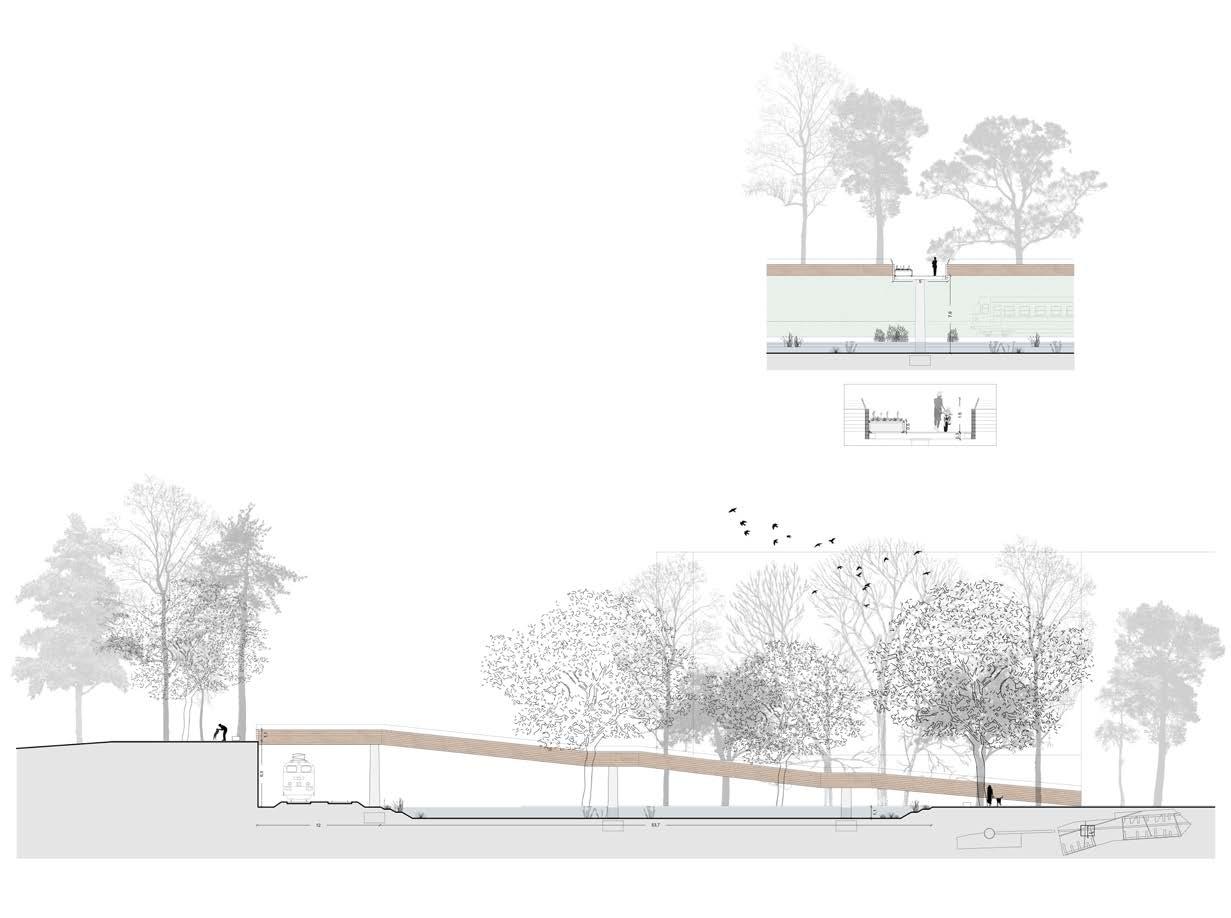
In the abandoned railway park of Porta Romana right outside the historical city fabric of Milan, to the south, lies the area of this project. The area is organized in a two-step program: it will firstly host the 2026 Winter Olympics athletes village and then, in 2030, it will be converted into student housing The plot is divided into two distinct parts, one located east and the other further west, connected by a railway line that longitudinally divides the whole project area.
Following three principal keywords: sustainability, connectivity, and ambiance, our proposal offers a range of spaces and functions throughout the site. The footprint of the built-up space is carefully designed following a set of internal and external grids to the plot, that also paves the way to north-south and east-west connections, with both anthropological and environmental character. Furthermore, the proposal gives value to the vegetation through the reconnection with the existing city green belt, creating a new green corridor running from the most oriental to the most occidental part of the project. Another goal is to create new bonds between the city green spaces, especially the adjacent Parco Agricolo Sud with the more central parts of Milan in hopes of paving the way for a future greener city.
longitudinal landscape section
cross section

Student Dorms
Semi-Public Spaces for Residents
Commercial/Hybrid Activities
Public Polyfunctional Center
Offices
Social Housing
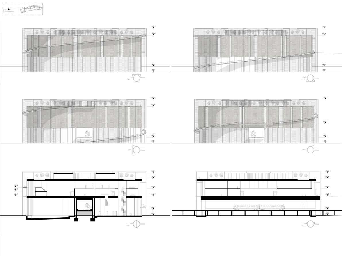
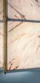
main area - typical sections and elevations
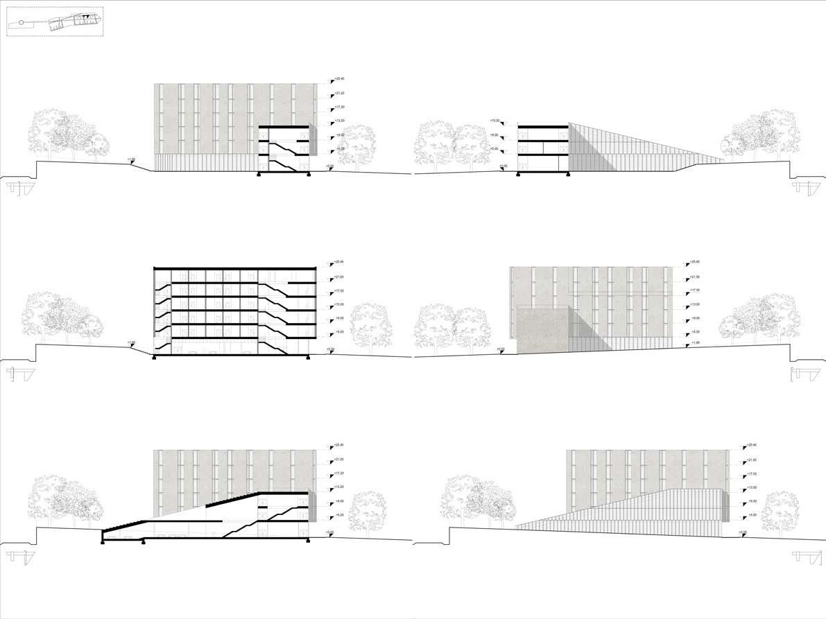
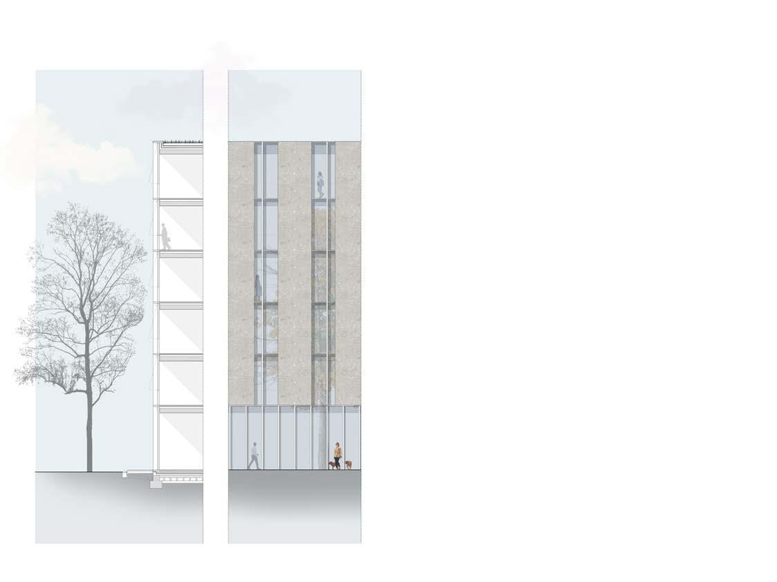
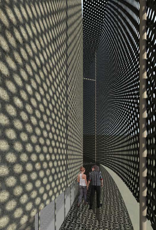
main area - typical facade detail
polyfunctional center - sections and elevations
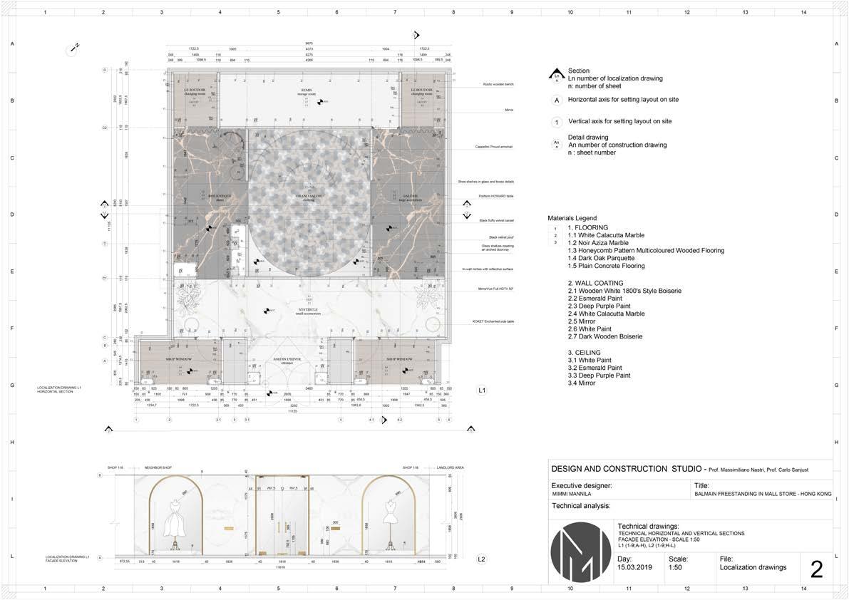
The task was to design a new store for the BALMAIN franchise in Hong Kong in the area called Landmark. The concept of the project, the research, and the construction details were some of the mai components we had to focus on.
The project’s core idea is based on a typical Balmain store, with a touch of my own style and preferences baked into the design.Many references were analyzed to understand perfectly what qualities a Balmain store should have.
The different rooms in the space were named after the french words of the spaces that can typically be found in a house. Each of the rooms was given its own identity. The entrance is very light and has a lot of open space as well as greenery. Furthermore, the resting rooms are darker and more sophisticated.
Again, importance was put on strong but elegant and looks, such as dark purple colours with velvet furniture and brass detailing. The spaces are supposed to feel expensive and luxorious, but also comfortable and cosy. That is why most rooms have either wooden claddings or parquettes that is inspired by the Scandinavian style that is chich, minimalistic and perfect for the core idea of the space.
Storage
Changing room ~3 msq
Shoes ~13 msq
Clothing ~22 msq
Bags ~13 msq
Accessories ~13 msq
Entrance ~4.5 msq
-open-light-green-minimalistic-

GRAND SALON
-comfortable-warm-chic-luxurious-

LE BOUDOIR
-cosy-wood-spacious-warm-
GALERIE
-dark-elegant-
BIBLIOTEQUE
-dark-elegant-mysterious-


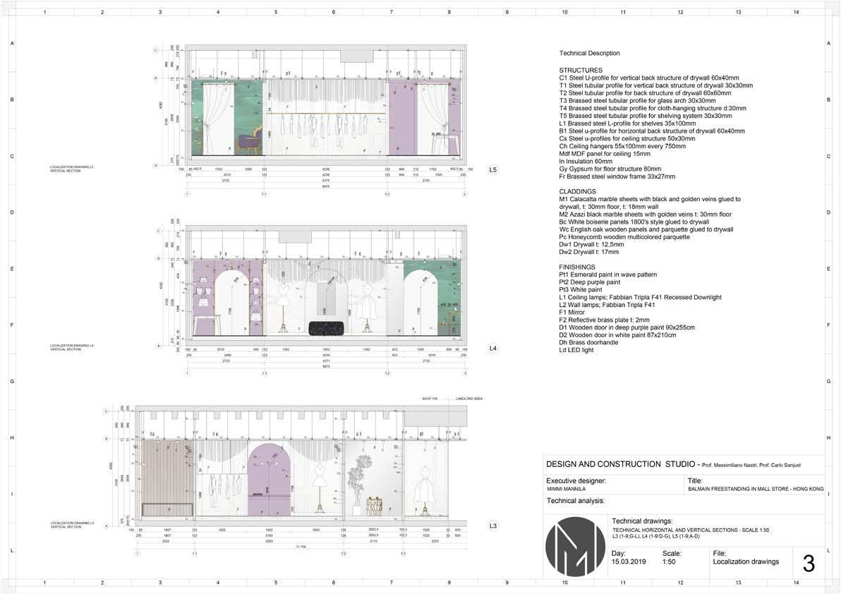
FINISHINGS
Pt1 Esmerald paint in wave pattern
Pt2 Deep purple paint
Pt3 White paint
L1 Ceiling lamps; Fabbian Tripla F41 Recessed Downlight
L2 Wall lamps; Fabbian Tripla F41
F1 Mirror
F2 Reflective brass plate t: 2mm
D1 Wooden door in deep purple paint 90x255cm
D2 Wooden door in white paint 87x210cm
Dh Brass doorhandle
Ld LED light
CLADDINGS
M1 Calacatta marble sheets with black and golden veins glued to drywall, t: 30mm floor, t: 18mm wall
M2 Azazi black marble sheets with golden veins t: 30mm floor
Bc White boiserie panels 1800’s style glued to drywall
Wc English oak wooden panels and parquette glued to drywall
Pc Honeycomb wooden multicolored parquette
Dw1 Drywall t: 12,5mm
Dw2 Drywall t: 17mm
STRUCTURES
C1 Steel U-profile for vertical back structure of drywall 60x40mm
T1 Steel tubular profile for vertical back structure of drywall 30x30mm
T2 Steel tubular profile for back structure of drywall 60x60mm
T3 Brassed steel tubular profile for glass arch 30x30mm
T4 Brassed steel tubular profile for cloth-hanging structure d:30mm
T5 Brassed steel tubular profile for shelving system 30x30mm
L1 Brassed steel L-profile for shelves 35x100mm
B1 Steel u-profile for horizontal back structure of drywall 60x40mm
Cs Steel u-profiles for ceiling structure 50x30mm
Ch Ceiling hangers 55x100mm every 750mm
Mdf MDF panel for ceiling 15mm
In Insulation 60mm
Gy Gypsum for floor structure 80mm
Fr Brassed steel window frame 33x27mm
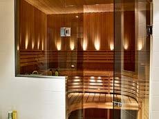
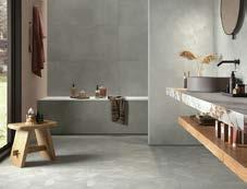
PIPE RENOVATION PROJECT-SAUNA COMPLEX
As Oy Hepokuja 9 is situated in Vantaa Finland. It is a 10 storey buildings with 45 apartments in total. In addition there are multiple storage units and in the basement you can find a public sauna complex and a laundry room.
The building was in need of a complete pipe and facade renovation. Because of this, all bathrooms as well as the ”wet areas” in the basement had to be torn down and redesigned in collaboration with experts from other fields.
floorplan sauna department 1:50 (zoom a)
furniture and equipment
vertical wood panels wave effect tile
1. wooden bench
2. wooden table
3. mirrror
4. hooks
5. showerheads
6. soapholder
7. floor drain
8. support handle
AK 1 = ceiling for wet room, plaster
AK 2 = ceiling, wooden panels
LaO 03 = door with solid laminate surface
PaO = wood panel door
SLO = glassdoor sauna
K = sauna heater
washroom elevations 1:50
changing room elevations 1:50


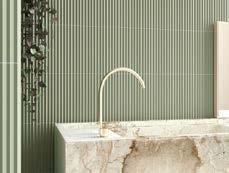
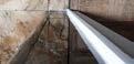
PIPE RENOVATION PROJECT -BATHROOM COMPLEX
The housing company As Oy Westendin Puisto dates back to the 80’s and is situated in the suburbs of Espoo Finland. It is composed of 11 one-story terraced houses and one two-story terraced house (house F) with 59 apartments in total.
The pipe renovation included all wet spaces in a way or another, and all bathrooms/saunas/washrooms were redesigned from scratch in collaboration with experts from the other fields.
masterplan 1:1000
houses A-L garages A1 and A2

typical apartment layout 1:100
wc elevations 1:50
bathroom elevations 1:50
abbreviations:
AK = ceiling
EI60 = fire class 60
H = (bed)room
K = kitchen/ sauna heater
KH = bathroom
KV = dryer
L = floor drain
PESUH. = washroom
PP = wasing machine
PUKUH. = changing room
S = sauna
VAR. = storage
bathroom, new design (zoom a) 1:25

wc elevations 1:50
sauna elevations 1:50
washroom elevations 1:50
typical sauna department, new design 1:25 (zoom b)
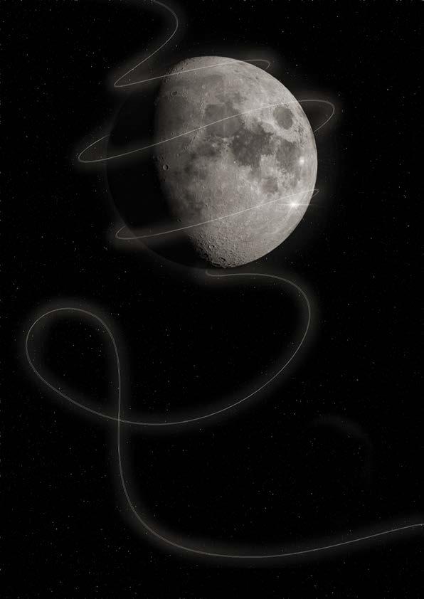
POSTER FOR LYRAN CHOIR’S CONCERT 3.11.2022
This poster was made for Lyran Choir’s (Akademiska Damkören Lyran) last concert with their conductor and director of arts of 14 years, Jutta Seppinen. The concert’s main theme was life’s marvels and wealth embedded in the phases of life. Just like the moon has its phases, so does life in all its shapes and sizes. The poster not only takes the reference of the moon in the title literally, it also conveys the mixed feelings of melanchony and curiosity looming over the choir as it was getting ready to enter a new era. As the string of light, life must go on.
In addition to this poster, tickets and pamphlets were made and printed. Posts for apps such as Instagram and Facebook were also created in the same style.

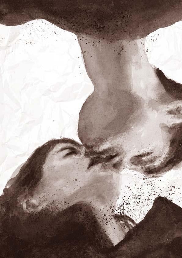
POSTER FOR LYRAN CHOIR’S CONCERT 2.11.2023
For the marketing material, we wanted something simple that conveyed the overall mystic and romantic vibe of the musical composition. We opted for a minimalistic style with earthy colors and the crumpled-up paper background. In addition to this poster, tickets and pamphlets were made and printed. Posts for apps such as Instagram and Facebook were also created in the same style.
Credit for the drawing used in poster: Linda Helaskoski.
”Why is it that people still like the story of Tristan and Isolde? It has been told repeatedly for almost 1000 years, in many different versions, with all manner of strange details added or changed. “The greatest love story ever!” But why? Of course, there is excitement, drama, love, lust, shame, death, dragons. I think the real reason why is because the love of Tristan and Isolde begins by accident—they drink a love potion. They didn’t mean to drink it, and they didn’t mean to fall in love. They drink and—BAM!—it starts. It is almost a laboratory experiment into what love might be like without any of the complications of how real love begins or works— without the excitement, embarrassment, frustration, guilt or competition present in the courtships of ordinary people.”
Extract from the love fail program note written by the composer David Lang.

Lyran
Riku
Laurikka
TO 2.11.2023 KL 19 RIDDARHUSET
BILJETTER AV KORISTER ELLER VIA LIPPU.FI

by david lang
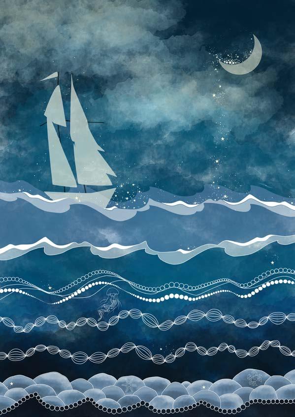
POSTER FOR A JOINT CONCERT 16.11.2024
”The music corporations of the University of Helsinki Akademiska Damkören Lyran, Akademiska Sångföreningen and Ylioppilaskunna Soittjat join forces to perform Williams’ first symphony. Based on the poems of Walt Whitman, the work deals with the essence of humanity and humanity, and is a praise to the sea, introspection and exploration.”
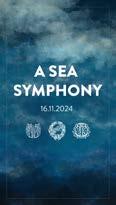


Above is marketing content for intagram stories. To the right is a poster meant to be printed on an A3 sheet size for marketing purposes.
Akademiska Damkören Lyran Akademiska Sångföreningen
Ylioppilaskunnan Soittajat
Under ledning av/johtaa: Aku Sorensen
Ralph Vaughan Williams
Solister/solistit:
Sopran/sopraano: Iida Antola
Baryton/baritoni: Jussi Vänttinen
16.11.2024 KL./KLO 19:00
MIKAEL AGRICOLA KYRKAN/ MIKAEL AGRICOLAN KIRKKO
BILJETTER/LIPUT: lippu.fi/akademen
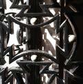
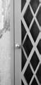
Piero Portaluppi was one of the most relevant architects in Milan in the beginning of the 19th century. Because of his rather diffuse style (which is characterized by a lot of ornamentation and eye catching materials) and his choise to work for the Fascists, he was later forgotten by many. Still, when you walk the streets of the city, you can clearly see that his architecture lives on, always trying to make a statement, always being a little bit different.


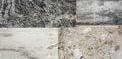


colour and material


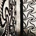
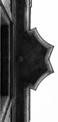


light and shadow patterns